What is Air Traffic Control Radar?什么是 Air Traffic Control Radar?
Air Traffic Control Radar turns life-or-death legibility into an aesthetic — phosphor-green blips, sweeping range rings, and monospace callsign tags that have guided aircraft since the 1950s.空中交通管制雷达将生死攸关的可读性升华为一种美学——自1950年代起引导航空器的磷光绿光点、旋转距离环与等宽呼号标签。
Air Traffic Control Radar in briefAir Traffic Control Radar 速览
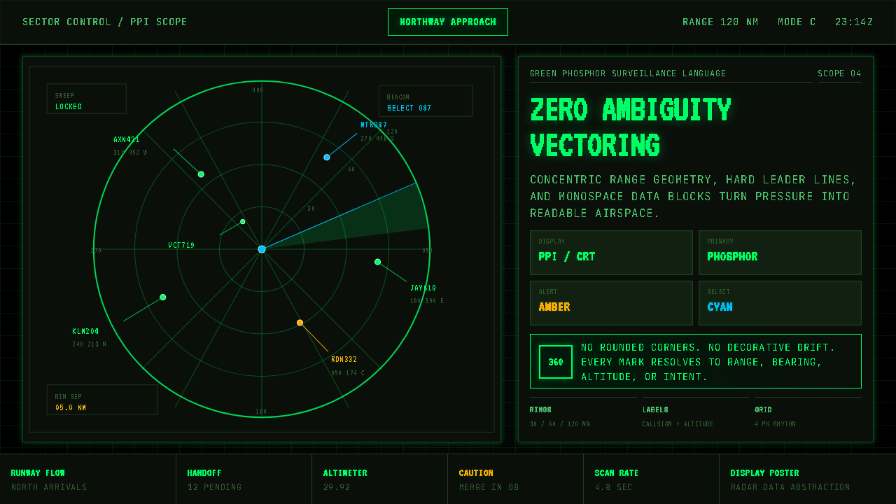
Air Traffic Control Radar is a design system distilled from the visual language of Plan Position Indicator displays — the radial-sweep screens found in FAA control towers, military air-defense operations centers, and naval command facilities. Its defining elements are the sweeping beam that clears the screen in a slow, clockwise arc; the concentric range rings marking measured distances from the antenna; and the small, bright target blips that represent individual aircraft. The palette is almost entirely phosphor green on near-black, a chromatic identity burned into cathode-ray tube screens across decades of operational use.空中交通管制雷达是一套从平面位置指示器(PPI)显示屏视觉语言中提炼而来的设计系统——这类屏幕存在于联邦航空管理局管制塔台、军事防空作战中心与海军指挥设施之中。其核心元素是以缓慢顺时针弧线扫过屏幕的旋转波束、标记距天线测量距离的同心距离环,以及代表单架航空器的明亮目标光点。整体色板几乎全是近黑背景上的磷光绿——数十年操作使用中,这一色彩身份被烙印在阴极射线管屏幕上。
The system is built around a single, non-negotiable requirement: zero-ambiguity legibility under conditions of extreme pressure. A controller tracking dozens of aircraft simultaneously cannot afford visual noise. Every element in the display — blip position, data block, leader line, range ring, velocity vector — carries precise operational meaning. Nothing is present for decoration. The aesthetic consequence of this demand is a kind of militant functionalism that happens to be visually arresting: crisp, glowing geometry suspended in darkness.这套系统围绕一个不可妥协的核心要求而构建:在极度压力条件下实现零歧义可读性。同时跟踪数十架航空器的管制员承受不起任何视觉噪音。显示屏上的每个元素——光点位置、数据块、引导线、距离环、速度矢量——都承载着精确的操作含义。没有任何元素是为装饰而存在的。这一要求的美学后果是一种好战式功能主义,而这种功能主义碰巧在视觉上令人震撼:清晰、发光的几何图形悬浮于黑暗之中。
In contemporary design, the Air Traffic Control Radar style translates this operational vocabulary into presentations, dashboards, editorial work, and interfaces where authority, precision, and high-stakes clarity are the desired emotional register. It is not a style of warmth or invitation — it is a style of command.在当代设计中,空中交通管制雷达风格将这套操作词汇转化为演示文稿、仪表板、编辑内容与界面——适用于权威、精确与高风险清晰度是期望情感基调的场合。这不是一种温暖或邀请的风格——它是一种指挥的风格。
See the Air Traffic Control Radar design system查看 Air Traffic Control Radar 完整设计系统
Where does Air Traffic Control Radar come from?Air Traffic Control Radar 从何而来?
The visual language of radar displays was born from necessity during the Second World War. British physicist Robert Watson-Watt led the Chain Home radar network development in the late 1930s, and the operational requirement to track multiple moving targets against a dark background — without the luxury of color, texture, or illustration — established the fundamental grammar: bright returns on dark fields, range marked by concentric geometry. The Plan Position Indicator format, which sweeps a radial beam and paints a persistent phosphor trace at each detected return, was standardized across Allied air-defense systems by the mid-1940s.雷达显示屏的视觉语言诞生于第二次世界大战的迫切需求。英国物理学家罗伯特·沃森-瓦特在1930年代末主导了链式防空雷达网络的开发,而在黑暗背景上跟踪多个移动目标——且无法使用色彩、纹理或插图——的操作要求确立了基本语法:深色底面上的亮色回波,同心几何图形标记距离。平面位置指示器格式——以旋转波束扫描并在每个探测到的回波处留下持久的磷光痕迹——到1940年代中期已在盟国防空系统中实现标准化。
After the war, radar technology moved from military air defense into civil aviation. The United States Federal Aviation Administration and its predecessors began deploying ground-based approach and en-route radar through the 1950s and 1960s. The displays inherited their visual logic directly from wartime systems: green phosphor on black, monospace alphanumeric tags identifying aircraft callsigns and altitudes, and leader lines connecting the target blip to its associated data block. The design was never the result of aesthetic deliberation — it was the direct product of cathode-ray tube physics, air-traffic operational procedure, and the constraint of building reliable systems under Cold War urgency.战后,雷达技术从军事防空领域进入民用航空。美国联邦航空管理局及其前身机构从1950至60年代开始在全国部署地面进近与航路雷达。这些显示屏直接从战时系统继承了其视觉逻辑:黑底绿磷光,等宽字母数字标签标识航空器呼号与高度,引导线将目标光点与其关联数据块相连。这种设计从来不是审美思考的产物——它是阴极射线管物理特性、空中交通操作程序以及在冷战紧迫性下构建可靠系统这三重约束的直接结果。
The introduction of ARTS (Automated Radar Terminal System) in the 1970s and later STARS (Standard Terminal Automation Replacement System) and ERAM (En Route Automation Modernization) in the 2000s and 2010s brought digital processing to air-traffic radar displays, but the visual conventions remained remarkably stable. Controllers trained on earlier systems needed to read new displays without relearning fundamental symbol vocabularies. The phosphor-green-on-black palette, the concentric range rings, and the monospace data block format survived each generational transition — not out of sentimentality, but because they worked, and any departure from them risked operational error.1970年代推出的ARTS(自动化雷达终端系统),以及2000至2010年代的STARS(标准终端自动化替代系统)和ERAM(航路自动化现代化)将数字处理引入了空中交通雷达显示,但视觉惯例保持了惊人的稳定性。在早期系统上接受训练的管制员需要在不重新学习基本符号词汇的情况下读取新显示屏。磷光绿配黑底的色板、同心距离环与等宽数据块格式在每一代系统迭代中得以保留——并非出于怀旧,而是因为它们有效,任何偏离都有引发操作失误的风险。
The parallel development of military systems by Lockheed Martin, Raytheon, and other defense contractors reinforced these conventions globally. FAA STARS consoles, NATO air-defense displays, and naval combat information centers all converged on a shared visual grammar because interoperability across allied systems demanded legibility at a glance. Luis Walter Alvarez's contributions to airborne radar and ground-controlled approach systems in the 1940s helped establish the technical foundations that later display designers inherited. By the time the aesthetic entered popular culture — through films, television, and eventually video games — its meaning was already fixed: this is how serious systems look when lives depend on readability.洛克希德·马丁、雷神公司和其他国防承包商对军事系统的同步开发在全球范围内强化了这些惯例。联邦航空管理局STARS控制台、北约防空显示屏与海军作战信息中心都汇聚于共同的视觉语法,因为盟国系统间的互操作性要求一眼即可读取。路易斯·沃尔特·阿尔瓦雷兹在1940年代对机载雷达与地面控制进近系统的贡献,帮助奠定了后代显示屏设计师所继承的技术基础。当这种美学通过电影、电视乃至电子游戏进入大众文化时,其含义已然固定:这就是当生死悬于可读性时,严肃系统的样貌。
What defines the Air Traffic Control Radar look?Air Traffic Control Radar 的视觉特征是什么?
Phosphor Palette磷光色板
The foundational color relationship is bright green against deep black — a chromatic pair derived directly from the emission spectrum of P31 and P43 phosphor compounds used in cathode-ray tube displays. The green carries an inner luminosity, as though it is self-generated rather than reflected light. Secondary information may appear in softer amber or pale cyan tones, but the dominant contrast is always the hard green-on-black. No warm tones, no neutral grays: the palette communicates that every element present is operationally active.基础色彩关系是深黑背景上的亮绿——这对色彩直接源自阴极射线管显示屏所使用的P31和P43磷光化合物的发射光谱。这种绿色带有内在的发光感,仿佛是自发光而非反射光。次要信息可能以较柔和的琥珀色或浅青色出现,但主导对比始终是绿底黑上的硬边绿色。没有暖色调,没有中性灰:这套色板传达的信息是,所有出现的元素都处于操作激活状态。
Concentric Ring Geometry同心环几何
Range rings — evenly spaced circles radiating from a central point — provide the structural skeleton of every radar composition. In authentic displays these rings represent measured distances from the antenna, spacing adjusted to the controller's selected range scale. As a design motif they create an immediate sense of radial depth and measured space, pulling the viewer's eye toward the center. Their weight is deliberately thin relative to the field they span: they are reference lines, not dominant forms, and the best applications keep them visually subordinate to the live data they frame.距离环——从中心点向外辐射的等间距同心圆——构成每幅雷达构图的结构骨架。在真实显示屏中,这些环代表距天线的测量距离,间距根据管制员选择的量程比例调整。作为设计母题,它们营造出即时的径向深度感与测量空间感,将观者视线拉向中心。相对于它们所跨越的画面,其线宽刻意保持纤细:它们是参考线而非主导形态,最佳应用中它们在视觉上始终从属于所框架的实时数据。
Sweep Wedge and Scan Trail扫描扇面与余辉拖尾
The rotating sweep beam and its decaying afterglow — a wedge of fading luminosity trailing the active scan line — are the most kinetically charged elements in the visual system. In static design work, the sweep is rendered as a frozen arc or a gradient wedge emanating from center, suggesting clockwise rotation. The afterglow effect, which in real displays represents phosphor persistence, translates visually as a tonal graduation from bright at the leading edge to near-invisible at the trailing edge. This motif immediately signals the temporal dimension: this system is alive, scanning, continuously updated.旋转扫描波束及其衰减余辉——跟随激活扫描线的一道渐暗发光扇面——是整个视觉系统中动感最强的元素。在静态设计作品中,扫描线被渲染为从中心向外发散的冻结弧线或渐变扇形,暗示顺时针旋转。余辉效果——在真实显示屏中代表磷光体的持续发光——在视觉上呈现为从前缘的亮到后缘的几近透明的色调渐变。这一母题立即传达出时间维度:这个系统是活的,正在扫描,持续更新。
Monospace Data Blocks等宽数据块
Every tracked target is accompanied by a small rectangular data block — the callsign, altitude readout, and ground speed — set in monospace characters. Monospace is not a stylistic choice but an operational one: equal character width allows controllers to read and compare alphanumeric strings at speed without eye movement adjusting for proportional kerning. Leader lines connect each blip to its data block at a consistent angle. In design applications, this convention translates into a preference for monospace or near-monospace type for all numerical and code-adjacent content, creating visual alignment and a sense that every figure is measured rather than estimated.每个被跟踪目标旁都附有一个小型矩形数据块——呼号、高度读数和地速——以等宽字符排列。等宽并非风格选择,而是操作需求:等宽字符允许管制员快速读取和比较字母数字字串,无需视线因比例字距调整而移动。引导线以固定角度将每个光点与其数据块相连。在设计应用中,这一惯例转化为对所有数字与代码相关内容使用等宽或近等宽字体的偏好,形成视觉对齐感,并传达出每个数字都是测量所得而非估算的感受。
Target Blip and Velocity Vector目标光点与速度矢量
Aircraft appear as small, bright points — blips — whose position updates with each antenna sweep. In more advanced systems, a short line extends from the blip in the direction of travel, the velocity vector, indicating projected position if current heading and speed are maintained. This is pure operational grammar: position now, heading next. As a design element the blip-and-vector pair is one of the most transferable motifs, suggesting a tracked object in motion through a measured field. It appears naturally in data visualization, mapping interfaces, and any context where entities move through monitored space.航空器以明亮小光点——光斑——呈现,其位置随每次天线扫描更新。在更先进的系统中,一条短线从光斑沿行进方向延伸出去,即速度矢量,表示若维持当前航向与速度的预测位置。这是纯粹的操作语法:当前位置,下一步航向。作为设计元素,光斑加矢量组合是可移植性最强的母题之一,暗示一个被跟踪的运动目标穿越测量空间。它自然地出现在数据可视化、地图界面以及任何实体在受监控空间中运动的场景中。
Grid and Sector Lines网格与扇区线
Underlying the circular radar field is a sparse orthogonal or radial grid defining airspace sectors, approach corridors, and prohibited zones. These lines are intentionally rendered at low luminosity — thin, barely-there strokes that provide spatial context without competing with live target data. The contrast between the dim structural grid and the bright operational layer is one of the system's most instructive lessons: hierarchy is enforced not by size alone but by luminosity. Background structure exists to orient; foreground data exists to act on.在圆形雷达画面之下,是一组稀疏的正交或径向网格,定义空域扇区、进近走廊与禁飞区。这些线条刻意以低亮度渲染——细薄、若隐若现的笔触提供空间背景,而不与实时目标数据竞争。暗淡结构网格与明亮操作层之间的对比,是这套系统最具启发性的课程之一:层级不仅靠尺寸强制,也靠亮度强制。背景结构用于定向;前景数据用于行动。
Functional Severity功能性严峻
The overall character of the style is unapologetically severe. There are no decorative elements, no gradients used for visual richness, no illustrative flourishes. Even the circular forms — which in other aesthetic traditions carry associations of softness or community — read as instruments rather than symbols of inclusion. This severity is the style's honest communication of its origin: a system designed for professionals under pressure, where ambiguity costs lives. Applied to design work, this severity reads as authority. It is most powerful when the content genuinely warrants that register — least convincing when applied to inherently low-stakes contexts.这种风格的整体气质毫不妥协地严峻。没有装饰性元素,没有为丰富视觉而使用的渐变,没有任何插图性花饰。即便是圆形元素——在其他美学传统中往往与柔软或包容相关联——在此也读作仪器而非包容的象征。这种严峻是这种风格对其起源的诚实传达:一套为压力下的专业人员设计的系统,在那里歧义意味着生命代价。应用于设计作品时,这种严峻被解读为权威。当内容确实需要这种基调时,它最为有力;当被应用于本质上低风险的场景时,则最缺乏说服力。
See the Air Traffic Control Radar design system查看 Air Traffic Control Radar 完整设计系统
Who shaped Air Traffic Control Radar?谁塑造了 Air Traffic Control Radar?
The Scottish physicist Robert Watson-Watt is widely credited with developing the first practical radar system for air defense, leading the team that built Chain Home — Britain's coastal radar network — in the late 1930s. Chain Home's operational displays established many of the conventions that persisted into civilian air traffic control: bright returns against dark grounds, signal persistence, and the use of multiple coordinated stations to triangulate position. Watson-Watt's insistence on operational reliability over optical elegance set a precedent that the entire lineage of radar display design followed: the display exists to serve the operator, and every design decision is subordinate to that purpose.苏格兰物理学家罗伯特·沃森-瓦特被广泛认为是第一个实用防空雷达系统的开发者,他在1930年代末领导团队建造了英国的海岸雷达网络——链式防空系统。链式防空系统的操作显示屏确立了许多延续至民用空中交通管制的惯例:深色底面上的亮色回波、信号持续性,以及利用多个协调站点进行位置三角测量。沃森-瓦特对操作可靠性胜于视觉优雅的坚持,为整个雷达显示设计谱系树立了先例:显示屏为服务操作员而存在,每一个设计决定都从属于这一目的。
American physicist and Nobel laureate Luis Walter Alvarez developed Ground Controlled Approach radar during the Second World War — a system that allowed controllers to guide aircraft to landing in low-visibility conditions using real-time radar data. His work demonstrated that radar display design was not merely a technical problem but a human-factors problem: how information is presented on screen determines whether a controller can act on it accurately under pressure. Alvarez's contributions helped establish the operational conventions for approach radar that later influenced the design of FAA terminal approach systems and, by extension, the visual vocabulary of the Air Traffic Control Radar aesthetic.美国物理学家、诺贝尔奖得主路易斯·沃尔特·阿尔瓦雷兹在第二次世界大战期间开发了地面控制进近雷达——一套利用实时雷达数据引导航空器在低能见度条件下着陆的系统。他的工作表明,雷达显示设计不仅是技术问题,更是人为因素问题:屏幕上信息的呈现方式决定了管制员能否在压力下准确行动。阿尔瓦雷兹的贡献帮助确立了进近雷达的操作惯例,后来影响了联邦航空管理局终端进近系统的设计,进而影响了空中交通管制雷达美学的视觉词汇。
The FAA Air Traffic Organization is the operational body responsible for the design and deployment of the United States national airspace system, including the STARS and ERAM display systems that represent the current generation of en-route and terminal radar displays. Through decades of iterative development — always constrained by the requirement that new displays be legible to controllers trained on older systems — the FAA ATO has maintained and refined the visual conventions of radar display design. Its human-factors research and display certification requirements have effectively codified the aesthetic into operational standards that have influenced radar display design globally.联邦航空管理局空中交通组织是负责美国国家空域系统设计与部署的操作机构,包括代表当代航路和终端雷达显示屏的STARS和ERAM系统。经过数十年的迭代开发——始终受制于新显示屏必须对接受过旧系统培训的管制员保持可读性这一要求——联邦航空管理局空中交通组织维护并精炼了雷达显示设计的视觉惯例。其人为因素研究与显示屏认证要求有效地将这种美学编成了具有全球影响力的操作标准。
As the prime contractor for STARS — the Standard Terminal Automation Replacement System deployed at major U.S. terminal radar approach control facilities from the 2000s onward — Lockheed Martin was directly responsible for translating decades of established radar display convention into modern digital systems. The challenge was considerable: replacing aging hardware without disrupting the operational visual language that controllers depended on. The resulting STARS displays preserved the essential aesthetic of phosphor-era radar — green-on-black, monospace data blocks, concentric range rings — while adding digital precision, scalable sector displays, and enhanced conflict-alert visualization. This preservation under technological transition is itself a demonstration of how deeply the visual system had become operationally necessary.作为STARS——从2000年代起在美国主要终端雷达进近管制设施部署的标准终端自动化替代系统——的主承包商,洛克希德·马丁公司直接负责将数十年确立的雷达显示惯例转化为现代数字系统。挑战相当严峻:在不扰乱管制员依赖的操作视觉语言的前提下替换老化硬件。由此产生的STARS显示屏保留了磷光时代雷达的基本美学——黑底绿色、等宽数据块、同心距离环——同时增加了数字精度、可缩放扇区显示和增强的冲突告警可视化。这种在技术迭代中的美学保留本身就证明了这套视觉系统已在多大程度上成为操作必需。
How do you use Air Traffic Control Radar today?今天怎么用 Air Traffic Control Radar?
The Air Traffic Control Radar style is one of the most precise aesthetic signals available to a designer: it communicates authority, operational precision, and high-stakes seriousness before a single word is read. Applied correctly, it elevates content that genuinely demands that register — data-heavy dashboards, security operations centers, command-and-control interfaces, and presentations where the subject matter is complex systems, infrastructure, or mission-critical operations. Applied incorrectly — to a consumer food brand, a wellness app, or a children's platform — it reads as tonal mismatch, sometimes even as menace.空中交通管制雷达风格是设计师可用的最精准美学信号之一:在读到任何文字之前,它就传达出权威、操作精确与高风险严肃感。正确应用时,它能提升那些真正需要这种基调的内容——数据密集型仪表板、安全运营中心、指挥控制界面,以及主题涉及复杂系统、基础设施或关键任务操作的演示文稿。错误应用时——用于消费类食品品牌、健康应用或儿童平台——则呈现出基调错配,有时甚至令人不安。
For presentation slides, the style works at its most powerful on a cover that takes the full-bleed dark field seriously. A cover composition should center or off-center the radar circle motif, allow concentric rings to extend to or past the frame edge, and place the title in a monospace or near-monospace typeface — aligned to the scan geometry rather than floating independently. Subtitle or event information can be treated as a data block: a tight cluster of lines, each a different level of the type hierarchy, set flush to a common left edge. Interior content slides benefit from treating each information panel as a radar sector: bounded, legible, with a clear internal hierarchy between the bright active data and the dimmer structural context. Data visualizations — bar charts, network graphs, timelines — should adopt the glowing-point-on-dark-field aesthetic rather than conventional chart styling.对于演示文稿,这种风格在封面上最为有力——前提是认真对待全出血深色画面。封面构图应将雷达圆圈母题置于中心或偏心位置,让同心环延伸至画框边缘甚至超出,标题以等宽或近等宽字体排列——对齐扫描几何而非独立浮动。副标题或活动信息可作为数据块处理:一组紧密的文字行,每行对应不同的文字层级,左边缘对齐。内容幻灯片适合将每个信息面板视为雷达扇区:有边界、可读,明亮活跃数据与暗淡结构背景之间层级清晰。数据可视化——柱状图、网络图、时间轴——应采用深色底面上发光点的美学,而非常规图表样式。
For web dashboards and operational interfaces, the style is exceptionally well-suited to real-time monitoring contexts: server status, network traffic, fleet tracking, financial market feeds, or security event streams. The approach is to treat the full viewport as a radar field — dark background, luminous active data elements, structural elements kept dim — and to use the sweep-wedge motif sparingly as a loading or refresh indicator rather than a decorative flourish. Pricing pages using this style should employ high contrast between tier cards, with the recommended or active tier rendered in the accent green against the dark field, and all typography set in a consistent monospace or technical sans-serif.对于网页仪表板与操作界面,这种风格在实时监控场景中极为适用:服务器状态、网络流量、舰队追踪、金融市场数据流或安全事件流。方法是将整个视口作为雷达画面处理——深色背景、发光的活跃数据元素、结构性元素保持暗淡——并将扫描扇形母题克制地用作加载或刷新指示器,而非装饰性花饰。采用这种风格的定价页面应在各等级卡片之间保持高对比度,推荐或激活等级在深色底面上以强调绿色渲染,所有排版采用统一的等宽或技术性无衬线字体。
For editorial and marketing work, the style supports a strong, unmistakable visual identity that does not require explanation. A feature article using this aesthetic might open with a full-spread dark illustration built from radar geometry — concentric circles, scan arcs, blip clusters — before transitioning to a lighter ground for body text. Marketing materials benefit from the style's poster-like directness: a single, large radar circle dominates the composition, callout type is set in high-contrast monospace, and supporting information is arranged in tight data-block clusters. The key discipline in editorial and marketing applications is restraint: the radar motifs should frame and elevate the content, not compete with it.对于编辑与营销内容,这种风格支持强烈、无需解释的鲜明视觉身份。采用这种美学的专题文章可以以由雷达几何——同心圆、扫描弧、光斑簇群——构成的全版深色插图开篇,再过渡到正文文字的较浅底面。营销材料受益于这种风格的海报式直接感:单个大型雷达圆圈主导构图,引用文字以高对比度等宽字体排列,辅助信息以紧密的数据块簇群排列。编辑与营销应用中的关键自律是克制:雷达母题应当框架并提升内容,而非与之竞争。
A common and damaging mistake when applying this style is treating the phosphor green as the only color and applying it at full saturation everywhere. In authentic radar displays, the green varies substantially across the field — brighter at active targets, dimmer at structural elements, nearly invisible at range ring subdivisions. A flat, uniform application of the accent color collapses this hierarchy and produces a display that reads as decorative rather than operational. A second common error is using the radar circle as a logo-like graphic and surrounding it with otherwise conventional design — the result is a costume rather than a system. The style works when the entire visual environment commits to the operational logic: dark fields, luminous hierarchy, monospace precision, geometric discipline.应用这种风格时最常见且最具破坏性的错误,是将磷光绿视为唯一色彩并以全饱和度到处使用。在真实的雷达显示屏中,绿色在整个画面上变化显著——活跃目标处更亮,结构性元素处更暗,距离环细分处几近透明。对强调色的平均、统一应用会削平这种层级,产生一个读作装饰性而非操作性的显示屏。第二个常见错误是将雷达圆圈用作类似标志的图形,再以其他惯常设计包围它——结果是服装而非系统。当整个视觉环境承诺于操作逻辑时,这种风格才真正有效:深色底面、发光层级、等宽精确、几何自律。
See the Air Traffic Control Radar design system查看 Air Traffic Control Radar 完整设计系统
Air Traffic Control Radar — FAQAir Traffic Control Radar · 常见问题
Is this style only suited to dark-mode interfaces?这种风格只适合深色模式界面吗?
In authentic radar displays, the dark-on-dark-field relationship is not arbitrary — it is the direct product of cathode-ray tube physics, where phosphor emission against a non-emissive black screen produces maximum luminance contrast. The style's entire hierarchy depends on luminosity differences: bright means active, dim means structural, very dim means background. On a light ground, this hierarchy collapses — glowing green reads as an accent color rather than as emitted light, and the operational gravity of the aesthetic is significantly diminished. Light-ground adaptations are possible, but they are closer to an industrial or technical aesthetic than to radar proper. If your context absolutely requires a light background, consider whether a different style — aviation instruments, engineering schematics — better serves the need.在真实的雷达显示屏中,深色底面上的关系并非任意——它是阴极射线管物理特性的直接产物,磷光在非发光黑屏上产生最大亮度对比。这种风格的整个层级依赖亮度差异:亮代表活跃,暗代表结构,极暗代表背景。在浅色底面上,这种层级崩溃——发光绿色读作强调色而非发射光,美学的操作重量感显著减弱。浅色底面的适配是可能的,但更接近工业或技术美学,而非真正的雷达感。如果你的场景确实需要浅色背景,请考虑另一种风格——航空仪表、工程示意图——是否更好地满足需求。
How do I use this style without making everything look like a game or science-fiction prop?如何使用这种风格而不让一切看起来像游戏或科幻道具?
The boundary between operational and cinematic radar is discipline in detail. Real radar displays are extremely restrained: minimal color variation, no lens flares, no animated scan lines beyond the actual sweep, no decorative circuit-board patterns, no glitch effects. The danger zone is reached when designers add visual effects that signal 'this is theatrical radar' rather than 'this is actual instrumentation.' Stick to the core elements — range rings, data blocks, monospace typography, the sweep arc — and apply them with operational restraint. The moment a design choice serves aesthetics rather than legibility, it tips from instrument to prop. In practice: fewer glow effects, not more; tighter spacing in data blocks; and geometric precision in every ring and line.操作性雷达与电影感雷达之间的边界在于细节的自律。真实的雷达显示屏极度克制:色彩变化最小,没有镜头光晕,除实际扫描之外没有动画扫描线,没有装饰性电路板图案,没有故障效果。当设计师添加的视觉效果传达的是「这是舞台雷达」而非「这是真实仪表」时,就到达了危险区域。坚守核心元素——距离环、数据块、等宽排版、扫描弧——并以操作性克制来应用它们。当一个设计决定服务于美学而非可读性的那一刻,它就从仪表滑向了道具。实践中:更少的发光效果,而非更多;数据块中更紧密的间距;每条环和线都保持几何精确。
Can the Air Traffic Control Radar style work for consumer-facing products?空中交通管制雷达风格能用于面向消费者的产品吗?
Rarely, and only when the consumer context is itself high-stakes or premium. Flight-tracking applications, marine navigation tools, amateur radio interfaces, or any consumer product where the user is operating in a professional-adjacent mode can carry the style convincingly. Luxury or collector markets — high-end watches, precision instruments, premium audio — can also absorb the aesthetic because their audiences already associate precision instrumentation with quality. Where it fails is any context where the primary emotional register is warmth, playfulness, accessibility, or community. A social platform, a recipe app, a children's education tool — the severity of the radar aesthetic actively works against the user experience these contexts require. The style is not adaptable to friendliness; it is better to choose a different aesthetic entirely than to soften radar conventions to the point where they lose their meaning.很少,且仅当消费者场景本身是高风险或高端性质时才有效。航班追踪应用、海洋导航工具、业余无线电界面,或任何用户以近专业模式操作的消费产品,都能令人信服地承载这种风格。奢侈品或收藏品市场——高端腕表、精密仪器、顶级音响——也能吸收这种美学,因为其受众已经将精密仪表与品质相关联。它失效的场景是任何主要情感基调为温暖、趣味、亲和或社群感的场景。社交平台、食谱应用、儿童教育工具——雷达美学的严峻感主动对抗这些场景所需的用户体验。这种风格无法适配友好感;与其将雷达惯例软化到失去意义的程度,不如直接选择完全不同的美学。
What makes this style different from generic dark-mode or cyberpunk design?这种风格与通用的深色模式或赛博朋克设计有何不同?
The difference is specificity of reference and discipline of execution. Generic dark-mode design uses dark backgrounds as an interface preference, with blue or purple accent colors, soft glows, and rounded UI components. Cyberpunk design layers in neon color combinations, distressed textures, glitch effects, and Japanese typographic elements — it is explicitly theatrical. Air Traffic Control Radar is neither: it is built from a single documented operational system, its color is operationally specific rather than decoratively varied, and its geometric vocabulary — concentric rings, radial lines, leader-lines to data blocks — derives from a real functional grammar. The test is whether a working air traffic controller would recognize the visual conventions as operationally coherent. Generic dark-mode and cyberpunk both fail that test; authentic radar design passes it.差异在于参照的特异性与执行的自律性。通用深色模式设计以深色背景作为界面偏好,配以蓝色或紫色强调色、柔和发光效果与圆角UI组件。赛博朋克设计叠加霓虹色彩组合、做旧纹理、故障效果与日文排印元素——它是明确的舞台性的。空中交通管制雷达两者都不是:它建立在单一有据可查的操作系统之上,其色彩是操作性特定的而非装饰性多变的,其几何词汇——同心环、径向线、连向数据块的引导线——源自真实的功能语法。检验标准是:一位在职空中交通管制员是否会将这些视觉惯例认作操作上连贯的。通用深色模式和赛博朋克都通不过这个测验;真实的雷达设计能通过。
How should typography be handled in this style?这种风格中的排版应如何处理?
Typography in Air Traffic Control Radar should be treated as instrumentation rather than expression. Monospace or near-monospace typefaces are the correct starting point for all numerical, code, and data-adjacent content — callsigns, coordinates, timestamps, system labels. The rationale is the same as in actual radar displays: equal character width enables rapid scanning and comparison without the eye compensating for proportional spacing. For longer text — headlines, body paragraphs, descriptive labels — a geometric or technical sans-serif in a regular or medium weight reads correctly within the system. What to avoid: display typefaces with personality, serif types with historical associations, condensed or expanded faces that introduce tension into the geometric regularity. The type should feel measured, not chosen — as though each character has a specific position it was calculated to occupy.空中交通管制雷达风格中的排版应被视为仪表而非表达。对于所有数字、代码和数据相关内容——呼号、坐标、时间戳、系统标签——等宽或近等宽字体是正确的起点。理由与真实雷达显示屏中相同:等宽字符使快速扫描与比较成为可能,无需视线补偿比例字距。对于较长的文字——标题、正文段落、描述性标签——几何或技术性无衬线字体以常规或中等字重在这个系统中读起来正确。应避免的是:有个性的展示字体、带历史联想的衬线体、在几何规律性中引入张力的压缩或拉宽字体。文字应感觉是被测量出来的,而非被挑选的——仿佛每个字符都占据着经计算确定的特定位置。
Related design styles相关设计风格
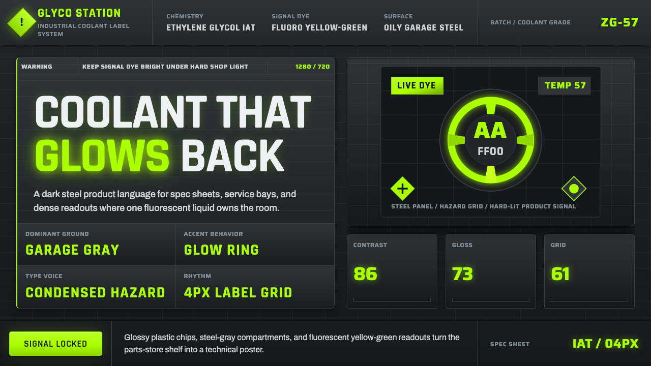 Fluorescent Antifreeze GreenCoolant becomes hazard signal. Fluoro green burns through steel-gray label gr…冷却液成为危险信号。荧光绿刺穿钢灰标签网格。
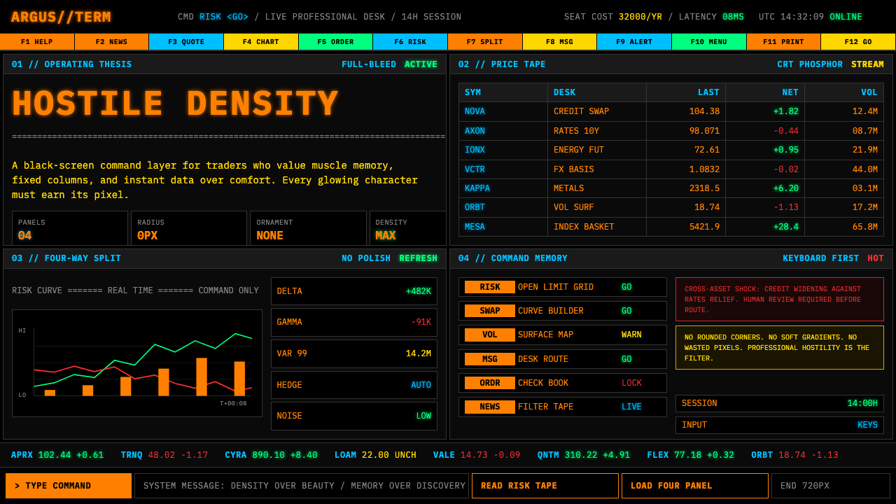
 Bloomberg Terminal (Amber CRT)Hostile data authority. Amber mono grids and four hard panels make black glas…强硬的数据权威。琥珀等宽字与四格硬边框,让黑玻璃像市场神经。
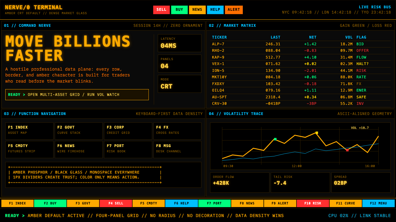
 Bloomberg Terminal (CRT Green)Hostile density wins. Orange CRT mono, black grids, and four-panel data walls.敌意密度取胜:橙色CRT等宽字、黑底四分屏数据墙。
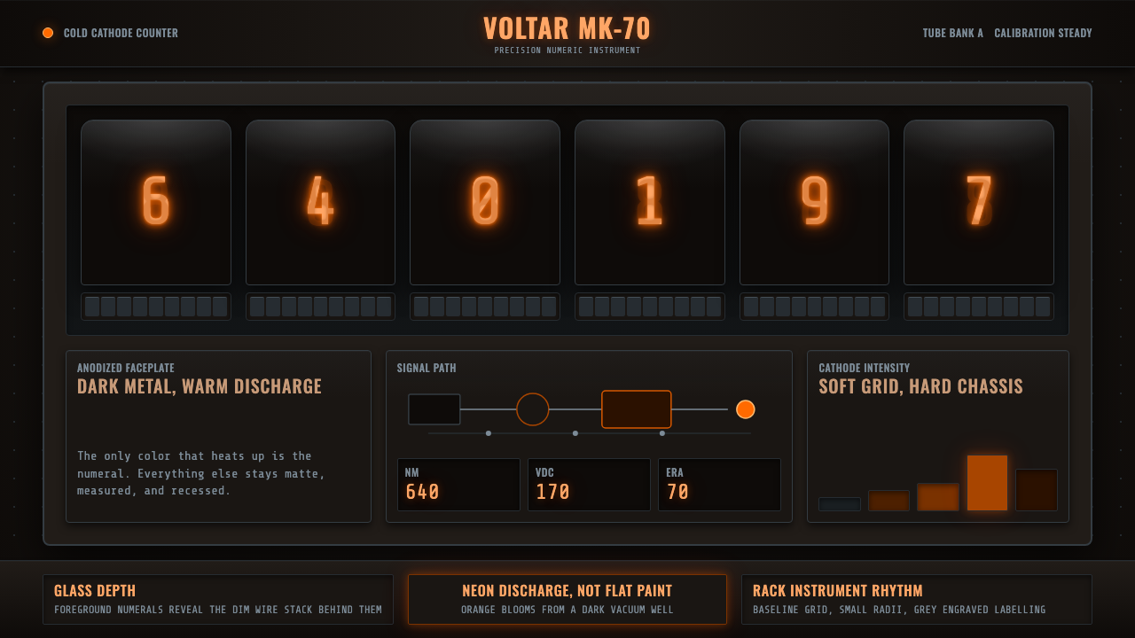 Nixie Tube DisplayHeat inside the machine. Neon-orange digits glow over black metal gridwork.机器里的热光:霓虹橙数字浮在黑色金属栅格上。
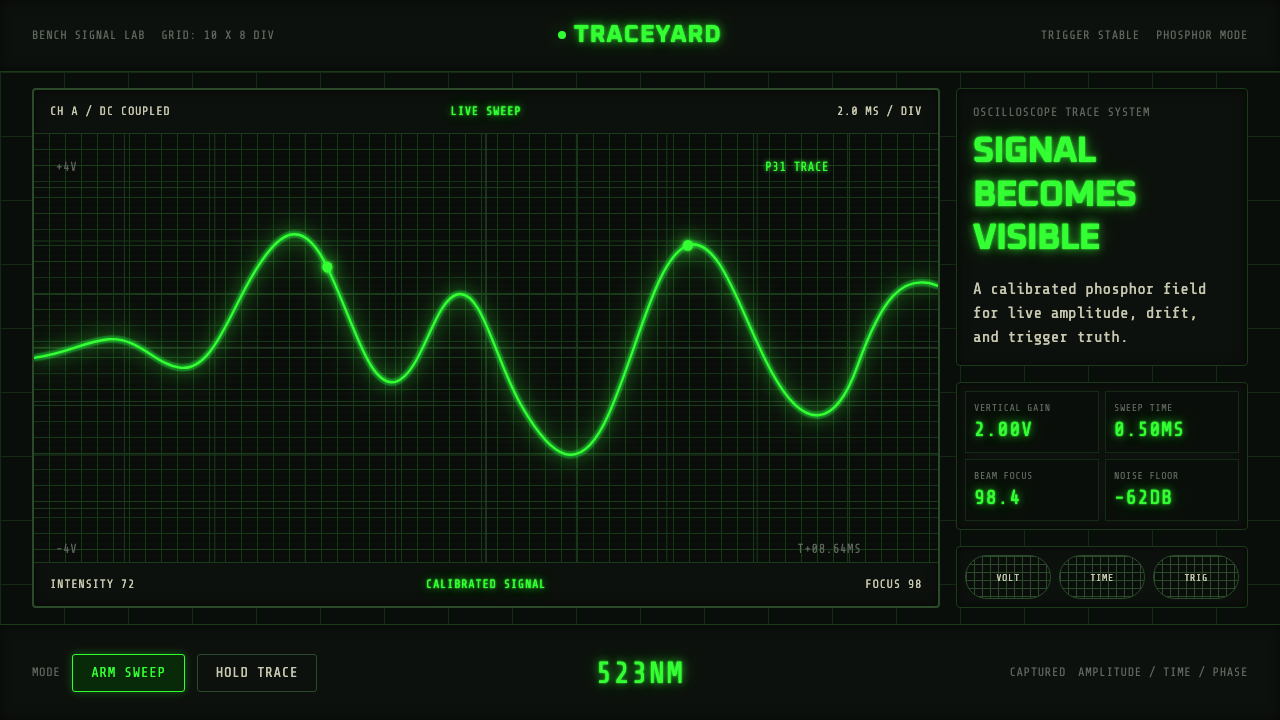 Oscilloscope TraceMeasurement glows. P31 green waveforms burn through a black graticule.测量在发光。P31绿波形穿过黑色刻度栅。
 Office Rubber StampsProcedure made visible. Vermilion Oswald stamps strike a manila logbook grid.程序被看见:朱红Oswald印戳砸在马尼拉账册网格上。