What is Oscilloscope Trace?
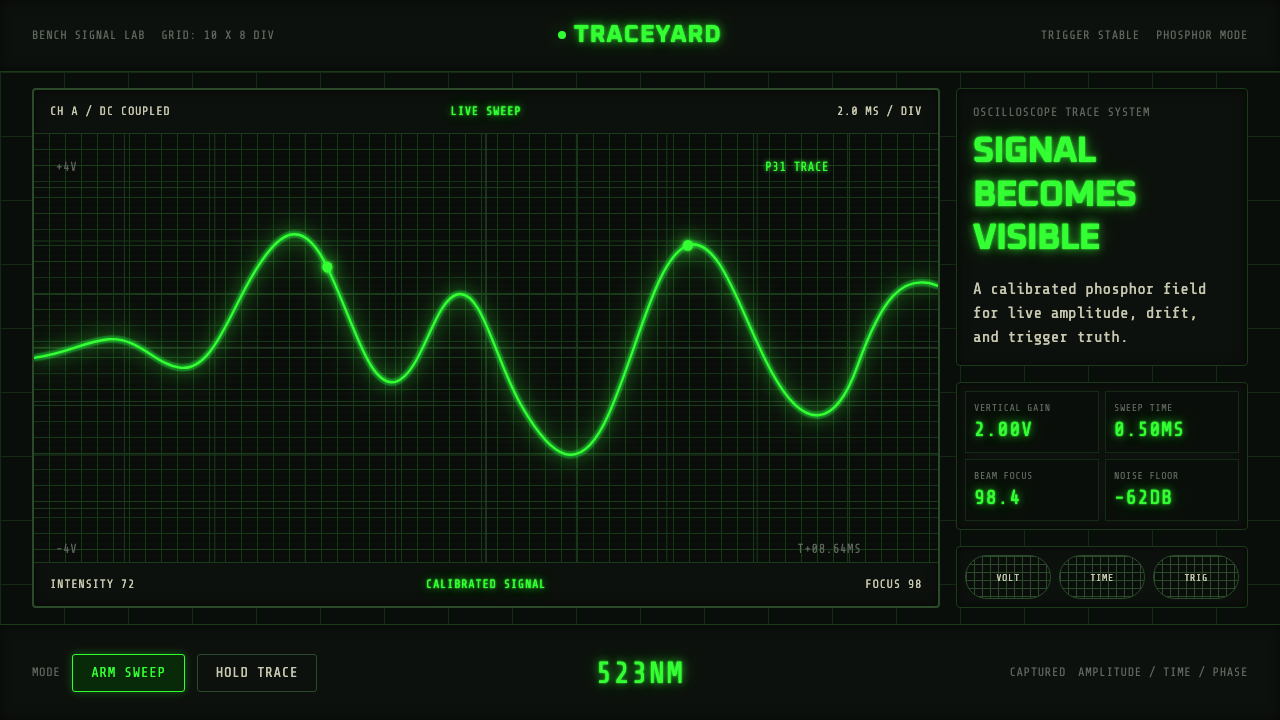
Oscilloscope Trace turns the instrument that measured the twentieth century into a design language — a hot green waveform burning across a dead-black screen, read through an etched glass grid.
Oscilloscope Trace in brief
Oscilloscope Trace is a style drawn from the mid-century American test bench: the cathode-ray oscilloscope, the instrument engineers used to make electrical signals visible. Its whole identity comes from one moment — a moving green line tracing a waveform across a near-black phosphor screen, boxed inside a glass graticule etched with a steady grid of measurement lines.
The look is not decorative; it is diagnostic. Every visual choice descends from the physical reality of the instrument: the screen surface is dark because CRT phosphor is at its most legible against near-black, the grid exists because engineers needed to read amplitude and time directly off the glass, and the glowing trace color is a direct reference to the specific phosphor coating — designated P31 — that these instruments used because it struck the best balance of brightness, persistence, and eye comfort for a technician staring at a screen for hours.
Because the source is a measuring device rather than an artwork, the aesthetic carries an inherent honesty. Numerals appear as blocky, segmented readouts rather than flowing script; labels are set in even, mechanical spacing rather than expressive type; and nothing on the screen exists without a metrological reason. The style borrows that discipline — every mark on the page reads as if it were calibrated rather than composed.
Where does Oscilloscope Trace come from?
The oscilloscope's story begins with the cathode-ray tube itself, developed in the late nineteenth century and refined through the early twentieth as physicists and engineers realized that a steerable beam of electrons striking a phosphor-coated glass screen could draw a picture of an electrical signal in real time. By the 1930s and 1940s, oscilloscopes were standard laboratory equipment, but they were often unreliable, hard to synchronize, and difficult to read accurately — a moving signal would smear or flicker unpredictably unless the sweep speed and the signal happened to line up by chance.
That problem was solved definitively by Howard Vollum, an American engineer who had worked on radar during the Second World War. Vollum invented a triggered-sweep circuit that let the oscilloscope's horizontal sweep lock precisely to the start of the signal being measured, producing a stable, readable trace instead of a jittering smear. In 1946, Vollum partnered with Melvin 'Jack' Murdock, a fellow veteran and businessman, to found Tektronix in Portland, Oregon. Their first product, the Tektronix Model 511, used Vollum's triggered-sweep design and quickly became the instrument every serious electronics lab wanted.
Tektronix grew through the 1950s, 60s, and 70s into the dominant name in oscilloscopes worldwide, headquartered in the Portland suburb of Beaverton. Its instruments — culminating in landmark product lines like the 500-series and later the 7000-series modular mainframes — set the visual and functional standard for the entire industry: dark instrument faces, rectangular CRT screens framed by control knobs, and that particular saturated green trace. Hewlett-Packard, founded by Bill Hewlett and David Packard in Palo Alto, California in 1939, built a parallel and complementary business in test and measurement instruments, reinforcing the same visual grammar of dark panels, precise dials, and glowing readouts across an entire generation of American electronics engineering.
This equipment defined what an entire generation of engineers, technicians, and hobbyists understood a piece of serious measurement gear to look like. From roughly 1950 through 1990, before digital storage displays and LCD panels replaced the analog CRT, the oscilloscope screen was the closest thing electronics work had to a window into an invisible world — and the visual language that grew up around reading that window has outlived the instruments themselves.
What defines the Oscilloscope Trace look?
Trace Color
The signature color is a single, saturated phosphor green — the visual reference to the P31 phosphor coating used across decades of oscilloscope tubes because it combined high brightness with a persistence long enough for the eye to follow a moving signal without strobing. This green is used sparingly and deliberately: it marks the active signal, the thing being measured, and almost nothing else competes with it for attention.
Ground and Contrast
The base surface reads as near-black, echoing the dead phosphor screen at rest before any signal arrives. This is not a soft charcoal but a flat, deep dark that makes the green trace and any secondary readouts feel as though they are being emitted from within the surface rather than printed on top of it — light coming from behind the glass, not reflecting off it.
The Graticule Grid
A steady, evenly spaced rectangular grid — the etched glass graticule engineers used to read amplitude and time directly off the screen — organizes the whole composition. The grid is understated rather than bold, present as a measuring reference rather than a decorative frame, and every major element aligns to it the way a waveform aligns to divisions on a real instrument.
Segmented Numerals
Numeric readouts take the blocky, angular form of seven-segment displays — the kind found on frequency counters and digital voltmeters of the same era. Numbers built from straight segments rather than curved strokes reinforce the sense that every figure on the page is a direct instrument reading, not a designer's typographic flourish.
Monospace Labeling
Text labels — channel markers, units, calibration notes — are set in an even, mechanical monospace rhythm, each character occupying identical width the way a typewriter or a panel engraving would. This produces a utilitarian, unhurried tone: labels read as annotations added by a careful technician, never as marketing copy competing for the eye.
Instrument Framing
Content is composed as though it sits inside a physical instrument bezel: a defined rectangular viewing area, corner brackets or tick marks suggesting calibration points, and a clear boundary between the 'screen' where the signal lives and the surrounding panel where controls and labels sit. This framing gives even flat digital layouts a sense of physical depth and instrumentation.
Restraint and Sparseness
Beyond the trace, the grid, and essential readouts, the composition stays empty. This sparseness is functional inheritance: a real instrument screen shows exactly the signal being measured and nothing else, because clutter obscures the reading. Emptiness here signals precision, not a lack of content.

Who shaped Oscilloscope Trace?
Vollum invented the triggered-sweep circuit that made the modern oscilloscope trace stable and readable, solving the synchronization problem that had plagued earlier instruments. Co-founding Tektronix in 1946 in Portland, Oregon, he set the engineering foundation on which the company's entire visual identity — the dark screen, the glowing trace, the precise grid — was built.
Murdock partnered with Vollum to found Tektronix, bringing business and organizational discipline that let Vollum's engineering vision scale into a company. His steady management helped Tektronix survive its lean early years and grow into the defining name in electronic test instrumentation for decades.
As a company, Tektronix produced the landmark oscilloscope product lines — including the 500-series and later the modular 7000-series — that defined the look of professional test equipment for the second half of the twentieth century. Its instruments' dark panels and saturated phosphor screens became the visual shorthand for 'serious measurement' across the electronics industry.
Founded by Bill Hewlett and David Packard in Palo Alto in 1939, HP built a parallel line of test and measurement instruments that reinforced the same visual grammar as Tektronix — dark faces, precise dials, glowing readouts — helping cement this look as the shared language of an entire era of electronics engineering rather than one company's house style.
How do you use Oscilloscope Trace today?
Oscilloscope Trace works best wherever a product wants to feel precise, technical, and trustworthy in a hands-on, instrument-panel way rather than a soft, consumer-friendly way. It is most convincing when the content genuinely involves data, signals, or measurement — the metaphor collapses if applied to something that has nothing to read or track.
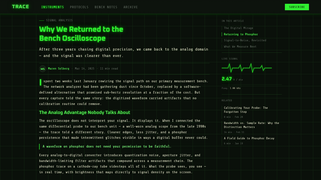
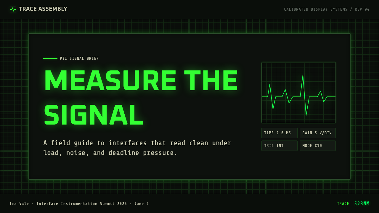
For presentation slides, the style gives cover pages an immediate sense of gravity: a dark field, a single glowing accent line or waveform shape, and calibration-style corner marks read as serious and technical before a single word is read. Content slides benefit from treating each slide like an instrument screen — a bounded grid area holding the key figure or chart, with supporting labels set in even, mechanical spacing around the edges. Data slides are a natural fit: line charts rendered as glowing traces against a dark grid look native to the style rather than decorated to match it.
For web interfaces, the aesthetic suits dashboards, monitoring tools, developer consoles, and anything measuring a live system — uptime, network traffic, sensor data. A dark base surface, a single accent color reserved for the active or important reading, and a light structural grid in the background communicate 'this is a measurement instrument, not a marketing page' immediately. Pricing pages can borrow the instrument-panel framing for comparison tables, treating each plan's numbers like calibrated readouts rather than sales copy.
For editorial and marketing contexts, the style works well for anything positioned around technical credibility, engineering heritage, or precision — write-ups about hardware, science communication, retro-computing culture. A magazine-style layout can use the grid as a structural device even where no literal chart appears, letting body text sit inside graticule-like margins for a quietly technical feel.
A common mistake is over-decorating: adding multiple competing bright colors, ornamental glow effects on every element, or dense grids that serve no measurement purpose. The style depends on restraint — one signal color, one grid, mostly emptiness — the same restraint a real instrument panel enforces because clutter would make it unreadable. Piling on visual noise to seem 'more technical' produces the opposite effect.
Oscilloscope Trace — FAQ
Why is green the signature color instead of any other trace color?
The green comes directly from the physical phosphor coating (designated P31) that dominated oscilloscope tubes for decades. Phosphor manufacturers found that this particular formulation offered a strong combination of brightness and persistence — the trace stayed visible long enough for the eye to follow a moving signal without appearing to strobe or vanish between refreshes — while remaining comfortable to view during long measurement sessions. Later instruments experimented with other phosphor colors, including amber and blue-white, but the green trace became so strongly associated with 'oscilloscope' that it functions as the style's signature even outside any literal CRT.
Is this style only appropriate for technical or scientific products?
It is strongest there, but it also works for anything that wants to borrow the credibility of precision measurement — developer tools, analytics products, hardware brands, retro-computing projects, or educational content about how things are built and measured. It struggles for anything warm, playful, or organic, where the coldness and gridded exactness of an instrument panel would read as sterile rather than trustworthy.
How literal should the CRT/instrument framing be in a modern digital product?
It works best as suggestion rather than literal replica. A defined rectangular viewing area, a light structural grid, and restrained corner marks are enough to evoke an instrument panel without forcing every screen to look like a literal oscilloscope bezel. Overly literal skeuomorphism — fake screen curvature, exaggerated scanlines, heavy vignetting — tends to read as costume rather than as the disciplined, functional aesthetic the style is drawing from.
Does this style work well with bright, colorful branding?
Not comfortably. Its power comes from having a single accent color read as 'the signal' against a near-black field; introducing multiple bright, competing hues undermines that reading and makes the composition feel decorated rather than measured. Brands that need a full, colorful palette are usually better served borrowing the grid and instrument framing conceptually while choosing their own restrained accent color, rather than trying to layer this style directly over an already colorful identity.
What's the difference between this and a generic 'dark mode' or 'hacker' aesthetic?
Generic dark-mode or hacker aesthetics are usually defined loosely — dark background, some neon accent, monospace type — without a specific physical referent. Oscilloscope Trace is anchored to one real object and its constraints: a CRT screen, a specific phosphor color, an etched measurement grid, and segmented instrument readouts. That specificity is what keeps the style disciplined; every choice can be traced back to why a piece of 1950s–1980s test equipment actually looked the way it did, rather than to a generic idea of 'looking technical.'
Related design styles
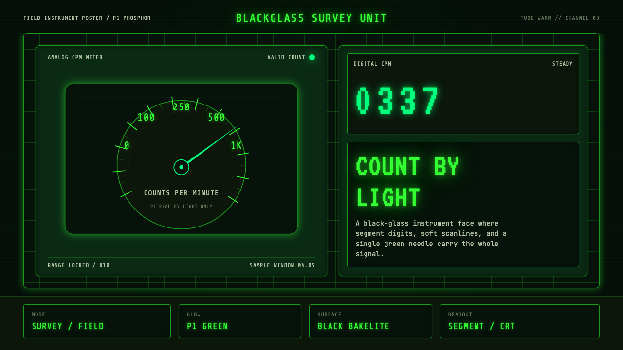 Geiger Counter Green ReadoutReads by glow. P1 green digits, scanlines, and a bordered black instrument gr…
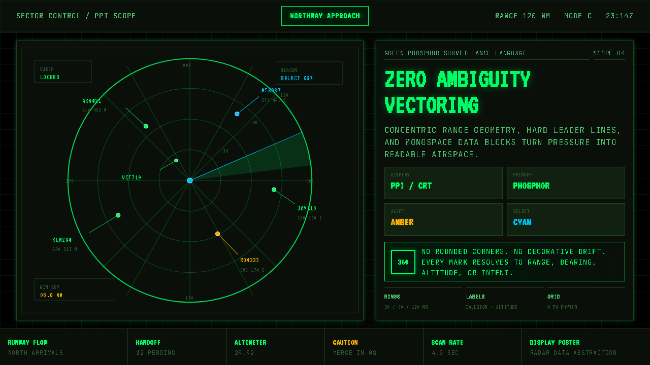 Air Traffic Control RadarOperational gravity. Phosphor green rings, sweep wedges, and monospace blips…
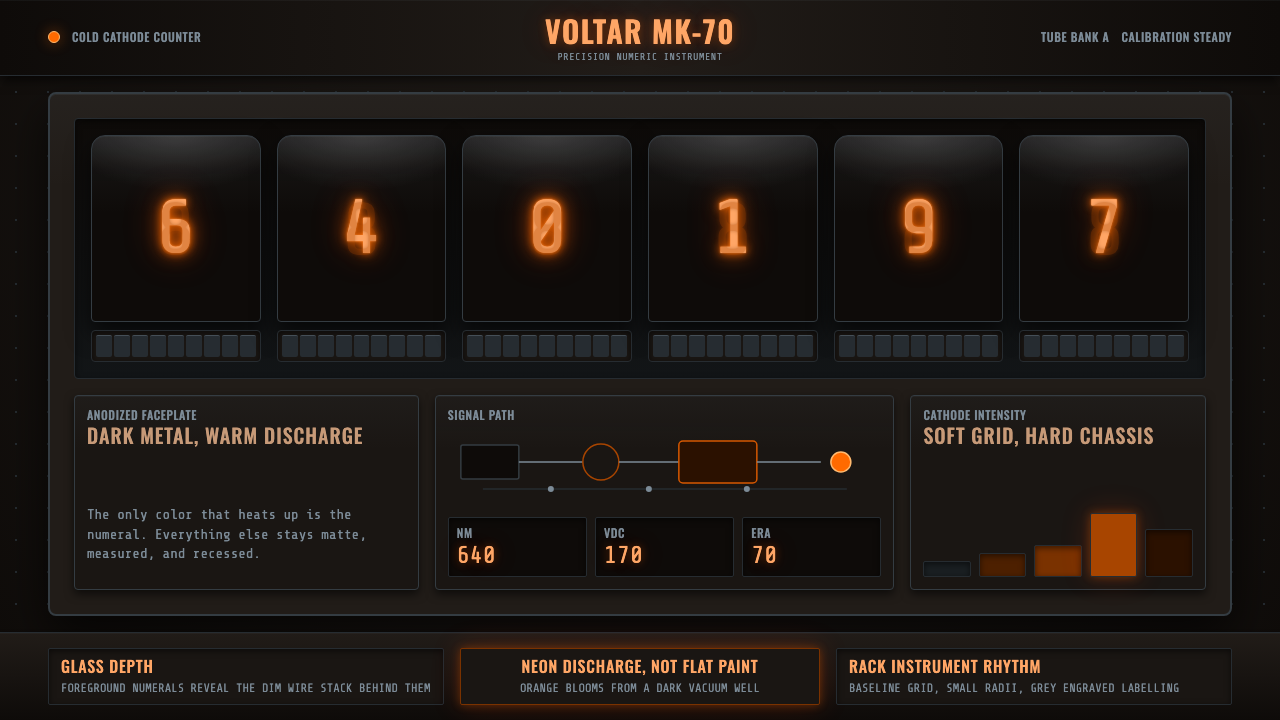 Nixie Tube DisplayHeat inside the machine. Neon-orange digits glow over black metal gridwork.
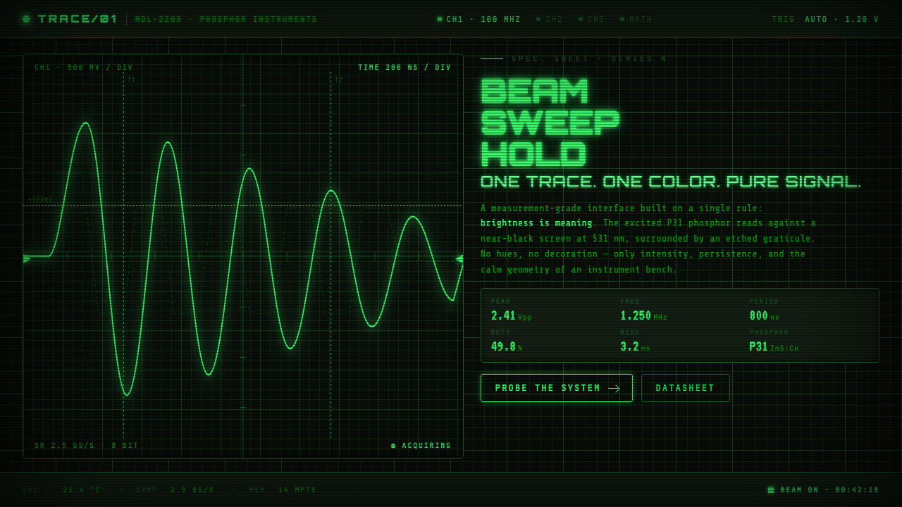 Oscilloscope WaveformBrightness is meaning. One P31 phosphor trace glowing across an etched gratic…
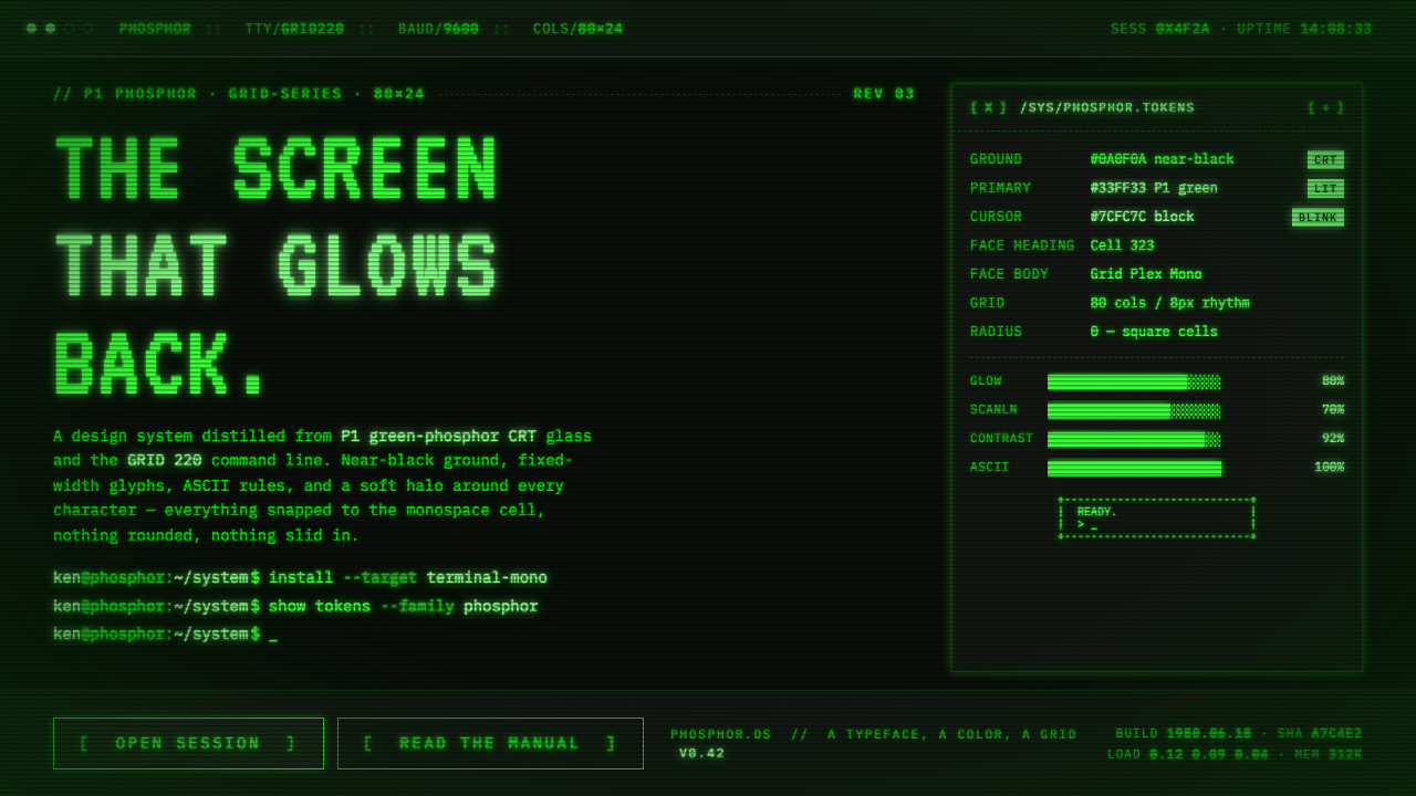 Unix Terminal MonoNear-black CRT glass that glows back. P1 phosphor green, VT323 mono, ASCII ru…
 Wind TunnelMakes darkness feel measurable. Cyan-white streamlines and monospace ticks gl…