What is New York Yellow Cab (1907)?什么是 New York Yellow Cab (1907)?
In 1907, a color choice backed by science became the most recognized signal in urban America — taxi yellow, black stencil type, and the checker stripe that turned a car into an institution.1907年,一个有科学依据的色彩决策成为美国城市最具辨识度的信号——出租车黄、黑色模板字与棋盘格条纹,让一辆汽车演变为一个城市符号。
New York Yellow Cab (1907) in briefNew York Yellow Cab (1907) 速览
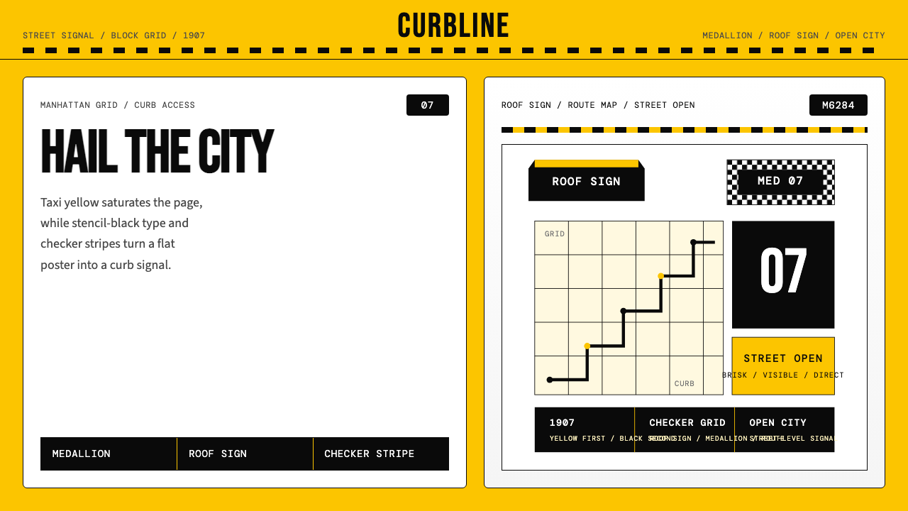
The New York Yellow Cab aesthetic is one of the rare instances where a purely functional decision — choosing the most visible color on a city street — crystallized into a complete and enduring visual system. The style is defined by its saturated, attention-commanding yellow ground, black type treated with stencil-like directness, and the checker stripe motif that marks boundaries, rooflines, and the threshold between passenger and driver. Nothing in this system exists for decoration. Every element earns its presence through legibility, contrast, or territorial marking.纽约黄色出租车美学是为数不多的案例之一:一个纯粹出于功能的决定——选择城市街道上能见度最高的颜色——凝固成了一套完整而持久的视觉系统。这套风格由饱和的、吸引注意力的黄色底面、以模板式直接性处理的黑色字体,以及标识边界、车顶线条与乘客司机分隔的棋盘格条纹共同定义。系统中没有任何元素存在于装饰目的,每一个元素都靠可读性、对比度或领域标记赢得其存在的正当性。
As a design language, the Yellow Cab system belongs to the tradition of industrial utility branding: signage that must communicate at speed, at distance, and in competition with urban noise. Its palette is not chosen for harmony or elegance but for physiological impact. The black-on-yellow pairing delivers maximum luminance contrast under virtually all lighting conditions — overcast midday, wet asphalt night, the blue-tinted shadow of a building canyon. Where Bauhaus used primary colors symbolically, the Yellow Cab system uses yellow instrumentally: visibility first, identity second, beauty third.作为一套设计语言,黄色出租车系统属于工业实用品牌的传统:标识必须在速度中、在距离外、在城市噪音的竞争中传达信息。它的色板不是为了和谐或优雅而选择,而是为了生理冲击力。黑底黄字的组合在几乎所有光照条件下都能提供最大亮度对比——阴天午后、湿沥青夜晚、建筑峡谷的蓝调阴影之中。包豪斯以象征性方式使用三原色,而黄色出租车系统则以工具性方式使用黄色:首先是可见性,其次是识别性,美学居第三位。
The checker stripe adds a structural layer distinct from pure color. Repeating equal-sized squares in alternating black and white create a rhythm that the eye catches even at the periphery of vision. Historically this pattern marked Checker Cab Company vehicles, but it evolved into a broader shorthand for taxi identity across the industry. In design application, the stripe functions like a ruled border or a halftone screen — it divides fields, signals edges, and gives hierarchy to a composition without requiring additional typographic elements.棋盘格条纹增添了一个超越纯色彩的结构层次。黑白交替排列的等大方格创造出一种节奏,让眼睛即便在视野边缘也能捕捉到。这一图案历史上标志着棋格出租车公司(Checker Cab Company)的车辆,但后来在整个行业演变为出租车身份更广泛的速记符号。在设计应用中,条纹的功能类似于划线边框或半调网屏——它划分区域、标示边缘,无需额外排版元素便能为构图赋予层级。
See the New York Yellow Cab (1907) design system查看 New York Yellow Cab (1907) 完整设计系统
Where does New York Yellow Cab (1907) come from?New York Yellow Cab (1907) 从何而来?
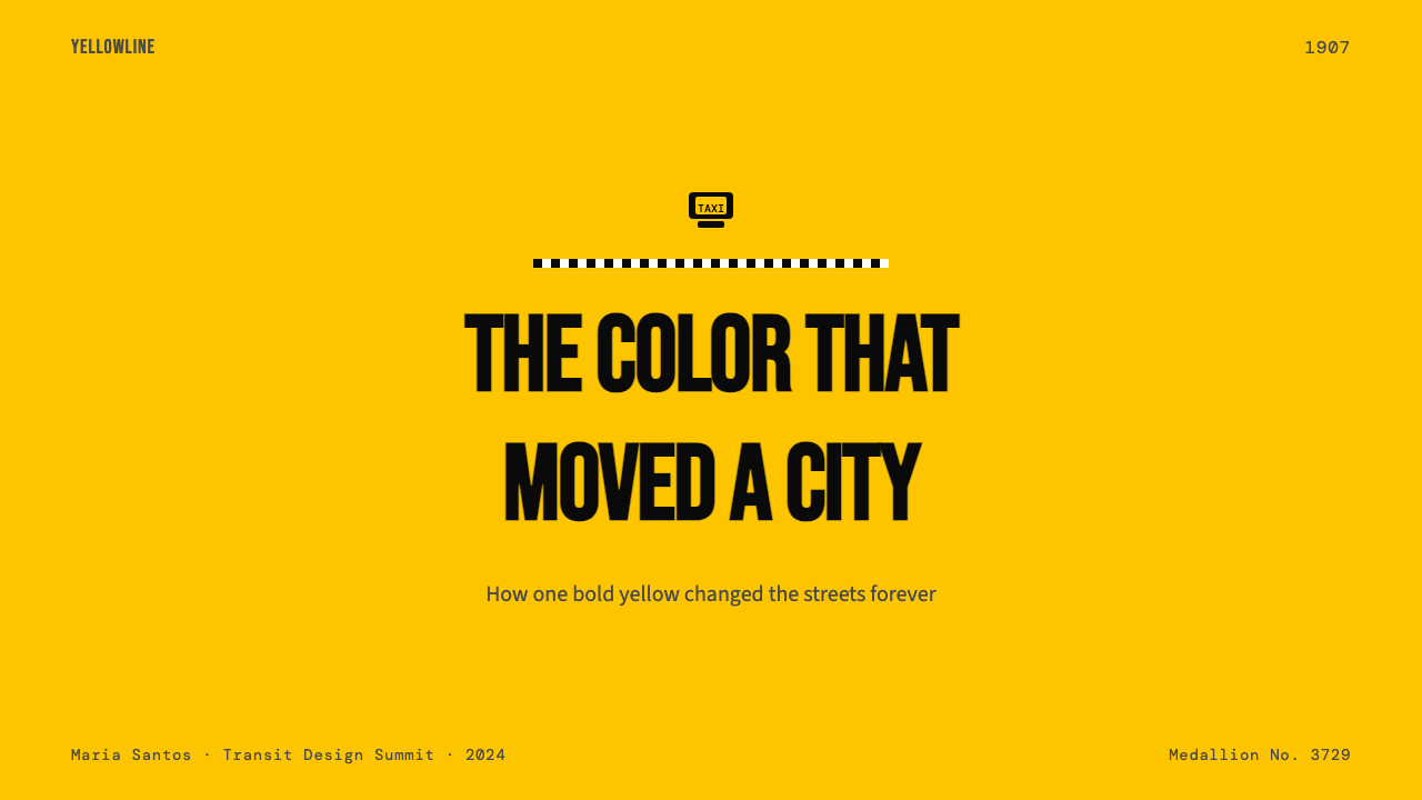
The story begins not in New York but in Chicago. In 1907, John D. Hertz — an Austrian immigrant who had built a used-car business — founded the Yellow Cab Company with a fleet of painted automobiles he intended to make instantly recognizable from a block away. According to Hertz's own account, the color choice was not guesswork: he commissioned research from the University of Chicago that concluded yellow was the most visible color at distance, particularly under the overcast skies and variable light conditions of a major American city. Hertz adopted the finding without hesitation. The name and the color were the same decision.故事的起点不是纽约,而是芝加哥。1907年,奥地利移民约翰·D·赫兹——他靠做二手车生意起家——以一批彩色涂装车辆创立了黄色出租车公司(Yellow Cab Company),打算让它们在一个街区之外就能被一眼认出。据赫兹本人的说法,选择这种颜色并非凭直觉:他委托芝加哥大学进行研究,结论是黄色在远距离上能见度最高,尤其是在美国大城市多云的天空和多变的光线条件下。赫兹毫不犹豫地采纳了这一发现。公司名称与车身颜色,是同一个决定。
New York's adoption of yellow taxis followed a few years later as the cab industry expanded and the regulatory apparatus around it began to form. The 1930s brought the medallion system, which used metal plates fixed to the hood to license and limit the number of authorized taxis. The medallion number — typically stenciled in black on a yellow ground, or cast onto a metal plate bolted to a field of yellow paint — became the visual grammar of the cab's front end. The Taxi and Limousine Commission, formalized in 1971, standardized the yellow color requirement across the New York fleet, cementing what had been a practical tradition into official regulation.纽约采用黄色出租车是在几年后随着出租车行业扩张和监管体系逐步形成而发生的。1930年代,牌照(medallion)系统出现,金属铭牌固定在引擎盖上,用以授权和限制获批出租车的数量。牌照号码——通常以黑色模板字印在黄色底面上,或铸造在黄色油漆底面上的金属铭牌上——构成了出租车前脸的视觉语法。1971年正式成立的出租车及豪华轿车委员会(TLC)将黄色要求标准化为纽约全市出租车队的规定,将一个实用传统固化为官方法规。
The Checker Cab Company, founded by Morris Markin in the early 1920s, introduced the checker stripe as a brand identifier for its vehicles. Checker Cabs operated in New York and dozens of other American cities, and the distinctive bodywork — high roof, wide doors, the alternating black-and-white stripe running along the lower body — became so associated with the taxi trade generally that other operators adopted variations of the pattern. The last Checker Cab rolled off the assembly line in 1982, but the stripe survived as cultural memory and visual shorthand, reproduced on livery details, signage, and promotional materials long after the vehicles that originated it disappeared.由莫里斯·马尔金在1920年代初创立的棋格出租车公司(Checker Cab Company)将棋盘格条纹作为其车辆的品牌标识引入。棋格出租车运营于纽约和数十个美国城市,其独特的车身造型——高车顶、宽车门、沿车身下部延伸的黑白交替条纹——与出租车行业的关联如此之深,以至于其他运营商也纷纷采用这一图案的变体。最后一辆棋格出租车于1982年驶下生产线,但条纹作为文化记忆和视觉速记幸存了下来,在那批创造了它的车辆消失很久之后,仍被复制在制服细节、标识和宣传材料上。
The roof sign — the illuminated box mounted above the passenger compartment — added the final element to the Yellow Cab visual vocabulary. Early roof signs were painted boards; by mid-century they were backlit boxes displaying the company name or fleet number in a stencil typeface bold enough to read from across an intersection. The combination of the illuminated yellow box against the larger yellow body of the car created a totemic silhouette: a moving rectangle of pure color with a smaller glowing rectangle above it, both readable in rain, fog, and the amber wash of sodium streetlights. This layered yellow-on-yellow legibility, achieved through material contrast rather than hue difference, is one of the system's most sophisticated visual properties.车顶灯箱——固定在乘客舱上方的发光盒——为黄色出租车视觉语汇增添了最后一个元素。早期的车顶标识是彩绘木板;到了世纪中叶,它们变成了背光灯箱,以足够粗的模板字体显示公司名称或车队编号,从交叉路口对面也能辨读。发光黄色灯箱与汽车更大的黄色车身叠合,创造出一个标志性的剪影:一个纯色移动矩形上方托着一个较小的发光矩形,在雨中、雾中以及钠灯街道的琥珀色光晕中同样清晰可辨。这种通过材质对比而非色相差异实现的黄色叠黄色可读性,是整个系统最为精妙的视觉特性之一。
What defines the New York Yellow Cab (1907) look?New York Yellow Cab (1907) 的视觉特征是什么?
Saturated Yellow Ground饱和黄色底面
The defining move of the system is using full-saturation taxi yellow as the dominant background field rather than confining it to accents. This inverts conventional design logic — where high-saturation color is reserved for small, emphatic moments — and instead makes the boldest possible statement the canvas itself. The yellow is warm without being orange, assertive without reading as cautionary or hazardous in context. It is the color of a decision made with total confidence.这套系统最具决定性的手法,是将高饱和度出租车黄作为主导背景底面,而非将其限定为强调色。这颠覆了常规设计逻辑——高饱和色通常只保留给小而有力的强调时刻——转而让最大胆的表达成为画布本身。这种黄色温暖而不偏橙,强势而在语境中不会被解读为警示或危险。它是一个充满自信的决定的颜色。
Stencil-Weight Black Type模板字重黑色字体
Typography in the Yellow Cab system reads as functional signage rather than refined lettering. Letterforms are broad, open, and spaced for distance legibility — the visual equivalent of shouting across traffic. Stencil-cut letterforms, with their interrupted strokes and slightly crude geometry, are the authentic register for this style. The black against yellow pairing gives every word a physical presence, as if the letters are objects placed on a surface rather than marks drawn on it.黄色出租车系统中的字体排印读起来像功能性标识而非精致书法。字形宽阔、开放,间距为远距离可读性而设置——相当于在车流中大声呼喊的视觉形式。模板裁切字形,凭借其断续笔画和略显粗糙的几何形,是这种风格最真实的表达。黑色字体与黄色底面的搭配赋予每个词语以物理存在感,仿佛字母是放置在表面上的物体,而非描绘在其上的痕迹。
Checker Stripe Rhythm棋盘格条纹节奏
The alternating black-and-white checker stripe is the system's structural accent. Used as a band or border, it creates immediate visual hierarchy without requiring color contrast — it works equally well separating yellow from black fields or running as a self-contained element. The stripe also signals speed and movement through its repeating pattern, echoing the rhythm of a passing vehicle and lending compositions a kinetic, urban energy.交替排列的黑白棋盘格条纹是这套系统的结构性强调元素。以条带或边框形式使用时,它无需色彩对比便能即刻建立视觉层级——无论分隔黄色与黑色区域,还是作为独立元素运行,效果同样出色。条纹还通过其重复图案传递速度感与运动感,呼应经过车辆的节奏,为构图注入动感十足的都市能量。
High-Contrast Silhouette高对比度剪影
Objects and figures in this aesthetic are rendered as clean silhouettes — flat black shapes against yellow, or flat yellow shapes against black — with no internal detail or shading. This approach originates in the visual demands of the street: a cab must be identified in a fraction of a second. Silhouette reading, where meaning comes from outline rather than surface detail, is the most efficient form of visual communication at speed and distance. In print and screen applications, the result is bold and graphic.在这种美学中,物体与图形以清晰的剪影呈现——黄色底面上的纯黑色平面形,或黑色底面上的纯黄色平面形——没有内部细节或阴影。这种处理方式源于街道的视觉需求:一辆出租车必须在零点几秒内被识别出来。剪影阅读——意义来自轮廓而非表面细节——是速度与距离下最高效的视觉传达形式。在印刷和屏幕应用中,结果大胆而图形化。
Utilitarian Flatness实用性平面感
The Yellow Cab system has no interest in dimensionality, shadow, or material simulation. Its surfaces are opaque and unmodulated. This is not a deliberate aesthetic statement in the way Bauhaus flatness is principled — it is the natural output of a system designed for paint on sheet metal, ink on cardboard, and light through a translucent box. The flatness is a side effect of the medium, but it produces a visual clarity that translates well to any flat-rendering context.黄色出租车系统对立体感、阴影或材质模拟没有任何兴趣。它的表面不透明且无调制。这不像包豪斯的平面性那样是一种有原则的主动美学声明——它是一套为钣金上的油漆、纸板上的油墨和透明灯箱上的光线而设计的系统所自然产生的输出。平面感是媒介的副产品,但它产生了一种在任何平面渲染语境中都能良好转译的视觉清晰度。
Medallion Numerals牌照数字
Large, isolated numerals — the fleet number, the medallion ID, the door-panel digits — are a recurring typographic feature of the Yellow Cab visual world. Used at scale on a yellow ground, a single numeral functions as both identifier and graphic element, giving compositions an asymmetric anchor similar to how a bold numeral works in editorial design. The numeral's utilitarian origin makes it feel immediate and honest rather than decorative.大尺寸、独立的数字——车队编号、牌照号码、车门面板上的数字——是黄色出租车视觉世界中反复出现的排版特征。在黄色底面上以大尺寸使用时,单个数字既是标识符,也是图形元素,为构图提供非对称的锚点,类似于编辑设计中粗体数字的功能。数字的实用主义来源使它感觉直接而诚实,而非装饰性的。
Night-Legibility Logic夜间可读性逻辑
The Yellow Cab system was optimized for night visibility long before digital interfaces made ambient-glow design fashionable. The illuminated roof sign — a glowing box of warm yellow above a yellow car — demonstrated that luminosity contrast matters as much as color contrast. In design application, this translates to a preference for elements that hold their identity in low-light or high-ambient contexts: heavy strokes, large type, and color choices with intrinsic warmth that survives under cool or colored artificial lighting.早在数字界面让环境光设计流行之前,黄色出租车系统就已针对夜间能见度进行了优化。车顶发光灯箱——黄色汽车上方一个温暖发光的盒子——证明了亮度对比与色彩对比同等重要。在设计应用中,这转化为对在低光或高环境光条件下仍能保持自身特性的元素的偏好:粗重笔画、大号字体,以及在冷色或有色人工照明下仍能保持内在温暖感的色彩选择。
See the New York Yellow Cab (1907) design system查看 New York Yellow Cab (1907) 完整设计系统
Who shaped New York Yellow Cab (1907)?谁塑造了 New York Yellow Cab (1907)?
Hertz founded the Yellow Cab Company in Chicago in 1907 and made the decision — backed by University of Chicago research — to paint the fleet yellow for maximum distance visibility. His instinct for brand clarity was unusual in an era when most cab operators used unmarked or casually painted vehicles. Hertz later founded the Hertz Corporation car rental business, but his lasting contribution to visual culture is the color system he established for urban taxi fleets, which influenced city transportation design on every continent.赫兹于1907年在芝加哥创立黄色出租车公司,并在芝加哥大学研究的支持下,做出了将全部车队涂成黄色以获得最大远距离能见度的决定。在大多数出租车运营商使用无标识或随意涂装车辆的时代,他对品牌清晰度的直觉实属罕见。赫兹后来创立了赫兹(Hertz)汽车租赁业务,但他对视觉文化最持久的贡献是他为城市出租车队建立的色彩系统——这一系统影响了每个大洲的城市交通设计。
Markin took control of the Checker Cab Manufacturing Company in the early 1920s and built it into the dominant taxi manufacturer in America. His Checker cars were known for their durability, high roof clearance, and — critically for this design system — the alternating checker stripe that ran along the lower body. Markin's vehicles were ubiquitous in New York from the 1930s through the 1970s, and the stripe he standardized became so culturally embedded that it outlasted the company's closure in 1982 to remain a global icon of taxi identity.马尔金在1920年代初接管棋格出租车制造公司(Checker Cab Manufacturing Company),并将其打造为美国最主要的出租车制造商。他生产的棋格出租车以耐用性、高顶棚空间闻名,而对这套设计系统最为关键的,是沿车身下部延伸的交替棋盘格条纹。马尔金的车辆从1930年代到1970年代在纽约随处可见,他标准化的条纹已深深嵌入文化记忆,在公司1982年关闭后依然作为出租车身份的全球符号长存。
Established by the New York City government in 1971, the TLC took the informal tradition of yellow cab color and made it law. By mandating a specific shade of yellow — known officially as Dupont M6284 — for all medallion taxis, the Commission completed the transformation of a practical branding choice into a regulated visual standard. The TLC's decades of consistent enforcement created the visual monoculture that makes the New York yellow cab recognizable worldwide and accounts for the aesthetic's quality of absolute, non-negotiable saturation.纽约市政府于1971年成立出租车及豪华轿车委员会(TLC),将黄色出租车颜色的非正式传统上升为法律。通过强制要求所有牌照出租车使用特定的黄色——官方名称为杜邦M6284——委员会完成了将实用品牌选择转化为受监管视觉标准的过程。TLC数十年如一日的执法创造了一种视觉单一文化,使纽约黄色出租车举世闻名,也解释了这套美学中那种绝对、不容商量的饱和度的由来。
Though not a designer, Lange's documentary photography of New York and American urban life in the mid-twentieth century established the yellow cab as a photographic subject with its own visual grammar. Her generation of street photographers — and their successors in editorial and advertising work — composed around the cab's yellow mass as both background and subject, shaping how the public understood taxi yellow as a signifier of urban modernity, speed, and democratic accessibility. The cab's visual presence in twentieth-century photography influenced how later designers abstracted and applied the system.朗格(Dorothea Lange)虽非设计师,但她对二十世纪中期纽约及美国城市生活的纪实摄影,确立了黄色出租车作为摄影主题的独特视觉语法。她那一代街头摄影师——及其在编辑与广告领域的继承者——以出租车的黄色体量既作背景又作主体来构图,塑造了公众对出租车黄作为都市现代性、速度与民主可及性符号的理解。出租车在二十世纪摄影中的视觉存在,影响了后来设计师对这套系统的抽象与应用方式。
The designer behind the 'I Love New York' campaign, Glaser worked in a New York whose visual identity was inseparable from the yellow cab. His broader contribution was demonstrating that New York's vernacular visual culture — the cab, the deli signboard, the subway map — could be elevated into designed artifacts without losing their populist legibility. Glaser's approach to city identity influenced how subsequent designers treated Yellow Cab aesthetics: not as raw material to be refined away, but as a deliberate visual register with its own authority and communicative power.「I Love New York」活动的设计者米尔顿·格拉泽(Milton Glaser)在一个视觉身份与黄色出租车密不可分的纽约中工作。他更广泛的贡献在于证明:纽约的通俗视觉文化——出租车、熟食店招牌、地铁线路图——可以被提升为设计作品,同时不失去其大众可读性。格拉泽对城市身份的处理方式影响了后续设计师对待黄色出租车美学的态度:不是将其作为需要被精炼掉的原材料,而是作为具有自身权威与传达力的刻意视觉表达。
How do you use New York Yellow Cab (1907) today?今天怎么用 New York Yellow Cab (1907)?
Applying the New York Yellow Cab style correctly requires accepting its most demanding premise: yellow is the ground, not the accent. Designers accustomed to using high-saturation color sparingly will instinctively want to pull back, reducing the yellow to a stripe or header element while returning to a neutral base. That instinct produces a diluted result that reads as a yellow-themed design rather than a Yellow Cab design. Commit to the full-bleed yellow field and build everything else — type, checker accents, silhouette elements — as figures against that ground.正确应用纽约黄色出租车风格,需要接受它最苛刻的前提:黄色是底面,不是强调色。习惯于克制使用高饱和色的设计师会本能地想要退缩,把黄色缩减为条纹或标题元素,同时回归中性底面。这种本能产生的是稀释的结果,读来像一个以黄色为主题的设计,而非真正的黄色出租车设计。全力投入满版黄色底面,将其他所有元素——字体、棋盘格强调、剪影元素——作为这个底面上的图形来构建。
For presentation slides, the Yellow Cab system excels on cover pages and section dividers where boldness and instant recognition are the goals. A cover should establish the yellow field at full strength, set the title in heavy stencil-weight type in black, and use a checker stripe band to anchor the bottom or divide the layout horizontally. Content slides require more restraint: use a white or near-white ground for body text and data, bring the yellow back as a header band, data highlight color, or chart accent. The shift between full-yellow and predominantly white slides creates a visual rhythm that signals structural transitions. Data charts on this system should use yellow for the primary series and black for supporting series, with checker-pattern fills available for categorical distinction.在演示文稿中,黄色出租车系统在封面页和章节分隔页上尤为出色,这些地方的目标是大胆感和即时识别性。封面应以全强度建立黄色底面,以黑色粗重模板字设置标题,并用棋盘格条纹带锚定底部或水平分割版面。内容页需要更多克制:正文和数据使用白色或接近白色的底面,将黄色作为标题带、数据高亮色或图表强调色带回。全黄与以白色为主的幻灯片之间的转换,创造出标示结构转折的视觉节奏。这套系统中的数据图表应将黄色用于主要数据系列,黑色用于辅助系列,棋盘格图案填充可用于类别区分。
For web interfaces, the Yellow Cab palette is particularly effective on dashboards, pricing pages, and promotional landing pages where category differentiation and immediate visual impact are valued. Navigation bars work well in full black with yellow hover states or active indicators. Primary call-to-action buttons in yellow-on-black or black-on-yellow carry the system's authority without requiring any other design element. Avoid using yellow for large body-text backgrounds in reading-heavy contexts — extended reading against a saturated yellow field causes visual fatigue. Reserve the full yellow for above-the-fold hero sections, feature callouts, and status indicators where the color's attention-commanding quality is an asset.对于网页界面,黄色出租车色板在需要类别区分和即时视觉冲击的仪表板、定价页面和推广落地页上尤为有效。导航栏以全黑底面搭配黄色悬停状态或激活指示符效果出色。黑底黄字或黄底黑字的主要行动号召按钮,无需任何其他设计元素便能传递这套系统的权威感。避免在阅读量大的场景中将黄色用作大面积正文背景——在饱和黄色底面上进行长时间阅读会导致视觉疲劳。将满版黄色保留给首屏英雄区、功能标注和状态指示器,这些地方该颜色吸引注意力的特质才是优势。
For editorial and marketing work, the style supports the kind of poster-logic headlines that need to be read at a glance. Magazine covers, event posters, and campaign key visuals benefit from the yellow ground's ability to compete with complex visual environments — it reads through a cluttered Instagram feed or a busy newsstand. Use large, isolated numerals as typographic anchors, limit the color palette to yellow, black, and white, and introduce the checker stripe as a dividing or framing element rather than an all-over texture. For long-form editorial layouts, alternate between yellow-ground feature openers and white-ground body sections, using the checker stripe as the transition element between modes.对于编辑与营销内容,这种风格支持那种需要一眼读懂的海报式大标题。杂志封面、活动海报和活动主视觉图受益于黄色底面在复杂视觉环境中脱颖而出的能力——它能穿透杂乱的社交媒体信息流或繁忙的报刊亭。使用大尺寸独立数字作为排版锚点,将色板限定为黄色、黑色和白色,将棋盘格条纹引入作为分隔或框架元素,而非全覆盖纹理。对于长篇编辑版面,在黄色底面的特写开篇页与白色底面的正文页之间交替,以棋盘格条纹作为两种模式之间的过渡元素。
A common mistake is treating the checker stripe as wallpaper — tiling it across a background or using it as a decorative fill for large areas. The stripe's power comes from its use as a border, band, or accent against a solid-color field. When it occupies too much of the composition, it competes with type and silhouette elements rather than supporting them. Similarly, introducing a third color beyond black and white into the checker pattern immediately weakens the system's visual logic. The checker works because it is binary — two values, no gradients, maximum contrast. Any softening of this principle reads as hesitation rather than design.一个常见错误是将棋盘格条纹当作墙纸——将其平铺作为背景或用于填充大面积区域。条纹的力量来自于它作为边框、条带或强调色出现在纯色底面上的方式。当它占据构图太多空间时,会与字体和剪影元素形成竞争而非支撑关系。同样,在棋盘格图案中引入黑白之外的第三种颜色,会立即削弱系统的视觉逻辑。棋盘格之所以有效,是因为它是二元的——两种值,无渐变,最大对比度。任何对这一原则的软化,读起来都像是犹豫,而非设计。
See the New York Yellow Cab (1907) design system查看 New York Yellow Cab (1907) 完整设计系统
New York Yellow Cab (1907) — FAQNew York Yellow Cab (1907) · 常见问题
Does this style only work with a yellow background, or can it be inverted?这种风格只能使用黄色背景,还是可以反转?
The system can be inverted to a black ground with yellow type and checker accents, and this variant has its own authority — it reads as the nighttime or interior mode of the same visual language. However, an all-white ground with yellow accents is the weakest interpretation: yellow on white loses most of its impact because the contrast is insufficient. The two viable poles are yellow ground with black figures and black ground with yellow figures. A composition that spends time at both poles — alternating sections — captures the full range of the system.这套系统可以反转为黑色底面搭配黄色字体和棋盘格强调,这一变体有其自身的权威感——它读来像同一套视觉语言的夜间或室内模式。然而,白色底面配黄色强调色是最弱的诠释:黄色在白底上失去了大部分冲击力,因为对比度不足。两个可行的极端是:黄色底面上的黑色图形,以及黑色底面上的黄色图形。在两个极端之间交替——交替出现的版块——能捕捉这套系统的全部表现范围。
How does the Yellow Cab style differ from general warning-sign or caution aesthetics?黄色出租车风格与一般警示标识美学有何不同?
The confusion is understandable — both use black-on-yellow and command attention. The distinction lies in intent and secondary elements. Warning signs pair yellow with hazard iconography, diagonal stripes, and universal symbols designed to communicate danger. The Yellow Cab system pairs yellow with stencil numerals, the checker stripe, and a typographic register that signals commerce and transit rather than caution. The checker stripe, in particular, reads as brand rather than warning. Keeping the type tone transactional and urban — fleet numbers, service names, directional callouts — rather than cautionary maintains the distinction in application.这种混淆可以理解——两者都使用黑底黄字并吸引注意力。区别在于意图和次要元素。警示标识将黄色与危险图标、斜纹条纹和旨在传达危险的通用符号配对。黄色出租车系统将黄色与模板数字、棋盘格条纹以及传递商业与交通信号而非警示的排版表达配对。棋盘格条纹尤其被解读为品牌而非警告。在应用中保持字体语调的商业性和都市性——车队编号、服务名称、方向标注——而非警示性,能维持这种区别。
Can photography be used within this design system?这套设计系统中可以使用摄影图像吗?
Photography fits the system best when treated as a flat, high-contrast element rather than a naturalistic window. Black-and-white photography — especially street-level urban photography with strong silhouette qualities — integrates cleanly against yellow fields. Duotone treatments that replace mid-tones with yellow produce a cohesive result. Full-color photography tends to introduce color complexity that competes with the yellow ground and weakens the system's visual simplicity. When a color photograph is necessary, cropping aggressively to isolate a single graphic element, or treating it as a silhouette cutout, will produce a more compatible result than placing it as a rectangular block.当摄影图像被当作平面、高对比度元素而非自然主义窗口处理时,最能融入这套系统。黑白摄影——尤其是具有强烈剪影特质的街道平视城市摄影——能在黄色底面上清晰融合。将中间调替换为黄色的双色调处理能产生一致的结果。全彩摄影往往引入色彩复杂性,与黄色底面形成竞争并削弱系统的视觉简洁性。当彩色照片不可避免时,激进裁剪以隔离单一图形元素,或将其处理为剪影镂空,比将其作为矩形色块放置能产生更相容的结果。
What kind of brands or products is this style a poor fit for?哪类品牌或产品不适合这种风格?
The Yellow Cab aesthetic carries strong associations with urgency, urban transit, and transactional efficiency — qualities that are assets in some contexts and liabilities in others. Brands that depend on warmth, craftsmanship, or quiet luxury will find the style's aggressive saturation and stencil-grade typography work against their positioning. Health and wellness products, premium hospitality brands, children's educational content, and anything that needs to communicate calm or intimacy are poor matches. The style also struggles in contexts where yellow's cultural associations vary significantly by region — in some markets, saturated yellow carries connotations unrelated to taxi branding, and the checker stripe may not read as the intended reference.黄色出租车美学带有强烈的紧迫感、都市交通和交易效率联想——这些品质在某些语境中是优势,在另一些语境中则是负担。依赖温暖感、工艺性或低调奢华的品牌,会发现这种风格的强势饱和度和模板级排版与其定位相悖。健康与养生产品、高端酒店品牌、儿童教育内容,以及任何需要传递平静或亲密感的产品,都不是好的匹配对象。这种风格在黄色文化联想因地区差异显著的场景中也会遇到困难——在某些市场,饱和黄色携带与出租车品牌无关的联想,棋盘格条纹也未必能被解读为预期的参照。
How do you handle the checker stripe at different scales — does it look the same on a large banner as on a business card?棋盘格条纹在不同尺度下如何处理——大型横幅和名片上的效果相同吗?
Scale is the chief technical challenge of the checker stripe. At small scales — a business card edge, a thin rule in a presentation deck — the squares must be sized so they remain individually readable rather than blurring into a gray band. At very small sizes, reducing the stripe to a single alternating sequence of black and white rectangles, rather than a multi-row grid, maintains legibility. At large scales — a full-bleed banner or a building wrap — a checker band that is proportionally sized to the composition will read correctly, but the stripe should still occupy a minority of the total surface to retain its role as accent rather than ground. The rule of thumb: the stripe marks a boundary or a band; it should never become the background.比例是棋盘格条纹最主要的技术挑战。在小尺度下——名片边缘、演示文稿中的细线——方格必须足够大,以保持单个可读性,而不是模糊成一条灰带。在极小尺寸下,将条纹简化为单排交替的黑白矩形序列(而非多行网格),能维持可读性。在大尺度下——满版横幅或建筑包覆——一个与构图比例相称的棋盘格条带会正确呈现,但条纹仍应占据总面积的少数部分,以保持其强调角色而非底面角色。经验法则:条纹标示边界或条带;它永远不应成为背景。
Related design styles相关设计风格
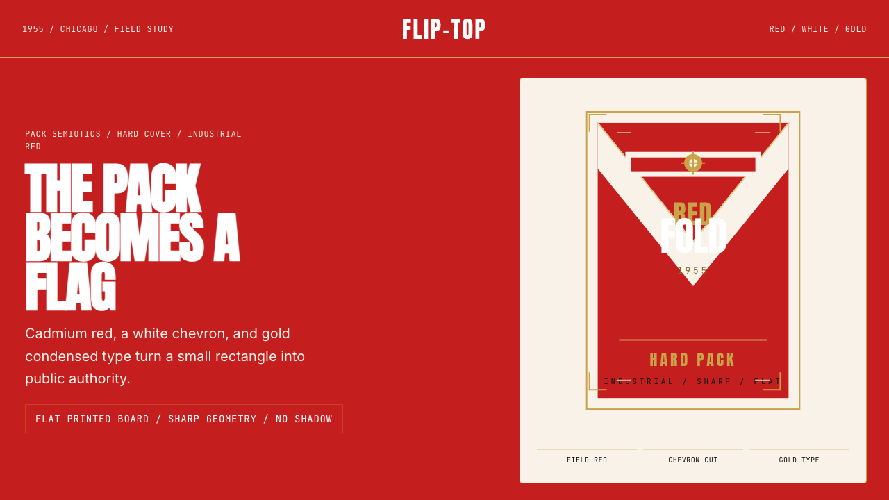 Marlboro Red Flip-Top (1955)Authority in one fold. Cadmium red, white chevron, and gold type read like a…一折成旗。镉红、白人字与金字排出强硬权威。
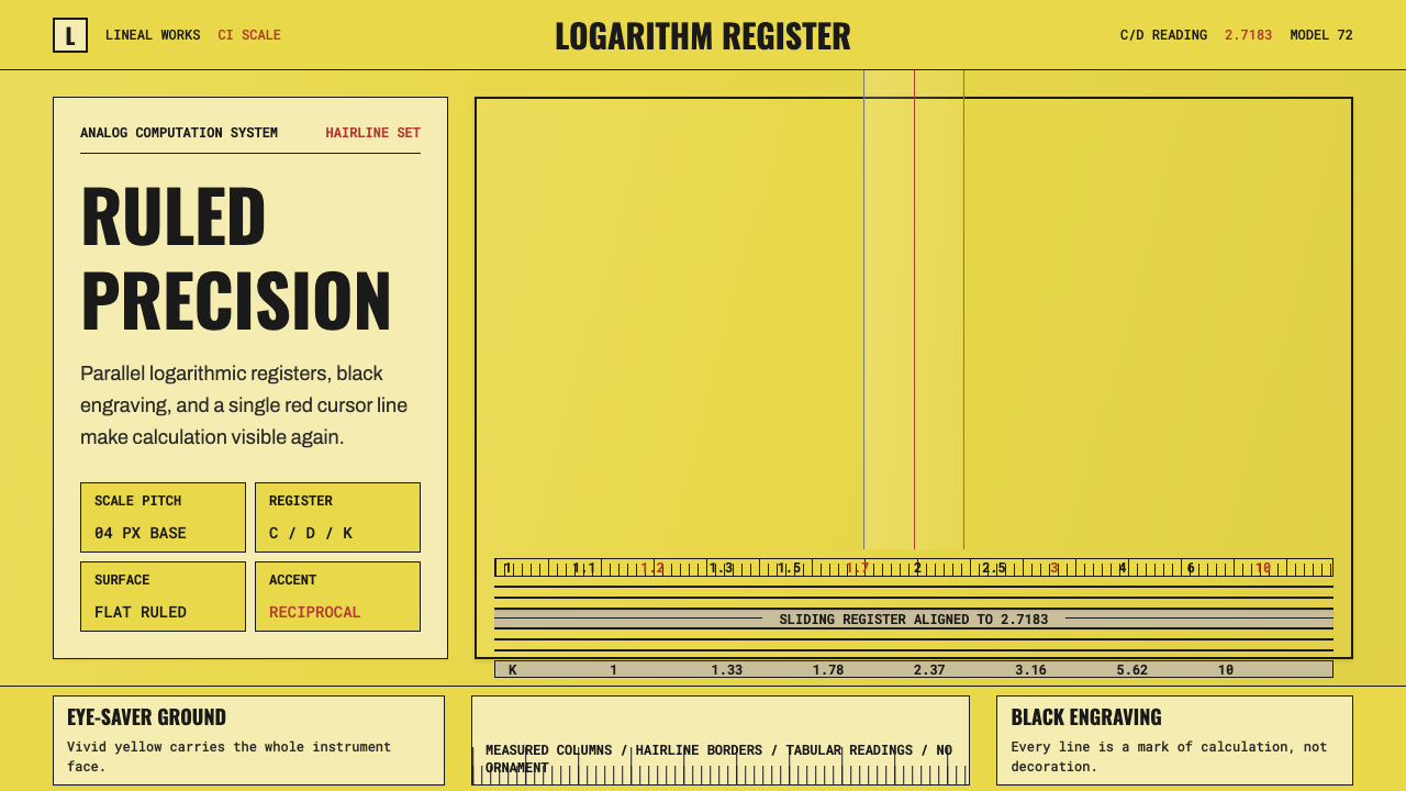 Slide RulePrecision made visible. Eye-saver yellow, black ticks, and one red hairline d…精密可见:护眼黄、黑刻线与一道红游标完成叙事。
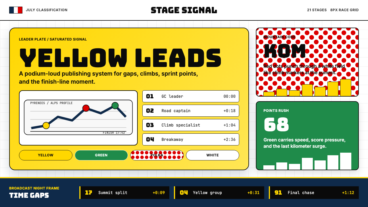 Tour de France (Yellow Jersey)Yellow owns the finish. Bungee type, polka dots, and navy tickers snap to an…黄衫统治终点:Bungee 字体、圆点红与海军蓝计时条咬合 8px 网格。
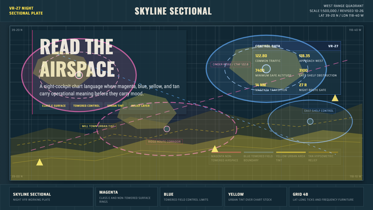 Aeronautical ChartReads like cockpit data. Magenta-blue airspace rings cut through dense dark-c…像座舱数据般可读:品红与蓝色空域环切入深色密集网格。
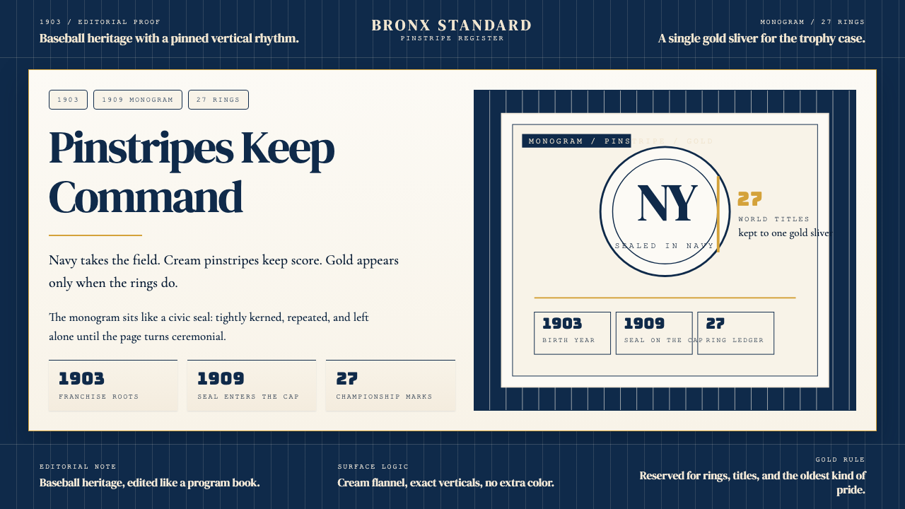 New York Yankees (Navy-Pinstripe)Navy restraint, not noise. Cream pinstripes and a gold monogram seal do the w…海军蓝克制到底。奶油细条纹与金色徽章撑起整页。