What is New York Yankees (Navy-Pinstripe)?什么是 New York Yankees (Navy-Pinstripe)?
Twenty-seven World Series championships, one interlocking monogram, and a single unbroken rule: restraint is the brand.二十七枚世界大赛冠军戒指,一个交错字母组合,以及一条从未被打破的原则:克制即是品牌。
New York Yankees (Navy-Pinstripe) in briefNew York Yankees (Navy-Pinstripe) 速览
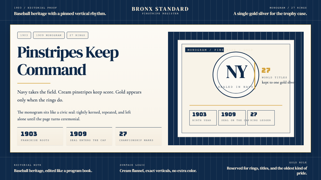
The New York Yankees visual identity is the most recognizable brand in American professional sports — built not on novelty or complexity, but on the disciplined repetition of three elements over more than a century. A saturated navy field. Vertical cream pinstripes. The interlocking NY monogram first rendered by Tiffany and Company in 1909. Everything else is subordinate to these three.纽约洋基队的视觉识别是美国职业体育中最具辨识度的品牌——其建立依靠的不是新奇或复杂,而是对三个元素超过一个世纪的纪律性重复。饱和的海军蓝底色。垂直的奶油色细条纹。1909 年由蒂芙尼公司首次制作的交错 NY 字母组合。其他一切都从属于这三者。
The aesthetic operates on the logic of aristocratic restraint: the fewer the elements, the more each one carries. Navy anchors the palette with a seriousness that borders on severity. The cream pinstripes soften that severity without compromising it — vertical lines that imply height, precision, and uniformity across an entire roster. The interlocking NY sits at the center not as decoration but as a seal, the typographic equivalent of a signet ring. Championship gold appears only where it has been earned: on trophies, retired number plaques, and the rings themselves.这套美学以贵族式克制的逻辑运作:元素越少,每个元素承载的分量越重。海军蓝以近乎严峻的严肃性锚定整个色板。奶油色细条纹在不破坏这种严肃性的前提下将其柔化——那些垂直线条暗示着高度、精准,以及整支球队阵容的整齐划一。交错 NY 字母组合居于中心,不是作为装饰,而是作为印章——字体意义上的金质图章戒指。冠军金色只在它应得的地方出现:奖杯、退役号码牌,以及那些戒指本身。
What distinguishes the Yankees visual language from generic sports branding is its refusal to evolve decoratively. While other franchises refresh their logos and add accent colors to chase contemporary taste, the Yankees system has absorbed over a century of cultural change without altering its core grammar. The pinstripe uniform worn today is, in its essential logic, the same garment codified in the early twentieth century. This stability is itself the message: institutions of genuine authority do not need to announce themselves with novelty.洋基视觉语言有别于普通体育品牌之处,在于它对装饰性演变的拒绝。当其他球队为追赶当代趣味而刷新标志、增加强调色时,洋基体系已经吸收了一个多世纪的文化变迁,而其核心语法分毫未动。今天穿着的细条纹球衣,在其基本逻辑上与二十世纪初编成守则时的那件相同。这种稳定性本身就是信息:真正具有权威的机构不需要用新奇来宣告自己的存在。
See the New York Yankees (Navy-Pinstripe) design system查看 New York Yankees (Navy-Pinstripe) 完整设计系统
Where does New York Yankees (Navy-Pinstripe) come from?New York Yankees (Navy-Pinstripe) 从何而来?
The franchise that became the New York Yankees was founded in 1901 as the Baltimore Orioles, one of the original eight clubs of the American League. In 1903 the club relocated to New York City, playing initially as the Highlanders — a name derived from their home ground at Hilltop Park in upper Manhattan. The move placed the team in direct competition with the established National League club, the New York Giants, and from the outset the Highlanders' management understood that survival in that market required a distinctive, durable identity.后来成为纽约洋基队的这支球队,1901 年以巴尔的摩金莺队的身份创立,是美国联盟最初八支球队之一。1903 年球队迁至纽约,最初以「高地人」(Highlanders)之名出战——这个名字源自他们位于曼哈顿上城区山顶公园(Hilltop Park)的主场。这次迁移使球队与成熟的国家联盟球队纽约巨人队直接竞争,从一开始,高地人队的管理层就明白,在那个市场上生存需要一个独特而持久的身份。
The pivotal visual moment arrived in 1909, when the club commissioned Tiffany and Company — the Manhattan luxury jeweler whose association with quality and permanence was already well established — to design a logo for a charity medallion. The result was the interlocking NY monogram: two letters fitted together with the precision of a craft object, each character supporting the other structurally. The choice of Tiffany was not incidental. It imported into a baseball context the symbolic vocabulary of institutional refinement, of objects made to last and to signify status across generations. The club adopted the NY mark on its uniform caps that same year.关键的视觉时刻发生在 1909 年,球队委托蒂芙尼公司——这家与品质和永恒的联结已然深入人心的曼哈顿奢侈珠宝商——为一枚慈善奖章设计标志。结果就是那个交错 NY 字母组合:两个字母以工艺品的精准度相互嵌套,每个字符在结构上支撑着另一个。选择蒂芙尼并非偶然。它将机构性精致的象征词汇——那种为经久传世而制造、跨越数代人承载地位意义的器物语言——引入了棒球的语境。同年,球队将 NY 标志采用于球帽制服。
The team's name changed to the Yankees in 1913, and the navy-pinstripe uniform was established in its characteristic form by 1915. The cream flannel ground with vertical navy pinstripes drew on a widespread convention in early-twentieth-century baseball, but the Yankees' version was distinctive in its restraint: no colored piping, no contrasting yoke, no extra ornament. The pinstripes themselves were allowed to do all the work — spacing, weight, and cream-to-navy ratio calibrated over years until the proportions felt inevitable rather than designed.球队于 1913 年更名为洋基队,海军蓝细条纹球衣在 1915 年前后以其标志性形态确立下来。奶油色法兰绒底布配垂直海军蓝细条纹,沿袭了二十世纪初棒球界的普遍惯例,但洋基队的版本因其克制而独树一帜:没有彩色镶边,没有对比色育克,没有多余装饰。细条纹本身被允许承担全部工作——间距、粗细、以及奶油色与海军蓝的比例经年累月地校准,直到那些比例看起来像是天然如此,而非被设计出来。
The identity crystallized around the players who wore it. Babe Ruth joined the Yankees in 1920 and transformed both the franchise and American popular culture; the pinstripe silhouette became inseparable from his mythology. Lou Gehrig, Joe DiMaggio, Mickey Mantle, and eventually Derek Jeter each carried the visual identity forward into new eras, their individual greatness becoming part of what the uniform meant. By the mid-twentieth century the Yankees had won enough World Series championships — eventually reaching twenty-seven — that the navy-and-cream palette had accumulated a weight of association that no redesign could replicate. George Steinbrenner, who purchased the team in 1973 and presided over its modern era, enforced strict grooming standards for players precisely because he understood the brand as a system: every variable controlled, no inconsistency permitted.这套身份识别围绕着穿着它的球员而结晶。贝比·鲁斯于 1920 年加入洋基队,改变了这支球队和整个美国大众文化;细条纹剪影与他的神话变得密不可分。卢·贾里格、乔·迪马乔、米基·曼托,乃至最终的德雷克·基特,各自将这套视觉识别带入新的时代,他们的个人伟大成为球衣所承载意义的一部分。到二十世纪中叶,洋基队已经赢得足够多的世界大赛冠军——最终达到二十七次——以至于海军蓝与奶油色的色板积累了任何重新设计都无法复制的联想重量。1973 年收购球队并主持其现代时代的乔治·斯坦布伦纳,对球员执行严格的仪容标准,正是因为他将品牌理解为一个体系:每个变量都受到控制,不允许任何不一致存在。
What defines the New York Yankees (Navy-Pinstripe) look?New York Yankees (Navy-Pinstripe) 的视觉特征是什么?
Color Architecture色彩结构
The palette is built on a strict hierarchy of three tones: a deep, fully saturated navy that reads as almost black in low light; a warm cream flannel white that carries just enough yellow undertone to feel textile rather than digital; and a reserved championship gold that appears only as accent in trophy and heritage contexts. No bright red, no royal blue, no silver — the system generates its authority precisely by refusing what other brands reach for. Navy dominates; cream structures; gold punctuates.色板建立在三种色调的严格等级体系上:一种深邃、完全饱和的海军蓝,在弱光下近乎黑色;一种带有足够黄色底调的温暖奶油法兰绒白,令人联想到织物而非屏幕;以及一种克制的冠军金,仅作为强调色出现在奖杯与传承语境中。没有亮红色,没有皇家蓝,没有银色——这套体系之所以产生权威感,恰恰是因为它拒绝了其他品牌所伸手取用的东西。海军蓝主导,奶油白结构,金色点睛。
The Pinstripe细条纹
The vertical pinstripe is the system's most distinctive element and its most carefully controlled one. The stripes are narrow — closer to a ruled line than a band — and spaced at intervals that allow each stripe to be read individually without the eye losing track of the whole. The directionality is strictly vertical, implying height and formality. On the cream flannel ground, the navy stripes create a woven, almost textile rhythm that is immediately legible as 'Yankees' even at a distance, even in motion.垂直细条纹是这套体系中最具辨识度也是管控最严格的元素。条纹纤细——更接近一根刻度线而非一条色带——间距的设定使每根条纹都能被单独读取,同时不让眼睛失去对整体的把握。方向性严格垂直,暗示高度与正式感。在奶油色法兰绒底布上,海军蓝条纹营造出一种如同编织物般的韵律,即便在远处、即便在运动中,也能立刻被辨认为「洋基」。
The Interlocking NY Monogram交错 NY 字母组合
The Tiffany-designed monogram is a logotype rather than a logomark — its power comes from letterform rather than symbol. The N and Y interlock at the crossbar in a way that makes neither letter fully legible in isolation, which is the point: the mark only resolves when seen as a whole. The serifs on both characters are classical, relating the mark to engraved institutional typography rather than to display or sporting vernacular. This typographic register — engraved, permanent, formal — separates the Yankees identity from every other baseball brand.蒂芙尼设计的字母组合是一个字体标志而非图形标志——它的力量来自字母形态而非符号。N 与 Y 在横档处交错,使每个字母单独看时都无法完全辨认,而这正是关键所在:这个标志只有在作为整体被审视时才能被解读。两个字符上的衬线是古典风格的,将这个标志与镌刻式的机构字体传统而非展示性或运动性俚俗字体联系起来。这种字体语域——镌刻、永恒、正式——将洋基队的身份与其他所有棒球品牌区分开来。
Typographic Register字体语域
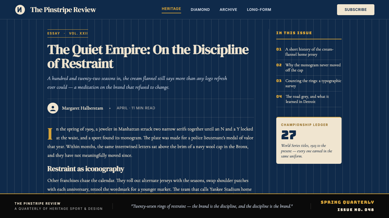
Where text accompanies the visual identity — on scorecards, programs, stadium signage, and official communications — the typographic choices consistently draw from classical American serif traditions. The letterforms are readable at large sizes and dignified at small ones; they have the quality of newspaper mastheads and memorial plaques, not of advertising display. This typographic conservatism reinforces the brand's overall message: we are an institution, not a campaign.在视觉识别需要文字配合的场合——记分卡、赛程手册、球场标识、官方传播——字体选择始终从美国古典衬线字体传统中取材。字母形态在大尺寸时可读,在小尺寸时庄重;它们具有报纸报头和纪念牌匾的品质,而非广告展示字体的品质。这种字体上的保守主义强化了品牌的整体信息:我们是一个机构,不是一场运动。
Compositional Gravity构图重力
Yankees-derived layouts carry a strong sense of downward and vertical gravity — the pinstripe logic extended into composition. Layouts favor tall formats, centered or top-anchored primary elements, and generous vertical breathing space between content tiers. Horizontal rules are used sparingly and carry real structural weight when they appear. The overall feeling is of institutional stationery, not editorial dynamism — which is precisely its strength in contexts requiring gravitas.洋基风格衍生的版面带有强烈的向下与垂直重力感——细条纹逻辑延伸进了构图。版面偏好竖向格式,主要元素居中或顶部锚定,内容层级之间留有充足的垂直呼吸空间。水平线条使用克制,一旦出现便承载真实的结构重量。整体感觉是机构信笺,而非编辑性动感——在需要庄重气场的场合,这正是其优势所在。
Material and Texture Reference材质与肌理参照
Even in fully digital applications, the Yankees aesthetic carries an implicit reference to physical textile — the woven flannel ground, the stitched pinstripe, the embroidered monogram. This material memory is activated through warm cream tones rather than pure white, through stripe weights that suggest thread rather than vector precision, and through gold accents that evoke embroidery thread and engraved metal rather than flat fills. The style reads as hand-finished even when it is not.即便在完全数字化的应用场合,洋基美学也带有对物理织物的隐性参照——编织法兰绒底布、缝合的细条纹、刺绣的字母组合。这种材质记忆通过温暖的奶油色调(而非纯白)、暗示针线而非矢量精准的条纹粗细,以及令人联想起刺绣丝线和镌刻金属(而非平面填色)的金色强调来激活。这种风格呈现出手工收尾的观感,即便事实上并非如此。
Restraint as System Logic克制作为系统逻辑
The defining discipline of the Yankees visual system is not any individual element but the rule that governs all of them: nothing is added unless it earns its place through function or heritage. No seasonal colorway updates, no collaboration overrides, no gradient treatments applied to freshen the mark. The system is closed, and its closure is the source of its power. Every element present has been present long enough to carry genuine historical weight, which means every element absent was genuinely refused.洋基视觉体系的决定性纪律不是任何单个元素,而是支配所有元素的规则:没有任何东西被添加进来,除非它能通过功能性或传承性证明自己的位置。没有季节性配色更新,没有联名合作覆盖,没有为刷新标志而施加的渐变处理。这套体系是封闭的,而它的封闭性正是其力量的来源。现存的每个元素都已经存在足够长的时间,以至于承载了真实的历史重量——这意味着每个缺席的元素,都是被真正拒绝掉的。
See the New York Yankees (Navy-Pinstripe) design system查看 New York Yankees (Navy-Pinstripe) 完整设计系统
Who shaped New York Yankees (Navy-Pinstripe)?谁塑造了 New York Yankees (Navy-Pinstripe)?
The Manhattan jeweler's commission to design the interlocking NY monogram for a charity medallion in 1909 produced the most enduring logo in American sports. By engaging a luxury craft institution rather than a sporting goods supplier, the Yankees' early management made a deliberate statement about the register of identity they were building. The Tiffany provenance attached to the monogram a set of associations — permanence, precision, institutional quality — that no amount of subsequent championship success could have manufactured from scratch.这家曼哈顿珠宝商于 1909 年受委托为一枚慈善奖章设计交错 NY 字母组合,由此创造了美国体育史上最持久的标志。通过委托奢侈工艺机构而非运动装备供应商,洋基队早期管理层就他们正在构建的身份语域做出了蓄意的声明。蒂芙尼的出处为这个字母组合附加了一套联想——永恒、精准、机构品质——这些是任何后续冠军成就都无法凭空制造的。
Ruth joined the Yankees in 1920 and became the first athlete in American history whose visual image — the broad pinstripe silhouette, the distinctive batting stance, the cap pulled low — was reproduced and circulated at a scale comparable to entertainment celebrities. His years with the Yankees (1920–1934) coincided with the team winning four World Series championships and established the pinstripe uniform as a symbol of sporting dominance in the American cultural imagination. Ruth did not design the visual system, but he gave it its first mythology.鲁斯于 1920 年加入洋基队,成为美国历史上第一位其视觉形象——宽阔的细条纹轮廓、独特的击球姿势、压低的球帽——以堪比娱乐明星规模被复制传播的运动员。他在洋基队的岁月(1920—1934 年)与球队赢得四次世界大赛冠军的时期重合,并在美国文化想象中将细条纹球衣确立为体育统治力的符号。鲁斯没有设计这套视觉体系,但他赋予了它第一个神话。
Gehrig's association with the Yankees uniform spans the franchise's most aesthetically formative period. Playing alongside Ruth and then carrying the team through the mid-1930s, Gehrig embodied a different register of the pinstripe identity — where Ruth represented flamboyant power, Gehrig represented disciplined consistency, which maps precisely onto the visual system's own values. His retirement speech at Yankee Stadium in 1939, in which he called himself 'the luckiest man on the face of the earth,' became part of the cultural fabric that the uniform now carries.贾里格与洋基队球衣的联结横跨了这支球队美学形成的最重要时期。先与鲁斯并肩作战,后在 1930 年代中期挑起球队大梁,贾里格体现了细条纹身份识别的另一种语域——鲁斯代表着浮夸的力量,贾里格则代表着纪律性的一致,这与视觉体系本身的价值观精确吻合。他于 1939 年在洋基体育场发表的退役演讲——自称「大地上最幸运的人」——已成为这件球衣如今承载的文化织物的一部分。
Jeter served as Yankees captain from 2003 until his retirement in 2014, and his career coincided with a period of intense scrutiny on sports branding and identity in the age of digital media. His consistent, undemonstrative excellence — and his equally consistent adherence to the Yankees' off-field standards of presentation — made him the contemporary embodiment of the brand's core proposition: that authority comes from sustained performance within a disciplined system, not from individual expression. Jeter's number 2 was retired in 2017.基特从 2003 年担任洋基队队长直至 2014 年退役,他的职业生涯与数字媒体时代对体育品牌和身份识别的高度关注时期重合。他始终如一、不事张扬的卓越,以及他对洋基队场外形象标准的同样始终如一的遵守,使他成为这个品牌核心命题的当代化身:权威来自在严格体系内持续的表现,而非个人表达。基特的 2 号球衣于 2017 年退役。
Steinbrenner purchased the Yankees in 1973 and served as principal owner until his death in 2010, presiding over the franchise's modern commercial era and seven World Series championships. His insistence on strict player presentation standards — no facial hair beyond a neat mustache, hair above the collar — was widely reported as personal preference, but functioned as brand management: every player in the uniform was also a representative of the visual system. Steinbrenner understood intuitively that a brand with this level of historical equity could only be damaged by inconsistency, not by rigidity.斯坦布伦纳于 1973 年收购洋基队,担任主要所有人直至 2010 年辞世,主持了球队现代商业时代和七次世界大赛冠军。他坚持严格的球员形象标准——胡须不得超出整洁的上唇须范围,头发不得垂至衣领——被广泛报道为个人偏好,但实际上发挥着品牌管理的作用:每一位穿着球衣的球员同时也是视觉体系的代表。斯坦布伦纳凭直觉理解,拥有这种历史积淀的品牌只会被不一致所损害,而不会被严格所损害。
How do you use New York Yankees (Navy-Pinstripe) today?今天怎么用 New York Yankees (Navy-Pinstripe)?
The Yankees Navy-Pinstripe visual system translates into designed artifacts through a disciplined reduction to its core logic: deep navy as the dominant ground or structural color, cream or warm off-white as the content field, vertical stripe patterns used sparingly and only when they contribute structural rhythm, the interlocking-NY or a similarly tight editorial serif monogram as the identity anchor, and championship gold reserved for the single most important accent. Applications that honor this hierarchy feel authoritative; applications that treat navy, cream, and gold as interchangeable accents dilute the system into generic sports-adjacent decoration.洋基海军蓝细条纹视觉体系通过对其核心逻辑的严格还原转化为设计产物:深海军蓝作为主导底色或结构性色彩,奶油色或温暖的近白色作为内容场域,垂直条纹图案克制使用且仅在贡献结构韵律时出现,交错 NY 或类似紧致的编辑性衬线字母组合作为身份锚点,冠军金色保留给唯一最重要的强调色。遵循这一等级体系的应用感觉权威;将海军蓝、奶油色和金色视为可互换强调色的应用,则将这套体系稀释为泛化的体育风格装饰。
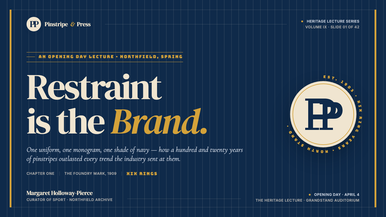
For presentation slides, the Yankees aesthetic works best on covers and section dividers rather than dense content pages. A cover following this logic places the title in a strong editorial serif against a full-bleed navy ground, with a cream or warm-white subtitle directly below and a single gold rule or ornament marking the base. The pinstripe motif, if used, should appear as a background texture at low opacity rather than as a dominant graphic element — it supports the composition without competing with the content hierarchy. Data slides should use navy for primary chart elements, cream for the background field, and gold only for the single most important data point or threshold line.在演示文稿中,洋基美学最适合用于封面和章节分隔页,而非密集的内容页。遵循这套逻辑的封面将标题以强劲的编辑性衬线字体置于满版海军蓝底色上,奶油色或暖白色副标题紧随其下,以单根金色线条或装饰元素标记底部。细条纹图案若被使用,应以低透明度作为背景肌理,而非作为主导图形元素——它支撑构图而不与内容层级竞争。数据幻灯片应将海军蓝用于主要图表元素,奶油色用于背景场域,金色仅用于唯一最重要的数据点或阈值线。
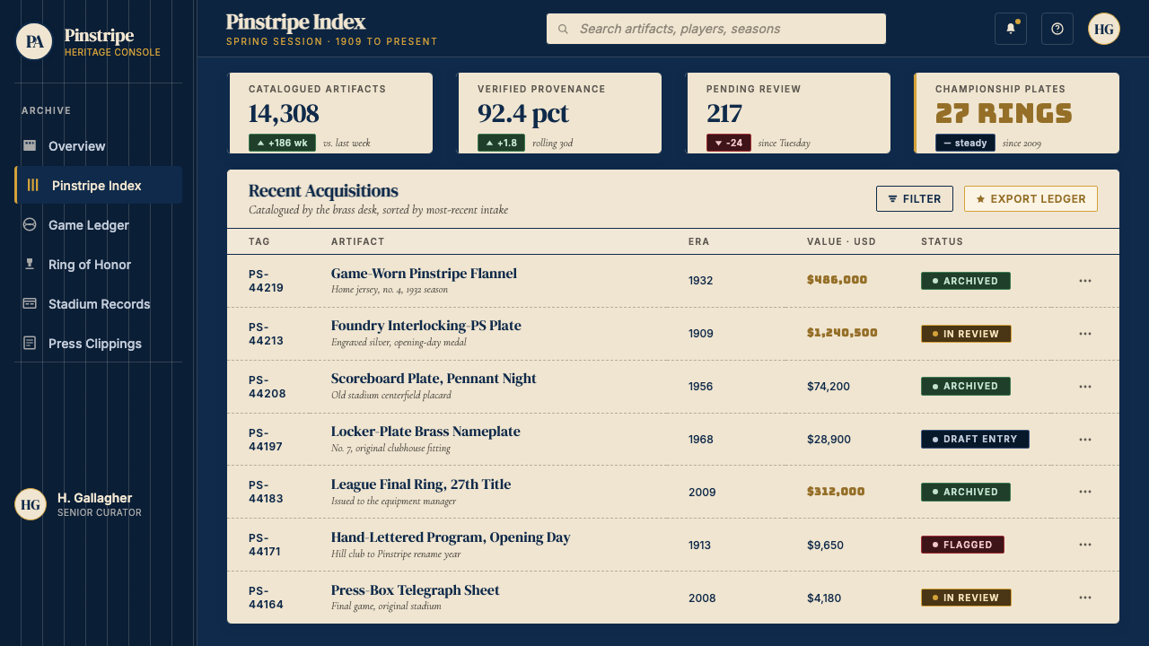
For web interfaces and dashboards, the system is particularly well suited to platforms that need to convey authority, permanence, and premium positioning — financial reporting tools, sports analytics dashboards, premium subscription interfaces, or any product where the user experience is built around trust in institutional data. The approach: use deep navy as the primary navigation and header background, warm cream or off-white as the content area ground, and reserve gold as the interactive accent for primary calls to action and key metrics. Typography should draw from classical serif traditions for headings and use a clean, legible sans-serif for body and data labels — the contrast between serif authority and sans-serif clarity reinforces the dual register of heritage and modernity.对于网页界面和仪表板,这套体系尤其适合需要传达权威性、永久感和高端定位的平台——金融报告工具、体育分析仪表板、高级订阅界面,或任何用户体验建立在对机构数据信任之上的产品。方法如下:以深海军蓝作为主导导航和页头背景,以温暖的奶油色或近白色作为内容区底色,金色保留为主要行动号召和关键指标的交互性强调色。字体排印应从古典衬线字体传统中取材用于标题,使用干净、易读的无衬线字体用于正文和数据标签——衬线字体的权威性与无衬线字体的清晰性之间的对比,强化了传承与现代性的双重语域。
For editorial and marketing applications, the style supports strong hierarchy and directional reading. A Yankees-derived marketing page treats the full-bleed navy section as the statement moment — white or cream type reversed out of navy carries the primary value proposition, while pinstripe texture at reduced opacity provides subtle depth without decoration. Pricing pages benefit from the system's natural tier logic: the premium tier sits in navy with cream type and gold accent; middle tiers in cream with navy type; entry tiers in lighter grounds. The gold accent should appear on one tier only — the moment it appears on two, the hierarchy collapses. For editorial layouts, use the navy-to-cream contrast to demarcate editorial from advertising, analysis from summary, or featured content from supporting material.对于编辑和营销应用,这种风格支持强劲的层级与方向性阅读。洋基风格衍生的营销页面将满版海军蓝区块视为声明时刻——从海军蓝底色中反白的奶油色或白色文字承载主要价值主张,而低透明度的细条纹肌理提供微妙的深度感而无装饰之嫌。定价页面受益于这套体系天然的等级逻辑:高级套餐以海军蓝底配奶油色文字和金色强调色;中级套餐以奶油色底配海军蓝文字;入门套餐以更浅的底色呈现。金色强调色应仅出现在一个套餐层级——一旦出现在两个,层级感随即崩溃。对于编辑版面,利用海军蓝与奶油色的对比来划分编辑内容与广告、分析与摘要、精选内容与支撑材料。
A common mistake when applying this visual language is treating the pinstripe as the leading element and the navy as its background, when the actual hierarchy is reversed: navy is the primary field and the pinstripes are its internal texture. A second frequent error is introducing warm metallic gold too broadly — the more surfaces gold touches, the less it signals championship. The system earns its impact through scarcity: one gold rule, one gold monogram stroke, one gold call-to-action button. A third mistake is substituting a cool white or blue-white for the cream ground, which destroys the textile warmth that separates this identity from generic corporate navy-and-white. The cream is doing aesthetic work that pure white cannot.应用这套视觉语言时最常见的错误,是将细条纹视为主导元素、将海军蓝视为其背景,而实际等级正好相反:海军蓝是主要场域,细条纹是其内部肌理。第二个常见错误是将温暖金属质感的金色引入过多表面——金色接触的表面越多,它传递冠军信号的力量越弱。这套体系的冲击力来自于稀缺性:一根金色线条,一个金色字母组合笔画,一个金色行动号召按钮。第三个错误是用冷白色或蓝白色替代奶油色底色,这会破坏将这套身份识别与泛化企业蓝白风格区分开来的织物温度感。奶油色在完成纯白色无法完成的美学工作。
See the New York Yankees (Navy-Pinstripe) design system查看 New York Yankees (Navy-Pinstripe) 完整设计系统
New York Yankees (Navy-Pinstripe) — FAQNew York Yankees (Navy-Pinstripe) · 常见问题
How is the Yankees visual identity different from generic navy-and-white corporate design?洋基队的视觉识别与泛化的海军蓝加白色企业设计有何不同?
Three things separate the Yankees system from generic navy-and-white: the cream warmth of the white (not cool white, not pure white, but a slightly warm off-white with textile connotation), the vertical pinstripe pattern as an internal texture (not a decorative border or graphic device), and the classical serif monogram as the typographic anchor (not a sans-serif wordmark or geometric icon). Remove any one of these three and you have a respectable navy corporate palette. Keep all three with the correct proportions and restraint and you have the Yankees system. The difference is in specificity, not in the general color family.三点将洋基体系与泛化的海军蓝加白色区分开来:白色的奶油暖调(不是冷白,不是纯白,而是带有织物联想的微暖近白色)、作为内部肌理的垂直细条纹图案(不是装饰性边框或图形元素),以及作为字体锚点的古典衬线字母组合(不是无衬线文字标志或几何图标)。去掉这三者中的任何一个,你得到的是一个体面的企业海军蓝色板。以正确的比例和克制保留全部三者,你得到的才是洋基体系。区别在于特殊性,而非大类色彩家族。
Can this style work in a light-mode digital interface without feeling like a throwback?这种风格能在浅色模式数字界面中使用而不显得像是复古做旧吗?
Yes, but it requires translating the aesthetic logic rather than copying its surface elements. In a light-mode interface, the cream ground becomes the default background, navy is used for navigation, headers, and primary type, and gold is reserved for a single interactive accent. The pinstripe, if used at all, should appear only in non-content zones — a sidebar background, a section separator — at very low contrast. The key is keeping the color hierarchy intact: cream as field, navy as structure, gold as signal. Interfaces that do this well feel contemporary rather than retro because the logic is sound and the restraint is consistent.可以,但需要翻译其美学逻辑,而不是复制其表面元素。在浅色模式界面中,奶油色底色成为默认背景,海军蓝用于导航、页头和主要文字,金色保留给唯一的交互性强调色。细条纹如果被使用,应仅出现在非内容区域——侧边栏背景、章节分隔线——且对比度极低。关键在于保持色彩等级不变:奶油色作为场域,海军蓝作为结构,金色作为信号。这样处理好的界面感觉是当代的而非复古的,因为逻辑是成立的,克制是一致的。
Why is championship gold used so sparingly, and what happens if it is used more broadly?为什么冠军金色的使用如此吝啬?大量使用会发生什么?
Gold in the Yankees system is a scarcity signal — it marks what is superlative within a context that already represents excellence. Its meaning depends entirely on its rarity. When gold appears on one element in a layout, the eye reads that element as the most important thing in the space. When gold appears on three or four elements, the hierarchy collapses and gold becomes merely a warm accent color, indistinguishable from the decorative gold found in any number of luxury-adjacent brands. The rule of thumb is that gold should never appear on more than one element per composition, and ideally that element is the primary call to action, the most important data point, or the identity mark itself.洋基体系中的金色是一种稀缺信号——它在一个本身已代表卓越的语境中标记出最高级别的存在。它的意义完全依赖于其稀有性。当金色出现在版面中的一个元素上时,眼睛会将该元素读取为空间中最重要的事物。当金色出现在三四个元素上时,等级感崩溃,金色仅仅变成一种温暖的强调色,与无数奢侈品毗邻品牌中的装饰性金色无异。经验法则是:金色在每个构图中出现的元素不应超过一个,理想情况下该元素是主要行动号召、最重要的数据点,或身份标志本身。
Is this style appropriate for brands outside sports — technology, finance, or editorial?这种风格适合体育之外的品牌吗——科技、金融或编辑类?
The Yankees system is rooted in a specific sporting heritage, but its underlying values — institutional authority, earned permanence, disciplined restraint — translate well to non-sports contexts where those same values are desired. Financial services brands, premium subscription products, and high-end editorial publications can all draw on this visual language without it reading as sports cosplay, provided the surface references to the specific identity (the interlocking NY monogram, the pinstripe as primary texture) are abstracted into their principles: editorial serif monograms replace the interlocking NY, vertical linear texture replaces the specific pinstripe pattern, and the cream-navy-gold hierarchy is maintained without literal baseball connotation. The style struggles in contexts that call for approachability, warmth, or playfulness.洋基体系根植于特定的体育传承,但其底层价值观——机构权威、经由积累而来的永久性、纪律性克制——在那些同样追求这些价值观的非体育语境中同样适用。金融服务品牌、高端订阅产品和高规格编辑类出版物都可以借鉴这套视觉语言,而不会被解读为体育主题的cosplay,前提是对这套特定身份识别的表层参照(交错 NY 字母组合、作为主要肌理的细条纹)被抽象为其原则:编辑性衬线字母组合取代交错 NY,垂直线性肌理取代具体的细条纹图案,奶油色—海军蓝—金色的等级体系在没有字面棒球联想的情况下被维持。这种风格在需要亲和力、温暖感或趣味性的场合表现欠佳。
How should the pinstripe be adapted for digital screens, where fine vertical lines can cause visual artifacts?细条纹在数字屏幕上应如何调整?精细的垂直线条可能在屏幕上产生视觉干扰。
The pinstripe's original context was physical textile — woven, stitched, seen at arm's length on a moving figure. Translating it to screen requires acknowledging that very fine vertical lines at certain sizes can cause moiré patterns or appear to vibrate at sub-pixel scales. The solution is not to eliminate the pinstripe but to apply it only at scales where it reads clearly — typically as a background texture on large, low-priority surfaces rather than as a dominant graphic element on content areas. Increasing the spacing between stripes slightly beyond the traditional textile proportion also helps; the goal is the rhythm and the directional feel, not a photographic reproduction of the jersey. On high-resolution displays the original proportions work well; on standard screens, a slightly more generous spacing maintains legibility without losing the character.细条纹的原始语境是物理织物——编织、缝合,在移动的人体上于手臂距离处被观看。将其转化到屏幕上,需要承认极细的垂直线条在某些尺寸下可能产生莫尔条纹,或在亚像素级别呈现出振动感。解决方案不是消除细条纹,而是仅在其能被清晰读取的尺度上应用它——通常作为大面积、低优先级表面上的背景肌理,而非内容区域上的主导图形元素。将条纹间距略微调宽至超出传统织物比例也有帮助;目标是那种韵律感和方向性观感,而非对球衣的照相式复制。在高分辨率显示器上,原始比例效果良好;在标准屏幕上,略为宽松的间距在不失去质感特征的前提下保持可读性。
Related design styles相关设计风格
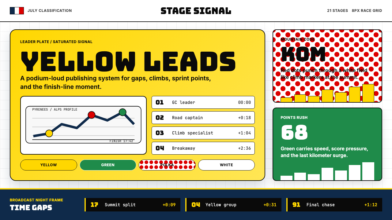 Tour de France (Yellow Jersey)Yellow owns the finish. Bungee type, polka dots, and navy tickers snap to an…黄衫统治终点:Bungee 字体、圆点红与海军蓝计时条咬合 8px 网格。
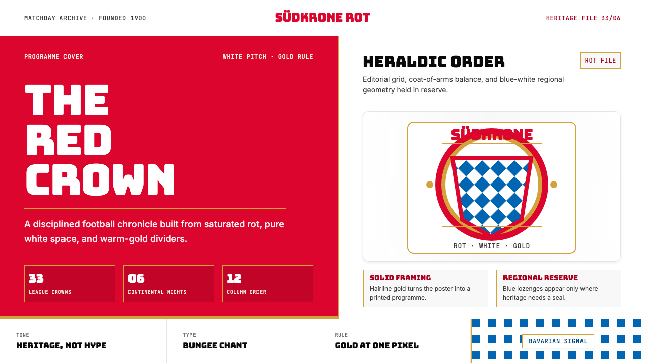 Bayern Munich (Rot)Heritage, not hype. Saturated rot fields, gold rules, and blue lozenges enfor…传统胜过喧哗:饱和红、金细线与蓝白菱格建立秩序。
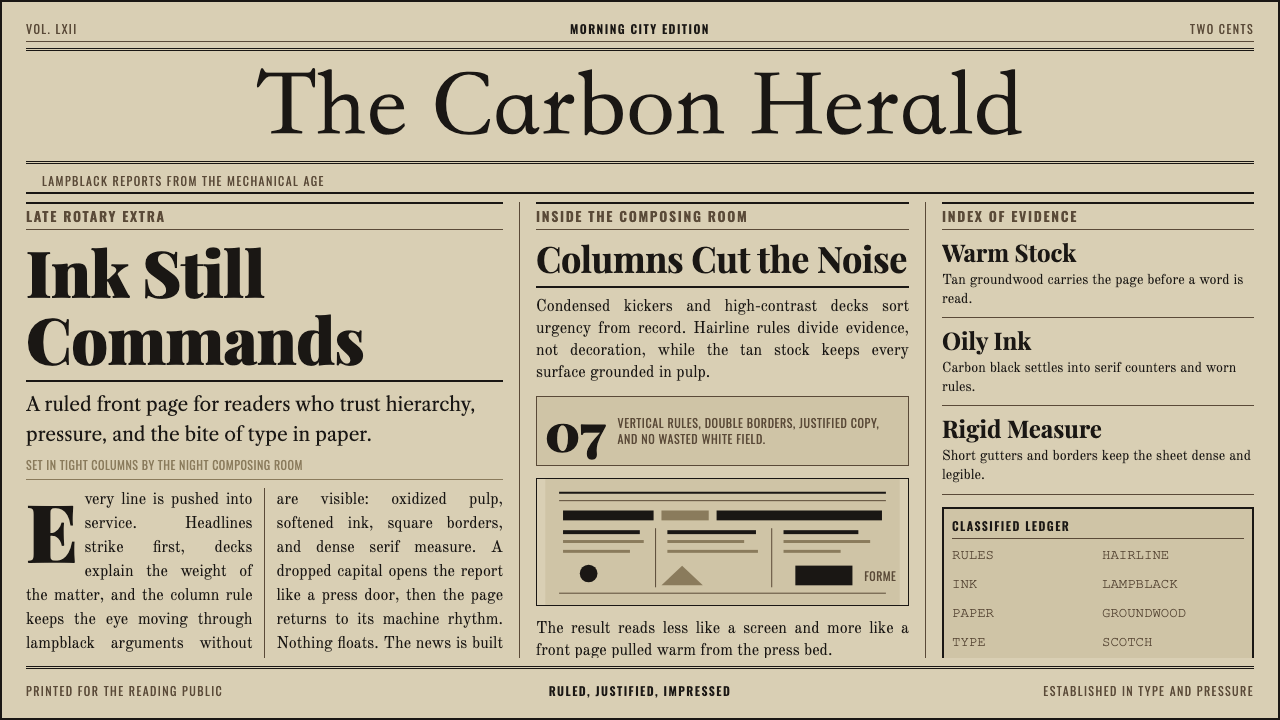 Broadsheet LetterpressAuthority in ink. Lampblack serif decks lock into tan paper with strict ruled…油墨里的权威:灯黑衬线与褐黄纸面,被严密栏线锁住。
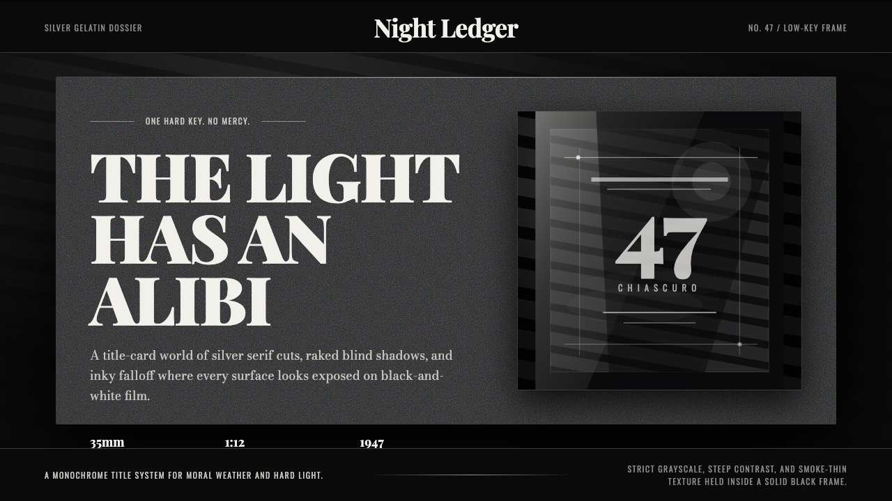 Film Noir ChiaroscuroLight is the crime. Silver serif cards, blind stripes, and grain carve drama…光就是罪证。银色衬线、百叶窗斜影与胶片颗粒从黑场刻出戏剧。
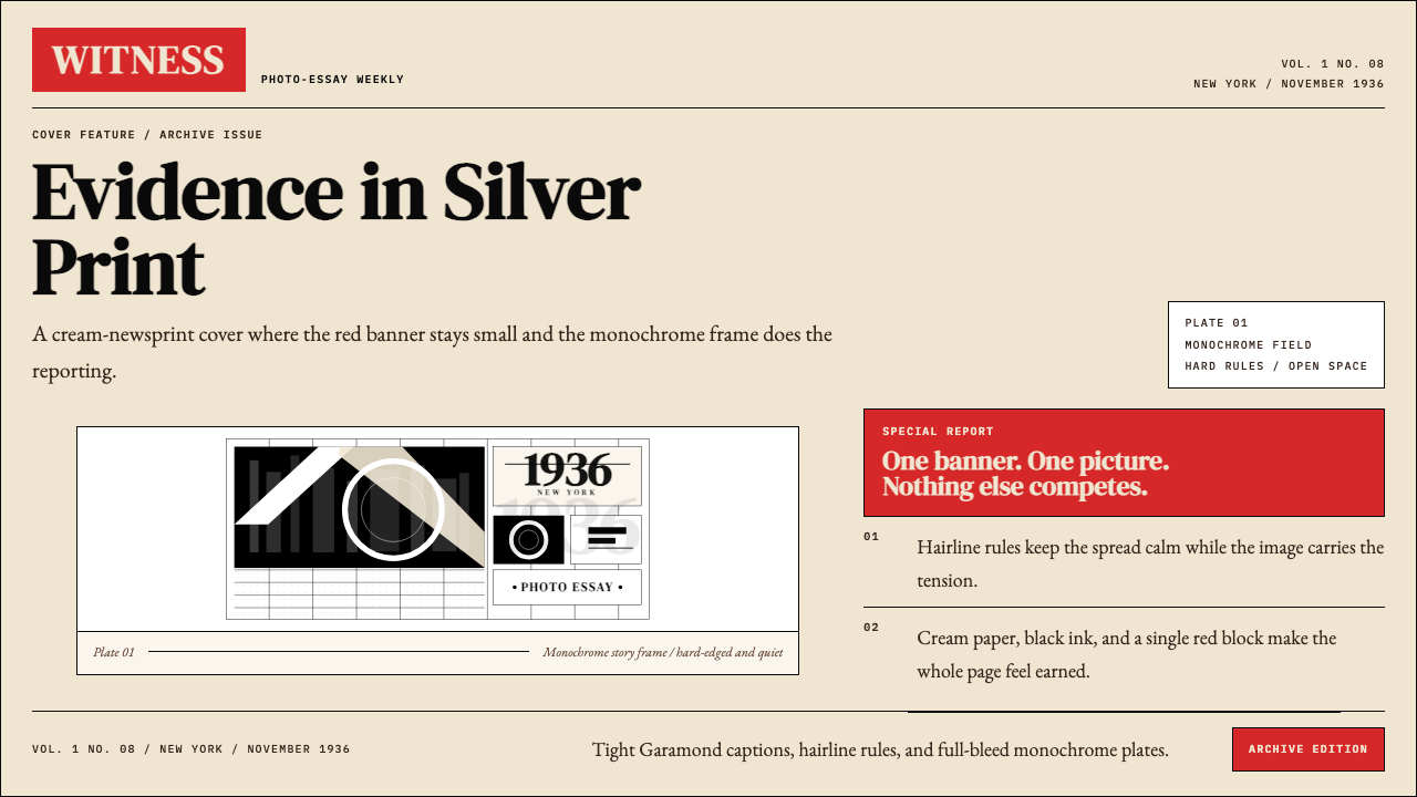 LIFE Magazine (Red-Banner)Photojournalism stripped bare. One red banner, cream newsprint, stark black p…摄影报道被剥到最简。红横幅、米色纸底与黑白版面。
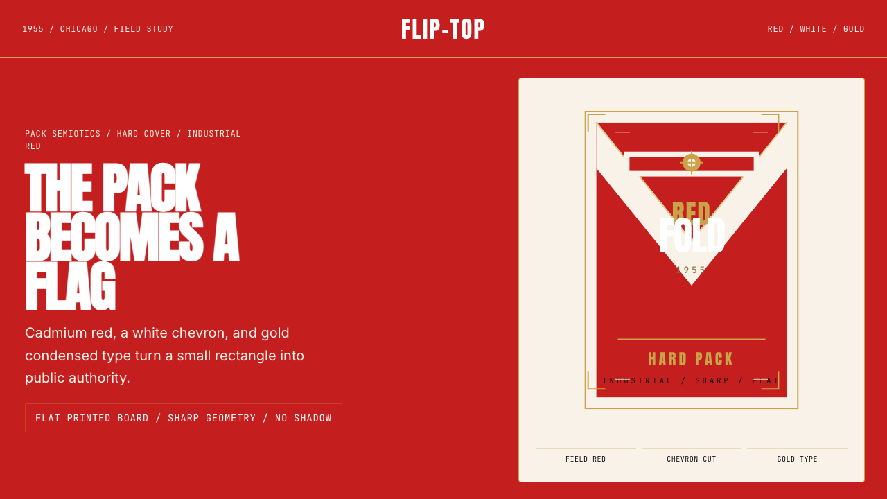 Marlboro Red Flip-Top (1955)Authority in one fold. Cadmium red, white chevron, and gold type read like a…一折成旗。镉红、白人字与金字排出强硬权威。