What is Broadsheet Letterpress?
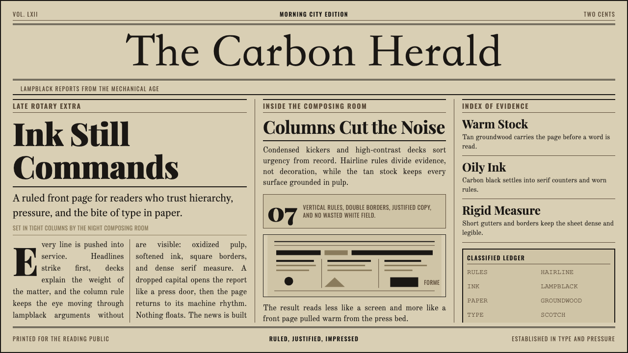
The broadsheet letterpress is authority compressed into ink and paper — condensed serif columns, hairline rules, hierarchical headline decks, and the warm density of lampblack on newsprint that made early-twentieth-century newspapers feel like objects of institutional weight.
Broadsheet Letterpress in brief
Broadsheet Letterpress is a design system rooted in the visual logic of early-twentieth-century newspaper printing, when type was set in metal and pressed physically into paper. The defining characteristics are a warm tan or aged-ivory ground, near-black carbon ink, tight multi-column grids divided by hairline vertical rules, and a strict typographic hierarchy — wood-type or blackletter nameplates at the masthead, condensed serif headline decks below, and dense roman body text filling every column.
Unlike decorative historical pastiche, this style is structurally disciplined. Every visual decision derives from the physical constraints and editorial conventions of the letterpress broadsheet: ink spread on absorbent newsprint creates a slight halo around letterforms; column rules prevent eye-drift across wide pages; headline decks reduce in scale through multiple tiers to funnel the reader from the biggest news to the supporting detail. The system's authority comes from that density — the sense that every square centimeter of the page has been claimed by information.
Visually, the system signals credibility through restraint and saturation of content. There are no decorative flourishes, no white space for its own sake, no color beyond the warm neutrals of aged paper and the near-black of oxidized ink. Drop initials and condensed kicker labels provide rhythmic anchors. The overall impression is of a medium that takes its own seriousness for granted — which is precisely the register it transfers to contemporary digital and print applications.
Where does Broadsheet Letterpress come from?
The broadsheet newspaper format took shape in the late eighteenth century, when British publishers adopted large paper sizes partly to circumvent a per-sheet stamp tax — fewer sheets meant fewer taxes on the same volume of content. By the mid-nineteenth century the format had migrated to North America, where the steam-powered cylinder press, and then Richard March Hoe's rotary press of 1843, made it possible to print tens of thousands of copies per hour. The broadsheet became the dominant vessel for mass public information in urban centers across the United States and Canada.
The letterpress technology that produced these papers worked by inking a raised surface — movable type or engraved wood blocks — and pressing it against paper under mechanical pressure. Ottmar Mergenthaler's Linotype machine, introduced in 1886, transformed newspaper composition by allowing operators to cast entire lines of type from molten metal at the keyboard rather than setting individual letters by hand. Linotype made the tight, justified, multi-column layouts of the classic broadsheet economically viable at daily production speeds. By the 1900s, a metropolitan newspaper might run eight columns across a broadsheet page, with headline decks set in one of the large wood-type display faces common to type foundry specimens of the era.
The visual grammar that distinguishes these papers was practical before it was aesthetic. Vertical column rules prevented ink from bleeding across columns on high-speed presses. Condensed type styles maximized word count in narrow column widths. Drop initials marked the opening of feature stories. Kicker labels — a few words of condensed type above the main headline — compressed additional context into minimal space. Frederic Goudy and other American type designers of the early twentieth century refined the Scotch and modern serif faces that filled broadsheet columns, optimizing them for the slightly imprecise ink transfer of newsprint printing.
By the 1930s and 1940s, at the height of the golden age of broadsheet journalism, the visual conventions had calcified into an instantly recognizable institutional style. Hot-metal composition, column rules, masthead blackletter, tiered headline decks — these were not merely production methods but signifiers of editorial seriousness that readers learned to decode. When cold type and then digital composition replaced letterpress in the latter twentieth century, the visual conventions outlasted the technology that had generated them, persisting in newspaper design as cultural codes long after their practical rationale had disappeared.
What defines the Broadsheet Letterpress look?
Color and Ground
The palette is binary: near-black ink against warm tan or aged-ivory paper. The warmth of the ground is not incidental — it replicates the oxidized groundwood pulp of authentic newsprint, which yellows with exposure to light and air. No tertiary colors appear, no accent hues, no decorative fills. Any variation in tone comes from ink density: denser ink for display headlines, lighter impressions in body text, the natural visual contrast of different type sizes and weights pressed at different coverage levels.
Typography and Hierarchy
The typographic system is explicitly tiered. A masthead nameplate — set in a wood-type display face, a blackletter, or a heavy slab serif — anchors the top of the page with maximum visual authority. Below it, headline decks descend through three or four distinct size steps, each condensed to maximize word count within column widths. Kicker labels in small condensed type sit above main headlines, adding context without weight. Body text is set tight in a Scotch or modern serif at the smallest comfortable reading size, with minimal leading, maximizing line density.
Column Grid and Rules
The classic broadsheet grid divided the page into five to eight columns of equal width, separated by hairline vertical rules. These rules served a functional purpose on letterpress presses — preventing ink from running across column boundaries at speed — but became the defining structural signature of the medium. The columns are narrow relative to a contemporary web grid, demanding highly condensed type to achieve readable line lengths. Headlines frequently span multiple columns, creating visual hierarchy through width as well as scale.
Drop Initials and Ornaments
Drop initials mark the opening of major stories, enlarging the first letter of body text to span three or four lines of depth. These are not decorative — they are wayfinding devices that let a reader scanning a dense page identify entry points instantly. Small ornamental borders, dashes, and tailpieces appear at article breaks and column footers, derived from the standard material in a letterpress compositor's job case. They are restrained in number and consistent in weight, functioning as punctuation for the page rather than embellishment.
Ink Texture and Material Presence
Authentic broadsheet letterpress printing left a subtle debossed impression where type pressed into paper, and ink spread slightly into the absorbent newsprint fibers, creating a soft halo around each letterform rather than a perfectly sharp edge. This material residue — the slight blur at stroke terminations, the ink gain on small type — gives the style its warmth and legibility at distance. When translating to digital applications, this quality is evoked through slightly softened stroke edges, a warm slightly-off-white ground, and type that prioritizes mass and density over razor precision.
Headline Weight and Condensation
Broadsheet display type is consistently condensed — narrow in proportion relative to its height — because column widths required that even the largest headlines fit within fixed vertical lanes. The condensed form at large scale produces a distinctive rhythm of closely-spaced vertical strokes that reads as monolithic authority. Modern serif faces — with their strong contrast between thick stems and hairline serifs — work particularly well at display scale in this system, as the contrast is amplified by the column width constraint and the visual texture of ink on rough paper.
White Space as Absence, Not Intention
Unlike contemporary editorial design, which uses negative space as an active compositional tool, the broadsheet letterpress aesthetic treats white space as a space not yet claimed by information. The ideal broadsheet page is dense; gaps between columns are functional (bleed prevention) rather than aesthetic breathing room. Applying this correctly means resisting the contemporary impulse to open up layout, and instead committing to a density that contemporary audiences may initially read as busy but quickly come to associate with seriousness and completeness.
Who shaped Broadsheet Letterpress?
Mergenthaler, a German-American inventor, patented the Linotype compositing machine in 1884 and introduced it commercially in 1886. The Linotype allowed a single operator to cast complete lines of type from molten lead by typing on a ninety-key keyboard, replacing a hand-composition process that required several workers per column. It directly enabled the dense, multi-column broadsheet layout that defines the style — without Linotype's speed, the economic model of daily metropolitan newspaper printing would have remained impossible at scale.
Hoe, a New York press manufacturer, developed and patented the rotary printing press in 1843. His machine fed paper from a continuous roll over a rotating cylindrical type bed, making print runs of tens of thousands of copies per hour possible for the first time. The Hoe rotary press transformed newspaper publishing from a craft operation into an industrial one and created the infrastructure that made the broadsheet the primary mass-communication medium of the late nineteenth and early twentieth centuries.
Goudy was the most prolific American type designer of the early twentieth century, producing over 120 typefaces across his career. Several of his designs — including Goudy Old Style and Goudy Modern — were widely used in newspaper typography of the period. His work exemplified the American approach to serif type design: warm, readable, with a humanist touch that softened the mechanical rigidity of industrial composition. Goudy also operated a hand-press at his private foundry, Villa Montezuma, maintaining a connection between the craft origins of type and its industrial deployment.
These two papers — among the most widely circulated broadsheets of the early twentieth century — were the visual laboratories in which the mature broadsheet style crystallized. The New York Tribune's typography under the influence of John Allen employed Scotch Roman types that became an industry standard for column composition. The Chicago Tribune's aggressive blackletter nameplate became a cultural landmark. Both papers' design choices — their masthead treatments, column widths, headline deck structures — were copied by regional papers across the continent, establishing the visual conventions as a national norm.
The anonymous skilled workers who set type on Linotype machines and assembled broadsheet pages in compositing rooms were the true authors of the visual system's refinements. Their day-to-day decisions about leading, column width, headline scaling, and ornament placement — made under the pressure of daily deadlines — consolidated the conventions that came to define the style. The compositing room operated under strict practical constraints that functioned as design discipline: every choice had to be executable in metal, within budget, before press time.
How do you use Broadsheet Letterpress today?
Broadsheet Letterpress translates well to contemporary applications precisely because its visual logic is structural — derived from physical constraints and editorial conventions — rather than purely stylistic. Applying it correctly means understanding what the system is actually doing: using column density to signal completeness, using typographic hierarchy to guide scanning rather than reading, and using material warmth to establish credibility. The style says: this is a document that takes itself seriously.
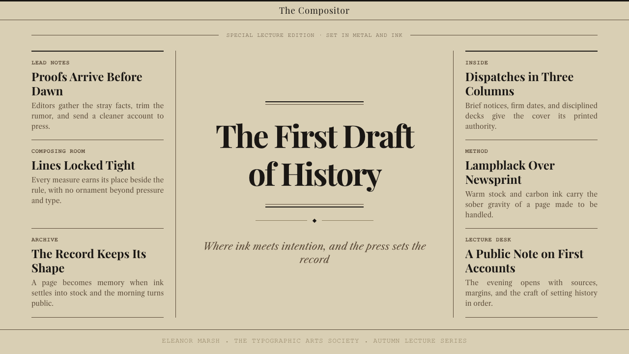
For presentation slides, the style works best on content-heavy decks where information density is a feature rather than a problem. A cover slide benefits from a stark masthead treatment: the title in a condensed serif at maximum size, a horizontal hairline rule beneath it, and a subdeck in smaller condensed type that functions like a newspaper kicker. Content slides should be structured as two or three columns of tight type, with section headers treated as mini-headlines in condensed display type. Data slides take on a newspaper infographic quality — tables and charts gain authority from the surrounding typographic environment without needing graphic elaboration.
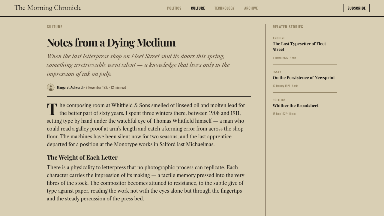
For web interfaces, the system adapts well to long-form editorial pages, documentation sites, and any platform that values the appearance of archival depth. A broadsheet-derived article layout uses a narrow measure for body text — comfortable for extended reading — with a generous outer margin for footnotes, pull quotes, or metadata, marked off by a hairline vertical rule that echoes the column separators of the source medium. Navigation can be treated typographically, without icons, using size and weight alone to distinguish primary and secondary links.
For editorial and marketing contexts, the style is particularly powerful when authority and institutional trust are the message. A newsletter or report designed in this register immediately communicates seriousness without having to assert it. Section covers use full-width headline treatments with tiered decks; interior pages run dense body text with drop initials marking major sections. Marketing applications — white papers, annual reports, institutional websites — benefit from the style's implicit suggestion of editorial independence and factual authority.
The most common mistake when applying this style is misunderstanding density as clutter. Broadsheet letterpress is dense by design, and any instinct to open it up with generous white space, modern sans-serif type, or a brighter color palette will collapse the authority that the system's density creates. The second common mistake is using multiple condensed display faces, which fragments the visual hierarchy that the system depends on. One condensed serif at multiple weights and scales will produce a more coherent result than an eclectic mix of display types, however historically accurate each individual face may be.
Broadsheet Letterpress — FAQ
Is Broadsheet Letterpress appropriate for digital-first products, or is it inherently a print style?
The style is fully transferable to digital, but it requires deliberate translation rather than direct copying. Several characteristics of physical letterpress — the slight ink halo around letterforms, the subtle texture of paper grain, the microscopic impression of type into newsprint — do not exist in digital rendering and must be evoked through design decisions rather than rendered literally. What transfers directly is the structural logic: the column grid, the typographic hierarchy, the tonal palette of near-black on warm near-white, the density of text relative to available space. Applied to long-form web content, documentation, or editorial digital products, the style creates a legibility and authority that is distinct from both contemporary flat design and from artificial vintage pastiche.
How does Broadsheet Letterpress differ from other newspaper-inspired styles, like the Swiss grid or editorial modernism?
The key difference is density and material warmth. Swiss grid-based editorial design — developed primarily for magazines in the 1950s and 1960s — uses generous white space as an active compositional element, pursues typographic purity through rigorous mathematical grids, and works with cold, neutral tones and photography as image. Broadsheet Letterpress is the opposite on all three axes: maximum content density, warm tonal ground, and typographic hierarchy achieved through condensation and tier rather than through spatial separation. Editorial modernism influenced by Alexey Brodovitch or Cipe Pineles prioritizes visual drama and photographic integration; the broadsheet style prioritizes information throughput and institutional stability.
Can this style work with color, or does it require monochrome treatment?
Historically, color entered newspaper printing slowly and selectively. Red was the first addition — used for headline decks on special editions, for datelines, for price or edition markers — because it reproduced reliably in two-color letterpress printing. If you introduce color into a broadsheet-derived design, follow the historical logic: use a single accent color with the same restraint that a two-color press imposes. Red is historically appropriate and carries the strongest association. If you move beyond red, the system begins to shift away from broadsheet and toward other print traditions. Full-color treatment generally undermines the authority that the tonal restraint creates.
What is the most important thing to get right when typesetting in this style?
The headline hierarchy. Everything else in the system — the column grid, the column rules, the drop initials, the warm ground — serves to frame the headline system. In authentic broadsheet design, a reader scanning the front page should be able to determine within two seconds which story is most important, which is second, and which are supplementary, using only headline scale as the guide. That hierarchy requires genuine differentiation in type size between tiers — not a subtle step, but a visible jump that registers immediately at reading distance. If the headline tiers are too close in scale, the whole system loses its organizational clarity, and the density that was meant to feel authoritative begins to feel merely congested.
Is this style appropriate for brands that want to feel modern, or does it read as purely historical?
The style can read as powerfully contemporary when the historical references are applied with precision rather than nostalgia. Several contemporary publications — including Delayed Gratification, the print edition of The Guardian, and various independent literary journals — use broadsheet-derived typographic conventions to signal deliberateness and depth in an era of rapid digital content. The critical factor is intentionality: using the system's structural logic without the period ornaments and decorative border treatments that signal pastiche. A publication or product that applies condensed serif typography, column grids, and tonal restraint without wood-type ornamentation or deliberately distressed ink effects reads as serious and considered — a contemporary choice that invokes historical authority rather than a costume.
Related design styles
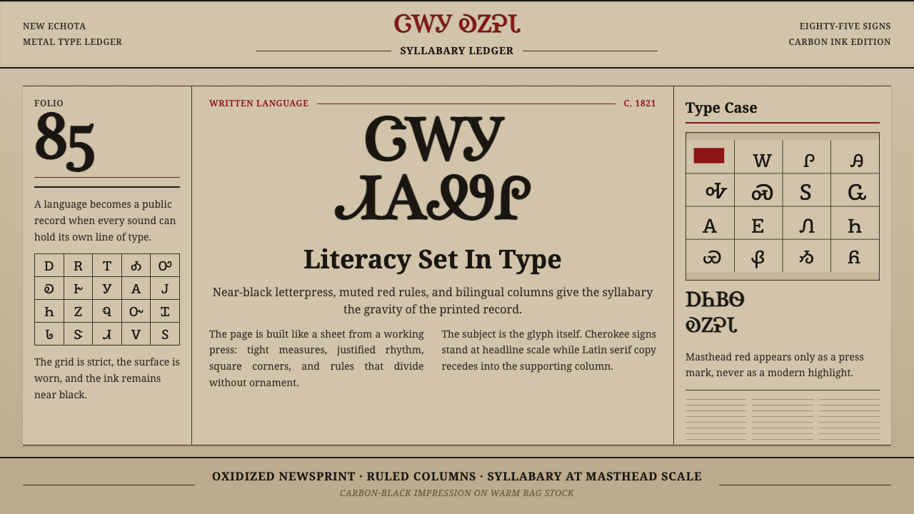 Cherokee SyllabaryLiteracy as inked record. Carbon type, muted red rules, and syllabary on tan…
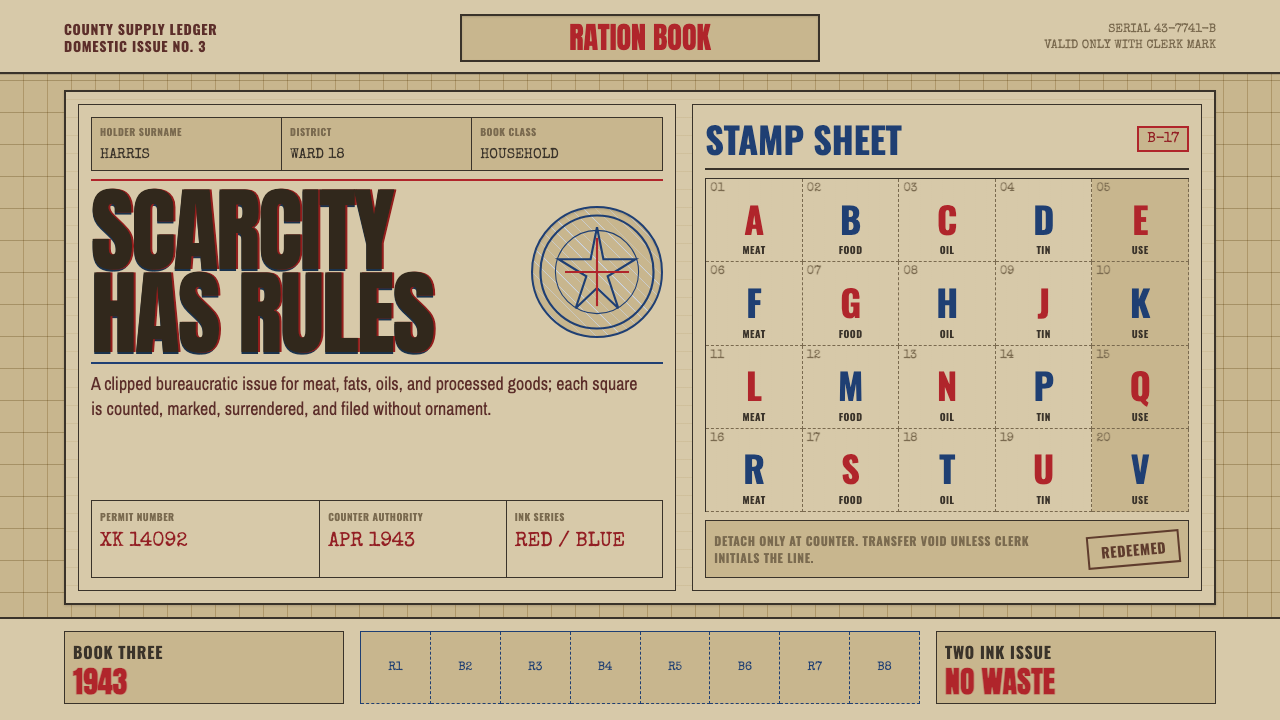 Wartime Ration CouponScarcity made visible. Buff card, red-blue overprint, and perforated grids do…
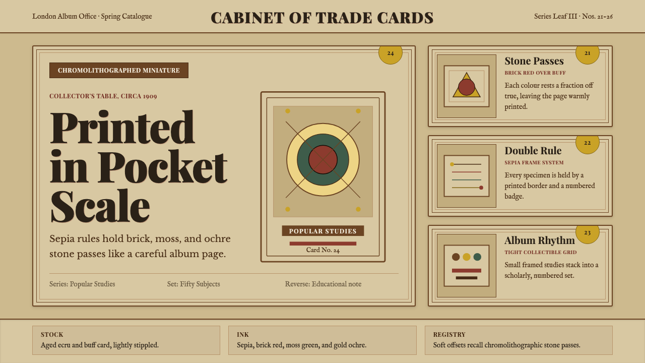 Cigarette Card SetCollectible scholarship. Sepia double-rules, buff stock, and ochre badges fra…
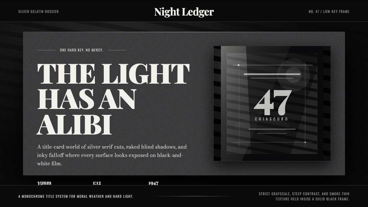 Film Noir ChiaroscuroLight is the crime. Silver serif cards, blind stripes, and grain carve drama…
 LIFE Magazine (Red-Banner)Photojournalism stripped bare. One red banner, cream newsprint, stark black p…
 National GeographicAuthority frames wonder. Yellow border, Bitter slab type, and warm paper make…