What is Wartime Ration Coupon?
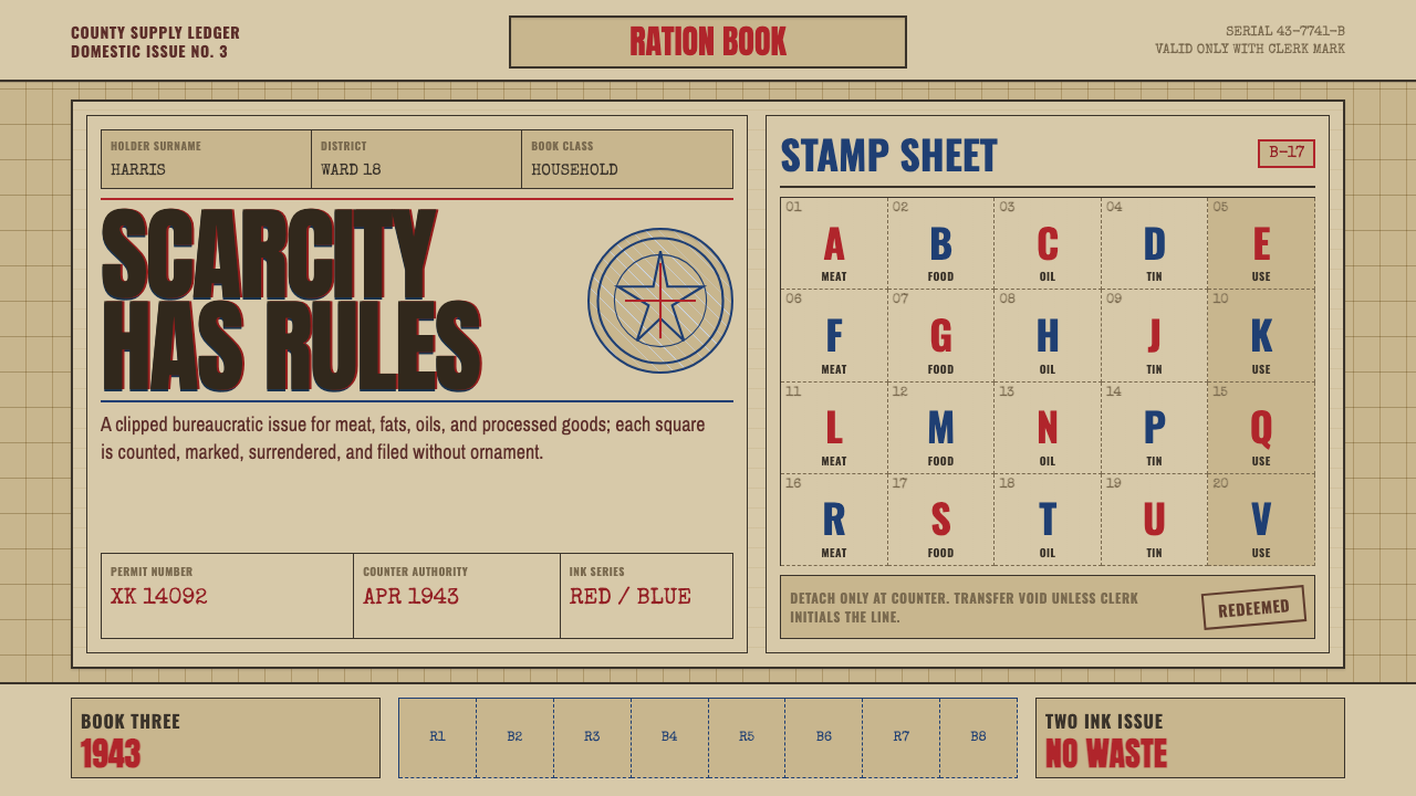
Wartime Ration Coupon makes scarcity visible — buff government card, a red-and-blue overprint, and numbered perforated stamp grids that do the design work with no decoration at all.
Wartime Ration Coupon in brief
Wartime Ration Coupon is drawn directly from a real bureaucratic object: the United States War Ration Book, issued to civilians during the Second World War under the authority of the Office of Price Administration. The specific reference is War Ration Book Three, distributed in 1943, printed on cheap buff-colored card stock under wartime paper and material controls. Every visual trait of the style traces back to a practical constraint of that document rather than an aesthetic choice.
The book's pages were composed of small numbered stamps arranged in tight, repeating grids, each stamp perforated so it could be torn out and surrendered at a shop counter in exchange for a controlled quantity of goods — sugar, meat, gasoline, shoes. An eagle seal and heavy condensed gothic lettering marked the book as a federal document, while the stamps themselves were kept deliberately small and undecorated, since their only job was to be counted, torn, and consumed.
The signature color move is a two-ink overprint: a dominant red used for primary text and framing, layered against a deep, utilitarian blue associated with processed and rationed food categories, both pressed onto economy-grade card that reads closer to newsprint than to fine stationery. Nothing in this system is decorative. Every mark — the seal, the numeral, the perforation line — exists because the document needed to function as a controlled, trackable unit of scarcity.
Where does Wartime Ration Coupon come from?
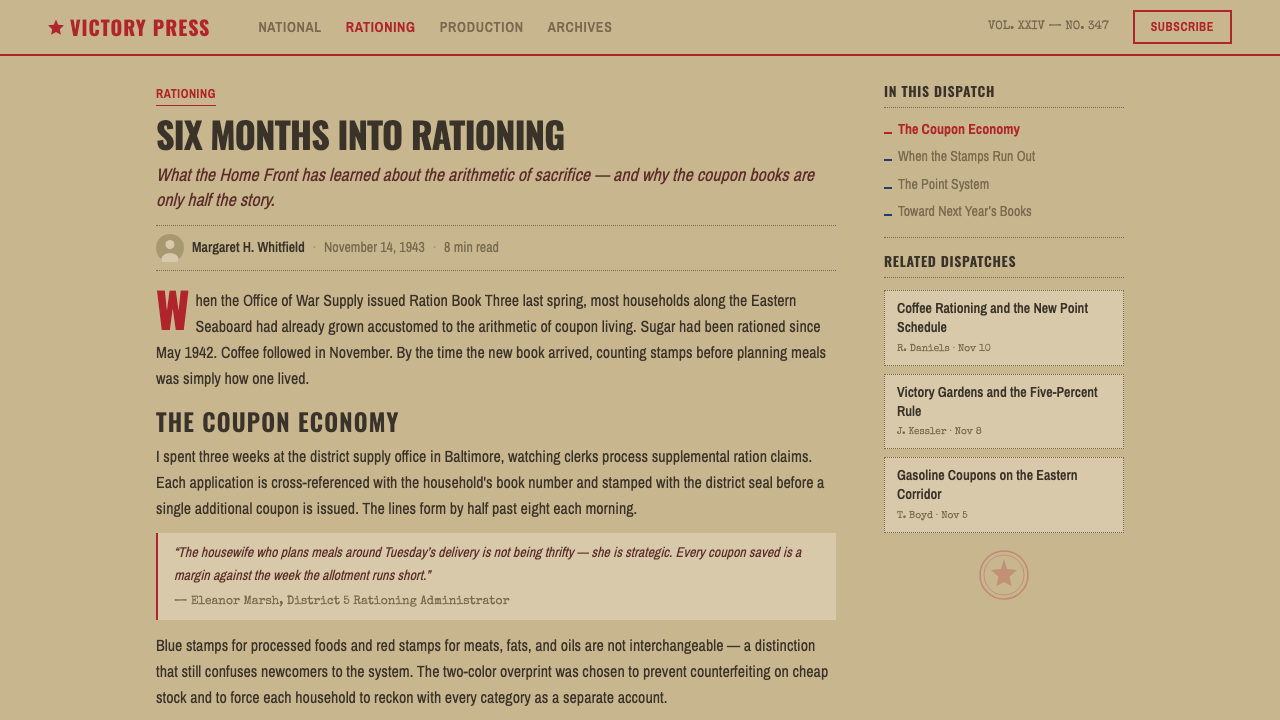
The United States entered rationing in 1942 as wartime demand strained supplies of food, fuel, rubber, and metal, and the Office of Price Administration was given federal authority to control prices and allocate scarce goods among the civilian population. Rationing was framed publicly as a matter of shared sacrifice and fairness: every household, regardless of income, received the same allotment of controlled goods, tracked through a system of ration books and stamps rather than money alone.
War Ration Book Three, issued in 1943, was one of several ration books distributed to American households over the course of the war, each covering different categories of controlled goods as shortages shifted. Books were issued per person, including children, and had to be presented alongside cash at the point of sale; a shopper without the correct stamp simply could not buy the item, no matter how much money they had. This made the ration book, not currency, the true limiting factor in wartime consumption.
The design of these books was governed entirely by function. Government printers working under wartime paper rationing used the cheapest viable card stock, and the OPA's own visual identity — the eagle seal, the condensed gothic typography associated with federal notices — was applied for authentication rather than branding. The overprinted color scheme served a practical anti-counterfeiting and sorting purpose: different stamp categories were color-coded so that shopkeepers and administrators could quickly identify which stamps corresponded to which controlled good.
This body of ration documentation is preserved today primarily through the US National Archives, which holds original ration books, OPA administrative records, and public information materials from the period. The visual austerity of these documents has since become a recognizable shorthand for wartime civilian experience more broadly — the sense of a bureaucracy stretched thin, printing on whatever paper it could get, prioritizing legibility and control above all else.
What defines the Wartime Ration Coupon look?
Color
A buff, economy card-stock ground carries a two-ink overprint of a dominant red and a deep, utilitarian blue. There is no third color and no gradient — the palette is fixed by what wartime printing could actually produce cheaply and in bulk, and every hue serves an identification purpose rather than a decorative one.
Typography
Heavy condensed gothic lettering, the kind associated with federal notices and stencils of the period, dominates headers and official markings. Body numerals and instructional text are set plainly and small, prioritizing density and legibility at a small physical scale over any expressive quality.
Grid
Small numbered stamps repeat in a tight, unbroken grid across the page — the visual rhythm of a page entirely given over to accounting rather than storytelling. This grid is the system's dominant compositional device: every other element organizes around it rather than the reverse.
Perforation
Dashed perforation lines separating individual stamps are a functional cue borrowed directly from the physical document — they signal that an element is meant to be detached, torn, and surrendered, giving the whole system a sense of consumable, single-use utility rather than a permanent, decorative surface.
Official seal
An eagle seal, or similar bureaucratic emblem, anchors the composition as a mark of federal authenticity. Unlike a decorative logo, it is meant to read as a stamp of official verification — plain, centered, and repeated in the same position rather than varied for visual interest.
Economy stock texture
The card ground reads as cheap, mass-produced stock rather than fine paper — closer in feel to newsprint than to stationery. This roughness is not a flaw to be smoothed over but a defining trait: it communicates the material scarcity that the entire document exists to manage.
Bureaucratic density
Every available surface carries numbered, functional information — there is no empty margin left purely for breathing room. This density is itself expressive: it reflects a document whose entire purpose was maximum accounting efficiency within a fixed, cheap sheet of card.
Who shaped Wartime Ration Coupon?
The federal agency granted authority in 1942 to control prices and ration scarce civilian goods during the Second World War. The OPA designed and issued the War Ration Books, including Book Three of 1943, establishing the visual template of numbered stamps, official seals, and overprinted color-coding that this style is built from.
The federal repository that preserves original War Ration Books, OPA administrative records, and wartime public information materials. Its holdings are the primary surviving source for the visual details this style draws from — the specific card stock, ink colors, and typographic conventions of 1943 rationing documents.
How do you use Wartime Ration Coupon today?
Wartime Ration Coupon is a style of enforced austerity — every application should ask what a real bureaucratic scarcity document would actually need to communicate, and refuse anything beyond that.
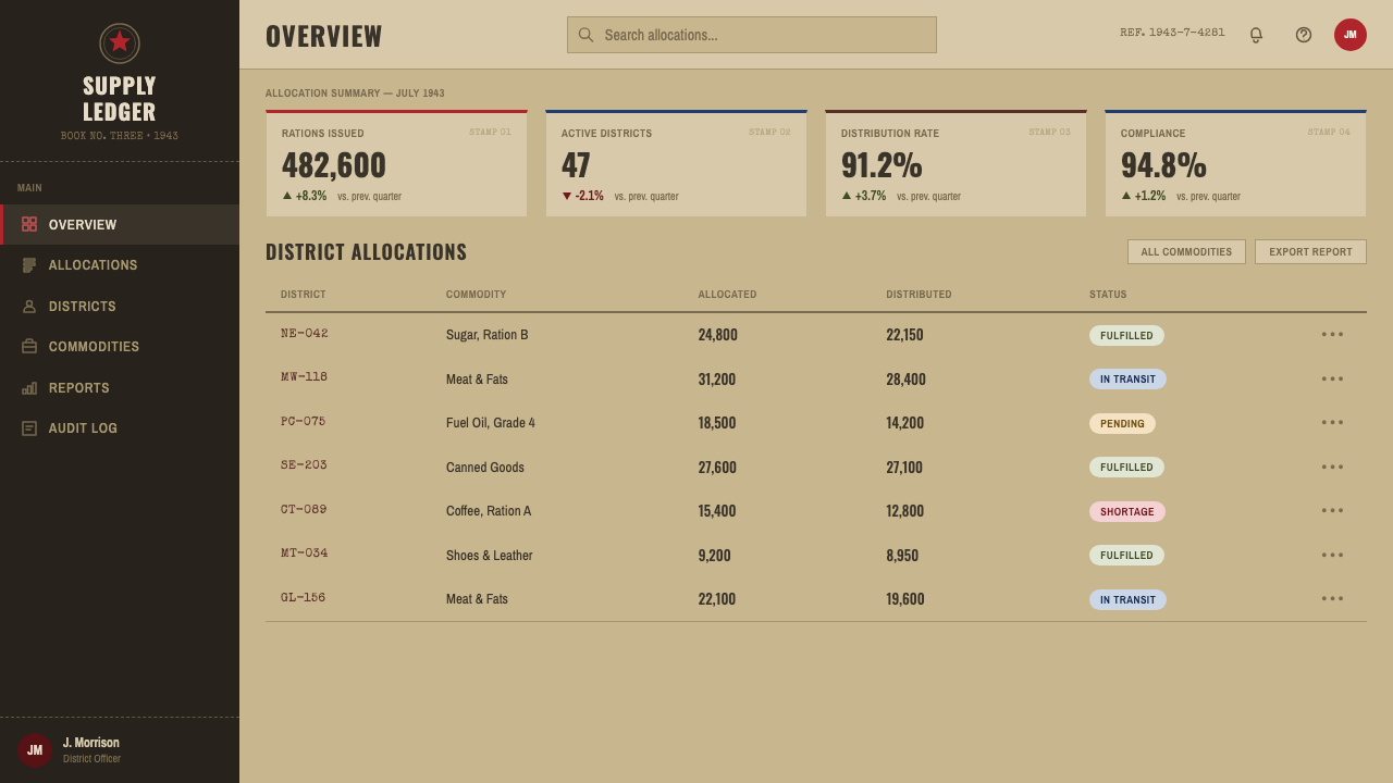
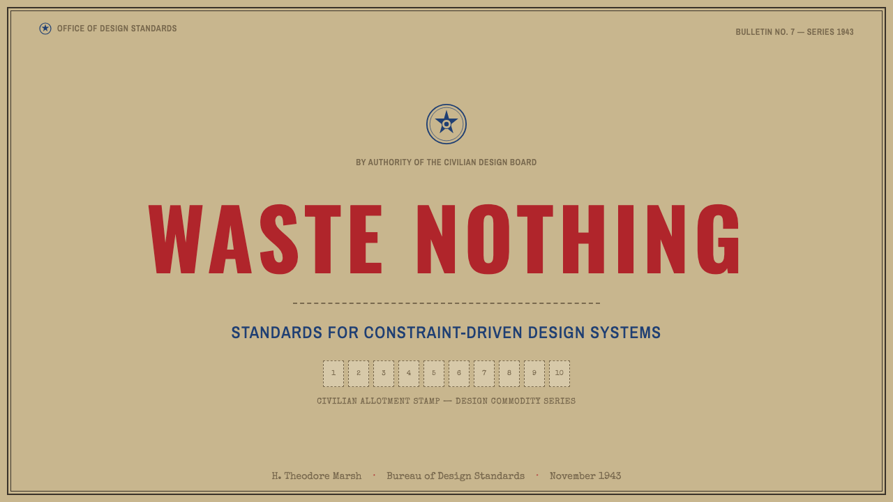
For presentation slides, the style works well for cover pages that need to convey urgency, constraint, or historical gravity — a title set in heavy condensed gothic type against the buff card ground, with a simple seal-like mark anchoring the composition. Content slides should lean into the grid-of-small-units logic: data presented as repeating numbered blocks rather than flowing paragraphs, echoing the stamp-sheet structure directly.
For web interfaces, this style is a strong match for products dealing with quotas, allocations, credits, or limited inventory — a usage-tracking dashboard, a limited-drop e-commerce page, or any interface where the core user action is 'redeem this unit before it's gone.' Pricing pages can use the overprint red-and-blue logic to distinguish tiers functionally, the way the original stamps distinguished goods categories, rather than through modern gradient or shadow-based differentiation.
For editorial and marketing work, the style suits historical storytelling, campaigns about scarcity or sustainability, and limited-edition product launches where a sense of 'only so many available' needs to be felt rather than just stated. The perforation motif in particular works well as a literal call-to-action device — a coupon to tear out, in digital or print form.
A common mistake is softening the style's roughness — smoothing the card texture, brightening the palette, or adding modern rounded corners to the stamp grid. Any of these moves undoes the document's core honesty: this style's authority comes from looking exactly like what it was, an underfunded wartime bureaucracy printing on the cheapest stock available, not from looking polished.
Wartime Ration Coupon — FAQ
Why does this style avoid gradients and polish so completely, given that most historical styles allow some refinement?
Because the source document was never meant to be refined — it was an emergency wartime artifact, produced under literal paper and ink shortages, whose only job was to function as a trackable unit of rationed goods. Adding polish contradicts the object's entire reason for existing. Other historical styles often draw from luxury objects where refinement was the point; this one draws from a document whose crudeness was itself a byproduct of the scarcity it managed.
Is the red-and-blue overprint just a color choice, or does it mean something?
It originates as a practical identification system: different ink colors on ration stamps allowed shopkeepers and administrators to quickly sort which stamps corresponded to which category of controlled goods, with blue specifically associated with processed food categories in the original documents. Using the two colors together is therefore a functional convention inherited from the source material, not an arbitrary aesthetic pairing — applying it means treating the two colors as carrying distinct categorical meaning, not just visual contrast.
Can this style be applied to anything other than scarcity or rationing themes?
It works best where a genuine sense of limitation, allocation, or accountability is part of the actual product logic — quota systems, credit-based platforms, limited inventory drops. Applying it purely for its graphic novelty, to a product with no actual scarcity or allocation logic, tends to feel like an empty costume rather than a functional match, since the entire visual system is built around communicating real constraint.
Why are the stamp units so small and densely packed instead of given more breathing room?
The original ration books had to fit a full set of controlled-goods allotments onto a fixed number of pages of the cheapest available card, under active wartime paper rationing. Density was a material necessity, not a design preference. A version of this style with generous whitespace between stamps would misrepresent the actual constraint the document was built to manage — the crowding is part of the honesty.
What kind of imagery, if any, fits within this style?
The original documents carried almost no illustrative imagery at all — only the eagle seal, numerals, instructional text, and stamp borders. Where imagery is needed in a contemporary application, it should follow the same restraint: simple line-drawn icons standing in for goods categories (a loaf, a can, a tire) rather than photographic or richly rendered illustration, keeping faith with a document that had neither the budget nor the purpose for anything more elaborate.
Related design styles
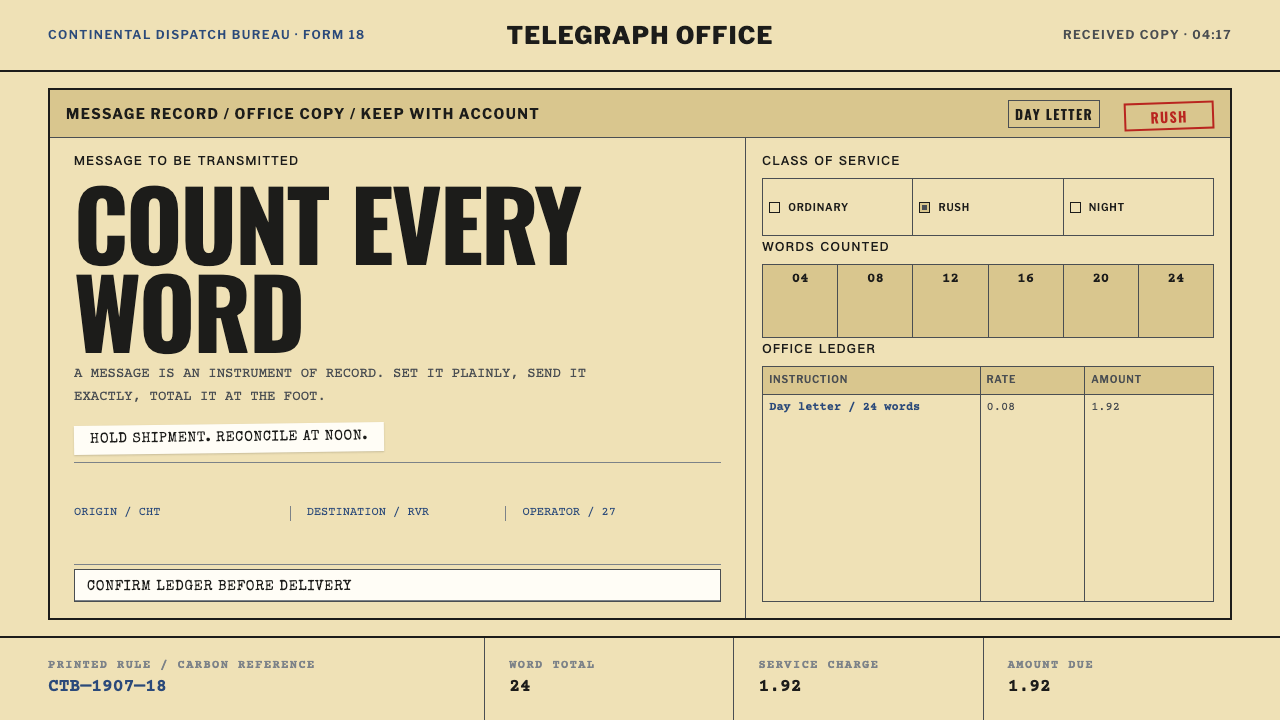 Telegraph Office FormA page that counts. Yellow pulp stock, all-caps type, and ruled charge fields…
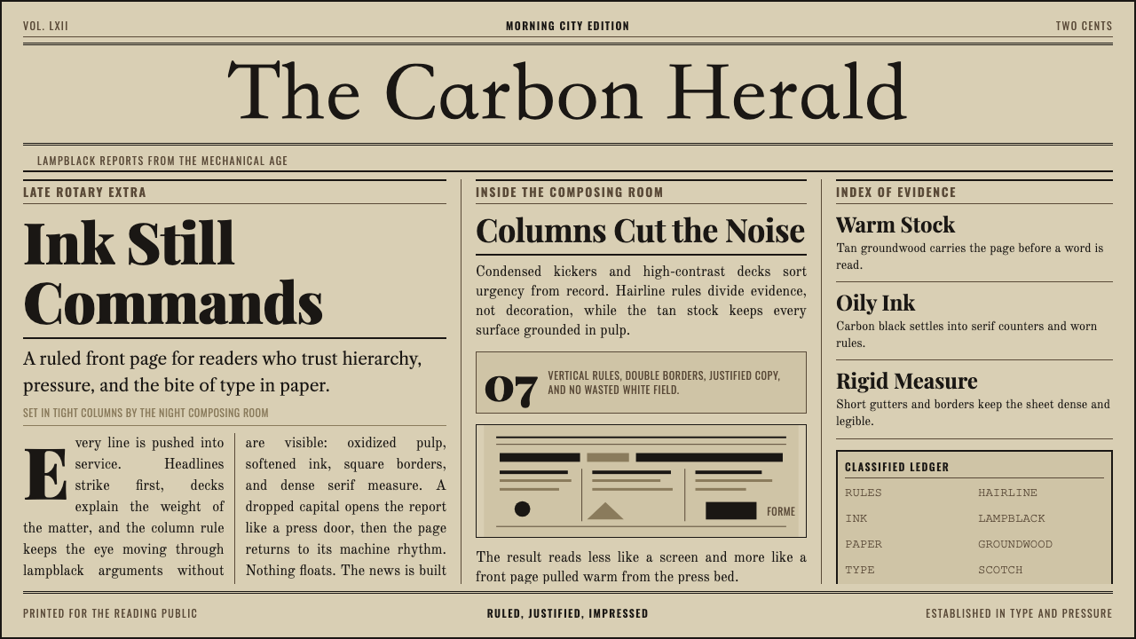 Broadsheet LetterpressAuthority in ink. Lampblack serif decks lock into tan paper with strict ruled…
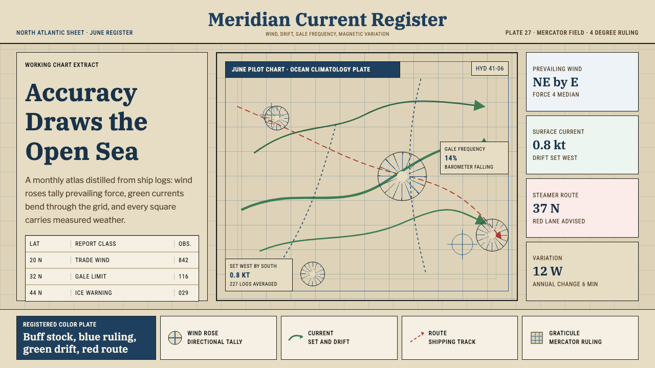 Ocean Pilot ChartAuthority by accumulation. Blue graticules and green currents crowd warm char…
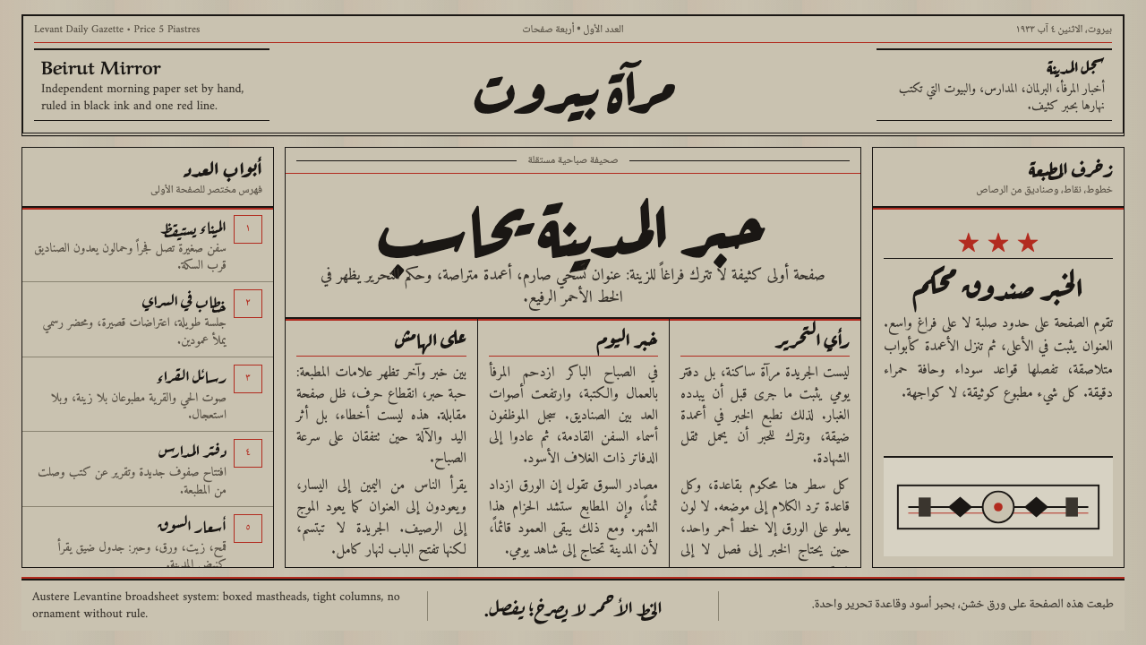 An-Nahar Beirut PressDense authority. Aged newsprint, black naskh columns, and one red rule hold t…
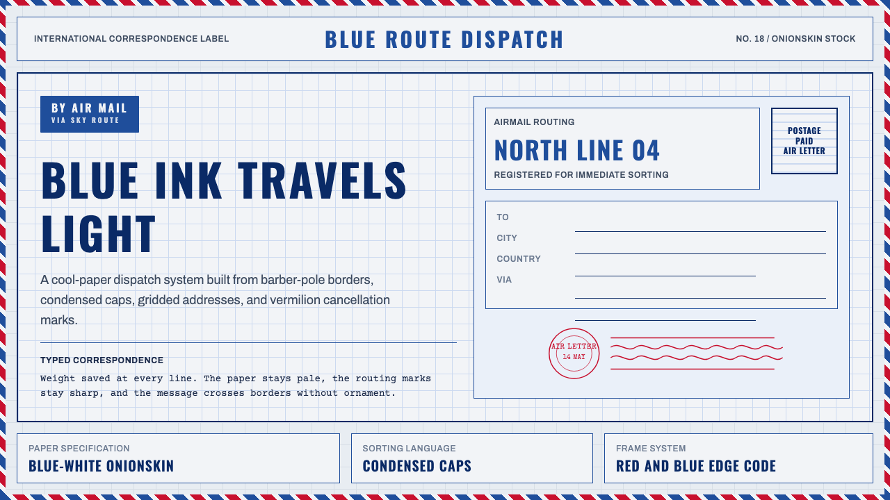 Par Avion Air MailPostal lightness made strict. Onionskin blue, Oswald caps, and red-blue edge…
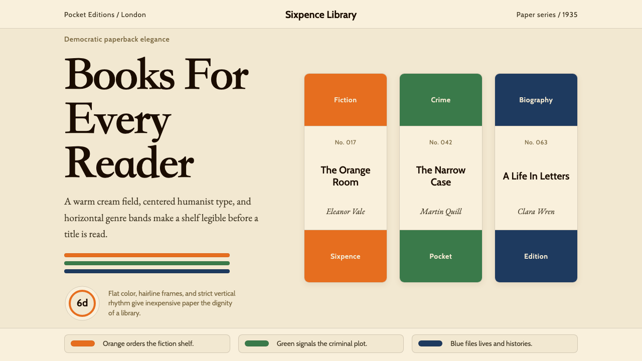 Penguin Books (1935)Paperback democracy. Cream stock, Cabin type, and orange-green-blue bands mak…