What is Cherokee Syllabary?
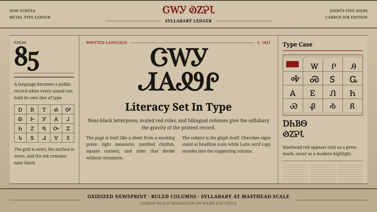
Before Sequoyah, no one had ever written the Cherokee language. By 1828 his 85-character syllabary was carrying a bilingual newspaper off a cast-metal press — and a design system was born from the way ink met aging rag paper, ruled columns held competing scripts, and carbon-black type announced a civilization's claim to literacy.
Cherokee Syllabary in brief
Cherokee Syllabary is a design system rooted in the material culture of the Cherokee Phoenix, the first Native American newspaper, published beginning February 21, 1828, at New Echota in present-day Georgia. Its visual identity is drawn from the medium itself: dense carbon-black letterpress ink bitten into warm, aging rag newsprint; rigid ruled column dividers; and the bilingual masthead that set Sequoyah's syllabic characters alongside Latin serifs of the same weight and dignity.
The system is not decorative revival — it is documentary precision. Every element refers back to something that physically existed: the warm tan of oxidized newsprint, the slight unevenness of hand-set type, the compressed leading of a paper that had to fit two alphabets into the same column width. The restraint is the point. In a political context where Cherokee literacy itself was contested, every choice of ink, rule, and spacing was also a statement.
Visually, the system operates through tonal contrast rather than hue contrast. There are no bright colors. The palette is anchored in muted, oxidized red — the color of period rule lines and section markers — against a warm tan ground, with carbon-black type providing all the weight. The result reads as simultaneously archival and urgent: old enough to carry authority, sharp enough to carry news.
Where does Cherokee Syllabary come from?
Sequoyah — also known by his English name George Gist or Guess — was a silversmith and warrior of the Cherokee Nation who, between roughly 1809 and 1821, worked in isolation to create a complete writing system for a spoken language that had never been written. He had no formal education and could not read English. His achievement was unprecedented: a single individual inventing a complete, functional script for a living language, from first principles, without access to pedagogical models for how syllabaries are constructed. When he demonstrated the system to Cherokee chiefs in 1821, his daughter Ayoka read from a letter he had written — proving the script could be learned and transmitted.
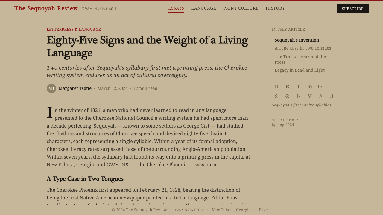
The system he created contained 85 characters (later reduced to 84 or 86 in some versions), each representing a syllable of the Cherokee language. The characters drew eclectically on forms Sequoyah had observed — Roman letters, numerals, and marks from English-language texts he had handled — but reassigned them entirely to Cherokee phonetic values. A shape that looked like a Roman 'D' meant something completely different in Sequoyah's syllabary. This deliberate visual borrowing without semantic borrowing was its own political act: using the colonizer's letterforms to build an independent system of meaning.
Adoption was rapid. The Cherokee Nation officially endorsed the syllabary in 1825. The Cherokee Phoenix launched its press in 1828, published in parallel columns of Cherokee and English, edited by Elias Boudinot and supported by missionary printer Samuel Worcester, who imported the cast-type punches needed to set the syllabary in metal. At its height the paper reached readers across the Cherokee Nation and into sympathetic white abolitionist and reform communities in the northeast. By the 1830s, literacy in the Cherokee syllabary was widespread — some accounts suggest higher than among white American neighbors — making the Cherokee Nation one of the most literate societies in North America at the time.
The Cherokee Phoenix ceased publication in 1834, under pressure from the United States government and the forced removal crisis that would culminate in the Trail of Tears in 1838–1839. But the syllabary survived removal and continued to be used for correspondence, religious texts, and community record-keeping throughout the nineteenth century and into the twentieth. Today it is formally encoded in the Unicode standard (block U+13A0 through U+13FF) and used in Cherokee-language education and revitalization programs. The visual design system derived from the newspaper's material form is thus a record of one of the most consequential acts of cultural self-determination in American history.
What defines the Cherokee Syllabary look?
Ground and Ink
The defining tonal relationship is carbon-black letterpress ink against warm, oxidized-tan newsprint — not the bright white of modern paper, not the cream of fine book stock, but the particular warm grey-brown of rag paper that has aged in air. The ground is not neutral: it carries the record of time. Against it, dense black type registers with the authority of press impression, each character slightly bitten into the surface. This is the system's defining contrast, and everything else in the palette is subordinate to it.
Ruled Column Structure
Column rules — thin, precise, printed in muted red or dark ink — are the skeleton of the layout. They do structural and symbolic work simultaneously: dividing Cherokee text from English text, organizing the bilingual page into parallel authorities, and giving the eye a path through dense typeset matter. The rule is not decorative. In period newspaper typography, rules were load-bearing. They told readers where one jurisdiction ended and another began, and in a bilingual publication this function took on legal and political weight.
Bilingual Typography
The Cherokee Phoenix set syllabary characters and Latin serif letterforms at the same optical weight and in the same column widths, granting them visual parity. This was a formal decision with political implications: neither script was the dominant text, neither was translated caption. The syllabary ran left to right just as English did, using the same baseline grid. The typographic challenge was considerable — syllabary characters have different vertical proportions than Latin letters — and the solutions the compositors found became part of the system's visual identity.
Muted Accent Color
The only color beyond black and the warm tan ground is a muted, oxidized red — the shade of aged printer's red ink, not the vivid scarlet of contemporary design. It appears in horizontal rules dividing the masthead from the body, in section markers, and occasionally in initial capitals or decorative column ornaments. Its role is architectural: it marks transitions and hierarchies, not calls to attention. The saturation is deliberately low, consistent with what iron-based pigment inks produced on absorbent rag stock in the early nineteenth century.
Dense, Compressed Setting
Newspaper economics demanded tight setting: narrow columns, minimal leading, every square inch of paper made to work. The Cherokee Phoenix's compositor worked under these constraints across two scripts simultaneously. The visual result is densely packed text blocks with a very small ratio of white space to content — the opposite of contemporary screen-optimized readability. Applied as a design aesthetic, this density reads as archival authority, as the accumulated weight of record, as the visual character of a document that has something to say and limited space to say it.
Serif Letterforms and Syllabic Characters
The system uses period-appropriate serif type — the workhorse book serifs of early nineteenth-century American printing, with bracketed serifs, slight stroke contrast, and moderate x-height. These share the page with Sequoyah's syllabary characters, which have their own internal logic: some suggest letterforms, some suggest numerals, some are wholly original. When set together, they produce a page texture that is neither purely Western nor purely non-Western — a genuinely hybrid typographic surface that is the system's most visually distinctive feature.
Masthead as Monument
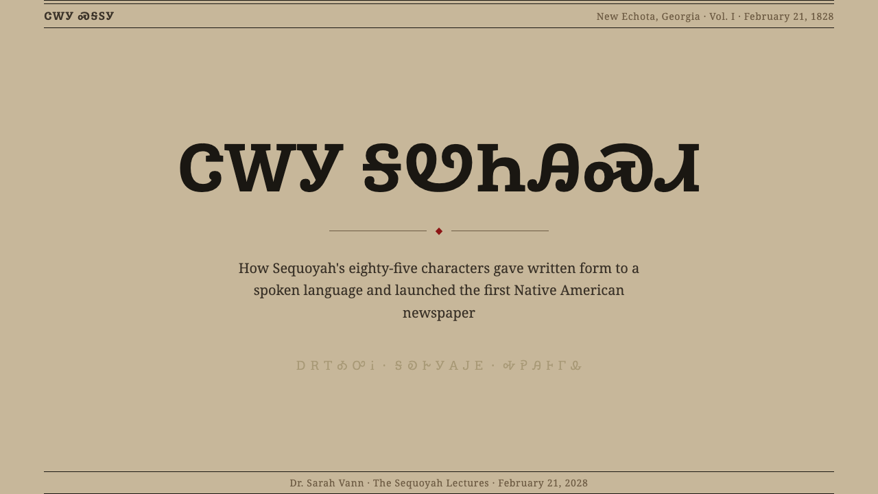
The masthead of the Cherokee Phoenix — with the paper's name set in both scripts above a printed eagle or ornamental rule — functions as more than a title. It is a declaration of existence, a proof of concept, and a political statement compressed into a single typographic block. In the design system, the masthead principle translates to header compositions that use bilingual or dual-register type to assert presence and parallel authority rather than to simply label content.
Who shaped Cherokee Syllabary?
Sequoyah completed his syllabary around 1821 after more than a decade of solitary work, and personally demonstrated it to skeptical Cherokee leaders by having his daughter read aloud from a letter written in it. He was the only person in recorded history to independently devise a complete writing system for a language without prior literacy in any script. He never profited commercially from the syllabary and spent later years traveling to locate Cherokee communities who had migrated westward, reportedly creating a second script along the way. The Cherokee Nation awarded him a silver medal in 1824.
Boudinot was the founding editor of the Cherokee Phoenix and a principal advocate for using the press as a tool of Cherokee political self-representation. He was educated at the Foreign Mission School in Connecticut and returned to the Cherokee Nation convinced that print literacy was essential for the Nation's political survival. His editorials engaged directly with federal Indian policy, land rights, and the debates over Cherokee sovereignty — making the newspaper not merely a cultural project but an active political instrument. His later support for the Treaty of New Echota, which ceded Cherokee lands to the United States, led to his assassination in 1839.
Worcester was a Congregationalist missionary who learned the Cherokee language and worked with Boudinot to establish the Cherokee Phoenix press. He was responsible for the technical challenge of obtaining movable type punches for the syllabary — commissioning the cast-metal type that made it possible to set Cherokee characters in a compositor's stick alongside Latin type. He was imprisoned by the state of Georgia in 1831 for refusing to swear an oath of allegiance to the state and leave Cherokee territory, and his case — Worcester v. Georgia — went to the U.S. Supreme Court, where Chief Justice John Marshall ruled in his favor, though President Andrew Jackson refused to enforce the ruling.
Ayoka is the first recorded person to read the Cherokee syllabary publicly. In 1821, when Sequoyah demonstrated his system to Cherokee leaders, it was Ayoka who read aloud from the letter her father had written, proving that another person could learn and use the script. Her role in the system's authentication was decisive: skeptics suspected that Sequoyah had merely memorized the letter himself, and Ayoka's successful reading under controlled conditions — the leaders dictated to Sequoyah, who wrote, and Ayoka read back what was written — proved the system's transmissibility.
The press itself — the physical cast-metal type, the hand-operated letterpress, the compositing practices developed at New Echota — is a figure in the design history of this system in the same way that a founding typographer is a figure in a typeface's history. The decisions made by the compositors about how to integrate syllabary characters with Latin type, how to set column widths, how to calibrate ink density on rag paper, how to rule the bilingual columns — these were design decisions that created the visual system as a material artifact, not merely a concept.
How do you use Cherokee Syllabary today?
Cherokee Syllabary as a design system is suited to contexts where archival seriousness, documentary weight, and the aesthetics of the printed record are the target register. It is not a style for playful or casual use — the system's origins carry a gravity that demands intentional application. The right contexts are: cultural institutions presenting historical material, long-form editorial that wants the visual character of a printed archive, research platforms dealing with language and literacy, and identity work for organizations whose mission involves heritage, preservation, or community memory.
For presentation slides, the system works most effectively when the ground color matches the oxidized-tan of aged newsprint rather than defaulting to white. Cover slides benefit from a masthead-like composition: the title in a period serif typeface, a thin muted-red horizontal rule beneath it, and secondary information — date, institution, author — set in a smaller weight of the same face. Content slides should treat the ruled column as a structural device: a narrow left column for labels or dates, a wide right column for body text, with the rule marking the division. Avoid centering; the system is built on left alignment and column authority.
For web interfaces and digital publishing, the system translates well to long-form reading experiences — article templates, archival databases, research portals. The key choices: a warm off-white background rather than pure white, a body typeface with bracketed serifs and moderate contrast, and muted red reserved exclusively for horizontal rules and section markers rather than interactive elements. Navigation and metadata should be compact and typographic, not icon-driven. Data visualizations, if needed, should use only the system's muted red and carbon black — no additional hues.
For editorial and marketing contexts, the most effective application is restraint. The system's visual power comes from its material associations — newsprint, press, record — and diluting those associations with contemporary styling undermines the effect. A report or white paper designed in this system should feel like a document someone might find in an archive, not like a contemporary PDF template that has borrowed some period details. Margins should be generous, body text slightly smaller than modern convention, and all color strictly limited to the two-color print palette.
The most common mistake when applying this system is confusing archival aesthetic with generic vintage styling. Cherokee Syllabary is not sepia-tinted nostalgia; it is a specific material and political record. Applications that pull in warm textures, distressed type, or decorative ink-splatter effects import associations from an entirely different tradition — frontier americana, old west typography — that are culturally inaccurate and disrespectful to the system's origins. The discipline required is to stay close to the actual material: warm tan ground, carbon black, muted red rules, bracketed serif type, and nothing else.
Cherokee Syllabary — FAQ
Is this design system specifically Cherokee, or does it represent a broader tradition of Indigenous print culture?
It is specifically Cherokee — rooted in the particular material form of the Cherokee Phoenix, the specific syllabary Sequoyah created, and the historical circumstances of the early nineteenth-century Cherokee Nation. Other Indigenous peoples in North America have their own writing systems and print histories, some older, some newer, and this system does not represent or appropriate those traditions. The visual language is tied to the letterpress technology, the bilingual page structure, and the muted color palette of a specific place and moment in history: New Echota, 1828.
How should designers handle the actual Cherokee syllabary characters if they want to use them in a project?
The Cherokee syllabary is formally encoded in Unicode and is supported by several typefaces, including those developed specifically for Cherokee language revitalization programs. Using the characters decoratively — as pattern or texture without linguistic meaning — is widely considered inappropriate, as they are a functional writing system currently used by speakers of the Cherokee language, not a visual ornament. If the project involves actual Cherokee language content, work with Cherokee language consultants and use typefaces approved by the Cherokee Nation. If the project is drawing on the visual system without literal character use, the aesthetic qualities — the warm ground, the muted red rules, the dense serif setting, the column structure — can be referenced without directly incorporating the script.
What is the relationship between this style and other newspaper or letterpress revival aesthetics?
There is surface overlap — warm paper color, serif type, column rules — but the purposes are different. Contemporary letterpress revival and newspaper aesthetics are typically nostalgic: they invoke the visual texture of old print as a marker of authenticity, craft, or pre-digital charm. Cherokee Syllabary is not nostalgic; it is documentary. The design choices it encodes were made under political duress, in service of a specific survival goal, and they carry that weight. Designs in this system should feel less like a craft beer label borrowing Victorian typography and more like a declaration of record — with the precision and seriousness that implies.
Can this system work for dark-background layouts?
With difficulty. The system's palette is fundamentally about the relationship between dense ink and aging paper — that is, a dark-on-light relationship with a warm, slightly irregular ground. Inverting to dark background produces a result that looks like a photographic negative rather than a print, and the warm oxidized quality that gives the system its historical weight is lost. If a dark version is necessary, the closest approximation would use a very dark warm brown rather than black as the ground, cream or aged-white for type, and the same muted red for rules — maintaining the tonal temperature of the original even as the value relationships are inverted. Pure black backgrounds are inconsistent with the system's material origins.
How does the Cherokee Syllabary design system differ from other writing-system-as-design-inspiration approaches?
Many design systems draw on writing or calligraphic traditions — Arabic calligraphy, East Asian brush scripts, Tibetan letterforms — and treat the script as a formal or decorative resource. Cherokee Syllabary is different because the design system is not derived from the script itself as a formal object, but from the material conditions of the script's first publication. The syllabary's visual forms are not the inspiration; the newspaper's physical artifact is. This means the system's key elements are not calligraphic or script-derived but typographic and archival: column rules, ink weight on paper, the bilingual page structure. The script appears in this system as content, not as pattern.
Related design styles
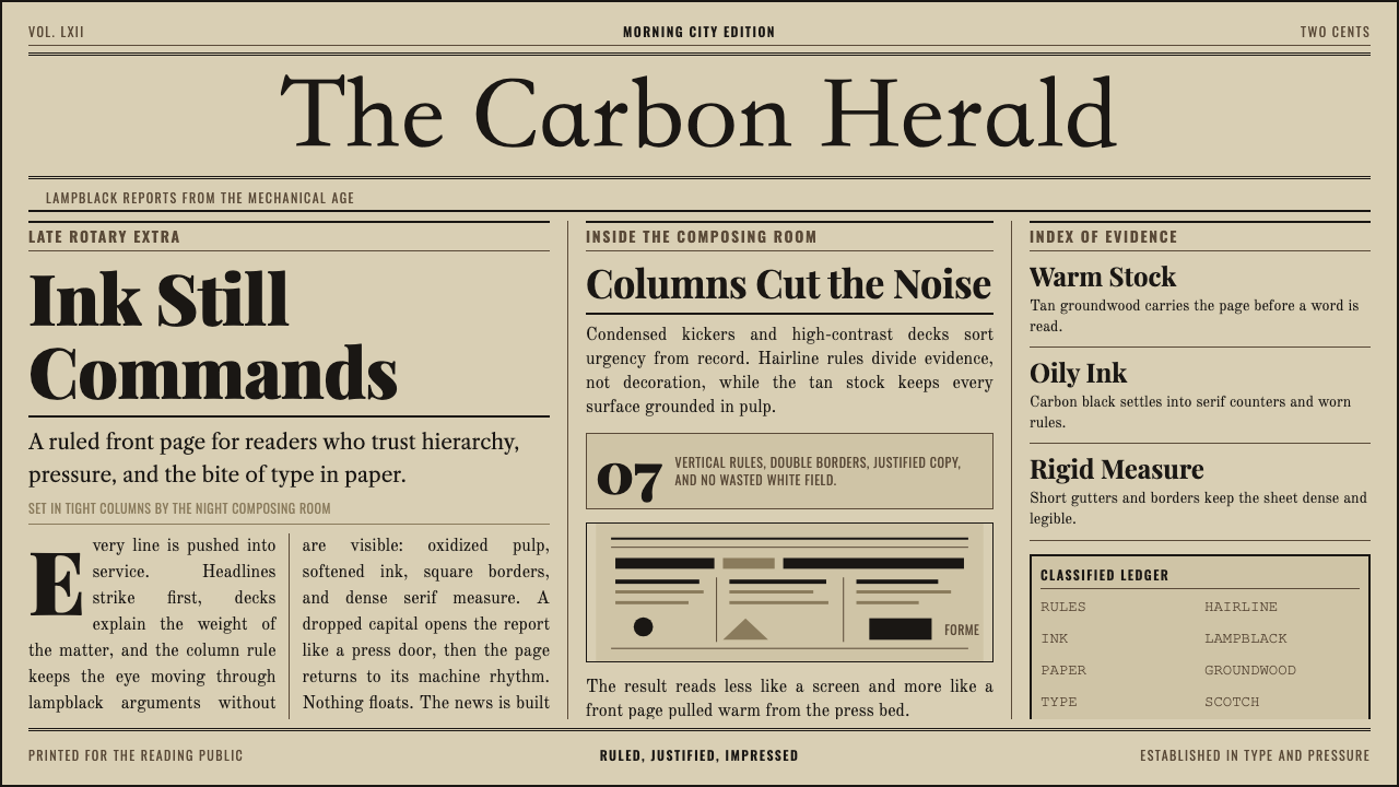 Broadsheet LetterpressAuthority in ink. Lampblack serif decks lock into tan paper with strict ruled…
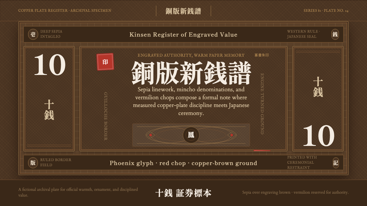 Meiji Japan NoteOfficial warmth. Sepia guilloche, mincho type, and one vermilion seal hold th…
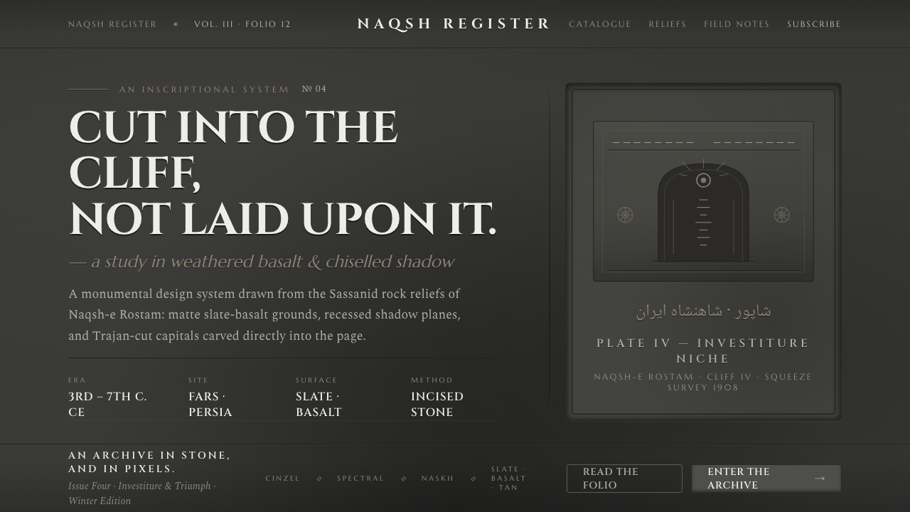 Iranian Dark Stone ReliefCarved into the cliff, not laid upon it. Slate-basalt grays, inset shadows, T…
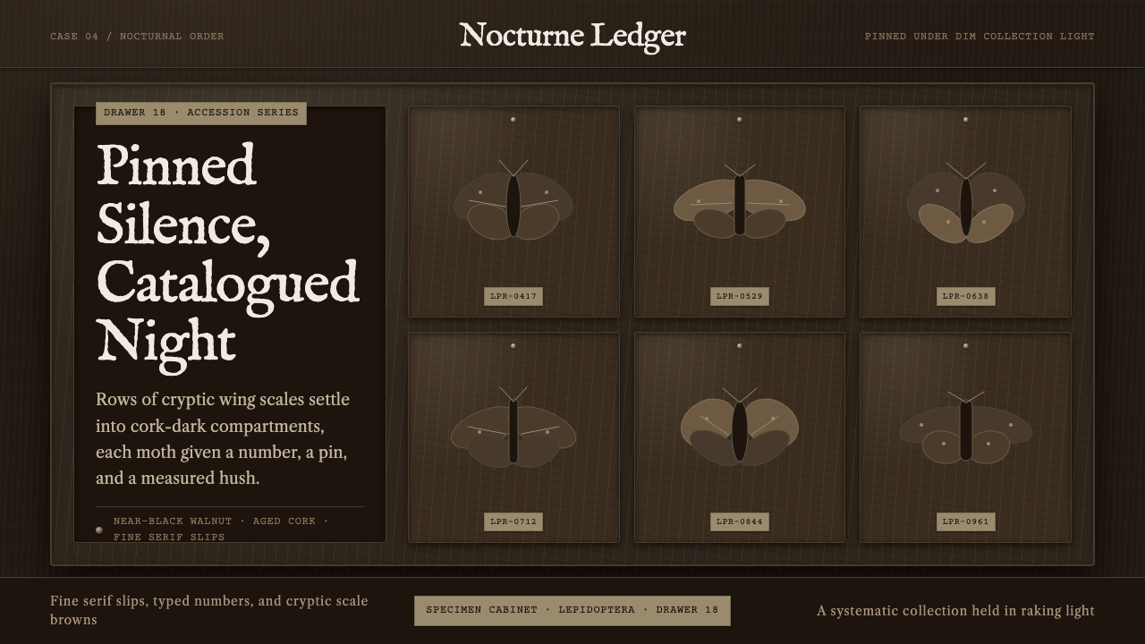 Lepidoptera DrawerDark, ordered hush. Walnut ground, IM Fell type, cork slips, and gridded moth…
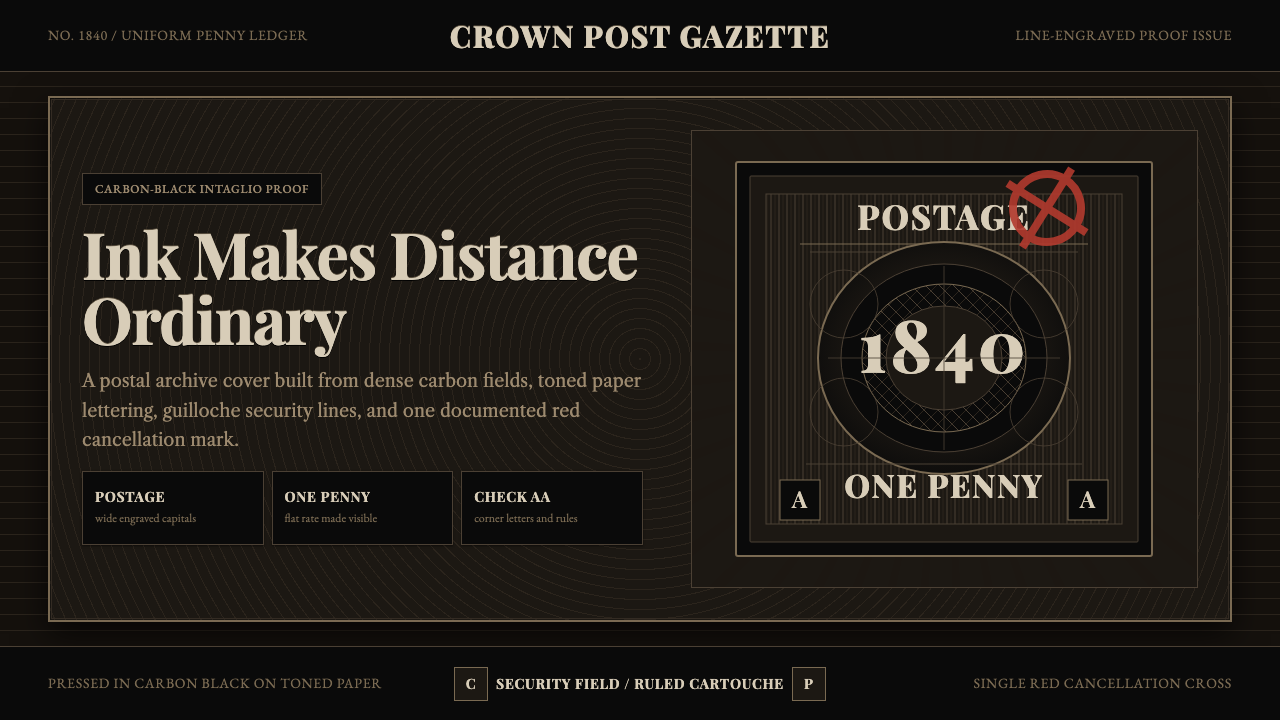 Penny Black StampBlack carries authority. Guilloche lines, Victorian serifs, and one red cross…
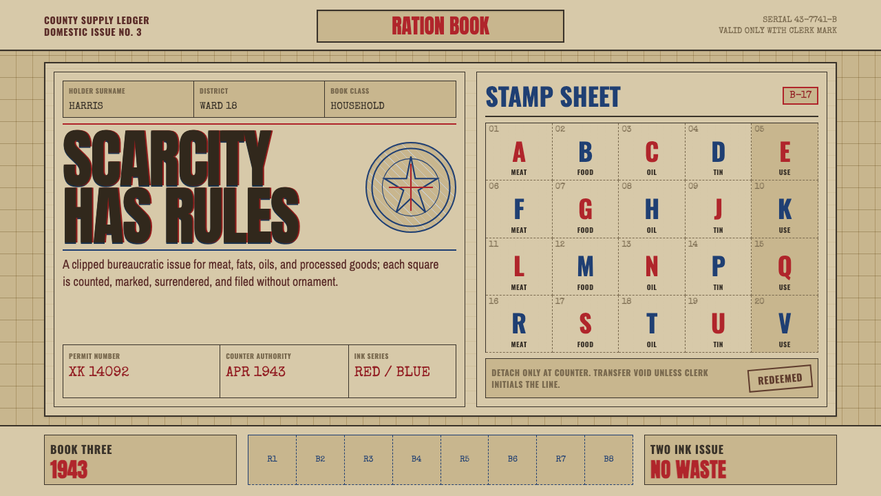 Wartime Ration CouponScarcity made visible. Buff card, red-blue overprint, and perforated grids do…