What is Audubon Birds of America?
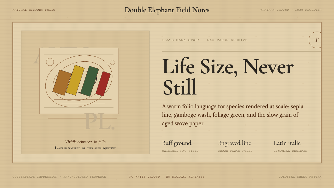
Audubon Birds of America is the apex of Romantic-era natural history art — life-size birds rendered in sepia aquatint then hand-colored with layered watercolor, set against the warm buff of aged Whatman rag paper. It speaks in earth tones, asymmetric composition, and the confident italic of engraved Latin binomials.
Audubon Birds of America in brief
Audubon Birds of America is a monumental natural history publication produced between 1827 and 1838, comprising 435 hand-colored double elephant folio plates depicting 497 species of North American birds at life size. Each plate combined the precision of engraved line with the warmth of hand-applied watercolor, producing images that were simultaneously scientific documents and artworks of the highest ambition.
The visual system is defined by its warm, restrained palette: engraving brown, gamboge ochre, muted foliage greens, and the buff ground of aged rag paper — never stark white, never a cool gray. Compositions are asymmetric and dynamic, arranged so that even a large heron or eagle fits naturally within the sheet, bending or coiling to accommodate the frame rather than being cropped. This gives every plate a sense of contained life.
Typography follows the conventions of early 19th-century letterpress: humanist serif faces in the tradition of Caslon and Garamond, with Latin binomials set in italic beneath each subject. The engraved script of species names, vernacular English titles, and the engraver's imprint together create a typographic voice that is scholarly without being austere — formal, but alive with the grain of hand-set metal type.
Where does Audubon Birds of America come from?
John James Audubon was born in 1785 in Saint-Domingue (present-day Haiti), the illegitimate son of a French sea captain and a Creole chambermaid. He was raised in France, studied briefly in Paris — where a brief encounter with Jacques-Louis David's studio may have informed his understanding of dramatic composition — and emigrated to the United States in 1803. His early years in America were commercially unsuccessful; he tried and failed at several business ventures in Kentucky and Louisiana. It was during these years of frontier life that he accumulated the observational drawings and taxidermy specimens that would eventually become The Birds of America.
Audubon's method was unconventional for his time. Rather than studying preserved museum skins mounted in stiff poses, he shot birds in the field, wired them into lifelike positions, and drew them immediately — often the same day — before they lost their color and flexibility. He worked on large paper sheets, frequently at a scale of one-to-one with the bird, allowing him to capture the specific musculature of a wing extended in flight or the exact curve of a pelican's neck folding into its breast. This insistence on life scale and observed posture is what sets the plates apart from all competing natural history illustration of the period.
Unable to find an American publisher willing to undertake the project at the scale he envisioned, Audubon sailed to Britain in 1826 and quickly found enthusiastic subscribers among the scientific and aristocratic elite. The engraving and printing were executed by William Home Lizars in Edinburgh and then, from 1827 onward, by Robert Havell Jr. in London — a collaboration that proved decisive. Havell's workshop translated Audubon's watercolor originals into aquatint copperplate engravings, which were then hand-colored by a team of watercolorists. The double elephant folio format — each sheet approximately 100 by 65 centimeters — was chosen specifically to accommodate life-size depictions of the largest species.
Publication took eleven years and the complete work ran to four volumes. Subscribers paid a substantial sum for each installment of five plates, and the total cost of a complete set placed it among the most expensive books of the 19th century. Only around 120 complete sets are known to survive. Audubon continued to travel and collect through the 1830s, expanding the work with species from Florida, Labrador, and the American West, and published a smaller octavo edition — the 'Royal Octavo' — between 1840 and 1844, which reached a far wider audience and cemented his reputation on both sides of the Atlantic.
What defines the Audubon Birds of America look?
Ground and Paper Tone
The defining surface of the Audubon system is not white but buff — the warm, slightly aged tone of Whatman rag paper. This ground is never neutral; it participates actively in every plate, reading as sunlit sky, dried grass, sandy shoreline, or bleached wood depending on context. Reproducing the style means accepting that the background is always a color, always contributing warmth, and that anything pure-white is already a departure from the source.
Earth-Tone Palette
The palette draws from the pigments available to early 19th-century watercolorists: sepia, burnt sienna, raw umber, gamboge, Prussian blue, and verdigris. These are not clean primaries — they are complex, slightly muted hues that shift in temperature as they layer. The result is a warmth that cannot be reproduced simply by picking 'brown' colors; it requires layering and allowing undertones to surface. Bright, saturated, or cool colors are foreign to the system and signal inauthenticity immediately.
Life-Size, Full-Bleed Composition
The most radical compositional decision in the Audubon plates is scale. Birds are depicted at actual body size, which forces the composition to accommodate the creature rather than fit it neatly into a conventional frame. Large birds coil their necks, stretch a wing to the corner, or turn their bodies diagonally across the sheet. This produces naturally asymmetric, dynamic layouts that feel discovered rather than designed. White space is not padding but the actual empty territory of sky or water surrounding the subject.
Engraved Line and Texture
Beneath the watercolor, every plate carries the structural skeleton of the aquatint engraving. Fine parallel hatching builds feather texture, cross-hatching suggests shadow beneath a wing, and the plate-mark pressed into the paper is visible at the image's edge. This engraved substrate gives the style its characteristic depth: the image is never purely painted but always slightly mechanical, always carrying the evidence of the press. Reproducing the aesthetic digitally requires simulating this layered quality — color over structure, not color alone.
Scholarly Typography
Each plate carries a disciplined typographic system drawn directly from 19th-century letterpress convention. Species names appear in two registers: the formal Latin binomial in italic, and the vernacular English name in roman. Below these, the engraver's imprint marks provenance. The typefaces belong to the humanist serif tradition — forms with visible calligraphic influence, bracketed serifs, and slightly uneven stroke width — rather than the rationalist moderns that would come to dominate later in the century. This typographic voice contributes to the style's air of careful scholarship.
Botanical and Habitat Context
Many plates include the bird's immediate habitat context: a branch of berries, a spray of marsh grass, a stump of rotting wood. These secondary elements are handled with the same observational precision as the birds — botanically accurate, rendered with attention to the specific texture of bark or the translucency of a berry's skin. They are never decorative additions but ecological facts, situating each species within its world. This contextual specificity is a major part of what gives the Audubon aesthetic its sense of documentary authority combined with visual richness.
Aging and Patina
Two centuries of existence have given surviving originals — and high-quality reproductions derived from them — a quality that cannot be faked by simply applying a sepia filter. True Audubon patina involves subtle foxing, slight unevenness in the paper's buff tone, the faint grid of the paper's laid and chain lines visible at certain angles, and color that has shifted slightly from its original freshness toward deeper amber and cooler green. Designs that invoke this aesthetic should resist the temptation to simulate aging crudely; the goal is the quiet authority of an object that has been well-preserved, not the theatrical decay of deliberate distressing.
Who shaped Audubon Birds of America?
Audubon (1785–1851) was the central figure of the project in every sense — the field observer, the watercolorist, the entrepreneur who secured British subscribers, and the relentless self-promoter who shaped his own legend as the 'American woodsman.' His observational method — shooting specimens fresh and wiring them into lifelike poses before drawing — was the technical innovation that made the life-size depictions possible, and his insistence on the double elephant folio format reflected his ambition to produce a work of undeniable monumentality.
Havell (1793–1878) was the London engraver and publisher who executed the bulk of the Birds of America plates from 1827 onward, following the early work begun by William Home Lizars in Edinburgh. His workshop translated Audubon's watercolor originals into aquatint copperplate engravings and supervised the hand-coloring process. The technical quality of Havell's engraving — the fineness of the hatching, the control of the aquatint tone — was central to the plates' success. Havell later emigrated to the United States and spent his final decades as a landscape painter in the Hudson River Valley.
The Scottish ornithologist MacGillivray (1796–1852) collaborated with Audubon on the written companion to the plates — the five-volume Ornithological Biography published between 1831 and 1839. MacGillivray supplied the rigorous scientific description and taxonomic analysis that gave the project its scholarly credibility; Audubon supplied the field anecdotes and observational notes. The collaboration illustrates a division of labor that was central to the project's character: aesthetic ambition and scientific accuracy were held in partnership rather than tension.
Among the 435 plates, the Great Blue Heron (Plate 211) is perhaps the most formally ambitious. The bird's extraordinary neck length forced Audubon to bend the heron into an S-curve that fills the entire sheet diagonally, its bill touching the lower margin while its feet grip a branch near the upper left. This solution — accommodating the animal's biology by accepting a dynamic, diagonal composition — became iconic and exemplifies the aesthetic logic of the entire enterprise: the design serves the subject, not the convention.
Lucy Audubon (1787–1874) was John James Audubon's wife and a figure whose practical support was indispensable to the project's completion. While Audubon spent years in the field and later in Britain securing subscribers, Lucy worked as a schoolteacher in Louisiana and Kentucky, financially supporting the family and, at times, the project itself. Her correspondence network and social connections in the American South helped Audubon gain access to the frontier environments where many species could be observed. The long separations and financial strain of the project's production years tested the marriage severely.
How do you use Audubon Birds of America today?
Applying the Audubon aesthetic to contemporary design work requires understanding what makes it legible as a system rather than simply as 'old-looking.' The defining qualities are the warm paper ground, the earth-tone palette, the asymmetric full-bleed composition centered on a single dominant subject, and the scholarly typographic voice. A design that captures all four will read as Audubon; one that borrows only the sepia tones will read as generic vintage.
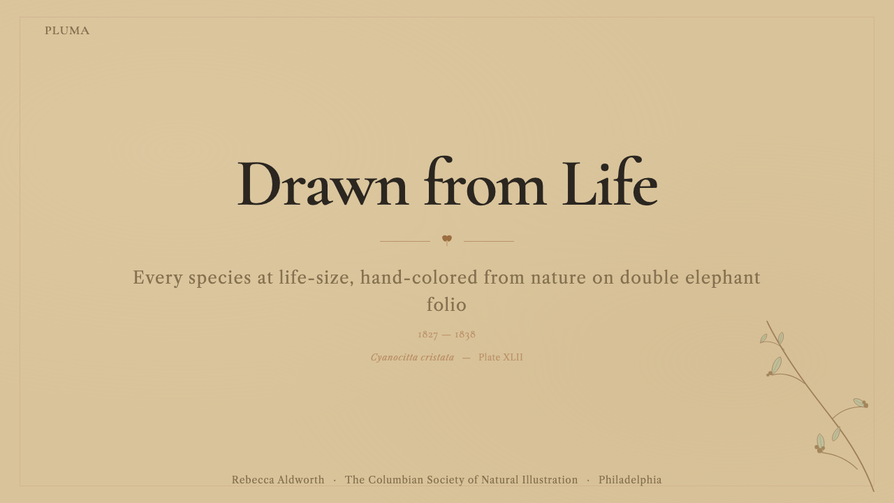
For presentation slides, the style works best for covers and section openers where a single strong image can dominate. A cover composed in this mode places a detailed naturalist illustration — bird, botanical specimen, anatomical diagram — asymmetrically on a buff or warm cream ground, with the title set in a humanist serif in the lower third. The bird or specimen should feel life-scale rather than decorative, which means sizing it so it nearly fills or slightly exceeds the frame. Content slides should maintain the warm ground color and limit text hierarchy to two levels: a large heading in a serif face and body text in a lighter weight of the same family.
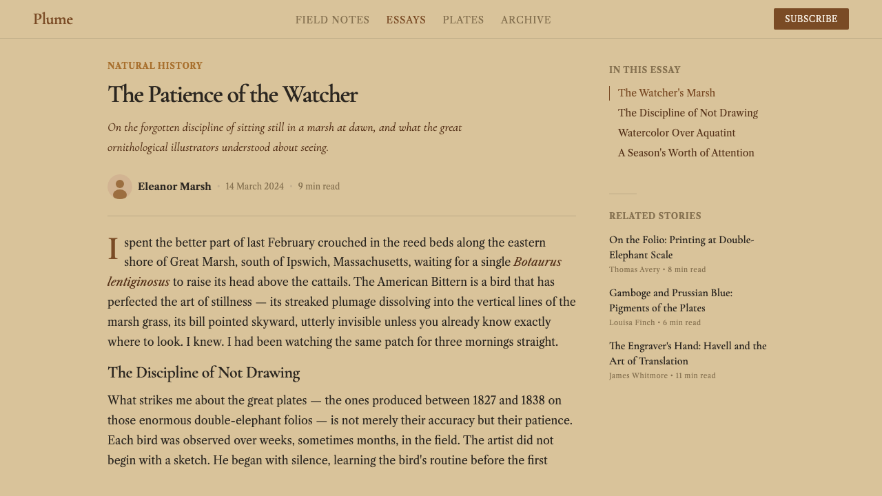
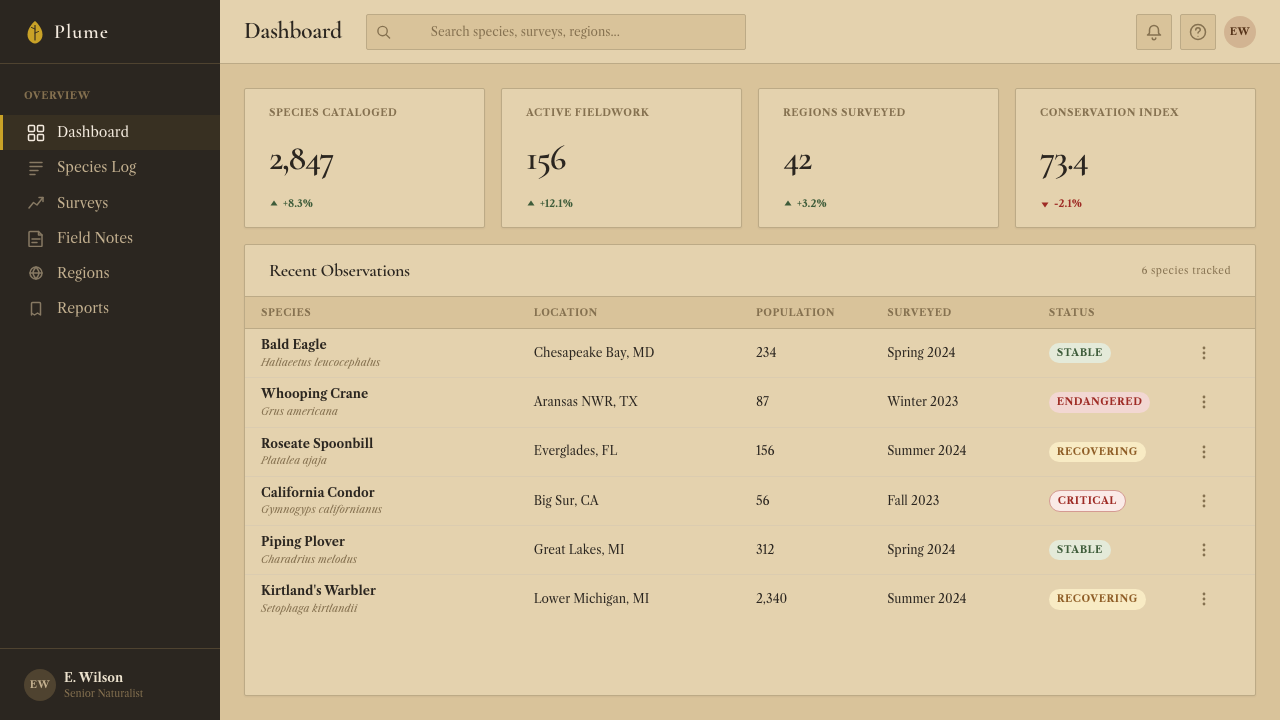
For web interfaces, the Audubon aesthetic is most suited to editorial contexts — natural history museums, scientific archives, artisanal goods, heritage brands — where the user expects warmth, authority, and the sense of consulting something carefully compiled over time. A dashboard in this mode would use warm off-white for the interface surface, engraving-brown for borders and rules, and reserve any stronger color for data visualization, treating charts as if they were hand-colored. Navigation should be typographic and restrained, with no icon decoration beyond simple line-weight indicators.
For editorial and marketing contexts, the style's strongest application is the feature article or long-form landing page. A full-width illustration at the top of the page — naturalist in character, asymmetrically composed — establishes the aesthetic register. Subsequent sections use a narrow column for body text with a wide margin for pull-quotes or annotations, echoing the plate-with-caption structure of the original volumes. Section dividers should be thin horizontal rules rather than decorative elements; the typography does the work.
The most common mistake when working with this aesthetic is confusing 'aged' with 'distressed.' Authentic Audubon-derived work feels preserved, not damaged. Paper foxing, uneven texture, and aged tone are present but restrained — the dominant impression is of quality and care, not decay. A second common error is using cool grays or near-black backgrounds: the Audubon system is a warm-ground system. Any move toward blue-black or cool shadow tones immediately breaks the palette's internal logic and reads as a different tradition entirely.
Audubon Birds of America — FAQ
How is Audubon different from other vintage natural history illustration styles?
The Audubon system is distinguished by three things that set it apart from generic natural history pastiche. First, the life-size convention: where most illustration traditions placed subjects at whatever scale fit conveniently, Audubon insisted on actual body dimensions, producing compositional solutions that feel biological rather than decorative. Second, the warm buff paper ground — the system is not built on white or cream but on the specific tone of aged Whatman rag, which participates actively in the color palette. Third, the combination of engraved structure with hand-applied watercolor: the image has two layers of mark-making, not one, and this layering gives it a depth that purely painted naturalist illustrations lack.
Can the Audubon aesthetic work in digital interfaces, or is it limited to print?
The aesthetic translates to digital work well in certain contexts, but it requires an honest acknowledgment of what cannot be replicated. The actual paper texture, the plate-mark, and the physical warmth of aged watercolor pigment are irreducible to screen color values — any digital simulation will be an interpretation, not a reproduction. What translates well: the warm ground color, the earth-tone palette, the asymmetric full-bleed composition, and the scholarly serif typography. Digital applications should lean into these transferable qualities rather than overcorrecting by adding fake grain and artifical aging effects, which tend to read as decoration rather than authenticity.
What makes the Audubon style feel scientific rather than just ornamental?
The scientific feeling comes from specificity. Every feather in an Audubon plate is a specific feather observed on a specific bird, not a generic representation of featherness. The botanical elements are botanically accurate. The Latin binomials are correct taxonomic designations for the period. The asymmetric compositions result from fitting an actual body onto an actual sheet, not from compositional theory. This commitment to the specific observed fact over the generic convention is what produces authority. Contemporary designs that borrow the style must make their own equivalent commitment: specific imagery rather than stock, accurate details rather than approximations, typography that carries meaning rather than period flavor.
Is the Audubon style appropriate for dark-mode or dark-background interfaces?
Dark-background inversions of the Audubon palette are possible but fundamentally work against the system's logic. The aesthetic is grounded — literally — in a warm, light paper tone that actively contributes warmth to every color placed on it. On a dark background, earth tones lose their characteristic relationship to the ground and tend to read as dull or muddy without the warm context they depend on. If a dark variant is needed, the best approach is to treat the dark surface as the shadow side of the original warm ground — shifting everything toward deeper amber and umber rather than toward cool gray or blue-black. The result reads as candlelit rather than inverted.
How should the Audubon aesthetic handle photography versus illustration?
The Audubon system predates photography and has no native relationship to photographic imagery. Contemporary applications have two honest choices. The first is to use illustration exclusively — naturalist drawing, botanical engraving, anatomical rendering — and treat photography as simply outside the system. The second is to process photographic images in ways consistent with the aesthetic's values: tight subject isolation against a warm ground, high tonal contrast, cropping that gives the subject life-scale presence rather than contextual setting, and color treatment that pushes the image toward the warm earth tones of the original palette. Photographic images processed this way can read as consistent with the system; unprocessed photography dropped onto a parchment background cannot.
Related design styles
 Firefly BioluminescenceQuietly luminous. Yellow-green 557 nm sparks drift through ruled indigo plate…
 Luang Prabang Saffron AlmsDawn has weight. Saffron bands cut through teak brown and smoke-gold editoria…
 Yemeni Socotra Dragon's Blood TreeCanopy shade holds the page. Resin red, amber rules, and serif specimen frami…
 Adobe Pueblo SouthwestFeels made by hand. Earthen tan, turquoise trim, and viga rhythm shape the fr…
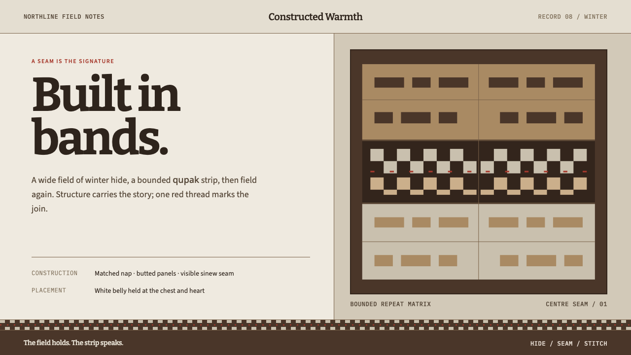 Iñupiat ParkaStructure carries the signature. Caribou-hide bands frame a bounded qupak rep…
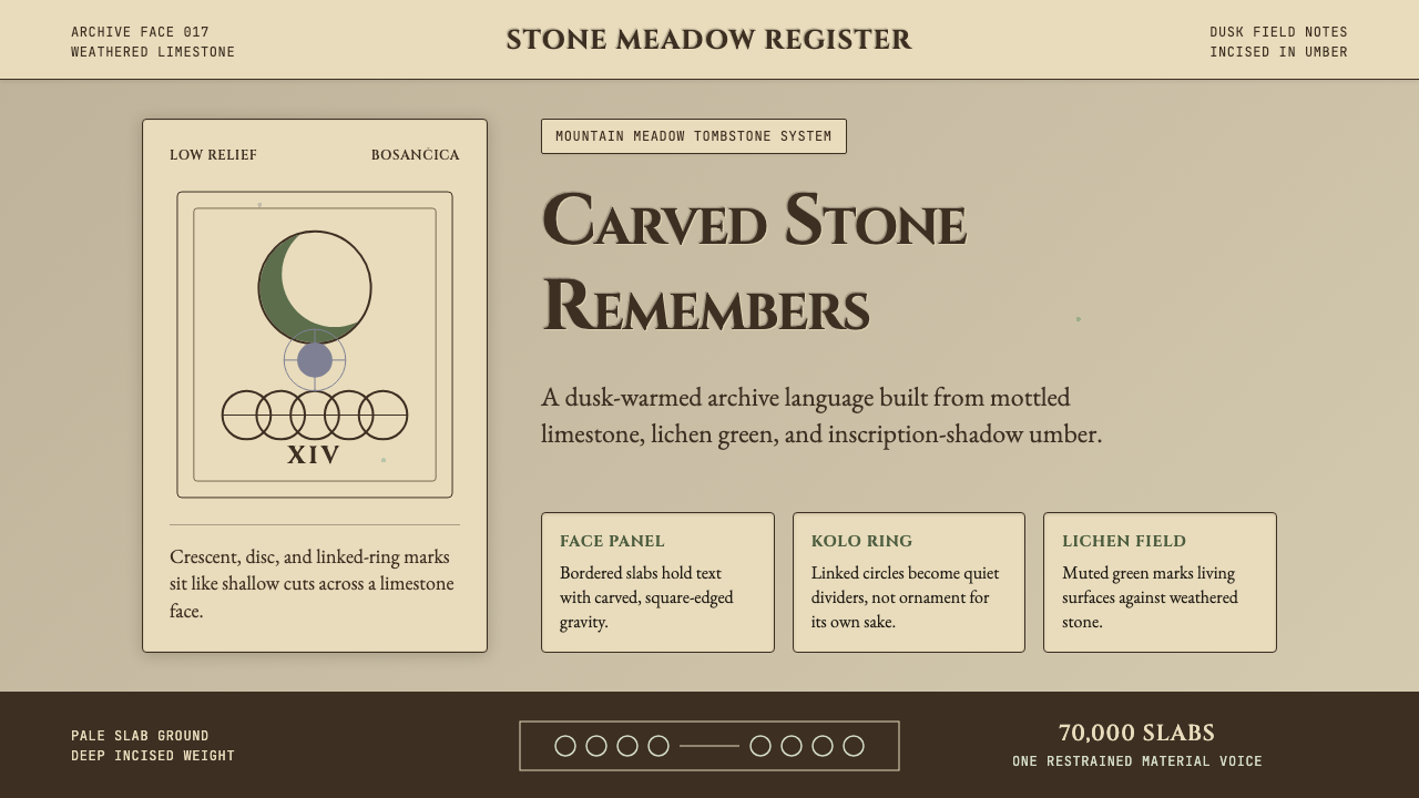 Bosnian Stećak Medieval TombstoneStone remembers quietly. Lichen green and Cinzel cuts sit on weathered limest…