Design style guide设计风格指南
What is Luang Prabang Saffron Alms?什么是 Luang Prabang Saffron Alms?
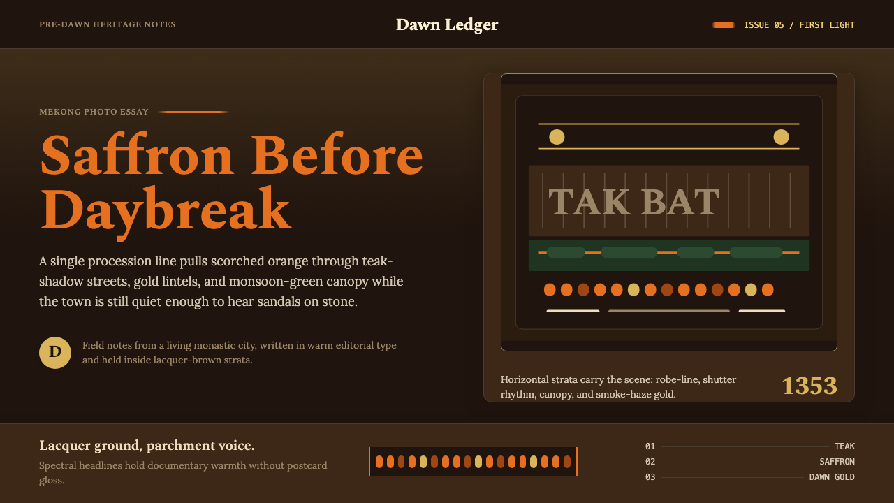
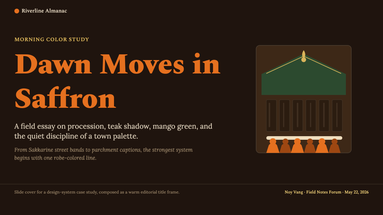
Each dawn in Luang Prabang, saffron-robed monks walk single-file past teak shopfronts and monsoon canopies — a procession that has painted this ancient royal city in scorched orange and lacquer brown for eight hundred years.每天黎明,身披藏红色袈裟的僧侣们在琅勃拉邦赤足列队而行,穿越柚木店铺与雨季芒果浓荫——这场延续八百年的布施仪式,将这座古老王城染成了灼热橙色与深漆木棕色。
Luang Prabang Saffron Alms in briefLuang Prabang Saffron Alms 速览
Luang Prabang Saffron Alms is a design aesthetic rooted in the tak bat ceremony — the daily pre-dawn alms round in which hundreds of Buddhist monks move in silence through the streets of Luang Prabang, Laos, accepting rice and offerings from the faithful. The visual event is arresting: a continuous band of deep saffron orange cuts through the dark, smoky atmosphere of early morning, set against surfaces of weathered teak, moss-covered stone, and the washed-out ochres of French colonial plaster.琅勃拉邦藏红布施美学,根植于布施仪式(tak bat)——老挝琅勃拉邦每日清晨,数百名佛教僧侣在寂静中列队穿行街道,接受信众供奉的糯米与食物。这一视觉事件令人摄魄:一道深沉的藏红橙色带,穿透黎明前浓重的晨雾与烟气,映衬在风化的柚木、青苔覆盖的石砌与法国殖民地建筑褪色赭墙之间。
The design language that emerges from this tradition is warm, solemn, and luminous in a restrained way. Scorched orange occupies the dominant role — not as a pure bright accent but as a deep, slightly burnished hue, closer to the shade of ancient lacquerware than to any modern safety signal. Against it, lacquer-brown and near-black grounds provide the weight and depth that keep the palette from tipping into cheerfulness. Smoke-tinted golden accents, the color of gilded stupa finials glimpsed through morning haze, add a precious quality without ostentation.由这一传统衍生的设计语言,温暖、庄重,以一种克制的方式散发光芒。灼热橙色占据主导——不是鲜明的强调色,而是一种深沉、略带光泽感的色调,更接近古老漆器的色泽,而非任何现代警示色。与之相对,深漆木棕色和近乎黑色的底面提供了分量与深度,使整套色板不至滑向轻佻。透过晨雾隐约可见的金色佛塔塔尖,其烟熏般的黄金点缀,增添了一种宝贵质感,却不流于炫耀。
This is not a style of high contrast or graphic boldness in the contemporary sense. Its emotional register is closer to meditation: slow, deliberate, weighted with accumulated time. The editorial warmth of a long-exposure photograph taken at first light — soft detail in the shadows, intense color where light falls directly — defines the tonal quality that the system consistently pursues.这不是一种当代意义上的高对比度或图形张力风格。它的情感基调更接近禅定:迟缓、从容、承载着积累的时光重量。以长曝光摄影在第一缕光线中捕捉的编辑影像美学——阴影中柔和的细节,直射光下的浓烈色彩——定义了这套体系一以贯之所追求的色调品质。
See the Luang Prabang Saffron Alms design system →查看 Luang Prabang Saffron Alms 完整设计系统 →
Where does Luang Prabang Saffron Alms come from?Luang Prabang Saffron Alms 从何而来?
Luang Prabang's identity as a sacred Buddhist city traces back to 1353, when King Fa Ngum unified the Lao principalities and founded the Lan Xang kingdom — the Land of a Million Elephants. He brought with him from the Khmer court a sacred Phra Bang Buddha image, which gave the city its name. From this founding moment, Luang Prabang was conceived not as a political capital alone but as a spiritual center, a place where royal authority and monastic life were understood to be mutually constitutive. The tak bat alms-round became institutionalized as a daily visible expression of that relationship: the sangha sustained by the laity, the laity blessed by the presence of the sangha.琅勃拉邦作为神圣佛教古城的身份,可追溯至1353年——法昂国王统一老挝各公国,建立兰沧王国,即「百万大象之国」。他从高棉宫廷带回一尊神圣的勃拉邦佛像,城市由此得名。自建城之初,琅勃拉邦便不单纯是政治都城,更被构想为精神中心——王权与僧侣生活在此被理解为相互构成的存在。布施仪式由此被制度化为这种关系的日常可见表达:僧团受信众供养,信众因僧团临在而蒙福。
Over the following centuries, Lan Xang Buddhist architecture evolved a distinctive visual vocabulary. Temples — called wats — feature sweeping, multi-tiered rooflines that cascade almost to the ground, covered in terracotta tile with gilt finials. Interior walls are decorated with gold stencil patterns on lacquer-red or dark grounds, depicting Jataka tales and celestial beings. Monk robes were dyed with jackfruit-root or saffron pigment to produce the characteristic deep orange that remains unchanged today. The color was not decorative choice but doctrinal expression: orange represents the fire of purification and the willingness to renounce worldly attachments.此后数百年间,兰沧王国的佛教建筑演化出独特的视觉语汇。寺庙(称为「瓦特」)以多层叠落的宽阔屋檐为特征,屋顶几乎垂落至地面,覆以红陶瓦与镀金塔顶。内墙在漆红色或深色底面上以金色镂刻图案装饰,描绘本生故事与天界众生。僧袍以波罗蜜根或藏红花色素染制,呈现出至今未变的深橙色。这种颜色不是装饰选择,而是教义表达:橙色代表净化之火,以及放弃世俗执着的意志。
French colonial presence from 1893 to 1953 added a second visual layer without erasing the first. French administrators and architects built along the peninsula between the Mekong and Nam Khan rivers, introducing lime-washed plaster facades, louvered wooden shutters, and arcaded colonnades alongside the existing wats and royal palace complex. The resulting hybrid — Indochina colonial vernacular layered over Lan Xang Buddhist architecture — defines Luang Prabang's street-level visual register today. The ochre and cream of colonial plaster against teak and gilded temple rooflines creates a color field that is uniquely warm, dense, and layered.1893年至1953年法国殖民统治,在不抹去前者的前提下叠加了第二层视觉语言。法国行政官员与建筑师在湄公河与南康河之间的半岛上建设,在现有的寺庙与王宫建筑群旁引入了石灰水刷白的抹灰立面、百叶木窗与拱廊柱廊。由此形成的混合风格——兰沧佛教建筑上叠加的法属印度支那殖民地风土建筑——定义了今日琅勃拉邦街道层面的视觉基调。殖民地抹灰的赭色与奶油色,映衬柚木与镀金寺庙屋顶,构成一个独特温暖、厚重而富有层次的色彩场域。
UNESCO World Heritage status in 1995, championed in part by scholar Anoulak Kittikhoun and conservation architect Henri Marchal's institutional legacy, formalized what had been an organic heritage: both the architectural fabric and the living monastic practices were recognized as inseparable. Conservation policy under the Heritage Charter has maintained the density and palette of the urban landscape, ensuring that the tak bat procession still moves through streets that look substantially as they did a century ago. The aesthetic that design practitioners reference today is therefore not a historical reconstruction but a still-living visual system, continuously renewed by daily ritual.1995年联合国教科文组织授予世遗地位,部分得益于学者阿努拉克·吉提坤与建筑遗产保护传统的推动,将原本有机生长的遗产正式化:建筑织物与活态僧侣传统被共同认定为不可分割的整体。《遗产宪章》下的保护政策维持了城市肌理的密度与色彩,确保布施仪式至今仍在面貌与百年前大体相同的街道上进行。设计从业者今日所参照的美学,因此不是历史重构,而是一套仍在活着的视觉系统,每日由仪式持续更新。
What defines the Luang Prabang Saffron Alms look?Luang Prabang Saffron Alms 的视觉特征是什么?
Color色彩
The palette is anchored by deep saffron orange — a burnished, slightly darkened hue with the warmth of aged lacquerware, not the brightness of a modern accent color. This anchoring orange sits against grounds of lacquer brown, near-black, or very deep teak-toned neutrals that prevent the warmth from becoming sweet. A secondary register of smoke-gold appears in smaller quantities — the color of gilded finials seen through morning haze — adding precious detail without overwhelming. Pale smoke or off-white appears only in supporting roles, providing the faint contrast needed for legibility in dense dark surfaces.色板以深沉的藏红橙色为锚——一种带有古老漆器温度的磨光、略显暗沉的色调,而非现代强调色的那种鲜亮。这一锚定橙色依附于深漆木棕色、近黑色或极深柚木调中性底面,使暖意不至滑向甜腻。烟熏金色以较小比例构成次级基调——晨雾中可见的镀金塔尖之色——增添宝贵细节而不压过整体。淡烟色或米白色仅以辅助角色出现,在厚重深色表面上提供可读性所需的微弱对比。
Luminosity and Depth光感与深度
The system prizes a particular quality of light: not the even illumination of a studio or the high-key brightness of modern flat design, but the warm, directional light of pre-dawn, where shadows are deep and color is intensified precisely because the overall light level is low. This translates into surfaces that are predominantly dark, with the orange and gold elements appearing to glow from within rather than being lit from without. The effect is one of weight and presence — surfaces that hold attention rather than repelling it.这套体系珍视一种特定的光线品质:不是摄影棚的均匀照明,也不是现代平面设计的高亮明快,而是黎明前那种温暖的方向性光线——整体光线水平低,阴影深沉,色彩因此更加浓烈。这转化为以深色为主的表面,橙色与金色元素像是从内部发光,而非被外部光源照亮。效果是一种分量感与存在感——让视线驻留而非反弹的表面。
Texture and Surface肌理与表面
Authentic materials in Luang Prabang are aged and warm: teak darkened by decades of oil and smoke, terracotta tile weathered by monsoon cycles, hand-applied stucco showing the trace of the mason's tool, gold leaf applied over lacquer showing microscopic texture at close range. The aesthetic honors this quality of accumulated surface — not through the use of photographic textures but through an understanding that surfaces should feel dense and time-worn rather than smooth and pristine. Digital interpretations favor paper-weight or matte finishes that suggest substance.琅勃拉邦真实材料的特质是历经岁月与温润:经数十年油脂与烟熏浸染而变深的柚木,经历雨季轮回而风化的红陶砖,手工涂抹的灰泥上留有泥瓦匠工具的痕迹,覆于漆面的金箔在近距离呈现肉眼可辨的微观肌理。这套美学尊重这种积累的表面品质——不是通过使用摄影纹理,而是通过理解:表面应感觉厚重、历经时光,而非光滑纯净。数字化诠释倾向于纸质感或磨砂质感,以暗示物质性。
Composition and Procession构图与行进感
The tak bat procession is linear and rhythmic — a horizontal band of repeating form, equally spaced, moving in a single direction. This compositional logic translates naturally into layouts that favor strong horizontal registers: wide image fields interrupted by narrow bands of color or type, repeated modular elements arranged with processional regularity, and a sense of left-to-right or top-to-bottom movement that never rushes. Vertical emphasis is reserved for stupa and doorway forms — tall, narrow, slightly tapered shapes that punctuate horizontal flow.布施仪式的行进是线性而有节律的——等间距排列的重复形态构成的水平条带,朝一个方向移动。这一构图逻辑自然转化为偏爱强烈水平基调的版面:宽幅图像场域被窄色带或字体打断,重复的模块化元素以仪式般的规律性排列,整体呈现从左到右或从上到下、从不急促的运动感。垂直强调保留给佛塔与门洞形态——高挑、狭窄、略带收分的形状,在水平流中构成节奏性的标点。
Ornament and Restraint装饰与克制
The system is not minimalist — the temple interiors that inform it are richly decorated with gold stencil, mirrored mosaic, and painted narrative friezes. But the ornament follows strict rules: it is always applied to surfaces rather than floating free, it is always patterned and repeating rather than figural and individual, and it never competes with the primary structural elements. In contemporary digital applications, this principle allows for the use of border patterns, gilded line details, or subtle ground textures, provided they remain subordinate to the hierarchy of color and form.这套体系不是极简主义——赋予它灵感的寺庙内部以金色镂刻、镜面马赛克与彩绘叙事壁带进行丰富装饰。但装饰遵循严格规则:始终附着于表面而非自由漂浮,始终是图案化的重复形态而非具象的个体,始终不与主要结构元素争夺视觉主导权。在当代数字应用中,这一原则允许使用边框图案、镀金线条细节或微妙的底面肌理,前提是它们始终从属于色彩与形态的层级秩序。
Typography Register字体基调
Text in this aesthetic belongs to the editorial tradition of magazine photojournalism and cultural heritage publication: measured, unshowy, and subordinate to image and color. Headline weight is generous but not aggressive. Body text maintains a calm, readable measure. There is no role for novelty typefaces or expressive fonts; the preference is for letterforms that feel timeless, neutral, and slightly warm — faces with a calligraphic quality in their curves that echoes the hand-applied gold-leaf stenciling of temple walls, without imitating it literally.这套美学中的文字属于杂志纪实摄影与文化遗产出版的编辑传统:从容、不炫耀、服从于图像与色彩。标题字重饱满而不强势。正文保持沉静可读的行宽。没有炫技字体或表现性字体的位置;偏好的是感觉永恒、中性、略带温度的字形——曲线中带有书法品质的字体,与寺庙墙壁上手工金箔镂刻相互呼应,但不是字面上的模仿。
Sacred and Quotidian Balance神圣与日常的平衡
Perhaps the most distinctive quality of this aesthetic is that it holds the sacred and the everyday in a single frame without forcing a resolution. The tak bat procession happens against an entirely ordinary backdrop of shopkeepers setting out their goods and children heading to school; the extraordinary is not separated from the mundane. In design terms, this means the system can carry ceremonial weight without becoming stiff or ecclesiastical, and can address everyday content without losing its sense of depth and occasion.这套美学最独特的品质,或许在于它在同一个画面中同时容纳神圣与日常,而不强行消解这种张力。布施仪式发生在完全世俗的背景中——店主正在摆出商品,孩子正赶着上学;非凡之事并不与平凡之事相隔离。在设计语言中,这意味着这套体系能够承载仪式感的分量而不显僵硬或宗教气息浓重,也能呈现日常内容而不失其深度与庄重感。
See the Luang Prabang Saffron Alms design system →查看 Luang Prabang Saffron Alms 完整设计系统 →
Who shaped Luang Prabang Saffron Alms?谁塑造了 Luang Prabang Saffron Alms?
Fa Ngum unified the Lao principalities in 1353 and founded the Lan Xang kingdom, establishing Luang Prabang as both political capital and sacred Buddhist center. His act of bringing the Phra Bang image from the Khmer court — and naming the city after it — encoded the identity between royal authority and Buddhist practice that would define the city's visual culture for the next seven centuries. The distinctive features of Lao temple architecture, including the sweeping low rooflines and interior gold-on-lacquer decoration, developed within the institutional framework he created.法昂于1353年统一老挝各公国,建立兰沧王国,确立琅勃拉邦作为政治都城与神圣佛教中心的双重身份。他从高棉宫廷带回勃拉邦佛像并以此为城市命名的举动,将王权权威与佛教修行之间的认同关系编码进城市身份,此后七个世纪,这一认同关系持续定义着城市的视觉文化。老挝寺庙建筑的独特特征——包括大幅下垂的低矮屋檐与内部金色漆面装饰——正是在他所奠立的制度框架内发展成型的。
Henri Marchal was a French archaeologist and conservator who worked extensively throughout French Indochina in the first half of the twentieth century. His influence on Luang Prabang was institutional: the conservation methods and documentation practices he helped establish formed the foundation of the heritage management frameworks that would eventually support UNESCO designation. His work exemplifies the paradox at the center of Luang Prabang's aesthetic — a colonial enterprise that, in its documentation and preservation of Buddhist architectural traditions, inadvertently helped ensure their survival into the present.亨利·马夏尔是二十世纪上半叶广泛工作于法属印度支那的法国考古学家与文物保护者。他对琅勃拉邦的影响是制度性的:他参与建立的保护方法与文献记录实践,奠定了遗产管理框架的基础,而这些框架最终支撑了联合国教科文组织的世遗认定。他的工作体现了琅勃拉邦美学核心的悖论——一项殖民事业,在记录与保护佛教建筑传统的过程中,无意间帮助确保了这些传统留存至今。
A Lao diplomat and cultural heritage specialist, Anoulak Kittikhoun played a significant role in the political and institutional processes that led to UNESCO World Heritage designation in 1995. His advocacy helped frame Luang Prabang's heritage not as a static historical artifact but as a living urban ecosystem in which monastic and civic life remained intertwined. The distinction matters for the aesthetic: the tak bat procession that defines the saffron visual register is not a performance staged for heritage tourism but a continuation of a practice that has never stopped.阿努拉克·吉提坤是老挝外交官与文化遗产专家,在推动1995年联合国教科文组织世遗认定的政治与制度进程中发挥了重要作用。他的倡导有助于将琅勃拉邦的遗产定性为一个活态城市生态系统——其中僧侣生活与市民生活始终相互交织——而非静态历史遗存。这一区分对于美学而言至关重要:定义藏红色视觉基调的布施仪式,不是为遗产旅游而搭演的表演,而是一种从未停止的传统的延续。
Patcharin Houngsaengkham represents the generation of Lao cultural practitioners and heritage professionals who have engaged critically with the tensions between heritage conservation, tourism development, and the lived realities of the monastic community. Her perspective — that the aesthetic identity of Luang Prabang must be understood as the product of an ongoing community, not merely an architectural inventory — informs a more nuanced application of the visual system: one that acknowledges the human practice behind the visual effect rather than reducing the saffron procession to a decorative motif.帕查林·洪赛甘代表着老挝文化从业者与遗产专业人士的一代,他们批判性地介入遗产保护、旅游开发与僧侣社区现实生活之间的张力。她的视角——琅勃拉邦的美学身份必须被理解为一个持续运作中的社群的产物,而不仅仅是一份建筑清单——为这套视觉系统提供了更为细腻的应用立场:承认视觉效果背后的人类实践,而不是将藏红色仪式行进简化为一个装饰母题。
The visual system of Luang Prabang was not the product of named individual designers but of generations of anonymous monastic craftsmen — painters, gilders, woodcarvers, and weavers working within a tradition of apprenticeship and devotional production. Their collective contribution established the color relationships, the proportional vocabulary of temple architecture, and the stencil-pattern grammar of interior decoration that define the aesthetic. The lack of individual authorship is itself significant: the system's visual authority comes from its cumulative depth and repetition across centuries, not from individual invention.琅勃拉邦的视觉体系,不是具名个体设计师的产物,而是数代匿名寺庙工匠——画工、鎏金匠、木雕匠与织造工——在师徒传承与虔诚生产传统中共同构建的。他们的集体贡献确立了色彩关系、寺庙建筑的比例语汇,以及定义这套美学的内部装饰镂刻图案语法。缺乏个体著作权本身具有意义:这套体系的视觉权威来自它在数百年间的累积深度与重复性,而非来自任何个体的发明创造。
How do you use Luang Prabang Saffron Alms today?今天怎么用 Luang Prabang Saffron Alms?
Luang Prabang Saffron Alms is a style that carries genuine cultural weight, which means it applies most naturally where depth, ceremony, and accumulated time are relevant values — cultural institutions, hospitality brands, heritage experiences, documentary editorial work, and any context where the emotional register of the content is elevated rather than casual. It does not transfer well to products where speed, brightness, and novelty are the dominant values.琅勃拉邦藏红布施是一种承载真实文化分量的风格,这意味着它最自然地适用于深度、仪式感与积累时光是相关价值的场景——文化机构、待客品牌、遗产体验、纪实编辑作品,以及任何内容的情感基调是庄重而非随意的场景。它不适合速度、亮度与新鲜感是主导价值的产品。
For presentation slides, the system works beautifully for cover and section-divider pages: a deep lacquer-brown or near-black full-bleed ground, with saffron as the single strong element — a horizontal band, a bold title, or a simple geometric form. Content slides should be treated with equal gravity: dark grounds, generous margins, and text set at a measured pace with strong size contrast between heading and body. Data slides deserve special attention — when charts and graphs are rendered in the saffron and smoke-gold palette against deep grounds, they take on a weight and seriousness that purely informational charts rarely achieve. Avoid using bright backgrounds on content slides, which will shatter the meditative atmosphere of the system.在演示文稿中,这套体系在封面与章节分隔页上效果出众:深漆木棕或近黑色的满幅底面,以藏红作为唯一强力元素——一条水平色带、一个粗重标题,或一个简单几何形。内容页应以同等庄重感处理:深色底面、充裕的边距,以及在标题与正文之间以强烈尺寸对比、从容节奏排设的文字。数据页值得特别关注——当图表以藏红和烟熏金的色板呈现于深色底面上,它们获得一种纯信息类图表很少能达到的分量感与严肃性。避免在内容页使用明亮背景,那会打破这套体系的冥想氛围。
For web interfaces, the style suits editorial, cultural, and hospitality contexts most naturally. A homepage built in this register might use a near-black hero with a wide horizontal saffron element and sparse, generous type. Navigation should be minimal and wordmark-forward; icon use should be restricted to simple symbolic forms rather than detailed illustrations. Dashboards and data products are less natural fits — the dark, warm palette increases perceived formality and reduces the urgency-at-a-glance quality that dashboards typically require. If applied to a dashboard, reserve the saffron for the most important metric or state only.对于网页界面,这种风格最自然地适合编辑、文化与待客场景。以这种基调构建的首页,可以是近黑色的宽幅主画面,配以一条宽阔的水平藏红色元素与稀疏从容的字体。导航应简洁而以文字标识为主;图标的使用应限于简单象征性形态,而非细节丰富的插图。仪表板与数据产品较难适配——深色暖调色板增加了感知上的正式感,削弱了仪表板通常需要的一眼速读的紧迫性。若将其应用于仪表板,将藏红保留给最重要的指标或状态。
For editorial and marketing work, the style excels at producing long-form content that feels worth reading: feature articles, destination guides, cultural essays, annual reports for organizations with a heritage dimension. The horizontal register of the procession translates into section breaks marked by full-width saffron rules or narrow band images. Pull quotes benefit from being set against a small saffron-ground panel. Photography should be treated warmly — slightly reduced contrast, shadows allowed to hold detail — rather than pushed to high contrast, which fights the meditative quality of the surrounding palette.对于编辑与营销作品,这种风格在制作值得细读的长篇内容时表现卓越:专题文章、目的地指南、文化散文、具有遗产维度的机构年报。仪式行进的水平基调,转化为以满幅藏红色线条或窄幅带状图像标记的段落分隔。引文放置于小块藏红色底面上可以取得良好效果。摄影应以温暖方式处理——略微降低对比度,允许阴影保留细节——而非推向高对比度,后者会与周围色板的冥想品质产生冲突。
A common mistake when working with this aesthetic is reducing it to the saffron color alone, then combining it with white backgrounds and clean sans-serif typography in a way that erases the depth and gravitas of the source material. The saffron only has its full power when surrounded by dark grounds. Similarly, pairing the palette with the visual vocabulary of contemporary minimal design — paper-white backgrounds, thin lines, generous negative space in a bright key — produces a confusion of registers: the color says ancient and weighty while the surrounding system says contemporary and light. The style demands commitment to its tonal world, not just selective borrowing of its most visible element.运用这套美学时最常见的错误,是将其简化为藏红色彩本身,然后将其与白色背景和简洁无衬线字体相结合,以一种抹去源材料的深度与庄重感的方式加以使用。藏红只有在深色底面环绕下才具有完整的力量。同样,将这套色板与当代极简设计的视觉语汇相搭配——纸白背景、细线条、明亮调的大片留白——会产生基调的混乱:色彩在说古老与厚重,而周边体系在说当代与轻盈。这种风格要求对其整体色调世界的承诺,而不仅仅是对其最显眼元素的选择性借用。
See the Luang Prabang Saffron Alms design system →查看 Luang Prabang Saffron Alms 完整设计系统 →
Luang Prabang Saffron Alms — FAQLuang Prabang Saffron Alms · 常见问题
Is it appropriate for a non-Lao brand to use this aesthetic?非老挝品牌使用这套美学是否合适?
The question is worth asking carefully. Luang Prabang Saffron Alms draws on a living religious tradition — the tak bat ceremony is not a historical artifact but an ongoing daily practice with deep meaning for the monastic community and the lay faithful. Using this aesthetic thoughtfully, with awareness of its origins and without reducing its sacred dimensions to surface decoration, is different from appropriating iconography without acknowledgment. The system is most appropriate for contexts where cultural depth, heritage, or contemplative experience is genuinely relevant to the product or message — not for contexts where the saffron and dark grounds are merely a novel color combination.这个问题值得审慎对待。琅勃拉邦藏红布施美学源于一项活态宗教传统——布施仪式不是历史遗存,而是对僧侣社群和在家信众具有深刻意义的持续日常实践。以知情、尊重的方式使用这套美学——了解其起源,不将其神圣维度简化为表面装饰——不同于不加认知的挪用符号学。这套体系最适合的场景,是文化深度、遗产或冥想体验与产品或信息真正相关的场合——而不是仅仅将藏红与深色底面当作新颖色彩搭配的场合。
How does this style differ from other warm Southeast Asian aesthetics?这种风格与其他东南亚温暖系美学有何不同?
Southeast Asian design traditions are remarkably diverse, and conflating them is a significant error. Luang Prabang Saffron Alms is specifically Lao Buddhist and French Indochina colonial in its genealogy, and it has a particular tonal quality — the pre-dawn light level, the deep dark grounds, the burnished rather than bright orange — that distinguishes it from, say, Thai temple gold (brighter, more saturated), Balinese tropical warmth (greener, more verdant), or Vietnamese lacquer aesthetics (more saturated reds and deep greens). The procession-linear compositional logic, the smoke-haze quality of the gold accents, and the specifically French-colonial vernacular of the architectural backdrop are all distinctive to this tradition.东南亚设计传统极为多样,将它们混为一谈是一个严重错误。琅勃拉邦藏红布施美学在谱系上特指老挝佛教与法属印度支那殖民传统,它具有一种独特的色调品质——黎明前的光线水平、深沉的暗色底面、磨光而非鲜亮的橙色——使其有别于泰国寺庙金色(更亮、更饱和)、巴厘岛热带暖调(更偏绿、更葱郁)或越南漆器美学(更饱和的红色与深绿色)。仪式行进式的线性构图逻辑、金色点缀的烟熏雾气品质,以及建筑背景中特定的法属殖民地风土样式,都是这一传统所独有的。
Can this style work for a light-background or high-brightness interface?这种风格能用于浅色背景或高亮度界面吗?
It can, but the transition requires care and a clear rationale. The light adaptation works best when the dominant structure of the page remains warm — off-white or aged-paper tones rather than clean white — and the saffron is used at full saturation against those warm grounds rather than diluted. A purely clean white background strips away the tonal richness that gives the saffron its ceremonial quality and risks making the palette look merely decorative. The most successful light adaptations tend to retain at least one major dark element — a full-width header band in deep brown, a sidebar in near-black — to maintain the contrast structure that the original system depends on.可以,但这种过渡需要谨慎处理并有明确理由。浅色适配效果最好的情况是:页面的主体结构仍保持温暖调性——用米白或陈纸色调而非纯净白色——同时藏红在这些暖色底面上以完整饱和度呈现,而非被稀释。纯净白色背景会剥去赋予藏红仪式感品质的色调丰富性,使这套色板看起来仅仅是装饰性的。最成功的浅色适配,往往保留至少一个主要深色元素——深棕色的全宽标题带,或近黑色的侧边栏——以维持原始体系所依赖的对比结构。
What role does the French colonial influence play in the aesthetic, and is it optional?法国殖民影响在这套美学中扮演什么角色?它是可以省略的吗?
The French Indochina colonial layer is not incidental to Luang Prabang's visual identity — it is structurally integrated into what the streetscape actually looks like. The ochre and cream of colonial plaster, the louvered wooden shutters, the arcaded facades, all contribute to the warm mid-tone ground against which the saffron of the monk robes and the gold of temple rooflines appear. Removing this layer in a design application is possible, but it changes the aesthetic from Luang Prabang specifically toward a more generic Theravada Buddhist or Southeast Asian register. The collision between the colonial vernacular and the Buddhist sacred is part of what gives the system its distinctive layered quality.法属印度支那殖民层并非琅勃拉邦视觉身份的附属成分——它结构性地融入了街道景观的实际面貌。殖民地抹灰的赭色与奶油色、百叶木窗、拱廊立面,共同构成了暖色调的中间色底面,藏红色僧袍与金色寺庙屋顶正是在这一底面上显现的。在设计应用中省略这一层是可能的,但这会将美学从特定的琅勃拉邦风格转向更通用的南传佛教或东南亚基调。殖民地风土样式与佛教神圣空间之间的碰撞,正是赋予这套体系独特分层品质的部分原因。
How should photography be selected and treated for this aesthetic?这套美学对摄影作品的选择与处理有哪些要求?
Photography that fits this system shares a specific atmospheric quality: warm color temperatures, a preference for early-morning or late-afternoon light rather than noon brightness, subjects that include aged surfaces, textile details, or human figures in relation to architectural context. High-key studio photography, brightly lit e-commerce style imagery, or photographs with strong cool casts will all sit uneasily within the palette. In terms of treatment, the goal is to preserve the warmth of the original rather than push contrast. Slight warm-tone grading that deepens shadows and intensifies the orange-brown range without brightening highlights is appropriate. The aesthetic resists the high-contrast treatment common in contemporary editorial photography, where shadows are crushed to near-black — here, shadow detail matters because the interplay of low light across textured surfaces is part of the system's visual identity.契合这套体系的摄影作品,共享一种特定的氛围品质:暖色温,偏好清晨或傍晚光线而非正午强光,画面主体包含历经岁月的表面、织物细节,或处于建筑场景中的人物。高调棚拍摄影、明亮的电商风格图像,或带有强烈冷色调的照片,都会与这套色板产生违和感。在处理层面,目标是保留原始画面的暖调而非推高对比度。略微的暖色调处理——加深阴影、强化橙棕色范围而不提亮高光——是合适的。这套美学抗拒当代编辑摄影常见的高对比度处理,即将阴影压缩至近乎纯黑——在这里,阴影细节至关重要,因为低光照在有质感表面上的相互作用,正是这套视觉体系身份认同的一部分。
Related design styles相关设计风格
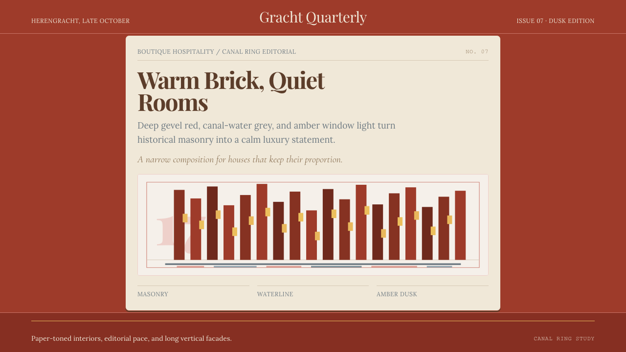 Amsterdam Canal HouseQuiet luxury in brick and cream. Playfair serif, narrow columns, amber window…克制的奢华。砖红配奶油纸面,窄列与琥珀窗光。
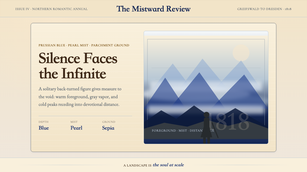 Caspar David FriedrichSilence becomes vast. Prussian blue depth, pearl mist, and parchment framing…寂静变得辽阔:普鲁士蓝纵深、珍珠雾与羊皮纸框层层后退。
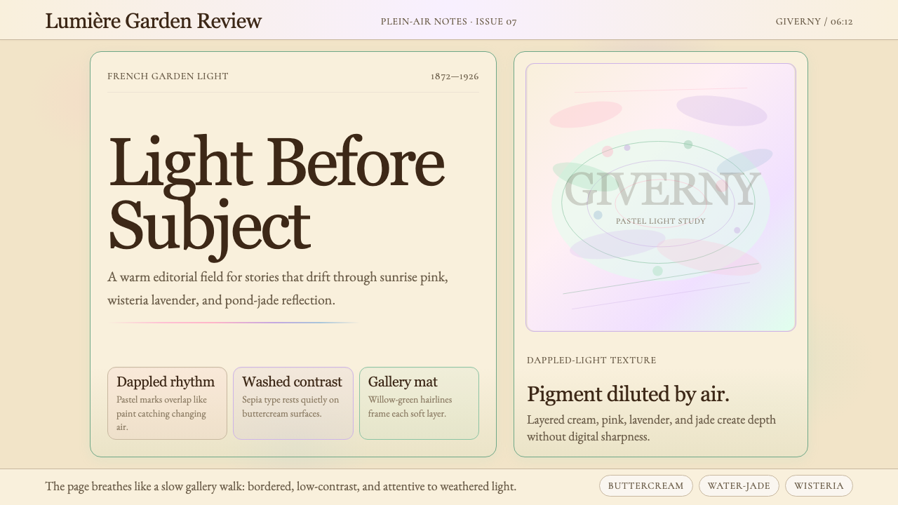 Claude Monet ImpressionistLight becomes the subject. Buttercream, pastel dapples, and Cormorant serif s…光成为主题。奶油底、粉彩斑点与Cormorant衬线柔化画面。
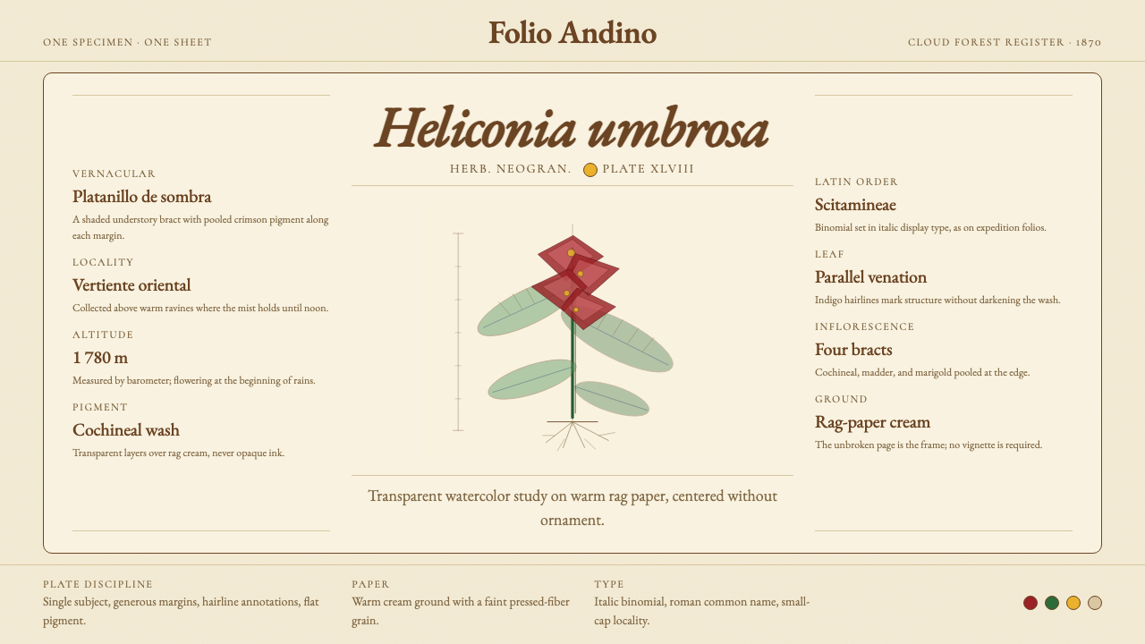 Colombian Botanical (Triana)Observation becomes ornament. Crimson watercolor specimen breathes on cream r…观察即装饰。绯红水彩标本静置于奶油破布纸。
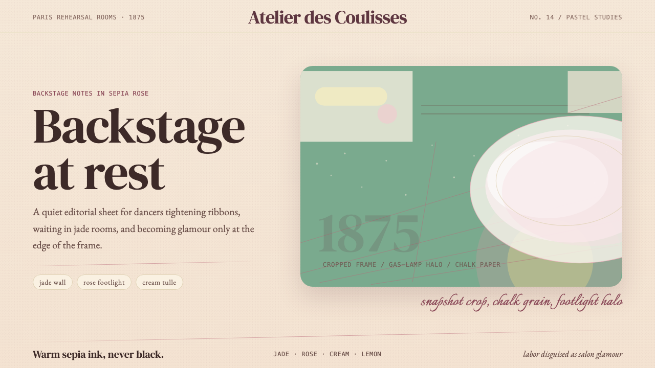 Degas Ballet PastelsBackstage glamour is labor. Jade walls, rose footlights, cropped serifs on cr…后台华丽即劳动。玉墙、玫瑰脚灯与裁切衬线落在奶油纸上。
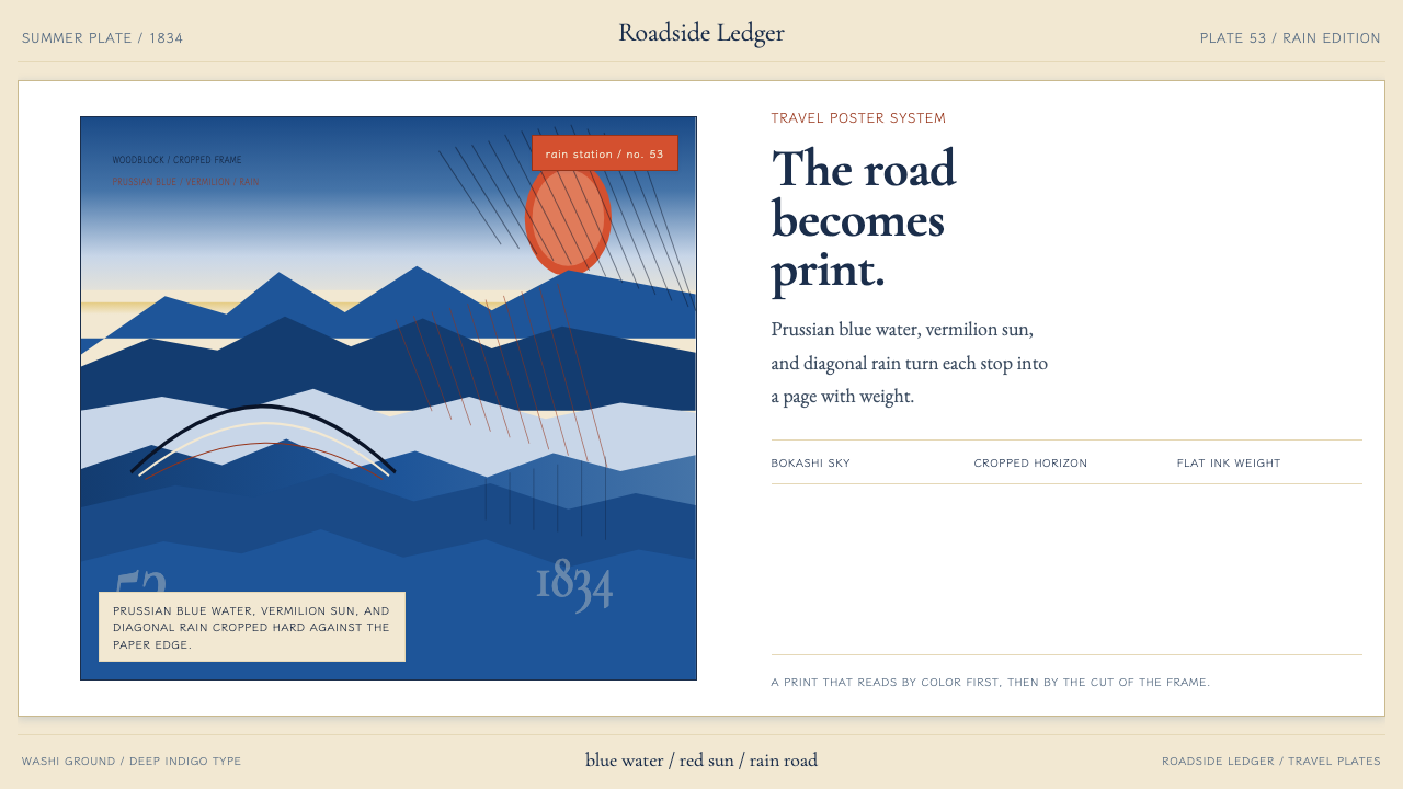 Hiroshige — Tokaido RoadA road print in motion. Prussian blue blocks, vermilion cartouches, diagonal…会行进的路途海报。普鲁士蓝色块、朱红题签与斜雨。