What is Degas Ballet Pastels?什么是 Degas Ballet Pastels?
Edgar Degas spent twenty-five years backstage at the Palais Garnier painting what audiences never saw — and in doing so invented an aesthetic of warm cream, jade green, and footlight rose that makes glamour feel like labor and labor feel like beauty.德加在巴黎歌剧院后台流连二十五年,画的是观众永远看不见的那一面——由此创造出一套以奶油暖调、玉色绿与脚灯玫瑰为核心的美学,让华丽显出劳动的质感,让劳动散发出美的光晕。
Degas Ballet Pastels in briefDegas Ballet Pastels 速览
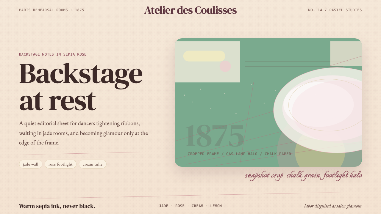
Degas Ballet Pastels is a design system drawn from the visual world of Edgar Degas's ballet paintings and pastels, produced between roughly 1870 and 1895. Where most historical styles derive from public, monumental art, this one is deliberately backstage: warm cream paper grounds, walls in a muted jade green, highlights in the soft rose of gas-lamp footlights, and body text rendered in a warm sepia-brown rather than stark black. The atmosphere is one of waiting, preparation, and practiced effort — not performance.德加芭蕾粉彩系统源自埃德加·德加约1870至1895年间创作的芭蕾绘画与粉彩作品所构成的视觉世界。大多数历史风格取材于公开的、纪念碑式的艺术,这套系统却刻意选取后台视角:奶油色纸本底面、静穆玉色的墙壁、煤气脚灯投出的柔和玫瑰色高光,以及用温暖赭褐色而非纯粹黑色书写的正文。整体氛围是等候、准备与反复练习的劳动,而非台前的演出。
The compositional logic is equally distinctive. Degas was a serious collector of Japanese woodblock prints, and from ukiyo-e he borrowed the cropped frame — subjects cut by the picture edge as though caught by an accidental glance, bodies half-entering or half-exiting the composition. This off-balance cropping is not carelessness; it is the system's primary way of generating intimacy and movement. Paired with Belle Époque serif letterforms that carry the weight of a Parisian salon programme, the result is something between a rehearsal-room document and a collector's print.构图逻辑同样与众不同。德加是浮世绘的忠实收藏者,他从中借鉴了裁切式画框——主体被画面边缘切断,仿佛被一瞥随手捕捉,身体若进若出、悬停在构图边界。这种失衡的裁切并非随意,而是这套系统制造亲密感与运动感的核心手段。搭配承载着巴黎沙龙节目单重量的Belle Époque衬线字体,效果介于排练室文件与收藏家版画之间。
The texture throughout is pastel-stippled rather than smooth. Where a contemporary digital style might reach for glassy gradients or glossy fills, this system substitutes the granular bloom of chalk on laid paper — soft, slightly uneven, never harsh. Shadows are halos of diffused footlight rather than hard drops. The overall effect is warm, studious, and subtly imperfect: the aesthetic of something beautiful that knows how much effort went into it.贯穿始终的肌理是粉彩点描式的,而非光滑平整的。当代数字风格可能诉诸玻璃质感的渐变或光泽填充,这套系统则以粉笔在纹理纸上的颗粒状晕染取而代之——柔软、略带不均匀,从不刺眼。阴影是漫射脚灯的光晕,而非硬边投影。整体效果温暖、沉静、带着微妙的不完美感:这是某种美丽之物所应有的气质,它清楚地知道自身背后凝结了多少努力。
See the Degas Ballet Pastels design system查看 Degas Ballet Pastels 完整设计系统
Where does Degas Ballet Pastels come from?Degas Ballet Pastels 从何而来?
Edgar Degas first entered the rehearsal rooms and stage wings of the Paris Opéra in the late 1860s, granted access through his friendship with the bass singer Lorenzo Pagans and later through Henri Rouart, an industrialist and amateur artist who moved easily in operatic circles. Degas was already a trained classicist who had studied the Renaissance masters in Italy; what the Opéra gave him was not spectacle but structure — the architecture of practiced bodies, the geometry of repeated movement, the way artificial gas-lamp light fell differently from any natural source he had ever painted.德加最初踏入巴黎歌剧院排练室与舞台侧翼是在1860年代末,入场的凭借是他与男低音歌手洛伦佐·帕甘斯的友谊,以及后来通过亨利·鲁阿特——一位工业家兼业余画家,在歌剧圈子里如鱼得水。此时的德加已是受过系统训练的古典主义者,曾在意大利研习文艺复兴大师;歌剧院给予他的不是奇观,而是结构——练习中身体的建筑性、重复动作的几何感,以及煤气脚灯以一种任何自然光源都无法复现的方式落在事物上的那种特质。
The ballet motif consumed him for the rest of his working life. He produced more than six hundred works depicting dancers — in oils, pastels, bronze sculpture, and monotype — across a span of roughly twenty-five years. The medium of pastel was central: it allowed rapid mark-making that could capture transient poses, and its chalky, powdery surface read in reproduction with a warmth that oil paint rarely achieved. By the 1880s Degas had developed a working method of layering pastel over monotype prints, building up dense, atmospheric grounds that glowed with an almost phosphorescent softness.芭蕾题材此后占据了他整个创作生涯。他留下了六百余件描绘舞者的作品——油画、粉彩、铜像与单版画——跨越约二十五年。粉彩媒介居于核心地位:它允许迅速落笔,捕捉转瞬即逝的姿态,而其粉质、粉末状的表面在复制中呈现出油画鲜少能达到的温暖感。到1880年代,德加已发展出将粉彩叠加在单版画印底上的工作方式,层层积累出浓郁的大气感底色,发出近乎磷光般的柔软光芒。
Two movements shaped what became, in retrospect, the system's visual DNA. French Impressionism supplied the commitment to observed light and the rejection of academic studio conventions — the sense that a painting should feel like a moment encountered rather than a scene arranged. Japonisme supplied the compositional audacity: Degas owned hundreds of ukiyo-e prints by Hiroshige, Utamaro, and Hokusai, and from them he absorbed the high viewpoint, the asymmetric cut, the willingness to let the frame amputate a figure at an arbitrary point. The resulting combination — Impressionist light values and Japanese compositional freedom — was entirely novel in European painting of the 1870s.两个运动塑造了这套系统的视觉基因。法国印象主义提供了对观察光线的承诺,以及对学院派画室惯例的拒绝——一种绘画应当感觉像是偶然遭遇的瞬间而非刻意布置的场景的感知。日本主义提供了构图上的大胆:德加收藏了广重、歌川国贞、葛饰北斋数以百计的浮世绘版画,从中吸收了高视点、不对称裁切,以及让画框在任意点截断人物的随意性。这种组合——印象主义的光线价值观与日本构图自由度——在1870年代的欧洲绘画中是全然新颖的。
The specific palette that defines this system — cream grounds, jade walls, footlight rose, sepia ink — is drawn directly from the physical environment of the Palais Garnier and from the material conditions of pastel itself. The jade-green of rehearsal-room walls was a standard institutional color of Belle Époque Paris, used because it did not fatigue the eye under gaslight. The warm rose of footlight illumination was a quality of early gas-stage lighting before electric arc lamps replaced it in the 1880s and 1890s. The cream and sepia are the tones of the laid paper Degas preferred and the warm brown ink he used for compositional sketches. Every color in the system has a documentary source — it is an archaeology of a specific place at a specific moment in the history of artificial light.定义这套系统的具体色板——奶油底色、玉色墙面、脚灯玫瑰、赭褐色墨——直接取材于巴黎歌剧院的物理环境和粉彩媒介的材料条件。排练室墙壁的玉绿色是Belle Époque巴黎的标准机构色,因为在煤气灯光下它不会使眼睛疲劳。脚灯暖玫瑰色是早期煤气舞台照明的特质,在1880至1890年代电弧灯取代它之前。奶油色与赭褐色是德加偏爱的纹理纸的色调,以及他用于构图素描的温暖棕色墨水的颜色。系统中的每一种颜色都有文献来源——它是一个特定地点在人造光历史中一个特定时刻的考古学。
What defines the Degas Ballet Pastels look?Degas Ballet Pastels 的视觉特征是什么?
Color Palette色彩体系
The palette is built around four closely related warm and cool neutrals — cream, jade, footlight rose, and sepia — rather than the saturated contrast of primary-color systems. Cream serves as the dominant ground, occupying the largest surface areas. Jade green appears as structural color: walls, accents, supporting fields. Footlight rose is used sparingly, reserved for highlights, warm glows, and emotional focal points. Sepia-brown replaces black for text, giving all type a warmth that pure black would destroy. The effect is chromatic intimacy rather than chromatic drama.色板以四种相互紧密呼应的暖冷中性色构建——奶油、玉色、脚灯玫瑰与赭褐——而非对比鲜明的三原色系统。奶油色作为主导底色,占据最大面积。玉绿色作为结构色出现:墙面、强调色、支撑性色块。脚灯玫瑰色使用克制,专用于高光、暖晕与情感焦点。赭褐色取代黑色用于文字,赋予所有文字一种纯黑色会破坏的温暖感。整体效果是色彩上的亲密,而非色彩上的戏剧。
Texture and Surface肌理与表面
All surfaces carry a pastel-stipple quality: slightly granular, chalky, and uneven in the way that chalk on laid paper is uneven. This texture is not decorative noise layered over clean shapes — it is the ground itself, present in backgrounds, in color fields, and in the soft halos that define the edges of lighter elements against darker ones. The system never uses glassy, gradient, or gloss-finish surfaces. The visual register is that of a collector's cabinet: beautiful and handled, not pristine and sealed.所有表面都带有粉彩点描的质感:略带颗粒感、粉笔般的、如粉笔在纹理纸上那样带着不均匀感。这种肌理不是叠加在干净形状之上的装饰性噪点——它是底面本身,存在于背景、色块,以及定义较亮元素与较暗元素之间边界的柔和晕染中。这套系统从不使用玻璃质感、渐变或光泽表面。视觉调性是收藏家橱柜的调性:美丽而有手迹,而非完美无瑕、封存如新。
Typography字体排印
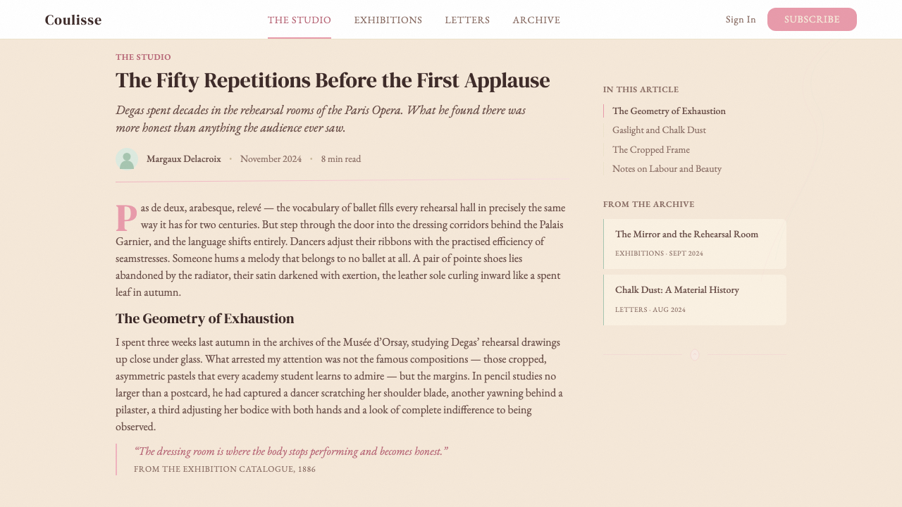
Type in this system is drawn from the Belle Époque serif tradition — letterforms with the structured elegance of late nineteenth-century French printing, including gently bracketed serifs, high contrast between thick and thin strokes, and a slight calligraphic warmth. Headlines carry the weight of a theatre programme or a collectors's edition colophon. Body text is set in the warm sepia-brown of the system ink, never stark black. Caps-set labels and short display lines are treated with generous letter-spacing, recalling the typographic conventions of Belle Époque poster design.这套系统的字体取材于Belle Époque衬线传统——带有十九世纪末法国印刷结构优雅的字形,包括轻柔的括弧衬线、粗细笔画之间的高对比度,以及略带书法温度的细节。标题承载着剧院节目单或收藏家版本题跋的分量。正文以系统墨水的温暖赭褐色书写,从不使用纯黑。全大写标签和短展示行以充裕的字距处理,令人想起Belle Époque海报设计的排印惯例。
Compositional Cropping构图裁切
Layouts in this system deliberately avoid centered, closed, symmetrical compositions. The core principle — borrowed directly from Degas's ukiyo-e-influenced framing — is the cropped subject: primary visual elements are positioned so that they appear to extend beyond the frame, or to have arrived mid-gesture. A figure's shoulder, a column header, a chart axis may all be cut by the edge of the card or slide. This off-balance composition generates a sense of caught motion and documentary immediacy, as though the design is a detail from something larger rather than a self-contained artifact.这套系统的版面刻意回避居中、封闭、对称的构图。核心原则——直接借鉴自德加受浮世绘影响的取景方式——是裁切式主体:主要视觉元素被定位为延伸至画框之外,或仿佛在动作中途出现。人物的肩膀、栏目标题、图表轴线都可能被卡片或幻灯片的边缘截断。这种失衡构图产生一种捕捉到运动的感觉和纪录片式的即时感,仿佛设计是某个更大整体的局部,而非一件自足的人工制品。
Light and Shadow光线与阴影
Shadow in this system is not a hard geometric offset but a soft bloom — the diffused glow of light that wraps around a form rather than cutting a clean silhouette behind it. This reflects the actual quality of gas-lamp footlight illumination, which was warmer, softer, and more enveloping than the directed spotlights of later electric theatre. Highlights are warm rather than white, tending toward cream or the palest rose. The overall lighting model is low-contrast and enveloping, emphasizing atmosphere over clarity — the opposite of Bauhaus's hard shadow logic.这套系统中的阴影不是硬边几何偏移,而是柔和的晕染——光线环绕形体的漫射光晕,而非在其身后切出干净的轮廓。这反映了煤气脚灯照明的真实质感,它比后来的电气剧院聚光灯更温暖、更柔和、更具包裹感。高光是暖色调而非纯白,倾向于奶油色或最淡的玫瑰色。整体光线模型低对比度、具有包裹感,强调氛围胜于清晰——与包豪斯硬边阴影逻辑恰好相反。
Structural Color Use色彩的结构性运用
Despite its warmth, the palette is used with structural discipline. Jade is not scattered as accent but assigned to specific functional zones: navigation backgrounds, sidebar fields, secondary card surfaces. Rose is not used for general decoration but appears only where an element carries emotional or hierarchical priority — a featured statistic, a section title, a call-to-action. Sepia anchors all text at every level. This assignment — ground color, structural color, accent color, ink color — is strict, and departing from it toward more general colorfulness immediately breaks the system's period coherence.尽管整体温暖,色板的使用仍遵循结构性纪律。玉色不是散布为强调色,而是被分配至特定功能区域:导航背景、侧边栏字段、次级卡片表面。玫瑰色不用于一般装饰,只在元素承载情感或层级优先级时出现——一个特色数据、一个段落标题、一个行动号召。赭褐色在所有层级的文字中起锚定作用。这种分配——底色、结构色、强调色、墨色——是严格的,偏离它走向更普遍的色彩丰富性,立即会破坏系统的时代连贯性。
Ornament and Restraint装饰与克制
Unlike Bauhaus, this system does not prohibit all ornament. It permits the ornament that Degas's source world actually contained: fine ruled lines in the manner of nineteenth-century bookbinding, small bracket and swash details drawn from Belle Époque letterpress, and subtle texture patterns derived from the woven structure of ballet costumes and barre floors. What the system refuses is ornament that does not have this documentary anchor — generic decorative borders, arbitrary floral motifs, or contemporary graphic elements imported from unrelated visual traditions. The question is not whether ornament exists but whether it belongs.与包豪斯不同,这套系统并不禁止所有装饰。它允许德加源世界中真实存在的装饰:十九世纪装订风格的细划线、取自Belle Époque活版印刷的小括弧与花体细节,以及源自芭蕾服装与把杆地板编织结构的微妙纹样。这套系统拒绝的是没有这种文献锚点的装饰——通用装饰边框、任意花卉母题,或从无关视觉传统中引入的当代图形元素。问题不在于装饰是否存在,而在于它是否归属于此。
See the Degas Ballet Pastels design system查看 Degas Ballet Pastels 完整设计系统
Who shaped Degas Ballet Pastels?谁塑造了 Degas Ballet Pastels?
Degas (1834–1917) trained as a classicist, copying Ingres and the Italian masters before developing the distinctive snapshot compositions and pastel technique that defined his mature style. He was not an Impressionist in the plein-air sense — he distrusted outdoor light and worked almost entirely from memory and studio observation — but he exhibited with the Impressionist group eight times from 1874 onward. His collection of more than a thousand Japanese woodblock prints directly shaped his compositional approach, and his systematic study of Eadweard Muybridge's motion photographs in the 1880s informed the documentary accuracy of his dancers' poses. The ballet works are the direct source material for every element of this design system.德加(1834—1917年)受过古典主义训练,师法安格尔与意大利大师,随后发展出快照式构图与粉彩技法,定义了他成熟期的风格。他不是户外写生意义上的印象主义者——他不信任户外光线,几乎完全依靠记忆与画室观察创作——但他从1874年起多次参加印象主义画展。他收藏的逾千幅浮世绘版画直接塑造了他的构图方式,1880年代对埃德华·迈布里奇运动摄影的系统研究则赋予了他笔下舞者姿态的纪录片式准确性。芭蕾系列作品是这套设计系统每一个元素的直接素材来源。
Marie van Goethem (born 1865) was a petit rat — the lowest rank of the Paris Opéra Ballet's student corps — who posed for Degas over several years in the late 1870s and early 1880s. She is best known as the model for the wax sculpture The Little Dancer of Fourteen Years, exhibited at the Impressionist show of 1881 and now known primarily through bronze casts. Van Goethem represents the human center of the system's aesthetic: not the celebrated principal dancer but the anonymous, working student waiting in the wings — the figure the system's backstage intimacy is built around.玛丽·范·戈塔姆(生于1865年)是巴黎歌剧院芭蕾舞团学生团中级别最低的「小老鼠」,在1870年代末至1880年代初为德加担任了数年模特。她以蜡像《十四岁的小舞者》的原型而最为人知,该作品于1881年印象派画展上展出,现主要以铜铸版本传世。范·戈塔姆代表了这套系统美学的人文核心:不是备受赞誉的首席舞者,而是在舞台侧翼等待的无名劳动学生——这套系统所有后台亲密感围绕其构建的那个人。
Mary Cassatt (1844–1926) was an American painter who worked in Paris within the Impressionist circle and shared with Degas both a passion for Japanese prints and an interest in domestic and interior subjects as legitimate painterly territory. Degas championed her work and the two maintained a long artistic friendship. Cassatt's own palette — warm cream grounds, soft rose, intimate interior light — runs closely parallel to the Degas ballet pastels and provides a secondary reference point for the system's color temperature and compositional intimacy. Her work demonstrates that the aesthetic is not unique to the ballet subject but is a coherent approach to interior warmth and observed light.玛丽·卡萨特(1844—1926年)是在巴黎印象主义圈子中工作的美国画家,与德加同样痴迷于日本版画,也同样认为日常生活与室内场景是正当的绘画领域。德加积极推介她的作品,两人保持了长期的艺术友谊。卡萨特自己的色板——奶油色暖底、柔和玫瑰、温馨的室内光线——与德加的芭蕾粉彩高度平行,为这套系统的色温和构图亲密感提供了次级参照点。她的作品证明,这种美学并不专属于芭蕾题材,而是对室内温暖与观察光线的一套连贯处理方式。
Henri Rouart (1833–1912) was an engineer, industrialist, and amateur painter who served as Degas's closest personal friend for over forty years and as his primary conduit into the social world of the Paris Opéra. Rouart's collection of Degas's works — assembled over decades of friendship — became one of the most important private holdings of Impressionist art in Paris. His role in the system's genealogy is less artistic than social: without Rouart's introductions and hospitality, Degas might never have gained the sustained backstage access that made the ballet pastels possible. He is a reminder that great aesthetic systems often depend on friendships and social networks as much as on formal artistic influences.亨利·鲁阿特(1833—1912年)是一位工程师、工业家兼业余画家,在四十余年间是德加最亲密的挚友,也是他进入巴黎歌剧院社交世界的主要引路人。鲁阿特在数十年友谊中积累的德加作品收藏,成为巴黎最重要的私人印象派藏品之一。他在这套系统谱系中的角色与其说是艺术的,不如说是社交的:没有鲁阿特的引荐与款待,德加可能永远无法获得持续的后台通行资格,而那正是芭蕾粉彩系列得以实现的前提。他提醒我们:伟大的美学系统往往与友谊和社交网络一样,依赖于正式的艺术影响。
The Japonisme movement — the widespread European fascination with Japanese visual art following the opening of trade with Japan in the 1850s and 1860s — supplied the compositional vocabulary that most sharply distinguishes the Degas ballet aesthetic from its Impressionist contemporaries. The high viewpoint, the cropped frame, the willingness to interrupt a figure at the picture edge, the asymmetric placement of subject against ground: all of these were conventions of ukiyo-e woodblock print design that Degas, Cassatt, Whistler, and others absorbed and adapted. In terms of this design system, Japonisme is the source of the cropping principle — the single most unusual compositional feature — and the authority behind its apparent informality.日本主义运动——欧洲在1850至60年代与日本开放贸易后对日本视觉艺术的广泛迷恋——提供了将德加芭蕾美学与同时代印象主义最鲜明区分开来的构图词汇。高视点、裁切画框、在画面边缘打断人物的意愿、主体与底色的不对称布局:所有这些都是浮世绘版画设计的惯例,被德加、卡萨特、惠斯勒及其他人吸收并转化。就这套设计系统而言,日本主义是裁切原则的来源——这是系统中最不寻常的构图特征——也是其表面随意性背后的权威依据。
How do you use Degas Ballet Pastels today?今天怎么用 Degas Ballet Pastels?
Degas Ballet Pastels is suited to contexts that need warmth, cultural depth, and a sense of practiced craft — not to contexts demanding sharp rational authority. Applied correctly, it transforms a designed artifact into something that feels curated and inhabited rather than manufactured and neutral. The style works best when the product it represents has a relationship with history, skill, or human effort: arts organizations, editorial publications, premium consumer goods, cultural institutions, and digital products in the adjacent spaces.德加芭蕾粉彩系统适合需要温暖感、文化深度和精工质感的场景,而非要求理性权威的场景。正确应用时,它将设计物转化为某种感觉上经过精心策划、有人栖居其中的存在,而非制造出的中性产品。这种风格在产品与历史、技艺或人类努力有所关联时效果最佳:艺术机构、编辑类出版物、高端消费品、文化机构,以及数字领域中与之相邻的产品。
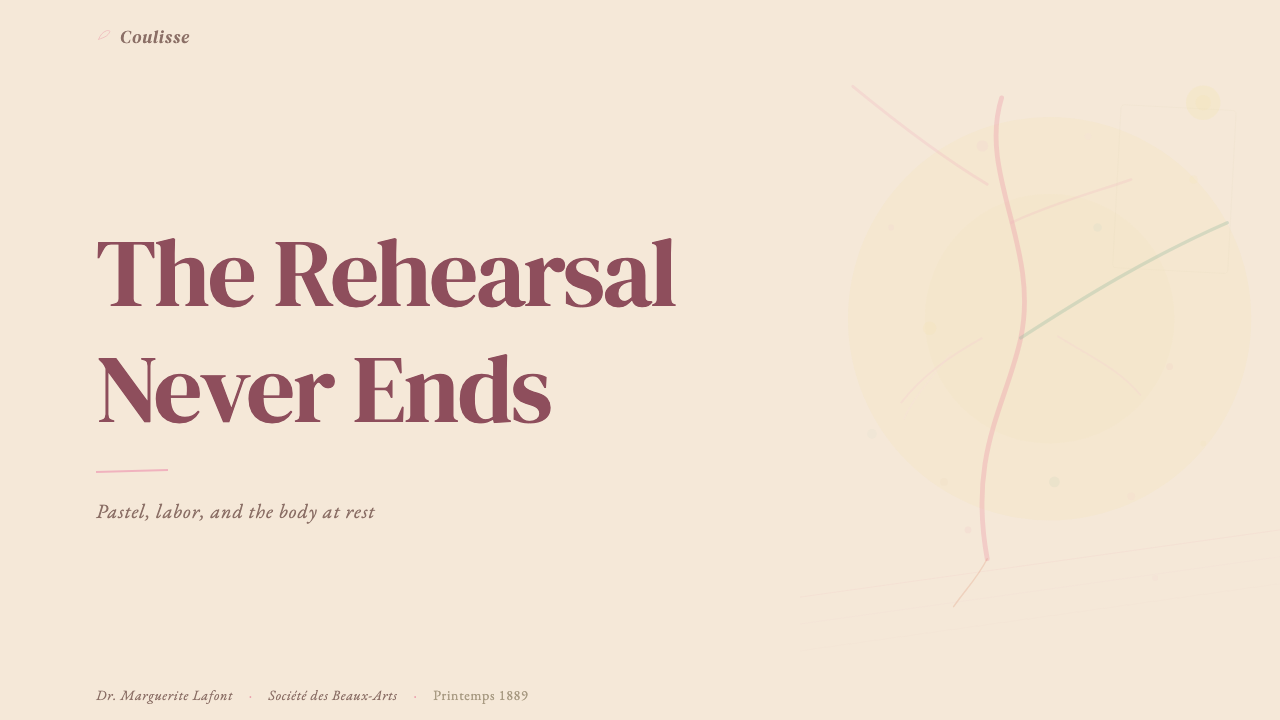
For presentation slides, the system offers a strong solution for both cover and content pages that need to feel distinguished without being loud. A cover slide works best with an off-center composition: the primary heading placed in a cream field with jade sidebar or footer element, and a subtle pastel-texture ground giving the surface its characteristic warmth. Content slides should avoid dense information packing — the aesthetic demands breathing room and generous white space. Data slides can carry simple charts and figures, but color coding should remain within the system palette: jade for primary data series, rose for highlight values, sepia for axis labels. Pie charts and donut charts work particularly well, as their circular form resonates with the choreographic imagery underlying the style.在演示文稿中,这套系统为封面页和需要显得不凡而不张扬的内容页提供了有力的解决方案。封面幻灯片最适合非居中构图:主标题置于奶油色底面,搭配玉色侧边或页脚元素,微妙的粉彩纹理底面赋予表面特有的温暖感。内容幻灯片应避免信息密集堆砌——这种美学需要呼吸空间与充裕的留白。数据幻灯片可以承载简单的图表与数据,但色彩编码应保持在系统色板之内:玉色用于主数据系列,玫瑰色用于高亮值,赭褐色用于坐标轴标签。饼图和环形图尤其适合,其圆形形态与这种风格潜在的舞蹈意象产生共鸣。
For web interfaces, this system is well-suited to editorial dashboards, arts-organization portals, premium brand websites, and any interface where the user experience is meant to feel like browsing a carefully curated collection rather than operating a tool. The approach: a cream or very warm off-white background throughout, jade for navigation and sidebar surfaces, sepia for all body and label text, rose reserved for primary calls to action and notification states. Card components should have soft, glowing edges rather than hard drop shadows. Pricing pages benefit from the system's inherent tier-differentiation logic: jade backgrounds for standard tiers, rose accents for featured or premium tiers, cream for supporting information.对于网页界面,这套系统适合编辑类仪表板、艺术机构门户、高端品牌网站,以及任何用户体验旨在让人感觉像在浏览精心策划的收藏品而非操作工具的界面。方法:全站采用奶油色或极暖的白色背景,导航与侧边栏表面用玉色,所有正文和标签文字用赭褐色,玫瑰色专用于主要行动号召和通知状态。卡片组件应有柔和发光的边缘,而非硬边投影。定价页受益于系统固有的层级区分逻辑:标准层用玉色背景,特色或高级层用玫瑰色强调,支撑信息用奶油色。
For editorial and marketing contexts, Degas Ballet Pastels supports a style of long-form storytelling that feels considered and unhurried. Article layouts work well with generous margins that carry pull-quotes in a slightly larger serif, section breaks marked by a fine horizontal rule in jade rather than a decorative ornament, and opening paragraphs set in a slightly elevated size to ease the reader in. Marketing pages are not well-served by the fast-scroll, high-contrast approach of contemporary conversion design — the style is better applied to above-the-fold feature sections and brand story sequences where depth and warmth matter more than immediacy. Social cards and event announcements in this style work well with an asymmetrically placed subject, a pale cream ground, and a single line of sepia type carrying the key information.在编辑与营销场景中,德加芭蕾粉彩系统支持一种感觉深思熟虑、不慌不忙的长篇叙事风格。文章版面适合宽裕的留白区域承载稍大号衬线字体的引文,段落分隔以玉色细水平线而非装饰元素标记,开篇段落以略大字号书写以引导读者入境。这种风格不适合当代转化设计的快速滚动、高对比度方式——它更适合应用于首屏特性区块和品牌故事叙述序列,在那些场景里深度与温暖感比即时性更重要。这种风格的社交卡片和活动公告适合不对称主体布局、淡奶油色底面和一行赭褐色文字承载关键信息。
The most common mistake when applying this system is pushing the palette toward conventional prettiness — adding more pink, softening the jade toward mint, making the cream brighter and cooler. Each of these moves destroys the period specificity that gives the palette its authority. The jade must stay in the muted, institutional register of Belle Époque interiors, not drift toward contemporary sage or seafoam. The rose must retain its warm, slightly amber character — it is footlight glow, not blush or candy. The cream must be genuinely warm, reading closer to aged paper than to fresh white. A second common mistake is symmetric centering: centering the headline, centering the image, centering the supporting text. This produces a layout that is merely soft and pretty rather than Degas-inflected — the cropping logic and off-balance placement are what give the system its distinctive vitality and must be preserved.应用这套系统时最常见的错误是将色板推向惯常的柔美感——加入更多粉色、将玉色软化至薄荷绿、让奶油色更亮更冷。每一步这样的调整都会摧毁赋予色板权威性的时代特殊性。玉色必须保持在Belle Époque室内空间那种静穆的机构色调中,而非漂移至当代鼠尾草绿或海泡绿。玫瑰色必须保留其温暖、略带琥珀的特质——它是脚灯的光晕,而非腮红或糖果色。奶油色必须真正温暖,读起来更接近泛黄的旧纸而非新鲜的白色。第二个常见错误是对称居中:居中标题、居中图片、居中支撑文字。这会产生一个仅仅柔美好看的版面,而非具有德加气息的版面——裁切逻辑和失衡布置才是赋予这套系统独特生命力的所在,必须予以保留。
See the Degas Ballet Pastels design system查看 Degas Ballet Pastels 完整设计系统
Degas Ballet Pastels — FAQDegas Ballet Pastels · 常见问题
How does this style differ from general vintage or Art Nouveau aesthetics?这种风格与一般复古风或新艺术风格有何不同?
Vintage and Art Nouveau aesthetics share some surface similarities — warm colors, period typography, decorative texture — but they are compositionally and philosophically quite different from the Degas ballet system. Art Nouveau relies heavily on organic, flowing line work, botanical motifs, and symmetrical decorative programs. Vintage aesthetics tend toward saturated nostalgia and deliberate imperfection as surface treatment. The Degas system, by contrast, is built on documentary observation: its colors are historically specific, its cropping is derived from photographic and ukiyo-e logic, and its warmth comes from material accuracy rather than stylistic softening. The test is whether the design looks like it is performing a period — if so, it has drifted toward general vintage. Authentically applied, it should feel like an archival object that happens to be contemporary.复古美学和新艺术风格在表面上与德加芭蕾系统有些相似——暖色调、时代字体、装饰性纹理——但在构图和哲学上大相径庭。新艺术风格大量依赖有机流动的线条、植物纹样和对称的装饰程序。复古美学倾向于饱和的怀旧感和刻意的不完美作为表面处理。德加系统则相反,建立在纪录性观察之上:它的色彩具有历史特殊性,它的裁切来源于摄影与浮世绘逻辑,它的温暖感来自材料的准确性而非风格的软化。检验标准是:设计看起来是在「表演」一个时代,还是真正属于那个时代——如果是前者,它已经漂向了泛化的复古。真正到位的应用,应该感觉像是一件恰好处于当代的档案物件。
Can this style work for data-heavy or technical products?这种风格适合数据密集型或技术性产品吗?
It can, but with discipline. The system's warmth and atmospheric quality can make a data-heavy interface feel less overwhelming and more considered — useful in analytics tools, research platforms, or editorial dashboards where users spend extended time with complex information. The constraint is that the pastel-texture aesthetic and the cropping logic must not be allowed to compromise information legibility. In practice this means: keep the sepia-on-cream text contrast well above comfortable reading thresholds, use jade and rose only for categorical or hierarchical differentiation in charts (not as continuous data scales), and resist the temptation to give every chart element a pastel-softened treatment that reduces contrast. The style works for analytical depth but not for rapid-scan dashboards where every millisecond of comprehension matters.可以,但需要纪律。这套系统的温暖感和大气质感能让数据密集型界面显得不那么压迫、更加从容——在分析工具、研究平台或编辑类仪表板中很有价值,这些场景中用户需要长时间与复杂信息相处。限制在于:粉彩纹理美学和裁切逻辑不能损害信息的可读性。实践中这意味着:保持赭褐色在奶油底上的文字对比度远高于舒适阅读的临界值,在图表中仅将玉色和玫瑰色用于分类或层级区分(而非连续数据刻度),并抵制将每个图表元素都做成粉彩柔化处理从而降低对比度的诱惑。这种风格适合分析性深度,但不适合每一毫秒的理解都至关重要的快速扫描仪表板。
Does the cropping principle apply to images only, or to layout elements as well?裁切原则只适用于图片,还是也适用于版面元素?
It applies to both, and the most effective use of the system extends the cropping logic beyond photography into structural layout elements. A jade background panel that bleeds off one edge of a slide, a serif heading whose ascenders are partially clipped by the card boundary, a circular chart motif positioned so that roughly a quarter of it falls outside the visible area — all of these extend the Degas framing logic into the layout layer without requiring any figurative imagery at all. The principle is that the frame of the design should feel arbitrary rather than definitive: as if the composition extends beyond what is shown. This is very different from the self-contained, fully-resolved compositions that most design systems aim for, and it is the feature that most clearly marks the style's distinctiveness.两者都适用,而且这套系统最有效的应用是将裁切逻辑延伸到摄影图像之外,进入结构性版面元素。一块玉色背景色块从幻灯片一侧出血、一行衬线标题的上延部分被卡片边界局部截断、一个圆形图表母题定位为大约四分之一落在可视区域之外——所有这些都将德加的取景逻辑延伸至版面层,完全不需要任何具象图像。原则是:设计的画框应该感觉是任意的而非最终确定的——仿佛构图延伸到所呈现内容之外。这与大多数设计系统追求的自足、完全收尾的构图截然不同,也是最清晰标志这种风格独特性的特征。
How does this system handle dark mode or dark-background layouts?这套系统如何处理深色模式或深色背景版面?
The system is fundamentally a light-ground system and a dark inversion is not recommended as a direct equivalent. The cream-and-jade palette depends on light reflectance to produce its warmth — on a dark background, the same hues flatten and lose their period character. A sympathetic dark variant, if required, should not simply invert the palette but instead reference the actual darkness of a Degas painting's shadows: a very deep, warm brown-black as background, jade as a mid-value structural tone, and rose and cream used sparingly as foreground accents only. Type should shift to a warm near-white rather than pure white. This approach preserves the atmospheric warmth of the source material on a dark ground without producing a generic dark-mode result.这套系统从根本上是浅色底面系统,不推荐直接做深色反转。奶油与玉色色板依赖光线反射产生温暖感——在深色背景上,同样的色相会变得扁平、失去时代特质。如果确实需要一个相近的深色变体,不应简单反转色板,而应参照德加画作阴影中真实的深色:以极深的暖褐黑色为背景,玉色作为中间调结构色,玫瑰色和奶油色只作为前景强调色少量使用。文字应转向暖色调的近白色而非纯白色。这种方式在深色背景上保留了源材料的大气温暖感,同时避免产生泛化的深色模式效果。
Is the pastel texture appropriate for professional or corporate contexts?粉彩纹理适合专业或企业场景吗?
The texture is appropriate in any professional context where the product's brand values include warmth, craftsmanship, cultural depth, or distinguished heritage — and inappropriate where the dominant values are precision, speed, technical authority, or corporate neutrality. A gallery, a fine-dining brand, a literary publisher, a premium financial advisory, or a performing-arts organization can all carry the pastel texture comfortably because the texture reinforces their values. A SaaS analytics platform, a logistics dashboard, or a legal compliance tool would find the texture at odds with what users expect and what the product needs to communicate. The texture is not more or less professional than any other design decision — it is specifically suited to some brand positionings and unsuited to others.这种纹理适合任何专业场景——只要产品的品牌价值包含温暖感、工艺性、文化深度或卓越传承——而在主导价值是精确、速度、技术权威或企业中立性的场景中则不合适。画廊、精致餐饮品牌、文学出版社、高端财务顾问或表演艺术机构都能舒适地承载粉彩纹理,因为纹理强化了它们的价值主张。SaaS分析平台、物流仪表板或法律合规工具则会发现纹理与用户预期及产品所需传达的信息相悖。纹理不比其他任何设计决策更专业或更不专业——它特别适合某些品牌定位,而不适合另一些。
Related design styles相关设计风格
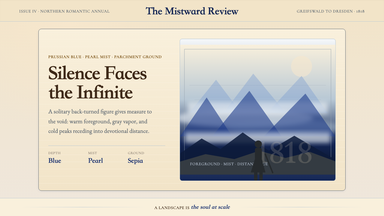 Caspar David FriedrichSilence becomes vast. Prussian blue depth, pearl mist, and parchment framing…寂静变得辽阔:普鲁士蓝纵深、珍珠雾与羊皮纸框层层后退。
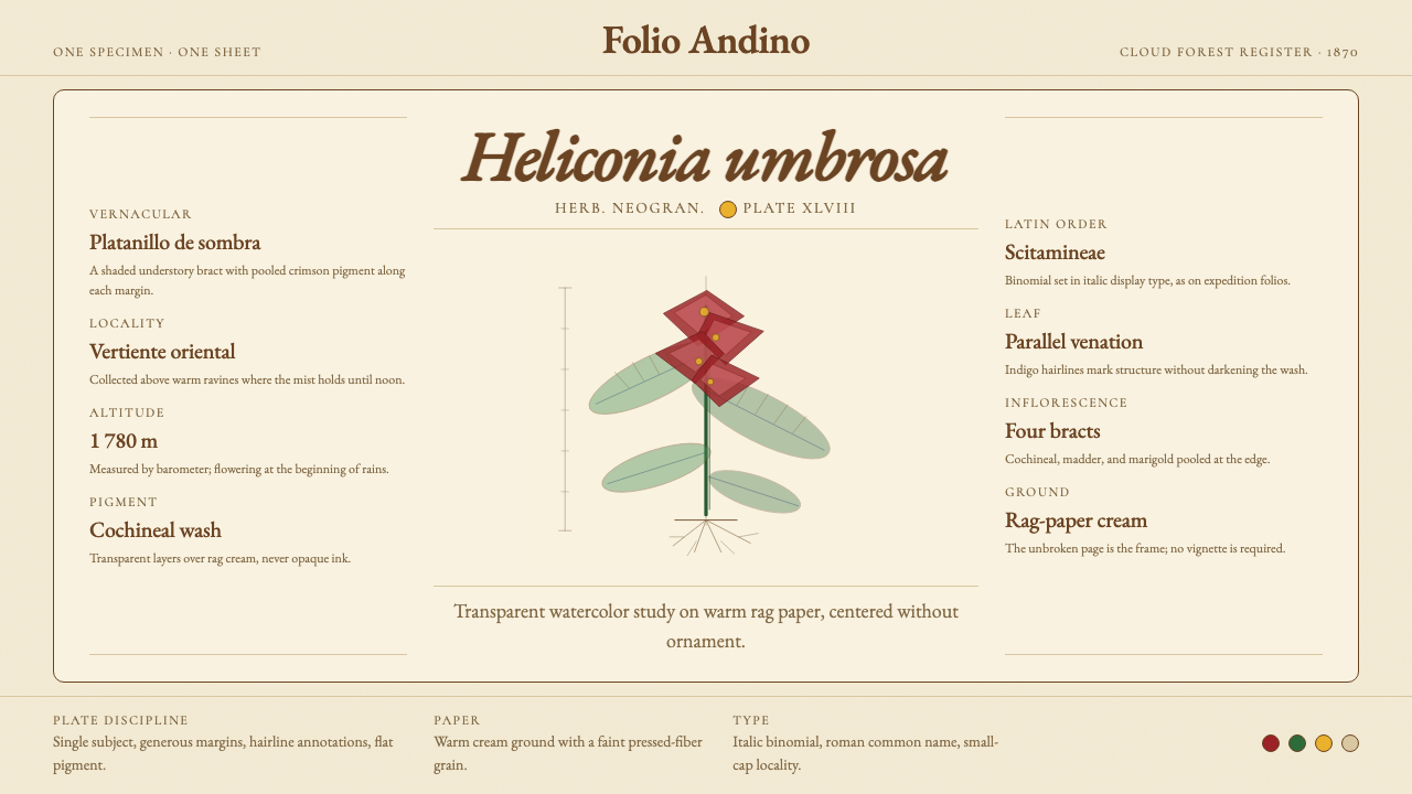 Colombian Botanical (Triana)Observation becomes ornament. Crimson watercolor specimen breathes on cream r…观察即装饰。绯红水彩标本静置于奶油破布纸。
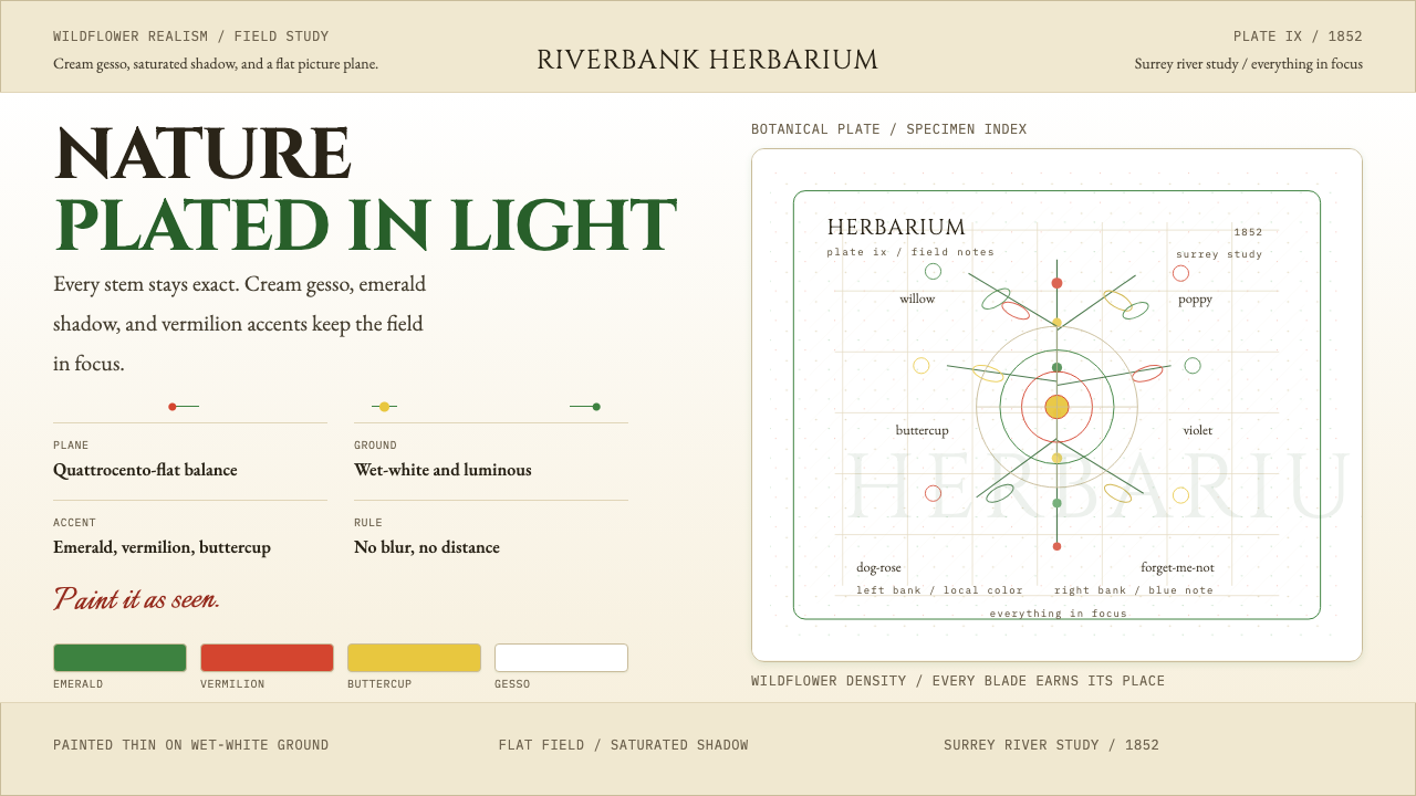 Millais — Ophelia / Wildflower Pre-RaphBotany, rendered with conviction. Cream gesso, emerald, and vermilion stay in…植物画得极其笃定。奶油底、祖母绿、朱红始终清晰。
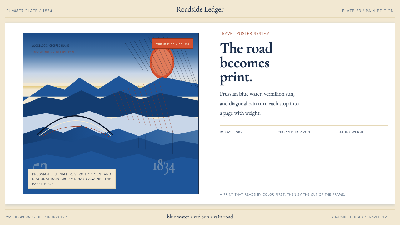 Hiroshige — Tokaido RoadA road print in motion. Prussian blue blocks, vermilion cartouches, diagonal…会行进的路途海报。普鲁士蓝色块、朱红题签与斜雨。
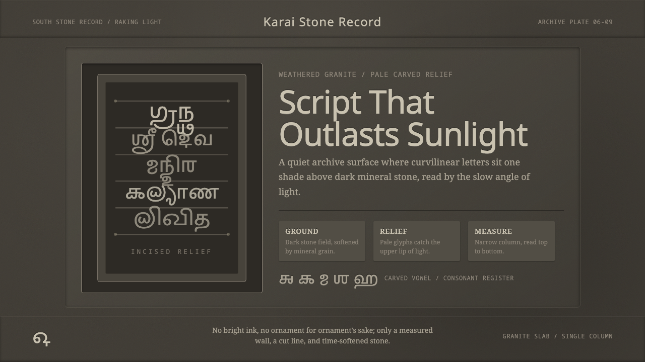 Tamil Grantha InscriptionSacred stone, quietly lit. Pale Grantha glyphs float on dark granite in a nar…肃穆如石:浅色格兰塔字浮在暗花岗岩上,窄列静读。
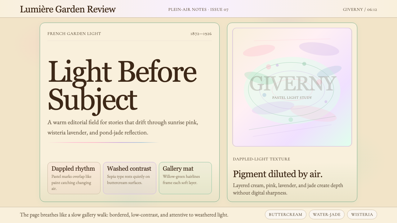 Claude Monet ImpressionistLight becomes the subject. Buttercream, pastel dapples, and Cormorant serif s…光成为主题。奶油底、粉彩斑点与Cormorant衬线柔化画面。