What is Claude Monet Impressionist?什么是 Claude Monet Impressionist?
Monet taught the world to paint light itself — and this design system translates that shimmering, transient beauty into a warm editorial language for modern screens.莫奈教会世界描绘光线本身——这套设计系统将那种闪烁、转瞬即逝的美,转化为现代屏幕上温暖的编辑式视觉语言。
Claude Monet Impressionist in briefClaude Monet Impressionist 速览
The Monet Impressionist design system draws its soul from one of the most radical ideas in the history of Western painting: that the subject of a picture need not be the object in the scene, but the light falling upon it. When Claude Monet exhibited Impression, Sunrise in Paris in 1874, critics used the title mockingly — the word 'impressionism' was initially an insult. Within a decade, it had become the name of the most influential painting movement of the nineteenth century, and the soft, luminous palette Monet spent his life perfecting had redefined what color could do on a flat surface.莫奈印象派设计系统的灵魂,源自西方绘画史上最激进的观念之一:一幅画的主题无需是场景中的物体本身,而可以是落在其上的光线。1874年莫奈在巴黎展出《日出·印象》时,批评家用这个标题嘲讽他——「印象主义」最初是一句骂人的话。不到十年,它便成为十九世纪影响最深远的绘画运动的名称;而莫奈用一生精炼的那种柔和、发光的色调,重新定义了色彩在平面上所能做的一切。
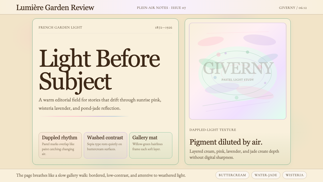
Visually, this system is defined by atmospheric softness rather than hard-edge clarity. The palette is drawn from Monet's recurring motifs: the warm pink and coral of early sunrise, the wisteria lavender and pale violet of his Giverny garden, the translucent jade and celadon of pond reflections, the buttercream warmth of late-afternoon light, and the hazy sky blues that dissolve into mist at the horizon. These hues are never saturated to full intensity — they are always tempered by light, as if seen through a scrim of morning atmosphere. Contrast is gentle and relative rather than stark and absolute.在视觉上,这套系统以大气的柔软感而非硬边的清晰感为定义。色板取自莫奈反复描绘的意象:黎明时分温暖的粉红与珊瑚色,吉维尼花园中的紫藤薰衣草与淡紫,池塘倒影中透明的翡翠绿与青瓷色,午后光线中奶油般的暖意,以及在地平线处消融入雾气的朦胧天空蓝。这些色调从不饱和至全强度——它们永远被光线调和,仿佛透过一层晨雾的薄纱所见。对比是柔和而相对的,而非强烈而绝对的。
Typography in this system reaches for the warmth and fineness of a printed editorial page. Delicate serif letterforms echo the organic curves of flowering wisteria and lily pads; generous leading and unhurried line lengths encourage reading as an act of dwelling rather than scanning. Ornamental flourishes are permitted where they serve the editorial character — this is a world apart from the austere rationalism of Bauhaus or the mechanical precision of Swiss grid systems. The overall effect is one of cultivated leisure, cultural richness, and the gentle authority of a well-made art publication.这套系统的字体排印追求印刷编辑页面的温度与精致。纤细的衬线字形呼应紫藤与睡莲叶的有机曲线;慷慨的行距与不急促的行长,鼓励阅读成为一种驻留而非扫视的行为。装饰性花饰在服务于编辑气质之处是被允许的——这是一个与包豪斯的严格理性主义、瑞士网格系统的机械精确截然不同的世界。整体效果是一种有教养的闲适、丰富的文化气韵,以及一本精心制作的艺术出版物所具备的温柔权威。
See the Claude Monet Impressionist design system查看 Claude Monet Impressionist 完整设计系统
Where does Claude Monet Impressionist come from?Claude Monet Impressionist 从何而来?
The movement that would take Monet's name as its emblem began not in a manifesto or a school, but in a practical revolt against the exhibition system that controlled French art. The Académie des Beaux-Arts, through its annual Salon, determined which paintings reached the public and which artists achieved careers. Its tastes ran to historical and mythological subjects rendered with smooth, invisible brushwork — finish was a virtue, and evidence of the painter's hand a flaw. In 1863, the Salon rejected so many submissions that Emperor Napoleon III permitted a 'Salon des Refusés' to display the rejected works. Édouard Manet's Le Déjeuner sur l'herbe scandalized visitors, but it also announced that a different kind of painting was pressing against the walls of acceptable taste.以莫奈之名为旗帜的这场运动,并非起始于宣言或学校,而是源于对控制法国艺术的展览体制的一次实际反抗。法国美术学院通过年度沙龙决定哪些画作能与公众见面、哪些艺术家能够立身。它的品味偏向以光滑、隐形笔触描绘的历史与神话题材——完成度是美德,画家的手痕是缺陷。1863年,沙龙拒绝了太多参展作品,拿破仑三世因此允许举办「落选者沙龙」展示被拒作品。爱德华·马奈的《草地上的午餐》令观众震惊,却也宣告:一种不同类型的绘画正在叩击可接受品味的墙壁。
Monet and his circle — which included Camille Pissarro, Pierre-Auguste Renoir, Alfred Sisley, and Berthe Morisot — rejected the studio-bound conventions of the Academy in favour of painting outdoors, directly from observation, in changing natural light. This practice of plein-air painting was not entirely new — the Barbizon school had worked in the open air decades earlier — but the Impressionists took it to a structural conclusion: if light was always changing, then the mark on the canvas had to be quick, visible, and responsive. The characteristic short, discrete brushstroke of Impressionism was not a stylistic whim but a technical necessity, a record of a specific moment of perceived light.莫奈与他的圈子——包括卡米耶·毕沙罗、皮埃尔-奥古斯特·雷诺阿、阿尔弗雷德·西斯莱和贝尔特·莫里索——拒绝了学院派封闭于画室的传统,转而在户外、在变化的自然光线下直接写生。这种外光写生的实践并非全然新鲜——巴比松画派数十年前便已在户外工作——但印象派画家将其推至结构性的结论:如果光线时刻在变,那么画布上的笔触就必须迅速、可见、有所回应。印象派标志性的短促、分离的笔触,并非风格上的任性,而是一种技术上的必然——是某一特定光线感知瞬间的记录。
Monet's personal journey through the movement traced its full ambitions. Born in Paris in 1840 and raised in Normandy, he received early encouragement from Eugène Boudin, the coastal landscape painter who first took him outdoors to work. He studied in Paris alongside Renoir, Sisley, and Frédéric Bazille, and by the time the first Impressionist exhibition opened in April 1874 at the studio of photographer Nadar, he was already committed to the serial study of light on a single subject across shifting time and conditions. His Haystacks series (begun 1890), the Rouen Cathedral studies (1892–1894), and the Thames views from London's Savoy Hotel represent the systematic investigation that distinguished him from painters content with a single view: he wanted to capture not a scene but the life of light within it across hours, seasons, and years.莫奈个人的历程勾勒出这场运动的全部抱负。他1840年生于巴黎,在诺曼底长大,早年得到海岸风景画家欧仁·布丹的鼓励,第一次被带到户外写生。他在巴黎与雷诺阿、西斯莱和弗雷德里克·巴齐耶并肩求学。1874年4月,第一届印象派画展在摄影师纳达尔的工作室开幕时,莫奈已坚定地投身于在不同时间与条件下对单一主题光线变化的系列研究。《干草垛》系列(始于1890年)、鲁昂大教堂研究(1892—1894年)和伦敦萨沃伊酒店俯瞰泰晤士河的系列画作,代表了他与满足于单一视角的画家的根本区别:他要捕捉的不是某个场景,而是光在其中跨越数小时、数季节、数年的生命。
The final chapter of Monet's life was played out at Giverny, the property in Normandy he acquired in 1883 and spent decades transforming into a living artwork. The Japanese bridge, the weeping willows, and above all the water-lily pond became the subjects of the monumental late canvases — the Nymphéas — that Monet worked on until his death in 1926 and which now occupy the oval rooms of the Orangerie in Paris. These late works anticipated abstraction: the horizon disappears, the lily pads and reflections become interchangeable, and what remains is pure color and atmosphere. Georges Clemenceau, the French statesman and Monet's lifelong friend, negotiated the gift of the grand decorations to the French state in the final years of Monet's life, ensuring that the movement's culminating vision would endure as a permanent public monument.莫奈人生的最后篇章在吉维尼展开——那是他1883年购置、用数十年心血改造成活体艺术品的诺曼底庄园。日式拱桥、垂柳,以及最重要的睡莲池,成为了晚年巨作《睡莲》(Nymphéas)的主题。莫奈一直工作到1926年辞世,这些画作如今陈列于巴黎橘园美术馆的椭圆形展厅中。这些晚期作品预示了抽象的到来:地平线消失,莲叶与倒影变得可以互换,剩下的是纯粹的色彩与氛围。法国政治家、莫奈的终身挚友乔治·克列孟梭在莫奈生命最后几年斡旋,促成了将这批大型装饰画捐赠给法国国家的协议,确保这场运动的巅峰愿景以永久的公共纪念碑形式留存。
What defines the Claude Monet Impressionist look?Claude Monet Impressionist 的视觉特征是什么?
Atmospheric Palette大气色调
Color in this system is always experienced as light-saturated atmosphere rather than flat pigment. The foundational hues — sunrise pink, wisteria lavender, pond jade, buttercream, and sky blue — are deployed at low intensity with high luminosity, as if every surface is simultaneously lit from within and washed by outdoor daylight. No single color dominates at full strength; instead, tones drift into one another at the edges, creating transitions that feel breathed rather than drawn. The overall palette reads as warm and enveloping, never clinical.这套系统中的色彩,始终呈现为充满光感的大气氛围,而非平涂的颜料。基础色调——日出粉、紫藤薰衣草、池塘翡翠绿、奶油色、天空蓝——以低饱和度、高明度的方式铺展,仿佛每一个表面都同时从内部发光、又被户外日光所洗涤。没有任何一种颜色以全强度主导画面;色调在边缘相互渗融,产生一种呼吸般自然、而非刻意描绘的过渡。整体色板读来温暖而包裹感十足,绝无冷硬的临床感。
Soft, Visible Texture柔软而可见的肌理
Where Bauhaus insists on smooth, frictionless surfaces, the Monet system welcomes the trace of the maker's hand. Backgrounds carry a subtle grain or washed quality, as if lightly stained with watercolor. Dividers and decorative elements may suggest the soft rhythm of a brushstroke rather than the mechanical precision of a ruled line. This texture is never so insistent as to impede legibility — it operates as a gentle sensory reminder that the content is being presented in a made, crafted environment rather than a purely computational one.包豪斯坚持光滑、无摩擦的表面;莫奈系统则欢迎制作者手痕的留存。背景带有细腻的颗粒感或水洗质感,仿佛轻轻用水彩晕染过。分隔线与装饰元素可以暗示笔触的柔和节奏,而非直线的机械精确。这种肌理绝不强烈到妨碍可读性——它作为一种温和的感官提示而存在,告诉读者:内容正呈现于一个有温度、有手工感的环境中,而非纯粹计算性的界面里。
Organic, Curvilinear Form有机的曲线形态
The Monet system does not share Bauhaus geometry's love of the hard circle, square, and triangle. Instead, forms follow the soft logic of the natural world: the arc of a stone bridge over still water, the ellipse of a lily pad, the unhurried curve of a garden path. Borders and containers use rounded corners that feel grown rather than constructed. Decorative motifs, where used, draw from botanical and aquatic sources — stylized leaves, rippled reflections — rather than the mechanical or the geometric.莫奈系统并不认同包豪斯几何对圆形、正方形、三角形的钟爱。形态转而遵循自然界的柔和逻辑:静水上石桥的弧度、睡莲叶的椭圆、花园小径不急促的弯曲。边框与容器使用圆角,感觉像是生长出来的,而非建构而成的。装饰母题(若使用)取材于植物与水生世界——风格化的叶片、涟漪般的倒影——而非机械或几何的来源。
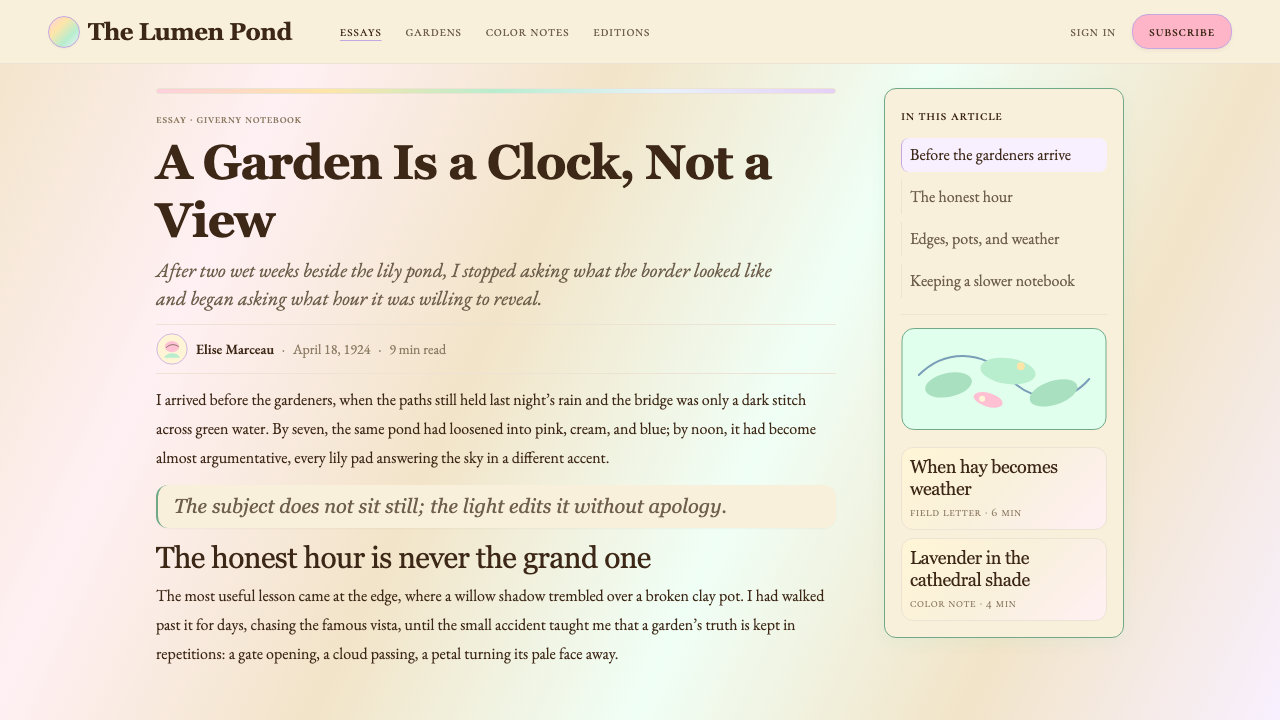
Delicate Editorial Typography纤细的编辑式字体排印
Type choices favor high-contrast serif letterforms with fine hairlines and pronounced stroke modulation — the kind of letterforms that carry associations with printed cultural journalism, museum catalogues, and fine art publishing. Headings are set at a scale that commands attention without aggression; body text flows in relatively long, unhurried lines with generous leading. The typographic color of a page is warm and open rather than dense and compressed. Italic cuts are used freely and expressively to introduce titles, quotations, and section headings.字体选择偏向高对比度的衬线字形,带有纤细的细线笔画与明显的笔画粗细变化——这类字形与印刷文化新闻业、博物馆图录和艺术出版物有着天然的联想关联。标题以足以吸引注意力但不咄咄逼人的尺度排列;正文在相对较长、不急促的行长中流动,行距慷慨。页面的排印色调温暖而开阔,而非密集而压缩。斜体切割被自由而表达性地用于标题、引文和章节标题的引导。
Luminous, Low-Contrast Layering发光的低对比度分层
Rather than separating elements with high-contrast borders or hard shadows, the Monet system uses tonal proximity to organize space. Sections are distinguished by a shift from buttercream to pale lavender, from soft white to the faintest blush — differences the eye reads without conscious effort. Shadows, where used, are soft and diffuse, suggesting natural light scattering across a surface rather than a cast shadow under artificial illumination. The result is a layout that breathes and reads as continuous, like the surface of still water, rather than a collection of discrete compartments.莫奈系统不以高对比度边框或硬边阴影分隔元素,而是用色调的亲近性来组织空间。各区块通过从奶油色到淡薰衣草、从柔和白到最淡粉红的微妙转换而彼此区分——这种差异由眼睛不费力地读取。阴影(若使用)柔和而漫射,暗示自然光在表面散射,而非人工照明下的投射阴影。结果是一个呼吸感十足、阅读起来如静水表面般连续的版面,而非一组离散隔间的集合。
Temporal, Transient Mood时间感与瞬息的情绪
Impressionism is the art of a specific moment — the six-thirty light, not the generalized daylight. The design system carries this sensibility in its tonal choices and compositional rhythm. Imagery, where included, favors soft focus, directional light, and the suggestion of movement or transition — a reflection disturbed by a breeze, petals on the verge of falling. The overall emotional register is one of pleasant melancholy, aesthetic alertness, and the cultured appreciation of beauty that does not last. This mood distinguishes the system sharply from contemporary styles aimed at urgency, clarity, or efficiency.印象派是某一特定时刻的艺术——六点半的光线,而非泛化的白昼。这套设计系统在色调选择与构图节奏中携带着这种感受力。图像(若使用)偏向柔焦、方向性光线,以及运动或过渡的暗示——被微风扰动的倒影,花瓣将落未落的瞬间。整体的情感基调是一种愉悦的忧郁、审美的警觉,以及对转瞬即逝之美有教养的欣赏。这种情绪使这套系统与追求紧迫感、清晰度或效率的当代风格形成鲜明区分。
Garden and Water Motifs花园与水的意象
The iconographic vocabulary of this system draws heavily from Monet's Giverny world: the lily pad, the arched bridge, trailing wisteria, water reflections, and the layered depth of a garden in full bloom. These motifs appear as background textures, decorative accents, section breaks, and illustrative elements. They are used with restraint — one or two per composition rather than as overall pattern — and always in service of the editorial or atmospheric intention of the layout rather than as decoration for its own sake.这套系统的图像词汇大量取自莫奈的吉维尼世界:睡莲叶、弧形拱桥、垂落的紫藤、水面倒影,以及花园盛开时分层的深度。这些意象以背景肌理、装饰点缀、章节分隔和插图元素的形式出现。它们被克制地使用——每个构图中一两处,而非作为整体图案——始终服务于版面的编辑或氛围意图,而非为装饰而装饰。
See the Claude Monet Impressionist design system查看 Claude Monet Impressionist 完整设计系统
Who shaped Claude Monet Impressionist?谁塑造了 Claude Monet Impressionist?
Born in Paris in 1840 and raised in the coastal town of Sainte-Adresse near Le Havre, Monet is the defining figure of Impressionism — the painter whose name the movement effectively carries. He was a founding participant of the 1874 exhibition that gave the movement its name (borrowed from his Impression, Sunrise), and he outlived most of his contemporaries, continuing to paint at Giverny until blindness from cataracts in his final years severely compromised his vision. His late Nymphéas series — conceived as a total environment, an unbroken panorama of the water-lily pond — anticipated the scale and immersiveness of twentieth-century abstraction and continues to attract more museum visitors than almost any other body of Impressionist work.莫奈1840年生于巴黎,在勒阿弗尔附近的海滨小镇圣阿德雷斯长大,是印象派的核心人物——这场运动实际上以他的名字为旗帜。他是1874年那届画展的创始参展人(运动名称借自他的《日出·印象》),并且比大多数同时代人活得更久,在吉维尼持续作画,直至晚年白内障严重损害视力。他晚期的《睡莲》系列——构想为一个整体环境、睡莲池不间断的全景——预示了二十世纪抽象艺术的规模与沉浸感,至今吸引的博物馆访客数量几乎超过任何其他印象派作品群。
Pissarro was the only painter to exhibit at all eight Impressionist exhibitions (1874–1886), and his role within the movement was more pedagogical and connective than his paintings alone suggest. He corresponded extensively with younger artists including Paul Cézanne and Paul Gauguin, encouraging and critiquing their work with unusual generosity. His own paintings — characterized by high viewpoints over streets and fields, a systematic interest in the fall of light across the middle distance, and a palette anchored in the grey-greens and warm ochres of the Île-de-France countryside — represent a quieter, more empirical branch of Impressionism than Monet's atmospheric extremism.毕沙罗是唯一参加了全部八届印象派画展(1874—1886年)的画家,他在运动中的角色比他的画作本身所显示的更具教育意义和连接作用。他与保罗·塞尚、保罗·高更等年轻艺术家有大量通信往来,以罕见的慷慨鼓励和评论他们的作品。他自己的画作——以俯瞰街道与田野的高视角、对中景光线变化系统性的关注,以及扎根于法兰西岛乡间灰绿与暖赭色的色板为特征——代表了印象派中比莫奈大气极端主义更安静、更经验主义的一支。
Renoir brought to Impressionism an interest in the human figure and social scene that complemented Monet's focus on landscape and light. His paintings of open-air café terraces, riverside bathing parties, and Montmartre dance halls — above all Le Moulin de la Galette (1876) and Luncheon of the Boating Party (1881) — captured the warmth and sociability of bourgeois Parisian leisure with a palette of exceptional luminosity. Where Monet dissolved his subjects into atmosphere, Renoir retained the individual warmth of faces and skin, giving the Impressionist palette its most immediately appealing human dimension.雷诺阿为印象派带来了对人物与社交场景的兴趣,与莫奈对风景与光线的专注形成互补。他描绘露天咖啡馆、河边浴场聚会和蒙马特舞厅的画作——尤其是《煎饼磨坊的舞会》(1876年)和《船上的午宴》(1881年)——以卓越的明亮色板捕捉了巴黎资产阶级休闲生活的温度与社交性。莫奈将主题消融于大气之中;雷诺阿保留了面孔与皮肤的个体温度,赋予印象派色板最直接动人的人文维度。
Morisot was the most prominent woman among the Impressionists, exhibiting in seven of the eight group exhibitions and consistently producing work of exceptional delicacy and psychological depth. Her subjects were primarily domestic and private — a woman reading by an open window, children in a garden, figures on a balcony overlooking Paris — but she handled these intimate scenes with the same commitment to observed light and free brushwork as her male contemporaries. Her palette leaned toward silvery whites, soft greys, and pale greens, and her compositions often suspended the figure in an atmosphere of reflective quiet that is distinctly her own.莫里索是印象派中最杰出的女性,参加了八届团体画展中的七届,持续创作出具有卓越精致感与心理深度的作品。她的主题主要是家庭与私密场景——在敞开的窗边读书的女人、花园里的孩子、俯瞰巴黎的阳台上的人物——但她以与男性同时代人同样投身于观察光线与自由笔触的方式处理这些亲密场景。她的色板偏向银白、柔和的灰与淡绿,构图常常将人物悬置于一种沉思般宁静的氛围中,那是鲜明属于她自己的特质。
Clemenceau's place in the Monet story is unique among the movement's associated figures: he was not a painter at all, but the French statesman known as 'The Tiger' who served twice as Prime Minister and led France through the final years of the First World War. His lifelong friendship with Monet began in their shared years in Normandy and deepened as Monet's eyesight declined. Clemenceau visited Giverny repeatedly, encouraged Monet to continue working through failing vision, and ultimately negotiated the donation of the grand Nymphéas decorations to the French state — ensuring the Orangerie installation became a reality before Monet's death in 1926.克列孟梭在莫奈故事中的位置,在运动相关人物中独一无二:他根本不是画家,而是被称为「猛虎」的法国政治家,两度出任总理,并领导法国度过第一次世界大战的最后几年。他与莫奈的终身友谊始于两人在诺曼底共度的岁月,随着莫奈视力衰退而愈发深厚。克列孟梭多次造访吉维尼,鼓励莫奈在视力衰退中坚持创作,最终斡旋促成将大型《睡莲》装饰画捐赠给法国国家——确保橘园的安装在莫奈1926年辞世前成为现实。
How do you use Claude Monet Impressionist today?今天怎么用 Claude Monet Impressionist?
The Monet Impressionist system is most powerful when the content itself has a cultural, editorial, or experiential character — when the goal is to evoke a state of contemplative engagement rather than drive rapid transactional decisions. Applied well, it communicates sophistication, warmth, and a curatorial sensibility that instantly distinguishes a product from the utilitarian defaults of modern interface design. Applied carelessly, it can read as nostalgic, unfocused, or decoratively overwrought. The key is understanding that Impressionism's softness is disciplined — Monet's canvases have immense compositional rigor beneath their apparent looseness — and bringing that same underlying structure to digital layouts.莫奈印象派系统在内容本身具有文化、编辑或体验性质时最为有力——当目标是唤起一种沉思式投入的状态,而非驱动快速的交易决策时。运用得当,它传递出精致感、温度与策展人的感受力,立即将产品与现代界面设计的功利性默认值区分开来。运用不当,则可能读来怀旧、散漫或装饰过度。关键在于理解:印象派的柔软是有纪律的——莫奈的画布在表面上的松动之下,有着巨大的构图严谨性——并将同样的底层结构带入数字版面。
For presentation slides, this system excels on both cover and section-break pages where mood and cultural positioning matter most. A cover built in this system might use a single atmospheric image — soft, directionally lit, with a visible textural depth — paired with a fine serif title set in warm near-white against a deep tonal ground of pond-jade or late-evening lavender. Content slides should resist the temptation to fill every surface with texture: treat the background as a quiet field, use tonal contrast rather than color contrast to separate sections, and let generous white space function as the breathing room that connects the layout to Impressionism's sense of atmosphere. Data slides take a more restrained approach — charts and graphs in the system's muted palette, with a single accent color drawn from the sunrise pink or wisteria range to highlight the key finding.在演示文稿中,这套系统在封面和分节页上表现最为出色,这些地方的情绪与文化定位最为重要。用这套系统制作的封面,可以使用一张大气的图像——光线柔和而有方向感、带有可见的质感深度——配以细衬线标题,以温暖的近白色排列在深色调的池塘翡翠绿或暮色薰衣草底面上。内容页应抵制用肌理填满每个表面的诱惑:将背景视为安静的底场,用色调对比而非色彩对比区分区块,让慷慨的留白充当将版面与印象派大气感连接起来的呼吸空间。数据页采取更克制的方式——图表使用系统的柔和色板,以从日出粉或紫藤范围中取出的单一强调色突出关键发现。
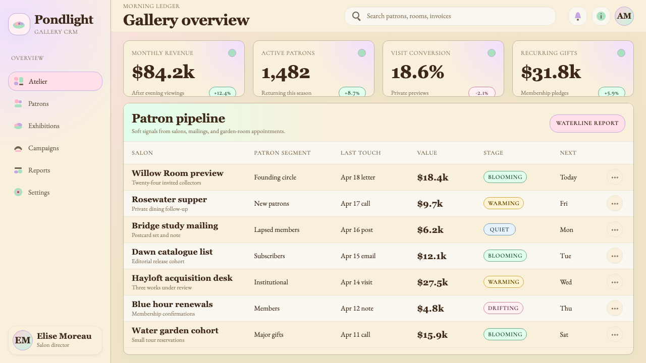
For web interfaces, this system is best suited to editorial platforms, cultural institution websites, art-adjacent e-commerce, and premium lifestyle products. Dashboard and pricing page applications require care: the low-contrast palette that creates atmospheric richness in an editorial layout can undermine scannability in a data-dense environment. When applying the system to dashboards, increase the tonal differentiation between section backgrounds slightly, ensure that body text remains at sufficient contrast for sustained reading, and use the warmer end of the palette — sunrise pink, buttercream — for interactive highlights and calls to action rather than the more atmospheric lavenders and blues. Navigation should use fine serif or well-proportioned sans-serif type; avoid icon-heavy interfaces that conflict with the system's literary character.在网页界面上,这套系统最适合编辑平台、文化机构网站、艺术相关电商和高端生活方式产品。仪表板与定价页面的应用需要谨慎:在编辑版面中创造大气丰富性的低对比度色板,在数据密集的环境中可能损害可扫描性。将系统应用于仪表板时,稍微增加各区块背景之间的色调差异,确保正文保持足够的对比度以供持续阅读,并使用色板中较温暖的一端——日出粉、奶油色——用于交互高亮和行动号召,而非将更具大气感的薰衣草和蓝色用于此目的。导航应使用细衬线或比例良好的无衬线字体;避免图标密集的界面,与系统的文学性格相冲突。
For editorial layouts, marketing pages, and cultural communications, this system is at its most natural. Long-form article layouts benefit from the system's generous leading, fine serif body type, and the use of atmospheric pull-quotes set in italic at an elevated scale. Feature sections on marketing pages can alternate between pale backgrounds — wisteria lavender, morning mist white, soft pond green — to create rhythm without structural repetition. Imagery should be chosen for softness of light and warmth of tone: photographs taken in golden-hour or overcast daylight, with visible texture and depth, rather than the hard-lit studio images common in contemporary technology marketing.对于编辑版面、营销页面和文化传播,这套系统最为自然。长篇文章版面得益于系统的慷慨行距、精致衬线正文字体,以及以大尺度斜体排列的大气引述段落。营销页面的特性区块可以在淡色背景之间交替——紫藤薰衣草、晨雾白、柔和池塘绿——以制造节奏感而无需结构性重复。图像应以光线的柔和度与色调的温度为选择标准:拍摄于黄金时段或阴天漫射光下的照片,具有可见的质感与深度,而非当代科技营销中常见的硬光棚拍图像。
A common mistake when applying this system is conflating atmospheric softness with visual vagueness. Monet's paintings are precise records of specific perceptual experiences — he was not painting fog, he was painting what he saw through fog, and the difference is everything. In digital terms, this means maintaining clear type hierarchy even when backgrounds are soft, ensuring interactive states are unmistakable even when palette contrast is low, and never using texture or tonal complexity as a substitute for compositional decisions. The system should feel like stepping into a carefully designed garden — quiet, enveloping, but navigable — rather than like looking through frosted glass.应用这套系统时最常见的错误,是将大气的柔软感等同于视觉上的模糊。莫奈的画是对特定感知体验的精确记录——他描绘的不是雾本身,而是他透过雾所见的事物,这一区别至关重要。以数字语言来说,这意味着:即使背景柔和,也要保持清晰的字体层级;即使色板对比度较低,也要确保交互状态清晰无误;绝不以肌理或色调复杂性代替构图决策。这套系统给人的感觉应该像走进一座精心设计的花园——安静、包裹,但可以穿行——而非像透过磨砂玻璃凝望。

See the Claude Monet Impressionist design system查看 Claude Monet Impressionist 完整设计系统
Claude Monet Impressionist — FAQClaude Monet Impressionist · 常见问题
How does Monet Impressionist differ from other soft or pastel-palette design systems?莫奈印象派与其他柔和或粉彩色板设计系统有何不同?
Most soft or pastel design systems use low-saturation color as a purely aesthetic choice — a way to feel gentle or approachable without a specific visual logic. The Monet system is distinct because its palette has a documented perceptual origin: these are the specific hues that recur across Monet's body of work because they correspond to specific atmospheric conditions in northern France — the particular quality of light at the Seine estuary, the color of water reflecting a sky filtered through morning mist. The system also pairs its palette with deliberate typographic and compositional choices that reinforce the editorial and cultural character; a generic pastel system typically does not carry this layer of thematic coherence.大多数柔和或粉彩设计系统将低饱和度色彩作为纯粹的美学选择——一种传达温柔或亲和感的方式,并无特定的视觉逻辑。莫奈系统的独特之处在于:它的色板有着有据可查的感知来源——这些具体的色调在莫奈的创作中反复出现,是因为它们对应于法国北部特定的大气条件——塞纳河口的特殊光线质感,以及晨雾过滤后天空倒映在水中的颜色。这套系统还将色板与刻意的字体排印和构图选择相配合,强化编辑性与文化性格;通用粉彩系统通常不携带这一层主题连贯性。
Can this system work for products that need to communicate urgency or drive quick decisions?这套系统能用于需要传递紧迫感或驱动快速决策的产品吗?
With significant modification, but generally it is not the right choice for those goals. The Monet system's low contrast, atmospheric layering, and leisurely typographic pacing are calibrated to encourage dwelling and contemplation — the opposite of the visual urgency that drives conversion-focused landing pages, time-limited offers, or emergency notifications. If a product requires both an atmospheric brand presence and clear calls to action, the practical solution is to use the Monet system for brand and editorial surfaces while switching to a more contrast-forward approach for transactional screens. Attempting to compress the full range of urgency into the system's palette tends to produce either muddy, low-impact calls to action or jarring tonal inconsistency.经过大幅修改后可以,但通常这不是实现那些目标的正确选择。莫奈系统的低对比度、大气分层和从容的排印节奏,被校准为鼓励驻留与沉思——与驱动以转化为导向的落地页、限时优惠或紧急通知所需的视觉紧迫感恰恰相反。如果一款产品既需要大气的品牌呈现,又需要清晰的行动号召,实际的解决方案是将莫奈系统用于品牌与编辑界面,而在交易性屏幕上切换到对比度更强的方案。试图将全部紧迫感的范围压缩进这套系统的色板,往往会产生浑浊、低效的行动号召,或者令人不适的色调不一致。
How should imagery be selected and treated to fit this system?如何选择和处理图像以契合这套系统?
Photography selected for this system should share the atmospheric qualities of the palette: soft, directional natural light rather than hard studio lighting; warm or neutral color temperature rather than cool or stark; visible depth-of-field that suggests a living, breathing scene rather than a product-isolated cutout. Images taken in golden-hour daylight, overcast outdoor light, or the diffused light of a large north-facing window all tend to fit naturally. Treatment should preserve the image's tonal range without aggressive cropping or high-contrast post-processing — slight warmth in the color grade reinforces the palette. Images used as full backgrounds should be layered with a soft tonal wash from the system's palette to create visual continuity between the image and the typographic elements placed over it.为这套系统选择的摄影图像,应与色板的大气品质相呼应:柔和的方向性自然光,而非坚硬的棚拍灯光;温暖或中性的色温,而非冷峻或生硬的色调;可见的景深,暗示一个有生命、会呼吸的场景,而非从背景中孤立的产品切图。在黄金时段阳光、户外阴天漫射光或大型北向窗户的散射光下拍摄的图像,往往天然契合。处理图像时应保留其色调范围,避免激进的裁切或高对比度后期处理——色调微微偏暖能强化色板的一致性。用作全幅背景的图像,应叠加一层来自系统色板的柔和色调洗染,以在图像与其上覆盖的排印元素之间创造视觉连续性。
Is Monet Impressionist suited to dark-mode or dark-background interfaces?莫奈印象派适合深色模式或深色背景界面吗?
A dark inversion of this system is possible but requires care. Monet's own paintings move between registers: the late Nymphéas work is sometimes very dark in its deepest shadow passages, with the lily pads and reflections emerging from near-black water. A dark variant can draw on this late-career palette — deep teal, near-black with an undertone of jade, accented by the pale luminosity of lily-white and sunrise pink. However, the system's defining quality — the sense that color is light rather than pigment — becomes harder to maintain against dark grounds, where the same muted hues can read as simply flat and lifeless. A successful dark Monet variant typically requires increasing the luminosity of the accent colors beyond their standard palette values to restore the sense of glow.这套系统的深色反转版本是可行的,但需要谨慎。莫奈自己的画作在色调上有所跨越:晚期《睡莲》作品在最深的阴影区域有时非常幽暗,莲叶与倒影从接近黑色的水中浮现出来。深色变体可以借鉴这一晚期色板——深青绿、带翡翠绿底色的近黑,以睡莲白与日出粉的淡淡发光感作为强调。然而,这套系统的决定性品质——色彩感觉是光而非颜料的感受——在深色底面上更难维持,相同的柔和色调在其上可能读来仅仅是平淡无生气的。一个成功的莫奈深色变体,通常需要将强调色的明度提升至超出标准色板值的程度,以恢复发光感。
What kinds of products or brands would be wrong for this system?哪些类型的产品或品牌不适合这套系统?
The Monet system is poorly matched to products that rely on signaling technical precision, raw efficiency, or aggressive modernity. Developer tools, financial trading interfaces, logistics dashboards, and cybersecurity platforms typically need visual languages that communicate rigor, speed, and exactitude — qualities at odds with the contemplative softness of Impressionism. Equally, brands that need to communicate mass-market accessibility and everyday affordability may find the system's cultural refinement reads as exclusive or precious rather than welcoming. The system works where a product genuinely shares Impressionism's values: beauty in transience, the cultivation of perception, and the pleasure of a made thing experienced with full attention.莫奈系统与那些需要传递技术精确性、原始效率或激进现代感的产品匹配度差。开发者工具、金融交易界面、物流仪表板和网络安全平台,通常需要传达严谨、速度与精确的视觉语言——这些品质与印象派沉思式的柔软感格格不入。同样,需要传达大众市场亲和力与日常可负担性的品牌,可能会发现这套系统的文化精致感被解读为排他或矫饰,而非欢迎。这套系统在产品真正与印象派价值观共鸣时最为有效:瞬息之中的美、感知力的培养,以及全神贯注体验一件精心制作之物的愉悦。
Related design styles相关设计风格
 Caspar David FriedrichSilence becomes vast. Prussian blue depth, pearl mist, and parchment framing…寂静变得辽阔:普鲁士蓝纵深、珍珠雾与羊皮纸框层层后退。
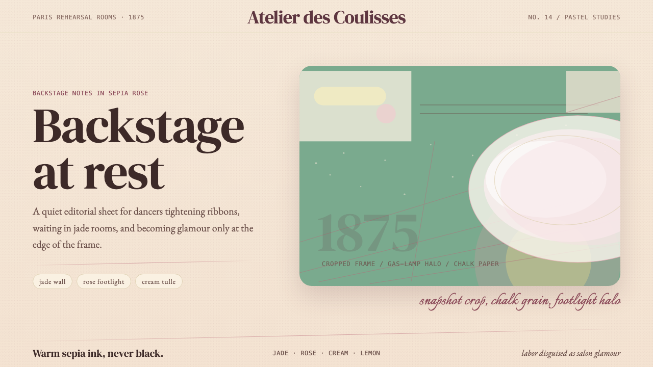 Degas Ballet PastelsBackstage glamour is labor. Jade walls, rose footlights, cropped serifs on cr…后台华丽即劳动。玉墙、玫瑰脚灯与裁切衬线落在奶油纸上。
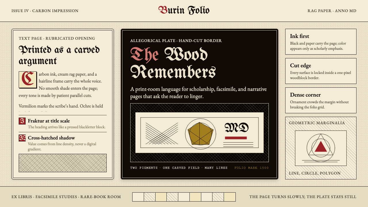 Dürer WoodcutInk remembers everything. Fraktur titles, rag-paper cream, and cross-hatched…木刻记住一切:哥特标题、破布纸奶油色与交叉排线。
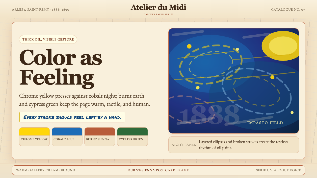 Van Gogh Post-ImpressionistFeeling made visible. Chrome yellow meets cobalt swirls on warm gallery cream.情感可见。铬黄与钴蓝旋涡落在暖画廊奶油底上。
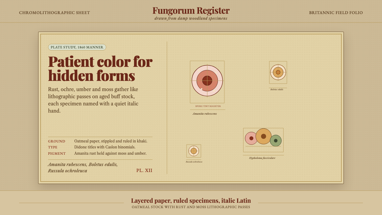 Victorian Mycology PlatePatient field science. Rust and moss specimens sit on stippled buff paper wit…耐心的田野科学。锈红与苔绿标本落在斑点米黄纸上,配斜体拉丁名。
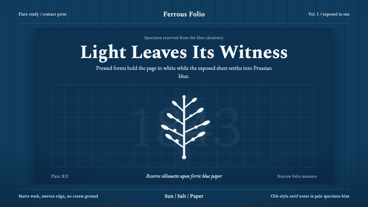 Anna Atkins CyanotypeScience turns spectral. Prussian blue ground, white reserves, Victorian serif…科学显影成幽灵:普鲁士蓝底、白色留影、维多利亚衬线宽边。