What is Victorian Mycology Plate?
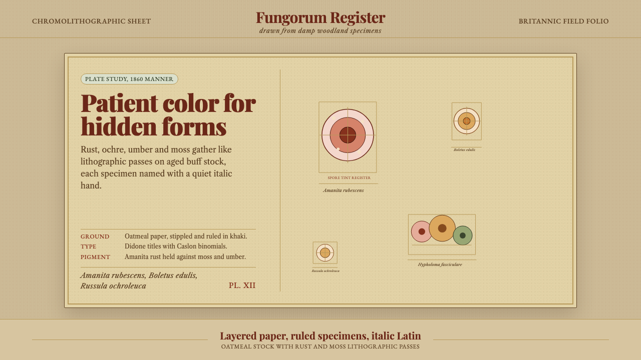
The Victorian mycology plate turns a naturalist's careful study of British fungi into a design system of stippled buff paper, muted rusts, and patient italic Latin.
Victorian Mycology Plate in brief
Victorian mycological plates document British fungi with the patient, observational eye of the nineteenth-century field naturalist: mushroom caps, gill structures, and cross-sections grouped at varied angles on a single page, each specimen lifted from a warm, oatmeal-toned paper ground and labeled in italic serif Latin binomial nomenclature. These plates were working scientific illustrations, produced to help readers identify species in the field, not decorative botanical prints made purely for display.
The color in these plates comes from chromolithography, a nineteenth-century printing process that built up an image through multiple stone-printed layers of ink, one color at a time. This process produced muted, earthy rusts, ochres, and umbers laid down in soft, stippled passes rather than flat, even color — the visible texture of the printing process itself becomes part of the image's character, never glossy, never perfectly uniform.
This design system rebuilds that printed plate as an interface: the aged buff page functions as the ground, a rusty Amanita red anchors primary actions and structure, and moss green, khaki, and umber fill the supporting register. Typography stays within period-appropriate serifs for body text, while headings rise to a high-contrast didone letterform reminiscent of Victorian scientific publishing. Every surface is meant to read like printed paper rather than glass or screen.
Where does Victorian Mycology Plate come from?
British mycology — the scientific study of fungi — developed as a distinct field within the broader Victorian enthusiasm for natural history documentation, flourishing particularly between 1847 and 1891, a period that saw the publication of major illustrated works cataloging British fungal species. This era coincided with wider Victorian scientific culture's drive to systematically observe, classify, and illustrate the natural world, extending botanical illustration's established conventions into the comparatively under-studied territory of fungi.
Fungi presented particular illustrative challenges that shaped the style: unlike flowering plants, mushrooms are three-dimensional, perishable, and often best understood through cross-sections revealing gill structure, stem attachment, and spore-bearing surfaces invisible from the outside. This pushed illustrators toward compound plates showing a single species from multiple angles — cap from above, cap from below showing gills, a vertical cross-section — arranged together on one page rather than a single naturalistic view, producing the layered, multi-view compositional habit characteristic of the genre.
Mordecai Cubitt Cooke stands among the most significant British mycologists of the period, publishing extensively illustrated works on fungi intended for both scientific and amateur audiences and helping popularize fungal identification as a respectable pursuit alongside more established botanical collecting. Anna Maria Hussey similarly contributed detailed illustrated studies of British fungi, part of a Victorian tradition in which women naturalists, often working outside formal institutional science, produced significant original illustrative and observational work. James Sowerby, working slightly earlier but foundational to the broader British natural history illustration tradition, established many of the conventions of specimen-plus-detail compound plate composition that mycological illustrators of the following decades continued to use.
The chromolithographic printing process itself was central to how these plates looked and felt: unlike hand-colored engravings, which varied significantly from copy to copy, chromolithography allowed consistent, repeatable color printing across large press runs, using multiple lithographic stones each inked with a different color and printed in careful register over the same sheet. The stippled, granular quality visible in these plates comes directly from the lithographic ink application technique, and this process — while eventually superseded by photographic reproduction methods in the early twentieth century — defined the visual texture of scientific and natural history publishing for several decades.
What defines the Victorian Mycology Plate look?
Color
Muted rusts, ochres, and umbers dominate, laid down as if built up through multiple stippled printing passes rather than flat digital fills. A rusty Amanita-cap red serves as the primary accent against the warm buff ground, with moss green and khaki providing supporting, earthy contrast. Nothing in this palette is bright or saturated in a modern sense — every hue reads as pigment settled onto old paper.
Stippled Texture
Surfaces carry a visible granular, stippled texture reminiscent of chromolithographic ink application, rather than smooth flat color or gradients. This texture is not decorative noise added afterward — it stands in for the physical printing process itself, and is essential to making a surface read as printed paper.
Warm Buff Ground
The background is a warm, oatmeal-toned buff paper color rather than clinical white, evoking the aged, slightly yellowed paper stock of a nineteenth-century printed plate. This warmth sets the tonal key for everything placed on top of it, making even muted colors feel rich rather than washed out.
Multi-Angle Compound Composition
A single specimen or subject is shown from several angles at once — from above, from below, in cross-section — grouped together on one page rather than presented as a single naturalistic view. This compound arrangement reflects the illustrative need to convey gill structure and internal detail invisible from a single viewpoint.
Italic Latin Nomenclature
Species names appear in italic serif Latin binomial form beneath each specimen, following the scientific naming convention still used today. This labeling detail signals rigor and taxonomic seriousness, distinguishing the plate from purely decorative botanical illustration.
High-Contrast Display Type
Headings rise to a high-contrast didone letterform — thin hairline strokes paired with much heavier stems — echoing Victorian scientific publishing conventions for title pages and section headers. This contrast between delicate body-text serifs and bold display headings creates a clear typographic hierarchy rooted in period print culture.
Paper, Not Glass
Every surface is meant to evoke printed paper rather than a glossy digital screen — no gradients that suggest glass reflection, no crisp vector-perfect edges. Slight imperfection and texture are treated as authenticity markers rather than flaws to be smoothed away.
Who shaped Victorian Mycology Plate?
A prolific and influential British mycologist who published extensively illustrated works on fungi aimed at both scientific and general audiences, helping establish fungal identification as a serious field of Victorian natural history study alongside more established botanical disciplines.
A British naturalist who produced detailed illustrated studies of fungi, part of a broader Victorian tradition of women naturalists contributing significant original observational and illustrative work to natural history, often outside formal scientific institutions.
A foundational figure in British natural history illustration whose compound-plate conventions — combining a specimen with detail views on a single page — established formatting approaches that later mycological illustrators continued to use throughout the nineteenth century.
How do you use Victorian Mycology Plate today?
The Victorian mycology plate style works when a designer treats the printed, textured paper quality as central rather than incidental — this is a system built around the physical evidence of chromolithographic printing, not simply a brown-and-green color scheme applied to a modern flat interface.
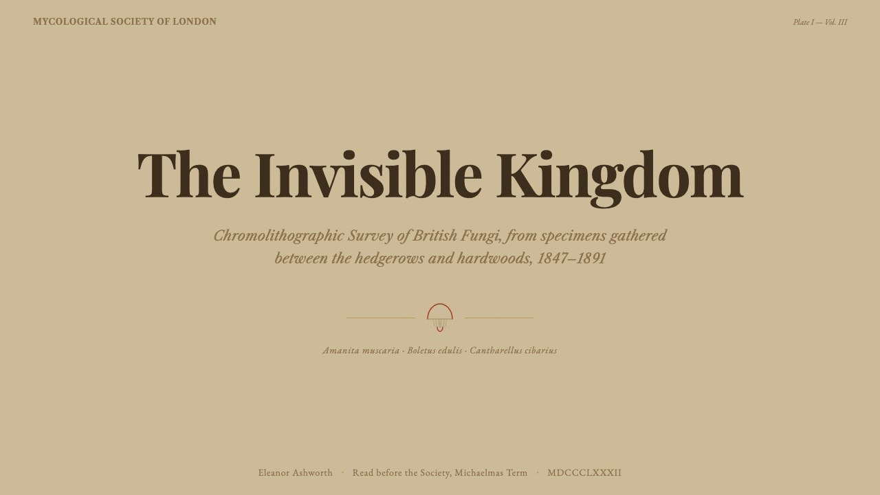
For presentation slides, this style suits cover pages and content slides dealing with scientific, natural, or archival subject matter especially well: a warm buff ground with a single rust-red accent shape and italic serif captioning immediately signals a naturalist's field-notebook mood. Data slides can borrow the compound-plate habit directly — showing a single subject or metric from multiple angles or breakdowns arranged together on one page, the way a mycological plate shows cap, gill, and cross-section side by side.
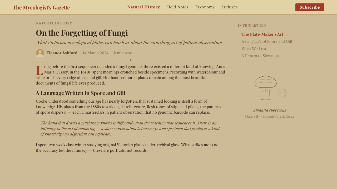
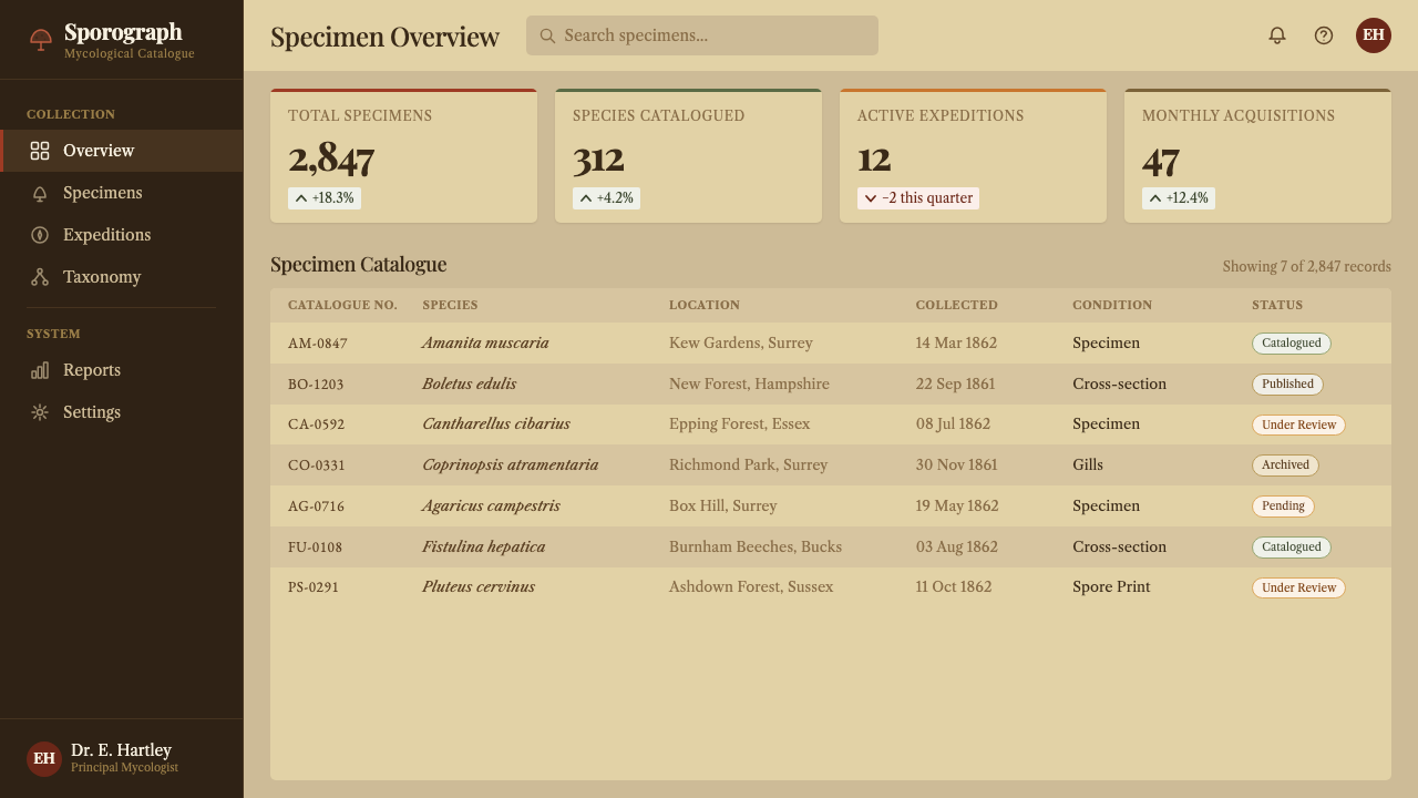
For web interfaces, the palette suits research, archival, educational, and specialist reference platforms, particularly content-heavy pages where a warm, textured ground and restrained rust-and-moss accent palette lend an atmosphere of careful, patient documentation. Dashboards and dense data tools are a weaker fit unless the stippled texture is used very sparingly, since heavy surface texture can compete with fine-grained numerical legibility.
For editorial and marketing work, the style rewards long-form nature writing, field-guide-style content, and heritage or provenance storytelling, where the compound multi-view composition and italic Latin labeling reinforce a sense of expert, patient observation. Marketing pages for products with a natural, artisanal, or scientific positioning benefit from the warm buff ground and muted earthy accents as an alternative to bright, saturated modern color schemes.
A common mistake is applying the color palette — rust, moss, ochre — without the stippled paper texture and warm buff ground, which produces a generic 'earthy' look rather than a genuine reference to chromolithographic printing. Another mistake is using body text in a heavy or overly modern sans-serif face; the system depends on period-appropriate serif type for body copy, with contrast reserved for display headings, to preserve its printed, scholarly character.
Victorian Mycology Plate — FAQ
Why do these plates show a single mushroom from several angles instead of one clean view?
Fungi carry much of their identifying information in features not visible from a single external viewpoint — the gill structure underneath the cap, the way the stem attaches, the color and texture revealed in cross-section. Victorian illustrators developed the compound-plate format specifically to convey this hidden detail, combining a top view, an underside view, and a cross-section on one page so a reader could identify a species from illustration alone.
What made chromolithography different from earlier hand-colored engravings?
Hand-colored engravings were painted by hand after printing, which meant significant variation between individual copies of the same plate. Chromolithography instead printed each color from its own separate stone in careful register, producing consistent, repeatable results across a full press run. The visible stippled, granular texture in these plates comes directly from how lithographic ink was applied to the printing stone.
Is this style specific to fungi, or does it apply to other Victorian natural history illustration?
The core visual conventions — chromolithographic stippled texture, warm buff paper ground, italic Latin nomenclature, compound multi-view plates — were shared broadly across Victorian botanical and zoological illustration, not unique to mycology. Fungi did push the compound-plate habit further than many other subjects, however, because gill structure and cross-section detail are so central to fungal identification, giving mycological plates a particularly dense, multi-angle character.
Can this style work with a bright or high-saturation color palette?
Not without losing its core identity. The muted, earthy quality of the palette comes directly from the physical limitations and character of nineteenth-century chromolithographic printing, and high-saturation modern color reads as a fundamentally different, more contemporary aesthetic. The style depends on restraint in both hue and texture working together — brightening the colors while keeping the paper texture produces an inconsistent result that undermines the printed, archival mood.
What products or brands suit this style, and where does it not work well?
It suits research institutions, natural history and science museums, field-guide and educational publishing, and artisanal or naturalist-positioned consumer brands seeking an atmosphere of patient, expert observation. It struggles for fast-moving consumer tech, gaming, or entertainment products aiming for energy and immediacy, where the muted palette and printed texture read as slow and old-fashioned rather than lively.
Related design styles
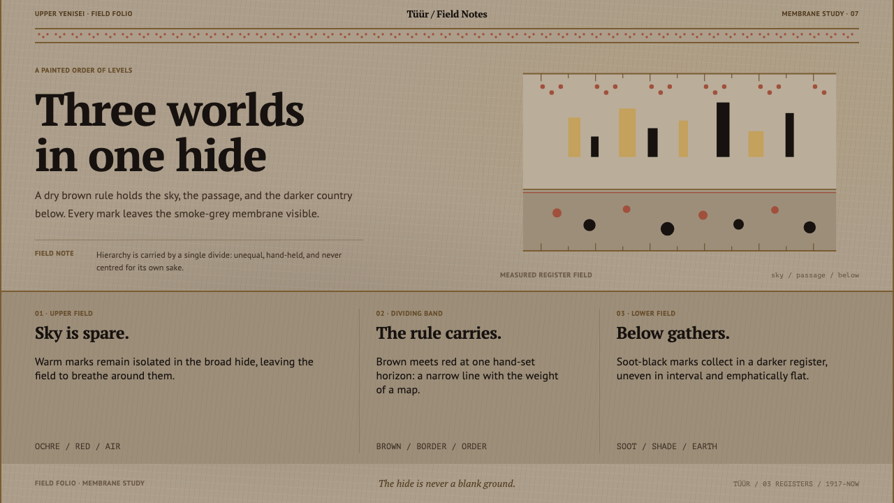 Khakas Shaman DrumA cosmology held by one rule. Smoke-tan hide, ochre marks, and a red-dotted M…
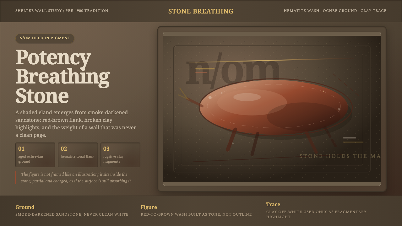 San Rock Art DrakensbergPotency stains the stone. Hematite gradients breathe over smoke-dark sandston…
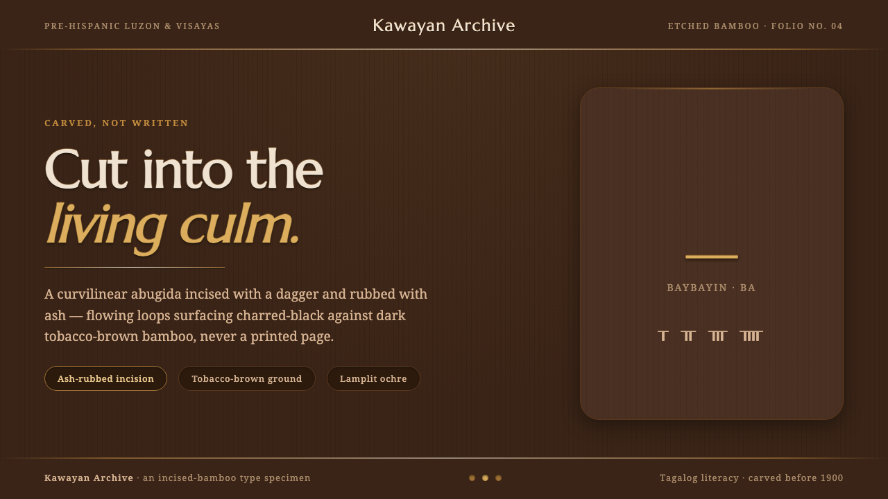 Baybayin ScriptCarved, not written. Curvilinear baybayin ash-rubbed into tobacco-brown bambo…
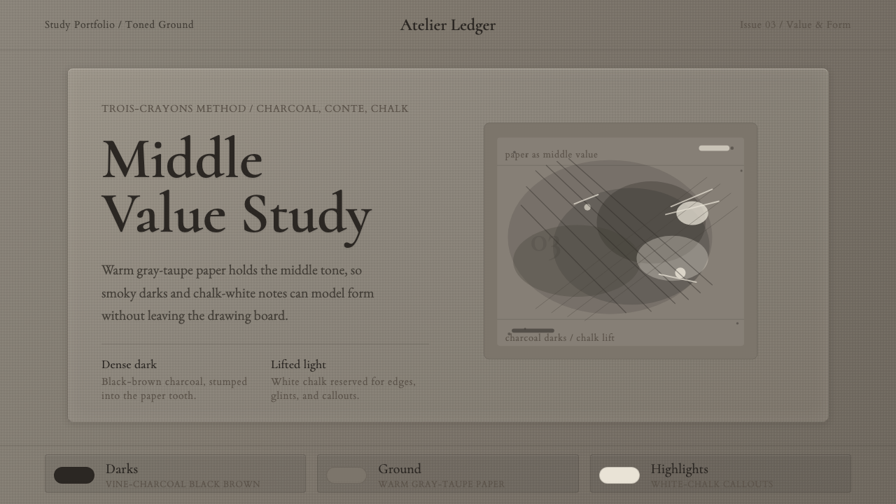 Charcoal & Conté DrawingAtelier calm, in middle value. Gray-taupe tooth, smoky charcoal, and chalk-wh…
 Claude Monet ImpressionistLight becomes the subject. Buttercream, pastel dapples, and Cormorant serif s…
 Conchology Shell PlateAged paper is the hero. Sepia Fell type and burin spirals make science feel a…