What is Chadian Toubou Saharan Route?
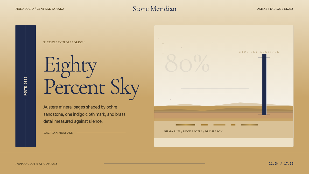
The Toubou people of northern Chad shaped an aesthetic of radical emptiness — ochre stone, indigo cloth, and a single vertical mark against a sky that fills most of the world.
Chadian Toubou Saharan Route in brief
The Chadian Toubou Saharan Route is a design style drawn from the visual culture of the Toubou — the 'rock people' of the Tibesti and Ennedi massifs in northern Chad. Their world is defined by the central Sahara at its most elemental: volcanic plateaus, salt-pan flats, and immense sky. Every material object they carry, wear, and trade reflects a discipline born of necessity: nothing excess, nothing fragile, and nothing that does not earn its weight across a thousand kilometers of desert.
As a design language, this style captures desert materiality through its compositional logic rather than through surface decoration. Wide-format layouts assign the majority of the visual field to emptiness — a warm, mineral-toned void that functions not as unused space but as the primary substance of the image. Against that emptiness, a small number of carefully placed marks carry all the meaning: a dark vertical element, a warm ochre band, an indigo accent that reads with the clarity of a caravan flag glimpsed at distance.
The result is an aesthetic of controlled austerity that is neither cold nor stark. The palette is warm — drawn from sandstone, sun-heated earth, volcanic rock, and the deep indigo of hand-dyed cloth — and its restraint feels earned rather than imposed. This is a style for compositions that need to project authority and stillness in equal measure.
Where does Chadian Toubou Saharan Route come from?
The Toubou have inhabited the hyperarid core of the central Sahara for at least a millennium, with historical documentation of their caravan activity reaching back to around 800 CE. They are not a single tribe but a confederation of semi-nomadic clans — the Teda in the Tibesti mountains, the Daza across the Borkou and Kanem lowlands — who share a language, a kinship structure, and a way of moving through one of the world's most hostile landscapes. Their identity is inseparable from mobility: the camel routes they maintained connected the sub-Saharan Sahel to the Mediterranean coast, carrying salt from Bilma and Fachi, natron from the Borkou depression, dried dates, and livestock across terrain that discouraged every other people from attempting the crossing.
The material culture of this caravan world is severely edited by the demands of desert travel. Tents are light — woven reed mats over bent-wood frames, collapsible in minutes, carried on a single camel. Clothing centers on the indigo-dyed turban, wound to protect the face from wind and sun, whose color deepens through repeated dyeing until it bleeds faint blue onto the skin. Kohl containers of hammered brass are among the most prized portable objects — small, precisely made, and containing a cosmetic with both protective and symbolic functions. Everything is weighted against its utility per kilogram carried.
The visual world produced by this culture is not ornamented in the conventional sense. There is no tradition of woven tapestry or painted architecture of the kind found in sedentary North African cultures. Instead, the Toubou's aesthetic is spatial and relational: the relationship between a dark figure and the immense pale sky, between a line of loaded camels and the empty horizon they move toward, between the vertical mark of a tent pole and the horizontal infinity surrounding it. The compositional logic is one of extreme ratio — a very small amount of dark, warm-toned object against a very large amount of pale, arid ground.
European documentation of the Toubou began seriously in the nineteenth century with French colonial surveys and intensified in the mid-twentieth century through ethnographers including Jean Chapelle and Catherine Baroin, whose field work in Chad systematized understanding of Toubou social organization, material culture, and trade routes. Henri Lhote's expeditions into the Sahara documented the broader rock art and cultural landscape that forms the deep visual heritage of the region. Photographer and explorer Michael Martin's documentation of contemporary Saharan cultures brought this visual world to wider international attention. These accounts, together with the Tibesti and Ennedi rock art sites — among Africa's most extraordinary — provide the visual evidence from which the design system's compositional and chromatic principles are derived.
What defines the Chadian Toubou Saharan Route look?
Palette
The palette is organized around the mineral tones of northern Chad's volcanic landscape: warm sandstone ochre for the dominant ground, deep indigo derived from hand-dyed cloth for the primary accent, and the near-black of volcanic basalt for structural marks. Warm neutral tones — the beige of bleached bone and the pale gold of salt-pan crust — fill the middle register. The overall effect is of a world made from earth, stone, and mineral-dyed textile rather than from pigment.
Negative Space
The most defining compositional feature is the proportion assigned to emptiness. In the Saharan visual world, the sky occupies the majority of any view; the ground and its objects are a narrow band at the base. Layouts derived from this tradition assign vast fields of warm-toned ground to negative space, treating it not as background but as the primary visual substance. The few placed elements read against this emptiness with the sharpness of objects at desert scale.
The Vertical Mark
A single dark vertical element — echoing the tent pole, the standing figure, the caravan column seen at distance — functions as the organizing anchor of most compositions. This mark is narrow relative to the field it inhabits, placed deliberately rather than centered, and it creates the visual tension that holds the composition together. Without it, the composition would be only atmosphere; with it, the atmosphere has scale and orientation.
Warm Materiality
Unlike cold-minimal styles that achieve emptiness through pure white and grey, this style's emptiness is warm. The dominant tones carry the memory of sunbaked stone and wind-polished sand. This warmth prevents the radical negative space from reading as clinical or industrial — it reads instead as geological, patient, and old. Texture, where it appears, is mineral: grained stone, woven cloth, hammered metal.
Indigo as Signal
In Toubou material culture, indigo is a marker of identity and protection — the deeply dyed turban cloth is one of the few colored objects in an otherwise earth-toned world. In the design system, indigo carries the same function: it is the accent that signals human presence, choice, and emphasis within a field of warm neutrals. Used sparingly, it reads with great clarity; when overused, the entire system loses its power.
Horizon Composition
When a horizon line is present, it sits low — typically in the lower quarter of the composition — maximizing the sky field. This low-horizon logic is directly borrowed from the desert landscape, where the sky dominates and the earth is a narrow platform. In interface and editorial contexts, this translates to compositions where a dominant upper field of warm ground anchors a thin band of content at the base, or where a single headline element hovers high against an open field below.
Restraint as Authority
The style's authority comes from what it withholds rather than what it deploys. There is no visual decoration, no gradient movement, no secondary palette introduced for variety. Every element present has survived a rigorous edit: if it does not carry specific meaning, it does not appear. This restraint — like the Toubou traveler's discipline about what to carry — is what gives the style its gravitas. Compositions that add even small decorative elements begin to feel like desert tents filled with unnecessary luggage.
Who shaped Chadian Toubou Saharan Route?
A French ethnographer who conducted extensive field research among the Toubou in Chad through the mid-twentieth century. Chapelle's documentation of Toubou social structure, material culture, and caravan practices remains one of the foundational scholarly records of this culture. His accounts of tent architecture, textile production, and the spatial logic of Toubou camps provide the ethnographic grounding for understanding the compositional principles that this design system formalizes.
A contemporary scholar whose research on Toubou social organization and the Chadian desert cultures built on Chapelle's foundations and extended the ethnographic record into the late twentieth century. Baroin's work on kinship, territory, and the cultural meaning of mobility among the Toubou offers a deeper framework for understanding why the visual world of this culture is organized around movement, horizon, and the relationship between a figure and the space it inhabits.
A French explorer and ethnographer whose expeditions into the Sahara — particularly his documentation of the Tassili n'Ajjer rock art in neighboring Algeria — established a scholarly foundation for understanding the deep visual heritage of the central Saharan region. Lhote's work revealed a tradition of figure-and-ground composition, horizon consciousness, and minimal mark-making that stretches back thousands of years and forms the deepest ancestral layer of the visual logic this design system draws from.
A German photographer and explorer who documented contemporary Saharan cultures across multiple decades of fieldwork. Martin's photographic work brought the visual world of the Toubou and neighboring Saharan peoples — the quality of desert light, the spatial relationships between figures and the vast landscape, the material specificity of caravan culture — to international audiences. His documentation of the salt routes and camel caravans provides some of the most direct visual evidence from which the design system's compositional sensibility is derived.
How do you use Chadian Toubou Saharan Route today?
The Toubou Saharan Route style is well-suited to contexts where authority comes from restraint rather than complexity — where the message is strengthened by what surrounds it rather than by what competes with it. Its highest-impact applications share a structural quality: a dominant field of warm-toned emptiness, a minimal number of marks, and confidence that the marks are enough.
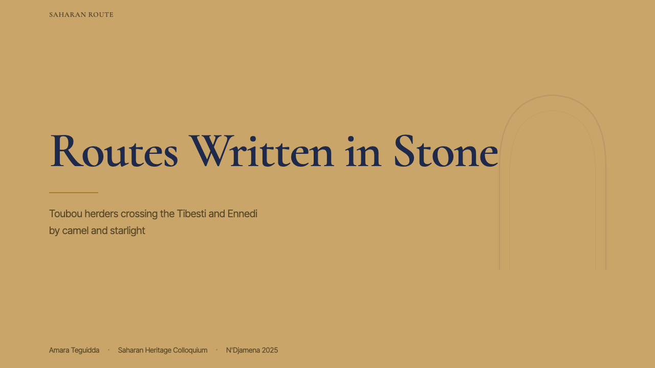
For presentation slides, the style works best when the designer is willing to let single ideas breathe across the full slide rather than filling every available field. A cover slide in this idiom carries one strong headline element — set in a serifed face at substantial scale — positioned in the lower third against a warm ochre or pale stone ground, with the remaining field left open. Content slides follow the same logic: one data point or one argument per slide, the supporting text minimal and positioned low, a single indigo or dark accent line used to anchor the visual field. Data visualizations take on a cartographic quality — a sparse set of marks against a warm ground, with the negative space doing as much analytical work as the marks themselves.
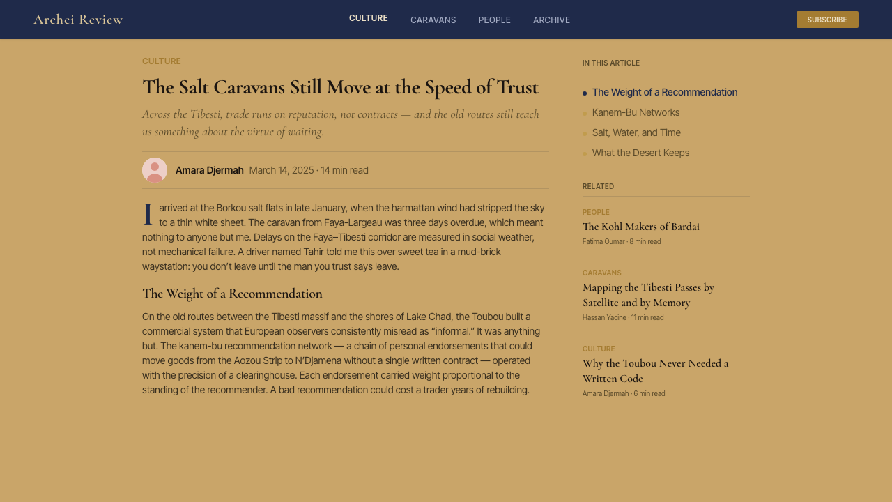
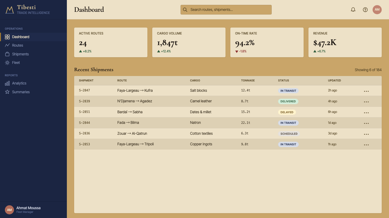
For web interfaces, this style is most effective in contexts that benefit from perceived rarity and considered restraint: luxury product landing pages, portfolio contexts, editorial publishing platforms, or any product that needs to signal that its creators exercise judgment rather than abundance. The approach translates to interfaces with generous whitespace (warm rather than pure white), typographic hierarchy achieved through scale and weight rather than color multiplication, and a single accent color deployed sparingly for interactive states. Navigation should be spare and typographic; imagery, when used, should be treated as a horizon-anchored element rather than a decorative fill.
In editorial and marketing work, the style produces compositions of striking stillness. A full-page spread organized around this idiom uses a wide-format image or color field for the upper two-thirds and a narrow text band below — inverting the conventional information hierarchy and forcing the viewer's eye to slow down before reaching the content. Marketing materials benefit from the poster logic of the style: a single strong visual claim in large type, the supporting argument in a narrow column, and enough open ground that the overall composition feels deliberately underpopulated. This sparseness reads as confidence rather than incompleteness.
The most common mistake when working with this style is filling the negative space — adding secondary imagery, decorative border elements, texture overlays, or gradient fills to the large open fields because they feel uncomfortably empty. That discomfort is the style working correctly. The open field is not a problem to be solved; it is the primary design element. A second common error is introducing a warm accent color alongside the indigo to 'round out' the palette — the style's power depends on the indigo reading as singular against the warm ochre ground. Adding a third accent undermines the figure-ground relationship that defines the entire visual logic.
Chadian Toubou Saharan Route — FAQ
How is this style different from other desert-inspired minimalist aesthetics?
Most desert-minimal aesthetics take the desert as a metaphor for emptiness — they use white or cool grey as the dominant ground and treat sparseness as a form of purification. The Toubou Saharan Route style is specifically warm: its emptiness comes from sandstone and sunbaked earth rather than from abstracted white space. This warmth changes the emotional register entirely — the style reads as geological and patient rather than clinical or hygienic. It also has a specific structural element — the single dark vertical accent — that most generic desert-minimal styles lack. That vertical mark is what gives the compositions their tension and their sense of a figure inhabiting a landscape.
Can this style work for dark-background layouts?
A dark inversion of this style is possible but requires a significant re-calibration. In the standard version, the warm ochre ground is the dominant element and the dark marks are the minority. On a dark ground — volcanic basalt black, say — the logic inverts: the warm ochre and pale stone tones become the light-bearing accents, and the indigo, which reads as a deep accent against ochre, would need to be replaced or repositioned. The result can work as a night-desert variation — the dark ground reading as the deep-sky field of a Saharan night — but it is a fundamentally different composition and loses much of the geological warmth that defines the standard version.
How do you maintain the style's authority without making layouts feel empty or unfinished?
The critical factor is the quality of what remains after reduction, not the quantity. Every element that is present in a Toubou-derived composition needs to be placed with deliberateness — the headline set with care in its relationship to the open field, the single accent mark positioned where it creates maximum tension with the surrounding emptiness, the ground tone warm enough to feel inhabited rather than abandoned. Layouts feel unfinished when the reduced elements are weakly placed or scaled; they feel authoritative when the few elements present occupy their position with complete conviction. A useful test: if removing one more element would collapse the composition, the current set is probably correct.
What typographic approach suits this style?
The Toubou Saharan Route style pairs naturally with serifed typefaces — specifically those with a slightly archaic or lapidary quality, as if cut from stone rather than drawn on paper. The serif connects to the material tradition of inscription in stone and metal that underlies the region's visual heritage. Type should be used sparingly: one strong display element at substantial scale, body text set with generous leading and narrow measure in a contrasting smaller weight. Type size variation should be dramatic — the headline several times the size of the body — because scale contrast is how the style achieves hierarchy. Running text in this idiom works best when it is short.
Is this style appropriate for consumer-facing products, or does it work better in professional contexts?
The style's warmth makes it more accessible to consumer audiences than cold minimalist aesthetics, but its fundamental severity — the radical reduction, the absence of decorative comfort — still limits its range. It works well for products where the audience is expected to bring some patience and sophistication: boutique hospitality, cultural institutions, premium single-product brands, serious editorial platforms, and portfolio contexts for creative professionals. It struggles in contexts where users need immediate visual orientation, where the product depends on gamification or energy, or where the audience includes users who equate visual richness with quality. In those contexts, the style's deliberate emptiness may read as neglect rather than confidence.
Related design styles
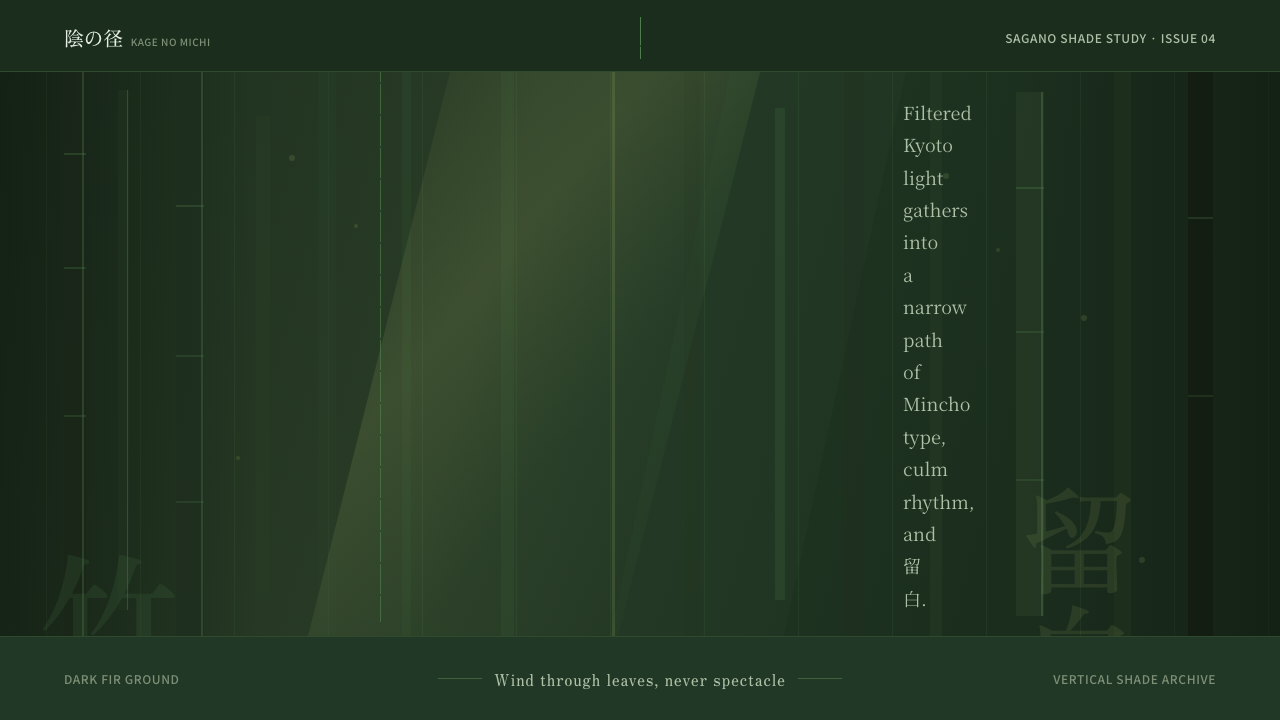 Bamboo GroveQuiet goes vertical. Fir green, Mincho type, and dappled culm rules create de…
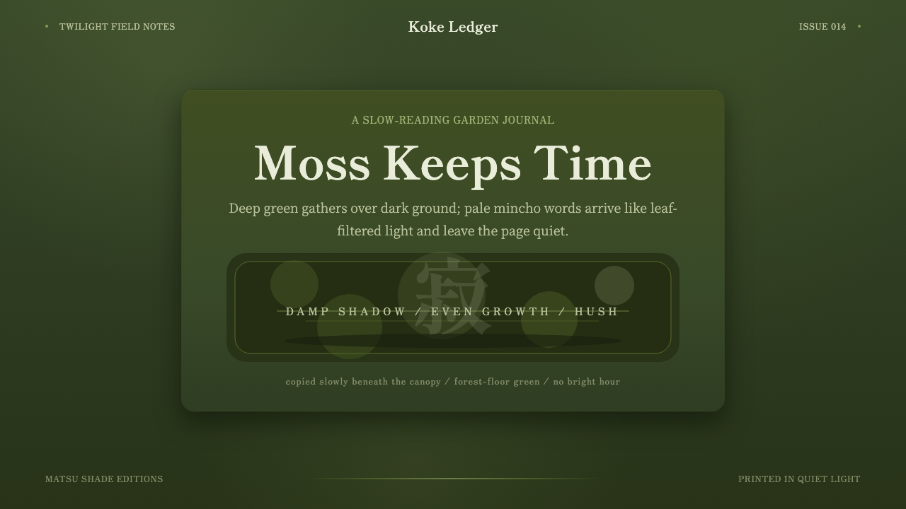 Kyoto Moss GardenStillness grows slowly. Deep moss greens, mincho serif, and dappled dark laye…
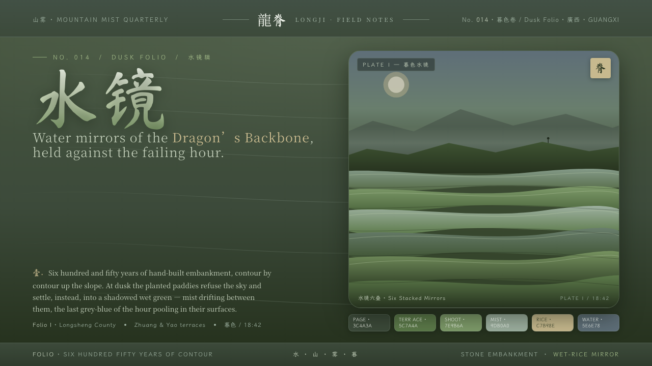 Rice TerraceRefuses the noon sky. Dusk paddy green ground, stacked water mirrors, brush c…
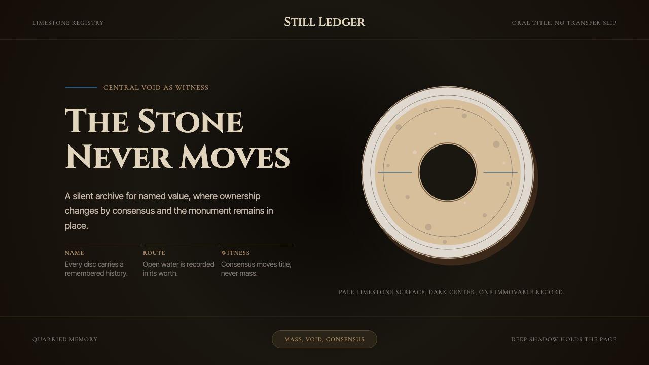 Yapese Stone Money (Micronesia)Monumental stillness. Limestone type and one circular void sit inside warm bl…
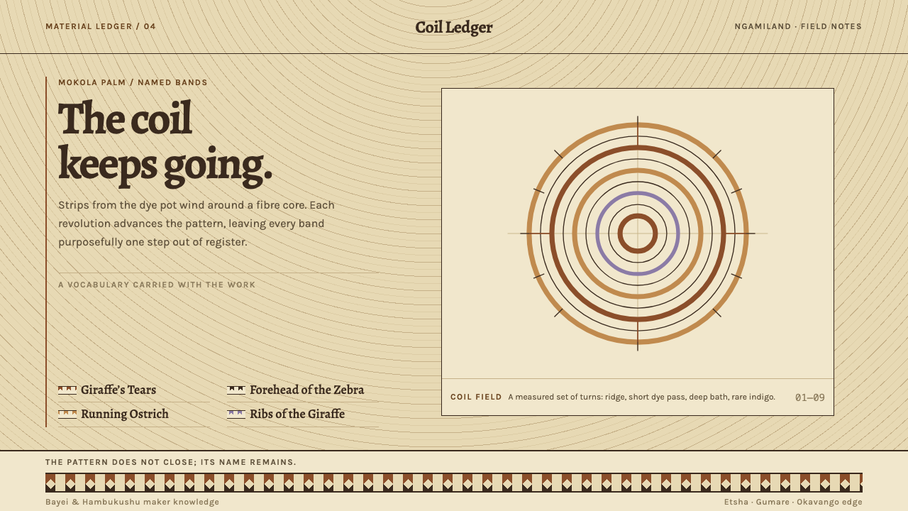 Botswana Coiled BasketThe pattern keeps travelling. Bark-brown stepped bands wind across a straw co…
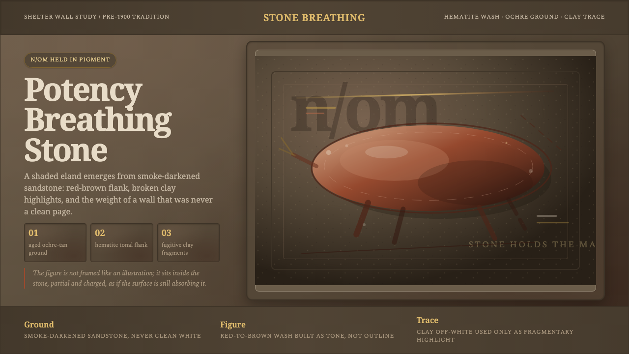 San Rock Art DrakensbergPotency stains the stone. Hematite gradients breathe over smoke-dark sandston…