Design style guide设计风格指南
What is Yapese Stone Money (Micronesia)?什么是 Yapese Stone Money (Micronesia)?
Rai stones — limestone discs up to four metres across, canoed five hundred kilometres of open Pacific — are the most radically still currency ever made, and their monumental circular form translates into a design language of singular, unhurried authority.雷石——直径可达四米的石灰岩圆盘,以独木舟横渡五百公里太平洋——是人类历史上最彻底「静止」的货币,而其纪念碑式的圆形也转化为一种沉着、不急不迫的设计语言。
Yapese Stone Money (Micronesia) in briefYapese Stone Money (Micronesia) 速览
The Yapese Stone Money design system takes its visual logic from the rai stone tradition of Yap, a small island group in the western Pacific. Rai stones are massive limestone discs — some taller than a person, some small enough to carry — each bearing a hole at the centre and a personal history recorded in oral tradition rather than written ledger. The defining quality of a rai stone is not its physical location but its social existence: ownership transfers through spoken consensus even as the stone remains immovable, sometimes underwater after a canoe sank en route from the quarry.雅浦石币设计体系从雅浦岛(西太平洋一处小群岛)的雷石传统中汲取视觉逻辑。雷石是巨大的石灰岩圆盘——有的比人还高,有的小到可以搬运——中央凿有圆孔,每块石头的历史由口述传统而非书面账本记录。雷石最核心的特质不是它的物理位置,而是它的社会性存在:即便石头纹丝不动(有时甚至沉在从采石场运返途中翻船的海底),所有权也可通过口头共识转移。
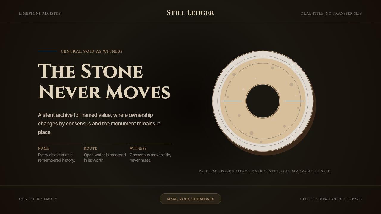
Translated into visual form, this tradition produces an aesthetic of monumental stillness. A single large circle — the primary compositional element — dominates every layout, evoking the disc itself. The central void of that circle is not empty space but the most charged element in the composition, just as the hole in a rai stone is its structural and symbolic heart. The surrounding palette is drawn from the material world of the stones: the warm cream of freshly quarried limestone, the deep shadow pooling inside the central hole, and the dark ochre of ancient weathered rock.转化为视觉语言,这一传统产生了一种纪念碑式静穆的美学。单一的大圆形——构图的主要元素——主导每一个版面,唤起石币本身的形象。这个圆形的中心虚空并非空白,而是构图中张力最充沛的元素,正如雷石的圆孔是其结构与象征意义的核心。环绕其周的色板源自石头的物质世界:新鲜采凿的石灰岩那温暖的奶白色、积聚在中央孔洞深处的阴影,以及千年风化岩石的深沉赭色。
What distinguishes this style from generic minimalism is its sense of geological weight. Layouts do not feel lightweight or airy — they feel dense and settled, as if the elements have been there for centuries and intend to remain. This quality makes the system unusually suited to contexts that require authority without aggression, and permanence without stiffness.将这种风格与一般极简主义区分开来的,是其地质般的重量感。版面不显轻盈空灵——它们厚重而沉稳,仿佛其中的元素已在此矗立数百年,且意图继续留存。这种特质使该体系在需要权威而不失温度、需要永久感而不显僵硬的场景中格外适用。
See the Yapese Stone Money (Micronesia) design system →查看 Yapese Stone Money (Micronesia) 完整设计系统 →
Where does Yapese Stone Money (Micronesia) come from?Yapese Stone Money (Micronesia) 从何而来?
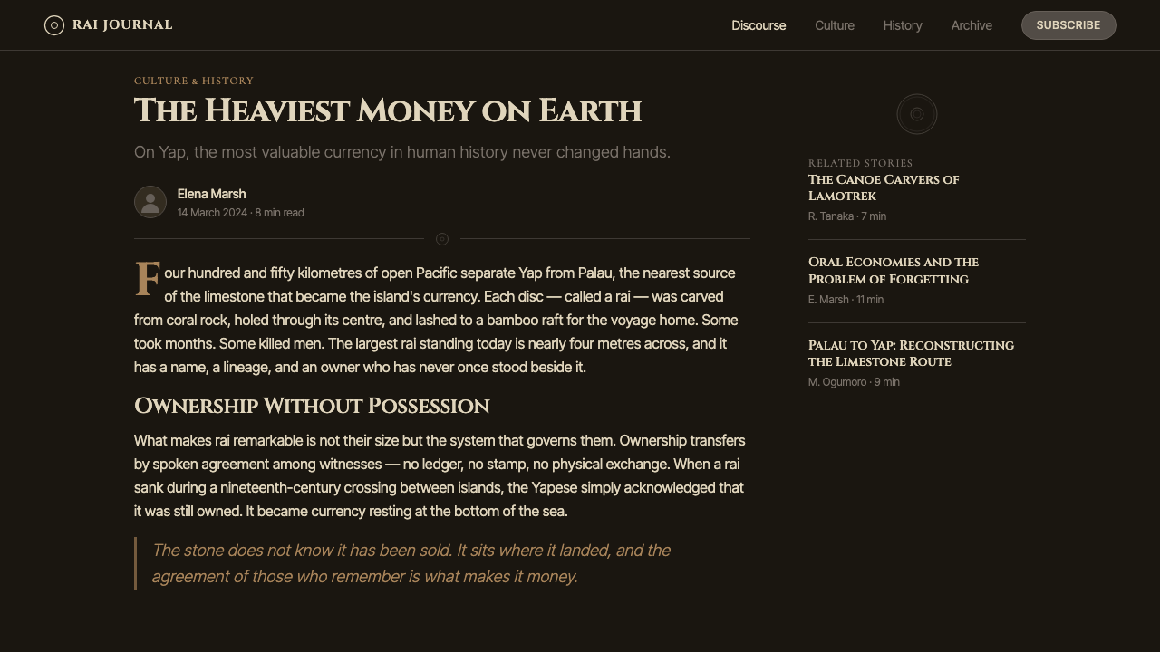
The rai stone tradition of Yap has roots stretching back to around 1000 CE, with quarrying activity reaching its peak intensity between roughly 1700 and 1900. The stones were carved not on Yap itself but on Palau — an archipelago some four hundred and fifty kilometres to the southeast — because the particular crystalline limestone there was prized above any rock available on Yap. Yapese navigators made the open-ocean crossing in outrigger canoes, quarried the discs on Palau, and then transported them home, a journey of extraordinary physical risk. The effort required to obtain a stone became part of its social value: the labour, the ocean crossing, the lives risked were all folded into the stone's history and memory.雅浦岛的雷石传统可追溯至约公元1000年,采石活动的高峰期大致在1700至1900年间。石头不是在雅浦本岛凿制,而是来自东南方约四百五十公里外的帕劳群岛——那里特有的晶质石灰岩被认为远优于雅浦本地的任何岩石。雅浦航海者驾驶舷外支架独木舟横渡大洋,在帕劳凿出圆盘,再历尽艰险将其运回,这是一段极度危险的旅程。获取一块石头所需付出的巨大努力本身也成为其社会价值的一部分:劳动、远洋航渡与冒险的生命,全都折叠进石头的历史与记忆之中。
Ownership and exchange operated through a system that fascinated and perplexed Western economists for over a century. The stones were not physically exchanged when property changed hands — instead, the community acknowledged the transfer verbally, and the stone remained where it stood. One stone, too large to move and reputedly resting on the sea floor after its transport canoe foundered, continued to circulate as valid currency for generations, its ownership recorded only in collective memory. This led the American economist Milton Friedman to write about Yap's monetary system in a 1991 essay, noting the parallels with modern currency systems in which value rests on social agreement rather than physical substance. The anthropologist William Henry Furness III provided the first detailed English-language account of the rai system in his 1910 book, after spending several months living among the Yapese.雷石的所有权与交换方式令西方经济学家困惑与着迷长达一个多世纪。当财产易手时,石头本身并不移动——社区通过口头认可转移,石头留在原处。有一块因运输独木舟翻沉而沉入海底、大到无法移动的巨石,几代人以来仍以有效货币的身份流通,其所有权只记录在集体记忆之中。这一现象促使美国经济学家米尔顿·弗里德曼在1991年的一篇文章中专门讨论雅浦的货币体系,并指出它与现代货币系统的相似之处——价值建立在社会共识之上,而非物质实体。人类学家威廉·亨利·弗内斯三世在雅浦人中生活数月后,于1910年出版的著作中提供了第一份详尽的英文雷石制度记录。
The colonial period introduced significant disruption. Germany administered Yap from 1899 to 1914, and German colonial authorities — frustrated by the Yapese refusal to maintain roads — reportedly marked certain stones with black crosses to declare them government property, effectively removing them from circulation until road work was performed. The Yapese found this deeply offensive, since the stones' social standing had nothing to do with their physical condition or location. Japan controlled the islands from 1914 to 1945, followed by United States administration under a UN trusteeship until 1986, when the Federated States of Micronesia gained independence.殖民时期带来了严重冲击。德国从1899年至1914年管辖雅浦,据记载,德国殖民当局——因雅浦人拒绝维修道路而恼怒——在某些石头上标注黑色叉号,宣布其为政府财产,使其退出流通直至道路工程完成。雅浦人认为此举极具冒犯性,因为石头的社会地位与其物理状态或位置毫无关联。1914至1945年间,日本控制这些岛屿;此后美国以联合国托管形式管辖,直至1986年密克罗尼西亚联邦独立。
Scholars including the archaeologist Scott Fitzpatrick and the museum curator Cora Lee Gillilland have studied the stones in depth, and the tradition continues: rai stones remain legally recognized as currency in Yap today, used in ceremonial exchanges and to settle significant social debts. They are displayed outside the offices of Yap's state government, lined up along roadsides in village squares, and protected under Federated States law. The design system draws on this remarkable continuity — a visual language built around an object that has functioned as currency for perhaps a thousand years and shows no sign of being retired.考古学家斯科特·菲茨帕特里克和博物馆学者科拉·李·吉利兰等学者对雷石进行了深入研究。这一传统延续至今:雷石在雅浦至今仍是受法律认可的货币,用于仪式交换和了结重要社会义务。它们被陈列在雅浦州政府办公室外,沿村广场路边排列,并受密克罗尼西亚联邦法律保护。本设计体系正是从这种非凡的延续性中汲取力量——一套以或许已流通千年、且毫无退场迹象的货币为原型构建的视觉语言。
What defines the Yapese Stone Money (Micronesia) look?Yapese Stone Money (Micronesia) 的视觉特征是什么?
The Dominant Circle主导圆形
A single large circle is the anchor of every composition, directly evoking the profile of the rai stone. Unlike geometric shapes used decoratively, this circle carries structural weight — it organises everything around itself, and the void at its centre is treated as the most important element on the page. Secondary elements orbit this form rather than competing with it. The composition depends on this one shape; nothing else contends for primacy.单一的大圆形是每一个构图的锚点,直接唤起雷石的侧面轮廓。与装饰性的几何形不同,这个圆形承载结构重量——它组织周围的一切,其中心的虚空被视为页面上最重要的元素。次级元素围绕这一形态运转,而非与之竞争。构图依赖于这一个形状,没有任何其他元素与之争夺主导地位。
Limestone and Shadow Palette石灰岩与阴影色板
The palette is narrow and derives directly from the material world of the stones: warm off-white suggesting freshly quarried limestone; a deep, warm black evoking the shadow pooled in the stone's central hole; and a muted ochre or stone-grey recalling the surface of ancient rock weathered by centuries of salt air. There are no cool greys, no blue-tinged shadows, no neutral whites — every tone carries the warmth of organic mineral material.色板狭窄,直接源自石头的物质世界:温暖的米白色,令人联想到新鲜采凿的石灰岩;深沉的暖黑色,唤起积聚在石币中央孔洞里的阴影;以及低饱和的赭色或石灰灰,呈现出经数百年盐风侵蚀的古老岩面。没有冷灰,没有带蓝调的阴影,没有中性的纯白——每一个色调都携带着有机矿物材料的温度。
Geological Weight and Stillness地质般的重量与静穆
Elements in this style do not float, hover, or animate with lightness. They sit — settled, heavy, as if placed there permanently. Generous spacing is not airy but ceremonial: the emptiness around a form amplifies its gravity rather than lightening the composition. This quality of stillness is the central visual argument of the style, and any element that introduces visual agitation or rapid change works against it.这种风格中的元素不会漂浮、悬停或轻盈地动态出现。它们静置——沉稳而厚重,仿佛被永久安放于此。充裕的留白不是轻盈,而是仪式性的:形态周围的空白放大其引力,而非使构图变轻。这种静穆的特质是本风格的核心视觉论点,任何引入视觉躁动或快速变化的元素都会与之相悖。
Oral-Ledger Typography口述账簿式字体排印
Type in this system has the quality of inscription rather than printing — weighty, deliberate, and spaced as if each word has been considered independently. Letterforms are set with generous tracking at large sizes and minimal decoration. The typographic hierarchy is simple: a single headline of monumental scale, a secondary body of modest weight, and very little else. Body text is set with measured line spacing — not tight, not loose — and reads with the unhurried pace of oral tradition.本体系中的文字具有铭刻而非印刷的特质——厚重、深思熟虑,间距设置仿佛每个字词都经过独立考量。字形在大尺寸下以充裕的字距排列,装饰极少。字体层级简洁:纪念碑式尺度的单一标题,适度字重的次级正文,仅此而已。正文以适中的行间距排列——不紧不松——阅读节奏如口述传统般从容不迫。
Textured Surface, Flat Structure有肌理的表面,平面化的结构
While the style embraces the idea of material texture — the roughness of coral limestone, the pitting of ancient rock — it renders that texture through tonal variation and grain rather than through depth or dimensionality. Surfaces feel textured but remain flat. There is no simulated three-dimensionality, no drop shadow suggesting a lifted card; the texture is in the pigment, not in the architecture of the layout.尽管本风格接纳材料肌理的意念——珊瑚石灰岩的粗糙、古老岩石的麻点——它通过色调变化和颗粒感来呈现这种肌理,而非通过深度或立体感。表面感觉有质感,但保持平面。没有模拟的三维感,没有暗示卡片被抬起的投影;肌理在颜料之中,不在版面的架构之中。
Consensual Hierarchy共识性层级
In the rai system, the stone's value is established by collective agreement rather than decree. The design system reflects this in its information hierarchy: importance is communicated through scale and position rather than through assertive color contrasts or bold graphic interventions. A primary element earns its prominence by occupying more space, not by shouting in a brighter color. The hierarchy feels agreed-upon, not imposed.在雷石体系中,石头的价值由集体共识而非命令确立。设计体系在信息层级上反映了这一点:重要性通过尺度与位置来传达,而非通过强烈的色彩对比或大胆的图形干预。主要元素通过占据更多空间而获得其突出地位,而不是以更明亮的颜色高喊。层级感觉是被认可的,而非被强加的。
The Immovable Negative Space不动的负空间
The circular void at the centre of every rai stone is structurally necessary — it allowed the stones to be moved on carrying poles — but it also became the stone's most distinctive feature, the shape that makes it immediately recognisable. In the design system, negative space carries the same weight as positive form. The hole, the gap, the unprinted area is not absence but presence. Compositions are balanced by attending to the negative space as carefully as to the elements themselves.每块雷石中央的圆形虚空在结构上是必要的——它使石头得以用承重杆搬运——但它同时也成为石头最具辨识度的特征,那个让人一眼认出的形状。在设计体系中,负空间与正形态承载同等分量。孔洞、间隙、未印刷的区域不是缺席,而是存在。构图的平衡有赖于对负空间与元素本身同等细心的关注。

See the Yapese Stone Money (Micronesia) design system →查看 Yapese Stone Money (Micronesia) 完整设计系统 →
Who shaped Yapese Stone Money (Micronesia)?谁塑造了 Yapese Stone Money (Micronesia)?
The American physician and anthropologist William Henry Furness III spent several months on Yap at the turn of the twentieth century and published the first detailed English account of the rai stone system in his 1910 book. His descriptions of stones resting on the ocean floor yet still functioning as valid currency captured the imagination of economists and anthropologists for generations. His insistence that the stones' value resided entirely in social memory — not physical possession — anticipated later debates about the nature of money and trust by decades.美国医生兼人类学家威廉·亨利·弗内斯三世在二十世纪之交曾在雅浦生活数月,并于1910年出版了第一份详尽的英文雷石制度记录。他对沉入海底的石头仍作为有效货币流通的描述,激发了数代经济学家和人类学家的想象力。他坚持认为石头的价值完全寓于社会记忆而非物理占有之中——这一洞见比后来关于货币与信任本质的辩论早了数十年。
The Nobel laureate economist Milton Friedman devoted a 1991 essay to Yap's monetary system, drawing explicit parallels between the rai stones and the modern international gold standard — specifically the Bank of France's gold holdings in New York, which shifted ownership through accounting entries without the metal ever moving. Friedman's engagement brought the Yapese tradition to a new audience and cemented its status as a canonical case study in the theory of money, value, and institutional trust. His analysis emphasized that the rai system was not primitive but logical — a pure expression of money's social rather than physical nature.诺贝尔经济学奖得主米尔顿·弗里德曼在1991年的一篇文章中专门讨论了雅浦的货币体系,并明确将雷石与现代国际金本位制作类比——特别是法兰西银行在纽约持有的黄金储备,这些黄金通过账目条目转移所有权,金属本身从未移动。弗里德曼的关注将雅浦传统带给了全新的受众,并巩固了其作为货币、价值与制度信任理论经典案例的地位。他的分析强调,雷石体系并非原始,而是合乎逻辑的——是货币社会性而非物质性本质的纯粹表达。
Cora Lee Gillilland was the curator responsible for the Smithsonian Institution's research and documentation of Yapese stone money, producing scholarly work that helped establish the stones as objects of serious museum study rather than mere curiosities. Her careful documentation of individual stones — their sizes, origins, oral histories, and circulation records — provided the foundational archive that later researchers built upon. Her work represents the careful, patient attention to material evidence that the rai tradition itself requires.科拉·李·吉利兰是负责史密森学会雅浦石币研究与记录工作的策展人,她的学术成果帮助将这些石头确立为严肃的博物馆研究对象,而非单纯的珍奇异物。她对各块石头的细致记录——尺寸、来源、口述历史与流通记录——为后来的研究者奠定了基础档案。她的工作体现了雷石传统本身所要求的那种细心而耐心的物质证据关注。
The archaeologist Scott Fitzpatrick conducted fieldwork in both Yap and Palau to trace the material history of the rai tradition, including mapping quarry sites on Palau and studying the logistics of the open-ocean transport that gave the stones their extraordinary social weight. His work confirmed and refined earlier accounts of the quarrying period and helped establish a more precise timeline for when the tradition reached its peak. His research underscores the extraordinary practical achievement that each stone represents — the outcome of a feat of navigation and labour that modern observers often underestimate.考古学家斯科特·菲茨帕特里克在雅浦和帕劳两地进行田野调查,追溯雷石传统的物质历史,包括绘制帕劳采石场遗址地图,研究赋予石头非凡社会重量的远洋运输的物流细节。他的研究确认并完善了早期记录,帮助更精确地确定了这一传统达到顶峰的时间线。他的研究强调了每块石头所代表的非凡实践成就——一项现代观察者往往低估的航海与劳动壮举的成果。
How do you use Yapese Stone Money (Micronesia) today?今天怎么用 Yapese Stone Money (Micronesia)?
The Yapese Stone Money style is a deliberate choice for contexts that need to communicate authority, permanence, and weight without resorting to conventional corporate visual language. It is not a style to apply quickly or lightly — its strength comes from commitment to its core principles: the dominant circle, the narrow limestone palette, and the quality of geological stillness. Applied half-heartedly, it reads as unfinished; applied with conviction, it is unmistakable.雅浦石币风格是一种需要在传达权威、永久感与厚重感时的刻意选择,而不诉诸惯常的企业视觉语言。这不是一种可以随意或轻松运用的风格——其力量来自对核心原则的坚持:主导圆形、狭窄的石灰岩色板,以及地质般静穆的特质。敷衍了事地应用,它显得未完成;满怀信念地应用,它无可混淆。
For presentation slides, this style works best on cover and section-break pages that need to command attention without aggression. A cover built on this system places the large circle centrally or slightly offset, fills it with the deep shadow tone, and floats the title in pale limestone type within or beside it. The result is a slide that stops the room before a word is spoken. Content slides should be treated with extreme restraint: one idea per slide, generous margins, type that breathes. Data slides can incorporate the circular motif as a framing device — a donut chart or circular progress indicator feels native to this aesthetic — but should resist the temptation to introduce decorative secondary colors.在演示文稿中,这种风格最适合需要不带攻击性地吸引注意力的封面页和章节分隔页。基于本体系构建的封面将大圆形置于中央或轻微偏移的位置,以深暗的阴影色填充,并在圆形内部或旁侧浮置石灰岩色调的标题文字。结果是一张在任何话语说出之前就让整个会场停顿的幻灯片。内容页应以极度克制处理:每张只呈现一个想法,充裕的边距,有呼吸感的文字。数据页可将圆形母题作为框架元素融入——圆环图或圆形进度指示器在这套美学中感觉浑然天成——但应抵制引入装饰性次级色彩的诱惑。
For web interfaces, this system suits landing pages, editorial journals, cultural institution sites, and any product that wants to signal seriousness and depth rather than speed and novelty. The approach on a dashboard or pricing page is to anchor the layout with a large circular graphic element, keep the background warm rather than cold, and use the ochre and limestone tones to differentiate tiers or states. Interactive elements should feel weighty — buttons with substantial padding and minimal radius, inputs with visible borders rather than ghost outlines. Navigation is typographic and horizontal, without icon decoration.对于网页界面,本体系适合落地页、编辑期刊、文化机构网站,以及任何希望传递严肃性与深度而非速度与新奇感的产品。在仪表板或定价页面上的做法是以大圆形图形元素锚定版面,保持背景温暖而非冷峻,用赭色和石灰岩色调区分等级或状态。交互元素应感觉有分量——内边距充足、圆角极小的按钮,以可见边框而非幽灵轮廓的输入框。导航是字体性的、横向的,无图标装饰。
For editorial and marketing work, this style naturally supports long-form reading experiences. An article layout using these principles would give the headline monumental scale, set body text in a narrow column with measured spacing, and use the circle as a pull-quote frame or section marker. Marketing pages benefit from the poster-like quality of a full-width circle on an off-white ground — a single, arresting image that does the work a dozen competing elements cannot. The limestone and shadow palette reads equally well in print as on screen, making it a reliable choice for brands that span both media.对于编辑与营销内容,这种风格自然适合长篇阅读体验。基于这些原则的文章版面会给标题以纪念碑式的尺度,将正文设置在具有适中间距的窄列中,并以圆形作为引言框架或段落标记。营销页面受益于米白底面上全宽圆形所具有的海报品质——一个单一的、令人驻足的视觉图像,完成十几个竞争元素无法完成的工作。石灰岩与阴影色板在印刷品和屏幕上同样易读,使其成为横跨两种媒介品牌的可靠选择。
A common mistake when applying this style is treating the circle as decoration rather than structure. When the circle becomes one element among many — scaled down, repeated, used as a bullet-point alternative — the geological authority of the style collapses into something merely geometric. The circle must dominate. A related error is reaching for cooler, lighter tones to make the palette feel more modern or digital: cool greys and blue-tinged whites work against the warmth that connects the colours to their mineral origins. Trust the ochre and the warm black — they are what give the style its sense of time and weight.应用这种风格时最常见的错误是将圆形当作装饰而非结构。当圆形变成众多元素之一——被缩小、重复、用作项目符号替代品——这种风格的地质权威便坍缩为仅仅几何化的东西。圆形必须占据主导地位。另一个相关错误是转向更冷、更浅的色调,使色板显得更现代或更数字化:冷灰色和带蓝调的白色与将颜色与矿物来源相连的温度感相悖。信赖赭色与暖黑色——正是它们赋予这种风格以时间感与重量感。
See the Yapese Stone Money (Micronesia) design system →查看 Yapese Stone Money (Micronesia) 完整设计系统 →
Yapese Stone Money (Micronesia) — FAQYapese Stone Money (Micronesia) · 常见问题
Why does the style use a circle rather than another geometric form?为什么这种风格使用圆形而不是其他几何形态?
The circle is not a stylistic choice in the conventional sense — it is a direct quotation from the source object. The rai stone is a disc, and the disc's profile is a circle. The central void is also circular. Using any other geometric form would sever the connection to the tradition being referenced. The circle also carries universal associations with wholeness, continuity, and the absence of a beginning or end — qualities that align naturally with a currency system designed to endure across generations.圆形不是通常意义上的风格选择——它是对源对象的直接引用。雷石是一个圆盘,圆盘的侧面轮廓是圆形,其中心虚空也是圆形。使用任何其他几何形态都会切断与所引用传统的联系。圆形同时携带着关于完整性、延续性以及无始无终的普遍联想——这些特质与一种旨在跨越世代延续的货币体系自然契合。
Can this style work for digital products that need to update frequently or show real-time data?这种风格能否用于需要频繁更新或显示实时数据的数字产品?
It can, but with care. The style's strength is stillness, and a product whose primary promise is speed or freshness will work against the aesthetic rather than with it. Where real-time data must be shown, the approach is to contain the dynamic elements within the stable structural frame — present live numbers in a typographic column anchored beside the dominant circle, rather than making the updating data the visual centrepiece. The surrounding structure should feel immovable even when specific values change.可以,但需谨慎。这种风格的优势在于静穆,而一个以速度或新鲜感为主要承诺的产品会与这套美学对抗而非协同。在必须展示实时数据的情况下,做法是将动态元素包含在稳定的结构框架之内——将实时数字呈现在锚定于主导圆形旁侧的字体列中,而不是让不断更新的数据成为视觉焦点。即便具体数值在变化,周围的结构也应感觉固若磐石。
How does this style handle colour for information coding — such as status colours in a dashboard?这种风格如何处理信息编码的色彩,例如仪表板中的状态颜色?
The limestone palette is deliberately narrow, which means status colours must be introduced with restraint. The approach is to reserve a single warm accent — a muted terracotta or a deep gold — for positive or primary states, and to signal warning or error through typographic weight or scale rather than conventional red-green coding. Where a second semantic colour is unavoidable, it should be desaturated enough to read as part of the mineral palette rather than as an imported convention. Bright signal colours break the spell of geological time that the style depends on.石灰岩色板刻意保持狭窄,这意味着状态色彩必须克制地引入。做法是为正面或主要状态保留单一的暖色强调——低饱和的赤陶色或深金色——并通过字体字重或尺寸而非惯常的红绿编码来传达警告或错误信号。在第二种语义色彩不可避免的情况下,它应当去饱和到足以读作矿物色板的一部分,而非作为一种外来惯例被引入。明亮的信号色会打破这种风格所依赖的地质时间咒语。
Is this a dark-mode style?这是一种深色模式风格吗?
The style's natural form is dark-ground — the deep shadow of the stone's central hole is its primary visual field, with pale limestone type and elements floating on top of it. This makes it inherently dark in orientation, but not in the conventional sense of a software dark mode, which typically uses a near-black grey. The Yapese Stone Money palette uses a warm, slightly brown-tinged black that evokes organic shadow rather than a digital dark canvas. A light-ground inversion is possible — limestone white as the background, deep shadow as the type colour — and retains the style's character, but the dark version is truer to the tradition it references.这种风格的自然形态是深色底面——石币中央孔洞那深沉的阴影是其主要视觉场域,石灰岩色调的文字与元素浮置其上。这使它在取向上本质上是深色的,但并非通常意义上的软件深色模式(通常使用近黑的灰色)。雅浦石币色板使用带有轻微棕调的暖黑色,唤起的是有机阴影而非数字深色画布。浅色底面的反转版本是可行的——石灰岩白作为背景,深沉阴影色作为文字色——并保留了这种风格的特质,但深色版本更忠实于它所引用的传统。
What kinds of content or brand values does this style communicate most naturally?这种风格最自然地传达哪类内容或品牌价值?
The style communicates permanence, trust, collective memory, and weight — qualities associated with things that are meant to last and are valued by agreement rather than by display. It suits institutions, archives, publishing houses, financial or legal services positioning themselves as stable and principled, and cultural products that want to feel deep-rooted rather than trend-driven. It is also well suited to any context where the slow accumulation of value — rather than instant gratification — is the product's core promise. Brands that need to communicate urgency, playfulness, or youth will find it resistant rather than accommodating.这种风格传达的是永久性、信任、集体记忆与厚重感——这些特质与那些意在长久留存、凭共识而非炫示被赋予价值的事物相关联。它适合机构、档案馆、出版社、希望定位为稳健且有原则的金融或法律服务,以及希望感觉根深蒂固而非趋势驱动的文化产品。它同样适合任何以价值的缓慢积累——而非即时满足——为产品核心承诺的场景。需要传达紧迫感、趣味性或年轻感的品牌会发现它是一种阻力而非助力。
Related design styles相关设计风格
 Chadian Toubou Saharan RouteRadical emptiness holds. Sandstone ochre, indigo serif, and one vertical mark…极致空旷成立:砂岩赭、靛蓝衬线与一道竖痕穿过天幕。
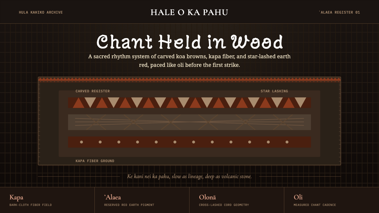 Hawaiian Hula Pahu DrumSacred weight, hand-marked. ʻAlaea red, kapa texture, and stacked carved regi…圣重而手作。ʻAlaea红、卡帕纹理与层叠雕刻带。
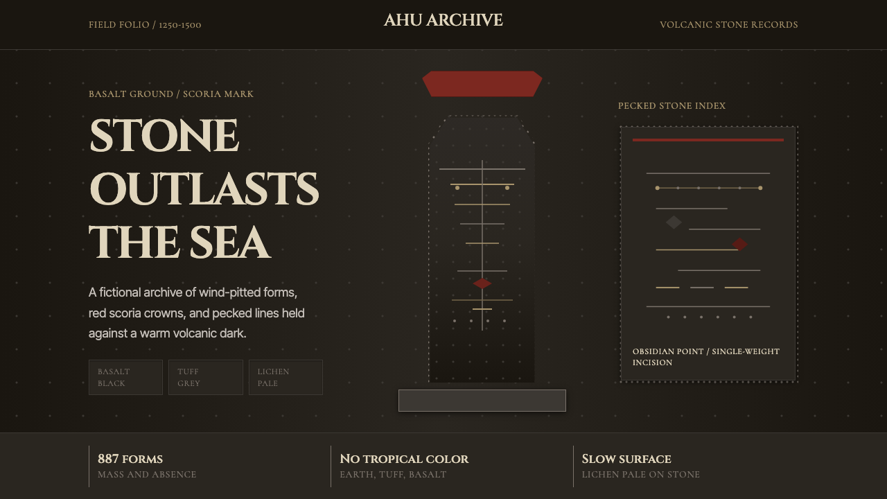 Rapa Nui Moai PetroglyphMonumental sparseness. Basalt black, scoria red, and pecked-dot borders hold…纪念碑式荒寂:玄武黑、火山红与凿点边框凝住沉默。
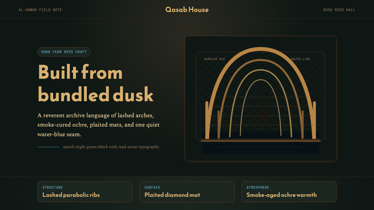 Iraqi Marsh Arab Mudhif ReedReverent reed darkness. Kufi arches, ochre lattice, and one water-blue line h…庄重的芦苇夜色。库菲拱线、赭黄格纹与一笔水蓝托住黄昏。
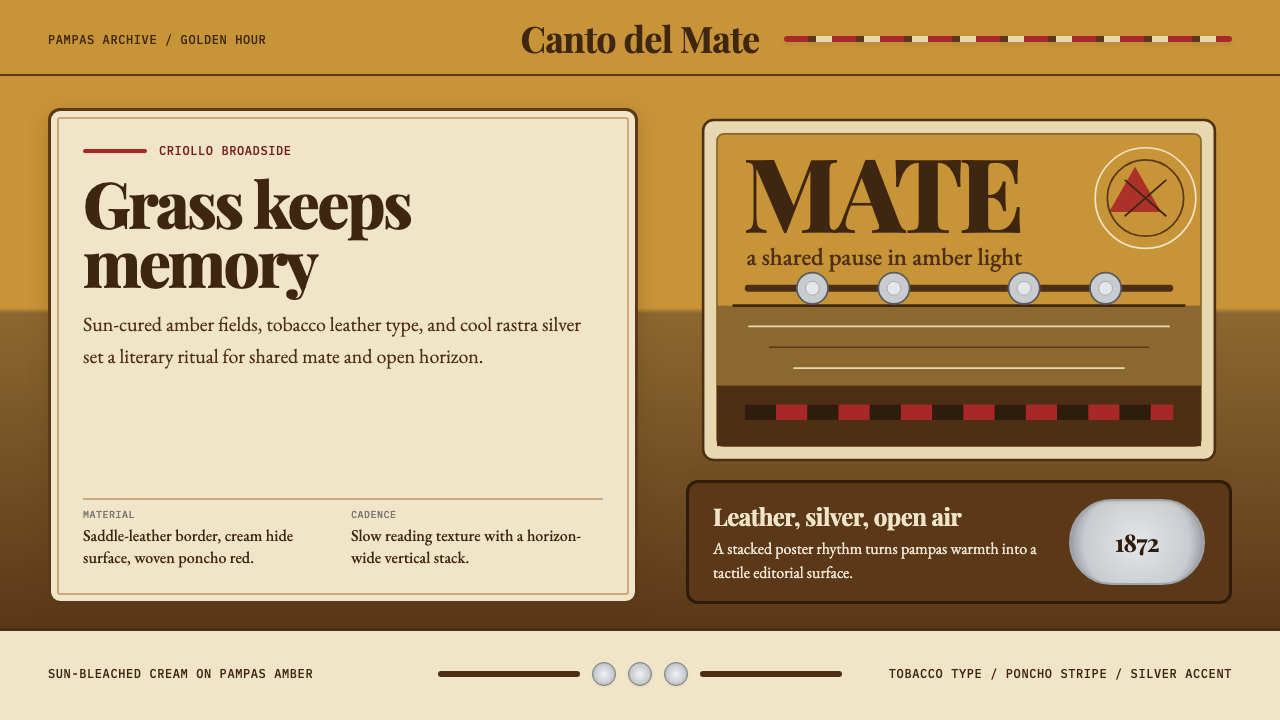 Argentine Gaucho (Pampas Mate Culture)Open grassland, printed warm. Amber fields, Playfair serif, and silver rastra…开阔草原的温热印刷:琥珀底、Playfair衬线与银色腰带几何。
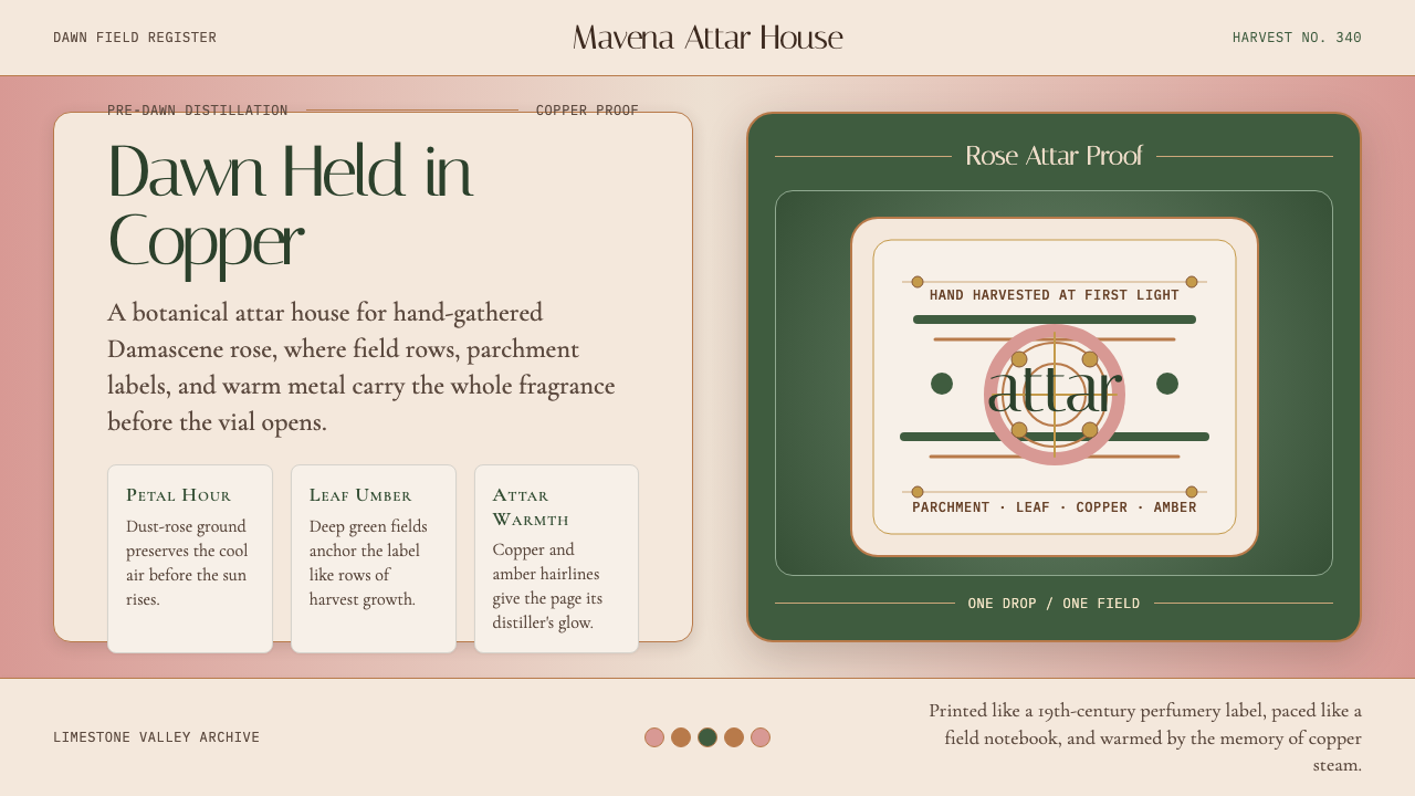 Bulgarian Kazanlak Rose ValleyDawn feels distilled. Dust-rose ground, leaf green, and copper label geometry…黎明被蒸馏:暮粉底、叶绿面与铜色标签几何留住香气。