Design style guide设计风格指南
What is Bulgarian Kazanlak Rose Valley?什么是 Bulgarian Kazanlak Rose Valley?
From Ottoman-era copper alembics to the perfume counters of Paris, the Kazanlak Rose Valley produced a visual language as layered as attar itself — dust-rose fields, deep leaf-green, and the warm gleam of distillery brass.从奥斯曼时代的铜制蒸馏器到巴黎的香水柜台,卡赞勒克玫瑰谷孕育出一套与玫瑰原精同样层次丰富的视觉语言——暮粉色花田、深邃叶绿,以及蒸馏坊黄铜的温润光泽。
Bulgarian Kazanlak Rose Valley in briefBulgarian Kazanlak Rose Valley 速览
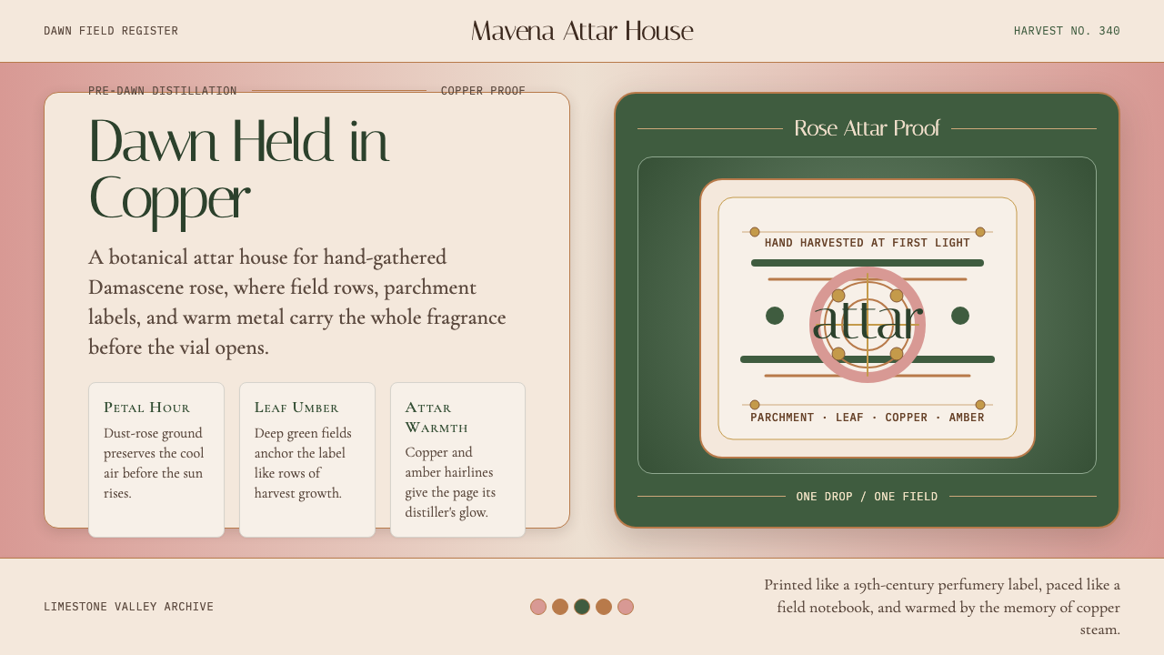
The Bulgarian Kazanlak Rose Valley design aesthetic draws on three centuries of rose-attar culture in central Bulgaria's Thracian Plain. It is a style rooted in the sensory world of pre-dawn harvest — the cool grey of limestone walls before sunrise, the dusty blush of opened Rosa damascena petals, the deep forest green of rose-leaf foliage, and the amber warmth of copper still-pots condensing steam into oil. These are not arbitrary colors; they are the colors of a specific agricultural moment, and the design language treats them with the same care a perfumer reserves for its source materials.保加利亚卡赞勒克玫瑰谷设计美学,根植于保加利亚中部色雷斯平原三个世纪的玫瑰精油文化。它的源头是凌晨采摘时分的感官世界——日出前石灰岩墙的冷灰,初绽的大马士革玫瑰花瓣的尘粉色,玫瑰叶深邃的林绿,以及铜制蒸馏罐将水汽凝结为精油时散发的琥珀暖光。这些不是随意挑选的颜色;它们是某一特定农业时刻的颜色,这套设计语言以香水师对待原材料的同等专注来处理它们。
Unlike design aesthetics that arrive fully formed from a single movement or school, the Kazanlak Rose style is the product of layered historical sediment: Ottoman horticultural practice, nineteenth-century botanical illustration, the label typography of European perfumery houses, and the folk-craft traditions of Bulgarian hand-weavers and embroiderers. The result is an aesthetic that feels at once archival and organic — simultaneously a scientific record and a sensory experience.与那些由单一运动或流派一次性确立的设计美学不同,卡赞勒克玫瑰风格是多层历史积淀的产物:奥斯曼园艺实践、十九世纪植物图鉴插画、欧洲香水品牌的标签排印,以及保加利亚手工织者与刺绣艺人的民间工艺传统。这套美学既有档案感又有有机感——既是科学记录,也是感官体验。
Typography within this aesthetic borrows from apothecary elegance and distiller's notebooks. Headline faces carry the upright authority of a nineteenth-century botanical label — formal without stiffness — while body text reads as running field notes, intimate and precise. Small capitals and generous letter-spacing recall the traditional layout of perfume labels where every gram of attar is accounted for with the same gravity as gold.这套美学中的字体排印,借鉴自药剂师的精致感与蒸馏师的田间笔记气质。标题字体带着十九世纪植物标签式的端正权威——庄重而不僵硬——正文读来如连续的田野手记,亲切而精确。小型大写字母与宽阔的字间距,让人想起传统香水标签的版面:那里的每一克原精都以与黄金同等的分量被记录。
See the Bulgarian Kazanlak Rose Valley design system →查看 Bulgarian Kazanlak Rose Valley 完整设计系统 →
Where does Bulgarian Kazanlak Rose Valley come from?Bulgarian Kazanlak Rose Valley 从何而来?
The history of rose cultivation in the Kazanlak region begins with Ottoman expansion into the Balkans in the late seventeenth century. Around the 1680s, Turkish planters introduced Rosa damascena — the Damask rose, prized for its exceptionally high oil content — to the limestone-fed valleys between the Balkan Mountains to the north and the Sredna Gora range to the south. The geology mattered: the thin, well-drained limestone soils, combined with the microclimate created by the mountain ranges on either side, produced rose petals with an attar yield far exceeding what could be achieved in the original Syrian cultivation zones. By the early nineteenth century, Kazanlak had become the world's principal source of rose oil.卡赞勒克地区玫瑰种植的历史,始于十七世纪末奥斯曼帝国向巴尔干半岛的扩张。约在1680年代,土耳其种植者将大马士革玫瑰——因其出油率极高而备受珍视——引入巴尔干山脉以南、斯雷德纳戈拉山脉以北之间的石灰岩河谷。地质条件至关重要:薄层、排水良好的石灰质土壤,加上两侧山脉共同营造的微气候,使玫瑰花瓣的精油产量远超原产叙利亚种植区所能达到的水平。到十九世纪初,卡赞勒克已成为世界玫瑰精油的主要产地。
The peak of the Bulgarian rose industry came in the period from roughly 1820 through the late nineteenth century, when Ottoman merchants and later independent Bulgarian traders controlled most of the global supply of rose attar shipped to Paris, London, Vienna, and Istanbul. The copper alembic distilleries that filled the valley's farmyards during May and June were the engine of the economy, and their visual culture — the amber condensation vessels, the hand-written weight ledgers, the botanical labels in Cyrillic and Ottoman script — became the raw material from which the region's design vocabulary would eventually be distilled.保加利亚玫瑰产业的鼎盛时期,大约在1820年至十九世纪末之间。奥斯曼商人、后来的独立保加利亚商人掌控着运往巴黎、伦敦、维也纳和伊斯坦布尔的大部分全球玫瑰精油供应。每年五六月间,铜制蒸馏器填满了整个河谷的农家院落,是这里经济的引擎;蒸馏坊的视觉文化——琥珀色的冷凝容器、手写重量台账、西里尔文与奥斯曼文对照的植物标签——后来成为这一地区设计词汇蒸馏的原材料。
Bulgarian independence in 1878 and the subsequent modernization of the rose industry brought new forms of visual documentation: botanical surveys commissioned by the Bulgarian Agricultural Ministry, illustrated catalogs produced by the growing perfumery export trade, and festival posters for the Kazanlak Rose Festival that began formalizing in the 1930s. Each of these layers added to the visual archive that designers working in this style draw on today. Key figures who helped shape both the cultural and commercial identity of the Kazanlak rose include Hristo Damyanov, who worked to systematize attar production in the mid-nineteenth century, and Petar Hadzhinikolov, whose accounts of the valley's economy and trade routes document the period of maximum commercial importance.1878年保加利亚独立与随后的玫瑰产业现代化,带来了新的视觉文献形式:保加利亚农业部委托的植物调查、不断壮大的香水出口贸易所产出的图解目录,以及1930年代起逐渐正式化的卡赞勒克玫瑰节海报。每一层积淀都为设计师今日所援引的视觉档案添砖加瓦。为塑造卡赞勒克玫瑰文化与商业身份作出重要贡献的人物,包括十九世纪中叶致力于系统化精油生产的赫里斯托·达米亚诺夫,以及彼得·哈吉尼科洛夫——后者对玫瑰谷经济与贸易路线的记述,记录了这一地区商业价值最高的时期。
The modern Rose Festival — held annually in Kazanlak in late May or early June — has itself become a design tradition. Festival graphics across the decades have accumulated into a visual archive that blends folk-embroidery motifs, botanical exactitude, and the commercial language of perfumery into a coherent regional identity. The historian and novelist Vera Mutafchieva, who documented Bulgarian social and material culture across her career, helped frame the rose industry not merely as agricultural history but as a carrier of national cultural meaning — a framing that continues to inform how designers approach this aesthetic.现代玫瑰节——每年五月末至六月初在卡赞勒克举办——本身也成为一种设计传统。数十年来积累的节庆视觉档案,将民间刺绣纹样、植物图鉴的精确性与香水商业语言融合成一种连贯的地域身份。历史学家兼小说家薇拉·穆塔夫奇耶娃,以其毕生对保加利亚社会与物质文化的书写,将玫瑰产业框定为不仅仅是农业史,更是民族文化意义的承载者——这一框架持续影响着设计师对这套美学的理解与运用。
What defines the Bulgarian Kazanlak Rose Valley look?Bulgarian Kazanlak Rose Valley 的视觉特征是什么?
Color Palette色彩体系
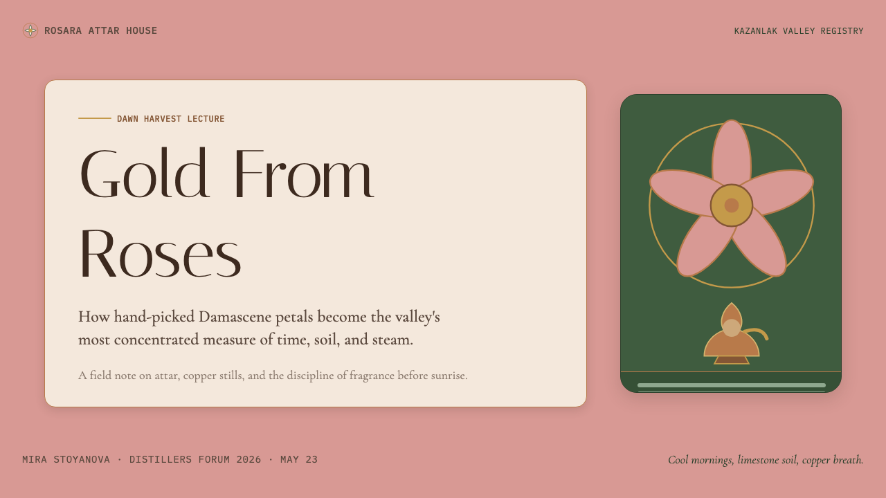
The palette centers on three interlocking tones drawn directly from the rose harvest. Dust-rose — the muted, slightly greyed pink of a Damask rose petal opened at dawn — serves as the dominant ground. Deep rose-leaf green, closer to the undersurface of the leaf than to fresh spring foliage, anchors the major surface areas. Copper-warm amber, the color of heated attar in a glass condensation vessel, provides the accent that unifies the palette's warmth. Supporting tones are drawn from the valley itself: the off-white of limestone walls, the soft grey-beige of morning mist, and the near-black of distillery wood ash. No color in this palette is saturated to full intensity; every tone carries some dust, some warmth, some memory of age.色板以玫瑰采摘时刻直接萃取的三种互锁色调为核心。暮粉色——黎明时分初绽的大马士革玫瑰花瓣那种微带灰意的柔粉——充当主要底色。玫瑰叶深绿,更接近叶片背面而非鲜嫩的春日绿意,锚定主要表面区域。铜器琥珀暖色,即玻璃冷凝容器中加热精油的颜色,提供统一整体温暖感的点睛之色。辅助色取自河谷本身:石灰岩墙的灰白、晨雾的柔灰米,以及蒸馏坊木灰的近黑。这套色板中没有任何颜色被推至纯粹的高饱和度;每一种色调都带着些许尘灰、些许暖意、些许岁月的记忆。
Typography字体排印
The typographic identity sits in the tradition of nineteenth-century apothecary and botanical label design. Display headlines use upright, high-contrast typefaces with fine hairlines and pronounced thick-thin strokes that recall the labeling conventions of European perfumery houses — authoritative and legible at a distance, yet richly detailed up close. Body text is set in a classical roman with old-style figures, at a comfortable measure that rewards reading rather than scanning. Small capitals appear frequently in subheadings and attributions, set with wider-than-standard spacing, evoking the weight and ceremony of a botanical classification. All-caps settings are used sparingly, and when they appear, letter-spacing is wide enough to treat each letter as an individual object.字体排印身份植根于十九世纪药剂师标签与植物图鉴的排版传统。展示性标题采用笔直、高对比的字体,细发丝笔画与粗主笔形成鲜明对比,令人想起欧洲香水品牌的标签惯例——在远处权威可辨,近看细节丰富。正文以经典罗马体排版,配以旧式数字,行宽舒适,更适合阅读而非扫视。小型大写字母频繁出现于副标题与注释,字间距比标准稍宽,唤起植物分类学名签的庄重与仪式感。全大写设置节制使用,且一旦出现,字间距务必宽阔到足以让每个字母作为独立对象存在。
Surface and Texture表面与质感
Where most digital design aesthetics trend toward either pure flatness or highly simulated depth, the Kazanlak Rose style occupies a middle ground that might be called archival texture. Backgrounds carry a faint quality suggesting aged paper, pressed botanical specimens, or the slightly rough surface of handmade label stock — not a digital noise effect, but an impression of physical substrate without explicit simulation. Copper and brass elements have a warm, slightly matte sheen that reads as metallic through tone and highlight placement rather than through any literal reflection map. This restraint keeps the aesthetic from tipping into steampunk pastiche.大多数数字设计美学趋向纯粹平面或高度模拟的深度感,而卡赞勒克玫瑰风格则占据一个可称为“档案质感”的中间地带。背景带有隐约的质地,令人联想到陈年纸张、压制的植物标本,或手工标签纸的微微粗糙——不是数字噪点效果,而是物理基底的印象,但没有刻意的模拟痕迹。铜与黄铜元素带有温暖、略微哑光的光泽,其金属质感通过色调与高光位置来传达,而非借助任何字面意义上的反射贴图。这种克制使这套美学不至于滑入蒸汽朋克的俗套。
Ornamental Language装饰语言
Unlike stripped-down modernist aesthetics, the Kazanlak Rose style permits — and indeed requires — a restrained use of botanical ornament. Thin-line botanical engravings of Rosa damascena branches, single blooms, and leaf clusters serve as border elements, dividers, and background motifs. Geometric frames derived from Bulgarian folk embroidery — particularly the repeating diamond and cross-stitch patterns of traditional aprons and tablecloths — appear at a scale small enough to read as texture rather than decoration. These elements are always rendered in a tonal variation of the surrounding field rather than in a contrasting color, keeping them subordinate to the typographic hierarchy.与简洁的现代主义美学不同,卡赞勒克玫瑰风格允许——实际上需要——克制地使用植物装饰。细线植物雕刻画——大马士革玫瑰枝条、单朵花头与叶簇——充当边框元素、分割线与背景纹样。源自保加利亚民间刺绣的几何框架——尤其是传统围裙与桌布上重复出现的菱形与十字绣纹样——以足够小的比例出现,读来更像质感而非装饰。这些元素始终以周围底面的同色调变化来呈现,而非以对比色处理,使其始终服从于字体层级。
Composition and Layout构图与版面
Layouts in this style favor a centered symmetry that recalls both the label design of European perfumery and the formal organization of botanical journal plates. The primary reading axis is vertical, with headline, subheadline, body text, and attribution stacked in deliberate sequence. Margins are generous — wide enough to accommodate botanical borders and to give each central element a sense of ceremonial isolation. Asymmetric elements, when they appear, are confined to accent positions: a copper ornament off-axis left, a small botanical spray in a lower corner. The overall effect is that of a designed object meant to be held and read closely, not scanned at a glance.这套风格的版面偏爱居中对称,这既令人联想到欧洲香水品牌的标签设计,也呼应植物学期刊图版的正式布局。主要阅读轴线是垂直的,标题、副标题、正文与注释以刻意的顺序纵向叠放。留白慷慨——宽阔到足以容纳植物边框,也足以赋予每个核心元素一种仪式性的孤立感。非对称元素若出现,仅限于点睛位置:轴线稍偏左的铜色装饰,或角落处的一簇小型植物纹样。整体效果如同一件被设计来细细把玩阅读的物件,而非快速扫视的版面。
Light and Shadow光线与阴影
The lighting logic of this aesthetic is diffuse and warm rather than harsh or directional. Shadows, where they appear, are soft and low-contrast — the shadow of a copper vessel in morning light, not the sharp cast shadow of noon. Drop shadows on card elements are warm-toned and spread generously, suggesting ambient light from a window rather than an overhead source. This warmth is the opposite of the cold, neutral drop shadows common in contemporary UI design. The effect reads as physical, aged, and inviting — as if the interface were illuminated by the same early-morning light under which the rose petals are harvested.这套美学的光线逻辑是漫射的、温暖的,而非刺烈或有强烈方向感的。阴影若出现,是柔和的、低对比度的——晨光中铜器的投影,而非正午的硬朗阴影。卡片元素上的投影色调偏暖、扩散慷慨,暗示来自窗口的环境光而非头顶光源。这种温暖与当代UI设计中常见的冷中性投影截然相反。效果读来是物质性的、有年代感的、亲切的——仿佛整个界面沐浴在采摘玫瑰花瓣时同一道黎明微光之中。
Material Evocation材质召唤
Every visual decision in this style alludes to a physical material without literally simulating it. The dust-rose ground evokes petal rather than representing it; the deep green surface calls to mind leaf without depicting one; the copper accent suggests the alembic without rendering it. This allusion-without-depiction is the style's most demanding quality and its most important discipline. The moment any element becomes literal — a photographic rose, a rendered copper pot — the aesthetic tips from evocative to illustrative, and the tension that gives the style its depth dissolves.这套风格中的每一个视觉决定都在暗示一种物质材料,而不是字面模拟它。暮粉底色唤起花瓣,而非再现它;深绿表面令人想到叶片,而非描绘它;铜色点缀指向蒸馏器,而非渲染它。这种“暗示而非描绘”是这套风格最高的要求,也是它最重要的纪律。一旦任何元素变得字面化——一朵摄影玫瑰、一只渲染铜锅——这套美学就会从“唤起”滑向“图解”,赋予风格深度的张力随之消散。
See the Bulgarian Kazanlak Rose Valley design system →查看 Bulgarian Kazanlak Rose Valley 完整设计系统 →
Who shaped Bulgarian Kazanlak Rose Valley?谁塑造了 Bulgarian Kazanlak Rose Valley?
A mid-nineteenth century figure closely associated with the systematization of rose-attar production in the Kazanlak valley. Damyanov worked to establish consistent distillation practices at a moment when the Bulgarian rose industry was expanding rapidly to meet European demand, helping to transform what had been a craft-scale operation into something approaching an organized industry. His name is associated with the period in which the visual culture of the trade — its labeling, packaging, and presentation — first began to consolidate into recognizable conventions.十九世纪中叶的重要人物,与卡赞勒克玫瑰精油生产标准化密切相关。彼时保加利亚玫瑰产业正急速扩张以满足欧洲市场需求,达米亚诺夫致力于建立一致的蒸馏工艺规范,将原本手工作坊规模的生产转化为接近系统化产业的形态。他的名字与贸易视觉文化——标签、包装与呈现方式——首次开始形成可识别惯例的那个时期紧密相连。
A chronicler of the Kazanlak region's economic and cultural life whose accounts of rose-valley trade routes and market relationships provide the most detailed documentary record of the industry at its height. Hadzhinikolov's writings describe the physical culture of rose production — the tools, the vessels, the schedules, the smells — with an attention to material detail that has made his work an invaluable source for both historians and designers seeking to ground their visual work in the sensory reality of the original context.卡赞勒克地区经济与文化生活的记录者,其对玫瑰谷贸易路线与市场关系的记述,提供了产业鼎盛时期最为详尽的文献记录。哈吉尼科洛夫的文字以细致的物质性笔触描述玫瑰生产的有形文化——工具、容器、时间节奏、气息——使其著作成为历史学家与设计师共同珍视的宝贵来源,后者借此将视觉创作根植于原初语境的感官现实之中。
Bulgarian historian and novelist whose scholarly and literary work reframed the rose-valley culture not merely as agricultural or commercial history but as a carrier of Bulgarian national identity across periods of Ottoman rule, liberation, and modernization. Mutafchieva's contribution to the design aesthetic is indirect but real: by insisting on the cultural and emotional weight of material practices — the rose harvest, the distillery, the festival — her writing helped establish the interpretive framework within which contemporary designers approach this visual tradition with seriousness rather than nostalgia.保加利亚历史学家兼小说家,其学术与文学作品将玫瑰谷文化重新框定为不仅仅是农业或商业史,而是保加利亚民族身份在奥斯曼统治、独立解放与现代化各个时期的承载者。穆塔夫奇耶娃对这套设计美学的贡献是间接的,却是真实的:通过坚持物质实践——玫瑰采摘、蒸馏坊、节庆——的文化与情感份量,她的写作帮助建立了一套诠释框架,使当代设计师能以严肃而非怀旧的态度对待这一视觉传统。
More tradition than individual, the Kazanlak Rose Festival has been an annual event since the early twentieth century, formalized in its modern form in the 1930s. Its festival posters, procession imagery, and printed ephemera constitute the primary design archive from which the contemporary aesthetic is assembled. Across nearly a century of festival graphics, certain visual decisions recurred consistently enough to constitute a grammar: the centering of Rosa damascena as the dominant motif, the combination of botanical and folk-embroidery elements, the use of warm metallic accents against floral ground colors. The festival's visual archive is, in effect, the style's design system.与其说是某个个人,不如说是一种集体传统——卡赞勒克玫瑰节自二十世纪初以来每年举办,并于1930年代以其现代形式正式确立。节庆海报、游行图像与印刷纸品,共同构成这套当代美学所由组装的主要设计档案。近一个世纪的节庆视觉史中,某些视觉决定以足够高的频率反复出现,最终形成一套语法:以大马士革玫瑰为主导纹样的居中构图,植物元素与民间刺绣元素的结合,在花卉底色上使用温暖金属质感点睛。节庆的视觉档案,实际上就是这套风格的设计体系。
Not a human figure but the biological fact at the center of the entire aesthetic. The Damask rose — brought to the Balkans from Syria via Ottoman trade routes — produces petals with an oil content and fragrance profile unlike any other cultivar. Its visual form, a dense, multi-layered bloom of muted, dusty pink set against dark green serrated leaves, directly generated the palette and compositional conventions of the Kazanlak style. Understanding the design system requires understanding the plant: its dawn-flowering habit (which dictated the harvest schedule and thus the culture of early-morning work and light), its color under different conditions of dew and sun, and its transformation from fresh petal to distilled essence.不是一个人物,而是整套美学核心的生物事实。大马士革玫瑰——经由奥斯曼贸易路线从叙利亚引入巴尔干半岛——所产花瓣的出油量与香气特征,有别于任何其他品种。它的视觉形态——在深绿色锯齿叶片衬托下,层叠致密的暮粉色花头——直接催生了卡赞勒克风格的色板与构图惯例。理解这套设计体系,需要理解这株植物:它黎明开花的习性(这决定了采摘时间表,进而塑造了早晨劳作与晨光的文化)、它在不同露水与阳光条件下的颜色,以及它从新鲜花瓣到蒸馏精华的转化过程。
How do you use Bulgarian Kazanlak Rose Valley today?今天怎么用 Bulgarian Kazanlak Rose Valley?
The Bulgarian Kazanlak Rose Valley aesthetic is best deployed when a design project needs to communicate sensory richness, artisanal authenticity, and a kind of quiet heritage authority — without resorting to the visual clichés of either generic 'vintage' or generic 'luxury.' It is a style that rewards careful application and punishes careless borrowing: the dust-rose and leaf-green palette looks considered when all elements are tonally consistent, but immediately dated when mixed with contemporary high-saturation palettes or default sans-serif typefaces.保加利亚卡赞勒克玫瑰谷美学,最适合在设计项目需要传达感官丰富性、手工真实感,以及一种宁静的传统权威感时使用——而无需借助泛化“复古”或泛化“奢华”的视觉套路。这是一种精心应用时回报丰厚、粗心借用时立刻穿帮的风格:暮粉与叶绿色板在所有元素色调一致时显得深思熟虑,一旦与当代高饱和度色板或默认无衬线字体混用,便立刻显得过时。
For presentation slides, this style works with unusual effectiveness on both cover pages and content pages that need to communicate expertise and care. A cover benefits from the centered, symmetrical composition borrowed from perfumery label design: the title set in a high-contrast display face at the center, framed above and below by thin botanical borders in a tonal variation of the ground color, with a copper-warm accent used only for the most important name or date. Content slides should carry the wide margins and vertical reading axis into the interior: one idea per slide, headline in the display face, body in the classical roman, with section breaks marked by a thin ornamental rule rather than a geometric divider.在演示文稿中,这套风格在封面页与需要传达专业性与用心感的内容页上都能发挥非同寻常的效果。封面适合借鉴香水标签设计的居中对称构图:标题以高对比度展示字体居中排列,上下各有以底色同色调变化呈现的细线植物边框,铜器暖色点缀仅用于最重要的名称或日期。内容页应将宽阔留白与垂直阅读轴线贯穿始终:每页一个概念,标题用展示字体,正文用经典罗马体,段落分隔以细装饰线而非几何分割线标记。
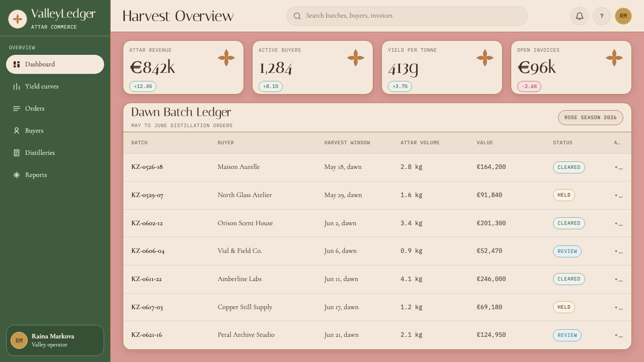
For web interfaces, this palette and typographic approach is particularly effective for products in the premium goods, wellness, botanical, hospitality, and cultural heritage sectors. Dashboard and pricing page layouts should use the centered vertical axis for the primary call-to-action hierarchy, with generous whitespace treating each tier card as an isolated object — the way a perfume bottle sits alone on a shelf — rather than a member of a grid. Navigation should be typographic, with the display face used for section names and the classical roman for secondary labels. Data visualization, where needed, should use the three core palette colors as distinct encoding channels, with the copper accent reserved for the most critical metric.在网页界面中,这套色板与排印方式对于高端商品、健康、植物、酒店与文化遗产领域的产品尤为有效。仪表板与定价页面的版面应以居中垂直轴线组织主要的行动号召层级,以慷慨的留白将每个等级卡片作为孤立对象呈现——就像香水瓶独自立于货架上——而非网格的一员。导航应以字体为主,展示字体用于栏目名称,经典罗马体用于次级标签。数据可视化若有需要,应以三种核心色板色作为独立的编码通道,铜器暖色保留给任意给定表面上最关键的那项指标。
For editorial and marketing work, the style's strongest application is in brand identity systems for products with genuine artisanal or heritage provenance — where the visual language can be grounded in the product's actual material culture rather than borrowed as decoration. In this context, the botanical ornament and symmetrical label-derived layouts work not as nostalgia but as an accurate signal of the product's values. Marketing materials in this style benefit from restraint in color application: the dust-rose ground should dominate, with deep green used for the secondary structural areas, and copper reserved for the single most important element on any given surface.在编辑与营销工作中,这套风格最强的应用场景,是为具有真实手工或传统渊源的产品建立品牌视觉体系——在那里,视觉语言能以产品自身的物质文化为根基,而非将其作为装饰借用。在这种语境下,植物装饰与从标签设计派生的对称版面,发挥的不是怀旧的作用,而是对产品价值观的准确信号传递。这套风格的营销材料在色彩使用上受益于克制:暮粉底色应占主导,深绿用于次要结构区域,铜色保留给任意表面上单个最重要的元素。
A common mistake when working with this aesthetic is over-literalizing it — adding photographic roses, explicit copper textures, or decorative flourishes beyond what the restrained botanical engraving tradition supports. The style's power comes from evocation, not illustration. A dust-rose background already smells of petals; adding a rose photograph destroys the evocative quality by converting it into decoration. Similarly, mixing warm metallic elements from other traditions — gold leaf effects, Art Nouveau flowing lines — undermines the specific historical coherence that gives the style its authority. The botanical engraving and the folk-embroidery frame must remain the only sources of ornament, rendered at tonal rather than chromatic contrast.使用这套美学时最常见的错误,是将其过度字面化——添加摄影玫瑰、明显的铜质纹理,或超出克制的植物雕刻传统所支持范围的装饰花饰。这套风格的力量来自“唤起”,而非“图解”。暮粉色背景本身已弥漫着花瓣的气息;加入一张玫瑰照片,会将这种唤起转化为装饰,从而摧毁它。同样,混入来自其他传统的温暖金属元素——金箔效果、新艺术运动的流动线条——会破坏赋予这套风格权威性的特定历史连贯性。植物雕刻与民间刺绣框架,必须始终是唯一的装饰来源,且以色调对比而非色相对比来呈现。
See the Bulgarian Kazanlak Rose Valley design system →查看 Bulgarian Kazanlak Rose Valley 完整设计系统 →
Bulgarian Kazanlak Rose Valley — FAQBulgarian Kazanlak Rose Valley · 常见问题
Is this style too niche for a modern digital product?这套风格对现代数字产品来说是否过于小众?
The style is historically specific but not limiting when applied correctly. What makes it niche is also what makes it distinctive: in a digital landscape saturated with neutral-palette minimalism and high-saturation gradient aesthetics, the dusty warmth and botanical authority of the Kazanlak Rose vocabulary signals a very specific set of values — heritage, sensory care, artisanal quality — without stating them explicitly. Products in the premium food, beauty, wellness, hospitality, and cultural heritage categories can benefit directly from this specificity. Outside those categories, the aesthetic can still function if the brand narrative has a genuine connection to handcraft, natural materials, or historical depth. What it cannot do is serve as a neutral container for any content: the style makes claims, and those claims need to be true of the product.这套风格在历史上有其特定指向,但正确应用时并不构成局限。使它小众的,恰恰也是使它与众不同的:在充斥着中性极简与高饱和渐变的数字环境中,卡赞勒克玫瑰词汇的尘灰暖意与植物权威感,能够清晰传递一套非常具体的价值观——传统、感官用心、手工品质——而无需将其明说。高端食品、美妆、健康、酒店与文化遗产领域的产品,能从这种特定性中直接获益。在这些领域之外,若品牌叙事与手工、天然材料或历史深度有着真实关联,这套美学同样能够发挥作用。它无法做到的是作为任何内容的中性容器:这套风格在表达主张,而这些主张需要与产品的实际情况相符。
How do you handle dark-mode versions of this aesthetic?这套美学如何处理深色模式版本?
A dark inversion of the Kazanlak Rose palette is workable but requires careful recalibration. The strategy is not to simply invert the ground color but to shift the reference point from pre-dawn light to the interior of a nineteenth-century distillery at night: deep charcoal walls, the warm amber glow of oil lanterns on copper vessels, and the deep green of foliage reduced to shadow. In practice, this means using a very dark, warm-toned charcoal (not cold grey, and not pure black) as the ground, maintaining the copper accent as a warm highlight, and using the muted dust-rose as a secondary accent rather than the dominant surface. The leaf green becomes even deeper, reading more as shadow than color. The critical discipline is maintaining the palette's warmth: a cold dark mode is a different aesthetic entirely.卡赞勒克玫瑰色板的深色反转是可行的,但需要仔细重新校准。策略不是简单地反转底色,而是将参照点从黎明前的光线转移至十九世纪蒸馏坊深夜的室内:深炭色石墙,油灯照在铜器上的温暖琥珀光晕,以及退入阴影中的深绿叶色。在实践中,这意味着以非常深沉、色调偏暖的炭灰色(而非冷灰,也不是纯黑)作为底色,保持铜器暖色作为温暖高光,将暮粉色降格为次级点缀而非主导表面。叶绿变得更深,读来更像阴影而非颜色。关键纪律是保持色板的温暖感:冷色调的深色模式是截然不同的另一套美学。
What distinguishes this style from generic 'vintage botanical' design?这套风格与泛化的“复古植物”设计有何区别?
Generic vintage botanical design borrows the surface elements of nineteenth-century scientific illustration — detailed engraved line drawings, aged paper textures, muted palettes — without the cultural and material specificity that gives those elements meaning. The Kazanlak Rose aesthetic is grounded in a particular geography, a particular plant, a particular industry, and a particular moment in commercial and craft history. This specificity shows in the palette (which is derived from the actual colors of the rose harvest, not from a general vintage warmth), in the typographic references (which point to perfumery labels and botanical journals from the Bulgarian and Ottoman traditions, not to a generic 'old print' look), and in the ornamental language (which combines Bulgarian folk embroidery with botanical engraving rather than using generic Victorian flourishes). Specificity is the antidote to pastiche.泛化的复古植物设计借用了十九世纪科学插画的表面元素——精细的雕刻线描、仿旧纸张质感、低饱和色板——却缺乏赋予这些元素意义的文化与物质特定性。卡赞勒克玫瑰美学根植于特定的地理、特定的植物、特定的产业,以及商业与手工历史上特定的时刻。这种特定性体现在色板上(它来源于玫瑰采摘时刻的实际颜色,而非一般性的复古暖调)、排印参照上(指向保加利亚与奥斯曼传统的香水标签与植物期刊,而非泛化的“老印刷品”外观)以及装饰语言上(将保加利亚民间刺绣与植物雕刻结合,而非使用泛化的维多利亚花饰)。特定性是对抗仿作的解药。
Can this style work for a technology product?这套风格能用于科技产品吗?
It can, but with significant adaptation. Technology products that have a genuine story about natural materials, artisanal data curation, or deep heritage (botanical databases, agricultural technology, fragrance AI tools, cultural preservation platforms) can leverage the style's authority and warmth with credibility. Products without that narrative connection risk creating a visual disjunction between aesthetic and product promise — the warm botanical language signals handcraft and slowness, which is the opposite signal of most technology positioning. The adaptation that works best is using the palette and typographic system while abandoning the botanical ornament in favor of the cleanest possible layout: the color temperature and typeface family carry the aesthetic signal without the decorative elements that would feel incongruous in a purely digital product context.可以,但需要相当程度的改编。若科技产品对天然材料、手工数据策展或深度传统有着真实的故事可讲(植物数据库、农业技术、香气AI工具、文化遗产保护平台),则可以可信地借用这套风格的权威感与温暖感。缺乏这种叙事关联的产品,则面临美学与产品承诺之间的视觉断裂风险——温暖的植物语言传递的是手工与缓慢的信号,这与大多数科技产品的定位恰好相反。最有效的改编方式是保留色板与排印体系,同时放弃植物装饰,转而追求尽可能简洁的版面:色温与字体族本身足以传递美学信号,而不需要在纯数字产品语境中显得格格不入的装饰性元素。
How should data and charts be handled within this aesthetic?这套美学中应如何处理数据与图表?
Data visualization within the Kazanlak Rose aesthetic should treat charts and graphs as botanical specimens rather than as geometric abstractions. This means using the three core palette tones as the primary encoding channels, with values mapped to the warmth spectrum from leaf-green (coolest, often used for reference or secondary data) through dust-rose (mid-range or positive) to copper-warm amber (highlight or critical value). Grid lines should be light and warm-toned, not cold grey. Axes and labels are best set in the classical roman typeface at a small size with generous letter-spacing, as if annotating a botanical plate. The most common mistake is importing high-saturation chart colors from a default palette — these immediately break the tonal consistency that gives the style its coherence.卡赞勒克玫瑰美学中的数据可视化,应将图表视为植物标本而非几何抽象物来处理。这意味着以三种核心色调作为主要编码通道,将数值映射到从叶绿(最冷,通常用于参照数据或次要数据)经暮粉(中间范围或正面数据)到铜器琥珀暖色(高亮或关键数值)的暖度谱系上。网格线应当浅淡而色调偏暖,而非冷灰。坐标轴与标签最好以经典罗马体小号排版,字间距慷慨,仿佛在为植物图版作注释。最常见的错误是从默认色板中引入高饱和度图表颜色——这会立刻打破赋予这套风格连贯性的色调一致性。
Related design styles相关设计风格
 Kazakh Shanyrak Yurt FeltDomestic warmth, engineered. Ram-horn red felt curls around a radial shanyrak…居家暖意如工程般精密。羊角红毡纹环绕沙尼拉克轮。
 Latvian Knitted MittensWinter craft glows. Sun-wheel red and Lielvarde gold lock into an 8-stitch bl…冬夜手作发光。太阳红与利耶尔瓦尔德金锁进八针蓝格。
 Lithuanian Amber (Baltic Pagan)Ancient amber glows. Honey resin on smoked oak, framed by saulė geometry.古琥珀在发光:烟熏橡木上蜂蜜树脂,太阳轮几何定框。
 Romanian Ie (folk embroidered blouse)Folklore becomes grid. Cochineal red and soot black stitch strict bands on li…民俗化作网格:亚麻白底上,胭脂红与炭黑织成严整带状刺绣。
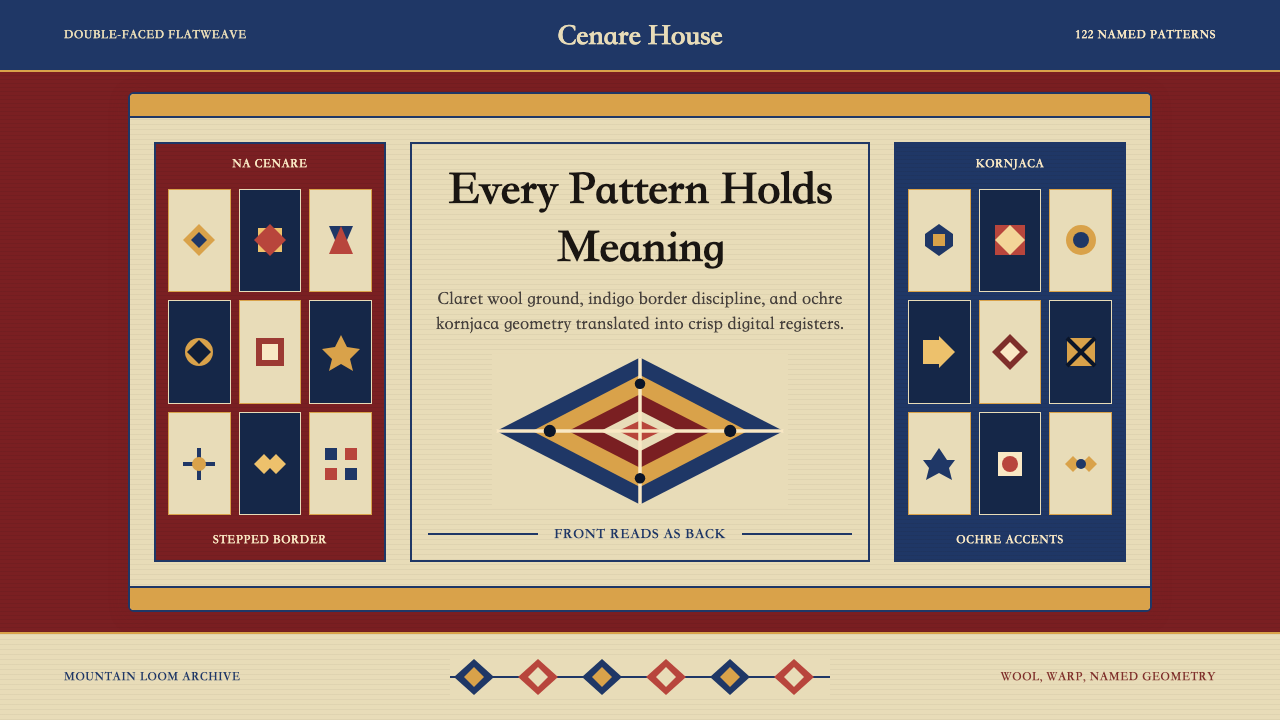 Serbian Pirot KilimWoven memory, sharply framed. Claret ground, indigo borders, ochre stepped di…织纹承载记忆。深酒红地、靛蓝边带与赭黄阶梯菱形。
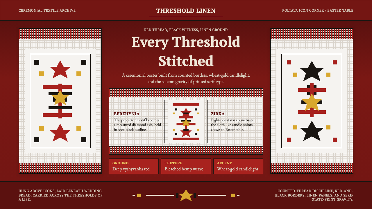 Ukrainian Rushnyk Ceremonial TowelCeremony stitched in red. Linen panels, soot-black crosses, and wheat-gold st…红线缝出仪式感:麻布面板、黑色十字与麦金星纹承载记忆。