Design style guide设计风格指南
What is Latvian Knitted Mittens?什么是 Latvian Knitted Mittens?
Latvian knitted mittens encode centuries of pagan cosmology into a dense, two-color stranded textile — a visual system where sun-wheels, morning-star crosses, and zigzag earth-signs still speak as clearly as any modern icon.拉脱维亚编织手套将数百年的异教宇宙观编入密实的双色提花织物——太阳轮、晨星十字与大地锯齿纹构成的符号系统,至今依然像任何现代图标一样清晰传情。
Latvian Knitted Mittens in briefLatvian Knitted Mittens 速览
Latvian Knitted Mittens is a design style rooted in the Baltic folk-textile tradition of raksti — a word meaning both 'signs' and 'writing' in Latvian — which organized geometric symbols into repeating two-color patterns across hand-knitted woolen objects. The visual system is built on strict eight-stitch and eight-row repeat modules, producing a grid of extraordinary regularity that nonetheless carries enormous symbolic variety: sun-wheels for cosmic order, morning-star diamonds for protection, interlocking keys for continuity, and zigzag lines for the earth's surface and the cycle of seasons.拉脱维亚编织手套是一种植根于波罗的海民间纺织传统的设计风格,其核心概念是 raksti——拉脱维亚语中同时意为「符号」与「书写」——将几何符号组织成手工编织羊毛物品上循环往复的双色纹样。整个视觉系统建立在严格的八针八行重复模块之上,构成一张规律性极强却又承载丰富象征变体的网格:太阳轮代表宇宙秩序,晨星菱形寓含护佑,相扣的钥匙纹象征延续,锯齿线则描绘大地表面与四季轮回。
What distinguishes this tradition from other European folk textiles is its dual nature as both ornament and communication. A bride's mitten collection was read by wedding guests as a record of her skill, regional identity, and family lineage. The five ethnographic regions of Latvia — Lielvārde, Kurzeme, Latgale, Vidzeme, and Zemgale — each developed recognizable motif dialects, with Lielvārde known for its densest geometric complexity and Kurzeme for its bold contrast between saturated fields and white grounds. This regional specificity means the tradition offers not one but several distinct visual languages sharing a common structural grammar.这一传统有别于欧洲其他民间纺织品的地方,在于其兼具装饰与传达的双重属性。新娘的手套收藏会被婚礼宾客解读为她技艺、地域身份与家族谱系的记录。拉脱维亚五个民族志区域——利耶尔瓦尔德、库尔泽梅、拉特加莱、维泽梅与泽姆加莱——各自发展出可辨的纹样方言:利耶尔瓦尔德以最为繁密的几何复杂度著称,库尔泽梅则以饱和色彩区域与白底之间的大胆对比见长。这种地域特殊性意味着,这一传统并非提供单一的视觉语言,而是共享同一结构语法的数种不同方言。
As a contemporary design style, Latvian Knitted Mittens draws on this vocabulary to produce work that feels simultaneously ancient and precisely geometric — the textile grid becomes an underlying compositional order, the raksti signs function as decorative marks with symbolic weight, and the palette of deep Baltic night-blue, sun-wheel red, and Lielvārde gold against bleached linen creates a distinctive warmth that no purely abstract geometric style can match.作为当代设计风格,拉脱维亚编织手套从这套词汇出发,创作出同时令人联想到古老与精确几何的作品——纺织网格成为底层的构图秩序,raksti 符号作为携带象征重量的装饰标记发挥作用,而深沉的波罗的海夜蓝、太阳轮深红与利耶尔瓦尔德金色在漂白亚麻底色上的组合,创造出纯抽象几何风格无法企及的独特温度。
See the Latvian Knitted Mittens design system →查看 Latvian Knitted Mittens 完整设计系统 →
Where does Latvian Knitted Mittens come from?Latvian Knitted Mittens 从何而来?
The signs woven into Latvian mittens predate the garments themselves. Raksti symbols have been found on Baltic bronze ornaments, carved wooden objects, and linen embroideries dating back to at least the early medieval period, and some scholars trace the solar motifs to the pre-Christian Baltic religion centered on Saule, the sun goddess, and Māra, the earth mother. This cosmological substrate is what gives the mitten tradition its unusual density of meaning: the decorative pattern and the religious sign were never fully separated. To knit a sun-wheel was also to invoke the sun's protection for the hands wearing the mitten through winter fieldwork.编织进拉脱维亚手套中的符号,比手套本身更为古老。raksti 符号已在至少可追溯至早期中世纪的波罗的海青铜饰品、木雕物件与亚麻刺绣上被发现,部分学者将太阳图案追溯至以太阳女神 Saule 和大地母亲 Māra 为核心的前基督教波罗的海宗教。正是这层宇宙观底色,赋予了手套传统不寻常的意义密度:装饰纹样与宗教符号从未被完全分离。编织一个太阳轮,同时也是为穿戴手套在冬日田间劳作的双手祈求太阳的庇护。
The practice of producing elaborate knitted mittens as betrothal and wedding gifts crystallized in the eighteenth and nineteenth centuries, when the genre reached its most systematic and codified form. Latvian ethnographers and collectors of the late nineteenth century, working in parallel with the national awakening movement known as Jaunlatvieši (the Young Latvians), documented mitten patterns from across the five regions and preserved them in illustrated atlases. The poet and folklorist Krišjānis Barons, best known for compiling the monumental Dainas collection of Latvian folk songs, was part of the same cultural moment that recognized textile patterns as carriers of national identity — a visual counterpart to the oral literary tradition.将精美编织手套作为订婚与婚礼礼物的实践,在十八、十九世纪达到其最系统化与规范化的形态——这也是该体裁最为成熟的时期。十九世纪末的拉脱维亚民族志学者与收藏者,与被称为「新拉脱维亚人」(Jaunlatvieši)的民族觉醒运动并行工作,记录了来自五个区域的手套纹样,并保存在有图解的图谱中。诗人兼民俗学者克里什亚尼斯·巴伦斯以汇编拉脱维亚民歌巨著《民歌集》(Dainas)而最为人知,他也是同一文化时刻的参与者——那个时刻认识到纺织纹样是民族身份的承载者,是口头文学传统的视觉对应物。
The Soviet period (1940–1941, 1944–1991) suppressed the explicit religious meanings of raksti signs while paradoxically preserving and institutionalizing the craft as a marker of Latvian folk culture, distinct from Russian traditions. State craft organizations documented patterns, trained knitters, and sold mittens as tourist objects, inadvertently creating a network of practitioners and a standardized canon of regional designs. Scholars like Mirdza Slava and Maruta Grasmane produced the reference atlases that contemporary designers still consult, cataloguing hundreds of distinct motifs by region and period.苏联时期(1940—1941年,1944—1991年)压制了 raksti 符号的明确宗教含义,同时却自相矛盾地将这门手工艺作为有别于俄罗斯传统的拉脱维亚民间文化标志加以保存和制度化。国家工艺组织记录纹样、培训编织者,将手套作为旅游品销售,无意中创建了一个从业者网络和一套标准化的地域图案典范。米尔扎·斯拉瓦和马鲁塔·格拉斯曼尼等学者编制了当代设计师至今仍在参考的标准图谱,按地区和年代收录了数百种不同的纹样。
The restoration of Latvian independence in 1991 triggered a revival that was as much symbolic as practical. The wearing and gifting of hand-knitted mittens in traditional patterns became an act of cultural assertion. Organizations like Sena Klēts worked to reconnect contemporary Latvian textile practice with its ethnographic sources, training a new generation of knitters in the regional pattern dialects that Soviet standardization had partially flattened. This post-independence revival is the direct context for the raksti tradition's emergence as a design style: the same energy that put hand-knitted mittens on the hands of politicians at independence ceremonies eventually found its way into digital interfaces, brand identities, and editorial graphics.1991年拉脱维亚恢复独立,引发了一场象征意义与实践意义同等深重的复兴。身着传统纹样手工编织手套、以之相互馈赠,成为一种文化宣示的行为。斯纳·克莱茨(Sena Klēts)等机构致力于将当代拉脱维亚纺织实践重新与其民族志源头相连接,为新一代编织者传授那些被苏联标准化部分夷平的地域纹样方言。这场后独立时期的复兴,正是 raksti 传统作为设计风格涌现的直接背景:将手工编织手套戴在独立典礼上政治人物双手的同一股能量,最终流入数字界面、品牌识别与编辑图形设计之中。
What defines the Latvian Knitted Mittens look?Latvian Knitted Mittens 的视觉特征是什么?
Palette色板
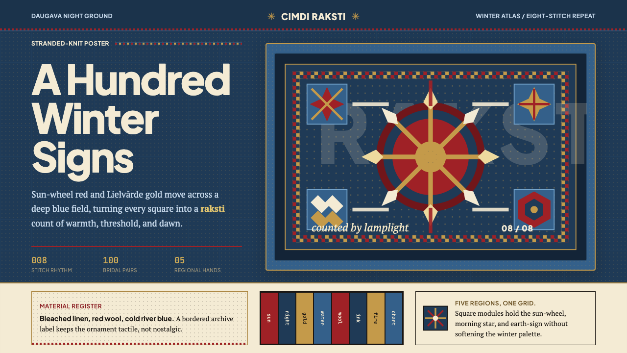
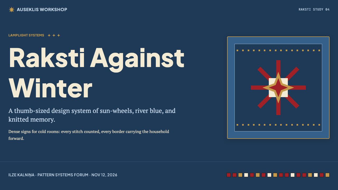
The palette is Baltic winter rendered as dyestuff: a deep Daugava-river night blue anchors every composition as the dominant ground, with sun-wheel red providing active warmth and Lielvārde gold marking accent and hierarchy. Stranded-knit black defines structural outlines and lettering, while bleached linen white creates the high-contrast field that makes the geometric motifs legible at the scale of a thumb. The overall effect is simultaneously saturated and cold — the warmth comes from hue, not from light, as if the colors are seen by lamplight inside a Baltic farmhouse in November.色板是以染料重现的波罗的海冬天:深沉的道加瓦河夜蓝作为主导底色锚定每一幅构图,太阳轮深红提供主动的暖意,利耶尔瓦尔德金色标注强调与层级。提花黑定义结构轮廓与文字,漂白亚麻白则形成使几何纹样在拇指尺度上清晰可读的高对比区域。整体效果既饱和又寒冷——温度来自色相而非光线,仿佛在十一月的波罗的海农舍室内以煤油灯光观看这些色彩。
Geometric Modularity几何模块性
Every motif in the tradition obeys the eight-stitch grid — the physical constraint of stranded knitting translated into a compositional principle. Diagonal lines resolve into staircase steps; curves become faceted approximations; the sun-wheel's spokes land exactly on grid intersections. This constraint produces a visual grammar of extraordinary consistency: no element can exist at less than one stitch of width, which means every form has a minimum weight and every composition shares the same underlying beat. In digital contexts, the grid becomes a modular tile system where decorative elements snap to invisible rules.这一传统中的每一种纹样都服从八针网格——提花编织的物理约束转化为构图原则。对角线解析为阶梯状折线,曲线成为多面近似,太阳轮的辐条精确落在网格交点上。这种约束产生了一套一致性极强的视觉语法:没有任何元素可以窄于一针,这意味着每种形态都有最小的视觉重量,每幅构图都共享同一底层节拍。在数字语境中,这个网格成为模块化的瓷砖系统,装饰元素吸附于隐形规则。
Symbol Vocabulary符号词汇
The raksti lexicon is specific and documented: the eight-spoke sun-wheel (Saules zīme) for cosmic protection, the morning-star cross (Auseklis) for guidance and new beginnings, the interlocking key pattern (atslēdziņa) for security and continuity, the zigzag earth-sign (zeme) for grounding and seasonal cycle, and the diamond (rūtiņa) for wholeness and enclosure. These are not decorative choices — each carried legible meaning within its original community. In contemporary use, they function as a symbolic register that elevates geometric decoration to something with cultural weight, even for audiences who cannot read the specific sign.raksti 词汇是具体且有文献记载的:八辐太阳轮(Saules zīme)代表宇宙守护,晨星十字(Auseklis)象征引导与新的开始,相扣钥匙纹(atslēdziņa)寓含安全与延续,锯齿大地符(zeme)体现扎根与四季轮回,菱形(rūtiņa)意指完整与围合。这些不是装饰性选择——每一种在其原始社群中都携带可读的含义。在当代使用中,它们构成一套象征性的话语层,即使对于无法识读具体符号的受众,也能将几何装饰提升为具有文化分量的存在。
Dense Two-Color Contrast密实双色对比
Stranded knitting is by definition a two-color technique: one color is always active in the foreground while the other forms the ground. This structural constraint produces compositions of stark, high-contrast figure-ground relationships without gradients, shadows, or blending. The visual weight is almost entirely carried by the relationship between the two colors — shift the ground from night-blue to white and the entire emotional register changes, even if every motif remains identical. This binary logic translates directly into digital design as a system that works cleanly in single-color reproduction and at small sizes.提花编织从定义上就是一种双色技法:一种颜色始终活跃在前景,另一种构成底色。这一结构约束产生了鲜明的高对比度图底关系,没有渐变、没有阴影、没有混合。视觉重量几乎完全由两种颜色之间的关系承载——将底色从夜蓝换成白色,整个情感基调随之改变,即使每一个纹样保持完全相同。这种二元逻辑直接转化为数字设计中的系统:在单色印刷和小尺寸下同样清晰有效。
Repetition and Border Logic重复与边框逻辑
The mitten's compositional structure is always striped horizontally: bands of plain knitting separate bands of motif repetition, with narrower separator bands at wrist and cuff edges. This layered-border logic — wide motif band, narrow separator, wide motif band — creates a rhythm that is both deeply orderly and visually generous. In contemporary layouts, this logic maps to section dividers, full-width decorative bands, and the treatment of headers and footers as banded zones rather than floating elements. The separator's thinness makes the motif bands feel expansive by contrast.手套的构图结构始终是横向条带式的:素色编织带将纹样重复带分隔开来,腕部与袖口边缘有更窄的分隔带。这种分层边框逻辑——宽纹样带、窄分隔带、宽纹样带——创造出一种既高度有序又视觉上宽裕的节奏。在当代版面中,这种逻辑映射为区块分隔线、通栏装饰带,以及将页眉页脚视为有厚度的带状区域而非浮动元素的处理方式。分隔带的纤细,使纹样带在对比中显得更为开阔。
Regional Texture and Variation地域质感与变体
Unlike a single-designer style system, the raksti tradition encompasses at least five regional dialects of meaningful visual difference. Lielvārde patterns are characterized by maximum motif density and complex interlocking; Kurzeme favors broader grounds and stronger contrast; Latgale introduces vertical symmetry alongside horizontal banding; Vidzeme and Zemgale tend toward more open compositions with larger dominant motifs. This internal variation means the style has genuine range — it is not a single look but a family of related looks, and a designer working within it can signal different registers of formality, density, or warmth by drawing on different regional models.与单一设计师风格系统不同,raksti 传统涵盖至少五种具有实质视觉差异的地域方言。利耶尔瓦尔德纹样的特点是最大程度的纹样密度与复杂的相互咬合;库尔泽梅偏爱更宽阔的底色区域与更强的对比;拉特加莱在横向条带之外引入纵向对称;维泽梅与泽姆加莱则倾向于更开放的构图与更大的主导纹样。这种内部变体意味着这种风格具有真正的跨度——它不是单一的外观,而是一组相关的外观家族,在其中工作的设计师可以通过援引不同的地域模式,传达不同层级的正式感、密度或温度。
Night-Field Luminosity夜底发光感
The dominant compositional mode places warm, saturated motifs on a dark night-blue ground rather than on white. This inversion of the typical folk-textile convention — where light grounds are more common — produces a distinctive luminosity: the red and gold signs appear to glow from within, the way lamplight catches embroidery in a dim room. This dark-field quality sets Latvian Knitted Mittens apart from most other European geometric folk styles and gives it a visual mood that contemporary designers associate with quality, warmth, and intimacy rather than clinical precision.主导构图模式将温暖、饱和的纹样置于深沉的夜蓝底色上,而非白色底色。这种对典型民间纺织品惯例——通常以浅色底色为主——的颠覆,产生了一种独特的发光感:红色与金色符号仿佛从内部发光,如同昏暗房间中灯光映在刺绣上的效果。这种暗底质感使拉脱维亚编织手套有别于大多数其他欧洲几何民间风格,赋予它一种当代设计师会联想到品质、温暖与亲密感而非临床精确度的视觉情调。

See the Latvian Knitted Mittens design system →查看 Latvian Knitted Mittens 完整设计系统 →
Who shaped Latvian Knitted Mittens?谁塑造了 Latvian Knitted Mittens?
The nineteenth-century poet and folklorist Krišjānis Barons is best known for compiling the Dainas, the monumental collection of Latvian folk songs that became a cornerstone of Latvian national identity. His work belongs to the same cultural moment that recognized textile patterns, song, and oral tradition as the repositories of a national consciousness that centuries of German and Russian overlordship had not extinguished. Without the national awakening movement he helped shape, the systematic documentation of mitten patterns might have been delayed by decades, and the regional atlases that contemporary designers consult might not exist.十九世纪诗人兼民俗学者克里什亚尼斯·巴伦斯以汇编《民歌集》(Dainas)而最为人知——这部拉脱维亚民歌巨著成为拉脱维亚民族认同的基石。他的工作属于同一文化时刻,那个时刻认识到纺织纹样、歌谣与口头传统,是数百年德意志与俄罗斯统治都未能熄灭的民族意识的储藏库。若非他参与塑造的民族觉醒运动,手套纹样的系统记录工作或许会延迟数十年,当代设计师所参考的地域图谱或许也不会存在。
Mirdza Slava was among the most important twentieth-century scholars of Latvian textile tradition, producing reference documentation of raksti patterns that organized the enormous regional variety of the mitten tradition into a form designers and craftspeople could navigate. Her atlases catalogued motifs by region, period, and symbolic function, creating the scholarly infrastructure that allowed the tradition to survive the Soviet period with its internal differentiation intact. Contemporary designers working with raksti signs draw on her documented corpus more often than they realize.米尔扎·斯拉瓦是二十世纪最重要的拉脱维亚纺织传统学者之一,她对 raksti 纹样的参考性记录工作,将手套传统庞大的地域多样性整理成设计师和手工艺者可以导航的形式。她的图谱按地区、年代与象征功能对纹样进行分类,建立了使这一传统在苏联时期保留其内部差异性的学术基础设施。从事 raksti 符号创作的当代设计师,往往在无意中援引着她所记录的语料库。
Maruta Grasmane continued and extended the documentation tradition begun by earlier ethnographers, producing illustrated references that made the regional mitten pattern dialects accessible to the generation of Latvian designers who came of age after independence. Her work represents the bridge between Soviet-era institutional preservation — which kept the craft alive but sometimes standardized it — and the post-independence revival that sought to reconnect practice with its ethnographic sources. Craft organizations like Sena Klēts built their revival programs on the scholarly record that Grasmane and her predecessors had maintained.马鲁塔·格拉斯曼尼延续并扩展了早期民族志学者开创的记录传统,编制了有插图的参考资料,使地域手套纹样方言对独立后成长起来的那一代拉脱维亚设计师触手可及。她的工作是苏联时代机构性保存(使手工艺得以存活,但有时加以标准化)与独立后寻求重新接通实践与民族志源头的复兴运动之间的桥梁。斯纳·克莱茨等工艺组织,将其复兴项目建立在格拉斯曼尼与前辈们所维护的学术记录之上。
The Latvian visual artist Daina Tabaka worked at the intersection of folk tradition and contemporary fine art, exploring how Baltic sign cultures could speak in a modern idiom without being diluted into folklore pastiche. Her engagement with the symbolic language of Baltic material culture — including raksti-related motifs — contributed to a discourse in which traditional signs were treated as a living visual resource rather than a museum object. This critical framing influenced how Latvian designers subsequently approached the mitten tradition: as a formal language to inhabit rather than an artifact to quote.拉脱维亚视觉艺术家戴娜·塔巴卡在民间传统与当代纯艺术的交汇处工作,探索波罗的海符号文化如何在不被稀释为民俗拼贴的前提下,以现代语汇发声。她对波罗的海物质文化象征语言(包括 raksti 相关纹样)的介入,推动了一种将传统符号视为鲜活视觉资源而非博物馆藏品的话语。这种批判性框架影响了拉脱维亚设计师此后接近手套传统的方式:将其视为可以居住其中的形式语言,而非可以引用的器物。
How do you use Latvian Knitted Mittens today?今天怎么用 Latvian Knitted Mittens?
Latvian Knitted Mittens translates most naturally into contexts where cultural depth, handcraft warmth, and geometric precision need to coexist — it is not a clinical minimalism but a structured richness. The visual system works best when designers commit to its underlying logic rather than extracting only the surface motifs: the dark-field inversion, the eight-unit grid, the two-color discipline, and the banded compositional structure all need to be present together for the style to cohere. Dropping the night-blue ground in favor of a white background, for instance, radically changes the style's emotional register toward something that reads more like Nordic folk craft than Baltic winter.拉脱维亚编织手套风格最自然地适用于文化深度、手工艺温度与几何精确度需要共存的场景——它不是临床式的极简主义,而是一种有结构的丰富感。当设计师致力于贯彻其底层逻辑而非仅仅提取表面纹样时,这套视觉系统才发挥最佳效果:暗底翻转、八单位网格、双色纪律与条带构图结构,都需要同时在场,风格才能凝聚。例如,若放弃夜蓝底色而选用白色背景,会将风格的情感基调彻底改变为更接近北欧民间工艺而非波罗的海冬天的阅读体验。
For presentation slides, the tradition offers a distinctive approach on both cover and content pages. A cover in this style uses the night-blue field as its ground, with a central sun-wheel or morning-star motif rendered in red or gold at large scale — the raksti sign functions as a focal emblem, not merely as pattern fill. The title appears in clean, upright display type against the dark ground; no gradient background or photographic imagery competes with the textile logic. Content slides work best as banded structures: a narrow decorative header band in the motif vocabulary, a generous content field in a muted ground, and a thin separator band at the foot. Data visualizations gain warmth when bars and segments are colored in the palette's red, gold, and white against the blue, rather than in generic corporate hues.对于演示文稿,这一传统在封面页与内容页上都提供了独特的处理方式。这种风格的封面以夜蓝色作为底色,中心放置大尺度的太阳轮或晨星纹样,以红色或金色呈现——raksti 符号作为焦点徽章发挥作用,而非单纯的图案填充。标题以干净、直立的展示字体排列在深色底面上;没有渐变背景或摄影图像与纺织逻辑竞争。内容页最好以条带结构呈现:顶部有一条用纹样词汇装饰的窄带,底色柔和的宽裕内容区,以及底部的细分隔带。当数据可视化的柱条与扇区以色板中的红、金、白色在蓝底上着色,而非使用通用企业色时,图表便获得了温度。
For web and digital interfaces, the style suits brand identity pages, cultural organization sites, editorial headers, and seasonal campaign microsites where warmth and distinctiveness matter more than corporate neutrality. Dashboard applications can use the grid logic without the figurative motifs — the eight-unit tile system translates into a consistent modular layout, and the palette's night-blue, red, and gold can define component states (default, active, alert) without importing the full textile vocabulary. E-commerce product pages in this style benefit from the decorative border logic: product images sit within banded frame compositions that recall the wrist and cuff borders of the mitten, giving each item a sense of ceremonial presentation.对于网页与数字界面,这种风格适合品牌识别页、文化组织网站、编辑型页眉,以及温度与独特性比企业中性更重要的季节性活动微型站点。仪表板应用可以使用网格逻辑而不引入具象纹样——八单位瓷砖系统转化为一致的模块化布局,色板中的夜蓝、红与金可以定义组件状态(默认、激活、警示),而无需引入完整的纺织词汇。使用这种风格的电商产品页面得益于装饰边框逻辑:产品图像置于条带框架构图之中,让人联想到手套的腕部与袖口边框,赋予每件商品一种仪式化呈现的感觉。
For editorial and marketing design, the style supports rich, full-bleed layouts where visual distinction is a primary goal. A magazine spread or digital article header using this vocabulary places a large-scale raksti motif — rendered clean and flat, not as a scan of actual textile — behind or alongside the headline type, with the dark-field ground unifying the composition. Marketing materials for craft, heritage, winter, or cultural tourism contexts gain immediate legibility from the tradition's strong regional associations. The banded structure also lends itself to editorial timelines, section headers, and infographic frames, where the horizontal-stripe logic of the mitten creates natural divisions between content zones.对于编辑与营销设计,这种风格支持视觉独特性是首要目标的富丽、满幅版面。使用这套词汇的杂志跨页或数字文章页眉,将大尺度的 raksti 纹样——干净平面地呈现,而非作为真实纺织品的扫描图——放置在标题字后面或旁边,深色底面统一整体构图。面向手工艺、文化遗产、冬季或文化旅游语境的营销材料,从这一传统强烈的地域联想中获得即时可读性。条带结构也适用于编辑型时间线、章节标题与信息图框架,手套的横向条带逻辑在内容区块之间创造自然的分隔。
The most common mistake when applying this style is treating it as surface pattern — extracting the sun-wheel or morning-star motif and dropping it onto an otherwise conventional layout as a decorative flourish. This produces a pastiche rather than a coherent style application, because the raksti sign loses its structural role and becomes a logo-like emblem floating free of any compositional logic. A related error is mixing the palette with warm beige or terracotta grounds instead of maintaining the night-blue dark field; this softens the contrast that makes the motifs legible and imports a different cultural register entirely. The style also struggles when stretched across contexts that require extensive neutral typography: long-form body text and detailed data tables are difficult to reconcile with the boldness and decorative density of the visual system, and forcing the pairing usually means the typography suffers rather than the decoration being reined in.应用这种风格时最常见的错误,是将其视为表面图案——提取太阳轮或晨星纹样,将其作为装饰点缀放置在其他方面完全常规的版面上。这产生的是拼贴而非连贯的风格应用,因为 raksti 符号失去了其结构性角色,变成了飘浮在任何构图逻辑之外的徽标式标记。另一个相关错误是将色板与暖米色或赭土色底色混合,而非维持夜蓝暗底;这会软化使纹样清晰可读的对比,并引入完全不同的文化语境。这种风格在需要大量中性排版的场景中也会遇到困难:长篇正文与详细数据表格难以与视觉系统的大胆感与装饰密度相调和,强行配对通常意味着排版受损,而非装饰被收敛。
See the Latvian Knitted Mittens design system →查看 Latvian Knitted Mittens 完整设计系统 →
Latvian Knitted Mittens — FAQLatvian Knitted Mittens · 常见问题
How does Latvian Knitted Mittens differ from other Nordic or Scandinavian folk-textile styles?拉脱维亚编织手套风格与其他北欧或斯堪的纳维亚民间纺织风格有何不同?
The most significant differences are the dark-field compositional mode and the symbolic density. Scandinavian folk-textile styles — Norwegian Selbu, Swedish Dala, Finnish geometric weaves — most commonly use white or light grounds with dark or colored motifs. Latvian mittens invert this: the night-blue ground is dominant, and warm motifs glow against it. The symbolic dimension is also more systematic in the Latvian tradition: raksti signs have documented meanings within a pre-Christian cosmological framework, whereas most Scandinavian folk motifs are primarily ornamental. This gives Latvian Knitted Mittens a visual weight and cultural seriousness that distinguishes it from the more decorative register of its Nordic neighbors.最显著的差异在于暗底构图模式与象征密度。斯堪的纳维亚民间纺织风格——挪威塞尔布、瑞典达拉、芬兰几何织物——通常以白色或浅色底面配以深色或彩色纹样。拉脱维亚手套与此相反:夜蓝底色占主导,温暖的纹样在其映衬下发光。象征维度在拉脱维亚传统中也更为系统化:raksti 符号在前基督教宇宙观框架内有有据可查的含义,而大多数斯堪的纳维亚民间纹样主要是装饰性的。这赋予拉脱维亚编织手套一种视觉重量与文化严肃性,使其有别于北欧邻居更具装饰性的话语层。
Can the raksti signs be used without the full two-color textile palette?raksti 符号能在不使用完整双色纺织色板的情况下单独使用吗?
Yes, but with significant trade-offs. The sun-wheel, morning-star, and earth-sign motifs are legible as isolated graphic elements — they function as icons, stamps, or watermarks in monochrome or brand-color contexts. What is lost is the visual logic that gives them structural weight: without the night-blue field and the high-contrast two-color relationship, they read as decorative marks rather than as part of a coherent design system. If the full palette cannot be maintained, the strongest approach is to use a single primary color (the red or gold) against a neutral dark ground rather than floating the motif on white, which loses almost all of the tradition's characteristic luminosity.可以,但需要承受显著的代价。太阳轮、晨星与大地符纹样作为孤立的图形元素是清晰可读的——它们在单色或品牌色语境中作为图标、印章或水印发挥作用。失去的是赋予它们结构重量的视觉逻辑:若缺少夜蓝底色与高对比度双色关系,它们会被解读为装饰性标记,而非连贯设计系统的组成部分。如果无法维持完整色板,最有效的方式是将单一主色(红色或金色)置于中性深色底面上,而非将纹样浮于白色之上——后者会失去这一传统几乎所有的特征性发光感。
Is this style appropriate for contexts outside Baltic or Eastern European cultural subjects?这种风格适合用于波罗的海或东欧文化主题之外的场景吗?
The style is broadly usable outside its cultural origin, but the designer's relationship to the source material matters. The raksti tradition is a living cultural practice, not a historical artifact, and the signs carry specific meanings within Latvian communities. Using the visual system for unrelated commercial contexts — particularly in ways that reduce the signs to exotic decoration — risks the same kind of surface-level appropriation that flattens any living tradition. The more defensible approach is to engage the formal logic of the style (the grid, the palette, the banded structure, the two-color discipline) with genuine attention to what makes it distinctive, while being transparent about the source. The style is strong enough to carry this weight — its formal qualities are genuinely transferable, and its warmth and geometric precision fill a gap that many Western design systems leave open.这种风格在其文化来源之外具有广泛的可用性,但设计师与源材料的关系至关重要。raksti 传统是一种鲜活的文化实践,而非历史遗物,这些符号在拉脱维亚社群中携带着具体的含义。将这套视觉系统用于无关的商业场景——尤其是以将符号简化为异域装饰的方式——会产生与将任何鲜活传统扁平化相同的表面挪用风险。更值得倡导的做法是:以对其独特性的真正关注来对待这种风格的形式逻辑(网格、色板、条带结构、双色纪律),同时对来源保持透明。这种风格足够有力,能够承载这份重量——其形式品质是真正可移植的,其温度与几何精确度填补了许多西方设计系统留下的空缺。
How does the eight-stitch grid translate into screen design and layout systems?八针网格如何转化为屏幕设计与版面系统?
In textile terms, the eight-stitch unit means every motif element — diagonal step, sun-wheel spoke, diamond corner — is precisely positioned on a regular lattice. In digital layout, this translates naturally into a modular grid where a base unit (say, a comfortable spacing increment) is used as the module, and all layout decisions — column widths, spacing between components, icon sizes, border widths — are multiples of that unit. The eight-unit rhythm also maps well onto standard grid systems (eight columns, sixteen columns) that many contemporary design tools use as defaults. The practical effect is a layout with the same underlying regularity as the textile: elements feel placed rather than merely positioned, and the composition has a tightness that rewards close inspection.在纺织术语中,八针单位意味着每个纹样元素——对角线阶梯、太阳轮辐条、菱形角——都精确地定位在规则的格阵上。在数字版面中,这自然转化为模块化网格:以一个基础单位(比如一个舒适的间距增量)作为模块,所有版面决策——列宽、组件间距、图标尺寸、边框宽度——都是该单位的倍数。八单位节拍也与许多当代设计工具默认使用的标准网格系统(八列、十六列)良好映射。实际效果是一种与纺织品具有相同底层规律性的版面:元素感觉是被放置的,而非仅仅被定位,构图具有一种经得起细察的紧密感。
What is the difference between this style and generic 'folk pattern' or 'ethnic textile' aesthetics?这种风格与通用的「民间图案」或「民族纺织品」美学有何不同?
Generic folk-pattern aesthetics borrow the surface appearance of traditional textiles — repeating geometric motifs, high-saturation color, decorative borders — without the underlying structural logic or cultural specificity. The result is often a visual shorthand for 'handmade' or 'heritage' that could plausibly come from any of a dozen traditions. Latvian Knitted Mittens is specific: the eight-stitch grid, the documented raksti sign vocabulary, the five regional dialects, the dark-field inversion, and the Baltic winter palette are particular rather than generic. Working with genuine specificity means the style can carry meaning and communicate cultural location, rather than merely signaling a vague ethnic warmth. The discipline required is to resist the temptation to generalize — to use the actual sun-wheel, the actual morning-star, the actual Daugava blue, rather than a generic starred pattern or a pleasant folk-inspired color story.通用的民间图案美学借用了传统纺织品的表面外观——重复的几何纹样、高饱和度色彩、装饰边框——而没有底层的结构逻辑或文化特殊性。结果往往是一种视觉速记,代表「手工制作」或「文化遗产」,可能来自十几种传统中的任何一种。拉脱维亚编织手套是具体的:八针网格、有文献记载的 raksti 符号词汇、五个地域方言、暗底翻转与波罗的海冬天色板,都是特定的而非通用的。以真正的特殊性工作意味着这种风格能够承载含义并传达文化位置,而非仅仅发出模糊的民族温度信号。所需要的自律是抵制泛化的诱惑——使用真正的太阳轮、真正的晨星、真正的道加瓦蓝,而非通用的星形图案或令人愉悦的民俗色彩故事。
Related design styles相关设计风格
 Guyanese Tassa DrumCeremony carries the beat. Indigo banners, Playfair type, and marigold rows g…仪式感击出鼓点:靛蓝旗面、Playfair 标题与万寿菊分隔线发光。
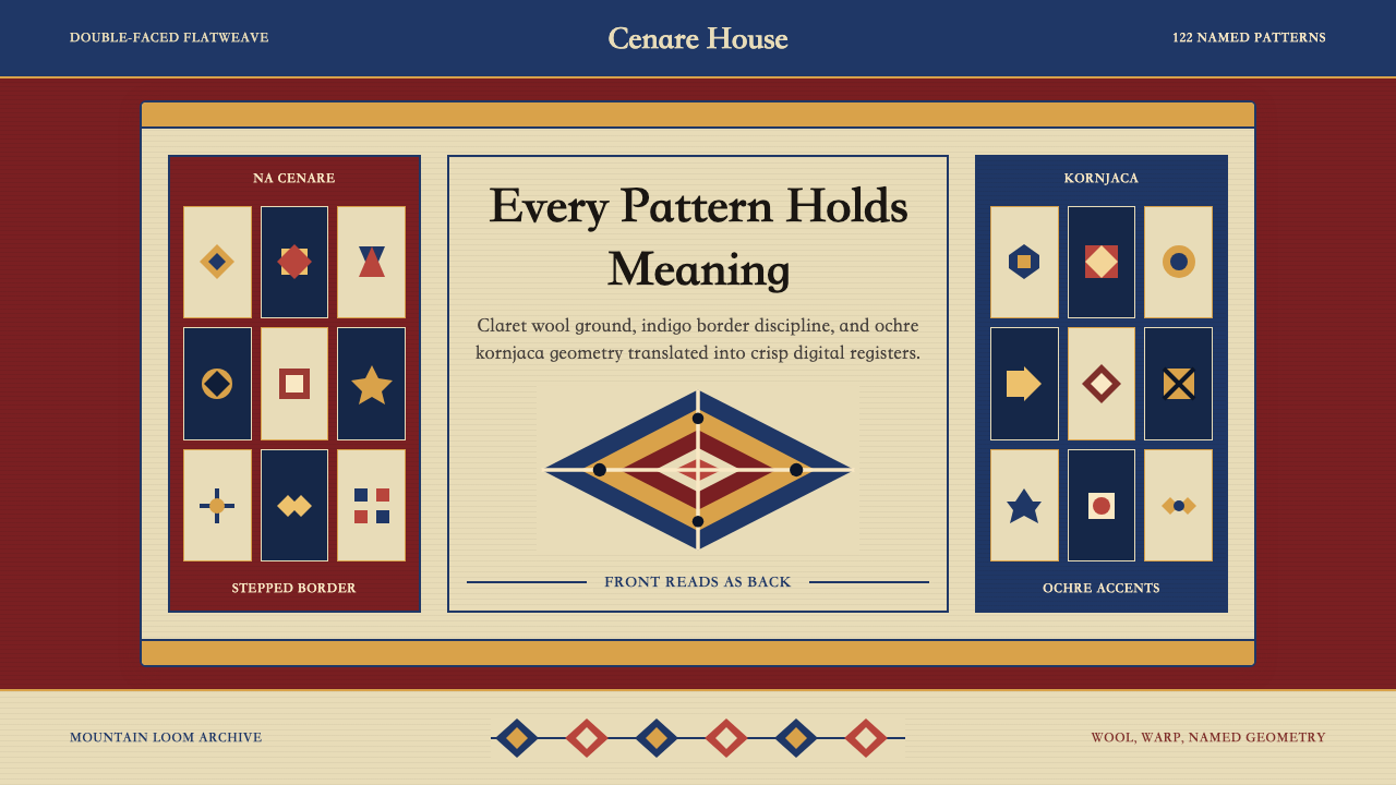 Serbian Pirot KilimWoven memory, sharply framed. Claret ground, indigo borders, ochre stepped di…织纹承载记忆。深酒红地、靛蓝边带与赭黄阶梯菱形。
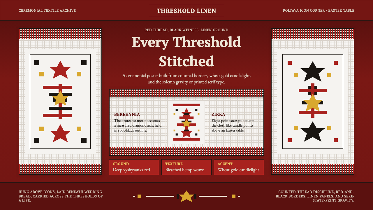 Ukrainian Rushnyk Ceremonial TowelCeremony stitched in red. Linen panels, soot-black crosses, and wheat-gold st…红线缝出仪式感:麻布面板、黑色十字与麦金星纹承载记忆。
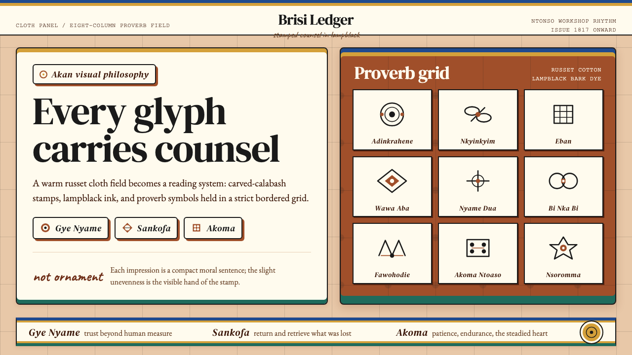 Akan Adinkra (Ghana)Proverbs become cloth. Russet grids, lampblack serif marks, and gold-edge ban…箴言化为布面:赭红网格、灯烟黑印纹与金边带盖出意义。
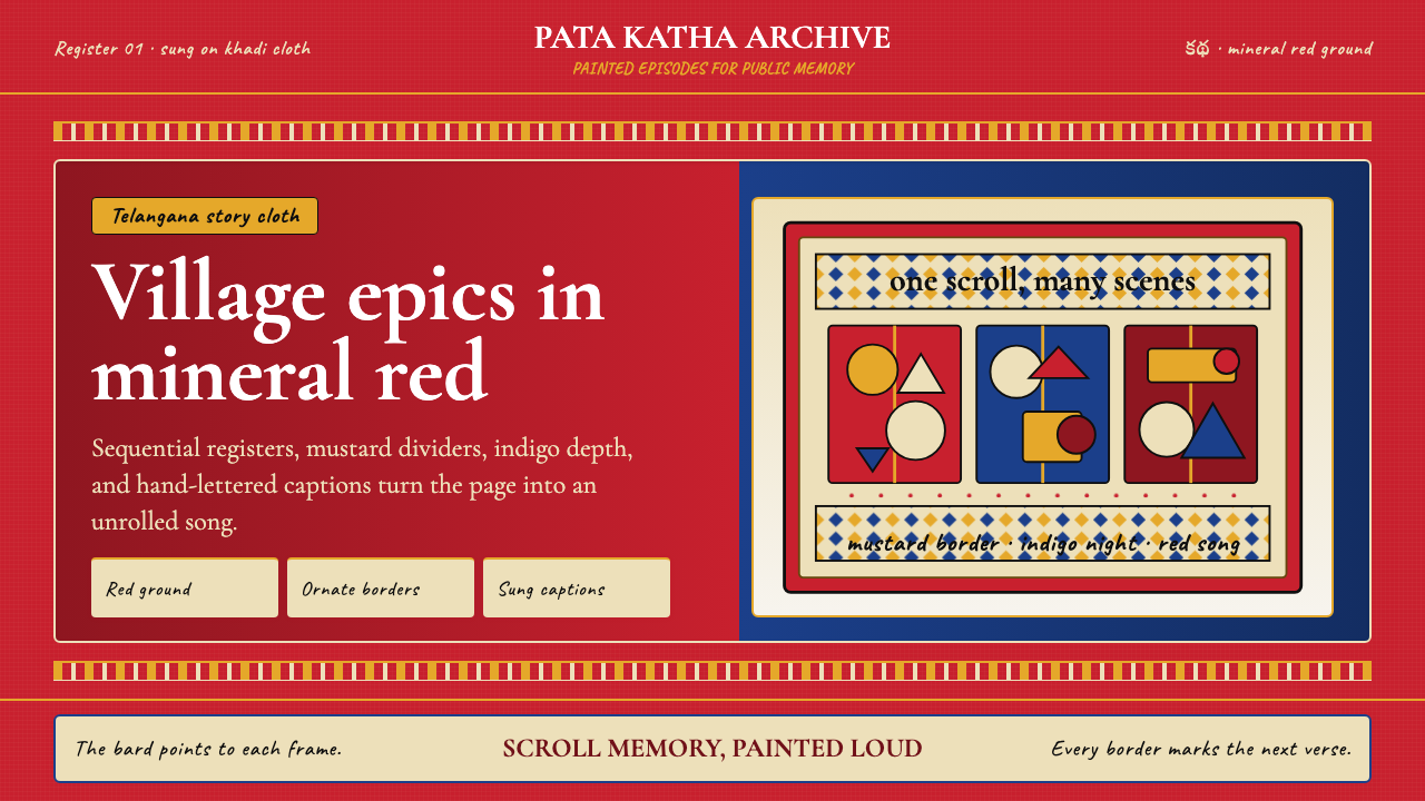 Andhra Cheriyal Scroll PaintingSaturated oral memory. Mineral red registers, mustard diamonds, and serif son…饱和的口述记忆:矿物红分格、芥末黄菱纹与衬线唱词。
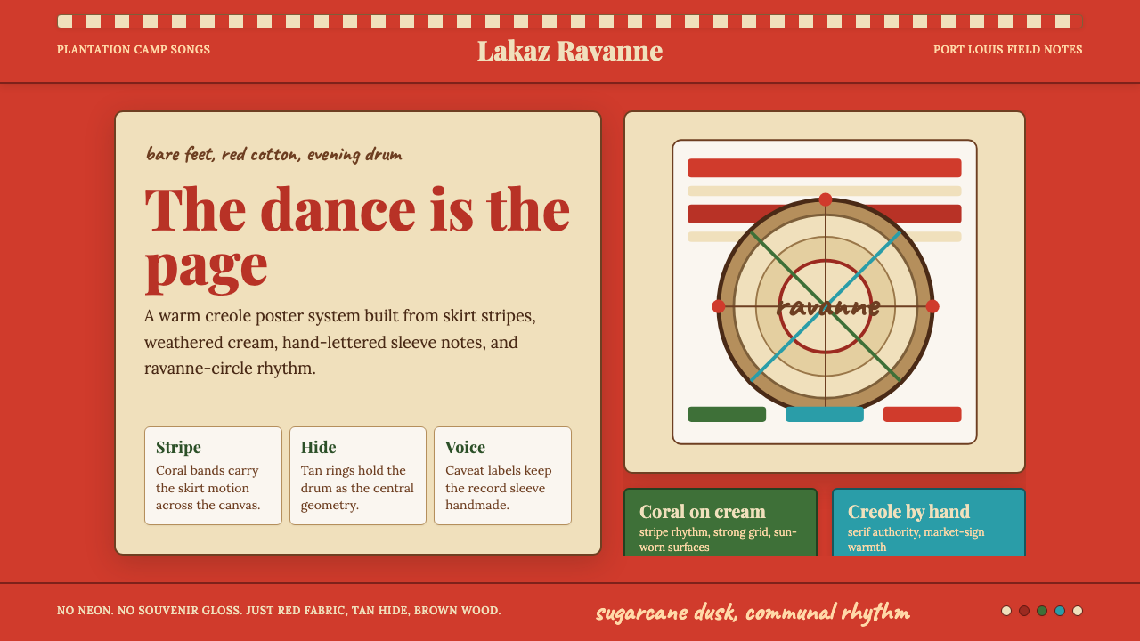 Mauritian Sega Creole (1810)Rhythm made visible. Coral stripes, cream sleeve type, and ravanne circles ca…节奏被看见:珊瑚红条纹、奶油唱片字与拉瓦纳鼓圆形。