Design style guide设计风格指南
What is Guyanese Tassa Drum?什么是 Guyanese Tassa Drum?
From the cane fields of colonial Guiana to Caribbean street processions, the tassa drum carried a whole civilization's color, ceremony, and resilience in its skin-stretched beat.从殖民时代圭亚那的甘蔗田到加勒比街头游行,塔萨鼓用绷紧的鼓皮承载了一整个文明的色彩、仪式与韧性。
Guyanese Tassa Drum in briefGuyanese Tassa Drum 速览
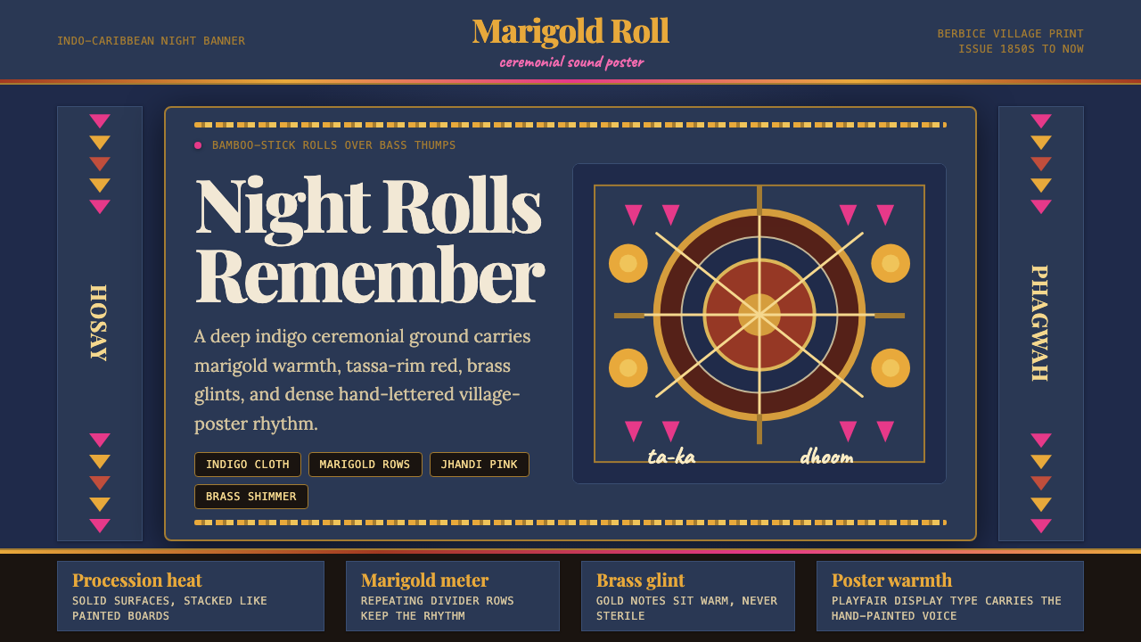
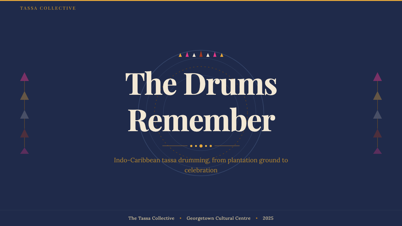
Guyanese Tassa Drum is a design aesthetic rooted in the ceremonial visual culture of Indo-Caribbean communities — the deep indigo banners carried in Hosay processions, the marigold garlands strung at Hindu weddings, the brass-bright flash of cymbals, and the dense, warmly saturated hand-painted posters that announced Phagwah celebrations across Berbice villages. It is a system built from layered warmth: dark grounds glowing under golden and orange accents, with bold display type that carries the weight of festival announcement.圭亚那塔萨鼓是一种植根于印度裔加勒比社区仪式视觉文化的设计美学——侯赛因游行中高举的深靛蓝旗帜、印度教婚礼上悬挂的万寿菊花环、铙钹映出的黄铜光芒,以及伯比斯村庄各处宣告洒红节庆典的浓烈手绘海报。它是一套由层叠温度构筑的系统:深色底面在金色与橙色强调中发光,配以承载节日公告分量的粗重展示字体。
At its heart the style is about ceremony made visible. Everything in it echoes the physical experience of attending a tassa performance — the deep resonant boom of the bass drum (the larger dhantal-reinforced kettledrum called the 'tassa'), the rapid, rolling bamboo-stick strikes that dance above it, the crowd pressing close under indigo fabric, the air thick with marigold and incense. Translated into graphic and interface terms, this means rich darkness as a ground, warm saturated color as signal, and a typographic presence that feels like a proclamation rather than a label.这种风格的核心是让仪式变得可见。其中的每一个元素都呼应着亲历塔萨演奏的身体感受——大鼓(那只更大的、配合达尔他伴奏的壶鼓,即「塔萨」)发出的深沉共鸣,在其上飞速滚动的竹棍击打,靛蓝布料下逼近的人群,空气中弥漫的万寿菊与香火气息。转化为图形与界面语言,这意味着以浓郁的暗色为底、以温暖饱和的色彩为信号、以感觉像公告而非标签的排印存在感。
The system sits in deliberate contrast to minimalist or neutral design languages. Where many contemporary systems seek to disappear, Tassa Drum asserts. It is festival-weight design — meant to be seen at distance, felt immediately, remembered.这套系统有意与极简或中性设计语言形成对比。当许多当代系统力求隐形时,塔萨鼓选择彰显。它是节庆量级的设计——用于在远处被看见、被立刻感受、被长久记住。
See the Guyanese Tassa Drum design system →查看 Guyanese Tassa Drum 完整设计系统 →
Where does Guyanese Tassa Drum come from?Guyanese Tassa Drum 从何而来?
The tassa drum's journey to Guyana begins with the indenture system. Between 1838 and 1917, after the abolition of slavery in the British Caribbean, the British colonial government recruited approximately 238,000 indentured labourers from the Indian subcontinent — primarily from the Bhojpuri-speaking regions of Bihar and eastern Uttar Pradesh — to work on sugar plantations in British Guiana, Trinidad, and other colonies. They arrived carrying languages, religions, musical instruments, and visual traditions that would take root in alien soil and evolve into something entirely their own.塔萨鼓抵达圭亚那的旅程始于契约劳工制度。1838至1917年间,英属加勒比地区废除奴隶制后,英国殖民政府从印度次大陆招募了约二十三万八千名契约劳工——主要来自比哈尔邦和北方邦东部讲博杰普尔语的地区——在英属圭亚那、特立尼达和其他殖民地的蔗糖种植园劳作。他们带来了语言、宗教、乐器与视觉传统,在异乡土地上生根,演化为独属于他们自己的东西。
Among the instruments carried was the tassa, a small goatskin-headed kettledrum struck with a curved bamboo stick. In north India, tassa drums were already associated with Muharram observances — the Hosay festival, in which effigies of the tombs of the Imam Hussein and his brother Hassan are paraded through streets in mourning processions. In the Caribbean, Hosay became one of the central ceremonial events of the Indo-Caribbean calendar, and tassa playing became its sonic identity. The visual world surrounding Hosay — deep indigo and crimson fabric, elaborately decorated taziya structures, dense floral offerings — formed the color memory that this design system draws upon.随行的乐器中就有塔萨鼓——一只用弯曲竹棍敲击的小型羊皮壶鼓。在北印度,塔萨鼓早已与穆哈兰姆月的侯赛因纪念活动联系在一起:在侯赛因节游行中,伊玛目侯赛因与其兄哈桑的陵墓仿制品被人们在哀悼队伍中抬过街道。在加勒比,侯赛因节成为印度裔加勒比历法中最核心的仪式活动之一,塔萨演奏成为它的声音标识。侯赛因节周围的视觉世界——深靛蓝与深红色布料、精心装饰的塔奇亚结构、浓密的花卉供品——构成了这套设计体系所汲取的色彩记忆。
Beyond Hosay, tassa became indispensable at Hindu weddings throughout the Guyanese interior. Village wedding posters, hand-lettered and hand-painted, advertised these celebrations with an exuberant density that had no interest in restraint: multiple typefaces, layered color, marigold yellow and vermillion red against dark grounds, ornamental borders inspired by both Indian folk painting and colonial print conventions. Scholars of Indo-Caribbean music and culture — Peter Manuel, who documented chutney-soca musical fusion; Frank Korom, whose fieldwork traced the Hosay festival from South Asia to the Caribbean; Helen Myers, who recorded the musical cultures of rural Trinidad — have traced how these visual and sonic traditions survived, transformed, and became markers of a distinct diaspora identity.在侯赛因节之外,塔萨鼓在圭亚那内陆各地的印度教婚礼上也不可或缺。村庄婚礼海报以手书手绘的方式宣告庆典,以一种毫不在乎克制的旺盛密度呈现:多种字体、层叠色彩、深色底面上的万寿菊黄与朱砂红、受印度民间绘画与殖民地印刷惯例双重启发的装饰边框。研究印度裔加勒比音乐与文化的学者们——记录恰特尼-索卡音乐融合的彼得·曼纽尔,田野工作追溯侯赛因节从南亚传至加勒比的弗兰克·科罗姆,录制特立尼达农村音乐文化的海伦·迈尔斯——都追踪过这些视觉与声音传统如何存活、转化,并成为独特流散身份的标记。
Mungal Patasar, the Trinidadian musician and cultural advocate who brought Indo-Caribbean classical and folk music into wider public awareness, represents the generation that began to frame these traditions explicitly as heritage worthy of formal recognition. The visual vocabulary of tassa ceremony — deep grounds, warm ceremonial color, bold proclamatory type — is not folk naivety; it is a sophisticated aesthetic that developed across generations of practitioners who understood that visibility was survival.特立尼达音乐家与文化倡导者芒格尔·帕塔萨尔将印度裔加勒比古典与民间音乐带入更广泛的公众视野,代表了开始将这些传统明确框定为值得正式认可之遗产的那一代人。塔萨仪式的视觉词汇——深色底面、温暖的仪式色彩、粗重的公告式字体——并非民间的天真,而是经几代实践者磨砺而成的成熟美学,他们深知:可见即存续。
What defines the Guyanese Tassa Drum look?Guyanese Tassa Drum 的视觉特征是什么?
Color Palette色彩体系
The palette centers on deep indigo as the primary ground — the color of Hosay banners and night-sky fabric canopies — layered with marigold gold, saffron orange, and warm vermillion. Brass-bright accents recall cymbal glints. The overall impression is of warm luminosity against darkness: colors that appear to glow from within rather than sit flatly on a surface. Desaturated or cool tones are used sparingly, mostly to create breathing room within the warmth.色板以深靛蓝作为主要底色——侯赛因旗帜与夜空织物华盖的颜色——之上叠加万寿菊金、藏红花橙与温暖的朱砂红。黄铜色调的强调色让人联想到铙钹的闪光。整体印象是温暖光辉在暗色中的涌现:这些颜色仿佛从内部发光,而非平铺在表面。低饱和或冷调色调的使用极为节制,主要用于在温度中制造喘息空间。
Typography字体排印
Display type carries the weight of ceremonial announcement — serifs with generous curves and a slight historical patina are preferred for headlines, reflecting the hand-lettered wedding poster tradition. Body text shifts to something more neutral to allow the richness of the color palette to breathe. Type is deployed at strong scale contrasts: a headline is meant to be readable at distance, echoing the function of festival posters seen across a village square.展示字体承载仪式公告的分量——偏好带有舒展曲线与轻微历史感的衬线体,呼应手书婚礼海报的传统。正文字体则转向更为中性的形态,让丰富的色彩体系有空间呼吸。字体在强烈的尺度对比中部署:标题意在远处可读,呼应村庄广场上被望见的节日海报的功能。
Texture and Layering质感与层叠
Surfaces carry the memory of physical materials — the slight roughness of painted fabric, the patina of weathered hand-bills, the granular warmth of marigold petals massed together. This is achieved through subtle tonal variation and layered warm values rather than photographic texture imports. The goal is depth that feels material without competing with the typographic and color hierarchy.表面承载着物理材料的记忆——涂绘布料的轻微粗糙感、风化传单的包浆、万寿菊花瓣聚集的颗粒温度。这通过微妙的色调变化与层叠的暖色值来实现,而非引入摄影纹理。目标是感觉有材质的深度,同时不与字体和色彩层级产生竞争。
Ornamental Borders装饰边框
Borders and frames serve a real structural role — they define ceremonial space, the way a garland frames a doorway or a canopy marks a performance area. Floral and geometric border motifs derived from Indo-Caribbean folk painting traditions appear as frames around content blocks, as dividers between sections, and as decorative coronations above key typographic elements. Unlike purely ornamental border use, here the border is read as marking significance.边框与装饰框架承担真实的结构功能——它们界定仪式空间,正如花环框定门口或华盖标记演出区域。源自印度裔加勒比民间绘画传统的花卉与几何边框母题出现为内容块的画框、段落间的分隔,以及重要排印元素上方的装饰冠饰。与纯粹装饰性的边框用法不同,这里的边框被解读为对重要性的标示。
Gold as Structural Signal金色作为结构信号
Marigold gold and warm brass tones function as the system's primary structural signal, playing the role that white plays in many dark-mode palettes. Headings, key data points, call-to-action elements, and dividers all receive the gold treatment — not as decoration but as the system's primary way of saying 'attend here.' The warmth of the gold keeps the system from reading as cold authority despite its structural boldness.万寿菊金与温暖黄铜色调作为系统的主要结构信号,扮演着白色在许多深色模式色板中所扮演的角色。标题、关键数据点、行动号召元素与分隔线都获得金色处理——不是作为装饰,而是系统表达「请关注这里」的主要方式。金色的温度使系统在结构上的大胆之外,不至于被解读为冷漠权威。
Rhythm and Repetition节奏与重复
Tassa music is built on rhythmic pattern — the bamboo-stick rolls are not improvised but learned and repeated. This translates into a design system that uses deliberate repetition of visual motifs: a marigold row as section divider, a consistent ornamental corner mark, a recurring scale relationship between heading and body text. Repetition is not monotony here; it is ritual.塔萨音乐建立在节奏模式之上——竹棍滚奏并非即兴,而是习得与重复的。这转化为一套有意重复视觉母题的设计系统:万寿菊行列作为段落分隔,一致的装饰角标,标题与正文之间反复出现的尺度关系。重复在这里不是单调,而是仪式。
Darkness as Warmth暗色作为温度
The system uses dark grounds not as a cold or austere statement but as a warm enclosure — the experience of being inside a festival tent at night, or under an indigo canopy, where darkness is intimate rather than stark. This is achieved by slightly warming the dark background tones toward brown or deep violet rather than pure neutral black, and by ensuring that the bright warm accents maintain the sensation of internal glow.系统使用深色底面,不是作为冷峻或严肃的表达,而是作为温暖的围合——如同置身夜晚节日帐篷内,或在靛蓝华盖下,暗色在那里是亲密的而非刺骨的。这通过将深色背景色调微微暖化为棕色或深紫调(而非纯中性黑)来实现,同时确保明亮的暖色强调维持内部发光的感觉。
See the Guyanese Tassa Drum design system →查看 Guyanese Tassa Drum 完整设计系统 →
Who shaped Guyanese Tassa Drum?谁塑造了 Guyanese Tassa Drum?
Ethnomusicologist whose research documented the chutney-soca musical fusion that emerged from Indo-Caribbean communities in Trinidad and Guyana, tracing how tassa drum traditions wove together with African-Caribbean rhythms and Hindi folk song to produce entirely new musical genres. His scholarly work provided a framework for understanding the aesthetic complexity and cultural resilience of Indo-Caribbean expressive culture.民族音乐学家,其研究记录了特立尼达和圭亚那印度裔加勒比社区涌现的恰特尼-索卡音乐融合,追踪塔萨鼓传统如何与非洲裔加勒比节奏和印地语民歌交织,产生全新的音乐流派。他的学术工作为理解印度裔加勒比表达文化的美学复杂性与文化韧性提供了框架。
Trinidadian sitarist, composer, and cultural advocate who bridged Indo-Caribbean classical traditions with contemporary musical forms and brought the depth of Indo-Caribbean cultural heritage into wider public recognition. His work helped reframe tassa and related ceremonial traditions not as survivals of a diminished past but as living creative systems with continuing aesthetic development.特立尼达西塔琴演奏家、作曲家与文化倡导者,将印度裔加勒比古典传统与当代音乐形式相连,把印度裔加勒比文化遗产的深度带入更广泛的公众认知。他的工作帮助重新定义塔萨及相关仪式传统——不是式微过去的遗存,而是具有持续美学发展的活态创造系统。
Cultural anthropologist whose fieldwork traced the Hosay festival — the central ceremonial context for tassa drumming — from its South Asian origins through its Caribbean diaspora transformations. His research documented the elaborate visual and material culture of Hosay: the deep-indigo and crimson banners, the decorated taziya structures, and the ways community identity was sustained through the sensory richness of ceremonial practice.文化人类学家,其田野工作追踪侯赛因节——塔萨鼓演奏的核心仪式语境——从南亚起源到加勒比流散转化的全过程。他的研究记录了侯赛因节精心的视觉与物质文化:深靛蓝与深红旗帜、装饰性塔奇亚结构,以及社区身份认同如何通过仪式实践的感官丰富性得以维系。
Ethnomusicologist who conducted extensive fieldwork on the musical cultures of rural Trinidad, including the Indo-Caribbean communities where tassa drumming was embedded in the full cycle of life events — weddings, festivals, religious observances. Her recordings and analyses helped preserve documentation of performance practices and the social contexts that gave the music, and its surrounding visual culture, their meaning.民族音乐学家,对特立尼达农村音乐文化进行了大量田野工作,包括塔萨鼓演奏嵌入婚礼、节日、宗教仪式等生命事件全周期的印度裔加勒比社区。她的录音与分析有助于保存演奏实践及赋予音乐和其周围视觉文化以意义的社会语境的文献记录。
The unnamed painters and letterers of the Berbice and Demerara regions who, over generations, developed the visual language of the festival announcement poster — layering warm saturated color against dark grounds, combining multiple lettering traditions, using marigold and vermillion as organizing signals. Their collective aesthetic practice is the most direct visual ancestor of this design system, representing a form of popular graphic design that preceded formalized design education and remains rooted in community ceremony.伯比斯与德梅拉拉地区无名的画师与书写者,他们历经几代人发展出节日公告海报的视觉语言——在深色底面上叠加温暖饱和的色彩,融合多种书写传统,以万寿菊色与朱砂色作为组织信号。他们的集体美学实践是这套设计系统最直接的视觉祖先,代表了一种先于正规设计教育、至今植根于社区仪式的大众图形设计形态。
How do you use Guyanese Tassa Drum today?今天怎么用 Guyanese Tassa Drum?
Guyanese Tassa Drum is a high-commitment visual system — its warmth, depth, and ceremonial weight make it most effective when applied holistically rather than as a surface treatment. Understanding the system means understanding that the dark ground is not a backdrop but the primary structural element, and that the warm gold and saffron accents earn their visibility precisely because the dark ground gives them space to glow.圭亚那塔萨鼓是一套高投入的视觉系统——它的温度、深度与仪式分量使其在整体应用时最为有效,而非作为表面处理叠加。理解这套系统意味着理解:深色底面不是背景,而是主要的结构性元素;温暖的金色与藏红花色强调之所以赢得可见性,正是因为深色底面为它们的发光腾出了空间。
For presentation slides, the system works powerfully on both cover and section-break pages. A cover composition should place the title in large, warm-toned display type against a deep indigo or near-black ground, with a marigold horizontal rule or ornamental border element framing it. Supporting text drops to a smaller scale in a lighter warm tone. Content slides benefit from the system's strong typographic hierarchy: one organizing heading in gold, body text in an off-white or warm cream, and data elements highlighted in saffron or vermillion rather than the cooler palette choices common in default slide themes. Data slides — charts, tables, comparative breakdowns — take on a festival-poster quality when the bars or segments use the warm palette: a marigold bar reading higher than a muted amber one carries both data and ceremony.在演示文稿中,这套系统在封面与段落分隔页上表现出强大力量。封面构图应将标题以大号暖色展示字体置于深靛蓝或接近纯黑的底面上,以万寿菊色水平线或装饰边框元素框定。辅助文字以更小的尺度、更亮的暖调呈现。内容页从系统强劲的字体层级中获益:一个金色组织性标题,正文用略白或暖奶油色,数据元素以藏红花或朱砂红高亮——而非默认幻灯片主题中常见的冷色系选择。数据页——图表、表格、对比分析——当柱条或扇区使用暖色板时,呈现出节日海报的品质:一根读数更高的万寿菊色柱子比暗哑琥珀色柱子同时承载数据与仪式感。
For web UI, the system is particularly well-suited to dashboard interfaces, event platforms, cultural or community-facing applications, and any context where the brand needs to communicate warmth, occasion, and depth simultaneously. Define a dark ground as the canvas — the equivalent of the indigo banner — and build all interactive states in gold and saffron. Card components should feel enclosed and warm, with subtle inner-glow effects rather than the cold-gray elevation shadows common in neutral design systems. Navigation should be typographically bold; icon decoration should echo geometric or floral motifs rather than the abstract line-icon conventions of neutral systems. Pricing pages benefit from the system's natural tier differentiation: a warm-glowing highlighted plan surrounded by darker, cooler-toned alternatives.对于网页界面,这套系统特别适合仪表板界面、活动平台、面向文化或社区的应用,以及任何品牌需要同时传达温度、场合与深度的语境。以深色底面为画布——相当于靛蓝旗帜——在金色与藏红花色中构建所有交互状态。卡片组件应感觉封闭而温暖,使用微妙的内发光效果,而非中性设计系统中常见的冷灰色高度投影。导航应字体上粗重有力;图标装饰应呼应几何或花卉母题,而非中性系统中抽象线条图标的惯例。定价页从系统自然的层级区分中获益:一个温暖发光的高亮套餐,被色调更深、更冷的替代套餐环绕。
For editorial and marketing work, the system's most natural register is the festival announcement or cultural heritage context, but it transfers effectively to any brand communication that wants to signal occasion, care, and hand-crafted quality. A feature article layout using Tassa Drum aesthetics would use a full-bleed deep-indigo header with gold headline type, a warm ornamental rule as section divider, and pull quotes highlighted in saffron on a dark card. Marketing pages should lean into the poster-like composition: full-width alternating dark and warmer-dark feature blocks, with gold and marigold as the consistent call-to-action color across both.对于编辑与营销内容,系统最自然的音域是节日公告或文化遗产语境,但它可以有效迁移至任何想要传达场合感、用心与手工质感的品牌传播。使用塔萨鼓美学的特写文章版面,将以全出血深靛蓝头图配金色标题字体、暖色装饰线作为段落分隔、藏红花色深卡片上的引用文字。营销页面应靠近海报式构图:全宽交替的深色与较暖深色特性区块,以金色和万寿菊色作为两者统一的行动号召色。
The most common mistake when working with this system is treating its warmth as permission for visual chaos — piling on multiple warm hues simultaneously without clear hierarchy. Authentic Tassa Drum restraint means that gold is reserved for the most important element in any composition; saffron and vermillion serve as secondary signals; the deep ground is allowed to dominate at least two-thirds of any given surface. Resist the impulse to fill dark space with additional warm color — the dark ground is not emptiness to be filled but presence to be honored. Similarly, adding cold or neutral tones as a 'balance' undermines the system's core warmth; if relief is needed, find it within the warm family rather than crossing into cool territory.使用这套系统时最常见的错误,是将它的温度理解为视觉混乱的许可——在没有清晰层级的情况下同时堆叠多种暖色调。真正的塔萨鼓克制意味着:金色保留给任何构图中最重要的元素;藏红花与朱砂红作为次级信号;深色底面被允许主导任何给定表面至少三分之二。要抵制用额外暖色填满深色空间的冲动——深色底面不是待填的空虚,而是待尊重的存在。同样,添加冷色或中性色调作为「平衡」会削弱系统的核心温度;如果需要喘息,在暖色家族内寻找,而非跨入冷色领域。
See the Guyanese Tassa Drum design system →查看 Guyanese Tassa Drum 完整设计系统 →
Guyanese Tassa Drum — FAQGuyanese Tassa Drum · 常见问题
Is this style appropriate only for Indo-Caribbean cultural content, or can it be applied more broadly?这种风格只适合印度裔加勒比文化内容,还是可以更广泛地应用?
The style derives its visual logic from a specific cultural tradition, but its formal characteristics — warm luminosity on dark grounds, ceremonial typographic weight, gold as a structural signal — translate across contexts wherever the desired tone is warmth, occasion, and depth. It works effectively for event platforms, cultural institutions, premium food and hospitality brands, community-facing applications, and any brand communication where the goal is to feel curated and celebratory rather than neutral and efficient. The key is adopting the system's formal logic rather than just borrowing its surface colors; a thoughtful application in an unrelated context can be appropriate, while a careless use that imports the surface without understanding the underlying hierarchy usually produces visual confusion.这种风格的视觉逻辑源自特定的文化传统,但其形式特征——暗色底面上的温暖光辉、仪式性排印分量、金色作为结构信号——在任何期望传达温度、场合与深度的语境中都可迁移。它在活动平台、文化机构、高端餐饮与酒店品牌、面向社区的应用,以及任何目标是感觉精心策划与庆典氛围而非中性高效的品牌传播中都表现出色。关键在于采用系统的形式逻辑而非仅仅借用表面色彩;在不相关语境中深思熟虑的应用可以是恰当的,而不理解底层层级就引入表面的粗心使用通常会产生视觉混乱。
How does this dark, warm palette perform in accessibility terms?这种深色暖调色板在无障碍性方面的表现如何?
The system's structural logic — warm gold or cream type against deep dark grounds — naturally produces strong contrast when applied correctly. The challenge arises with the secondary and tertiary warm tones: saffron and warm amber against deep indigo can be insufficient contrast at body text sizes, and vermillion on near-black requires careful verification. The practical approach is to reserve the lower-contrast warm combinations for decorative or large-display elements only, and to ensure that any text carrying essential information either sits in the high-contrast gold-on-dark combination or falls back to near-white on dark. The gold structural signal should always clear accessibility thresholds, since it is the system's primary information carrier.系统的结构逻辑——深色底面上的暖金色或奶油色字体——在正确应用时自然产生强烈对比。挑战出现在次级和三级暖调:藏红花与暖琥珀对深靛蓝在正文字号上的对比可能不足,朱砂红对近黑色也需要仔细验证。实际做法是将对比度较低的暖色组合仅保留用于装饰性或大型展示元素,并确保任何承载关键信息的文字要么使用高对比度的金对暗组合,要么退回到深色上的近白色。金色结构信号应始终超过无障碍阈值,因为它是系统的主要信息载体。
How does Tassa Drum differ from other warm, dark-palette design systems like Art Deco or certain luxury brand aesthetics?塔萨鼓与其他暖色深调设计系统(如装饰艺术或某些奢侈品牌美学)有何不同?
Art Deco and luxury brand dark palettes share the gold-on-dark structural logic but diverge in spirit and execution. Art Deco aims for streamlined elegance: its gold is cool and metallic, its dark grounds are near-neutral or charcoal, its geometry is angular and machined, its ornament is precise and symmetrical. Luxury brand aesthetics often layer in photography, soft textures, and aspirational distance. Tassa Drum is warmer in every sense: the gold leans toward marigold rather than metallic silver-gold, the dark grounds carry a faint warmth toward indigo or brown rather than neutral black, the ornament is organic and derived from folk rather than machine traditions, and the overall tone is communal and festive rather than aspirational and exclusive. A useful heuristic: Art Deco feels like a hotel lobby; Tassa Drum feels like a festival tent.装饰艺术与奢侈品牌深色色板共享金对暗的结构逻辑,但在精神与执行上各有分岐。装饰艺术追求流线型优雅:其金色偏冷而金属感,深色底面近乎中性或炭灰色,几何形角度锐利如机器加工,装饰精确而对称。奢侈品牌美学往往叠加摄影、柔和质感与渴望感距离。塔萨鼓在每个意义上都更温暖:金色倾向万寿菊而非金属银金,深色底面向靛蓝或棕色带有微弱温度而非中性黑,装饰有机且源自民间而非机器传统,整体基调是共同体的节庆感而非渴望与排他。一个有用的直觉:装饰艺术感觉像酒店大堂;塔萨鼓感觉像节日帐篷。
Can Tassa Drum work for digital products that require a light-mode option?塔萨鼓能适用于需要浅色模式选项的数字产品吗?
A light-mode inversion of this system is possible but requires rethinking the fundamental logic. The system's warmth depends on the relationship between dark ground and glowing warm accent — inverting to a light background breaks that relationship. A workable light variant leans into warm cream or warm white grounds (not pure white), uses deep indigo or near-black for structural elements and body text, retains marigold gold for interactive highlights and key calls to action, and introduces warm terracotta or saffron for secondary signals. The result is more restrained than the full dark system but retains its warmth and festival-poster character. Avoid inverting to a cold-white background — that eliminates the warmth that defines the system's identity.对这套系统进行浅色模式反转是可能的,但需要重新思考基本逻辑。系统的温度依赖于深色底面与发光暖色强调之间的关系——反转为浅色背景会打破这一关系。一个可行的浅色变体倾向于暖奶油色或暖白底面(而非纯白),用深靛蓝或近黑色处理结构性元素和正文,保留万寿菊金用于交互高亮和关键行动号召,引入暖赤陶色或藏红花色作为次级信号。结果比完整深色系统更为克制,但保留了其温度与节日海报特征。避免反转为冷白背景——那会消除定义系统身份的温度。
What is the right level of ornamental border use before it becomes excessive?装饰边框用到什么程度才是恰当的,之后就会显得过度?
The test is whether the border is doing structural work — marking a transition, framing a zone of elevated importance, creating a visual container for a discrete content block — or simply adding decoration for its own sake. In authentic festival poster tradition, borders defined the edges of announced content and were read as signal rather than noise. Applied well in digital contexts, an ornamental border should appear at major section transitions, around hero or feature content blocks, and perhaps as a dividing element above key headings. It should not appear around every card, every paragraph block, or as a repeated background texture. When borders proliferate across all levels of a hierarchy simultaneously, they stop reading as emphasis and start reading as pattern — and the system's ceremonial weight dissolves into wallpaper.判断标准在于边框是否在做结构性工作——标记过渡、框定重要性提升的区域、为独立内容块创建视觉容器——还是仅仅为了装饰而装饰。在真实的节日海报传统中,边框界定了公告内容的边缘,被解读为信号而非噪音。在数字语境中应用得当时,装饰边框应出现在主要段落过渡处、英雄或特性内容块周围,或许还作为关键标题上方的分隔元素。它不应围绕每张卡片、每个段落块出现,或作为重复的背景纹理。当边框在层级各个层次同时蔓延时,它们停止被解读为强调,开始被解读为图案——系统的仪式分量就此消融为墙纸。
Related design styles相关设计风格
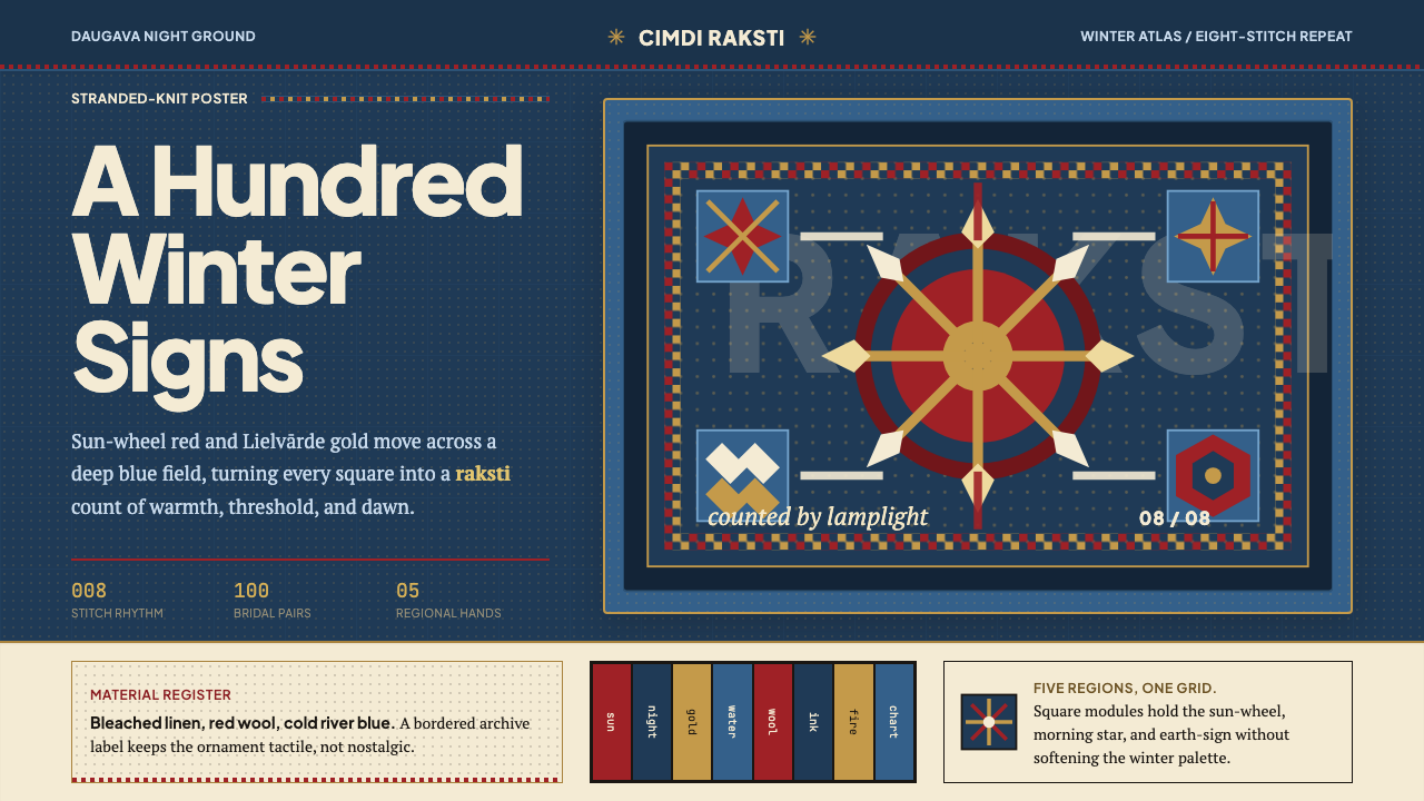 Latvian Knitted MittensWinter craft glows. Sun-wheel red and Lielvarde gold lock into an 8-stitch bl…冬夜手作发光。太阳红与利耶尔瓦尔德金锁进八针蓝格。
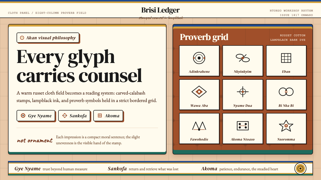 Akan Adinkra (Ghana)Proverbs become cloth. Russet grids, lampblack serif marks, and gold-edge ban…箴言化为布面:赭红网格、灯烟黑印纹与金边带盖出意义。
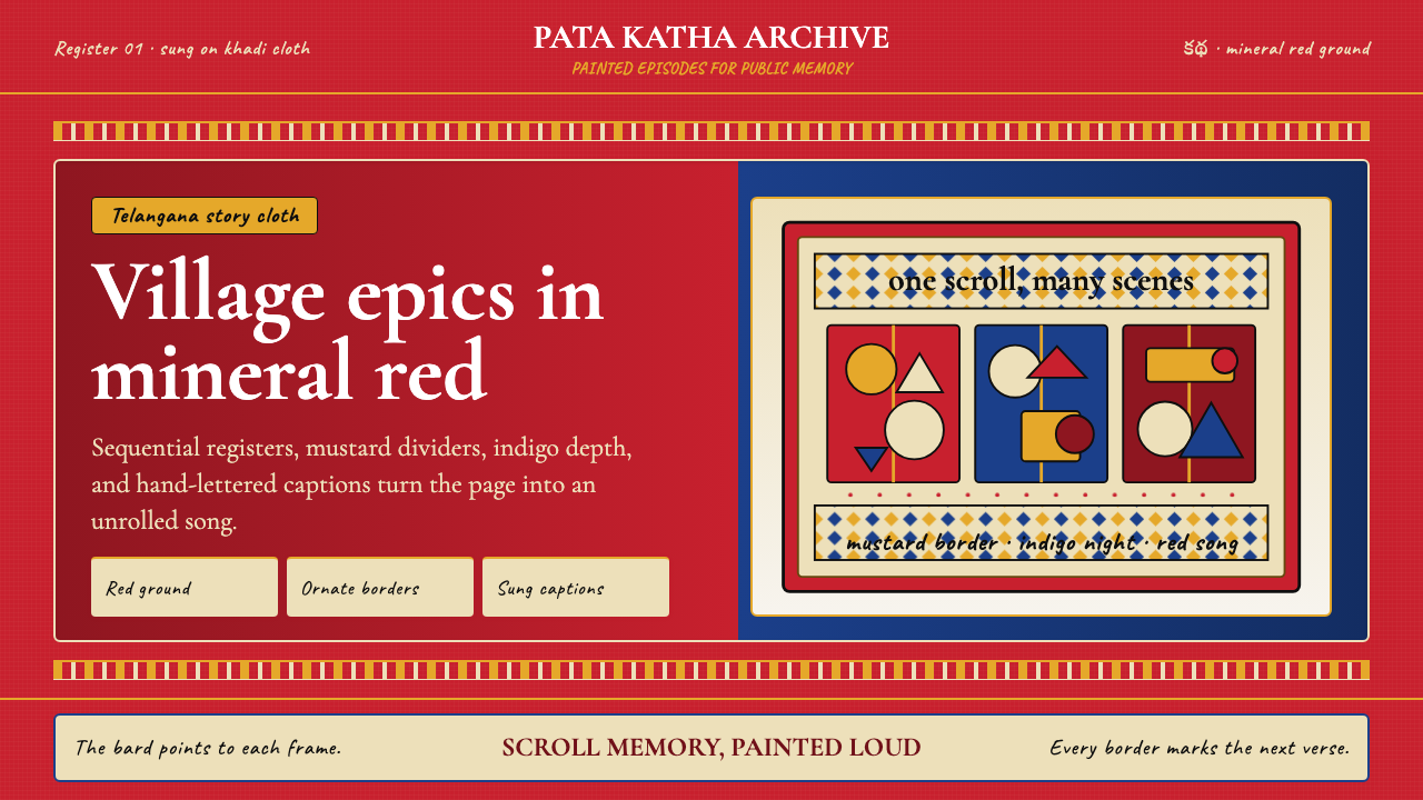 Andhra Cheriyal Scroll PaintingSaturated oral memory. Mineral red registers, mustard diamonds, and serif son…饱和的口述记忆:矿物红分格、芥末黄菱纹与衬线唱词。
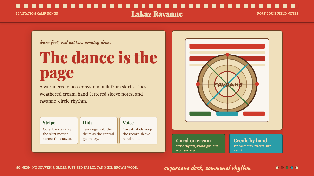 Mauritian Sega Creole (1810)Rhythm made visible. Coral stripes, cream sleeve type, and ravanne circles ca…节奏被看见:珊瑚红条纹、奶油唱片字与拉瓦纳鼓圆形。
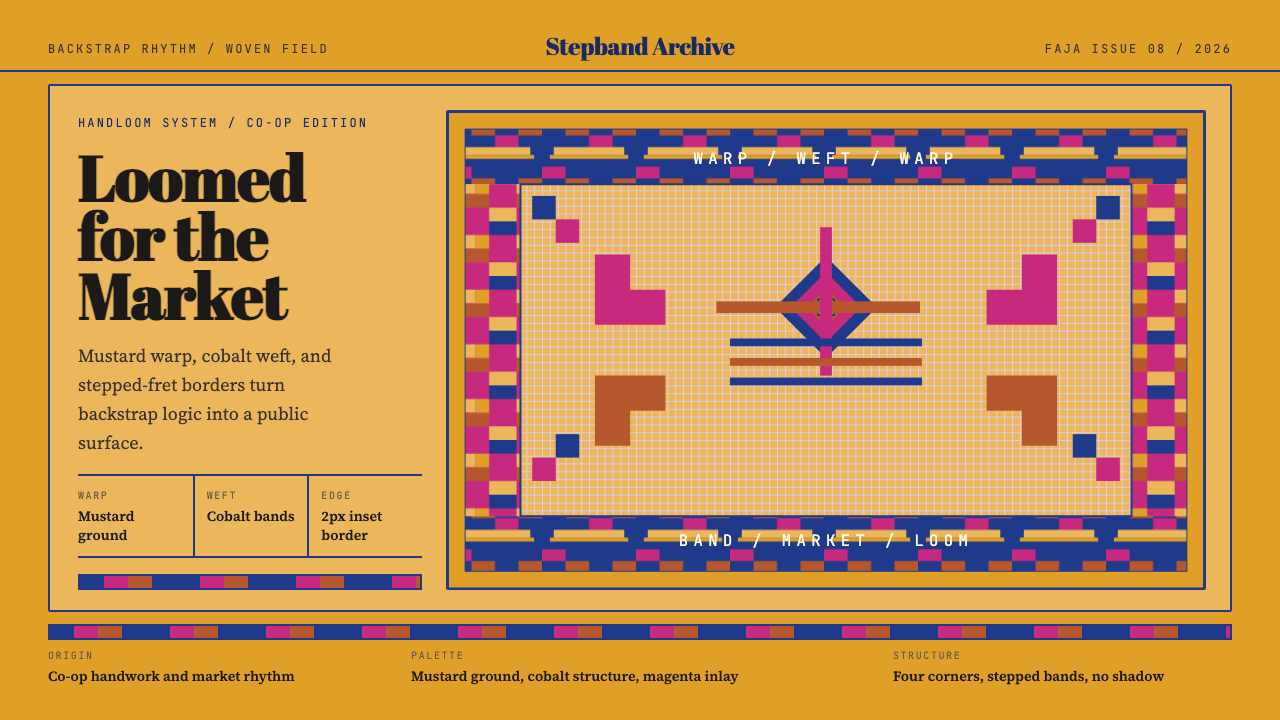 Otavalo Andean TextileThe loom stays vivid. Mustard ground, cobalt bands, stepped-fret borders.织机依旧鲜活。芥末底、钴蓝带纹与阶梯边框。
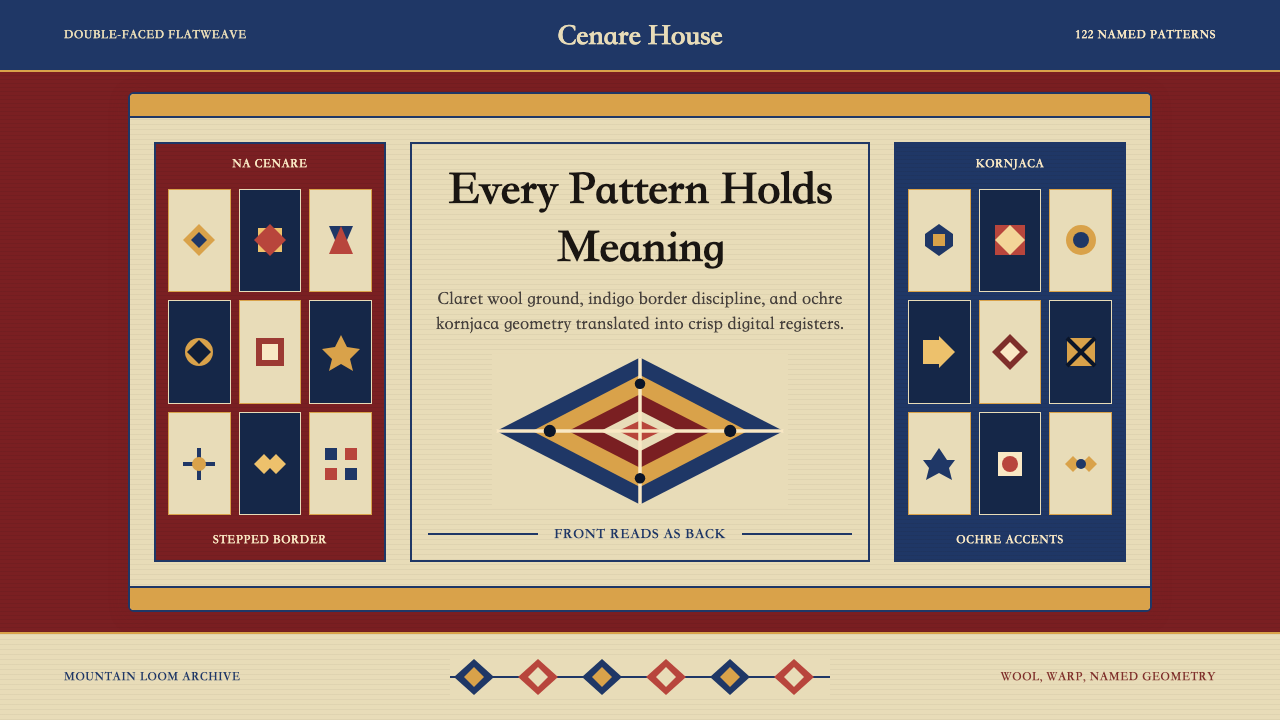 Serbian Pirot KilimWoven memory, sharply framed. Claret ground, indigo borders, ochre stepped di…织纹承载记忆。深酒红地、靛蓝边带与赭黄阶梯菱形。