What is Otavalo Andean Textile?什么是 Otavalo Andean Textile?
Five centuries of backstrap-loom geometry — mustard warp, cobalt weft, stepped fret — now speak the language of screens.五个世纪的背带织机几何——芥末经线、钴蓝纬线、阶梯回纹——如今以屏幕的语言重新发声。
Otavalo Andean Textile in briefOtavalo Andean Textile 速览
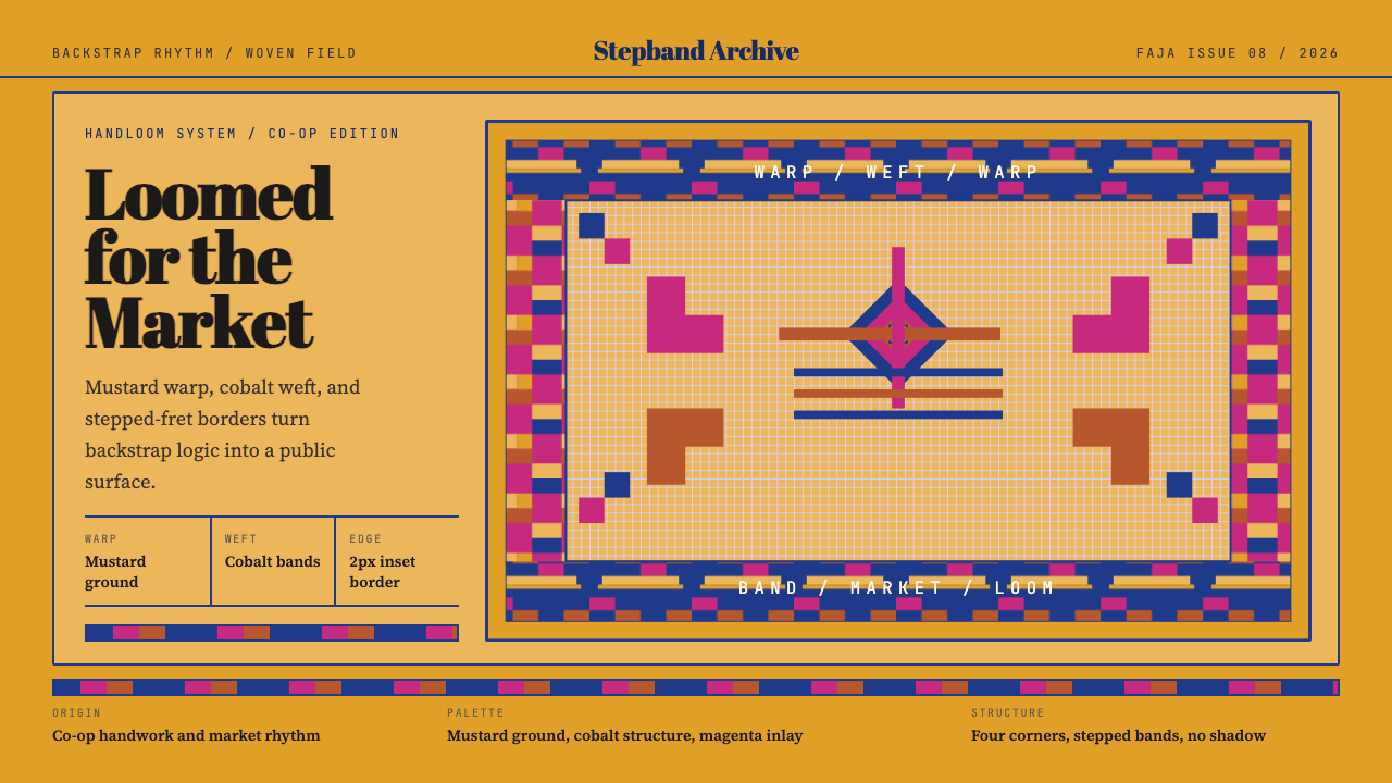
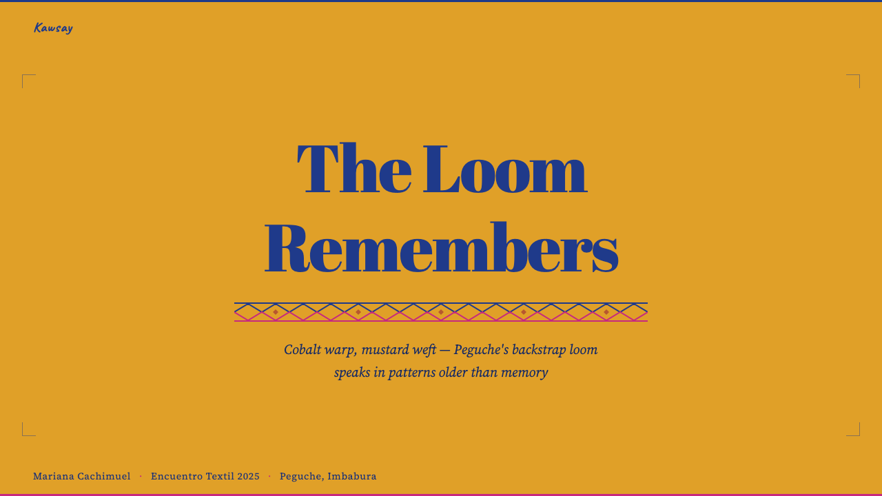
The Otavalo Andean Textile design system translates the living weaving tradition of Ecuador's Imbabura highlands into a digital visual language. Its foundation is a saturated, unapologetically bold palette — mustard yellow and cobalt indigo above all — organized through stepped geometric bands, four-corner-symmetric layouts, and fret-patterned borders whose structural logic derives directly from the backstrap loom that Otavaleño weavers have used since pre-Incaic times.奥塔瓦洛安第斯纺织设计系统将厄瓜多尔因巴布拉高地的活态织造传统转化为数字视觉语言。其核心是大胆饱满的色彩体系——以芥末黄与钴蓝靛为主——通过阶梯几何带纹、四角对称布局和回纹边框加以组织,其结构逻辑直接源自自前印加时代延续至今的背带织机。
Unlike many 'world textiles' aesthetics that flatten indigenous craft into surface decoration, this system preserves the underlying grammar of the weave. Color relationships are not arbitrary; they mirror the actual warp-and-weft decisions that a master weaver at the Saturday Plaza de los Ponchos market would make. Geometric bands repeat at consistent intervals, borders frame content as a faja (woven belt) frames the body, and the overall composition radiates outward from a central axis in four-way symmetry — a structural device central to both Andean cosmology and backstrap-loom construction.与许多将原住民工艺简化为表面装饰的「世界纺织」美学不同,这一系统保留了织物底层的语法。色彩关系并非随意为之,而是映射着奥塔瓦洛织工在周六佩格切广场市集上所做的真实经纬决策。几何带纹以固定间隔重复,边框如腰带(faja)围绕身体一样框定内容,整体构图从中央轴线向四个方向对称延展——这一结构手段既是安第斯宇宙观的核心,也是背带织机构造的基本逻辑。
The result is a design language that feels simultaneously ancient and immediately contemporary. It communicates warmth, cultural specificity, and craft authority without sentimentality, making it well-suited to contexts that require richness, identity, and the confident presence that comes from a tradition measured in centuries rather than trends.最终呈现出一种既古老又当代的设计语言。它传递温暖、文化特殊性与工艺权威感,却不流于感伤,非常适合那些需要丰富感、身份认同感与由数百年传统而非流行趋势所赋予的从容在场感的设计场景。
See the Otavalo Andean Textile design system查看 Otavalo Andean Textile 完整设计系统
Where does Otavalo Andean Textile come from?Otavalo Andean Textile 从何而来?
The Otavalo Valley, nestled in Ecuador's Imbabura Province at an elevation of roughly 2,500 meters, has been a textile-producing center since well before the Inca expansion into the region in the late fifteenth century. Archaeological evidence shows that the Caranqui people — the pre-Inca inhabitants of the northern Ecuadorian highlands — wove cotton and camelid fiber on backstrap looms and developed the stepped fret and diamond geometric vocabulary that remains central to Otavaleño textile identity today. When the Inca incorporated the region circa 1495, they formalized textile production through the mit'a (rotational labor) system, expanding the weaving workforce but not fundamentally altering the existing geometric conventions.坐落于厄瓜多尔因巴布拉省、海拔约2500米的奥塔瓦洛谷地,早在十五世纪末印加帝国扩张至此之前,便已是重要的纺织生产中心。考古证据显示,厄瓜多尔北部高地的前印加居民卡兰基人以背带织机纺织棉花与骆驼科纤维,并发展出阶梯回纹和菱形几何词汇——这一词汇至今仍是奥塔瓦洛纺织身份的核心。约1495年印加将该地区并入版图后,通过「米塔」(轮换劳役)制度将纺织生产规范化,扩大了织工队伍,但并未从根本上改变既有的几何程式。
Spanish colonial rule, beginning with the conquest of Quito in 1534, imposed the obraje (forced workshop) system, concentrating indigenous weavers in commercial textile factories that produced coarser woolen cloth for colonial markets. The obraje system was brutal — workers labored under debt peonage, often for generations — but it also inadvertently maintained weaving as the economic and cultural backbone of the Otavalo region. When the obrajes declined in the late eighteenth and early nineteenth centuries, Otavaleño weavers did not abandon textiles; they pivoted to cottage production and market trade. By the early twentieth century, the Saturday market at the Plaza de los Ponchos in Otavalo had become one of the largest and most famous indigenous markets in the Americas.始于1534年基多被征服的西班牙殖民统治引入了「奥布拉赫」(强制工坊)制度,将原住民织工集中于商业纺织工厂,为殖民市场生产粗糙的羊毛布料。奥布拉赫制度极为残酷——工人以债务农奴身份劳作,往往延续数代——但也无意中维持了纺织业作为奥塔瓦洛地区经济与文化支柱的地位。十八世纪末至十九世纪初奥布拉赫衰落后,奥塔瓦洛织工并未放弃纺织,而是转向家庭生产与市场贸易。到二十世纪初,奥塔瓦洛佩格切广场的周六市集已成为美洲规模最大、最负盛名的原住民市场之一。
The 1960s marked a pivotal transformation: international tourism and growing awareness of indigenous craft among foreign buyers created an export market that allowed Otavaleño weavers to trade globally while remaining based in the highlands. Families such as the Conterón and Lema lineages — who had maintained master-weaver knowledge across generations — became entrepreneurial anchors of the new export economy. Weavers from Peguche and Iluman, the weaving villages adjacent to Otavalo, traveled to markets in Colombia, Europe, and eventually North America and Asia, making Otavaleño textiles among the most globally distributed indigenous handicrafts of the late twentieth century.1960年代标志着一次关键转型:国际旅游业兴起和外国买家对原住民工艺日益增长的关注,催生了出口市场,使奥塔瓦洛织工得以在高地安家的同时走向全球贸易。康特隆家族和莱马家族等世代守护着织造大师技艺的家族,成为新出口经济的创业支柱。来自佩格切和伊卢曼——奥塔瓦洛毗邻织造村落——的织工前往哥伦比亚、欧洲乃至北美和亚洲的市场,使奥塔瓦洛纺织品成为二十世纪末传播最广的原住民手工艺品之一。
The 2010s through the mid-2020s brought a further evolution: fair-trade cooperatives, digital pattern archives, and a generation of Otavaleño designers trained in both traditional weaving and contemporary graphic arts began systematically codifying the visual grammar of the textile tradition. Organizations connected to the Pawkar Raymi (flowering festival) cultural revival worked to document historic pattern vocabularies and establish quality standards for co-op production. This synthesis — backstrap-loom heritage meeting fair-trade ethics and design-conscious branding — is the immediate source of the Otavalo Andean Textile design system as a digital aesthetic.2010年代至2020年代中期,又迎来了新一轮演变:公平贸易合作社、数字图案档案库,以及同时受训于传统织造与当代图形艺术的新一代奥塔瓦洛设计师,开始系统性地将纺织传统的视觉语法加以编码。与帕瓦卡尔·拉伊米(花开节)文化复兴运动相关的组织致力于记录历史图案词汇,并为合作社生产建立质量标准。这一综合——背带织机遗产与公平贸易伦理和设计意识品牌的结合——正是奥塔瓦洛安第斯纺织设计系统作为数字美学的直接渊源。
What defines the Otavalo Andean Textile look?Otavalo Andean Textile 的视觉特征是什么?
Saturated Core Palette高饱和核心色系
The palette is organized around two dominant hues — a warm, deep mustard yellow that reads as ochre in shadow and a cobalt indigo that carries the depth of natural dye at its richest saturation. Against these, a warm near-white or natural linen ground provides the visual breathing room that keeps the composition legible rather than overwhelming. Accent hues — deep burgundy, forest green, or terracotta — appear sparingly as the third or fourth voice in a composition, always subordinate to the mustard-cobalt axis. The key principle is that every color is fully committed: no pastels, no washed tones, nothing tentative.色板围绕两种主导色彩组织——一种温暖而深沉的芥末黄(在阴影中呈赭石感),以及一种携带着天然染料最浓饱和度的钴靛蓝。两者之间,温暖的近白色或亚麻本色底面提供视觉呼吸空间,使构图保持可读而不压迫。深酒红、林绿或陶土色等强调色彩偶尔作为构图中的第三或第四声部出现,始终从属于芥末-钴蓝这条主轴。核心原则是:每一种颜色都完全投入——没有粉彩,没有冲淡的色调,没有任何犹豫不决的存在。
Stepped Fret and Geometric Band Patterns阶梯回纹与几何带纹
The stepped fret — a right-angled spiral motif that migrates across pre-Columbian Andean textiles from Ecuador to Peru to Bolivia — is the signature structural element. In the Otavalo system specifically, the fret appears as a repeating border device, framing content zones the way a woven faja frames the body. Within content areas, geometric bands run horizontally or vertically at regular intervals, dividing the composition into registers much as the loom divides warp into sections. Zigzag and diamond fills appear within these bands, always built from horizontal and vertical line segments rather than diagonal strokes — a direct consequence of the grid logic of weaving.阶梯回纹——一种直角螺旋母题,横跨从厄瓜多尔到秘鲁再到玻利维亚的前哥伦布时期安第斯纺织品——是最具标志性的结构元素。在奥塔瓦洛体系中,回纹尤其作为重复性边框装置出现,如腰带围框身体一般框定内容区域。在内容区域内,几何带纹以规则间隔水平或垂直延伸,将构图划分为一个个区段——正如织机将经线分节一样。锯齿纹和菱形填充在这些带纹中出现,始终由水平与垂直线段构成,而非斜线笔触——这是织造网格逻辑的直接体现。
Four-Corner Symmetric Composition四角对称构图
Otavaleño textiles traditionally orient their central motif so that the composition mirrors itself both horizontally and vertically — a four-way rotational symmetry that reflects Andean cosmological thinking about the four cardinal directions and the balance of complementary forces. In the design system, this principle manifests as layout structures that radiate from a clear center point, with decorative or informational elements repeated at each corner or quadrant. It is not rigid grid symmetry in the Swiss sense but organic mirroring — the four quadrants carry the same visual weight even when their content differs slightly.奥塔瓦洛纺织品传统上将中央母题定向,使构图在水平和垂直两个方向均形成镜像——这种四向旋转对称反映了安第斯宇宙观中关于四个基本方向与互补力量平衡的思考。在设计系统中,这一原则表现为从清晰中心点向外辐射的布局结构,装饰或信息元素在各角落或象限重复出现。这不是瑞士风格意义上的严格网格对称,而是有机镜像——四个象限承载相同的视觉重量,即便其内容略有差异。
Warp-and-Weft Typographic Logic经纬字体逻辑
Typography in the Otavalo system follows the structural clarity of the weave: headlines sit in bold, broad letterforms that echo the visual weight of the mustard warp bands, while body text is set in a clean, upright form that reads as the fine horizontal weft threading through the composition. Letterforms are never distorted, never italicized for decoration, and always spaced generously so that each word breathes — just as each geometric unit in a woven band is separated by a thread of ground color. The type hierarchy is defined by size and weight contrast rather than by color variation; color in type is reserved for the occasional accent word, much as a single thread of accent color appears in an otherwise monochromatic weaving band.奥塔瓦洛系统中的字体排印遵循织物的结构清晰性:标题采用粗重宽博的字形,呼应芥末经线带纹的视觉分量,而正文则以干净、直立的字形排列,读来如同贯穿构图的精细水平纬线。字形绝不变形,绝不为装饰而倾斜,始终保持慷慨的字距——正如织物带纹中每个几何单元被一根底色线隔开。字体层级由字号与字重的对比来定义,而非依靠色彩变化;字体中的色彩仅保留用于偶尔的强调词,就如同一条织造带纹中的一根强调色线。
Tactile Surface Language触感表面语言
Where the Bauhaus insists on absolute flatness, the Otavalo system allows and celebrates a gentle suggestion of textile surface — not photographic texture, but a visual character that evokes the slight relief of woven threads without literally simulating fabric. Background fields carry a quiet warmth, as if light were falling across a linen ground. Borders have a solidity that reads as woven rather than drawn. This tactile quality is achieved through choices of overall density and visual rhythm rather than through any literal texture filter or image overlay; it is inherent in the pattern vocabulary itself.包豪斯坚持绝对的平面性,而奥塔瓦洛系统则允许并庆祝一种对纺织表面的轻柔暗示——不是摄影质感,而是一种唤起织物微微浮凸感的视觉性格,而非字面意义上的织物模拟。背景底面带有一种安静的温度,仿佛光线斜落在亚麻底面上。边框的厚实感读来如同编织而非描绘。这种触感品质通过整体密度与视觉韵律的选择来实现,而非借助任何字面上的纹理滤镜或图像叠加——它内在于图案词汇本身。
Register and Band Rhythm区段与带纹节奏
Composition in the Otavalo system is organized into horizontal or vertical registers — discrete zones separated by geometric bands, each register carrying a distinct informational or visual function. This register logic mirrors the structure of a poncho or manta, where clearly bounded zones of pattern alternate with plainer grounds. In practice, a page or slide might be divided into a header register, a primary content register, and a footer register, each bounded by a fret or band that marks the transition. This creates a natural reading hierarchy without requiring typographic tricks: structure is legible in the composition itself.奥塔瓦洛系统中的构图按水平或垂直区段组织——由几何带纹分隔的独立区域,每个区段承载不同的信息或视觉功能。这种区段逻辑映射了斗篷或曼塔的结构——清晰有界的图案区域与较素净的底面交替排列。在实践中,页面或幻灯片可能被划分为标题区段、主要内容区段和页脚区段,各区段之间以回纹或带纹标记过渡。这在无需任何字体技巧的情况下创造了自然的阅读层级:结构本身在构图中清晰可辨。
Celebratory Color Contrast庆典色彩对比
Otavaleño textiles are made to be worn at festivals — Pawkar Raymi, Inti Raymi — and the color system carries that ceremonial energy. Contrast levels are high, the interaction between mustard and cobalt is active rather than harmonious, and accent colors are used to punctuate rather than blend. This is not the restrained, tonal color pairing of Scandinavian design or the symbolic restraint of Bauhaus primaries; it is the confident, full-voiced color of a craftsperson who has spent years learning exactly how much each color can give before it overwhelms. The system is bold by design, and diluting its contrasts in the name of 'accessibility' or 'subtlety' works against its essential character.奥塔瓦洛纺织品是为节庆而织——帕瓦卡尔·拉伊米、印蒂·拉伊米——色彩系统携带着那种仪式能量。对比度高,芥末黄与钴蓝之间的互动是主动而非和谐的,强调色用于标点而非融合。这不是斯堪的纳维亚设计那种克制的同色系配色,也不是包豪斯三原色的象征性节制;而是一位工匠经过多年学习、深知每种颜色在压倒一切之前能给予多少之后,那种自信、充沛的色彩表达。这个系统天生大胆,以「无障碍」或「低调」为名稀释其对比,只会背离其本质性格。
See the Otavalo Andean Textile design system查看 Otavalo Andean Textile 完整设计系统
Who shaped Otavalo Andean Textile?谁塑造了 Otavalo Andean Textile?
Mariano Pichamba is among the most-cited master weavers of the Peguche community, a village immediately north of Otavalo whose weavers have historically produced some of the finest ponchos and tapestries in the region. Pichamba represents the artisan-entrepreneur model that became central to Otavalo's global reach from the 1970s onward: a master of traditional backstrap and treadle loom techniques who also navigated the export market without compromising the geometric precision and color saturation that define Peguche-style work. His lineage is credited with maintaining the integrity of stepped-fret border construction at a time when market pressure pushed many workshops toward simplified, faster patterns.马里亚诺·皮恰姆巴是佩格切社区最常被引用的织造大师之一,佩格切是奥塔瓦洛正北的一个村落,其织工历来以生产该地区最精美的斗篷和挂毯著称。皮恰姆巴代表了一种工匠-企业家模式——1970年代以来这一模式成为奥塔瓦洛全球影响力的核心:他是传统背带织机与踏板织机技艺的大师,同时也在不妥协于阶梯回纹边框构造的几何精确性与色彩饱和度的前提下,驾驭着出口市场。他的传承脉络被认为在市场压力推动许多工坊转向简化、更快速图案的时代,维护了佩格切风格作品的完整性。
Though Tránsito Amaguaña (1909–2009) is known primarily as a political leader and indigenous rights activist rather than a textile artisan, her century-long life and legacy are inseparable from the context in which Otavaleño craft survived and gained international recognition. Her work organizing Cayambe-area indigenous communities against hacienda exploitation directly influenced the legal and social conditions that allowed Otavalo's Saturday market to operate freely, and her advocacy for indigenous education helped create the conditions under which weaving knowledge could be transmitted as cultural heritage rather than merely as colonial labor. She represents the political dimension without which the Otavalo textile tradition's current flourishing would not have been possible.特兰西托·阿马瓜尼亚(1909—2009年)主要以政治领袖和原住民权利活动家而非纺织工匠的身份为人所知,但她长达百年的生命与遗产与奥塔瓦洛工艺得以存续并获得国际认可的历史背景密不可分。她组织卡扬贝地区原住民社区反抗庄园剥削的工作,直接影响了允许奥塔瓦洛周六市集自由运营的法律和社会条件;她对原住民教育的倡导,则帮助创造了使织造知识能够作为文化遗产而非单纯殖民劳役传承的条件。她代表着那个政治维度——没有它,奥塔瓦洛纺织传统的当代繁荣将无从实现。
The Conterón family of Iluman — one of the weaving villages in Otavalo's immediate orbit — exemplifies the multigenerational artisan enterprise that sustained Otavalo's international reputation through the export boom of the late twentieth century. Working across backstrap-loom tapestry, commercial treadle production, and eventually cooperative branding, the Conterón lineage maintained pattern archives that documented historic geometric vocabularies at a time when market demand threatened to homogenize regional styles. Their work bridging traditional knowledge with fair-trade certification and design-conscious export branding made them a reference point for the 2010s codification of the Otavalo aesthetic as a coherent design system.伊卢曼的康特隆家族——奥塔瓦洛直接辐射范围内的织造村落之一——典型地代表了多代相传的工匠企业,正是这类家族在二十世纪末出口繁荣时期维系了奥塔瓦洛的国际声誉。跨越背带织机挂毯、商业踏板织机生产和最终的合作社品牌化,康特隆家族保存了记录历史几何词汇的图案档案,在市场需求威胁将地区风格同质化的时代守护了传统。他们在传统知识、公平贸易认证与具有设计意识的出口品牌化之间搭建桥梁的工作,使其成为2010年代将奥塔瓦洛美学编码为连贯设计系统这一进程的重要参照。
The Lema family is among the most widely recognized names in Otavaleño textile entrepreneurship, with members who established market stalls and wholesale operations across Ecuador, Colombia, and eventually Europe from the 1970s onward. What distinguishes the Lema lineage in the context of the design system is their role in quality standardization: as early exporters navigating both indigenous craft traditions and international buyer expectations, Lema family members had to articulate — in practical commercial terms — what made an Otavaleño textile visually and technically distinct from cheaper imitations. That articulation, carried out through market practice rather than academic codification, laid informal but durable groundwork for the formal design vocabulary that the Otavalo Andean Textile system now makes explicit.莱马家族是奥塔瓦洛纺织创业中最广为人知的名字之一,其成员自1970年代起在厄瓜多尔、哥伦比亚乃至欧洲建立了摊位和批发业务。莱马家族在设计系统背景下的特殊之处在于他们在质量标准化方面的角色:作为同时驾驭原住民工艺传统与国际买家期望的早期出口商,莱马家族成员不得不以实际商业语言明确表达——是什么使奥塔瓦洛纺织品在视觉和工艺上有别于更廉价的仿制品。这种表达通过市场实践而非学术编码来完成,为奥塔瓦洛安第斯纺织系统今日所明确呈现的正式设计词汇奠定了非正式但持久的基础。
Pawkar Raymi — the Kichwa flowering festival celebrated in Peguche in February — is less a single figure than a cultural institution that has become one of the most visible platforms for the contemporary articulation of Otavaleño identity. Since its revival and formalization in the 1990s, Pawkar Raymi has functioned as a design laboratory: festival visual materials, stage sets, ceremonial garments, and printed programs have all become occasions for Otavaleño artisans and designers to consciously articulate the relationship between traditional textile aesthetics and contemporary visual communication. The festival's consistent visual identity — rooted in the same stepped-fret, mustard-cobalt vocabulary as the wider textile tradition — is one of the most direct sources of the design system's contemporary form.帕瓦卡尔·拉伊米——每年二月在佩格切庆祝的克丘亚花开节——与其说是一个人物,不如说是一种文化机制,它已成为当代表达奥塔瓦洛身份最重要的平台之一。自1990年代复兴并正式化以来,帕瓦卡尔·拉伊米发挥着设计实验室的功能:节庆视觉材料、舞台布景、仪式服装和印刷节目册,都成为奥塔瓦洛工匠和设计师有意识地阐明传统纺织美学与当代视觉传播之间关系的场合。节庆一贯的视觉识别——根植于与更广泛纺织传统相同的阶梯回纹、芥末-钴蓝词汇——是该设计系统当代形式最直接的来源之一。
How do you use Otavalo Andean Textile today?今天怎么用 Otavalo Andean Textile?
The Otavalo Andean Textile system carries a visual authority that comes from cultural depth rather than formal reduction. Applying it well requires understanding that every element — the mustard ground, the cobalt band, the stepped fret border — is a reference to a living craft tradition, not a freely interchangeable decoration. Used with this awareness, the system brings warmth, richness, and a sense of earned identity to any context that wants to communicate confidence and cultural groundedness.奥塔瓦洛安第斯纺织系统所携带的视觉权威来自文化深度,而非形式简化。正确应用它,需要理解每个元素——芥末底面、钴蓝带纹、阶梯回纹边框——都是对一个活态工艺传统的引用,而非可以随意替换的装饰。带着这种意识使用,该系统能为任何想要传达自信与文化根基感的场景带来温暖、丰富性与一种历经积淀的身份感。
For presentation slides, the system excels on ceremonial and high-stakes decks: product launches, cultural institutions, heritage brands, and organizations that want to communicate both tradition and contemporary relevance. A cover slide works best with a full bleed of the mustard ground, a single strong cobalt band anchoring the bottom third, and the title in bold upright type against the warm ground. The four-corner symmetric layout — placing a corner fret motif at each corner — frames the central content with dignity and weight. Content slides should maintain the register logic: a colored top band labels the section, the body content occupies the main register on a near-white ground, and a narrow footer band closes the composition. Data slides work well when chart elements are colored according to the mustard-cobalt-accent hierarchy, with bars and segments treated as geometric objects in their own right.在演示文稿方面,该系统在仪式感强、重要性高的幻灯片中表现最佳:产品发布、文化机构、传承品牌,以及希望同时传达传统与当代相关性的组织。封面幻灯片最适合以芥末底面铺满画面,单条强劲钴蓝带纹锚定下三分之一区域,标题以粗重直立字体置于温暖底面之上。四角对称布局——在每个角落放置回纹母题——以庄重与厚重感框定中心内容。内容幻灯片应保持区段逻辑:顶部彩色带纹标记章节,正文内容在近白色底面的主区段展开,窄幅页脚带纹收合构图。数据幻灯片适合按芥末-钴蓝-强调色层级为图表元素着色,将柱条和扇区作为独立的几何对象处理。
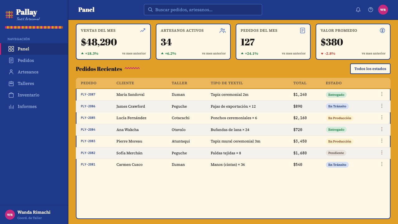
For web interfaces and dashboards, the system is well-suited to platforms with cultural, educational, or heritage mandates, as well as to e-commerce environments selling craft goods, luxury products, or anything where provenance and authenticity matter. Navigation bars and section headers benefit from cobalt grounds with mustard type, using the geometric band as a visual anchor. Card components should have clearly bounded borders — not soft shadows — that echo the fret-bordered registers of the textile. Pricing pages can use the tier-differentiation power of the accent palette: one tier in the mustard family, another in the cobalt family, a premium tier in a deep burgundy or forest green. Interactive states should feel decisive — a full-color fill on hover rather than a tint — consistent with the palette's commitment to full saturation.对于网页界面与仪表板,该系统非常适合具有文化、教育或遗产使命的平台,以及销售工艺品、奢侈品或任何来源与真实性至关重要的电商环境。导航栏与章节标题适合以钴蓝底配芥末字,将几何带纹作为视觉锚点。卡片组件应有清晰有界的边框——而非柔和阴影——呼应纺织品中回纹边框所界定的区段。定价页面可以利用强调色系的层级区分能力:一个等级采用芥末色系,另一个采用钴蓝色系,高级等级采用深酒红或林绿。交互状态应当果断——悬停时以全色填充而非色调——与色板对完全饱和度的承诺保持一致。
For editorial and marketing work, the system supports layouts where visual richness and cultural specificity are part of the message. An editorial spread using this system might place a full-width cobalt header image or color field at the top, drop into a mustard-ground feature zone with stepped-fret borders framing pull quotes, then close with a near-white body text register. Marketing materials — posters, social cards, event graphics — benefit from the system's poster-like boldness: a single dominant color field occupying the majority of the composition, with the secondary color appearing only in the border or a typographic accent. The system also adapts well to packaging and physical print contexts, where the textile metaphor becomes literal and the tactile warmth of the color palette reads especially well on uncoated or textured paper stocks.对于编辑与营销内容,该系统支持视觉丰富性与文化特殊性本身就是信息一部分的版面。使用这一系统的编辑版面,可能在顶部放置全宽钴蓝标题图像或色块,过渡到以阶梯回纹边框框定引语的芥末底面特写区域,再以近白色正文区段作结。营销材料——海报、社交卡片、活动图形——受益于该系统的海报式大胆感:单一主导色块占据构图大部分面积,次要色彩仅出现在边框或字体强调中。该系统也很好地适应包装和实体印刷场景,在这些场景中纺织隐喻变得字面化,色板的触感温度在非涂布或肌理纸张上尤为动人。
A common mistake when applying the Otavalo system is treating the geometric motifs as purely decorative elements that can be scaled down to subtle background patterns or used as light watermarks. The stepped fret and band patterns carry structural meaning in this system: they define zones, establish hierarchy, and mark transitions. When reduced to mere ornamentation, they lose their organizing function and the composition becomes visually busy without being structurally clear. The second common error is softening the palette — diluting the mustard toward beige or the cobalt toward slate — in the belief that more muted tones feel more 'sophisticated.' What actually happens is that the system loses the cultural energy that makes it distinctive. Full saturation is not a stylistic choice but a fidelity to the source material: a freshly loomed faja at the Plaza de los Ponchos is not beige and slate.应用奥塔瓦洛系统时最常见的错误,是将几何母题视为纯粹的装饰元素,将其缩小为微妙的背景图案或用作淡色水印。在这一系统中,阶梯回纹和带纹图案承载着结构意义:它们定义区域、建立层级、标记过渡。当被简化为纯粹的装饰,它们便失去了组织功能,构图变得视觉上繁杂而结构上不清晰。第二个常见错误是柔化色板——将芥末稀释成米色,或将钴蓝推向石板灰——以为更柔和的色调显得更「精致」。实际上发生的是:系统失去了使其与众不同的文化能量。完全饱和度不是风格选择,而是对源材料的忠实——佩格切广场上一条刚织好的腰带,不是米色与石板灰。
See the Otavalo Andean Textile design system查看 Otavalo Andean Textile 完整设计系统
Otavalo Andean Textile — FAQOtavalo Andean Textile · 常见问题
Is the Otavalo system appropriate for brands with no connection to Ecuador or Andean culture?奥塔瓦洛系统适合与厄瓜多尔或安第斯文化毫无关联的品牌吗?
Cultural appropriation is a real concern with any system grounded in indigenous craft. The practical guidance here is: consider whether your use honors or exploits. Using the aesthetic as a coherent design language while acknowledging its origins — in product copy, in design documentation, in the way you talk about the style choice — is qualitatively different from lifting geometric motifs as exotic decoration without context. The system is most appropriate for brands that want to communicate craft, warmth, cultural richness, and depth, and who are willing to engage with those values substantively rather than superficially. It is least appropriate for contexts where the aesthetic serves as a costume — a visual shortcut for 'ethnic' or 'artisanal' that carries no further commitment.对于任何根植于原住民工艺的系统,文化挪用都是真实存在的顾虑。实践指导在于:考虑你的使用是在尊重还是利用。将这一美学作为连贯设计语言使用,同时在产品文案、设计文档和谈论风格选择的方式中承认其渊源——这与不带语境地将几何母题作为异域装饰直接挪用,在性质上是截然不同的。该系统最适合想要传达工艺感、温度、文化丰富性与深度,并愿意实质性而非肤浅地介入这些价值观的品牌。最不适合的场景是将这一美学用作戏服——一种「民族」或「手工」的视觉捷径,背后没有任何进一步的承诺。
How does this system differ from other Andean or Latin American textile aesthetics?这一系统与其他安第斯或拉丁美洲纺织美学有何不同?
Andean textile traditions are highly regional: Peruvian Cusco textiles, Bolivian Aymara weaving, Guatemalan Maya huipiles, and Otavaleño work are related by their shared pre-Columbian roots in backstrap-loom geometry but differ substantially in color system, motif vocabulary, and compositional logic. Otavaleño work is distinguished by the dominance of the mustard-cobalt dyadic, the particular stepped-fret border construction, the four-corner symmetric layout orientation, and a relatively restrained accent palette compared to the fuller chromatic range of Guatemalan or Bolivian traditions. Peruvian highland textiles often use a wider red-and-black palette with figurative animal or geometric motifs that differ from the abstract interlocked frets of the Imbabura tradition. Understanding these distinctions matters when applying the system: mixing motifs from different Andean traditions produces visual incoherence rather than richness.安第斯纺织传统有很强的地域性:秘鲁库斯科纺织品、玻利维亚艾马拉织物、危地马拉玛雅惠皮尔,以及奥塔瓦洛作品,因共同的前哥伦布时期背带织机几何根源而相互关联,但在色彩体系、母题词汇和构图逻辑上存在实质差异。奥塔瓦洛作品的特征是芥末-钴蓝二元色的主导地位、特定的阶梯回纹边框构造、四角对称的布局取向,以及与危地马拉或玻利维亚传统更宽广色域相比较为节制的强调色系。秘鲁高地纺织品通常使用更宽广的红黑色板,搭配具象动物或几何母题,与因巴布拉传统抽象交错回纹有所不同。理解这些区别在应用该系统时至关重要:混合来自不同安第斯传统的母题会产生视觉混乱,而非丰富性。
Can the system work in a dark or night-mode variant?该系统可以做深色或夜间模式变体吗?
A dark variant is possible but requires significant recalibration. The historic Otavaleño palette is not built around a dark ground — the loom works on natural fiber, and the 'dark' in traditional textiles is deep cobalt indigo or burgundy, not a neutral black or near-black. A dark variant works best when it takes deep cobalt as the primary ground (rather than neutral black), allows mustard yellow to perform as the dominant warm light against that ground, and restricts the neutral near-white to typography and fine border detail only. Using a neutral dark gray or black as the ground tends to flatten the cultural energy of the palette and push the result toward a generic 'dark mode' rather than a genuine dark expression of the textile system. The four-corner symmetric layout and stepped-fret borders remain effective at any ground value.深色变体是可行的,但需要显著的重新校准。历史上的奥塔瓦洛色板并非以深色底面为基础——织机在天然纤维上运作,传统纺织品中的「深色」是深钴靛或酒红,而非中性黑色或近黑色。深色变体最有效的做法是:以深钴蓝作为主要底面(而非中性黑),让芥末黄在该底面上充当主要暖光,并将近白色的中性色仅保留给字体和精细边框细节。使用中性深灰或黑色作为底面,往往会压平色板的文化能量,使结果趋向于通用的「暗黑模式」,而非纺织系统的真正深色表达。四角对称布局和阶梯回纹边框在任何底面明度下都保持有效。
How should photography be handled within this design system?在这一设计系统中应如何处理摄影图像?
Photography integrates well when it is treated as a textural element rather than a compositional anchor. Images of woven textiles, highland landscapes, market scenes, or craft processes work naturally within the system because they share the palette's warm ochre-and-blue visual world. Portraits of people should be handled with particular care — especially images of Otavaleño weavers or indigenous subjects — ensuring that photographic subjects are presented with dignity and contextual integrity, not reduced to atmospheric decoration. In layout, photography works best when contained within clearly bounded registers or frames consistent with the band-and-border logic of the system. Full-bleed photography can work for emotional impact but should be paired with a band or border overlay that maintains the system's geometric character rather than allowing the photo to read as a generic lifestyle image.当摄影作为纹理元素而非构图锚点处理时,它能很好地融入系统。纺织品、高地景观、市集场景或工艺过程的图像自然契合这一系统,因为它们与色板的温暖赭石蓝视觉世界共享同一语境。人像应特别谨慎处理——尤其是奥塔瓦洛织工或原住民群体的图像——确保拍摄对象以有尊严、有语境完整性的方式呈现,而非被简化为氛围性装饰。在版面中,摄影最适合被包含在与系统带纹-边框逻辑一致的清晰有界区段或框架内。全出血摄影可以用于情感冲击,但应搭配带纹或边框叠加,以维持系统的几何特征,而非让照片读来像一张通用的生活方式图像。
Does the system work for digital products that require high information density, such as data-heavy dashboards?该系统适用于需要高信息密度的数字产品(如数据密集型仪表板)吗?
Yes, with a clear strategy for managing density. The register-and-band logic that organizes Otavaleño textiles is actually well-suited to information-dense layouts because it provides strong visual zoning without requiring the kind of heavy typographic hierarchy that some data-heavy interfaces depend on. The approach: use the cobalt-ground header band to establish primary navigation and context, reserve the mustard palette for primary metrics or key performance indicators that require immediate attention, and use the near-white register for dense tabular or body content where legibility is paramount. Geometric borders between information zones replace the soft dividers that would feel out of character. The key constraint is color budget: in a data-rich interface, resist the temptation to use all palette colors simultaneously at full saturation — assign each hue a specific semantic role and maintain that consistently across the entire interface.可以,但需要一套清晰的密度管理策略。组织奥塔瓦洛纺织品的区段-带纹逻辑实际上非常适合信息密集型版面,因为它提供了强劲的视觉分区,而无需某些数据密集型界面所依赖的厚重字体层级。方法如下:使用钴蓝底面标题带纹建立主要导航与背景,将芥末色系保留给需要即时关注的主要指标或关键绩效指标,使用近白色区段处理需要最高可读性的密集表格或正文内容。信息区域之间的几何边框替代了与系统气质不符的柔和分割线。关键约束是色彩预算:在数据丰富的界面中,抵制同时以全饱和度使用所有色板颜色的冲动——为每种色相分配特定的语义角色,并在整个界面中始终如一地保持一致。
Related design styles相关设计风格
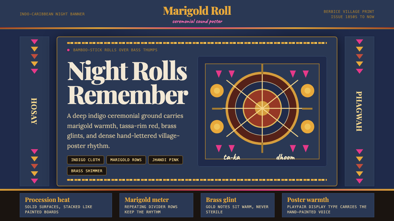 Guyanese Tassa DrumCeremony carries the beat. Indigo banners, Playfair type, and marigold rows g…仪式感击出鼓点:靛蓝旗面、Playfair 标题与万寿菊分隔线发光。
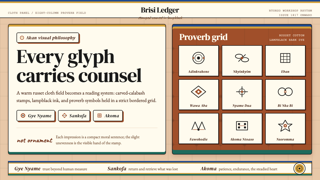 Akan Adinkra (Ghana)Proverbs become cloth. Russet grids, lampblack serif marks, and gold-edge ban…箴言化为布面:赭红网格、灯烟黑印纹与金边带盖出意义。
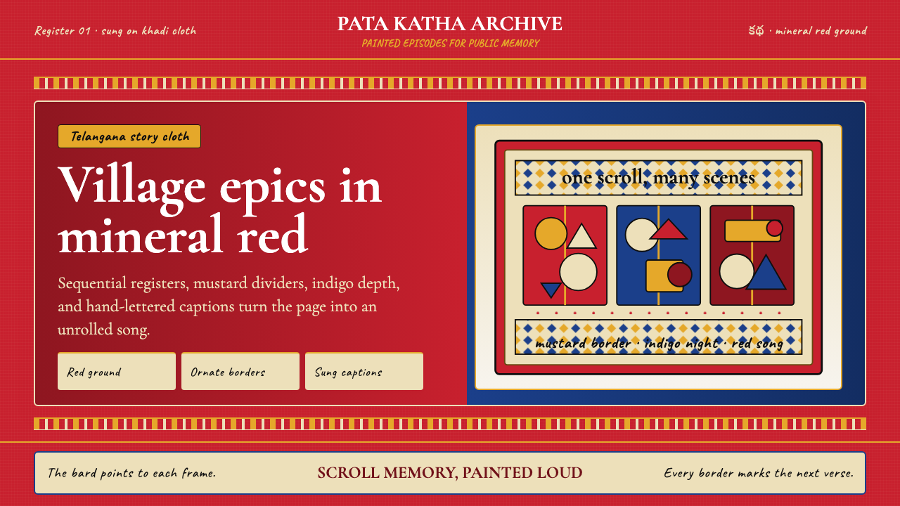 Andhra Cheriyal Scroll PaintingSaturated oral memory. Mineral red registers, mustard diamonds, and serif son…饱和的口述记忆:矿物红分格、芥末黄菱纹与衬线唱词。
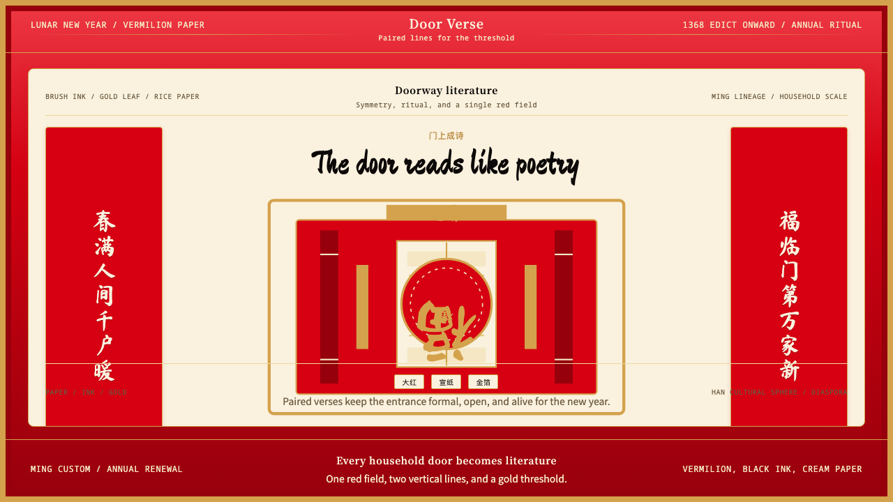 Chinese Spring Festival Red CoupletLiterature on the door. Vermilion paper, vertical pairs, and gold calligraphy.门上成诗。大红纸、竖联对称与金墨呼应。
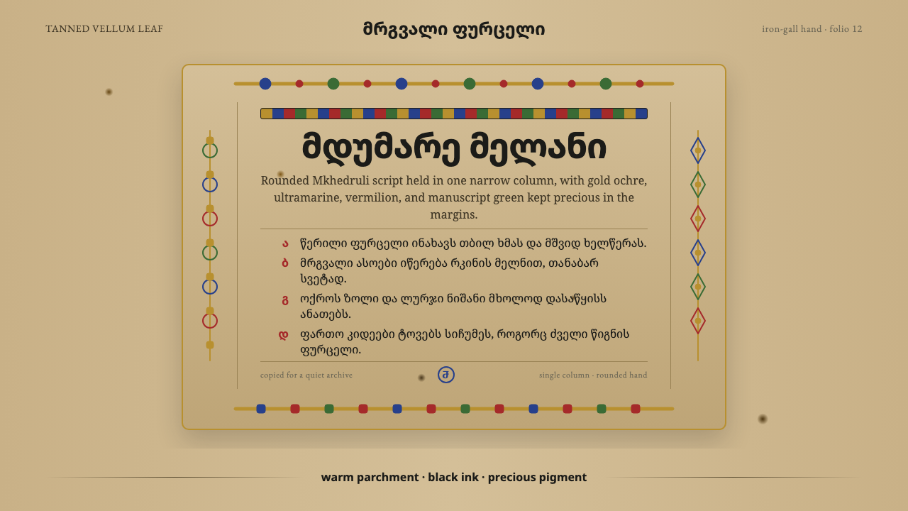 Georgian MkhedruliA manuscript breathes slowly. Tanned vellum, round Mkhedruli ink, ochre and u…抄本缓慢呼吸:鞣革羊皮、圆体墨字、赭金与群青。
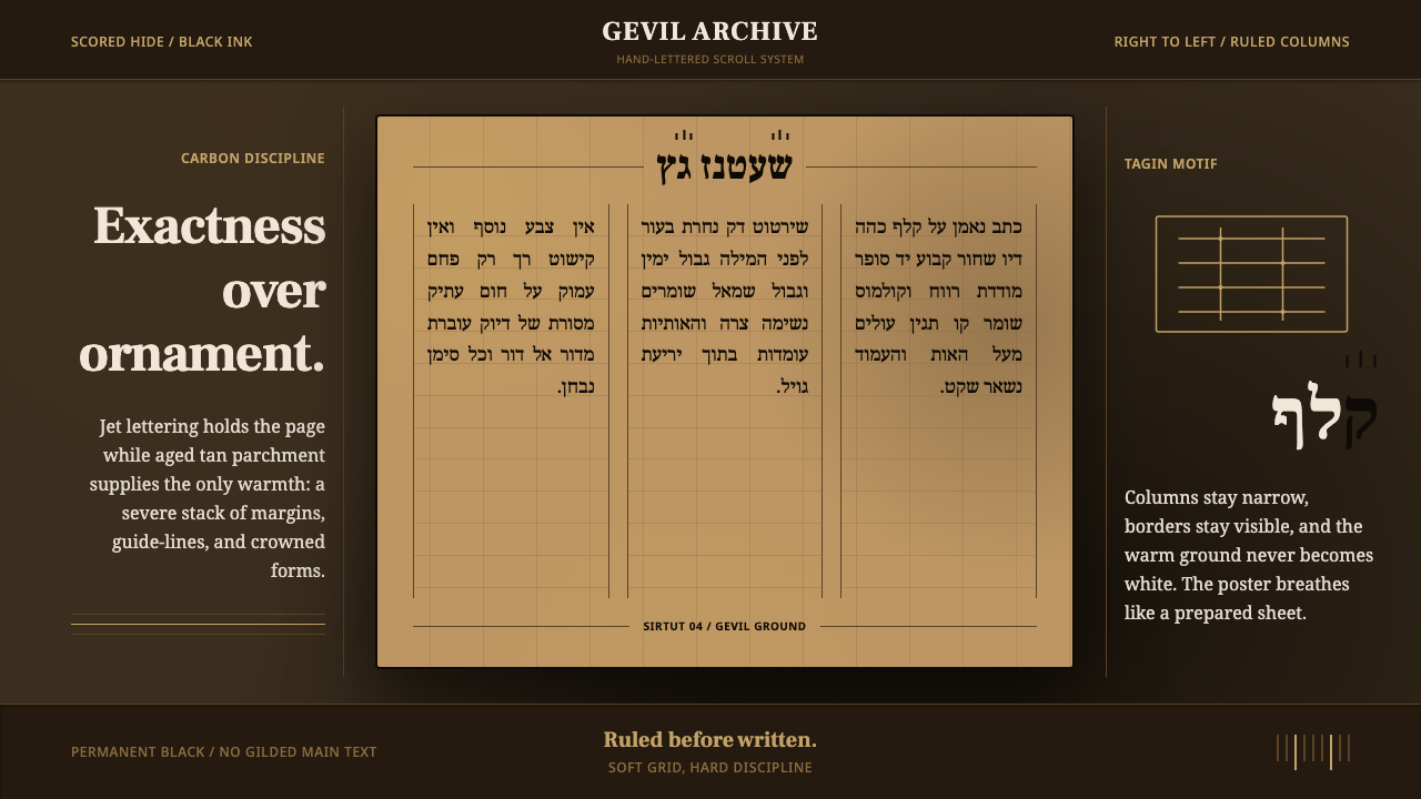 Hebrew STaM ScrollExactness over ornament. Jet ink, ruled Hebrew columns, and amber-tan parchme…精确压过装饰。黑墨、希伯来栏线与琥珀羊皮纸。