What is Chinese Spring Festival Red Couplet?什么是 Chinese Spring Festival Red Couplet?
Vermilion paper, paired brushstrokes, and six hundred years of doorway poetry — the spring couplet is China's most democratic design system.大红纸、双联墨迹、六百年门框诗行——春联是中国最具民间生命力的设计体系。
Chinese Spring Festival Red Couplet in briefChinese Spring Festival Red Couplet 速览
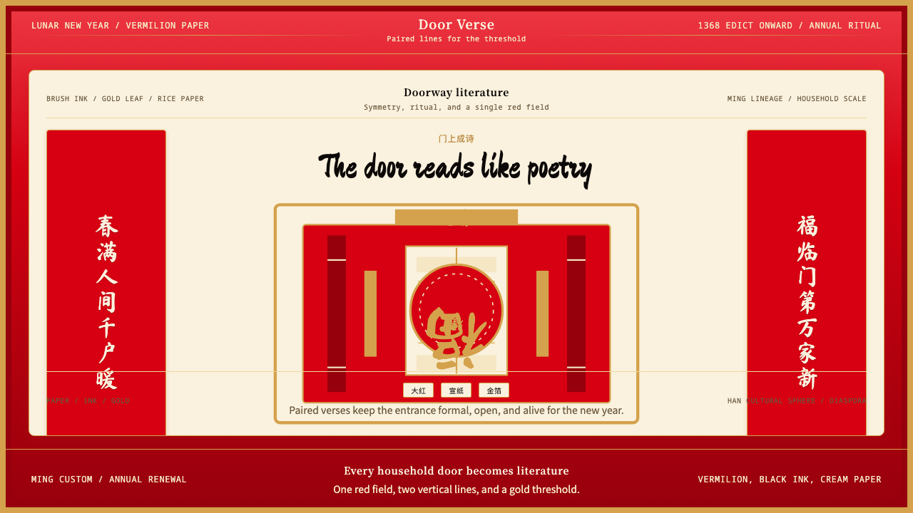
The Chinese Spring Festival red couplet — known as chunlian (春联) — is a visual tradition practiced by hundreds of millions of households each Lunar New Year. Two vertical strips of saturated vermilion paper, each bearing a line of brush-written auspicious verse, are pasted on the left and right door frames of a home or business, with a shorter horizontal strip across the lintel completing the composition. The entire arrangement is governed by a strict bilateral symmetry: the right strip leads, the left responds, and every character on one side is answered by a corresponding character on the other in meter, tone, and meaning.中国春节红色对联——即「春联」——是数以亿计的家庭每逢农历新年必行的视觉传统。两条竖向大红纸,各书吉祥句,分贴于门框左右;一条横批压于门楣,三者共同构成完整构图。整体布局遵循严格的对称法则:右联起头,左联呼应,一边每一个字都与另一边在平仄、格律与意境上形成对答。
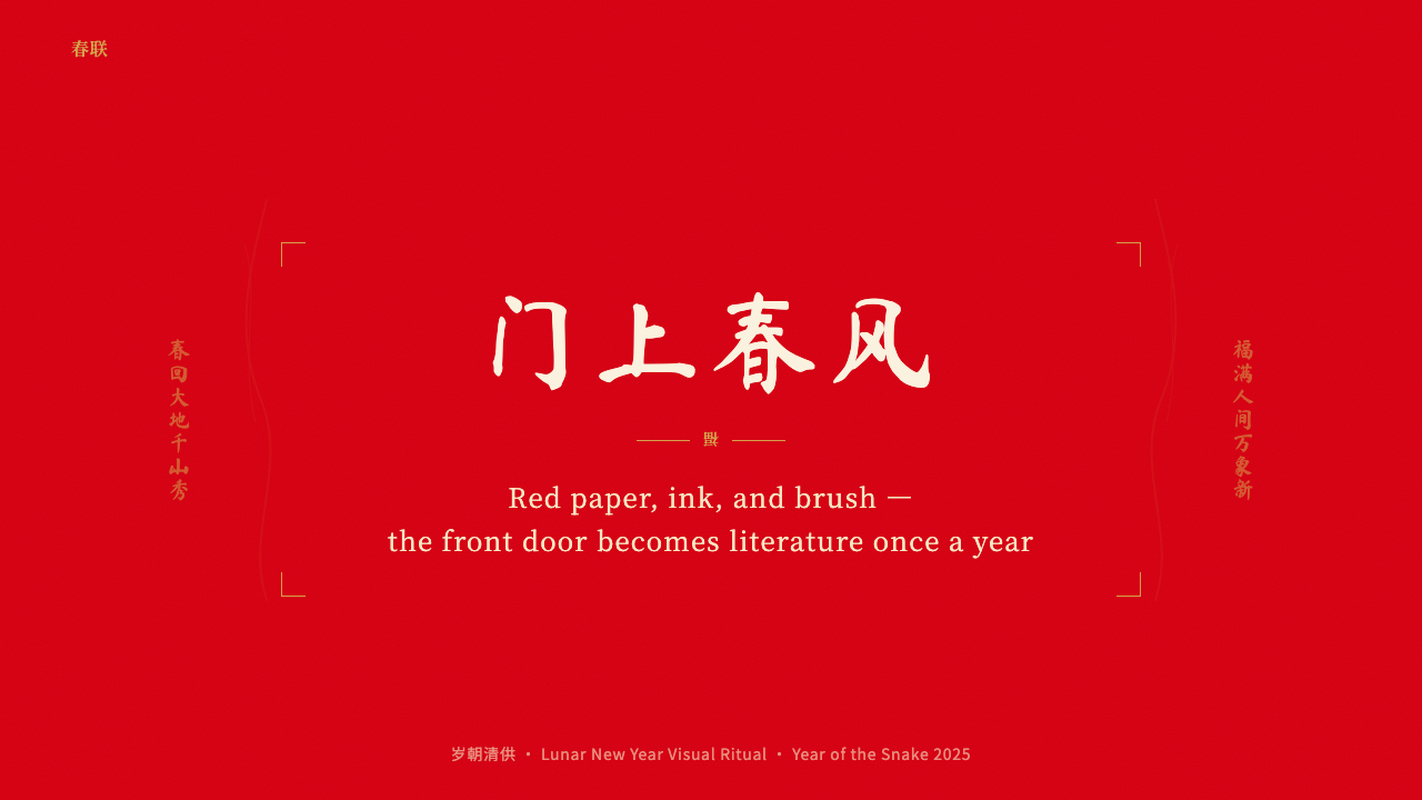
The visual language is spare and absolute. Deep red dominates as the ground — not a decorative choice but a cultural one, red being the color of luck, vitality, and the warding of evil in Han cultural belief. Against this ground, characters are rendered in mineral-black ink or gold, both of which achieve maximum legibility and visual weight. No other colors appear. No illustrative imagery competes with the text. The calligraphy itself — typically in one of the classical scripts, from the formal kaishu to the fluid xingshu — is the sole ornament and the sole message. Content and form are indistinguishable.其视觉语言简洁而绝对。深红色主宰底面——这不是装饰性选择,而是文化选择:红色在汉文化信仰中象征吉祥、生机与辟邪。字迹以松烟墨或金色书就,两者皆能在红底上实现最大的清晰度与视觉分量。其他颜色概不出现,插图图像亦不与文字竞争。书法本身——通常取楷书之端正或行书之流动等经典字体——既是唯一的装饰,也是唯一的内容。形式与内容浑然一体,不可分割。
Translated into interface design, this system becomes a discipline of constraint and ceremony. The palette reduces to three elements: a saturated warm red ground, a near-white or cream content surface evoking the texture of unbleached paper, and a deep ink tone for all typographic work. Composition inherits the couplet's bilateral logic — paired vertical columns, mirror-balanced layouts, the sense that every element on the left has a counterpart on the right. Calligraphic heading type carries the ritual weight of the brushstroke, while the overall effect projects the warmth, festivity, and ceremonial gravity that the tradition embodies.将这一传统转译为界面设计,即是一套以约束与仪式为核心的语言体系。色板简化为三个要素:饱和的暖红底色、近白或奶白的内容面(令人联想到本色宣纸的质感),以及用于所有文字排印的深墨色调。构图承接对联的对称逻辑——成对的竖向纵列、镜像平衡的版式、左侧每个元素都有右侧对应物的感知。毛笔字体的标题承载笔触的仪式分量,整体效果传递出这一传统所蕴含的温暖、喜庆与庄重并存的气息。
Where does Chinese Spring Festival Red Couplet come from?Chinese Spring Festival Red Couplet 从何而来?
The spring couplet traces its roots to the peachwood charms (桃符, táofú) of the Five Dynasties period, roughly the tenth century. These were rectangular boards of peachwood hung at the entrance of homes during the new year, inscribed with the names of the door gods Shenshu (神荼) and Yulü (郁垒) to ward off evil spirits. The practice was ancient and widespread, but the form was still that of an amulet rather than a literary composition. The transformation from charm to couplet — from protective symbol to paired verse — began when literati began replacing the divine names with original lines of poetry, retaining the bilateral structure while filling it with literary content.春联的源头可追溯至五代时期(约十世纪)的桃符习俗。桃符是悬挂于门前的长方形桃木板,上书门神神荼与郁垒之名,用以驱鬼辟邪。这一习俗由来已久,广泛流行,但其形式仍是护身符而非文学创作。从符咒到对联的转变——从护佑性符号到成对诗句——始于文人以自撰诗句取代神名,在保留左右对称结构的同时注入了文学内容。
The decisive historical moment came in 1368, when Zhu Yuanzhang (朱元璋), the founding emperor of the Ming dynasty, issued an edict mandating that every household in the capital Nanjing affix a pair of couplets on red paper to their door frames before the new year. This act accomplished two things simultaneously: it democratized a practice previously associated with the educated class by making it universal, and it fixed the material — red paper — as canonical. The emperor is said to have personally toured the city on New Year's Eve to verify compliance and to compose impromptu couplets for households that had none. Whether the stories are precisely accurate matters less than what they reveal: the spring couplet was already understood as a civic and cultural obligation, not merely a personal custom.历史上的决定性时刻发生于1368年,明太祖朱元璋颁令,要求京城南京家家户户于新年前在门框上张贴红纸对联。此令同时完成了两件事:它将原本与文人阶层相关联的习俗普及为全民行为,并将红纸确立为不可更改的材料规范。据说皇帝亲自于除夕夜出巡,查看家家是否遵令,并为未贴对联的人家即兴挥毫。这些故事是否字面属实并不重要,它们所揭示的才是关键:春联在当时已被理解为一种公民与文化义务,而非单纯的个人习俗。
Over the subsequent five centuries of Ming and Qing rule, the couplet tradition ramified into an elaborate folk art with its own craft economy. Papermakers in regions like Jiajiang in Sichuan and Fuyang in Zhejiang developed specialized production of the deep red paper used exclusively for couplets, achieving saturations and surface textures suited to absorbing brush ink without bleed. Inkmakers compounded formulas that would remain legible across the months between one new year and the next. Itinerant calligraphers set up stalls at markets to write couplets for households without a skilled brush hand — a practice still visible in contemporary China each January. The form's strict prosodic requirements (tonal antithesis, semantic parallelism, equal character count on both strips) meant that skill in couplet composition became a recognized literary accomplishment, with competitions and anthologies dedicated to the form.此后历经明清五个多世纪,对联传统衍生出完整的民间工艺经济体系。四川夹江、浙江富阳等地的造纸工匠专门生产对联专用大红纸,钻研出适于毛笔墨水充分着色而不晕染的饱和度与纸面质感;制墨师傅配制能在整个年节期间保持清晰可读的墨方。走街串市的书法师傅在年集摆摊,为没有书法功底的家庭代写对联——这一景象在当代中国每年一月依然可见。对联严格的格律要求(声调相对、语义相对、字数相同)意味着擅写对联本身就是公认的文学造诣,专门的对联竞赛与选集由此产生。
In the modern period, the tradition survived political turbulence with remarkable resilience. The Cultural Revolution (1966–1976) suppressed many traditional observances, but the spring couplet returned with force when restrictions eased, and it was formally integrated into the national cultural heritage framework in 2006, when the custom of writing and posting spring couplets was included in China's first National Intangible Cultural Heritage List. Today, the couplet is practiced across the entire Han cultural sphere — mainland China, Taiwan, Hong Kong, Singapore, and Chinese diaspora communities worldwide — and has been adopted in some form by other East Asian cultures that absorbed Confucian ceremonial practice. Mass-produced printed couplets exist alongside hand-brushed ones, and digital versions appear on screens and social media, but the fundamental visual grammar — red ground, black or gold verticals, bilateral pair — remains unchanged across six centuries.进入现代,这一传统以惊人的韧性度过了政治动荡。文化大革命(1966—1976年)压制了许多传统习俗,但管制松动后,春联随即强势回归。2006年,书写与张贴春联的习俗被列入中国首批国家级非物质文化遗产名录,正式纳入国家文化遗产保护体系。今天,春联习俗流行于整个汉文化圈——中国大陆、台湾、香港、新加坡及全球华人社区——并以不同形式传播至吸纳了儒家仪式文化的其他东亚文化中。机器印制的对联与手笔书写的并存,数字版本出现在屏幕与社交媒体上,但其根本视觉语法——红底、黑色或金色竖字、成双成对——在六百年间始终如一。
What defines the Chinese Spring Festival Red Couplet look?Chinese Spring Festival Red Couplet 的视觉特征是什么?
Color Ground底色
The dominant ground is a deep, fully saturated vermilion red — not the orange-leaning red of warning systems nor the blue-shifted crimson of Western formal contexts, but a warm, dense red with cultural specificity. This red is never softened into a pastel and never darkened toward maroon; it is always at full chromatic intensity. Against it, content surfaces appear in a near-white or unbleached cream tone that reads as unpigmented paper rather than a designed neutral. The contrast between the two is deliberate and maximal.主导底色是深邃、高度饱和的朱红——既非偏橙的警示红,也非西方正式语境中偏蓝的深红,而是具有文化特殊性的暖润、厚重之红。这一红色从不柔化为粉调,也从不加深为暗枣红;它永远处于全饱和的色彩强度。与之对应的内容面,以近白或本色奶白呈现,令人联想到未经染色的宣纸,而非精心设计的中性色。两者之间的对比是刻意且极致的。
Calligraphic Typography书法字体排印
Heading text draws from the brush-calligraphy tradition. The appropriate register ranges from the formal upright strokes of regular script (kaishu) to the fluid, slightly compressed energy of running script (xingshu) — both are acceptable; cursive grass script (caoshu) is too abbreviated for design headlines and should be avoided. What matters is that the letterforms carry visible evidence of the brush: varying stroke weight within each character, the slight flare at stroke terminals, the organic variation between characters that no digital geometric type can replicate. Body text may use a clean Ming-style or Song-style typeface for legibility, with the calligraphic heading type providing the ceremonial register.标题文字取自毛笔书法传统。合适的字体范围从楷书的端正竖直到行书的流动、略显紧凑的张力——两者均可接受;草书因过于简省,不适合设计标题,应予回避。关键在于字形须携带可见的笔触痕迹:每个字内部的笔画粗细变化、笔画末端的轻微外张、字与字之间任何数字几何字体都无法复制的有机差异。正文可使用明体或宋体以保证可读性,以书法标题字体承载仪式性的庄重感。
Bilateral Symmetry对称双联构图
The couplet form demands perfect structural pairing: every element on the right has a counterpart on the left, and the two sides hold each other in balance. In design, this translates into layout structures built around a vertical central axis, with paired columns, mirrored section blocks, and visual weight distributed equally between the two halves. This is not the asymmetric tension of Bauhaus composition but its opposite — a deliberate mirror logic that communicates completeness, harmony, and ceremonial order. Layouts need not be robotically identical on both sides; tonal variation within a shared structure is correct and expected.对联形式要求完美的结构呼应:右侧每一个元素都在左侧有其对应,两边相互平衡。在设计中,这转化为围绕垂直中轴线构建的版式——成对的纵列、镜像的内容区块、在两个半面之间均等分配的视觉重量。这不是包豪斯构图式的非对称张力,而是其对立面——一种刻意的镜像逻辑,传递完整、和谐与仪式秩序。版式不必在左右两侧机械地完全相同;在共同结构内部的色调变化是正确且符合传统的。
Vertical Orientation纵向取向
Classical Chinese text runs from top to bottom, right to left, and the couplet reinforces this directionality absolutely. In design adapted from this tradition, vertical text blocks, tall narrow containers, and portrait-oriented compositional logic all carry cultural resonance. Even when horizontal text is necessary for interface legibility, structural elements — dividers, accent bars, iconographic columns — should be oriented vertically wherever possible, reinforcing the sense of upright stature that the couplet embodies. The vertical emphasis also conveys elevation and formality, qualities historically associated with classical Chinese architectural and calligraphic proportion.传统汉字从上至下、从右至左书写,对联彻底强化了这一方向性。在借鉴这一传统的设计中,垂直文字块、纵长的窄型容器、竖向的构图逻辑都承载着文化共鸣。即便在界面可读性要求使用横排文字的情况下,结构性元素——分隔线、强调条、图形纵列——也应尽量保持竖向,强化对联所蕴含的挺立庄重感。纵向强调同时传递出高度与正式感,这正是历史上与中国传统建筑及书法比例相关联的气质。
Gold and Ink as Accent金墨双重强调
Against the red ground, two accent options define the tradition: mineral-black ink for everyday couplets and gold leaf or gold-pigment ink for auspicious and formal contexts. In design, both work as high-contrast typographic options on red backgrounds, with black carrying a grounded, scholarly gravity and gold projecting celebration and prestige. The two should not be used simultaneously as competing typographic voices on the same surface; choose one as the primary text treatment and reserve the other for hierarchy differentiation — gold for a single headline tier, black for supporting text, for instance, or vice versa.在红底之上,两种强调选择定义了这一传统:普通对联用松烟墨,吉祥正式场合用金箔或金墨。在设计中,两者都是红色背景上高对比度的字体选项——黑色传递沉稳的书卷气,金色投射喜庆与尊贵。两者不应在同一版面上同时作为相互竞争的字体声音并用;应选其一作为主要文字处理,另一者用于层级区分——例如金色用于单一标题层级,黑色用于辅助文字,或反之亦然。
Auspicious Iconography吉祥图案元素
Beyond the couplet strips themselves, the broader Spring Festival visual vocabulary includes a set of recurring symbolic motifs: the character for luck or fortune (福) displayed prominently — often inverted to mean luck has arrived; the plum blossom signaling resilience through winter; the red lantern as the definitive festival marker; stylized cloud and wave scrollwork derived from classical textile and ceramic patterns. In design work, these elements function as accent graphics rather than compositional anchors — a single repeated motif in a border or background, a horizontally stretched cloud pattern as a divider. They should be used with selective restraint: one or two per composition, never as wallpaper.除对联本身之外,春节更宏观的视觉语汇还包括一组反复出现的吉祥图形:醒目呈现的福字——常倒贴以寓福到;报春的梅花;作为节庆最典型标志的红灯笼;源自传统织物与瓷器纹样的云纹和水波纹卷草图案。在设计中,这些元素作为点缀性图形而非构图锚点发挥作用——边框或背景中单一重复的纹样,横向拉伸的云纹作分隔线。应以克制的选择性使用:每幅构图一两处即可,切忌铺满全版。
Festive Warmth Without Frivolity喜庆而不轻浮
The spring couplet is celebratory in intent but solemn in execution. The calligraphy is careful, the verse is literary, the ritual is civic. This combination of warmth and gravity distinguishes the aesthetic from generic festive design, which tends toward high-energy chaos and visual competition. In interface terms, this means the festive feeling is carried by color temperature and compositional order rather than by animation, confetti, or visual noise. The red ground is warm; the typography is controlled; the white space within compositions is generous. The result should feel like a ceremony, not a party.春联在意图上是喜庆的,但在执行上是庄重的。书法严谨,诗句文雅,仪式具有公民意义。这种温暖与庄重的结合,将这一美学与通常倾向于高能量混乱和视觉竞争的普通节庆设计区别开来。在界面层面,这意味着节庆感由色彩温度和构图秩序承载,而非由动画、彩屑或视觉噪声传递。红色底面是温暖的,字体排印是克制的,构图内部的留白是充裕的。结果应当令人感受到仪式,而非派对。
Who shaped Chinese Spring Festival Red Couplet?谁塑造了 Chinese Spring Festival Red Couplet?
The founding emperor of the Ming dynasty, Zhu Yuanzhang issued the 1368 edict that transformed the spring couplet from an elite literary practice into a universal civic obligation. By mandating red paper and doorframe placement for every household in Nanjing, he fixed the material and compositional grammar of the form for the six centuries that followed. His reported habit of personally touring neighborhoods on New Year's Eve to inspect couplets — and to write them for households that had none — made him the tradition's most consequential patron. The Ming dynasty's administrative reach also spread the practice across the empire, converting a regional literati custom into a pan-Chinese annual ritual.明太祖朱元璋颁布1368年诏令,将春联从精英文人习俗转变为全民公民义务。通过规定南京每户人家必须在门框贴红纸对联,他为此后六百年奠定了这一形式的材料与构图语法。相传他在除夕夜亲自出巡检查对联,并为没有对联的人家亲笔题写——这使他成为这一传统最具影响力的推行者。明朝的行政覆盖范围也将这一习俗传播至全国,将地域性的文人惯例转化为全中国性的年度仪式。
Wang Xizhi, the fourth-century calligrapher revered as the Sage of Calligraphy (书圣), did not write spring couplets — the form did not yet exist in his era — but his aesthetic legacy shaped every brushstroke that followed. His Orchid Pavilion Preface (兰亭序) established ideals of balance, rhythm, and organic variation in letterforms that Chinese calligraphers have studied and emulated for seventeen centuries. The stylistic criteria applied to couplet calligraphy — the quality of the brushstroke, the distribution of ink within each character, the spatial relationship between characters — are ultimately Wang's criteria. Any appreciation of the spring couplet's typographic dimension is an appreciation, at some remove, of his influence.四世纪书法家王羲之被尊为书圣,并未书写过春联——彼时这一形式尚未出现——但他的美学遗产影响了此后每一笔笔触。他的《兰亭序》确立了字形中平衡、节奏与有机变化的理想,中国书法家为此临摹研习长达十七个世纪。评判对联书法的标准——笔触质量、墨色在字内的分布、字间的空间关系——归根结底是王羲之的标准。任何对春联文字维度的欣赏,都是对他的影响在某种程度上的欣赏。
Qi Gong (1912–2005) was the twentieth century's most celebrated Chinese calligrapher and an Imperial Palace Museum curator whose work on classical calligraphy scholarship bridged the traditional and modern eras. His distinctive style — a refined, airy regular script with exceptional internal balance — became one of the most influential calligraphic models of the late twentieth century, appearing on institutional plaques, book covers, and commemorative couplets throughout China. His scholarship on the history and aesthetics of Chinese calligraphy helped preserve the theoretical framework within which spring couplet practice is understood, ensuring that the tradition's literary and formal standards survived into the digital age.启功(1912—2005年)是二十世纪最著名的中国书法家,亦是故宫博物院的文物鉴定专家,其古典书法研究沟通了传统与现代两个时代。他独特的风格——精致、空灵的楷书,内部平衡感超卓——成为二十世纪下半叶最具影响力的书法范式之一,出现于中国各地的机构匾额、书籍封面与纪念对联上。他对中国书法历史与美学的学术研究,有助于保存理解春联传统所依托的理论框架,确保这一传统的文学与形式标准得以延续至数字时代。
The unsung practitioners of the couplet tradition are the itinerant brush calligraphers who set up seasonal stalls at new year markets across China — and who have done so in an unbroken line from at least the Song dynasty. These anonymous craftspeople are the tradition's transmission mechanism: they make the form accessible to households without a skilled brush hand, they carry regional stylistic variations from one location to another, and they maintain live calligraphic practice in an era of digital typography. Their stalls, with red paper rolls and ink-blackened brushes spread across folding tables, remain one of the most visible signs that the Spring Festival visual tradition is alive rather than archival.这一传统默默无闻的传承者,是在中国各地年集摆摊的流动书法师傅——这一不间断的传承至少可追溯至宋代。这些无名工匠是传统的传播机制:他们让没有书法功底的家庭也能获得春联,将各地不同的风格变体从一处带往另一处,并在数字排印时代维系着活态的书法实践。他们的摊位——红纸长卷与墨迹淋漓的毛笔铺展在折叠桌上——至今仍是春节视觉传统生生不息而非博物馆遗存的最直观证明。
How do you use Chinese Spring Festival Red Couplet today?今天怎么用 Chinese Spring Festival Red Couplet?
The Chinese Spring Festival red couplet style is best applied in contexts where warmth, cultural resonance, and a sense of occasion are desired alongside structural legibility. Unlike more austere historical styles, this system is inherently celebratory — the red ground signals good fortune, the bilateral composition implies completeness, and the calligraphic type carries ceremonial weight. These qualities make it well suited to Lunar New Year campaigns, culturally specific brand identities, festival-season product launches, and any context in which Chinese or broader East Asian cultural affiliation is a meaningful dimension of the design brief.中国春节红色对联风格最适合应用于既需要温暖感、文化共鸣与仪式感,又要求结构可读性的场景。与更为简朴的历史风格不同,这一体系本质上是喜庆的——红色底面传递吉祥,对称双联构图暗示圆满,书法字体承载仪式分量。这些特质使其非常适合农历新年营销活动、具有文化特殊性的品牌识别、节庆季产品发布,以及任何中华或更广泛东亚文化归属感是设计命题重要维度的场景。
For presentation slides, the system works at two distinct levels. Cover slides benefit from a full red ground with paired vertical title treatment — the main title running in one large calligraphic block on one side and a subtitle or date in a smaller, answering block on the other, with generous white space between them. Content slides should shift to the cream or near-white ground, reserving the red for accent bars, section headers, or horizontal marker lines. Data slides in this style take a diagrammatic approach: charts should read as clean, high-contrast figures on light grounds, with the red used selectively to highlight the key data series rather than applied to all elements uniformly. The overall deck should feel like a beautifully printed ceremonial document rather than a generic business presentation.在演示文稿中,这一系统在两个层面上发挥作用。封面页适合全红底面配以成对竖向标题处理——主标题以一块大型书法字体居于一侧,副标题或日期以较小的呼应性文字块居于另一侧,两者之间留有充裕空间。内容页应转换为奶白或近白底面,将红色保留给强调条、章节标题或水平标记线。该风格的数据页采用示意图式处理:图表应在浅色底面上呈现为清晰、高对比度的图形,红色选择性地用于突出关键数据系列,而非均等施用于所有元素。整套幻灯片应令人感受到精美印制的仪式性文件,而非通用商务演示。
For web interfaces, this style suits landing pages, campaign microsites, and culturally specific product pages more naturally than it suits utility dashboards or complex SaaS interfaces. A landing page applying this system would use the red ground for the hero section and major call-to-action areas, with content sections dropping to cream or white grounds for extended reading. Navigation and interactive elements should use the deep ink tone rather than the red, reserving red for primary actions only. Pricing pages can apply the bilateral layout logic effectively: two or three tiers displayed as paired vertical columns with symmetric spacing, allowing the form itself to communicate the comparison. Avoid applying the full red ground to dense information environments — the chromatic intensity that works for a festival cover overwhelms a feature matrix.对于网页界面,这种风格更自然地适合落地页、活动专题页和文化特定产品页,而非通用仪表板或复杂SaaS界面。应用该体系的落地页,在主视觉区和主要行动召唤区使用红色底面,内容区下沉至奶白或白色底面以便延伸阅读。导航与交互元素应使用深墨色调而非红色,将红色仅保留给主要操作。定价页可以有效运用对称双联版式逻辑:两到三个等级以成对竖向栏目展示,对称间距让形式本身传达比较关系。避免将全红底面应用于信息密集的界面——对节庆封面有效的色彩强度,会使功能矩阵不堪重负。
For editorial and marketing work, the spring couplet style provides a strong framework for Lunar New Year editorial packages, cultural features, and brand campaigns targeting Chinese-speaking audiences during the festival season. A magazine spread in this style would use a red ground for the opening spread with large calligraphic display type, transitioning to a cream ground for the body of the article with a consistent red rule marking section divisions. Marketing materials — social cards, email headers, outdoor posters — benefit from the style's inherent boldness: the red-and-gold or red-and-black contrast reads across distances and in small formats, and the auspicious iconography (the inverted Fu character, the lantern, the plum blossom) provides a recognizable seasonal signal that works even when the calligraphic type is absent.对于编辑与营销内容,春联风格为面向华语受众在节庆季发布的农历新年编辑专题、文化报道和品牌活动提供了强有力的框架。该风格的杂志版面以红色底面开篇,配以大型书法展示字体,正文部分过渡至奶白底面,以一致的红色线条标记章节分隔。营销物料——社交卡片、邮件页眉、户外海报——受益于这一风格固有的视觉冲击力:红金或红黑对比在远距离和小尺寸下均清晰可辨,吉祥图案元素(倒置的福字、红灯笼、梅花)提供即使书法字体缺席也能辨识的季节性视觉信号。
A common mistake when applying this style is conflating it with generic Chinese or Asian festive design, which tends to add dragons, excessive gold gradients, cartoon-style illustrations, and cluttered pattern work. The spring couplet aesthetic is distinguished by its restraint: two colors (red and either black or gold), bilateral structure, calligraphic type, and selective use of traditional motifs. Designers who feel the urge to add more visual elements are almost certainly adding noise rather than meaning. The tradition's six-hundred-year survival depends precisely on its refusal to accumulate decoration — every household door, every year, the same red paper and the same bilateral form, with only the verse changing. That discipline is the design lesson.应用这一风格时最常见的错误,是将其与通常添加龙纹、过度金色渐变、卡通插图和繁杂图案的泛华人或亚洲节庆设计混为一谈。春联美学的特点正在于其克制:两种颜色(红色加黑色或金色)、对称双联结构、书法字体,以及对传统图案元素的选择性运用。感到需要添加更多视觉元素的设计师,几乎必然是在增加噪音而非意义。这一传统六百年的传承,恰恰依赖于它对装饰堆砌的拒绝——家家户户,年年如此,同样的红纸、同样的双联形式,只有诗句在更换。这种自律,就是设计的启示。
Chinese Spring Festival Red Couplet — FAQChinese Spring Festival Red Couplet · 常见问题
Is this style appropriate for non-Chinese-New-Year contexts, or does it always read as seasonal?这一风格适合用于非春节场合吗,还是它总是被解读为节庆性的?
The deep red ground and bilateral paired layout do carry strong Lunar New Year associations in most audiences who recognize the tradition. However, the association is not inescapable — it depends on how many of the tradition's specific signals appear simultaneously. A design that uses the red ground but replaces calligraphic type with a modern sans-serif, omits auspicious iconography, and uses a single-column layout rather than a bilateral pair will read as culturally warm and Chinese-influenced without triggering an exclusively festival reading. The key signals that make the seasonal reading unavoidable are: calligraphic paired verticals plus red-and-gold palette plus explicit auspicious motifs. Remove one or two of these and the cultural reference remains while the seasonal specificity softens.深红底面与对称双联版式,在大多数了解这一传统的受众中确实承载了浓厚的农历新年联想。然而这种联想并非无法避免——它取决于有多少传统的具体信号同时出现。一个使用红色底面但以现代无衬线字体替代书法字体、省略吉祥图案、采用单列版式而非双联对称的设计,会被解读为具有文化温度的中国风格,而不必然触发专属节庆的联想。使季节性解读不可回避的关键信号是:书法竖联加红金色板加明显的吉祥图案元素。去掉其中一两个,文化参照得以保留,而季节特异性则随之柔化。
How does this style differ from other Chinese aesthetics like ink-wash painting or Tang dynasty patterns?这一风格与水墨画或唐代纹样等其他中国美学有何不同?
The spring couplet style is specifically a folk and civic art form — it belongs to the vernacular tradition rather than the elite court or scholar-artist tradition. Ink-wash painting (水墨画) belongs to the literati painting tradition and operates through suggestion, misty gradation, negative space as atmosphere, and the representation of nature. Tang dynasty textile and ceramic patterns are ornamental and dense, built on repeating geometric or floral motifs. The couplet aesthetic, by contrast, is typographic at its core — its primary material is language rendered in calligraphy, not image. The red ground is bold and populist rather than subtle and refined. The bilateral structure is civic and symmetrical rather than dynamic and asymmetric. These distinctions matter for application: mistaking the spring couplet style for a general Chinese aesthetic and adding ink-wash texture or Tang scrollwork will produce an incoherent hybrid.春联风格是一种特定的民间与公民艺术形式——它属于世俗传统,而非精英宫廷或文人画家传统。水墨画属于文人画传统,以暗示、朦胧渐晕、作为氛围的留白以及自然意象的呈现为运作方式。唐代织物与瓷器纹样是繁密的装饰性纹样,建立在重复的几何或花卉图案上。春联美学则以文字排印为核心——其主要材料是以书法呈现的语言,而非图像。红色底面是大胆的、平民化的,而非含蓄而精致的。双联结构是公民性的、对称的,而非动态的、非对称的。这些区别在应用上至关重要:若将春联风格误解为泛中国美学,在其中添加水墨质感或唐代卷草纹,将产生一种不连贯的混杂风格。
Can the red-and-gold palette work in dark mode or low-light interfaces?红金色板能在深色模式或低亮度界面中使用吗?
Red-and-gold on a dark ground is historically attested — festival lanterns and ceremonial objects often use exactly this combination — and it can work in digital contexts, but it requires care. The challenge is that a very dark background shifts the red toward appearing more intense and almost alarming rather than festive. A dark adaptation works best when the ground is not pure black but a deep warm brown or near-black with a slight warm cast, evoking lacquerware rather than a blank screen. On this ground, gold reads as genuinely luminous and celebratory, while red can be used sparingly for accent only. The cream paper surface should not appear in a dark-mode version — it breaks the environmental coherence. This dark variant suits ceremonial overlays, loading screens, and special occasion UI states rather than extended content interfaces.红金配色在深色底面上有历史依据——节庆灯笼与礼仪器物常用的恰恰是这一组合——在数字环境中也可行,但需要谨慎处理。难点在于,非常深的背景会使红色显得更加强烈,几乎令人感到警示,而非喜庆。深色适配版本最有效的做法是:底面不用纯黑,而用深暖褐色或带有轻微暖调的近黑,令人联想到漆器而非空白屏幕。在这样的底面上,金色呈现出真实的光彩与喜庆感,而红色仅用于点缀性强调。奶白纸面不应出现在深色模式版本中——它会破坏环境的整体协调。这一深色变体适合仪式性覆盖层、加载页面和特定场合的界面状态,而非延伸性内容界面。
How should auspicious text like the Fu character be handled — always literal, or can it be abstracted?福字等吉祥文字应如何处理——总是字面呈现,还是可以抽象化?
The Fu character (福, meaning luck or fortune) is one of the most culturally loaded single characters in the Chinese visual tradition, and its use in design requires some care. Used literally and correctly — large, centered or prominently placed, optionally inverted (倒福) to signal luck arriving — it is immediately understood and carries its full cultural resonance. Abstracted as a geometric motif or reduced to a pattern element, it can work as surface texture or border detail without the full cultural weight, though designers should be aware that many Chinese audiences will still recognize the character and its meaning even in stylized form. The pitfall to avoid is using it as a purely decorative pattern without cultural awareness — the character has specific meaning and specific occasions for use, and treating it as arbitrary decoration can read as culturally obtuse.福字是中国视觉传统中文化意涵最为厚重的单字之一,在设计中使用须谨慎。字面而正确地使用——大字居中或醒目摆放,可选择倒置(倒福)以寓福到——会立即被受众理解,并承载完整的文化共鸣。将其抽象为几何图案或简化为花纹元素,可以作为肌理表面或边框细节,而不承载全部文化分量;但设计师需意识到,许多华语受众即便在风格化形态下也仍能辨认出这个字及其含义。需要规避的陷阱是:在缺乏文化自觉的情况下将其作为纯粹的装饰图案使用——这个字有特定含义和特定使用场合,将其视为随意的装饰,可能会被解读为对文化的漠视。
Does the style work for brands that are not Chinese-owned or Chinese-targeted?这一风格适合非华资或非华人受众品牌使用吗?
It can, but the context and intent must be considered carefully. The spring couplet tradition is specific and culturally significant — it is not generic East Asian decor. When a non-Chinese brand applies this style thoughtfully, in a clearly defined seasonal or cultural celebration context, with genuine engagement with the tradition's meaning rather than surface borrowing, the result can be respectful and effective. The relevant questions are: Is there a genuine occasion (Lunar New Year campaign, a culturally specific partnership, a market where Chinese cultural resonance is directly relevant)? Is the specific tradition being engaged with rather than a vague gesture toward Chinese-ness? Is the calligraphic and compositional work done with craft rather than approximation? Affirmative answers to all three support use; negative answers suggest the style is being deployed as cultural shorthand rather than cultural engagement.可以,但必须仔细考量场景与意图。春联传统是具体而富有文化意义的——它不是泛东亚装饰元素。当一个非华资品牌经过深思熟虑地在明确界定的季节性或文化庆典场景中应用这一风格,以对传统意义的真诚理解而非表面借用为前提,结果可以是尊重而有效的。相关问题是:是否有真实的场合(农历新年活动、具有文化特殊性的合作关系、中华文化共鸣直接相关的市场)?是否在与这一特定传统互动,而非对中国性作出模糊的手势?书法与构图层面的工作是否以工艺而非近似为准绳?三个问题均肯定则支持使用;否定则意味着这一风格被作为文化速记而非文化互动来部署。
Related design styles相关设计风格
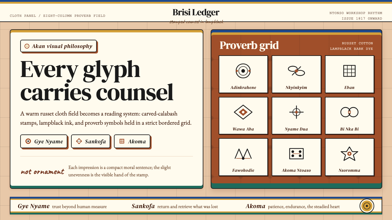 Akan Adinkra (Ghana)Proverbs become cloth. Russet grids, lampblack serif marks, and gold-edge ban…箴言化为布面:赭红网格、灯烟黑印纹与金边带盖出意义。
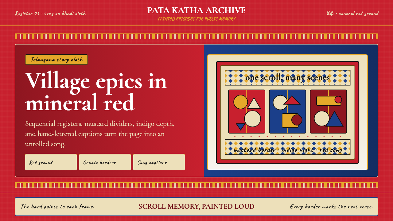 Andhra Cheriyal Scroll PaintingSaturated oral memory. Mineral red registers, mustard diamonds, and serif son…饱和的口述记忆:矿物红分格、芥末黄菱纹与衬线唱词。
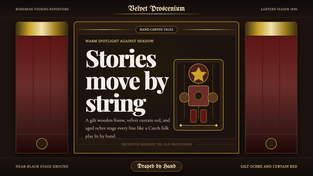 Marionette TheaterStorytelling feels hand-lit. Curtain red, gilt borders, and carved serif type…叙事如手工打光:剧幕红、鎏金边框与雕刻感衬线围成舞台。
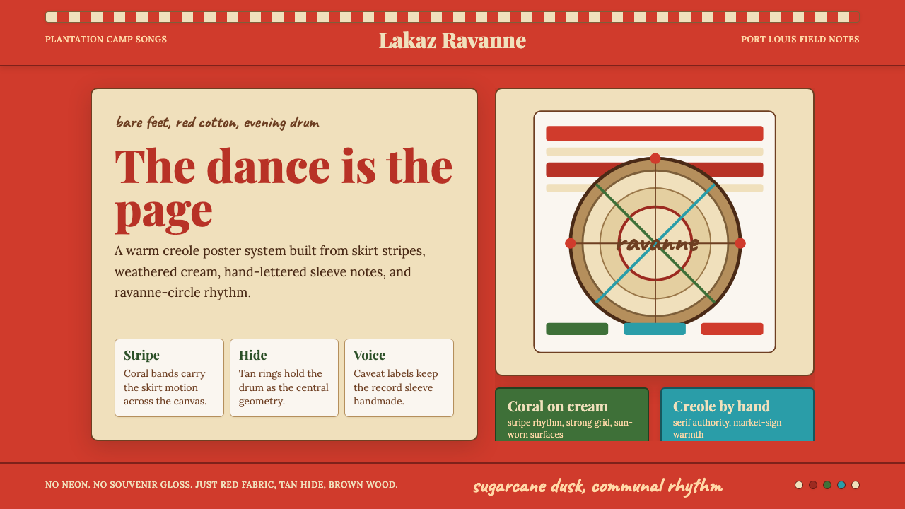 Mauritian Sega Creole (1810)Rhythm made visible. Coral stripes, cream sleeve type, and ravanne circles ca…节奏被看见:珊瑚红条纹、奶油唱片字与拉瓦纳鼓圆形。
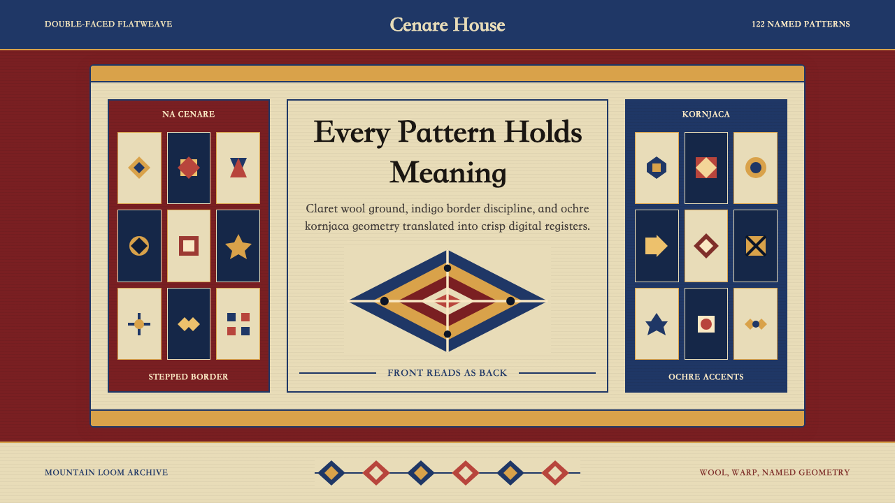 Serbian Pirot KilimWoven memory, sharply framed. Claret ground, indigo borders, ochre stepped di…织纹承载记忆。深酒红地、靛蓝边带与赭黄阶梯菱形。
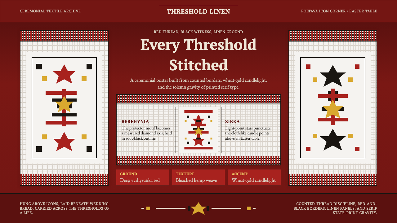 Ukrainian Rushnyk Ceremonial TowelCeremony stitched in red. Linen panels, soot-black crosses, and wheat-gold st…红线缝出仪式感:麻布面板、黑色十字与麦金星纹承载记忆。