What is Georgian Mkhedruli?
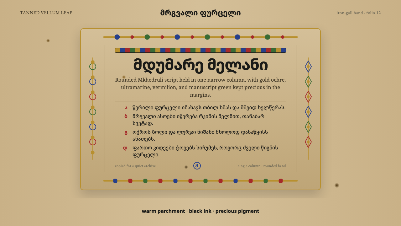
Mkhedruli is the rounded hand of medieval Georgian monks — a caseless alphabet written in iron-gall ink on tanned vellum, where letters flow like a single continuous gesture and color is reserved for the sacred.
Georgian Mkhedruli in brief
Mkhedruli is a design system built from the visual world of the medieval Georgian Gospel book: a page of tanned, darkened vellum carrying a single column of rounded, caseless letterforms, its margins wide enough to breathe, its color confined to the rare moment of illumination. Nothing in this system is printed in the modern sense — everything reads as if drawn by hand with a reed pen and a small brush, on a surface that has aged for centuries under candlelight and incense smoke.
The visual identity rests on three things working together: a warm, umber-toned ground that stands in for parchment; a script whose every letter is built from continuous curves rather than straight strokes or sharp joins; and a small, disciplined set of pigment colors — a gold-toned ochre, a deep blue, a red, and a muted green — that appear only where a scribe would have used them, in headpieces, initials, and interlace borders, never as a general decorative wash.
What makes it instantly recognizable is restraint paired with warmth. The page is not stark or clinical the way a modern minimalist system might be — it carries the visible history of the material itself, the faint unevenness of hand-applied ink, the soft darkening of aged animal skin. Yet it is also not cluttered: a manuscript page reserves its ornament for a few structural moments and lets a great deal of quiet, ochre-toned space carry the rest.
Where does Georgian Mkhedruli come from?
Mkhedruli is one of three historical scripts used to write the Georgian language, and by far the youngest and most rounded of the three. It descends from Asomtavruli, the oldest Georgian majuscule script attested from the fifth century, by way of Nuskhuri, a smaller, more angular ecclesiastical hand developed for faster copying of liturgical texts. Mkhedruli itself begins to appear in inscriptions and manuscripts from around the eleventh century, and by the late medieval period — the twelfth through fourteenth centuries — it had become the dominant hand for Georgian book production, prized for the qualities this system rebuilds: rounded, flowing letterforms a scribe could write quickly and legibly across a long page.
The script's development is inseparable from the monastic scriptoria of the Georgian Orthodox Church, for centuries the primary institution producing, copying, and illuminating books in the Georgian lands. Gospel manuscripts such as the Gelati Gospels and the Adishi Gospels — named for the monasteries and mountain villages that preserved them — are landmark survivals of this tradition, their pages built from tanned vellum, iron-gall ink, and pigments ground from minerals and gold leaf. These were not merely texts to be read; they were objects of devotion in themselves, and the labor of illumination — gilded headpieces, ornamental initials, interlaced borders drawn from grapevine and knotwork motifs — was an act of worship as much as a craft.
Georgia's position in the South Caucasus, at a crossroads between the Byzantine world, the Islamic Middle East, and the Eurasian steppe, shaped this manuscript tradition visibly. Georgian Orthodox Christianity absorbed Byzantine models of book illumination while developing its own letterforms, ornamental vocabulary, and monastic centers — including Georgian Athonite scribes working at monasteries on Mount Athos, who kept close ties between Georgian and broader Eastern Christian manuscript culture. The result reads as recognizably Caucasian Christian book art: related to Byzantine illumination in its use of gold and hierarchy of ornament, but built from a completely different, indigenous alphabet.
Mkhedruli went on to become, centuries later, the standard script of modern Georgian — the form still written and printed today — which gives this historical system an unusual continuity: the same rounded letterforms that filled a Gospel page in the twelfth century are, in essence, what a Georgian reads on a street sign now. Few historical manuscript hands have that kind of unbroken thread from monastery scriptorium to daily use.
What defines the Georgian Mkhedruli look?
Ground and Surface
The defining surface is a darkened, warm parchment tone — not the bright white of paper, but the deep, uneven umber a piece of tanned animal skin takes on after centuries of handling, candlelight, and incense smoke. This ground is never flat or perfectly uniform; it carries the suggestion of age, of a material that has a history independent of what is written on it. Every other visual choice in the system sits against this warm, low-contrast field.
Letterform
Mkhedruli letters are built almost entirely from continuous, rounded curves rather than straight strokes and sharp corners — the same rounded quality that made the script faster and more fluid to copy than its angular predecessor Nuskhuri. The alphabet is caseless: there is no distinction between capital and lowercase forms, so a heading is distinguished from body copy by scale and by the ornamental treatment around it, never by a separate alphabet of larger letters. Letters tend to hang from or sit astride a shared writing line in a way that keeps a long line of text feeling like one unbroken gesture.
Color
Color is drawn from a small, disciplined workshop palette: a gold-leaf ochre, a deep ultramarine-like blue, a vermilion red, and a muted manuscript green. These are mineral and gilded pigments, so every hue sits at the saturation a brush loaded with ground stone or metal leaf could actually reach — nothing glows, nothing is neon, and nothing behaves like a modern flat digital fill. Color is also functional rather than universal: it marks illumination, not the whole page. A headpiece or an initial letter might carry the full palette; the surrounding column of text stays close to ink-on-parchment.
Composition and Margin
A manuscript page is built around a single column of text set well inside generous margins — space that was never wasted in a medieval book, since vellum was costly, but was deliberately preserved as a frame that let the written column breathe and let a reader's eye rest before returning to the text. This system rebuilds that same proportion: a column of Georgian letterforms surrounded by a wide, quiet field of the aged parchment ground, so that the small illuminated moments read as genuinely rare rather than as one decorative element among many.
Ornament and Interlace
Where decoration appears, it takes the form of headpieces framing the opening of a text, enlarged and gilded initial letters, and interlace borders built from grapevine tendrils and knotwork — motifs shared broadly across Caucasian and Byzantine Christian book art. This ornament is concentrated, not distributed: it announces a beginning, a chapter break, or a moment of particular reverence, and then recedes, leaving the bulk of the page to plain, disciplined text. The interlace itself is drawn with the same continuous, curving logic as the letterforms, so ornament and script feel like they come from the same hand.
Materiality of the Mark
Every mark reads as the product of a real tool on a real surface: the slightly variable line weight of a reed or quill dipped in iron-gall ink, the small pooling where a scribe re-inked mid-line, the soft edge where pigment meets parchment rather than a crisp vector boundary. Nothing is perfectly regular. This materiality separates an authentic manuscript feel from a merely 'old-looking' filter — the irregularity has to feel like it came from a hand holding a tool, not a texture applied afterward.
Restraint and Reverence
Underlying every visual choice is a governing attitude: this is a devotional object, not a decorative one, and every element of the page — the ground, the script, the color, the ornament — is disciplined by that purpose. Color is rare because pigment was precious and because rarity itself signals reverence. Margins are generous because they frame the text as something worth pausing over. The system rewards a designer who treats every colored or gilded element as a considered exception, not a default.
Who shaped Georgian Mkhedruli?
One of the great illuminated Gospel manuscripts preserved in Georgia, associated with Gelati Monastery, a major center of medieval Georgian learning and book production. Its pages exemplify the full manuscript system this design draws from: darkened vellum, a disciplined column of Mkhedruli-descended script, and illumination concentrated in gilded headpieces and initials. Manuscripts like this were produced by monastic scriptoria where copying scripture was itself an act of devotion, not merely a technical task.
A landmark medieval Georgian Gospel manuscript named for the mountain village of Adishi in Svaneti, where it was preserved for centuries. Along with the Gelati Gospels, it represents the visual and material vocabulary this system rebuilds: iron-gall ink on tanned vellum, rounded caseless script, and a workshop palette of ochre, blue, red, and green reserved for illumination. Its survival in a remote mountain community speaks to how deeply manuscript culture penetrated Georgian religious and civic life beyond the major monastic centers.
The community of monks and copyists working at Gelati Monastery, one of medieval Georgia's principal centers of manuscript production and religious scholarship. Their disciplined, repeated practice of copying scripture by hand — letter by letter, in iron-gall ink on prepared vellum — is what standardized and refined Mkhedruli into the fluent, rounded book hand this system reconstructs. Their work was collective and largely anonymous, valued for faithful transmission of sacred text over individual authorship.
Georgian monks and copyists active at monasteries on Mount Athos, the autonomous monastic peninsula that was a crossroads of Eastern Christian manuscript culture. Their presence connected Georgian book production to the broader currents of Byzantine and Eastern Orthodox illumination while preserving distinctly Georgian letterforms and ornament, reinforcing the system's identity as Caucasian Christian book art rather than a regional variant of Byzantine style alone.
How do you use Georgian Mkhedruli today?
Mkhedruli is a style best applied where warmth, reverence, and a sense of crafted history are the goal — it rewards restraint far more than it rewards abundance, and it works best when a designer resists the temptation to fill the parchment ground with decoration.
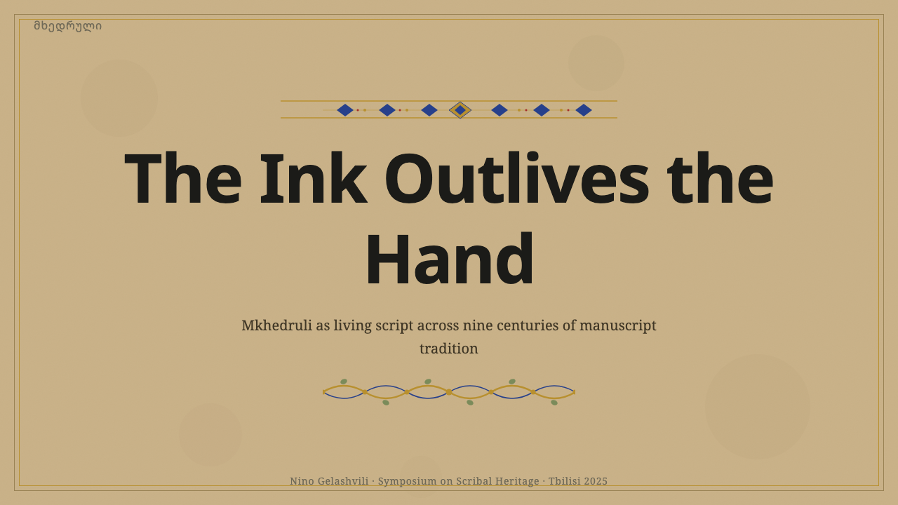
For presentation slides, the cover page should behave like the opening leaf of a Gospel book: a dark, warm parchment field, a single centered or asymmetrically placed illuminated mark or initial, and a title set in restrained, generous space rather than crowded against the edges. Content and data slides should mostly stay in ink-on-parchment mode — a quiet column of text against the warm ground — reserving the manuscript palette for a single accent per slide, such as a section marker or a small ornamental rule, rather than coloring charts or data points across the full palette.
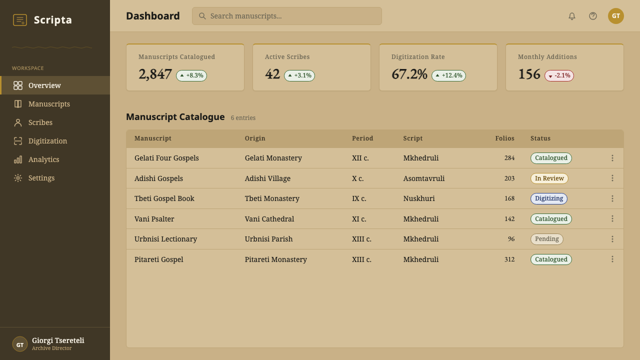
For web interfaces, the system translates well to dashboards and pricing pages that want to feel considered and premium rather than clinical: a warm, low-contrast parchment-toned background in place of stark white, ink-dark text, and the accent palette used sparingly for a single call-to-action button or a tier badge rather than across every interactive element. Pricing tiers can borrow the manuscript logic directly — the higher tier gets the illuminated treatment, a touch of gold-toned ochre, while lower tiers stay in plain ink-on-parchment, reinforcing hierarchy without loud visual signals.
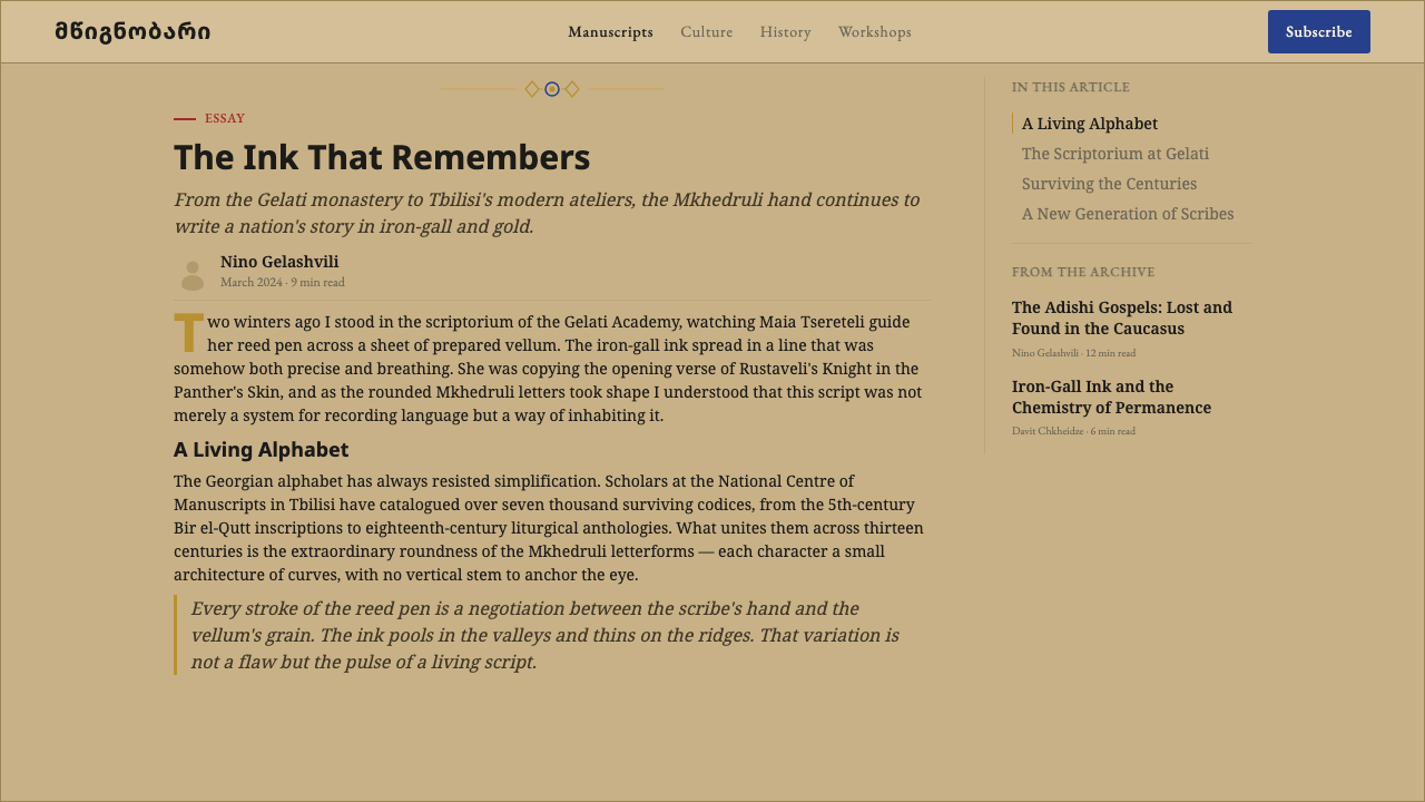
For editorial and marketing work, the style is suited to content about craft, heritage, history, or anything that benefits from a sense of considered permanence — a long-form article can use a narrow text column against the parchment ground with a single illuminated initial letter opening each major section, echoing how a scribe would mark a new chapter. Marketing pages benefit from treating the manuscript palette the way the original workshop did: one moment of gold and color per page, not a wash of ornament across every section.
The most common mistake is treating this as a generic 'old paper' or 'vintage' filter — applying a beige tint and a serif font and calling it done. That misses the actual discipline of the system, which is about where color and ornament are withheld as much as where they appear. A second common mistake is over-saturating the accent palette to modern digital brightness; the pigments this system draws from were mineral and hand-ground, and every color should look like it could plausibly have come from a brush, not a screen.
Georgian Mkhedruli — FAQ
Is Mkhedruli the same as the modern Georgian alphabet used today?
Yes, in essence. Mkhedruli is one of three historical Georgian scripts — after the older Asomtavruli and Nuskhuri — and it is the form that became, centuries after its emergence in medieval manuscripts, the standard alphabet of the modern Georgian language. This design system draws on its earlier, manuscript-era appearance: the rounded letterforms as they appeared on tanned vellum in Gospel books, rather than on a printed or digital page, which is why the visual emphasis falls on parchment, ink, and illumination rather than on contemporary typography.
Why is color used so sparingly in this style?
Because in the manuscript tradition this system rebuilds, color came from precious materials — ground minerals and gold leaf — applied by hand to a devotional object. Pigment was too costly and too labor-intensive to spread across an entire page, so scribes concentrated it in the moments that mattered most: an opening headpiece, an illuminated initial, an interlace border. Rarity was part of how color communicated reverence. Reproducing that discipline today means resisting the urge to color everything and instead choosing one deliberate moment per page or screen for the full palette to appear.
How does this style differ from a generic 'illuminated manuscript' or 'medieval' theme?
A generic medieval theme often borrows surface cues indiscriminately — gothic blackletter, Western European heraldry, or a vague 'parchment texture' filter — without grounding them in a specific tradition. This system is built specifically from Georgian Orthodox manuscript culture: a caseless, rounded script found nowhere else, a palette and ornamental vocabulary (grapevine interlace, gilded headpieces) tied to Caucasian and Byzantine Christian book art, and manuscripts like the Gelati and Adishi Gospels as concrete reference points. The result reads as a specific place and tradition, not a generic 'old book' aesthetic.
Can this style work on a light or white background instead of dark parchment?
The system's identity depends heavily on the darkened, aged parchment ground — it is what makes the gold and pigment accents feel like genuine illumination rather than ordinary color on a page. A lighter adaptation is possible for contexts that require higher contrast or brighter interfaces, but it should keep the warm, slightly uneven undertone of aged vellum rather than shifting to a stark, neutral white, and it should keep color just as rare. Losing the warmth of the ground tends to flatten the whole system into a plain serif-and-gold decoration rather than a manuscript.
What kinds of products or content does this style suit, and where does it struggle?
It suits content that benefits from a sense of heritage, craft, and considered permanence — cultural and heritage brands, publishing and editorial projects, premium or artisanal products, and anything positioning itself as thoughtful rather than fast-moving. It struggles in contexts that need to feel immediate, high-energy, or aggressively modern — a real-time trading dashboard or a youth-oriented entertainment app would fight against the style's quiet, devotional pacing. It can also read as inauthentic if applied without the underlying discipline of restraint, since its warmth depends entirely on knowing where not to add color or ornament.
Related design styles
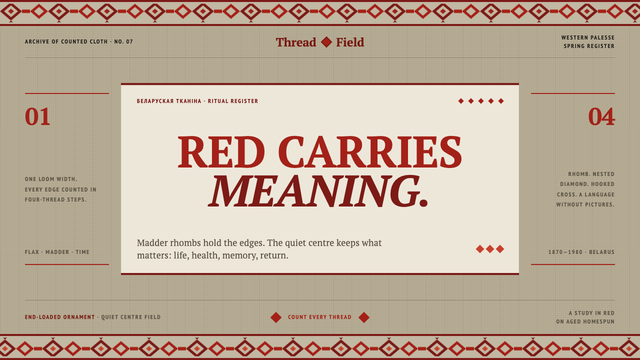 Belarusian RushnykRed carries meaning. Madder rhombs crowd aged flax edges while the woven cent…
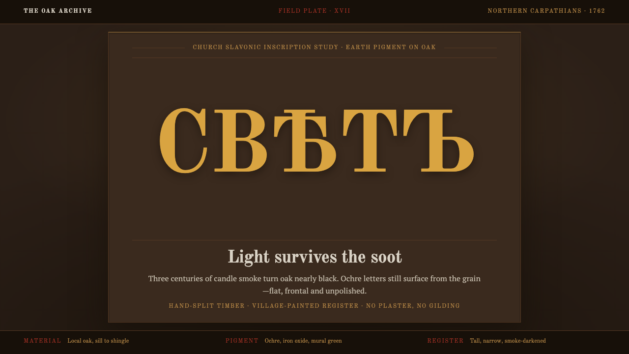 Maramureș Wooden ChurchLight survives the soot. Ochre type and earth-red geometry rise through smoke…
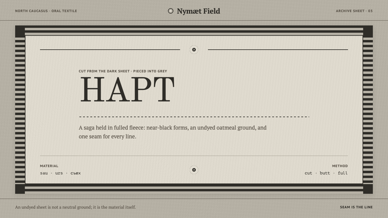 Ossetian Nart FeltThe seam is the line. Near-black cut forms sit on an undyed oatmeal field ins…
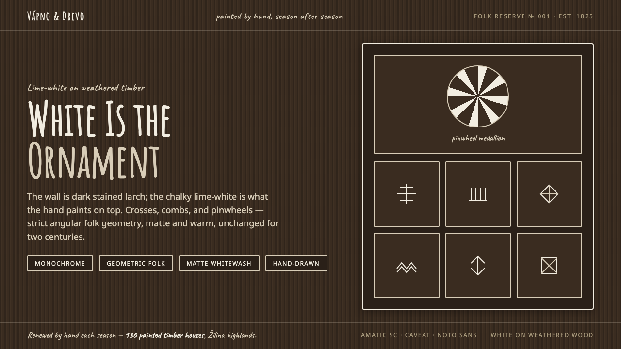 Čičmany Painted House OrnamentWhite is the ornament, not the page. Lime-white folk geometry on dark weather…
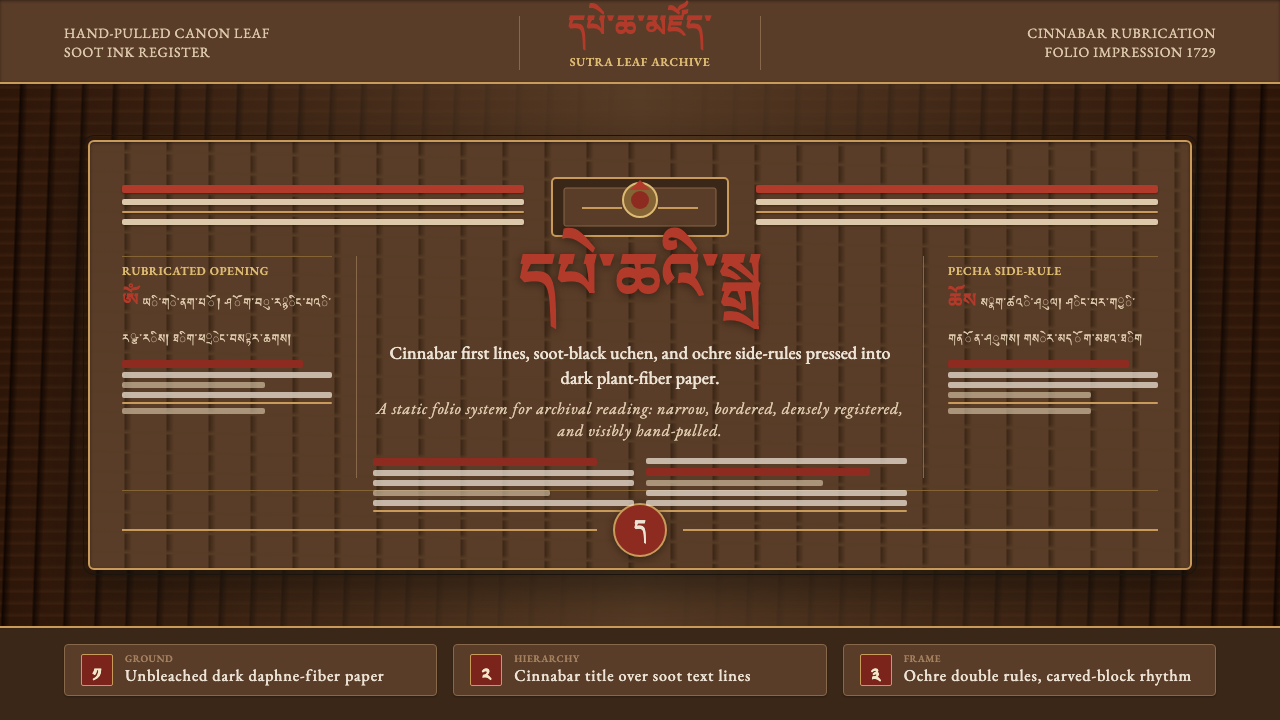 Derge Woodblock Sutra PrintHand-pulled scripture gravity. Cinnabar uchen and ochre rules press into dark…
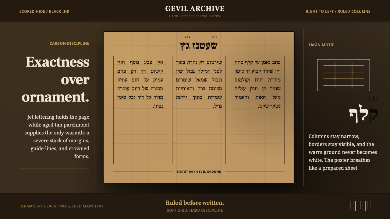 Hebrew STaM ScrollExactness over ornament. Jet ink, ruled Hebrew columns, and amber-tan parchme…