Design style guide设计风格指南
What is Tongan Ngatu (Tapa)?什么是 Tongan Ngatu (Tapa)?
Ngatu is Tonga's most sacred textile — monumental bark cloth stamped with ancestral geometry that turns every ceremony into a living archive of lineage and honour.恩加图是汤加最神圣的织物——用祖传几何图案拓印在树皮布上,让每一场仪式都成为血脉与荣誉的活态档案。
Tongan Ngatu (Tapa) in briefTongan Ngatu (Tapa) 速览
Ngatu is the monumental beaten-bark cloth of the Kingdom of Tonga, produced by women's collectives who pound paper mulberry bark into wide fibrous sheets and then stamp layered pigment over carved wooden stencil tablets called kupesi. The cloth can stretch thirty metres or more for royal ceremonies, and its length is not incidental — in Tongan culture, the longer the ngatu, the weightier the honour it bestows on the recipient.恩加图是汤加王国的大幅树皮布,由妇女集体将纸桑树皮捶打成宽幅纤维薄片,再以名为库佩西的木刻模板逐层拓印颜料而成。布料在皇室仪式中可延展至三十米以上,而这种长度绝非偶然——在汤加文化中,恩加图越长,赠予受礼者的荣耀便越厚重。
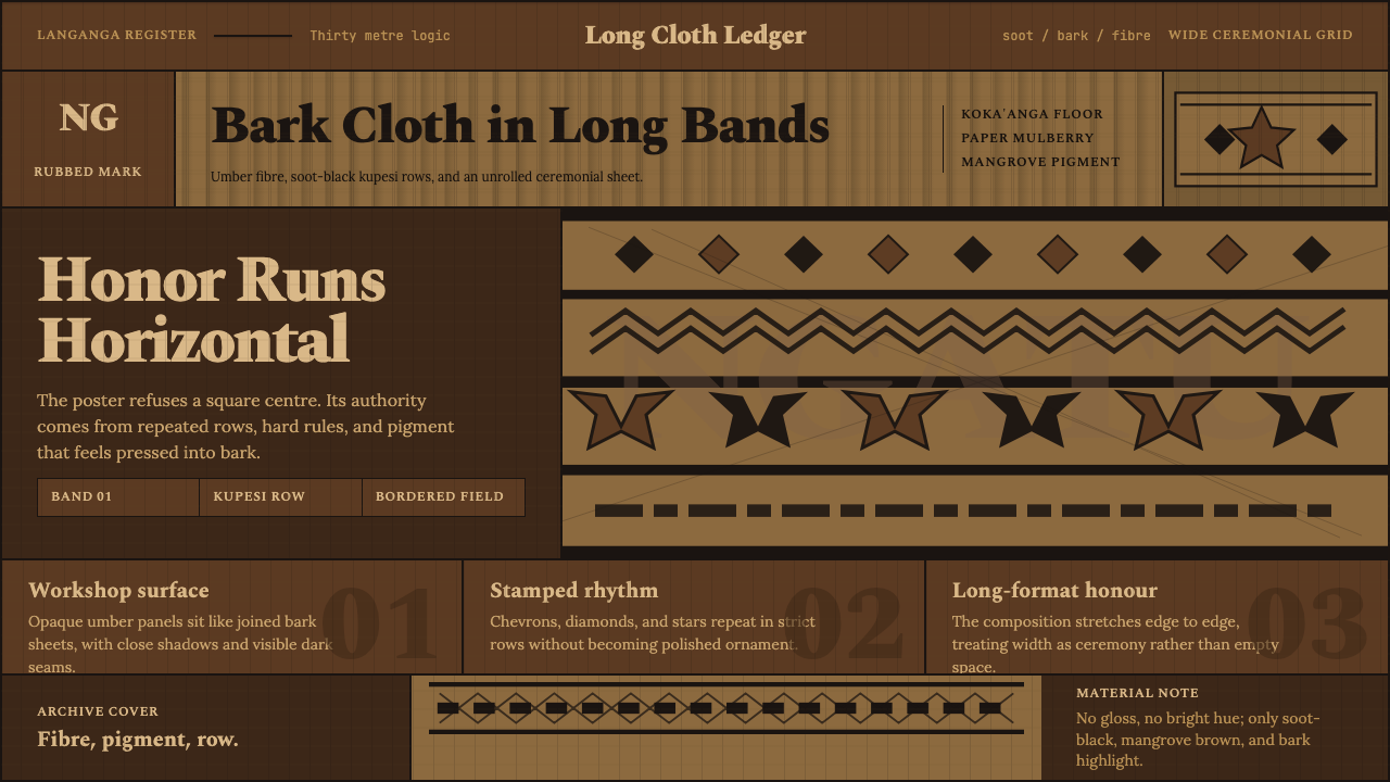
As a design language, ngatu channels the logic of the workshop floor: warm umber and sandy ground tones that recall unpigmented bark fibre, strict horizontal banding called langanga that structures the composition like a slow musical score, and motifs whose edges retain the gentle unevenness of a hand-rubbed transfer rather than resolving into the sharpness of machine-cut lines. The result is a visual system that feels simultaneously ancient and vivid — its geometric vocabulary is crisp in intent yet soft in execution.作为一套设计语言,恩加图将工坊地面的逻辑搬上画面:温暖的赭褐色与沙金色底调唤起未染色的树皮纤维质感,称为"朗安加"的严格水平条带如同一首舒缓的乐谱般构建起整体节奏,而图案的边缘保留着手工拓印特有的轻微不均匀感,从不锐利如机器切割的线条。这套视觉系统让人感到古老而又鲜活——几何词汇意图明确,执行却温润柔和。
The motifs themselves are a pictorial dictionary of Polynesian cosmology. Manulua birds in paired flight represent duality and safe passage. Tokelau feletoa eight-pointed stars mark celestial orientation. Fata chevrons signal woven matting and the structural roof beams of a fale house. Each motif carries relational meaning: who made the cloth, for whom, and on what occasion. Ngatu is never purely decorative — it is communicative in the deepest sense, a document of social bond rendered in pigment on fibre.图案本身是波利尼西亚宇宙观的象形词典。成对飞翔的双鸟纹"马努鲁阿"象征二元性与平安渡行;八角星纹"托克劳费莱托阿"标示天体方位;人字形椽纹"法塔"呼应编织席纹与传统法莱草屋的屋梁结构。每个图案都承载着关系性含义:谁制作了这块布、为谁而作、因何而作。恩加图从来不只是装饰,它在最深层的意义上是一种传达——用颜料与纤维写就的社会纽带文书。
See the Tongan Ngatu (Tapa) design system →查看 Tongan Ngatu (Tapa) 完整设计系统 →
Where does Tongan Ngatu (Tapa) come from?Tongan Ngatu (Tapa) 从何而来?
Tapa cloth production — known across the Pacific under different names, as kapa in Hawaiʻi, siapo in Samoa, and ngatu in Tonga — belongs to one of the oldest continuous textile traditions in the world. In Tonga, the practice is documented at least from the eighteenth century through European contact accounts, though oral tradition and archaeological evidence suggest the fundamentals stretch back many centuries further. The paper mulberry tree, Broussonetia papyrifera, was carried deliberately across the Pacific by Polynesian navigators as an essential cultural plant, ranking alongside breadfruit and coconut as a pillar of island economy.树皮布制作——在太平洋各地以不同名称流传,夏威夷称之为卡帕,萨摩亚称之为希亚波,汤加则称之为恩加图——属于世界上最古老的连续纺织传统之一。在汤加,这一实践至少从十八世纪起就有欧洲接触者的文字记录,而口述历史与考古证据表明,其基本形态可追溯至更早的数百年前。纸桑树(学名Broussonetia papyrifera)由波利尼西亚航海者作为重要文化植物有意携带穿越太平洋,与面包果树和椰子树并列,是岛屿经济的重要支柱。
The production of ngatu is governed by the institution of the koka'anga, a collective work session in which women of a household or community gather to beat, join, and decorate the bark sheets together. The koka'anga is not merely a practical arrangement for dividing labour — it is a social and spiritual act. Songs are sung, genealogies recited, and the knowledge of kupesi patterns transmitted from senior women to younger ones. Specific kupesi designs belong to particular families and islands; to know a pattern is to carry a lineage. Queen Salote Tupou III, who reigned from 1918 to 1965 and became internationally known after her dignified attendance at the 1953 coronation of Queen Elizabeth II, was herself a renowned ngatu maker and a dedicated patron of this tradition, actively commissioning large ngatu for state occasions and using the cloth as diplomatic gifts.恩加图的制作受"科卡安加"制度约束——这是一种集体劳作形式,由同一家族或社区的妇女聚集在一起,共同捶打、拼接和装饰树皮片。科卡安加不只是一种分工的实用安排,更是一种社会性和精神性行为:歌谣被传唱,族谱被诵读,库佩西图案的知识由年长女性传授给年轻一代。特定的库佩西设计属于特定的家族和岛屿;懂得一个图案,就是在守护一条血脉。萨洛特·图普三世女王(1918—1965年在位,因1953年优雅出席伊丽莎白二世加冕典礼而享誉国际)本人是一位著名的恩加图制作者,她积极委托大幅恩加图用于国事场合,并将这种布料作为外交礼物赠送,是这一传统最重要的庇护者之一。
The kupesi stencil tablets are carved from pandanus leaf or wood, with raised geometric designs that transfer pigment to the bark surface when rubbed. The pigment palette historically uses two key materials: koka, the reddish-brown dye derived from the bark of the Bischofia javanica tree, which produces the characteristic warm umber of finished ngatu, and tongo, a soot-black derived from mangrove bark charcoal, used for the darkest banding and the sharpest motif outlines. This two-tone palette — warm earth and deep black against the natural cream of unpigmented bark — is not a stylistic choice but a material consequence, and it carries forward into contemporary applications of the aesthetic.库佩西模板由露兜树叶或木材雕刻而成,带有凸起的几何图案,将颜料拓印到树皮表面。历史上的颜料色谱使用两种关键材料:科卡——从爪哇重阳木树皮提取的红棕色染料,产生成品恩加图特有的温暖赭褐色;通戈——从红树林木炭提取的烟灰黑,用于最深的色带和最清晰的图案轮廓。这种双色调色谱——温暖的赭土色与深邃的墨黑色,映衬着未染色树皮的天然奶油底——不是风格性的选择,而是材料的必然结果,并在这套美学的当代应用中得以延续。
In the twentieth and twenty-first centuries, Tongan ngatu practice has expanded with the diaspora. Large communities in Auckland, Sydney, and Salt Lake City have carried koka'anga traditions into new contexts, producing ngatu for weddings, funerals, graduations, and church anniversaries as well as for royal ceremonies in the islands. Contemporary artists and designers — including sculptor Filipe Tohi, who translates kupesi geometry into three-dimensional lattice structures, and the collective Pacific Sisters, which recontextualised Pacific textiles in fashion and performance — have brought the visual logic of ngatu into international gallery and design discourse. The movement known as fonua heritage practice frames ngatu making not as cultural preservation in a static sense, but as a living intellectual tradition that continues to generate new knowledge.二十和二十一世纪,汤加恩加图实践随着移民潮扩展到更广阔的世界。在奥克兰、悉尼和盐湖城的大型汤加社区,科卡安加传统被带入新的语境,恩加图被制作用于婚礼、葬礼、毕业典礼、教会周年庆典,也用于岛屿上的皇室仪式。当代艺术家和设计师——包括将库佩西几何转化为三维格架结构的雕塑家菲利普·托希,以及在时尚与表演中重新语境化太平洋纺织品的集体"太平洋姐妹"——已将恩加图的视觉逻辑带入国际画廊与设计话语。被称为"方努阿遗产实践"的运动将恩加图制作定义为一种活态知识传统,而非静态意义上的文化保存。
What defines the Tongan Ngatu (Tapa) look?Tongan Ngatu (Tapa) 的视觉特征是什么?
Ground Tone底色基调
The foundational colour of ngatu is the natural cream-to-warm-sand tone of unpigmented paper mulberry bark fibre — not white, not beige, but something between the two that retains a sense of organic warmth. Where pigment is applied, the warm umber of koka dye and the soot-black of tongo sit against this natural ground, never against a neutral or cool-toned background. The palette reads as rich and earthy rather than bright, its depth coming from the material itself rather than from added saturation.恩加图的基础色调是未染色纸桑树皮纤维的天然奶油至暖沙色——不是纯白,不是米黄,而是介于两者之间、保留着有机温度感的颜色。颜料被施加的地方,科卡染料的温暖赭褐色与通戈的烟灰黑落在这片天然底色之上,从不衬托在中性或冷色调背景之上。整体色调读来丰富而质朴,其深度来自材料本身,而非附加的饱和度。
Horizontal Banding水平条带
The langanga grid — alternating pigmented and unpigmented horizontal bands running the full width of the cloth — is the primary structural device in ngatu composition. These bands do not vary in width within a single cloth; their regularity is the point, creating a measured visual rhythm like lines on a manuscript page. Motifs live inside the pigmented bands; the unpigmented intervals serve as breathing room and as implicit borders. Everything runs long rather than tall, reinforcing the horizontal logic that pervades the tradition."朗安加"网格——贯穿布料全幅的涂色与未涂色水平条带交替排列——是恩加图构图中最主要的结构性装置。这些条带在同一块布中宽度不变,这种规律性正是其要义所在,制造出如同乐谱线条般有节奏感的视觉律动。图案居住在涂色条带内部,未涂色的间隔则充当呼吸空间与隐性边框。一切都横向延展而非纵向高耸,强化了这一传统中无处不在的水平逻辑。
Kupesi Motifs库佩西图案
The kupesi vocabulary is finite but combinatorially rich: manulua paired birds, tokelau feletoa eight-pointed stars, fata chevrons, tauvae interlocking borders, and looped vine patterns drawn from natural forms observed in the Tongan landscape. Each motif has fixed geometric proportions inherited from the carved stencil, but slight variations in rubbing pressure and pigment density give each impression a handmade signature that distinguishes ngatu from printed textile. The motifs never blend into one another — they are discrete units within a band, maintaining clean optical separation even as they repeat across the full cloth width.库佩西词汇是有限的,但组合方式极为丰富:双鸟纹马努鲁阿、八角星纹托克劳费莱托阿、椽形人字纹法塔、连锁边框纹陶瓦埃,以及取自汤加自然景观的藤蔓循环纹。每个图案都有继承自木刻模板的固定几何比例,但拓印压力和颜料密度的细微变化赋予每次印记独特的手工印记,使恩加图有别于印刷织物。图案之间彼此不融合——它们是条带内的离散单元,即使在整幅布料的宽度上重复出现,也保持清晰的视觉间隔。
Hand-Rubbed Edge Quality手工拓印的边缘质感
Perhaps the most distinctive feature of ngatu as a design language is the character of its edges. Because pigment is applied by rubbing a damp cloth over a raised kupesi stencil, the resulting transfer carries a soft halo — the interior of a motif is fully saturated, but its outer edges feather slightly where pressure was inconsistent. This is not imprecision to be corrected; it is a quality to be embraced. It signals authenticity, material engagement, and human presence. Contemporary applications that vector-trace these motifs into perfectly hard edges lose what is most essential about the aesthetic.也许恩加图作为设计语言最具辨识度的特征,是它边缘的品格。由于颜料是通过将湿布在凸起的库佩西模板上摩擦施加的,所得拓印带有轻微的晕边——图案内部色彩饱满,但外缘因压力不均而轻微羽化。这不是需要纠正的不精确;这是需要拥抱的品质。它传递着真实性、材料参与感和人的存在。将这些图案矢量化描摹成完美硬边的当代应用,恰恰失去了这套美学中最本质的东西。
Compositional Horizontality构图的横向性
Ngatu always runs long rather than square. Even in contemporary applications derived from this tradition, compositions feel most authentic when they favour landscape orientation, wide-format cropping, and page structures that breathe from left to right rather than top to bottom. This is not merely an aesthetic preference — it is embedded in the cultural logic of the cloth itself, where length signifies honour. A square or portrait-format application of ngatu geometry can feel truncated or compressed, as though something important has been cut away.恩加图永远横向延展而非方形居中。即便是当代从这一传统中衍生的应用,当构图偏向横幅方向、宽幅裁切、页面结构从左到右而非从上到下地呼吸时,感觉最为真实。这不只是审美偏好——它嵌入在布料本身的文化逻辑之中,布料的长度即荣耀的分量。将恩加图几何用于方形或纵向格式,可能令人感到截断或压缩,仿佛有什么重要的东西被切掉了。
Fibrous Surface Texture纤维表面质感
Authentic ngatu never reads as smooth. The beaten bark retains a subtle grain — sometimes almost like coarse watercolour paper, sometimes more like compressed grass — that gives pigmented areas a tactile visual weight. In digital or print applications, this quality is best evoked through textured grounds rather than flat fills, through slight tonal variation within a nominally uniform colour area, and through avoiding the hyper-smooth rendering that makes backgrounds feel like vinyl. The grain is the memory of process.真实的恩加图从不呈现光滑质感。被捶打的树皮保留着细微的纹路——有时近似粗粒水彩纸,有时更像压缩的草编——赋予涂色区域触感十足的视觉重量。在数字或印刷应用中,这种品质最好通过有纹理的底面而非平面填色来唤起,通过名义均匀色域内的细微色调变化来表达,并通过避免令背景如乙烯基般超光滑的渲染来维系。纹路是工艺过程的记忆。
Two-Tone Pigment Logic双色调颜料逻辑
Ngatu's working palette is fundamentally binary: the warm reddish-brown of koka-dyed areas and the deeper, near-black of tongo-charcoal bands. These two tones perform different roles — the brown suggests warmth, ancestry, and ground; the black conveys authority, outline, and formal structure. When a third colour is introduced in contemporary derivations, it must earn its place by performing a genuinely distinct communicative function, not simply for visual variety. The two-tone discipline is what keeps ngatu compositions from visual clutter despite the density of their motif work.恩加图的工作色谱从根本上是二元的:科卡染色区域的温暖红棕色,以及通戈木炭条带的更深沉的近黑色。这两种色调执行不同的角色——棕色传达温度、祖先与大地;黑色传递权威、轮廓与正式结构。在当代衍生应用中引入第三种颜色时,它必须以承担真正独特的传达功能来赢得自己的位置,而不仅仅是为了视觉多样性。正是这种双色调的自律,使恩加图构图在图案工作如此密集的情况下依然不显拥挤。
See the Tongan Ngatu (Tapa) design system →查看 Tongan Ngatu (Tapa) 完整设计系统 →
Who shaped Tongan Ngatu (Tapa)?谁塑造了 Tongan Ngatu (Tapa)?
Reigning from 1918 to 1965, Queen Salote was the most prominent cultural patron of ngatu making in the modern era. She personally produced ngatu, commissioned ceremonial cloths for state occasions, and gave ngatu as diplomatic gifts to foreign dignitaries. Her attendance at Queen Elizabeth II's 1953 coronation — where she rode in an open carriage in the rain without closing the roof, an act widely interpreted as a mark of deference and dignity — brought international attention to Tongan culture at a critical moment. Her active promotion of koka'anga as a living institution, rather than a museum artifact, helped ensure the practice continued through the twentieth century with full cultural seriousness.萨洛特·图普三世女王(1918—1965年在位)是现代最重要的恩加图文化庇护者。她亲自制作恩加图,为国事场合委托礼仪性布料,并将恩加图作为外交礼物赠予外国贵宾。她出席1953年伊丽莎白二世加冕典礼时——在雨中乘坐开篷马车而不合上车顶,这一举动被广泛解读为敬重与尊严的体现——在关键时刻将国际目光引向汤加文化。她积极推动科卡安加作为活态制度而非博物馆文物继续存在,帮助确保这一实践在整个二十世纪以完整的文化严肃性得以延续。
Tohi is a Tongan-born, New Zealand-based sculptor who has spent several decades translating the geometric vocabulary of kupesi patterns into large-scale three-dimensional lattice structures. Working primarily in stainless steel, timber, and concrete, he extracts the underlying mathematical logic of fata chevrons, tokelau stars, and interlocking border patterns and rebuilds them as spatial objects that can be walked around and through. His work demonstrates that the ngatu visual system is not a surface decoration but a structural language capable of generating form in any medium, and has been installed in public spaces across New Zealand, Australia, and the Pacific.菲利普·托希是出生于汤加、定居新西兰的雕塑家,数十年来一直致力于将库佩西图案的几何词汇转化为大型三维格架结构。他主要以不锈钢、木材和混凝土为媒介,提取法塔人字纹、托克劳星纹和连锁边框图案的底层数学逻辑,将其重建为可以环绕和穿行的空间对象。他的作品证明,恩加图视觉系统不是表面装饰,而是一套能在任何媒介中生成形态的结构性语言,已在新西兰、澳大利亚及太平洋地区的公共空间中落成安装。
Tu'imala Kaho is one of the most respected contemporary master weavers and ngatu makers in Tonga, widely recognised for her command of the full kupesi vocabulary and her role in transmitting koka'anga knowledge to younger generations. Her work has been collected by institutions including Te Papa Tongarewa in New Zealand and has been exhibited internationally as an example of living Pacific textile knowledge. She represents the practitioner tradition that is the backbone of ngatu continuity: not artists reinterpreting the form from outside, but practitioners working within it who carry the social and technical knowledge forward intact.图依玛拉·卡霍是汤加最受尊敬的当代织造与恩加图制作大师之一,以其对库佩西词汇的全面掌握以及向年轻一代传授科卡安加知识的重要角色而广受认可。她的作品被新西兰国家博物馆等机构收藏,并作为太平洋活态纺织知识的例证在国际上展出。她代表着实践者传统——恩加图延续的根基:不是从外部重新诠释这一形式的艺术家,而是在其内部工作、将社会与技术知识原封不动地传递下去的实践者。
Pacific Sisters is an Auckland-based art and fashion collective founded in the 1990s, bringing together Māori and Pacific women — including members with Tongan heritage — who recontextualised traditional Pacific textile practices including ngatu within contemporary fashion performance and visual art. Their work placed tapa-derived aesthetics on the runway, in gallery installations, and in music video contexts, demonstrating that the visual logic of ngatu was not archival material but a living design vocabulary capable of speaking to contemporary urban identity. They are among the earliest and most influential figures to bridge Pacific textile traditions and global design discourse."太平洋姐妹"是1990年代在奥克兰成立的艺术与时尚集体,汇聚了毛利和太平洋岛国女性——包括汤加裔成员——将包括恩加图在内的传统太平洋纺织实践重新语境化于当代时尚表演和视觉艺术之中。她们的工作将树皮布衍生美学带上了天桥秀台、画廊装置和音乐录影带,证明恩加图的视觉逻辑不是档案材料,而是一套能够言说当代都市身份的活态设计词汇。她们是最早、也是最具影响力的桥接太平洋纺织传统与全球设计话语的人物之一。
How do you use Tongan Ngatu (Tapa) today?今天怎么用 Tongan Ngatu (Tapa)?
Ngatu design language is not simply a pattern library — it is a compositional system with a clear internal logic. Applying it well means understanding that logic and working with it rather than sampling motifs for their exotic visual appeal. The horizontal band structure, the two-tone palette, the textured ground, and the hand-rubbed motif quality form a system in which each element reinforces the others. Lifting one element (say, the star motifs) and dropping it onto an unrelated layout produces decoration, not design.恩加图设计语言不只是图案库,而是一套具有清晰内在逻辑的构图系统。善用它意味着理解这套逻辑并与之协同工作,而非因异域视觉吸引力而采样图案。水平条带结构、双色调色谱、有质感的底面以及手工拓印的图案品质,构成一个各要素相互强化的系统。单独提取一个要素(比如星纹)并将其植入毫无关联的版面,产生的是装饰,而非设计。
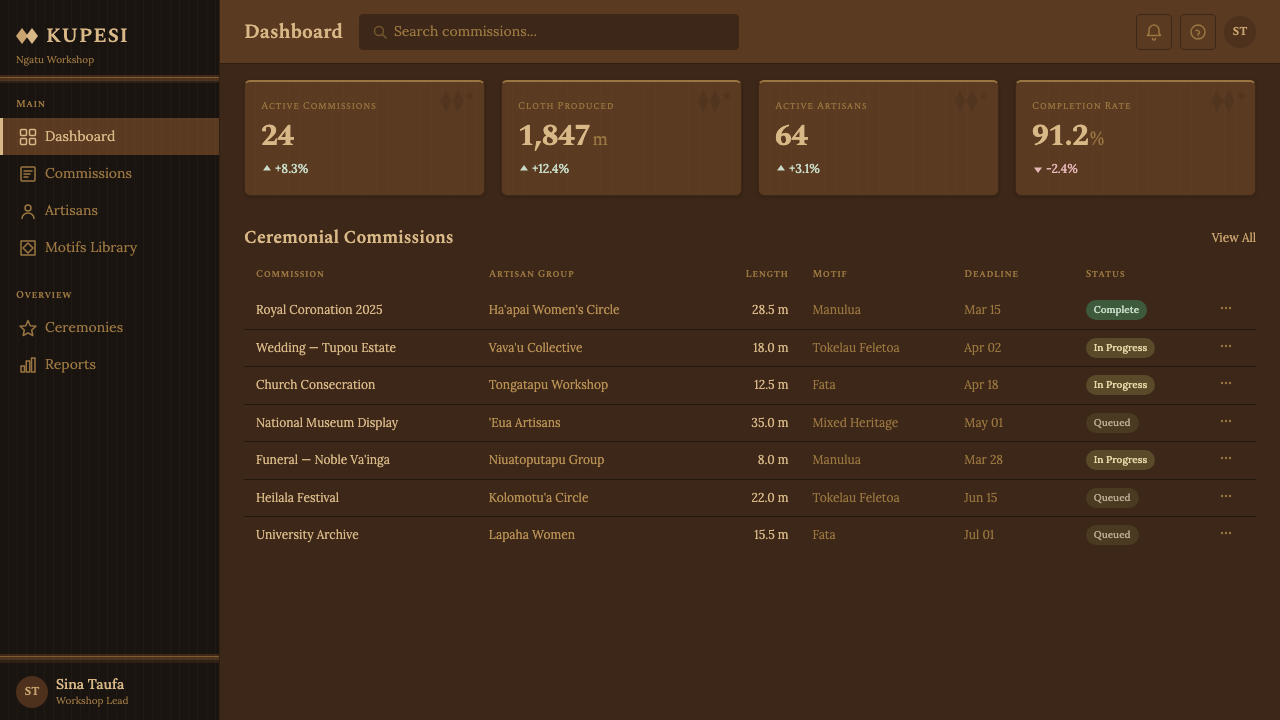
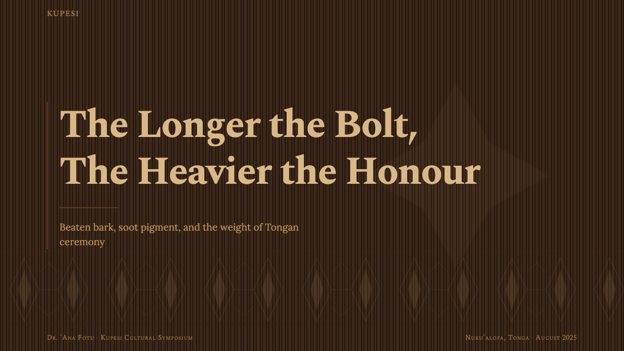
For presentation slides, ngatu works particularly well on cover and section divider pages where visual weight and cultural resonance are the goal. A wide-format cover composition with the langanga band structure running full bleed across the slide — alternating warm umber zones with the natural cream of the ground — creates immediate compositional authority. The title sits in the unpigmented zone against the light ground, with the primary motifs filling the pigmented band behind it. Content slides should restrain the motif work to header or footer bands only, keeping the central content area clear. Data slides can use the two-tone palette logically: the warm umber for primary data series, the deeper tone for reference or comparative lines.对于演示文稿,恩加图在封面与分节页上尤为有效,因为这些场合追求的正是视觉分量与文化共鸣。横幅格式的封面构图将朗安加条带结构横贯整张幻灯片出血——暖赭色区域与天然底色的奶油色交替——制造出立竿见影的构图权威感。标题落在浅色底面的未涂色区域,主要图案填满身后的涂色条带。内容页应将图案工作收敛于页眉或页脚条带,保持中央内容区域清晰。数据页可以合理运用双色调色谱:温暖赭褐色用于主要数据系列,更深的色调用于参考线或对比线。
For web and interface design, the ngatu system lends itself to contexts where heritage, craft, and Pacific cultural identity are values the product wishes to claim. Dashboard components can use the langanga banding as a sectional structure — full-width horizontal dividers in the warm earthy tone that separate functional zones. Navigation bars, section headers, and card headers all become opportunities to invoke the horizontal band logic at smaller scale. Card components work well with a textured background that subtly evokes bark grain rather than a flat fill; shadows, where used, should be warm in tone rather than cool grey.对于网页与界面设计,恩加图系统适合那些产品希望彰显传统、手工艺与太平洋文化身份价值的语境。仪表板组件可以将朗安加条带作为分区结构——用暖土色全宽水平分隔线划分功能区域。导航栏、分区标题和卡片头部都成为在较小尺度上调用水平条带逻辑的机会。卡片组件搭配微妙唤起树皮纹路的有纹理背景效果更佳,而非平面填色;投影(若使用)在色调上应是温暖的,而非冷灰色。
For editorial design and marketing materials, the ngatu aesthetic supports both bold cover moments and sustained reading layouts. A magazine spread or marketing poster can place the full langanga band composition as a full-bleed background, with text sitting over the lighter unpigmented zones. Body text layouts benefit from generous horizontal margins that echo the generous edge-to-edge breath of the cloth itself. The style works particularly well for brands connected to Pacific culture, heritage tourism, cultural institutions, and organisations whose work involves community, collective practice, or intergenerational knowledge.对于编辑设计和营销材料,恩加图美学既支持大胆的封面时刻,也支持持续的阅读版面。杂志跨页或营销海报可将完整的朗安加条带构图铺满出血背景,文本落在较浅的未涂色区域之上。正文排版受益于宽裕的水平边距,呼应布料本身从边到边的慷慨呼吸感。这种风格对与太平洋文化、遗产旅游、文化机构相关的品牌,以及那些工作涉及社区、集体实践或代际知识传承的组织尤为有效。
A common mistake is to apply the motifs as isolated decorative elements without embedding them in the banding structure that gives them meaning. Floating a manulua bird or a tokelau star in a corner of an otherwise unrelated layout borrows the symbol but abandons the system. Similarly, rendering the motifs with perfectly smooth, hard-edged vector precision removes the hand-rubbed quality that is fundamental to the aesthetic. The best applications of ngatu geometry retain some sense of fibrous ground, warmth in the palette, and slight softness at motif edges — signal qualities that speak to the cloth's material origins even when the medium is entirely digital.一个常见错误是将图案作为孤立的装饰元素使用,而不将其嵌入赋予其意义的条带结构之中。将一只马努鲁阿双鸟或一颗托克劳星孤立地浮在其他版面的角落,借用了符号却抛弃了系统。同样,以完美光滑的硬边矢量精度渲染图案,会消除手工拓印品质——而这正是这套美学的根本所在。对恩加图几何最好的应用,保留了某种纤维底面的质感感、色谱中的温度,以及图案边缘的轻微柔和——这些信号性品质即使在媒介完全数字化时,也能传达出布料的材料起源。
See the Tongan Ngatu (Tapa) design system →查看 Tongan Ngatu (Tapa) 完整设计系统 →
Tongan Ngatu (Tapa) — FAQTongan Ngatu (Tapa) · 常见问题
Is ngatu the same as tapa cloth?恩加图和树皮布是同一回事吗?
Tapa is the English umbrella term for beaten-bark cloth found across the Pacific — it derives from a Tongan word but is used generically to describe similar textiles in Tonga, Samoa, Hawaiʻi, Fiji, and beyond. Ngatu is the Tongan-specific term for this cloth and refers to Tongan production methods, motifs, and ceremonial protocols. So all ngatu is tapa, but not all tapa is ngatu. The design language documented here is specifically Tongan: the kupesi stencil tradition, the langanga grid, the koka and tongo pigment system, and the koka'anga collective production institution are features of Tongan practice that differ meaningfully from, say, Samoan siapo or Hawaiian kapa, which have their own distinct visual vocabularies and production traditions.树皮布(tapa)是太平洋各地树皮捶打布料的英语总称——这个词源自汤加语,但被泛指汤加、萨摩亚、夏威夷、斐济等地的同类纺织品。恩加图是汤加对这种布料的专属称谓,特指汤加的生产工艺、图案和仪式规程。因此,所有恩加图都是树皮布,但并非所有树皮布都是恩加图。本文记录的设计语言特指汤加传统:库佩西模板传统、朗安加网格、科卡与通戈颜料系统,以及科卡安加集体制作制度,这些都是汤加实践的特征,与萨摩亚希亚波或夏威夷卡帕有着有意义的区别——后两者拥有各自独特的视觉词汇和生产传统。
Can ngatu motifs be used individually, without the banding structure?库佩西图案可以脱离条带结构单独使用吗?
Technically yes, but with significant loss of meaning and visual integrity. The kupesi motifs developed specifically to function within the langanga band system — their repetitive regularity and internal geometry make sense as part of a larger horizontal sequence. Used in isolation, they read more like decorative stamps than as elements of a system. If individual motifs must be used — for an icon, a logo mark, or a small accent — the tokelau feletoa star tends to isolate most legibly, as it has strong geometric coherence as a single unit. The manulua paired bird also works as a standalone emblem. Whatever is chosen, the motif should retain some sense of the textured ground it normally inhabits, rather than sitting on a perfectly smooth or white background, to preserve at least some connection to the material logic of the tradition.技术上可以,但视觉完整性和意义的损失相当显著。库佩西图案是专门在朗安加条带系统中发挥作用而发展出来的——其重复的规律性和内在几何在更大的水平序列中才有意义。单独使用时,它们读来更像装饰性印章,而非系统中的元素。如果必须单独使用图案——用于图标、徽标或小型点缀——托克劳费莱托阿星纹作为单一单元时通常是最易辨认的,因为它拥有强烈的几何凝聚性。双鸟纹马努鲁阿作为独立徽章也有一定效果。无论选择哪个,图案都应保留某种通常所处的有纹理底面感,而不是落在完美光滑或纯白的背景上,以至少维系与这一传统材料逻辑的某种联系。
How does ngatu differ from other Pacific textile design languages?恩加图与其他太平洋纺织设计语言有何不同?
The most immediate differences are structural. Tongan ngatu is distinctively horizontal in its compositional logic, with the langanga banding system running the full length of what can be an extremely long cloth. Fijian masi, by contrast, tends toward more varied geometric compositions that are less strictly banded. Samoan siapo uses different pigment sources and a somewhat different motif vocabulary, with more emphasis on the geometric precision of the elei stencil and a slightly cooler, greyer palette from different plant-derived pigments. Hawaiian kapa is characterised by finely textured watermark-like patterns achieved through differential beating rather than applied pigment, giving it a subtler, more monochromatic quality. Each tradition reflects its own island ecology, available plant materials, and social context. The Tongan system is perhaps the most architecturally ordered of these, with its strict grid and clear compositional hierarchy.最直接的差异是结构性的。汤加恩加图的构图逻辑具有显著的水平性,朗安加条带系统贯穿整块布料的全长——而这块布可以非常之长。相比之下,斐济马西倾向于更多样化的几何构图,条带化程度较低。萨摩亚希亚波使用不同的颜料来源和略有差异的图案词汇,更强调埃莱模板的几何精确度,并因不同植物颜料而呈现略显清冷、偏灰的色调。夏威夷卡帕的特征是通过不均匀捶打而非施加颜料形成的精细纹理水印状图案,赋予其更低调、更近单色的品质。每种传统都映照着其所在岛屿的生态系统、可用植物材料和社会语境。汤加体系也许是其中最具建筑秩序感的,拥有严格的网格和清晰的构图层级。
Is it appropriate for non-Tongan designers to use ngatu aesthetics?非汤加设计师使用恩加图美学是否合适?
This question does not have a single universal answer, but several principles help navigate it responsibly. The most important is context and intent: using ngatu-derived aesthetics for a project that has a genuine connection to Tongan or broader Pacific culture — a community institution, a cultural event, a product by a Pacific-owned business — is very different from using them purely for their visual exoticism in an unrelated commercial context. Engagement with the tradition's meaning, history, and social context matters; using the motifs as understood symbols rather than anonymous patterns shifts the relationship from extraction to citation. Collaborating with Tongan artists or community members is not a bureaucratic requirement but a practical way to ensure the work is grounded in genuine understanding. Where specific family-owned kupesi designs are used, their particular provenance should be acknowledged.这个问题没有统一的普适答案,但有几条原则有助于以负责任的方式驾驭它。最重要的是语境和意图:将恩加图衍生美学用于与汤加或更广泛太平洋文化有真实联系的项目——社区机构、文化活动、太平洋原住民所有的企业产品——与仅仅因其视觉异域感而在毫不相关的商业语境中使用,是截然不同的。与传统的意义、历史和社会语境保持真正的接触至关重要;将图案作为已理解的符号而非匿名花样来使用,将关系从提取转变为引用。与汤加艺术家或社区成员合作不是一种行政要求,而是确保作品根植于真正理解的实际途径。在使用特定家族所有的库佩西设计时,应当承认其特定来源。
How does ngatu design handle colour outside the traditional two-tone palette?恩加图设计如何处理传统双色调色谱之外的颜色?
Contemporary ngatu practitioners and artists have introduced additional colours — ochre yellows, muted greens, terracotta reds — particularly in work designed for gallery contexts or international exhibition. These extensions are not illegitimate, but they require care to avoid disrupting the tonal logic that makes the traditional palette work. The fundamental principle is that any additional colour should still feel warm, earthen, and materially credible — as though it could plausibly have come from a plant or mineral pigment rather than from a synthetic dye chart. Cool tones (blues, cool greys, violets) sit uneasily in the ngatu system because they have no material precedent in the tradition's pigment history. If a project requires cooler tones for practical reasons — brand alignment, accessibility contrast — they work better as very small accents rather than as grounds or banding colours.当代恩加图实践者和艺术家引入了更多颜色——赭黄色、哑光绿、赤陶红——尤其是在为画廊语境或国际展览设计的作品中。这些延伸并非不合法,但需要谨慎,以免破坏赋予传统色谱生命力的色调逻辑。基本原则是:任何额外的颜色都应仍然感觉温暖、质朴、材料上可信——仿佛它可能合理地来自某种植物或矿物颜料,而非合成染料色卡。冷色调(蓝色、冷灰色、紫色)在恩加图系统中显得格格不入,因为它们在这一传统的颜料历史中没有材料先例。如果项目因实际原因(品牌对齐、无障碍对比度)需要冷色调,将其用作极小面积的点缀,而非底色或条带色彩,会更为妥当。
Related design styles相关设计风格
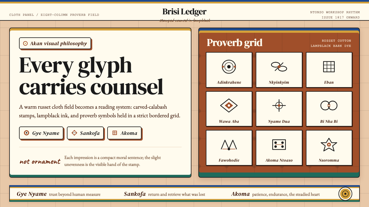 Akan Adinkra (Ghana)Proverbs become cloth. Russet grids, lampblack serif marks, and gold-edge ban…箴言化为布面:赭红网格、灯烟黑印纹与金边带盖出意义。
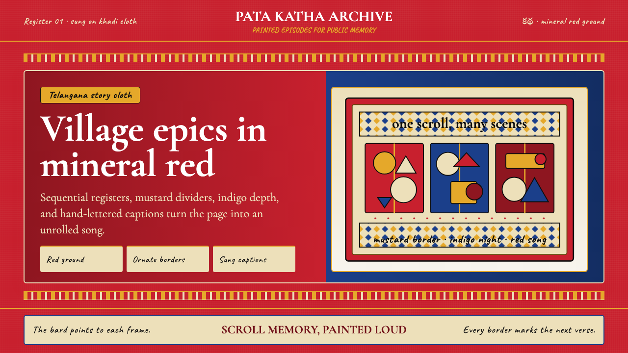 Andhra Cheriyal Scroll PaintingSaturated oral memory. Mineral red registers, mustard diamonds, and serif son…饱和的口述记忆:矿物红分格、芥末黄菱纹与衬线唱词。
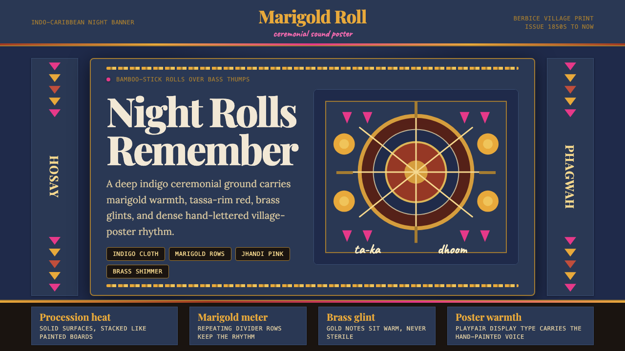 Guyanese Tassa DrumCeremony carries the beat. Indigo banners, Playfair type, and marigold rows g…仪式感击出鼓点:靛蓝旗面、Playfair 标题与万寿菊分隔线发光。
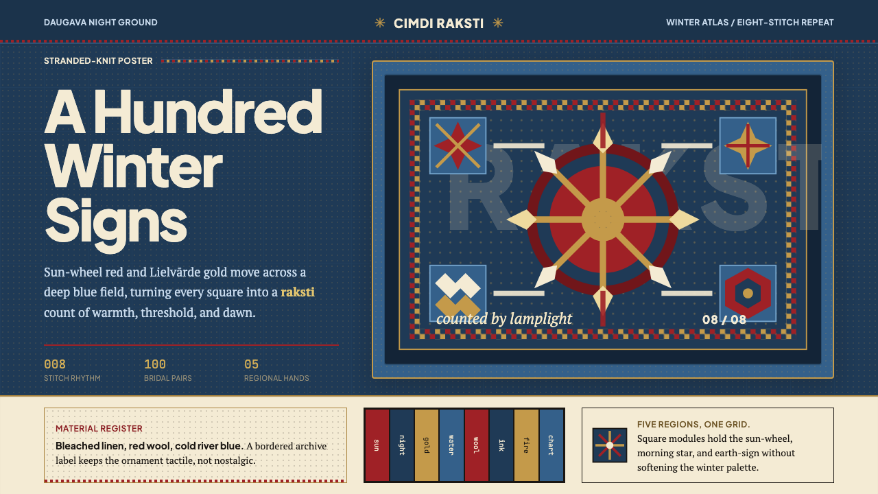 Latvian Knitted MittensWinter craft glows. Sun-wheel red and Lielvarde gold lock into an 8-stitch bl…冬夜手作发光。太阳红与利耶尔瓦尔德金锁进八针蓝格。
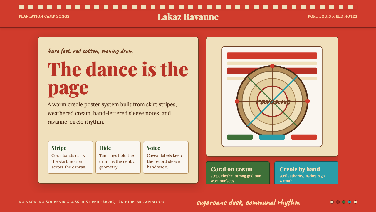 Mauritian Sega Creole (1810)Rhythm made visible. Coral stripes, cream sleeve type, and ravanne circles ca…节奏被看见:珊瑚红条纹、奶油唱片字与拉瓦纳鼓圆形。
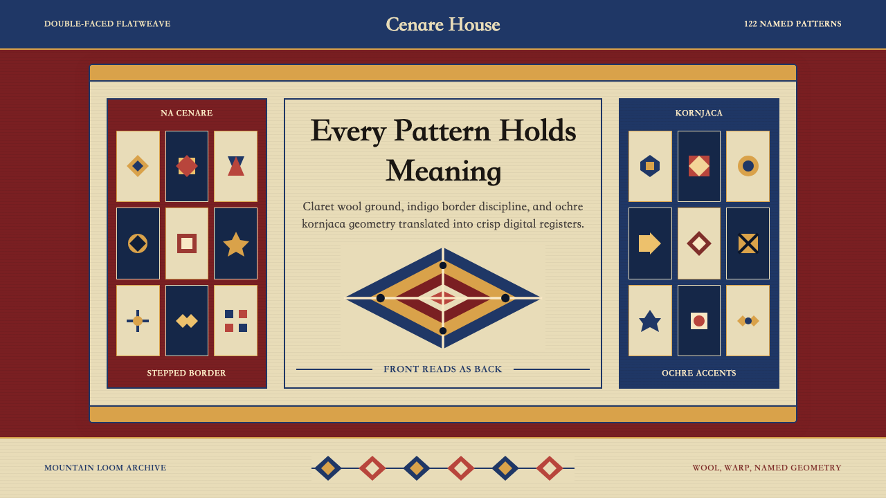 Serbian Pirot KilimWoven memory, sharply framed. Claret ground, indigo borders, ochre stepped di…织纹承载记忆。深酒红地、靛蓝边带与赭黄阶梯菱形。