What is Hebrew STaM Scroll?
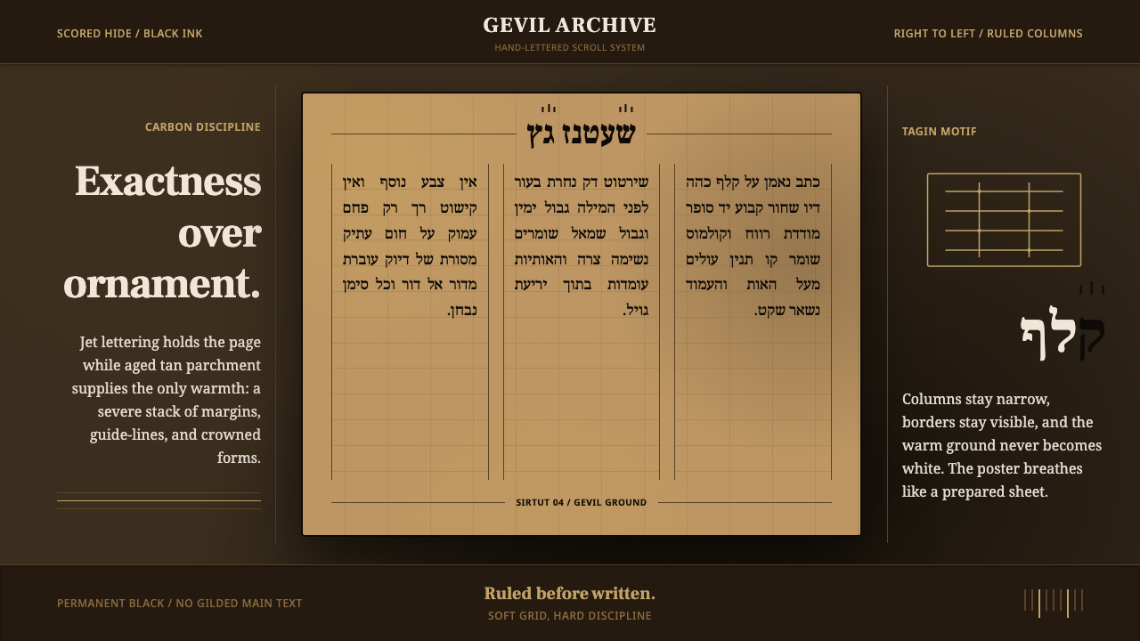
STaM is not a style invented for a page — it is the living hand of the sofer, a scribal discipline where every stroke of jet-black ink on tan parchment is governed by law, not taste.
Hebrew STaM Scroll in brief
STaM is an acronym built from three Hebrew words — Sefer Torah, Tefillin, Mezuzah — the three categories of sacred text a trained ritual scribe is licensed to produce. Unlike a design movement that emerged from a school, a manifesto, or a commercial studio, STaM is a craft transmitted scribe to scribe, generation to generation, under religious law that specifies not just what the letters say but exactly how they must be formed, spaced, and inked. The visual result is one of the most disciplined letterforms in continuous use anywhere in the world: dense, upright, right-to-left columns of Hebrew script, hand-lettered with a quill onto full animal-hide parchment.
The aesthetic is built entirely from constraint. Ink must be permanent and the deepest possible black — halacha treats faded or brown-toned ink as invalidating the text, so jet carbon-black is not a stylistic preference but a legal requirement. The parchment beneath it is never bleached or whitened; it stays the warm tan-brown of cured animal skin, aged further by time. Between the two there is no ornament, no illustration, no color accent — only the calculated tension of pure black ink against warm, imperfect ground.
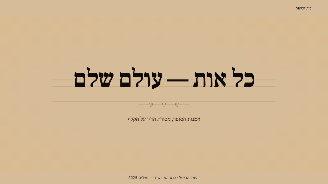
What makes STaM instantly recognizable, even to someone who cannot read Hebrew, is its ruled exactness. Faint guide-lines called sirtut are scored directly into the parchment before a single letter is written, and the scribe's columns sit inside them with almost mechanical evenness — right-hand margins as disciplined as the left, letter spacing consistent across an entire page written over weeks or months. Seven specific letters carry a further mark of craft: tagin, tiny three-stroke crown-like flourishes rising off the top of the letterform, the one permitted decorative flourish in an otherwise ornament-free system.
Where does Hebrew STaM Scroll come from?
STaM has no founding date and no single point of origin in the way a modern design movement does — its roots trace back to antiquity, to the earliest era of Hebrew scriptural transmission, and its practice has continued essentially without interruption since. The word 'gevil,' the specific full-hide parchment prescribed for Torah scrolls, points to a preservation method already old by the time it was codified: the whole thickness of an animal skin, split and cured, rather than the thinner split-layer parchment used for less sacred documents. The system that governs STaM today is best understood not as a style that was designed, but as a set of laws that happened to produce a style — durability and legibility across centuries mattering more than any single scribe's expressive hand.
The scribal tradition owes its remarkable consistency to the Masoretes, the scholarly custodians who, especially between the seventh and tenth centuries, worked to fix and preserve the exact text, spelling, and reading tradition of Hebrew scripture. Their painstaking cross-referencing of manuscripts — tracking every letter, every spacing convention, every marginal note — is why a Torah scroll written today follows conventions traceable across an unbroken chain of copying rather than drifting the way most hand-copied traditions do. The Masoretic project was, in effect, an early and extraordinarily rigorous form of standards enforcement: a Hebrew scroll from one continent had to match one from another, letter for letter.
Alongside the Masoretes, generations of halachic codifiers — rabbinic authorities who set down Jewish religious law in writing — formalized exactly what made a STaM document kosher, or ritually fit for use. These codes specify letterform construction stroke by stroke, mandate the sirtut ruling lines, dictate which seven letters must carry tagin crowns, and set exacting standards for the ink's permanence and blackness and for the parchment's preparation. A single disqualifying error — a malformed letter, a smudge, a break in a line that should be continuous — can render an entire scroll unfit, which is why the discipline of the sofer is inseparable from the discipline of a proofreader and legal scholar at once.
The sofer, the ritual scribe, remains the living center of this practice today, largely unchanged in method from centuries past: quill in hand, ink freshly prepared, parchment stretched and ruled, working through Torah scrolls, tefillin, and mezuzot with the same patient, letter-by-letter attention the Masoretes' standards demand. It is one of the very few visual traditions in the world where the 'movement' is not a period that closed but a craft still actively practiced, in the same materials and by the same rules, wherever Jewish communities exist across the diaspora.
What defines the Hebrew STaM Scroll look?
Ink
The ink is jet, carbon black, and permanent by requirement rather than choice — halacha invalidates text that has faded toward brown or gray, so the scribe's ink must hold its density indefinitely. There is no washed or aged-black option here; the black is meant to look, centuries later, exactly as absolute as the day it was written. This is the single non-negotiable anchor of the whole system: everything else in the palette exists only to set that black off.
Ground
The parchment is gevil, full-hide and never bleached — its color is the warm tan-brown that cured animal skin naturally takes on, deepened further with age. Where a modern minimalist system might reach for a bright white ground to maximize contrast, STaM deliberately keeps its ground warm and slightly uneven, because the material is a living hide rather than a manufactured sheet. The contrast against the ink is still stark, but it is a contrast between two natural materials, not between ink and an artificially whitened field.
Column Discipline
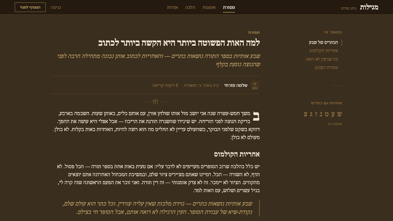
Text runs in tight right-to-left columns, each one measured and ruled before writing begins. Sirtut lines — scored faintly into the parchment itself, not drawn in ink — set both the baseline for each row and the vertical boundary for each column, so that margins on both sides read as deliberately even rather than approximately even. Because a single scroll may be written across weeks or months, this ruled structure is what keeps letter height, spacing, and column width consistent from the first line to the last.
Tagin Crowns
Seven specific Hebrew letters carry tagin — small three-stroke, crown-like flourishes rising from the top of the letterform. This is the one point in the entire system where anything resembling decoration is not only permitted but mandated, and even here the flourish is rule-bound: the same seven letters, the same three strokes, every time, by every scribe, on every scroll. It functions less like ornament in the design sense and more like a fixed diacritical mark — a flourish with the freedom of a flourish removed.
Letterform Construction
Each Hebrew letter must be formed through a specified stroke order and shape, with malformed letters capable of disqualifying an entire scroll from ritual use. This produces letterforms that are upright, dense, and evenly weighted — no calligraphic flourish connecting one letter to the next, no variation in stroke width for expressive effect. The visual rhythm comes from repetition of near-identical letterforms marching in a fixed grid, not from variation between them.
Absence of Ornament
Outside the tagin crowns, there is no illustration, no border, no marginal decoration, and no color beyond the ink and the ground. This is not a minimalist aesthetic choice in the contemporary sense — it is the residue of a system whose entire purpose is textual transmission with zero tolerance for anything that could be mistaken for, or distract from, the sacred content. The resulting page reads as severe and exact rather than sparse in a fashionable sense.
Material Presence
Because the ground is a real cured hide rather than manufactured paper, the parchment carries subtle natural variation — faint grain, slight tonal shifts across a sheet, an irregular edge where the skin itself ended. A design system drawing on STaM should treat this material presence as essential, not as a flaw to be smoothed away: the imperfection of the ground is precisely what makes the exactness of the ink and the ruling read as an achievement rather than a default.

Who shaped Hebrew STaM Scroll?
The sofer is not a single historical figure but a continuously renewed role: a trained scribe certified to hand-letter Torah scrolls, tefillin, and mezuzot according to halachic law. Training is apprenticeship-based and can take years, covering not only letterform construction but the full body of law governing kosher status — how to prepare a quill, mix ink, rule parchment, and recognize a disqualifying error. The sofer is simultaneously artisan, legal scholar, and proofreader, and remains the only figure legally permitted to produce these texts today, exactly as in antiquity.
Active especially between the seventh and tenth centuries, the Masoretes were the scholarly guardians of the exact Hebrew text — its spelling, its pronunciation tradition, its precise transmission from copy to copy. Their meticulous cross-checking across manuscripts is the reason a Torah scroll written today still matches, letter for letter, one written in a different community centuries ago. Without their standard-setting labor, the visual consistency that defines STaM as a system — rather than a loose family of regional hand-copying styles — would not exist.
Generations of rabbinic legal authorities set down, in written halachic codes, the exact specifications that make a STaM document ritually fit: stroke-by-stroke letterform rules, the requirement for sirtut ruling lines, the designation of which seven letters must carry tagin, and the standards for ink permanence and parchment preparation. Their codification is what turns individual scribal habit into an enforceable, transmissible system — the reason STaM looks essentially the same wherever in the world it is practiced.
How do you use Hebrew STaM Scroll today?
STaM's aesthetic transfers best where the goal is to signal permanence, authority, and exactness rather than warmth or approachability — its entire visual logic is built from constraint, not from an attempt to please the eye, and design work that borrows it should preserve that severity rather than soften it into generic 'parchment texture' decoration.
For presentation covers, the style rewards restraint: a cover treated as a single dense block of dark ink-toned type or rule-work set against a warm, unbleached-parchment ground, with no accent color and no illustrative imagery, communicates gravity immediately. Content and data slides should lean on the column discipline — strict, evenly ruled vertical structure, consistent line spacing across every slide in a deck the way sirtut keeps a scroll consistent across months of writing. Data is best shown as exact figures set in disciplined rows rather than as decorative charts; the tradition's entire visual power comes from precision, not from graphic flourish.
In web UI, dashboards and pricing pages can borrow the same logic: a warm, slightly warm-toned neutral ground standing in for parchment, near-black text carrying all the weight, ruled dividers between rows and sections doing the work that sirtut does on a scroll, and zero decorative color — reserve any accent, if used at all, for a single, rare marking equivalent to a tagin crown, appearing only on the one or two elements that most need distinguishing, such as a plan currently active or a status that requires attention.
For editorial and marketing work, the style suits long-form, text-forward layouts where the argument is that something has stood the test of exactness over time — heritage brands, archives, legal or scholarly publishing, typography-led editorial. A page can use a narrow, evenly ruled text column against a warm ground, letting line rhythm and margin discipline carry the authority rather than photography or color blocking. The tone should read as exact and considered, never as decoratively 'ancient' or aged-for-effect.
The most common mistake is treating STaM as a texture — slapping a parchment-brown background and a serif font behind ordinary content and calling it done. The style's actual power is structural: the ruled, even columns; the single uncompromising ink color; the near-total absence of ornament outside one small, rule-bound flourish. Borrowing the texture without the discipline produces something that looks vaguely old rather than something that reads as exact, and exactness — not age — is the entire point of this tradition.
Hebrew STaM Scroll — FAQ
What does the acronym STaM actually stand for?
STaM combines the first letters of three Hebrew categories of sacred text: Sefer Torah (the Torah scroll), Tefillin (the phylacteries worn during prayer, each containing tiny handwritten scrolls), and Mezuzah (the parchment scroll affixed to a doorpost). All three are written by the same class of trained ritual scribe, under the same body of law governing letterform, ink, and parchment — which is why they are grouped together as a single scribal discipline rather than three unrelated crafts.
Why is the ink required to be so completely black, with no variation allowed?
Halacha treats the permanence and depth of the ink as part of what makes a scroll ritually valid — text that has faded toward brown or gray over time can render a scroll unfit for use, so scribes traditionally prepare ink formulated to hold jet-black density indefinitely. This is a legal and functional requirement rather than an aesthetic one, but it produces a visual signature that is instantly recognizable: none of the softened, sepia-toned 'aged ink' look common in decorative historical pastiche. Authentic STaM black is meant to look as absolute centuries from now as it does today.
What are tagin, and why are they the only decorative element allowed?
Tagin are small three-stroke, crown-like flourishes that rise from the top of seven specific Hebrew letters, mandated by halachic law rather than left to a scribe's discretion. They are the sole point in the entire STaM system where anything resembling ornament is not just tolerated but required — and even there, the flourish itself is fixed: the same letters, the same three strokes, in every scroll by every scribe. Everywhere else, the system enforces total absence of decoration, which is why tagin read less like artistic embellishment and more like a formal, rule-bound mark woven into the letterform itself.
Is STaM the same thing as generic Hebrew calligraphy or 'ancient scroll' decoration?
No, and the distinction matters. Decorative Hebrew calligraphy and staged 'ancient scroll' imagery are free to vary stroke width for expressive effect, add illustration or border ornament, and use whatever ground tone looks visually pleasing. STaM permits none of this: letterform construction is legally fixed, the ground is unbleached full-hide parchment rather than any warm-toned paper, ornament is absent outside the seven tagin letters, and every visual choice traces back to a specific requirement in halachic law rather than an artistic decision. Applying STaM authentically means respecting that it is a rule-governed craft, not a decorative motif to be freely restyled.
Does STaM's aesthetic work for secular or commercial design projects?
It can, but it calls for particular care given the material's sacred origin. The style works best as a source of structural discipline — ruled column exactness, a single uncompromising ink tone, near-total restraint on ornament — applied to contexts where permanence and precision are the desired message: archival platforms, legal or scholarly publishing, heritage branding, typography-led editorial. It is poorly suited to contexts needing warmth, playfulness, or cultural imagery unrelated to its origin, and designers should avoid literal religious symbols or text when the intent is purely aesthetic, keeping the borrowing at the level of structural principle rather than sacred content.
Related design styles
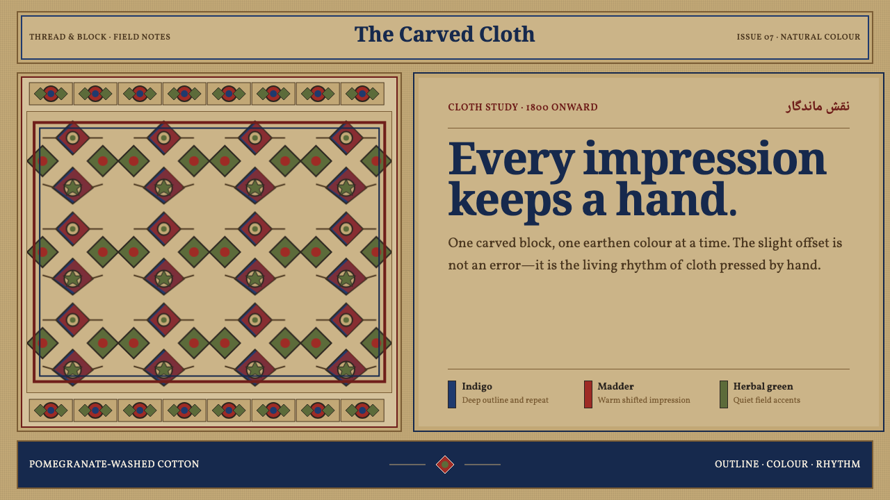 Isfahan Qalamkar PrintEvery impression keeps a hand. Indigo and madder repeats shift softly across…
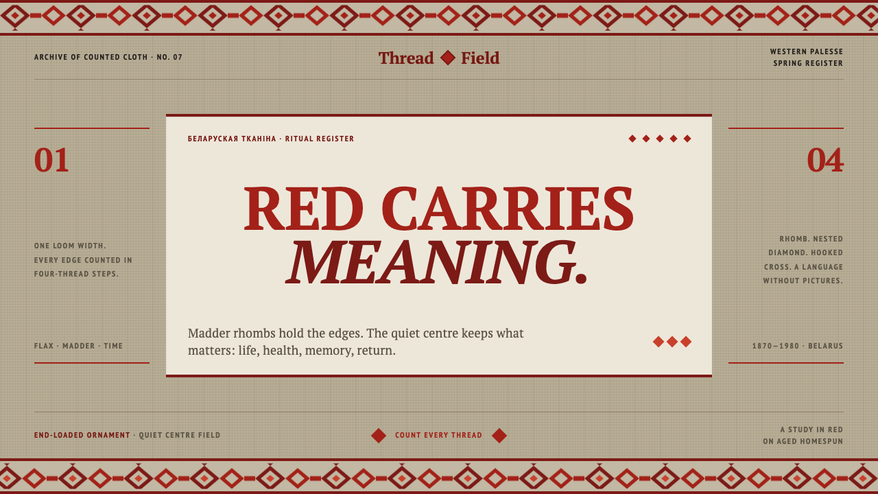 Belarusian RushnykRed carries meaning. Madder rhombs crowd aged flax edges while the woven cent…
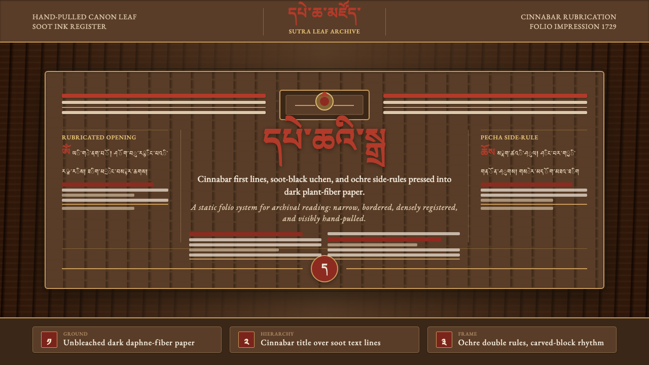 Derge Woodblock Sutra PrintHand-pulled scripture gravity. Cinnabar uchen and ochre rules press into dark…
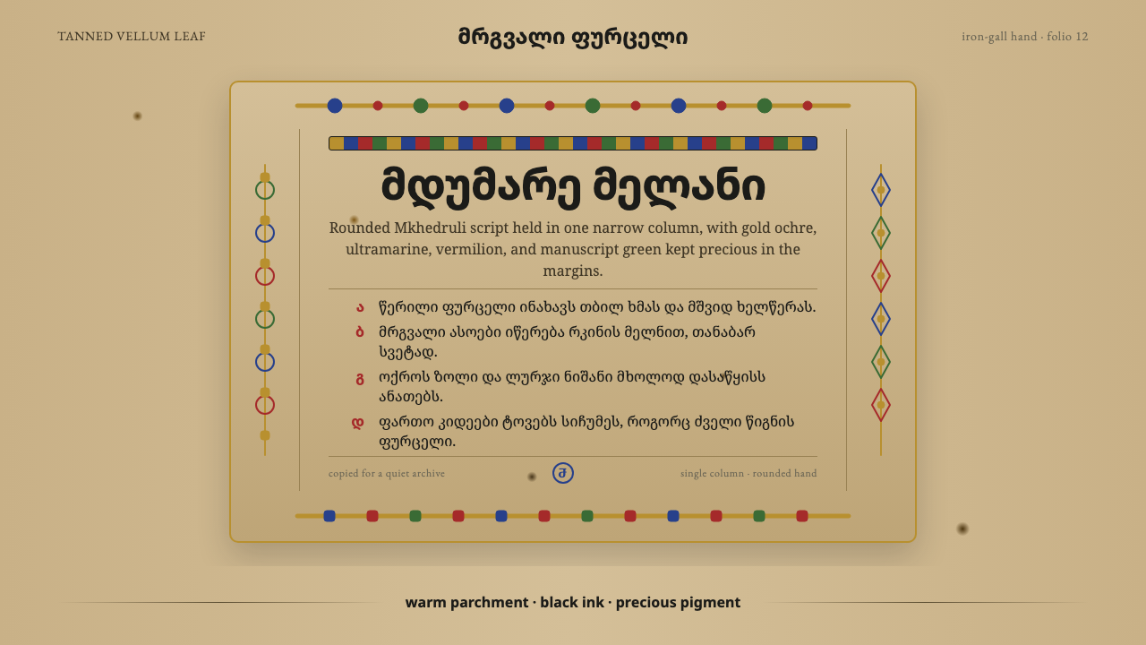 Georgian MkhedruliA manuscript breathes slowly. Tanned vellum, round Mkhedruli ink, ochre and u…
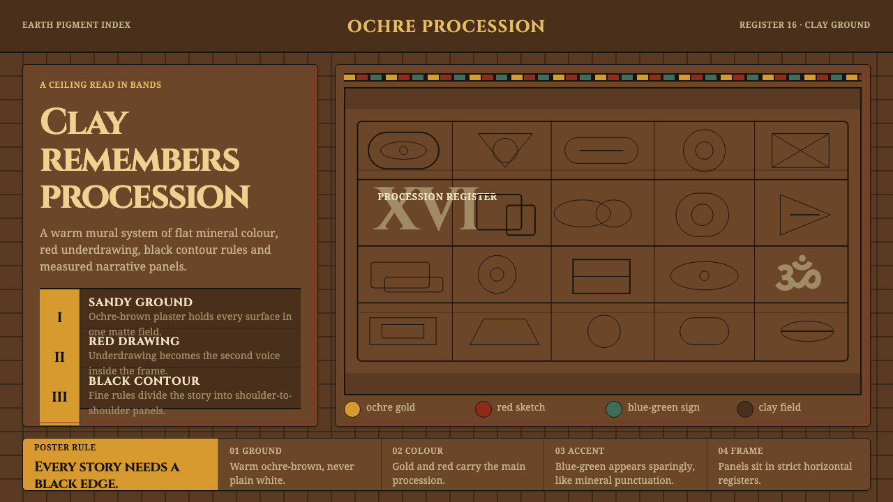 Lepakshi Vijayanagara CeilingEarth remembers in registers. Ochre gold, red underdrawing and black rules ma…
 Maramureș Wooden ChurchLight survives the soot. Ochre type and earth-red geometry rise through smoke…