What is Lithuanian Amber (Baltic Pagan)?
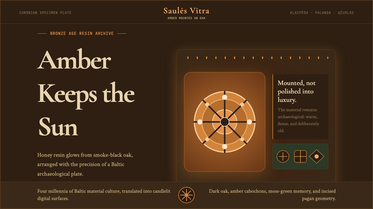
From the world's oldest amber coast, Lithuanian design crystallizes four thousand years of Baltic pagan ritual into a visual language of honey resin, smoke-blackened oak, and sacred sun geometry.
Lithuanian Amber (Baltic Pagan) in brief
Lithuanian Amber is a design system rooted in the material culture and cosmology of the Baltic Balts — the last pagan civilization in Europe, whose formal conversion to Christianity came only in 1387, centuries after neighboring peoples. The visual language draws its palette from fossilized amber ranging across the full spectrum of resin tones, from pale straw to deep cognac to almost-black root amber, layered against surfaces that evoke smoke-cured wood and rough-hewn stone. The result is a design register that feels simultaneously ancient and precise, earthy and luminous.
At the center of the system sits the saulė — the Lithuanian sun — rendered as an eight-radial wheel whose geometry appears on Bronze Age amber pendants, medieval floor tiles, and nineteenth-century folk-textile borders alike. This solar motif is not merely decorative; in Baltic cosmology the sun goddess Saulė presided over fate, weaving, and the care of souls, and her wheel emblem carried the weight of an entire theological worldview. When the Lithuanian national revival of the nineteenth century sought visual symbols to unify a dispersed rural people, the saulė wheel became one of its most resonant emblems.
The system also draws on the sacred serpent tradition. The žaltys — a harmless grass snake — was kept in many Lithuanian farmhouses as a protective household spirit, and serpent motifs wind through folk woodcarving, amber jewelry, and woven sashes. Paired with the sun wheel and the deep forest palette of the Curonian Spit, these symbols constitute a coherent pagan visual grammar that this design system makes accessible for contemporary application.
Where does Lithuanian Amber (Baltic Pagan) come from?
The Baltic amber coast — stretching from the Curonian Spit across what is now the Kaliningrad region and into Lithuania's Palanga district — has been a source of traded amber since the Neolithic period. Amber artifacts have been found in Egyptian tombs, Mycenaean shaft graves, and across the Roman Empire, all originating from the shores now associated with Lithuania. The ancient Greeks called amber elektron and believed it to be solidified sunlight or the tears of Phaethon's sisters — a mythological identification that resonated with Baltic peoples, who independently read the sun's energy into the material. By the Bronze Age, Baltic amber-carvers were producing sun-cross pendants and serpent amulets of considerable formal sophistication, establishing an iconographic vocabulary that would remain continuous across four millennia.
The Baltic tribes — Lithuanians, Latvians, and the now-extinct Old Prussians — resisted Christianization far longer than any other European people. The Teutonic Knights spent two centuries attempting to conquer and convert the region, but Lithuania proper maintained its pagan religious tradition until the political conversion of Grand Duke Jogaila in 1387 — and rural folk practice continued far beyond that date in disguised or syncretic form. This exceptional longevity meant that Baltic visual culture developed its own deep grammar of sacred symbol relatively undisturbed: the saulė sun wheel, the moon goddess Meness, the thunder god Perkūnas's oak staff, the fate-goddess Laima's weaving patterns. These are not borrowed or imported motifs but autochthonous Baltic inventions with unbroken lineages.
The nineteenth-century Lithuanian national revival — operating under Russian imperial rule, which banned Lithuanian-language printing from 1864 to 1904 — transformed this folk material into national cultural capital. Jonas Basanavičius, a physician and ethnographer who became the movement's symbolic patriarch, organized the collection of oral folklore, folk songs (dainos), and material artifacts that became the foundation of Lithuanian national identity. The visual corollary was a renewed interest in folk woodcarving, weaving patterns, and amber craft: the Palanga amber masters became cultural heroes, and the cross-stitch and weaving patterns of rural women were studied and codified as national design heritage.
Mikalojus Konstantinas Čiurlionis — painter, composer, and symbolist visionary — synthesized this heritage into a self-conscious high art between roughly 1905 and his death in 1911. His large-scale paintings blend Baltic pagan cosmology with the visual vocabulary of European symbolism: deep forest greens and amber golds, cosmic cycles depicted as interlocking geometric forms, serpentine motifs that glide between the earthly and the spiritual. Čiurlionis created what amounts to a visual theology of Baltic paganism, and his paintings — which he gave musical titles like Sonata of the Sea and Rex — established the authoritative visual register that this design system extends. The anthropologist Marija Gimbutas, whose excavations of Old European and Baltic archaeological sites from the 1950s onward uncovered extensive evidence of pre-Christian goddess iconography, provided the scholarly framework that gave this visual tradition renewed intellectual authority in the late twentieth century.
What defines the Lithuanian Amber (Baltic Pagan) look?
Amber Palette
The defining palette runs through the full spectrum of natural amber: pale straw and candlelight at one end, through warm honey and cognac midtones, to root amber so dark it approaches brown-black at the other. These resinous warm tones sit against smoke-darkened grounds — charred oak, slate grey, deep earth — that evoke the forest floor and the smokehouse rather than the bright gallery. The interplay of luminous amber warmth against dense dark ground is the system's most distinctive visual signature, creating a sense of something precious and ancient caught in preserved light.
Solar Wheel Geometry
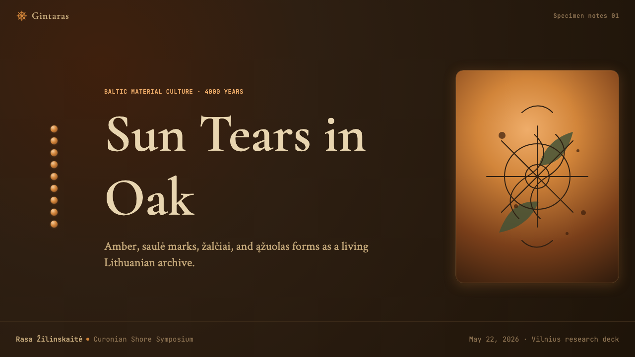
The saulė eight-radial sun wheel is the master motif — a circle divided by eight evenly spaced radiating lines, sometimes simplified to a cross within a circle, sometimes elaborated with curved spurs that suggest rotation. This form appears at all scales: as an architectural organizing grid, as an ornamental border repeat, as a single medallion element, or as a micro-detail in corner treatments. Its strength is that it reads simultaneously as cosmic symbol, decorative device, and structural diagram. The wheel's geometry is strict but its visual weight varies considerably — from bold black on amber to a delicate incised line on dark ground.
Serpent Ornament
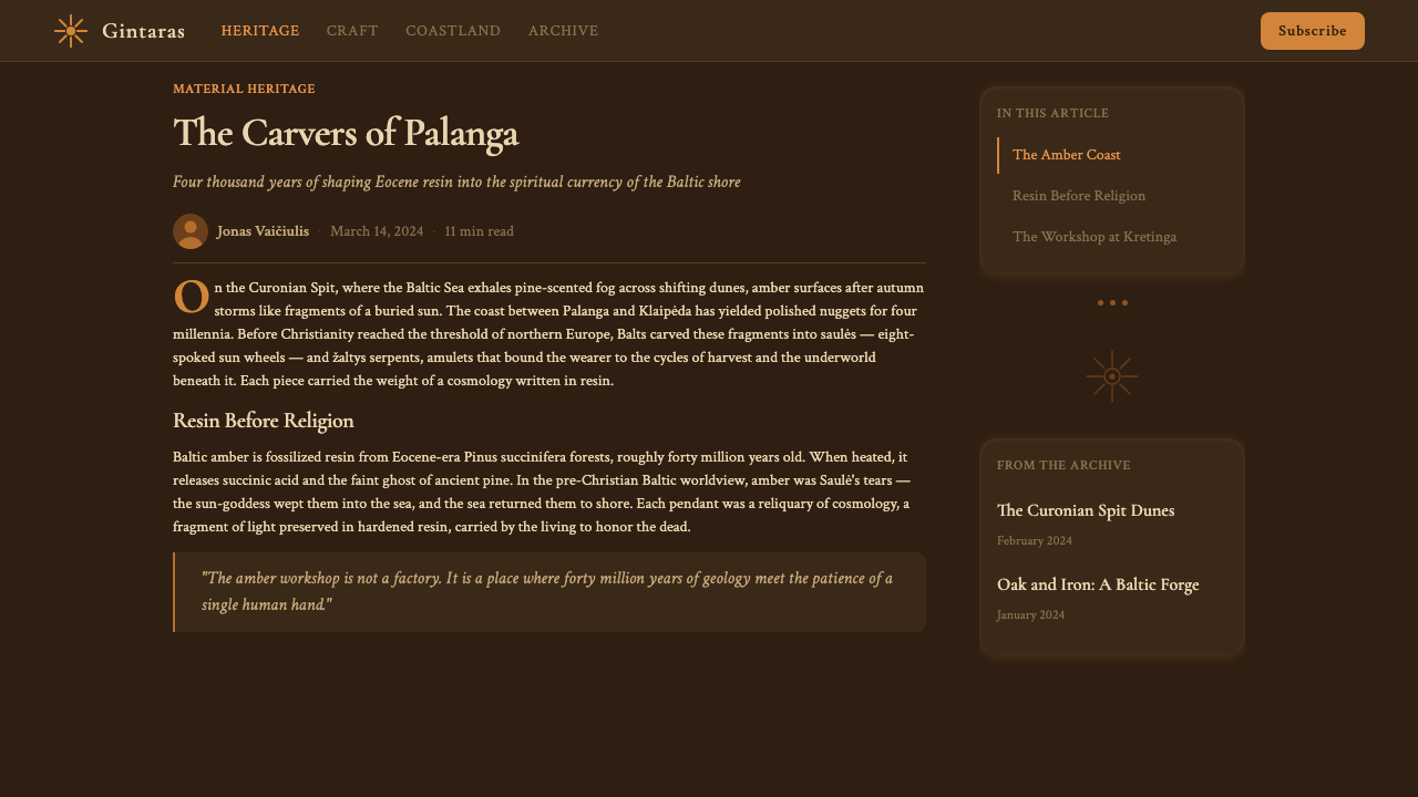
The sacred žaltys serpent enters the system as a sinuous border motif, interlace pattern, and object-silhouette. Unlike the aggressive serpent imagery of many other traditions, the Baltic žaltys is protective and domestic — its line quality is fluid and unhurried, suggesting slow coil rather than strike. In borders, serpent forms create continuous interlace bands where the body of the serpent both divides and connects zones of a composition. In jewelry-inspired layout details, a serpent coiled into a circle can function as a circular frame or badge containing text or imagery.
Forest and Earth Grounds
Where many historical design systems use white or cream grounds, Lithuanian Amber characteristically works against dark grounds that evoke specific natural materials: the black of charred wood, the deep olive of moss-covered rock, the brown-grey of dried peat, the near-black of old oak timber. These are not arbitrary dark neutrals — each has a material referent in the Baltic landscape. Against these grounds, amber tones glow with particular intensity, and the solar motifs seem lit from within. Textural suggestion is present in the depth and warmth of these grounds, though always suggested through color quality rather than literal pattern.
Carved-Relief Line Quality
The line quality in this system refers back to carved amber and incised woodwork rather than printed or drawn marks. Lines have the slight warmth and variable weight of handcraft: they terminate bluntly, they swell modestly at corners, they read as incised or raised rather than drawn. This quality is most evident in border treatments and in the rendering of solar and serpentine motifs, where the line itself carries the warmth of the material. The difference between this system and a purely geometric modern interpretation of the same symbols lies almost entirely in line quality — the geometry is the same, but the feel of how it was made changes everything.
Layered Symbolic Hierarchy
Lithuanian Amber compositions tend to work through several scales of symbolic meaning simultaneously. The macro level establishes cosmological orientation through the solar wheel or a strong radial composition. A middle level carries narrative or structural content through serpent borders, oak-leaf garlands, or geometric field divisions. The micro level holds fine incised detail — tiny repeated sun-crosses, dot-and-circle eye motifs borrowed from Bronze Age amber carving, woven-pattern micro-borders. This layering rewards close inspection without appearing cluttered at distance, because each scale of detail is calibrated to be coherent at its own reading distance.
Material Warmth Over Coldness
Across all its elements, Lithuanian Amber privileges warmth as a design value — not softness or sentimentality, but the specific warmth of aged organic materials: resin, wood, stone, fiber. This distinguishes it sharply from cold modernist geometries that share some of its formal motifs. Even the solar wheel, which in a strictly geometric reading is simply a divided circle, acquires warmth through its amber-toned rendering and its association with living ritual. The system is capable of severity — particularly in its dark-ground compositions — but the severity reads as the gravity of age rather than the coldness of machine production.
Who shaped Lithuanian Amber (Baltic Pagan)?
Čiurlionis (1875–1911) was simultaneously a composer and a painter, and his work in both media was inseparable from Baltic pagan cosmology. His large-format paintings — organized in series with musical titles like sonata, fugue, and prelude — synthesized the deep forest palette and solar symbolism of Lithuanian folk art with the symbolic ambitions of European symbolism and Art Nouveau. His compositions move between the astronomical and the intimate, from cosmic sea-visions to the domestic detail of an amber pendant. He died at thirty-five, leaving a body of roughly three hundred paintings that constitute the single most authoritative visual statement of Baltic pagan aesthetics in high-art form. The Lithuanian national gallery in Kaunas holds the primary collection.
Gimbutas (1921–1994) was a Lithuanian-American archaeologist whose decades of excavation across Old European and Baltic sites produced the most comprehensive scholarly account of pre-Christian goddess iconography in existence. Her identification of a coherent symbolic system — a visual grammar of spirals, serpents, birds, and solar wheels — running continuously from Neolithic Old Europe through the Bronze Age Balts gave this design tradition an intellectual architecture. Her books, particularly The Goddesses and Gods of Old Europe and The Language of the Goddess, provided the interpretive framework through which contemporary designers, scholars, and artists understand Baltic pagan visual material. Regardless of the debates her interpretations have provoked among specialists, her image catalogs remain the primary visual reference for anyone working with this tradition.
Basanavičius (1851–1927) was a physician and ethnographer who became the symbolic patriarch of the Lithuanian national revival. Working largely from exile — the Russian imperial ban on Lithuanian-language printing between 1864 and 1904 made open cultural work impossible — he coordinated the collection of folk songs, myths, and material artifacts that provided the raw material for Lithuanian national identity. The journal Aušra (Dawn) that he founded in 1883 was smuggled into Lithuania in thousands of copies and served as the primary vehicle for the revival's visual and textual culture. His work established the precedent that Baltic pagan folk material — its amber craft, sun-wheel ornament, serpent motifs, and woven patterns — was not primitive survivalism but sophisticated cultural heritage worthy of serious aesthetic engagement.
The amber-carving workshops of Palanga — the Lithuanian coastal town on the Curonian Spit — represent the continuous craft lineage that connects Bronze Age amber-carvers to the contemporary design tradition. The Palanga Amber Museum, housed in a neo-baroque palace surrounded by a botanical garden, holds over twenty-eight thousand amber specimens and historic carvings that document the full iconographic range of Baltic amber craft: sun-cross pendants, serpent amulets, amber-inlaid wooden objects, and figurative carvings of Baltic deities. The anonymous masters whose work fills this collection established the formal vocabulary — the proportions of the sun-cross, the characteristic curve of the serpent form, the relationship between amber and dark wood — that the contemporary design system is built upon.
How do you use Lithuanian Amber (Baltic Pagan) today?
Lithuanian Amber is a deeply atmospheric style — its primary strength lies in its ability to communicate age, craft, and cultural rootedness, which makes it particularly well-suited to contexts where heritage and authenticity are central values. Applied correctly, it reads as simultaneously archaic and curated, as if the interface were an artifact on a museum table rather than a screen element. This quality can be powerful or distracting depending on context, so the first design decision is always whether the product genuinely benefits from that atmosphere.
For presentation slides, the style works best on cover pages and section dividers rather than dense content slides. A cover can use a full dark ground — deep charcoal or smoke-black — with a central amber sun-wheel medallion and a title in a warm off-white or candlelight tone. The radial geometry of the solar motif naturally centers a composition and gives it structural authority. Section dividers can use a simplified serpent border running horizontally across the slide width, with amber geometric dividers marking chapters. Content slides should strip back to the dark ground with amber-toned headings and near-white body text; adding solar or serpentine ornament to content slides risks visual competition with the information itself.
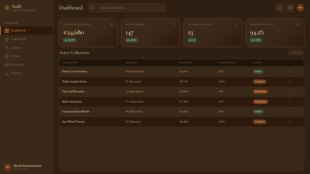
For web interfaces, Lithuanian Amber fits editorial contexts, heritage brand pages, museum or gallery sites, and products positioned around craft or cultural legacy. A dark-ground layout with warm amber accent elements creates strong visual hierarchy: amber for primary interactive elements, a lighter amber-straw for secondary labels, near-white for body text, all against a deep charcoal or smoke-toned background. Navigation components can incorporate minimal sun-cross or serpent border details that are decorative without being distracting. Dashboard contexts are harder — the warmth and ornamentation of the system can work against the clarity demands of data-heavy interfaces, and a stripped-back application that retains only the palette and the occasional solar motif will perform better than a full ornamental treatment.
For editorial and marketing work, the style produces distinctive book covers, exhibition materials, cultural-institution identity, and festival branding. The combination of deep dark grounds, amber warmth, and geometric folk ornament is immediately recognizable and occupies a distinct visual space from both clean minimalist design and exuberant folk-art illustration. Marketing pages benefit from alternating full-width blocks: dark ground with amber headline versus amber ground with deep charcoal text. Amber and sun-wheel motifs work well as section-end decorative closes, providing visual punctuation without adding navigation complexity.
A common mistake when applying this system is treating it primarily as a color exercise — adding amber tones to an otherwise contemporary layout and calling it Lithuanian Amber. The system's real identity comes from the specific combination of palette, symbolic geometry, and line quality. A layout that uses amber colors but keeps hard geometric modernist shapes and clean contemporary typography will produce a mismatch between the warmth promised by the color and the coldness delivered by the form. Conversely, the solar wheel geometry needs the dark ground and the amber palette to read as sacred symbol rather than tech logo; transplanting just the eight-radial wheel form into a light-background corporate context will strip it of its meaning and produce something that looks like a generic radial graphic.
Lithuanian Amber (Baltic Pagan) — FAQ
How does Lithuanian Amber differ from other Northern European folk-inspired design systems?
The most important distinction is the darkness and warmth of the palette. Scandinavian folk-inspired design typically works on light grounds with high-contrast dark and bright accents; the overall feeling is clean and legible. Lithuanian Amber works in reverse — the ground is dark, the accents are warm and luminous. The symbolic vocabulary is also specific: the saulė sun wheel and žaltys serpent are distinctly Baltic motifs, not shared with Norse, Slavic, or Celtic traditions in the same form. Lithuanian Amber also carries a specific material logic — amber itself, as a physical substance, dominates the color and surface quality in a way that has no equivalent in Viking silver, Celtic knotwork, or Slavic embroidery systems.
Is this system appropriate for secular or commercial projects, given its religious origins?
The Baltic pagan tradition from which this system draws is genuinely ancient — it predates Christianity in that region by thousands of years — but it is not a living religion in the sense of having an active contemporary community that might object to commercial appropriation. The motifs have been part of Lithuanian national cultural identity rather than active religious observance for several centuries. Contemporary Lithuanian designers, textile artists, and craft workers use these symbols freely in secular and commercial contexts. The appropriate caution is aesthetic rather than ethical: using the symbols shallowly, as mere decoration stripped of their formal logic, produces weaker design than engaging with the full system.
Can the system work with a light background, or does it require a dark ground?
A light-ground variant is possible but requires significant adjustment. The most important shift is to the amber tones themselves: on a dark ground, amber reads as luminous and precious because it glows against the darkness; on a white or cream ground, the same amber tones flatten into ordinary warm yellow and lose their specific quality. A successful light-ground variant would use a warm parchment or aged-vellum ground rather than pure white, keep amber as a structural accent rather than a dominant area color, and work the solar and serpentine motifs in a deeper brown-amber against the lighter ground. The dark forest feeling that is central to the system's atmosphere cannot be fully preserved in a light variant — it becomes a softer, more accessible version that trades some of the system's gravitas for approachability.
How should the solar wheel motif be scaled and placed to avoid looking like a logo mark?
The risk of the sun wheel reading as a generic logo mark increases when it appears at medium scale, in isolation, at a single size, centered on a clean background — all the conventions of badge or icon design. To avoid this, use the solar wheel at multiple scales in the same composition: a large background field version that bleeds off one edge, a medium structural version that organizes a section, and a small detail version that repeats in borders. Alternatively, embed it within a larger pattern field — a repeating grid of sun wheels, or a sun wheel integrated into a border band alongside serpentine elements — so that it reads as part of a pattern language rather than a standalone symbol. The amber palette and dark ground also help: the wheel on a charcoal-amber surface looks like a carved artifact; the same wheel on white looks like a company logo.
What kind of typography pairs best with this system?
This system has strong material warmth that cold, geometric, or strictly modernist typefaces will fight against rather than complement. The typefaces that pair best are those with some degree of organic quality in their letterforms — a modest contrast between thick and thin strokes, slightly humanist proportions, or a historical lineage that connects to pre-industrial printing. This does not mean using literal historical revival faces or rustic wood-type aesthetics, which would push the overall feeling too far toward period costume. What works is a typeface where the quality of the letterforms is warm and considered without being decorative — one that could sit comfortably alongside carved amber without either looking out of place. Rigid technical sans-serifs and pure geometric letterforms will always feel mismatched against the amber ground.
Related design styles
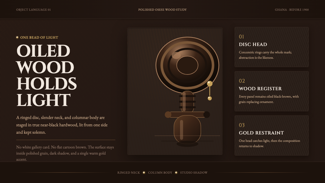 Akuaba Akan Fertility DollDarkness becomes sculpture. Near-black wood, ringed geometry, and one gold be…
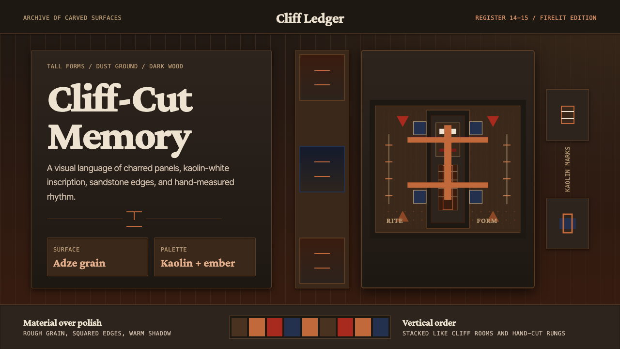 Dogon Bandiagara Cliff MaskHand-hewn gravity. Charred wood, kaolin type, and sandstone geometry stack li…
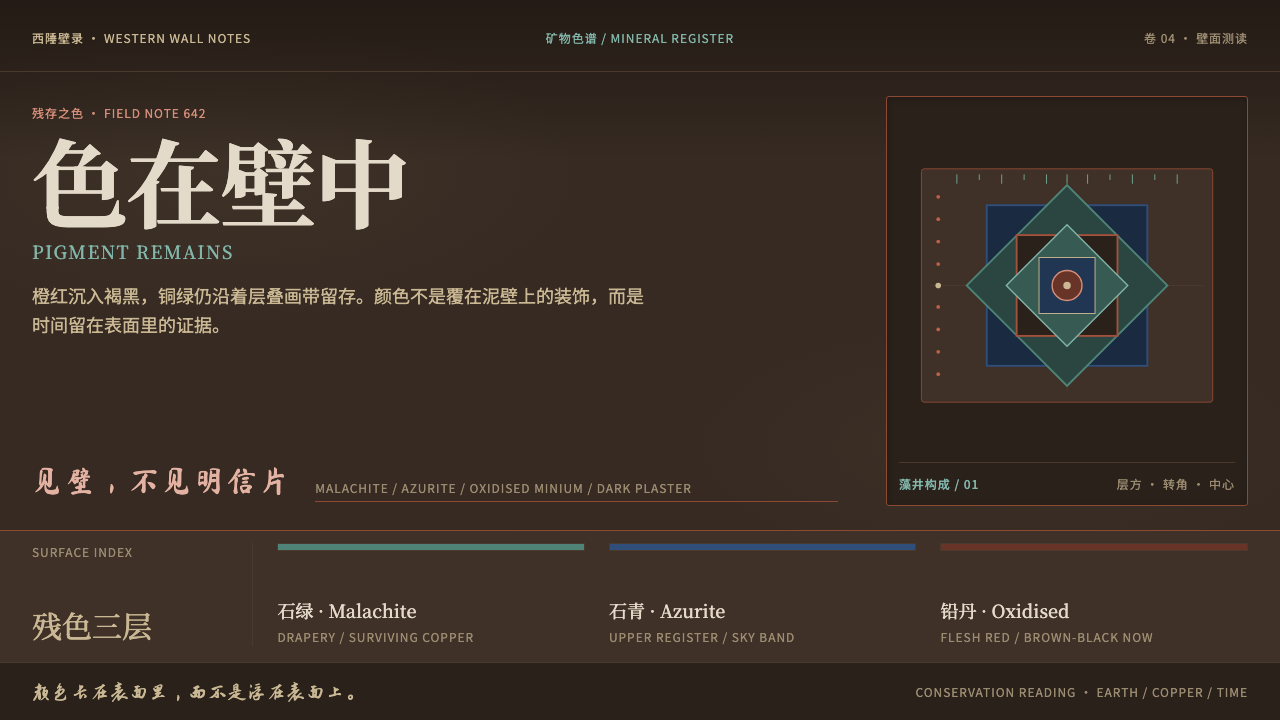 Dunhuang Mogao MuralsTime lives in the wall. Mineral green and azurite endure on oxidised brown pl…
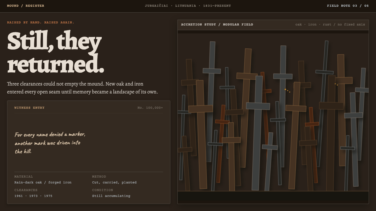 Hill of CrossesMemory returns by hand. Rain-black oak and rusted iron overlap until density…
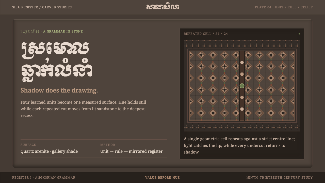 Khmer Kbach MotifShadow carves the grammar. Repeated stone cells turn a narrow sandstone palet…
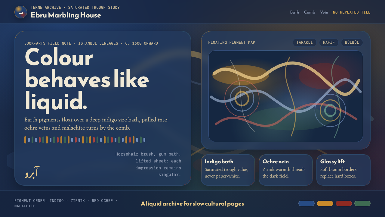 Ottoman Ebru MarblingLiquid, never tiled. Indigo bath, ochre veins, and glassy bloom edges carry t…