What is Egyptian Coptic Textile?什么是 Egyptian Coptic Textile?
Wool and linen bound together in saturated warmth — Coptic tapestry squares carried Christian Egypt's visual memory across a thousand years of daily wear.羊毛与亚麻在饱和暖色中交织——科普特挂毯方块将基督教埃及的视觉记忆,以日常穿着的方式延续了千年。
Egyptian Coptic Textile in briefEgyptian Coptic Textile 速览
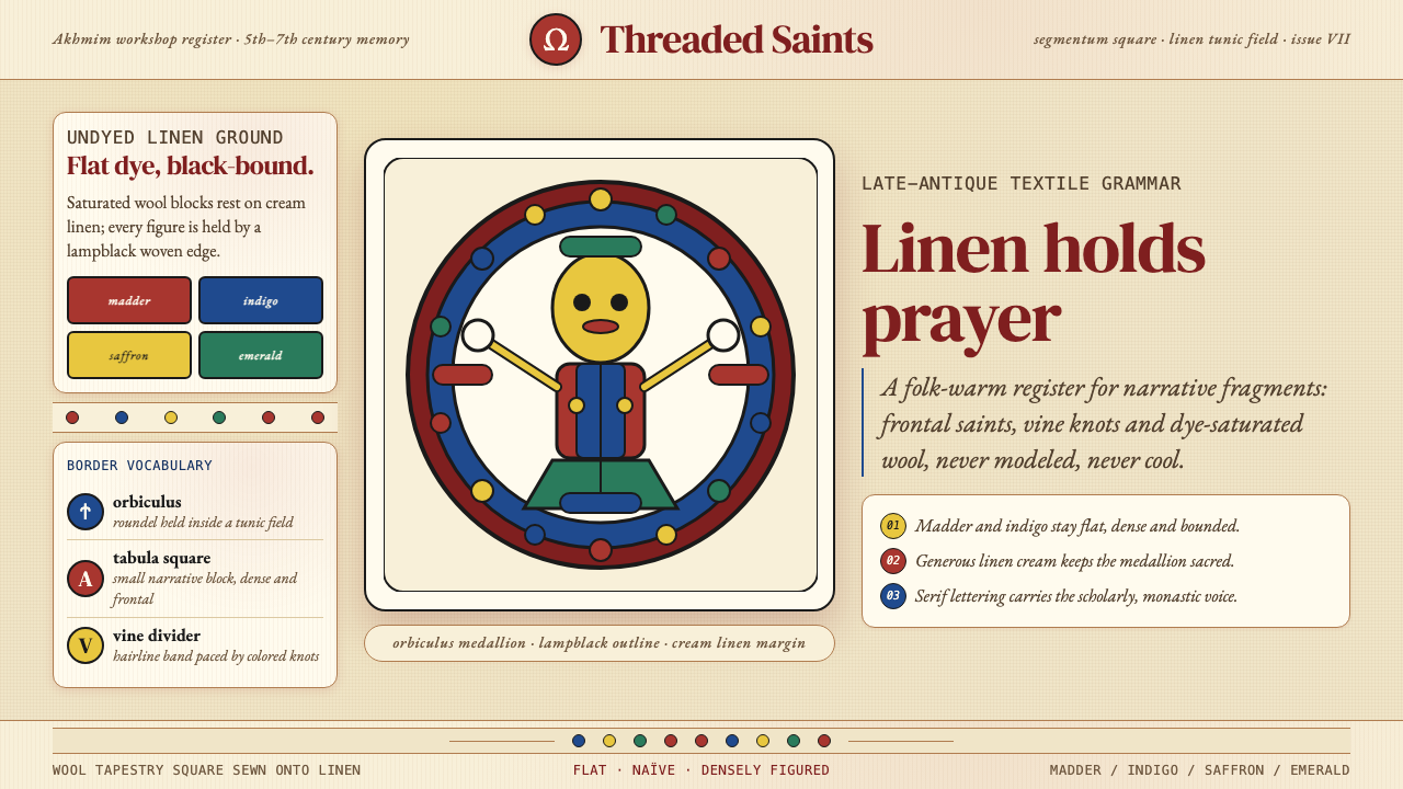
Egyptian Coptic Textile is the weaving tradition of Christian Egypt spanning the 4th through 8th centuries CE. Weavers worked wool tapestry-squares — called tabulae or clavi — directly onto undyed linen tunics, filling them with figures bounded by a heavy lampblack outline. The resulting palette is immediately recognizable: saturated madder-red, deep indigo, saffron yellow, and emerald green sit against the warm cream of undyed linen, creating a color language that feels simultaneously ancient and vivid.科普特纺织是公元 4 至 8 世纪基督教埃及的织造传统。织工将羊毛挂毯方块——称为 tabulae 或 clavi——直接织入未漂白的亚麻外袍,以浓重的墨黑轮廓线勾勒出人物图样。由此形成的色彩语言辨识度极高:茜草红、深靛蓝、藏红花黄与翡翠绿,落在未染色亚麻的暖乳白底面上,既古老又鲜活。
The iconographic vocabulary is richly layered. Praying figures called orants — wide-eyed, frontal, arms raised — share space with dancing maenads carried over from pagan Dionysiac memory, with peacocks spreading jeweled tails, with vine tendrils curling into inhabited roundels, and with lion-and-hunter scenes rooted in the heroic tradition. This mixing of Christian devotion and inherited Greco-Roman motif was not contradiction but continuity — the same weavers and the same families who had once honored Dionysus now honored Christ, and they brought their entire visual repertoire with them.图像词汇丰富而多层。祈祷人像(奥兰特)——大眼、正面、双臂上举——与自异教狄俄尼索斯记忆中沿袭而来的舞蹈舞女共处,与开屏展现宝石尾羽的孔雀共处,与蜿蜒出人物图案的葡萄藤蔓共处,与根植于英雄传统的狮子猎手场景共处。基督教虔信与希腊罗马母题的混融并非矛盾,而是延续——曾经供奉狄俄尼索斯的织工与家族,转而供奉基督,将整套视觉词汇一并带来。
The style is neither Greco-Roman naturalism nor Byzantine formality. It is its own register: flat, naïve in the best sense, densely figured, and profoundly warm. Figures are rendered with large expressive eyes and stylized bodies; backgrounds are filled rather than opened; borders are thick and active rather than merely framing. This density and warmth, combined with the tactile reality of wool on linen, gives Coptic textile a folk directness that no courtly or ecclesiastical style ever quite matched.这种风格既不是希腊罗马的自然主义,也不是拜占庭的庄严程式,而是自成一格:平面、以最好意义上的稚拙处理、构图密实、色彩饱和而温暖。人物以大而富于表情的眼睛和程式化的身体呈现;背景被充实而非留白;边框厚重而富有活力,而不仅仅是框架。这种密度与温暖,加上羊毛与亚麻的触感现实,赋予科普特纺织一种任何宫廷或宗教风格都无法企及的民间直接性。
See the Egyptian Coptic Textile design system查看 Egyptian Coptic Textile 完整设计系统
Where does Egyptian Coptic Textile come from?Egyptian Coptic Textile 从何而来?
The Coptic textile tradition grew from the convergence of three distinct weaving cultures in Roman Egypt. Greek settlers had brought Mediterranean loom techniques; Pharaonic Egypt contributed a millennia-old tradition of fine linen production; and the eastern trade routes introduced Iranian and Syrian pattern vocabularies — the hunting roundel, the pearl border, the confronted-animal motif. When Christianity became the religion of Roman Egypt from the 4th century onward, weavers adapted these combined inheritances to serve a new devotional context without abandoning a single thread of what had come before.科普特纺织传统,源自罗马埃及三种不同织造文化的汇聚。希腊移民带来了地中海式的织机技术;法老时代的埃及贡献了绵延数千年的优质亚麻生产传统;而东方贸易路线则引入了伊朗与叙利亚的图案词汇——猎场圆形构图、珍珠边框、对称动物母题。从公元 4 世纪起,当基督教成为罗马埃及的主流信仰,织工在不舍弃任何既有遗产的前提下,将这些汇聚的传承改造为服务新虔信语境的视觉体系。
The primary production centers were concentrated in Middle and Upper Egypt. Akhmim (ancient Panopolis) on the Upper Nile was the dominant weaving city, with a long history as a center of linen and wool production stretching back into the Pharaonic period. Antinoöpolis, founded by Emperor Hadrian in 130 CE, became another significant site. The Fayum oasis, Bawit with its important monastery, and the Saqqara complex near Memphis all yielded important textile finds. These were not luxury goods alone — Coptic tunics were everyday garments, worn by people of modest means and wealthy patrons alike, and the tapestry inserts varied from modest repeating geometric borders to elaborate figural medallions on fine wool.主要的生产中心集中在中埃及与上埃及。位于上尼罗河的阿赫米姆(古称帕诺波利斯)是最重要的织造城市,其亚麻与羊毛生产历史可追溯至法老时代。哈德良皇帝于公元 130 年兴建的安提诺埃也成为另一重要产地。法尤姆绿洲、拥有重要修道院的巴维特,以及孟菲斯附近的萨卡拉建筑群,均出土了大量重要纺织品。这些并非单纯的奢侈品——科普特外袍是日常服装,平民与富裕赞助人均有穿着,挂毯嵌片从简单的几何边框到精细的人物圆章,因阶层与用途而异。
The rediscovery of Coptic textiles began in the 1880s through large-scale tomb excavations, particularly at Akhmim, where the dry desert conditions had preserved cloth intact for fifteen centuries. The French archaeologist Albert Gayet led major excavations at Antinoöpolis beginning in 1895, recovering thousands of fragments and complete garments. The Austrian dealer Theodor Graf had earlier brought the first significant group of Akhmim textiles to European attention. These excavation campaigns — conducted with methods that would be considered destructive by modern standards — dispersed material across the museums of Europe and North America, with major collections now held at the Victoria and Albert Museum in London, the Metropolitan Museum of Art in New York, the Louvre in Paris, and the Abegg-Stiftung in Riggisberg, Switzerland.科普特纺织品的再发现,始于 19 世纪 80 年代的大规模墓葬发掘,尤以阿赫米姆为要——干燥的沙漠条件将布料完好保存了十五个世纪。法国考古学家阿尔贝·加耶自 1895 年起主持安提诺埃的大规模发掘,出土了数千件残片与完整服装。奥地利商人西奥多·格拉夫则更早将第一批重要的阿赫米姆纺织品带入欧洲人的视野。这些以现代标准看来颇具破坏性的发掘,将大量文物分散至欧美各博物馆:伦敦维多利亚与艾尔伯特博物馆、纽约大都会艺术博物馆、巴黎卢浮宫及瑞士里吉斯贝格的阿贝格基金会,如今均藏有重要的科普特纺织品。
Scholarly understanding deepened significantly through the 20th century. Art historians including Anna Gonosová and textile scholars such as Cäcilia Fluck established systematic catalogues and attribution frameworks, connecting individual fragments to their production regions and periods. Contemporary scholarship has moved beyond simple stylistic classification to examine the social and economic contexts of production — who wore these garments, who made them, and how workshops transmitted designs across generations. The field now recognizes that what was once called a single Coptic style encompasses significant regional variation and a centuries-long evolution from relatively naturalistic late-antique figure work toward the increasingly schematic, flat, and powerfully abstracted imagery of the 7th and 8th centuries.学术理解在 20 世纪得到深化。安娜·戈诺索娃等艺术史学家,以及切希莉亚·弗鲁克等纺织品学者,建立了系统性的目录与风格归属框架,将各残片与其产地和年代相连接。当代学术研究已超越简单的风格分类,转而审视生产的社会与经济语境——谁穿着这些服装,谁制作它们,工坊又如何跨代传递图案。学界如今认识到,曾被笼统称为科普特风格的体系,实际上包含了显著的地区差异,以及从相对自然主义的晚古典人物图像,向 7、8 世纪日益程式化、平面化、强力抽象化图像演进的漫长历程。
What defines the Egyptian Coptic Textile look?Egyptian Coptic Textile 的视觉特征是什么?
Color Palette色彩体系
The Coptic palette centers on four saturated plant and mineral dyes applied to natural wool: madder-red (the dominant warm anchor), indigo (the principal cool contrast), saffron yellow (used for highlight and secondary figures), and weld or verdigris for the rarer emerald-green accents. These colors sit against undyed linen, whose warm cream acts as both ground and breathing space. Lampblack outline is the fifth essential element — every figure, every leaf, every border is bounded by a firm dark contour that holds the saturated fills in check and gives the entire composition its characteristic graphic legibility.科普特色板以四种饱和植物与矿物染料施于天然羊毛为核心:茜草红(主导性的暖调锚色)、靛蓝(主要的冷调对比)、藏红花黄(用于高光与次要人物),以及较少出现的木樨草黄或铜绿带来的翡翠绿强调色。这些颜色落在未染色的亚麻底面上,其暖乳白色既是底面也是呼吸空间。墨黑轮廓线是第五个不可或缺的要素——每个人物、每片叶子、每条边框,都被有力的深色轮廓收束,令饱和填色得以节制,并赋予整体构图以其特有的图形清晰度。
Figure Style人物风格
Coptic figures are frontal, flat, and intentionally un-naturalistic. Eyes are disproportionately large — sometimes nearly circular — and carry enormous expressive weight; they are the focal point of every face and the primary vehicle of devotional intensity. Bodies are schematic rather than anatomically observed: limbs are tubular, drapery is rendered as stacked parallel lines rather than observed cloth, and proportion is governed by hierarchy and emphasis rather than realism. This naïve directness is not failure but choice — it was the visual grammar of a tradition that valued spiritual presence over physical illusion.科普特人物正面、平面,且有意不追求自然主义。眼睛比例夸大——有时近乎圆形——承载着巨大的表现力;它们是每张面孔的视觉焦点,也是虔信强度的首要载体。身体是程式化而非解剖学观察的结果:四肢呈管状,衣褶以叠加平行线而非对布料的观察来呈现,比例由层级与强调决定,而非由写实主义决定。这种稚拙的直接性不是失败,而是选择——它是一个重视精神在场胜于形体幻觉的传统的视觉语法。
Compositional Density构图密度
Unlike classical Mediterranean styles that valued negative space, Coptic textile composition fills every available area with figure, motif, or pattern. Borders are not merely framing devices — they are inhabited by running animals, vine tendrils, and geometric interlace. Roundels and squares are packed with layered figures, often with secondary elements wedged into corners or framing bands. This density reflects both a horror vacui — a discomfort with empty space — and the practical reality of weaving, where every thread represents labor and leaving areas blank would be waste. The result is a richly legible surface that rewards close looking.与重视留白的古典地中海风格不同,科普特纺织构图将每一处可用空间都填满人物、母题或图案。边框不仅仅是框架装置——它们被奔跑的动物、葡萄藤蔓和几何交错纹样所占据。圆形与方形构图挤满了层叠人物,次要元素往往被塞入角落或框架带中。这种密度既反映了对空白空间的不适(即充填恐惧症),也体现了织造的现实——每一根线都代表劳动,留下空白区域意味着浪费。结果是一个丰富而清晰的表面,值得细细品读。
Outline and Flatness轮廓与平面性
The lampblack contour line is the structural backbone of Coptic visual language. It is never tentative — it is bold, consistent, and drawn with the confidence of a tradition that had been using outline as the primary organizational device since the time of the pharaohs. Within the outline, color is applied as flat, unmodulated fill: there is no shading, no modeling toward volume, no attempt to suggest three-dimensional form through tonal variation. Light does not exist in Coptic textile as a spatial force; objects are not lit, they are identified. This radical flatness, combined with saturated color, produces images of extraordinary visual strength.墨黑轮廓线是科普特视觉语言的结构脊梁。它从不犹豫——粗重、一致,以一个自法老时代起便以轮廓作为首要组织手段的传统所具有的自信绘就。在轮廓之内,颜色以平坦、无调制的填色方式施用:没有阴影,没有朝向体积的塑造,没有通过色调变化暗示三维形体的尝试。光线在科普特纺织中不作为空间力量存在;物体不是被照亮的,而是被辨识的。这种彻底的平面性,与饱和色彩相结合,产生了具有非凡视觉力量的图像。
Syncretic Iconography融合图像志
Coptic textile iconography freely combines Christian, late-antique pagan, and Pharaonic visual elements without apparent tension. A single tunic might carry an orant (Christian prayer figure), a Dionysiac maenad (pagan inheritance), a Nilotic water scene with crocodiles (Pharaonic landscape), and a pearl-border roundel of Iranian derivation. This syncretism is not eclecticism for its own sake — it reflects the actual lived experience of Coptic Egyptians, who inhabited a cultural landscape shaped by millennia of overlapping traditions. For contemporary designers, it models a way of drawing from multiple visual sources that achieves coherence through shared graphic language rather than thematic purity.科普特纺织图像志自由融合了基督教、晚古典异教与法老时代的视觉元素,且不显矛盾。一件外袍上可能同时有奥兰特(基督教祈祷人像)、狄俄尼索斯舞女(异教传承)、带鳄鱼的尼罗河场景(法老景观),以及源自伊朗的珍珠边框圆形构图。这种融合并非为了折中主义而折中——它反映了科普特埃及人的真实生活体验,他们生活在由数千年重叠传统塑造的文化景观中。对当代设计师而言,它提供了一种从多元视觉来源汲取灵感的方式——通过共同的图形语言而非主题纯粹性来实现整体的连贯。
Border and Frame Language边框与框架语言
The borders of Coptic tapestry inserts are as significant as their central fields. Standard border types include running wave and vine-tendril patterns, geometric guilloche and interlace, rows of facing buds or palmettes, and the pearl-border (a row of small circles) of Iranian and Central Asian derivation. These borders are not passive containment — they are active visual elements that define scale, establish rhythm, and signal the register of what they enclose. A coarser geometric border signals a humble everyday garment; an intricate figural border with inhabited vine-scroll signals wealth and commemorative intention.科普特挂毯嵌片的边框与其中央图案同等重要。标准边框类型包括:波浪形与葡萄藤蔓流动纹样、几何波纹与交错纹、成排的相对花蕾或棕榈叶,以及源自伊朗与中亚的珍珠边框(一排小圆圈)。这些边框不是被动的围合——它们是积极的视觉元素,定义尺度,建立节奏,并标志所围内容的等级。粗糙的几何边框意味着日常平民服装;带人物图案的葡萄藤蔓精细边框则意味着财富与纪念意图。
Warmth as System温暖作为系统
If a single quality distinguishes Coptic textile from every other late-antique visual tradition, it is warmth — not as a sentimentality but as a structural property of the color system. The undyed linen ground is warm cream, not cold white. Madder-red is the dominant hue, warming the entire palette. Even the indigo, a cool color in isolation, is deepened by its proximity to the red and gold tones surrounding it, taking on a purple resonance rather than a purely cool blue note. This warmth is not accidental — it is the cumulative effect of using natural, undyed fibers as ground and warm-shifted natural dyes as figure. Every contemporary application of this aesthetic should begin with this warming of the ground, because the palette rests on it.若说有哪一种品质能将科普特纺织与其他所有晚古典视觉传统区分开来,那就是温暖——不是作为情感上的温情,而是作为色彩系统的结构性特质。未染色的亚麻底面是暖乳白,而非冷白。茜草红是主导色相,将整个色板的基调定为温暖。即便是靛蓝这一单独看来偏冷的颜色,在被周围的红色与金色调环绕时,也加深并带上了紫色共鸣,而非纯粹的冷蓝音符。这种温暖并非偶然——它是以天然未染色纤维为底面、以暖调天然染料为图案的累积效果。每一次对这种美学的当代应用,都应从这种底面的暖化开始,因为整个色板建立于此之上。
See the Egyptian Coptic Textile design system查看 Egyptian Coptic Textile 完整设计系统
Who shaped Egyptian Coptic Textile?谁塑造了 Egyptian Coptic Textile?
The French Egyptologist Albert Gayet conducted the most extensive systematic excavations of Coptic textiles, leading missions to Antinoöpolis from 1895 through the early 1900s. His campaigns recovered thousands of complete and fragmentary garments, many of which entered French museum collections. Though his methods lacked the stratigraphic rigor of modern archaeology, his detailed documentation and the sheer volume of material he recovered established the foundation for all subsequent Coptic textile scholarship. His work brought the aesthetic of Coptic weaving to broad public attention in France and beyond.法国埃及学家阿尔贝·加耶主持了最系统的科普特纺织品发掘工作,自 1895 年起多次前往安提诺埃进行考察,共出土数千件完整或残缺的服装,其中许多进入法国博物馆收藏。尽管他的方法缺乏现代考古学的地层学严谨性,但其详细的文献记录与庞大的出土材料,为此后所有科普特纺织品研究奠定了基础。他的工作使科普特织造美学在法国及更广范围内引起了广泛的公众关注。
The Viennese antique dealer Theodor Graf was instrumental in bringing Coptic textiles to European collectors and museums in the 1880s and 1890s. His acquisition and sale of the first major groups of Akhmim textiles — through exhibitions in Vienna, Berlin, and Paris — introduced the aesthetic to Western audiences who had never seen such material. Graf's commercial instincts drove the early market for Coptic works, accelerating both scholarly interest and the problematic dispersal of material across private collections. His role illustrates how the rediscovery of Coptic textile was shaped as much by art market dynamics as by academic archaeology.维也纳古董商西奥多·格拉夫在 19 世纪 80 至 90 年代将科普特纺织品引入欧洲收藏家与博物馆的过程中发挥了关键作用。他收购并出售的第一批重要阿赫米姆纺织品——通过在维也纳、柏林和巴黎举办的展览——向从未见过此类材料的西方观众介绍了这种美学。格拉夫的商业敏锐性驱动了科普特作品的早期市场,既加速了学术关注,也推动了材料向私人收藏的有问题的分散。他的角色说明,科普特纺织品的再发现,同样为艺术市场动态而非纯粹学术考古所塑造。
Cäcilia Fluck, a German textile historian based at the Museum of Islamic Art in Berlin, has become one of the leading contemporary scholars of Coptic textiles. Her systematic cataloguing work, collaborative excavations at sites including Antinoöpolis, and contributions to the comprehensive Textiles from the Nile Valley publication series have significantly advanced the field's understanding of workshop practices, regional distinctions, and dating methods. Fluck's scholarship represents the shift in Coptic textile studies from aesthetic appreciation to rigorous contextual analysis — understanding not just what these objects look like, but who made them, how they were made, and what they meant to their wearers.德国纺织品历史学家切希莉亚·弗鲁克,现任职于柏林伊斯兰艺术博物馆,是当代科普特纺织品研究的领军学者之一。她的系统性编目工作、在安提诺埃等遗址的合作发掘,以及对《尼罗河谷纺织品》系列出版物的贡献,显著推进了学界对工坊实践、地区差异与年代鉴定方法的理解。弗鲁克的学术研究代表了科普特纺织品研究从美学欣赏向严格语境分析的转型——不仅理解这些物品看起来如何,更理解谁制作了它们、如何制作,以及它们对穿着者意味着什么。
The art historian Anna Gonosová made significant contributions to understanding the iconographic sources and stylistic development of Coptic textile motifs. Her close analysis of individual tapestry panels — tracing how specific compositional formats, figure types, and border patterns were transmitted, adapted, and transformed across workshops and across generations — helped establish the intellectual framework for understanding Coptic weaving not as a single static style but as an evolving tradition with deep roots in the late-antique visual koine of the eastern Mediterranean.艺术史学家安娜·戈诺索娃对理解科普特纺织品母题的图像来源与风格发展做出了重要贡献。她对单件挂毯面板的细致分析——追踪特定的构图形式、人物类型与边框图案如何在工坊之间及代际之间被传递、改造与转变——帮助确立了理解科普特织造的知识框架:它不是一种单一的静态风格,而是一个在东地中海晚古典视觉通用语中深扎根基的演进传统。
How do you use Egyptian Coptic Textile today?今天怎么用 Egyptian Coptic Textile?
Egyptian Coptic Textile as a design reference requires understanding its internal logic rather than merely borrowing its surface appearance. The system's power comes from three structural decisions: a warm-ground palette built on undyed cream rather than white; heavy contour lines that define every element before color fills it; and a compositional density that treats empty space as a resource to be used, not preserved. Applied correctly, the aesthetic produces work that feels simultaneously archaic and urgent — a quality that distinguishes it from the many historical styles that read as merely decorative.以埃及科普特纺织作为设计参照,需要理解其内在逻辑,而非仅仅借用其表面外观。这套系统的力量来自三项结构性决策:以未染色乳白而非白色构建的暖底调色板;在颜色填充之前定义每个元素的粗重轮廓线;以及将空白空间视为待使用而非待保留的资源的构图密度。正确应用时,这种美学产生的作品既感觉古老又感觉紧迫——这种品质使它有别于许多仅仅被解读为装饰性的历史风格。
For presentation slides, this style suits cover pages and section dividers more naturally than data-heavy content slides. A cover in the Coptic mode works with a warm cream or aged-linen ground, strong geometric or medallion framing for the title block, and a limited palette of saturated warm colors for decorative elements. Section-opener slides benefit from the style's border language — a thick ornamental frame or a vine-tendril divider signals a shift in register without requiring a change in typeface. Data slides are harder to execute authentically: the density principle can quickly overwhelm numerical content. The best approach is to use the palette and framing language for structural elements while keeping the data visualization itself relatively open.对于演示文稿,这种风格比起数据密集的内容页,更自然地适合封面页与章节分隔页。科普特风格的封面以暖乳白或做旧亚麻底面为基础,为标题块使用强有力的几何或圆章框架,为装饰元素使用有限的饱和暖色色板。章节起始页受益于这种风格的边框语言——厚重的装饰边框或葡萄藤蔓分隔线,无需改变字体即可标志语境的转换。数据页更难以真实执行:密度原则很容易压倒数字内容。最佳方案是将色板与框架语言用于结构性元素,同时保持数据可视化本身相对开放。
For web interfaces, the Coptic aesthetic is most naturally suited to editorial-style pages, cultural heritage contexts, and brands positioning themselves around craft, heritage, or artisanal production. Dashboard and functional interfaces are more challenging — the style's density and warmth work against the scannability that utility interfaces require. Where the style is applied to web, keep backgrounds in the warm cream or warm off-white range, use the saturated colors sparingly as accent against that ground, and rely on bordered components rather than shadow-based depth. Navigation and UI controls should be treated with restraint, borrowing the palette without imposing the figural density.对于网页界面,科普特美学最自然地适合编辑风格页面、文化遗产语境,以及围绕工艺、传承或手工生产定位的品牌。仪表板与功能性界面更具挑战性——这种风格的密度与温暖与实用界面所需的可扫描性相悖。在将这种风格应用于网页时,将背景保持在暖乳白或暖米白范围内,将饱和色彩作为该底面上的强调色节制使用,并依赖有边框组件而非基于阴影的深度。导航与界面控件应克制处理,借用色板而不强加人物图案的密度。
For editorial and marketing work, the style's strongest application is in contexts that celebrate cultural depth, craft lineage, or warm human storytelling. A brand identity drawing on Coptic textile would use the medallion format as a recurring framing device, the warm-ground palette as its color foundation, and the heavy-outline treatment as a graphic signature for illustration or iconography. Marketing pages work well with the style's border-and-frame vocabulary for section structure, using ornamental dividers instead of ruled lines and keeping body text on warm cream grounds. Editorial layouts in long-form journalism or cultural publishing can use the palette and framing language to create visual chapters, with each section announced by a border element.对于编辑与营销作品,这种风格最强的应用场景是庆祝文化深度、工艺传承或温暖人文叙事的语境。借鉴科普特纺织的品牌识别体系,会将圆章格式作为反复出现的框架装置,将暖底调色板作为色彩基础,将粗重轮廓处理作为插图或图标的图形签名。营销页面适合使用这种风格的边框词汇作为章节结构,以装饰性分隔线代替直线,将正文保持在暖乳白底面上。长篇新闻或文化出版物的编辑版面,可以用色板与框架语言创造视觉章节,每个章节以边框元素开篇。
A common mistake when applying this style is flattening its warmth into generic earth tones or boho-neutral palettes. Coptic color is not muted — it is saturated warmth, which is different. Madder-red is deep and rich, not dusty rose; indigo is full and dense, not faded denim; saffron is vivid, not mustard. A second common error is using the iconographic vocabulary — orants, peacocks, vine tendrils — as literal decorative motifs without absorbing the underlying graphic principles of flatness, heavy outline, and warm ground. Borrowing the motifs without the structure produces pastiche. The style is better learned from its palette and compositional logic than from its recognizable imagery.应用这种风格时最常见的错误,是将其温暖感拉平为通用大地色调或波西米亚中性色板。科普特色彩并不沉闷——它是饱和的温暖,这是不同的概念。茜草红是深沉而丰富的,而非尘灰玫瑰;靛蓝是充盈而浓密的,而非褪色牛仔蓝;藏红花黄是鲜活的,而非芥末黄。第二个常见错误是将图像词汇——奥兰特、孔雀、葡萄藤蔓——作为字面装饰母题借用,而不吸收平面性、粗重轮廓与暖底色的底层图形原则。只借用母题而不借用结构,只能产生仿制品。这种风格从其色板与构图逻辑中学习,比从其可辨识图像中学习,收获更大。
A third pitfall is treating the style as appropriate only for brands with an explicit historical or archaeological identity. Coptic textile's folk directness, warm palette, and human-centered iconography make it surprisingly applicable to contemporary brands in food, craft beverage, artisanal goods, and values-led consumer products — anywhere that warmth, authenticity, and visual richness are genuine brand values. The key is extraction of principle rather than literal quotation of ancient imagery.第三个陷阱是将这种风格视为仅适合具有明确历史或考古身份的品牌。科普特纺织的民间直接性、暖调色板与以人为中心的图像志,使其出人意料地适用于食品、工艺饮品、手工商品和价值观驱动的消费品等当代品牌——任何温暖、真实性与视觉丰富性是真实品牌价值的场合。关键在于提取原则,而非字面引用古代图像。
See the Egyptian Coptic Textile design system查看 Egyptian Coptic Textile 完整设计系统
Egyptian Coptic Textile — FAQEgyptian Coptic Textile · 常见问题
How is Coptic textile different from Byzantine art?科普特纺织与拜占庭艺术有何不同?
Byzantine art and Coptic textile share a late-antique Christian context and a general tendency toward frontality and flatness, but they operate in very different registers. Byzantine art is courtly and hierarchical — it was produced for imperial and ecclesiastical patrons and aimed to project divine authority through gold, formal symmetry, and controlled grandeur. Coptic textile is folk and warm — it was produced for everyday garments worn by ordinary Egyptians and aimed to surround the body with devotional imagery through saturated color, dense pattern, and accessible iconography. Byzantium uses gold ground to suggest transcendence; Coptic weaving uses undyed linen cream to suggest continuity with everyday warmth. Where Byzantine figures are remote and austerely beautiful, Coptic figures are direct, large-eyed, and humanly immediate.拜占庭艺术与科普特纺织共享晚古典基督教语境,以及对正面性与平面性的总体倾向,但它们运作在截然不同的层次上。拜占庭艺术是宫廷式与等级化的——它为帝国与宗教赞助人所制,旨在通过黄金、正式对称与控制的宏大传递神圣权威。科普特纺织是民间式与温暖的——它为普通埃及人的日常服装所制,旨在通过饱和色彩、密实图案与易于理解的图像志,以虔信图像环绕身体。拜占庭用黄金底面暗示超越性;科普特织造用未染色亚麻乳白暗示与日常温暖的延续。拜占庭人物遥远而庄严,科普特人物则直接、大眼,具有人性的即刻感。
Can this style work for dark-background designs?这种风格能用于深色背景设计吗?
The Coptic palette is fundamentally a warm-ground system — its warmth and legibility depend on the undyed linen cream acting as the passive ground against which saturated colors register. A dark inversion is possible but requires significant adaptation. On a deep ground, the pale linen tone shifts to a highlight or text color rather than a ground, and the primary palette must be adjusted so that madder-red and saffron carry the warmth rather than the ground itself. The heavy lampblack outline — which is invisible on the historic linen ground — becomes irrelevant on a dark background; it must be replaced with a warm light outline or abandoned in favor of color contrast alone. Dark Coptic-derived palettes can work for theatrical, luxury, or festival contexts, but they lose the essential folk warmth that makes the style distinctive.科普特色板本质上是一个暖底色系统——其温暖感与可读性依赖于未染色亚麻乳白作为被动底面,使饱和色彩得以呈现。深色反转版本是可能的,但需要大幅调整。在深色底面上,亚麻浅色调转变为高光或文字颜色而非底面,主色板必须调整,使茜草红与藏红花黄承载温暖感,而非依赖底面本身。在历史性亚麻底面上几乎不可见的墨黑轮廓线,在深色背景上变得无关紧要;它必须被暖色浅轮廓替代,或放弃轮廓而单纯依赖色彩对比。深色科普特衍生色板可用于戏剧性、奢侈或节庆语境,但它们失去了使这种风格独特的根本性民间温暖感。
Is the syncretic iconography — mixing Christian, pagan, and Pharaonic imagery — appropriate to reference in contemporary design?这种融合图像志——混合基督教、异教与法老时代图像——适合在当代设计中参考吗?
The syncretic quality of Coptic iconography is one of its most intellectually interesting features, but contemporary designers should engage with it carefully. Lifting specific religious imagery — orants, crosses, or specific biblical scenes — from a devotional context into commercial design risks disrespect to communities for whom these images carry living religious meaning. The safer and more productive approach is to engage with the Coptic style at the level of graphic principle: its palette, its compositional density, its outline language, its border vocabulary, and its medallion framing — all of which are culturally rich without being specifically sacred. The peacock, the vine tendril, and the geometric interlace are all available without reservation; the devotional figure at prayer is more delicate territory.科普特图像志的融合性质是其最具智识趣味的特征之一,但当代设计师应谨慎介入。将特定宗教图像——奥兰特、十字架或特定圣经场景——从虔信语境中提取用于商业设计,有对这些图像承载活态宗教意义的社群造成不敬的风险。更安全、也更有成效的方法,是在图形原则层面介入科普特风格:其色板、构图密度、轮廓语言、边框词汇和圆章框架——所有这些在文化上都很丰富,而不具体地具有神圣性。孔雀、葡萄藤蔓和几何交错纹样都可以毫无保留地使用;祈祷中的虔信人像则是更需审慎对待的领域。
What contemporary design contexts is this style least suited to?这种风格最不适合哪些当代设计语境?
The Coptic style struggles most in contexts that require visual lightness, openness, and calm. High-volume information interfaces — complex dashboards, data-dense analytical tools, or multi-step forms — are difficult to execute well because the style's density principle works against the breathing room these interfaces need. Minimalist or luxury-minimalist brand contexts are also poor fits: the warmth and fullness of the Coptic visual vocabulary conflicts with the deliberate restraint that luxury minimalism depends on. Corporate and financial contexts, which typically signal authority through restraint and precision, similarly find the style too warm, too figured, and too folk-inflected. The style is best reserved for brands and contexts where richness, warmth, depth, and a sense of deep cultural rootedness are genuine values.科普特风格最难发挥的,是那些需要视觉轻盈、开放与平静的语境。高信息量界面——复杂仪表板、数据密集的分析工具或多步骤表单——难以完美执行,因为这种风格的密度原则与这些界面所需的呼吸空间相悖。极简主义或奢侈极简品牌语境也不是好的契合:科普特视觉词汇的温暖感与充实感,与奢侈极简主义所依赖的刻意克制相冲突。企业和金融语境通常通过克制与精准传递权威感,同样会觉得这种风格过于温暖、过于多图、过于具有民间色彩。这种风格最适合留给那些丰富感、温暖感、深度与深厚文化根基是真实价值观的品牌与语境。
How can I distinguish authentic Coptic textile-derived design from surface imitation?如何区分真正源自科普特纺织的设计与表面模仿?
Authentic Coptic-derived design is structured from the inside out: it begins with the warm undyed-linen ground, builds saturated color on top of that warmth, and uses heavy outline to define every element before filling with color. Surface imitation typically reverses this logic — it borrows the recognizable motifs (vine tendrils, roundels, geometric borders) and applies them to a white or neutral ground, producing results that look like decorative appliqué rather than an integrated visual system. The test is whether the warmth is structural or cosmetic: if removing the earth tones would reveal an essentially cold, white-ground layout with ornamentation on top, the design has borrowed surface without absorbing system. Genuine application feels warm, dense, and bounded — not decorated.真正源自科普特纺织的设计,是由内而外构建的:从暖乳白底面出发,在这种温暖之上堆叠饱和色彩,并用粗重轮廓在填色之前定义每个元素。表面模仿通常颠倒这一逻辑——借用可辨识的母题(葡萄藤蔓、圆章、几何边框)并将其应用于白色或中性底面,产生的结果看起来像装饰性贴片,而非整合的视觉系统。检验标准是:温暖感是结构性的还是装饰性的——如果去掉大地色调会露出一个本质上冷调、白色底面、上面贴有装饰的版面,那么这个设计只借用了表面而没有吸收系统。真正的应用感觉温暖、密实且有边界——而非被装饰。
Related design styles相关设计风格
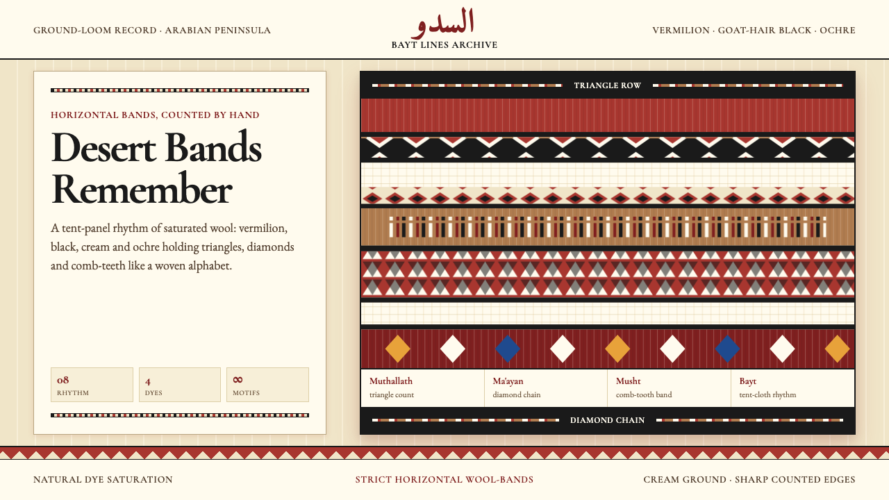 Bedouin Desert Textile (Sadu)Woven memory, not ornament. Vermilion-black bands count triangles and diamond…记忆被织成条带:朱砂与黑色在奶油羊毛上数出三角与菱形。
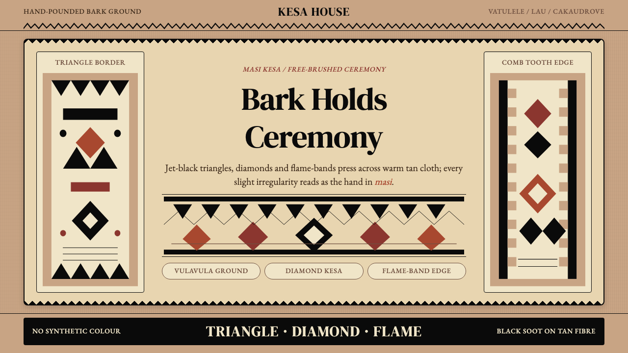 Fijian Masi (Tapa Cloth)Ceremony hits in black. Tan bark ground carries diamonds, zigzags and flame-b…黑色几何即仪式:暖褐树皮底承载菱形、锯齿与火焰边。
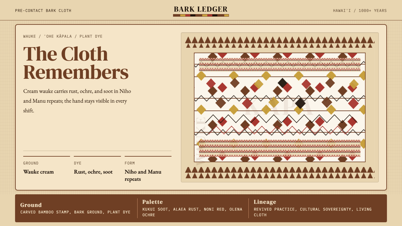 Hawaiian Kapa (Bark Cloth)Ceremonial geometry. Cream wauke, rust, ochre, and soot stamped in repeat.庄严几何。奶油 wauke 底上锈红、姜黄、烟黑反复手印。
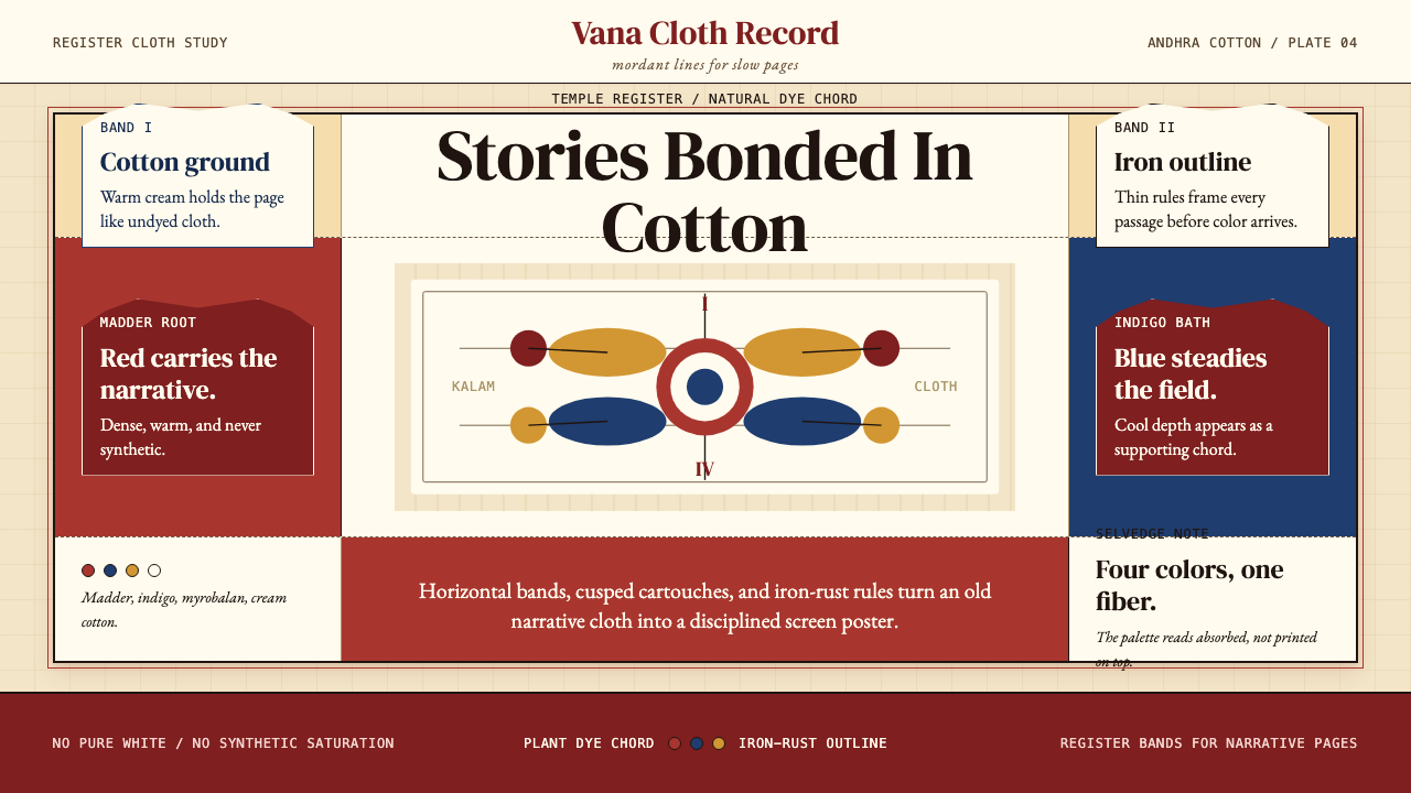 Kalamkari (Andhra Pradesh)Cloth becomes narrative. Madder bands, indigo panels, and iron rules stack li…棉布化为叙事:茜草红条带、靛蓝面板与铁锈线层层如庙布。
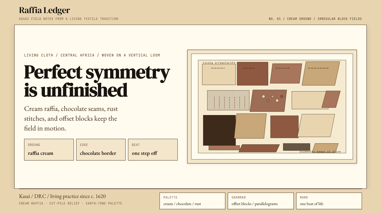 Kuba Raffia Cloth (Congo)Deliberate asymmetry lives. Cream raffia, chocolate seams, and rust blocks.不对称才有生命。奶油拉菲亚底配棕、赭、铁锈块面。
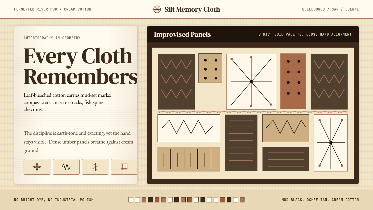 Mali Bògòlanfini (Bambara Mud-Cloth)Autobiography in geometry. Deep umber motifs breathe across cream cotton.几何写成自传:深赭纹样在米白棉布上呼吸。