What is Kalamkari (Andhra Pradesh)?什么是 Kalamkari (Andhra Pradesh)?
Eight hundred years of South Indian hand-drawn cloth — tamarind-twig kalam, plant-dye palette, and temple registers stacked like sacred narrative — translated into a living design system.八百年南印度手绘棉布工艺——罗望子枝笔、植物染料色谱与层叠如神殿叙事的条带寄存格——转译为一套鲜活的设计系统。
Kalamkari (Andhra Pradesh) in briefKalamkari (Andhra Pradesh) 速览
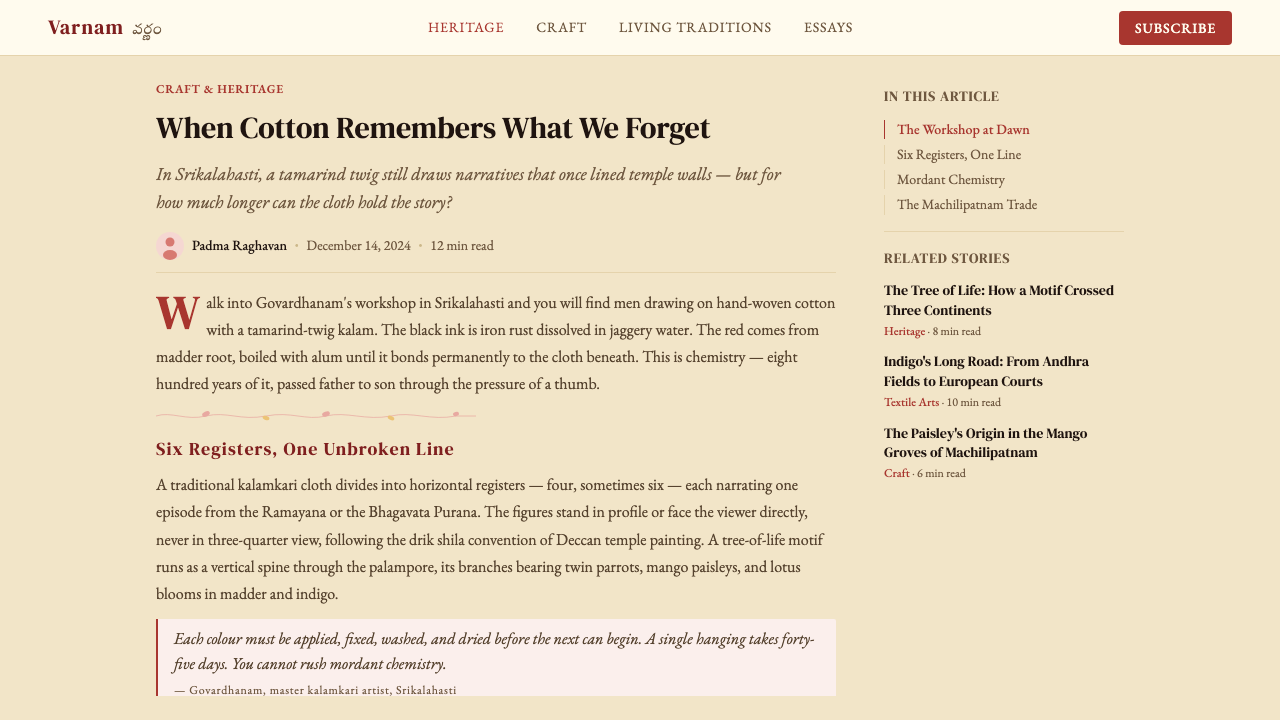
Kalamkari is an 800-year-old South Indian craft of drawing directly on cotton cloth using a tamarind-twig stylus called a kalam. Artisans apply mordants and plant-based dyes — madder red, iron-rust black, indigo blue, myrobalan yellow, pomegranate pink — that bond permanently into the fiber through a sequence of soaking, drying, and fixing stages. The result is color that does not read synthetic: it is warm, slightly varied, and organically settled into the weave. Two historic schools coexist under the same name. Srikalahasti, inland on the banks of the Swarnamukhi River, practices purely freehand work: the kalam traces mythological narratives, deities, and flora directly onto cloth without any printed guide. Machilipatnam, on the Coromandel Coast, combines woodblock printing for ground patterns with kalam detailing for outlines and fine interior work — a hybrid suited to larger-scale decorative and export production.Kalamkari 是印度安得拉邦传承八百余年的手绘印染棉布工艺。工匠以罗望子树枝削制的「卡兰」(kalam)笔为工具,将植物染料——茜草根红、铁锈黑、靛蓝、诃子黄、石榴粉——直接绘于棉布之上,经由浸泡、晾晒、固色等多道工序,让色彩与纤维永久结合。最终呈现的色泽不带任何工业感:温润、略带自然晕变,有机地沉入织物纹理。同一名称之下,历史上并存着两大流派:斯里卡拉哈斯蒂派位于斯瓦纳穆基河畔内陆地带,以纯粹的徒手绘制见长——卡兰笔在棉布上直接勾勒神话叙事、神祇图像与花卉纹样,无需任何印刷底稿引导;马奇利帕特南派位于科罗曼德海岸,以木刻版印底纹、再以卡兰笔补绘轮廓与细节,这种混合工艺更适合大规模的装饰与外销生产。
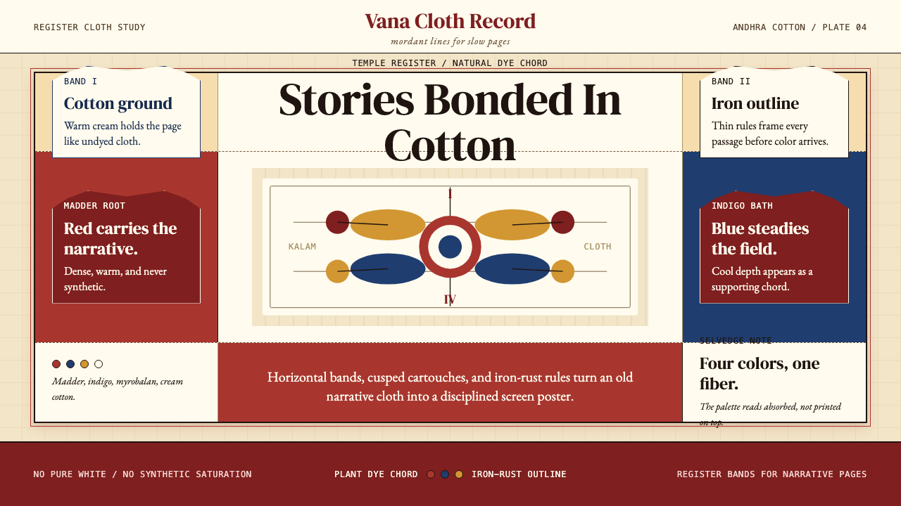
As a design system, Kalamkari translates that woven cloth into screen and print. The ground is cream or unbleached natural cotton — never synthetic white and never cool gray. Content is organized in horizontal register bands, each carrying a distinct narrative or data layer, in the same way temple cloths divide cosmic stories into sequential rows. Iron-rust outlines unify every element: they are firm, hand-drawn rather than mechanical in character, and they give the system its defining warmth. A central vertical axis — the tree of life, or kalpa vriksha — provides structural symmetry, around which asymmetric organic detail can radiate freely. Color is governed by the natural-dye chord: warm madder reds, deep indigo blues, earthy ochres and mustard yellows, muted pomegranate pinks, and occasionally a mineral green derived from the interaction of iron and myrobalan. Nothing in this palette reads electric or industrial.作为设计系统,Kalamkari 将那块棉布搬上屏幕与纸面。底色是奶油色或未漂白的天然棉本色——绝非冷白,也绝非灰调。内容以横向叙事条带(register band)组织,每条带承载独立的叙事层或数据层,如同庙宇神布将宇宙故事分列为连续的横排段落。铁锈色轮廓线统一勾勒每个元素:线条坚定而带有手绘性格,而非机械精准,正是这种轮廓线赋予整套系统标志性的温度。中央垂直轴——生命树,即 kalpa vriksha——提供结构性对称,有机的非对称细节则自由地向两侧辐射。色彩由天然染料和弦所主宰:温润的茜草红、深沉的靛蓝、土质的赭石与芥末黄、内敛的石榴粉,偶尔出现由铁与诃子相互作用产生的矿物绿。整个色谱中没有任何一个颜色是电气化或工业化的。
The style occupies a distinctive position in the landscape of historical design systems. Unlike systems that derive their authority from reduction and abstraction — Bauhaus geometry, Swiss typography — Kalamkari derives its authority from density, narrative, and craft specificity. Every mark carries memory of the maker's hand. Applied thoughtfully, this makes it one of the richest visual languages available for brands, editorial contexts, or digital interfaces that want to communicate heritage, artisanal authenticity, warmth, and cultural depth without resorting to cliché.Kalamkari 在历史设计系统的版图中占据一个独特的位置。与那些从减法和抽象中汲取权威的系统——包豪斯几何、瑞士排版——不同,Kalamkari 的权威来自密度、叙事与工艺特殊性。每一笔都携带着制作者手的记忆。若应用得当,它是目前最为丰富的视觉语言之一,适合任何希望传达传承感、手工真实性、温度与文化深度的品牌、编辑语境或数字界面——而不必诉诸陈词滥调。
See the Kalamkari (Andhra Pradesh) design system查看 Kalamkari (Andhra Pradesh) 完整设计系统
Where does Kalamkari (Andhra Pradesh) come from?Kalamkari (Andhra Pradesh) 从何而来?
The earliest documented Kalamkari cloths were produced as temple hanging narratives — long vertical and horizontal panels narrating episodes from the Ramayana, Mahabharata, and Puranas. These cloths were not decorative in the domestic sense; they were devotional objects, hung in temples as visual scripture for worshippers who could not read Sanskrit texts. The craft likely developed alongside South Indian temple culture from at least the twelfth century, though earlier antecedents exist in the broader tradition of cloth-painting across the subcontinent. The name itself is Persian in origin — kalam means pen or reed, kari means craft or work — a linguistic trace of the Mughal and Sultanate patronage that would later transform the tradition.现存最早有文献记载的 Kalamkari 布料是作为庙宇悬挂叙事画而制作的——长长的竖幅与横幅,描绘《罗摩衍那》、《摩诃婆罗多》与往世书中的故事段落。这些布料并非日常装饰物,而是供物,悬挂于庙宇之中,为不识梵文经典的信众提供可见的视觉圣典。这门工艺很可能从十二世纪前后便随南印度庙宇文化共同发展,尽管在次大陆更广泛的布画传统中存在更早的先例。「Kalamkari」这个名称本身源自波斯语——kalam 意为笔或苇管,kari 意为工艺或劳作——语言本身留下了莫卧儿帝国与苏丹国赞助的历史印记,这种赞助关系日后将深刻改变这门传统。
Between approximately 1500 and 1700, Mughal and Deccani Sultanate patronage fundamentally reshaped Kalamkari production at Machilipatnam. Patrons required large decorative panels for palace interiors: tent linings, floor spreads, and chamber dividers. This demand introduced Persian and Mughal aesthetic sensibilities — arabesque floral scrolls, structured geometric borders, the cypress tree and garden motifs of Persian carpet design — into what had been a primarily Hindu narrative tradition. The Machilipatnam school absorbed these forms while retaining its plant-dye palette and resist-printing techniques, producing a hybrid visual language that was simultaneously South Indian in color and Indo-Persian in compositional structure.大约在 1500 至 1700 年间,莫卧儿帝国与德干苏丹国的宫廷赞助从根本上重塑了马奇利帕特南的 Kalamkari 生产。赞助人需要大幅装饰面板用于宫廷内部:帐篷衬里、地铺与隔间帘布。这种需求将波斯与莫卧儿的美学感性——蔓草花卉卷轴、结构化几何边框、波斯地毯设计中的柏树与园林母题——引入了原本以印度教叙事为主的传统之中。马奇利帕特南流派吸纳了这些形式,同时保留其植物染料色谱与防染印花技术,形成了一种色彩属于南印度、构图结构属于印度—波斯的混合视觉语言。
From the seventeenth century onward, the Coromandel Coast became a significant node in the global textile trade. Dutch and English East India Company agents stationed at Masulipatnam (the colonial name for Machilipatnam) commissioned Kalamkari cloths in large quantities for European markets. European consumers called these fabrics chintz — from the Hindi chint, meaning variegated or spotted — and they became enormously fashionable in Dutch, English, and French interiors by the late seventeenth century. To meet European demand, Machilipatnam workshops adapted their compositions: borders became more regularized, grounds lighter, and floral motifs larger and more isolated. This export phase introduced new levels of standardization, but it also spread awareness of the craft across two continents and helped finance continued production through the eighteenth century.从十七世纪起,科罗曼德海岸成为全球纺织贸易的重要节点。驻扎在马苏利帕特南(马奇利帕特南的殖民地名称)的荷兰与英国东印度公司代理人大量订购 Kalamkari 布料销往欧洲市场。欧洲消费者将这类织物称为「印花布」(chintz,来自印地语 chint,意为斑驳或多彩),到十七世纪末,它们在荷兰、英国与法国室内装饰中风靡一时。为满足欧洲需求,马奇利帕特南的工坊调整了构图风格:边框趋于规则,底色更浅,花卉母题更大且更加独立分布。这一出口阶段引入了更高程度的标准化,但也将这门工艺的影响力传播至两个大陆,并在整个十八世纪为持续生产提供了经济支撑。
The nineteenth century brought considerable disruption. British colonial economic policies and the flooding of Indian markets with industrially produced Manchester cotton cloth devastated hand-production across the subcontinent. Kalamkari production contracted sharply, particularly at Machilipatnam, where block-printing workshops could not compete with machine-printed fabric on price. The craft survived mainly in Srikalahasti, where the temple-cloth tradition maintained a degree of ritual patronage, and in small family workshops carrying hereditary knowledge. The twentieth-century revival came in stages: the All India Handicrafts Board supported documentation and artisan training from the 1950s, Kalamkari received a Geographical Indication tag recognizing its regional authenticity, and contemporary designers including Sabyasachi Mukherjee brought the aesthetic into high-fashion contexts, reintroducing the visual language to global audiences. Today both schools remain active, with a new generation of practitioners working across traditional cloth, paper, and digital applications.十九世纪带来了严重冲击。英国殖民地经济政策与曼彻斯特工业化棉布涌入印度市场,使次大陆各地的手工生产遭受重创。Kalamkari 生产急剧萎缩,尤其是马奇利帕特南,那里的木刻印花工坊在价格上根本无法与机器印花布竞争。工艺主要在斯里卡拉哈斯蒂存续下来,那里的庙宇布画传统维系着一定程度的仪式赞助;同时也在少数世代传承的家庭工坊中保留命脉。二十世纪的复兴分阶段推进:全印度手工艺委员会从 1950 年代起支持文献整理与工匠培训;Kalamkari 获得地理标志认证,认定其地域真实性;当代设计师萨布亚萨奇·慕克吉等人将这套美学带入高级时装语境,让这套视觉语言重新进入全球视野。如今两大流派均仍活跃,新一代从业者跨越传统布料、纸张与数字应用领域,持续发展这门工艺。
What defines the Kalamkari (Andhra Pradesh) look?Kalamkari (Andhra Pradesh) 的视觉特征是什么?
Color Palette色彩体系
The palette is bounded by the chemistry of plant dyes. Madder root yields the warm, slightly brownish reds — never the electric crimson of synthetic dye. Indigo provides the only true blue, ranging from pale woad-shadow to deep midnight depending on the number of dye baths. Iron-rust mixed with myrobalan mordant produces the characteristic charcoal-black outline color. Myrobalan alone yields amber and ochre; pomegranate rind gives soft pinks. The palette thus has internal coherence: every color is warm-toned, slightly earthed, and optically compatible with every other color in the system. Cool tones and desaturated neutrals are absent; pure white is absent; the ground itself is warm cream.色谱受植物染料化学性质的限制。茜草根产出温润、略带棕调的红色——绝无合成染料那种电气化的鲜红。靛蓝提供唯一的纯正蓝色,根据染浴次数从淡淡的蓝灰到深邃的午夜蓝不等。铁锈与诃子媒染剂混合,产生标志性的炭黑色轮廓线。单独使用诃子可得琥珀与赭色;石榴皮带来柔和的粉红。整个色谱因此具有内在的一致性:每种颜色都是暖调、略带土质感,与系统内所有其他颜色在视觉上和谐共存。冷色调与去饱和中性色均不存在,纯白亦不存在——底色本身就是温暖的奶油色。
Register Band Structure叙事条带结构
Content is organized in horizontal bands called registers, stacked vertically to narrate a sequence of events, hierarchies, or categories. Each register is bounded top and bottom by a continuous border line, often decorated with a repeating small motif — a lotus bud chain, a geometric step pattern, or a scrolling vine. This register logic mirrors the organization of South Indian temple sculpture, where narrative friezes wrap around a sanctum at different heights, each telling a different story. On screen or on the slide, registers become the primary layout unit: a title register, a content register, a data register, and a footer register each occupy their horizontal band without bleeding into the others.内容以横向叙事条带(register)组织,竖向叠放以呈现事件序列、层级关系或类别分组。每条带的上下边缘均有连续边框线约束,通常以重复的小型母题装饰——莲花苞链、几何台阶纹或卷草纹。这种寄存格逻辑映射了南印度庙宇雕刻的组织方式:叙事浮雕带绕圣所在不同高度层层环绕,各讲述不同的故事。在屏幕或幻灯片上,寄存格成为主要的版面单元:标题带、内容带、数据带与页脚带各自占据横向区间,互不侵越。
Iron-Rust Outline铁锈轮廓线
The defining mark in Kalamkari is the iron-rust black outline — drawn with the kalam in a single continuous gesture when the craft is at its finest. This line is not perfectly mechanical: it swells slightly at curves, tapers at stroke endings, and carries visible directionality. In a design system, this translates to borders, dividers, and decorative frames that are firm and warm in character rather than cold and precise. The outline unifies every element on the ground — illustrations, text containers, data frames, decorative borders — the same way the kalam line unifies figure, ground, and ornament on the cloth.Kalamkari 最具标志性的笔触是铁锈黑色轮廓线——工艺最精湛时,卡兰笔以单一连贯的动作一气呵成。这条线并非完美的机械线条:它在弯曲处略有加粗,在笔触收尾处逐渐收细,并带有可见的运动方向感。在设计系统中,这转化为边框、分割线与装饰框架——性格坚定而温润,而非冰冷而精准。这条轮廓线统一了画面底色上的每一个元素——插图、文字容器、数据框架、装饰边框——正如卡兰线在棉布上统一了图像、底色与装饰纹样。
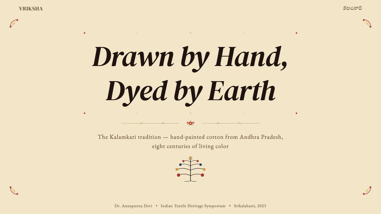
Tree of Life Axis生命树中轴
The kalpa vriksha — the wish-fulfilling tree of Indian cosmology — appears as a central vertical spine in both Srikalahasti and Machilipatnam work. Its trunk is the axis of symmetry; its branches carry flowers, birds, and narrative figures that radiate left and right in near-mirror arrangements. In design application, the tree-of-life logic provides the structural center of complex compositions: a central headline, data visualization, or hero illustration is flanked by symmetrically weighted content blocks or decorative columns. The surrounding detail is never perfectly mirrored — organic variation is essential to the aesthetic — but the bilateral logic is always present.「卡帕·弗里克夏」(kalpa vriksha,如意树)——印度宇宙论中实现愿望的神树——在斯里卡拉哈斯蒂与马奇利帕特南的作品中均以中央垂直主干的形式出现。树干是对称轴;枝桠向左右辐射,承载花卉、鸟类与叙事人物,形成近似镜像的布局。在设计应用中,生命树逻辑为复杂构图提供结构中心:居中的标题、数据可视化或主视觉,被对称分量的内容区块或装饰性立柱左右夹峙。周围的细节从不完全镜像——有机变化是这种美学的本质——但双侧对称的逻辑始终存在。
Botanical and Figural Density植物与人物密度
Kalamkari grounds are never empty. Between primary figures and narrative scenes, every available surface is filled with lotus scrolls, peacock feathers, stylized mango forms, creeper tendrils, and fish scales. This infill is not filler in the pejorative sense — it is load-bearing decoration that unifies the composition and signals craft mastery. A design system derived from Kalamkari embraces this density selectively: illustration frames carry decorative infill borders, section dividers incorporate repeating botanical elements, and empty grounds are understood as unusual rather than the default. This makes the system distinctly different from minimal aesthetics where whitespace is the primary value.Kalamkari 的底面从不留白。在主体人物与叙事场景之间,所有可用的画面空间都填满了莲花卷草、孔雀羽毛、风格化芒果形、藤蔓卷须与鱼鳞纹。这种填充并非贬义上的填料——它是承担构图统一作用的结构性装饰,也是工艺精通的信号。以 Kalamkari 为基础的设计系统有选择地拥抱这种密度:插图框架带有装饰性填充边框,章节分割线融入重复性植物元素,空白底面被理解为非常态而非默认状态。这使这套系统与以留白为首要价值的极简美学截然不同。
Warm Ground温暖底色
The ground in Kalamkari is always the color of prepared cotton: a warm, slightly yellowish cream produced by treating the cloth in a bath of myrobalan and buffalo milk before any pigment is applied. This ground is the single most important differentiator of the style. It prevents any color in the palette from reading cold or clinical. Madder red on cream is richer than madder red on white; indigo on cream is warmer and less harsh than indigo on white. In screen applications, the ground should read as natural material rather than digital neutral — warm without being yellow, substantial without being dark.Kalamkari 的底色始终是处理过的棉布本色:一种温润、略带黄调的奶油色,由棉布在施加任何颜料之前先在诃子与水牛奶浴液中浸泡处理而产生。这种底色是整套风格最重要的辨别性特征。它使色谱中的任何颜色都不会显得冷漠或医疗感。茜草红铺在奶油底上比铺在纯白上更为丰富;靛蓝铺在奶油底上比铺在纯白上更温润、更少刺激性。在屏幕应用中,底色应读来像天然材料而非数字中性色——温暖而不偏黄,有质感而不沉暗。
Hand-Drawn Character手绘性格
The most difficult aspect of Kalamkari to transfer into digital or print work is its hand-drawn quality — the evidence of the maker's hand visible in every line and fill. Mechanical perfection is the enemy of this aesthetic. In practical application, this means preferring slightly irregular border patterns over machine-perfect rules, hand-rendered illustrations over photographic imagery, and letterforms with calligraphic ancestry over purely geometric sans-serifs. It does not mean deliberately introducing errors; it means choosing visual elements whose character carries warmth and specificity rather than neutrality and precision.Kalamkari 最难迁移至数字或印刷工作的方面是它的手绘性格——制作者的手在每一条线、每一片填色中都留下可见的痕迹。机械的完美是这种美学的敌人。在实际应用中,这意味着偏向略带不规则的边框图案而非机器精准的直线,偏向手绘插图而非摄影图像,偏向具有书法传统的字体而非纯几何的无衬线字体。这并不意味着刻意引入错误,而是意味着选择那些性格中携带温度与特殊性——而非中性与精确性——的视觉元素。
See the Kalamkari (Andhra Pradesh) design system查看 Kalamkari (Andhra Pradesh) 完整设计系统
Who shaped Kalamkari (Andhra Pradesh)?谁塑造了 Kalamkari (Andhra Pradesh)?
A master Kalamkari artist from Srikalahasti who has dedicated his practice to preserving and transmitting the freehand temple-narrative tradition. Niranjan's work demonstrates the full range of the Srikalahasti kalam's expressive capacity, from the finest hair-thin outlining of facial features to the bold compositional structures of multi-figure mythological panels. He has been recognized by Indian craft bodies for his role in training the next generation of practitioners and for maintaining the ritual and devotional dimensions of the craft alongside its increasing visibility in the contemporary design market.来自斯里卡拉哈斯蒂的卡兰卡里大师,毕生致力于保护和传承纯手绘庙宇叙事传统。尼兰詹的作品展示了斯里卡拉哈斯蒂卡兰笔的全部表现力,从描绘面部特征的最细发丝轮廓线到多人物神话画面的宏观构图结构。他因在培养下一代从业者,以及在这门工艺在当代设计市场日益受到关注的同时维护其仪式与供奉维度方面所做的贡献,而获得印度工艺机构的认可。
A leading figure in the Machilipatnam tradition, Lakshman Rao is known for his mastery of the combined block-print and kalam method that defines the coastal school. His contribution has been particularly significant in documenting and codifying the woodblock vocabulary — the precise carved motifs used to lay down the structural ground of a Machilipatnam piece — at a moment when many hereditary block-carvers have left the profession. His workshops have helped sustain the ecosystem of complementary skills on which the school depends.马奇利帕特南流派的领军人物,拉克什曼·拉奥以精通木版印刷与卡兰笔结合的方法——正是这种方法定义了沿海流派——而著称。他的贡献在于,在许多世代传承的木版雕刻师已离开这一行业的时刻,系统整理和编纂了马奇利帕特南作品所依赖的木版词汇——即用于铺设一件马奇利帕特南作品结构底纹的精确雕刻母题。他的工坊帮助维系了该流派所依赖的互补技能生态系统。
A Srikalahasti master who has pursued an experimental path within the tradition, applying Kalamkari technique to new formats — large wall installations, contemporary art contexts, and collaborations with architects and interior designers. Srinivas's practice demonstrates that the Kalamkari visual language is not frozen in its historic forms: the kalam's logic of line, register, and botanical density can expand to address contemporary spatial scales without losing its essential character. His work has been exhibited internationally and contributed to repositioning the craft as a living tradition rather than a museum artifact.斯里卡拉哈斯蒂大师,在传统内部走出了一条实验性路径——将 Kalamkari 技法应用于新的形式:大型墙面装置、当代艺术语境,以及与建筑师和室内设计师的合作。斯里尼瓦斯的实践证明,Kalamkari 视觉语言并未凝固于其历史形态之中:线条、寄存格与植物密度的卡兰逻辑,可以扩展至当代空间尺度而不失其本质性格。他的作品在国际上展出,有力推动了这门工艺从博物馆文物向鲜活传统的重新定位。
The Kolkata-born fashion designer who, from the early 2000s onward, became the most internationally prominent voice for Indian handcraft textiles including Kalamkari. Mukherjee's collections have consistently incorporated Kalamkari panels, borders, and motifs — bringing them into luxury fashion contexts alongside his signature blend of historical Indian textiles. His work is significant not because it is documentary or preservationist, but because it recontextualized Kalamkari within global luxury aesthetics, demonstrating that the visual language could carry authority in contemporary fashion and design without being domesticated or diluted. The renewed commercial interest in Kalamkari production that followed his collections has had direct impact on artisan livelihoods in both Srikalahasti and Machilipatnam.这位出生于加尔各答的时装设计师从 2000 年代初起,成为包括 Kalamkari 在内的印度手工纺织品在国际上最具影响力的代言声音。慕克吉的系列作品始终将 Kalamkari 的面板、边框与母题融入其标志性的历史印度纺织品混搭之中,带入奢侈时装语境。他的意义不在于文献整理或保存主义,而在于他将 Kalamkari 重新语境化于全球奢侈美学之中,证明这套视觉语言无需被驯化或稀释,即可在当代时装与设计中彰显权威。随其系列作品引发的 Kalamkari 生产商业兴趣的复苏,对斯里卡拉哈斯蒂与马奇利帕特南两地工匠的生计产生了直接而积极的影响。
The seventeenth and eighteenth-century European East India Company agents — Dutch, English, and French — who commissioned and exported Kalamkari cloths from the Coromandel Coast were not artists, but their curatorial and commercial decisions fundamentally shaped the tradition. By specifying lighter grounds, larger floral motifs, and more regularized border systems, they introduced a standardization that pushed Machilipatnam toward a broader compositional language. The chintz trade created the first significant global audience for Kalamkari aesthetics, and the stylistic adaptations made for European markets left permanent traces in the Machilipatnam school's vocabulary that persist in the tradition today.十七、十八世纪在科罗曼德海岸订购并出口 Kalamkari 布料的欧洲东印度公司代理人——荷兰、英国与法国——并非艺术家,但他们的策展式商业决策从根本上塑造了这门传统。通过指定更浅的底色、更大的花卉母题和更规则化的边框体系,他们引入的标准化将马奇利帕特南推向了更为宽泛的构图语言。印花布贸易为 Kalamkari 美学创造了第一批重要的全球受众,而为欧洲市场所做的风格适应,在马奇利帕特南流派的词汇中留下了永久的印记,并在今日的传统中延续可见。
How do you use Kalamkari (Andhra Pradesh) today?今天怎么用 Kalamkari (Andhra Pradesh)?
Applying Kalamkari to contemporary design work requires understanding what the system is actually doing structurally, not merely borrowing its surface visual markers. The style's core logic is: warm ground, horizontal register organization, iron-rust outline discipline, botanical infill density, and a natural-dye color chord. When all five are present and working together, the result reads as Kalamkari-derived; when only the color palette is borrowed and applied to a modern minimal layout, the result is decorative pastiche. The distinction matters because Kalamkari's authority comes from system coherence, not from ornamental elements applied individually.将 Kalamkari 应用于当代设计工作,需要理解这套系统在结构上实际做了什么,而不仅仅是借用其表面视觉标记。这套风格的核心逻辑是:温暖底色、横向寄存格组织、铁锈色轮廓线规范、植物填充密度,以及天然染料色彩和弦。当这五者同时存在并协同运作时,结果读来是 Kalamkari 衍生风格;当只有色谱被借用并应用于现代极简版面时,结果只是装饰性的拼贴。这种区别至关重要,因为 Kalamkari 的权威来自系统的整体一致性,而非单独应用的装饰元素。
For presentation slides, Kalamkari works most powerfully on cover slides where the full visual vocabulary can be deployed without information-density constraints. A strong Kalamkari cover uses a warm cream ground, a central composition anchored by a tree-of-life or large botanical illustration treated as a hero element, a title set in a typeface with calligraphic warmth placed within a clearly bounded register band, and a border system that frames all four edges with repeating botanical motifs. Content slides should simplify significantly: retain the cream ground and iron-rust border discipline, use register bands to separate sections, and introduce the color palette sparingly through data visualization elements, category labels, or accent rules. Data slides benefit from the register logic directly — each data category occupies its own horizontal band, with plant-dye colors assigning meaning to series without competing with each other.在演示文稿中,Kalamkari 最能在封面幻灯片上发挥力量——在那里,完整的视觉词汇可以不受信息密度限制地完全展开。一张出色的 Kalamkari 封面使用温暖的奶油底色,以生命树或大型植物插图作为主视觉锚定中心构图,将标题排在具有书法温度的字体中、置于清晰界定的寄存格带内,以重复植物母题的边框体系环绕四边。内容幻灯片则应大幅简化:保留奶油底色与铁锈色边框规范,以寄存格带分隔章节,通过数据可视化元素、类别标签或强调线条节制地引入色彩。数据幻灯片直接受益于寄存格逻辑——每个数据类别占据自己的横向条带,植物染料色彩为系列赋予意义而不相互竞争。
For web interfaces and dashboards, Kalamkari suits platforms where warmth, craft heritage, and cultural specificity are intended brand values — artisanal e-commerce, cultural institutions, travel and hospitality, food and beverage with regional provenance emphasis, and wellness brands rooted in traditional practice. The approach: set a warm cream background throughout, use bordered card components with a firm warm outline rather than soft shadow, employ a botanical border pattern as a recurring motif in navigation headers and section dividers, and restrict the full color palette to illustrative or accent elements. Pricing pages work well when each tier is housed in a register band with its own botanical border treatment, and calls to action are colored in madder red or indigo rather than generic blue or green.在网页界面与仪表板方面,Kalamkari 适合那些将温度感、工艺传承与文化特殊性作为预期品牌价值的平台——手工艺电商、文化机构、旅行与酒店业、强调地域来源的餐饮品牌,以及根植于传统实践的健康品牌。方法如下:全站设置温暖的奶油色背景,使用带有坚定温润轮廓线而非柔和阴影的边框卡片组件,以植物边框图案作为导航栏头部与章节分割线的重复性母题,将完整色谱限制于插图或强调元素。定价页面在每个等级都用带有植物边框处理的寄存格带承载时效果极佳,行动号召按钮以茜草红或靛蓝着色,而非通用的蓝色或绿色。
For editorial and marketing work, Kalamkari provides an exceptionally rich language for print and digital content that aims to communicate craft, provenance, and depth. A Kalamkari-derived editorial layout uses a warm cream paper ground, a botanical drop-cap or initial illustration to open each major section, register bands to organize pull quotes or sidebars, and iron-rust rules rather than gray lines to separate content zones. Marketing pages benefit from the style's poster-like compositional density: full-width panels carry large botanical or figural illustrations with text overlay in a clearly bounded register, alternating between cream-ground and deep-indigo-ground sections to create rhythm without introducing new colors. Brand identity systems derived from Kalamkari should anchor on a single dominant motif — a specific flower, bird, or tree form — rather than attempting to reference the full visual vocabulary simultaneously.在编辑与营销内容中,Kalamkari 为旨在传达工艺感、来源感与深度的印刷与数字内容提供了异常丰富的视觉语言。Kalamkari 衍生的编辑版面使用温暖的奶油底纸色,以植物首字下沉或首字插图开启每个主要章节,以寄存格带组织引语或侧边栏,以铁锈色规线而非灰色线条分隔内容区域。营销页面受益于这种风格的海报式构图密度:全宽面板承载大型植物或人物插图,文字叠加于清晰界定的寄存格内,奶油底与深靛蓝底区块交替出现,以不引入新颜色的方式创造节奏。来源于 Kalamkari 的品牌视觉识别系统应锚定于单一主导母题——特定的花卉、鸟类或树木形态——而非试图同时引用完整的视觉词汇。
A common mistake when applying Kalamkari is treating the botanical ornamentation as optional decoration that can be added or removed without changing the system's character. In authentic Kalamkari, the infill density is structural — it is what creates the sense of a fully inhabited visual world. Stripping it out in favor of modern whitespace principles produces something that looks like Indian-themed decoration rather than a Kalamkari-derived design system. The correct approach when simplifying for digital contexts is to concentrate the botanical density at borders, frames, and accent elements rather than eliminating it entirely, preserving the system's essential character while adapting its density to screen legibility requirements.应用 Kalamkari 时最常见的错误,是将植物装饰性填充视为可以随意添加或删除而不改变系统性格的可选装饰。在真实的 Kalamkari 中,填充密度是结构性的——正是它创造了一个完整居住的视觉世界的感觉。为了现代留白原则而将其剥除,产生的是印度主题装饰的外表,而非 Kalamkari 衍生的设计系统。在为数字语境简化时,正确的做法是将植物密度集中于边框、框架与强调元素,而非完全消除——在保留系统本质性格的同时,将其密度适应于屏幕可读性的要求。
See the Kalamkari (Andhra Pradesh) design system查看 Kalamkari (Andhra Pradesh) 完整设计系统
Kalamkari (Andhra Pradesh) — FAQKalamkari (Andhra Pradesh) · 常见问题
What is the difference between Srikalahasti and Machilipatnam Kalamkari?斯里卡拉哈斯蒂与马奇利帕特南的 Kalamkari 有何区别?
The two schools share a name, a plant-dye palette, and a warm-ground aesthetic, but differ fundamentally in technique and historical orientation. Srikalahasti Kalamkari is purely freehand — the kalam draws every line directly on cloth without any printed guide. It is the older devotional tradition, historically producing temple narratives and religious cloths. Machilipatnam Kalamkari combines woodblock printing for the structural ground pattern with kalam work for outlines and fine detail. It evolved as a more commercially oriented school, producing decorative panels and, from the seventeenth century onward, export goods for European markets. In design application, Srikalahasti-influenced work tends toward more fluid, less regularized compositions; Machilipatnam-influenced work tends toward more structured, repeating-pattern systems.两大流派共享名称、植物染料色谱与温暖底色美学,但在技法和历史取向上存在根本差异。斯里卡拉哈斯蒂 Kalamkari 是纯粹的徒手绘制——卡兰笔在棉布上直接勾勒每一条线,无需任何印刷底稿引导。它是更古老的供奉传统,历史上主要生产庙宇叙事布与宗教用布。马奇利帕特南 Kalamkari 则将木刻版印花用于结构性底纹图案,以卡兰笔绘制轮廓与细节。它作为更具商业取向的流派发展起来,生产装饰性面板,并从十七世纪起向欧洲市场提供出口商品。在设计应用中,受斯里卡拉哈斯蒂影响的作品趋向更为流动、较少规则化的构图;受马奇利帕特南影响的作品趋向更为结构化的重复图案系统。
Can Kalamkari work in a dark-background layout?Kalamkari 风格能用于深色背景版面吗?
A dark inversion is possible but requires significant compositional adjustment. The warm cream ground is so central to the aesthetic that replacing it with a dark background fundamentally changes the character of the system. The most successful dark-ground Kalamkari-derived treatments use deep indigo as the background — not neutral black or charcoal — because indigo is native to the palette and maintains the system's color relationships. On an indigo ground, madder red and myrobalan gold read as warm highlights rather than structure colors, and the botanical infill reads as gold or cream line-work against the dark field. The iron-rust outline color typically inverts to a pale warm tone. This approach works well for evening event materials, luxury packaging, or inverted hero panels within an otherwise cream-ground layout.深色反转版本是可行的,但需要对构图做出重大调整。温暖的奶油底色是这套美学如此核心的元素,以至于用深色背景替换它从根本上改变了系统的性格。最成功的深色底 Kalamkari 衍生处理,以深靛蓝作为背景——而非中性黑或炭色——因为靛蓝是色谱的原生成员,能够维护系统内的色彩关系。在靛蓝底上,茜草红与诃子金读来是温润的高光色而非结构色,植物填充读来是深色底面上的金色或奶油色线描。铁锈轮廓色通常反转为浅暖调。这种方法适用于夜间活动材料、奢侈包装,或在整体以奶油色为底的版面中局部使用的反色主视觉面板。
How does Kalamkari differ from other South and Southeast Asian botanical textile traditions?Kalamkari 与其他南亚和东南亚植物纹织物传统有何不同?
Several South and Southeast Asian textile traditions share botanical motifs and plant-dye palettes with Kalamkari, but each has distinct formal properties. Batik — practiced across Java, Malaysia, and parts of India — uses wax-resist rather than kalam drawing, producing outlines that are slightly irregular and soft-edged where the wax cracked. Ikat — practiced widely across Indonesia, Central Asia, and India — achieves its patterns through thread dyeing before weaving, producing characteristically blurred, feathered edges that Kalamkari does not share. Block-printed Indian textiles from Rajasthan and Gujarat use flat repeat patterns with less figural and narrative content than Kalamkari typically employs. The distinguishing properties of Kalamkari are: the kalam's drawn line giving it a calligraphic character, the narrative register structure organizing content sequentially, and the specific natural-dye chord — madder, indigo, myrobalan, iron — that is tied to Andhra Pradesh's specific material history.多个南亚与东南亚纺织传统与 Kalamkari 共享植物母题和植物染料色谱,但各自具有截然不同的形式特征。爪哇、马来西亚及印度部分地区的蜡染(Batik)使用防蜡而非卡兰线描,在蜡裂处产生略带不规则感和柔软边缘的轮廓。在印度尼西亚、中亚和印度广泛实践的绞缬(Ikat)通过织前的经纬线染色获得图案,产生 Kalamkari 所不具备的特征性模糊、羽状边缘。拉贾斯坦邦和古吉拉特邦的印度木刻印花纺织品使用平面重复图案,人物与叙事内容远少于 Kalamkari 的典型水准。Kalamkari 的区分性特征是:卡兰的线描赋予它书法性格;叙事寄存格结构将内容顺序组织;以及与安得拉邦特定物质历史相关联的天然染料和弦——茜草、靛蓝、诃子、铁锈。
Is the Kalamkari palette compatible with accessibility standards for digital use?Kalamkari 色谱是否符合数字使用的无障碍标准?
The natural-dye palette of Kalamkari presents specific accessibility considerations for digital application. The warm cream ground has lower contrast against pale yellow and light ochre than a pure white ground would, so body text should always be set in the iron-rust black or a deep indigo — never in a mid-tone plant-dye color — to maintain readable contrast ratios. Madder red used as a background color needs dark text overlay, not cream text, to achieve sufficient contrast. Indigo backgrounds accept both cream and gold text at adequate contrast levels. The most common accessibility failure in Kalamkari-derived digital work is using plant-dye colors — particularly ochre, pomegranate pink, and pale indigo — at medium saturation as text or interactive label colors against cream; these combinations reliably fail contrast requirements and should be reserved for purely decorative or illustrative elements.Kalamkari 的天然染料色谱在数字应用中有特定的无障碍考量。温暖的奶油底色与浅黄和浅赭色之间的对比度低于纯白底色,因此正文文字应始终使用铁锈黑或深靛蓝——绝不使用中间调的植物染料色——以维持可读的对比度。以茜草红作为背景色时,需要深色而非奶油色的叠加文字才能实现足够的对比度。靛蓝背景可以承载奶油色和金色文字,并达到足够的对比水准。Kalamkari 衍生数字作品中最常见的无障碍问题,是将植物染料颜色——尤其是赭色、石榴粉和淡靛蓝——以中等饱和度用于奶油底上的文字或交互标签色;这些组合可靠地无法通过对比度要求,应保留用于纯装饰性或插图性元素。
What kinds of products or brands are a poor fit for Kalamkari?哪些类型的产品或品牌不适合使用 Kalamkari?
Kalamkari carries specific cultural and aesthetic associations that make it unsuitable for certain product categories. It reads as warm, narrative, craft-rooted, and South Asian in cultural register — which is a powerful fit for brands that share those values but can be incongruous or appropriative in others. Technology products positioning for precision and rational efficiency struggle against the style's organic density and warm tones. Financial products requiring strict neutrality and authority may find the ornamental richness undercuts the expected register. Children's educational products and playful consumer applications need lighter, more primary palettes than Kalamkari's earth-toned natural-dye system provides. Most critically: brands with no genuine connection to South Asian craft heritage should exercise considerable care before adopting the aesthetic wholesale, since the style carries cultural meaning that is not simply decorative. A thoughtful selective reference — botanical register logic, warm ground, outline discipline — is more defensible than a wholesale visual adoption.Kalamkari 承载着特定的文化与美学关联,使其不适合某些产品类别。它读来是温润的、叙事性的、扎根于工艺的,在文化调性上属于南亚——这对于共享这些价值观的品牌是强有力的契合,但对其他品牌可能显得不协调甚至构成文化挪用。以精确性与理性效率定位的科技产品,会与这种风格的有机密度和温暖色调产生冲突。需要严格中立性与权威感的金融产品,可能会发现这种装饰性丰富削弱了预期的调性。儿童教育产品和轻松消费类应用,需要比 Kalamkari 以大地色调为主的天然染料系统更轻盈、更纯粹的色谱。最关键的是:与南亚工艺传承没有真实关联的品牌,在全面采用这套美学之前应格外审慎,因为这套风格承载的文化意义并非仅仅是装饰性的。有节制的选择性引用——植物寄存格逻辑、温暖底色、轮廓线规范——比全面的视觉挪用更为负责任。
Related design styles相关设计风格
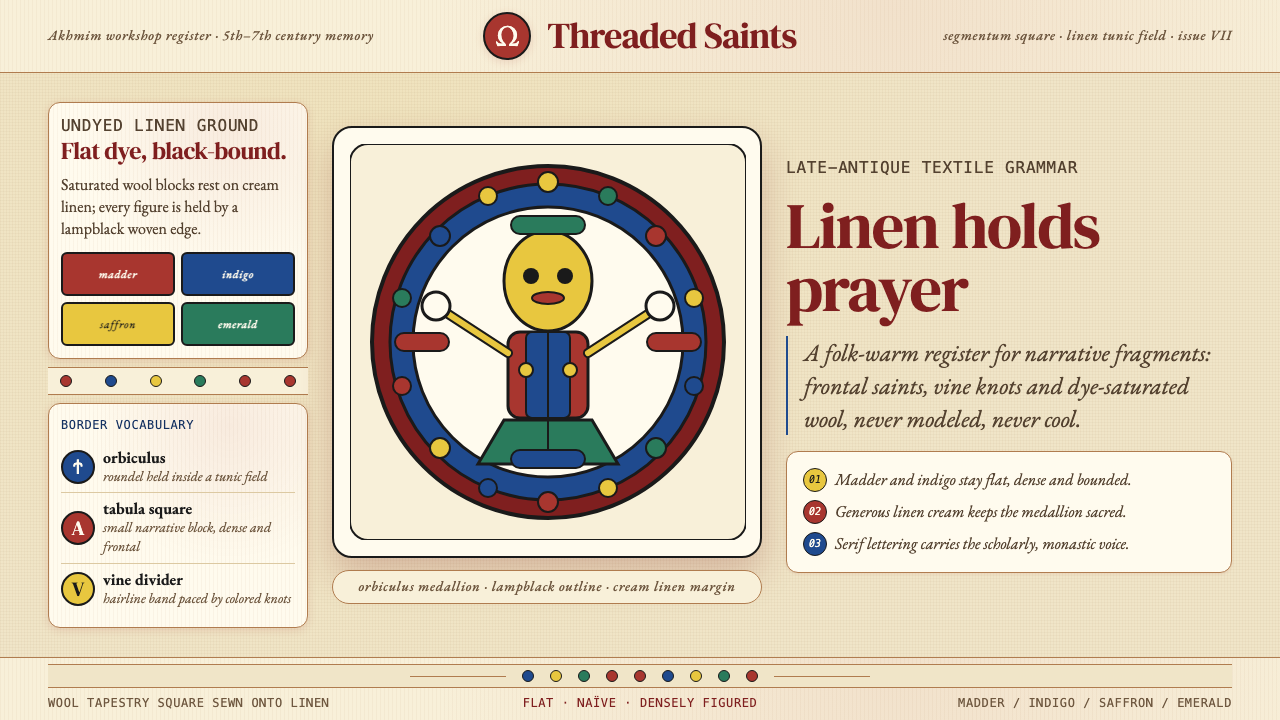 Egyptian Coptic TextileWarmth woven flat. Madder, indigo and saffron medallions sit on linen cream.温暖被织成平面:茜草红、靛蓝与藏红花圆章落在亚麻乳白上。
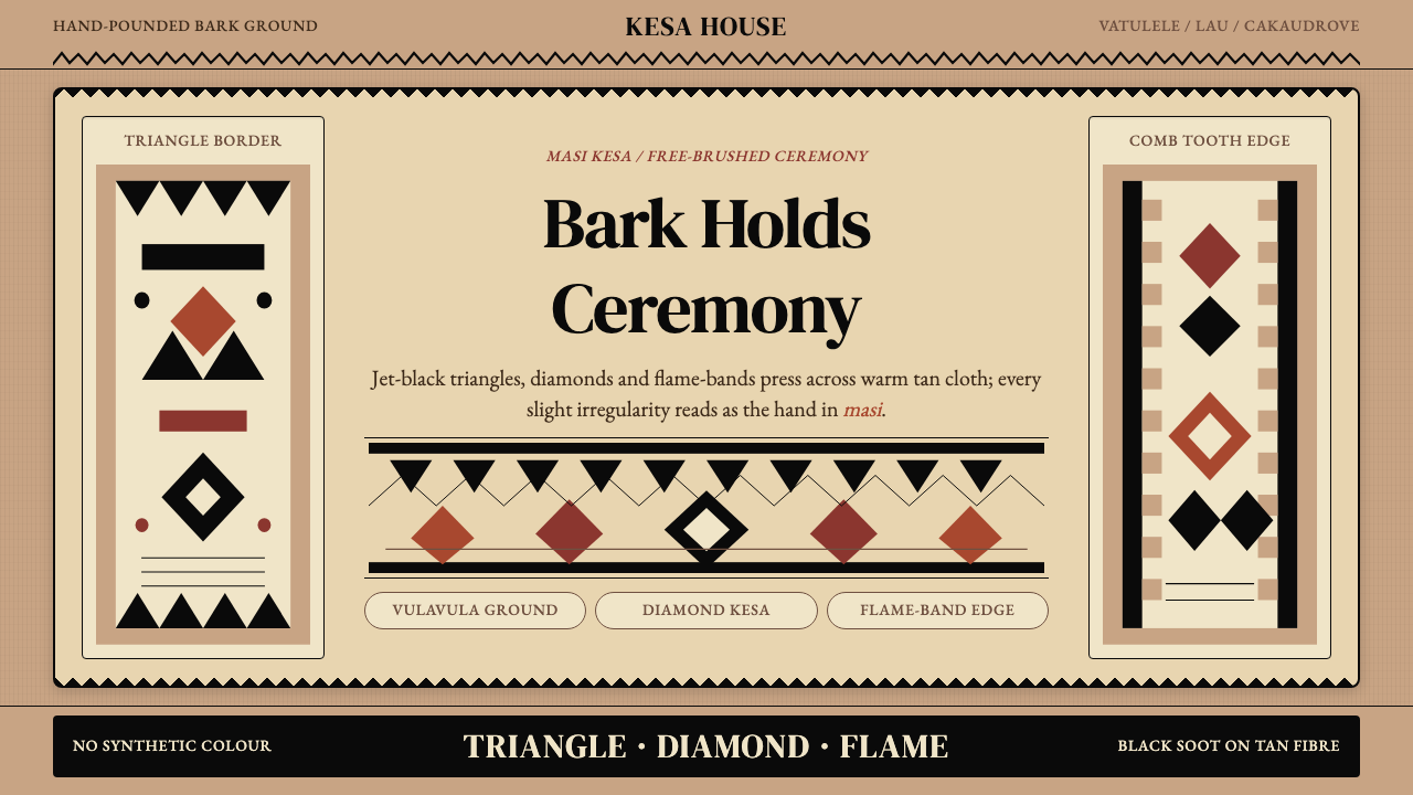 Fijian Masi (Tapa Cloth)Ceremony hits in black. Tan bark ground carries diamonds, zigzags and flame-b…黑色几何即仪式:暖褐树皮底承载菱形、锯齿与火焰边。
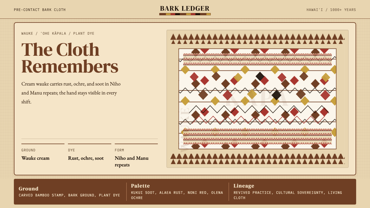 Hawaiian Kapa (Bark Cloth)Ceremonial geometry. Cream wauke, rust, ochre, and soot stamped in repeat.庄严几何。奶油 wauke 底上锈红、姜黄、烟黑反复手印。
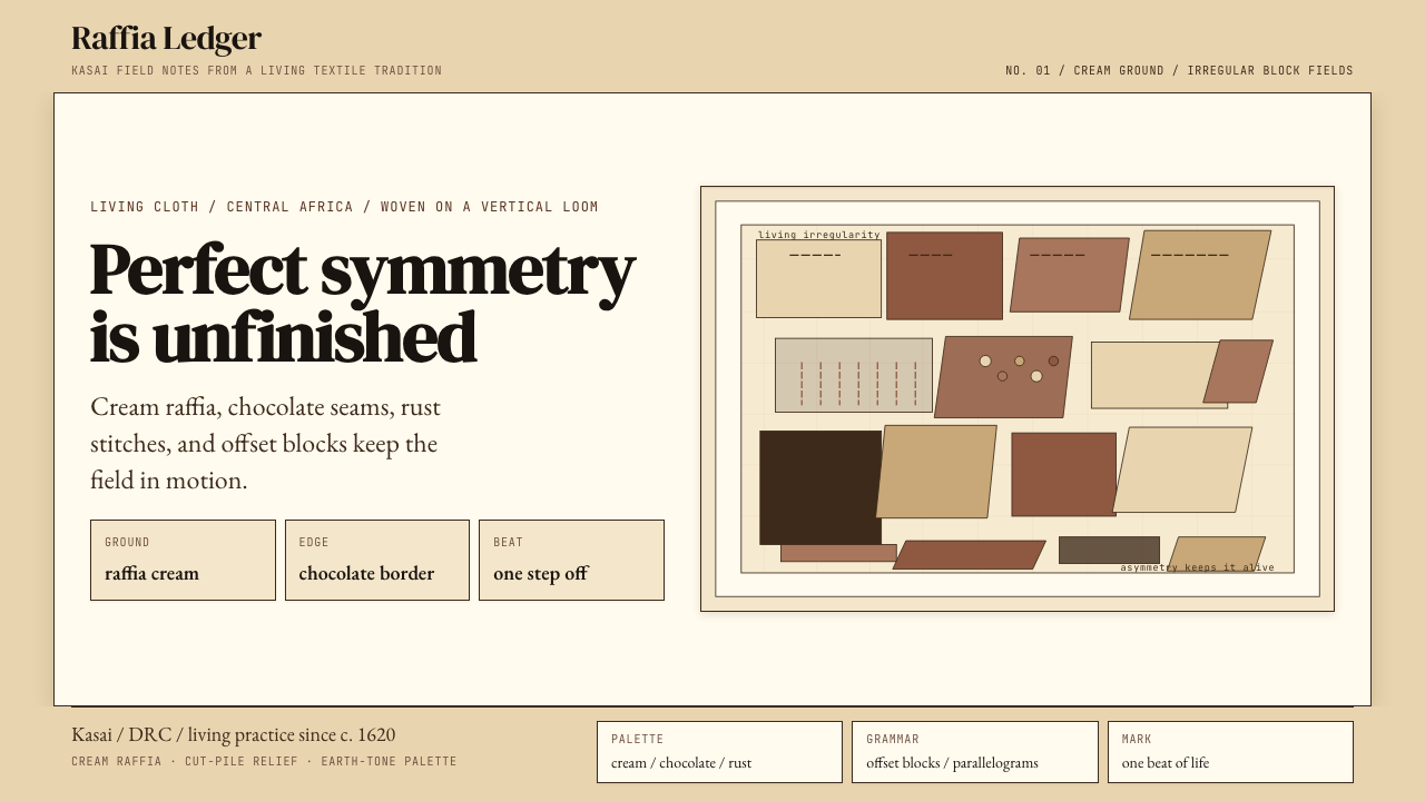 Kuba Raffia Cloth (Congo)Deliberate asymmetry lives. Cream raffia, chocolate seams, and rust blocks.不对称才有生命。奶油拉菲亚底配棕、赭、铁锈块面。
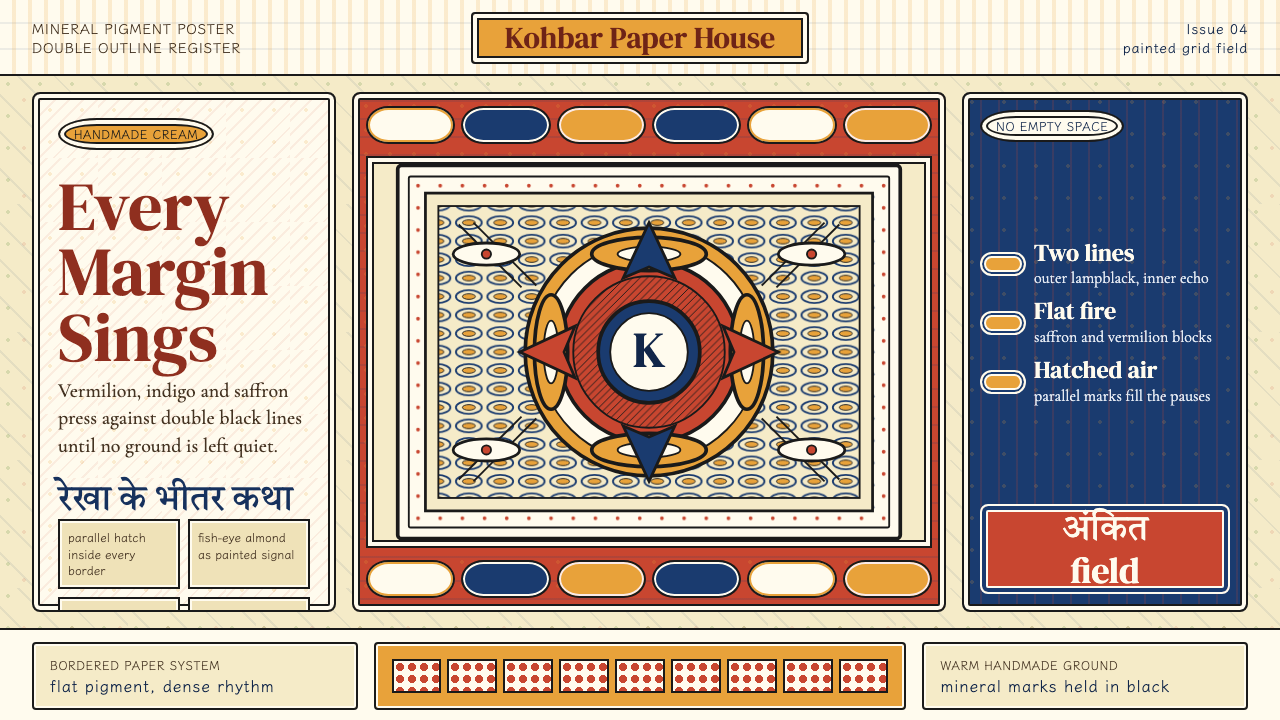 Madhubani (Mithila Folk Painting)No empty ground. Vermilion, indigo and saffron pack double-outlined panels wi…不留空地。朱砂、靛蓝与姜黄铺满双线边框和密集排线。
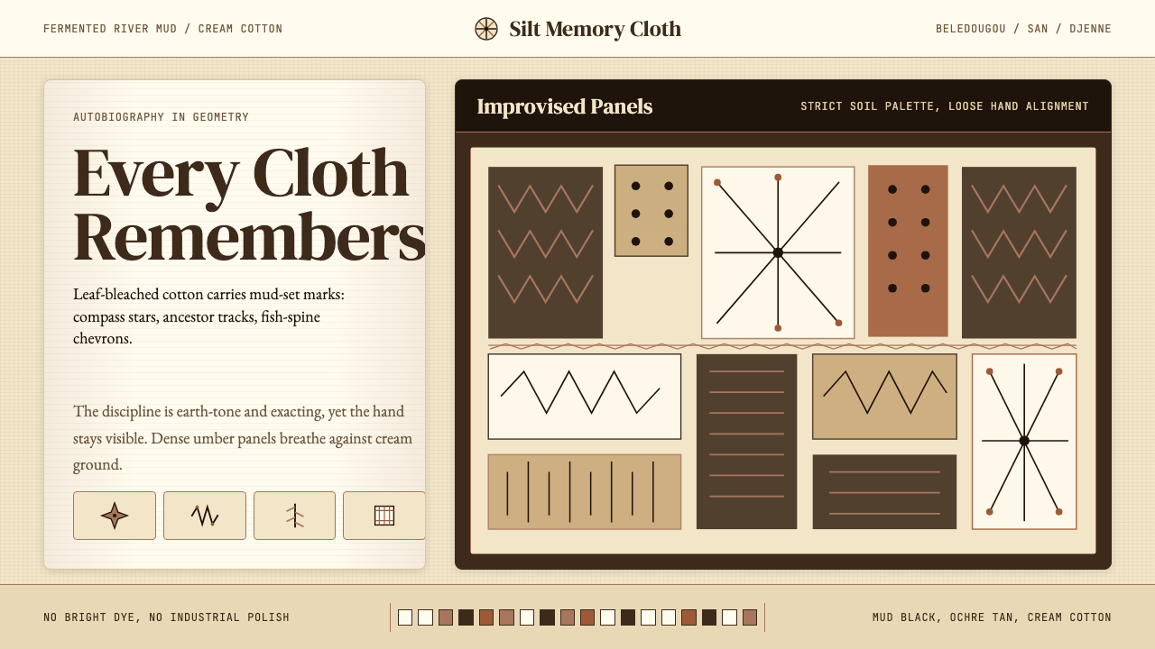 Mali Bògòlanfini (Bambara Mud-Cloth)Autobiography in geometry. Deep umber motifs breathe across cream cotton.几何写成自传:深赭纹样在米白棉布上呼吸。