What is Romanian Ie (folk embroidered blouse)?
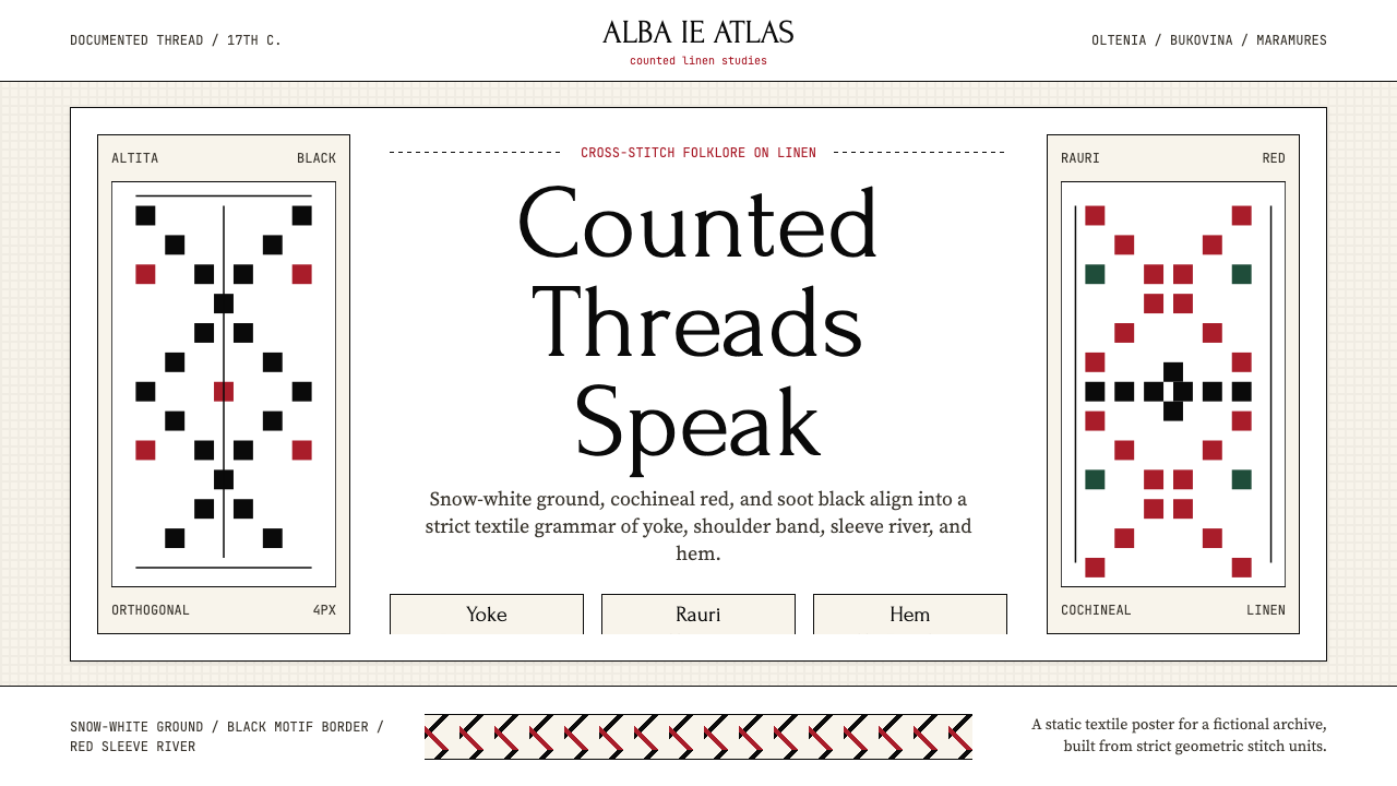
The Romanian ie is a thousand years of regional identity stitched into linen — a peasant blouse whose strict cross-stitch grammar became the visual language of an entire civilization.
Romanian Ie (folk embroidered blouse) in brief
The Romanian ie is a hand-embroidered linen blouse worn by women across Romania for at least four centuries of documented history. It is not merely a garment; it is a coded visual text, each region producing its own dialect of geometry, color, and stitch density. The shoulder yoke (altiță), the vertical sleeve bands (râuri), and the hem borders together constitute a hierarchical layout system — a grid of meaning as deliberate and rigorous as any modernist composition.
What makes the ie distinctive in the broader world of folk textile traditions is its combination of strict orthogonal geometry with extreme regional specificity. An experienced eye can identify whether a blouse comes from Oltenia, Bukovina, Maramureș, Banat, or Transylvania by the color palette alone — Oltenia prefers dense black geometric altițe on undyed white linen; Bukovina is known for vivid cochineal red diagonals cascading down the sleeves; Maramureș produces subtle white-on-white relief work that reads as pure texture. The same system, radically different dialects.
The ie crossed from folk vernacular into high culture at the turn of the twentieth century, when Queen Marie of Romania wore it at European courts and Henri Matisse painted it twice — most famously in his 1940 canvas known as La Blouse Roumaine, where the embroidered yoke becomes a geometric foil to a naturalistic figure. In 2022, UNESCO added the ie to its list of Intangible Cultural Heritage, recognizing the active knowledge systems of the craftswomen who still practice it. The design system distilled from the ie is not nostalgia; it is a living language translated into interface architecture.
Where does Romanian Ie (folk embroidered blouse) come from?
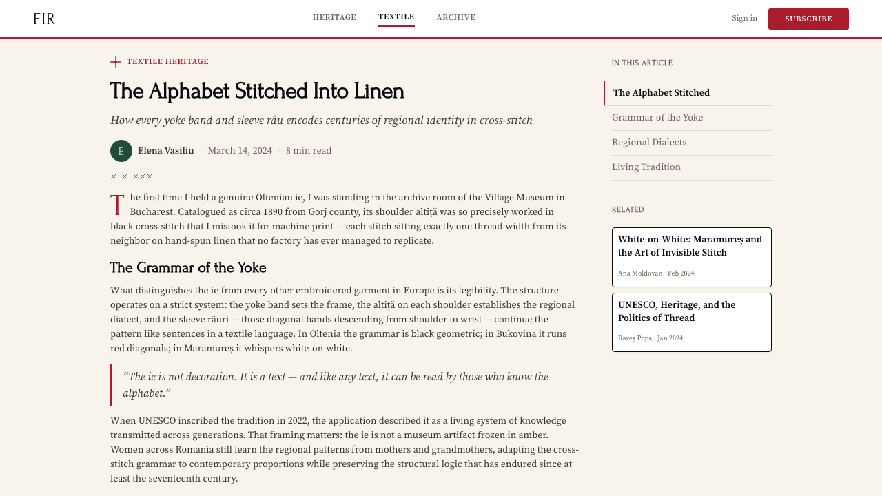
The earliest textile evidence from Romanian territories dates to the Bronze Age, but the ie as a documented garment — with its characteristic regional embroidery traditions — appears in art and written records from the seventeenth century onward. The craft's deep roots lie in the self-sufficient agrarian communities of the Carpathian basin, where village women produced every textile by hand, from spinning and weaving the linen ground to dyeing threads and executing the final embroidery. The garment was not decorative surplus; it was a primary material expression of community identity, marital status, age, and the festive calendar.
Each of Romania's historic provinces developed a distinct visual vocabulary shaped by the materials available, trade routes, and neighboring cultural influences. Oltenia, in the southwest, favored jet-black silk thread or wool on undyed linen — a stark graphic contrast that gives its pieces an almost heraldic quality. Bukovina, in the northeast, acquired cochineal red through trade connections stretching toward the Ottoman sphere, and its dense diagonal bands (râuri) became the most internationally recognized face of the ie tradition. Maramureș, isolated in the northern Carpathians, preserved archaic white-on-white work that preceded the introduction of color dyes. Transylvania, long under Habsburg influence, absorbed central European motifs, producing hybrid pieces where geometric Romanian grammar met baroque floral interpolation.
The ie entered national consciousness as a political symbol during the nineteenth-century movement for Romanian national unity. Cultural organizations such as ASTRA (the Transylvanian Association for Romanian Literature and the Culture of the Romanian People, founded 1861) collected and catalogued regional embroidery specimens alongside folk song and oral literature, constructing a coherent national heritage from disparate regional traditions. Urban intellectuals and the royal family took up the garment as a symbol of Romanian identity distinct from Ottoman and Habsburg political affiliations — a textile argument for cultural autonomy.
Queen Marie of Romania (1875–1938), herself of British and Russian royal descent, became the ie's most prominent ambassador. She wore it in diplomatic contexts across Europe, commissioned photographic portraits in it, and wrote admiringly of its aesthetic in her memoirs. This aristocratic endorsement amplified the garment's visibility precisely when Romanian national identity was under the greatest political stress, in the years surrounding the First World War and the achievement of Greater Romania in 1918. The 2013 social media campaign referencing Matisse's painting spread globally as a photo-sharing movement on June 24, the traditional Sânziene festival — bringing the ie to a new international audience and demonstrating that its formal properties translate powerfully across media and cultures. UNESCO's 2022 inscription formalized what artists and diplomats had long recognized: the ie is a complete visual system, not a costume.
What defines the Romanian Ie (folk embroidered blouse) look?
Color Logic
The ie's palette operates through controlled contrast rather than variety. The dominant ground is undyed linen — a warm, slightly creamy white that reads as neutral without the coldness of bright white. Against this ground, strong chromatic accents carry all the visual weight: cochineal red (the Bukovina standard), dense soot black (the Oltenia preference), or deep indigo in some Banat variants. These accent colors are never decorative; they encode regional identity. A design system derived from the ie holds to the same logic: the ground is quiet and near-neutral, the accent color is singular and purposeful, and the two tones together achieve a contrast that reads clearly at any scale.
Geometric Grammar
Cross-stitch by its nature is a pixelated medium: each stitch occupies a fixed cell on the linen grid, and diagonal curves are approximated through staircase stepping. This constraint produces a visual language of strict geometric forms — diamonds, crosses, stepped chevrons, interlocking meanders, and eight-pointed stars. There are no organic curves, no representational flora or fauna, and no gradients. The motifs are inherited, regional, and governed by rules passed from mother to daughter, but within those rules each embroiderer makes compositional decisions about density, repetition interval, and the proportion of positive (stitched) to negative (ground) space. The result is a system that is simultaneously rule-bound and individually expressive.
Band Hierarchy
The ie's structural logic is organized in horizontal and vertical bands that correspond precisely to the garment's anatomy: the altiță (shoulder yoke) is the widest and most elaborately decorated band; the râuri (arm rivers) run vertically down the sleeves; the încreț (gathered cuff) transitions between sleeve and wrist; the poale (hem border) closes the composition at the bottom. This is not decoration distributed freely across a surface — it is a hierarchical layout where each band has a defined position, proportional weight, and level of visual complexity. Translated into interface design, this band logic produces a system of clearly delineated zones: header, content column, sidebar, footer — each with its own density and ornamental permission.
Repetition and Rhythm
The ie's visual power comes largely from the sustained repetition of a small motif unit across a long band. A single diamond or cross repeated fifty times across a sleeve becomes something different from the individual motif — it reads as texture, as rhythm, as an architectural frieze rather than an ornament. The interval between repetitions, and the amount of undyed linen left between bands, controls the visual tempo. Dense bands with tight intervals create urgency and formality; widely spaced motifs on a generous ground create calm and legibility. This rhythmic control is the fundamental compositional tool of the ie tradition, and it maps directly onto how spacing and repetition function in interface grids.
Material Integrity
The ie is made on linen: a bast fiber textile with a visible weave structure, a warm off-white natural color, and a slightly textured hand. The embroidery does not disguise the ground fabric — it celebrates it. The negative space between and around the stitched motifs is the undyed linen itself, and that linen texture is part of the aesthetic. Nothing is coated, printed over, or simulated. In a design system derived from the ie, this principle translates as an insistence on the legibility of structure: backgrounds should feel substantial rather than artificially smoothed; textures, where they appear, should read as material properties rather than decorative veneers.
Symmetry and Mirror Logic
Unlike the asymmetric dynamism of modernist poster design, the ie operates through bilateral symmetry — motifs repeat identically on both sides of a central axis, whether that axis is the center front of the blouse or the centerline of a sleeve band. This symmetry is not rigid in the bureaucratic sense; slight variations in hand stitching mean no two rows are identical at the microscopic level. But at the compositional level, the visual system is balanced, stable, and self-enclosed. For contemporary applications, ie-derived layouts favor centered or near-centered compositions over strongly asymmetric ones, and visual tension comes from density and color contrast rather than from positional imbalance.
Border as Punctuation
In the ie, borders serve a specific syntactic function: they separate zones of different embroidery character, mark transitions between structural sections, and close the composition at the garment's edges. They are rarely the most elaborate element — that role belongs to the altiță — but they are never absent. A garment without borders reads as unfinished, because the borders are what give each zone its defined territory. In interface work derived from this tradition, ruled lines and border elements function the same way: not as decoration but as punctuation, marking where one content zone ends and another begins, and giving the overall composition the legibility of clearly articulated sections.
Who shaped Romanian Ie (folk embroidered blouse)?
Marie of Edinburgh (1875–1938), granddaughter of Queen Victoria and Tsar Alexander II, became Romania's most influential cultural ambassador when she married Crown Prince Ferdinand in 1893. Her adoption of the ie as diplomatic dress was a calculated act of political identity: wearing it at European courts, she positioned Romania as a nation with a sophisticated indigenous culture rather than a peripheral imitator of Western fashions. Her photographic portraits in the ie circulated widely, and her memoirs praised its aesthetic qualities with genuine understanding. At the Paris Peace Conference in 1919, her appearance in Romanian peasant dress carried real diplomatic weight in support of the country's territorial claims.
Matisse encountered Romanian embroidery through his friendship with Romanian artists in Paris, and was struck by the graphic intensity of the ie's stitched yoke. He painted the garment twice, most definitively in a large-format work completed in 1940 (now in the Centre Pompidou), in which the embroidered altiță — rendered in bold black and red geometric patterning — becomes the visual anchor of a composition that otherwise dissolves into loose, flat planes of color. That Matisse, the master of pattern and color, chose to render the ie's geometry with such precision suggests he understood it as a visual system in its own right, not merely as ethnic costume.
Florica Zaharia (1936–2020) spent her career as a textile historian and conservator, most prominently as a curator at the Victoria and Albert Museum in London, where she worked on Romanian and Eastern European textile collections. Her scholarly work — cataloguing, dating, and interpreting embroidery specimens — provided the systematic art-historical foundation that allowed the ie's regional variation to be understood as a coherent typological system rather than a collection of curiosities. Her research influenced how museums worldwide classify and display Romanian folk textiles, and her publications remain primary references for anyone working with ie-derived design systems.
Tănăsescu is among the contemporary Romanian designers and researchers who have worked most systematically to document living ie-making communities and translate the tradition's formal properties into contemporary practice. Her work sits at the intersection of ethnography and design, mapping the specific visual rules of different regional schools and testing which of those rules remain generative when removed from their original material context. She represents the generation of practitioners for whom the ie is neither museum object nor nationalist symbol but an active design vocabulary with demonstrable contemporary relevance.
Founded in Sibiu in 1861, ASTRA was a cultural organization established under Habsburg rule to preserve and promote Romanian language, literature, and folk culture in Transylvania. Its systematic collection of embroidery specimens, folk costumes, and craft artifacts — now housed in the ASTRA National Museum Complex — constitutes one of the most comprehensive archives of Romanian textile tradition in existence. ASTRA's documentation work transformed regionally specific embroidery practices from local knowledge held by individual craftswomen into a systematically recorded national heritage, making formal analysis of ie traditions possible for subsequent generations of designers and scholars.
How do you use Romanian Ie (folk embroidered blouse) today?
Applying the Romanian ie as a design system requires understanding its structural logic — band hierarchy, controlled color, geometric repetition, and material ground — rather than treating it as a surface pattern to be applied decoratively. The ie's vocabulary works when each element earns its place: ornament that does not mark a structural transition or reinforce a hierarchical boundary is ornament without purpose, which is foreign to the tradition.
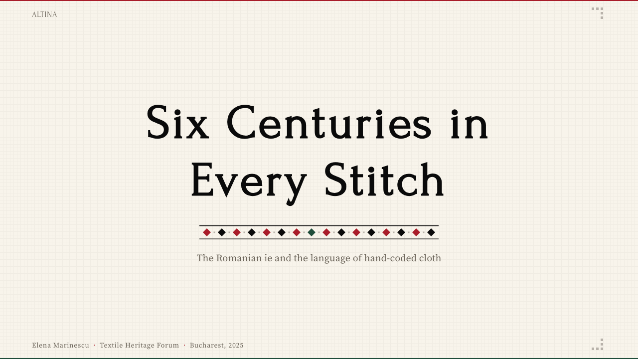
For presentation slides, the ie approach produces decks with unusually strong visual rhythm. Cover slides work best with a dominant band motif running horizontally across the upper or lower third — a dense geometric border that frames the content field without invading it. Title typography should sit against a near-white or undyed linen-toned ground, with a single strong accent color (red or black) reserved for the most important word or phrase. Content slides should be treated as structured zones: a narrow top band with section identity, a wide open content field, and a thin footer band — the altiță, râuri, and poale hierarchy transposed to horizontal layout.
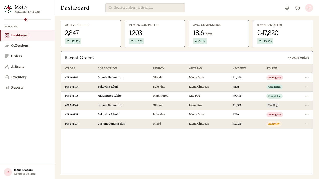
For web interfaces, the ie system works particularly well for culturally positioned brands, editorial platforms, heritage institutions, and any product where craft quality and deep provenance are part of the value proposition. Dashboard layouts can use the band hierarchy directly: a header zone with controlled density, a main content zone with generous linen-toned ground, and bordered card components whose ruled edges echo the embroidered borders of the original garment. Navigation should be typographic and rhythmic — items evenly spaced like repeated motif units — rather than weighted by icon decoration.
For editorial and marketing work, the ie's strongest asset is its ability to communicate both rigor and warmth simultaneously — qualities that are difficult to achieve with purely modernist or purely folk vocabularies. A magazine spread derived from ie principles might use a ruled column border as the grid anchor, set body text against a warm off-white ground, and deploy a single geometric ornamental element — perhaps a simplified diamond or stepped chevron — as a section marker rather than a full decorative border. The motif reads as sophisticated restraint rather than naive decoration when isolated and scaled appropriately.
A common mistake when working with ie-derived aesthetics is over-ornamentation: applying embroidery-style borders to every element on the page, creating visual competition between zones that should be quiet content areas and zones that should carry the decorative weight. In the original garment, the plain ground between bands is as important as the bands themselves — it is what gives the bands their visual power. A design derived from the ie should follow the same principle: most surfaces should be quiet, and the band elements should appear in strategic positions only, marking the hierarchy rather than filling the field.
Romanian Ie (folk embroidered blouse) — FAQ
Is the Romanian ie a single tradition, or are there significant regional differences?
The differences are significant enough that specialists treat the regional schools as distinct traditions within a shared framework. Oltenia uses predominantly black thread on undyed linen, creating stark graphic contrast. Bukovina is characterized by rich cochineal red bands cascading diagonally down the sleeves. Maramureș preserved archaic white-on-white relief embroidery that predates the introduction of color dyes to the region. Banat and Transylvania absorbed neighboring influences — Ottoman, Habsburg, Saxon — producing hybrid vocabularies. What unites them is the structural logic: band hierarchy, orthogonal geometry, cross-stitch as the base stitch, and the undyed linen ground. What separates them is the chromatic register and the specific motif vocabulary.
How does the ie's symmetry differ from the asymmetry of modernist design systems?
The ie is built on bilateral symmetry — patterns mirror across a central axis, and compositions balance through identical repetition rather than through the tension of unequal weights. This makes it fundamentally different from Bauhaus and Swiss International Style, both of which use asymmetric balance as a primary compositional tool. The practical implication for contemporary use is that ie-derived layouts will feel centered, stable, and architecturally grounded rather than dynamic and directional. Products that want to communicate depth, craft quality, and cultural rootedness will find the symmetrical ie logic more appropriate than modernist asymmetry, which tends to read as urgent, contemporary, and commercially optimized.
Can the ie aesthetic work for digital products, or is it too strongly tied to physical textile?
The ie translates well to digital contexts precisely because its visual logic is already abstract and structural. Cross-stitch is inherently a pixel grid — motifs are built from discrete square units arranged on an orthogonal matrix — which means the transition to screen-based design involves less conceptual loss than traditions built on brushstroke or organic form. The band hierarchy, the geometric motifs, the controlled color contrast, and the rhythm of repetition all map cleanly onto interface grids. What requires translation is the material warmth of linen: a warm off-white background and slightly textured surface treatments can evoke the ground fabric without simulating it literally.
What is the difference between using ie motifs decoratively versus using the ie system structurally?
Decorative use treats ie motifs as surface embellishment — a chevron border here, an eight-pointed star there — applied to an underlying layout that was designed on different logic. The motifs become wallpaper. Structural use means deriving the layout's organizational logic from the ie's own compositional principles: the band hierarchy governs where content zones begin and end, the grid module governs spacing, the white ground is treated as a load-bearing element rather than filler. Decorative use typically produces a folksy, costumery effect that signals ethnic theme rather than rigorous visual system; structural use produces an aesthetic authority that functions regardless of whether the viewer recognizes the source.
How do you prevent ie-derived design from reading as costume or kitsch?
The risk arises when the decorative surface is imported without the structural logic that gives it meaning. A layout covered in geometric embroidery motifs with no underlying band hierarchy reads as wallpaper, not as a system. The discipline that prevents this is restraint in application: use the band hierarchy to control where ornament appears, keep the ground generous and quiet, limit the color palette to the two-tone contrast of the tradition (accent against linen-white), and scale motifs according to their structural role rather than for visual richness. When ornamental elements are used sparingly and in positions that earn them — marking the header, closing the footer, dividing major content zones — they read as deliberate structural decisions, not as decoration for its own sake.
Related design styles
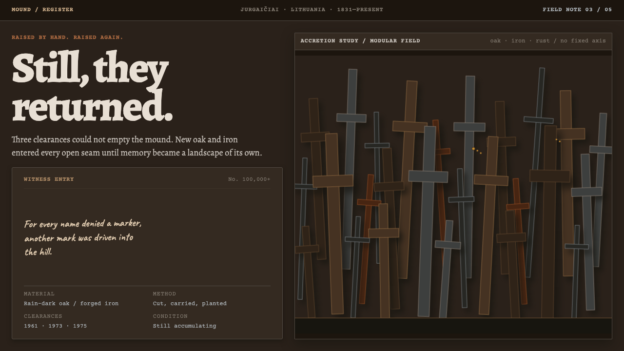 Hill of CrossesMemory returns by hand. Rain-black oak and rusted iron overlap until density…
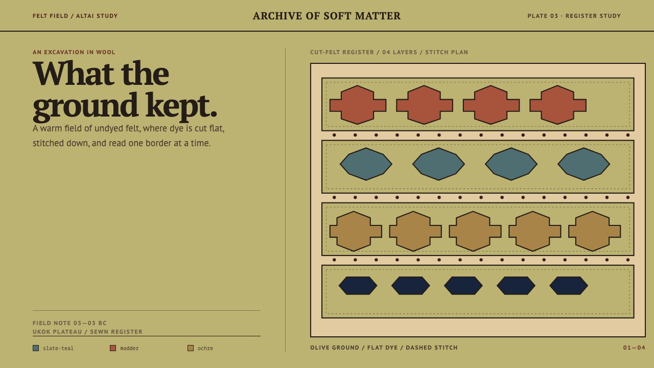 Pazyryk Ice MaidenSoft matter holds its ground. Olive felt carries stitched teal, madder, and o…
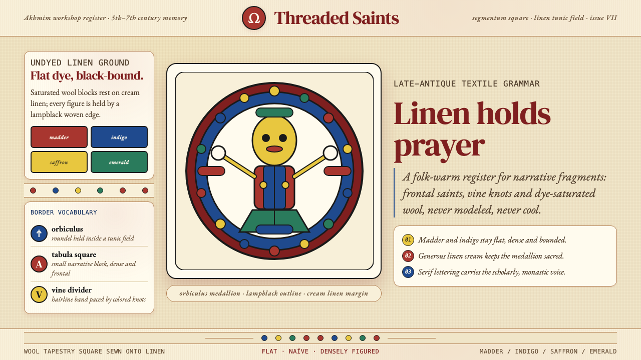 Egyptian Coptic TextileWarmth woven flat. Madder, indigo and saffron medallions sit on linen cream.
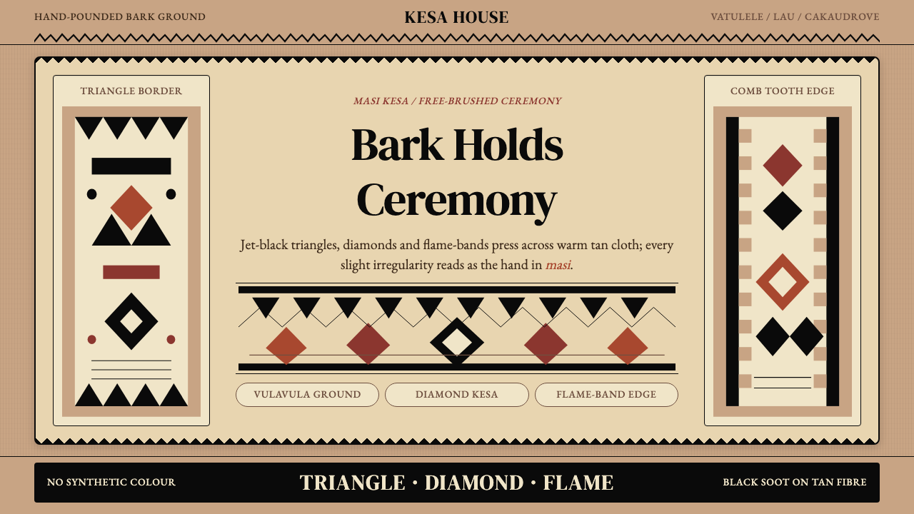 Fijian Masi (Tapa Cloth)Ceremony hits in black. Tan bark ground carries diamonds, zigzags and flame-b…
 Hawaiian Kapa (Bark Cloth)Ceremonial geometry. Cream wauke, rust, ochre, and soot stamped in repeat.
 Kalamkari (Andhra Pradesh)Cloth becomes narrative. Madder bands, indigo panels, and iron rules stack li…