Design style guide设计风格指南
What is Rapa Nui Moai Petroglyph?什么是 Rapa Nui Moai Petroglyph?
From the volcanic silence of the Pacific's most remote island, a design language of monumental austerity — dark stone, massive silhouettes, and marks pecked by hand into eternity.从太平洋最偏远岛屿的火山沉默中,一种纪念碑式简朴的设计语言诞生——深色石面、巨大轮廓、以及手工啄入永恒的印记。
Rapa Nui Moai Petroglyph in briefRapa Nui Moai Petroglyph 速览
Rapa Nui Moai Petroglyph is a design system rooted in the visual culture of Easter Island — one of the world's most isolated human settlements, located more than two thousand kilometers from the nearest inhabited land. Its aesthetic vocabulary is drawn from two intertwined traditions: the colossal moai stone figures carved between roughly 1250 and 1500 CE, and the thousands of petroglyphs — birds, fish, spirals, and human faces — pecked into basalt and tuff across the island's volcanic landscape.拉帕努伊摩艾岩刻是一套根植于复活节岛视觉文化的设计体系——这里是世界上最孤立的人类聚居地之一,距最近的有人岛屿超过两千公里。其美学词汇源自两种交织的传统:大约1250至1500年间凿刻的巨型摩艾石像,以及数千幅遍布全岛火山地貌的岩刻——鸟、鱼、螺旋纹与人面像,啄入玄武岩和火山凝灰岩之中。
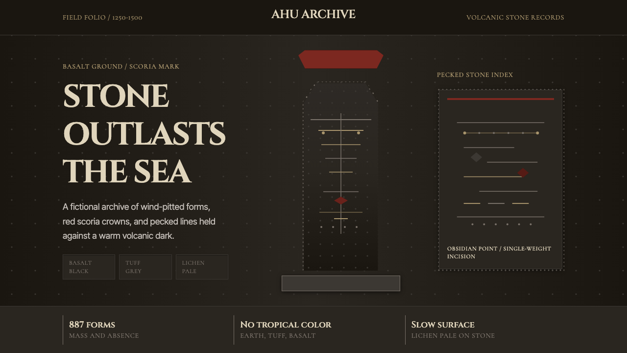
The visual identity this system embodies is one of extreme restraint imposed by environment and intention. Color is limited to what the island's geology provides: the charcoal grey of basalt, the warm red-brown of scoria cinder, the pale ashen tone of volcanic tuff, and the faint silver-green of lichen slowly colonizing every exposed surface. Against these tones, carved marks gain their power through contrast — dark line on dark stone, relief cut just deep enough to catch the angle of the sun. There are no bright hues here, no decorative flourishes, no color applied as embellishment. The palette is the landscape.这套体系所承载的视觉身份,是由环境与意图共同施加的极度克制。色彩仅限于岛屿地质所赋予的范围:玄武岩的炭灰色、火山渣的暖红褐色、火山凝灰岩的灰白色调,以及缓慢侵占每一处裸露表面的苍银绿地衣。在这些色调衬托下,凿刻的标记通过对比获得力量——深色线条叠于深色石面,浮雕凿入恰到好处的深度以捕捉斜射的阳光。这里没有鲜亮色调,没有装饰性花哨,没有作为点缀施加的颜色。色板即地景。
What distinguishes this aesthetic from other monumental traditions is its combination of massive vertical scale and intimate mark-making. The moai range from compact figures to giants exceeding twenty meters, yet every one was shaped by hand, each stroke of the toki stone chisel a human-scale decision. The petroglyphs alongside them are even more direct: fingertip-sized depressions pecked one by one into an unyielding surface. Scale and intimacy coexist. Monumentality does not erase the trace of the maker — it amplifies it.这一美学区别于其他纪念碑传统之处,在于巨大的垂直尺度与亲密的标记制作的结合。摩艾从紧凑的小型石像到超过二十米的巨人不等,然而每一尊都由人手塑造,石凿的每一笔都是人体尺度的决定。与之相伴的岩刻更为直接:指尖大小的凹点,一个一个地啄入坚不可摧的表面。宏大与亲密共存。纪念碑性非但没有抹去制作者的痕迹,反而将其放大。
See the Rapa Nui Moai Petroglyph design system →查看 Rapa Nui Moai Petroglyph 完整设计系统 →
Where does Rapa Nui Moai Petroglyph come from?Rapa Nui Moai Petroglyph 从何而来?
Rapa Nui was settled by Polynesian voyagers, most likely from the Marquesas or Mangareva, sometime around 1000 to 1200 CE — a feat of open-ocean navigation that remains extraordinary by any measure. The settlers found a subtropical island densely forested with the now-extinct Jubaea palm, rich in seabirds, and with no land mammals beyond the colonizers' own animals. Over the following centuries they developed a stratified society organized around competing lineages, each vying to erect more and larger moai on stone platforms called ahu along the island's coastline. Moai were not merely monuments: they were believed to concentrate the mana — the ancestral spiritual power — of deceased chiefs, radiating it across the land they faced, protecting and fertilizing the territory of the living.拉帕努伊由波利尼西亚航海者在大约公元1000至1200年间定居,移民来源最可能是马克萨斯群岛或曼加雷瓦——这是一项以任何标准衡量都堪称非凡的远洋航行壮举。定居者发现了一座亚热带岛屿,密布着现已灭绝的智利棕榈,海鸟丰富,陆地哺乳动物仅限于定居者自带的动物。此后数百年间,他们发展出以竞争性宗族为组织核心的分层社会,各宗族争相在沿海石台(称为ahu)上竖立更多、更大的摩艾。摩艾不仅是纪念碑:人们相信它们汇聚了已故酋长的玛纳(mana)——祖先的精神力量——并将其向所面对的土地辐射,庇护并滋育生者的领地。
Petroglyph carving ran alongside and sometimes predated moai construction, with the richest concentrations found at Orongo — a ceremonial village on the southwestern crater rim — and Rano Raraku, the tuff quarry where most moai were carved and many were left unfinished, still embedded in the rock face. The dominant petroglyph motif at Orongo is the tangata manu, or birdman: a crouching human figure with a bird's head, commemorating the annual competition in which representatives of rival clans swam to the islet of Motu Nui to retrieve the first egg of the sooty tern, with the winner's clan chief becoming tangata manu for the year. The birdman cult replaced the moai-building tradition after the latter's collapse, suggesting a society that could reinvent its visual and ritual language under catastrophic pressure.岩刻的凿制与摩艾建造并行,有时甚至更早,最密集的岩刻群位于奥龙戈(西南火山口边缘的仪式村落)和拉诺·拉拉库(大多数摩艾在此凿刻,许多未竟之作仍嵌于岩面)。奥龙戈最主要的岩刻母题是「鸟人」(tangata manu):一个蜷伏的人形带着鸟头,纪念一年一度的竞争仪式——各对立氏族的代表游向莫图努伊小岛,争夺玄燕鸥的第一颗蛋,胜者所在氏族的酋长在此后一年成为鸟人。鸟人崇拜在摩艾建造传统崩溃后取而代之,显示出一个社会在灾难性压力下重塑其视觉与仪式语言的能力。
European contact began with Jacob Roggeveen's Dutch fleet arriving on Easter Sunday 1722 — giving the island its colonial name. By that time, the moai had already been toppled, probably in internecine warfare following ecological collapse. The population, estimated at a peak of several thousand, had fallen dramatically. What the Dutch and later Spanish, British, and French visitors found was a society in the process of cultural reinvention — still practicing petroglyphs, still holding the birdman ceremony, but with the ahu platforms standing empty and the fallen moai slowly being reclaimed by vegetation.欧洲接触始于1722年复活节那天雅各布·罗赫芬的荷兰船队抵达——由此得了殖民地名称。彼时摩艾已被推倒,可能毁于生态崩溃后的内部战争。曾达数千人的峰值人口急剧缩减。荷兰人及其后的西班牙、英国与法国访客所见,是一个正在文化重建中的社会——仍在刻制岩刻、仍举行鸟人仪式,但ahu平台空空如也,倒下的摩艾正慢慢被植被吞没。
Systematic study of Rapa Nui's visual culture began in earnest in the twentieth century. Thor Heyerdahl's Kon-Tiki expedition (1947) and his later work on the island in 1955–56 drew global attention, though his theories about South American origins have since been largely refuted by genetic and linguistic evidence. Jo Anne Van Tilburg's moai inventory project, running from 1982 onward, produced the definitive catalog of all 887 moai. Steven Roger Fischer spent years attempting to decode rongorongo — the undeciphered script tablets found on the island — without reaching a consensus solution. Sebastian Englert, a German priest who lived on the island from 1935 until his death in 1969, produced the foundational dictionary of the Rapa Nui language and documented hundreds of oral traditions that might otherwise have been lost. It is through this layered archaeological and anthropological record that the island's visual language became legible to the wider world.对拉帕努伊视觉文化的系统研究在二十世纪正式展开。托尔·海尔达尔的「康提基」探险(1947年)及其1955至56年在岛上的工作引发了全球关注,尽管他关于南美起源的理论此后基本上被遗传学和语言学证据所推翻。乔·安·范·蒂尔伯格自1982年起主持的摩艾普查项目产出了887尊摩艾的权威目录。史蒂文·罗杰·费舍尔多年致力于解读「朗格朗格」——在岛上发现的未被破解的文字板——但未能达成共识结论。德国神父塞巴斯蒂安·恩格勒特从1935年居住于岛上直至1969年辞世,编写了拉帕努伊语的基础词典并记录了数百条否则将失传的口述传统。正是通过这一层层叠加的考古与人类学记录,这座岛屿的视觉语言才得以向更广阔的世界呈现。
What defines the Rapa Nui Moai Petroglyph look?Rapa Nui Moai Petroglyph 的视觉特征是什么?
Palette色板
The color vocabulary is drawn entirely from volcanic geology: the deep charcoal of basalt, the warm red-brown of scoria cinder, and the pale ashen grey of volcanic tuff. Lichen adds a faint, silvery note. There is no color in the system that does not exist on the island itself. Tonal contrasts are achieved by layering these near-neutrals — shadow against stone, stone against sky — rather than by introducing hue. The effect reads as both ancient and powerfully graphic.色彩词汇完全取自火山地质:玄武岩的深炭灰、火山渣的暖红褐,以及火山凝灰岩的灰白调。地衣添加了一抹淡淡的银色。体系中没有任何一种颜色不存在于岛屿本身。色调对比通过叠加这些接近中性的色彩实现——阴影对石面,石面对天空——而非引入鲜明色相。效果既古远又极具平面张力。
Silhouette and Mass轮廓与体量
Moai are defined primarily by silhouette: the elongated rectangular head, the jutting compressed brow, the long nose, the thin compressed lips, the ears extending to shoulder level. These features are not naturalistic — they are abstracted toward maximum iconic legibility at great distance. In design application, this translates to a preference for bold, readable exterior shapes over interior detail. Forms should be recognizable at a glance, across the room, and in reduced reproduction.摩艾主要通过轮廓来定义:拉长的方形头部、突出的压缩额眉、修长的鼻梁、紧闭的薄唇、延伸至肩部的耳朵。这些特征并不写实——它们被抽象为在极远距离仍能最大程度辨认的图标式形态。在设计应用中,这转化为对粗犷、可读的外部轮廓的偏好,而非对内部细节的关注。形态应在一眼之间、从房间对面、在缩小版本中都可辨认。
Verticality and Scale Contrast垂直感与尺度对比
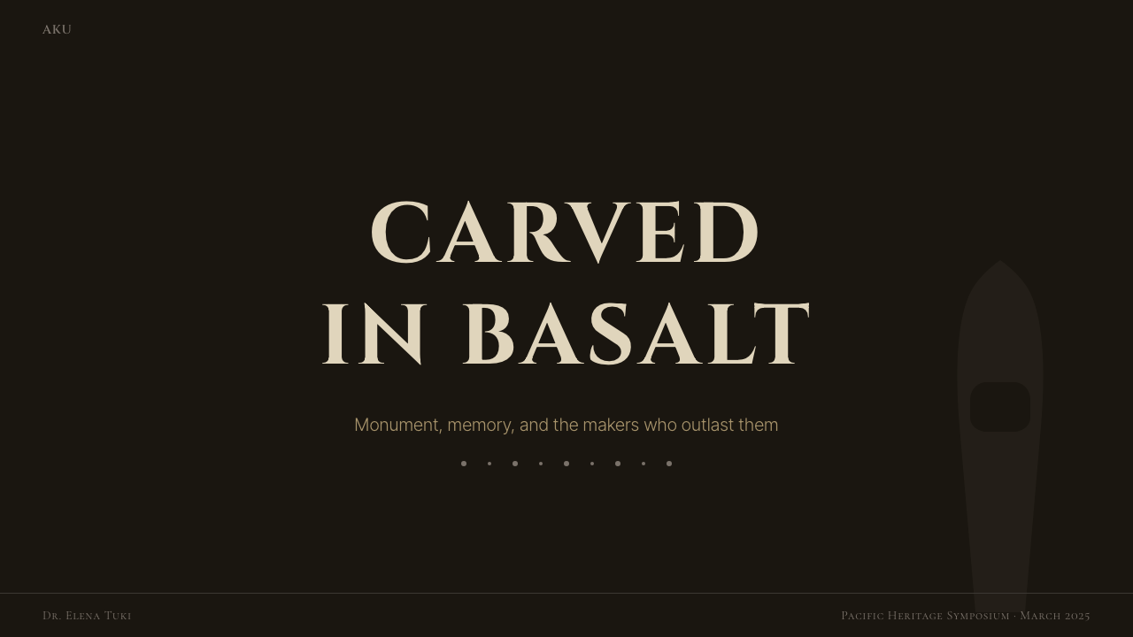
Moai figures are almost exclusively vertical in orientation, their height dramatically exceeding their width, standing against the low, broad sweep of the Pacific horizon. This extreme verticality creates scale contrast — the human figure dwarfed, the sky vast, the stone figure mediating between the two. Design work in this idiom uses strong vertical rhythm, exploits the tension between a dominant tall element and a wide, sparse ground, and treats negative space not as emptiness but as the 'open sea' that gives the vertical form its power.摩艾几乎全部呈垂直方向,高度远超宽度,矗立于太平洋地平线低阔横扫的背景之前。这种极端的垂直性制造了尺度对比——人形渺小,天空浩瀚,石像在两者之间斡旋。以此风格创作的设计作品使用强烈的垂直节奏,发挥主导高耸元素与宽阔稀疏底面之间的张力,将负空间视为赋予垂直形态力量的「浩海」,而非虚空。
Pecked Mark and Surface Texture啄刻痕迹与表面质感
Petroglyphs are made by repetitive percussion — an obsidian point struck against stone, thousands of times, to remove material and leave a depression. The resulting marks have a characteristic rough-edged quality: not the clean line of a brush or engraving tool, but a stippled, slightly uneven path that retains the evidence of labor. This aesthetic values controlled imprecision — marks that clearly came from a hand, not a machine. Applied to graphic work, it suggests texture achieved through repetitive unit patterns rather than smooth continuous fills.岩刻通过反复的叩击完成——黑曜石尖端击打石面,成千上万次,去除物质并留下凹痕。所产生的标记具有一种特有的粗边品质:不是毛笔或刻刀的干净线条,而是点画式的、略微不均匀的路径,保留着劳作的痕迹。这种美学推崇有控制的不精确——标记清楚地来自一双手,而非机器。应用于平面作品时,它提示通过重复单元图案而非平滑连续填充来实现质感。
Symbolic Compression符号性压缩
Both moai faces and birdman petroglyphs reduce complex subjects — a human chief, a mythological figure — to their most essential identifying marks. The moai face, for instance, carries no expression in the conventional sense, yet is instantly recognizable as a face and as specifically Rapa Nui. This is the logic of the pictograph: strip away everything that varies, keep only what is constant and necessary. In design, this maps to icon systems, logotype reduction, and the discipline of asking what the minimum visual information is that still unambiguously communicates the intended meaning.摩艾面孔和鸟人岩刻都将复杂的主体——一位人类酋长,一个神话形象——简化为最本质的识别标志。例如,摩艾面孔通常意义上没有表情,却能被立即辨认为一张脸,且明确是拉帕努伊的脸。这是象形符号的逻辑:剥去所有可变的东西,只保留不变且必要的东西。在设计中,这对应于图标体系、标志简化,以及追问「仍能明确传达预期含义的最少视觉信息是什么」的自律。
Darkness as Ground深色作底
This is fundamentally a dark-ground system. Basalt is near-black; the night sky over the open Pacific is absolute. Light — the pale lichen, the ashen tuff, the bleached bone of old coral — emerges from darkness rather than sitting against a bright background. Marks are legible because they catch light in a dark field, not because they are printed onto a white page. This reverses the conventional light-ground default of print culture and demands that layouts be structured around how light and detail emerge from depth.这从根本上是一套深色底面系统。玄武岩接近黑色;开阔太平洋上方的夜空是绝对的深暗。光——苍白的地衣、灰白的凝灰岩、旧珊瑚的漂白骨色——从黑暗中浮现,而非映衬于明亮背景之上。标记之所以可读,是因为它们在深色场中捕捉光线,而非印刷在白色纸面上。这颠覆了印刷文化中惯常的浅色底面默认,要求版面围绕光线与细节如何从深度中浮现来构建结构。
Sparse Composition稀疏构图
Moai typically stand alone or in a row along an ahu platform, separated by generous intervals of empty coastline. The negative space between figures is not wasted — it is what gives each figure its monumental weight. Petroglyphs are similarly distributed: a single birdman against a broad expanse of stone carries more presence than a field of competing motifs. This aesthetic of deliberate sparseness privileges the isolated element and treats surrounding emptiness as a compositional force in its own right.摩艾通常单立,或沿ahu台沿排成一列,由宽阔的空旷海岸线间隔开来。石像之间的负空间并非浪费——正是它赋予每一尊石像其纪念碑式的分量。岩刻同样如此分布:一只孤独的鸟人映衬于大片石面,比一群竞争的母题更具存在感。这种刻意稀疏的美学赋予孤立元素以特权,并将周围的空旷视为构图力量本身。

See the Rapa Nui Moai Petroglyph design system →查看 Rapa Nui Moai Petroglyph 完整设计系统 →
Who shaped Rapa Nui Moai Petroglyph?谁塑造了 Rapa Nui Moai Petroglyph?
The Norwegian explorer brought Rapa Nui to global popular consciousness through the Kon-Tiki expedition of 1947 and his excavations on the island in 1955–56. Heyerdahl was the first to conduct systematic archaeological work on the moai, partially re-erecting several figures and documenting the construction techniques of the ahu platforms. His theories about South American migration to the Pacific, while largely discredited by subsequent genetic and linguistic research, had the lasting effect of framing Rapa Nui as a site of world-historical significance rather than a regional curiosity. His writings and films introduced the island's monumental visual vocabulary to a mid-twentieth-century audience.这位挪威探险家通过1947年的「康提基」探险和1955至56年在岛上的发掘,将拉帕努伊带入全球大众视野。海尔达尔是第一位对摩艾进行系统考古工作的人,他部分复立了若干石像,并记录了ahu台的建造技法。他关于南美向太平洋移民的理论虽被后续遗传学和语言学研究基本推翻,但产生了持久影响:将拉帕努伊定格为具有世界历史意义的遗址,而非地区奇观。他的著作与影片向二十世纪中叶的观众介绍了这座岛屿的纪念碑式视觉词汇。
The American archaeologist who directed the Easter Island Statue Project from 1982 onward, producing the definitive catalog of all 887 moai — their dimensions, materials, carving stages, and locations. Van Tilburg's systematic inventory transformed what had been impressionistic and sometimes fanciful accounts of the statues into a rigorous archaeological record. Her computer modeling work investigated how the moai might have been transported from Rano Raraku to their ahu platforms — findings that shifted scholarly understanding of Rapa Nui society's logistical capabilities. Her work made the formal vocabulary of the moai statistically accessible and analytically precise.这位美国考古学家从1982年起主持复活节岛雕像项目,产出了887尊摩艾的权威目录——记录其尺寸、材料、凿刻阶段与位置。范·蒂尔伯格的系统普查将此前印象式乃至带有幻想色彩的石像记述转变为严格的考古档案。她的计算机建模工作研究了摩艾从拉诺·拉拉库运输至ahu台的可能方式——这些发现改变了学界对拉帕努伊社会物流能力的认知。她的工作使摩艾的形式词汇在统计上可量化、在分析上可精确把握。
A German Capuchin priest who arrived on Rapa Nui in 1935 and remained until his death in 1969, Englert is the island's foremost linguistic and ethnographic documentarian. His Rapa Nui language dictionary and grammar, along with his collection of oral traditions, myths, and ritual practices, preserved cultural knowledge that was rapidly being lost. His museum on the island — now the Museo Anthropológico Padre Sebastián Englert — holds the primary collection of artifacts documenting the petroglyph and material culture traditions. Without his decades of patient fieldwork, much of what is now understood about the symbolic content of the visual tradition would not be recoverable.这位德国方济各嘉布遣会神父于1935年抵达拉帕努伊,直至1969年辞世。恩格勒特是岛上最重要的语言与民族志记录者。他的拉帕努伊语词典和语法书,以及他收集的口述传统、神话和仪式实践,保存了正在迅速消逝的文化知识。他在岛上创立的博物馆——现为塞巴斯蒂安·恩格勒特神父人类学博物馆——收藏着记录岩刻与物质文化传统的主要文物。若无他数十年耐心的田野调查,现在对视觉传统象征内容的许多认知将无从追溯。
A New Zealand scholar of Oceanic linguistics who has devoted decades to the study of rongorongo — the undeciphered script found on wooden tablets from Rapa Nui — and to the broader linguistic and cultural history of the island. Fischer's attempts to decode rongorongo remain contested, but his exhaustive documentary work on the tablets, combined with his comprehensive history of the island published in 2005, constitutes one of the most thorough scholarly treatments of Rapa Nui's intellectual and visual traditions available in English. His research keeps alive the question of what written or proto-written language may have accompanied the island's visual culture.这位新西兰大洋洲语言学学者数十年来致力于研究「朗格朗格」——在拉帕努伊木质板上发现的未被破解的文字——以及这座岛屿更广泛的语言和文化历史。费舍尔解读朗格朗格的尝试至今仍有争议,但他对板刻的详尽记录工作,加上2005年出版的这座岛屿综合历史,构成了英文世界中对拉帕努伊智识与视觉传统最为全面的学术处理之一。他的研究持续保持着这个问题的生命力:何种书写或前书写语言可能曾伴随这座岛屿的视觉文化存在。
How do you use Rapa Nui Moai Petroglyph today?今天怎么用 Rapa Nui Moai Petroglyph?
Rapa Nui Moai Petroglyph is a high-conviction dark aesthetic. Before applying it, the designer must accept its core premise: darkness is the ground, not the exception. Attempting to run the system on a light background fundamentally misreads what gives it power. The palette of charcoal, basalt-black, scoria-red, and ashen tuff works because these tones are close enough in value that contrast must be earned through deliberate placement, not assumed from light-against-dark defaults.拉帕努伊摩艾岩刻是一套高度定见的深色美学。应用它之前,设计师必须接受其核心前提:深色是底面,不是例外。试图在浅色背景上运行这套体系,从根本上误读了赋予它力量的来源。炭灰、玄武黑、火山渣红和灰白凝灰色的色板之所以有效,是因为这些色调在明度上彼此接近,对比必须通过刻意的定位来争取,而非依赖浅色叠深色的默认关系。
For presentation slides, this style is most effective on cover and section-divider pages where monumental impact is the goal. A cover page built in this idiom might feature a single large silhouette form — derived from moai proportions, strongly vertical — against a near-black ground, with a title in a wide-spaced, architecturally weighted typeface occupying the lower third. Content slides should resist overcrowding: one thought per slide, generous margins, and any data visualizations treated as geometric objects in their own right rather than as chartjunk. Dark bar charts with scoria-toned highlight bars and ashen grid lines read as lapidary — carved, not generated.对于演示文稿,这种风格在封面和分节分隔页上最为有效——这些页面追求纪念碑式的冲击力。以此风格制作的封面可以是:一个大型单一轮廓形态——源于摩艾比例,强烈垂直——映衬于接近黑色的底面,标题以宽间距、建筑感字体占据下三分之一区域。内容页应抵制过度拥挤:每张幻灯片一个想法,充裕的边距,所有数据可视化被视为几何对象本身而非图表垃圾。深色柱状图以火山渣调的高亮柱条和灰白网格线呈现,读来如石刻——凿制而成,而非生成。
For web UI, this system suits products where authority, depth, and permanence are brand values: archival platforms, cultural institutions, high-end portfolio sites, or any service that wants to signal solidity in contrast to the bright and ephemeral defaults of mainstream web design. Dashboard components should use card surfaces with very subtle raised texture achieved through close-value dark tone-on-tone variation rather than light drop shadows. Navigation should be typographic and sparse — few items, generous spacing, no icon decoration. Interactive states are best indicated through a single accent tone drawn from the scoria-red range applied consistently across hover, focus, and active states.对于网页界面,这套体系适合以权威感、深度与永久性为品牌价值的产品:档案平台、文化机构、高端作品集网站,或任何希望在主流网页设计的明亮短暂默认之中彰显稳重的服务。仪表板组件应使用卡片表面,通过接近值的深色叠深色变化而非浅色投影来实现极为微妙的浮起质感。导航应当字体性且稀疏——少量条目、充裕间距、无图标装饰。交互状态最好通过取自火山渣红范围的单一强调色来标示,一致地应用于悬停、聚焦和激活状态。
For editorial and marketing applications, the style supports the kind of authority typically associated with cultural heritage, archaeology, and long-form storytelling. A feature article layout might open with a full-bleed dark image — stone, sky, ocean — with a headline in stark contrast applied directly over it. Pull quotes gain weight when set large and isolated on a dark panel with minimal surrounding text. Marketing pages work well when organized around a single bold claim per viewport, with the surrounding negative space treated as the Pacific horizon: not empty, but vastly, intentionally open.对于编辑与营销应用,这种风格支持通常与文化遗产、考古学和长篇叙事相关联的那种权威感。一篇特写文章版面可以用满幅深色图像——石材、天空、大海——开头,标题以强烈对比直接覆于其上。引文置于深色面板上,大字号且孤立,周围文字极少,便能获得分量。营销页面适合以每个视口一个大胆主张来组织,周围的负空间被视为太平洋地平线:不是空旷,而是浩瀚的、有意为之的开放。
The most common mistake when applying this system is filling in the negative space. Designers trained in grid-dense, content-heavy layouts will instinctively want to add secondary elements, supporting text, or decorative details to what reads as empty. Resist this impulse entirely. A moai does not require a caption to be powerful. The silence around the form is part of the form. A second common error is reaching for a brighter accent color — cyan, electric yellow, vivid orange — to 'activate' the dark palette. This destroys the system's geological coherence; the only hues that work are the ones that could plausibly occur in volcanic stone or lichen.应用这套体系时最常见的错误是填满负空间。习惯于网格密集、内容繁重版面的设计师,会本能地想要为看起来空旷的区域添加次要元素、辅助文字或装饰性细节。请完全抵制这种冲动。摩艾不需要说明文字就能令人震撼。形态周围的沉默是形态本身的一部分。第二个常见错误是选用更鲜亮的强调色——青色、电黄、鲜橙——来「激活」深色色板。这会摧毁体系的地质连贯性;唯一有效的色相,是那些在火山石或地衣中可能真实出现的色相。
See the Rapa Nui Moai Petroglyph design system →查看 Rapa Nui Moai Petroglyph 完整设计系统 →
Rapa Nui Moai Petroglyph — FAQRapa Nui Moai Petroglyph · 常见问题
How is this different from a generic dark-mode design?这与普通深色模式设计有何不同?
Generic dark mode is light-mode design inverted — the same layout logic applied to a dark background, typically with a single blue or purple accent color lifted from the interface's light-mode version. Rapa Nui Moai Petroglyph is not an inversion; it is a fundamentally dark-ground system whose compositional logic — sparse elements, vertical emphasis, near-neutral tonal palette with geological color — was never light to begin with. The distinction shows in spacing: dark mode tends to compress and fill; this system treats the dark field as expansive and essential.普通深色模式是浅色模式设计的反转——同一套版面逻辑应用于深色背景,通常搭配从界面浅色模式提取的单一蓝色或紫色强调。拉帕努伊摩艾岩刻不是反转;它是一套从根本上就以深色为底的系统,其构图逻辑——稀疏元素、垂直强调、地质色调的接近中性色板——从来就不是浅色的。区别体现在间距上:深色模式倾向于压缩和填充;这套体系将深色场视为宽阔且不可或缺的。
Can the birdman or moai silhouette be used as a graphic element?鸟人或摩艾轮廓可以作为图形元素使用吗?
With care. The moai silhouette is a powerful and globally recognizable form, but it carries the weight of sacred cultural heritage belonging to the Rapa Nui people, who are still a living community. Using a literal moai outline as decoration trivializes a symbol that is deeply tied to ancestor veneration and identity. The more principled approach is to apply the design principles the moai embody — extreme verticality, iconic simplification, deliberate scale contrast — to original forms rather than to reproduce the silhouette itself. The system's power comes from its formal vocabulary, not from appropriating its specific icons.需要谨慎。摩艾轮廓是一种强大且全球可辨认的形态,但它承载着属于拉帕努伊人民的神圣文化遗产的分量——他们至今仍是一个活生生的社群。将摩艾轮廓字面上作为装饰元素使用,会将一个与祖先崇拜和身份认同深度相连的符号庸俗化。更有原则的做法是:将摩艾所体现的设计原则——极端垂直性、图标式简化、刻意的尺度对比——应用于原创形态,而非复制轮廓本身。这套体系的力量来自其形式词汇,而非对其特定图标的挪用。
Does the rough, hand-pecked quality of petroglyphs translate well to digital design?岩刻那种粗粝的手工啄刻质感,在数字设计中能有效转化吗?
It translates better as a principle than as a literal texture. Directly importing a photographic stone texture or a scanned petroglyph rubbing as a background risks feeling like a themed restaurant backdrop rather than a considered aesthetic. The principle behind the petroglyph surface is that marks have weight, labor, and controlled imprecision — they are not clean vectors. In digital applications, this can be interpreted through typography choices that favor slightly irregular, humanistic letterforms over geometric perfection, through icon systems built on thicker, slightly variable stroke weights, and through visual rhythm that values the handmade mark over the machine-perfect edge.作为原则比作为字面质感更易转化。直接将摄影石材纹理或扫描岩刻拓片导入作背景,有风险沦为主题餐厅背景板,而非经过深思的美学选择。岩刻表面背后的原则是:标记有重量、有劳作、有受控的不精确——它们不是干净的矢量图形。在数字应用中,这可以通过字体选择来诠释——偏向略有不规则感的人文主义字形而非几何完美;通过图标系统的构建——采用较粗、略有变化的笔画粗细;通过视觉节奏——推崇手工标记感而非机器完美边缘。
How should the scoria red be used — as a primary surface color or as an accent?火山渣红应如何使用——作为主体面色还是强调色?
Almost always as an accent. In the island's landscape, scoria red appears as cinder cones, as the red-tinged rock around volcanic vents, and as the pukao topknots placed on completed moai — not as the primary covering of every surface. In a design built on basalt-black and tuff-grey grounds, the scoria tone works best when concentrated in a single interactive element, a category indicator, a headline emphasis, or a thin structural rule. Using it at large scale — as a full section background or a primary fill — flattens the geological hierarchy that gives the palette its sense of depth.几乎始终作为强调色。在岛屿地景中,火山渣红出现于火山锥、火山口周围的红调岩石,以及置于完工摩艾顶部的普考(pukao)发髻——而非每个表面的主体覆盖色。在以玄武黑和凝灰灰为底面的设计中,火山渣色调在集中于单一交互元素、类别指示符、标题强调或细结构线时效果最佳。大面积使用它——作为整节背景或主体填充——会拉平赋予色板深度感的地质层级关系。
Is this style appropriate for brands that have no connection to Polynesian or Pacific culture?对于与波利尼西亚或太平洋文化毫无关联的品牌,这种风格适用吗?
The formal principles of the system — monumental verticality, geological color, sparse composition, deep negative space, and controlled imprecision of mark — are available to any designer willing to apply them thoughtfully. The specific iconography of Rapa Nui, particularly the moai silhouette and the birdman petroglyph, belongs to a living cultural tradition and should not be appropriated decoratively. The distinction is between using a tradition's formal logic as a design vocabulary and using its sacred objects as decoration. The former is how design has always built on history; the latter is not appropriate regardless of the brand.这套体系的形式原则——纪念碑式垂直性、地质色彩、稀疏构图、深度负空间、受控的标记不精确感——对任何愿意深思熟虑地应用它们的设计师都是开放的。拉帕努伊的具体图像志,尤其是摩艾轮廓和鸟人岩刻,属于一个仍在延续的活态文化传统,不应被装饰性地挪用。区别在于:将一个传统的形式逻辑作为设计词汇使用,与将其神圣物件用作装饰之间的分野。前者是设计以历史为根基的一贯方式;后者则无论对于什么品牌都不合适。
Related design styles相关设计风格
 Warli Tribal PaintingTwo triangles make a human. Rice-paste cream on red-clay ochre, dancers proce…两个三角形即一个人:红土赭墙上的米浆白颜料,舞者绕笛者成同心圆。
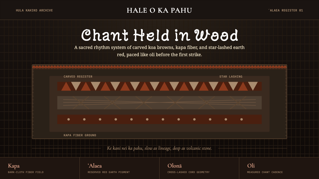 Hawaiian Hula Pahu DrumSacred weight, hand-marked. ʻAlaea red, kapa texture, and stacked carved regi…圣重而手作。ʻAlaea红、卡帕纹理与层叠雕刻带。
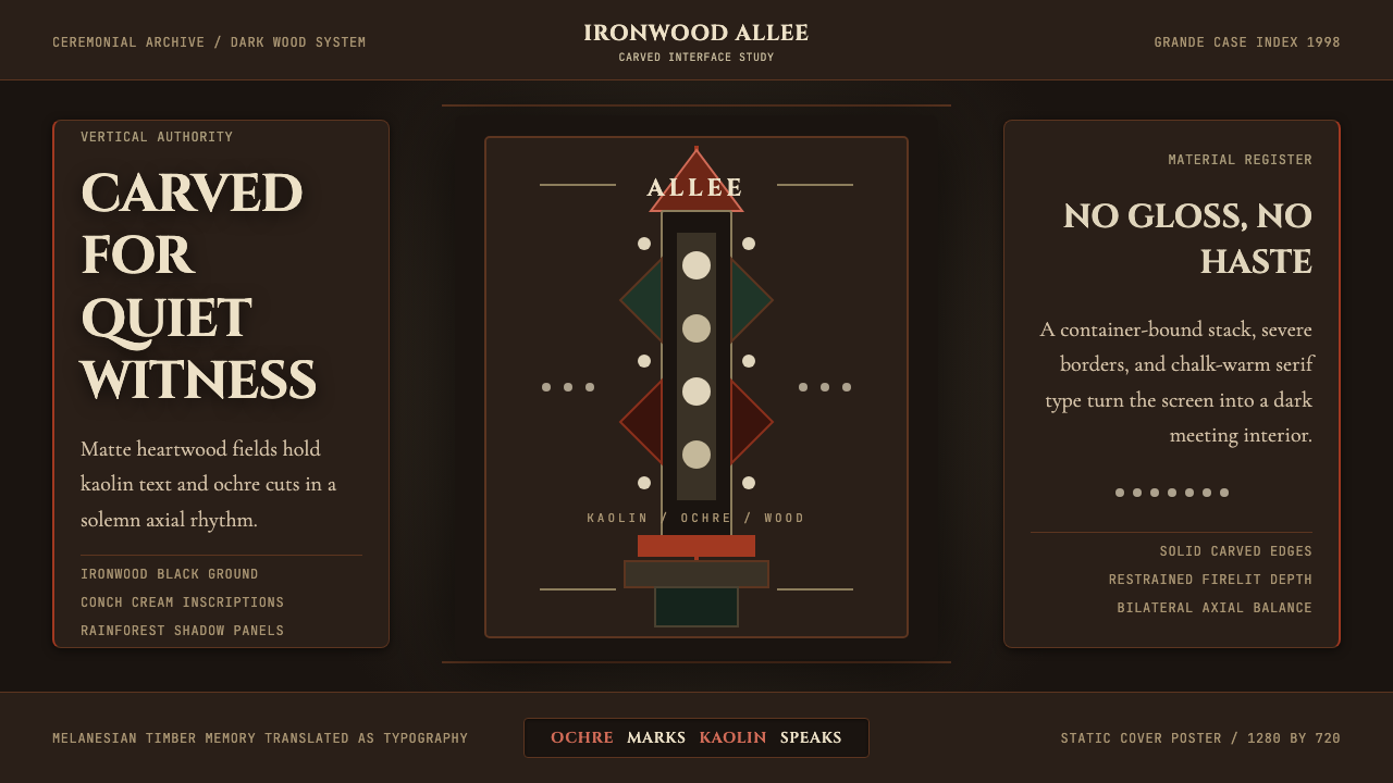 New Caledonia Kanak TotemSolemn carved darkness. Ochre axis, kaolin serif type, and conch dots hold th…庄严的雕木暗场。赭红中轴、高岭土衬线与贝壳圆点撑起画面。
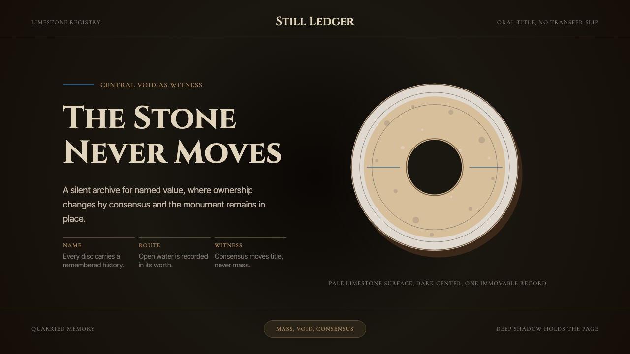 Yapese Stone Money (Micronesia)Monumental stillness. Limestone type and one circular void sit inside warm bl…纪念碑般静止:石灰岩文字与单一圆洞沉入暖黑阴影。
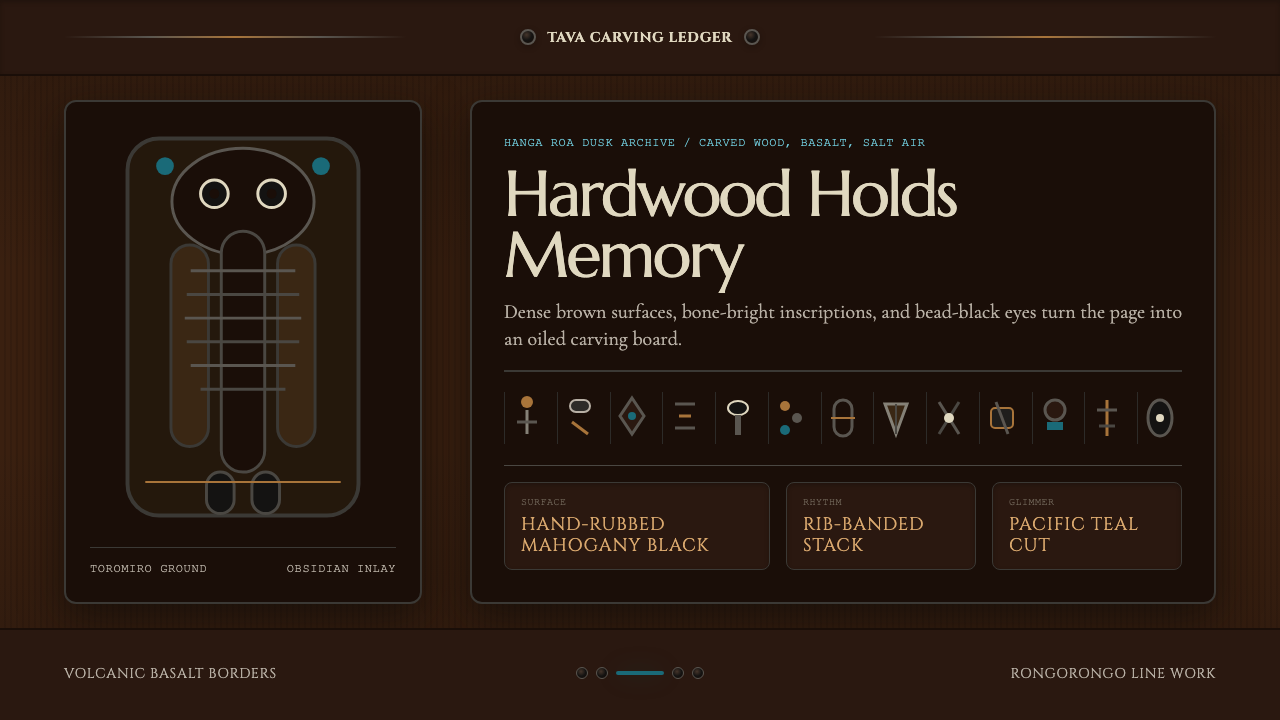 Chilean Rapa Nui Toromiro (Easter Island)Ancient weight, dusk-lit. Toromiro brown, Cinzel capitals, rib bands, obsidia…古老而沉重:托罗米罗褐、Cinzel碑文体、肋骨横带与黑曜石珠。
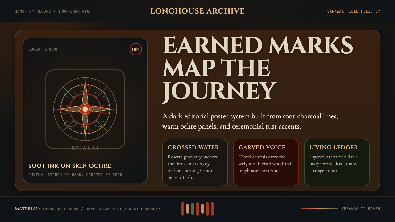 Dayak Borneo Tattoo (Iban)A living journey ledger. Soot lines, ochre panels, and rust rosettes feel han…身体成旅程账本。炭线、赭面与锈红莲座如手敲入肤。