Design style guide设计风格指南
What is New Caledonia Kanak Totem?什么是 New Caledonia Kanak Totem?
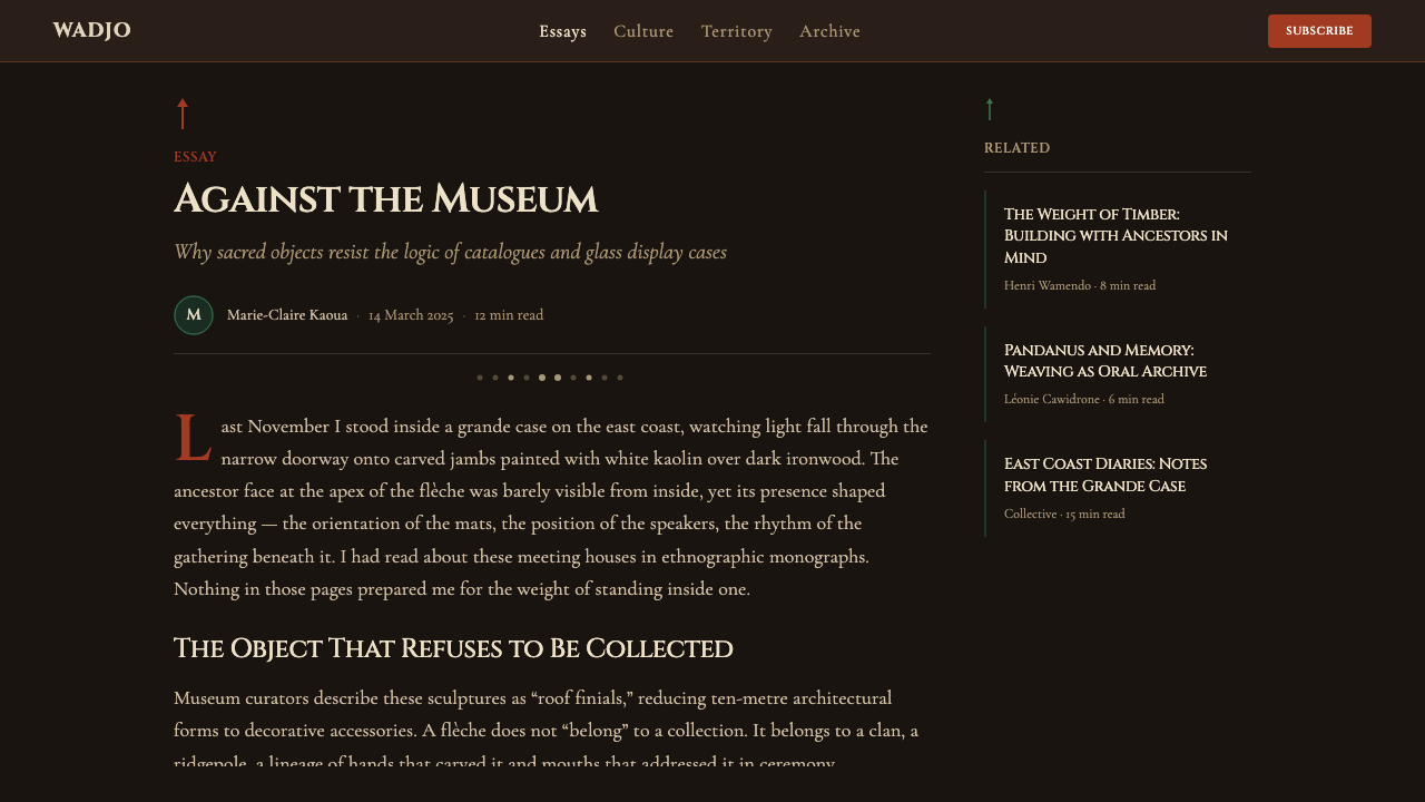
From the carved roof finials of the grande case meeting house to the solemn darkness of ironwood, New Caledonia Kanak Totem translates an ancestral sculptural tradition into a digital visual language of ritual weight and vertical power.从大圆屋(grande case)屋脊雕刻到铁木深沉的暗色,新喀里多尼亚卡纳克图腾将一种祖先雕塑传统转化为充满仪式感与垂直张力的数字视觉语言。
New Caledonia Kanak Totem in briefNew Caledonia Kanak Totem 速览
New Caledonia Kanak Totem is a design style rooted in the material culture of the Kanak people of New Caledonia — an archipelago in the southwest Pacific — and especially in the carved wooden sculptures known as flèches faîtières, the soaring roof finials that crown the grande case, the communal meeting house at the center of Kanak social and ceremonial life. The style takes its visual logic from three primary materials: the near-black density of ironwood timber, the stark white of kaolin chalk used for face markings and ancestor figures, and the burnt orange of ochre body paint worn during ritual ceremonies.新喀里多尼亚卡纳克图腾是一种根植于卡纳克人物质文化的设计风格。卡纳克人是新喀里多尼亚群岛(西南太平洋)的原住民,其视觉传统的核心是被称为「屋脊箭」(flèches faîtières)的高耸木雕——装饰大圆屋(grande case)屋顶的祖先像柱。大圆屋是卡纳克社会与仪式生活的精神中心。这套风格的视觉逻辑来自三种主要材料:铁木那近乎无光的深黑,用于绘制面部纹样与祖先像的高岭土白,以及仪式体绘所用的烧赭红。
Visually, the style is characterized by deep, almost lightless backgrounds — the interior darkness of a ceremonial space — against which vertical forms and chalky markings emerge with stark clarity. The composition moves along a dominant vertical axis, echoing the posture of carved ancestor figures and the upward reach of roof finials. This verticality is not merely aesthetic but structural: in Kanak visual tradition, height and upward orientation signify ancestral connection and sacred authority.在视觉上,这种风格以极深、近乎无光的背景为底——仿佛仪式空间的内部暗场——垂直形态与粉笔般的标记从中浮现,形成鲜明对比。构图沿主导垂直轴展开,回应着雕刻祖先像的站立姿态与屋脊饰物的向上延伸。这种垂直性不仅是美学选择,更是结构原则:在卡纳克视觉传统中,高度与向上的朝向象征着与祖先的连接以及神圣权威。
The 1998 opening of the Tjibaou Cultural Centre in Nouméa, designed by Italian architect Renzo Piano, provided a contemporary anchor for the style. Piano's towering timber-ribbed structures — built to suggest traditional Kanak architecture without directly imitating it — bridged the gap between ancestral form and modernist construction. In the same spirit, New Caledonia Kanak Totem bridges carved wood and pixel, ritual space and screen, without collapsing one into the other.1998年,意大利建筑师伦佐·皮亚诺在努美阿设计的吉巴乌文化中心落成,为这一风格提供了当代锚点。皮亚诺那些高耸的木肋结构——意图唤起卡纳克传统建筑的精神而非直接模仿其形式——架起了祖先形态与现代建造之间的桥梁。新喀里多尼亚卡纳克图腾也以同样的方式,将木雕与像素、仪式空间与屏幕连接起来,而不使二者相互消融。
See the New Caledonia Kanak Totem design system →查看 New Caledonia Kanak Totem 完整设计系统 →
Where does New Caledonia Kanak Totem come from?New Caledonia Kanak Totem 从何而来?
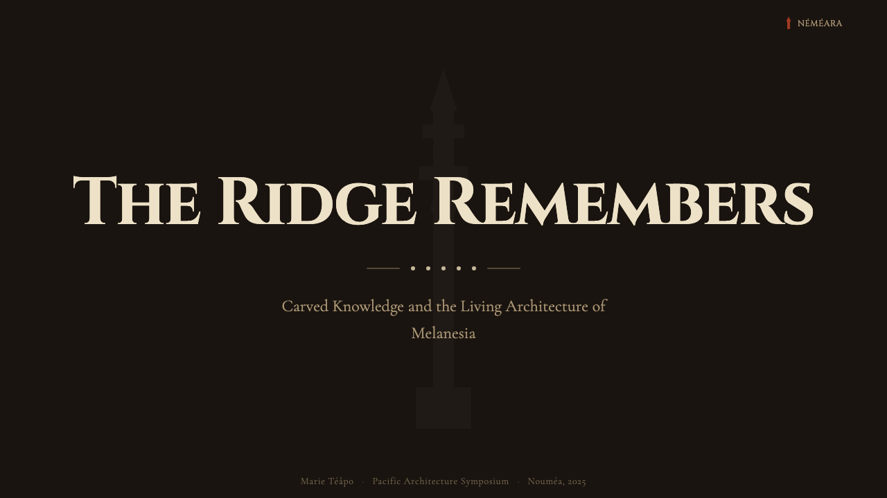
The Kanak people have inhabited the islands of New Caledonia for more than three thousand years, developing a material culture in which carved wood plays a central symbolic and social role. The most significant sculptural form is the flèche faîtière — a tall, composite wooden sculpture mounted at the apex of the grande case. These finials are not purely decorative: they represent the founding ancestor of the clan whose meeting house they crown, and their height signals the prestige and spiritual standing of that lineage. The carved faces at the top of each finial are schematic rather than portrait-like, built from geometric reductions of the human face — concentric rings for eyes, a projecting ridge for a nose, a horizontal bar for a mouth. This schematic quality makes them legible from a distance and imbues them with a timeless, archetype quality that distinguishes them from naturalistic figuration.卡纳克人在新喀里多尼亚群岛上已生活了三千余年,发展出一套以木雕为核心象征与社会媒介的物质文化。最重要的雕刻形式是「屋脊箭」(flèche faîtière)——一种竖立于大圆屋顶点的高大复合木雕。这些饰柱并非纯粹的装饰:它们代表大圆屋所在氏族的创始祖先,其高度则标志着该血统的声望与精神地位。每根饰柱顶端雕刻的面孔是图式化而非写实的,由人脸的几何简化构成——同心环代表眼睛,突出的脊梁代表鼻子,横条代表嘴。这种图式特质使它们在远处清晰可辨,并赋予其一种超越时间的原型气质,使之区别于自然主义的具象雕塑。
European contact in the nineteenth century brought both disruption and documentation. The French colonial administration, which formally annexed New Caledonia in 1853, suppressed many aspects of Kanak ceremonial life, including certain uses of the grande case. At the same time, French ethnographers and missionaries began systematically collecting and studying Kanak material culture. Among the most significant scholars was Maurice Leenhardt, a Protestant missionary and ethnologist who spent more than two decades in New Caledonia and produced foundational studies of Kanak cosmology and social structure, including the landmark 1937 work Gens de la Grande Terre. His documentation preserved knowledge of forms and practices that were being actively suppressed by the colonial administration.十九世纪的欧洲接触既带来了冲击,也带来了记录。法国殖民政府于1853年正式兼并新喀里多尼亚后,压制了卡纳克仪式生活的诸多方面,包括大圆屋的某些功能。与此同时,法国民族志学家与传教士开始系统性地收集与研究卡纳克物质文化。其中最重要的学者是莫里斯·勒纳尔德(Maurice Leenhardt)——一位新教传教士与民族学家,他在新喀里多尼亚深耕二十余年,留下了关于卡纳克宇宙观与社会结构的奠基性研究,包括1937年的代表作《大地岛之人》(Gens de la Grande Terre)。他的记录保存了许多在殖民管治下被主动压制的形式与实践的知识。
The Kanak independence and cultural revival movement of the late twentieth century brought new urgency to questions of visual and material identity. Jean-Marie Tjibaou, the charismatic leader of the Kanak socialist independence movement (FLNKS), argued that political independence and cultural renewal were inseparable — that the Kanak people could not establish political sovereignty without first affirming the vitality of their own cultural forms. Tjibaou was assassinated in 1989, but the cultural centre that bears his name, built in Nouméa and opened in 1998, became a monument to his vision. The centre was designed by Renzo Piano, who worked closely with Kanak community members to develop structures that evoke traditional architecture through abstraction rather than replication.二十世纪末卡纳克独立与文化复兴运动,使视觉与物质身份认同问题焕发了新的紧迫性。卡纳克社会主义独立运动(FLNKS)的领袖让-马里·吉巴乌(Jean-Marie Tjibaou)主张,政治独立与文化复兴不可分割——卡纳克人若不先确立自身文化形式的活力,便无法建立政治主权。吉巴乌于1989年遭暗杀,但以他命名的文化中心——建于努美阿,1998年落成——成为其愿景的丰碑。该中心由伦佐·皮亚诺设计,他与卡纳克社区成员紧密合作,发展出通过抽象而非复制来唤起传统建筑的结构形式。
The academic and curatorial work of Roger Boulay, a specialist in Melanesian art at the Musée du Quai Branly, brought rigorous art-historical attention to Kanak carving traditions and helped establish the flèche faîtière as a form recognized within international design discourse. His research connected the specific formal qualities of Kanak sculpture — the verticality, the geometric schematism, the relationship between dark ground and bright marking — to broader questions of how non-Western visual traditions could be understood on their own terms rather than through a European primitivist lens. This intellectual groundwork has made it possible to approach Kanak visual culture not as exotic raw material but as a developed aesthetic tradition with its own internal logic.法国凯布朗利博物馆黑拉尼西亚艺术专家罗杰·布雷(Roger Boulay)的学术与策展工作,将严谨的艺术史视角引入卡纳克雕刻传统,并帮助确立了屋脊箭在国际设计话语中的地位。他的研究将卡纳克雕塑的特定形式品质——垂直性、几何图式主义、深色底与亮色标记的关系——与更广泛的议题相连接:非西方视觉传统如何在自身的内在逻辑下被理解,而非透过欧洲原始主义的棱镜。这一学术铺垫使我们得以将卡纳克视觉文化视为一套具有内在逻辑的成熟美学传统,而非异域的原始素材。
What defines the New Caledonia Kanak Totem look?New Caledonia Kanak Totem 的视觉特征是什么?
Background Depth背景深度
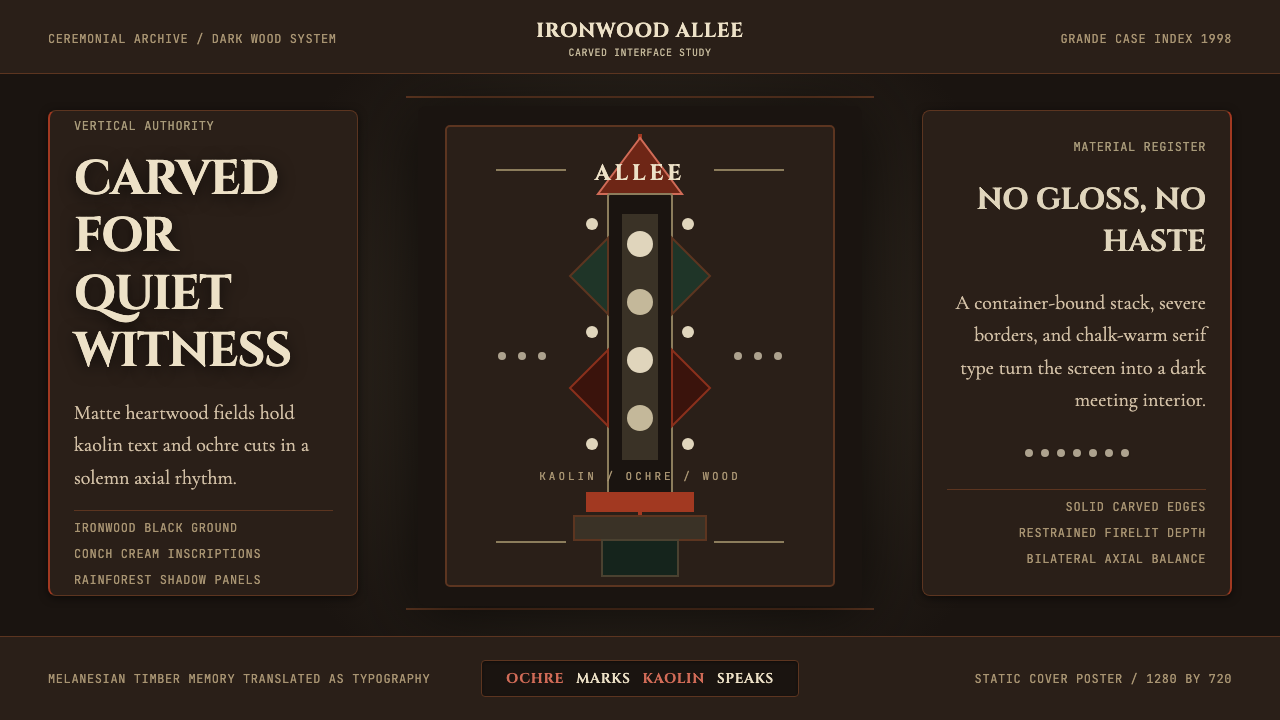
The defining ground of this style is an extreme darkness — not merely dark grey but the near-total darkness of ironwood timber and the unlit interior of a ceremonial space. This depth is not empty: it carries weight and gravity, functioning as a presence rather than an absence. Against it, every lighter element carries the force of emergence, as if surfacing from ancient darkness into visibility.这种风格的底色是一种极致的深暗——不只是深灰,而是铁木木料与仪式空间未经照亮的内部所呈现的近乎全黑。这种深度并非空洞:它承载着重量与庄重感,作为一种存在而非缺席发挥作用。在其衬托下,每一个较亮的元素都携带着从古老黑暗中浮现的力量。
Vertical Axis垂直轴线
Composition is organized around a pronounced vertical spine — echoing the posture of carved ancestor figures and the upward thrust of the flèche faîtière roof finial. Content elements are stacked vertically with deliberate spacing between them, creating a rhythm of ascent. This vertical discipline conveys authority and solemnity; horizontal interruptions are used sparingly and only to mark structural transitions of significance.构图围绕一条显著的垂直脊柱组织——呼应雕刻祖先像的站立姿态与屋脊箭饰柱的向上延伸。内容元素沿垂直方向叠置,各元素之间留有刻意的间距,形成上升的节奏。这种垂直纪律传递出权威与庄重感;水平方向的打断极为克制,仅用于标记具有意义的结构性转换。
Ochre and Kaolin Marks赭红与高岭土标记
The palette draws from two ceremonial materials: the burnt orange-red of ochre body paint and the chalky, almost luminous white of kaolin clay. Against the ironwood ground, ochre functions as the primary accent — warm, urgent, ceremonially charged. Kaolin white is used for finer marks, outlines, and text, suggesting chalk drawings on dark surfaces or the pale face markings of carved ancestor figures. Neither color is used decoratively; both carry the weight of ritual use.色板取自两种仪式材料:体绘用的烧赭红色,以及高岭土黏土那种粉白色、近乎发光的白。在铁木底色的衬托下,赭红作为主要强调色——温暖、迫切、带有仪式感的重量。高岭土白用于细线、轮廓与文字,让人联想到在深色表面留下的粉笔痕迹,或雕刻祖先像上苍白的面部标记。两种色彩都不以装饰为目的,皆承载着仪式使用的重量。
Schematic Geometry图式几何
Figurative elements — when they appear — are abstracted to their geometric essentials in the manner of Kanak carving: concentric rings, lateral ridges, stepped profiles, and vertical stacking. This schematic quality gives icons and marks a timeless, archetype quality distinct from either naturalistic illustration or contemporary flat design. Decorative curves are absent; forms are built from deliberate geometric reductions.当具象元素出现时,它们以卡纳克雕刻的方式被抽象至几何本质:同心环、横向脊梁、阶梯状轮廓、垂直叠置。这种图式特质赋予图标与标记一种超越时间的原型气质,有别于自然主义插图或当代扁平设计。装饰性曲线不存在;形态由刻意的几何简化构建。
Dot and Mark Rhythm圆点与标记节奏
Repeated small marks — dots, short dashes, conch-shell-like circular accents — are used as textural elements and rhythmic punctuation within the composition. These echo the surface texturing on carved wooden objects, where patterns of incised marks distinguish different clans and lineages. In a digital context, they function as decorative-structural elements that add visual density without breaking the fundamental darkness of the ground.重复的小型标记——圆点、短划、贝壳状圆形装饰——作为纹理元素与节奏性标点在构图中使用。这些标记呼应木雕表面的刻划纹样,那些纹样在传统中用于区分不同氏族与血统。在数字语境中,它们作为装饰性-结构性元素发挥作用,在不破坏底色基本暗度的前提下增添视觉密度。
Serif Gravitas衬线的庄重
Typography in this style draws on kaolin-influenced letterforms: a serifed type with slightly worn, chalk-like edges that echo hand-applied marks on dark surfaces. The weight is significant — letterforms are neither delicate nor mechanical but carry the substantiality of carved marks. Type is used sparingly, with generous surrounding space; the rare letter or word on a dark field carries the same visual weight as a carved inscription.这种风格的字体排印借鉴高岭土的特质:一种略带磨损感、粉笔边缘的衬线字体,呼应在深色表面手工施加的标记。字重显著——字形既非纤细也非机械,而是承载着雕刻痕迹的实体感。文字被克制地使用,四周留有充裕空间;深色底面上稀疏的字母或词语,与一道雕刻铭文承担着同等的视觉分量。
Material Honesty材料诚实
The style avoids simulated gradients, soft glows, and polished surface effects in favor of the matte, tactile quality of actual carved and painted materials. Ironwood does not reflect light; kaolin chalk does not blend smoothly into dark ground; ochre paint sits on the surface rather than sinking into it. Digital applications that honor this material logic use flat, matte rendering that acknowledges the difference between screen and substance.这种风格回避模拟渐变、柔和光晕与抛光表面效果,转而追求真实雕刻与绘制材料的哑光触感质地。铁木不反光;高岭土白不与深色底色柔和融合;赭红色颜料附着于表面而非渗入其中。遵循这种材料逻辑的数字应用使用扁平哑光渲染,承认屏幕与实物之间的差异。

See the New Caledonia Kanak Totem design system →查看 New Caledonia Kanak Totem 完整设计系统 →
Who shaped New Caledonia Kanak Totem?谁塑造了 New Caledonia Kanak Totem?
Tjibaou was the most prominent leader of the Kanak independence movement in the twentieth century, serving as secretary-general of the FLNKS (Kanak and Socialist National Liberation Front). His central argument — that political independence required cultural self-affirmation — made him as much a theorist of visual and material identity as a political leader. His 1975 staging of the Melanesia 2000 festival, which brought together Kanak cultural practitioners from across the archipelago, was a landmark assertion of Kanak cultural vitality under colonial conditions. The Tjibaou Cultural Centre, opened nine years after his assassination, remains the most internationally visible embodiment of his vision.吉巴乌是二十世纪卡纳克独立运动最重要的领袖,曾任FLNKS(卡纳克与社会主义民族解放阵线)秘书长。他的核心论点——政治独立需要文化自我确立——使他既是视觉与物质身份的理论家,也是政治领袖。1975年,他主持策划的「美拉尼西亚2000」节庆活动汇聚了群岛各地的卡纳克文化实践者,是殖民处境下卡纳克文化活力的里程碑式宣示。以他命名、在他遇刺九年后落成的文化中心,至今仍是他愿景最具国际能见度的体现。
The Italian architect designed the Tjibaou Cultural Centre (opened 1998) in close dialogue with Kanak community members and cultural advisers. His approach — using modern engineering and timber to suggest the forms of traditional Kanak architecture without reproducing them literally — became a model for culturally engaged contemporary architecture. The centre's ten wood-ribbed cases, rising in height along the ridge of a peninsula and open at the top to the Pacific wind, translate the upward thrust of the grande case into a form legible to both Kanak and international audiences. Piano's building is the primary visual reference point for the style's treatment of vertical timber forms against open sky.意大利建筑师伦佐·皮亚诺在与卡纳克社区成员及文化顾问的紧密对话中,设计了吉巴乌文化中心(1998年落成)。他的方法——以现代工程与木材来暗示传统卡纳克建筑的形态,而非字面复制——成为文化参与型当代建筑的范本。中心的十个木肋圆屋沿半岛山脊依次升高,顶部向太平洋的风敞开,将大圆屋的向上张力转化为卡纳克与国际观众都能理解的形式。皮亚诺的建筑是这一风格处理垂直木构形态与开放天空关系的首要视觉参照。
A Protestant missionary and self-taught ethnologist, Leenhardt lived and worked in New Caledonia from 1902 to 1926, producing the most detailed early documentation of Kanak social structure, cosmology, and material culture. His 1937 ethnographic study Gens de la Grande Terre and his later philosophical work Do Kamo (1947) — which examined Kanak notions of personhood, body, and myth — provided the conceptual framework through which Kanak visual tradition has been most influentially interpreted. His documentation of the grande case and its associated carved objects preserved knowledge that colonial suppression was actively erasing.勒纳尔德是一位新教传教士与自学成才的民族学家,1902至1926年间在新喀里多尼亚生活与工作,留下了最详尽的早期卡纳克社会结构、宇宙观与物质文化记录。他1937年的民族志研究《大地岛之人》及后来的哲学著作《多·卡莫》(1947年)——探讨卡纳克的人格、身体与神话观念——为卡纳克视觉传统的诠释提供了最具影响力的概念框架。他对大圆屋及相关木雕器物的记录保存了殖民压制正在主动抹除的知识。
A specialist in Melanesian art and material culture at the Musée du Quai Branly in Paris, Boulay conducted extensive fieldwork and archival research on Kanak carving traditions throughout the late twentieth century. His scholarly work helped establish the flèche faîtière as a recognized form within international art history and design discourse — not as primitive artifact but as the product of a sophisticated aesthetic tradition. His cataloguing of the formal properties of Kanak sculpture (the geometric schematism, the relationship between dark grounds and light marks, the verticality and ritual function) provided the art-historical basis on which contemporary designers can engage with the tradition rigorously.布雷是巴黎凯布朗利博物馆黑拉尼西亚艺术与物质文化专家,二十世纪后半叶在卡纳克雕刻传统领域进行了大量田野调查与档案研究。他的学术工作帮助确立了屋脊箭在国际艺术史与设计话语中的地位——不是作为「原始文物」,而是作为成熟美学传统的产物。他对卡纳克雕塑形式特征的系统整理——几何图式主义、深色底与亮色标记的关系、垂直性与仪式功能——为当代设计师以严谨态度接触这一传统提供了艺术史基础。
How do you use New Caledonia Kanak Totem today?今天怎么用 New Caledonia Kanak Totem?
New Caledonia Kanak Totem is a high-specificity style — its power comes from commitment. Because the visual system is built on extreme darkness, ochre warmth, and vertical ceremony, it works best in contexts that call for solemn weight, cultural depth, and a deliberate departure from the lightweight brightness that dominates most contemporary digital design. Applied carelessly, it risks feeling theatrical; applied with conviction, it commands attention in a way that few other styles can match.新喀里多尼亚卡纳克图腾是一种高特异性风格——其力量来自全情投入。因为这套视觉系统建立在极致深暗、赭红温度与垂直仪式感之上,它最适合那些需要庄重分量、文化深度,以及刻意偏离当代数字设计主流轻盈明亮气质的场景。随意应用会显得戏剧化;充分投入则能以其他风格难以匹敌的方式命令视线。
For presentation slides, the style suits cover pages and section dividers with exceptional force. A cover built on near-total darkness with a vertical arrangement of title, subtitle, and an ochre accent mark carries an authority that few light-palette presentations achieve. Content slides should maintain the dark ground and restrict text to kaolin-white with ochre highlights for essential emphasis only. Data slides take on a ritual quality: when bars, lines, and chart elements are rendered in ochre against darkness, they read as marks of significance rather than neutral information display. Reserve white-ground slides for moments when contrast with the dominant darkness is itself the message.在演示文稿中,这种风格在封面页与章节分隔页上具有非凡的力量。一张以近乎全黑为底、垂直排列标题、副标题与赭红强调标记的封面,所传递的权威感是大多数浅色系演示难以企及的。内容页应保持深色底面,将文字限制在高岭土白,赭红仅用于关键的强调。数据页呈现出仪式般的质感:当条形、折线与图表元素以赭红色在黑暗中呈现,它们被理解为具有意义的标记,而非中性的信息显示。将白色底面保留给深色主基调中需要以对比本身传达信息的时刻。
For web interfaces and dashboards, this style works well in contexts where gravitas and distinction matter more than approachability — portfolio sites for artists and cultural institutions, editorial interfaces for long-form writing, or product dashboards for industries where solemnity is appropriate. The dark ground reduces eye fatigue in low-light environments; the high contrast between ochre and darkness makes hierarchy immediately legible without color-coding complexity. Navigation and structural elements should remain typographic and restrained, allowing the dark field to dominate.对于网页界面与仪表板,这种风格适合庄重感与独特性比亲近感更重要的场景——艺术家与文化机构的作品集网站、长篇写作的编辑界面,或严肃氛围适当的行业产品仪表板。深色底面在低光环境下降低眼部疲劳;赭红与黑暗之间的高对比度使层级无需复杂色彩编码即可立即清晰。导航与结构元素应保持字体性与克制,让深色底面主导整体。
For editorial and marketing work, the style is particularly effective for contexts involving cultural heritage, archival material, documentary subjects, or brands that position themselves against mainstream lightness. A full-spread editorial opener built on Kanak Totem darkness with a single large ochre headline and sparse kaolin body text creates an immediate sense of occasion. Marketing applications work best when the style is allowed to occupy the full visual field rather than appearing in a box or panel — cropping the darkness diminishes its power.对于编辑与营销内容,这种风格在涉及文化遗产、档案材料、纪录片题材,或将自身定位为抗拒主流明亮感的品牌等场景中尤为有效。一张以卡纳克图腾暗色为底、配以单一大号赭红标题与稀疏高岭土白正文的全幅编辑开篇,立刻传递出一种特殊的仪式感。营销应用在风格被允许占据整个视觉场域——而非出现在方框或面板中——时效果最佳:裁切深色底面会削弱其力量。
The most common mistake when applying this style is diluting the darkness. A medium-dark grey background with small ochre accents produces neither the lightness of a conventional palette nor the depth of authentic Kanak Totem — it falls between registers and loses the style's fundamental gravity. Commit to the ironwood depth or do not use the style. A second common error is adding decorative elements drawn from other dark-palette traditions — Nordic, Japanese, or Brutalist. The style's marks have specific ceremonial reference; substituting unrelated geometric ornament produces pastiche rather than coherent visual language.应用这种风格最常见的错误是稀释深度。以中等深灰色为底、配以小面积赭红强调,既无法达到常规色板的明亮,也无法达到正宗卡纳克图腾的深度——它落在两种语境之间,失去了这种风格的根本重力。要么全情投入铁木的深度,要么不使用这种风格。第二种常见错误是添加来自其他深色系传统——北欧、日式或野兽派——的装饰元素。这种风格的标记具有特定的仪式指涉;用不相关的几何装饰替代,产生的是拼凑而非连贯的视觉语言。
See the New Caledonia Kanak Totem design system →查看 New Caledonia Kanak Totem 完整设计系统 →
New Caledonia Kanak Totem — FAQNew Caledonia Kanak Totem · 常见问题
Is this style appropriate to use in commercial design without cultural permission?在没有文化许可的情况下,将这种风格用于商业设计是否合适?
This is a live question in design ethics, and there is no universal consensus. The Kanak Totem style draws on a living cultural tradition — not an extinct historical aesthetic — and its symbolic elements (the flèche faîtière form, the ceremonial ochre, the kaolin markings) carry specific meaning within Kanak society. Designers using this style should approach it with the awareness that they are working with abstracted forms of a living tradition, and should be prepared to acknowledge that source directly and publicly. Using the visual vocabulary of the style while removing or ignoring its cultural reference is the least defensible approach; using it while explicitly crediting its origins and context is more honest. Engaging with contemporary Kanak cultural institutions when undertaking significant commercial projects is always the more considered path.这是设计伦理领域的一个现实议题,尚无普遍共识。卡纳克图腾风格源自一种仍然活跃的文化传统——而非已消亡的历史美学——其象征元素(屋脊箭形态、仪式赭红、高岭土标记)在卡纳克社会中承载着特定意义。使用这种风格的设计师应意识到:他们在使用的是一种活态传统的抽象形式,并应准备好直接、公开地承认这一来源。在使用这套视觉语汇的同时抹去或忽略其文化指涉,是最难以辩护的做法;在明确归功于其文化来源与背景的前提下使用,则更为诚实。在开展重大商业项目时,与当代卡纳克文化机构接触始终是更审慎的路径。
How does this style differ from other dark-palette design systems?这种风格与其他深色调设计系统有何不同?
Many dark-palette design systems — from Scandinavian moodboard darkness to Japanese wabi-sabi restraint to contemporary dark mode UI — share the use of dark grounds but differ fundamentally in their relationship to light and mark-making. Kanak Totem is distinguished by the specific warmth of its ochre accent (which differs from the cool golds of Nordic dark palettes and the subdued naturals of Japanese restraint), by the schematic geometric quality of its marks (which differ from the organic forms of wabi-sabi), and by the vertical ceremonial structure of its composition (which differs from the horizontal calm of Scandinavian design). The style's source in carving — in marks made by removing material rather than applying it — gives it a quality of revelation rather than decoration: each mark on the dark field is an uncovering.许多深色调设计系统——从斯堪的纳维亚情绪板式的暗色到日式侘寂的克制,再到当代深色模式UI——都共享深色底面的使用,但在与光线和标记制造的关系上存在根本差异。卡纳克图腾的独特性在于:其赭红强调色的特定温度(有别于北欧深色调色板的冷金与日式克制的低调自然色);其标记的几何图式化品质(有别于侘寂的有机形态);以及其构图的垂直仪式结构(有别于斯堪的纳维亚设计的水平静默)。这种风格源自雕刻——通过移除材料而非添加材料来制造标记——赋予了它一种揭示而非装饰的品质:深色底面上的每一道标记,都是一次显露。
Can this style work in a light-background context?这种风格能否在浅色背景的场景中使用?
A light-ground inversion is technically possible but comes at significant cost to the style's fundamental character. The ironwood darkness is not a variable; it is the style's premise. Without it, what remains is a set of ochre and chalk marks on a neutral ground — which loses both the ceremonial gravity and the specific visual logic of emergence against depth. A more productive approach for contexts where dark backgrounds are not appropriate is to use a restricted application: a dark header band or section accent within an otherwise light layout, rather than attempting a full light-ground version of the style. This preserves the system's integrity while adapting to practical constraints.浅色底面的反转在技术上是可行的,但会使这种风格的根本特质付出显著代价。铁木深黑不是一个变量;它是这种风格的前提。没有它,剩下的只是一套赭红与粉白标记落在中性底面上——这既失去了仪式的庄重感,也失去了从深度中浮现的特定视觉逻辑。对于不适合深色背景的场景,更有效的做法是局部应用:在整体浅色版面中使用深色的标题带或章节强调区,而非尝试完整的浅色版本。这在适应实际约束的同时保留了系统的完整性。
What kinds of imagery pair well with this style?哪类图像与这种风格搭配效果最佳?
Imagery that pairs best with Kanak Totem has either strong sculptural presence or high tonal contrast that can hold its own against the dark ground. High-contrast black-and-white documentary photography — particularly of physical objects, architectural forms, or human figures — works well when treated as flat, non-naturalistic elements rather than windows into scenes. Close-up photography of carved or textured surfaces (wood, clay, stone) resonates with the style's material logic. Avoid photography with soft naturalistic lighting, bright outdoor scenes, or vibrant unrelated color, which will fight the dark ground rather than integrate with it. Abstract marks and geometric elements tend to work better than photographic imagery in most applications.与卡纳克图腾搭配效果最佳的图像,要么具有强烈的雕塑存在感,要么拥有足以与深色底面抗衡的高调性对比度。高对比度的黑白纪实摄影——尤其是实物、建筑形态或人物图像——在以扁平、非自然主义方式处理(而非作为场景窗口)时效果良好。雕刻或纹理表面(木材、陶土、石头)的特写摄影与这种风格的材料逻辑产生共鸣。避免使用具有柔和自然光线、明亮户外场景或不相关鲜艳色彩的摄影——这类图像会与深色底面产生冲突而非融合。在大多数应用中,抽象标记与几何元素往往比摄影图像更为有效。
How does the Tjibaou Cultural Centre inform the style without making it purely architectural?吉巴乌文化中心如何影响这种风格,而不使其沦为纯粹的建筑参照?
The Tjibaou Cultural Centre matters to this style not as a building to be reproduced but as a set of translated principles. Piano's design demonstrated that Kanak visual logic — verticality, timber darkness, the relationship between upward thrust and open sky — could be reinterpreted in a modern structural language without losing its cultural resonance. The lesson for digital design is the same: the style's elements (the dark ground, the vertical axis, the ochre and kaolin marks) are abstractions of deeper cultural principles, not literal copies of physical objects. Designers who understand this can apply the style's logic to any medium — screen, print, physical space — without the result feeling like an architectural illustration. The goal is to carry the same qualities of weight, emergence, and ceremonial presence that the Centre embodies, translated into the specific conventions of the design medium at hand.吉巴乌文化中心对这种风格的意义,不在于作为需要再现的建筑,而在于它所体现的一套被翻译过的原则。皮亚诺的设计证明:卡纳克视觉逻辑——垂直性、木料深黑、向上张力与开放天空的关系——可以在现代结构语言中被重新诠释而不失去文化共鸣。对数字设计的启示是相同的:这种风格的元素(深色底面、垂直轴线、赭红与高岭土标记)是更深层文化原则的抽象,而非对物理对象的字面复制。理解这一点的设计师,可以将这种风格的逻辑应用于任何媒介——屏幕、印刷、实体空间——而不使结果沦为建筑插图。目标是承载文化中心所体现的同等重量感、浮现感与仪式存在感,并将其转化为手头设计媒介的特定惯例。
Related design styles相关设计风格
 Hawaiian Hula Pahu DrumSacred weight, hand-marked. ʻAlaea red, kapa texture, and stacked carved regi…圣重而手作。ʻAlaea红、卡帕纹理与层叠雕刻带。
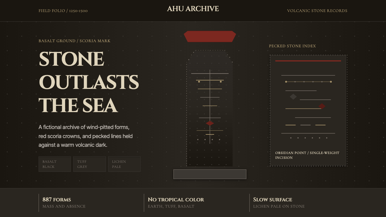 Rapa Nui Moai PetroglyphMonumental sparseness. Basalt black, scoria red, and pecked-dot borders hold…纪念碑式荒寂:玄武黑、火山红与凿点边框凝住沉默。
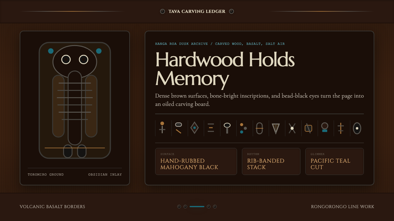 Chilean Rapa Nui Toromiro (Easter Island)Ancient weight, dusk-lit. Toromiro brown, Cinzel capitals, rib bands, obsidia…古老而沉重:托罗米罗褐、Cinzel碑文体、肋骨横带与黑曜石珠。
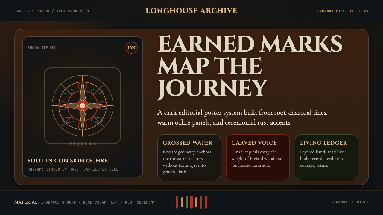 Dayak Borneo Tattoo (Iban)A living journey ledger. Soot lines, ochre panels, and rust rosettes feel han…身体成旅程账本。炭线、赭面与锈红莲座如手敲入肤。
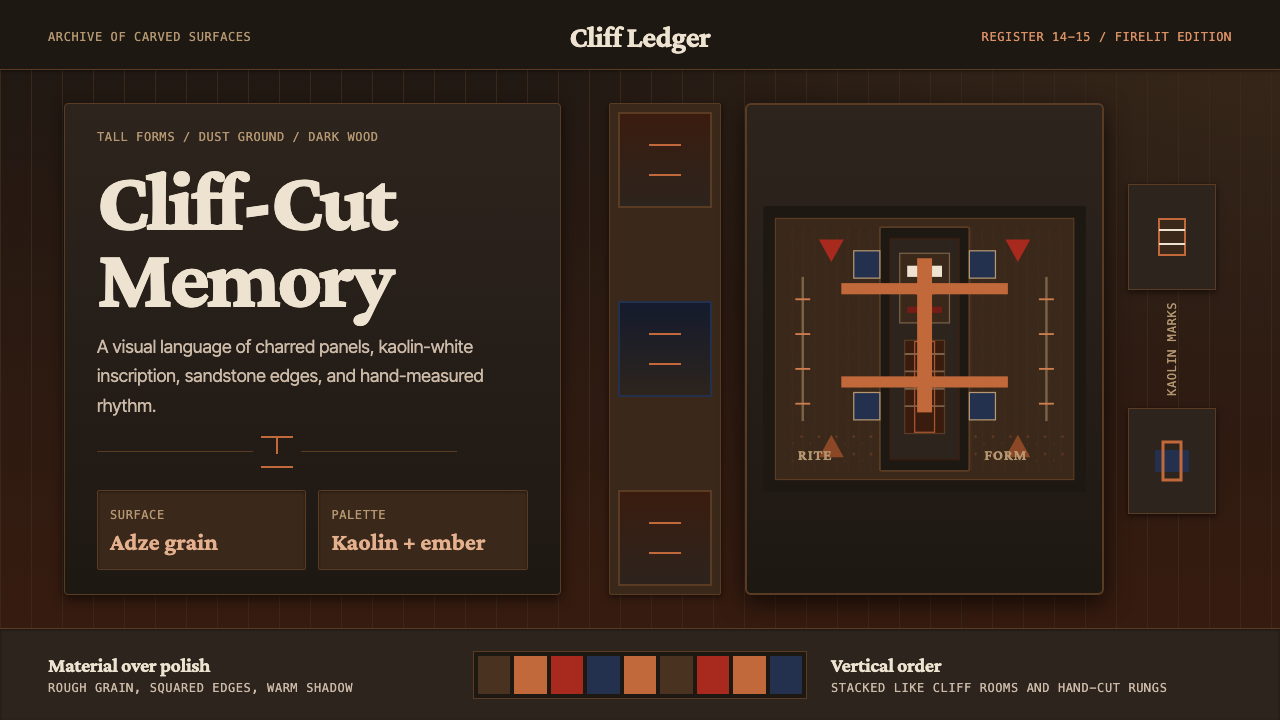 Dogon Bandiagara Cliff MaskHand-hewn gravity. Charred wood, kaolin type, and sandstone geometry stack li…手凿般沉稳:炭木底、高岭土字与砂岩几何层层堆叠。
 Ecuadorian Otavalo Cochineal LoomHandwoven gravity. Cochineal and cobalt stripes tense against charcoal, cut b…手织般厚重:胭脂红与钴蓝经纬压在炭黑上,只留一条铬黄线。