Design style guide设计风格指南
What is Ecuadorian Otavalo Cochineal Loom?什么是 Ecuadorian Otavalo Cochineal Loom?
From the highland looms of Imbabura, a weaving tradition older than the Inca empire transforms mineral-dye saturation and precise stripe geometry into one of the Americas' most enduring and visually powerful design systems.源自因巴布拉高地织机的编织传统,早于印加帝国,将矿物染料的饱和质感与精准的条纹几何,凝炼为美洲最持久、最具视觉张力的设计体系之一。
Ecuadorian Otavalo Cochineal Loom in briefEcuadorian Otavalo Cochineal Loom 速览
Ecuadorian Otavalo Cochineal Loom is a design system rooted in the living textile practice of the Kichwa-Otavaleño weavers of Imbabura province in the northern Andes. It draws directly from the visual vocabulary of the backstrap loom — the tensions of the warp, the rhythmic interlocking of the weft, the mineral richness of dyes derived from cochineal insects, indigo plants, and volcanic earth pigments — and translates those properties into a digital aesthetic language.厄瓜多尔奥塔瓦洛胭脂虫织机设计系统,根植于安第斯山脉北部因巴布拉省基丘瓦-奥塔瓦洛织工的活态纺织实践。它直接从腰织机的视觉词汇中汲取:经线的张力,纬线的节律性交错,胭脂虫、靛蓝植物与火山土颜料提炼出的矿物染料的厚重质感——并将这些特性转化为数字美学语言。
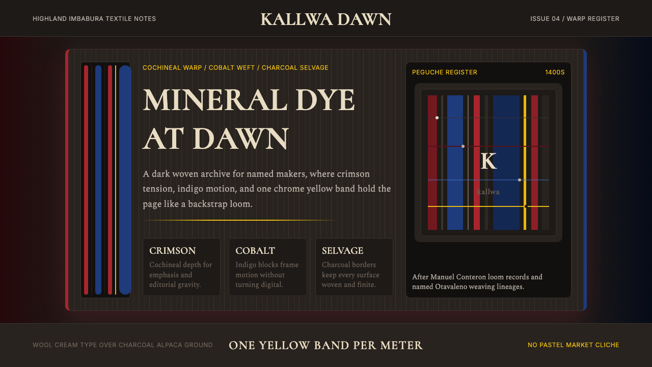
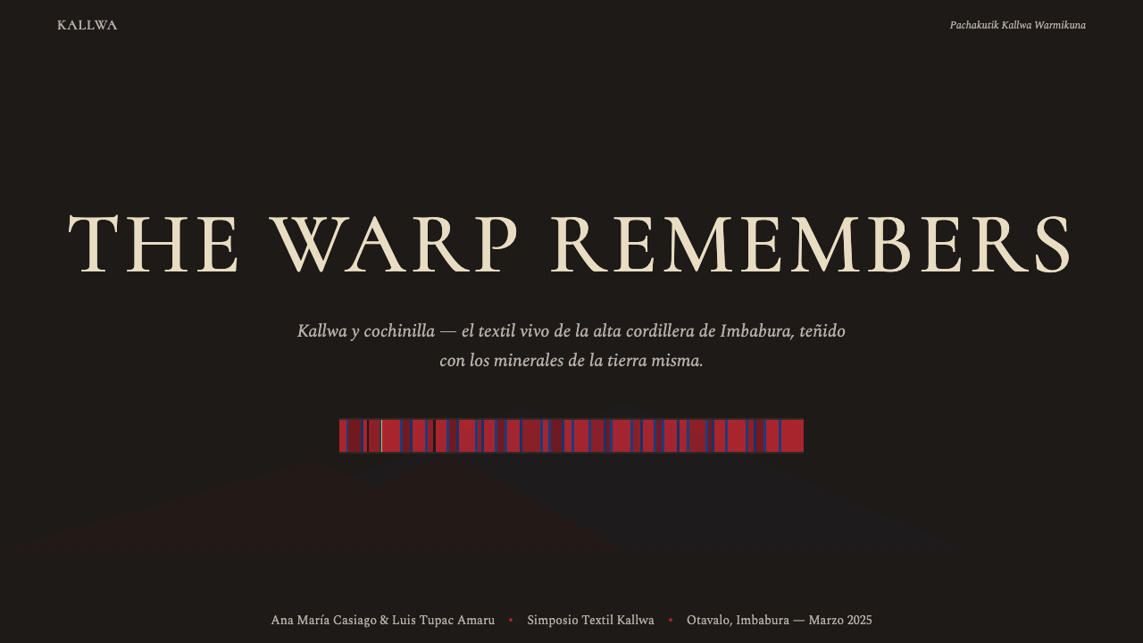
The system is built around a core contrast: deep, saturated chromatic bands — cochineal crimson, indigo cobalt, chrome yellow — pressed against a charcoal ground made from undyed dark alpaca or llama fiber. This is not a palette assembled for contemporary taste; it is the direct visual record of what those dyes do to those fibers under highland light. The stripe is the fundamental unit of composition, carrying the weight of both decoration and structure simultaneously.这一系统以核心对比为骨架:深沉、高饱和的色彩条带——胭脂虫深红、靛蓝钴色、铬黄——压入由未染深色羊驼毛或骆马毛织就的炭黑底面。这并非为当代审美精心调配的色板,而是那些染料施于那些纤维、在高地光线下的直接视觉记录。条纹是构图的基本单元,同时承载装饰与结构的双重重量。
What distinguishes this tradition from other Andean textile systems is its particular economy: one accent color per meter of cloth. Each chamarra or anaco is disciplined by this rule. The cochineal-dyed warp threads carry the primary chromatic statement; the cobalt weft crosses and ties; the charcoal selvage frames the whole; and a single band of chrome yellow appears once, like a signature, to close the composition. That restraint — abundance of craft meeting austerity of layout — gives the Otavaleño textile its characteristic visual authority.令这一传统有别于其他安第斯纺织体系的,是其特有的经济原则:每米布料只用一种强调色。每件查马拉披风或阿纳科裙都受此规则约束。胭脂虫染色的经线承载主要色彩陈述;钴蓝纬线穿越交织;炭黑布边框定整体;铬黄条带只出现一次,如同签名,为构图收尾。这种克制——工艺的丰盈与版面的简朴相遇——赋予奥塔瓦洛纺织品特有的视觉权威感。
Where does Ecuadorian Otavalo Cochineal Loom come from?Ecuadorian Otavalo Cochineal Loom 从何而来?
The Otavaleño weaving tradition predates the Inca empire's expansion into what is now northern Ecuador in the late fifteenth century. Kichwa-speaking peoples of the Imbabura highlands had already developed sophisticated backstrap-loom textile production, using locally grown cotton and wool from the camelids that grazed on the páramo grasslands. When the Inca administration incorporated the region, they recognized the textile skill of Imbabura's weavers and organized them into mit'a labor arrangements — rotating tribute obligations that required communities to produce cloth for state redistribution. This formalized what was already a region of high weaving density and deep specialist knowledge.奥塔瓦洛编织传统早于印加帝国在十五世纪末向厄瓜多尔北部扩张。因巴布拉高地的基丘瓦语系民族已发展出成熟的腰织机纺织生产,使用本地种植的棉花,以及在帕拉莫高地草原放牧的骆驼科动物的羊毛。印加行政体系并入该地区后,承认了因巴布拉织工的技艺,并将其纳入米特'a劳役制度——以轮换贡赋义务要求各社区为国家再分配生产布料。这使一个本已织造密集、专业知识深厚的地区得到进一步制度化。
Cochineal entered the highland palette through contact with Mesoamerican trade networks, although the parasite that produces the dye — Dactylopius coccus, a scale insect living on Opuntia cacti — was also native to the drier Andean valleys. The crimson produced by cochineal is among the most intense natural reds known, and its adoption transformed the visual character of highland Andean textiles. Unlike the organic ochres and earthy madders common before, cochineal red has a luminous, almost electric presence that does not fade easily under highland ultraviolet. Spanish colonizers recognized the commercial value of cochineal immediately and made it one of the most traded commodities in the colonial Andean economy, second only to silver.胭脂虫经由与中美洲贸易网络的接触进入高地色板,尽管产生染料的寄生昆虫——栖居于仙人掌上的胭脂蚧(Dactylopius coccus)——在较干燥的安第斯山谷中也有原生分布。胭脂虫产生的深红色是已知最强烈的天然红色之一,其引入从根本上改变了高地安第斯纺织品的视觉特质。与此前常见的有机赭色和土红不同,胭脂虫红具有一种在高地紫外线下不易褪色的明亮、近乎电光质感。西班牙殖民者立即意识到胭脂虫的商业价值,使其成为殖民安第斯经济中仅次于白银的大宗贸易商品。
The Plaza de Ponchos in Otavalo, formalized as a market space in 1964, became the principal node for the Otavaleño textile economy. But the market's consolidation accelerated something deeper: the standardization and refinement of a textile aesthetic that had been evolving across centuries. Weavers competing in a visible market had incentive to develop the most recognizable and transportable forms of the tradition. The chamarra — a woven shawl or poncho — and the anaco — a wraparound skirt woven in warp-stripe patterns — became the iconic objects through which the tradition communicated itself to outside audiences.奥塔瓦洛的蓬乔广场(Plaza de Ponchos)于1964年正式设立为市场空间,成为奥塔瓦洛纺织经济的核心节点。但市场的巩固加速了更深层的变化:一套历经数百年演化的纺织美学的标准化与精炼。在可见市场中相互竞争的织工,有动力发展出这一传统中最具辨识度且最易于流通的形态。查马拉(一种织造披肩或斗篷)与阿纳科(一种以经向条纹图案织就的缠绕式裙装)成为标志性器物,传统通过它们向外部受众表达自身。
The contemporary boom from the nineteen-nineties onward brought Otavaleño weavers into global circuits. Families established shops in European capitals, North American cities, and across Latin America. This diaspora created a feedback loop: the textile aesthetic traveled, encountered other design systems, and returned to Otavalo carrying new influences — but the core vocabulary of cochineal warp, cobalt weft, charcoal ground, and single accent band proved durable. The movements of Kichwa-Otavalo cultural revival, Pachakutik political design, and the consolidation of the Plaza de Ponchos as a cultural institution collectively reinforced rather than diluted the tradition's visual coherence.二十世纪九十年代起的当代繁荣将奥塔瓦洛织工带入全球回路。家族在欧洲城市、北美城市和拉丁美洲各地开设店铺。这一散居创造出一种反馈循环:纺织美学旅行、遭遇其他设计体系,再携带新影响返回奥塔瓦洛——但胭脂虫经线、钴蓝纬线、炭黑底面与单一强调色条带的核心词汇被证明具有持久生命力。基丘瓦-奥塔瓦洛文化复兴运动、帕查库提克政治设计运动,以及蓬乔广场作为文化机构的巩固,共同强化而非稀释了这一传统的视觉连贯性。
What defines the Ecuadorian Otavalo Cochineal Loom look?Ecuadorian Otavalo Cochineal Loom 的视觉特征是什么?
Color System色彩体系
The palette is built on a fundamental opposition between mineral-dye saturation and deep, unsaturated ground. Cochineal crimson — a luminous, slightly warm red with extraordinary depth — serves as the primary chromatic agent. Indigo cobalt, cooler and more recessive, crosses the crimson as a structural counterweight. Chrome yellow, used sparingly as the single accent element, carries a sharp energetic charge that activates the darker tones around it. The charcoal ground — derived from the natural dark pigmentation of alpaca and llama fiber — is not neutral but carries its own warm animal undertone that prevents the palette from reading as cold or graphic. These colors do not blend; they contrast.这一色板建立在矿物染料饱和色与深沉、低饱和底色的根本对立之上。胭脂虫深红——一种明亮、略带暖调、深度卓绝的红色——是主要色彩媒介。靛蓝钴色,更为清冷而内敛,以结构性对等的姿态横越深红。铬黄作为唯一强调元素节制使用,携带一种激活周围暗色调的尖锐能量感。炭黑底面——源自羊驼与骆马纤维的自然深色素——并非中性,而带有其自身温暖的动物底蕴,使整个色板不显冷峻或图形化。这些颜色不相融合;它们相互对比。
Stripe as Structure条纹即结构
The warp stripe is not decoration — it is the grammar of the system. Vertical bands of color arise directly from the mechanical logic of the loom: the warp threads, tensioned by the weaver's body and fixed in their positions, determine where each color will fall. The stripe is thus structurally honest; it cannot be repositioned arbitrarily without changing the weaving process itself. In digital translation, this principle becomes a commitment to columnar organization and the refusal of decorative mark-making that floats free of the underlying grid. Spacing between stripes is as meaningful as the stripes themselves.经向条纹不是装饰——它是这一体系的语法。色彩的纵向带状分布直接源于织机的机械逻辑:由织工身体张紧、位置固定的经线,决定了每种颜色的落点。因此条纹在结构上是诚实的;若不改变编织过程本身,便无法任意移位。在数字转化中,这一原则转化为对纵向组织的承诺,以及拒绝任何脱离底层网格自由浮动的装饰性标记。条纹之间的间距与条纹本身同等重要。
The Single Accent Rule单一强调原则
Traditional Otavaleño textiles operate under a strict economy: one chromatic accent per composition. The chrome yellow band appears once within the field of crimson and cobalt stripes — not as a repeated motif, but as a structural event, a punctuation mark that resolves the composition. This rule emerges not from aesthetic theory but from material practice: extra accent colors require extra dye baths, extra warping sequences, extra weaving complexity. Scarcity of means produced a design principle. In contemporary application, this translates to a rigorous single-accent discipline: one color reserved exclusively for the most critical interactive or structural element, with everything else drawn from the primary palette.传统奥塔瓦洛纺织品遵循严格的经济原则:每件构图只有一种色彩强调。铬黄条带在深红与钴蓝条纹之间仅出现一次——不是作为重复母题,而是作为结构性事件,一个解决构图的标点符号。这一规则并非源于美学理论,而是源于材料实践:额外的强调色意味着额外的染色浴、额外的穿经序列、额外的编织复杂度。手段的匮乏催生了设计原则。在当代应用中,这转化为严格的单一强调纪律:一种颜色专门保留给最关键的交互或结构元素,其余一切从主色板中取用。
Textile Weight and Surface Quality织物厚重感与表面质地
Otavaleño cloth is not delicate. It is dense, heavy, durable — the properties of a fabric made to withstand the cold and wet of the highland páramo at altitude. The weave itself is visible as surface texture: the crossing of warp and weft creates a subtle relief that catches light differently from the face and from the edge. This physical quality translates aesthetically into a preference for elements that read as substantial rather than airy, grounded rather than floating. Visual weight should feel earned and intentional, not decorative. Backgrounds carry presence; text should be set with enough density that it holds its position in the composition.奥塔瓦洛布料并不精致轻薄,而是厚密、沉重、耐久——为抵御高海拔帕拉莫草原的寒冷与潮湿而生的织物特性。编织本身作为表面纹理可见:经纬交织产生的细微浮雕,从正面与侧面会呈现不同的光线折射。这种物理特质在美学上转化为对厚实而非轻盈、沉稳而非漂浮元素的偏好。视觉分量应感觉是被赢得的、有意为之的,而非装饰性的。背景承载存在感;文字的排布应有足够密度,以在构图中保持自身位置。
Bilateral Symmetry and Vertical Flow双侧对称与纵向流动
Unlike the asymmetric dynamism of many modernist design systems, the Otavaleño textile tradition is fundamentally symmetrical along the vertical axis. A chamarra is a mirror image of itself: the left warp and the right warp carry the same sequence of colors, and the composition reads as balanced when laid flat or worn. This bilateral symmetry creates a composed, ceremonial quality — not static, because the horizontal weft crossings introduce a secondary rhythm, but ordered. Vertical flow dominates: the eye moves from top to bottom along the stripe columns, not diagonally across the field.与许多现代主义设计体系的不对称动感不同,奥塔瓦洛纺织传统沿纵轴具有根本性的对称性。查马拉是自身的镜像:左侧经线与右侧经线承载相同的色彩序列,铺平或穿戴时构图呈现平衡状态。这种双侧对称赋予作品一种端庄的、仪式性的品质——并非静止,因为横向纬线交织引入了次级节律,但有序。纵向流动主导全局:视线沿条纹纵列从上至下移动,而非斜向穿越画面。
Darkness as Ground暗色作底
The charcoal base of the Otavaleño textile is not a neutral backdrop but a positive element that shapes how the saturated color bands read. Against a very dark ground, cochineal crimson appears almost luminous — the contrast is greater than it would be on a light ground, and the dye's inherent warmth is amplified rather than diluted. This means the system is fundamentally dark-first: the dark ground is the primary surface, and the colored bands emerge from it rather than being placed onto a neutral field. This is the opposite of the light-ground tradition common in European decorative textiles of the same period.奥塔瓦洛纺织品的炭黑底面不是中性的背景,而是正向元素,塑造着高饱和色彩条带的读法。在极深的底面上,胭脂虫深红显得近乎发光——对比度大于浅色底面上的效果,染料固有的暖调被放大而非稀释。这意味着这一系统从根本上是暗色优先的:暗色底面是主要表面,色彩条带从中涌现,而非被置于中性底面之上。这与同时期欧洲装饰纺织品中常见的浅色底面传统恰好相反。
Geometric Precision Without Measurement无量度的几何精准
Otavaleño stripe geometry is precise, but its precision is bodily rather than mathematical. The weaver counts threads by feel and by sight, maintaining consistent stripe widths through trained muscle memory and rhythmic counting rather than a ruler or measuring device. The result has the qualities of handmade precision: perfectly regular enough to read as intentional, with a sub-perceptible variation that distinguishes it from machine output. Stripe widths repeat exactly enough to signal control, but the slight irregularity of natural fiber and hand tension gives the surface life. In digital application, this quality suggests tolerating and even introducing subtle variation rather than demanding mechanical perfection.奥塔瓦洛条纹几何精准,但其精准是身体性的而非数学性的。织工凭触感与目视计算经线,通过训练有素的肌肉记忆与节律性计数——而非尺子或量具——保持条纹宽度的一致。结果兼具手工精准的特质:规整到足以被读作有意为之,同时带有一种次感知层面的变化,将其与机器输出区别开来。条纹宽度的重复精确到足以传递掌控感,但天然纤维与手工张力的细微不规则赋予表面以生命。在数字应用中,这一特质提示我们:容忍甚至引入细微变化,而非追求机械完美。
Who shaped Ecuadorian Otavalo Cochineal Loom?谁塑造了 Ecuadorian Otavalo Cochineal Loom?
Miguel Andrango is among the most recognized contemporary Otavaleño master weavers, credited with maintaining and transmitting the technical knowledge of the backstrap loom in its most demanding traditional forms during a period when commercial pressure was pushing many weavers toward faster treadle-loom production. His work has been documented by ethnographic researchers and has served as a reference point for discussions about the continuity of textile tradition as a form of cultural memory rather than simply an economic activity.米格尔·安德朗戈是当代最具声望的奥塔瓦洛宗师级织工之一。在商业压力迫使许多织工转向更快的脚踏织机生产的时期,他致力于以最严格的传统形式维护和传承腰织机的技术知识。他的工作已被民族志研究者记录,并作为将纺织传统延续视为文化记忆形式——而非单纯经济活动——讨论中的参照坐标。
Lynn Meisch is an anthropologist whose decades of fieldwork in Otavalo produced some of the most detailed documentary records of the textile tradition in its market and social context. Her ethnographic work — particularly on the relationship between the Plaza de Ponchos economy and the maintenance of cultural identity — provided the academic framework that helped international audiences understand Otavaleño weaving not as folk craft but as a sophisticated, self-aware visual culture capable of global circulation while maintaining local coherence.林恩·梅施是一位人类学家,其在奥塔瓦洛数十年的田野调查产出了关于纺织传统在市集与社会语境中最为详尽的文献记录之一。她的民族志工作——尤其是关于蓬乔广场经济与文化认同维护之间关系的研究——为国际受众提供了理解奥塔瓦洛编织的学术框架:它不是民间手工艺,而是一种能够在全球流通的同时保持本地连贯性的精密、自觉的视觉文化。
Ariruma Kowii is a Kichwa-Otavaleño poet, academic, and cultural advocate whose work has been central to the articulation of Otavaleño identity as something simultaneously rooted in pre-Inca textile and linguistic traditions and capable of engaging with contemporary global cultural politics. His advocacy for Kichwa language preservation and his writing on the relationship between Andean material culture and cosmology have contributed to the framing of the textile tradition not merely as aesthetic heritage but as an embodied philosophical system.阿里鲁马·科维是一位基丘瓦-奥塔瓦洛诗人、学者与文化倡导者,其工作对于将奥塔瓦洛身份阐述为既深植于前印加纺织与语言传统、又能与当代全球文化政治对话的存在,具有核心意义。他对基丘瓦语言保护的倡导,以及关于安第斯物质文化与宇宙观关系的写作,推动了将纺织传统框定为不仅是美学遗产,更是具身化哲学体系的理解。
José Cotacachi represents the generation of Otavaleño weavers who expanded the tradition's reach through market entrepreneurship during the global boom of the nineteen-nineties and two-thousands. His family's establishment of retail networks outside Ecuador — across Latin America and into Europe — exemplifies the diaspora dynamic that carried the Otavaleño textile aesthetic into international design consciousness while maintaining the core vocabulary of cochineal, cobalt, and charcoal ground. This generation demonstrated that a tradition could travel without dissolving.何塞·科塔卡奇代表着九十年代与二十一世纪初全球繁荣期间,通过市场创业扩大传统影响力的那一代奥塔瓦洛织工。他家族在厄瓜多尔以外——遍布拉丁美洲并延伸至欧洲——建立零售网络的历程,典型体现了将奥塔瓦洛纺织美学带入国际设计视野的散居动态,同时保持了胭脂虫红、钴蓝与炭黑底面的核心词汇。这一代人证明了一种传统可以流传而不溶解。
How do you use Ecuadorian Otavalo Cochineal Loom today?今天怎么用 Ecuadorian Otavalo Cochineal Loom?
Ecuadorian Otavalo Cochineal Loom translates most successfully into digital contexts that benefit from strong chromatic authority, clear vertical organization, and a sense of material presence. The key to application is understanding the system's underlying logic — darkness as primary surface, saturated color emerging from that darkness, single accent used with ceremony — rather than simply reproducing the stripe pattern as a visual motif.厄瓜多尔奥塔瓦洛胭脂虫织机风格最能成功转化为那些受益于强烈色彩权威、清晰纵向组织与物质存在感的数字语境。应用的关键在于理解这一体系的底层逻辑——暗色作为主要表面,饱和色彩从暗色中涌现,单一强调色以仪式般的庄重使用——而非简单地将条纹图案作为视觉母题来复制。
For presentation slides, the system works best with a dark base as the primary surface. Cover slides benefit from full-field cochineal crimson or deep charcoal, with the title set in a light, weighty letterform that reads against the saturated ground. Content slides should organize information into clear vertical bands — a primary content column flanked by a narrower metadata column — echoing the warp-stripe structure. Use the single accent color (bright yellow or a secondary saturated hue) exclusively for the one element that needs the audience's attention in each slide. Data visualizations become stripe diagrams: bars and segments should be colored with the same restraint as warp threads, with the accent color marking only the most significant data point.在演示文稿中,这一系统最适合以深色底面为主要表面。封面幻灯片受益于全幅胭脂虫深红或深炭黑,标题以轻盈而有分量的字形排布,在饱和底面上清晰可读。内容页应将信息组织为清晰的纵向带状——一个主要内容纵列,侧翼以较窄的元数据纵列——呼应经向条纹结构。将单一强调色(明亮黄色或次要饱和色调)专门保留给每张幻灯片中最需要引导观众注意力的那一个元素。数据可视化成为条纹图表:柱条与扇区应以与经线同等的克制着色,以强调色只标注最重要的数据节点。
For web interfaces, this system suits platforms where cultural richness, authority, and considered craft are desired values: editorial publications, cultural institutions, artisan marketplaces, and premium product sites. The approach: build on a dark base, define a strict columnar grid that reflects the warp structure, and reserve the single accent color for primary interactive elements — the call to action, the active navigation state, the key status indicator. Navigation should be typographically clear, with no decorative flourishes. Cards and panels should sit with visual weight against the dark ground, not float with soft shadows.对于网页界面,这一系统适合那些以文化丰富性、权威感与精心工艺为期望价值的平台:编辑出版物、文化机构、手工艺品市集与高端产品网站。方法如下:以深色底面为基础,定义反映经向结构的严格纵列网格,将单一强调色保留给主要交互元素——行动号召、活跃导航状态、关键状态指示器。导航应字体清晰,无装饰花饰。卡片与面板应在深色底面上呈现视觉分量,而非以柔和阴影漂浮。
For editorial and marketing work, the style supports immersive, bold visual storytelling. Full-bleed dark sections with saturated-color typography can alternate with lighter passages — but the accent color should appear in the light sections with the same discipline as in the dark ones, never multiplying. Marketing materials benefit from the tradition's ceremonial quality: treat the accent element as a single significant gesture per composition, not as a repeated highlight pattern. The stripe structure translates well into section dividers, progress indicators, and any element that needs to communicate sequence or rhythm.对于编辑与营销工作,这种风格支持沉浸式、大胆的视觉叙事。深色满版区块配以饱和色彩文字,可与较浅的段落交替出现——但强调色在浅色段落中应保持与深色段落同等的纪律,绝不倍增。营销物料受益于这一传统的仪式品质:将强调元素视为每件构图中一个单一的重大手势,而非重复的高亮图案。条纹结构能很好地转化为章节分割线、进度指示器,以及任何需要传达序列感或节律感的元素。
A common mistake is treating the three primary colors of the palette as equal players to be distributed evenly. In the Otavaleño tradition, cochineal red is the dominant warp, cobalt is the structural weft, and yellow is the single accent. Inverting this hierarchy — or distributing all three in equal quantities — produces noise rather than composition. Similarly, placing the stripe pattern over a light ground inverts the system's logic: this is fundamentally a dark-ground tradition, and lightening the base reduces the luminous intensity that makes the saturated colors read as powerful rather than merely colorful.常见错误是将色板的三种主色视为需要均等分配的平等参与者。在奥塔瓦洛传统中,胭脂虫红是主导经线,钴蓝是结构性纬线,黄色是单一强调。颠倒这一层级关系——或将三种颜色等量分布——产生的是噪音而非构图。同样,将条纹图案置于浅色底面上会反转这一体系的逻辑:这从根本上是一种暗色底面传统,减淡底面会降低饱和色彩读来有力量而非仅仅多彩的那种发光强度。
Ecuadorian Otavalo Cochineal Loom — FAQEcuadorian Otavalo Cochineal Loom · 常见问题
How does this system differ from other Andean textile traditions like Peruvian or Bolivian weaving?这一体系与秘鲁或玻利维亚编织等其他安第斯纺织传统有何不同?
While all Andean highland textile traditions share certain technical foundations — the backstrap loom, camelid wool, natural mineral dyes — the Otavaleño system is distinguished by several specific choices. The dominant use of cochineal crimson as the primary warp color against a charcoal ground is characteristic; many Peruvian and Bolivian traditions use a wider range of dye colors simultaneously and often on lighter grounds. The Otavaleño single-accent discipline is also distinctive — other Andean traditions frequently layer multiple accent colors and complex pictographic or symbolic motifs into the textile field. The Otavaleño aesthetic tends toward bold, abstract stripe geometry over narrative or symbolic imagery, which makes it more directly translatable to contemporary design systems.虽然所有安第斯高地纺织传统都共享某些技术基础——腰织机、骆驼科动物羊毛、天然矿物染料——奥塔瓦洛体系以若干特定选择著称。将胭脂虫深红作为主要经线色施于炭黑底面的主导性使用是其特征;许多秘鲁和玻利维亚传统同时使用更广泛的染料色彩组合,且通常在较浅的底面上。奥塔瓦洛的单一强调纪律同样与众不同——其他安第斯传统常常在织物面上叠加多种强调色与复杂的图形或象征性母题。奥塔瓦洛美学倾向于大胆的抽象条纹几何,而非叙事性或象征性图像,这使其更直接地可转化为当代设计系统。
Is the dark background essential, or can the system work on a light ground?深色背景是必不可少的吗?还是这一系统也能在浅色底面上运作?
The dark ground is fundamental to the system's visual logic, not a stylistic option. The Otavaleño textile produces its characteristic luminosity by placing highly saturated mineral-dye colors against a very dark field — the contrast is what makes cochineal crimson appear to glow rather than simply appear red. On a light ground, the same colors read entirely differently: the crimson becomes a flat, warm tone rather than a luminous force; the cobalt loses its recessive structural quality; and the chrome yellow accent, which gains its power from being surrounded by darkness, becomes merely another light element. A light-ground version would require a fundamental redesign of the color relationships, and would be better understood as a different system inspired by the tradition rather than a translation of it.深色底面是这一系统视觉逻辑的基础,而非风格选项。奥塔瓦洛纺织品的特征性光辉正是通过将高饱和矿物染料色置于极深底面来实现——正是这种对比,使胭脂虫深红看起来是在发光,而非仅仅呈现为红色。在浅色底面上,相同的颜色会呈现完全不同的效果:深红变成平坦的暖调,而非发光的力量;钴蓝失去其内敛的结构性品质;铬黄强调色——其力量正来源于被暗色包围——也只是变成另一个浅色元素。浅色底面版本需要对色彩关系进行根本性的重新设计,更应被理解为受该传统启发的不同系统,而非对它的转化。
How strictly should the single accent rule be followed in a complex digital interface?在复杂的数字界面中,单一强调原则应该被多严格地遵守?
The spirit of the rule — that the accent color carries ceremonial weight and should not be depleted by overuse — is more important than mechanical application. In a complex interface, a single accent color can appear multiple times without violating the principle, provided it appears only on elements of equal functional significance. What the rule forbids is using the accent color for both primary calls to action and minor decorative elements simultaneously — that devalues the signal. A practical approach: define the single accent as the exclusive property of one functional category (primary interactive states, critical alerts, or active navigation), and use the primary palette for everything else. The accent should be the rarest color in the interface at any given moment.这一原则的精神——强调色承载仪式性重量,不应因过度使用而被消耗——比机械化应用更为重要。在复杂界面中,单一强调色可以多次出现而不违反原则,前提是它只出现在功能重要性相当的元素上。这一规则禁止的是将强调色同时用于主要行动号召和次要装饰元素——那会贬低信号的价值。一个实用方法:将单一强调色定义为某一功能类别的专属属性(主要交互状态、关键警示或活跃导航),其余一切从主色板中取用。在界面中的任何给定时刻,强调色应该是出现最少的颜色。
Does the system work for brands that want to convey warmth and approachability rather than authority?这一体系适合希望传递温暖感与亲近感而非权威感的品牌吗?
The Otavaleño system carries inherent warmth — the cochineal red has an organic, mineral quality that differs from the cool severity of many modernist design systems, and the charcoal ground has animal undertones from the natural fiber that prevent it from reading as cold or industrial. However, the system's overall character is ceremonial and weighty rather than casual or playful. It communicates dignity, craft, and cultural depth. Brands that want approachability in a light, friendly sense — pastel palettes, rounded forms, soft shadows — will find this system at odds with those values. But brands that want warmth in the sense of genuine cultural richness, material honesty, and considered gravity will find it well-suited.奥塔瓦洛体系具有内在的温暖感——胭脂虫红带有一种有机的、矿物质的品质,有别于许多现代主义设计体系的冷峻严肃;炭黑底面源自天然纤维的动物底蕴,使其不显冷漠或工业化。然而,这一体系的整体气质是仪式性的、有分量的,而非随性或活泼的。它传递的是尊严、工艺与文化深度。希望以轻盈、友好的方式传递亲近感的品牌——粉彩色板、圆润形态、柔和阴影——会发现这一体系与那些价值观格格不入。但希望以真正的文化丰富性、材料诚实与经过考量的庄重感来传递温暖的品牌,则会发现它非常适合。
How does this system handle typography, given that it originates in a pre-typographic textile tradition?这一体系如何处理字体排印,考虑到它起源于一种前印刷术的纺织传统?
The textile origin means the system has no native typographic component — it must be constructed from principles rather than inherited from a historical practice. The translation logic is this: the warp stripe's qualities (strong vertical orientation, consistent weight, clear color assignment, bilaterally symmetrical) suggest a typographic approach that mirrors those structural properties. Heavy letterforms with clear vertical stress read as consistent with the warp structure. The single-accent principle applies to type hierarchy: the most critical typographic element should carry the accent color; all other levels of hierarchy should be drawn from the primary palette — light type on dark ground, or dark-ground reversal for emphasis. Avoid typefaces with strong horizontal stress or decorative features that would introduce visual noise into the stripe-governed composition.纺织品起源意味着这一体系没有原生的字体排印组件——它必须从原则中构建,而非从历史实践中继承。转化逻辑如下:经向条纹的特质(强烈的纵向取向、一致的重量、清晰的色彩分配、双侧对称)提示一种与这些结构属性呼应的字体排印方法。具有清晰纵向应力的粗重字形读来与经向结构一致。单一强调原则适用于字体层级:最关键的排印元素应承载强调色;所有其他层级从主色板中取用——深色底面上的浅色文字,或以深色底面反转强调。避免具有强烈横向应力或装饰性特征的字体,以免向条纹主导的构图中引入视觉噪音。
Related design styles相关设计风格
 Iraqi Marsh Arab Mudhif ReedReverent reed darkness. Kufi arches, ochre lattice, and one water-blue line h…庄重的芦苇夜色。库菲拱线、赭黄格纹与一笔水蓝托住黄昏。
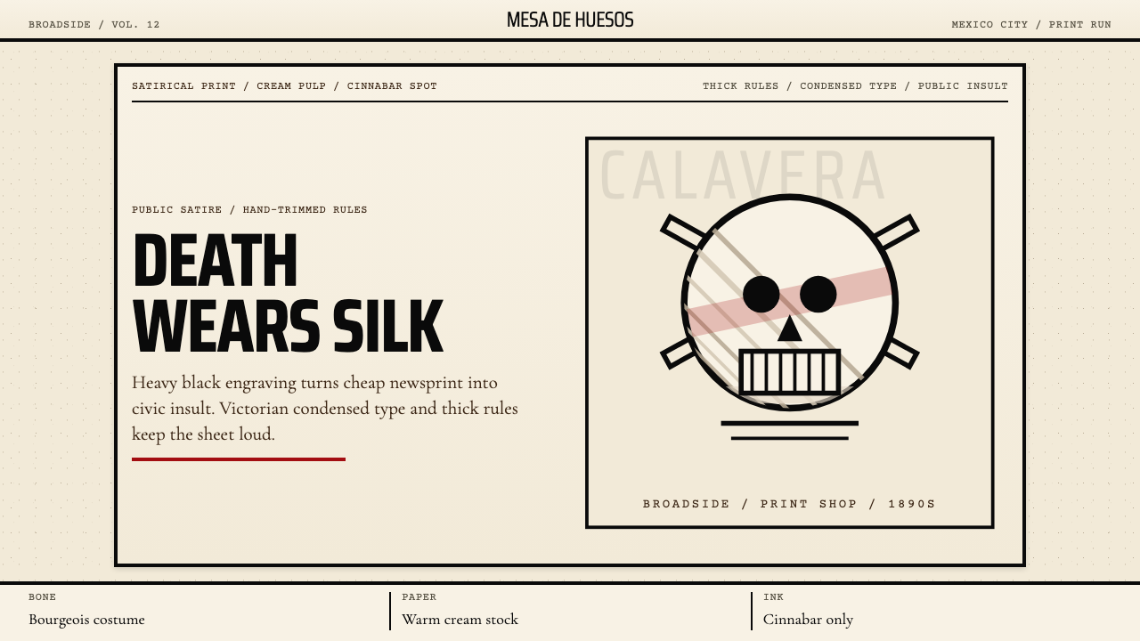 José Guadalupe Posada CalaveraDeath turns civic. Heavy black engravings on cream pulp, with cinnabar red.死亡化作公共讽刺。粗黑雕刻线配奶油纸与朱砂红。
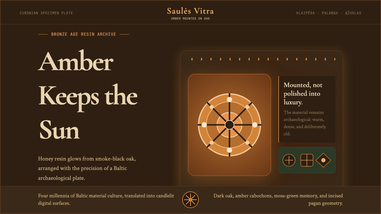 Lithuanian Amber (Baltic Pagan)Ancient amber glows. Honey resin on smoked oak, framed by saulė geometry.古琥珀在发光:烟熏橡木上蜂蜜树脂,太阳轮几何定框。
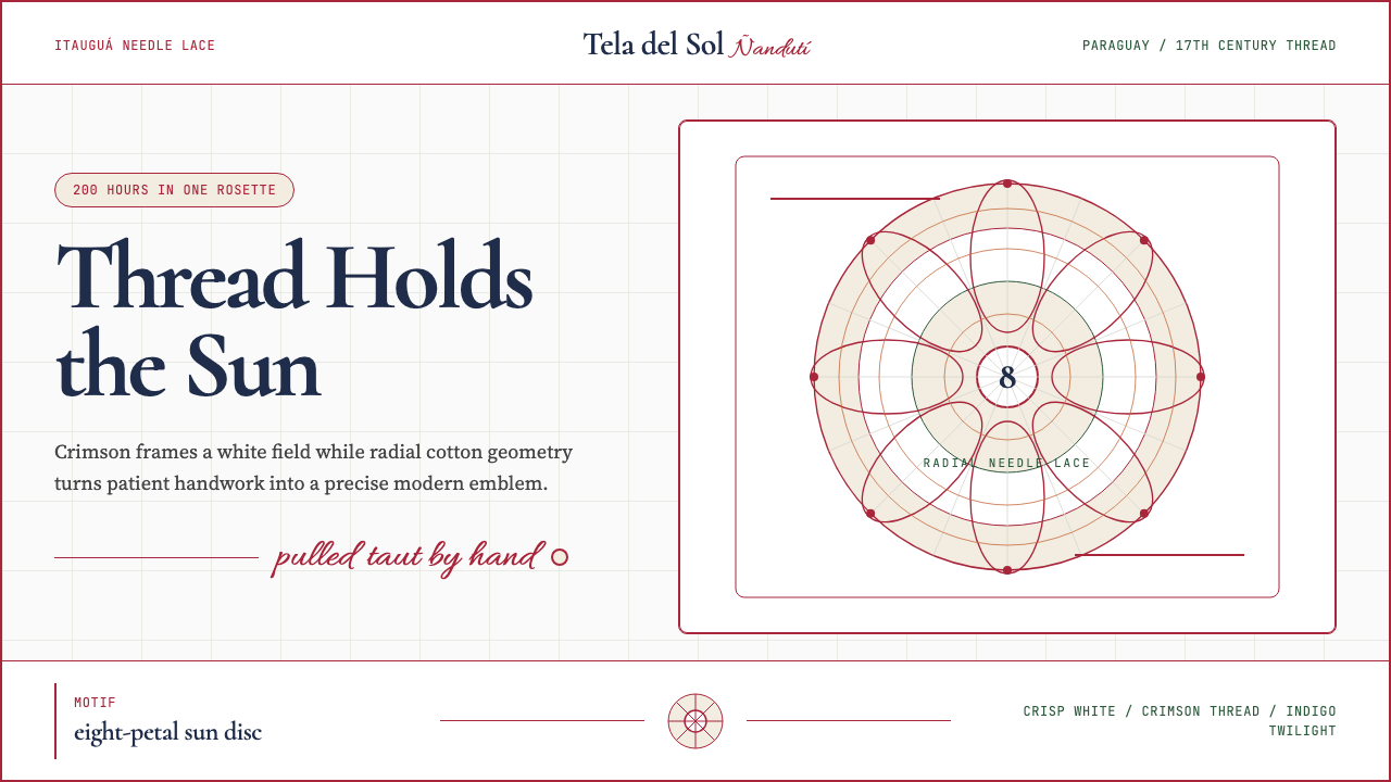 Paraguayan Ñandutí LacePatient craft, modern frame. Crimson lines pin radial lace on crisp white.耐心手艺,现代框架。深红线把放射蕾丝钉在洁白底上。
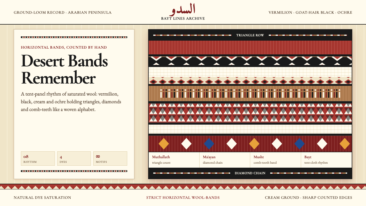 Bedouin Desert Textile (Sadu)Woven memory, not ornament. Vermilion-black bands count triangles and diamond…记忆被织成条带:朱砂与黑色在奶油羊毛上数出三角与菱形。
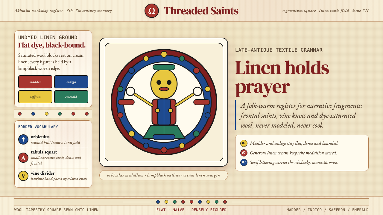 Egyptian Coptic TextileWarmth woven flat. Madder, indigo and saffron medallions sit on linen cream.温暖被织成平面:茜草红、靛蓝与藏红花圆章落在亚麻乳白上。