What is José Guadalupe Posada Calavera?什么是 José Guadalupe Posada Calavera?
Posada turned death into democracy — skeleton figures in bourgeois finery, printed on cheap newsprint for the streets of Mexico City.波萨达让死亡成为民主——骷髅人物身着资产阶级华服,印在廉价新闻纸上流布墨西哥城街头。
José Guadalupe Posada Calavera in briefJosé Guadalupe Posada Calavera 速览
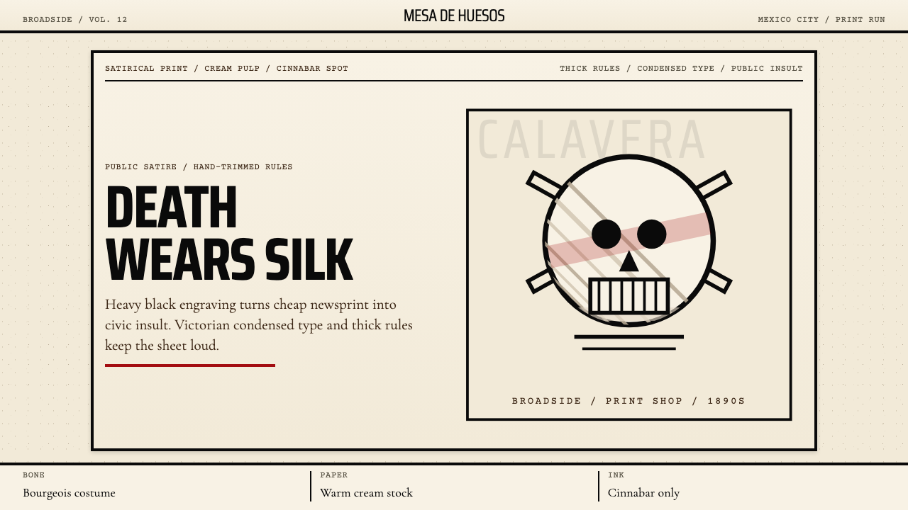
The José Guadalupe Posada Calavera style is a visual language rooted in the broadsides and penny-press prints that circulated in Mexico City from the 1880s through the early twentieth century. Its defining elements are heavy black engraving lines on warm, yellowed paper grounds, a cinnabar red deployed as a single dramatic accent, condensed Victorian display type, and thick rectilinear borders that echo the broadside format of the print shop. At its center is the calavera — the skeleton figure dressed in the costumes of the living — which became the vehicle for biting political and social commentary aimed at a largely illiterate urban public.波萨达骷髅风格是一套根植于十九世纪八十年代至二十世纪初在墨西哥城流通的传单与廉价印刷品的视觉语言。其核心元素包括:温暖泛黄纸张底面上的粗黑雕刻线条、作为单一戏剧性点缀色的朱砂红、压缩的维多利亚式展示字体,以及呼应印刷作坊传单格式的厚重矩形边框。风格的核心是骷髅——身着生者服饰的骨骼人物——它成为面向大量文盲城市公众进行辛辣政治与社会评论的媒介。
Posada worked as a relief engraver for the publisher Antonio Vanegas Arroyo, producing hundreds of prints that documented crimes, disasters, political scandals, and the annual celebrations of Día de los Muertos. His most enduring creation, the Calavera Garbancera — later renamed La Catrina by Diego Rivera — depicted a female skeleton in an elaborate European hat, mocking the social pretensions of Mexicans who aped European fashion while denying their indigenous heritage. The image condensed an entire social critique into a single iconic figure.波萨达为出版商安东尼奥·瓦内加斯·阿罗约担任浮雕版画雕刻师,创作了数百幅记录犯罪、灾难、政治丑闻以及亡灵节年度庆典的版画。他最持久的创作——骷髅嘉班塞拉(后被迭戈·里维拉改名为「卡特琳娜」)——描绘了一位戴着精致欧式帽子的女性骷髅,嘲讽那些效仿欧洲时尚、却否认自身印第安裔根源的墨西哥人的社会虚荣。这幅图像将整套社会批判浓缩进一个单一的标志性形象。
As a design system, the Posada aesthetic is one of deliberate tension: the macabre made festive, the high-culture form made popular, the grave subject made comic. It operates through contrast — the refinement of Victorian typography set against raw engraving marks, the ceremonial formality of a bordered broadside carrying a skeleton dancing in top hat and tails. This tension is the source of its power and its continued resonance in contemporary graphic design, editorial illustration, and cultural branding.作为一套设计系统,波萨达美学建立在刻意的张力之上:骇人的内容被做得喜庆,高文化的形式被做得通俗,沉重的主题被做得诙谐。它通过对比来运作——维多利亚式排版的精致与生猛版刻痕迹并置,庄重的加框传单版面承载着头戴高礼帽、身穿燕尾服翩翩起舞的骷髅。这种张力是其力量与当代持续共鸣的来源,使之在当代平面设计、编辑插图与文化品牌领域仍保有强大生命力。
See the José Guadalupe Posada Calavera design system查看 José Guadalupe Posada Calavera 完整设计系统
Where does José Guadalupe Posada Calavera come from?José Guadalupe Posada Calavera 从何而来?
José Guadalupe Posada was born in 1852 in Aguascalientes, a provincial city in central Mexico, where he apprenticed in a local print shop and learned the craft of ceramic decoration before moving to León to work as a lithographer. In 1888 he relocated to Mexico City, where he established a workshop directly across from the print house of Antonio Vanegas Arroyo, a publisher who had built a thriving business producing corridos (ballad broadsheets), crime pamphlets, religious prints, and Día de los Muertos calavera verses — short satirical poems naming public figures as the newly dead. The partnership between Posada and Vanegas Arroyo, which lasted until Posada's death in 1913, was the engine of the visual style that bears his name.何塞·瓜达卢佩·波萨达1852年生于墨西哥中部省城阿瓜斯卡连特斯,在当地印刷作坊学徒并学习陶器装饰工艺,后移居莱昂担任石版印刷师。1888年,他迁居墨西哥城,在出版商安东尼奥·瓦内加斯·阿罗约的印刷作坊对面建立了自己的工作室。瓦内加斯·阿罗约已通过出版民谣传单(科里多斯)、犯罪小册子、宗教版画和亡灵节骷髅诗(以死亡调侃公众人物的简短讽刺诗)建立起繁荣的业务。波萨达与瓦内加斯·阿罗约的合作从1888年延续至1913年波萨达去世,是这套以其名字命名的视觉风格的发动机。
The broadside print tradition Posada inherited was already ancient — it traced back to sixteenth-century Spanish colonial printing and the Catholic Church's use of woodcut imagery in religious instruction. What Posada introduced was a shift from static devotional imagery toward dynamic satirical narrative. Working first in lead relief engraving and later in zinc etching — a faster, cheaper technique — he developed a mark-making vocabulary of extraordinary energy: thick, unmodulated contour lines; hatching that built up shadow through raw repetition rather than tonal graduation; and figures that compressed emotion into posture, gesture, and grotesque facial expression rather than subtle modeling.波萨达所继承的传单印刷传统已有悠久历史,可追溯至十六世纪西班牙殖民印刷业以及天主教会以木刻图像进行宗教教化的实践。波萨达的创新在于将静态的奉献性图像转变为充满动感的讽刺叙事。他先以铅浮雕版画创作,后改用更快速廉价的锌蚀刻技法,发展出一套极具张力的笔触词汇:粗重而无调制的轮廓线;以纯粹重复而非色调过渡堆积阴影的交叉排线;以及通过姿态、动作与夸张面部表情压缩情感、而非依赖微妙建模的人物形象。
The political context was decisive. Posada worked through the final decades of the Porfiriato — the long authoritarian rule of Porfirio Díaz, which lasted from 1876 to 1911 — and into the violent years of the Mexican Revolution. The broadside press occupied a precarious but essential position: too popular and too cheap to suppress entirely, it circulated images of hanged criminals, catastrophic floods, miraculous apparitions, and dancing skeletons that served as coded commentary on a society riven by inequality and ruled by a regime that performed civilization while tolerating mass poverty. The calavera form — using death as the leveling agent, reducing generals and grandees to bones — was the print tradition's most powerful political instrument.政治语境是决定性因素。波萨达工作于波菲里亚托统治的最后几十年——波菲里奥·迪亚斯的长期威权统治从1876年延续至1911年——并经历了墨西哥革命的动荡岁月。传单印刷业处于一种脆弱却不可或缺的位置:因太大众、太廉价而无法被完全压制,它流通着被绞死的罪犯、灾难性洪水、神奇显灵以及骷髅舞蹈的图像,作为对一个被不平等撕裂、由表演文明却纵容大规模贫困的政权统治的社会的隐晦评论。骷髅形式——以死亡作为拉平一切的力量,将将军与贵族都还原为骨骼——是这一印刷传统最有力的政治武器。
Posada died in obscurity and poverty in 1913, and was buried in a common grave. His rehabilitation came in the 1920s, when the muralist Diego Rivera — newly returned from Paris and deeply engaged with the project of constructing a post-revolutionary Mexican national identity — discovered Posada's prints and recognized in them an authentic popular visual tradition. Rivera collected Posada's work, cited him in interviews, and incorporated calavera imagery into his own murals. The French artist Jean Charlot published the first serious critical essay on Posada in 1925. By the 1940s, Posada had been canonized as the father of Mexican graphic art, and La Catrina — a figure Posada created but Rivera named, elaborated, and placed in a mural landscape — had become one of the most recognizable images in the hemisphere.波萨达于1913年在默默无闻与贫困中辞世,被葬于公共墓地。他的名誉复原发生在二十世纪二十年代,当时壁画家迭戈·里维拉——刚从巴黎归来,深度投入构建后革命时代墨西哥国家身份认同的项目——发现了波萨达的版画,并在其中认出了一套真实的大众视觉传统。里维拉收藏波萨达的作品,在访谈中援引其名,并将骷髅图像融入自己的壁画。法国艺术家让·夏洛于1925年发表了第一篇关于波萨达的严肃批评文章。到二十世纪四十年代,波萨达已被奉为墨西哥平面艺术之父,而「卡特琳娜」——一个由波萨达创造、由里维拉命名、延伸并置于壁画景观中的形象——已成为整个美洲最具辨识度的图像之一。
What defines the José Guadalupe Posada Calavera look?José Guadalupe Posada Calavera 的视觉特征是什么?
Engraving Line Weight版刻线重
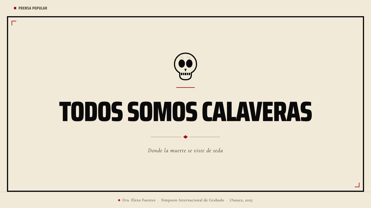
The foundational mark of the style is the heavy, unmodulated contour line — the direct trace of a relief engraving tool cut into lead or zinc. Unlike fine-art intaglio, which favors tonal variety and hairline detail, Posada's broadside engravings used thick, consistent strokes that read clearly at small scale on coarse newsprint. Outlines are bold and closed; interior detail is built through densely packed hatching rather than graduated shading. The result is a visual language that operates entirely through contrast: solid black shape against light ground, with no intermediate tone.这种风格的基础笔触是粗重而无调制的轮廓线——浮雕版画工具切入铅或锌版所留下的直接痕迹。与偏好丰富色调和发丝般细节的纯艺术凹版印刷不同,波萨达的传单雕刻使用粗重一致的线条,在粗糙新闻纸上以小尺寸仍清晰可读。轮廓粗犷封闭;内部细节通过密集的交叉排线而非渐层阴影堆积。结果是一套完全通过对比运作的视觉语言:实心黑色形状对比浅色底面,没有中间色调。
Warm Paper Ground温暖纸张底色
The authentic Posada broadside was printed on cream-pulp newsprint — a cheap, acid-containing paper that yellowed quickly with age and light exposure. This warm, slightly irregular ground is inseparable from the visual identity of the style. Contemporary applications channel this quality through off-white or aged-cream backgrounds that retain warmth and tactility rather than optical-white or cool-gray surfaces. The ground is never pure white, never neutral; it carries the sensory memory of the print shop and the street vendor's stack of papers.真实的波萨达传单印刷在奶油色纸浆新闻纸上——这种廉价的含酸纸张随光照与时间迅速泛黄。这种温暖、略带不规则感的底面与这种风格的视觉身份密不可分。当代应用通过选用米白或陈旧奶油色背景来传达这种质感,保留温度与触感,而非选用光学白或冷灰色表面。底色绝不是纯白,绝不是中性的;它承载着印刷作坊与街头小贩那叠报纸的感官记忆。
Cinnabar Red Accent朱砂红点缀
Red in the Posada system is a single-color spot — a second pass of ink in a warm, slightly orange-leaning red that invokes the mineral pigment cinnabar used in traditional Mexican crafts and colonial-era religious painting. It is used sparingly: to highlight a headline, to fill a border element, to color a decorative skull, to mark a text block that demands immediate attention. It never serves as a background color; it is always figure against the cream ground. Its warmth distinguishes it from the cooler primaries of Northern European graphic traditions — this red is earthy and festive simultaneously.朱砂红在波萨达体系中是单一的专色——一道温暖偏橙的红色油墨,让人联想到传统墨西哥工艺与殖民时代宗教绘画中使用的矿物颜料朱砂。它被节制使用:点亮标题、填充边框元素、为装饰性骷髅着色、标记需要立即抓住注意力的文字块。它从不充当背景色,始终是奶油色底面上的图形。其暖调使它区别于北欧平面传统中更冷的原色——这种红色同时是大地色的,也是节庆色的。
Condensed Victorian Display Type压缩维多利亚展示字体
The typography of the Posada broadside draws from the condensed wood-type and metal-type display faces that filled nineteenth-century print shops across North America and Latin America — ultra-compressed letterforms with pronounced thick-thin stroke contrast, heavy serifs, and decorative details that gave each letter an almost architectural presence. Headlines are set tightly, often in all capitals, with the condensed width allowing multiple words to stack dramatically in a narrow column. This typographic style sits in deliberate and productive tension with the rawness of the engraved imagery beneath it.波萨达传单的排版取材于充斥十九世纪北美与拉丁美洲印刷作坊的压缩木活字与金属活字展示字体——极度压缩的字形,笔画粗细对比鲜明,衬线粗重,装饰细节赋予每个字母近乎建筑般的存在感。标题排版紧密,通常全大写,压缩的字宽使多个单词能以富有戏剧性的方式叠排在窄柱中。这种排版风格与其下方生猛的版刻图像形成刻意而富有成效的张力。
Rectilinear Border System矩形边框系统
Every Posada broadside is contained within a thick border of typographic rules — the horizontal and vertical lines that print shops assembled from foundry-cast rule material. These borders are not decorative in a floral or ornamental sense; they are structural, giving the broadside the authority of a posted notice or official document even when the content within is scandalous or satirical. Inner borders further divide the sheet into zones for illustration, headline, and verse text. The frame becomes part of the content: it signals that what is inside is public, official, worth stopping on the street to read.每张波萨达传单都被粗重的排印直线边框所包围——印刷作坊用铸造直线条材料拼装而成的水平与垂直线条。这些边框并非花卉式或装饰性的;它们是结构性的,赋予传单布告或官方文件般的权威感,即便其中内容是耸人听闻或讽刺性的。内层边框进一步将页面划分为插图、标题与诗文区域。边框本身成为内容的一部分:它发出信号——框内的内容是公共的、正式的、值得在街头驻足阅读的。
Calavera Figure as Social Allegory骷髅形象作为社会寓言
The defining iconographic element of the style is the calavera — skeleton figures that retain every social marker of their living identities: the general's epaulettes, the dandy's top hat, the widow's veil, the bourgeois matron's imported Parisian hat. The skeleton is not a symbol of horror but of equity: death strips rank and wealth from everyone equally, revealing the absurdity of social pretension. Visually, calavera figures operate through recognizable costume detail rendered in simplified silhouette — the body is schematic, but the hat, the uniform, the jewelry is specific and cutting.这种风格最核心的图像元素是骷髅——骷髅人物保留着生前身份的每一个社会标记:将军的肩章、花花公子的高礼帽、寡妇的面纱、资产阶级贵妇进口的巴黎帽。骷髅不是恐怖的象征,而是平等的象征:死亡将等级与财富从所有人身上一视同仁地剥除,揭示了社会虚荣的荒诞。在视觉上,骷髅形象通过简化轮廓中的可识别服饰细节来运作——身体是图示化的,但帽子、制服、珠宝是具体而犀利的。
Festive Macabre Tone节庆骇人的基调
The Posada style is not gothic or melancholy — it is carnivalesque. Death in the broadside tradition is not a source of grief but of comedy and social leveling. Skeletons play guitar, ride bicycles, dance at balls, argue in congress. This festive quality permeates every element of the visual system: the energy of the hatching, the humor implied by juxtaposed costume and skeleton, the playfulness of the verse text that accompanied the images. A design that successfully channels this tradition carries both weight and wit, gravity and glee — it never collapses into mere spookiness.波萨达风格不是哥特式或忧郁的——它是狂欢节式的。传单传统中的死亡不是悲伤的来源,而是喜剧与社会拉平的来源。骷髅弹吉他、骑自行车、在舞会上起舞、在国会里争论。这种节庆品质渗透进视觉系统的每一个元素:排线的能量、服饰与骷髅并置所隐含的幽默、配合图像的诗文文字的顽皮性。一个成功传承这一传统的设计同时携带分量与机智、庄重与喜悦——它永远不会沦为单纯的恐怖。
See the José Guadalupe Posada Calavera design system查看 José Guadalupe Posada Calavera 完整设计系统
Who shaped José Guadalupe Posada Calavera?谁塑造了 José Guadalupe Posada Calavera?
Posada produced an estimated two thousand or more broadside engravings during his Mexico City career, working at extraordinary speed to respond to current events — a criminal execution, a train derailment, a political scandal — often publishing within days of the events they depicted. His technical range extended from detailed zinc etchings to rapidly cut lead relief blocks, and his visual invention never settled into formula despite the pressures of commercial output. He died in 1913, was buried in a common grave when his rent went unpaid, and was disinterred and reburied in a mass grave six years later. His rehabilitation by the muralists of the 1920s rescued both the work and the reputation from oblivion.波萨达在墨西哥城的职业生涯中估计创作了两千幅以上的传单版画,以惊人的速度回应时事——一场刑事处决、一次列车出轨、一桩政治丑闻——往往在事件发生后数日内便完成出版。他的技术范围从精细的锌蚀刻延伸至快速刻制的铅浮雕版块,尽管承受着商业产出的压力,他的视觉创造力从未陷入程式化。1913年,他在贫困中去世,因欠租未付而被埋入公共墓地,六年后又被迁入万人冢。二十世纪二十年代壁画家们对他的名誉恢复,使作品与声誉双双从湮没中得救。
Vanegas Arroyo was the publisher and entrepreneur who created the economic and editorial context in which Posada's visual style developed. A former schoolteacher from Puebla, he established his Mexico City print house in 1880 and built a popular press empire on broadside ballads, crime pamphlets, religious almanacs, and the annual Día de los Muertos calavera publications. He understood his audience precisely — literate enough to read verse, urban enough to recognize political caricature — and shaped the format constraints within which Posada worked: the single sheet, the dual column, the verse-image layout. Without Vanegas Arroyo's commercial acumen and popular instinct, Posada's imagery would have had neither the volume nor the distribution to become a visual tradition.瓦内加斯·阿罗约是出版商与企业家,为波萨达视觉风格的发展创造了经济与编辑语境。这位来自普埃布拉的前教师于1880年在墨西哥城建立印刷作坊,并凭借民谣传单、犯罪小册子、宗教历书以及年度亡灵节骷髅出版物建立起大众出版帝国。他对受众有着精准的理解——识字程度足以读懂诗文,城市化程度足以领会政治漫画——并塑造了波萨达工作的版式约束:单张、双栏、诗文图像并置布局。没有瓦内加斯·阿罗约的商业眼光与大众直觉,波萨达的图像既不会有成为视觉传统所需的产量,也不会有所需的发行量。
Manilla was Posada's immediate predecessor at the Vanegas Arroyo press, working for the publisher through the 1870s and 1880s before Posada's arrival displaced him as the primary engraver. His calavera figures — somewhat stiffer and less energetically composed than Posada's — established the visual conventions that Posada would inherit and dramatically intensify. The relationship between the two engravers was long obscured because early twentieth-century critics sometimes misattributed Manilla's work to Posada; disentangling their respective contributions required archival research conducted decades after both men's deaths.马尼利亚是波萨达在瓦内加斯·阿罗约出版社的直接前任,在二十世纪七八十年代波萨达到来之前担任主要版画雕刻师。他的骷髅人物——比波萨达的稍显僵硬、构图动感稍逊——确立了波萨达将要继承并大幅强化的视觉惯例。两位版画家之间的关系长期模糊不清,因为二十世纪初的评论者有时将马尼利亚的作品误归于波萨达;厘清两人各自贡献需要在二人去世数十年后进行的档案研究。
Rivera did not create the Posada style but was responsible for its elevation into the canon of Mexican national art. Returning from fourteen years in Europe in 1921, Rivera discovered Posada's prints circulating as street ephemera and recognized them as the authentic popular visual voice that his own muralist project required as its popular-culture counterpart. He collected hundreds of Posada's prints, named the Calavera Garbancera figure 'La Catrina,' and incorporated her into his 1947 mural Dream of a Sunday Afternoon in Alameda Park — where she appears full-length between the young Rivera and the adult Rivera, as a figure of cultural memory and national irony. Rivera's championing transformed Posada from a forgotten commercial engraver into the founding father of Mexican graphic art.里维拉并未创造波萨达风格,但他负责将其提升至墨西哥国家艺术经典的地位。1921年从欧洲十四年旅居归来,里维拉发现波萨达的版画作为街头短暂印刷品流通,并认出它们正是他自己的壁画项目所需要的大众视觉声音对应物。他收藏了数百幅波萨达版画,将骷髅嘉班塞拉命名为「卡特琳娜」,并将她纳入1947年的壁画《阿拉梅达公园的星期日午后梦》——在那里,她全身出现于年轻里维拉与成年里维拉之间,作为文化记忆与国家反讽的形象。里维拉的推崇将波萨达从一位被遗忘的商业版画师转变为墨西哥平面艺术的奠基父。
Charlot was a French artist who arrived in Mexico in 1921 and became deeply embedded in the muralist movement. In 1925 he published the first serious critical essay on Posada, rescuing a body of work that was rapidly disappearing as the original broadside sheets deteriorated or were discarded. Charlot's essay established the critical vocabulary — popular print tradition, political satire, death as democratic leveler — that all subsequent Posada scholarship has drawn on. He also helped organize the first exhibitions of Posada's work and lobbied for the collection of surviving prints in Mexican public institutions.夏洛是一位法国艺术家,1921年抵达墨西哥并深度融入壁画家运动。1925年,他发表了第一篇关于波萨达的严肃批评文章,抢救了一批随原版传单纸张老化腐损或被丢弃而迅速消失的作品。夏洛的文章确立了批评词汇——大众印刷传统、政治讽刺、死亡作为民主拉平力量——所有后续波萨达学术研究都从中汲取。他还协助组织了波萨达作品的首批展览,并游说将现存版画收藏于墨西哥公共机构。
How do you use José Guadalupe Posada Calavera today?今天怎么用 José Guadalupe Posada Calavera?
The Posada Calavera style transfers into contemporary design work through its structural logic rather than through literal skeleton imagery. A designer reaching for this vocabulary is choosing a specific relationship between visual weight, cultural gravitas, and wit — a combination that works best when the content itself carries some element of satire, critique, celebration, or the kind of direct public address that the broadside format was designed for. It does not suit corporate neutrality or minimalist restraint; it is a voice, not a frame.波萨达骷髅风格通过其结构逻辑而非字面意义上的骷髅图像转化为当代设计实践。选择这套视觉词汇的设计师,是在选择视觉分量、文化庄重感与机智之间的一种特定关系——这种组合在内容本身携带某种讽刺、批评、庆典,或传单格式所服务的那种直接公众诉求元素时效果最佳。它不适合企业中性或极简克制;它是一种声音,而非一个框架。
For presentation slides, the style translates most effectively on cover and section-break pages that demand immediate visual impact. A cover built in this vocabulary uses the warm paper ground as the slide background, sets a large headline in condensed display type with maximum weight, reserves the cinnabar red for a single emphasized word or decorative element, and contains the composition within a thick ruled border. Content slides within the same deck should be treated more sparingly — the engraving energy of the style can overwhelm text-heavy pages. Consider alternating: one full-bleed illustrative slide in the complete vocabulary, followed by clean content slides that retain only the warm ground and display-type hierarchy.在演示文稿中,这种风格在需要即时视觉冲击力的封面与章节分隔页上转化效果最佳。以这套词汇构建的封面将温暖的纸张底色作为幻灯片背景,以最大字重的压缩展示字体排布大标题,将朱砂红保留给单一强调词或装饰元素,并用厚重直线边框包裹构图。同一演示文稿中的内容幻灯片应更为节制——这种风格的版刻能量可能会压制文字密集的页面。考虑交替使用:一张完整词汇的满版插图幻灯片,紧接着是仅保留温暖底面和展示字体层级的简洁内容幻灯片。
For web interfaces, the style is most at home in editorial and cultural contexts: event pages for festivals and cultural organizations, Day of the Dead or Mexican heritage campaigns, food and beverage brands positioning themselves within Mexican craft traditions, and music or arts platforms that want to evoke populist energy and street-press credibility. In dashboard or product interfaces, the visual weight of the style requires careful management — thick borders and heavy type can overwhelm functional UI components. A practical approach is to apply the full vocabulary to hero sections, landing pages, and marketing surfaces, while using the warm ground and typographic hierarchy as the quieter connective tissue of content pages and data views.对于网页界面,这种风格最适合编辑与文化语境:节庆与文化组织的活动页面、亡灵节或墨西哥文化遗产活动、将自身定位于墨西哥手工艺传统中的食品与饮料品牌,以及希望传达民粹能量与街头印刷公信力的音乐或艺术平台。在仪表板或产品界面中,风格的视觉分量需要谨慎管理——粗重边框与大字重字体可能会压制功能性界面组件。一个实用的方法是将完整词汇应用于主视觉区域、落地页与营销表面,同时以温暖底色和字体层级作为内容页与数据视图更安静的连接组织。
For editorial and marketing work, the style offers strong tools for information hierarchy and emotional contrast. A Posada-inflected editorial layout treats pull quotes as broadside headlines — set in oversized condensed type with a cinnabar rule above and below — while body text runs in a readable weight and measure beneath. Marketing campaigns that draw on this vocabulary work best when they lean into the festive-macabre tension deliberately: the combination of warm, celebratory color and the gravity of skeleton imagery creates the cognitive contrast that makes the message memorable. Poster formats are the natural habitat of the style, and contemporary posters for cultural events, political campaigns, or social commentary can draw directly on the broadside structure — full border, dominant image, stacked headline, smaller verse or subtitle below.对于编辑与营销内容,这种风格提供了强大的信息层级与情感对比工具。带有波萨达气质的编辑版面将引用语处理为传单标题——以超大压缩字体排布,上下各加一条朱砂色直线——而正文以可读的字重与行宽排布于其下。借鉴这套词汇的营销活动在刻意倚重节庆骇人张力时效果最佳:温暖的庆典色彩与骷髅图像的庄重感相结合,产生使信息令人难忘的认知反差。海报格式是这种风格的自然栖息地,当代文化活动、政治运动或社会评论海报可以直接借鉴传单结构——完整边框、主导图像、叠排标题、较小的诗文或副标题置于下方。
A common mistake when applying this style is reducing it to decoration — adding skull motifs to an otherwise unrelated design system and calling it Posada. The authentic logic of the style is political and communicative: every element, including the border, the engraving texture, and the red accent, carries meaning that connects to the broadside tradition of public address. A second common error is importing the calavera figure without the social critique it embodies — using skeleton imagery purely for visual edge or seasonal theming without the leveling wit that gives the figure its cultural force. The style rewards designers who understand what the calavera is actually doing: not frightening the viewer, but inviting them to laugh at the pretensions of the powerful.应用这种风格时最常见的错误是将其简化为装饰——在一个与之无关的设计系统上添加骷髅图案并称之为波萨达风格。这种风格的真实逻辑是政治性与传达性的:每一个元素,包括边框、版刻质感和红色点缀,都承载着与传单公众诉求传统相连的意义。第二个常见错误是在剥离其所体现的社会批判的情况下引用骷髅形象——纯粹为了视觉锐度或季节性主题使用骷髅图像,而没有赋予这一形象文化力量的拉平式机智。这种风格奖励那些理解骷髅实际在做什么的设计师:不是吓唬观看者,而是邀请他们嘲笑权贵的虚荣。
See the José Guadalupe Posada Calavera design system查看 José Guadalupe Posada Calavera 完整设计系统
José Guadalupe Posada Calavera — FAQJosé Guadalupe Posada Calavera · 常见问题
Is this style only suitable for Day of the Dead or Mexican holiday contexts?这种风格只适合亡灵节或墨西哥节日语境吗?
No — and assuming otherwise is a significant creative limitation. The Posada style was created for political satire and social commentary that operated year-round, not as seasonal decoration. Its broadside format was the newspaper of the street, addressing crime, disaster, and injustice on any day of the year. Contemporary applications that have successfully used this vocabulary include political campaign graphics, labor rights materials, anti-corruption journalism, festival and concert promotion for any kind of music with populist energy, and food and craft brands grounded in artisan tradition. The calavera imagery works in any context where social leveling, the absurdity of pretension, or festive irreverence serves the message.不——如此假设是一个重大的创意局限。波萨达风格的创建是为了全年运作的政治讽刺与社会评论,而非季节性装饰。它的传单格式是街头的报纸,在一年中的任何一天记录犯罪、灾难与不公正。成功使用这套词汇的当代应用包括:政治竞选平面设计、劳工权利材料、反腐败新闻报道、任何具有民粹能量的音乐节与演唱会宣传,以及根植于工匠传统的食品与手工艺品牌。骷髅图像在任何社会平等化、虚荣荒诞性或节庆无所顾忌感服务于信息传达的语境中都有效。
How does the cinnabar red function differently from accent colors in other design systems?朱砂红在这套设计系统中的功能与其他设计系统中的强调色有何不同?
In most contemporary design systems, accent color signals interactivity, calls to action, or brand identity. In the Posada system, the cinnabar red carries historical and cultural weight that precedes its functional role. It evokes the spot-color printing of the broadside press, the red of colonial religious painting, and the warmth of traditional Mexican craft pigments. Applied correctly, it does not simply draw the eye — it invokes a tradition. This means it should be used even more sparingly than a typical accent: one headline, one border element, one critical image detail. When it appears in multiple places simultaneously, it loses the singularity that gives it cultural authority.在大多数当代设计系统中,强调色传达交互性、行动号召或品牌身份。在波萨达体系中,朱砂红承载着先于其功能角色的历史与文化分量。它唤起传单印刷的专色,唤起殖民时代宗教绘画的红色,以及传统墨西哥工艺颜料的温度。正确应用时,它不仅仅是吸引目光——它在召唤一个传统。这意味着它应该比典型的强调色使用得更节制:一个标题、一个边框元素、一个关键图像细节。当它同时出现在多处时,便失去了赋予它文化权威的单一性。
Can the style work with photography, or does it require flat illustration?这种风格能与摄影结合吗,还是必须使用平面插图?
The original Posada style predates photography as a practical print medium and used hand-engraved illustration exclusively. Contemporary applications can incorporate photography, but the integration requires a specific treatment: high-contrast duotone or halftone reproduction that reduces the photograph to a near-graphic quality, consistent with the engraving mark of the surrounding imagery. A photographic portrait processed to emphasize strong contour and reduce midtone detail can sit comfortably within the broadside format. What does not work is naturalistic, full-color photography placed directly against the warm paper ground and engraving line vocabulary — the tonal and textural contrast is too jarring. The photograph must be stylized to meet the engraving on its own terms.原始的波萨达风格早于摄影作为实用印刷媒介出现,完全使用手工雕刻插图。当代应用可以融入摄影,但整合需要特定处理:将照片以高对比度双色调或网点半色调方式复制,使之接近图形质量,与周围图像的版刻笔触保持一致。经过处理以强调强烈轮廓、减少中间调细节的肖像照片,可以舒适地置于传单版式中。不奏效的是将自然主义全彩摄影直接置于温暖纸张底色与版刻线条词汇之中——色调与质感的反差过于突兀。照片必须被风格化,以在版刻的条件下与之相遇。
What is the difference between Posada's style and Day of the Dead folk art more broadly?波萨达风格与更广泛意义上的亡灵节民间艺术有何区别?
Day of the Dead folk art encompasses a wide range of material and visual traditions — painted sugar skulls, papier-mâché figures, marigold altars, embroidered textiles, painted pottery — that share a festive attitude toward death but differ significantly in medium, color vocabulary, and cultural origin. Posada's style is specifically a print tradition, rooted in the mass-reproduction technology of the broadside press. Its aesthetic is defined by the constraints of relief engraving: limited color, high contrast, strong contour, bold type. Day of the Dead folk art is generally more colorful, more materially rich, and more varied in its sources and regional expressions. Using Posada's vocabulary specifically invokes the print tradition and its political satire legacy; borrowing from Day of the Dead more broadly draws from a wider and more decorative vernacular. They are related but not interchangeable.亡灵节民间艺术涵盖广泛的物质与视觉传统——彩绘糖骷髅、纸浆人偶、万寿菊祭坛、刺绣纺织品、彩绘陶器——这些传统对死亡共享一种节庆态度,但在媒介、色彩词汇与文化起源上差异显著。波萨达风格特指一种印刷传统,根植于传单印刷机的大规模复制技术。它的美学由浮雕版画的约束所界定:有限色彩、高对比度、强烈轮廓、粗重字体。亡灵节民间艺术通常色彩更丰富、材质更多样、来源与地区表达更为多元。具体使用波萨达词汇,是在召唤印刷传统及其政治讽刺遗产;更广泛地借鉴亡灵节,则是从更宽广也更具装饰性的民间语汇中取材。两者相关但不可互换。
How do I avoid making the style feel like a costume rather than a genuine design decision?如何避免让这种风格看起来像是服装而非真正的设计决策?
The test is whether the formal choices — the heavy border, the condensed type, the engraving texture, the skeleton imagery — are doing communicative work specific to the content, or whether they are draped over the content regardless of fit. Posada's broadsides worked because every formal element amplified the subject: the border gave authority to scandalous content, the engraving line made the skeleton both urgent and vivid, the cinnabar red made the headline impossible to ignore on a crowded wall. When designers apply these same elements to, say, a tech startup's pricing page or a logistics company's annual report, the disconnect is legible — the form is contradicting the content rather than serving it. The style is genuine when its formal vocabulary and the content's communicative ambition are genuinely aligned: when you are actually speaking to a public, actually making a case, actually finding the absurdity in power.判断标准是:形式选择——粗重边框、压缩字体、版刻质感、骷髅图像——是否在做特定于内容的传达工作,还是无论是否合适都被披盖在内容之上。波萨达的传单之所以奏效,是因为每一个形式元素都放大了主题:边框赋予耸人听闻内容以权威,版刻线条使骷髅既紧迫又生动,朱砂红使标题在拥挤的墙面上无法被忽视。当设计师将这些相同元素应用于某个科技初创公司的定价页面或物流公司的年度报告时,脱节是显而易见的——形式在与内容相抵牾,而非服务于它。当形式词汇与内容的传达抱负真正对齐时,这种风格才是真诚的:当你真的在向公众发言,真的在提出论点,真的在发现权力中的荒诞。
Related design styles相关设计风格
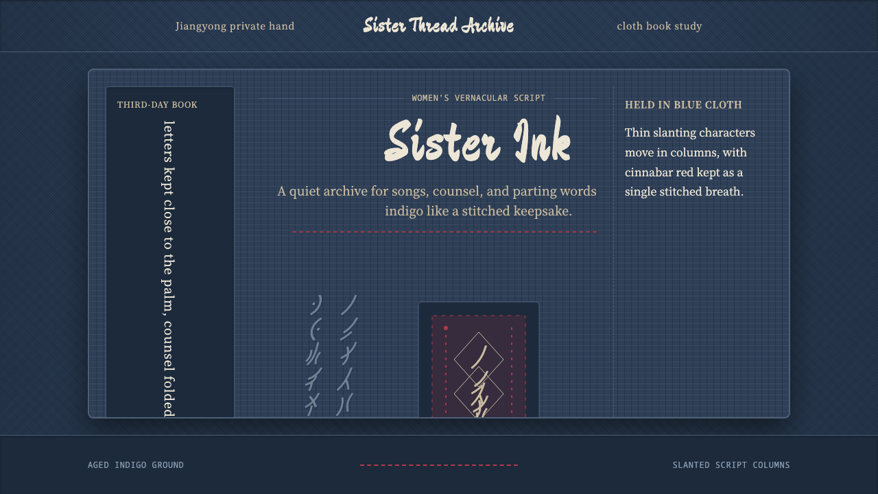 Nüshu 女书Private script, cloth-soft. Indigo weave, slanted columns, and one red thread…私密而柔韧:靛蓝布纹、斜列女书与一缕红线承载声音。
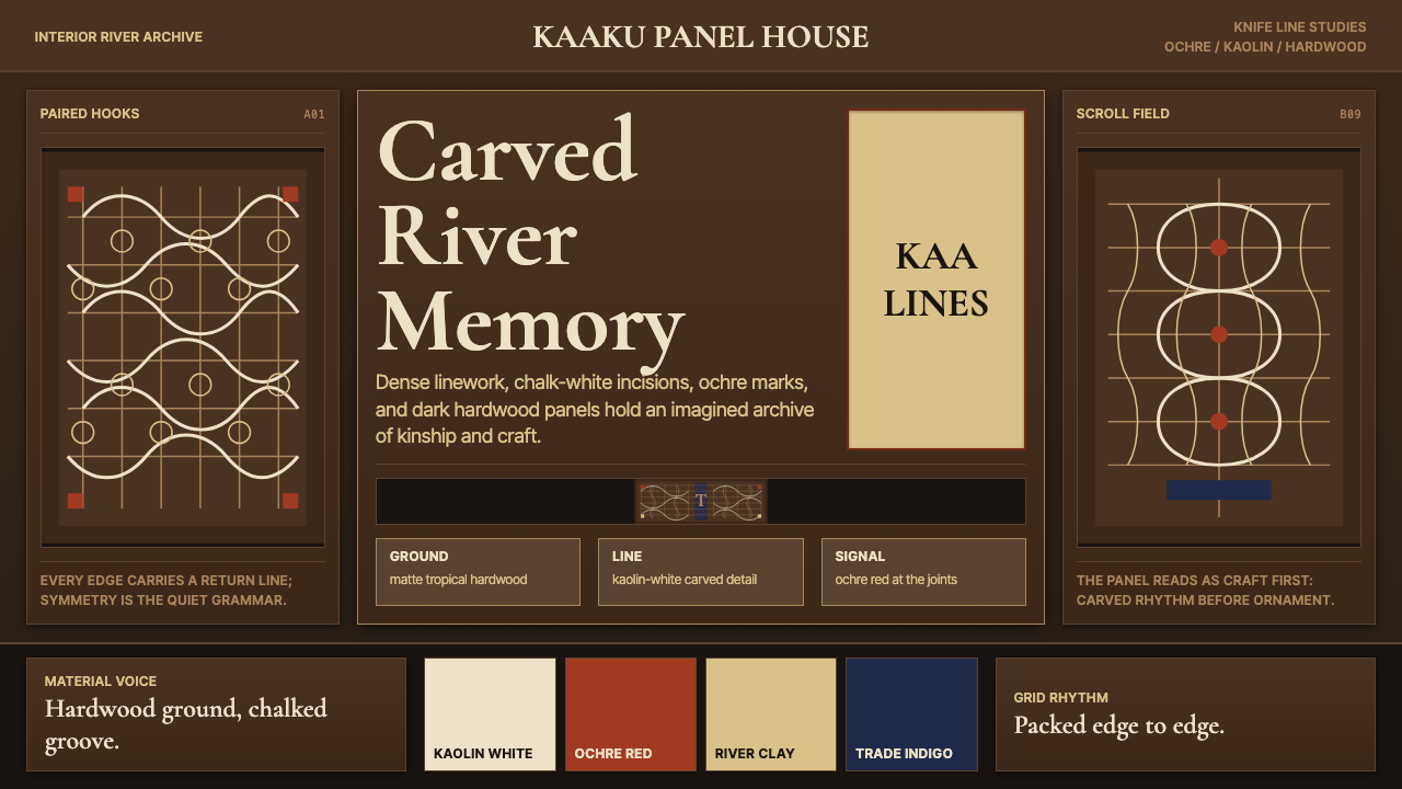 Suriname Maroon TembeDense memory, carved in rhythm. Kaolin lines cross hardwood brown in bilatera…记忆密实如刻。高岭土白线在硬木棕上对称交织。
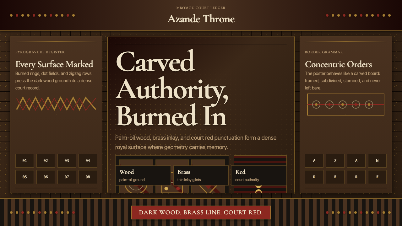 Central African Azande ThroneDense court gravity. Dark wood grids, brass dots, and court red cover every s…宫廷感厚重:深木网格、黄铜点阵与宫廷红铺满表面。
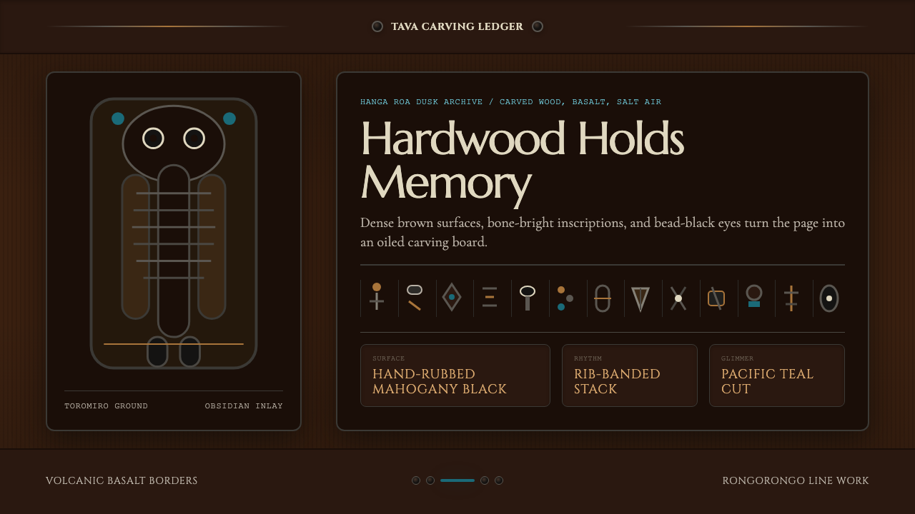 Chilean Rapa Nui Toromiro (Easter Island)Ancient weight, dusk-lit. Toromiro brown, Cinzel capitals, rib bands, obsidia…古老而沉重:托罗米罗褐、Cinzel碑文体、肋骨横带与黑曜石珠。
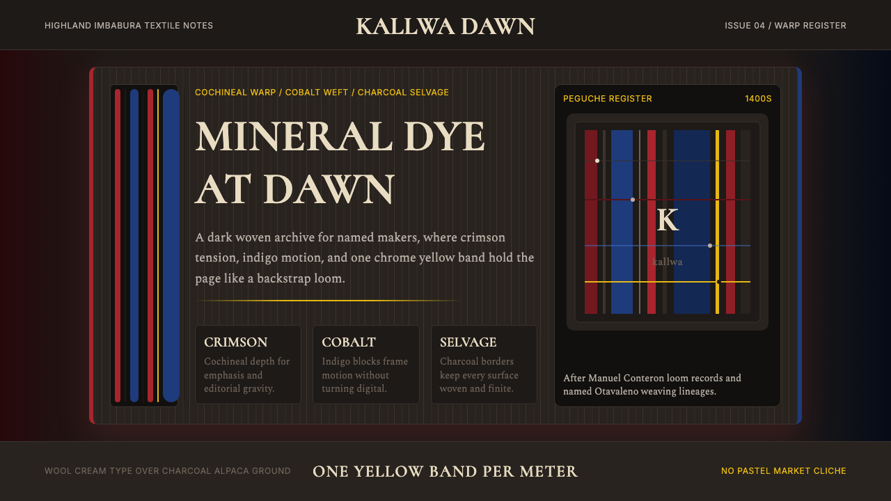 Ecuadorian Otavalo Cochineal LoomHandwoven gravity. Cochineal and cobalt stripes tense against charcoal, cut b…手织般厚重:胭脂红与钴蓝经纬压在炭黑上,只留一条铬黄线。
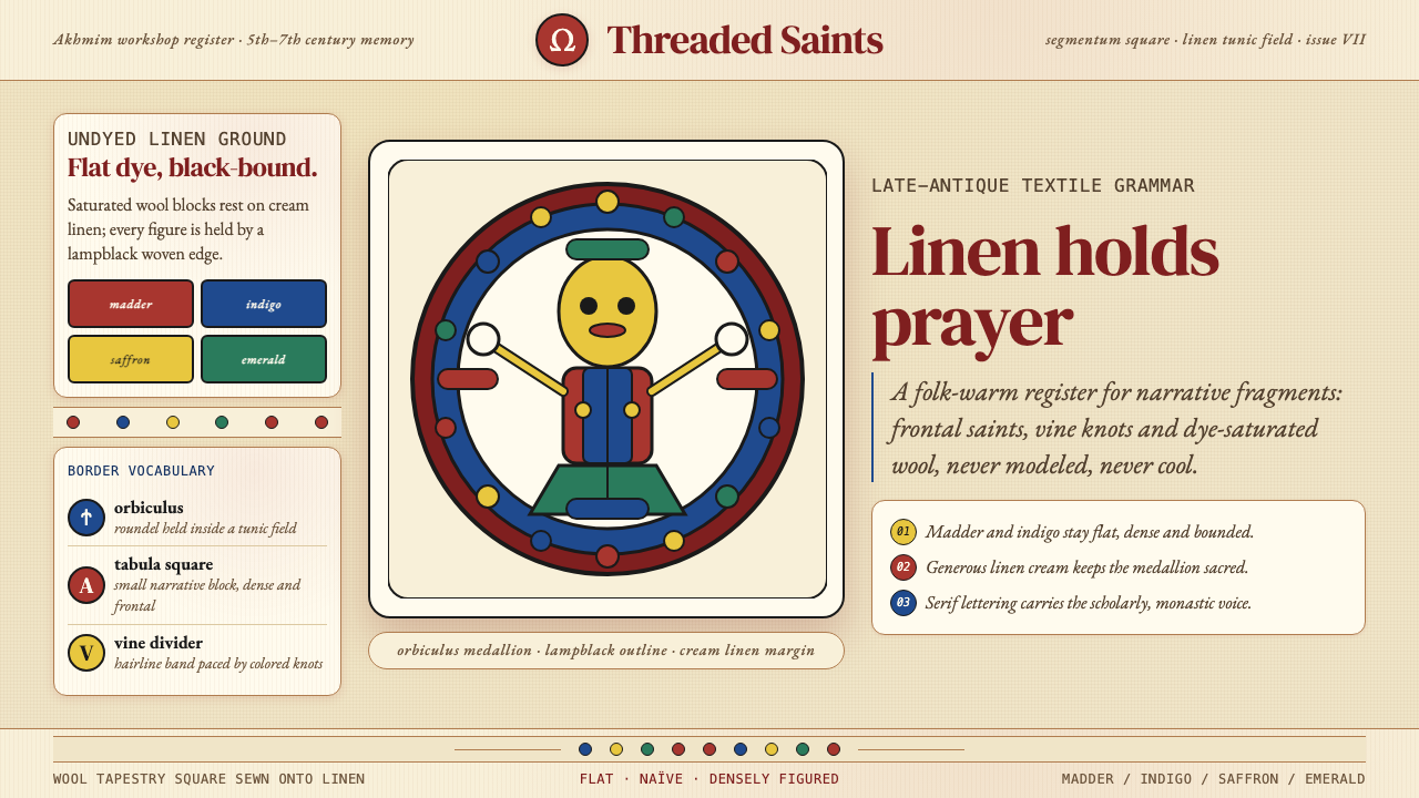 Egyptian Coptic TextileWarmth woven flat. Madder, indigo and saffron medallions sit on linen cream.温暖被织成平面:茜草红、靛蓝与藏红花圆章落在亚麻乳白上。