What is Central African Azande Throne?
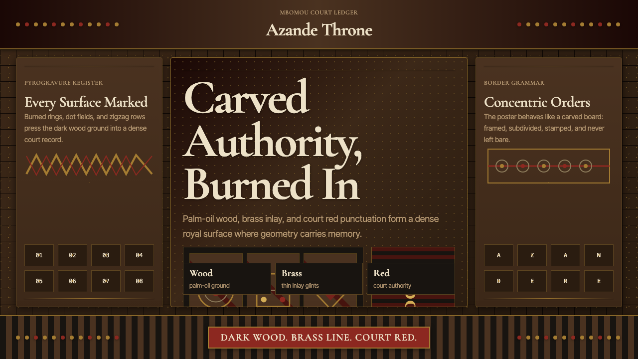
The Azande throne tradition transforms every surface into a story — dense pyrogravure grids, brass-dot constellations, and court red punctuation born from the royal workshops of the Mbomou river basin.
Central African Azande Throne in brief
The Central African Azande Throne aesthetic is a design language forged in the royal courts of the Azande kingdoms, where skilled craftsmen covered every surface of ceremonial furniture, instruments, and architectural elements with an unbroken field of burned geometric marks. Concentric circles radiate outward from anchor points, zigzag rows march across borders, and dot fields fill every remaining space — leaving nothing bare, nothing silent.
At the heart of this tradition is pyrogravure: the practice of burning patterns directly into dark, oil-seasoned wood using heated metal tools. The technique creates marks that are simultaneously incised and darkened, giving the surface a rich, layered depth that no paint or carving alone can achieve. The ground tonality is the deep, almost black warmth of aged palm-oil wood, against which brass inlay accents catch and hold light like scattered embers.
Court red — a deep, saturated crimson used sparingly and deliberately — functions as punctuation within the overall geometric composition. It signals hierarchy and ceremonial weight without overwhelming the intricate burned patterning beneath it. The overall effect is one of controlled density: a surface that appears to vibrate with information, yet reads as unified and authoritative, the material expression of royal permanence.
Where does Central African Azande Throne come from?
The Azande — also spelled Zande — are a people whose kingdoms expanded dramatically across the Mbomou river basin from the eighteenth century onward, eventually spanning territories that today form parts of the Central African Republic, northeastern Democratic Republic of Congo, and South Sudan. The Avongara royal lineage, which consolidated power over a confederation of previously distinct groups from roughly the 1700s onward, presided over a court culture that placed extraordinary value on finely worked material objects as expressions of legitimate authority.
The classic court period of the Azande throne tradition is generally dated to the nineteenth century, when the kingdoms reached their greatest territorial and political consolidation. European travelers and naturalists who encountered Azande craftwork during this era — most notably the German botanist and explorer George Schweinfurth, who traveled through the region in the early 1870s — returned with accounts and specimens that astonished Western audiences. Schweinfurth's descriptions of Azande stools, harps, and architectural carvings, published in his 1875 work on Central African peoples, brought global attention to the sophistication of the tradition.
The anthropologist E. E. Evans-Pritchard, who conducted fieldwork among the Azande in the 1920s and 1930s and published his landmark study of their social structure and belief system in 1937, documented the role that finely crafted objects played within the political and ritual life of the court. Evans-Pritchard's accounts make clear that the geometric patterning on throne stools and other royal objects was not decorative in any casual sense — it carried encoded meaning about lineage, cosmic order, and the relationship between the ruler and the natural world.
The pyrogravure tradition draws on a broader Central African decorative vocabulary shared across multiple cultures of the Uele river basin, yet the Azande court workshops produced a particularly dense and systematic version of this vocabulary. The double-throne stool — a seat wide enough for two persons, used in ceremonies of alliance and witness — represents the apex of the form. Such objects moved through networks of gift exchange and tribute, sealing political relationships and serving as tangible embodiments of a kingdom's prestige and permanence.
What defines the Central African Azande Throne look?
Ground Tonality
The foundation of the aesthetic is deep, oil-darkened wood — a tone that sits between rich brown and near-black, carrying the warmth of aged organic material. This ground is not a neutral backdrop but an active participant: the darkness makes the burned marks legible and gives the brass inlay its maximum contrast. A lighter ground would dissolve the density that is the tradition's defining quality.
Pyrogravure Patterning
Burned geometric marks — concentric circles, zigzag rows, dot fields, and diamond lattices — are arranged in bands that follow the structural contours of the object, emphasizing its form rather than ignoring it. Each band is internally consistent: a zigzag border remains a zigzag border for its entire run. Transitions between pattern zones are marked by single ruled lines or a row of dots, giving the composition a clear internal grammar despite its overall density.
Brass Accent Logic
Brass — obtained through trade and therefore a prestige material — appears as small dots, studs, or inlaid strips that interrupt the burned surface at rhythmic intervals. These accents are never used to fill an entire zone; they punctuate rather than dominate. The metallic warmth of brass against darkened wood creates a visual rhythm that reads as luminous precision within an otherwise matte and tactile surface.
Court Red as Punctuation
Court red — a deep, saturated crimson derived from organic pigments applied to specific zones of ceremonial objects — functions not as a background tone but as a hierarchical signal. It marks the seat surface, a ceremonial rim, or a crown element, telling the viewer where authority is concentrated. Its sparing use intensifies its power: in a composition that is otherwise all dark wood and brass, a single zone of deep red commands immediate attention.
Horror Vacui as Principle
Where many design traditions use negative space as a tool, the Azande court aesthetic operates on the opposite principle: empty surface is incomplete surface. Every available field receives patterning. This is not carelessness or excess — it is a coherent philosophy in which density equals completeness, and completeness equals dignity. The skill of the craftsman is measured not by what is left out but by how consistently and precisely the marks cover every available space.
Structural Emphasis Through Banding
Pattern bands do not wander freely across a surface; they follow and emphasize the structural logic of the object. A leg is treated differently from an apron, which is treated differently from a seat rim. This banding approach means that even a heavily decorated object retains a clear reading of its form — the decoration articulates rather than conceals the underlying structure.
Material Prestige Hierarchy
The three materials in this aesthetic — wood, brass, and pigment — are not equivalent. Wood is the foundation and the medium; brass is the prestige layer, added where political weight is greatest; red pigment marks the sacred or ceremonial apex. This hierarchy is spatial: the higher or more visible the zone, the more likely it is to receive brass or red accents. Applying these materials without regard to this hierarchy produces objects that feel flattened and uncommitted.
Who shaped Central African Azande Throne?
Gbudwe was the most celebrated of the late nineteenth-century Azande rulers, presiding over a kingdom centered in what is now South Sudan near the town of Yambio. His court became a focal point for the finest surviving examples of Azande throne and ceremonial object production. Gbudwe's resistance to colonial encroachment — he was killed in 1905 during British colonial campaigns — made him a figure of lasting historical significance for the Azande people, and objects associated with his court have been particularly prized in ethnographic collections worldwide.
The German botanist and geographer Schweinfurth traveled through the Uele river basin in the early 1870s and became the first European to document Azande material culture systematically. His published accounts and the specimens he brought back to European museums introduced Azande woodwork — including throne stools, harps, and carved architectural elements — to an international audience. Schweinfurth's documentation established the scholarly baseline against which later anthropological study would be conducted, and many of the objects he described and collected remain in European institutional collections today.
The British social anthropologist Evans-Pritchard conducted sustained fieldwork among the Azande in the 1920s and 1930s, producing scholarship that remains foundational to the study of Central African societies. His work illuminated how finely worked material objects — including throne stools and ceremonial harps — were embedded within the political, cosmological, and social structures of Azande life, rather than existing as mere decorative production. Evans-Pritchard's framing helped later generations of designers, curators, and scholars understand that the geometric patterning of Azande court objects was a systematic visual language rather than surface embellishment.
The Avongara are the royal clan that rose to political dominance over the broader Azande confederation from the early eighteenth century onward. Their consolidation of power brought with it a standardization and refinement of court material culture — the throne tradition as a coherent aesthetic system, rather than a collection of individual craft practices, emerged under their patronage. Understanding the Avongara as the institutional force behind the style helps explain why its visual language is so consistent across objects made by different hands in different places: it was court production governed by shared standards of quality and symbolic meaning.
Unlike many design traditions that are remembered through named individual makers, the Azande throne aesthetic was produced by specialist craftsmen whose individual identities were rarely recorded in either oral or written tradition. These anonymous makers — trained within workshop lineages and under court patronage — achieved a remarkable consistency of technical quality and visual vocabulary across centuries of production. Recognizing their collective contribution as a systematic and sophisticated body of knowledge, rather than as anonymous folk production, is essential to understanding the tradition accurately.
How do you use Central African Azande Throne today?
The Azande Throne aesthetic translates into contemporary design contexts through three interdependent principles: a dark, rich ground tonality; dense, systematic geometric patterning applied in structured bands; and a restrained hierarchy of metallic and chromatic accent. These principles work together — separating them produces work that borrows the look without the logic.
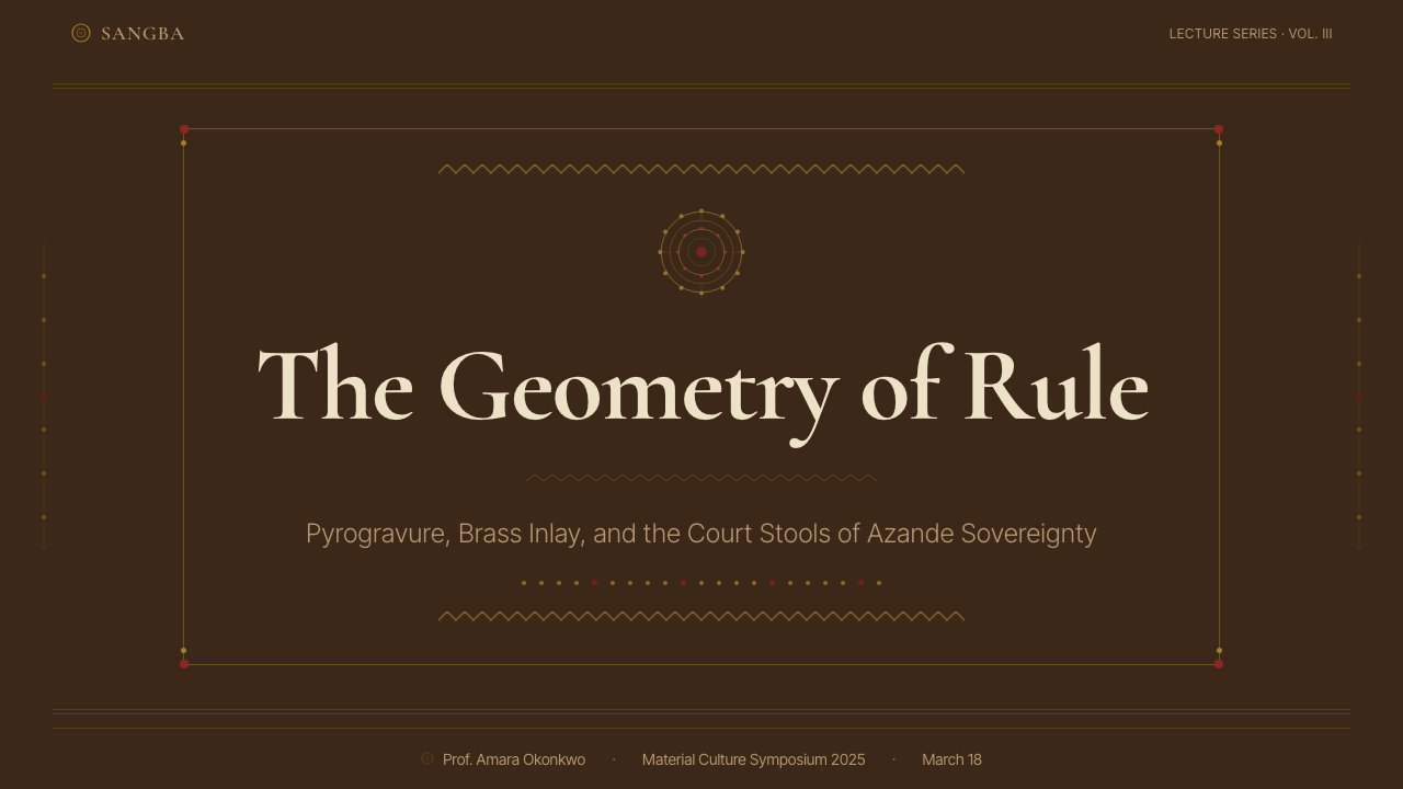
For presentation slides, this style suits cover pages and section dividers more naturally than it suits dense content slides. A cover built on a near-black ground, with a single panel of intricate geometric patterning occupying one zone and a high-contrast title occupying another, communicates ceremonial authority and cultural depth. Data slides can adopt the banding logic — framing charts within bordered zones rather than floating them freely — while using a restrained version of the palette for differentiation. Avoid applying heavy patterning behind text: the density that works for decorative surfaces becomes visual noise behind readable content.
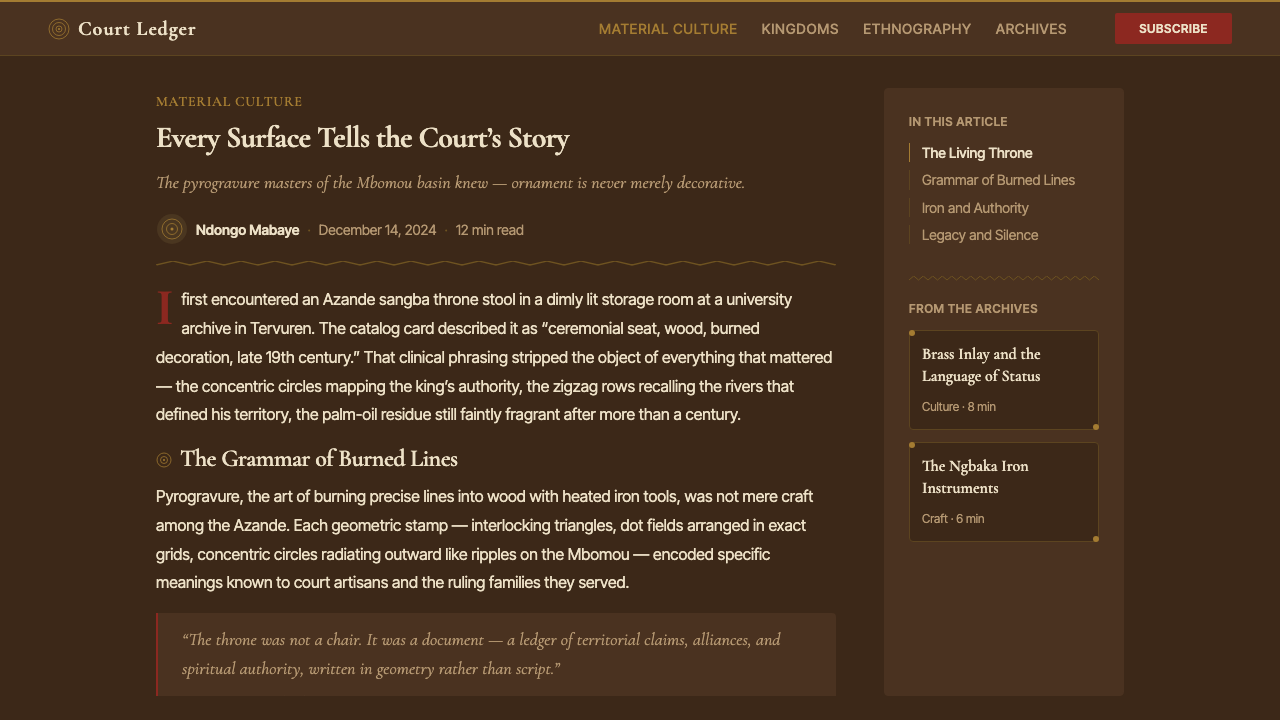
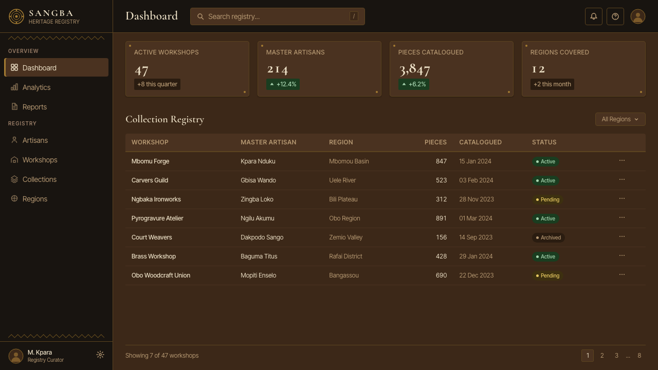
For web interfaces, the aesthetic is best deployed in hero sections, feature introductions, and onboarding screens where impact and identity take priority over pure information density. A dark ground with subtle geometric texture, brass-toned interactive accents, and court-red used exclusively for primary calls to action creates a navigable hierarchy without violating the style's fundamental character. Dashboard grids can use the banding principle — grouping related data panels within visually bounded zones — but the patterning should be tonal rather than literal: texture and border treatment rather than full pyrogravure density.
For editorial and marketing applications, the Azande Throne palette and compositional logic work well in print-focused contexts: book covers, exhibition materials, cultural institution identities, and brand campaigns that want to signal depth, authority, and non-Western cultural grounding. A marketing page that uses alternating dark-ground and warm-neutral sections, with brass-toned accents highlighting key statistics or quotes, achieves the style's combination of density and hierarchy without overwhelming the reader. The style also adapts to packaging design for premium goods where richness of surface treatment signals quality.
A common mistake when applying this style is mistaking density for complexity. The Azande court aesthetic is dense but systematic — every mark follows a rule, every band serves a structural purpose, and accent materials appear in positions of hierarchical meaning. Designers who apply random patterning to fill space, or who use metallic and chromatic accents without regard to compositional weight, produce work that reads as busy and decorative rather than authoritative. The discipline is in the system: plan the band structure first, then fill each band consistently, and place accents only where the underlying compositional logic demands them.
Central African Azande Throne — FAQ
What distinguishes the Azande throne tradition from other Central African decorative traditions?
While pyrogravure decoration appears across multiple cultures of the Uele and Congo river basins, the Azande court tradition is distinguished by its systematic completeness and its tight integration of three material registers — burned wood, brass inlay, and court-red pigment — into a hierarchically coherent composition. Many neighboring traditions use one or two of these elements; the Azande court aesthetic uses all three in a consistent relationship that reflects the political and ritual structure of the royal court itself. The double-throne stool form is also particularly associated with the Azande kingdoms and has no close parallel in other Central African court traditions.
Is this a dark-mode aesthetic, or does it work on lighter grounds?
The tradition is fundamentally dark-ground — the near-black tonality of oil-seasoned wood is not incidental but essential, because it is what gives the burned marks their legibility and the brass inlay its maximum luminosity. A transposition to a light ground is possible in contemporary applications, but it requires reconsidering every material relationship: on a light ground, the marks need to be significantly darker in value to maintain the density effect, the brass equivalent would need to be a deeper metallic rather than a bright one, and court red loses some of its punctuating power against a cream or white field. Light-ground versions tend to read as lighter and more approachable, which may suit some applications but sacrifices the ceremonial weight that defines the original.
How do I avoid cultural misappropriation when using this style?
Engaging thoughtfully with Azande visual culture means being transparent about its origins, understanding what the tradition actually signifies rather than using it as exotic surface texture, and — where possible — attributing the source and directing audiences toward learning more about the culture itself. The risk of misappropriation is highest when the visual elements are extracted purely as aesthetic novelty, divorced from their historical and political context, and used to decorate products or brands that have no meaningful relationship to Central African culture. A considered application acknowledges the tradition as a sophisticated, politically embedded design language rather than treating it as raw material for stylistic borrowing.
What kind of products and contexts is this style suited to, and where does it struggle?
The Azande Throne aesthetic is well suited to contexts where authority, depth, and ceremonial seriousness are desired: cultural institutions, premium brand identities, historical publications, exhibition design, and any visual context where richness of surface treatment signals intentionality and care. It works well for dark-mode digital interfaces in professional or creative tools. It struggles in contexts that call for lightness, speed, or casual accessibility — consumer apps designed for quick interaction, children's products, health and wellness contexts, or any application where the density and darkness of the style would feel oppressive rather than authoritative. It also struggles when reduced to very small scales, where the intricacy of the patterning collapses into undifferentiated texture.
How does the density of the patterning relate to meaning, rather than just decoration?
In the Azande court tradition, an undecorated or sparsely decorated surface would have signaled incompleteness — an object not fully realized, not fully worthy of its ceremonial function. Density was a form of respect: to the occasion, to the recipient, and to the material itself. This is why the horror vacui principle is structural rather than ornamental: leaving space empty is not a choice but a failure. For contemporary designers, internalizing this logic shifts the practice from filling space to completing a surface — a subtle but significant reframing that tends to produce more purposeful and consistent results.
Related design styles
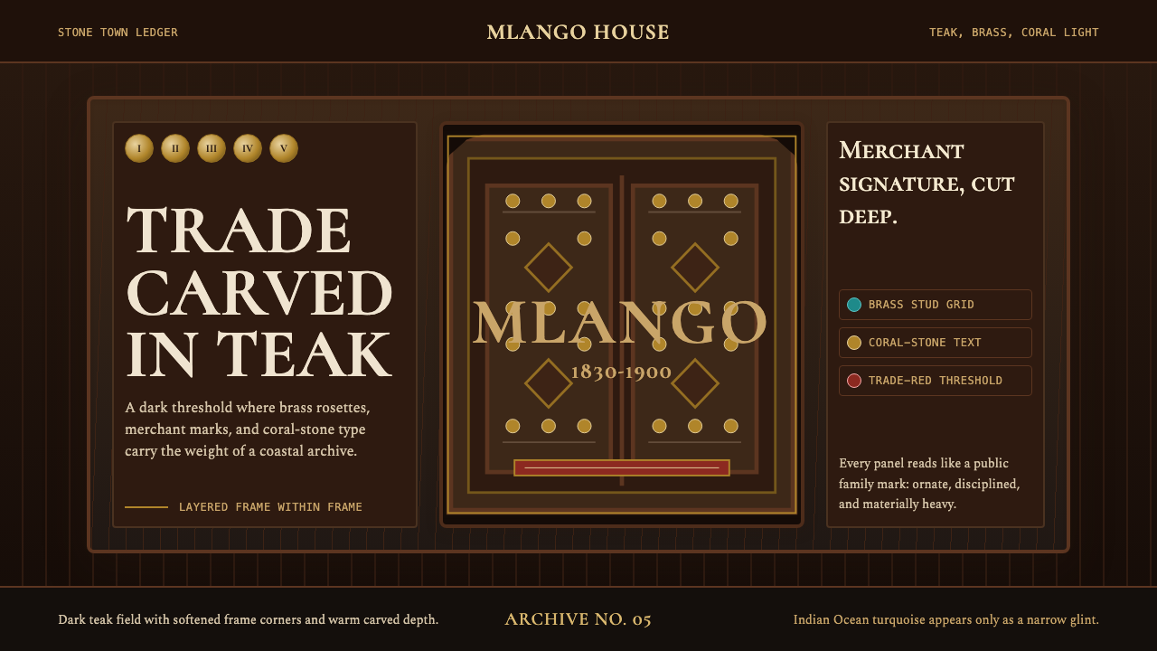 Swahili Stone Town DoorTeak darkness remembers. Brass studs and Cormorant small caps frame a carved…
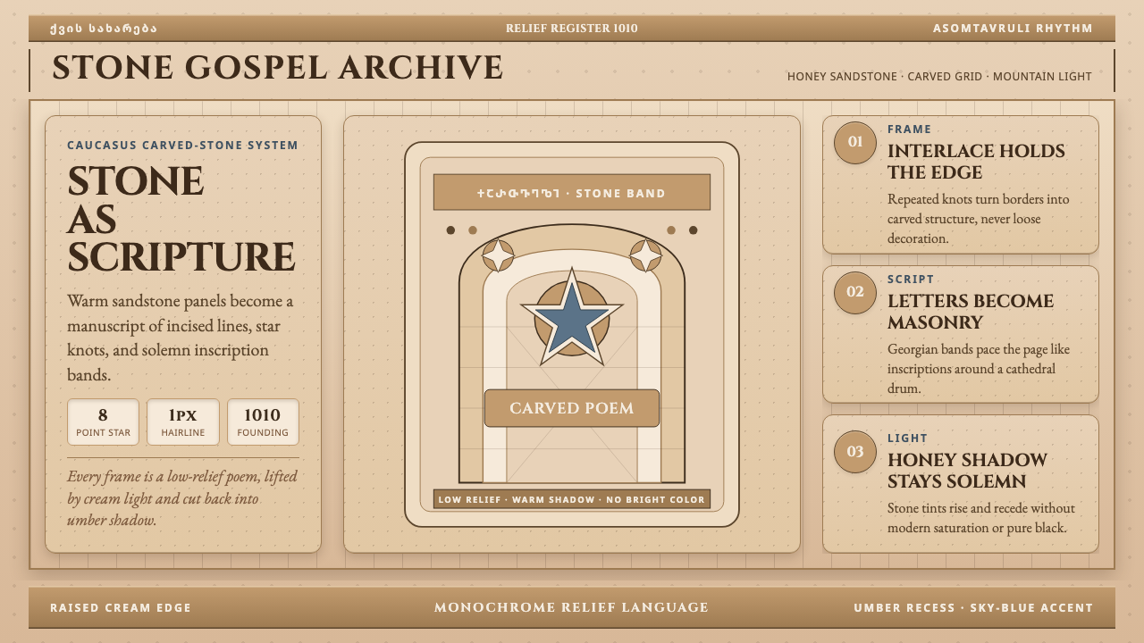 Georgian Nikortsminda Stone-CarvingStone becomes scripture. Cinzel caps and Georgian bands carve honey-sandstone…
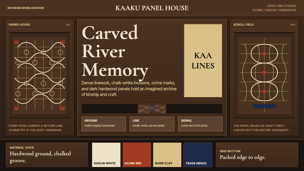 Suriname Maroon TembeDense memory, carved in rhythm. Kaolin lines cross hardwood brown in bilatera…
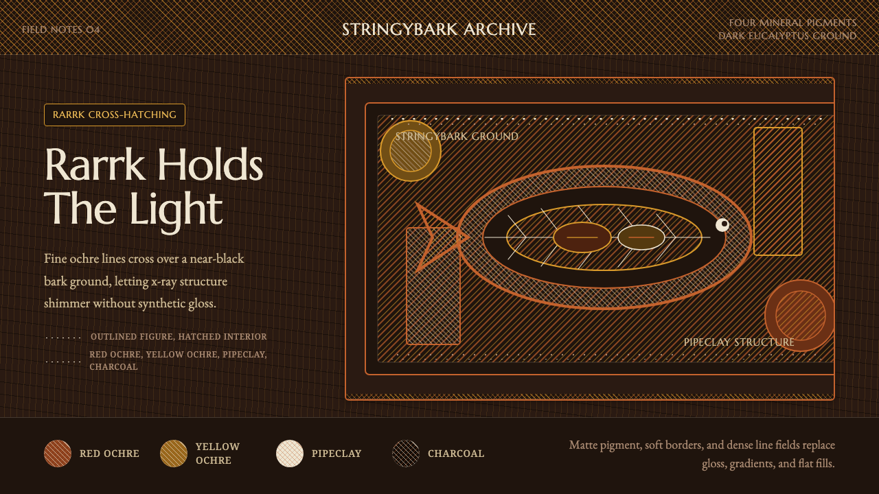 Arnhem X-Ray Bark PaintingShimmers without gloss. Ochre rarrk lines vibrate on dark stringybark.
 Burmese Yun LacquerwareLacquer glows in cut lines. Cinnabar, orpiment and viridian band a mirror-bla…
 Delft Blue PotteryRestrained, yet every inch speaks. Cobalt hairlines crowd a cream tile grid.