What is Delft Blue Pottery?什么是 Delft Blue Pottery?
Delft Blue turned a trade emergency into an aesthetic empire — cobalt brushstrokes on cream tin-glaze that could pass for Ming porcelain by candlelight.代尔夫特蓝陶将一场贸易危机化为美学帝国——烛光下,锡釉乳白陶胎上的钴蓝笔触足以与明青花乱真。
Delft Blue Pottery in briefDelft Blue Pottery 速览
Delft Blue is the signature ceramic tradition of the Dutch Republic's Golden Age: hand-painted tin-glazed earthenware in deep cobalt on a warm cream-white ground. Born from the workshops of the city of Delft in the seventeenth century, the style mimicked Chinese porcelain so faithfully that it became a luxury in its own right — collected by European courts, exported worldwide, and eventually copied by every major European pottery center from Frankfurt to Faenza.代尔夫特蓝陶是荷兰共和国黄金时代最具代表性的陶艺传统:在温暖乳白的锡釉陶胎上,以深钴蓝色手绘装饰。这种风格诞生于十七世纪代尔夫特城的窑场,对中国瓷器的模仿之逼真使其本身成为一种奢侈品——被欧洲宫廷收藏,销往世界各地,并最终被从法兰克福到法恩扎的每一个欧洲陶瓷中心所仿制。
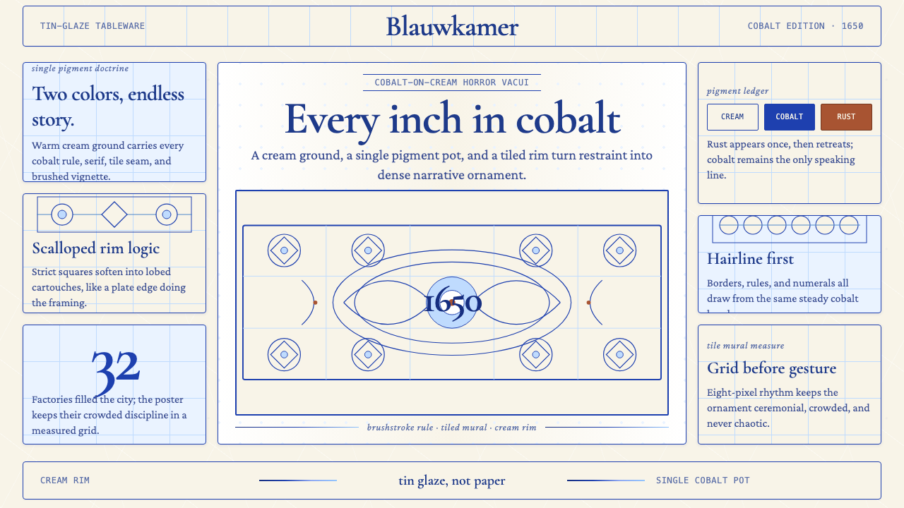
The visual system is built on a two-color discipline of striking purity. Deep cobalt — the only reliable high-temperature pigment available to Dutch potters — is applied over a tin-oxide glaze that fires to a dense, luminous off-white. Everything the style says, it says in these two tones: a single decisive brushstroke outlines a windmill sail; dense crosshatching builds the shadow under a tulip petal; fine stippling gives depth to a heron's wing. The restraint is structural, not minimal — every square centimeter of surface tends to carry detail, but detail organized into legible, balanced compositions.这套视觉体系建立在一种惊人纯粹的双色纪律之上。深钴蓝——荷兰陶工可用的唯一可靠高温颜料——施于锡氧化物釉面之上,烧制后呈现出浓郁、发光的暖白色。这种风格所言说的一切,皆以这两种色调道出:一笔果断的笔触勾勒风车帆臂的轮廓;密集的交叉阴影线在郁金香花瓣下方构建阴影;细腻的点描赋予鹭鸟翅羽以深度。这种克制是结构性的,而非极简主义的——每一平方厘米的表面都倾向于承载细节,但细节被组织进清晰、均衡的构图之中。
Iconographically, Delft Blue speaks in a vocabulary immediately recognizable across centuries: windmills, canal houses, sailing ships, tulip bouquets, farm courtship scenes, herons among rushes, and — borrowed directly from Chinese blue-and-white — pavilions, cloud scrolls, and ornamental fences. Scalloped borders, tile-grid murals composed of individual painted squares, oval cartouches, and hand-lettered inscriptions in serif letterforms complete the system. Rare polychrome pieces add iron-rust orange, manganese purple, or antimony yellow as accent tones, but the two-color cobalt-and-cream version remains the canonical expression of the style.在图像语言上,代尔夫特蓝陶使用一套跨越数百年依然一眼可辨的视觉词汇:风车、运河边的房屋、帆船、郁金香花束、农家求爱场景、芦苇丛中的苍鹭,以及直接借自中国青花的亭台楼阁、云肩卷纹与装饰性栏杆。扇贝形边框、由单块彩绘方砖拼组的瓷砖墙画、椭圆形涡卷框,以及衬线手写体铭文,共同构成了这套完整的视觉系统。偶有的彩绘作品以铁锈橙、锰紫或锑黄作为点缀色,但钴蓝与乳白的双色版本始终是这种风格最经典的表达。
See the Delft Blue Pottery design system查看 Delft Blue Pottery 完整设计系统
Where does Delft Blue Pottery come from?Delft Blue Pottery 从何而来?
The story of Delft Blue begins with a supply-chain crisis. Through most of the early seventeenth century, the Dutch East India Company (VOC) imported enormous quantities of Chinese blue-and-white porcelain — Ming dynasty ware — which was the prestige tableware of European courts and wealthy merchants. Then, in the 1620s and 1630s, civil war and dynastic transition in China disrupted the Jingdezhen kilns. Shipments collapsed. The Dutch merchant class, accustomed to porcelain on their tables, suddenly faced a shortage, and the Delft potters — who had been producing tin-glazed earthenware (maiolica) in the Italian tradition since the mid-sixteenth century — saw their opportunity.代尔夫特蓝陶的故事始于一场供应链危机。在十七世纪初的大部分时间里,荷兰东印度公司(VOC)从中国大量进口明朝青花瓷,这是欧洲宫廷和富裕商人阶层的顶级餐瓷。然而,在1620至1630年代,中国的内战与王朝更替打乱了景德镇窑场的生产。货运大幅减少。习惯以瓷器上桌的荷兰商人阶层突然面临短缺,而代尔夫特的陶工——自十六世纪中叶起便以意大利传统烧制锡釉陶器(锡釉彩陶)——嗅到了机会。
Delft was already a prosperous industrial city in South Holland with an established ceramics trade. After the decline of the Delft brewing industry in the mid-seventeenth century freed up large warehouse spaces, entrepreneurs converted breweries into pottery workshops almost overnight. By 1650, some thirty potteries operated in the city, competing fiercely on the quality of their Chinese-style decoration. The key technical advance was the double-firing process: a first bisque fire set the earthenware body, then the tin glaze was applied and the cobalt decoration painted over it, and a second glaze fire fused everything into the characteristic dense, slightly luminous surface. This surface, cooler and denser than Chinese porcelain, nonetheless captured the blue-and-white visual language with remarkable fidelity.代尔夫特本已是南荷兰省一座繁荣的工业城市,拥有成熟的陶瓷贸易。十七世纪中叶代尔夫特酿酒业衰退,腾出了大量仓储空间,企业家们几乎一夜之间将啤酒厂改造成陶瓷工坊。到1650年,城中约有三十家窑场在激烈竞争中角力于中式装饰的精良程度。关键技术进步在于二次烧制工艺:第一次素烧固定陶胎,随后施以锡釉并在釉面上绘制钴蓝装饰,第二次釉烧将一切融合为那种标志性的浓密、略带发光感的表面。这种釉面比中国瓷器更冷峻致密,却以惊人的忠实度再现了青花的视觉语言。
The peak years of Delft Blue production ran roughly from 1650 to 1750. During this century, the leading workshops — among them De Porceleyne Fles (The Porcelain Bottle, which survives today as Royal Delft), and those associated with master potters Aelbrecht de Keizer, Adrianus Kocx, and the painter-decorator Frederik van Frytom — developed a house vocabulary that layered Dutch landscape and genre motifs over the Chinese structural grammar. Van Frytom in particular became renowned for his large-format painted tiles and plaques depicting Dutch panoramas in a style that owed as much to Golden Age landscape painting as to Chinese blue-and-white. The workshops also produced tulip vases, apothecary jars, dinner services, wall tiles, and monumental decorative objects — all in the same two-color discipline.代尔夫特蓝陶生产的鼎盛时期大约从1650年延续到1750年。在这一百年间,领先的窑场——包括De Porceleyne Fles(「瓷瓶」窑,今日作为皇家代尔夫特延续至今),以及与陶艺大师艾尔布雷特·德·凯泽尔、阿德里亚努斯·科克斯以及画师兼装饰师弗雷德里克·范·弗里托姆相关联的窑场——在中国式结构语法之上叠加荷兰风景与风俗母题,形成了各自的风格词汇。范·弗里托姆尤以大尺幅描绘荷兰全景的彩绘瓷砖和挂板著称,其风格一半来自黄金时代风景画,一半来自中国青花。各窑场还生产郁金香花瓶、药剂师罐、餐具组合、墙砖和大型装饰器物——全部遵循同一套双色纪律。
By the early eighteenth century, several forces began to erode Delft's dominance. Chinese exports resumed and European demand for genuine porcelain intensified. More critically, the discovery of hard-paste porcelain manufacture at Meissen in 1708 gave European competitors a material advantage Delft's soft earthenware could not match. The invention of transfer printing in England in the 1750s further undercut the hand-painted tradition. Yet the style did not die — it calcified into an icon. De Porceleyne Fles, founded in 1653, carried the tradition through into the nineteenth and twentieth centuries, and Delft Blue became less a living ceramic practice than a cultural symbol: the visual shorthand for Dutch craft identity, widely reproduced, collected, and emulated worldwide.十八世纪初,数股力量开始侵蚀代尔夫特的主导地位。中国出口恢复,欧洲对真正瓷器的需求与日俱增。更关键的是,1708年梅森发现硬质瓷的制造工艺,赋予了欧洲竞争者一种代尔夫特软质陶器无法比拟的材料优势。1750年代英国转印技术的发明进一步冲击了手绘传统。然而这种风格并未消亡——它结晶为一个图腾。1653年创立的De Porceleyne Fles将这一传统延续至十九、二十世纪,代尔夫特蓝陶由此从一种鲜活的陶艺实践蜕变为一种文化符号:荷兰工艺身份的视觉速记,在全球范围内被广泛复制、收藏与效仿。
What defines the Delft Blue Pottery look?Delft Blue Pottery 的视觉特征是什么?
Two-Color Discipline双色纪律
The defining constraint of Delft Blue is its palette: deep, saturated cobalt against a warm cream-white tin-glaze ground. No other hues are structurally necessary, and in canonical pieces none appear. The cobalt ranges in tone from a near-black concentrated outline to diluted washes that suggest sky or water, giving the painter a full tonal register within a single pigment. The warmth of the cream ground — subtly different from a pure optical white — keeps the overall effect inviting rather than clinical, a distinction that matters greatly when adapting the style to digital or print contexts.代尔夫特蓝陶最根本的约束是其调色板:饱和的深钴蓝,对应温暖乳白色的锡釉底面。在结构上不需要其他色相,经典作品中也确实不见其踪。钴蓝的色调从接近黑色的浓缩轮廓线,到暗示天空或水面的稀释渲染,使画师得以在单一颜料中获得完整的色调幅度。乳白底面的温暖感——与纯光学白有微妙差别——使整体效果亲切而非临床,这一区别在将此风格移植至数字或印刷语境时至关重要。
Painterly Brushwork绘画性笔触
Unlike transfer-printed or stenciled ceramics, Delft Blue is hand-painted, and the evidence of the brush is central to its identity. Outlines are drawn with a confident, slightly variable line weight that reveals the artist's speed and pressure. Interior areas are filled with stippling, crosshatching, or wash — techniques borrowed from Dutch Golden Age print and drawing practice. This handmade quality gives even mass-produced Delft pieces a warmth and slight irregularity that distinguishes them from mechanical reproduction. When adapting the aesthetic to digital work, deliberately imperfect strokes, variable line weights, and hand-drawn textures preserve this essential character.与转印或镂版陶瓷不同,代尔夫特蓝陶是手绘的,笔触的痕迹是其身份认同的核心。轮廓线以沉稳而略有变化的线条粗细勾勒,揭示了画师的速度与力度。内部区域以点描、交叉阴影线或渲染填充——这些技法均借自荷兰黄金时代的版画与素描实践。这种手工质感赋予即便是批量生产的代尔夫特器物以温暖感和轻微的不规则性,将其与机械复制品区分开来。在将这种美学移植至数字作品时,刻意不完美的笔触、可变的线条粗细和手绘纹理,能够保留这一本质特征。
Horror Vacui Ornament恐空式装饰
Delft Blue is deeply suspicious of empty space. Compositions tend to fill their fields completely, layering central motifs with framing borders, background hatching, and secondary vignettes until the surface achieves a sense of productive density. This quality — sometimes described by the Latin term horror vacui, fear of the void — is borrowed partly from Chinese blue-and-white and partly from the Baroque sensibility of the Dutch Golden Age. The result is rich rather than cluttered: every element has compositional purpose, and the eye is given a clear hierarchy even within a dense field. Borders, whether scalloped, geometric, or foliate, organize the composition and contain its energy.代尔夫特蓝陶对空白空间保持高度警惕。构图倾向于将画面填满,以边框、背景阴影线和次要小景与中心母题层层叠压,直至表面达到一种充实的密度感。这种特质——有时以拉丁文「horror vacui」(恐惧虚空)来描述——一半借自中国青花,一半来自荷兰黄金时代的巴洛克感性。结果是丰富而非杂乱:每个元素都有其构图目的,即便在密集的画面中,视线仍能找到清晰的层级。边框——无论是扇贝形、几何形还是叶饰形——组织构图,收束其能量。
Iconographic Vocabulary图像语汇
Delft Blue draws on two distinct iconographic traditions that it blends seamlessly. From the Chinese blue-and-white it imports: rock gardens, willow branches, pavilions, cloud bands, decorative fences, and figures in robes. From Dutch daily life and Golden Age landscape painting it draws: windmills, canal houses, sailing vessels, tulip arrangements, farm scenes, herons, and hunting vignettes. The genius of the Delft synthesis is that these two vocabularies coexist without contradiction — a Dutch windmill set within a Chinese rock-garden border feels natural rather than incongruous. This cultural blending is the style's most distinctive intellectual quality.代尔夫特蓝陶融合了两种截然不同的图像传统,却浑然无迹。从中国青花借用:假山、垂柳、亭台楼阁、云带、装饰性栏杆和身着长袍的人物。从荷兰日常生活和黄金时代风景画汲取:风车、运河边房屋、帆船、郁金香插花、农家场景、苍鹭和狩猎小景。代尔夫特综合体的妙处在于:这两套词汇并置而不显矛盾——一座荷兰风车置于中式假山边框之内,感觉自然而非突兀。这种文化融合是这种风格最独特的智识品质。
Tile-Grid Composition瓷砖网格构图
One of Delft Blue's most architecturally ambitious formats is the painted tile mural: individual square tiles, each bearing a fragment of a larger image or a self-contained vignette, assembled into walls, fireplace surrounds, and staircase linings. This grid logic — modular units combining into a larger coherent composition — translates naturally to screen and slide layout. A grid of image tiles, each with its own cobalt-framed detail, creates an instantly recognizable Delft rhythm. Individual tiles often feature a small corner ornament — a stylized oxhead, a spider, or a fleur-de-lis — that visually connects adjacent tiles without requiring perfect alignment.代尔夫特蓝陶在建筑语境中最雄心勃勃的形式之一,是彩绘瓷砖壁画:单块方形瓷砖,各自承载更大图像的一个片段或一个独立小景,拼组成墙面、壁炉边框和楼梯内衬。这种网格逻辑——模块化单元组合为更大的连贯构图——天然适合屏幕与幻灯片版面。每格都有钴蓝框定细节的图像网格,能营造出一眼可辨的代尔夫特节奏。单块瓷砖通常在角落饰以小型装饰——风格化的牛头、蜘蛛或鸢尾纹——在不要求精确对齐的情况下,将相邻瓷砖在视觉上连接起来。
Serif Lettering and Cartouche Framing衬线铭文与涡卷框
Where text appears on Delft Blue objects — on apothecary jars, commemorative plates, and decorative tiles — it is typically rendered in a robust hand-lettered serif style that echoes the Dutch printing tradition of the seventeenth century. Text is often enclosed within a baroque cartouche: an oval or shield-shaped frame of scrollwork, foliage, or shell ornament that gives it visual prominence without competing with the figurative decoration. This framing principle is directly applicable to modern slide layouts and editorial design: a cobalt-outlined text block with a slightly baroque border reads as Delft-derived, even in a digital context.凡是代尔夫特蓝陶器物上出现文字的地方——药剂师罐、纪念盘和装饰瓷砖——通常以厚重的手写衬线风格呈现,呼应十七世纪荷兰印刷传统。文字常被置于巴洛克式涡卷框内:一种椭圆形或盾形边框,由涡卷纹、叶饰或贝壳装饰构成,在不与具象装饰争夺注意力的前提下,赋予文字视觉显著性。这种框定原则可直接应用于现代幻灯片版面和编辑设计:一个以钴蓝轮廓框定、带有略显巴洛克风格边框的文字块,即便在数字语境中,也会被解读为代尔夫特风格。
Restrained Polychrome Accent克制的多色点缀
Although cobalt-on-cream is the canonical Delft expression, a distinct tradition of polychrome Delft ware exists, known as Delft Polychrome or Fayence Delft. In these pieces, iron-red, manganese purple, copper green, and antimony yellow are introduced as accent tones alongside the dominant cobalt. The key discipline is that polychrome is used sparingly — as a guest, not a co-host. A tulip rendered in rust-orange against a cobalt stem and leaf structure demonstrates the approach: the accent hue intensifies the composition without disrupting the blue-and-white foundation. In digital and print applications, a single warm accent tone introduced against the blue-and-cream base creates visual emphasis while preserving the style's essential character.尽管「钴蓝施于乳白」是代尔夫特最经典的表达,但存在一种独特的彩绘代尔夫特传统,称为「代尔夫特彩绘」或「法恩扎代尔夫特」。在这些作品中,铁红、锰紫、铜绿和锑黄作为点缀色与主导的钴蓝并置。关键的纪律在于:多色使用要克制——作为客色,而非主角。一朵以铁锈橙呈现的郁金香,置于钴蓝茎叶结构之中,诠释了这种做法:点缀色调强化构图,而不打破青白底色的基础。在数字和印刷应用中,在蓝白底色上引入单一暖色调,能在保留风格本质特征的同时,创造视觉重点。
See the Delft Blue Pottery design system查看 Delft Blue Pottery 完整设计系统
Who shaped Delft Blue Pottery?谁塑造了 Delft Blue Pottery?
Founded in 1653 and the only surviving original Delft pottery factory, De Porceleyne Fles — The Porcelain Bottle — is the institutional guardian of the tradition. Through the economic crises that shuttered every other Delft workshop by the late eighteenth century, it maintained continuous production. In the nineteenth century it was revitalized under the artistic leadership of Joost Thooft, who modernized the visual vocabulary while preserving the hand-painted cobalt technique. Today operating as Royal Delft, it functions simultaneously as a working pottery, a museum, and the primary authority on what authentic Delft Blue looks and feels like — its archives representing over three and a half centuries of continuous visual development.创立于1653年的De Porceleyne Fles——「瓷瓶」窑——是唯一幸存下来的代尔夫特原始陶瓷工厂,也是这一传统的制度性守护者。当其他所有代尔夫特窑场在十八世纪末的经济危机中相继关闭时,它坚持了持续生产。十九世纪,在艺术总监约斯特·托夫特的带领下,它重焕生机,在保留手绘钴蓝技艺的同时,更新了视觉词汇。如今作为皇家代尔夫特运营,它同时是一座工作中的窑场、一座博物馆,以及关于真正代尔夫特蓝陶外观与质感的首要权威——其档案代表着超过三个半世纪的连续视觉演变。
Van Frytom (c. 1632–1702) is the most distinguished individual artist to emerge from the Delft tradition, celebrated for large painted plaques and dishes bearing expansive Dutch landscape panoramas — riverside towns, windmills on flat horizons, ships on broad waterways — executed in a style that bridges Golden Age landscape painting and the decorative ceramic tradition. His compositions abandoned the dense all-over ornament typical of Chinese-derived Delft in favor of spacious, atmosphere-conscious layouts that gave cobalt wash a nearly watercolor-like transparency. His work demonstrates that the Delft two-color discipline could achieve an almost painterly poetry while remaining formally within the ceramic tradition.弗雷德里克·范·弗里托姆(约1632—1702年)是代尔夫特传统中最杰出的个体艺术家,以描绘宏阔荷兰风景全景的大型彩绘挂板和碟盘著称——河畔城镇、平坦地平线上的风车、宽阔水道上的船只——其风格架桥于黄金时代风景画与陶瓷装饰传统之间。他的构图放弃了中国风代尔夫特典型的密集全覆盖装饰,转而采用宽阔的、注重氛围的版面,使钴蓝渲染呈现出近乎水彩般的透明感。他的作品证明,代尔夫特双色纪律能够在正式保持陶瓷传统范畴内,达到近乎绘画的诗意境界。
Kocx (died 1701) was the proprietor of De Grieksche A (The Greek A) factory and one of the most commercially ambitious Delft masters of the late seventeenth century. His workshop was among the first to produce the elaborate tulip vases — towering pyramidal or angular forms with multiple spouts — that became a defining luxury object of the Dutch court and the English monarchy. He supplied William III and Queen Mary II of England, whose patronage elevated Delft Blue from a prosperous trade good to an object of monarchical prestige. Kocx also pioneered the production of large-format tile panels depicting biblical and allegorical subjects for aristocratic interiors, establishing the form that would later define Delft's architectural legacy.科克斯(卒于1701年)是「希腊A」窑场的东主,也是十七世纪末最具商业野心的代尔夫特大师之一。他的工坊是最早生产精巧郁金香花瓶的窑场之一——那些高耸的金字塔形或多角形、带有多个出水口的器物,成为荷兰宫廷和英国王室的标志性奢侈品。他为威廉三世和英格兰女王玛丽二世供货,这种王室赞助将代尔夫特蓝陶从一种繁荣的贸易商品提升为君主尊贵的象征。科克斯还开创了为贵族室内制作描绘圣经和寓言题材的大尺幅瓷砖挂板,确立了日后定义代尔夫特建筑遗产的形式。
De Keizer was among the first generation of Delft masters to systematically adapt Chinese blue-and-white compositional principles to Dutch subject matter in the 1640s and 1650s, laying the visual grammar that later workshops would refine and codify. His approach to border design — organizing the rim of a plate or the shoulder of a vase into registers of alternating motifs separated by geometric bands — became a standard template. He also trained many of the painters and decorators who staffed the next generation of Delft workshops, making him as significant as a pedagogical figure as he was as a producer. His legacy is less in specific surviving objects than in the diffusion of technical and compositional knowledge through the Delft craft community.德·凯泽尔是1640至1650年代最早系统地将中国青花构图原则适配荷兰题材的代尔夫特大师之一,奠定了后来各窑场加以提炼和编码的视觉语法。他的边框设计手法——将盘沿或花瓶颈肩组织成以几何带分隔的交替母题区段——成为标准范式。他还培训了许多供职于下一代代尔夫特窑场的画师和装饰师,使他作为教育人物的意义不亚于其作为生产者的地位。他的遗产与其说体现在特定的存世器物上,不如说体现在技艺与构图知识在代尔夫特工匠群体中的广泛传播。
Thooft (1817–1890) was the nineteenth-century industrialist who rescued De Porceleyne Fles from near-bankruptcy in 1876 and transformed it into a viable modern enterprise without abandoning its handcraft identity. His contribution was essentially curatorial and entrepreneurial: he commissioned thorough documentation of historical Delft forms, standardized production processes enough to ensure consistency at scale, and established the workshop's identity as an authentic survivor rather than a revival or imitation. The monogram TF (Thooft and Labouchere, his partner) became one of the most recognized pottery marks in Europe. Without Thooft's intervention, the living tradition of hand-painted Delft Blue would very likely have ended entirely in the nineteenth century.托夫特(1817—1890年)是十九世纪的实业家,1876年将De Porceleyne Fles从濒临破产的边缘拯救出来,在不放弃手工艺身份的前提下,将其转型为一家可持续运营的现代企业。他的贡献本质上是策展性和企业家性的:他委托对历史代尔夫特形制进行系统记录,将生产工艺标准化到足以在规模上保证一致性,并确立了工坊作为真正幸存者而非复兴或仿制品的身份认同。「TF」字母组合印记(托夫特与合伙人拉布舍尔)成为欧洲最广为人知的陶瓷标志之一。若非托夫特的介入,手绘代尔夫特蓝陶的活态传统极有可能在十九世纪便已彻底终结。
How do you use Delft Blue Pottery today?今天怎么用 Delft Blue Pottery?
Delft Blue is one of the few historical styles that carries genuine narrative weight — it signals craft, heritage, and cultural depth rather than simply announcing a color preference. Applying it correctly requires understanding its core logic: two colors disciplined by handwork, dense ornament organized into clear hierarchy, and a vocabulary of specific motifs that function as cultural quotations. Reaching for a cobalt-on-cream palette without also applying the compositional grammar produces decoration without character — the visual equivalent of using a historical font without understanding the typographic system it belongs to.代尔夫特蓝陶是少数几种承载真实叙事分量的历史风格之一——它传递工艺感、历史感与文化深度,而不仅仅是宣告一种色彩偏好。正确运用它,需要理解其核心逻辑:以手工劳动约束的双色体系、组织进清晰层级的密集装饰,以及作为文化引语的特定母题词汇。只借用钴蓝配乳白的色板,而不同时运用其构图语法,产生的是有装饰却无性格的结果——就像使用一种历史字体却不理解它所属的排印系统。
For presentation slides, Delft Blue performs best when its tile-grid logic informs the layout system. A cover slide built around a central cobalt medallion on a cream ground, framed by a scalloped border, establishes the visual contract immediately. Supporting content slides work well with a narrow cobalt rule separating the header from the body, and with section breaks marked by a small tile-grid motif or a stylized tulip ornament. Data visualization adapts naturally to the style: bar charts rendered in cobalt on cream, with a single rust-orange accent series where emphasis is needed, read as part of the same visual world rather than as imported charts. Avoid placing photographic images directly on Delft-styled slides — if imagery is required, treat photographs as high-contrast duotone vignettes within an oval or cartouche frame.在演示文稿中,代尔夫特蓝陶在其瓷砖网格逻辑信息化版面系统时表现最佳。封面幻灯片以乳白底面上的中央钴蓝圆章为核心,扇贝形边框加以框定,能立即确立视觉契约。内容幻灯片适合以细钴蓝线分隔标题与正文,以小型瓷砖网格母题或风格化郁金香装饰标记章节切换。数据可视化能自然融入这种风格:钴蓝绘于乳白底面上的柱状图,需要强调时加入单一铁锈橙强调色,与整体视觉世界浑然一体,而非显得是从外部引入的图表。避免在代尔夫特风格幻灯片上直接放置摄影图像——若必须使用图像,将照片处理为椭圆形或涡卷框内的高对比度双色调小景。
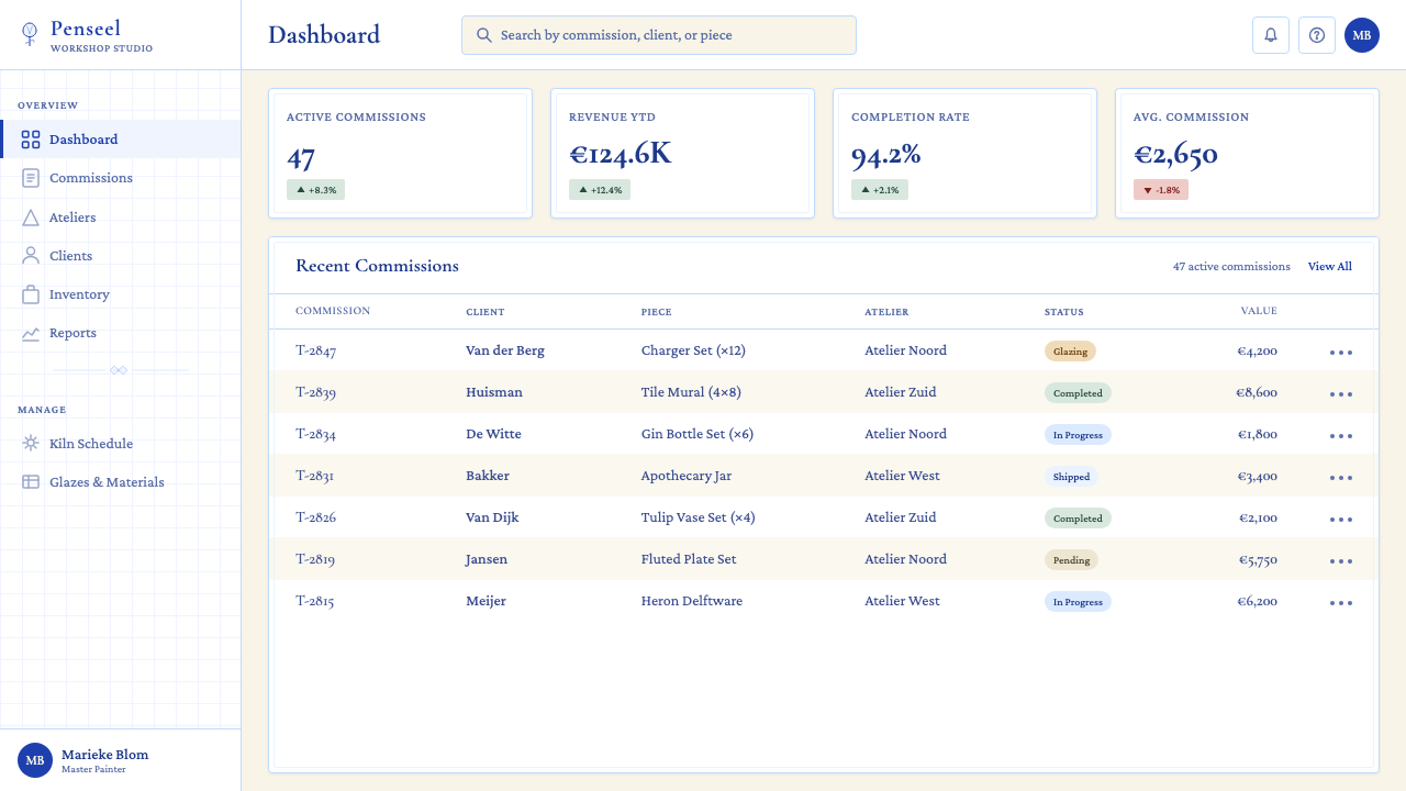
For web interfaces — particularly dashboards, pricing pages, and cultural-sector platforms — Delft Blue offers a distinctive alternative to the dominant minimal-modern conventions. The approach: establish a cream or warm off-white page ground, use deep cobalt for primary interactive elements and navigation, and reserve body text for near-black rather than pure black. Card components take on the tile format — equal-sized, cobalt-bordered, arranged in a grid — with icons drawn in a hand-sketch style rather than geometric flat vectors. Hover states and focus indicators can use a slightly deeper cobalt wash rather than a colored highlight. The style is particularly well-suited to products in heritage, hospitality, food and drink, craft, and cultural institution contexts.对于网页界面——尤其是仪表板、定价页面和文化领域平台——代尔夫特蓝陶提供了有别于主流极简现代风格的独特选择。方法如下:建立乳白或暖白页面底色,以深钴蓝用于主要交互元素和导航,正文文字采用接近黑而非纯黑的颜色。卡片组件采用瓷砖格式——等尺寸、钴蓝边框、网格排布——图标以手绘素描风格而非几何平面矢量绘制。悬停状态和焦点指示器可使用略深的钴蓝渲染,而非彩色高亮。这种风格尤其适合文化遗产、酒店餐饮、食品饮料、工艺品和文化机构语境下的产品。
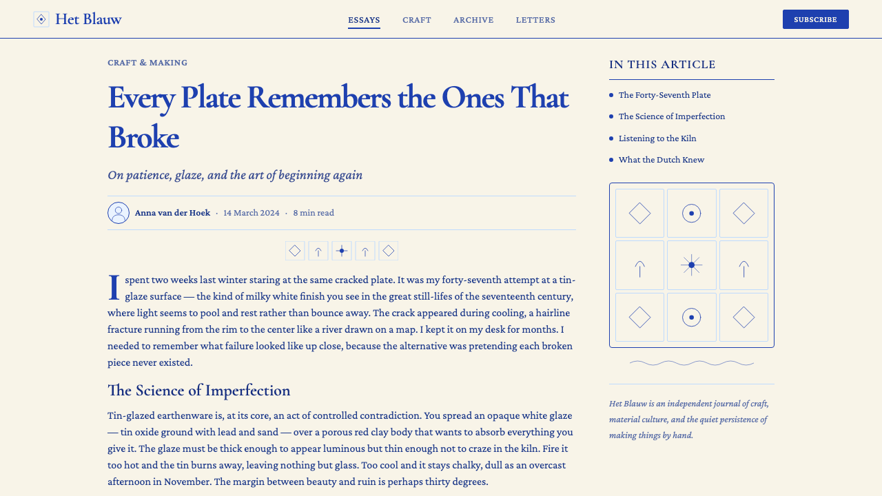
For editorial and marketing work, Delft Blue supports a narrative-rich approach where the visual system reinforces a sense of history, craft, and provenance. A magazine feature layout might use a large cobalt-tinted pull quote in a cartouche on the recto page, with body text in a sturdy serif that echoes the hand-lettered tradition, set against a cream stock or equivalent background tone. Marketing campaigns benefit from the iconographic vocabulary: windmills, tulips, and ships carry immediate cultural recognition and can anchor a visual identity that reads as both international and specifically Dutch. The style is equally effective on packaging — particularly for food, spirits, ceramics, and luxury goods — where the two-color cobalt-and-cream combination on a tactile matte surface produces a premium, handcrafted impression.对于编辑和营销工作,代尔夫特蓝陶支持一种叙事丰富的方法,视觉系统强化历史感、工艺感与溯源感。杂志特稿版面或许可以在右版页的涡卷框内放置大块钴蓝色调引用语,正文使用呼应手写传统的厚重衬线字体,置于乳白纸张质感或等效背景色调之上。营销活动受益于图像语汇:风车、郁金香和帆船承载即时可辨的文化认知,能够锚定一种既具国际感又鲜明属于荷兰的视觉身份。这种风格在包装上同样有效——尤其是食品、烈酒、陶瓷和奢侈品——钴蓝与乳白的双色组合在有质感的哑光表面上,呈现出高端手工的印象。
A common mistake when applying Delft Blue is treating it as a simple color-swap exercise: taking an existing layout, coloring it cobalt and cream, and assuming the result will read as Delft. The style's identity depends equally on its ornamental density, its specific motif vocabulary, and its handwork quality. A sparse, geometric layout in cobalt and cream reads as minimalism with a blue tint, not as Delft. The other frequent error is introducing too many additional hues alongside the cobalt and cream base. Delft's polychrome accent tradition is restrained — one warm guest color, used sparingly and with compositional purpose. Deploying four or five colors in the name of 'polychrome Delft' produces decoration that loses the discipline the style depends on for its authority.应用代尔夫特蓝陶时最常见的错误,是将其视为简单的换色练习:将既有版面染成钴蓝和乳白,便以为结果会呈现代尔夫特风格。这种风格的身份认同,同等依赖于其装饰密度、其特定母题词汇,以及其手工品质。一个稀疏的、几何化的钴蓝配乳白版面,呈现的是带蓝色调的极简主义,而非代尔夫特。另一个频繁出现的错误是在钴蓝与乳白底色之外引入过多色相。代尔夫特的彩绘点缀传统是克制的——一种温暖的客色,稀疏使用且有构图目的。以「彩绘代尔夫特」为名部署四五种颜色,产生的装饰会失去这种风格赖以确立权威感的纪律性。
See the Delft Blue Pottery design system查看 Delft Blue Pottery 完整设计系统
Delft Blue Pottery — FAQDelft Blue Pottery · 常见问题
How does Delft Blue differ from other blue-and-white ceramic traditions like Chinese blue-and-white or English Willow Pattern?代尔夫特蓝陶与中国青花、英国柳纹等其他青白陶瓷传统有何不同?
All three descend from the same Chinese blue-and-white tradition, but they diverge in important ways. Chinese blue-and-white, produced primarily at Jingdezhen, is true porcelain — harder, more translucent, with a brighter, cooler white and a more precise cobalt line achievable because the porcelain body does not absorb the pigment as readily. Delft Blue is earthenware with a tin glaze, which produces a warmer, denser surface; the brushwork has more visible texture and the white has a cream warmth that porcelain does not. English Willow Pattern (developed in Staffordshire in the 1780s) is transfer-printed rather than hand-painted, producing perfectly replicated imagery with no brushwork variation — the opposite of the handwork quality central to Delft's identity. Willow Pattern also uses a fixed, narrative scene composition, while Delft offers a much broader compositional vocabulary.三者均源自同一中国青花传统,但在重要方面存在分歧。中国青花主要产自景德镇,是真正的瓷器——更坚硬、更透光,白色更明亮、更清冷,钴蓝线条更精准,因为瓷胎对颜料的吸收不像陶胎那样强烈。代尔夫特蓝陶是带锡釉的陶器,呈现出更温暖、更致密的表面;笔触带有更明显的纹理,白色具有瓷器所不具备的乳白温暖感。英国柳纹(1780年代在斯塔福德郡发展起来)是转印而非手绘,产生完美复制的图像,无笔触变化——与手工品质这一代尔夫特身份认同核心恰恰相反。柳纹使用固定的叙事场景构图,而代尔夫特提供了宽广得多的构图词汇。
Can Delft Blue work in a modern digital product without looking like a heritage pastiche?代尔夫特蓝陶能在现代数字产品中运用,而不显得像是对历史风格的简单拼贴吗?
Yes, but the approach matters enormously. The designs that successfully modernize Delft Blue take its structural principles — cobalt-on-cream discipline, grid-based modularity, handwork texture — and apply them at the level of system design rather than surface decoration. This means designing the grid system as a tile-grid, using cobalt as the primary interaction color with cream as the base, and introducing hand-drawn or slightly imperfect line qualities in icons and dividers rather than machine-perfect geometry. The mistake is applying the motifs — windmills, tulips — without the underlying structural logic. Applied correctly, Delft Blue reads as a distinctive contemporary design decision that happens to have historical roots, not as a museum exhibit.可以,但方法至关重要。成功将代尔夫特蓝陶现代化的设计,在系统设计层面而非表面装饰层面运用其结构原则——钴蓝配乳白的纪律、网格模块化、手工质感。这意味着将网格系统设计为瓷砖网格,以钴蓝作为主要交互色、乳白为底色,在图标和分割线中引入手绘或略带不完美的线条质量,而非机器完美的几何形。错误在于只借用母题——风车、郁金香——而不搭载底层结构逻辑。正确运用时,代尔夫特蓝陶呈现为一种恰好具有历史根源的独特当代设计决策,而非博物馆展品。
What makes something authentically Delft Blue versus a generic cobalt-and-white design?什么使一件作品真正属于代尔夫特蓝陶风格,而非泛泛的钴蓝配白色设计?
Three distinguishing qualities: the warmth of the white (cream rather than optical white or pure cool white), the handwork quality of the cobalt marks (variable line weight, brush texture, stippling and wash rather than fills and strokes), and the compositional density (horror vacui organization with clear hierarchy rather than sparse minimalism). A design that uses a bright cold white background, perfectly uniform cobalt geometric shapes, and empty negative space is using the color but not the system. The motif vocabulary — tulips, windmills, cartouches — helps signal the reference, but the three structural qualities are what make a design feel genuinely Delft-derived rather than merely blue-and-white.三种区分性特质:白色的温暖感(乳白而非光学白或纯冷白)、钴蓝笔触的手工品质(可变的线条粗细、笔触纹理、点描与渲染而非填充与描边),以及构图密度(在清晰层级下的恐空式组织,而非稀疏的极简主义)。一个使用明亮冷白背景、完全均匀的钴蓝几何形体和大量留白的设计,使用了颜色,却没有使用这套系统。母题词汇——郁金香、风车、涡卷框——有助于传递历史引用,但这三种结构性特质,才是使一件设计真正感觉源自代尔夫特而非仅仅是「青白配色」的根本所在。
Is Delft Blue appropriate for luxury branding, or does it risk looking nostalgic or quaint?代尔夫特蓝陶适合用于奢侈品牌塑造吗?还是有陷入怀旧或旧时代感的风险?
Delft Blue is genuinely well-suited to luxury contexts — its historical association with royal patronage, costly imported materials, and handcraft expertise maps naturally onto luxury brand values. The risk of quaintness is real but avoidable. The style tips into nostalgic pastiche when it is used illustratively — when the windmills and tulips are the whole message — rather than structurally, when the underlying two-color discipline and handwork quality are doing compositional work. Luxury applications that succeed with Delft Blue tend to use the motifs sparingly as signature details (a tulip on a bottle neck label, a scallop border on a hang tag) while letting the cream-and-cobalt color discipline and material quality do the primary communicative work. In packaging especially, the combination of matte cream stock with deep cobalt printing reads as premium without requiring any figurative motifs at all.代尔夫特蓝陶确实非常适合奢侈品语境——它与王室赞助、昂贵进口材料和手工专业技艺的历史关联,自然映射至奢侈品牌价值观。陷入怀旧感的风险是真实的,但可以避免。当这种风格被用于插图式目的时——当风车和郁金香就是全部信息时——它会滑入怀旧拼贴;而当底层的双色纪律和手工品质在承担构图工作时,则不然。成功以代尔夫特蓝陶运用于奢侈品的案例,倾向于将母题克制地用作签名细节(瓶颈标签上的郁金香、吊牌上的扇贝边框),而让乳白与钴蓝的色彩纪律和材质品质承担主要的传达工作。尤其在包装领域,哑光乳白基材搭配深钴蓝印刷的组合,不需要任何具象母题便能呈现高端感。
How should Delft Blue handle typography — does it require a period-appropriate serif?代尔夫特蓝陶应如何处理字体排印——是否必须使用符合时代特征的衬线字体?
A sturdy serif typeface is strongly preferable and will always produce the most coherent result within the Delft Blue system. The historical reference point is the Dutch punchcutter tradition of the seventeenth century — letterforms with relatively high contrast between thick and thin strokes, moderate bracketed serifs, and a slight calligraphic axis. A contemporary typeface in this spirit will read as Delft-appropriate without requiring a literal historical revival. Sans-serif type is not impossible within a Delft-derived layout, but it creates a visible tension with the style's hand-drawn, ornamented identity — it tends to read as a deliberate modernization signal rather than as part of the system. If a sans-serif is required by a brand's broader identity, pairing it with cobalt rule lines, cartouche framing, and reduced ornament can preserve enough of the Delft character to hold the system together.厚重的衬线字体是强烈推荐的选择,在代尔夫特蓝陶体系内始终能产生最连贯的结果。历史参照点是十七世纪荷兰铸字师传统——字形具有相对高的粗细笔画对比、适度的带弧角衬线,以及略带书法式的字轴。当代字体中具有这种精神的款式,无需字面上的历史复原,便能被解读为符合代尔夫特气质。无衬线字体并非完全无法用于代尔夫特风格版面,但它会与这种风格手绘、装饰性的身份认同产生明显张力——往往被解读为刻意的现代化信号,而非系统的有机组成部分。若品牌更广泛的身份认同要求使用无衬线字体,将其与钴蓝线条、涡卷框和减量装饰搭配,能够保留足够的代尔夫特特质,使整套系统维持内聚力。
Related design styles相关设计风格
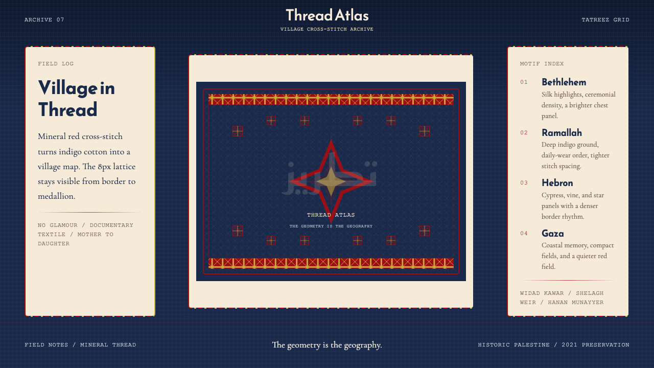 Palestinian Tatreez Cross-StitchMemory in thread. Red cross-stitch on indigo cotton, built on an 8px grid.记忆被线缝住。红绣靛蓝布,8px网格作骨架。
 Paracas Andean TextileAncestral and exact. Jewel tones repeat on deep cobalt in strict 90° turns.古老而精确:宝石色在深钴蓝底上按90°旋转重复。
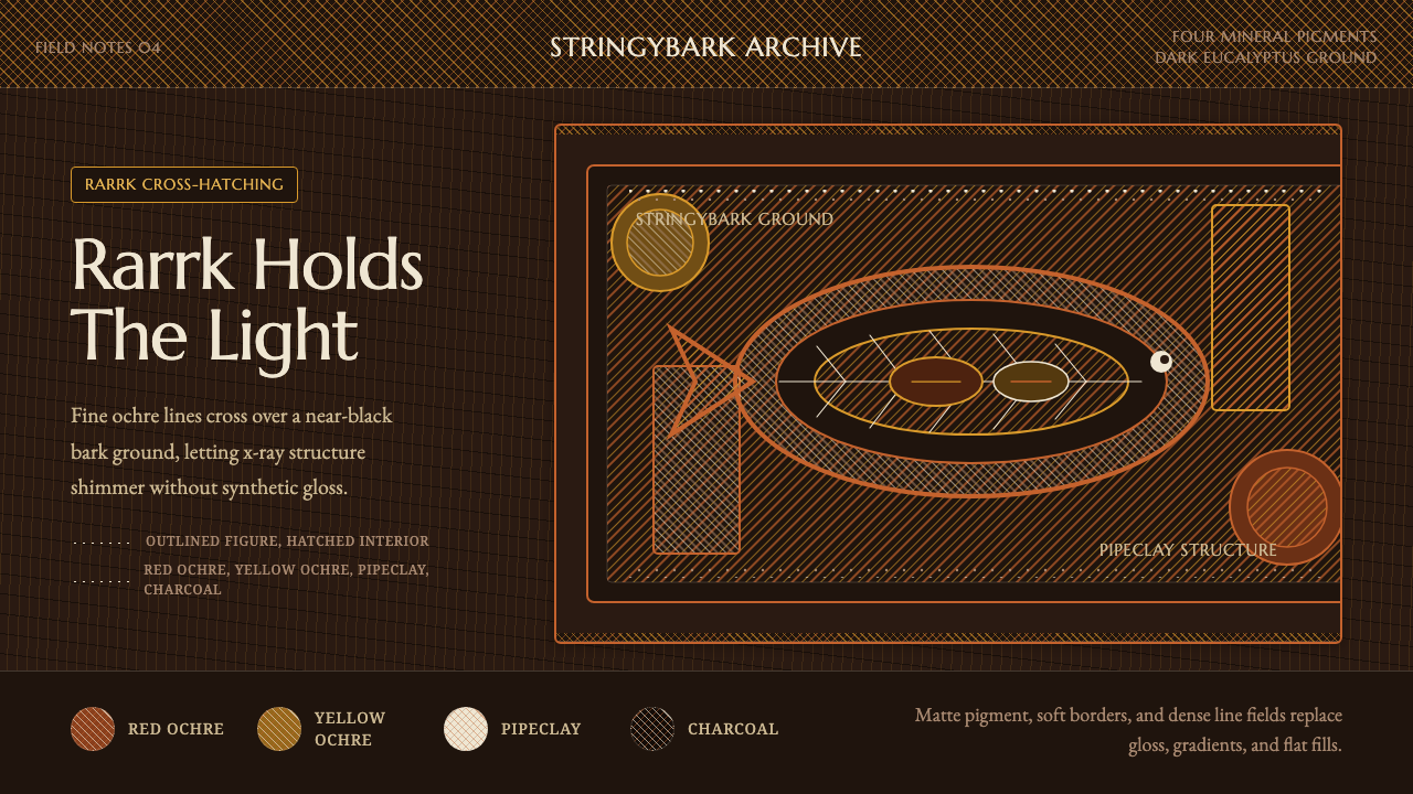 Arnhem X-Ray Bark PaintingShimmers without gloss. Ochre rarrk lines vibrate on dark stringybark.无光泽却闪烁:赭色rarrk线在深树皮底上振动。
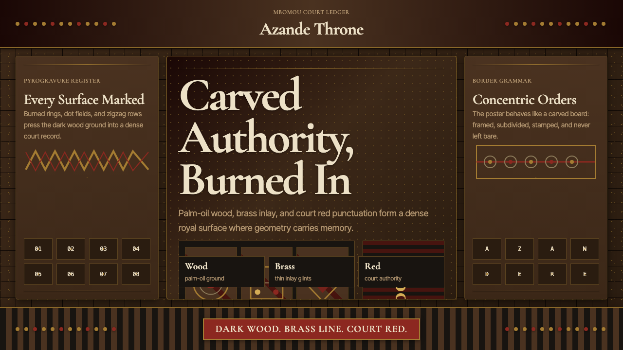 Central African Azande ThroneDense court gravity. Dark wood grids, brass dots, and court red cover every s…宫廷感厚重:深木网格、黄铜点阵与宫廷红铺满表面。
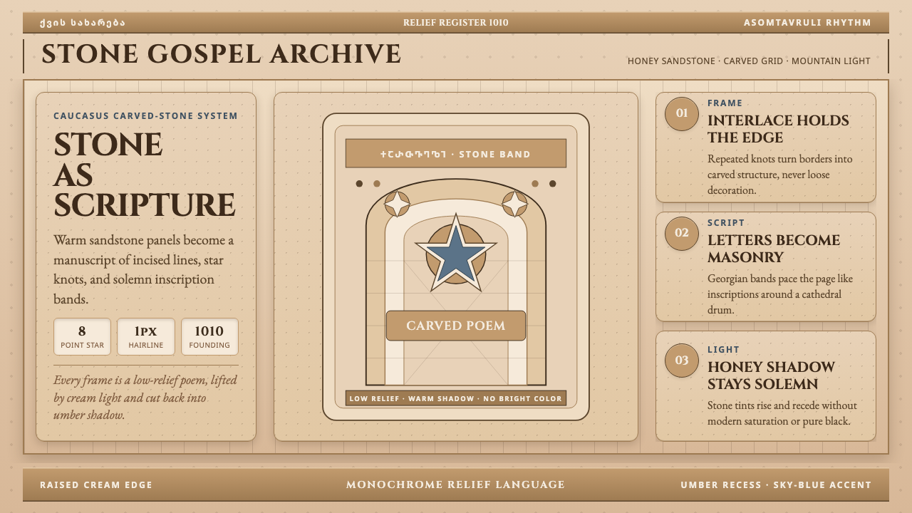 Georgian Nikortsminda Stone-CarvingStone becomes scripture. Cinzel caps and Georgian bands carve honey-sandstone…石如经卷。Cinzel大写与格鲁吉亚铭文刻出蜜砂岩网格。
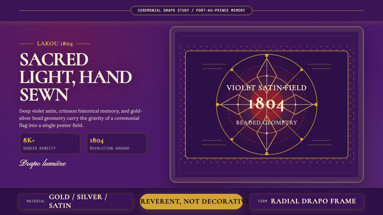 Haitian Vèvè Sequin Drapo 1804Sacred density. Violet satin, gold sequins, and radial geometry hold 1804 gra…神圣而厚重:紫缎、金色亮片与放射几何承载1804的庄严。