What is Paracas Andean Textile?什么是 Paracas Andean Textile?

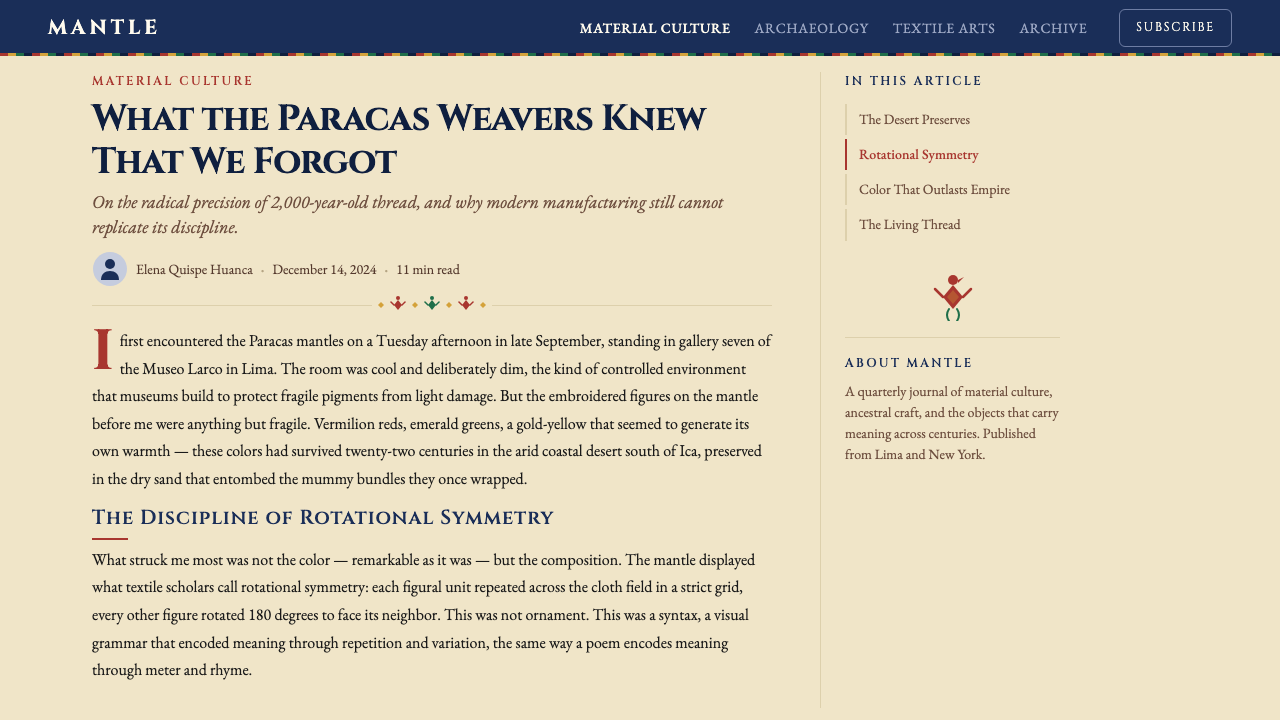
Two thousand years before pantone, Andean weavers mapped the cosmos in cochineal red and indigo blue — fifty identical shamans rotating in perfect lockstep across four meters of alpaca wool.早于任何色彩体系两千年,安第斯织者用胭脂虫红与靛蓝在四米羊驼毛上绘制宇宙——五十个相同的萨满以完美的旋转步伐列队而行。
Paracas Andean Textile in briefParacas Andean Textile 速览
Paracas Andean Textile is a design language derived from the embroidered burial mantles of the Paracas culture on Peru's south coast, active roughly from 700 BCE to 200 CE. The visual system is built on three interlocking principles: saturated jewel-tone color on a deep cobalt ground, strict rotational symmetry enforced across the full width of a cloth, and a dense repertoire of recurring figures — flying shamans, jaguars, monkeys, and supernatural birds — each drawn with bold embroidered outlines and filled with contrasting hues.帕拉卡斯安第斯织物是一套源自秘鲁南海岸帕拉卡斯文化刺绣丧葬披风的设计语言,该文化大约活跃于公元前700年至公元200年。这套视觉系统建立在三个相互咬合的原则之上:深钴蓝底面上的饱和宝石色调、贯穿织物全幅的严格旋转对称,以及一套密集的循环图像词汇——飞翔的萨满、美洲豹、猴子、神鸟,每一个都以粗重的刺绣轮廓勾勒,以对比色调填充。
What separates this tradition from decorative textile arts elsewhere is its systematic, almost algorithmic quality. A single mantle contains fifty to one hundred nearly identical figures, each rotated exactly ninety degrees from its neighbor, the sequence repeating in a four-directional grid across the full surface. The repetition is not laziness — it is cosmological argument. Each rotation embodies a cardinal direction, a season, a state of spiritual transformation. The aesthetic is simultaneously archaeological and monumental: ancient in its materials, rigorous in its geometry, and quietly sacred in its intent.将这一传统与其他地方的装饰性纺织艺术区别开来的,是它系统性的、近乎算法式的品质。单件披风容纳五十至一百个近乎相同的图像,每一个相对其邻者恰好旋转九十度,这一序列在全幅表面以四方向网格重复延展。重复并非懈怠——它是宇宙论的论述。每一次旋转体现一个基本方向、一个季节、一种精神转化的状态。这种美学同时具有考古性与纪念碑性:材料上是古老的,几何上是严格的,意图上是静默而神圣的。
In its contemporary application as a design system, Paracas Andean Textile translates this visual intelligence into a vocabulary for digital and print work. The deep cobalt ground becomes a commanding background field. The jewel tones — ruby red, emerald green, saffron yellow, and shellfish purple — serve as the primary accent and hierarchy palette. Rotational grid logic governs layout and pattern. The result carries an authority that reads as neither Western modernist nor generically ethnic, but as the product of a fully realized, self-sufficient visual civilization.作为一套设计系统在当代应用中,帕拉卡斯安第斯织物将这种视觉智慧转化为数字与印刷工作的词汇。深钴蓝底面成为强势的背景场域。宝石色调——红宝石红、祖母绿、藏红花黄、紫螺紫——充当主要强调色与层级调色板。旋转网格逻辑统辖版面与图案布局。最终效果所承载的权威感,既不读作西方现代主义,也不读作泛化的民族风情,而是一个完整、自洽的视觉文明的产物。
See the Paracas Andean Textile design system查看 Paracas Andean Textile 完整设计系统
Where does Paracas Andean Textile come from?Paracas Andean Textile 从何而来?
The Paracas peninsula, a windswept desert promontory on Peru's south coast, was home to a culture that flourished for nearly a millennium before being absorbed into the Nazca tradition around 200 CE. The region's extreme aridity — almost no rainfall for centuries on end — preserved objects in a state that would be impossible in wetter climates. When Peruvian archaeologist Julio C. Tello excavated the Paracas Necropolis in 1925, he uncovered more than four hundred mummy bundles, each wrapped in multiple layers of finely embroidered textiles. The colors were not faded. The figures were not blurred. Two thousand years in the sand had left them as vivid as the day they were made.帕拉卡斯半岛是秘鲁南海岸一处风大沙多的荒漠岬角,曾孕育一个繁盛近千年的文化,约在公元200年被纳斯卡传统所吸收。该地区极度干旱——数百年几乎无雨——使文物得以保存在潮湿气候下不可能实现的状态。1925年,秘鲁考古学家胡里奥·C·特洛在挖掘帕拉卡斯公墓时,发现了四百余具木乃伊包裹,每一具都由多层精美刺绣织物层层包裹。色彩没有褪去,图像没有模糊。两千年的沙土封存,让它们与出土之日同样鲜活。
The dyes that produced these colors were among the most sophisticated in the pre-industrial world. Cochineal, a dye extracted from the dried bodies of scale insects that live on prickly pear cacti, yielded reds of extraordinary intensity and lightfastness — a range from pale rose through crimson to near-purple, depending on the mordant used and the acidity of the dye bath. Indigo, fermented from the leaves of several plant species native to the Andes, produced deep blue tones. Weld and other plant sources contributed yellows. Shellfish murex provided a rare and costly purple. The Paracas weavers understood mordanting, over-dyeing, and resist techniques well enough to produce color combinations that still carry visual weight across two millennia.产生这些色彩的染料,是前工业世界最为复杂精妙的染料之一。胭脂虫染料萃取自寄生于仙人掌上的介壳虫干燥虫体,产生的红色具有非凡的强度与耐光性——从淡玫瑰红到绯红再到近紫,色域因媒染剂与染浴酸碱度的不同而变化。靛蓝由安第斯本地数种植物的叶片发酵而得,产生深沉的蓝色调。染料木等植物来源贡献了黄色。紫螺提供了稀有而昂贵的紫色。帕拉卡斯织者对媒染、套染与防染技术的掌握,足以产出跨越两千年仍具视觉张力的色彩组合。
The figures themselves — the flying shamans with their elaborate headdresses and trophy heads, the feline creatures with split-staffs and serpent attributes — are not merely decorative motifs. Scholars including Anne Paul and Mary Frame have demonstrated that these figures encode a systematic visual language. Specific attribute combinations signal specific supernatural identities; the orientation of a figure relative to its neighbors encodes relational meaning; the four-directional rotational scheme maps onto Andean cosmological models of spatial and temporal organization. What looks to a modern eye like a bold repeating pattern is, for its makers, closer to a written text.图像本身——戴着繁复头饰、持着战利品首级的飞翔萨满,手持双叉权杖与蛇属的猫科神祇——绝非单纯的装饰母题。安·保罗与玛丽·弗雷姆等学者已证明,这些图像编码了一套系统性视觉语言。特定属性组合标示特定的超自然身份;图像相对于其邻者的朝向编码关系意义;四方向旋转方案映射安第斯宇宙论中空间与时间组织的模型。在现代眼光看来如同大胆重复图案的东西,对其创作者而言更接近于一种书写文字。
The textile tradition did not end with the Paracas culture. It passed through Nazca, through the Wari empire (roughly 600 to 1000 CE), through the Inca empire (roughly 1400 to 1532 CE), and continues in contemporary Andean weaving cooperatives throughout Peru, Bolivia, and Ecuador. In the twentieth century, scholars such as Anne Paul produced systematic catalogs of Paracas iconography, while artists like Maximo Laura — a contemporary Peruvian master weaver — have extended the visual language into large-format tapestries that hang in international museums and corporate collections. The Lima Larco Museum holds the most significant institutional collection, where the textiles are displayed in conditions that allow their scale and chromatic intensity to be fully apprehended.这一纺织传统并未随帕拉卡斯文化终结。它经由纳斯卡、瓦里帝国(约公元600至1000年)、印加帝国(约1400至1532年)传承下来,并延续至今日秘鲁、玻利维亚与厄瓜多尔各地的安第斯编织合作社。二十世纪,安·保罗等学者系统整理了帕拉卡斯图像志目录,而马克西莫·劳拉等当代秘鲁织造大师则将这一视觉语言延伸至大幅挂毯,陈列于国际博物馆与企业收藏之中。利马拉尔科博物馆收藏着最重要的机构藏品,织物在那里以可充分感知其尺度与色彩强度的条件展出。
What defines the Paracas Andean Textile look?Paracas Andean Textile 的视觉特征是什么?
Color — Jewel Tones on Cobalt Ground色彩——钴蓝底上的宝石色调
The defining chromatic decision is a deep, saturated cobalt blue as the dominant ground, against which jewel tones — ruby red, emerald green, saffron yellow, and shellfish purple — read with maximum intensity. The ground is not neutral; it is assertive. The accent colors do not decorate the background — they compete with it and win through saturation rather than lightness. This produces a visual temperature that is simultaneously warm and cool, ancient and immediate. In practice, no more than three accent hues appear prominently on any one surface, with one typically dominant and the others used for interior fill or outline contrast.最具定义性的色彩决策,是以深沉饱和的钴蓝作为主导底色,宝石色调——红宝石红、祖母绿、藏红花黄、紫螺紫——在其上以最大强度呈现。底色并不中性,它是主动的。强调色并非装饰背景,而是与之竞争,靠饱和度而非明度取胜。这产生了一种同时温暖又冷静、古老又当下的视觉温度。在实践中,任何单一画面上突出出现的强调色不超过三种,其中一种通常主导,其余用于内部填充或轮廓对比。
Rotational Symmetry — The Four-Direction Grid旋转对称——四方向网格
The structural engine of the system is not bilateral symmetry but rotational symmetry, specifically the ninety-degree rotation of a complex figure across a grid. A single figure is drawn; it is then rotated and repeated such that every adjacent unit faces a different cardinal direction. Seen close up, the pattern appears to show figures in many orientations; seen at a distance, it resolves into a unified, hypnotically stable field. This logic — local variation, global order — gives layouts an energy that purely symmetrical patterns lack. It rewards slow looking and repays the eye at every scale.这一系统的结构引擎不是双边对称,而是旋转对称——具体而言是复杂图像在网格上以九十度为单位的旋转重复。单一图像先被绘制,然后旋转复制,使每个相邻单元朝向不同的基本方向。近看时,图案似乎呈现出朝向各异的图像;远望时,则解析为统一、催眠般稳定的视觉场域。这种逻辑——局部变化、整体秩序——赋予版面纯对称图案所缺乏的能量。它奖励缓慢的凝视,在每一个尺度上都回报眼睛。
Figure Drawing — Bold Outline and Interior Contrast图像绘制——粗重轮廓与内部对比
Each figure in the Paracas tradition is bounded by a thick, continuous embroidered outline in a hue that contrasts sharply with both the ground and the figure's interior fill. The interior is not monochromatic — limbs, headdress elements, and attribute objects are each filled in a different hue, producing a mosaic effect within the silhouette. This approach ensures that figures read at distance as bold unified shapes while rewarding close inspection with color complexity. In digital application, this translates to strong stroke weights on illustrative elements and deliberate multi-color fill strategies rather than flat single-color fills.帕拉卡斯传统中的每个图像都由一条粗重、连续的刺绣轮廓线界定,其色调与底面及图像内部填充均形成鲜明对比。内部并非单色——肢体、头饰元素、属性器物各自填以不同色调,在轮廓内产生马赛克效果。这种处理确保图像在远处读作粗重的统一形态,同时在近处细看时呈现色彩的复杂性。在数字应用中,这转化为插图元素上的强笔画粗细,以及刻意的多色填充策略,而非平面单色填充。
Iconographic Vocabulary — Specific, Recurring Figures图像词汇——特定的循环图像
The motif vocabulary is not abstract — it is populated by identifiable beings: the flying shaman with fanged mouth and trophy head, the oculate being with radiating appendages, the feline creature with split-staff, the supernatural bird. Each figure carries a fixed set of attributes that identifies it within the iconographic system. This commitment to a specific, readable figure vocabulary rather than geometric abstraction gives the style a narrative weight that purely ornamental pattern systems lack. Applied to design, it suggests the use of a controlled set of illustrative icons or emblems rather than generic decorative pattern.母题词汇并不抽象——它由可辨识的存在者构成:獠牙、持战利品首级的飞翔萨满,带有放射状附肢的眼状神祇,持双叉权杖的猫科神兽,超自然神鸟。每个图像携带一套固定属性,在图像志系统中标识自身。相比于纯几何抽象,这种对特定可读图像词汇的坚持赋予这种风格纯装饰性图案系统所缺乏的叙事分量。应用于设计时,它意味着使用一套受控的插图图标或徽章,而非通用装饰图案。
Texture — Embroidered Surface Quality质感——刺绣表面品质
The original textiles are not flat — they are built up from thousands of individual embroidery stitches, each adding a tiny increment of raised, directional texture to the surface. The visual effect is a surface that shifts slightly as light changes, that has grain and directionality within each color field. In contemporary application, this quality is suggested rather than simulated: a subtle woven or fabric-grain texture applied to solid color fields, or illustrative linework that varies in weight to suggest the irregularity of hand-stitched outline. The texture should feel handmade and material, not digital and smooth.原始织物并非平面——它们由数千个独立刺绣针脚堆积而成,每一针为表面增添一点微小的凸起方向性质感。视觉效果是一个随光线变化而微微移动的表面,在每个色彩场域内都有纹理与方向性。在当代应用中,这种品质是被暗示而非模拟的:对实色面施加细腻的织物纹理,或以粗细变化的插图线条暗示手绣轮廓的不规则性。质感应当令人感到手工制作与材料性,而非数字化与光滑。
Scale — Monumental Repetition尺度——纪念碑式的重复
The original mantles are not small objects — they are four meters long and were designed to be seen as a whole from a distance as well as examined close up. The scale relationship between the individual figure and the total cloth is carefully calibrated: the figure is large enough to be read at arm's length, the total field is large enough to produce a visual rhythm when seen from across a room. In design application, this means that pattern elements should be sized for the actual viewing distance of the medium — generous on a printed cover, tighter on a phone screen — and that the total composition should read as a unified field before it reads as a collection of individual motifs.原始披风并不是小型物件——它们长达四米,被设计为既可整体远观,又可近距细察。单个图像与整块织物的尺度关系经过精心校准:图像大到可在臂长距离阅读,整体场域大到可在房间对面产生视觉节律。在设计应用中,这意味着图案元素应依照实际观看距离来定尺——印刷封面上宜宽裕,手机屏幕上宜紧凑——而整体构图应先读作统一场域,再读作单个母题的集合。
Typography — Inscriptional Weight and Ceremonial Register字体排印——碑铭分量与仪典语调
The original textiles have no letterforms, but the design language implies a typographic register: monumental, inscriptional, ceremonial. The appropriate typographic companion to Paracas Andean Textile is a large-uppercase serif with strong stroke contrast — a face in the tradition of classical Roman stone inscription, evoking permanence and cultural authority — used for display and headline purposes. Body text, where present, should be set in a legible serif at comfortable reading size, with generous leading that echoes the open intervals between figure rows in the original cloth. Avoid typefaces that feel casual, grotesque, or purely geometric; the typographic mood is reverent and deliberate.原始织物没有字形,但这套设计语言隐含了一种排印语调:纪念碑式的、碑铭式的、仪典式的。与帕拉卡斯安第斯织物匹配的排印搭档,是笔画对比强烈的大写衬线体——传承自古典罗马石刻碑铭传统的字体,唤起永恒感与文化权威感——用于展示与标题目的。正文(若出现)应以舒适阅读大小排印可读衬线体,并留出宽裕的行间距,呼应原始织物图像行间的开放间隔。避免感觉随意、怪诞或纯几何的字体;排印氛围应是庄重而审慎的。
See the Paracas Andean Textile design system查看 Paracas Andean Textile 完整设计系统
Who shaped Paracas Andean Textile?谁塑造了 Paracas Andean Textile?
Tello (1880–1947) is the founding figure of Peruvian archaeology. Born in Huarochirí in the central Andes, he was the first indigenous Peruvian to earn an international academic degree (Harvard, 1909) and dedicated his career to demonstrating that Peru's pre-Columbian civilizations were independent, sophisticated achievements rather than diffusions from other cultures. His 1925 excavation of the Paracas Necropolis — which he conducted under difficult conditions, racing against looting — brought the Paracas textiles to international scholarly attention and established the framework within which they have been studied ever since. The Lima Larco Museum and the National Museum of Archaeology, Anthropology and History in Lima both hold significant Tello-era collections.特洛(1880—1947年)是秘鲁考古学的奠基人物。他出生于中部安第斯的瓦罗奇里,是第一位获得国际学术学位的秘鲁原住民(哈佛大学,1909年),并将毕生精力用于证明秘鲁前哥伦布文明是独立的、成熟的成就,而非来自其他文化的扩散。他在1925年于艰难条件下、与盗掘赛跑中主持发掘的帕拉卡斯公墓,使帕拉卡斯织物进入国际学术视野,并建立了此后研究的基本框架。利马拉尔科博物馆与利马国家考古人类学历史博物馆均收藏有重要的特洛时代藏品。
Anne Paul is the scholar most responsible for transforming the study of Paracas textiles from archaeological cataloging into iconographic analysis. Her landmark publication Paracas Ritual Attire: Symbols of Authority in Ancient Peru (1990) provided the first systematic analysis of the relationship between figure attributes and probable ritual or social function. Paul demonstrated that specific combinations of headdress, mouth-mask, and held object identify distinct supernatural figures in a coherent iconographic system — that the textiles are not merely beautiful but semantically structured. Her work established the interpretive foundations that scholars including Mary Frame have continued to build on.安·保罗是将帕拉卡斯织物研究从考古学目录整理转变为图像志分析的最重要学者。她的里程碑著作《帕拉卡斯仪典服饰:古代秘鲁的权威象征》(1990年)首次系统分析了图像属性与可能的仪典或社会功能之间的关系。保罗证明,头饰、口面具与持握物的特定组合在一套连贯的图像志系统中标识不同的超自然图像——织物不仅仅是美丽的,更是语义结构化的。她的研究建立了诠释基础,玛丽·弗雷姆等学者在此基础上持续深耕。
Mary Frame is a textile scholar and weaver who has contributed the most technically detailed analyses of Paracas structure and figure construction. Her work focuses on how the embroiderers encoded meaning through the direction and sequence of stitches — not only in the visible imagery but in the underlying structural logic of the cloth itself. Frame's research has demonstrated that the textile tradition embeds spatial and directional information at multiple levels simultaneously: in the figure, in the figure's relationship to neighboring figures, and in the orientation of the stitching relative to the warp and weft. This layered encoding is what distinguishes Paracas textiles as a meaning-bearing system rather than a decorative one.玛丽·弗雷姆是一位纺织学者兼织者,为帕拉卡斯结构与图像构造提供了技术上最为详尽的分析。她的工作聚焦于刺绣者如何通过针脚的方向与顺序编码意义——不仅在可见图像中,也在织物本身的底层结构逻辑中。弗雷姆的研究证明,这一纺织传统在多个层次上同时嵌入空间与方向信息:在图像内部、在图像与相邻图像的关系中、以及在刺绣方向相对于经纬线的朝向中。这种分层编码正是帕拉卡斯织物被界定为意义承载系统而非装饰系统的关键所在。
Maximo Laura is a contemporary Peruvian master weaver, born in 1955 in Ayacucho, who has extended the Paracas and broader Andean textile tradition into large-format fine-art tapestry. His works — some exceeding two meters in height — are held in the collections of the United Nations, the World Bank, and numerous international museums. Laura's practice demonstrates that the Paracas visual language is not a closed historical system but a living one: he maintains strict fidelity to the traditional color approach and figure vocabulary while extending scale, subject matter, and compositional complexity beyond what any pre-Columbian weaver could have produced. His work is the clearest contemporary evidence that Paracas Andean Textile is a viable aesthetic system for large-format, high-resolution visual communication.马克西莫·劳拉是1955年生于阿亚库乔的当代秘鲁织造大师,他将帕拉卡斯及更广泛的安第斯纺织传统延伸至大幅精品挂毯。他的作品——部分高逾两米——被联合国、世界银行及众多国际博物馆收藏。劳拉的实践证明,帕拉卡斯视觉语言并非封闭的历史系统,而是鲜活的:他在严格忠实于传统色彩处理与图像词汇的同时,将尺度、主题与构图复杂度延伸至任何前哥伦布时期织者都无法企及的程度。他的工作是帕拉卡斯安第斯织物作为大幅高分辨率视觉传播的可行美学系统的最清晰当代佐证。
Rebeca Carrión Cachot (1897–1960) worked alongside Tello and later directed the National Museum of Archaeology. Her 1931 study La Indumentaria en la Antigua Cultura Paracas provided the first detailed typological analysis of the figures and their costume attributes. She established the basic descriptive vocabulary — the naming and categorization of figure types — that subsequent scholars refined. Her work represents the transition from Tello's broad archaeological surveys to the more focused iconographic scholarship that Paul and Frame later developed. Together, these scholars form the interpretive lineage through which Paracas textiles have been understood as a coherent visual and cultural system.雷贝卡·卡里翁·卡肖特(1897—1960年)曾与特洛并肩工作,后来出任国家考古博物馆馆长。她1931年的研究《古代帕拉卡斯文化的服饰》对图像及其服装属性进行了首次详细的类型学分析。她建立了基本的描述性词汇——图像类型的命名与分类——供后继学者不断精炼。她的工作代表了从特洛的宏观考古调查,向保罗与弗雷姆后来发展的更为聚焦的图像志学术研究的过渡。这些学者共同构成了诠释谱系,帕拉卡斯织物正是经由这一谱系被理解为一套连贯的视觉与文化系统。
How do you use Paracas Andean Textile today?今天怎么用 Paracas Andean Textile?
Paracas Andean Textile works best when the design brief calls for authority, cultural depth, and visual intensity — situations where the designed artifact is meant to feel like a primary document rather than a communication tool. The deep cobalt ground reads immediately as serious and commanding; the jewel-tone accents read as precious and deliberate. This makes the system well-suited to institutional presentations, premium product launches, cultural heritage brands, and any context where gravitas and distinctiveness are more important than approachability.帕拉卡斯安第斯织物在设计需求要求权威感、文化深度与视觉强度时表现最佳——那些设计物被期望感觉如同原始文献而非传播工具的场合。深钴蓝底面立即传递严肃而强势的信号;宝石色调强调读作珍贵而审慎。这使得这套系统非常适合机构演示、高端产品发布、文化遗产品牌,以及任何庄重感与独特性比亲和力更重要的语境。
For presentation slides, the system divides naturally into two modes. Cover slides benefit from the full pattern treatment: the cobalt ground with one or two figures from the rotational grid overlaid at large scale, the title set in large-uppercase inscriptional serif, a single jewel-tone accent used for the brand or event name. The combination reads as a visual statement before it reads as a title card — which is appropriate for high-stakes keynotes and award presentations. Content slides should pull back to a simpler register: cobalt ground retained, body text in cream or near-white at a generous size, section headings in the accent color, no pattern overlay on text-heavy slides. Data slides work well when chart elements are colored from the jewel-tone palette — bars and segments in ruby, saffron, and emerald against a cobalt or deep-navy ground read as distinctly as traditional textile figures against their background.在演示文稿中,这套系统自然分为两种模式。封面幻灯片适合完整的图案处理:钴蓝底面上大尺度叠加旋转网格中的一两个图像,标题以大写碑铭衬线体排印,品牌或活动名称使用单一宝石色调强调。这种组合在读作标题卡之前先读作视觉宣言——这对于高风险主题演讲与颁奖展示是恰当的。内容幻灯片应回归更简洁的语调:保留钴蓝底面,正文以奶油色或近白色以宽裕字号排印,章节标题用强调色,文字密集的幻灯片不叠加图案。数据幻灯片当图表元素取色于宝石色调调色板时表现出色——在钴蓝或深海军蓝底面上的红宝石、藏红花与祖母绿色柱条和扇区,读来如同传统织物图像衬于底色般清晰可辨。
For web interfaces and digital dashboards, the system requires some adaptation. A full cobalt ground works for hero sections and feature blocks but is too dominant for long-form reading interfaces. A practical approach: use the deep cobalt for navigation, sidebars, and high-emphasis components; use a very light warm neutral for the primary content area; reserve the jewel tones for data visualization, interactive states, and call-to-action elements. Pricing pages work particularly well with this treatment — tier differentiation through jewel-tone accent on card borders or headers, with the recommended tier marked by the full cobalt background, creates a visual hierarchy that is both legible and memorable.对于网页界面与数字仪表板,这套系统需要一定的调适。完整的钴蓝底面适用于英雄区块与特性版块,但对于长篇阅读界面过于强势。实用的方法是:深钴蓝用于导航、侧边栏与高强调组件;主内容区使用非常浅的暖中性色;宝石色调保留给数据可视化、交互状态与行动号召元素。定价页面使用这种处理效果尤佳——通过卡片边框或标题上的宝石色调强调区分套餐层级,推荐套餐以完整钴蓝背景标记,创造出既易读又令人印象深刻的视觉层级。
For editorial and marketing work, the style supports bold, high-contrast treatments that photograph well and reproduce at any scale. A Paracas-inflected magazine spread or brochure cover works best when it commits fully to the cobalt ground with large-scale figure imagery — either original textile photography or contemporary illustration in the same vocabulary — and reserves all white or cream space for text. Marketing campaigns using this aesthetic read as culturally substantial rather than trendy, which makes them well-suited for brand positioning in premium, heritage, or global-institutional contexts. The rotational grid logic can be applied to multi-panel sequences: a series of social media cards or a folded brochure where each panel continues the pattern creates a satisfying sense of visual rhythm and system coherence.对于编辑与营销工作,这种风格支持大胆的高对比度处理,在摄影与任何尺度的复制中都表现良好。帕拉卡斯风格的杂志跨页或宣传册封面,在完全投入钴蓝底面配合大尺度图像——原始织物摄影或同一词汇体系下的当代插图——并将所有白色或奶油色空间保留给文字时效果最佳。采用这种美学的营销活动读来具有文化实质感而非流行感,使其非常适合高端、传统或全球机构语境中的品牌定位。旋转网格逻辑可应用于多面板序列:一组社交媒体卡片或一本折叠宣传册中,每个面板延续图案,产生令人满足的视觉节律感与系统连贯性。
The most common mistake when applying Paracas Andean Textile is treating the jewel-tone palette as decorative rather than structural — scattering red, green, and yellow accents across a layout without the underlying rotational logic that gives the original textile its order. A second common error is using the cobalt ground without committing to its intensity, producing a washed-out version that reads as generic dark blue rather than as a commanding field. The third is adding softness where the system demands hardness: soft shadows, blurred edges, and gradients are antithetical to a visual language built on flat dyed surfaces and crisp embroidered outlines. When in doubt, reduce the number of colors and increase the scale and boldness of the remaining elements — this system rewards decisiveness.应用帕拉卡斯安第斯织物时最常见的错误,是将宝石色调调色板视为装饰性而非结构性的——将红、绿、黄强调色散布于版面,而缺乏赋予原始织物秩序的底层旋转逻辑。第二个常见错误是使用钴蓝底面时不投入其强度,产生读来如同普通深蓝而非强势场域的稀释版本。第三个错误是在系统要求硬度之处添加柔软:柔和阴影、模糊边缘与渐变,与建立于平整染色表面和清晰刺绣轮廓之上的视觉语言背道而驰。有疑虑时,减少色彩数量,增加余下元素的尺度与大胆度——这套系统奖励果断。
See the Paracas Andean Textile design system查看 Paracas Andean Textile 完整设计系统
Paracas Andean Textile — FAQParacas Andean Textile · 常见问题
Is this style appropriate for brands outside of Peru or Andean culture?这种风格适合秘鲁或安第斯文化以外的品牌使用吗?
The question of cultural context is genuine and worth considering carefully. The Paracas Andean Textile tradition belongs to a living cultural sphere — Andean communities continue to weave, and the iconographic tradition continues to carry meaning. Applying the style respectfully means engaging with it as a coherent visual civilization rather than as a decorative surface: understanding what the rotational logic, the color hierarchy, and the figure vocabulary are doing structurally, and deploying them with that understanding rather than as atmospheric texture. Brands outside the Andean sphere that use this style credibly tend to do so in contexts where cultural depth and global scope are explicit brand values — institutional, academic, and international organizations for whom the Andean visual tradition carries universal rather than regional associations.文化语境的问题是真实存在的,值得认真考量。帕拉卡斯安第斯织物传统属于一个鲜活的文化领域——安第斯社区仍在纺织,图像志传统仍在承载意义。以尊重的方式应用这种风格,意味着将其作为一套连贯的视觉文明而非装饰表面来对待:理解旋转逻辑、色彩层级与图像词汇在结构上做了什么,并带着这种理解部署它们,而非将其作为氛围质感。安第斯圈子以外的品牌中,能够可信地使用这种风格的,往往是在文化深度与全球视野是明确品牌价值的语境下——机构、学术与国际组织,对他们而言安第斯视觉传统承载的是普世而非地域性的联想。
Can Paracas Andean Textile work on light backgrounds, or is the cobalt ground mandatory?帕拉卡斯安第斯织物能在浅色背景上使用,还是钴蓝底面是必须的?
The deep cobalt ground is historically canonical and produces the most authentic reading of the style, but it is not absolutely mandatory. A light-ground variant is possible — warm cream or natural linen tones echo the undyed alpaca wool ground that appears in some Paracas pieces — but it requires a significant shift in how the other colors function. On a light ground, the jewel tones must increase in visual weight to maintain the system's intensity, and the figure outlines should become heavier to preserve the bold legibility that characterizes the tradition. The risk on a light ground is that the style drifts toward generic folk-art or Southwest-textile pastiche. Staying close to the specific Paracas iconographic vocabulary — the systematic rotation, the specific figures — rather than relying on surface color alone is what prevents that drift.深钴蓝底面在历史上是标准形态,产生最为正宗的风格读感,但并非绝对必须。浅色底面变体是可行的——温暖的奶油色或天然亚麻色调呼应部分帕拉卡斯作品中出现的未染色羊驼毛底——但这要求其他色彩的功能发生重大转变。在浅色底面上,宝石色调必须增加视觉重量以维持系统的强度,图像轮廓应变得更重以保持这一传统所特有的粗重可读性。在浅色底面上的风险是,风格漂移向泛化的民间艺术或西南纺织品仿制。坚守帕拉卡斯特定图像志词汇——系统性旋转、特定图像——而非单靠表面色彩,是防止这种漂移的关键。
How is this different from other pre-Columbian or indigenous Andean design styles?这与其他前哥伦布时期或安第斯土著设计风格有何不同?
Several distinct visual traditions coexist under the broad label of Andean textile art. Nazca (which directly followed Paracas) used a lighter ground and more elongated, more abstract figure forms. Wari textiles (roughly 600–1000 CE) used a stepped-fret and geometric abstraction that is more grid-like and less figural. Inca textiles used the tocapu — small geometric squares containing abstract glyphs — arranged in bands, producing a more restrained and heraldic effect. Contemporary Andean cooperative weaving varies enormously by region. Paracas is specifically characterized by the deep cobalt ground, the bold embroidered outline, the dense rotational repetition of complex figural scenes, and the specific iconographic vocabulary of shamanic transformation. Any application that retains these specific features reads as Paracas rather than as generically Andean.在安第斯纺织艺术的宽泛标签下,共存着几种截然不同的视觉传统。纳斯卡(直接继承自帕拉卡斯)使用较浅的底面和更细长、更抽象的图像形态。瓦里织物(约公元600—1000年)使用阶梯纹与几何抽象,更偏向网格化而较少图像性。印加织物使用托卡普——含有抽象象形文字的小型几何方块——以带状排列,产生更内敛的纹章效果。当代安第斯合作社编织因地区不同而差异巨大。帕拉卡斯的特征明确:深钴蓝底面、粗重刺绣轮廓、复杂具象场景的密集旋转重复,以及萨满变形的特定图像志词汇。保留这些特定特征的任何应用,读来是帕拉卡斯风格而非泛安第斯风格。
Does the style work for digital data visualization?这种风格适合数字数据可视化吗?
Yes, with deliberate application. The Paracas palette — with its four to five clearly differentiated, high-saturation jewel tones against a deep dark ground — is actually well-suited to multi-series data visualization, where distinguishable categorical colors are essential. The cobalt ground functions like a dark-mode dashboard background, and the jewel tones provide naturally high contrast against it. The practical constraint is the number of distinct colors: the system works with four to five accent hues before it starts to feel inconsistent with its source material. For datasets requiring more than five categorical colors, the system requires extension through lightness variants of the existing hues rather than introduction of new colors outside the palette. Charts and graphs in this system should avoid drop shadows and soft glows; the data elements — bars, lines, arcs — should be rendered as flat, solid, crisp-edged shapes, consistent with the flat dyed surfaces of the original textiles.可以,但需要刻意应用。帕拉卡斯调色板——在深暗底面上四到五种清晰区分的高饱和宝石色调——实际上非常适合多系列数据可视化,其中可区分的类别色彩至关重要。钴蓝底面作用如同深色模式仪表板背景,宝石色调在其上提供自然的高对比度。实际限制是可用色彩的数量:这套系统在四到五种强调色时运作良好,超过这个数量就开始感觉与源材料不一致。对于需要五种以上类别色彩的数据集,系统需要通过现有色调的明度变体而非引入调色板以外的新色来扩展。这套系统中的图表应避免投影与柔和光晕;数据元素——柱条、线条、弧形——应渲染为平整、实心、边缘清晰的形态,与原始织物的平整染色表面一致。
How do I avoid making the style look like costume or theme-park Andean rather than serious design?如何避免这种风格看起来像服装秀或主题公园式安第斯风情,而非严肃的设计?
The distinction between authentic application and pastiche comes down to structural integrity versus surface borrowing. Pastiche takes the colors and perhaps a single recognizable motif — the stepped fret, the condor silhouette — and scatters them decoratively. Authentic application uses the underlying logic: the rotational grid, the specific figure vocabulary, the strict color hierarchy of dominant ground and subordinate accent, the flat embroidered quality of form. Concrete markers of serious application: the rotation sequence is systematic rather than random; color relationships are based on the original dye palette rather than approximations; typography is inscriptional and grave rather than folksy; the overall scale and proportion of the composition are monumental rather than cute. When a design reads as archaeological and monumental, it is working; when it reads as festive or decorative, the underlying structural logic has been lost.真实应用与仿制品之间的区别,归结为结构完整性与表面借用的区别。仿制品提取色彩,也许加上一个可辨识的单一母题——阶梯纹、神鹰剪影——并以装饰性方式散布。真实应用使用底层逻辑:旋转网格、特定图像词汇、主导底色与从属强调色的严格色彩层级、图像的平整刺绣品质。严肃应用的具体标志:旋转序列是系统性的而非随机的;色彩关系基于原始染料调色板而非近似值;排版是碑铭式和庄重的而非民俗风格的;构图的整体尺度与比例是纪念碑式的而非可爱的。当一件设计读来具有考古性与纪念碑性,它就在正常运作;当它读来具有节庆感或装饰性,底层结构逻辑就已丧失。
Related design styles相关设计风格
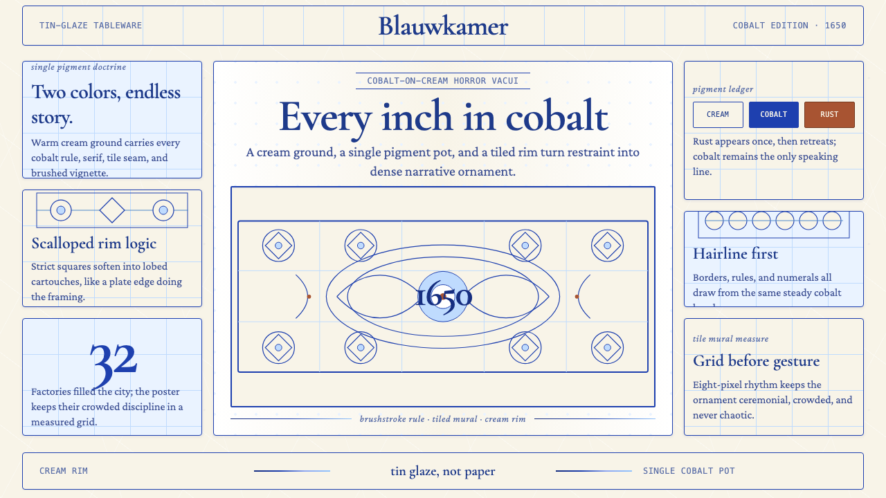 Delft Blue PotteryRestrained, yet every inch speaks. Cobalt hairlines crowd a cream tile grid.克制却寸土必描。钴蓝细线铺满米白瓷砖网格。
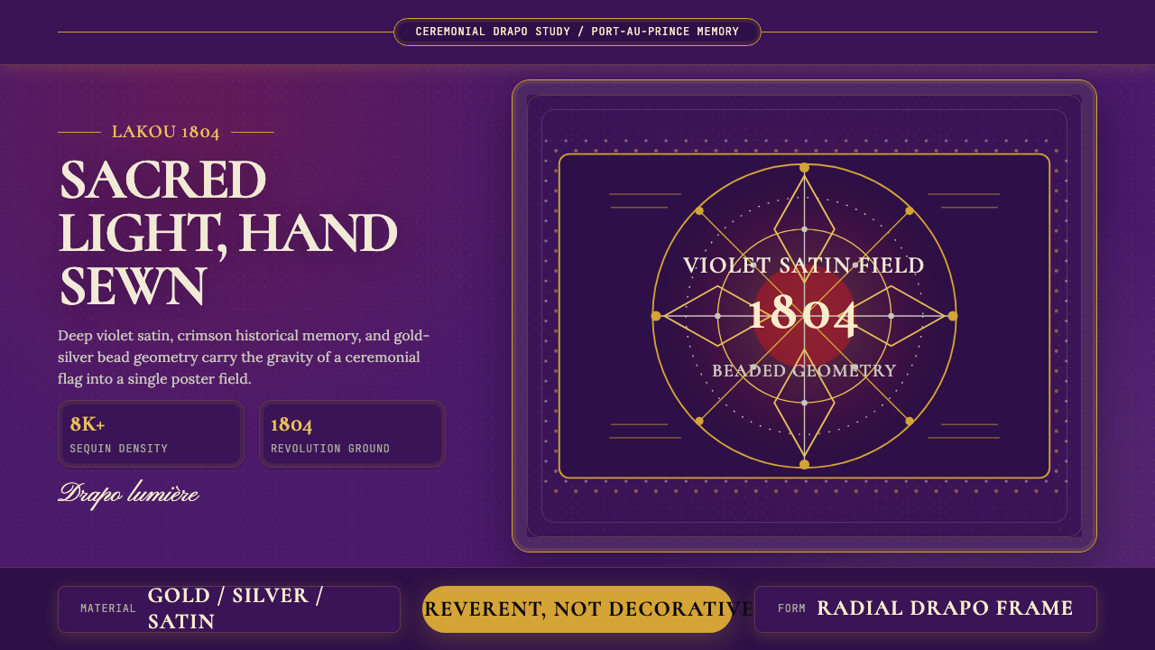 Haitian Vèvè Sequin Drapo 1804Sacred density. Violet satin, gold sequins, and radial geometry hold 1804 gra…神圣而厚重:紫缎、金色亮片与放射几何承载1804的庄严。
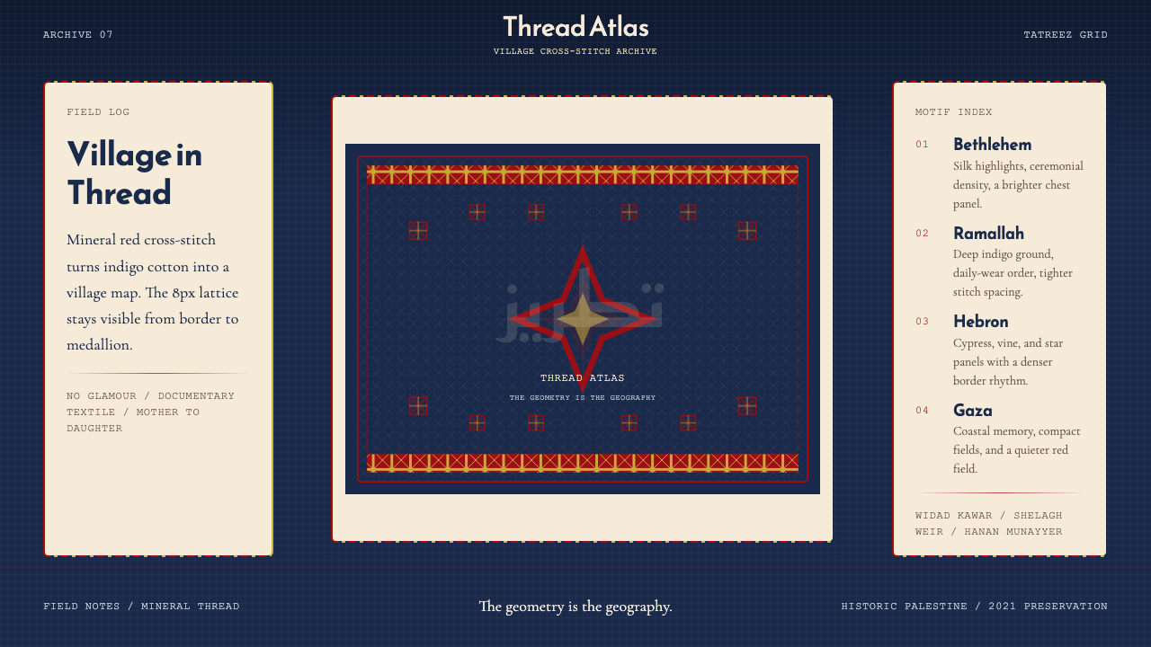 Palestinian Tatreez Cross-StitchMemory in thread. Red cross-stitch on indigo cotton, built on an 8px grid.记忆被线缝住。红绣靛蓝布,8px网格作骨架。
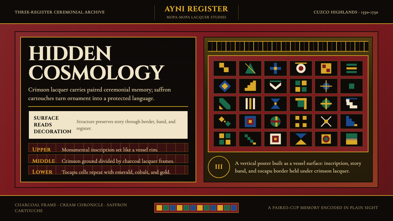 Peruvian Quechua Keros (Andean Cup)Hidden cosmology glows. Crimson lacquer and saffron tocapu grids frame the st…隐秘宇宙观发光。深红漆底与藏红金托卡普格纹框住叙事。
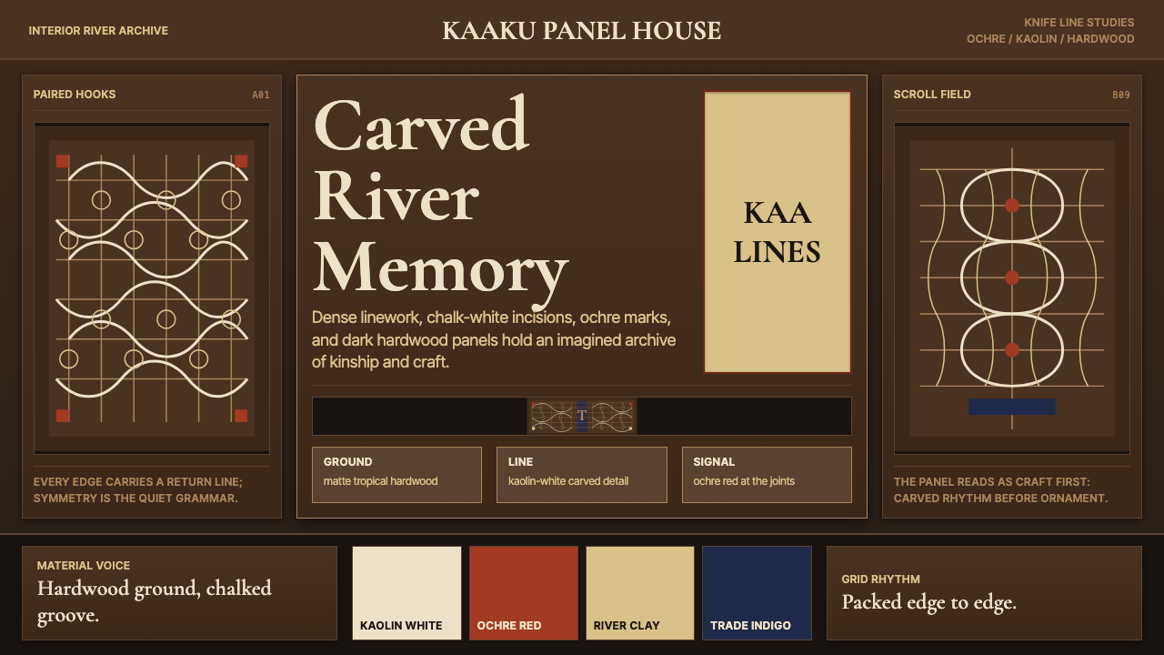 Suriname Maroon TembeDense memory, carved in rhythm. Kaolin lines cross hardwood brown in bilatera…记忆密实如刻。高岭土白线在硬木棕上对称交织。
 Arnhem X-Ray Bark PaintingShimmers without gloss. Ochre rarrk lines vibrate on dark stringybark.无光泽却闪烁:赭色rarrk线在深树皮底上振动。