Design style guide设计风格指南
What is Peruvian Quechua Keros (Andean Cup)?什么是 Peruvian Quechua Keros (Andean Cup)?
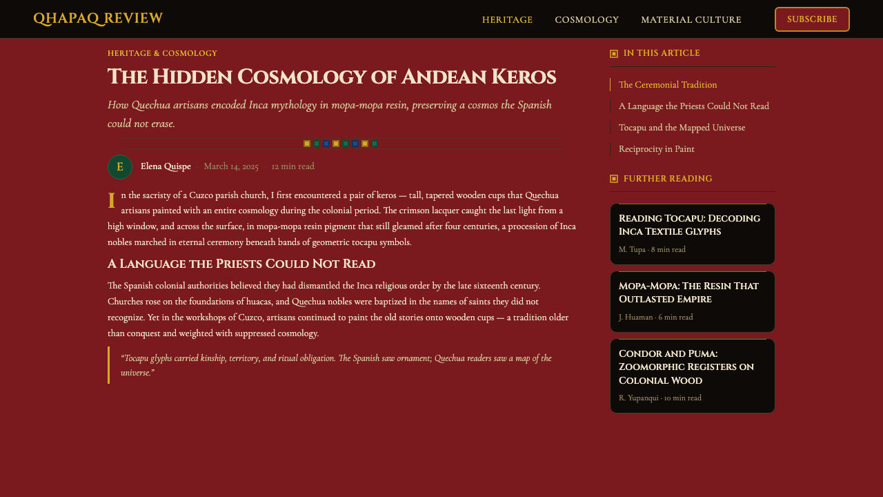
Quechua kero cups carried a hidden universe — crimson lacquer, saffron geometric bands, and sacred processions that colonial rulers mistook for mere decoration.克丘亚凯罗杯藏着一个隐秘宇宙——深红漆底、藏红花几何边带,以及殖民者误以为只是装饰的神圣游行图景。
Peruvian Quechua Keros (Andean Cup) in briefPeruvian Quechua Keros (Andean Cup) 速览
Peruvian Quechua Keros (Andean Cup) is a design system rooted in the painted wooden ceremonial vessels of the Quechua-speaking Andes. Known as keros, these cups were used to share chicha — a fermented maize beer central to Inca ritual life — during ceremonies that reinforced social bonds, honored ancestors, and communicated cosmological order. Their painted surfaces are among the most visually sophisticated objects to survive the colonial encounter in the Americas.秘鲁克丘亚凯罗杯(安第斯仪式杯)是一套源自安第斯克丘亚语区彩绘木质礼器的设计体系。凯罗杯用于在仪式中共享奇查酒——一种在印加礼仪生活中居于核心地位的发酵玉米酒——这些仪式强化社会纽带、祭祀祖先、传达宇宙秩序。其彩绘表面是整个美洲殖民接触中保存下来的视觉上最为复杂精妙的器物之一。
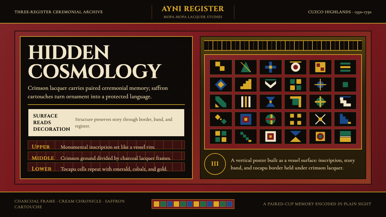
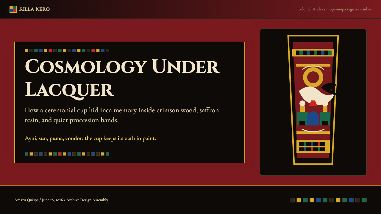
The visual language of the kero is built on three compositional registers stacked vertically around the cup body. The uppermost band carries interlocking geometric cartouches called tocapu — small, precisely bounded fields containing abstract symbols that functioned as a kind of visual vocabulary in Inca society. The middle register opens into narrative figuration: pumas, condors, solar discs, and processions of Inca nobles rendered in saturated mineral and resin pigments. The lowest band returns to geometric rhythm, anchoring the composition in structured repetition. Together these layers create a visual system that moves between code and image, ornament and meaning.凯罗的视觉语言建立在三个沿杯身垂直叠加的构图区段上。最上方是被称为「托卡普」的连锁几何纹样——精确界定的小框格,每格内含抽象符号,构成印加社会的一套视觉词汇系统。中间区段展开叙事性图像:美洲豹、神鹰、太阳神盘面,以及身着礼服的印加贵族游行队伍,以饱和的矿物与树脂颜料绘制。最下方又回归几何节奏,以结构性重复锚定整体构图。这三层共同构成一套在代码与图像、装饰与意义之间游走的视觉系统。
What distinguishes the kero aesthetic from other pre-Columbian visual traditions is the technique introduced during the colonial period: mopa-mopa resin painting. Artisans pressed thin layers of pigmented resin — vivid crimson, deep emerald, warm saffron gold — directly onto the wooden vessel surface, building up color fields of extraordinary vividness and durability. This lacquer-like finish gives kero palettes their characteristic intensity: not the earthy ochres of ceramic traditions, but jewel-saturated hues that read as deliberately chosen and symbolically weighted.凯罗美学区别于其他前哥伦布时期视觉传统的关键,在于殖民时期引入的莫帕莫帕树脂绘画技法。工匠将染色树脂薄层——鲜艳深红、深邃翠绿、温暖藏红花金——直接压附于木质器身,堆叠出色彩极度鲜明且耐久的色域。这种近似漆器的表面赋予凯罗色板其标志性的浓烈强度:不是陶器传统中的赭土色系,而是宝石般饱和的色调——经过刻意选择、承载象征分量。
Where does Peruvian Quechua Keros (Andean Cup) come from?Peruvian Quechua Keros (Andean Cup) 从何而来?
The kero tradition stretches back into the pre-Inca Andean past, with wooden and ceramic vessels used in ceremonial drinking across multiple highland cultures for centuries before the Inca expansion. Under the Inca empire (roughly 1438–1532), keros became instruments of statecraft: the Inca ruler would share chicha from paired keros with nobles, military commanders, and regional lords, sealing alliances and obligations through the act of reciprocal drinking. The vessels were produced in the highland cities of the Cuzco region — the imperial capital — and distributed as gifts that carried the prestige of the state.凯罗传统可上溯至前印加时代的安第斯高地,在印加帝国扩张之前数百年间,多个高原文化已以木质和陶质器皿用于仪式性饮酒。在印加帝国时期(约1438—1532年),凯罗成为国家治理的工具:印加统治者以成对的凯罗与贵族、军事将领和地区领主共饮奇查酒,通过互饮行为封印联盟与义务。这些器皿产自库斯科地区——帝国首都——的高原城市,作为礼物分发,承载着国家的威望。
The Spanish conquest of 1532 did not immediately end kero production. Instead, it transformed it. Between approximately 1550 and 1750, Quechua artisans adapted the kero form to new conditions, introducing the mopa-mopa resin-paint technique that enabled far greater chromatic intensity and figurative detail than earlier methods. Colonial-era keros typically added Spanish elements — horses, Christian imagery, European textiles — alongside traditional Andean iconography, creating a syncretic visual language that was legible to colonial authorities as harmless decoration while simultaneously preserving Inca cosmological references for Quechua viewers who knew how to read them. This double-coding made the kero one of the most sophisticated acts of cultural resistance in the colonial Americas.1532年西班牙征服并未立即终结凯罗的生产,而是改变了它的形态。约在1550至1750年间,克丘亚工匠将凯罗形制调适于新的处境,引入莫帕莫帕树脂绘画技法,使色彩浓度与图像细节远超早期技术所能达到的水平。殖民时期的凯罗通常在传统安第斯图像中加入西班牙元素——马匹、基督教图像、欧洲织物纹样——创造出一种混融的视觉语言:在殖民当局眼中不过是无害的装饰,却同时为懂得解读的克丘亚观看者保存了印加宇宙观的参照。这种双重编码使凯罗成为殖民时代美洲最具智识深度的文化抵抗行动之一。
The primary geographic centers of kero production were the highland departments of Cuzco, Apurímac, and Puno in present-day Peru, and the Lake Titicaca basin extending into what is now Bolivia. These high-altitude regions — above three thousand meters — shared a visual culture shaped by the vast, luminous landscape of the altiplano: the deep blue of high-altitude sky, the ochre and crimson of volcanic earth and textile dyes, the gold of morning light across puna grasslands. The kero palette absorbed and concentrated these environmental colors into a deliberately saturated register.凯罗生产的主要地理中心集中在今秘鲁的库斯科、阿普里马克、普诺高原省份,以及延伸至今玻利维亚境内的的喀喀湖盆地。这些海拔三千米以上的高原地区共享着一种被辽阔而明亮的高原景观所塑造的视觉文化:高空的深蓝,火山红土与织物染料的赭红与深红,高原草甸晨光中的金黄。凯罗色板吸纳并浓缩了这些环境色彩,形成刻意饱和的色彩语调。
By the nineteenth century, as museum collecting intensified, keros entered European and North American collections, where they were studied primarily as ethnographic objects. Scholars such as Joanne Pillsbury, Tom Cummins, Lisa Trever, and Verena Liebscher later reframed keros as sophisticated communicative artifacts — design objects encoding political, cosmological, and social meaning through a deliberate visual system. This scholarship transformed how the objects are understood: not as craft curiosities but as evidence of a fully developed visual intelligence operating under conditions of cultural suppression.十九世纪博物馆收藏热兴起后,凯罗进入欧美机构,最初主要被作为民族志器物研究。学者乔安·皮尔斯伯里、汤姆·卡明斯、丽萨·特雷弗与维雷纳·利布舍尔后来将凯罗重新定义为复杂的传播性人工物——通过精密视觉系统编码政治、宇宙论与社会意义的设计对象。这一学术转向改变了世界对这些器物的理解:它们不再是工艺奇物,而是在文化压制条件下运作的完整视觉智性的见证。
What defines the Peruvian Quechua Keros (Andean Cup) look?Peruvian Quechua Keros (Andean Cup) 的视觉特征是什么?
Palette色板
The kero palette centers on three dominant hues: a deep lacquered crimson that saturates the ground, a warm saffron-gold that outlines and fills the tocapu geometric cartouches, and a cool emerald that fills figural elements. Charcoal and near-black anchor the darkest tones, functioning as both outline and shadow. The palette is high in saturation and low in lightness — jewel-toned rather than pastel, ceremonial rather than decorative. These are colors chosen to be read at a distance and to survive centuries of use.凯罗色板以三种主导色调为核心:饱和底面的深红漆色、勾勒并填充托卡普几何纹样的温暖藏红花金,以及填充人物与动物图像的冷翠绿。炭色与近黑锚定最深的色调,同时充当轮廓与阴影。整体色板饱和度高、明度低——是宝石色调而非粉彩,是礼仪性的而非装饰性的。这些颜色被选择用于在远处清晰可读,并经受数百年的使用而不褪色。
Three-Register Composition三段式构图
Every kero surface is organized into three horizontal zones: a geometric header band of tocapu cartouches, a narrative middle field of figures and scenes, and a geometric footer band that mirrors or complements the header. This tripartite structure is non-negotiable — it is the compositional grammar of the form. In design terms, it provides a hierarchy of reading: the eye enters through the geometric framework, moves to the figural narrative, and exits through grounding geometry. The structure also encodes cosmological meaning, with the vertical axis of a cup corresponding to levels of the Andean world.每只凯罗的表面都被组织成三个水平区段:上方是由托卡普纹样组成的几何带、中间是人物与场景的叙事图像带,以及与上方呼应或互补的几何底带。这种三段式结构是不可省略的——它是这一形制的构图语法。从设计角度看,它提供了清晰的阅读层级:视线从几何框架进入,移向图像叙事,再经由基底几何退出。这一结构同时承载着宇宙论意义,杯身的垂直轴线对应安第斯世界观中的宇宙层级。
Tocapu Geometry托卡普几何
Tocapu are the small, precisely bounded geometric fields that appear in the border bands and occasionally within the figural register. Each tocapu unit is a self-contained rectangle or square containing a pattern — stepped frets, hourglass forms, interlocking diamonds, zigzag chevrons — rendered with sharp-edged precision. The tocapu bands repeat these units in rhythmic sequence, creating a visual cadence similar to a typographic border or a musical motif. Scholars believe individual tocapu functioned as meaningful units within a broader visual code, analogous to heraldic badges or calendar signs.托卡普是出现在边框带(偶尔也进入图像区段)中的精确界定的小型几何框格。每个托卡普单元是一个自足的矩形或方形,内含一种图案——阶梯形回纹、沙漏形、交锁菱形、锯齿箭纹——以锐利的精确度绘制。托卡普带将这些单元以节律性序列重复排布,形成类似排版边框或音乐动机的视觉韵律。学者认为个别托卡普在更广泛的视觉代码体系中充当有意义的单元,类似于纹章徽记或历法符号。
Figural Narrative图像叙事
The middle register of a kero presents figures in profile or three-quarter view against the crimson ground: Inca nobles carrying offerings, pumas and condors as sacred animals, solar discs flanked by rays, and — in colonial-era keros — Spanish horsemen integrated into processional scenes. Figures are rendered with confident, flat outlines filled with solid color fields. There is no modeling or shading; depth is suggested by vertical stacking of figures rather than perspective recession. The result is a visual register that reads simultaneously as illustration and as heraldic symbol.凯罗中段呈现在深红底上的侧面或四分之三视角人物:手持贡品的印加贵族、作为神圣动物的美洲豹与神鹰、被光芒环绕的太阳神盘面,以及在殖民时期凯罗中融入游行场景的西班牙骑士。人物以自信的平面轮廓线绘制,内部填充实色。没有体积塑造或明暗,深度感通过人物的垂直叠置而非透视退缩来暗示。所呈现的图像区段,同时以插画与纹章符号的双重身份被读取。
Lacquer Intensity漆面强度
The mopa-mopa resin technique produces a surface quality unlike any other pre-modern painting tradition. Color fields are perfectly flat, with razor-sharp edges between hues and no visible brushwork or texture. The resin layers build depth without translucency — colors appear to glow from within rather than reflect light from the surface. This intensity is not about decoration; it is about legibility and durability. Kero pigments were designed to remain vivid after centuries of handling and outdoor ceremonial use. In digital design terms, the equivalent would be colors at maximum achievable vividness on the display medium.莫帕莫帕树脂技法产生了一种有别于任何其他前现代绘画传统的表面品质。色域完全平整,色与色之间边界锐利,没有可见的笔触或纹理。树脂层堆叠出深度感而不产生透明感——颜色仿佛从内部发光,而非从表面反射光线。这种强度不是为了装饰,而是为了可读性与耐久性。凯罗颜料的设计目标是在经历数百年的手持使用与户外仪式后仍保持鲜艳。在数字设计语境中,等价的表达是在所用显示介质上实现最大可达的鲜明度。
Bilateral Symmetry within the Register区段内的双侧对称
While the three-register structure provides vertical hierarchy, the composition within each register typically follows a bilateral symmetry organized around a central axis — a solar disc, a central figure, or a heraldic animal. This central axis is not a mirror: the flanking elements may be slightly varied, as in heraldic compositions where paired animals face each other with minor differences. The symmetry creates ceremonial weight and visual stillness even within a highly saturated, active palette. It is symmetry used as ritual form, not as mechanical balance.三段式结构提供垂直层级,而每个区段内部的构图通常围绕一条中心轴线呈现双侧对称——以太阳神盘、中央人物或纹章动物为轴。这条中心轴并非严格镜像:两侧元素可能略有差异,如纹章构图中成对动物相向而立但细节各异。即便在高度饱和、色调活跃的色板中,这种对称也创造出仪式性分量与视觉静止感。这是作为礼仪形式而使用的对称,而非机械性的平衡。
Dark Ground Logic深色底面逻辑
The deep crimson ground is not a neutral background — it is an active field that gives warm luminosity to the saffron gold and makes the cool emerald vibrate by contrast. Figures are read against this charged ground rather than on top of a neutral white. Dark-ground composition is relatively rare in Western design traditions but is natural to the kero, where the lacquered vessel body itself functions as the ground. Working with a dark ground requires thinking about which colors advance (warm saffron, bright gold) and which recede (deep emerald) rather than relying on light-ground contrast norms.深红底面不是中性背景——它是一个主动的色场,赋予藏红花金以温暖的发光感,并通过对比使冷翠绿产生振动。人物在这个充满张力的底面上被阅读,而非被放置于中性白底之上。深色底面构图在西方设计传统中相对罕见,对凯罗而言却是自然的——漆面杯身本身就充当底面。使用深色底面需要思考哪些颜色前进(暖藏红花金、明亮金黄)、哪些退缩(深翠绿),而非依赖浅色底面的对比规范。
Who shaped Peruvian Quechua Keros (Andean Cup)?谁塑造了 Peruvian Quechua Keros (Andean Cup)?
Pillsbury is a leading art historian of the pre-Columbian Andes whose research fundamentally reshaped scholarly understanding of keros as political and communicative objects rather than ethnographic curiosities. Her work on Inca material culture, conducted across major museum collections in the Americas and Europe, established the frameworks through which kero iconography is now systematically interpreted — including the relationship between tocapu patterning, state identity, and ceremonial drinking as a form of political theater.皮尔斯伯里是前哥伦布时期安第斯艺术史领域的权威学者,其研究从根本上重塑了学界对凯罗的理解——将其视为政治性与传播性器物,而非民族志奇物。她在美洲与欧洲各大博物馆馆藏中展开的印加物质文化研究,建立了当今系统解读凯罗图像学的基本框架,包括托卡普纹样、国家身份认同与仪式性饮酒作为政治剧场之间的关系。
Cummins brought the tools of art history and visual semiotics to the analysis of Andean objects, arguing in landmark scholarship that keros should be understood as part of a broader Andean visual language that operated independently of alphabetic writing. His work on colonial-era keros demonstrated the sophistication of the double-coding strategy — how Quechua artisans embedded Inca iconographic meaning within surface elements that colonial administrators read as purely decorative. His research transformed keros from historical artifacts into design documents.卡明斯将艺术史与视觉符号学的工具引入安第斯器物研究,在其里程碑式的著作中主张:凯罗应被理解为一套独立于拼音书写运作的更广泛安第斯视觉语言的组成部分。他对殖民时期凯罗的研究揭示了双重编码策略的复杂性——克丘亚工匠如何将印加图像学意义嵌入殖民管理者视之为纯粹装饰的表面元素之中。他的研究将凯罗从历史文物转变为设计文献。
Trever's scholarship bridges pre-Columbian and colonial Andean art, with particular attention to the materiality of image-making and the ways Andean artists negotiated between indigenous visual traditions and the demands of colonial representation. Her work on the relationship between surface, pigment, and meaning in Andean objects — including keros — provides critical tools for understanding why the mopa-mopa resin technique was adopted and what it enabled beyond purely technical capability.特雷弗的学术研究跨越前哥伦布时期与殖民时代的安第斯艺术,尤其关注图像制作的物质性,以及安第斯艺术家如何在本土视觉传统与殖民再现要求之间进行协商。她对安第斯器物(包括凯罗)中表面、颜料与意义之间关系的研究,为理解莫帕莫帕树脂技法为何被采用、以及它在纯技术能力之外所开启的可能性提供了关键工具。
Liebscher contributed systematic iconographic analysis of colonial-era kero imagery, cataloguing the recurring motifs — the Inca procession scenes, the puma and condor symbols, the tocapu systems — and tracing their transformations under colonial pressure. Her work is particularly valuable for design practitioners because it documents the compositional logic of the kero surface as a system: how elements are sequenced, how registers interact, and how the overall visual program encodes layered meaning.利布舍尔对殖民时期凯罗图像进行了系统性的图像志分析,整理了反复出现的母题——印加游行场景、美洲豹与神鹰符号、托卡普系统——并追踪了它们在殖民压力下的演变。她的研究对设计从业者尤为宝贵,因为它将凯罗表面的构图逻辑作为一个系统加以记录:元素如何排序、区段如何互动,以及整体视觉程序如何编码多层意义。
How do you use Peruvian Quechua Keros (Andean Cup) today?今天怎么用 Peruvian Quechua Keros (Andean Cup)?
The kero visual system translates into contemporary design through three core moves: leading with a deep saturated ground rather than a neutral background, organizing content into clearly delineated horizontal registers, and using a small high-saturation palette — warm gold, cool emerald, deep crimson — with deliberate symbolic intent. The style rewards contexts where richness, cultural depth, and ceremonial weight are desired rather than minimalist clarity.凯罗视觉系统通过三个核心操作转化为当代设计:以饱和的深色底面代替中性背景、将内容组织成清晰划定的水平区段、并以小型高饱和色板——暖金、冷翠绿、深红——进行具有明确象征意图的运用。这种风格适合需要丰富感、文化深度与仪式分量、而非极简清晰的设计场景。
For presentation slides, the kero approach is most effective when used at the register level. A cover slide works as a kero surface in miniature: a deep crimson or near-black ground carries a central emblem or title in warm gold, with a horizontal tocapu-like geometric band at top and bottom to frame the composition. Content slides benefit from the three-register model applied at scale — a narrow header strip in a geometric pattern, the main content in the central field, and a footer strip with category or pagination. Data slides take on ritual weight when chart elements are colored in the kero palette: gold bars on a dark ground, emerald comparison lines, crimson highlights for key values.在演示文稿中,凯罗方法在区段层面最为有效。封面页可被作为微型凯罗表面来构思:深红或近黑底面承载温暖金色的中央徽记或标题,顶部与底部各有一条水平托卡普式几何带框住构图。内容页受益于按比例应用的三段式模型——顶部窄几何图案带、中间主体内容区段、底部带有类别或页码的底带。当图表元素采用凯罗色板时,数据页呈现出仪式性分量:深底上的金色柱条、翠绿比较线、深红关键值高亮。
For web interfaces and dashboards, kero logic suggests dark-ground compositions where the ground itself carries visual charge. Sidebar navigation works well as a tocapu band — a sequence of vertically stacked, geometrically bordered items in warm gold against deep crimson or charcoal. Card components should emphasize contained color fields rather than soft shadows; sharp-edged and flat, with each card acting as a bounded register. Pricing pages benefit from tier differentiation using the palette's natural hierarchy: a warm gold card for the featured tier, a deep crimson accent for urgency, emerald for confirmation states.对于网页界面与仪表板,凯罗逻辑引向深色底面构图——底面本身承载视觉张力。侧边导航可作为托卡普带运作——在深红或炭色底面上,以暖金呈现垂直叠置、几何边框分隔的导航项序列。卡片组件应强调界定清晰的色域,而非柔和阴影;边缘锐利、色域平整,每张卡片作为一个有边界的区段。定价页受益于利用色板天然层级进行套餐区分:暖金卡片用于推荐套餐、深红强调用于紧迫感、翠绿用于确认状态。
For editorial and marketing work, the kero style lends itself to cover imagery and section breaks that feel both ancient and contemporary. A full-bleed dark ground with a central geometric emblem in gold immediately references kero compositional grammar without literal quotation. Section headers can use a narrow horizontal band of tocapu-like geometric pattern to divide content registers — a device that creates visual continuity without repeating a single motif. Marketing copy should be set in high contrast against the dark ground, using scale and weight to establish hierarchy rather than color variation within the text.对于编辑与营销内容,凯罗风格适合封面图像与章节分隔,呈现出既古老又当代的感觉。全出血深色底面配以金色中央几何徽记,立即引用了凯罗构图语法而不落入字面引用。章节标题可使用一条窄水平托卡普式几何图案带分隔内容区段——这是一种在不重复单一母题的前提下建立视觉连续性的手法。营销文字应在深色底面上以高对比度呈现,用字号与字重建立层级,而非在文字内部使用色彩变化。
A common mistake is treating the kero palette as a warm, earthy, or folkloric aesthetic — adding organic textures, brushstroke effects, or terracotta tones that flatten the palette's jewel-like intensity into something closer to artisanal craft. The authentic register is the opposite: lapidary precision, flat color fields, razor-sharp geometric edges. Another frequent error is overloading the figural zone with too many narrative elements, which destroys the register logic that gives kero composition its ceremonial stillness. The discipline of the three-register structure — geometry, narrative, geometry — is what separates kero-informed design from generic Andean pastiche.一个常见错误是将凯罗色板视为温暖、质朴或民俗风格的美学——加入有机纹理、笔触效果或赤陶色调,将色板的宝石般强度压平为更接近手工艺品的质感。真实的表达恰恰相反:宝石雕刻式的精确、平整色域、锐利的几何边界。另一个常见错误是在图像区段中堆砌过多叙事元素,这会破坏赋予凯罗构图仪式静止感的区段逻辑。三段式结构——几何、叙事、几何——的纪律,正是区隔凯罗启发式设计与泛安第斯风格仿制品的关键所在。
Peruvian Quechua Keros (Andean Cup) — FAQPeruvian Quechua Keros (Andean Cup) · 常见问题
Is this style only appropriate for projects with a Latin American or indigenous cultural focus?这种风格只适合具有拉丁美洲或原住民文化主题的项目吗?
Not necessarily. The kero visual system is distinctive enough that it carries cultural associations, and designers should be thoughtful about context. But the core principles — dark saturated grounds, horizontal register composition, high-intensity geometric banding, a small jewel-toned palette — are structural devices that can be applied abstractly without literal cultural quotation. The risk of inappropriate borrowing is higher when figurative kero iconography (pumas, condors, specific tocapu motifs) is used decoratively without understanding. The geometric and compositional logic transfers more freely.不一定。凯罗视觉系统具有足够鲜明的文化关联性,设计师应当审慎考量使用语境。但其核心原则——深色饱和底面、水平区段构图、高强度几何带、小型宝石色调色板——是可以抽象应用的结构性手法,无需字面上的文化引用。当凯罗的具象图像学(美洲豹、神鹰、特定托卡普纹样)在不求理解的情况下被装饰性使用时,不当借用的风险更高。几何与构图逻辑则具有更自由的可移植性。
How does the kero palette differ from other Andean or Latin American design traditions?凯罗色板与其他安第斯或拉丁美洲设计传统有何不同?
The kero palette is distinguished by its lacquer-like intensity and its dark ground. Many Andean textile traditions use similarly saturated hues — the warp-faced weaving of Cusco or the island communities of Lake Titicaca employs vivid reds, greens, and golds — but typically on lighter grounds. The mopa-mopa resin technique gives the kero palette its particular depth: colors that appear to glow from within rather than reflect ambient light. Mexican pre-Columbian traditions like Mixtec codex painting also use saturated, dark-ground compositions, but the figurative style and geometric vocabulary are entirely distinct. The kero stands apart as a lacquer tradition with a ceremonial register quite different from textile or ceramic color systems.凯罗色板以其漆器般的强度与深色底面为特征。许多安第斯纺织传统也使用类似饱和度的色调——库斯科或的的喀喀湖岛屿社区的经面编织使用鲜亮的红、绿、金——但通常铺设于较浅的底面上。莫帕莫帕树脂技法赋予凯罗色板其独特深度:颜色仿佛从内部发光,而非反射环境光。墨西哥前哥伦布时期传统如米斯特克手抄本绘画也使用饱和的深色底面构图,但图像风格与几何词汇截然不同。凯罗作为漆器传统,其仪式性表达区别于纺织品或陶器色彩系统,自成一格。
Can the kero style work in a light-ground, white-background digital context?凯罗风格能在浅色底面、白色背景的数字设计场景中使用吗?
With significant adjustment, yes — but the inversion changes the style's fundamental character. On a light ground, the palette reads as warm and richly decorative rather than as luminously saturated and ceremonially weighty. If working light-ground, the three-register compositional structure remains the most useful element to preserve: geometric banding at top and bottom, narrative content in the center. The saffron gold becomes the primary accent against white, and the crimson serves as a secondary emphasis. Emerald works as a third accent. The result is warmer and more approachable but loses the jewel-box intensity that makes the dark-ground version so distinctive.经过较大幅度的调整是可行的——但这种反转改变了风格的基本性格。在浅色底面上,色板呈现的是温暖而富于装饰感,而非发光般饱和与仪式性厚重。若使用浅色底面,三段式构图结构仍是最值得保留的元素:顶底几何带,中间叙事内容。藏红花金成为白底上的主强调色,深红充当次要强调,翠绿作为第三强调色使用。结果是更温暖、更易于亲近,但失去了深色底面版本那种珠宝盒般的强度——正是这种强度让原版如此与众不同。
What is the difference between tocapu geometry and generic geometric pattern?托卡普几何与一般几何图案有何区别?
Tocapu units are self-contained, bounded fields — each geometric motif occupies its own clearly delimited rectangle or square, separated from its neighbors by a visible frame or edge. They are not flowing tessellations or continuous repeat patterns in the sense of Moorish tile or Art Nouveau surface design. The containment is the distinguishing feature: each unit is discrete, complete, and potentially meaningful in isolation. In practical design terms, this means tocapu-inspired geometric bands function more like a sequence of distinct emblems or badges than like a repeating wallpaper pattern. The visual rhythm comes from repetition of units rather than from the continuity of a single flowing motif.托卡普单元是自足的、有边界的框格——每个几何母题占据其各自清晰划定的矩形或方形,与相邻单元以可见边框或边线分隔。它们不是连续的密铺图案,也不是摩尔式磁砖或新艺术风格表面设计意义上的流动重复纹样。界定性是其鉴别特征:每个单元是独立的、完整的,在孤立状态下也可能具有意义。在实际设计中,这意味着托卡普启发式几何带的功能更像是一组独立徽记或标识的序列,而非重复的壁纸图案。视觉节律来自单元的重复,而非单一流动母题的连续性。
How should the double-register geometric banding be handled at small sizes or on mobile screens?三段式构图中的几何带在小尺寸或移动端屏幕上应如何处理?
At small sizes, the tocapu geometric band should be simplified — the level of detail that reads clearly at desktop scale becomes visual noise at mobile dimensions. The most effective approach is to use a single color stripe of consistent height as a stand-in for the detailed geometric band, preserving the compositional rhythm of header-content-footer without requiring the internal patterning to be legible. Alternatively, a single repeating motif at a larger scale — one geometric unit spanning the full band height — can substitute for the densely packed tocapu sequence. The register structure itself is the semantically important element; the internal detail of the geometric bands is secondary and can scale down gracefully.在小尺寸下,托卡普几何带应当简化——在桌面尺寸清晰可读的细节层次,在移动端尺寸会变成视觉噪音。最有效的方法是用一条高度一致的单色条带替代精细的几何带,在不要求内部纹样可读的前提下保留「标题—内容—页脚」的构图节律。另一种方案是以更大的尺度使用单一重复母题——一个几何单元横跨整条带高——替代密集排布的托卡普序列。区段结构本身是语义上重要的元素;几何带的内部细节是次要的,可以优雅地缩减。
Related design styles相关设计风格
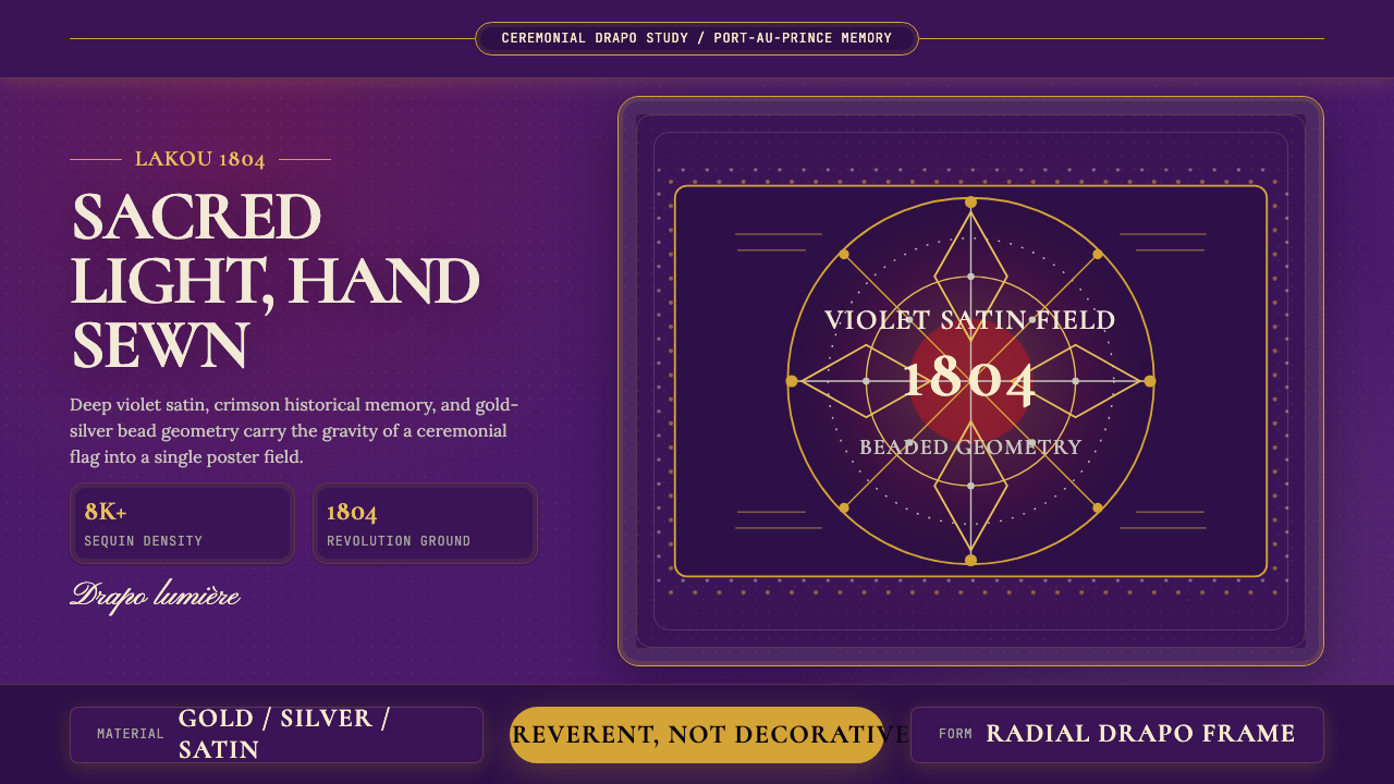 Haitian Vèvè Sequin Drapo 1804Sacred density. Violet satin, gold sequins, and radial geometry hold 1804 gra…神圣而厚重:紫缎、金色亮片与放射几何承载1804的庄严。
 Paracas Andean TextileAncestral and exact. Jewel tones repeat on deep cobalt in strict 90° turns.古老而精确:宝石色在深钴蓝底上按90°旋转重复。
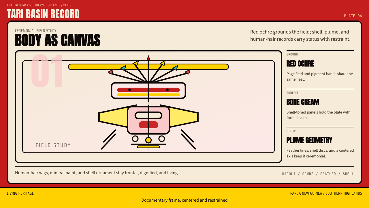 PNG Huli WigmanBody as ceremony. Red ochre, cream bone, and feathered geometry hold a fronta…身体即仪式。红赭石、骨白与羽状几何托起正面肖像。
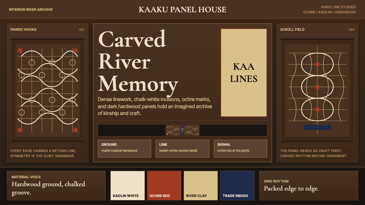 Suriname Maroon TembeDense memory, carved in rhythm. Kaolin lines cross hardwood brown in bilatera…记忆密实如刻。高岭土白线在硬木棕上对称交织。
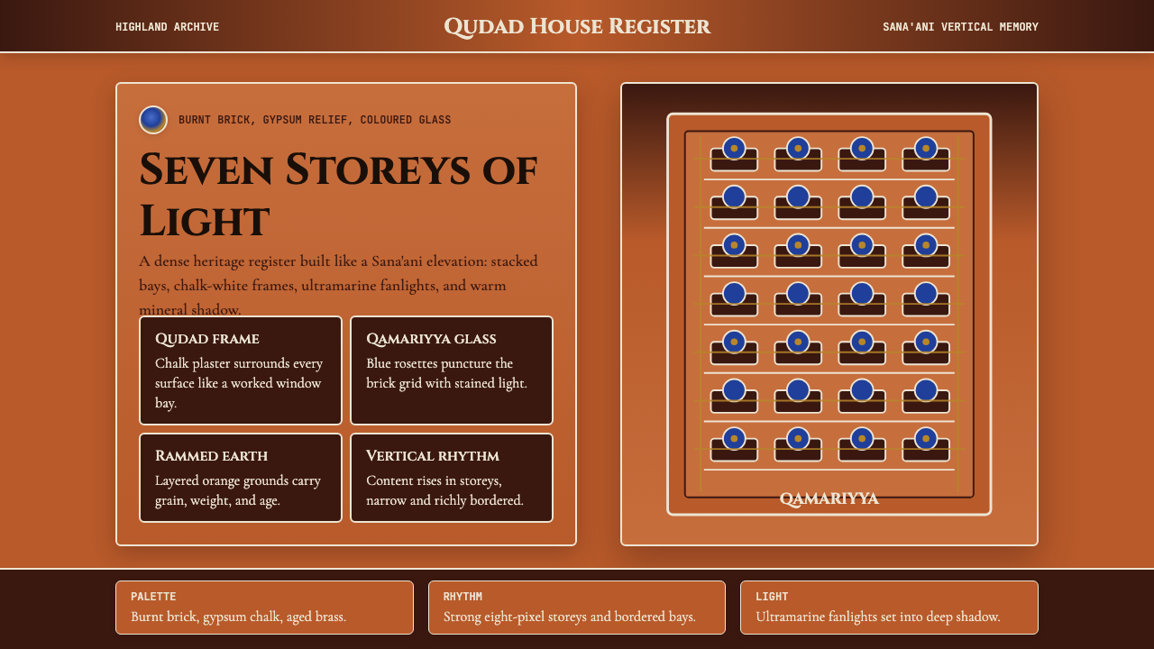 Yemeni Sana'a Old City Tower-HouseVertical memory, densely framed. Brick orange, gypsum white, and blue rosette…垂直记忆被密集镶框:砖橙、石膏白与蓝色花窗层层上升。
 Central African Azande ThroneDense court gravity. Dark wood grids, brass dots, and court red cover every s…宫廷感厚重:深木网格、黄铜点阵与宫廷红铺满表面。