Design style guide设计风格指南
What is Yemeni Sana'a Old City Tower-House?什么是 Yemeni Sana'a Old City Tower-House?
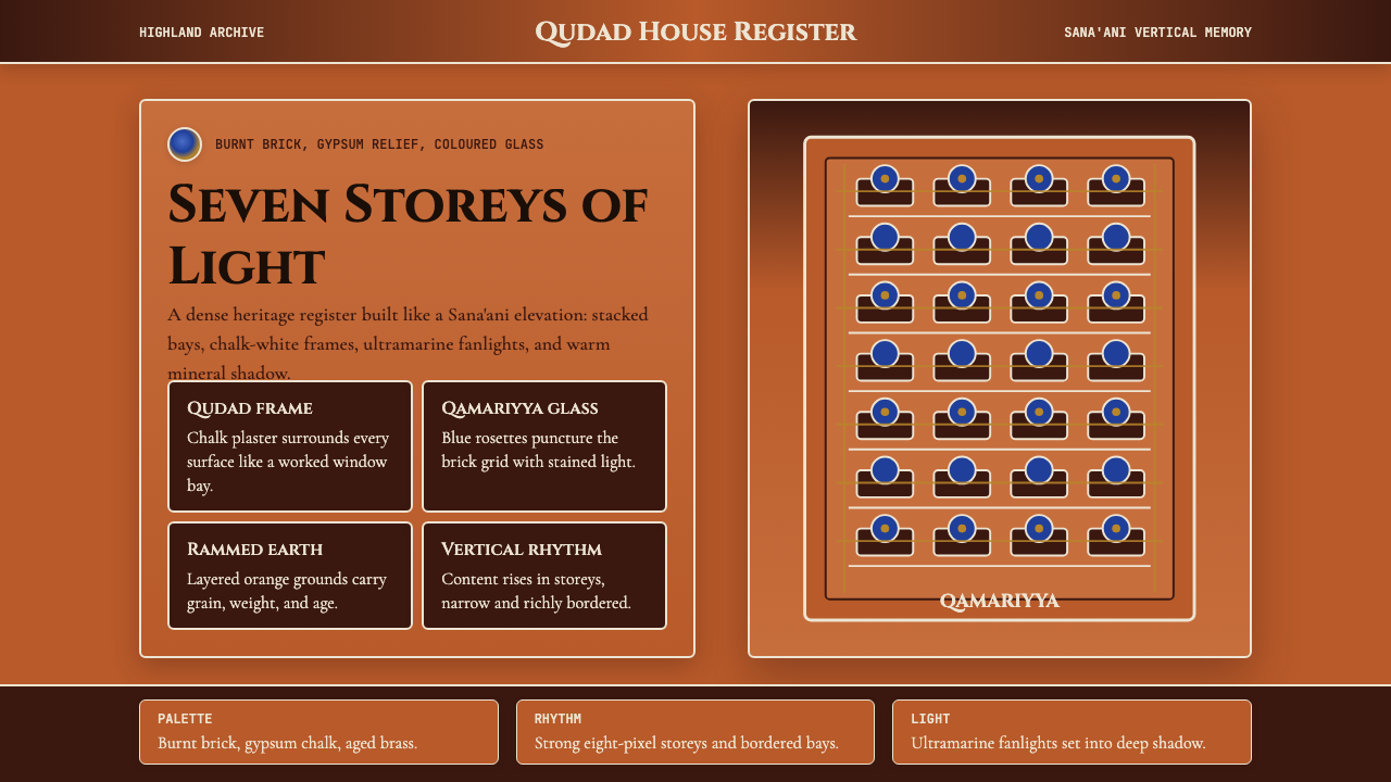
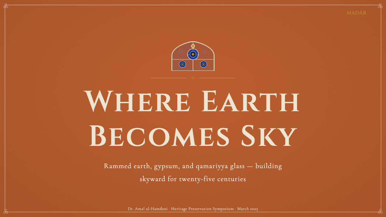
Seven storeys of rammed earth, white gypsum crowns, and jewel-toned stained-glass fanlights — Sana'a's tower-house tradition is one of the world's most exuberant vertical architectures, compressed into a mineral palette that reads as both ancient and startlingly vivid.七层夯土、白石膏勾勒的窗眉、宝石色的彩玻璃天窗——萨那塔楼民居传统是世界上最热烈的垂直建筑之一,凝练成一套矿物色彩,既古老厚重又令人震惊地鲜活。
Yemeni Sana'a Old City Tower-House in briefYemeni Sana'a Old City Tower-House 速览
The Yemeni Sana'a Old City Tower-House style is a design language rooted in the vernacular architecture of one of the world's oldest continuously inhabited cities. It draws on the visual vocabulary of multi-storey rammed-earth and burnt-brick tower houses whose facades are articulated by white gypsum friezes, geometric stucco relief bands, and the glowing colour-washed light of qamariyya — semicircular or rectangular fanlights filled with coloured glass set in geometric tracery. The overall effect is densely layered, richly textured, and unabashedly ornate, yet the ornament is never arbitrary: every framing line, every white gypsum eyebrow above a window, every rosette of coloured glass performs a structural or climatic role as well as an aesthetic one.也门萨那老城塔楼民居风格,是植根于世界上持续居住最久城市之一的民间建筑语言。它汲取的视觉词汇来自多层夯土与烧砖塔楼——其立面由白色石膏(qudad)楣带、几何灰泥浮雕线脚,以及qamariyya(彩色玻璃天窗)的温暖光晕共同组成。Qamariyya是半圆形或矩形的扇形高窗,内填以铅条分割的几何彩色玻璃,将晨光折散成蓝红交叠的花纹投在石地板上。整体效果层层叠叠、质感丰富、繁复华丽,但装饰从不任意妄为——每一道框线、每一道窗上的白石膏眉板、每一朵彩色玻璃花窗,都同时承担着结构性或气候性的功能,而非单纯的审美点缀。
At its core, the style is built around a saturated mineral palette — fired-brick orange, chalky qudad lime-plaster white, deep qamariyya blue, and the warm amber of polished stone floors — applied to surfaces that are deliberately imperfect. Grain, texture, and the trace of the craftsman's hand are not flaws to be smoothed away but the medium's essential character. Digital interpretations of this style honour that principle by treating texture as a foreground element rather than a background noise, layering warm tonal variation across surfaces that might otherwise flatten into uniform fills.这套风格的核心是一组饱和的矿物色彩:烧砖橙、石灰粉笔白(qudad)、qamariyya深蓝,以及抛光石地板的暖琥珀色。这些颜色被施加于刻意保留不完美感的表面——夯土的颗粒、石灰抹面的粗粝、匠人手工的痕迹,都不是需要抹平的瑕疵,而是材料本质的表达。这套风格的数字化演绎尊重这一原则:将肌理作为前景元素而非背景噪声来处理,在可能变成均质平涂的表面上叠加温暖的色调变化。
Unlike austerity-driven minimalist traditions, Sana'a tower-house aesthetics embrace the decorated surface as an act of cultural memory. Each building's facade is a vertical autobiography of the city's craft traditions: the qudad lime-plaster work, the carved stucco, the leaded qamariyya glass. A design system inspired by this tradition is fundamentally rich and additive — it works by accumulation and precision rather than by subtraction.与追求极度简约的设计传统不同,萨那塔楼民居美学把装饰表面视为一种文化记忆的行为。每栋建筑的立面都是城市手工艺传统的垂直自传:qudad石灰抹面工艺、雕刻灰泥、铅条彩色玻璃。受这一传统启发的设计体系,在本质上是丰富且累加的——它通过积累与精确来运作,而非通过削减。
Where does Yemeni Sana'a Old City Tower-House come from?Yemeni Sana'a Old City Tower-House 从何而来?
Sana'a is one of the highest capital cities in the world, perched on a plateau more than two thousand metres above sea level in the Yemeni highlands. The Old City — a walled urban fabric of tower houses, mosques, hammams, and souqs — has been inhabited for at least two and a half millennia. The tower-house typology that defines its skyline emerged gradually over centuries as a response to the particular demands of the site: the need to maximise living space on limited urban plots, the requirement to manage the sharp temperature swings of a high-altitude desert climate, and the social custom of stacking different family activities across distinct vertical floors. The qamariyya stained-glass fanlights are not merely decorative; they admit diffused coloured light while filtering the intense highland sun, creating interior environments that are luminous without being harsh.萨那是世界上海拔最高的首都城市之一,坐落于也门高原海拔两千余米的台地之上。老城——由塔楼民居、清真寺、浴室(hammam)与集市(souq)构成的有墙城市肌理——已有至少两千五百年的持续居住历史。定义其天际线的塔楼民居类型,是数百年间对特定场地需求的逐渐回应:在有限的城市地块上最大化居住面积,应对高原沙漠气候昼夜温差悬殊的挑战,以及将不同家庭活动分层垂直安排的社会习俗。Qamariyya彩色玻璃天窗绝非纯装饰——它们在引入漫射彩色光线的同时过滤强烈的高原阳光,创造出明亮而不刺眼的室内环境。
The construction tradition of Sana'a relies on locally sourced materials processed by generations of specialised craftsmen. Rammed earth and unfired mud brick form the structural mass; a fired-brick skin, made from the region's distinctive red-orange clay, weathers the exterior. Surfaces are sealed with qudad, a traditional lime plaster derived from calcined limestone and volcanic aggregate that is exceptionally hard, water-resistant, and brilliantly white — a technology refined over centuries and specific to the Yemeni highlands. The white geometric friezes of qudad that band the facades and crown the windows are not applied ornament but an expression of the plaster's own properties: it can be carved, shaped, and polished to a gleam that contrasts sharply with the warm brick beneath. The result is a facade that reads as a dialogue between the warm mineral mass of the earth and the precision of the white gypsum frame.萨那的建造传统依赖本地采集的材料,由世代相传的专业工匠加工处理。夯土与未烧制的土坯砖构成结构主体;外皮则以烧制砖包裹,当地独特的红橙色黏土使其在风化后呈现出饱和的砖橙色调。表面以qudad密封——一种由煅烧石灰石与火山骨料制成的传统石灰抹面,坚硬、防水且洁白,是也门高原特有的几百年精炼技艺。装饰立面、勾勒窗框的白色几何qudad线脚,并非附加的装饰,而是石膏本身特性的自然表达:它可被雕刻、塑形、抛光至光泽,与下面温暖的砖色形成鲜明对比。最终呈现的立面,是大地矿物温度与白色石膏框架精准度之间的对话。
The qamariyya craft has its own long lineage. Coloured glass was imported and traded across the Arabian Peninsula, and skilled glaziers developed local traditions of geometric patterning — stars, hexagons, interlocking arcs — that echo the geometric rigour of Islamic decorative arts more broadly while adapting them to the specific scale and proportions of the fanlight opening. The colours most associated with Sana'a qamariyya are deep ultramarine blue, ruby red, amber yellow, and emerald green, though the chromatic range varies by period and by the patron's resources. By the medieval period, the qamariyya had become a social marker as well as an architectural one: the richness and complexity of a fanlight's geometry and colour signalled the status of the household within.Qamariyya工艺有其悠久的传承脉络。彩色玻璃经由阿拉伯半岛的贸易往来输入,技艺精湛的玻璃匠人发展出本地的几何图案传统——星形、六边形、互扣的弧线——在呼应伊斯兰装饰艺术整体几何严谨性的同时,将其适配于天窗开口的特定尺度与比例。与萨那qamariyya最相关的颜色是深群青蓝、宝石红、琥珀黄和祖母绿,不过色彩范围因时期与赞助人财力而有所差异。到中世纪时期,qamariyya已同时成为建筑与社会的标志物:天窗几何与色彩的丰富复杂程度,在在显示着宅主在城市中的地位与身份。
Ronald Lewcock, the British architectural historian, produced the most comprehensive scholarly documentation of Sana'a's built environment, and his work in the 1980s coincided with the UNESCO inscription of the Old City as a World Heritage Site in 1986. Salma Samar Damluji, the Yemeni-British architect, extended this documentation into detailed technical analysis of construction methods and material traditions, producing records that have proved essential as conservation efforts have struggled against the damage of recent conflicts. The inscription of Sana'a Old City on the World Heritage List brought international attention to a building tradition that had previously been little known outside the Arab world, and it laid the groundwork for the tradition's current status as a recognised vernacular masterwork — and, more recently, as a source for contemporary design vocabulary.英国建筑历史学家罗纳德·列科克(Ronald Lewcock)对萨那建成环境进行了最为系统的学术记录,他在1980年代的工作与联合国教科文组织于1986年将老城列为世界遗产几乎同步。也门裔英国建筑师萨尔玛·萨马尔·达姆卢吉(Salma Samar Damluji)将这些记录延伸为对建造方法与材料传统的详尽技术分析,留下了极为珍贵的档案——在近年武装冲突造成大规模破坏、保护工作举步维艰之际,这些档案愈发显得不可替代。萨那老城的世遗身份使这一在阿拉伯世界之外鲜为人知的建筑传统获得了国际关注,也为其当前作为公认民间建筑杰作的地位——以及作为当代设计词汇来源——奠定了基础。
What defines the Yemeni Sana'a Old City Tower-House look?Yemeni Sana'a Old City Tower-House 的视觉特征是什么?
Mineral Colour Palette矿物色彩
The palette is drawn directly from the building materials: a saturated warm orange derived from fired highland clay brick, a brilliant chalky white from qudad lime plaster, a deep blue-indigo carried by the qamariyya glass, and an amber warmth from polished stone floors and aged timber lintels. These four anchors are used in consistent relationship — the orange as the dominant field, the white as the articulating frame, the blue as the chromatic jewel, and the amber as a warmth grounding the composition. Secondary tones — dusty terracotta, aged gold, soft ochre — emerge from the material's own ageing and patination rather than being added artificially.色彩直接源自建造材料:源自烧制高原黏土砖的饱和暖橙、源自qudad石灰抹面的粉笔洁白、源自qamariyya彩色玻璃的深蓝靛青,以及源自抛光石地板与陈年木过梁的琥珀暖意。这四个锚点色彩以稳定的关系共存——橙色作为主导的底场,白色作为清晰的框线,蓝色作为色彩的珠宝,琥珀色作为锚定构图的温度。次级色调——尘土赭红、陈年金棕、柔和土黄——来自材料本身的岁月沉积与包浆,而非人为添加。
Vertical Emphasis and Stacking垂直强调与层叠
The tower-house silhouette is fundamentally vertical. Facades are organised as stacked registers — each floor reads as a distinct horizontal band, articulated by gypsum friezes and punctuated by windows in regular rhythmic intervals. This banding creates a visual cadence that moves the eye upward, with ornamental density increasing toward the upper storeys (historically the most prestigious living spaces). In design application, this translates into layouts that breathe vertically, use horizontal banding as structural punctuation, and reserve the richest decorative density for the focal zone of the composition.塔楼民居的轮廓从根本上是垂直的。立面按叠加的水平带状区域组织——每一层作为独立的横向带状区间,由石膏线脚分节,以规律节律的窗洞点缀其间。这种带状分节制造出一种视觉韵律,引导视线向上移动,装饰密度随层数升高而递增(历史上高层是最尊贵的起居空间)。在设计应用中,这转化为垂直呼吸的版面、用水平带状结构作为结构标点、将最丰富的装饰密度保留于构图焦点区域。
Geometric Tracery and Frame-Within-Frame几何格纹与框中套框
A recurring formal device in Sana'a architecture is the frame within a frame: a window opening is edged by a gypsum moulding, which is itself edged by a wider stucco band, which sits within the brick facade plane. The qamariyya fanlight adds a third register — geometric glass divisions nested inside the architectural frame. This layering of frames at different scales creates visual depth without physical recession, a technique directly applicable to card components, modal dialogs, and any interface element where hierarchy needs to be communicated through containment rather than positioning.萨那建筑中反复出现的形式手法是框中套框:窗洞被石膏线脚镶边,线脚本身又被更宽的灰泥带框住,整体坐落在砖墙立面的平面内。Qamariyya天窗添加了第三个层次——几何玻璃分格嵌套于建筑框架之内。这种跨不同尺度的框架叠加创造出无需实际后退的视觉深度——这一技巧可直接应用于卡片组件、模态对话框,以及任何需要用包容关系而非位置来传达层级的界面元素。
Handcraft Texture and Intentional Imperfection手工质感与有意的不完美
Sana'a surfaces carry the mark of their making: the grain of rammed earth, the trowel stroke in wet plaster, the slight irregularity of hand-cut glass. These imperfections are not incidental — they are the material's declaration of authenticity. In digital design, this principle argues against the frictionless smoothness of flat fills and perfectly uniform gradients. Subtle grain overlays, gentle tonal variation across what appears to be a single colour, and slightly irregular hand-drawn line weights all serve to inject the warmth and presence that characterises Sana'ani surfaces.萨那的表面承载着制作的痕迹:夯土的颗粒肌理、湿石膏上的抹刀印记、手工切割玻璃的轻微不规则。这些不完美并非偶然——它们是材料对真实性的宣告。在数字设计中,这一原则反对平整填色与完美均匀渐变的无摩擦光滑感。细腻的颗粒叠加、看似单一颜色上的轻柔色调变化、略有不规则的手绘线重——这些都是注入萨那式表面所特有的温暖与存在感的手段。
Jewel-Light Transparency宝石光透明性
The qamariyya fanlight introduces a quality unique in the tradition's vocabulary: light that is coloured by transmission rather than reflection. The deep blue and ruby cast across a stone floor by a morning fanlight is an experience of luminous saturation quite different from a painted surface. In design systems, this translates to the use of translucent or semi-transparent overlays — colour applied as a tint over a lighter layer — to create a sense of light passing through material rather than sitting opaquely on it. Overlapping translucent shapes that mix optically echo the way qamariyya geometry layers colour within a single opening.Qamariyya天窗引入了这套传统词汇中独一无二的品质:透射而非反射所带来的色光。清晨彩色天窗在石地板上投射的深蓝与宝石红,是一种与涂绘表面截然不同的发光饱和感体验。在设计系统中,这转化为使用半透明或透明叠加的手法——将色彩作为覆盖在浅色层上的色调来施加——创造出光线穿透材料而非不透明地停留其上的感觉。在视觉上混合的半透明叠加形状,呼应qamariyya几何图案在单一天窗开口内叠加色彩的方式。
Ornament as Structure装饰即结构
In Sana'a architecture, no decorative element is purely decorative. The qudad gypsum eyebrow above a window sheds rainwater; the stucco relief band marks a structural floor plate; the geometric fanlight tracery distributes wind loading across the glass. This integration of ornament and function produces a visual system where richness and logic coexist without contradiction. The design implication is that decorative density should be placed where it serves both the eye and the information architecture — at transitions between sections, at hierarchy markers, at interactive affordances — rather than scattered uniformly.在萨那建筑中,没有任何装饰元素是纯装饰性的。窗上的qudad石膏眉板具有导水功能;灰泥浮雕线脚标示结构楼板位置;几何天窗格纹分散玻璃上的风荷载。这种装饰与功能的整合,产生出一套丰富性与逻辑性并存而不矛盾的视觉体系。其设计启示是:装饰密度应布置在同时服务于视觉与信息架构的位置——在段落之间的过渡处、在层级标记处、在交互可供性处——而非均匀散布。
Warm Darkness and Selective Illumination温暖的暗度与选择性光照
Tower-house interiors are characterised by a warm, controlled dimness punctuated by intense pools of coloured light from the fanlights. This is not darkness by default or poverty of light but a deliberate calibration: the bright highland sun is kept at bay while pools of jewel-coloured light provide focal illumination. In design terms, this suggests a background register that is relatively subdued — warm off-white or deep earthy tone — with high-contrast, chromatically rich elements used as points of focus, rather than an overall brightness that flattens hierarchy.塔楼民居的室内以温暖、受控的幽暗为底,间或被来自天窗的强烈彩色光斑点亮。这不是默认的黑暗或光线匮乏,而是刻意的调校:把明亮的高原阳光阻挡在外,以宝石色彩色光斑提供焦点照明。就设计而言,这意味着背景色调相对克制——温暖的近白或深沉的土色——以高对比度、色彩丰富的元素作为焦点,而非用整体亮度拉平层级。
Who shaped Yemeni Sana'a Old City Tower-House?谁塑造了 Yemeni Sana'a Old City Tower-House?
Queen Arwa, who ruled the Sulayhid dynasty from Sana'a between 1067 and 1138, is the most celebrated female ruler in medieval Islamic history. Her patronage of architecture and urban infrastructure in Yemen — mosques, caravanserais, and irrigation works — during a period of intense political complexity demonstrates the central role of Sana'a as a seat of sophisticated cultural production long before the tower-house typology reached its mature form. Her legacy is invoked whenever the tradition's historical depth and its position within the broader Islamic world are discussed.阿尔瓦女王(Sayyida Arwa al-Sulayhi)于1067至1138年间从萨那统治苏莱赫王朝,是中世纪伊斯兰历史上最负盛名的女性统治者。她在政治高度复杂的时期对也门建筑与城市基础设施的赞助——清真寺、商旅驿站与灌溉工程——证明了萨那作为高度复杂文化生产中心的核心地位,远早于塔楼民居类型达到成熟形态。每当讨论这一传统的历史深度及其在伊斯兰世界更广泛格局中的位置时,她的遗产都被援引。
The British architectural historian Ronald Lewcock produced the foundational scholarly documentation of Sana'a's built environment in the years surrounding the UNESCO World Heritage inscription. His meticulous measured drawings, material analyses, and typological surveys of the Old City's tower houses established the descriptive vocabulary — qudad, qamariyya, the stacking logics of the mafraj reception room — that subsequent scholars and designers have used as a reference framework. His work transformed a living but poorly understood building tradition into a rigorously documented world heritage.英国建筑历史学家罗纳德·列科克在联合国教科文组织世界遗产申报前后数年间,完成了对萨那建成环境的奠基性学术记录。他对老城塔楼民居进行的精细测绘、材料分析与类型学调查,建立起描述性词汇体系——qudad、qamariyya、mafraj接待室的叠加逻辑——为此后的学者与设计师提供了参考框架。他的工作将一套活态但鲜为人知的建造传统转化为严格记录的世界遗产。
The Yemeni-British architect Salma Samar Damluji extended Lewcock's documentation into detailed technical and cultural analysis, publishing foundational texts on the architecture of the Yemen highlands that gave international audiences access to a building tradition previously confined to specialised Arabic scholarship. Her work on the qudad lime-plaster technique in particular has proved critical to conservation efforts: as traditional craftsmen become harder to find and recent conflicts have accelerated structural damage, her technical records provide the best available guide for reconstruction and material matching.也门裔英国建筑师萨尔玛·萨马尔·达姆卢吉将列科克的记录延伸为详尽的技术与文化分析,出版了关于也门高原建筑的奠基性著作,使国际读者得以接触到此前局限于阿拉伯语专业学术圈的建造传统。她对qudad石灰抹面技术的专项研究在保护工作中尤为关键:随着传统工匠日益难觅、近年武装冲突加速了结构损毁,她的技术记录提供了重建与材料匹配方面现存最优质的指导。
Abdullah al-Hadrami represents the lineage of master craftsmen — the ustadh — who carried the qudad plaster tradition and the qamariyya glazing craft forward through apprenticeship across generations. While not a single historical individual but a composite figure representing a craft tradition, the Hadrami craftsmen are historically documented as among the most skilled practitioners of both lime-plaster work and geometric stained-glass assembly in the Arabian Peninsula. Their mobility — Hadrami craftsmen worked across Yemen, Oman, and East Africa — spread the visual vocabulary of tower-house decoration far beyond the Yemeni highlands.阿卜杜拉·哈德拉米代表着世代相传的工匠大师(ustadh)谱系,正是他们通过学徒制将qudad石灰抹面传统与qamariyya玻璃工艺薪火相传。这不是单一的历史个体,而是一个代表手工艺传统的复合人物;然而哈德拉米工匠作为阿拉伯半岛石灰抹面与几何彩色玻璃拼装两项技艺中最精湛的实践者,有翔实的历史文献记录。他们的流动性——哈德拉米工匠活跃于也门、阿曼与东非——将塔楼民居装饰的视觉词汇传播到远超也门高原的广大地域。
How do you use Yemeni Sana'a Old City Tower-House today?今天怎么用 Yemeni Sana'a Old City Tower-House?
The Yemeni Sana'a tower-house style is one of the richest visual traditions available to contemporary designers, but it demands careful handling: its power comes from density and layering, which means it rewards contexts where there is enough space, hierarchy, and content to justify the system's complexity. Applied well, it produces work that feels deeply rooted, materially rich, and quietly authoritative. Applied carelessly, it risks visual overcrowding or a superficial exoticism that flattens the tradition's actual logic.也门萨那塔楼民居风格是当代设计师可用的最丰富视觉传统之一,但它需要谨慎处理:其力量来自密度与层叠,这意味着只有在拥有足够空间、层级深度与内容量以支撑这套体系复杂性的场景中,它才能发挥最大价值。运用得当,它能产出深植于文化根基、材料感丰富、静默而权威的作品。处理随意,则容易导致视觉过载,或一种将传统实际逻辑压平的浅薄异国情调。
For presentation slides, the style works best as a bold cover system and as a distinctive structural device for section dividers. A cover slide should commit to the vertical orientation and layered framing that defines the architectural source: a dominant burnt-orange or deep-earth field, a white gypsum-referencing border or rule system at the edges, and a title treatment that reads as an inscription — centred, weighty, with generous internal margins. Content slides should use the banding logic more sparingly: one horizontal accent band in warm white or deep blue marks transitions between content areas, while the slide body remains relatively unencumbered. Data visualisations benefit from the palette's mineral saturation: the blue and orange combination carries excellent contrast and remains legible against warm neutral grounds.对于演示文稿,这套风格最适合作为大胆的封面体系,以及区段分隔页的独特结构手法。封面页应当彻底拥抱建筑来源所定义的垂直取向与层叠框架:主导性的烧砖橙或深沉土色底场,边缘处以白色石膏意象的边框或线条体系,以及具有铭刻感的标题处理——居中、厚重、留有充裕的内部留白。内容页应更克制地运用带状逻辑:一条暖白色或深蓝色的水平强调带标记内容区域的过渡,而页面主体保持相对简洁。数据可视化得益于这套色彩的矿物饱和度:蓝橙组合对比度极佳,在暖中性底色上依然清晰可读。
For web interfaces, the style translates most naturally into hero sections, landing pages, and editorial contexts where full-page visual richness is appropriate. Dashboard and utility interfaces can use the style at a reduced register: the mineral palette without the decorative layering, the banding logic expressed in subtle tonal shifts between page sections rather than explicit border ornamentation. Qamariyya-inspired translucent overlays work well as hover states or modal backdrops, introducing a jewel-light quality that differentiates the interface from generic flat design without requiring a wholesale commitment to the full architectural vocabulary.对于网页界面,这套风格最自然地转化为英雄区块、落地页,以及适合全页视觉丰富性的编辑内容场景。仪表板与功能性界面可以用更低调的方式运用这套风格:保留矿物色彩,省略装饰性层叠,以页面区段之间微妙的色调偏移而非明确的边框装饰来表达带状逻辑。受Qamariyya启发的半透明叠加适合用作悬停状态或模态背景,引入宝石光质感,使界面区别于通用的扁平设计,同时无需全面投入整套建筑词汇。
For editorial and marketing applications, the tower-house system is particularly well suited to premium positioning and cultural storytelling. The frame-within-frame device works naturally as a pull-quote container, an image caption treatment, or a sectional border system in long-form articles. Marketing layouts benefit from the style's poster qualities: a full-bleed warm-earth background, white headline type that reads as carved rather than printed, and a single chromatic accent — qamariyya blue or amber — used consistently for calls to action and interactive elements.对于编辑与营销应用,塔楼民居体系尤其适合高端定位与文化叙事场景。框中套框的手法自然适合用作引言容器、图片说明处理,或长文章的章节边框体系。营销版面受益于这套风格的海报气质:满幅暖土色背景、以雕刻而非印刷感呈现的白色标题文字,以及一种始终如一地用于行动号召与交互元素的单一色彩强调——Qamariyya蓝或琥珀。
A common mistake when working with this style is treating it as a purely surface treatment — adding texture overlays and warm colours to an otherwise unchanged grid without engaging with the vertical stacking logic, the frame-within-frame hierarchy, or the functional logic of ornament placement. The result is a generic warm-neutral aesthetic with Yemeni-adjacent colour, not a genuine interpretation of the tradition. The style's discipline lies in its structural principles: the layering of frames, the functional placement of decorative density, and the chromatic restraint that ensures the jewel blues and burnt oranges read as focal elements rather than overall tone.运用这套风格时最常见的错误,是将其当成纯表面处理——在未作根本改动的网格上添加质感叠加与暖色调,却不涉入垂直叠加逻辑、框中套框的层级秩序或装饰布置的功能逻辑。结果是一套带也门邻近色调的通用暖中性美学,而非对这一传统的真实诠释。这套风格的纪律体现在其结构原则中:框架的层叠、装饰密度的功能性布置,以及确保宝石蓝与烧砖橙作为焦点元素而非整体基调被感知的色彩克制。
Yemeni Sana'a Old City Tower-House — FAQYemeni Sana'a Old City Tower-House · 常见问题
How does this style relate to broader Islamic geometric design?这套风格与更广泛的伊斯兰几何设计有何关联?
The Sana'a tower-house tradition shares the Islamic world's broader commitment to geometric ornament — the use of stars, interlocking polygons, and rhythmic tessellation as the primary decorative vocabulary — but applies it in ways specific to the Yemeni highlands. Where Moroccan or Persian geometric traditions tend toward larger-scale wall surfaces and intricate all-over patterning at close viewing distance, Sana'a geometry is primarily expressed at the scale of the fanlight: a single opening that concentrates geometric complexity within a bounded, luminous frame. The colour range is also different: where Moroccan zellige tilework employs a wider chromatic range including terracotta, turquoise, and ochre, Sana'a glass is more chromatic-jewel in character, dominated by the deep blue and ruby that read most vividly against highland light.萨那塔楼民居传统与伊斯兰世界更广泛的几何装饰承诺共享同一脉络——以星形、互扣多边形与节律密铺作为主要装饰词汇——但以也门高原特有的方式运用这些元素。摩洛哥或波斯的几何传统倾向于大尺度的墙面铺展与近距离观看的繁密全面图案,萨那几何则主要在天窗的尺度上表达:在单一开口内集中几何复杂度,形成一个有界的发光框架。色彩范围也有所不同:摩洛哥泽利格瓷砖采用包含赭红、绿松石与土黄的更宽广色域,萨那玻璃更具宝石色彩特质,以高原光线下最鲜活的深蓝与宝石红为主导。
Can the style work in a light, airy context, or is it inherently heavy and ornate?这套风格能在轻盈通透的场景中运用,还是它本质上厚重繁复?
The architectural source is genuinely dense and ornate, but the style can be applied in a lighter register by selecting from its vocabulary rather than importing the full system. A light application might take only the warm mineral colour range — the creamy off-whites, dusty terracottas, and amber mid-tones — and the banding logic, while leaving aside the heavy geometric tracery and frame-within-frame layering. The qamariyya-inspired translucent colour quality is particularly suited to light applications: a warm amber or pale indigo translucent layer on white reads as luminous rather than heavy. What the style cannot do well is cold whiteness or the sharp geometric austerity of minimalist traditions — its underlying sensibility is always warm, material, and layered.建筑来源本身确实密集繁复,但通过从其词汇中选取部分而非引入完整体系,这套风格可以以更轻盈的调性运用。轻盈版本可以只取用温暖的矿物色彩范围——奶油近白、尘土赭红与琥珀中间调——以及带状逻辑,而搁置厚重的几何格纹与框中套框的叠加。受Qamariyya启发的半透明色彩质感尤其适合轻盈应用:在白色上叠加暖琥珀或淡靛蓝的半透明层,呈现的是发光感而非沉重感。这套风格无法良好处理的,是冰冷的白色或极简传统的锐利几何克制——其底层气质始终是温暖、材料性与层叠式的。
What is qudad, and how does it affect the visual system?什么是qudad?它如何影响这套视觉体系?
Qudad is a traditional lime plaster specific to the Yemeni highlands, produced by calcining limestone with volcanic aggregate. It is exceptionally hard and water-resistant — harder than most modern Portland cement-based plasters — and, crucially, brilliant white. The characteristic white friezes and window eyebrows of Sana'a tower houses are qudad work, and their visual effect depends on that particular quality of white: not the blue-white of modern paint, but a warm, slightly chalky white that reads as mineral rather than industrial. In design application, qudad white should be interpreted as a warm off-white or parchment rather than a pure or cool white — the distinction changes the character of the entire palette.Qudad是也门高原特有的传统石灰抹面,由煅烧石灰石与火山骨料制成。它极其坚硬、防水性强——比大多数现代波特兰水泥砂浆更坚硬——且至关重要地,洁白无比。萨那塔楼民居标志性的白色线脚与窗眉板都是qudad工艺,其视觉效果取决于这种白色的特殊品质:不是现代涂料的偏蓝白色,而是一种温暖、略带粉笔质感的白,读来是矿物感而非工业感。在设计应用中,qudad白应被诠释为温暖的近白或羊皮纸白,而非纯正或偏冷的白色——这一区别改变了整套色彩的性格。
Is the style appropriate for dark-mode interfaces?这套风格适合深色模式界面吗?
A dark inversion is possible and has historical precedent in the tower-house interior experience, where warm darkness punctuated by jewel light is the default condition. A dark-mode interpretation should treat the background as a deep warm earth tone — a near-black with an orange or umber undertone — rather than a neutral or cool dark. Against that warm dark field, the qudad white elements read as illuminated planes rather than bare light-mode survivors, and the qamariyya blue and amber take on the quality of glowing jewels. The risk is that too many chromatic elements simultaneously at high saturation will create visual confusion — a dark Sana'a-inspired palette works best with strong hierarchy, keeping all but one or two chromatic accents at reduced saturation.深色反转是可行的,且在塔楼民居室内体验中有历史先例——温暖的幽暗间以宝石光点本就是默认状态。深色模式诠释应将背景处理为深沉的暖土色调——带橙色或棕褐色底色的近黑——而非中性或偏冷的深色。在这种温暖的暗场中,qudad白色元素读来是受光的平面而非浅色模式的残留,Qamariyya蓝与琥珀则呈现出发光宝石的质感。风险在于同时出现过多高饱和度色彩元素会造成视觉混乱——受萨那启发的深色色彩方案最佳效果来自强烈的层级秩序,除一到两个色彩强调以外,其余均以降低的饱和度呈现。
How does the style handle typography?这套风格如何处理字体排印?
The historical Sana'a tradition is not a typographic tradition in the Western sense — its inscriptions are in Arabic calligraphy, and the visual weight of lettering in the built environment reads as part of the decorative surface rather than an information-delivery system separate from it. For contemporary applications in Latin scripts or mixed environments, the style suggests type with material weight: slightly extended letterforms, generous tracking that gives the line breathing room analogous to the tower-house facade's generous framing margins, and a preference for type that reads as carved or set rather than printed. Display type works well when treated as a framed element — inscribed within a gypsum-white panel against a warm earth ground — rather than floating free on a blank field. Body text should be spacious enough not to contradict the overall palette's sense of deliberate, unhurried layering.历史上的萨那传统并非西方意义上的字体排印传统——其铭文是阿拉伯书法,建成环境中文字的视觉重量是装饰表面的组成部分,而非与之分离的信息传递系统。对于当代拉丁文字或混合语言环境的应用,这套风格建议具有材料重量感的字体:略微宽展的字形、充裕的字间距(给文字行以呼吸空间,类比塔楼立面慷慨的框架留白),以及倾向于读来是雕刻或铸造而非印刷感的字体选择。展示性大字体适合作为框内元素处理——铭刻于暖土色底面上的石膏白面板之内——而非在空白底场上自由漂浮。正文间距应足够充裕,不至于与整套色彩那种从容、不急迫的层叠感相悖。
Related design styles相关设计风格
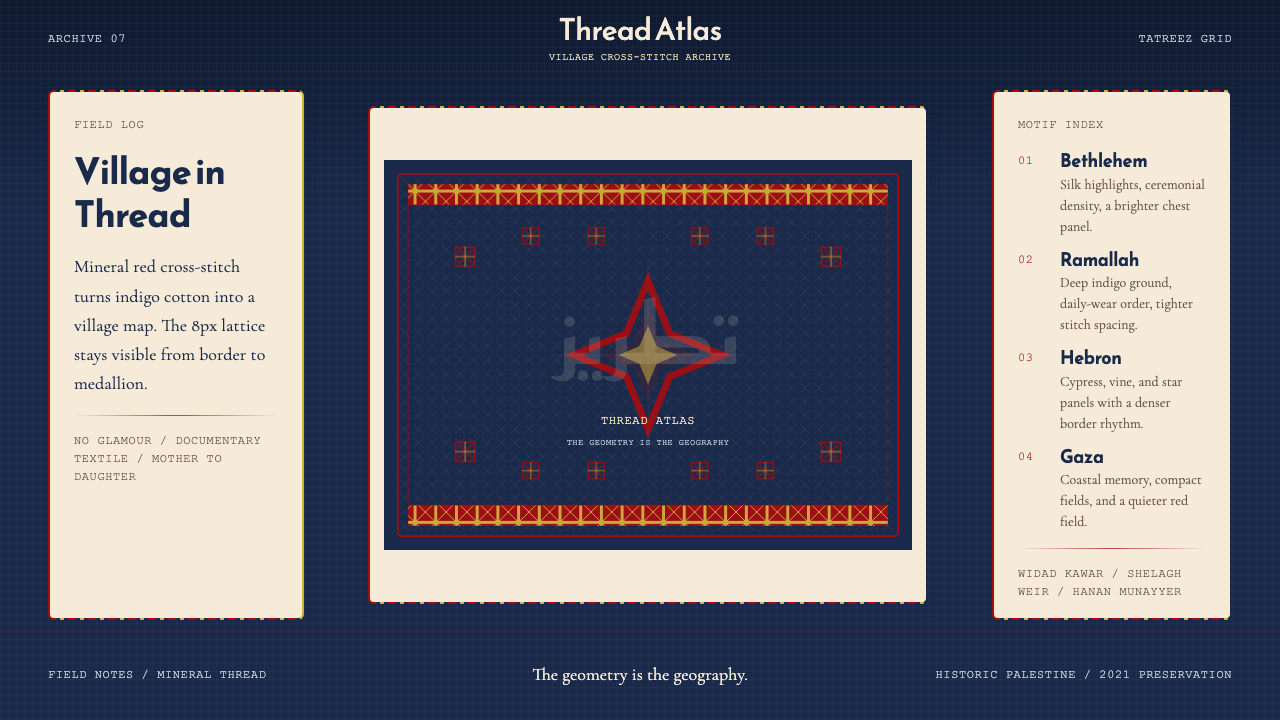 Palestinian Tatreez Cross-StitchMemory in thread. Red cross-stitch on indigo cotton, built on an 8px grid.记忆被线缝住。红绣靛蓝布,8px网格作骨架。
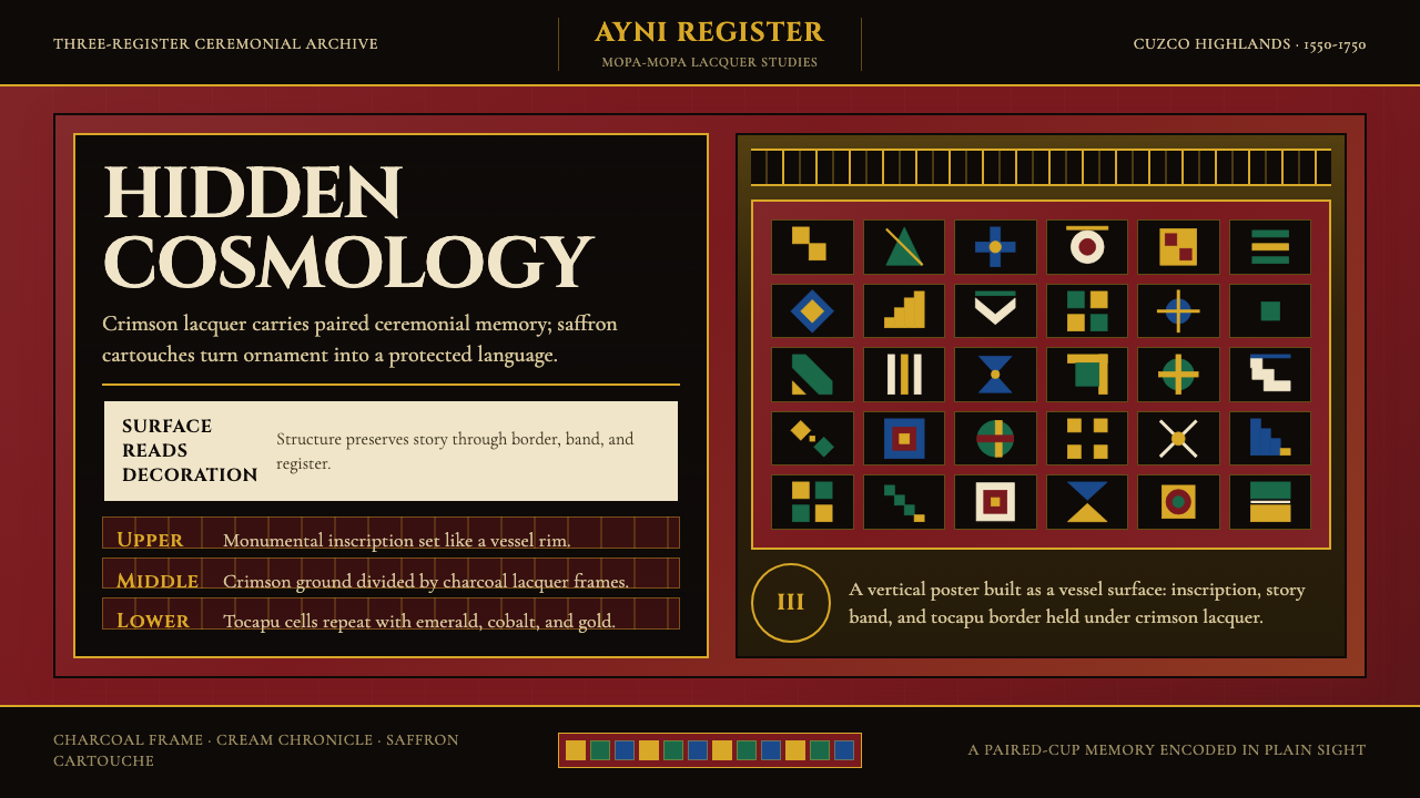 Peruvian Quechua Keros (Andean Cup)Hidden cosmology glows. Crimson lacquer and saffron tocapu grids frame the st…隐秘宇宙观发光。深红漆底与藏红金托卡普格纹框住叙事。
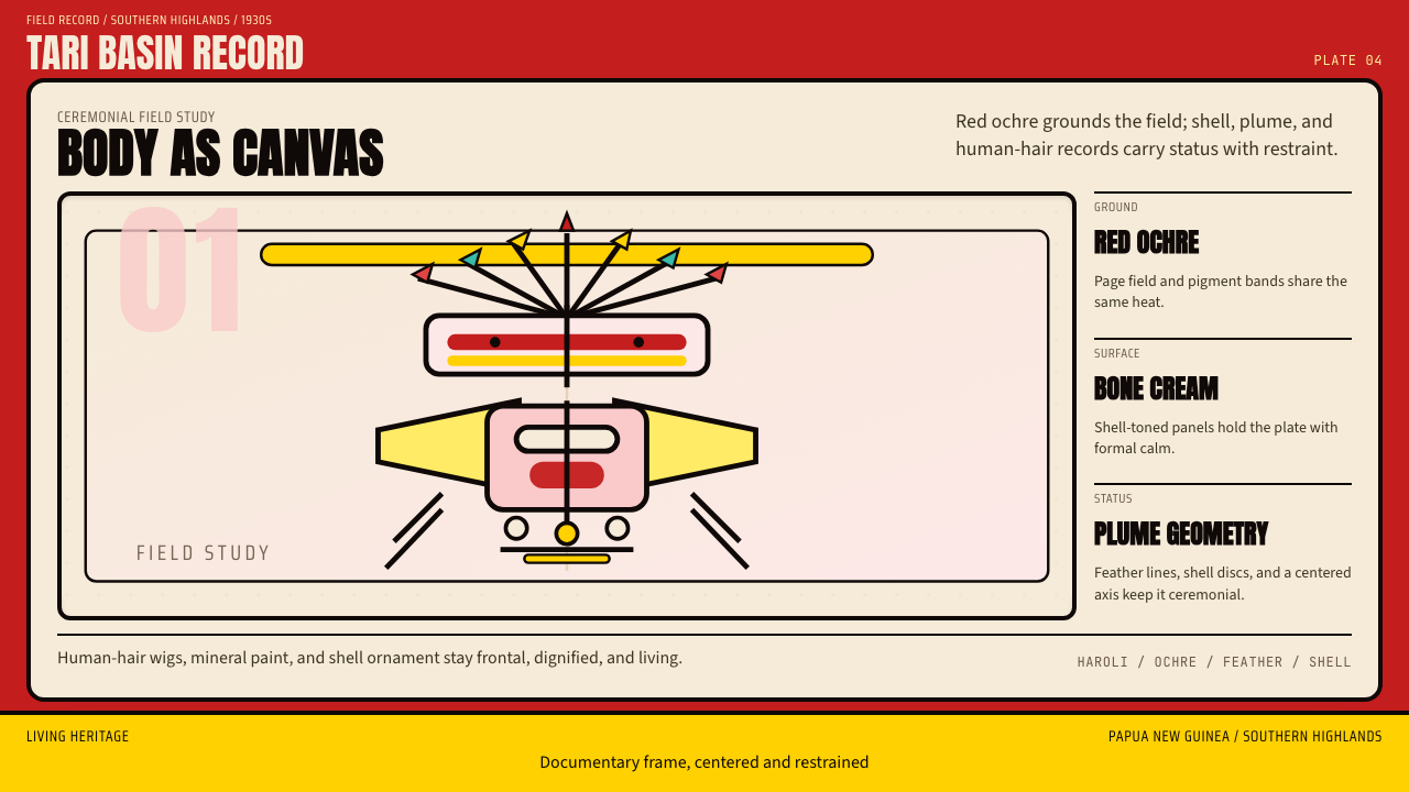 PNG Huli WigmanBody as ceremony. Red ochre, cream bone, and feathered geometry hold a fronta…身体即仪式。红赭石、骨白与羽状几何托起正面肖像。
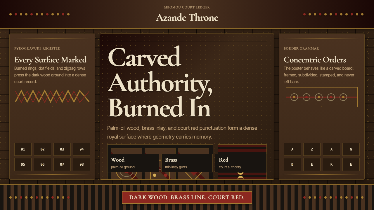 Central African Azande ThroneDense court gravity. Dark wood grids, brass dots, and court red cover every s…宫廷感厚重:深木网格、黄铜点阵与宫廷红铺满表面。
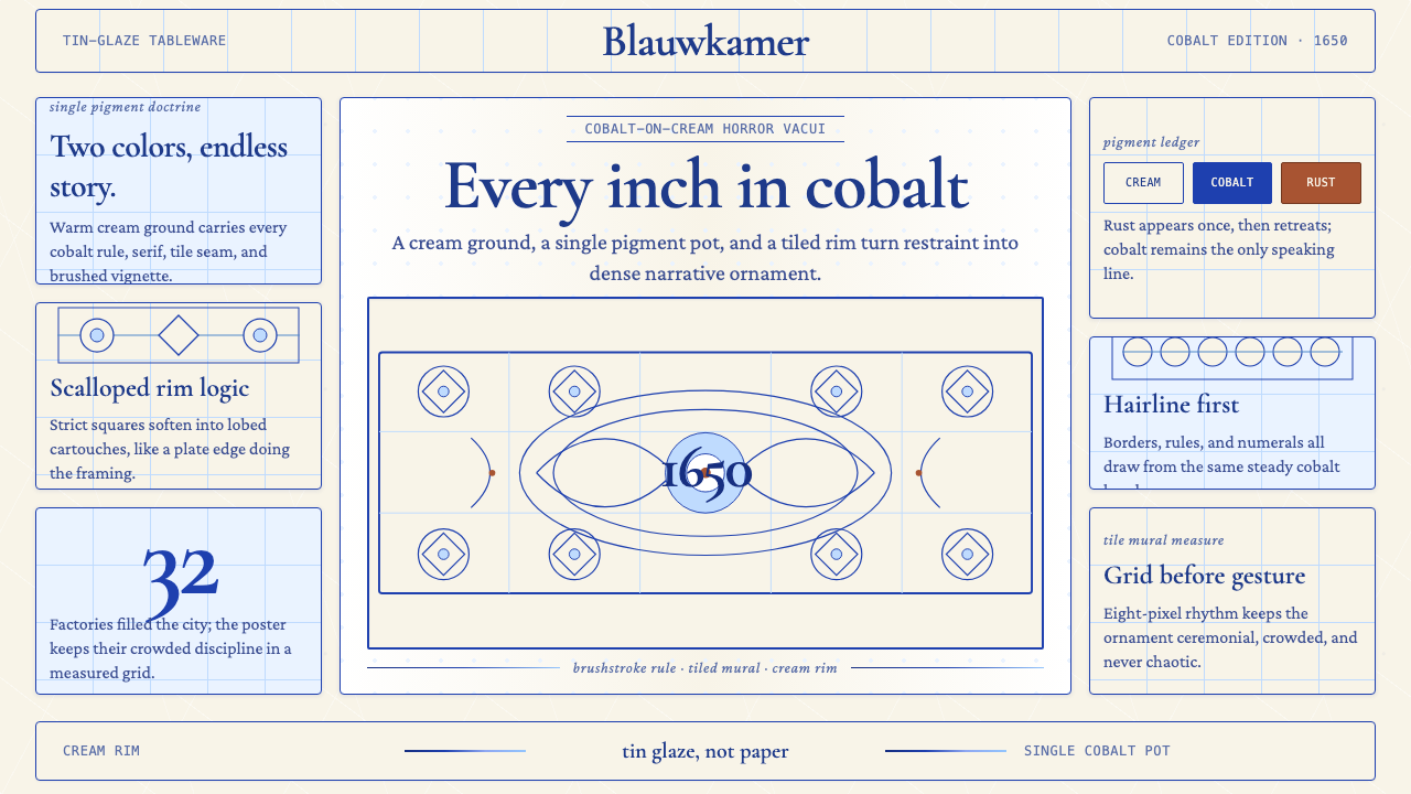 Delft Blue PotteryRestrained, yet every inch speaks. Cobalt hairlines crowd a cream tile grid.克制却寸土必描。钴蓝细线铺满米白瓷砖网格。
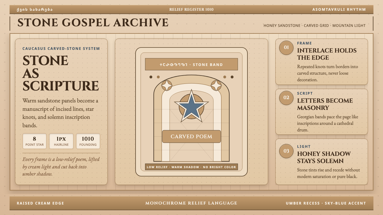 Georgian Nikortsminda Stone-CarvingStone becomes scripture. Cinzel caps and Georgian bands carve honey-sandstone…石如经卷。Cinzel大写与格鲁吉亚铭文刻出蜜砂岩网格。