What is Georgian Nikortsminda Stone-Carving?什么是 Georgian Nikortsminda Stone-Carving?
In the mountain light of the Caucasus, an entire cathedral becomes a manuscript — every surface carved with vine-scroll, geometric star, and sacred inscription.在高加索的山地光线里,整座大教堂化为一卷手稿——每一面墙、每一扇窗框都被缠枝纹、几何星与圣铭刻满。
Georgian Nikortsminda Stone-Carving in briefGeorgian Nikortsminda Stone-Carving 速览
Georgian Nikortsminda Stone-Carving is the visual and architectural tradition born from the 11th-century Georgian Orthodox cathedral-building programme, most fully realised at Nikortsminda Cathedral (consecrated 1010–1014 CE) in the Imereti region. Its defining character is the complete coverage of warm honey-coloured sandstone exteriors with dense, low-relief carving: interlaced vine-scrolls that never repeat exactly, geometric girih-derived star rosettes, figural panels of lions and bulls serving as corbels, and continuous bands of Asomtavruli — the ancient rounded script of the Georgian alphabet — running as inscriptional friezes around gables, window-frames, and tympana.格鲁吉亚尼科尔茨明达石雕风格,是11世纪格鲁吉亚东正教大教堂建造运动所孕育的视觉与建筑传统,在伊梅列季地区的尼科尔茨明达大教堂(1010—1014年落成)上得到最完整的呈现。其核心特征是:以温润蜜色砂岩砌筑的教堂外墙被密集的低浮雕覆盖——从不重复的缠枝卷纹、来自几何传统的八角星与花窗花饰、充当挑檐的狮首与牛首,到沿着山花、窗框与鼓门楣连续延伸的亚速姆塔乌鲁里(古格鲁吉亚圆体字母)铭文带。
Unlike Byzantine icon art, which operates in a flattened and hieratic symbolic register, or Western Romanesque carving, which tends toward bold and somewhat coarse figural relief, Nikortsminda-tradition carving is fine-grained, allover, and deliberately text-like: every gable, arch-surround, and door-jamb is treated as a page to be filled with interlocking pattern. The stone surface is never left bare. The effect is simultaneously monumental and intimate — a building you can read, or at least feel compelled to read, as you move around its exterior.与拜占庭圣像艺术的扁平、威仪象征体系不同,也有别于西欧罗马式雕刻惯用的粗犷人物浮雕,尼科尔茨明达传统的石雕细密、铺陈全面,并刻意呈现出近乎文字的连续性:每一面山花、每一道拱券、每一根门侧柱都被当作一页待填写的页面,以互锁纹样布满。石面从不留白。整体效果既宏大又亲密——这是一座你可以阅读的建筑,或至少是一座让你在行走于外围时忍不住想要阅读的建筑。
The colour world of this tradition is imposed by material: the warm amber of freshly cut local sandstone deepening with centuries of weathering through mellow ochre into shadowed umber and moss-darkened brown. Carved channels sink into near-black shadow against the sunlit ground, producing a palette of extreme tonal contrast within a single hue family. The only relief from this warm stone register is the ash-grey of Caucasus mountain sky visible above the roofline — a colour that provides the tradition's sole cool counterpoint.这一传统的色彩世界由材料本身决定:本地砂岩新切时的温暖琥珀,经数百年风化深化为柔和的赭黄,再沉入阴影处的乌褐与苔藓侵染的暗棕。雕刻槽沟在向阳底面映衬下沉入近乎漆黑的阴影,在单一色相家族内制造出极端的明度对比。这种暖色砂岩基调之外唯一的变化,是屋顶线上方可见的高加索灰蓝天色——那是整个传统中唯一的冷色反调。
Where does Georgian Nikortsminda Stone-Carving come from?Georgian Nikortsminda Stone-Carving 从何而来?
The Nikortsminda tradition emerged during the Georgian Golden Age, that extraordinary century of political consolidation and cultural flowering that ran from roughly 975 to 1213 CE under the Bagrationi dynasty. King Bagrat III (ruled 975–1014), who unified the kingdoms of Abkhazia and Kartli and extended Georgian sovereignty across most of the South Caucasus, sponsored an intensive programme of church construction that became both a statement of dynastic legitimacy and a vehicle for developing a distinctly Georgian visual identity. The Nikortsminda Cathedral, begun under his patronage in the final years of his reign, represents the most ambitious flowering of the carving style that would define the tradition.尼科尔茨明达传统兴起于格鲁吉亚黄金时代——那是从约公元975年延续至1213年、在巴格拉提王朝统治下政治整合与文化繁盛交织的非凡世纪。统一了阿布哈兹与卡尔特利诸王国、将格鲁吉亚主权延伸至南高加索大部的巴格拉特三世(在位975—1014年),主持了一场密集的教堂建造运动,这场运动既是王朝合法性的宣示,也是塑造独特格鲁吉亚视觉身份的媒介。尼科尔茨明达大教堂正是在他的赞助下于在位晚年动工,代表着这一雕刻风格最雄心勃勃的开花。
The geographical and material conditions of the South Caucasus region were decisive in shaping the aesthetic. The Imereti, Shida Kartli, and Mtskheta regions sit at elevations where local sandstone — warm in colour, consistently fine-grained, and workable with iron chisels — was the primary available building material. Byzantine workshops used marble and mosaic; Seljuk builders in neighbouring territories used brick and plaster. Georgian builders in this tradition worked almost exclusively in stone, and the qualities of their local stone — its receptiveness to fine cutting, its warm tonality, its ability to hold intricate line-work over centuries — shaped every choice the carvers made.南高加索地区的地理与材料条件对美学的形成起到了决定性作用。伊梅列季、希达·卡尔特利与姆茨赫塔地区处于特定海拔,当地砂岩色泽温润、质地均一细密、可用铁凿精细加工,是首要可得的建筑材料。拜占庭工坊使用大理石与马赛克;邻近地区的塞尔柱建造者使用砖块与灰泥;而这一传统中的格鲁吉亚建造者几乎专用石材——本地石材对精细切割的顺应性、温暖的色调、以及数百年保持细密线刻的能力,塑造了雕刻者的每一个决策。
The iconographic sources of Nikortsminda carving are richly syncretic. The vine-scroll and inhabited-scroll motifs derive ultimately from Hellenistic and early Byzantine ornamental traditions transmitted through the Christian East. The geometric star-rosettes and interlace patterns show clear affinities with Islamic geometric art as practised in the broader medieval Caucasus and Anatolia — a cultural porousness that reflects the region's position as a crossroads between Byzantine Christendom, the Islamic world, and the Iranian cultural sphere. The Asomtavruli inscriptional bands are uniquely Georgian: the script, used since at least the 5th century CE, was deployed in these buildings not merely as signage but as ornament in its own right, the letterforms becoming part of the visual rhythm of the carved surface.尼科尔茨明达石雕的图像来源具有丰富的融合性。缠枝卷纹与有人物的卷纹母题,最终追溯自通过基督教东方传递的希腊化时期及早期拜占庭装饰传统;几何八角星与交织纹样则与中世纪高加索及安纳托利亚更广范围内的伊斯兰几何艺术有清晰的亲缘关系——这种文化渗透性反映出该地区作为拜占庭基督教世界、伊斯兰世界与伊朗文化圈交汇十字路口的地理位置。亚速姆塔乌鲁里铭文带则是格鲁吉亚独有的:这种至少自公元5世纪起使用的字体,在这些建筑中不仅用作题铭,本身亦作为装饰——字母形态融入雕刻表面的视觉节律之中。
The tradition reached its widest geographic expression in the century following Nikortsminda, with major works at Samtavisi Cathedral (1030), Svetitskhoveli Cathedral at Mtskheta (rebuilt 1010–1029, further elaborated across the 11th century), and Bagrati Cathedral in Kutaisi (consecrated 1003, though substantially damaged in later centuries). Queen Tamar, who ruled Georgia from 1184 to 1213 and presided over the kingdom's greatest territorial extent, continued to patronise church construction and manuscript production in the same tradition. Modern scholarship on the tradition was substantially shaped by the architectural historian Wachtang Beridze, whose meticulous documentation of Georgian medieval church fabric in the 20th century provided the foundational record, later extended by David Khoshtaria and others working on the archaeology and conservation of the buildings.这一传统在尼科尔茨明达之后的一个世纪里达到最广泛的地理延伸,主要作品包括萨姆塔维西大教堂(1030年)、姆茨赫塔的斯韦蒂茨霍韦利大教堂(1010—1029年重建,11世纪间持续完善)以及库塔伊西的巴格拉蒂大教堂(1003年落成,后世大部受损)。统治格鲁吉亚(1184—1213年)、主持王国领土最大扩张的塔玛女王,持续赞助同一传统中的教堂建造与手稿制作。现代学界对这一传统的研究,很大程度上由建筑史学家瓦赫坦格·别里兹在20世纪对格鲁吉亚中世纪教堂建筑的细密记录奠基,戴维·科什塔里亚等人此后在建筑考古与保护领域进一步拓展了这一基础。
What defines the Georgian Nikortsminda Stone-Carving look?Georgian Nikortsminda Stone-Carving 的视觉特征是什么?
Palette色调
The Nikortsminda palette is monochromatic by material necessity and philosophical choice. The ground is the warm amber of local honey-sandstone; the carved relief reads as a darker version of the same stone, its channels filled with deep brown shadow. Weathering introduces subtle variation — patches of silver-grey lichen, streaks of iron-red oxidation, zones of surface blackening — but all of this remains within a narrow warm-neutral range. The only external colour reference is the pale grey-blue of open sky. There are no polychrome accents, no applied pigments, no gilding. The visual richness is achieved entirely through the contrast of light striking relief against shadow pooling in incised line.尼科尔茨明达的色调因材料性质与哲学选择而呈单色调。底面是本地蜜色砂岩的温暖琥珀;浮雕本身读作同一石材的更深版本,雕槽中积聚深棕阴影。风化引入细微变化——斑块状银灰苔藓、铁红氧化纹路、局部表面炭化——但一切都停留在狭窄的暖中性范围内。唯一的外部色彩参照是开阔天际的浅灰蓝。没有多色点缀,没有彩绘颜料,没有贴金。视觉丰富性完全来自阳光打在浮雕上的亮与阴刻线里积聚的暗之间的对比。
Surface Coverage表面覆盖
The governing principle of the style is horror vacui applied at architectural scale: no exterior stone surface should remain uncarved. Tympana, gable fields, window-jambs, blind arcading, corbel-courses, and the transitions between architectural elements are all treated as fields for carving. This total coverage does not produce visual chaos because the carving is organised into clearly bounded zones — each architectural member receives its own ornamental programme — and because the relief is uniformly shallow, keeping everything within a single visual plane. The density reads as richness, not noise.这一风格的主导原则是建筑尺度的恐空原则:没有任何外部石面应保持未雕状态。鼓门楣、山花面、窗侧柱、盲券廊、挑檐线脚,以及各建筑构件之间的过渡带,全部被作为雕刻场地处理。这种全面覆盖并不产生视觉混乱,因为雕刻被组织进清晰界定的区域——每个建筑构件有各自的装饰方案——且浮雕一律为浅浮雕,使一切维持在单一视觉平面内。密度呈现为丰盛,而非噪音。
Interlace and Vine-Scroll交织纹与缠枝纹
The vine-scroll — a continuously flowing stem that branches, curls back on itself, and fills its field with leaf, tendril, and occasional inhabited forms — is the primary decorative vocabulary. In Nikortsminda carving it achieves a particular density and fineness: the stems are thin, the intervals between filled, and the logic of growth is followed with botanical consistency. Interlace, where strands pass over and under one another in a regular sequence, appears on framing bands and border zones, operating as a kind of visual punctuation between different ornamental fields. Both motifs were executed with iron chisels capable of cutting channels only a few millimetres wide.缠枝卷纹——一条连续流动的茎干,分叉、向自身卷回,以叶片、卷须偶尔夹杂有人物形态填满空间——是主要的装饰词汇。在尼科尔茨明达石雕中,它达到特有的密度与纤细度:茎干纤薄,间隔被填满,生长逻辑以植物学的一致性贯彻。交织纹(股线以规律序列相互穿越)出现在框架带与边界区域,充当不同装饰场之间的视觉标点。两种母题均以能切出数毫米宽槽沟的铁凿执行。
Geometric Star-Rosettes几何星形花饰
Set within the vine-scroll fields or occupying the centres of tympana as focal medallions, the geometric star-rosettes are constructed on the same compasses-and-straightedge logic as Islamic girih geometry, producing eight-pointed stars, twelve-pointed stars, and interlocking polygonal grids from a single generating angle. The stars function as visual anchors in the composition — the densest concentrations of formal energy, where the viewer's eye rests before being carried back into the surrounding vine-scroll. Their geometric precision contrasts with the organic growth logic of the vine, and this contrast — rule against growth, angle against curve — is one of the style's central visual tensions.嵌入缠枝纹场内或作为焦点花饰章占据鼓门楣中心,几何星形花饰以与伊斯兰几何传统相同的圆规直尺逻辑构造:从单一生成角度推导出八角星、十二角星与互锁多边形网格。星形在构图中充当视觉锚点——形式能量最集中处,观者的目光在此稍驻,再被引回周围的缠枝纹中。其几何精确性与缠枝纹的有机生长逻辑形成对照——规则对抗生长,折角对抗曲线——这一对照是这种风格最核心的视觉张力之一。
Asomtavruli Inscription Bands亚速姆塔乌鲁里铭文带
Running as continuous horizontal friezes around window apertures, beneath gable-peaks, and along the transitions between stories, the Asomtavruli script bands serve a double function: they record dedications, donor names, and liturgical texts, and they operate as purely visual ornament within the carved field. The rounded, majuscule letterforms of Asomtavruli — the oldest of the three Georgian scripts — have a natural affinity with the curvilinear vocabulary of the vine-scroll, and skilled carvers integrated them seamlessly into the overall surface rhythm. To a viewer unable to read Georgian, the inscription band reads as another register of dense, flowing ornament.沿着窗洞口、山花峰脊下方以及各层之间的过渡部位连续延伸的亚速姆塔乌鲁里字体铭文带,兼具双重功能:记录奉献辞、捐建者姓名与礼仪文本,同时在雕刻场内发挥纯粹视觉装饰的作用。亚速姆塔乌鲁里——三种格鲁吉亚字体中最古老者——的圆润大写字母形态与缠枝纹的曲线词汇有天然的亲和力,熟练的石雕师将它们与整体表面节律无缝融合。对无法阅读格鲁吉亚文字的观者而言,铭文带读起来就是另一道密集流动的装饰带。
Figural Corbels有像挑檐
At the junctions between walls and rooflines, and at the corners of apses and drums, carved corbels in the forms of lion heads, bull heads, and occasionally human faces project from the stone surface. These are not mere surface relief but fully three-dimensional sculptural elements, cut deep enough to cast strong shadow. The lion and bull forms carry ancient Caucasian symbolic associations — sovereignty, strength, the sacred — and place this Christian tradition in a longer pre-Christian regional visual history. They also interrupt the all-over flatness of the vine-scroll field with sudden volumetric incident, marking the structural logic of the building beneath the ornamental surface.在墙体与屋顶线的交接处,以及后殿与鼓座的转角处,以狮首、牛首偶尔辅以人面形态雕刻的挑檐从石面凸出。这些不是纯粹的表面浮雕,而是被深凿至足以投下浓重阴影的完整三维雕塑构件。狮与牛的形态承载着高加索地区古老的象征联想——主权、力量与神圣——将这一基督教传统置于更漫长的前基督教地区视觉史中。它们也以骤然的体积感打断缠枝纹场的全面平铺,在装饰表面之下标示出建筑的结构逻辑。
Low Relief and Shadow Drawing浅浮雕与阴影素描
The carving throughout the tradition is low relief — the projection rarely exceeds what the eye reads as a few centimetres at most, often far shallower. This shallowness is a technical decision as much as an aesthetic one: deep undercutting in fine-grained sandstone risks fracture, and the buildings were designed to stand for centuries. The consequence is that the visual effect of the carved surface changes dramatically with the angle and quality of light. In the low, raking light of morning or evening the carving reads as a dense field of shadow-drawing; at midday, much of the relief flattens. The tradition assumes outdoor mountain light, and designs to work hardest at the hours when that light is most directional.这一传统中的雕刻全程为浅浮雕——凸出量极少超过视觉上感知的数厘米,往往更浅。这种浅度既是技术决定也是美学决定:细密砂岩中深度镂刻的风险是断裂,而这些建筑被设计为屹立数百年。其后果是:雕刻表面的视觉效果随光线角度与质量发生显著变化。在晨昏低斜的擦射光下,雕刻呈现为一片密集的阴影素描;正午时分,大部分浮雕趋于平坦。这一传统预设于室外山地光线之中,并被设计为在光线方向性最强的时刻发挥最大效力。

Who shaped Georgian Nikortsminda Stone-Carving?谁塑造了 Georgian Nikortsminda Stone-Carving?
Bagrat III (ruled 975–1014) was the first king of a unified Georgia, having consolidated the kingdoms of Abkhazia, Kartli, Kakheti, and Rani under a single crown. His patronage of the Nikortsminda Cathedral and several contemporary churches established the visual programme that would define Georgian sacred architecture for the next two centuries. The building campaign he sponsored was understood not merely as piety but as political act — the visual assertion, in carved stone, of a coherent Georgian Christian civilisation.巴格拉特三世(在位975—1014年)是统一格鲁吉亚的第一位国王,将阿布哈兹、卡尔特利、卡赫季与拉尼诸王国整合于同一王冠之下。他对尼科尔茨明达大教堂及多座同期教堂的赞助,确立了此后两个世纪格鲁吉亚圣殿建筑的视觉范式。他所主持的建造运动不仅被理解为虔诚的宗教行为,也是一种政治宣示——以石雕形式对连贯格鲁吉亚基督教文明的视觉确认。
Tamar (ruled 1184–1213), the first woman to rule Georgia in her own right and celebrated in Georgian tradition as 'King of Kings', presided over the kingdom's greatest territorial extent and cultural efflorescence. Though the Nikortsminda Cathedral predates her reign by nearly two centuries, she is the paradigmatic royal patron of the broader Georgian Golden Age aesthetic — commissioning church construction, manuscript illumination, and the monumental poem The Knight in the Panther's Skin (Vepkhistkaosani) by Shota Rustaveli, which was itself dedicated to her.塔玛女王(在位1184—1213年)是格鲁吉亚历史上第一位以自身名义统治的女性,在格鲁吉亚传统中被尊称为“万王之王”,主持了王国领土最广与文化最盛的时代。尽管尼科尔茨明达大教堂早于她的统治近两个世纪,她仍是格鲁吉亚黄金时代整体美学的典范王室赞助人——委托建造教堂、制作手稿彩饰,并赞助肖塔·鲁斯塔维利创作了献给她本人的长篇史诗《虎皮武士》。
Beridze (1902–1985) was the most significant Georgian architectural historian of the 20th century, whose systematic fieldwork and publications documented the medieval church fabric of Georgia with a rigour and completeness that had not existed before. His work on Nikortsminda and the other Golden Age churches established the scholarly framework through which the tradition is understood — identifying typological sequences, recording iconographic programmes, and situating Georgian carving within the broader history of medieval Christian art.别里兹(1902—1985年)是20世纪最重要的格鲁吉亚建筑史学家,其系统性田野调查与著述以前所未有的严谨与完整度记录了格鲁吉亚中世纪教堂建筑。他对尼科尔茨明达及其他黄金时代教堂的研究,确立了理解这一传统的学术框架——识别类型学序列、记录图像方案,并将格鲁吉亚石雕置于中世纪基督教艺术的更广史脉中加以定位。
Khoshtaria is a contemporary Georgian archaeologist and architectural historian whose fieldwork has substantially extended the record of Georgian medieval building, particularly through excavation and close documentation of fabric at sites including Nikortsminda. His work has clarified the construction sequence of key buildings, identified phases of repair and modification, and brought the technical understanding of medieval Georgian stone-carving craft — the tools used, the workshop organisation, the sequence of execution — to a higher level of precision.科什塔里亚是当代格鲁吉亚考古学家与建筑史学家,其田野调查工作——尤其是通过发掘与对尼科尔茨明达等遗址建筑面料的细密记录——极大拓展了格鲁吉亚中世纪建筑的资料库。他的研究厘清了关键建筑的建造序列,识别了修缮与改建的各历史层次,并将中世纪格鲁吉亚石雕工艺的技术理解——所用工具、工坊组织方式、施工执行顺序——推进到更高的精确度。
How do you use Georgian Nikortsminda Stone-Carving today?今天怎么用 Georgian Nikortsminda Stone-Carving?
Nikortsminda Stone-Carving is a high-specificity historical style — it carries strong cultural and geographic associations — so applying it requires a clear thematic fit. It works best for projects in the domains of heritage, cultural tourism, luxury goods with artisanal positioning, documentary and archival publishing, sacred or contemplative institutions, and any design context where densely crafted surface detail is a value rather than a liability. The style signals antiquity, craftsmanship, and the weight of a specific place and tradition.尼科尔茨明达石雕是一种高度特指性的历史风格——承载着强烈的文化与地理联想——因此应用它需要清晰的主题契合。它最适合以下领域的项目:文化遗产、文化旅游、具有工艺定位的奢侈品、纪录与档案出版、宗教或冥想类机构,以及任何将表面雕刻密度视为价值而非负担的设计语境。这种风格传递出古旧感、匠造感,以及特定地域与传统的分量。
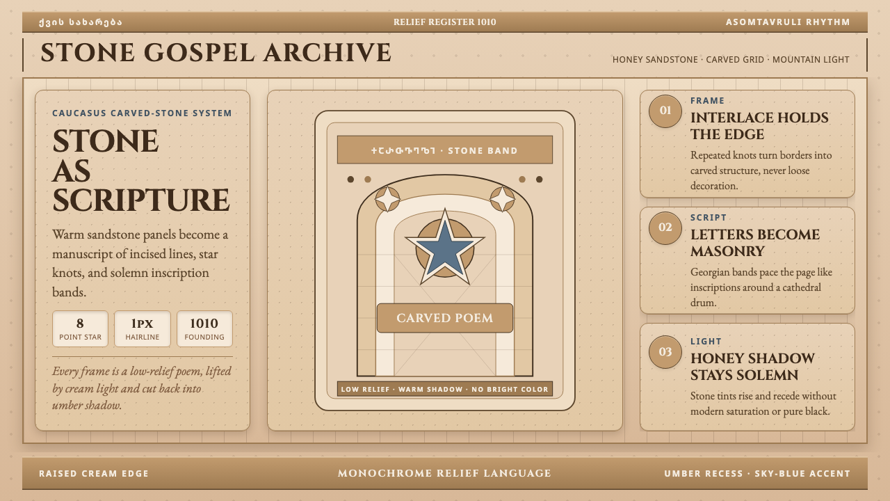
For presentation slides, the style is well-suited to cover pages and section dividers rather than dense content pages. A cover treatment might use the warm sandstone tone as the ground, with a panel of extracted geometric rosette or vine-scroll line-work — rendered as fine pale line on the warm amber background — occupying a full third to half of the frame, with the title set in a serif face recalling inscriptional letterforms. Content slides work best with the texture vocabulary used sparingly: a narrow band of interlace ornament at the top or bottom margin, substantial white space (or warm parchment tone) for text, and the stone palette restricted to accent elements. Data slides in this style gain character from using the warm amber and deep shadow-brown as the two tones of a bar chart or proportional diagram, avoiding any colour that does not belong to the stone register.用于演示文稿时,这种风格更适合封面页与章节分隔页,而非密集内容页。封面处理方案可以用温润的砂岩色调作为底面,以提取的几何星形花饰或缠枝纹线稿——在温暖琥珀底上渲染为细淡线条——占据画面三分之一至二分之一,标题以令人联想到铭文字体的衬线字体排布。内容页最好将纹样词汇控制在点睛程度:顶部或底部留白处一道窄交织纹装饰带,正文留有充分的白空间(或温暖的羊皮纸色调),石材色调仅用于点缀元素。数据页以这种风格处理时,可用温润琥珀与深沉阴影棕作为柱状图或比例示意图的两个色调,避免任何不属于石材色域的颜色。
For web interfaces and dashboards, the style is best deployed in heritage portals, museum collection browsers, cultural-institution homepages, and luxury product presentation pages. The approach: use a warm near-white or parchment tone for the primary background, stone-brown for all body text, and the deeper shadow-umber as a hover and active state indicator. Surface decoration should be used architecturally — as border treatments, section-header motifs, or loading-screen ornamentation — rather than scattered across every component. Navigation benefits from an inscription-like quality: generous letter-spacing, measured weight, a serif or lapidary typeface. Interactive elements should be calm and deliberate rather than animated, reflecting the stillness of carved stone rather than the dynamism of digital motion.用于网页界面与仪表板时,这种风格最适合部署在遗产门户、博物馆藏品浏览器、文化机构首页与奢侈品呈现页面。方法:以温润的近白或羊皮纸色调作为主背景,石棕色用于所有正文,更深的阴影乌棕用作悬停与激活状态指示。表面装饰应以建筑性方式使用——作为边框处理、区段标题母题或加载屏幕装饰——而非散布在每个组件上。导航受益于铭文式品质:宽松字距、稳重字重、衬线或石刻风格字体。交互元素应平静而从容,而非动态活泼,呼应石刻的静止感而非数字运动的动态性。
For editorial and marketing work — book covers, exhibition catalogues, cultural-institution annual reports, heritage tourism campaigns — the style's density and warmth are direct assets. A double-page spread can set body text in a measured serif column against a warm ground, with a full-bleed reproduction of carved stone detail as the facing page. Marketing materials gain authority from treating the ornamental vocabulary as a signature system: consistent use of the same extracted vine-scroll or star-rosette motif across touchpoints reads as brand identity rooted in cultural depth. Packaging for heritage food, wine, or craft products benefits from the association between the warm stone palette and the idea of age, provenance, and handwork.用于编辑与营销内容——书籍封面、展览图录、文化机构年报、文化旅游推广——这种风格的密度与温度是直接优势。双页跨版可以在温润底面上排设一列有节制的衬线字体正文栏,对页以石雕细节满幅呈现。营销物料将装饰词汇作为签名性系统处理时获得权威感:在不同接触点上一致使用同一提取的缠枝纹或星形花饰母题,读作根植于文化深度的品牌识别。文化遗产食品、葡萄酒或手工制品的包装,受益于温润石材色调与年份感、产地感、手作感之间的联想关联。
The most common mistake when applying this style is attempting to replicate its surface density digitally without understanding its spatial logic. Scattering tile-pattern fragments across a background produces visual noise, not richness — because in the original buildings the carving is organised by architectural structure, with each panel bounded by its own frame and the overall programme unified by material consistency. The digital equivalent is to use ornamental elements as deliberate zone-markers — bordering a specific content block, heading a specific section — rather than as background fill. A second common mistake is pairing the warm stone palette with cool, saturated accent colours. This tradition has no bright blues, no acid greens, no vivid purples: the only permissible cool note is a grey that recalls stone in overcast light.应用这种风格时最常见的错误,是试图在数字媒介中复制其表面密度而不理解其空间逻辑。将纹样碎片随意铺散在背景上只会产生视觉噪音而非丰盛感——因为在原始建筑中,雕刻由建筑结构组织,每个面板有自己的边界框定,整体方案由材料的一致性统一。数字等价物是将装饰元素作为刻意的区域标记使用——框定特定内容块、标示特定区段——而非作为背景填充。另一个常见错误是将温润石材色调与冷、饱和的强调色配对。这一传统没有鲜艳蓝、荧光绿、艳丽紫:唯一可被接受的冷色调,是让人联想起阴天石材颜色的灰。
A note on typography: no exact script or font family is prescribed here, but the tradition's inscriptional character calls for letterforms with lapidary quality — a slight squareness in the proportions, a readability derived from carved rather than drawn construction. All-caps or small-caps settings suit the style's monumental register. Body text should be set generously spaced, in a weight that reads as substantial without heaviness, with a line-length that creates a text-column proportioned like a manuscript page rather than a newspaper column.
Georgian Nikortsminda Stone-Carving — FAQGeorgian Nikortsminda Stone-Carving · 常见问题
How is Nikortsminda Stone-Carving different from Byzantine church decoration?尼科尔茨明达石雕与拜占庭教堂装饰有何不同?
Byzantine sacred decoration is primarily flat, additive, and light-emitting: mosaic tesserae on gold grounds, icon panels with gilded haloes, frescoes that represent figures in a hierarchical frontal register. The imagery is figurative and theological — Christ Pantocrator, the Virgin, saints, narrative scenes. Nikortsminda carving, by contrast, is primarily abstract, subtractive, and shadow-drawing: the carver removes stone rather than applying colour, produces pattern rather than figure, and works in the tonal range of a single material rather than across a full chromatic palette. Both traditions are Eastern Christian and share some iconographic sources, but their means are fundamentally different — mosaic versus relief, light versus shadow, figure versus pattern.拜占庭圣殿装饰主要是平面的、叠加性的、发光性的:金底马赛克贴片、有镀金光环的圣像面板、以正面层级构图呈现人物的湿壁画。图像是具象和神学性的——全能基督、圣母、圣人、叙事场景。尼科尔茨明达石雕则主要是抽象的、减法性的、阴影素描式的:石雕师做减法而非加色,制造纹样而非人物,在单一材料的明度范围内工作而非跨越完整色谱。两种传统同属东方基督教,共享部分图像来源,但手段根本不同——马赛克对浮雕,光对影,人物对纹样。
Can this style work in a digital or screen context, given that it originated in carved stone?这种起源于石雕的风格,能否在数字或屏幕语境中有效运用?
Yes, but the translation requires deliberate adaptation rather than direct reproduction. On screen, you cannot replicate the tactile depth of shallow stone relief, the tonal shift as light moves across a wall, or the monumental scale of a cathedral exterior. What you can translate is the compositional logic: the total coverage of a defined field, the organisation of ornament into architecturally bounded zones, the use of a narrow warm palette, the combination of geometric and organic motifs within a single visual register, and the inscription-like quality of text set against a carved-surface ground. The most successful digital applications treat the ornamental vocabulary as a structural system — borders, headers, dividers — rather than attempting to simulate carved stone literally.可以,但转译需要刻意的改编而非直接复制。在屏幕上,你无法复制浅浮雕的触觉深度、光线扫过墙面时的色调变换,或大教堂外墙的纪念碑式尺度。可以转译的是构图逻辑:对特定场域的全面覆盖、将装饰组织进建筑性边界区域、使用窄幅暖色调色板、在单一视觉层级内组合几何与有机母题,以及文字在雕刻表面底纹上的铭文式品质。最成功的数字应用将装饰词汇作为结构性系统处理——边框、标题、分隔线——而非试图字面模拟石雕效果。
What typefaces and typographic approaches suit this style?哪些字体排印方式与这种风格相契合?
The style does not prescribe specific font families, but it calls for letterforms with lapidary or inscriptional qualities — slightly squared proportions, a construction logic that recalls cutting rather than drawing, clear contrast between stroke weights. Display type works well at large scale in all-capitals, recalling the monumental register of the Asomtavruli inscription bands. Body text benefits from a generous set — wider than usual tracking, a comfortable leading — to echo the spacious distribution of carved line across the stone ground. Condensed display faces and anything with a highly expressive or calligraphic character would undercut the style's monumental restraint.这种风格不规定具体字体家族,但它需要具有石刻或铭文品质的字形——比例略显方正、构造逻辑让人联想到切割而非书写、笔画粗细对比清晰。展示字体以全大写在大尺度下效果良好,呼应亚速姆塔乌鲁里铭文带的纪念碑式庄严。正文排版受益于宽松设置——比通常更宽的字距、舒适的行距——以呼应雕刻线条在石面上的宽展分布。紧缩展示字体以及任何具有高度表现性或书法感特征的字体,都会削弱这种风格的纪念性克制。
Is this style appropriate for contemporary brands, or does it read as too historical?这种风格适合当代品牌使用,还是会显得过于历史感?
The style is well-suited to brands where historical depth, geographic specificity, and artisanal quality are genuine positioning values — wine, spirits, heritage tourism, luxury leather goods, cultural institutions, fine publishing. For brands that need to communicate forward-looking innovation, technological dynamism, or playful accessibility, it is a poor fit. The key is whether the specific associations the style carries — the Caucasus, medieval Christian culture, carved stone, antiquity — align with what the brand actually offers and wants to claim. Used authentically, it provides an unusually specific cultural signature that distinguishes from the generic historicism of faux-classical or generic medieval references. Used without contextual justification, it reads as arbitrary costume.这种风格非常适合历史深度、地理特指性与工艺品质是真实定位价值的品牌——葡萄酒、烈酒、文化遗产旅游、奢华皮具、文化机构、精品出版。对于需要传达前瞻创新、技术动态感或轻松亲和力的品牌而言,它是糟糕的选择。关键在于:这种风格所承载的特定联想——高加索、中世纪基督教文化、石雕、古旧感——是否与品牌实际提供的产品及希望主张的定位真正对齐。真实地运用,它提供一种异常具体的文化签名,将品牌从仿古典或泛中世纪的通俗历史主义中区别出来。缺乏语境合理性地使用,则读作随意的戏服。
What are the most important things to avoid when working in this style?使用这种风格时最需要避免哪些事项?
Four things above all. First, cool or saturated colour: the tradition is monochromatic in warm stone tones, and introducing vivid blues, greens, or purples breaks the material logic entirely. Second, gradient fills: the style operates in hard contrasts between lit surface and shadowed incision — gradients import a photographic naturalism that is alien to the tradition. Third, scattered ornament: the vine-scroll and rosette motifs only work when organised within architecturally defined zones, not when tiled as background texture or applied randomly. Fourth, overcrowding at small scale: the original carving was designed for architectural surfaces read at a distance of several metres; at thumbnail or small-screen scale, the density becomes illegible, and the decorative vocabulary needs to be simplified or isolated to a single motif.最重要的有四点。第一,冷色或饱和色:这一传统在温润石材色调的单色域内运作,引入鲜艳蓝、绿或紫会彻底打破材料逻辑。第二,渐变填充:这种风格在受光表面与雕刻阴影之间以硬对比运作——渐变引入了与这一传统格格不入的摄影自然主义。第三,散布装饰:缠枝纹与星形花饰母题只有在建筑性边界区域内组织时才有效,作为背景纹理平铺或随机应用则行不通。第四,小尺度下的过度密集:原始石雕为从数米距离阅读的建筑表面而设计;在缩略图或小屏幕尺度下,密度变得难以辨认,装饰词汇需要被简化或归结为单一母题。
Related design styles相关设计风格
 Central African Azande ThroneDense court gravity. Dark wood grids, brass dots, and court red cover every s…宫廷感厚重:深木网格、黄铜点阵与宫廷红铺满表面。
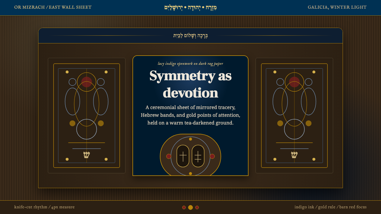 Jewish Papercut MizrahDevotion as openwork. Indigo filigree and Hebrew bands glow on dark rag paper.虔敬化作镂空:靛蓝花饰与希伯来横带在暗纸上发光。
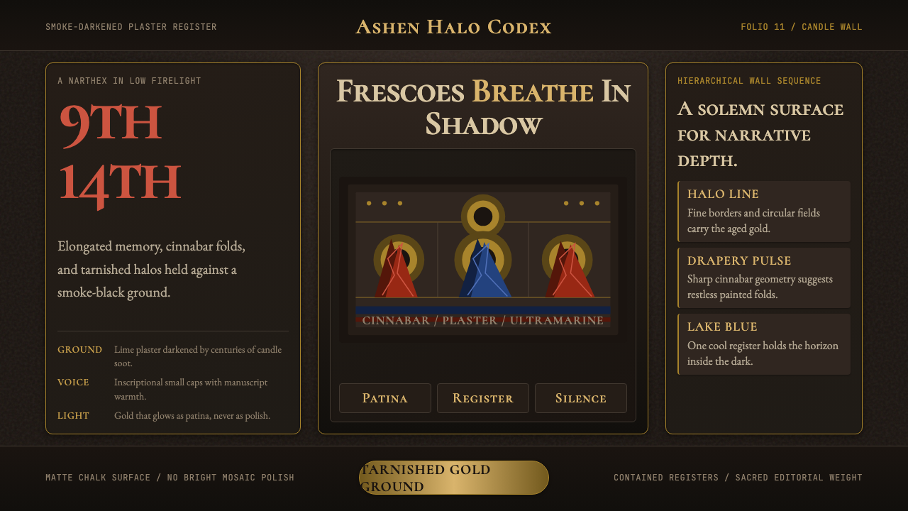 Macedonian Ohrid Fresco (Byzantine)Sacred darkness breathes. Tarnished gold rings, cinnabar folds, and plaster g…神圣暗光在呼吸。暗金圆环、朱砂折线与灰泥颗粒托起它。
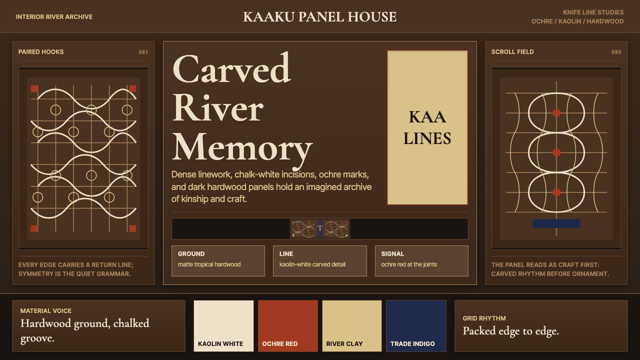 Suriname Maroon TembeDense memory, carved in rhythm. Kaolin lines cross hardwood brown in bilatera…记忆密实如刻。高岭土白线在硬木棕上对称交织。
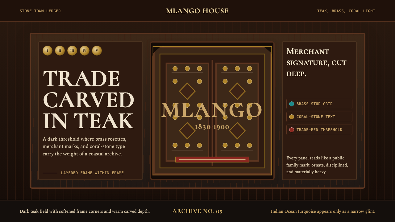 Swahili Stone Town DoorTeak darkness remembers. Brass studs and Cormorant small caps frame a carved…幽暗承载记忆。黄铜门钉与Cormorant小型大写勾勒柚木门框。
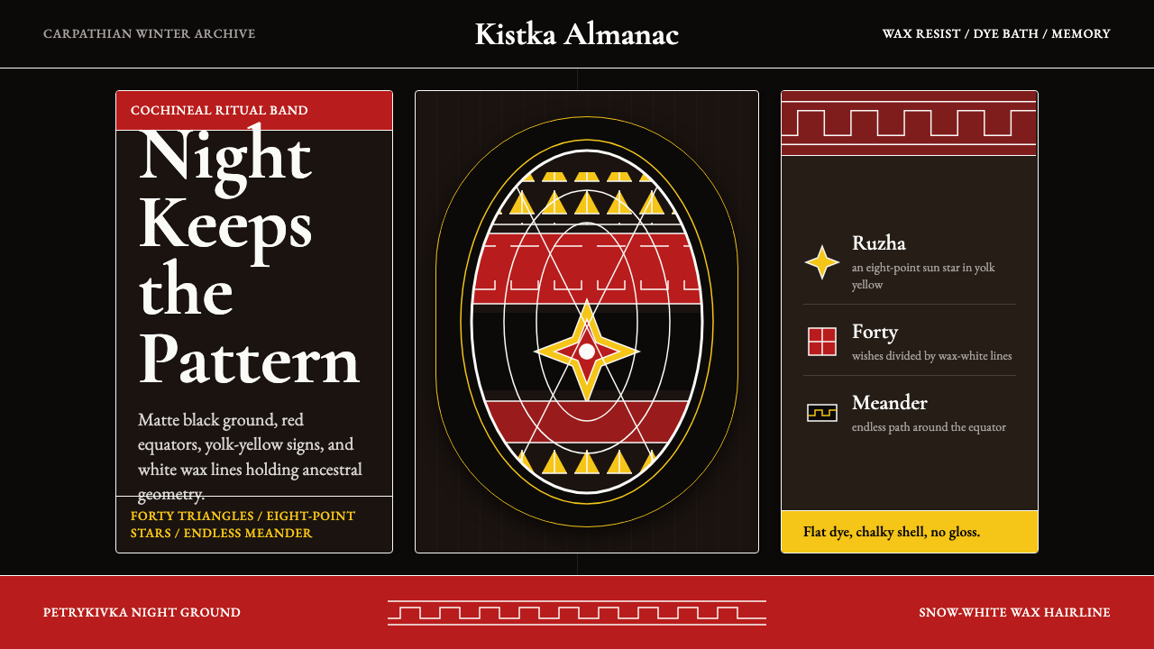 Ukrainian Pysanky (wax-resist egg)Night holds memory. Red bands, yolk geometry, and white wax lines cut matte b…夜色承载记忆:红色带、蛋黄几何与白蜡线刻入哑黑底。