What is Jewish Papercut Mizrah?
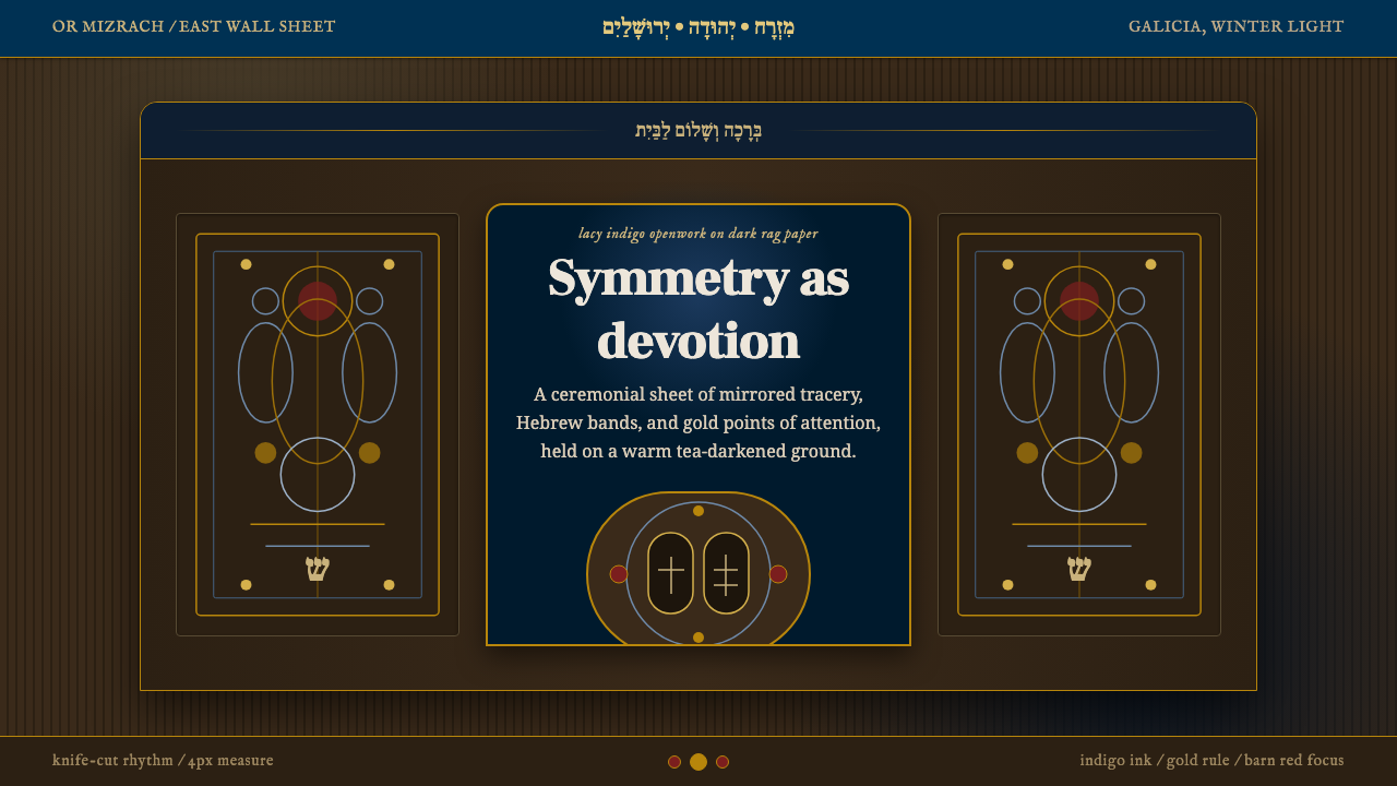
A mizrah turns devotion into lacework — a single sheet of paper cut so intricately that light itself becomes the ornament.
Jewish Papercut Mizrah in brief
Jewish Papercut Mizrah is a design system drawn from a devotional folk-art object: the mizrah, a cut-paper sheet Eastern European Jewish families hung on the east-facing wall of the home to orient prayer toward Jerusalem. The word itself means 'east' in Hebrew. As a visual language it is defined by openwork — pattern made not by adding ink to paper but by removing paper entirely, so that whatever sits behind the sheet glows through the gaps.
The system is built on strict bilateral symmetry, mirrored guardian animals flanking a central medallion, bands of Hebrew text running across the top like a lintel, and a ground that always reads as aged rather than clean. Where Bauhaus achieves order through a grid and a restricted primary palette, this system achieves order through the discipline of the knife: every cut must hold its neighboring shapes together, so pattern and structure are the same decision.
Visually, the effect is closer to stained glass or a rood screen than to a printed page. A deep, ink-like blue carries the fine tracery of vines, birds, and lettering; small notes of gold and a warm brick-red mark only the most sacred focal points, never spreading across the whole field. Nothing in the system is printed flat white on white — the ground itself is always toned, aged, and warm, so the cut pattern has something to glow against.
Where does Jewish Papercut Mizrah come from?
Papercutting as a devotional craft traveled with Ashkenazi Jewish communities across Central and Eastern Europe for centuries, but the mizrah as a distinct household object reached its fullest expression in the folk workshops of Ukraine and Galicia in the second half of the 19th century, roughly 1850 to 1900. It belonged to a broader tradition of ritual papercuts — shavuoslekh for the holiday of Shavuot, menorahs for Hanukkah — but its placement in the most visible room of the home made it the most elaborate and most publicly seen of the group.
The making of a mizrah was a specialized manual skill rather than an anonymous domestic craft. A papercutter worked with a sharp knife directly on inexpensive rag paper, cutting the pattern freehand or from a folded and pricked template, so that a single continuous sheet became lace-like tracery of animals, foliage, and lettering. Because the paper itself was cheap and fragile, the true material value of the object lay entirely in the skill of the cutting — a folk equivalent of stone tracery or wrought ironwork, achieved with nothing more than a blade and a steady hand.
Once cut, the sheet was rarely left as bare paper. Papercutters commonly inked the linework and touched details with gouache, and — critically — mounted the finished cutting onto a darker backing sheet. This backing is what gives the mizrah its glow: without it, a papercut is just a fragile lattice; with a dark ground behind it, every negative space becomes a point of light.
The imagery drew on a shared vocabulary of Ashkenazi devotional folk art: paired lions (referencing the Lion of Judah and guardianship of the sacred), eagles or birds of prey (associated with divine protection and swiftness), and a central tablet or medallion evoking the Tablets of the Law. This vocabulary was largely anonymous — mizrahim were made by unnamed folk papercutters working within the community rather than named artists working for patrons, which is itself characteristic of Ashkenazi folk art as a category: authorship mattered less than fidelity to a recognized devotional form.
What defines the Jewish Papercut Mizrah look?
Openwork Structure
The defining technical fact of this system is that pattern and structure are the same operation: a shape only exists because the paper around it was removed, and every cut has to leave enough connective material for the sheet to hold together. Translated to an interface, ornament is never a layer added on top of a solid surface — it behaves as if it were cut through, with negative space doing as much visual work as the marks themselves.
Aged, Toned Ground
The background is never a clean, bright white. It reads as darkened rag paper — warm, slightly uneven, touched by age — because the entire visual logic depends on a dark backing for the cut pattern to glow against. A pure white ground would flatten the system's central trick; the ground has to carry weight and warmth of its own, closer to old parchment or a dimly lit room than to a blank digital canvas.
Indigo as Structural Ink
A deep, saturated blue — closer to ink than to sky — carries the bulk of the linework: the vines, the animal silhouettes, the lettering strokes. It functions the way black ink functions in a woodcut: it is the load-bearing color, present almost everywhere, while every other hue is used sparingly and only to mark something as important. This is the opposite of a system where color is spread evenly across the palette; here one deep tone does nearly all the structural work.
Gold and Barn Red as Sacred Accent
Gold and a warm, brick-like red never spread across the composition — they land only on the elements the system treats as most sacred: the central medallion, a crown motif, a key phrase within the Hebrew banding. Because these accents are so tightly rationed, they read as emphasis rather than decoration. A design that scatters gold everywhere loses this hierarchy entirely; the accent has to stay rare to keep its meaning.
Bilateral Symmetry
The composition mirrors itself precisely across a vertical axis: a lion on the left is answered by a lion on the right, an eagle by an eagle, a curl of foliage by its mirror twin. This is a very different kind of balance from the asymmetric tension found in modernist systems — it is ceremonial rather than dynamic, closer to the symmetry of an altarpiece or a facade than to a magazine layout. Breaking the mirror even slightly reads as an error, not as an intentional accent.
Bands of Sacred Text
Hebrew lettering appears not as isolated labels but as continuous horizontal bands, most often running across the top of the composition like an architectural lintel or a frieze. The lettering is treated as pattern as much as language — dense, rhythmic, and evenly spaced — so that even a viewer who cannot read the text recognizes it as a structural band holding the top of the composition together, the way a cornice holds together the top of a building.
Guardian Animal Pairs
Lions and eagles (or other birds of prey) appear in mirrored pairs flanking the central focal point, functioning as heraldic guardians rather than naturalistic illustration. Their forms are stylized and consistently frontal or profile-facing rather than dynamically posed — closer to the language of a coat of arms than to observational drawing. This heraldic stylization lets the animals sit within a strictly symmetrical, pattern-dense composition without breaking its rhythm.
Who shaped Jewish Papercut Mizrah?
No named master is attached to this tradition — the mizrah was made by unnamed craftspeople working within Ashkenazi communities across Ukraine and Galicia, passing technique and iconography down through apprenticeship and imitation rather than signed commissions. This anonymity is itself informative: the mizrah belongs to a category of devotional folk art where fidelity to a recognized form mattered more than individual authorship, much like icon painting or liturgical embroidery in other traditions.
The mizrah was one of several ritual object types produced through Ashkenazi papercutting, alongside shavuoslekh (window decorations for Shavuot) and menorah images for Hanukkah. Understanding it as part of this broader family clarifies why its visual grammar — dense openwork, animal pairs, sacred lettering — recurs across otherwise different objects: a shared vocabulary applied to different calendar occasions, not a single isolated invention.
The paired lions flanking the central medallion draw on the long-standing Jewish symbolic association between the lion and the tribe of Judah, and by extension guardianship of sacred space. This motif recurs throughout Jewish ceremonial art — on Torah ark curtains, on synagogue facades — and the mizrah's use of it in mirrored pairs ties the household object visually to the same symbolic register as communal and synagogue art.
The choice of inexpensive rag paper — rather than parchment, vellum, or any costly material — is itself part of the tradition's character. It reflects the domestic, non-elite context in which mizrahim were produced and displayed: a devotional object accessible to an ordinary household, whose value lay entirely in the skill of the cutting rather than in costly materials, a quality this system preserves by never treating its aged ground as a luxury finish.
How do you use Jewish Papercut Mizrah today?
This system rewards restraint precisely because its source material is so dense. Applying it well means treating the deep indigo tracery and the aged, toned ground as the load-bearing decision, and treating gold or barn red as a sparingly rationed accent reserved for the single most important element on the page — never as a general-purpose highlight color.
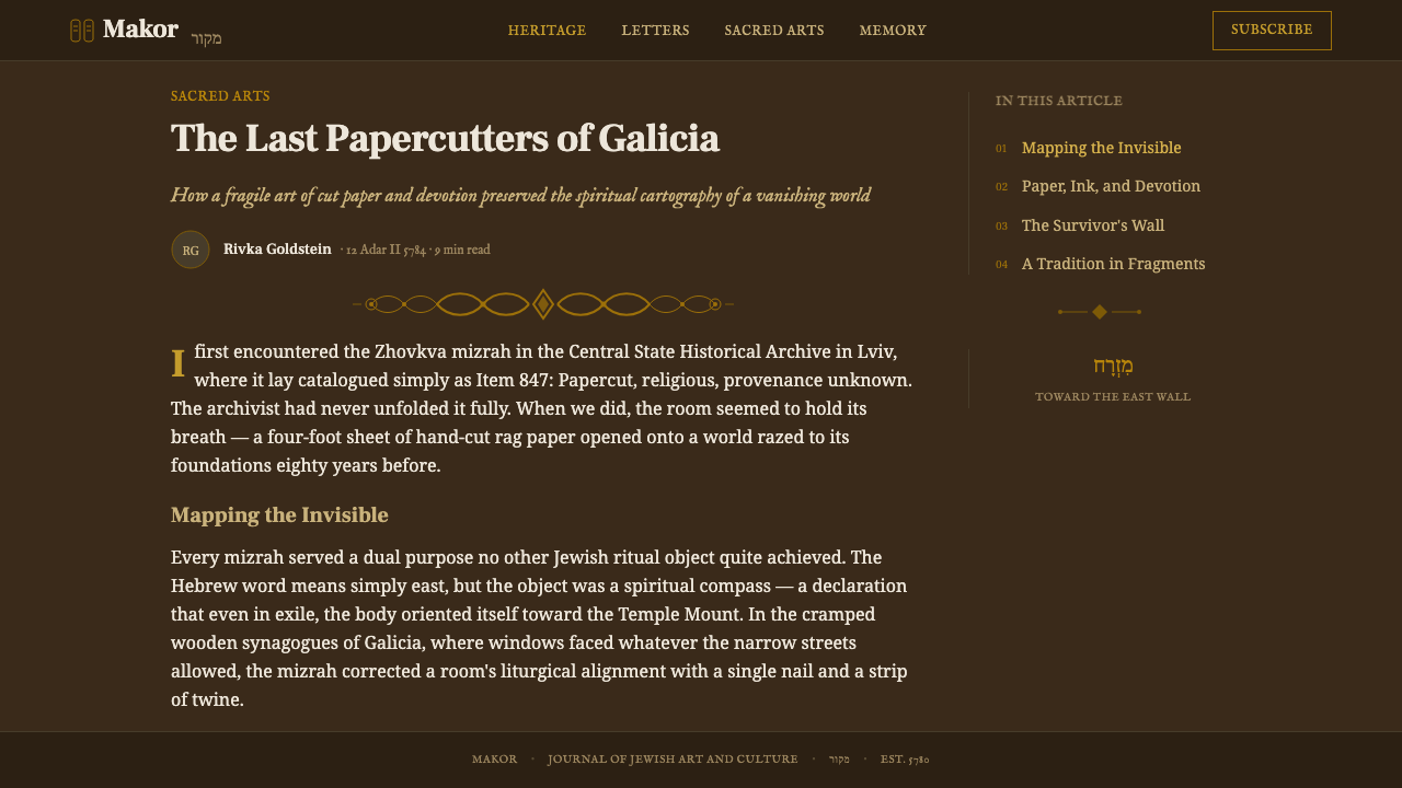
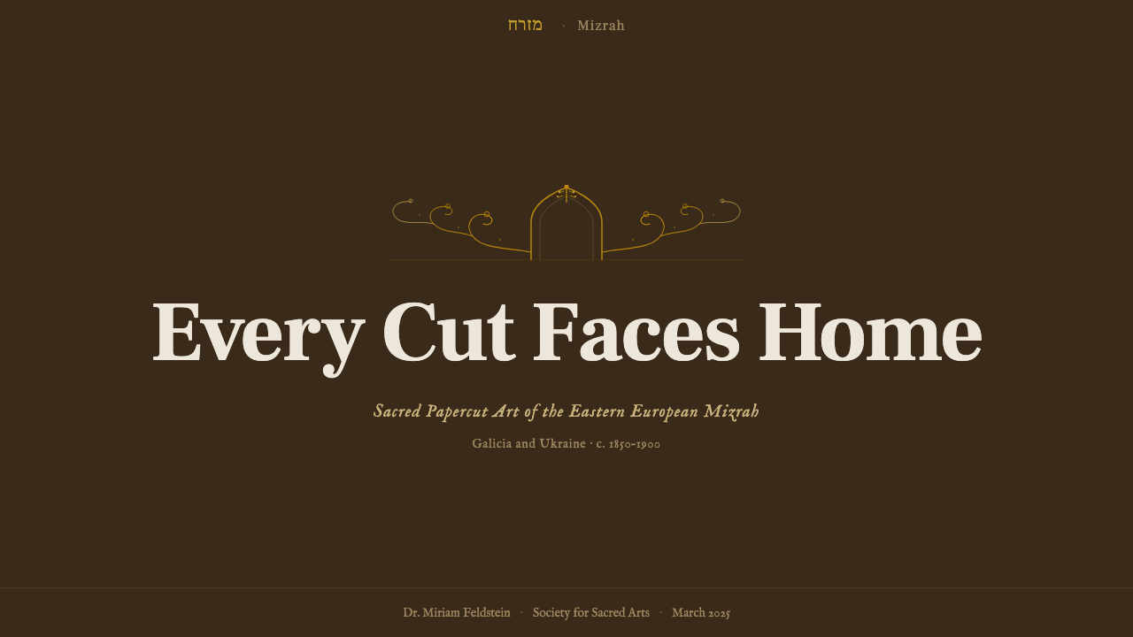
For presentation slides, a cover page can use the full ceremonial weight of the system: a centered, symmetrical composition with the title sitting where the medallion would sit, flanked by lighter decorative framing rather than literal animal illustrations, against the warm dark ground. Content and data slides should pull back from that density — keep the aged ground and indigo contrast for structure and headers, but let body text and chart areas breathe in a calmer zone, so the ornamental register is reserved for entry points rather than repeated on every slide.
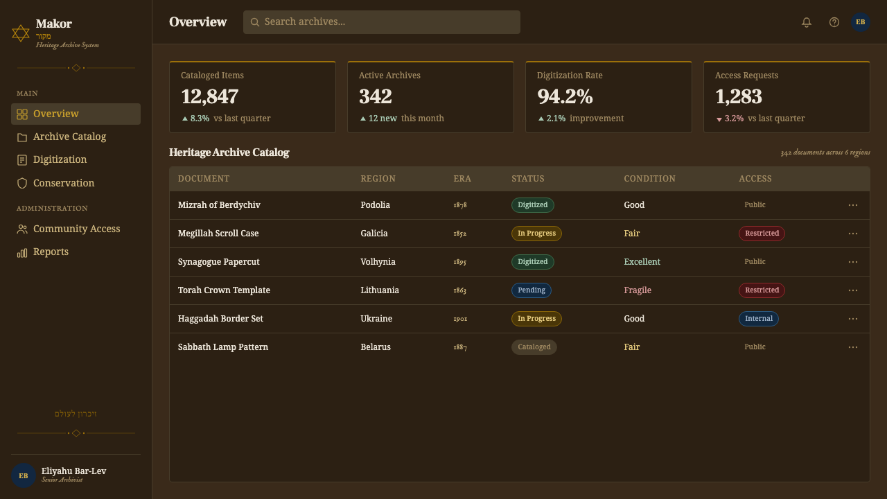
For web interfaces such as dashboards, the openwork sensibility translates best into border treatment, divider motifs, and card framing rather than dense pattern across entire backgrounds — a dashboard covered edge to edge in fine tracery becomes illegible fast. Reserve the deep indigo and warm dark ground for chrome and navigation, keep data-dense areas calmer for readability, and ration the gold or red accent the way the source object does: to mark the one number, alert, or tier that matters most. Pricing pages can lean into the symmetry principle directly — mirrored plan cards flanking a central 'recommended' tier read naturally within this system's logic.
For editorial and marketing work, the system's strength is ceremony: a masthead or hero band treated like the Hebrew lettering band — a continuous, rhythmic strip across the top — reads as authoritative and rooted rather than generic. Pull-quotes or callouts can borrow the medallion idea, framed and centered rather than left-aligned, signaling that a passage is a focal statement rather than passing text.
A common mistake is spreading the gold or red accent broadly, the way a more casual 'ornamental' style might use a metallic color throughout. That immediately breaks the hierarchy the source object depends on — sacredness is expressed through scarcity, not abundance. A second common mistake is putting the linework on a bright white ground; without a toned, darker backing, the logic of openwork glowing through negative space collapses, and the result reads as generic lace rather than this specific tradition.
Jewish Papercut Mizrah — FAQ
What does 'mizrah' actually mean, and why does the object face east?
Mizrah is the Hebrew word for 'east.' For Jewish communities living in Europe, Jerusalem lies to the east, so a mizrah was hung on the eastern wall of the home to give household prayer a fixed, physical orientation toward the holy city. The object is simultaneously a devotional aid and a wall decoration — its function determined its placement, and its placement is why it was made elaborate enough to be worth looking at every day.
How is this different from generic 'papercut art' or Chinese papercutting styles?
Papercutting as a technique appears across many cultures, but this system is specifically Ashkenazi and devotional: defined by its iconography (paired lions and eagles, a central tablet medallion, Hebrew text bands), its ritual function (orienting prayer toward Jerusalem), and its material history (rag paper mounted on a darkened backing, ca. 1850–1900 Ukraine and Galicia). Chinese papercutting has its own distinct motif vocabulary and ritual contexts. Treating 'papercut' as a single generic style erases the specificity that makes each tradition recognizable.
Why does the palette lean so heavily on indigo instead of a wider range of colors?
Historically, the ink used to finish a papercut's linework was typically a deep blue, functioning the way black ink functions in a woodcut — as the primary structural color that appears almost everywhere. Keeping the system's own palette narrow (deep indigo doing the bulk of the work, gold and barn red rationed to sacred focal points) preserves the hierarchy the original object depends on. Widening the palette to include many hues in equal proportion would dilute the sense that some elements are more sacred, and therefore more colored, than others.
Can this system work on a light background, or does it require a dark ground?
The system is built around a dark, aged, toned ground because the visual trick of openwork depends on light reading through negative space against something darker behind it. A version on a bright white ground is possible but loses the defining sensation of the source object — instead of pattern glowing through darkness, you get lines sitting flatly on a blank field, reading as generic lace rather than this specific devotional tradition. If a lighter palette is required, it is more faithful to lighten the ground toward warm parchment than to push it all the way to bright white.
Does the strict symmetry ever get relaxed, or is it always mirror-perfect?
In the source tradition, symmetry is close to absolute — ceremonial objects in this vocabulary signal order and sanctity through mirrored balance rather than dynamic tension. When adapting the system to a modern interface, the safest approach is to preserve strict symmetry for the most ceremonial elements (a hero section, a central focal card, a masthead) while allowing supporting content — body text, data tables, navigation — to follow ordinary reading conventions. Breaking the mirror on a focal element undercuts the system's core logic; relaxing it in supporting content does not.
Related design styles
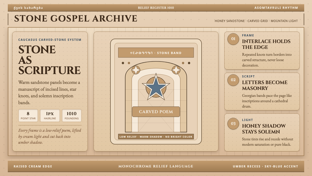 Georgian Nikortsminda Stone-CarvingStone becomes scripture. Cinzel caps and Georgian bands carve honey-sandstone…
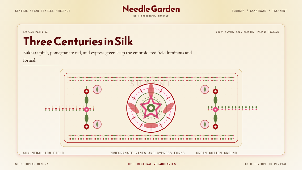 Uzbek Suzani TextileThree centuries in silk. Cream ground, pink medallions, vine borders, cypress…
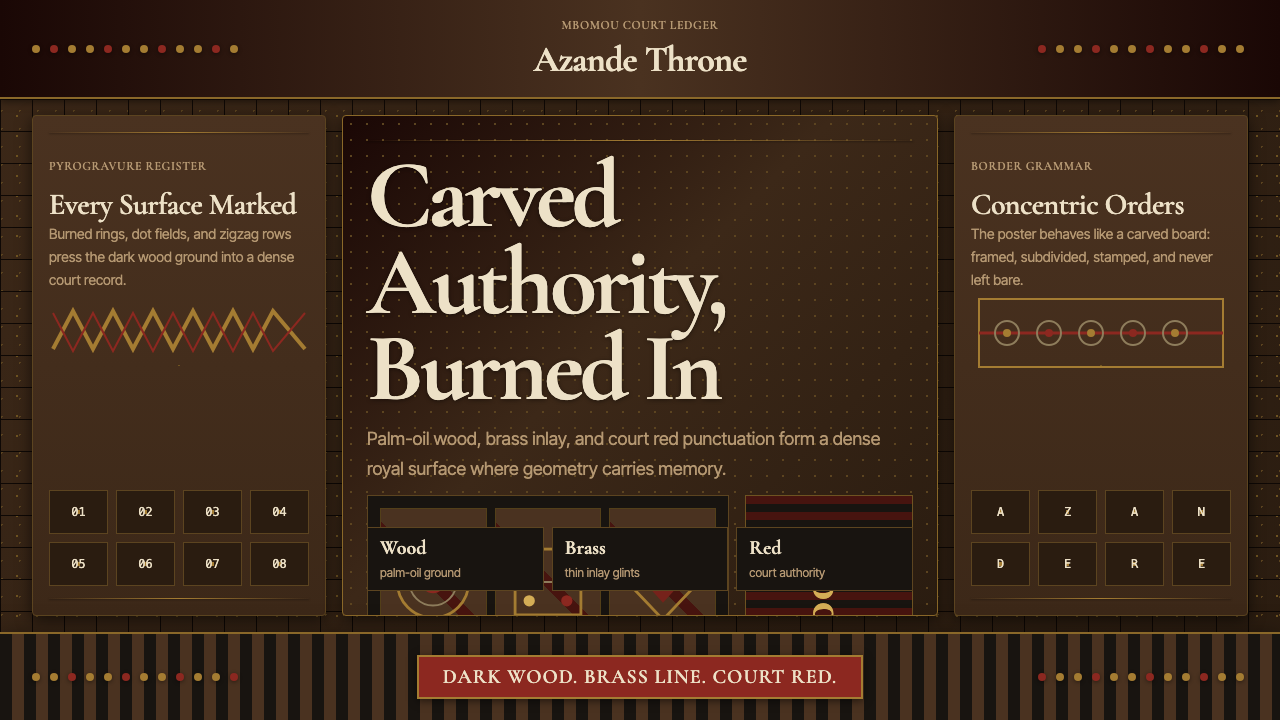 Central African Azande ThroneDense court gravity. Dark wood grids, brass dots, and court red cover every s…
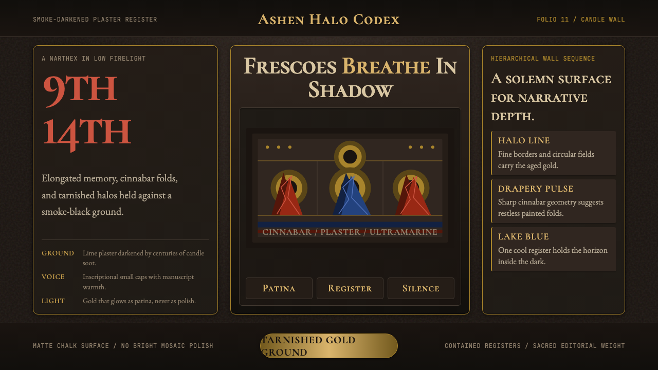 Macedonian Ohrid Fresco (Byzantine)Sacred darkness breathes. Tarnished gold rings, cinnabar folds, and plaster g…
 Suriname Maroon TembeDense memory, carved in rhythm. Kaolin lines cross hardwood brown in bilatera…
 Swahili Stone Town DoorTeak darkness remembers. Brass studs and Cormorant small caps frame a carved…