What is Swahili Stone Town Door?
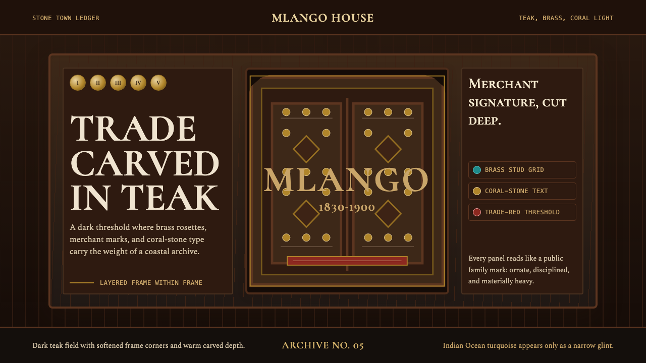
Carved in teak, studded in brass, and shadowed like the interior of a sultan's antechamber — the Swahili Stone Town Door style turns merchant-era Zanzibar into a complete visual language.
Swahili Stone Town Door in brief
The Swahili Stone Town Door style takes its cues from the monumental carved teak doors of Zanzibar's Stone Town — one of the most concentrated survivals of Indian Ocean mercantile architecture anywhere on earth. Each door in that tradition was not merely an entrance but a public declaration of its owner's lineage, faith, and commercial standing. Intricate geometric borders, floral rosettes, calligraphic Quranic inscriptions, and ranks of heavy brass spikes read from a distance as a single bold composition, and close up as an encyclopaedia of craft and culture.
As a design system, it channels the specific visual grammar of those doors into contemporary contexts: the deep darkness of teak wood as the dominant background tone, brass-warm metallic accents catching light against that shadow, and coral-stone or lime-washed white as the text surface — warm, granular, slightly rough against the polished metal. The overall sensibility is one of controlled density: many layers of pattern and material coexisting without chaos because each operates at a different visual scale.
This is a dark, richly textured style that rewards close looking. Unlike minimalist systems that achieve clarity by removal, the Stone Town Door aesthetic achieves presence by accumulation — layering ornament upon ornament until each threshold becomes a statement of accumulated wealth and craft mastery. Applied digitally or in print, it signals heritage, luxury, and cultural specificity rather than the universal rationalism of European-derived modernism.
Where does Swahili Stone Town Door come from?
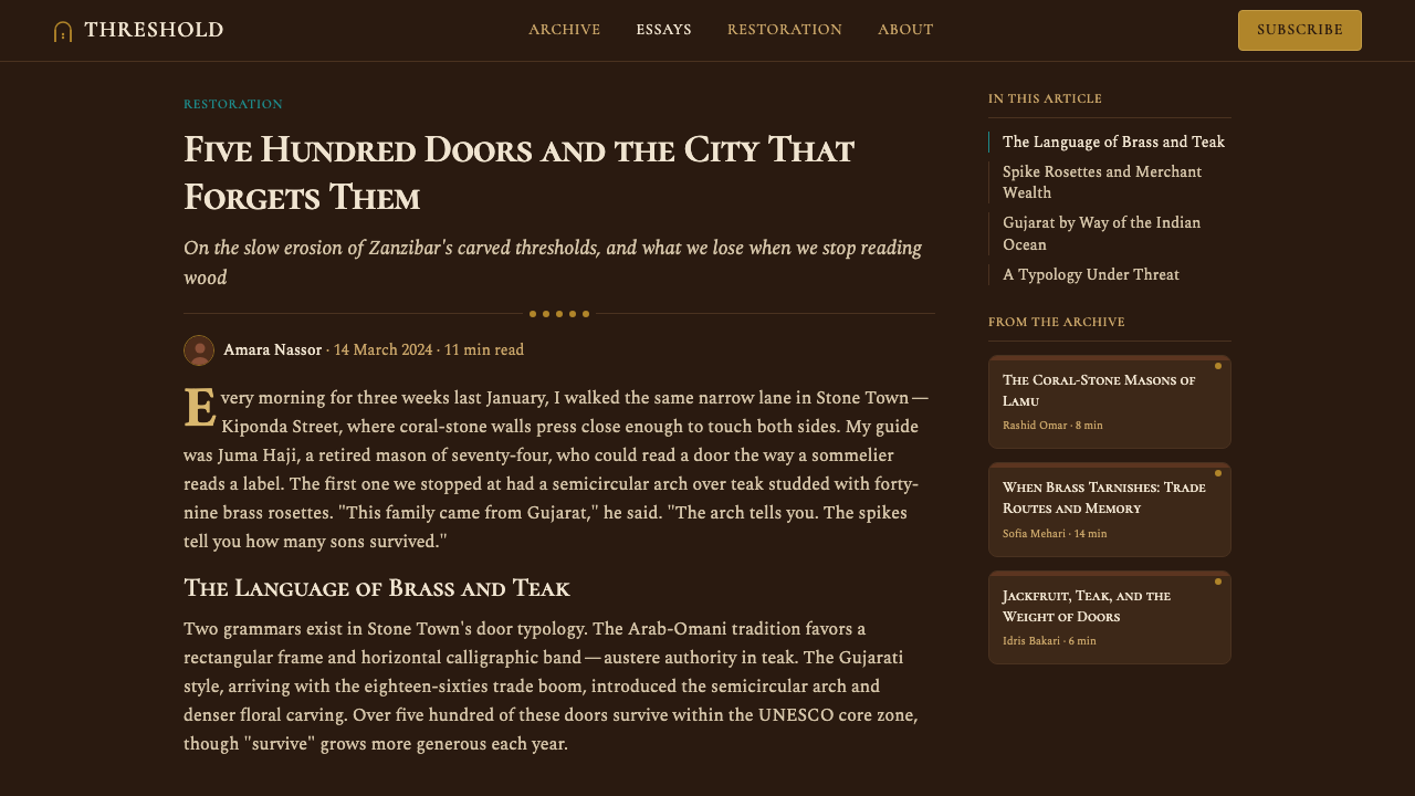
The doors of Zanzibar's Stone Town are products of the 1830s to 1900 trade-boom peak, when the island served as the dominant commercial hub of the western Indian Ocean. Sultan Seyyid Said relocated the Omani sultanate's capital from Muscat to Zanzibar in 1840, transforming what had been a modest coastal settlement into a city of stone merchant palaces. The doors were among the most conspicuous signals of that transformation: a wealthy merchant family commissioning a new door would spend as much on it as many families spent on an entire house.
The carving tradition that produced these doors was itself a synthesis of at least three distinct cultural streams. Indian Bhanushali carpenter families — who had emigrated to the Swahili coast as part of the dhow-trade diaspora — brought with them a woodworking tradition rooted in the intricately carved facades of Gujarati havelis. Arab patrons contributed the calligraphic and geometric vocabulary of Islamic ornament, including the interlocking star patterns and Quranic border inscriptions that frame many doors. African Swahili culture supplied the localized adaptation: the fish, chains, and frankincense motifs that appear on doors belonging to locally established families rather than recent Omani or Indian arrivals.
The brass studs — perhaps the most immediately recognizable element — are thought to have originated as a defence against war elephants in the Indian subcontinent, where studded doors were practical armour. On the Swahili coast, the military rationale had long since dissolved, but the studs remained as pure prestige signifiers: the more and larger the studs, the wealthier the household. Photographs and architectural surveys from the late nineteenth century show doors with hundreds of studs arranged in geometric formations, each one individually cast and hand-fitted.
Scholars Mark Horton and Abdul Sheriff have done the most systematic work documenting and interpreting Stone Town's architectural heritage. Horton's archaeological fieldwork established the longue durée of Swahili coastal urbanism — demonstrating that Stone Town's stone-building tradition predated the Omani sultanate by centuries — while Sheriff's social history of the Zanzibar slave and clove trade provided the economic framework that explains why merchant families invested so heavily in doors as status display. Today more than five hundred carved doors survive in Stone Town, which UNESCO inscribed as a World Heritage Site in 2000.
What defines the Swahili Stone Town Door look?
Background Darkness
The dominant ground tone is deep, warm darkness — the color of aged teak heartwood seen in low equatorial light. This is not the cool neutral black of digital minimalism but a brown-tinged shadow that carries the warmth of organic material and centuries of oil and touch. Against this ground, every other element achieves its intensity: brass glows, pale stone reads as luminous, and carved relief catches directional light to create its own internal structure.
Brass Warmth
Brass — used for studs, door knockers, hinges, and decorative roundels — is the primary accent material. Its color sits between gold and amber, warm enough to contrast with dark wood without the harshness of pure yellow. In the design system, brass tones serve as the interactive and highlight layer: they mark points of importance and draw the eye across a composition the way literal brass hardware draws attention across a carved door. The metallic quality — reflective but not mirrored, warm but not saturated — is central to the aesthetic.
Layered Geometric Ornament
The visual surface is built in concentric registers of pattern: a border of interlocking stars gives way to a band of stylized vines, which frames a central panel of deeper figural carving. Each register operates at a different scale and density, so the eye can read the composition from multiple distances. The geometry is Islamic in character — rigorous mathematical constructions based on six-fold and eight-fold symmetry — but the execution allows for organic variation within the grid, which gives the ornamentation its handcrafted character rather than a mechanical precision.
Calligraphic and Textural Typography
Text in the Stone Town Door tradition is never merely informational — inscriptions are ornament as much as language. Quranic verses and blessing phrases appear in classical Arabic script, their letterforms stretched, compressed, and knotted to fill decorative panels. In contemporary application, this translates to a preference for display typefaces with calligraphic heritage and strong horizontal strokes, set at generous sizes where individual characters can be appreciated as drawn forms. Body text benefits from the high contrast between the pale type surface and the dark ground, achieving legibility without the clinical neutrality of modern sans-serifs.
Relief Depth and Shadow
The carved door achieves its visual weight through physical depth — grooves several centimetres deep create shadows that shift as the light moves through the day. In the design system, this translates to a layered elevation model: elements at different depths cast distinct shadows, but those shadows are warm and directional rather than soft and diffuse. The depth is purposeful rather than decorative; it establishes hierarchy by placing some elements literally above others, and the shadows between layers create natural visual separators without requiring additional lines or borders.
Material Warmth and Organic Variation
Stone Town doors show their age proudly: the wood darkens unevenly with oil and touch, the brass studs patinate to different shades, and the carved surfaces collect the faint shadows of dust in their deepest grooves. This is not imperfection but character. The design system honours this by favouring textures and surfaces that suggest organic material over perfectly flat or uniformly saturated fields. Slight variations in tone within a single colour field — the unevenness of genuine wood grain or lime wash — are features rather than bugs, signalling authenticity and depth.
Symmetry as Structure, Asymmetry as Signature
The overall door composition is broadly symmetrical — left and right halves mirror each other in their major registers of pattern — but within each register, the artisan's hand introduces slight asymmetries: a rosette shifted fractionally off-centre, a chain motif that varies subtly between panels. This combination gives the design both the authority of formal order and the vitality of the handmade. Applied in contemporary contexts, it suggests using strict bilateral symmetry for the primary structural grid while allowing accent elements and details to deviate slightly, preventing the composition from feeling mechanically generated.

Who shaped Swahili Stone Town Door?
The Omani sultan who relocated his capital from Muscat to Zanzibar in 1840, triggering the island's transformation into the dominant hub of the western Indian Ocean trade. His court's patronage set the standard for merchant-class display: the elaborately carved teak door became, under his sultanate, the primary architectural marker of status. The visual vocabulary of the Stone Town door style — its particular combination of Omani Islamic geometry with Indian carpentry and Swahili coastal motifs — crystallised during the decades of his reign and its immediate aftermath.
The craftsmen most responsible for the technical execution of Stone Town's carved doors came from Bhanushali communities who had migrated to the Swahili coast as part of the Indian Ocean dhow-trade diaspora. They brought a woodworking tradition developed over centuries in Gujarat, where intricately carved wooden facades — havelis — were the dominant form of merchant-class domestic architecture. Their synthesis of Gujarati carpentry technique with the geometric and calligraphic demands of Omani and Swahili patrons produced the distinctive hybrid style that defines Stone Town's doors.
A British archaeologist whose systematic excavations of Swahili coastal sites from the 1980s onward fundamentally revised understanding of when and how the region's stone-building tradition began. Horton demonstrated that Stone Town's architectural heritage had deep pre-Omani roots, challenging colonial-era narratives that attributed all significant cultural achievement on the Swahili coast to Arab or Asian outside influence. His work established the longue durée framework that allows the Stone Town door style to be understood as a genuinely hybrid product of multiple intersecting cultures rather than an import.
A Tanzanian historian whose scholarship on the political economy of nineteenth-century Zanzibar — focusing on the slave trade, the clove plantation system, and the dynamics of the Indian Ocean commercial world — provided the social and economic context in which the door-carving tradition flourished. Sheriff's work makes clear that the doors were not merely decorative objects but active instruments in the competitive display of wealth among merchant families embedded in a global trade network. His book Slaves, Spices and Ivory in Zanzibar remains the definitive account of the era.
Unlike many design movements, the Stone Town door tradition has no single auteur or founding manifesto — it is a collective practice evolved over decades of commission, craft, and competition among hundreds of merchant families and their favoured workshops. Recognising this collective authorship is important for understanding the style: its richness comes precisely from the accumulation and negotiation of multiple cultural contributions, none of which dominates absolutely. The Indian Ocean dhow network that connected Oman, Gujarat, the Swahili coast, and beyond was itself the originating context, and the doors are that network's most enduring aesthetic monument.
How do you use Swahili Stone Town Door today?
The Stone Town Door style suits any context where heritage, material richness, and cultural authority are the desired signals — and where the audience is expected to spend time with the surface rather than scan past it. It is the opposite of neutral: choosing it is an explicit statement about the weight of history and the value of craft. Applied carelessly, that statement becomes noise; applied with understanding of what the system is actually doing, it creates distinctive work that is difficult to mistake for anything else.
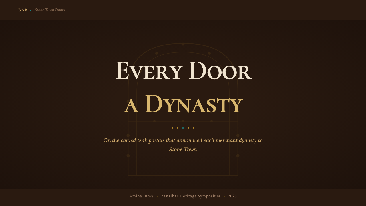
For presentation slides, the style works most powerfully on cover pages and section dividers where the full darkness and ornamental density can be deployed without competing with dense information. A cover built on this system might use a deep warm-dark background, a central geometric medallion built from the interlocking-star vocabulary, and a title set in a calligraphic display typeface at a size where individual letterforms read as architectural elements. Content slides should be treated more sparingly: use the dark ground for headers and callout blocks, shift to a lighter coral-stone or aged-paper tone for body text areas, and let the brass-warm accent carry hierarchy markers. Data slides work well when charts are treated as ornamental objects — bar charts framed by geometric borders, data points marked with small brass-toned roundels — rather than as clinical output.
For web interfaces, the style is best suited to landing pages, editorial features, and product detail pages where depth and prestige are the primary impressions. Dashboard and utility interfaces are a poor fit unless the product itself is a heritage brand or cultural institution — the ornamental density slows scanning. A web application using this style should commit to the dark background for hero and feature sections, use the coral-stone or aged-cream tone for content areas, and reserve brass accents for primary interactive elements: buttons, active states, progress indicators. Navigation should be restrained — wordmarks and typographic labels — with the ornamental vocabulary appearing only at section boundaries and decorative breaks.
For editorial and marketing work, the style excels at conveying the kind of authority associated with long-established institutions, rare goods, or deep specialist knowledge. A magazine cover or feature spread can use the full ornamental vocabulary — geometric border frames, layered pattern registers, calligraphic display type — while body text retreats to legible setting on a lighter ground. Marketing pages for luxury goods, cultural organisations, specialty food and beverage brands, or travel experiences rooted in historical places will find the Stone Town Door register natural and credible. The key is maintaining the contrast between the ornamental sections and the quieter reading sections; using the full pattern vocabulary at body-text density will exhaust the reader.
A common mistake when applying this style is treating it as a theme to be applied through colour substitution alone — choosing dark backgrounds and gold tones while keeping the underlying layout logic of a minimal modern system. The Stone Town Door aesthetic is not a colour palette; it is a way of organising visual density through layered registers of pattern at different scales. Without that layering, the dark-and-gold combination looks like generic luxury branding rather than a specific cultural tradition. Similarly, the style struggles when paired with very clean, geometrically rigid typography — the typeface needs enough calligraphic warmth to sit comfortably against the ornamental ground, or the contrast between text and decoration will feel like a collision rather than a conversation.
Swahili Stone Town Door — FAQ
Is this style culturally specific, or can it be used in any context?
The Stone Town Door style is deeply culturally specific — it is rooted in a particular place, period, and community of practice, and that specificity is the source of its visual distinctiveness. Using it thoughtfully means acknowledging and engaging with that heritage rather than treating it as a generic exotic texture. In practice, this means the style is best applied in contexts with a genuine connection to the themes it embodies: the Indian Ocean world, Swahili coastal culture, Islamic ornamental traditions, the aesthetics of merchant-era East Africa, or contemporary work that engages explicitly with these histories. Applying it as a random luxury veneer risks cultural superficiality. Applying it with genuine engagement — drawing on the actual visual grammar, understanding the layers of cultural synthesis it represents — produces work that is both distinctive and honest.
How do you balance the ornamental density with readability?
The original doors solve this problem through scale differentiation: the densest ornament appears at the borders and secondary registers, while the largest carved panel at the centre is often relatively spare — a single lotus or chain motif with space around it. The eye moves from the complex periphery to the clearer centre, and the contrast between the two densities makes both legible. In contemporary application, the same principle applies: reserve the full ornamental vocabulary for structural frames and decorative sections, and treat the content areas — especially body text — as a quieter ground. This requires deliberate restraint in the content zones, which can feel counter-intuitive given the style's richness, but the contrast is exactly what makes the ornament readable rather than oppressive.
Can the style work on a light background instead of dark?
It is possible but requires careful calibration. The Stone Town Door system is designed for dark grounds — the relationship between deep teak wood, glowing brass, and pale stone depends on the darkness as a unifying base. On a light background, the brass tones risk reading as brash or cheap rather than warm and prestigious, and the ornamental patterns lose the drama of relief-on-dark that gives them their three-dimensional quality. A light-background variant works better when the palette shifts toward the coral-stone and aged-lime-wash tones — keeping warmth but reducing contrast — and when the ornamental vocabulary is used selectively as border details rather than as the dominant surface. Think of it as the interior of the archway rather than the door itself: whitewashed coral stone with brass fixtures, rather than the carved teak face.
How does the style handle photography or illustration?
Photography sits naturally in the Stone Town Door system when it is treated as another material surface rather than as a transparent window. High-contrast photographs of actual Swahili coastal material culture — carved wood, brass objects, coral stone, textiles, spices — integrate well when given defined borders and allowed to rest within the ornamental frame. More general photography should be treated with a warm overlay or duotone treatment that harmonises its tones with the brass and teak palette, preventing a clash between the photographic naturalism and the stylised ornamental ground. Illustration works best when it adopts the vocabulary of the tradition: line work with the density and precision of architectural drawing, geometric stylisation of organic forms, or patterns that explicitly reference the interlocking-star and rosette vocabulary of the doors themselves.
Where does this style struggle most in contemporary applications?
The style struggles most in high-frequency functional interfaces — applications where users need to perform repeated tasks quickly, scan for information at a glance, or complete multi-step flows without friction. The ornamental density that gives the style its character works against the cognitive economy that utility interfaces require. It also struggles in very small format contexts: a notification banner, a mobile-first card component, a data table row — these formats cannot accommodate the layered register vocabulary without becoming illegible. The style is also a poor fit for brands whose core value is transparency or simplicity, since its fundamental grammar is accumulation rather than reduction. Finally, the style ages quickly when trends in 'dark luxury' move on, because it is recognisable enough to be imitated and fashionable enough to be over-used; the best counter to this is to apply it with the full specificity of its cultural reference rather than abstracting it into a generic dark-and-gold aesthetic.
Related design styles
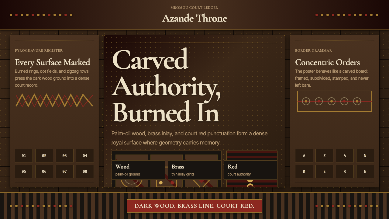 Central African Azande ThroneDense court gravity. Dark wood grids, brass dots, and court red cover every s…
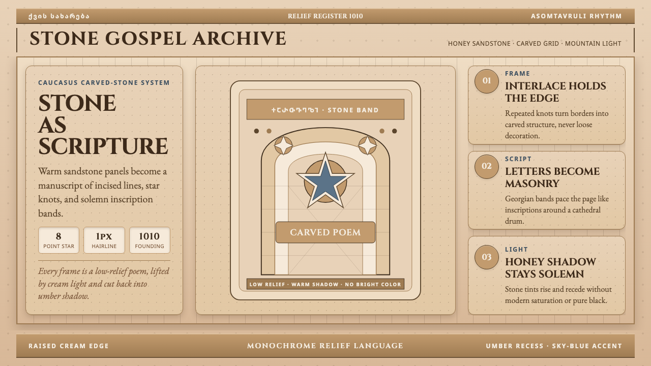 Georgian Nikortsminda Stone-CarvingStone becomes scripture. Cinzel caps and Georgian bands carve honey-sandstone…
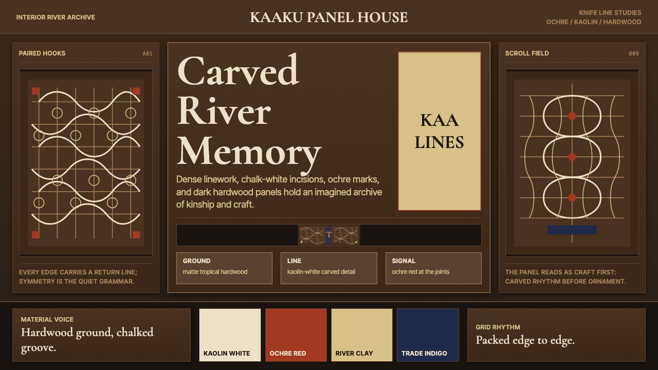 Suriname Maroon TembeDense memory, carved in rhythm. Kaolin lines cross hardwood brown in bilatera…
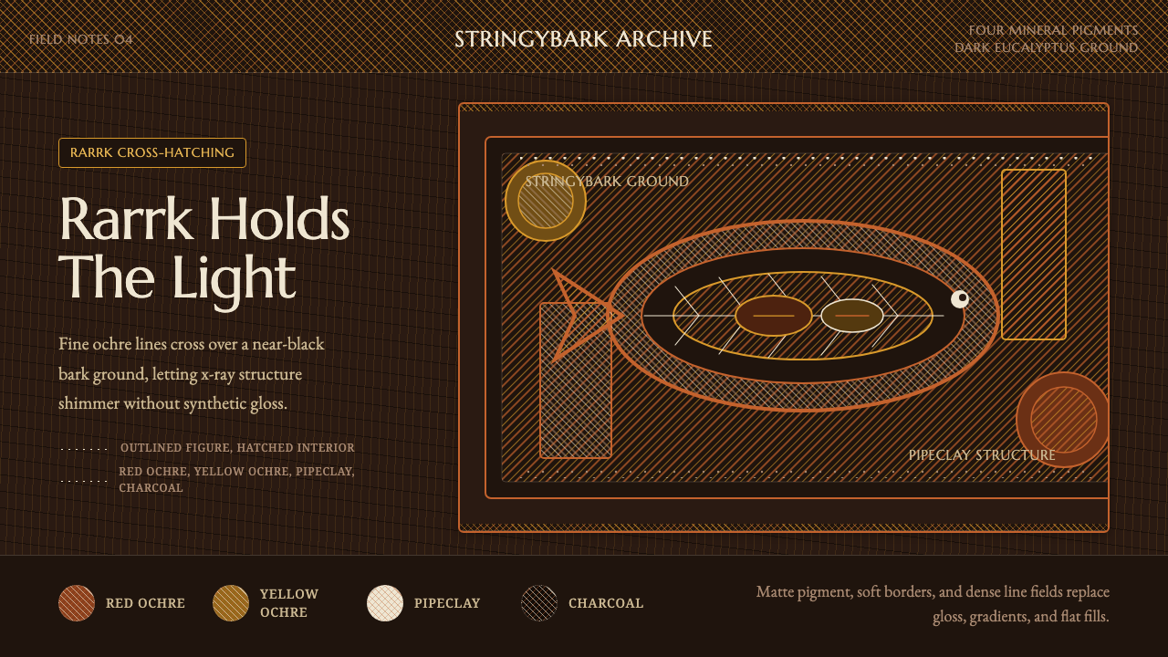 Arnhem X-Ray Bark PaintingShimmers without gloss. Ochre rarrk lines vibrate on dark stringybark.
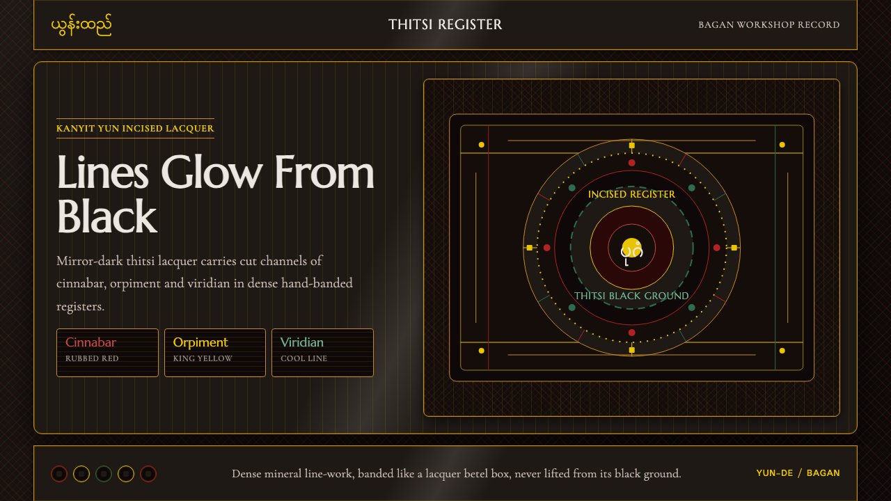 Burmese Yun LacquerwareLacquer glows in cut lines. Cinnabar, orpiment and viridian band a mirror-bla…
 Delft Blue PotteryRestrained, yet every inch speaks. Cobalt hairlines crowd a cream tile grid.