What is Kerala Mural Temple?什么是 Kerala Mural Temple?
Kerala Mural Temple translates the devotional density of ancient Hindu sanctum walls — saffron grounds, mineral-pigment warmth, and hairline brushwork borders — into a digital visual system where every surface earns its ornament.喀拉拉壁画寺庙风格将古印度教圣殿墙面的虔诚密度——藏红花底色、矿物颜料的温暖质感与细如发丝的笔触边框——转化为一套每一寸装饰皆有其意义的数字视觉体系。
Kerala Mural Temple in briefKerala Mural Temple 速览
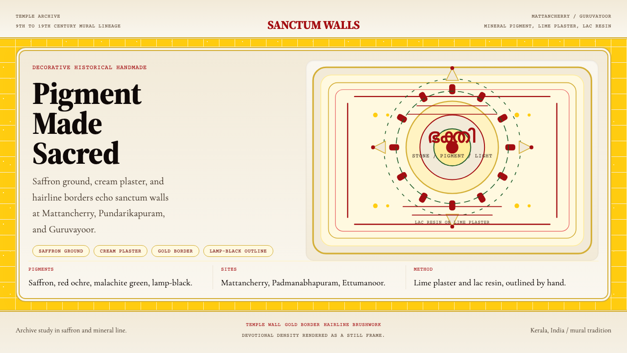
Kerala Mural Temple is a design system rooted in the sacred wall-painting tradition of Hindu temples in Kerala, India. Its visual language draws from compositions where saffron-yellow grounds anchor cream lime-plaster panels, mineral-derived colors carry deep symbolic weight, and every surface is filled with dense, purposeful ornament — the aesthetic inversion of minimalism, where richness is not excess but devotion made visible.喀拉拉壁画寺庙风格是一套植根于印度喀拉拉邦印度教寺庙神圣壁画传统的设计体系。其视觉语言来自这样的构图:藏红花黄底色承托石灰膏奶油色面板,矿物颜料承载深厚的象征意义,每一寸表面都被密集而有目的的装饰填满——这是极简主义的美学反面,丰盛在此不是过度,而是虔诚的可见形态。
The style is defined by its warmth and density: deep ochre and saffron tones dominate the page ground, while cream and off-white panels hold the primary content as though framing a sanctum inscription. Borders are treated as active elements — thin, precise, and layered in the manner of temple frieze bands — rather than passive dividers. Classical serif typography echoes the monumental stone inscriptions of Kerala's great temples, giving text a ceremonial gravity.这种风格以其温暖与密度为核心:深赭石与藏红花色调主导页面底色,而奶油色与近白色的面板如同框住圣殿铭文般容纳主要内容。边框被视为主动元素——细腻、精准、以寺庙楣带纹饰的方式层叠——而非被动的分割线。古典衬线字体呼应喀拉拉伟大寺庙的石碑题刻,赋予文字以庄严的仪式感。
Where Bauhaus removes ornament to reveal structure, Kerala Mural Temple adds ornament to consecrate it. The underlying grid is still disciplined and hierarchical, but it is expressed through patterned borders, layered framing, and a palette drawn from natural mineral pigments rather than industrial primaries. The result is a system that feels simultaneously ancient and precise — authoritative without being cold, ornate without being chaotic.包豪斯通过去除装饰来揭示结构,而喀拉拉壁画寺庙风格则通过增添装饰来神圣化结构。其底层网格同样严谨且富有层级,但它通过花纹边框、多重框架与来自天然矿物颜料而非工业三原色的色板来表达自身。结果是一套既感古老又感精准的体系——权威而不冷漠,华美而不混乱。
See the Kerala Mural Temple design system查看 Kerala Mural Temple 完整设计系统
Where does Kerala Mural Temple come from?Kerala Mural Temple 从何而来?
Kerala mural painting traces its documented origins to at least the 9th century, when the region's distinctive temple architecture — characterized by sloped wooden roofs, enclosed ambulatories, and small, intensely decorated inner sanctums — created the particular wall surfaces that the tradition would come to fill. The earliest surviving examples appear in sites such as the Thirunandikkara Cave Temple and the Thrissur Vadakkunnathan Temple complex, where panels depict episodes from the Ramayana and Mahabharata in a style already recognizable for its confident, sinuous line and strong mineral palette.喀拉拉壁画有文献记录的起源至少可追溯至9世纪。该地区独特的寺庙建筑——以斜木屋顶、封闭环廊和小而装饰极为密集的内圣殿为特征——造就了这一传统最终填满的特定墙面。现存最早的实例出现在蒂鲁南迪卡拉石窟寺与特里苏尔瓦达库纳坦寺庙建筑群等地,壁画以描绘《罗摩衍那》与《摩诃婆罗多》场景为主,其自信流畅的线条与强烈的矿物色板在风格上已清晰可辨。
The tradition reached its zenith between the 16th and 19th centuries, coinciding with a period of relative political stability and substantial temple patronage in Kerala. The Vijayanagara Empire and its successor kingdoms, along with local Nair chieftains and temple trusts, commissioned extensive cycles of mural painting across the region. Mattancherry Palace in Kochi — built by the Portuguese in 1555 and gifted to the Cochin royal family — houses some of the finest surviving examples: densely packed mythological scenes where figures are rendered in red ochre, lamp-black, yellow derived from orpiment, green from malachite, and white from lime, with no space left void between them.这一传统在16至19世纪达到鼎盛,与喀拉拉地区相对政治稳定、寺庙赞助资源充裕的时期相吻合。毗奢耶那伽罗帝国及其继承王国,连同当地纳亚尔酋长与寺庙信托,在全区委托创作了大量壁画系列。科钦马坦切里宫——1555年由葡萄牙人建造并赠予科钦王室——保存了一些最精美的现存实例:神话场景密密堆叠,人物以红赭石、灯黑、雌黄黄色、孔雀石绿与石灰白绘就,人物之间不留任何空白。
The technical process was as demanding as the theological program it served. Master artists — working within hereditary guilds whose knowledge passed from generation to generation — first prepared lime-plastered walls with multiple layers, allowing each to cure fully before applying the next. Pigments were ground from raw minerals: yellow from orpiment or turmeric, red from red ochre or vermilion, green from erinite or malachite, black from lamp soot, white from shell lime. Each pigment was bound with coconut water or plant-based fixing agents and applied to the still-damp plaster so that the color fused with the wall rather than sitting atop it. This fresco-like technique, combined with Kerala's humid climate, means that the most durable murals are those on sheltered interior walls where the lime could carbonate slowly over centuries.技术工艺与其所服务的神学议程同样苛刻。画师们——在世代相传的家族行会中工作——首先以多层石灰浆处理墙壁,让每一层充分固化后再施加下一层。颜料从原矿石磨制:黄色来自雌黄或姜黄,红色来自红赭石或朱砂,绿色来自磷灰石或孔雀石,黑色来自灯烟,白色来自贝壳石灰。每种颜料以椰子水或植物性固着剂调和,趁灰泥尚湿时施于墙面,使颜色与墙体融为一体而非浮于表面。这种类湿壁画技法加之喀拉拉湿润的气候,使得最耐久的壁画恰恰是那些位于庇护内壁的作品——石灰在那里可以历经数百年缓慢碳酸化。
The 20th century brought both decline and revival. Colonial-era temple renovation projects, changes in building materials, and shifting patronage patterns threatened the continuity of the hereditary guilds. The Kerala Lalithakala Akademi and a network of individual scholar-practitioners worked from the mid-20th century onward to document surviving murals, train new practitioners, and reintroduce the tradition into contemporary temple construction and public architecture. Artists such as Mammiyoor Krishnankutty Nair became central figures in this revival, combining scholarly research into historical techniques with active mural practice. Today the tradition is recognized as a living art form — practiced in newly commissioned temple murals, taught in art schools, and documented in academic archives — while also functioning as a source vocabulary for contemporary design and visual communication.20世纪带来了衰落与复兴的双重面貌。殖民时期的寺庙修缮工程、建筑材料的更替以及赞助模式的变迁,威胁着家族行会的传承连续性。喀拉拉拉利塔卡拉学院与一批个人学者从业者,自20世纪中叶起致力于记录现存壁画、培训新一代画师并将这一传统重新引入当代寺庙建造与公共建筑。马米尤尔·克里希南库蒂·纳伊尔等艺术家成为这场复兴的核心人物,将历史技法的学术研究与积极的壁画实践相结合。今天,这一传统被认可为活态艺术形式——在新委托的寺庙壁画中实践,在美术学校中传授,在学术档案中记录——同时也作为当代设计与视觉传播的源语汇而发挥着影响。
What defines the Kerala Mural Temple look?Kerala Mural Temple 的视觉特征是什么?
Color色彩
The palette is drawn from mineral pigments found in the historical tradition: saffron-yellow as the dominant ground, deep red ochre for figure outlines and emphasis, malachite green as a secondary accent, lamp-black for structural line and fine detail, and cream or shell-white for highlight and panel surfaces. These colors carry devotional and cosmological associations — the saffron ground evoking sacred fire and auspiciousness, the deep reds signifying divine energy. Secondary and tertiary hues from outside this mineral vocabulary rarely appear; the warmth of the palette comes from the natural impurity of each pigment rather than from brightness.色板取自历史传统中的矿物颜料:藏红花黄作为主导底色,深红赭石用于人物轮廓与强调,孔雀石绿作为次级点缀,灯黑用于结构线条与细节,奶油色或贝壳白用于高光与面板表面。这些颜色承载着虔诚与宇宙论的关联——藏红花底色唤起圣火与吉祥之意,深红象征神圣能量。这套矿物词汇之外的间色与复色极少出现;色板的温暖来自每种颜料天然的不纯粹性,而非来自高饱和度。
Ornamental Density装饰密度
Unlike Western classical traditions that use negative space to isolate and elevate individual figures, Kerala mural composition treats the entire surface as a field to be consecrated. Every background is patterned, every border is layered, every figure is surrounded by iconographic attributes and decorative framing. In a digital application of this principle, the goal is not to fill space arbitrarily but to ensure that every zone of the composition carries visual intention — empty white space would be a theological error, a surface left unsanctified.与西方古典传统以留白来隔离并抬升单一人物不同,喀拉拉壁画构图将整个表面视为需要被神圣化的场域。每一处背景都有纹样,每一道边框都层层叠叠,每一个人物都被图像志属性与装饰框架所环绕。在这一原则的数字应用中,目标不是任意地填满空间,而是确保构图中每一区域都承载视觉意图——空白的白色表面将是一个神学错误,一片未被圣化的表面。
Line and Contour线条与轮廓
The defining mark of Kerala mural work is its confident, unbroken contour line. Historical painters used a single-hair brush — a technique called 'lekhana' — to draw figures and borders with a line that is simultaneously precise and alive, never mechanical. The line varies subtly in weight to model volume without recourse to tonal shading: thicker where a form turns away from the viewer, thinner where it faces forward. In digital application, this principle manifests as hairline borders, fine rule lines, and typographic letterforms with subtle stroke contrast — never the homogeneous line weight of geometric minimalism.喀拉拉壁画作品的决定性标志是其自信而不间断的轮廓线。历史画师使用单毛笔——一种称为「lekhana」的技法——以一根细线勾勒人物与边框,这条线同时精准而充满生命力,从不机械。线条在粗细上有微妙的变化,以此塑造体积感而无需借助色调渐变:形体背向观者处较粗,面向观者处较细。在数字应用中,这一原则体现为发丝般的边框、细腻的分割线,以及笔画对比微妙的衬线字体字形——永远不是几何极简主义那种均质的线重。
Typography字体排印
Classical serif typefaces are the natural companions of Kerala mural compositions, evoking the monumental inscriptions carved into the granite facades of Kerala's great temples. The serif detail echoes the quality of a master's brushstroke — purposeful, unhurried, slightly weighted at the terminal. Type is set with generous leading to allow each line to breathe within its ornamental frame, and size hierarchies are established through weight and measure rather than through color variation. Display text benefits from letterforms with high contrast between thick and thin strokes, reinforcing the visual rhythm of the surrounding mural line work.古典衬线字体是喀拉拉壁画构图天然的搭档,令人联想到镌刻在喀拉拉伟大寺庙花岗岩立面上的纪念性碑铭。衬线细节呼应大师笔触的品质——有目的、不急促、在笔端略微加重。文字设置宽松的行距,让每一行在其装饰框架中得以呼吸;字号层级通过字重与行宽而非颜色变化来建立。展示性文字从粗细笔画高对比度的字形中获益,强化周围壁画线条的视觉节奏。
Framing and Borders框架与边框
Temple murals are never presented without their architectural frame: carved stone surrounds, painted frieze bands, and threshold markings that signal the boundary between sacred and profane space. In design application, this principle becomes a system of layered borders — a fine outer rule, a slightly wider mid-band, and an innermost content frame — that contain and elevate the material within. These borders are not decorative afterthoughts but structural members of the composition, establishing hierarchy and marking transitions between sections as firmly as a temple doorway marks a transition between spaces.寺庙壁画从不在没有建筑框架的情况下呈现:雕刻石质围框、彩绘楣带与门槛标记,标示出神圣空间与世俗空间之间的边界。在设计应用中,这一原则转化为层叠边框系统——一道细外线、一道稍宽的中间带、一道最内层的内容框——容纳并提升其中的材料。这些边框不是装饰性的事后添加,而是构图的结构性成员,建立层级并如同寺庙门廊标示空间过渡般坚定地标示段落之间的转换。
Iconographic Systematization图像志系统化
Kerala temple murals operate within a codified iconographic grammar: each deity has prescribed attributes, colors, gestures, and spatial positions. This is not arbitrariness dressed in tradition but a legibility system — a viewer who knows the grammar can read a composition as fluently as a text. In design terms, this corresponds to a strict component system where each element type has a defined role, fixed visual properties, and a predictable position in the hierarchy. Variation within the system is permitted; violation of the system's grammar undermines its readability.喀拉拉寺庙壁画在一套成文的图像志语法中运作:每位神祇都有规定的属性、颜色、手势与空间位置。这不是披着传统外衣的任意性,而是一套可读性系统——熟悉语法的观者可以像读文本一样流畅地阅读构图。在设计术语中,这对应于一套严格的组件系统,其中每种元素类型都有定义好的角色、固定的视觉属性,以及在层级中可预期的位置。系统内的变体是允许的;违反系统语法则会破坏其可读性。
Surface Warmth表面温暖感
The mineral pigments of the Kerala tradition produce colors with a warmth and depth that synthetic equivalents rarely match. Saffron ground has a golden undertone; red ochre leans slightly brown; malachite green carries a grey-green complexity. In digital surfaces, this warmth is preserved by choosing tones with warm undertones — no cool-white backgrounds, no blue-shifted neutrals, no pure saturated hues. The warmth of the palette is what distinguishes the style from other high-density ornamental traditions and what makes it feel materially grounded rather than decoratively arbitrary.喀拉拉传统的矿物颜料产生一种合成颜料极少能媲美的温暖与深度。藏红花底色带有金色底调;赭红略微偏褐;孔雀石绿承载着灰绿色的复杂性。在数字表面中,这种温暖感通过选择带暖色底调的色调来保留——没有冷白背景,没有偏蓝的中性色,没有纯粹高饱和度的色相。色板的温暖感是这种风格区别于其他高密度装饰传统的关键,也是使其感觉有材料质感而非装饰性任意的根本所在。
See the Kerala Mural Temple design system查看 Kerala Mural Temple 完整设计系统
Who shaped Kerala Mural Temple?谁塑造了 Kerala Mural Temple?
Krishnankutty Nair is among the most celebrated practitioners of the Kerala mural revival in the 20th century, combining deep scholarship into historical technique with active production of new temple murals. His work at sites across Kerala helped establish the standards for what authentic revival practice looked like — how historical pigments could be approximated with durable modern materials, how traditional iconographic programs could be extended into newly constructed sanctum spaces, and how the master-apprentice transmission could be formalized into teachable curricula without losing the gestural immediacy of the tradition.克里希南库蒂·纳伊尔是20世纪喀拉拉壁画复兴中最受推崇的实践者之一,将对历史技法的深度学术研究与积极的新寺庙壁画创作相结合。他在喀拉拉各地的工作,帮助确立了真正的复兴实践标准——历史颜料如何用耐久的现代材料近似还原,传统图像志议程如何延伸至新建圣殿空间,以及师徒传承如何在不失传统笔触即时性的前提下被正式化为可教授的课程体系。
Saji T.K. represents the contemporary generation of Kerala mural artists working across both traditional temple commissions and public and gallery contexts. His practice demonstrates the tradition's adaptability: the same technical vocabulary — mineral-derived palette, confident contour line, layered iconographic density — translates from sacred sanctum walls to secular public murals and contemporary art exhibitions without losing its essential character. His engagement with the tradition as a living practice rather than a historical reconstruction has been influential in framing how Kerala mural painting is understood and taught in contemporary art education.萨吉·T.K.代表着当代喀拉拉壁画艺术家群体,同时活跃于传统寺庙委托与公共及画廊语境。他的实践展示了这一传统的适应性:同样的技术词汇——矿物衍生色板、自信的轮廓线、层叠的图像志密度——从神圣圣殿墙壁移植至世俗公共壁画与当代艺术展览,而不失其本质特征。他将这一传统视为活态实践而非历史重建的参与方式,对当代艺术教育如何理解与传授喀拉拉壁画产生了深远影响。
The great mural cycles of Mattancherry Palace, Guruvayoor Temple, and the Krishnapuram Palace were produced by masters whose names were not recorded — not because their skill was unrecognized, but because the tradition understood the work as offering rather than authorship. These anonymous painters developed the canonical compositional programs, the precise iconographic grammar, and the technical standards of lime preparation and pigment binding that the revival tradition would later study and reconstruct. Their anonymity is part of the tradition's theological orientation: the artist's ego is dissolved into the act of devotional making.马坦切里宫、古鲁瓦尤尔寺庙与克里希纳普拉姆宫的伟大壁画系列,出自那些名字未被记录的大师之手——不是因为他们的技艺未被认可,而是因为传统将这项工作理解为供奉而非创作。这些匿名画师发展出典范性的构图议程、精确的图像志语法,以及石灰处理与颜料调和的技术标准,后来的复兴传统将对这些内容加以研究与重建。他们的匿名性是这一传统神学取向的组成部分:艺术家的自我消融于虔诚制作的行为之中。
The Vijayanagara Empire (1336–1646) and its regional successor courts provided the institutional patronage that enabled the most ambitious mural cycles of the 16th and 17th centuries. Temple construction and decoration were understood as acts of royal devotion and political legitimacy simultaneously — a king who commissioned a great mural cycle was fulfilling both his spiritual obligations and his role as protector and amplifier of Hindu culture. The aesthetic choices that define what we now recognize as classical Kerala mural style — the particular balance of iconographic density, the warmth of the mineral palette, the monumental scale of individual figures — were shaped in part by the theological and political priorities of this patronage context.毗奢耶那伽罗帝国(1336—1646年)及其地方继承王廷提供了支撑16至17世纪最宏大壁画系列的制度性赞助。寺庙建造与装饰同时被理解为王室虔诚与政治合法性的行为——委托创作伟大壁画系列的君王,既是在履行其灵性义务,也是在扮演印度教文化守护者与传扬者的角色。我们如今认定为古典喀拉拉壁画风格的审美选择——图像志密度的特定平衡、矿物色板的温暖感、单体人物的纪念性体量——在一定程度上是由这一赞助语境中的神学与政治优先项所塑造的。
How do you use Kerala Mural Temple today?今天怎么用 Kerala Mural Temple?
Kerala Mural Temple is one of the more architecturally specific styles available in contemporary design work — it brings a strong cultural and aesthetic proposition that works powerfully when matched to the right context, and can feel incongruous when misapplied. The style is appropriate wherever warmth, ceremonial authority, visual richness, and depth of craft signal the right values: luxury and heritage brands, cultural institutions, spiritual or wellness platforms with a South Asian or broadly Eastern aesthetic register, editorial design for subjects involving history, mythology, or material culture, and presentation contexts that need to communicate gravitas and refinement rather than modernity and speed.喀拉拉壁画寺庙风格是当代设计实践中建筑特性最鲜明的风格之一——它带来强烈的文化与美学主张,在匹配正确语境时效果强劲,错误应用时则可能产生格格不入之感。这种风格适用于温暖感、仪式权威、视觉丰盛与工艺深度恰好是正确价值信号的场合:奢华与遗产品牌、文化机构、带有南亚或泛东方美学取向的灵性或健康平台、涉及历史、神话或物质文化主题的编辑设计,以及需要传达庄重与精炼而非现代性与速度的演示语境。
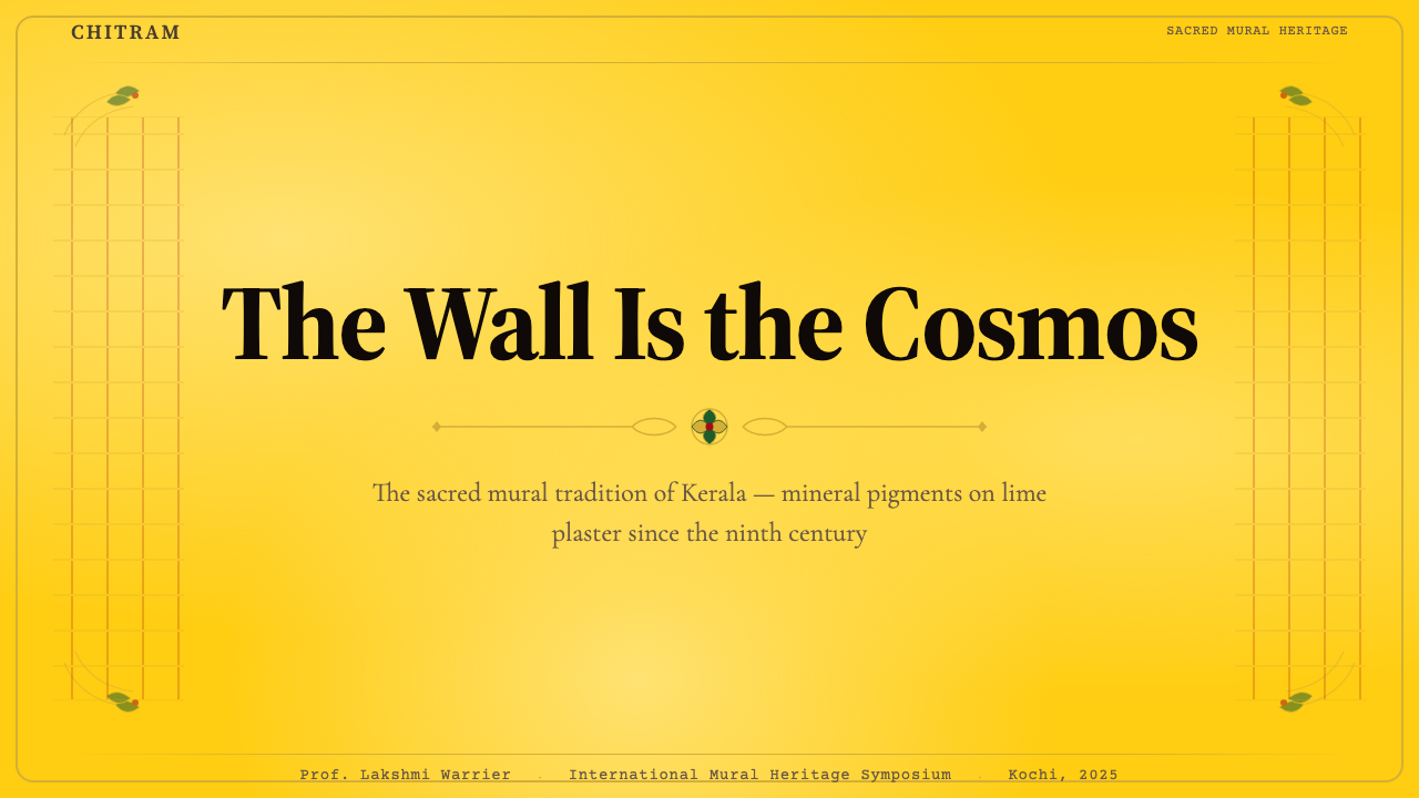
For presentation slides, the style rewards a deliberate structural approach. Cover slides work best with the saffron ground as the dominant surface, a cream panel inset as the title field, and fine border rules framing the composition — no photography, no geometric minimalism, the visual weight coming entirely from color, typography, and ornamental border detail. Content slides should maintain the warm ground across all pages for visual consistency, with cream panels defining the primary content zone. Data slides can deploy the mineral palette as a symbolic language: the deep red for primary metrics and critical thresholds, the malachite accent for secondary data series, black for axis lines and labels. The overall composition should feel like an illuminated manuscript page — densely organized but never random.对于演示文稿,这种风格需要刻意的结构性方法来回报。封面幻灯片以藏红花底色作为主导表面效果最佳,嵌入奶油色面板作为标题区域,细边框线条框定构图——无摄影图像,无几何极简主义,视觉重量完全来自色彩、字体与装饰边框细节。内容幻灯片应在所有页面保持暖色调底色以确保视觉一致性,奶油色面板定义主要内容区域。数据幻灯片可将矿物色板用作象征性语言:深红用于主要指标与临界阈值,孔雀石绿用于次级数据系列,黑色用于坐标轴线与标签。整体构图应如同一页彩饰手稿——密集有序,从不随机。
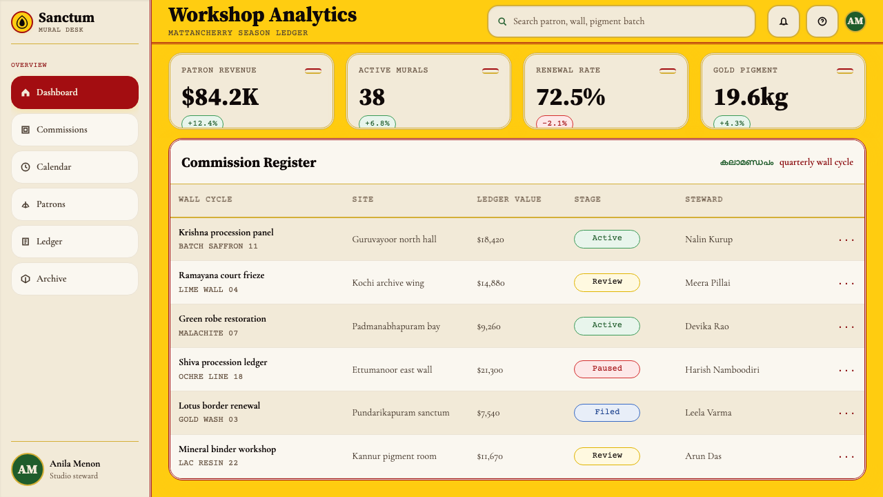
For web interfaces, the style is particularly well-suited to contexts where the visual experience is itself part of the product's value proposition — cultural heritage platforms, luxury e-commerce, editorial publications with a strong design identity, and pricing pages for products positioning themselves in the premium or artisanal tier. The implementation approach: use the saffron or deep ochre as the page ground, cream panels for card and content containers, layered border systems for component framing, and classical serif typography for all primary text. Dashboard applications can use the mineral palette for state differentiation — alert states in ochre-red, stable states in cream-white, active states with a malachite accent — with hairline borders defining component boundaries. Navigation should carry the same ceremonial weight as a temple threshold, clearly marking zones of transition.对于网页界面,这种风格特别适合视觉体验本身是产品价值主张组成部分的场景——文化遗产平台、奢华电子商务、具有强烈设计身份的编辑类出版物,以及将自身定位于高端或手工艺层级的产品定价页面。实施方法:以藏红花或深赭石作为页面底色,奶油色面板用于卡片与内容容器,层叠边框系统用于组件框架,古典衬线字体用于所有主要文字。仪表板应用可将矿物色板用于状态区分——告警状态用赭红色,稳定状态用奶油白,激活状态用孔雀石绿点缀——以发丝状边框定义组件边界。导航应承载与寺庙门槛同等的仪式重量,清晰标示区域过渡。
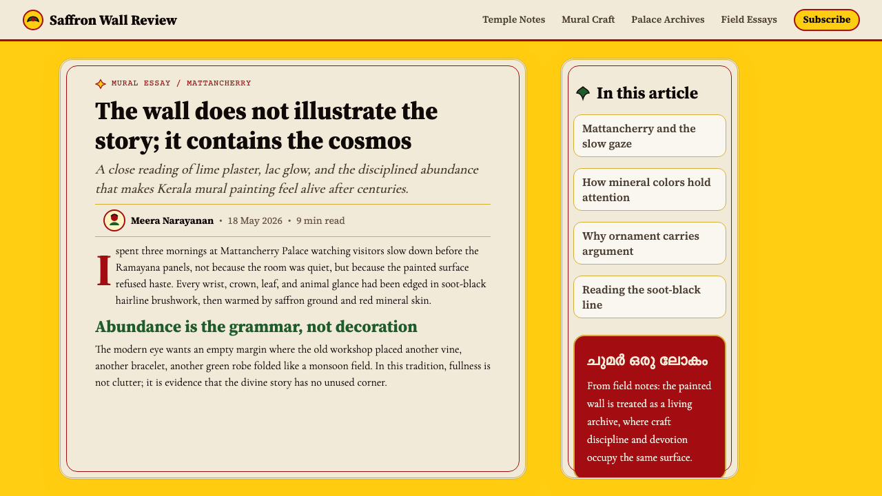
For editorial and marketing applications, the style's richness translates naturally into high-impact layout work. A Kerala Mural Temple editorial spread pairs a warm saffron or ochre dominant field with tightly leaded classical serif text, ornamental border bands between sections, and pull-quotes set in enlarged letterforms against the cream panel tone. Marketing pages benefit from the style's poster-quality authority: full-width section blocks alternate between saffron-ground and cream-ground, with the deep red reserved for calls to action and emphasis. The style works particularly well for content involving craft, provenance, heritage, and ritual — any context where the visual communication needs to signal that what is being offered has depth and history, not just immediate utility.对于编辑与营销应用,这种风格的丰盛感自然转化为高冲击力的版式设计。喀拉拉壁画寺庙风格的编辑跨页,将温暖的藏红花或赭石主导场域与行距紧凑的古典衬线正文配对,段落间设装饰楣带,摘录引语以放大字形置于奶油面板色调之上。营销页面从这种风格的海报式权威中获益:全宽段落块在藏红花底与奶油底之间交替,深红保留用于行动号召与强调。这种风格对涉及工艺、出处、遗产与仪式的内容尤其有效——任何视觉传播需要表明所提供之物具有深度与历史、而不仅仅是即时实用性的场景。
A common mistake when applying Kerala Mural Temple is mistaking decorative density for visual noise. The style's power depends on the decoration being systematic and legible: borders at consistent weights, palette colors used with iconographic intention rather than for variety, and ornamental elements confined to designated structural roles such as framing, dividing, and thresholding. Adding pattern arbitrarily, mixing warm and cool tones, or using the saffron ground inconsistently across a composition breaks the devotional logic of the system. Similarly, pairing the style with sans-serif or geometric typefaces undermines the visual coherence — the ceremonial quality of Kerala Mural Temple depends on typography that carries the same crafted, stroke-varied quality as the mural line itself.应用喀拉拉壁画寺庙风格时最常见的错误,是将装饰密度误认为视觉噪音的许可。这种风格的力量依赖于装饰的系统性与可读性:边框保持一致的粗细,色板颜色以图像志意图而非为了多样性来使用,装饰元素限定在其指定的结构角色中——框架、分割与门槛标示。任意添加图案、混用暖色与冷色调,或在构图中不一致地使用藏红花底色,都会打破这套系统的虔诚逻辑。同样,将这种风格与无衬线或几何字体配对会破坏视觉连贯性——喀拉拉壁画寺庙风格的仪式品质依赖于承载着与壁画线条同等工艺感与笔画变化质量的字体排印。
See the Kerala Mural Temple design system查看 Kerala Mural Temple 完整设计系统
Kerala Mural Temple — FAQKerala Mural Temple · 常见问题
Is Kerala Mural Temple appropriate for products without any South Asian cultural connection?喀拉拉壁画寺庙风格适合与南亚文化没有任何关联的产品吗?
The style can be applied outside its originating cultural context, but doing so well requires understanding what the visual system is communicating beyond surface appearance. The Kerala mural aesthetic signals depth, craft, devotion, warmth, and heritage — values that can be relevant to products in luxury, wellness, cultural, and editorial contexts regardless of geographic specificity. Where it becomes problematic is when the surface iconography (specific deity representations, sacred symbols) is applied without understanding or respect for what those symbols mean. The design system abstracted from the style — mineral palette, ornamental density, layered borders, classical type — is fully transferable; specific sacred iconographic content should be handled with cultural awareness.这种风格可以应用于其起源文化语境之外,但要做好,需要理解这套视觉系统在表面外观之外传达的内容。喀拉拉壁画美学传递深度、工艺、虔诚、温暖与遗产——这些价值观在奢华、健康、文化与编辑语境中的产品里可能是相关的,与地理特殊性无关。当表面图像志(特定神祇的形象、神圣符号)在没有理解或尊重这些符号意义的情况下被应用时,才会产生问题。从这种风格中抽象出的设计系统——矿物色板、装饰密度、层叠边框、古典字体——完全可以移植;特定的神圣图像志内容则应以文化自觉来处理。
How does Kerala Mural Temple differ from other South Asian ornamental design traditions?喀拉拉壁画寺庙风格与其他南亚装饰设计传统有何不同?
Several features distinguish it from neighboring traditions. The mineral palette — with saffron-yellow as the dominant ground — is specific to Kerala's tradition and differs from the more jewel-toned palette of Rajasthani miniature painting or the cooler, blue-and-white emphasis of certain Mughal decorative work. The thick, confident contour line that defines Kerala mural figures has a boldness and directness that Tanjore painting, for example, replaces with gold-leaf inlay and gem-encrusted surfaces. The iconographic program draws specifically from Dravidian traditions of the South — the Ramayana, Puranas, and Kerala's own regional mythology — rather than from the Persianate or Central Asian influences visible in northern Indian court art. The style's combination of warm ground, strong outline, and controlled mineral palette is distinctive and specific.若干特征使其区别于邻近传统。矿物色板——以藏红花黄为主导底色——是喀拉拉传统所特有的,不同于拉贾斯坦细密画更偏宝石色调的色板,也不同于莫卧儿装饰艺术中某些作品的冷调蓝白强调。定义喀拉拉壁画人物的粗犷自信轮廓线具有一种大胆与直接,而坦焦尔绘画则以金箔嵌入与宝石镶嵌表面来取代它。图像志议程专门取自南方的达罗毗荼传统——《罗摩衍那》、《往世书》与喀拉拉自身的地方神话——而非北印度宫廷艺术中可见的波斯或中亚影响。这种风格中暖色底面、强烈轮廓与可控矿物色板的组合是独特而具体的。
Can the style work in a light or minimal composition, or does it require high ornamental density?这种风格能在简洁或极简的构图中使用吗,还是它必须保持高装饰密度?
The style can be calibrated along a density axis, but reducing it too far produces something that no longer reads as Kerala Mural Temple — it becomes a warm-toned, serif-heavy design with border details, which might be pleasant but loses the specific character. A useful minimum threshold: at least two levels of border framing on major compositional elements, the warm ground color maintained consistently, and serif typography with visible stroke contrast. Below this threshold, consider whether a different warm, heritage-inflected style might be more appropriate for the content density the project requires. The style does not need to be maximally dense to work, but it does need to be more dense than most contemporary digital defaults.这种风格可以在密度轴上进行调校,但减少过度则会产生一种不再被读作喀拉拉壁画寺庙风格的东西——它变成了一种暖色调、衬线字体厚重、带有边框细节的设计,可能令人愉悦,但失去了特定特征。一个有用的最低阈值:主要构图元素上至少两层边框框架,暖色调底色持续保持,以及具有明显笔画对比的衬线字体。低于这一阈值,请考虑是否有不同的温暖、带遗产色彩的风格更适合项目所需的内容密度。这种风格不需要达到最大密度才能奏效,但它确实需要比大多数当代数字默认值更为密集。
How should photography and real images be handled within this style?在这种风格中应如何处理摄影与真实图像?
Photography is the most challenging element to integrate with Kerala Mural Temple, because the style's visual logic is built around flat, line-defined, mineral-colored surfaces — the naturalistic depth of photography is in some tension with this. When photography must be used, the most coherent approach is to treat it as an inset panel: framed within the border system, given a warm-toned overlay or duotone treatment that brings it into the mineral palette's register, and positioned as a contained element within the composition rather than as a full-bleed background. Full-bleed photography backgrounds are generally incompatible with the style — they undermine the warm-ground logic that the entire system depends on. Illustrated or stylized imagery that shares the palette and line quality of the tradition integrates far more naturally than photographic realism.摄影是与喀拉拉壁画寺庙风格整合最具挑战性的元素,因为这种风格的视觉逻辑建立在平面、线条定义、矿物着色的表面上——摄影的自然主义深度与此存在一定张力。当摄影必须使用时,最连贯的方法是将其视为嵌入面板:框定在边框系统内,给予暖色调叠加或双色调处理使其进入矿物色板的音域,并将其定位为构图中的包含元素而非出血背景。全出血摄影背景通常与这种风格不兼容——它们破坏了整个系统所依赖的暖色底面逻辑。在色板与线条质量上与传统共鸣的插图或风格化图像,比摄影现实主义更自然地融入其中。
Does Kerala Mural Temple suit dark-mode or dark-background layouts?喀拉拉壁画寺庙风格适合深色模式或深色背景版面吗?
Dark-mode is more problematic for this style than for many others. The core logic of Kerala Mural Temple depends on the saffron or warm-ochre page ground — a color that is fundamentally a warm medium value, not a dark one. Inverting to a near-black background loses the distinctive warmth that makes the style legible as itself rather than as generic ornate design. A partial adaptation is possible: deep terracotta or very dark warm brown can serve as a ground that preserves some of the warmth while reducing overall luminosity — closer to the interior light of a lamp-lit sanctum than to a digital dark mode. On such grounds, cream and saffron swap roles: cream becomes the dominant panel and text tone, saffron the accent. The malachite green and red ochre continue to function as accents. This adaptation works best in contexts where atmospheric immersion is the goal — full-screen editorial or experience design — rather than in utility interfaces where readability across diverse ambient conditions is required.深色模式对这种风格比对许多其他风格更具挑战性。喀拉拉壁画寺庙风格的核心逻辑依赖于藏红花或暖赭石页面底色——这从根本上是一种温暖的中等明度色,而非深色。反转至接近黑色的背景会失去使这种风格作为其自身而非泛泛华丽设计被识别的独特温暖感。部分适应是可能的:深陶土色或非常深的暖棕色可以作为底色,在降低整体亮度的同时保留一些温暖感——更接近烛光圣殿内部的光线,而非数字深色模式。在这样的底色上,奶油色与藏红花互换角色:奶油色成为主导面板与文字色调,藏红花成为点缀色。孔雀石绿与赭红继续作为点缀色发挥作用。这种适应在以氛围沉浸为目标的场景中效果最佳——全屏编辑或体验设计——而非在需要在多样环境条件下保持可读性的功能性界面中。
Related design styles相关设计风格
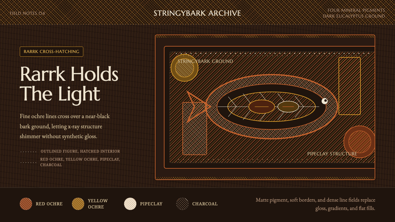 Arnhem X-Ray Bark PaintingShimmers without gloss. Ochre rarrk lines vibrate on dark stringybark.无光泽却闪烁:赭色rarrk线在深树皮底上振动。
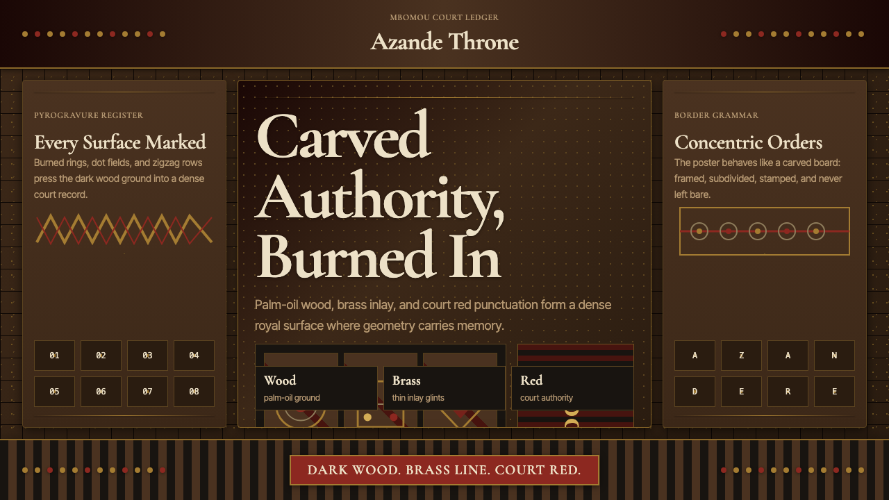 Central African Azande ThroneDense court gravity. Dark wood grids, brass dots, and court red cover every s…宫廷感厚重:深木网格、黄铜点阵与宫廷红铺满表面。
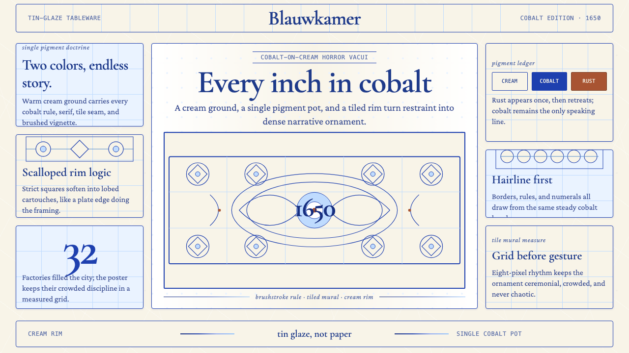 Delft Blue PotteryRestrained, yet every inch speaks. Cobalt hairlines crowd a cream tile grid.克制却寸土必描。钴蓝细线铺满米白瓷砖网格。
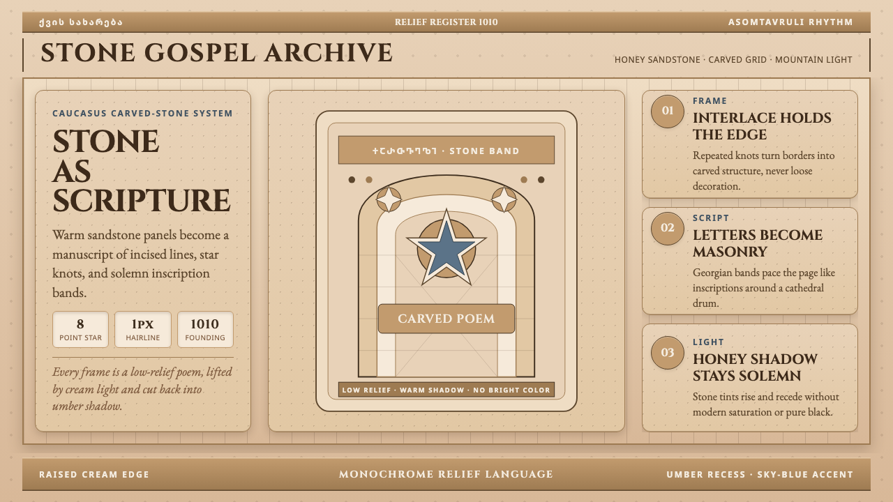 Georgian Nikortsminda Stone-CarvingStone becomes scripture. Cinzel caps and Georgian bands carve honey-sandstone…石如经卷。Cinzel大写与格鲁吉亚铭文刻出蜜砂岩网格。
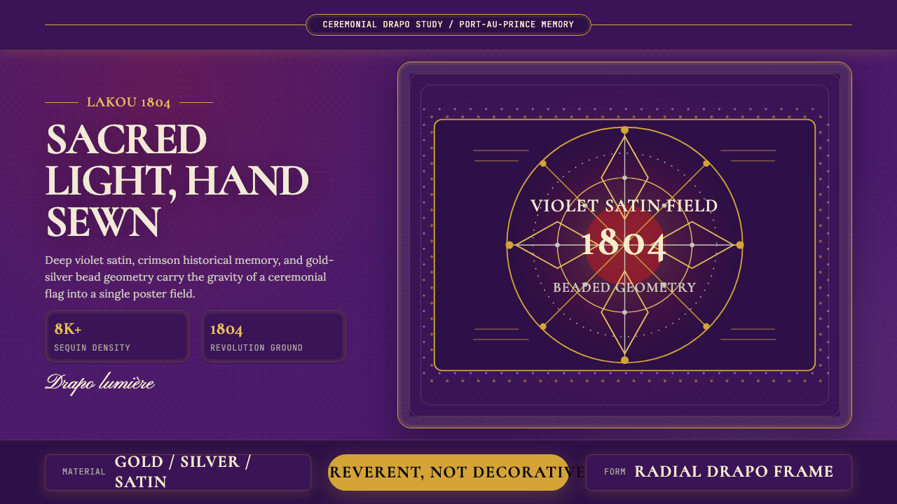 Haitian Vèvè Sequin Drapo 1804Sacred density. Violet satin, gold sequins, and radial geometry hold 1804 gra…神圣而厚重:紫缎、金色亮片与放射几何承载1804的庄严。
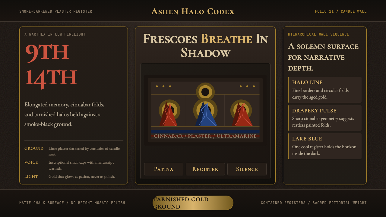 Macedonian Ohrid Fresco (Byzantine)Sacred darkness breathes. Tarnished gold rings, cinnabar folds, and plaster g…神圣暗光在呼吸。暗金圆环、朱砂折线与灰泥颗粒托起它。