What is Ukrainian Pysanky (wax-resist egg)?
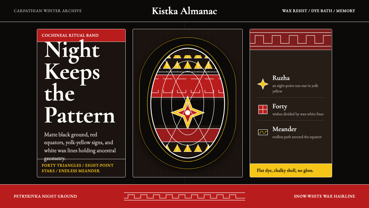
Ukrainian pysanky compress a millennium of protective symbolism into wax-resist layers on a single eggshell, producing a visual language of geometric talismans that is simultaneously ancient and strikingly modern.
Ukrainian Pysanky (wax-resist egg) in brief
Pysanky are wax-resist dyed eggs rooted in a Ukrainian folk tradition that stretches back at least a thousand years, though scholars trace the symbolic vocabulary to pre-Christian Slavic ritual life. The name derives from the Ukrainian verb pysaty — to write — because the maker does not paint the egg so much as inscribe it: a heated metal stylus called a kistka draws molten beeswax lines across the shell, those lines resist the dye bath, and as the egg moves through successive color stages (lightest to darkest), a layered geometry accumulates beneath the wax. When the wax is finally melted away, the design emerges all at once, irreversible and complete.
The visual result is a world of interlocking bands, eight-pointed stars, endless meanders, and triangular fields rendered in a palette of matte iron-gall black, deep cochineal red, and sharp egg-yolk yellow, with fine white hairlines where the original wax reserved the natural shell. Every mark has tectonic weight: the lines are not outlines around shapes but the shapes themselves, thin wax threads that hold the composition the way lead channels hold stained glass. Scale is compressed to the surface of an object you can hold in one hand, which gives even the most complex pysanky an intensity that larger decorative surfaces rarely achieve.
As a design system, pysanky offer something unusual: a complete and internally consistent geometric language developed outside the Western mainstream. Its organizing principles — symmetrical band division, radial repetition, the interplay of positive and negative across repeated units — produce compositions that look simultaneously folk and abstract, handmade and diagrammatic. That tension is not accidental; it is the tradition's most transferable quality.
Where does Ukrainian Pysanky (wax-resist egg) come from?
The deep roots of pysanky lie in Slavic spring ritual. Before the Christianization of Kievan Rus in 988, eggs played a central role in ceremonies tied to the seasonal return of light and fertility. Decorated eggs — imbued with geometric marks believed to hold protective power — were buried in fields, placed at the foundations of houses, or given as gifts between households at the vernal equinox. The egg's symbolism was cosmological: a self-contained world, the boundary between darkness and life. When Christianity spread through Ukraine, the tradition did not disappear; it was absorbed into the Easter calendar, the protective talismans reinterpreted as symbols of resurrection and renewal. The depth of that pre-Christian substrate is still visible in the geometric vocabulary — motifs with no direct Christian reading continued to be passed down through female craft lineages for centuries.
The tradition's geographic heartland is western Ukraine — the Hutsul, Bukovyna, and Pokuttia regions of the Carpathian foothills — where village practice was most dense and regional variation most pronounced. Each subregion developed its own compositional grammar: Hutsul eggs tend toward dark grounds with tightly packed geometric fields, Bukovyna work often features a more open arrangement of botanical and zoomorphic forms alongside geometric bands, and Pokuttia pysanky are notable for their fine-line precision and the dominance of meander and scroll motifs. The mountain villages also maintained the most elaborate systems for assigning specific protective meanings to individual motifs: the eight-pointed star (zirka) for hope and life, the endless line (bezkonechnyk) for eternity, the ram's horns (baranyachi rohaty) for strength and prosperity.
The nineteenth century brought two parallel developments. The first was ethnographic documentation: Ukrainian and Austro-Hungarian scholars began systematically recording regional motif vocabularies, and museum collections in Kyiv, Lviv, and Vienna accumulated thousands of historical eggs. This documentation preserved much that might otherwise have been lost during the upheavals of the twentieth century. The second development was diaspora dispersal: waves of emigration in the late nineteenth and early twentieth centuries, followed by the catastrophic disruptions of collectivization (and the Holodomor of 1932–1933), sent Ukrainian communities across North America and Western Europe, where pysanky making became a critical marker of cultural continuity and identity. Ukrainian cultural associations in Canada and the United States established teaching programs, exhibitions, and eventually museums — most notably the Ukrainian Museum in New York — that maintained the tradition outside its geographic homeland.
The late twentieth century brought renewed scholarly and artistic interest in pysanky as a site of Ukrainian identity assertion, particularly following Ukrainian independence in 1991. Practitioners like Vera Manko, Tania Osadca, and Lubow Wolynetz worked to document endangered regional variants and establish the tradition's international profile. Today pysanky occupy a dual position: they are living folk craft, still made in villages across Ukraine and in diaspora communities worldwide, and they are recognized as significant objects in the history of decorative art — a rare case of a continuously practiced pre-Christian tradition that survived Christianization, Soviet-era cultural suppression, and diaspora displacement with its core visual grammar substantially intact.
What defines the Ukrainian Pysanky (wax-resist egg) look?
Ground and Depth
The dominant ground in pysanky is a deep, matte black — not the flat digital black of print production, but a surface that reads as absorptive, with a slight chalky quality evocative of the eggshell beneath. This darkness is not the absence of color; it is the final dye stage, the deepest layer the egg passes through, and its depth gives every other color its vibrancy. The second most significant ground is a warm egg-yolk yellow, which anchors many compositions as the earliest dye layer — preserved as open field by early wax work before the darker baths follow.
Ritual Color Logic
The pysanky palette is built from dyes derived from natural sources — iron gall for black, cochineal or madder root for red, onion skins and weld for yellow, woad or indigo for blue — and the colors carry specific symbolic weight within the tradition. Red signals life, passion, and protection from evil; black denotes the fertile earth and the power of night; yellow speaks of light, harvest, and the sun; white (preserved as bare shell) stands for purity and new beginning. This symbolic system is not decorative; it determines which colors occupy which band positions within a given composition, and regional conventions govern these placements with considerable specificity.
Geometric Vocabulary
The compositional units of pysanky are drawn from a finite vocabulary of motifs, each with a traditional name and associated meaning: the eight-pointed star (zirka), the endless meander (bezkonechnyk), triangular fields (sometimes called wolf's teeth or pine trees depending on region), diamond grids, ram's horns, and the solar cross. These motifs are not illustrations of their referents — they are geometric abstractions that accumulate meaning through convention. What distinguishes the pysanky tradition from other folk geometric systems is the precision of interlocking: motifs are designed to fit together without gaps or overlaps, filling the entire surface of the egg in continuous, tessellating fields.
Band Structure and Radial Symmetry
The egg's ovoid form is divided by the maker into compositional zones through an initial wax-line skeleton. Most pysanky begin with a central equatorial band, then divide each hemisphere into further bands or quadrants using thin wax lines that follow the egg's natural curvature. Within these divisions, motifs are repeated radially — typically four or eight times around the circumference — creating a symmetry that reads as both ordered and dynamic. The band structure is load-bearing: it determines what motif goes where, prevents visual chaos across an irregular surface, and ensures the composition reads coherently from any angle.
Line as Form
In most decorative traditions, lines outline or separate areas of color. In pysanky, the wax lines are themselves the primary visual element — reserves of light against dark ground — rather than dividers between colored fields. The finest pysanky feature hairlines of extraordinary precision, achieved with the narrowest kistka tips, that read as drawn rather than printed. This gives the finished egg a quality closer to engraving or etching than to painting or dyeing. The line's weight — its thickness, the consistency of its edges, the way it turns corners — distinguishes skilled from unskilled work as clearly as any other technical attribute.
Surface Texture and Finish
Traditional pysanky have a characteristically matte, chalky surface — the natural eggshell beneath the dyes — rather than the glossy finish of commercial decorated eggs. This matteness is not an accident; it is the authentic material state of the object, and it gives the dark ground its depth and the lighter areas their crispness. Some contemporary makers apply a varnish after completion, but the unvarnished surface — particularly under raking light that catches the slight texture of the shell — is the visual reference that defines the tradition at its most authentic.
Controlled Complexity
Pysanky are among the most formally complex objects in folk art: a single egg may carry forty or more distinct geometric units arranged within a hierarchical band structure. Yet the compositions do not read as chaotic, because complexity is managed through three principles — radial repetition (the same unit appears multiple times around the circumference), complementary contrast (light motifs against dark grounds, angular motifs against curved ones), and bounded fields (each band or division contains its own motif type, preventing bleed between systems). This management of complexity within constraint is the tradition's deepest design lesson.
Who shaped Ukrainian Pysanky (wax-resist egg)?
Manko is among the most influential contemporary authorities on pysanky, both as a practicing artist and as a documentation scholar. Working primarily in the Ukrainian diaspora context, she produced systematic written and photographic documentation of regional pysanky traditions, tracing the geographic distribution of specific motifs across Hutsul, Bukovyna, and Pokuttia practice. Her analytical approach helped establish pysanky as a subject of serious material culture study rather than solely a craft preserved for sentimental or ethnic-identity reasons, and her published work became a primary reference for subsequent generations of practitioners and researchers worldwide.
Zelinska represents the Galician regional tradition within pysanky making, working within a lineage of Pokuttia-style practice characterized by fine-line geometric precision and a particular mastery of meander and scroll motifs. Her work demonstrates how the tradition can operate simultaneously as living craft and as historically grounded artistic practice — each egg produced not as a reproduction of a museum object but as a continuation of a design conversation that has evolved across multiple generations.
Osadca worked at the intersection of pysanky tradition and contemporary craft education, teaching the technique in North American contexts where practitioners had no direct community transmission to draw on. Her contribution was methodological: she developed pedagogy for teaching the kistka technique to adult learners without a childhood apprenticeship background, making the tradition accessible to practitioners in diaspora communities who wanted to engage with it seriously but had not grown up within it. Her teaching approach influenced a generation of North American pysanky artists who now produce work of serious technical and visual quality.
Wolynetz served as curator of folk art at the Ukrainian Museum in New York, where she was instrumental in building one of the most significant institutional collections of historical and contemporary pysanky outside Ukraine. Her curatorial and scholarship work focused on the material culture dimensions of the tradition — how objects were made, used, exchanged, and preserved — rather than solely on their symbolic or iconographic content. This emphasis on the material object helped position pysanky within a broader conversation about folk art, craft, and the politics of cultural preservation in diaspora contexts.
Before individual names were recorded, pysanky making was transmitted through female lineages in Carpathian villages, with specific regional motif systems maintained by unnamed practitioners across generations. The Hutsul tradition in particular — characterized by dark grounds, dense geometric packing, and a codified system of motif meanings — represents a collective achievement that no single named figure produced. Acknowledging this collective authorship is important to understanding the tradition accurately: the most significant design innovations in pysanky happened across communities and centuries, not through individual artistic innovation in the modern sense.
How do you use Ukrainian Pysanky (wax-resist egg) today?
Applying pysanky-derived design requires understanding what the system actually does: it manages intense visual complexity within strict structural constraints, and it achieves impact through layering and density rather than through emptiness and reduction. This makes it almost the philosophical opposite of minimalism. Used correctly, it produces work of extraordinary richness; used carelessly, it collapses into visual noise. The discipline required is not about what to leave out — it is about what rules govern what goes in.
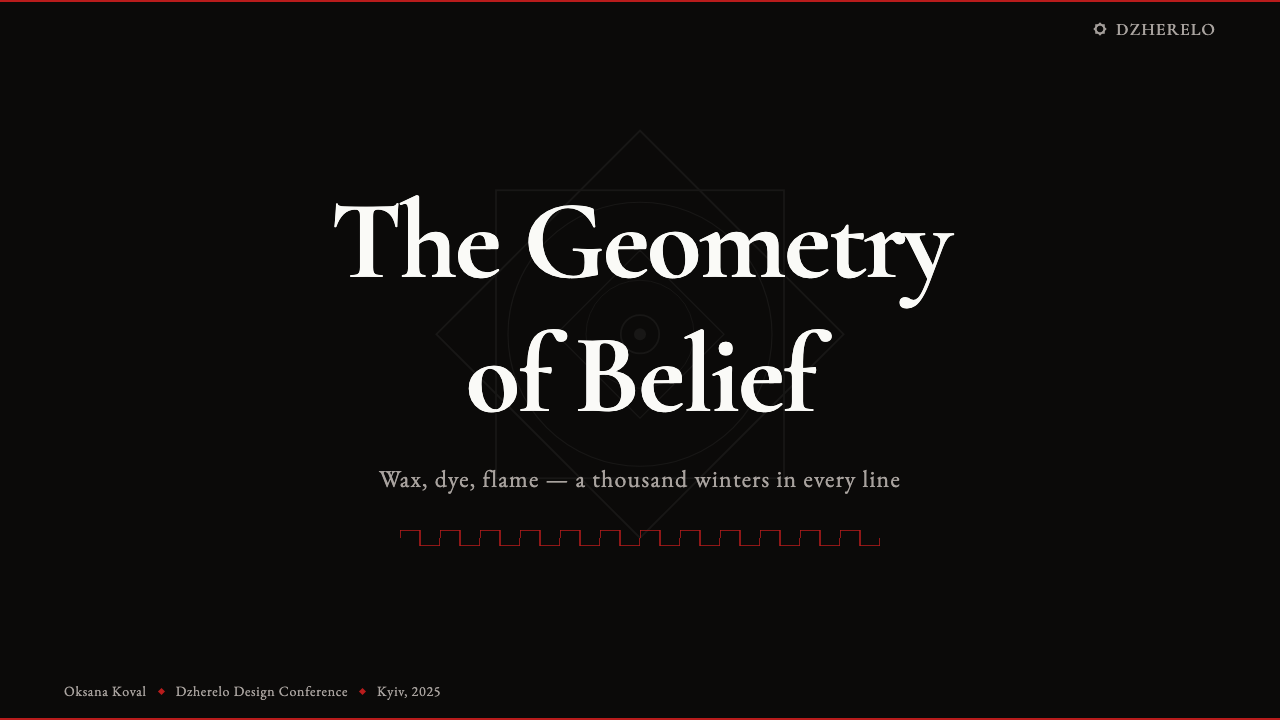
For presentation slides, pysanky works most powerfully on covers and section dividers. A cover built on this system uses a deep matte dark ground, a central geometric motif repeated radially at medium scale, and one or two color accents — warm red and egg-yolk yellow — reserved for the innermost and outermost bands. Type should be set in a clean, unornamented face at high contrast to the ground; the geometric system carries the visual weight, so the typographic role is clarity and restraint, not competition. Content slides should not attempt to replicate the geometric density — instead, carry forward only the color palette and ground treatment, using the dark background and accent colors to frame clear information hierarchies. Attempting to apply the full motif vocabulary to a bullet-point slide produces clutter, not richness.
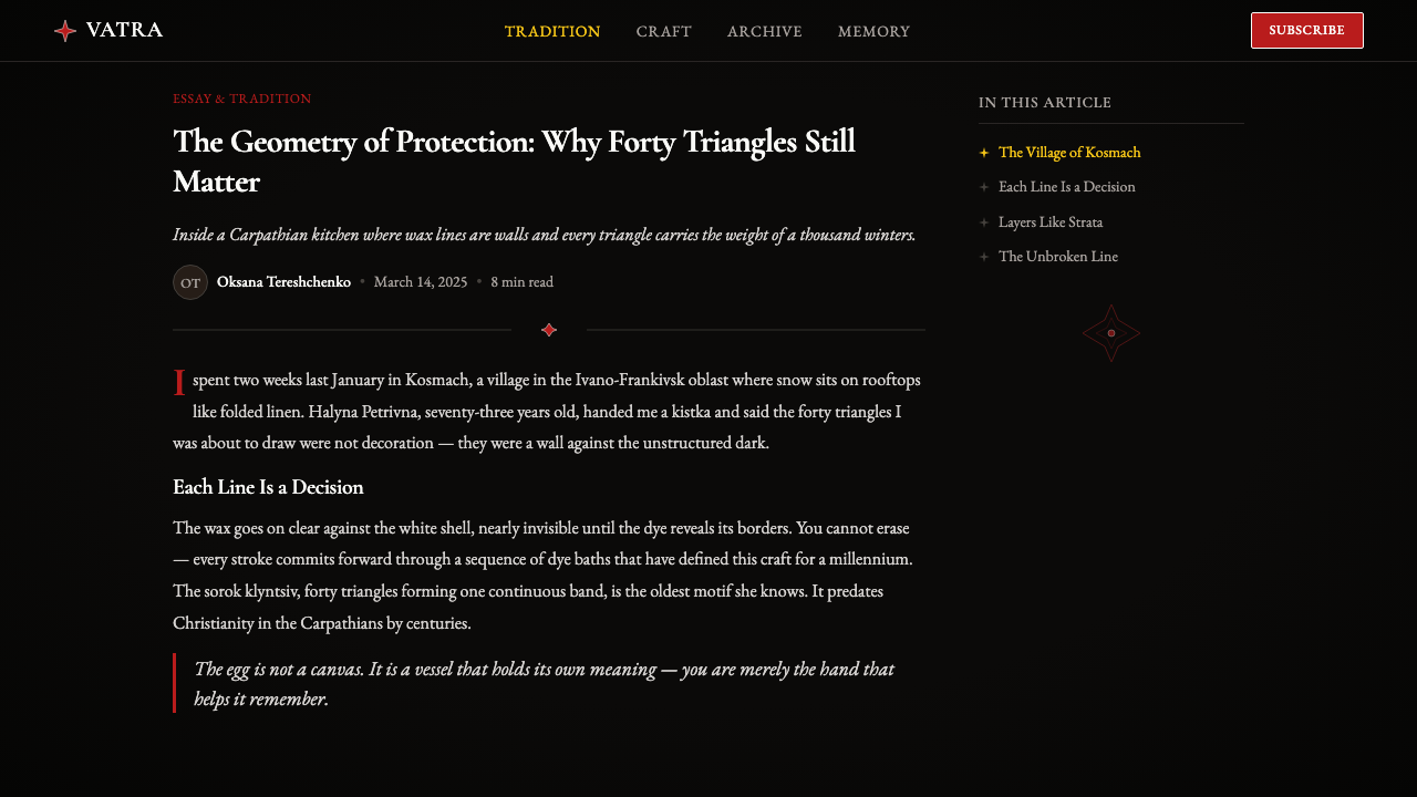
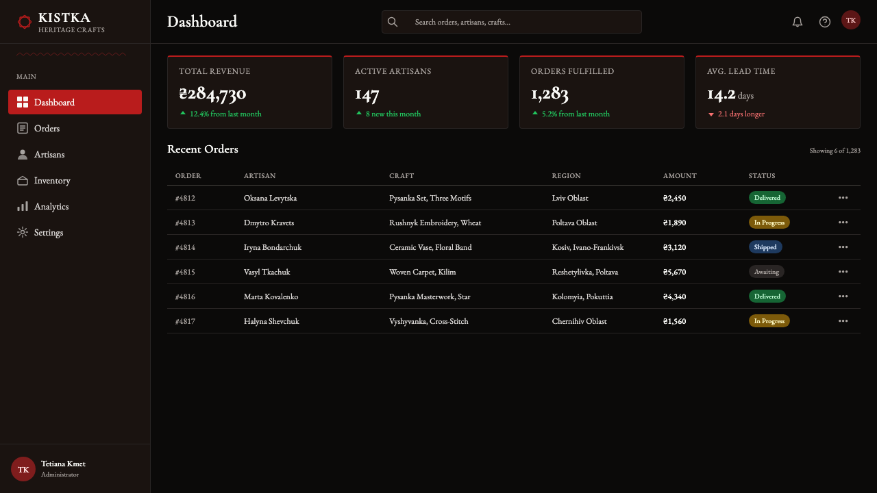
For web interfaces, pysanky is most appropriate for contexts where cultural specificity is a desired quality — heritage organizations, diaspora cultural institutions, artisan marketplaces, or brands with an explicit eastern European or folk-craft positioning. On dashboards and utility pages, the full geometric vocabulary is too dense; instead, deploy the palette — deep dark grounds, matte surface treatment, warm red and yellow accents — and use geometric border elements and dividers drawn from the motif vocabulary as structural decoration. Navigation and interactive elements should remain typographically clean; the pysanky system provides the frame, not the controls. On marketing and landing pages where brand expression has more room, section headers and feature blocks can incorporate adapted geometric band motifs without overwhelming readability.
For editorial and print work, pysanky offers some of its strongest possibilities. A magazine cover or poster can carry the full geometric treatment when the type footprint is small. Spread interiors work well with pysanky-inspired borders, pull-quote frames, and section ornaments that draw from the meander and star vocabulary without replicating full egg compositions. The key editorial discipline is treating the motifs as a supporting frame for text rather than as competing content: the geometric system should organize the page, not fight for attention with the words on it. Book cover design for titles in eastern European history, folk art, or Ukrainian cultural subjects can draw on pysanky with full legitimacy; applied to unrelated content, the system risks feeling costume-like rather than systemic.
A common mistake when working with pysanky-derived design is mistaking surface decoration for structure. The tradition's geometric system is load-bearing — the band divisions and motif placements are determined by a compositional logic, not by visual whim. Designers who borrow isolated motifs and scatter them decoratively across a layout lose the tradition's actual design intelligence: the way it manages complexity through nested hierarchy and radial repetition. A second frequent error is adding gradients, drop shadows, or glow effects to pysanky-derived elements. The tradition's palette is flat and matte by nature and production; introducing depth simulation breaks the material coherence that gives the system its authority.
Ukrainian Pysanky (wax-resist egg) — FAQ
Is pysanky the same as other folk egg decoration traditions?
No — pysanky is specifically the Ukrainian wax-resist tradition, and it is technically and visually distinct from other decorated egg practices. The defining characteristic is the batik-like layered process: wax is applied, the egg is dyed, more wax is applied over the dyed areas to preserve them, the egg is dyed again in a darker color, and this sequence continues through as many stages as the design requires. The final wax removal reveals all the preserved layers at once. This is fundamentally different from painting directly on the egg surface (as in Fabergé-style enamel work or Bavarian painted eggs), from relief or carved egg traditions, or from simple single-dye immersion. The geometric vocabulary is also distinctive: most other European decorated egg traditions feature floral, pastoral, or figurative motifs, whereas pysanky are predominantly geometric and abstract.
How does the pysanky dark-ground palette work differently from other dark design systems?
Most dark design systems — dark mode interfaces, noir film aesthetics, high-end packaging — use darkness as a premium or dramatic signal, often combined with metallic accents, gloss, and high-contrast white. The pysanky dark ground is different in character: it is matte and absorptive rather than glossy and reflective, warm rather than cool (the black has earthy undertones from its iron-gall source), and the accents against it are specifically warm — red and yellow rather than silver or neon. The result reads as ancestral and ritual rather than technological or luxurious. When applying this system, the key discipline is maintaining the matte surface treatment throughout — glossy or reflective elements break the material logic immediately.
Can pysanky-derived design work in contexts without any Ukrainian cultural connection?
Yes, but the degree of abstraction matters. The pysanky visual system has design properties — its management of geometric complexity, its dark-ground palette logic, its radial compositional structure — that function independently of their cultural origin and can be applied in any context where those properties are useful. The more literally the motifs are borrowed (specific named motifs used intact, specific symbolic color assignments followed), the more the design carries cultural baggage that requires either acknowledgment or context. The more the system is distilled to its structural principles — the band-and-division logic, the positive-negative line work, the palette character — the more freely it can operate without requiring cultural framing. Applied outside Ukrainian cultural contexts, the most honest approach uses the system's structural intelligence while developing new motif vocabulary rather than directly lifting traditional symbols.
What makes pysanky geometry feel different from other folk geometric traditions?
Several qualities distinguish it. First, the radial symmetry operates on a curved surface, not a flat one — the motifs are designed to wrap the egg without distortion, which gives them a slightly different proportional logic than flat geometric systems. Second, the positive-negative inversion is structural rather than optional: because the wax reserves light against dark, the relationship between figure and ground is baked into the production method, and the geometry reads as both the light lines and the dark fields between them simultaneously. Third, the tradition's motif vocabulary is unusually finite and codified — unlike improvised folk geometric systems, pysanky motifs have names, assigned meanings, and rules about placement, which creates a legible grammar rather than pure pattern. This combination of radial structure, positive-negative duality, and codified vocabulary produces a geometric character that is genuinely distinct from Moorish, Celtic, or Andean geometric traditions, even when superficial similarities exist.
How should the motif system be adapted for digital contexts without losing its essential character?
The most important adaptation is maintaining the line-as-form logic in a medium where fills are easier to produce than precise lines. In digital implementation, the temptation is to treat the geometric fields as filled color areas with outlined borders — reversing the pysanky logic, where the line is the primary element and the color field is what the line encloses. A more faithful adaptation draws the geometric system as a network of lines, even when those lines must be slightly thicker than a physical kistka would produce. The second critical adaptation is surface character: the matte quality of the original is best approximated in digital contexts through flat, unlit color treatment — no gradients, no inner glows, no simulated dimensionality. Finally, maintain the band-and-division structure as a compositional backbone even when only partial motif vocabulary is deployed; the hierarchy of divisions is what makes pysanky-derived work legible rather than merely decorative.
Related design styles
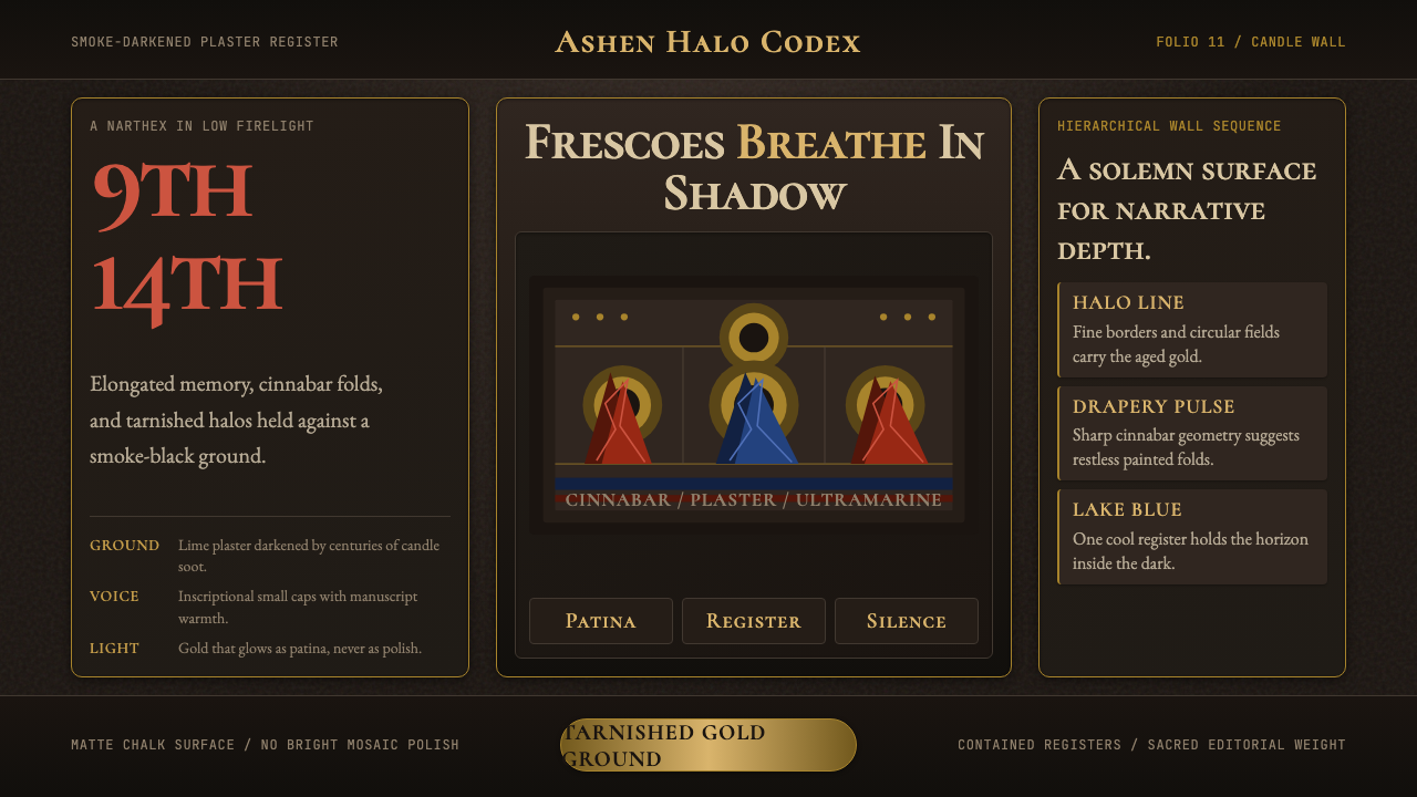 Macedonian Ohrid Fresco (Byzantine)Sacred darkness breathes. Tarnished gold rings, cinnabar folds, and plaster g…
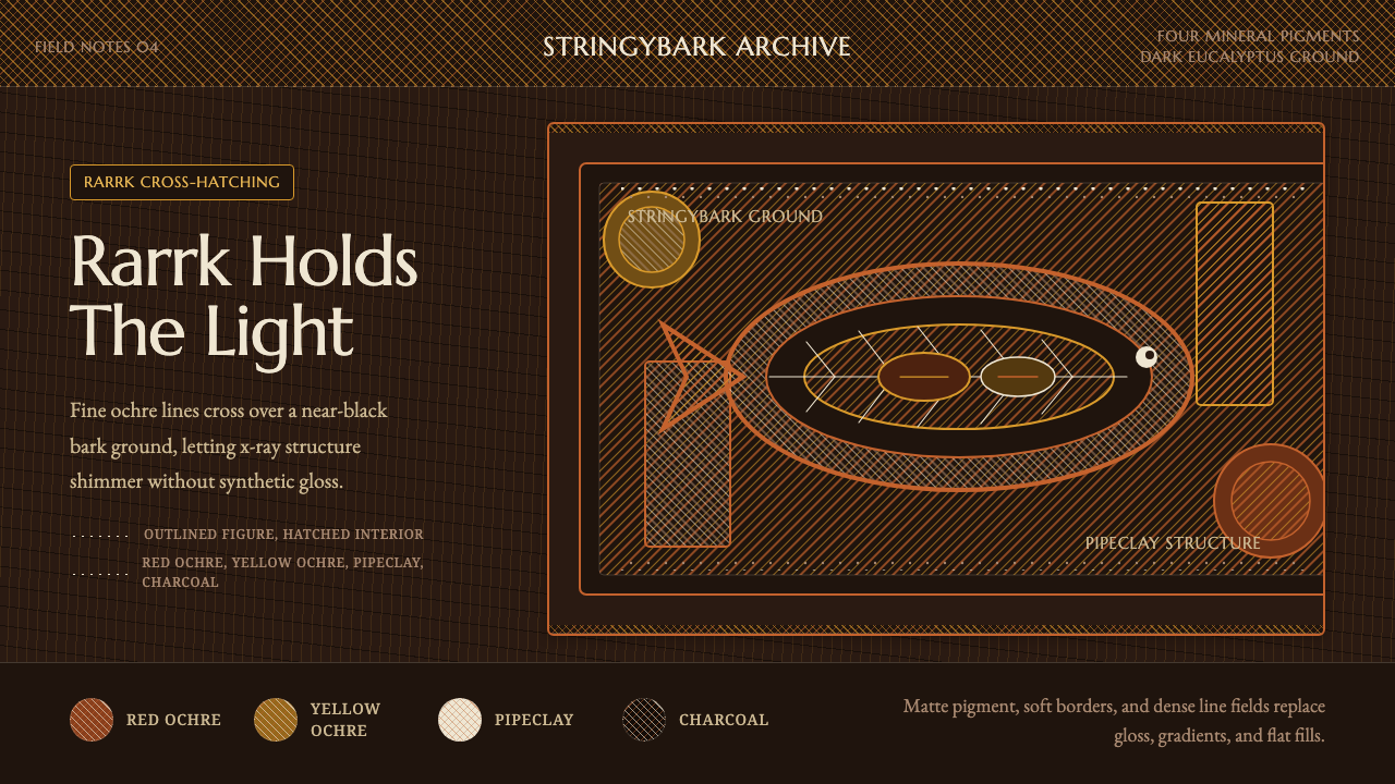 Arnhem X-Ray Bark PaintingShimmers without gloss. Ochre rarrk lines vibrate on dark stringybark.
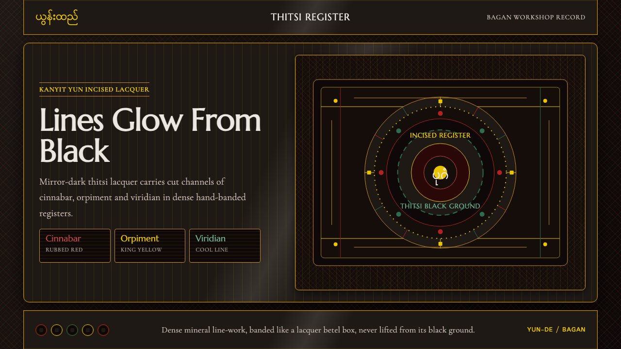 Burmese Yun LacquerwareLacquer glows in cut lines. Cinnabar, orpiment and viridian band a mirror-bla…
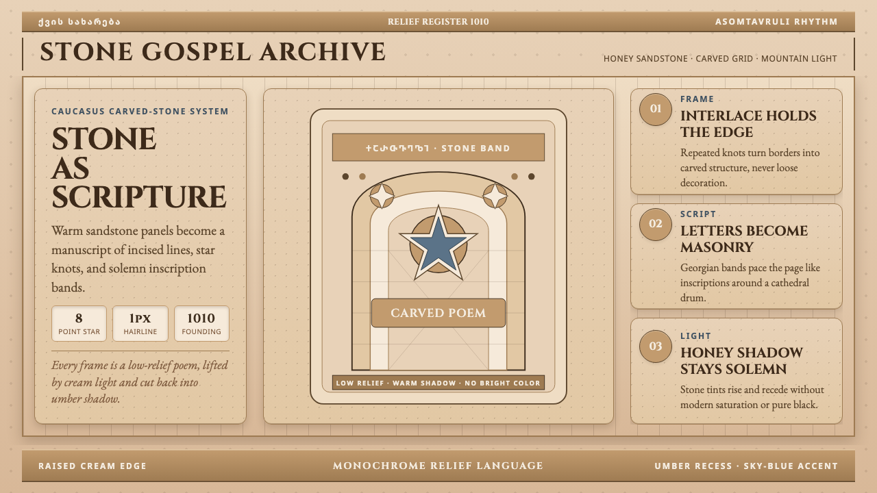 Georgian Nikortsminda Stone-CarvingStone becomes scripture. Cinzel caps and Georgian bands carve honey-sandstone…
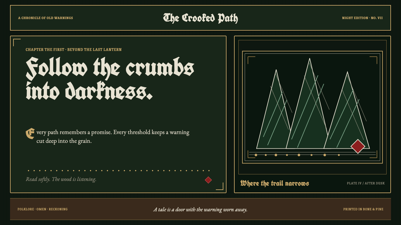 Grimm Fairy Tales (Black Forest Woodcut)The dark wood closes in. Bone-white cuts and aged-gold frames score a pine-bl…
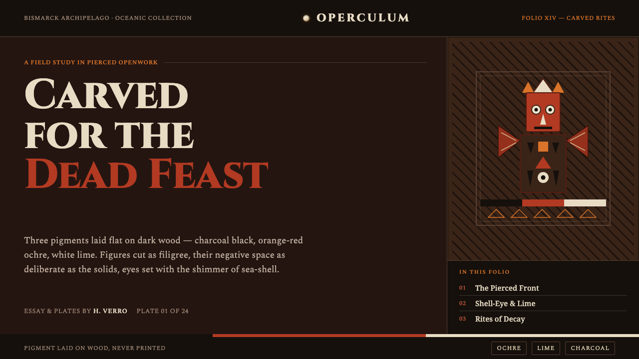 Malagan CarvingCarved for the dead feast. Ochre, lime and charcoal pierced into dark wood, e…