What is Chilean Rapa Nui Toromiro (Easter Island)?
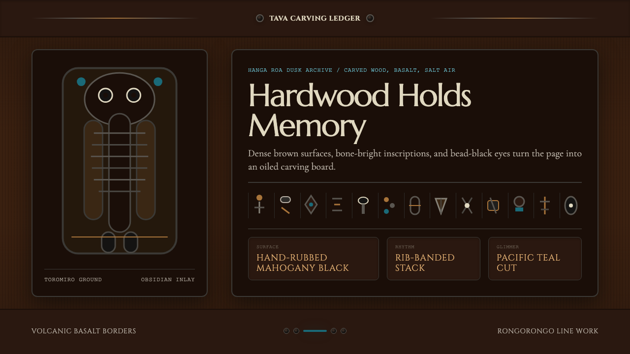
From the world's most isolated inhabited island comes a design language carved from hardwood and volcanic stone — dense, ancestral, and weighted with centuries of silence.
Chilean Rapa Nui Toromiro (Easter Island) in brief
Chilean Rapa Nui Toromiro is a design style rooted in the sculptural tradition of Easter Island — the remote Chilean territory known in the Rapanui language as Te Pito o te Henua, the Navel of the World. The aesthetic draws its visual grammar from the island's most defining material culture: the moai kavakava ancestor figurines carved from toromiro hardwood, the abstract rib-band patterns etched into ceremonial objects, the undeciphered rongorongo script inscribed on wooden boards, and the obsidian and volcanic basalt of the island's geological character.
The palette is deep and nocturnal — built around the warm brown of toromiro wood, the near-black of polished mahogany, the cool gray-black of volcanic basalt, and the rare, startling flash of Pacific teal that suggests the surrounding ocean glimpsed through stone. Against these dark grounds, detail is rendered not in brightness but in surface quality: the distinction between a matte carved recess and a burnished raised ridge, the difference between rough basalt and smooth obsidian. This is a style where richness comes from depth and density rather than from color contrast.
Typographically, the style draws on the weight and authority of monumental carved letterforms — letterforms that feel incised into a surface rather than printed on it. The overall effect is one of studied gravity: a visual language that communicates through restraint and mass rather than through lightness and variation. Every element has the feeling of having been worked slowly, by hand, from resistant material.
See the Chilean Rapa Nui Toromiro (Easter Island) design system
Where does Chilean Rapa Nui Toromiro (Easter Island) come from?
The cultural history of Rapa Nui stretches back to the settlement of the island by East Polynesian voyagers, most likely arriving in the first millennium CE across thousands of miles of open ocean without navigational instruments. This feat of seafaring — arguably the most extraordinary in human history — established a society that then developed in near-total isolation for centuries. The island's sculptural tradition reached its apogee in the great moai statues, some weighing many tonnes, transported across the island's terrain through methods still debated by archaeologists. The toromiro tree — Sophora toromiro — was the island's only native hardwood, and it was carved into the smaller, more intimate ancestor figurines that served ritual and social functions quite distinct from the monumental moai.
The moai kavakava — emaciated male ancestor figures with protruding ribs, protruding shoulder blades, and large, staring eyes inlaid with coral and obsidian — are among the most haunting sculptural forms in world art. Their skeletal quality is not accidental: these were understood as representations of the recently dead, of ancestors returning from the spirit realm to be present at ceremonies. Alongside them, the Rapanui carving tradition produced rapa dance paddles, ua clubs, and the remarkable rongorongo boards — wooden tablets inscribed with a system of glyphs that remains one of the few fully undeciphered writing systems in existence. European contact, beginning with Dutch explorer Jacob Roggeveen's arrival on Easter Sunday 1722, initiated a catastrophic century of slave raids, smallpox epidemics, and ecological collapse that reduced the Rapanui population from perhaps sixteen thousand to fewer than one hundred and fifty by the 1870s.
The study of Rapanui culture was largely carried out by outside scholars working with diminished and traumatized communities. Alfred Métraux, the French-Swiss anthropologist who conducted fieldwork in 1934–1935, produced the most comprehensive early ethnographic account of what survived. Father Sebastian Englert, a Capuchin missionary who lived on the island from 1935 to 1969, compiled a Rapanui dictionary and documented oral traditions. Steven Roger Fischer mounted the most sustained modern scholarly attempt to decode rongorongo, working through the 1990s and 2000s. Catherine Orliac's archaeobotanical work reconstructed the ecological history of the island, including the near-extinction of the toromiro tree — by the twentieth century, the last wild specimen had died, and the species survives today only through specimens grown from seeds collected by Thor Heyerdahl during his 1955 expedition, now cultivated in botanical gardens in Sweden and Chile.
Since the 1960s, a Rapanui cultural-rights movement has pushed for greater autonomy from Chile and the repatriation of artifacts held in European and North American museums. The island's sculptural and craft traditions have undergone a sustained revival, with contemporary Rapanui artists working in wood, stone, and mixed media that draws on ancestral forms while engaging with the island's present-day realities as a tourist destination and UNESCO World Heritage site. The toromiro aesthetic, as a design language, channels this layered history — honoring the weight and gravity of a tradition that nearly disappeared, while giving it a surface that can function in contemporary visual contexts.
What defines the Chilean Rapa Nui Toromiro (Easter Island) look?
Color
The palette is built from the earth and stone of Rapa Nui itself: the warm, medium brown of toromiro heartwood as the primary ground tone; polished mahogany-black for raised surfaces and focal elements; volcanic basalt gray for structural midtones; and a rare Pacific-teal accent that appears sparingly as the ocean beyond the island's cliffs. These are colors of depth and absorption rather than emission — they do not compete for attention but layer into a unified, shadowed whole. The palette reads as unambiguously dark, suited to contexts where weight and solemnity are desired values.
Texture and Surface
Where most dark design systems rely on color variation to create hierarchy, this aesthetic relies on surface quality. The distinction between a rough-hewn matte ground and a hand-burnished raised form is the primary visual language. Elements that carry emphasis are rendered as smoother, more reflective surfaces set against the matte dark background — emulating the way carved toromiro figurines catch light at their ridges and edges while their recesses fall into shadow. This texture-based hierarchy creates depth that reads as material rather than digital.
Typography
The style calls for letterforms with the weight and authority of inscriptions cut in stone — display type that reads as if pressed into rather than printed onto a surface. Capitals carry particular emphasis, echoing the use of monumental letterforms in commemorative and ceremonial contexts. Body text is set with generous spacing and deliberate restraint, allowing each line to breathe against the dark ground. The typographic voice is solemn and unhurried; condensed or playful letterforms are foreign to this aesthetic.
Pattern and Band Motifs
A recurring structural element in Rapanui carving is the horizontal rib band — repeated parallel ridges that wrap around figurines, clubs, and paddle handles, organizing the carved surface into registers. In design application, this translates to thin, evenly spaced horizontal rules and banded dividers that segment layouts without introducing color contrast. These bands carry an architectural quality: they divide space the way stone courses divide a wall, through repetition and spacing rather than ornamental flourish.
Form and Silhouette
Rapanui carving is characterized by compact, self-contained forms — the moai kavakava is a tight vertical composition, its protrusions organized around a central axis, its overall silhouette legible from any angle. In design application, this translates to a preference for bounded, self-sufficient elements with clear outer edges: cards and containers that have strong silhouettes rather than dissolving into the background, icons and marks whose outline communicates before detail is read. The aesthetic discourages elements that bleed, overflow, or dissolve at their boundaries.
Accent and Inlay
Traditional Rapanui figurines derived much of their visual intensity from small, precisely placed inlays — coral pupils set into obsidian eyes, or obsidian beads marking specific anatomical points. In design terms, this principle of the precisely placed accent is essential: a single element in Pacific teal or a near-white highlight in an otherwise uniformly dark composition focuses attention and creates the sense of a carefully worked surface. The accent should feel embedded rather than applied — a detail that rewards close inspection rather than announcing itself from a distance.
Isolation and Negative Space
Easter Island's defining geographic condition is its radical isolation — two thousand miles from the nearest populated land in any direction. The aesthetic internalizes this condition as spatial generosity: key elements are placed with significant breathing room, surrounded by dark ground that serves not as emptiness but as the depth from which form emerges. This is negative space understood as the ocean — vast, absorbing, and essential to the meaning of whatever rises out of it.

See the Chilean Rapa Nui Toromiro (Easter Island) design system
Who shaped Chilean Rapa Nui Toromiro (Easter Island)?
The French-Swiss anthropologist Alfred Métraux conducted the first sustained ethnographic fieldwork on Rapa Nui in 1934–1935, producing Easter Island: A Stone Age Civilization of the Pacific — still the foundational text for understanding the island's pre-contact and post-contact cultural history. Working with an island community reduced to barely a few hundred people, Métraux documented material culture, oral tradition, and what remained of ceremonial practice with rigor and empathy. His accounts of the toromiro carving tradition and the social function of moai kavakava figurines remain central references for designers and scholars seeking to engage with this visual heritage authentically.
Sebastian Englert, a Capuchin friar from Bavaria, arrived on Easter Island in 1935 and remained until his death in 1969 — becoming the island's most enduring outside witness and advocate. He compiled the first comprehensive Rapanui dictionary, documented oral traditions, and opened a small museum that became the nucleus of what is now the Museo Antropológico Padre Sebastián Englert. His dual role as missionary and ethnographer was not without complexity, but his language work in particular preserved records of Rapanui vocabulary and narrative that might otherwise have been lost entirely, including descriptions of carving practices and the ceremonial significance of specific objects.
New Zealand scholar Steven Roger Fischer mounted the most ambitious modern attempt to decode the rongorongo script — the undeciphered glyph system inscribed on Rapanui wooden tablets. Working through the 1990s and 2000s, Fischer proposed a cosmogonic chant structure underlying the tablets, a thesis that remains contested but has driven rigorous re-examination of all surviving examples. His work drew global attention to rongorongo's visual complexity and its potential as a source of graphic language — the densely packed, rhythmic repetition of zoomorphic and anthropomorphic glyphs that appears in the Rapanui design vocabulary as a kind of generative ornamental logic.
French archaeobotanist Catherine Orliac reconstructed the ecological history of Rapa Nui through analysis of charcoal, seeds, and plant remains from archaeological excavations. Her work documented the island's dramatic deforestation — a collapse driven by a combination of human resource use, rat predation on tree seeds, and climatic factors — and specifically traced the decline of the toromiro tree to near-extinction. By establishing the timeline of ecological loss, Orliac's research provided the material context for understanding why carved wood became so culturally central on an island that eventually ran out of it — and why the toromiro, as the last native hardwood, acquired the kind of significance that makes it a worthy foundation for a design language.
Norwegian adventurer and ethnographer Thor Heyerdahl is a controversial figure in Pacific studies — his 1947 Kon-Tiki expedition proposed that Polynesia was settled from South America rather than Southeast Asia, a thesis now disproved by genetic and linguistic evidence. His 1955 Easter Island expedition, however, had one consequence of lasting importance: he collected seeds from the last surviving toromiro tree on the island. Those seeds, cultivated in botanical gardens in Stockholm and later propagated to other institutions, represent the entire ex-situ living population of the toromiro species. Without Heyerdahl's collection, the tree whose wood defines this aesthetic would now exist only in museum collections.
How do you use Chilean Rapa Nui Toromiro (Easter Island) today?
The Rapa Nui Toromiro aesthetic is a high-conviction style — it is not a neutral framework that adapts to any content, but a strong visual voice that communicates specific values: ancestral weight, material depth, isolation, and the gravity of things that have survived. Applied correctly, it creates a powerful impression of authenticity and permanence. Applied carelessly, it can feel heavy and undifferentiated, a dark surface without the internal logic that makes the original tradition legible.
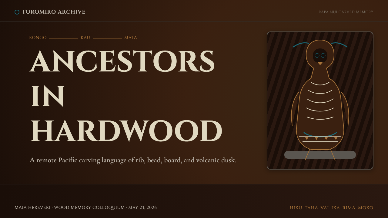
For presentation slides, this style is most effective on covers and section dividers, where its boldness can be deployed at full scale before more content-dense pages require a somewhat lighter touch. A cover built in this aesthetic should use dark grounds across the full bleed, place title type in a warm near-white that reads as aged bone or worn ivory against the dark field, and introduce a single teal accent element — a rule, a simple geometric mark — that catches the eye the way an inlaid obsidian eye catches light in a darkened room. Content slides should thin the palette: reduce the tonal complexity and use generous whitespace to ensure legibility, while maintaining the typographic register of weight and authority established on the cover.
For web interfaces, this aesthetic suits applications where the subject matter itself carries cultural or historical depth: documentary platforms, museum or archive-adjacent sites, cultural heritage organizations, or premium products in crafted goods, spirits, or luxury accessories. Dashboard and data visualization work in this style requires care: the palette's limited tonal range can compress data distinctions unless one designates the teal accent as the data-highlight color and uses the brown-to-black range for structural elements. Pricing pages can deploy the style effectively by treating each tier as a carved register — bounded, weighted, with the premium tier marked not by a brighter color but by a richer surface treatment.
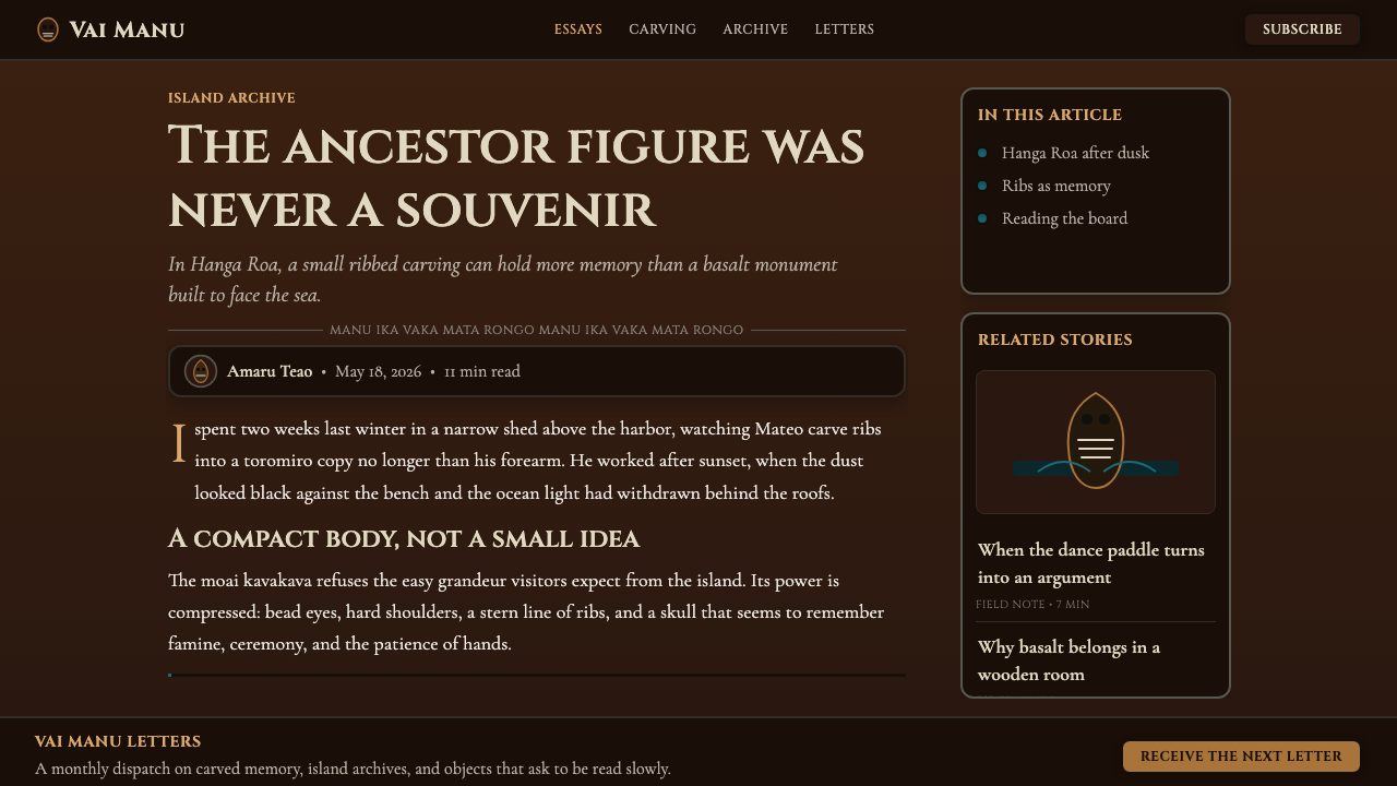
For editorial and marketing work, the style supports long-form content that rewards sustained reading. A Rapa Nui Toromiro-derived article layout uses the dark palette for headers and pull quotes, shifts to a near-white or warm light ground for the body text column to ensure reading comfort, and uses banded horizontal rules to mark section breaks with the regularity of carved rib patterns. Marketing pages should lead with the bold, self-contained silhouettes the style favors: full-bleed dark feature blocks where a single product or concept is placed against the deep ground with generous surrounding space — the isolation of the island rendered as compositional emphasis.
The most common mistake when applying this style is treating the dark palette as permission for visual clutter — stacking multiple elements without deliberate spacing, using both brown and black and gray and teal simultaneously at equal weight, or adding texture effects that simulate organic material rather than simply letting the color depth do the work. The toromiro aesthetic earns its richness through restraint: the dark ground is a single, unified surface; the accent appears once, precisely placed; the typographic weight is consistent and unhurried. Any element that competes for equal status with the primary form should be removed or subordinated. Isolation is not emptiness — it is the condition that gives the remaining elements their meaning.
See the Chilean Rapa Nui Toromiro (Easter Island) design system
Chilean Rapa Nui Toromiro (Easter Island) — FAQ
Is this style appropriate for brands with no direct connection to Rapa Nui culture?
The question is worth taking seriously. The Rapanui people are a living community with a documented history of cultural dispossession, and visual styles derived from indigenous craft traditions can carry ethical weight that purely historical European styles do not. Responsible use involves being transparent about the source — not presenting the style as merely abstract or generic — and avoiding the literal reproduction of specific sacred forms such as rongorongo glyphs or specific moai figurine types. Using the aesthetic as a design language derived from the tradition's visual principles (the color palette, the weight, the texture logic, the banding patterns) while maintaining clear distance from appropriating sacred or ceremonially specific imagery is the defensible approach. Brands working in contexts that directly benefit from Rapanui cultural interest — tourism, museum publishing, educational content about the Pacific — have the clearest case for use.
How does this style differ from other Polynesian-derived dark aesthetics?
Rapa Nui's aesthetic is distinctly more austere than most Polynesian design traditions, which tend toward intricate surface patterning, layered geometric ornament, and richer chromatic ranges. Māori koru patterns, Samoan pe'a tattoo compositions, and Hawaiian kapa cloth designs all feature complex, high-density surface coverage. The Rapa Nui tradition is characterized instead by the compact self-containment of the carved figurine form, the banded simplicity of rib-pattern ornament, and the sparse power of the rongorongo script. The palette is narrower and darker. In practical terms, this makes the Rapa Nui aesthetic more transferable to digital contexts where clarity and hierarchy are needed — the complexity is in depth and weight rather than in surface elaboration.
Can this style work on a light background, or is it fundamentally a dark-mode aesthetic?
The style is fundamentally dark — its source material, the toromiro figurine in a carving shed at dusk, is irreducibly nocturnal. A light-background inversion is technically possible but loses the essential quality of the original: the sense that form is emerging from depth rather than sitting on a surface. If a light context is required — for body text legibility in long-form content, or for a daytime interface context — the most defensible approach is a warm, aged paper tone for the background rather than a clean white, paired with a very dark brown (rather than pure black) for text, and a selective use of the dark palette for headers, borders, and accent elements. This creates a parchment-and-carved-wood register that retains the thermal quality of the aesthetic without the full darkness.
What kinds of imagery or photography work best with this aesthetic?
Photography that works in this aesthetic shares qualities with the carved object itself: high contrast, strong silhouette, surface texture that reads as material rather than light. Macro shots of stone, wood grain, or organic surfaces treated with high contrast fit naturally. Landscape photography of volcanic terrain, coastlines, or any environment where geology is the dominant visual element also integrates well. What does not work: bright, saturated lifestyle photography; soft-lit portraiture with naturalistic skin tones; any imagery that implies ease, abundance, or domestic warmth. The visual logic of the style calls for images that have weight, shadow, and a quality of endurance — things that look as if they have been there for a very long time.
How do you avoid this style feeling oppressive or heavy in sustained use?
The Rapa Nui aesthetic is intentionally weighted, but weight and oppression are not the same thing. The difference lies in spacing and economy. The carvers who produced moai kavakava did not crowd their figurines with detail — each protrusion, each eye, each carved rib occupies exactly the space it needs, surrounded by smooth, unworked surface. In design terms, this means using the dark palette sparingly within layouts that have room to breathe: adequate margins, line spacing that allows text to rest rather than crowd, and a discipline of reducing elements until only what is necessary remains. The teal accent, used once and decisively, provides relief without breaking the tonal register. Think of it the way you would think of a single lit candle in a dark room — the darkness is the context that gives the light its power.
Related design styles
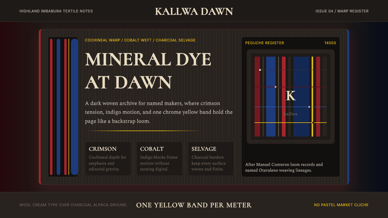 Ecuadorian Otavalo Cochineal LoomHandwoven gravity. Cochineal and cobalt stripes tense against charcoal, cut b…
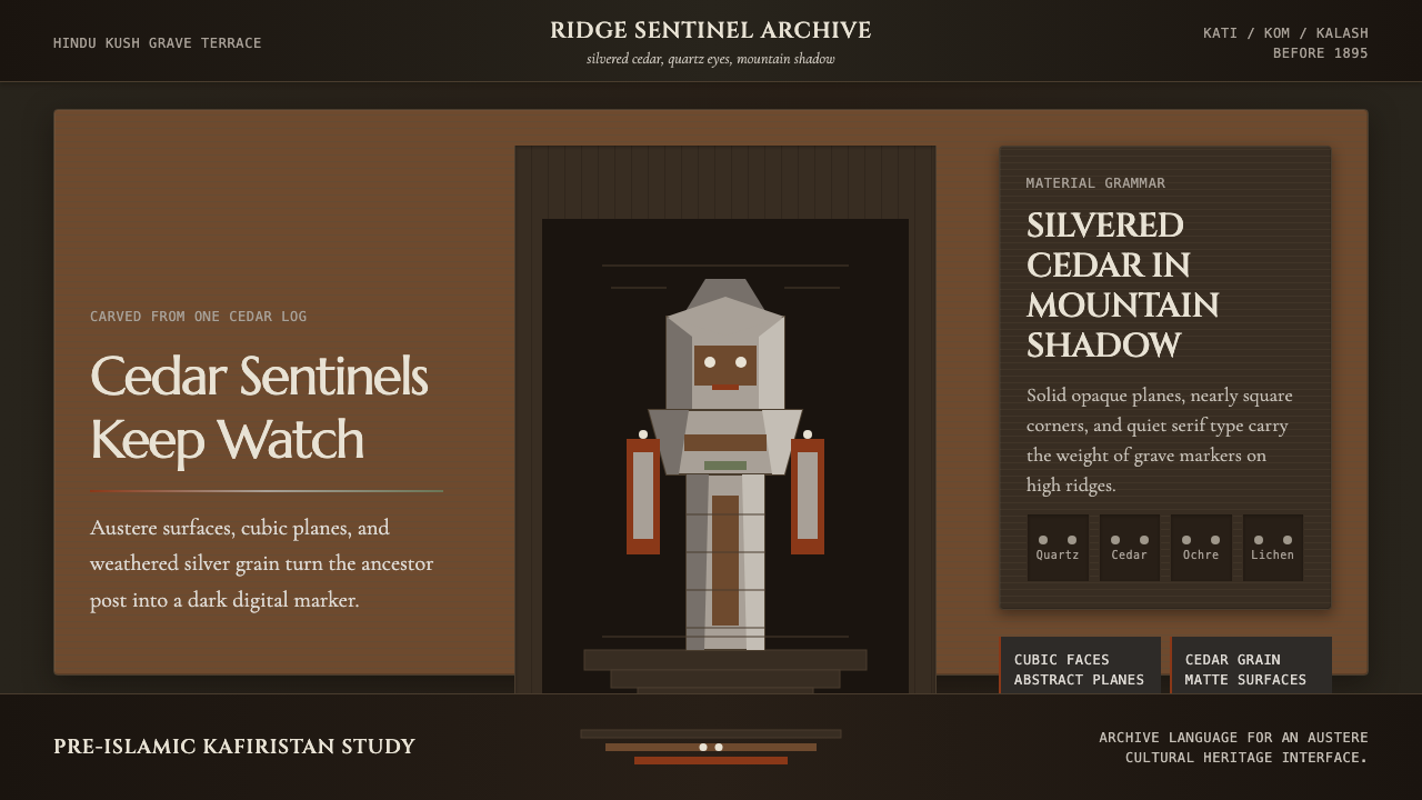 Nuristani Wooden Effigy (Pre-Islamic Kafiristan)Grave-marker serious. Silver cedar, quartz dots, and columnar stack hold the…
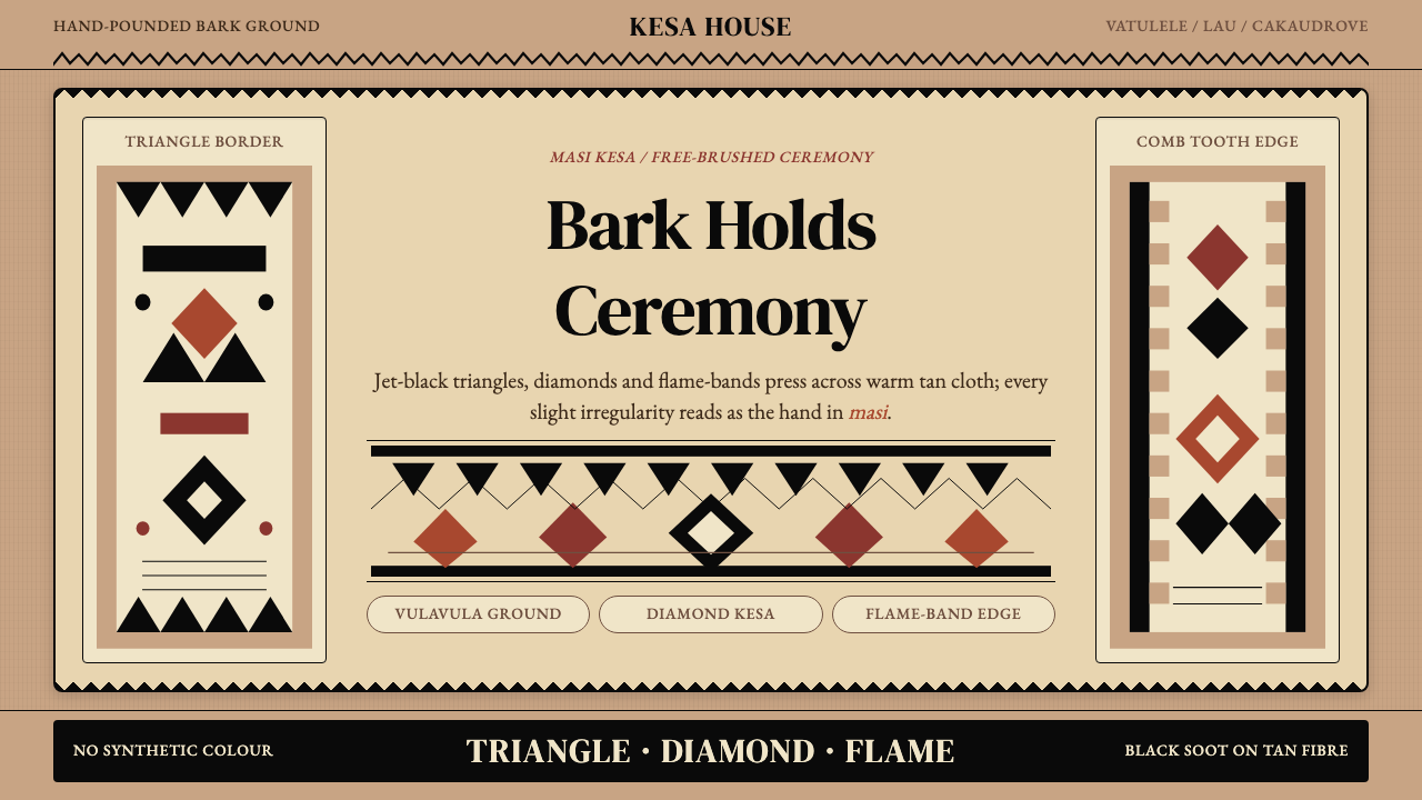 Fijian Masi (Tapa Cloth)Ceremony hits in black. Tan bark ground carries diamonds, zigzags and flame-b…
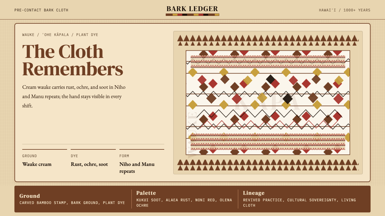 Hawaiian Kapa (Bark Cloth)Ceremonial geometry. Cream wauke, rust, ochre, and soot stamped in repeat.
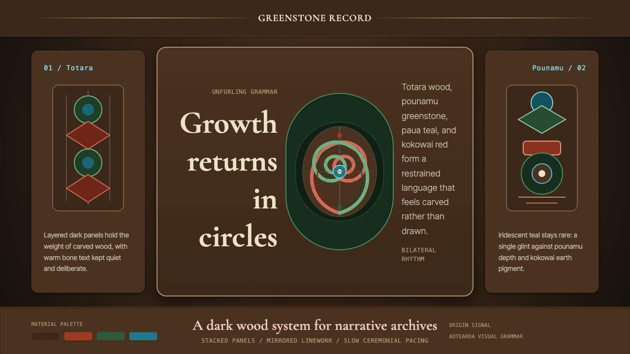 Māori Koru Spiral (Aotearoa)Carved, not drawn. Totara brown, pounamu green, and mirrored koru geometry ca…
 Niuean HiapoEvery line keeps its maker. Dark plant ink fills smoky barkcloth in hand-rule…