Design style guide设计风格指南
What is Nuristani Wooden Effigy (Pre-Islamic Kafiristan)?什么是 Nuristani Wooden Effigy (Pre-Islamic Kafiristan)?
Carved from single cedar logs by the last polytheists of the Hindu Kush, Nuristani wooden effigies turn ancestor grief into monolithic, mountain-shadow form — a design language as austere and grave-marker serious as the ridgelines that held them.努里斯坦木雕祖先像由兴都库什山脉最后的多神信徒从整根雪松原木中凿出,将对先祖的哀思化为巨石般肃穆的山影造型——一套与竖立它们的山脊同样庄严、如墓碑般凝重的设计语言。
Nuristani Wooden Effigy (Pre-Islamic Kafiristan) in briefNuristani Wooden Effigy (Pre-Islamic Kafiristan) 速览
The Nuristani Wooden Effigy design system draws its visual vocabulary from one of the most isolated sculpture traditions on earth: the ancestor figures carved by Kati, Kom, and Kalash peoples across the ridge gravesites of what was Kafiristan — the 'Land of the Infidels' — until the forced Islamization of 1895. These effigies were not decorative objects. They were presences: vertical, columnar, face-forward, eyes inlaid with quartz to catch mountain light. The design system translates their gravity into a digital language that is dark-ground, silver-toned, and structurally monolithic.努里斯坦木雕祖先像设计系统的视觉词汇,来源于地球上最与世隔绝的雕刻传统之一:卡提、科姆和卡拉什族人在卡菲里斯坦——“异教徒之地”——山脊墓地上凿刻的祖先形象,这一传统延续至1895年强制伊斯兰化为止。这些雕像不是装饰品,它们是一种临在:垂直、柱状、正面朝前,双眼以石英镶嵌,用以折射山间光线。本设计系统将其庄严感转化为一套深色底面、银灰色调、结构上如巨石般浑然一体的数字语言。
At its core, the style is about weight and witness. Where most design systems seek to reduce visual friction, this one cultivates deliberate density — the sense that something ancient and unmovable occupies the screen. The palette is deep shadow with silver-cedar highlights, the forms are columnar and stacked rather than flowing or organic, and the overall affect is one of ceremonial solemnity rather than approachability. This is a system for content that deserves to be taken seriously.这套风格的核心是重量感与见证感。大多数设计系统致力于减少视觉阻力,而这套系统却刻意营造厚重感——那种古老而不可撼动之物占据屏幕的感觉。色板是深沉的阴影配以银灰雪松色的高光,形态是柱状堆叠而非流动或有机的,整体气质是典仪式的庄严,而非亲近感。这是一套为值得被认真对待的内容而生的系统。
The effigy tradition the system references was genuinely singular. Unlike Gandharan Buddhist sculpture to its south or Persian court art to its west, Nuristani carving was produced by non-literate, polytheist mountain communities who had no contact with the Islamic design traditions that surrounded them. Their visual language evolved independently across centuries of isolation — which is precisely what gives it its uncompromising, unornamented character. The digital system inherits that self-sufficiency: it owes nothing to contemporary trends and is not trying to appeal to everyone.这套系统所参照的雕像传统是真正独一无二的。与其南方的犍陀罗佛教雕塑或西方的波斯宫廷艺术不同,努里斯坦雕刻由不识文字的多神教山地社群创作,他们与周围的伊斯兰设计传统毫无接触。他们的视觉语言在数百年的隔绝中独立演化——这正是其视觉语言具有毫不妥协、毫无装饰特质的根本原因。数字系统继承了那种自给自足:它不欠当代潮流任何东西,也无意取悦所有人。
Where does Nuristani Wooden Effigy (Pre-Islamic Kafiristan) come from?Nuristani Wooden Effigy (Pre-Islamic Kafiristan) 从何而来?
The region that produced these effigies — Kafiristan, now Nuristan province in northeastern Afghanistan, extending into the Chitral and Kalash valleys of what is now Pakistan — was the last enclave of pre-Islamic polytheism in the Hindu Kush. The peoples there, predominantly Kati, Kom, and Kalash, worshipped a pantheon of deities including Imra (the creator), Moni, and Gish (the war god), and maintained a complex ancestor cult in which carved wooden figures played a central role. When a warrior of high status died, an effigy — called a gandau or, in some valleys, a pashto — was commissioned from a specialist carver and mounted at the gravesite or at a communal platform near the village threshold.孕育这些雕像的地区——卡菲里斯坦,即今阿富汗东北部努里斯坦省,延伸至今巴基斯坦的吉德拉尔和卡拉什山谷——是兴都库什山脉伊斯兰化之前最后的多神教飞地。当地人口以卡提、科姆和卡拉什族为主,信奉包括伊姆拉(造物主)、莫尼和吉什(战神)在内的众神,并维系着一套以木雕像为核心的复杂祖先崇拜体系。高地位武士死后,家人会委托专职匠人凿制一尊雕像——卡提语称“gandau”,某些山谷称“pashto”——竖立于墓地旁或村庄门槛附近的公共台地上。
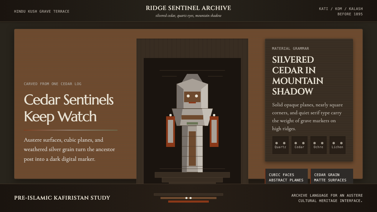
The effigies were carved from the trunk of the deodar cedar, a tree that holds particular sacred significance across the Hindu Kush region and was known for its remarkable durability and the silver-grey patina it develops with decades of mountain exposure. Carvers worked from a single log using adzes and chisels, producing forms that were necessarily columnar — the shape of the living tree imposed itself on the finished figure. Faces were rendered with high-relief cubic geometry: a flat brow plane, a projecting nose block, deeply incised horizontal slits for eyes later filled with quartz crystals or polished stone. Arms were rarely rendered fully; when they appeared, they were flat lateral projections rather than articulated limbs.雕像的材料是喜马拉雅雪松(deodar cedar)——一种在整个兴都库什地区具有特殊神圣意义的树木,以其卓越的耐久性著称,历经数十年山地风霜后会发展出银灰色的包浆。匠人以整根原木为材,用锄形凿和平凿工作,由此产生的形态必然是柱状的——活树的形状将自身强加于成品之上。面部以高浮雕的立方几何处理:平坦的额面、突出的鼻块、深凿的水平缝隙作眼,后以石英晶体或磨光石填入。手臂极少被完整刻画;若出现,也是扁平的横向延伸,而非关节分明的肢体。
The scholarly documentation of Kafiristan began in earnest with George Scott Robertson, a British political officer who spent fourteen months in the region in 1890 and 1891 — just years before the forced conversion — and published his findings as 'The Kafirs of the Hindu Kush' in 1896. His account, illustrated with photographs of effigies that no longer exist, remains the primary firsthand record of the tradition at its last full expression. Later scholars including Karl Jettmar, Max Klimburg, and Wolfgang Lentz worked from surviving objects in museum collections (principally in Kabul, Vienna, and Berlin) and the testimony of Kalash communities — the one group that retained elements of the old religion under Pakistani protection — to reconstruct the ritual context and regional variation of the effigy tradition.对卡菲里斯坦的学术记录始于英国政治官员乔治·斯科特·罗伯逊。他在1890至1891年间——强制改宗前数年——在该地区驻留了十四个月,并于1896年以《兴都库什的卡菲尔人》为题发表了研究成果。该书附有大量已不复存在的雕像照片,至今仍是这一传统最后全盛期的首要第一手记录。其后,卡尔·耶特马尔、马克斯·克林堡和沃尔夫冈·伦茨等学者从博物馆馆藏(主要在喀布尔、维也纳和柏林)的幸存器物,以及卡拉什社群的口述——这是唯一在巴基斯坦保护下保留了旧宗教部分元素的群体——重建了雕像传统的仪式背景与地区差异。
The forced conversion ordered by Amir Abdur Rahman Khan in 1895 was swift and comprehensive. Within months, temples were demolished, effigies were destroyed or scattered, and the public practice of the ancestor cult was ended. Some objects were rescued by European travelers or sold to colonial museums in the years immediately before and after the conversion; others survived in remote valleys or were hidden by communities. The Kalash of Chitral, protected by the Pakistani state, retained variants of the old festival calendar and some carving traditions, providing scholars with a living — if attenuated — reference point. What the design system draws on is this entire arc: the pre-conversion fullness, the documentation in extremis, and the survival fragments.阿布杜尔·拉赫曼汗于1895年下令的强制改宗迅速而彻底。数月之内,神庙被拆毁,雕像被销毁或散失,祖先崇拜的公开实践就此终止。改宗前后数年间,部分器物被欧洲旅行者带走或售予殖民地博物馆;另有一些在偏远山谷中留存,或被社群隐藏。受巴基斯坦保护的吉德拉尔卡拉什人保留了旧节庆历法和部分雕刻传统,为学者提供了一个活的——尽管已大为削减的——参照点。本设计系统汲取的正是这整段历史弧线:改宗前的完整面貌、极限处境下的文献记录,以及那些幸存的碎片。
What defines the Nuristani Wooden Effigy (Pre-Islamic Kafiristan) look?Nuristani Wooden Effigy (Pre-Islamic Kafiristan) 的视觉特征是什么?
Palette色板
The dominant ground is deep shadow — the visual equivalent of a mountain valley after sunset, where darkness is not black but a complex dark that absorbs light without reflecting it. Against this, silver-cedar tones carry the surface: the warm grey of deodar weathered by altitude, catching oblique light. Quartz-white is used sparingly as an eye-level accent, the way inlaid crystals catch the only available light on a dim ridgeline. Ochre and earth tones may appear as secondary warmth, referencing the pigment traces found on surviving effigies. Nothing in the palette is saturated or synthetic.主导底色是深沉的阴影——视觉上等同于日落后的山谷,那种黑暗并非纯黑,而是一种吸收光线却不反射的复杂深色。在此之上,银灰雪松色承载表面:海拔风化的喜马拉雅雪松的暖灰调,迎着斜射光线。石英白极度克制地作为视线高度的强调点,如同镶嵌的晶体在昏暗山脊上捕捉唯一的可用光线。赭色和大地色可作为次要暖调出现,呼应幸存雕像上发现的颜料痕迹。色板中没有任何饱和或人工合成的色彩。
Form and Silhouette形态与轮廓
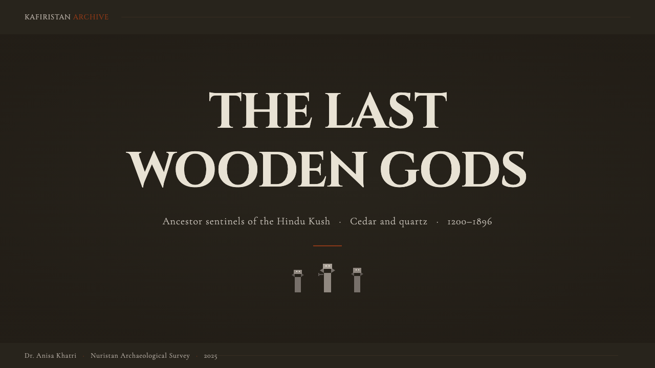
The primary form vocabulary is columnar and stacked — the vertical logic of a figure carved from a standing tree. Elements do not flow or curve organically; they are block-built, one register above another, with the overall silhouette reading as a single monolithic shape from a distance. Facial geometry, where it appears as a motif, is cubic: flat planes meeting at hard angles, projecting masses rather than modeled surfaces. The effigy's characteristic frontality — it faces directly out, never turned — translates into a compositional preference for symmetry on the vertical axis combined with asymmetric weight distribution across it.主要形态词汇是柱状与堆叠的——从立木中雕凿出的人像所内含的垂直逻辑。各元素不流动、不有机弯曲;它们以块体方式构建,一层叠于另一层之上,整体轮廓在远处读来是一个单一的巨石形状。面部几何(作为母题出现时)是立方体式的:平面以硬角相交,是突出的体块而非塑造的曲面。雕像特有的正面性——始终直面观者,从不侧转——转化为构图上对垂直轴对称的偏好,同时结合横轴上非对称的重量分配。
Texture and Surface纹理与表面
The surface register of the style references the grain of weathered cedar — linear, directional, and structural rather than decorative. Texture, where used, runs parallel to the vertical axis, reinforcing the columnar reading. It is never soft or organic in the manner of bark or woven material; it is the texture of something worked by a tool, where the marks of making are preserved rather than smoothed away. Smooth areas and textured areas are in explicit contrast, not continuous transition — the way a carved block alternates worked face with rough edge.这套风格的表面层次参照的是风化雪松的木纹——线性的、有方向性的,是结构性而非装饰性的。纹理(若使用)沿垂直轴平行延伸,强化柱状阅读感。它决不是树皮或编织物那般柔软有机;而是被工具处理过之物的纹理,制作的痕迹被保留而非磨平。光滑区域与有纹理区域形成明确对比,而非连续过渡——如同一块雕刻木块在加工面与粗糙边缘之间的交替。
Composition and Stacking构图与堆叠
Layouts organize information in stacked horizontal registers rather than flowing columns or diagonal arrangements. Each register is visually self-contained and separated from the next by a clear structural gap — the visual equivalent of the carver's horizontal groove separating head from torso from plinth. Within each register, elements are anchored to the vertical center axis with bilateral weight that may be unequal but is never chaotic. There is no decorative negative space in the contemporary sense; white or ground-color gaps are structural, not aspirational.版面以水平堆叠层次而非流动列或对角线排布来组织信息。每一层次在视觉上自成一体,通过清晰的结构间隙与下一层分隔——这是匠人用水平凹槽将头部、躯干与基座分开的视觉等价物。在每一层次内,元素锚定于垂直中轴,两侧重量可以不等,但绝不混乱。这里没有当代意义上的装饰性留白;白色或底色的间隙是结构性的,而非追求格调的产物。
Accent and Eyes强调与眼睛
The quartz-eye motif — a single point of stark light set into deep shadow — is the system's primary accent logic. Where other design systems might use color for emphasis, this one uses a concentrated point of near-white or cool-silver against the dark ground, placed at the expected focal height of the composition. This accent is singular and placed with intention; scattering multiple bright points would dissolve the gravity the system depends on. The effect is one of alert stillness: something watches.石英眼睛的母题——深沉阴影中嵌入的一个鲜明光点——是本系统的主要强调逻辑。其他设计系统可能用色彩来强调,而这套系统在深色底面上使用集中的近白色或冷银色点,置于构图预期的视觉焦点高度。这个强调是单一且有意为之的;散布多个亮点会瓦解系统所依赖的庄重感。其效果是一种警觉的静止:有什么东西在凝视。
Typography字体排印
Type choices align with the monolithic character of the forms: letterforms should be wide-set, relatively low in contrast between thick and thin strokes, and carry weight that reads as carved rather than printed. Display type at large scale behaves like an architectural inscription — read once, understood immediately, not elaborated. Body text at reading scale is set with generous leading, treating the space between lines as the structural gaps between carved registers. Decorative typefaces, script faces, and anything that suggests lightness or speed are categorically out of register.字体选择与形态的整体性格对齐:字形应宽松设定,粗细笔画对比相对低,具有读来像是凿刻而非印刷的分量。大尺寸展示字体的行为如同建筑铭文——一眼读毕,即刻理解,无需引申。阅读尺寸的正文以充裕的行距排列,将行间空隙视为刻凿层次之间的结构性间距。装饰性字体、手写体,以及任何暗示轻盈或速度感的字体,都与这套系统的调性格格不入。
Motion and Transition动效与过渡
Movement in the system is slow, weighted, and directional — always along the vertical axis, suggesting ascent or descent rather than lateral flow. Transitions between states are deliberate, with a pause at the end of movement that emphasizes arrival rather than the ease of getting there. Nothing bounces, springs, or accelerates. The analog reference is not digital interaction norms but the way a heavy wooden door swings: it gathers momentum, completes its arc, and settles with authority.本系统的动效缓慢、沉重且有方向性——始终沿垂直轴移动,暗示上升或下降,而非横向流动。状态之间的过渡是刻意的,在运动末端有一个停顿,强调抵达而非抵达的便利感。没有任何弹跳、回弹或加速。类比参照不是数字交互规范,而是一扇沉重木门的开合:它积蓄动能,完成弧线,然后以庄重之势定格。
Who shaped Nuristani Wooden Effigy (Pre-Islamic Kafiristan)?谁塑造了 Nuristani Wooden Effigy (Pre-Islamic Kafiristan)?
The British political officer who spent fourteen months in Kafiristan in 1890 and 1891 — just years before the forced conversion — and published 'The Kafirs of the Hindu Kush' in 1896. His account is the primary firsthand record of the effigy tradition at its last full expression. Without his photographs and detailed ethnographic descriptions, much of what is now known about the placement, commissioning, and ceremonial use of the effigies would be irrecoverable.英国政治官员,1890至1891年间在卡菲里斯坦驻留了十四个月——距强制改宗仅数年——并于1896年出版了《兴都库什的卡菲尔人》。该书是这一雕像传统最后全盛期的首要第一手记录。若无他的照片与详尽民族志描述,关于雕像的竖立、委托与仪式使用的大量知识将无从复原。
Austrian ethnologist and specialist in the art and religion of the Hindu Kush, whose work from the mid-twentieth century onward synthesized museum collections, archival photography, and fieldwork with surviving Kalash communities into the most systematic scholarly framework for understanding Nuristani material culture. His studies of effigy iconography — the specific geometric conventions of face rendering, the relationship between figure type and the status of the deceased — remain foundational.奥地利民族学家,兴都库什艺术与宗教专家。他从二十世纪中叶起的研究,将博物馆馆藏、档案照片与对幸存卡拉什社群的田野调查综合为理解努里斯坦物质文化最系统的学术框架。他对雕像图像志的研究——面部刻画的特定几何惯例、人像类型与逝者身份之间的关系——至今仍是这一领域的基础文献。
Austrian art historian who conducted extensive fieldwork in Nuristan in the 1960s and 1970s and produced the most detailed regional mapping of surviving wooden sculpture traditions and their stylistic variation across valleys. His documentation of post-conversion survival — effigies that had been hidden or adapted to new functions — expanded the known corpus significantly and demonstrated the persistence of the visual language even after its ritual context had been severed.奥地利艺术史学家,1960至70年代在努里斯坦进行了广泛田野调查,对现存木雕传统及其跨山谷风格变异作出了最详尽的地区性梳理。他对改宗后幸存遗物的记录——那些被隐藏或被赋予新功能的雕像——显著扩展了已知器物总量,并证明了这一视觉语言的生命力,即便其仪式语境已被切断。
German scholar of Iranian and Afghan regional cultures who contributed to the linguistic and contextual documentation of Nuristani communities, helping establish the cultural framework within which the effigy tradition operated. His work on the Nuristani languages and their relationship to Vedic Sanskrit positioned the Kafir peoples within the broader context of Indo-Iranian cultural history and clarified the antiquity of the traditions that produced the effigy sculpture.德国伊朗和阿富汗地区文化学者,为努里斯坦社群的语言与情境记录作出贡献,协助建立了雕像传统得以运作的文化框架。他对努里斯坦诸语言及其与吠陀梵语关系的研究,将卡菲尔族群置于印度-伊朗文化史的宏观语境中,并厘清了产生雕像雕刻传统的历史渊源。
The Afghan amir whose 1895 military campaign against Kafiristan ended the effigy tradition. His forced conversion of the entire population — renaming the region Nuristan, 'Land of Light' — was not an act of cultural understanding but of consolidation. Paradoxically, the urgency of his campaign prompted European observers to document what they could before it disappeared, making him an inadvertent factor in the tradition's partial survival in the scholarly record.阿富汗埃米尔,其1895年对卡菲里斯坦的军事征服终结了雕像传统。他对整个人口的强制改宗——将该地区更名为努里斯坦,即“光明之地”——是一次强权巩固的行动,而非文化理解。矛盾的是,其行动的紧迫性促使欧洲观察者在消失之前尽力记录,使他在无意间成为这一传统在学术记录中得以部分留存的推动因素。
How do you use Nuristani Wooden Effigy (Pre-Islamic Kafiristan) today?今天怎么用 Nuristani Wooden Effigy (Pre-Islamic Kafiristan)?
The Nuristani Wooden Effigy style is not a general-purpose design system. It belongs to a specific register of intentional gravity — documentary projects, cultural heritage presentations, premium artisanal brand identities, memorial or archival interfaces, and contexts where the visual tone must signal that what is being shown has survived something and carries weight accordingly. Attempting to apply it to contexts that require warmth, playfulness, or mass appeal will produce results that read as oppressive rather than serious.努里斯坦木雕祖先像风格不是一套通用设计系统。它属于刻意营造的庄重感这一特定调性范畴——纪录片项目、文化遗产展示、高端手工艺品牌识别、纪念或档案界面,以及视觉基调必须传达“所展示的内容历经沧桑、因而具有分量”的场景。试图将其应用于需要温暖感、趣味性或大众吸引力的场景,只会产生压迫感而非庄重感。
For presentation slides, the style works best at maximum contrast: a deep, near-black ground with silver-cedar typography and a single quartz-white element at focal height. Cover slides should present a single dominant visual element — a columnar form, a face rendered in cubic geometry, a strong vertical motif — treated with the compositional gravity of a gravestone rubbing. Content slides work as stacked registers: a label zone, a content zone, and a data zone, each separated by a clean structural break. Charts and data should be rendered as flat, structural forms against the dark ground, with quantitative differentiation achieved through tonal variation rather than color variety.在演示文稿中,这套风格在最高对比度下效果最佳:深沉的近黑底面,配以银灰雪松色字体和单一置于视觉焦点高度的石英白元素。封面页应呈现单一主导视觉元素——柱状形态、以立方几何处理的面部、强烈的垂直母题——以墓碑拓片般的构图庄重感加以处理。内容页作为堆叠层次运作:标签区、内容区和数据区,各以清晰的结构断口分隔。图表和数据应在深色底面上呈现为平面、结构性形态,通过色调变化而非色彩多样性来实现量化区分。
For web interfaces, the style suits editorial platforms, museum digital collections, archival databases, and high-end cultural commerce where depth and provenance are selling points. The implementation logic: a dark ground throughout, with silver-cedar as the primary text tone and quartz-white reserved for headings and interactive states. Navigation should be typographic and minimal — no icon decoration, no hover animations beyond opacity changes, no pill-shaped button borders that compete with the columnar form vocabulary. Cards should feel like stone tablets: full-bleed dark backgrounds, text sitting at the top of the field like an inscription, no rounded corners. Pricing or tier differentiation is achieved through typographic weight alone.在网页界面中,这套风格适合编辑平台、博物馆数字馆藏、档案数据库,以及深度与来源是卖点的高端文化商务场景。实现逻辑如下:全程深色底面,银灰雪松色作为主要文字色调,石英白保留给标题和交互状态。导航应是字体性的、极简的——无图标装饰,除透明度变化外无悬停动画,无与柱状形态词汇竞争的胶囊形按钮边框。卡片应有石板的质感:全出血深色背景,文字像铭文一样立于区域顶部,无圆角。定价或等级区分仅通过字重来实现。
For editorial and marketing applications, the style supports long-form cultural journalism, documentary film identities, high-end book cover and museum catalog design, and brand contexts where claiming a pre-commercial origin is part of the proposition. The poster-format version of the system — a single large columnar form bisecting a dark field, with a small quantity of silver type at a contrasting register — has particular power as a campaign anchor. Marketing copy should be declarative and unhurried rather than urgent or benefit-led; the visual system is doing the authority work, and the text only needs to be clear.在编辑和营销应用中,这套风格支持长篇文化新闻、纪录片视觉识别、高端书籍封面与博物馆图录设计,以及主张前商业起源是品牌命题组成部分的场景。系统的海报格式版本——单一大型柱状形态平分深色画面,少量银灰文字处于对比性的层次——作为营销活动主视觉具有特殊力量。营销文案应是陈述性的、不紧迫的,而非急迫或以利益为导向的;视觉系统承担权威性的工作,文字只需清晰即可。
A common mistake is treating the dark palette as an opportunity for decorative complexity — adding subtle gradients, layered shadows, or glowing accent elements to relieve the visual weight. Each of these additions contradicts the system's foundational logic. The style's power comes from its refusal of relief: the darkness is not atmospheric, it is structural. Similarly, introducing warmer or more saturated accent colors in an attempt to add friendliness will collapse the tonal coherence that gives the system its distinctive presence. If a context genuinely needs warmth or approachability, this is not the right style — choose it when you can fully commit to its gravity.一个常见错误是将深色色板理解为添加装饰复杂性的机会——增加微妙渐变、分层阴影或发光强调元素来缓解视觉重量。这些添加中的每一项都与系统的基本逻辑相悖。这套风格的力量来自于对缓解的拒绝:黑暗不是氛围性的,而是结构性的。同样,试图通过引入更温暖或更饱和的强调色来增加亲近感,会瓦解赋予系统独特气质的色调连贯性。如果一个场景真正需要温暖感或亲近感,这套风格就不适合——只在能够完全承诺其庄重感时选择它。
Nuristani Wooden Effigy (Pre-Islamic Kafiristan) — FAQNuristani Wooden Effigy (Pre-Islamic Kafiristan) · 常见问题
Is this style appropriate only for cultural or heritage projects, or can it work for commercial brands?这套风格只适合文化或遗产项目,还是也能用于商业品牌?
It can work for commercial brands, but the brand proposition has to be genuinely compatible with the style's character. Artisanal food producers who emphasize pre-industrial process, independent distilleries or fermenters, high-end stationery or bookmaking, craft materials suppliers — any brand whose value proposition includes depth, patience, and a rejection of the contemporary throwaway aesthetic can credibly use this register. It will not work for brands whose proposition is speed, convenience, or broad accessibility. The acid test is whether the brand could plausibly be described as 'grave-marker serious' without that being a liability.可以用于商业品牌,但品牌主张必须与这套风格的气质真正兼容。手工食品生产者(强调前工业流程)、独立酿造商、高端文具或书籍制作商、工艺材料供应商——任何价值主张包含深度、耐心和拒绝当代一次性美学的品牌,都可以可信地使用这种调性。对于主张速度、便利或广泛可及性的品牌,它将无法奏效。判断标准是:这个品牌能否在不构成负担的情况下被合理描述为“如墓碑般凝重”。
How does the effigy style handle light-mode contexts — does it only work on dark grounds?这套风格如何处理浅色模式场景——它只能用于深色底面吗?
The style was conceived as dark-ground, and the full weight of the system is most legible in that register. A light inversion is possible but requires careful management of the tonal hierarchy. On a light ground, the silver-cedar tones shift to a warm grey ink on a near-white field, and the quartz-white accent loses its function entirely — you need a dark ink focal point instead. The columnar forms and stacked composition still read correctly in light mode, but the atmosphere shifts from ceremonial solemnity toward archival restraint: think museum label rather than gravesite. Both are valid; they are simply different aspects of the same source culture.这套风格以深色底面为出发点设计,系统的全部分量在该调性下最为清晰。浅色反转是可行的,但需要谨慎管理色调层级。在浅色底面上,银灰雪松色调转变为近白底面上的暖灰墨水,石英白强调点完全失去功能——需要用深色墨水焦点取而代之。柱状形态和堆叠构图在浅色模式下仍能正确阅读,但氛围从典仪式的庄严转向档案式的克制:想象博物馆标签而非墓地。两者都是有效的;它们只是同一源文化的不同面向。
The effigies are from a specific cultural tradition — does using this style risk cultural appropriation?这些雕像来自特定文化传统——使用这套风格是否有文化挪用的风险?
This is a reasonable question worth thinking through carefully. Design systems that draw on historical visual traditions always carry this tension. The Nuristani effigy tradition is a documented art-historical corpus associated with communities that were coercively dissolved in 1895 — there is no living Nuristani polytheist community whose consent could be sought in the traditional sense. The Kalash of Pakistan retain related traditions and are a living community whose cultural rights are worth respecting; this system draws on the broader effigy tradition, not specifically on Kalash-specific sacred objects. Using the visual language thoughtfully — crediting the source, avoiding the use of sacred symbols as logos or trivial decoration, and treating the reference with the seriousness it carries — is the appropriate approach. Using it carelessly, or in contexts that would read as mocking, is not.这是一个值得认真思考的合理问题。汲取历史视觉传统的设计系统始终承载这种张力。努里斯坦雕像传统是一个已记录的艺术史语料库,与1895年被强制解散的社群相关——没有现存的努里斯坦多神教社群可以在传统意义上征求同意。巴基斯坦的卡拉什人保留了相关传统,是一个其文化权利值得尊重的现存社群;本系统汲取的是更广泛的雕像传统,而非专门针对卡拉什神圣器物。审慎地使用这套视觉语言——注明出处,避免将神圣符号用作商标或轻浮装饰,以应有的严肃态度对待这一参照——是恰当的做法。漫不经心地使用,或用于可能被解读为嘲弄的场景,则不然。
How does this style relate to other dark, monolithic design aesthetics like brutalism or industrial design?这套风格与粗野主义或工业设计等其他深沉、整体性美学有何关联?
There are surface similarities — dark grounds, structural weight, rejection of decorative softness — but the sources and therefore the affects are quite different. Web brutalism references concrete architecture and deliberately confrontational graphic design; its darkness tends to be aggressive and anti-aesthetic. Industrial design systems reference machine production and systematic efficiency; their darkness is functional and neutral. The Nuristani effigy style's darkness is ceremonial and memorial — it comes from a tradition of marking death and honoring ancestral presence, not from a critique of visual convention or a celebration of mechanical production. The emotional register is solemnity rather than aggression or efficiency, which changes how it reads in use.表面上有相似之处——深色底面、结构性重量、拒绝装饰性柔化——但其来源和因此产生的情感体验相当不同。网页粗野主义参照的是混凝土建筑和刻意对抗性的平面设计;其黑暗倾向于攻击性和反美学性。工业设计系统参照的是机械生产和系统效率;其黑暗是功能性和中性的。努里斯坦木雕风格的黑暗是典仪式性和纪念性的——它来自一个标记死亡、尊崇祖先临在的传统,而非对视觉惯例的批判或对机械生产的颂扬。情感调性是庄严而非攻击性或效率感,这改变了它在使用中的阅读方式。
Can this style coexist with color photography or illustration, or does it require purely typographic and geometric elements?这套风格能与彩色摄影或插图共存吗,还是只能使用纯字体和几何元素?
Photography and illustration can be incorporated, but they require significant tonal adjustment to remain within the system. Color photography used at full saturation will read as a foreign intrusion — the warmth and naturalistic light of most photography contradicts the system's constructed darkness. The approach that works: convert photography to high-contrast monochrome or deep duotone in the silver-cedar and shadow range, crop to isolate a single strong form, and treat the resulting image as a textural element rather than a narrative one. Illustration should follow the same logic — flat, angular, rendered in the palette's tonal range, with no organic curves or warm accents. The test is whether the image, placed in the layout, reads as another carved element or as a window into a different world. It should read as carved.摄影和插图可以融入,但需要显著的色调调整才能保持在系统内。以全饱和度使用的彩色摄影会读来像外来的侵入——大多数摄影的温暖感和自然主义光线与系统的构建性黑暗相悖。有效的做法是:将摄影转换为银灰雪松色和阴影色范围内的高对比度单色或深度双色调,裁剪以隔离单一强烈形态,并将所得图像视为纹理性元素而非叙事性元素。插图应遵循同样的逻辑——平面的、有棱角的、在色板的色调范围内呈现,没有有机曲线或暖色强调。判断标准是:置于版面中的图像,读来是又一个雕刻元素,还是通向另一个世界的窗口。它应该读来像是被凿刻出来的。
Related design styles相关设计风格
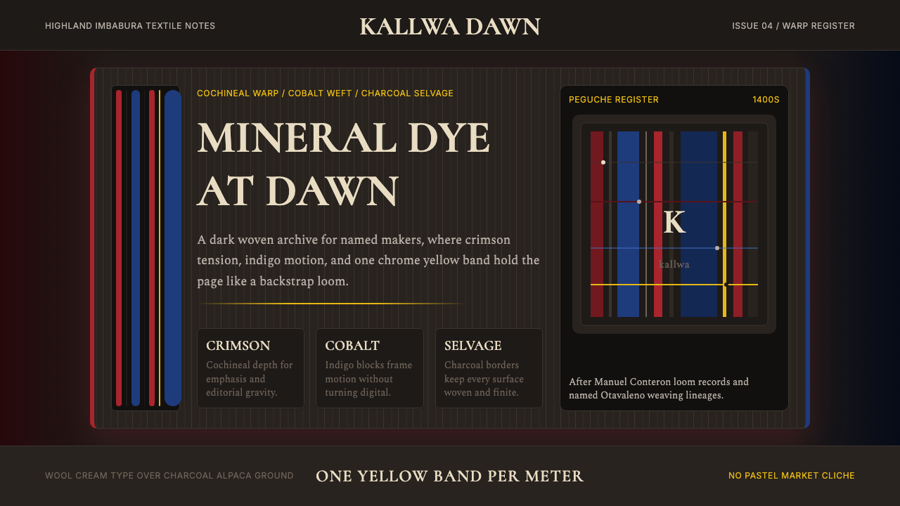 Ecuadorian Otavalo Cochineal LoomHandwoven gravity. Cochineal and cobalt stripes tense against charcoal, cut b…手织般厚重:胭脂红与钴蓝经纬压在炭黑上,只留一条铬黄线。
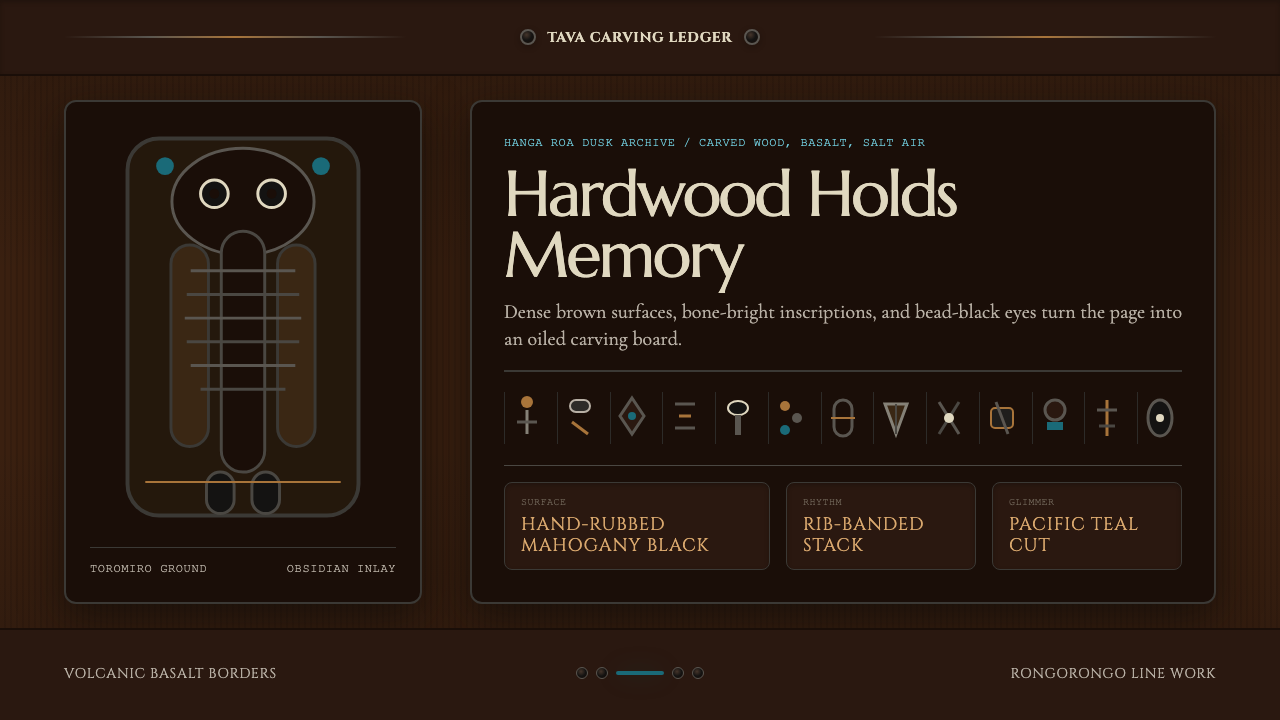 Chilean Rapa Nui Toromiro (Easter Island)Ancient weight, dusk-lit. Toromiro brown, Cinzel capitals, rib bands, obsidia…古老而沉重:托罗米罗褐、Cinzel碑文体、肋骨横带与黑曜石珠。
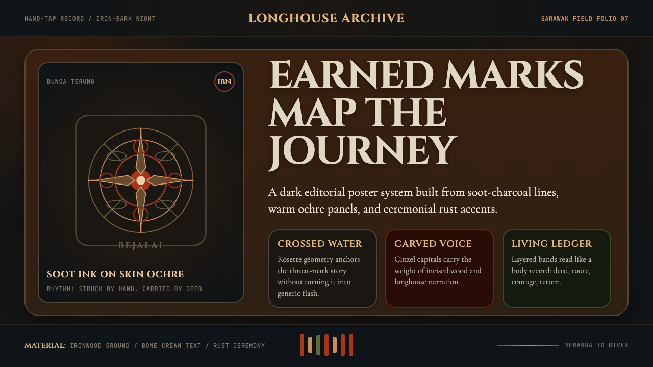 Dayak Borneo Tattoo (Iban)A living journey ledger. Soot lines, ochre panels, and rust rosettes feel han…身体成旅程账本。炭线、赭面与锈红莲座如手敲入肤。
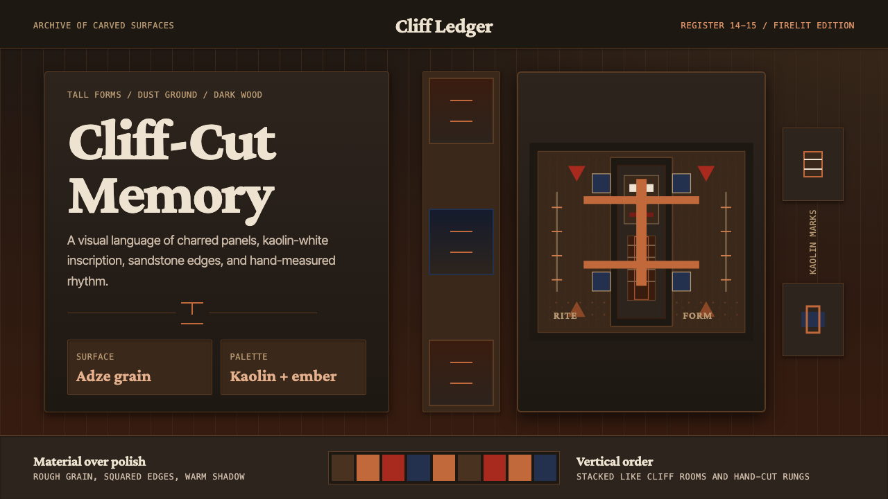 Dogon Bandiagara Cliff MaskHand-hewn gravity. Charred wood, kaolin type, and sandstone geometry stack li…手凿般沉稳:炭木底、高岭土字与砂岩几何层层堆叠。
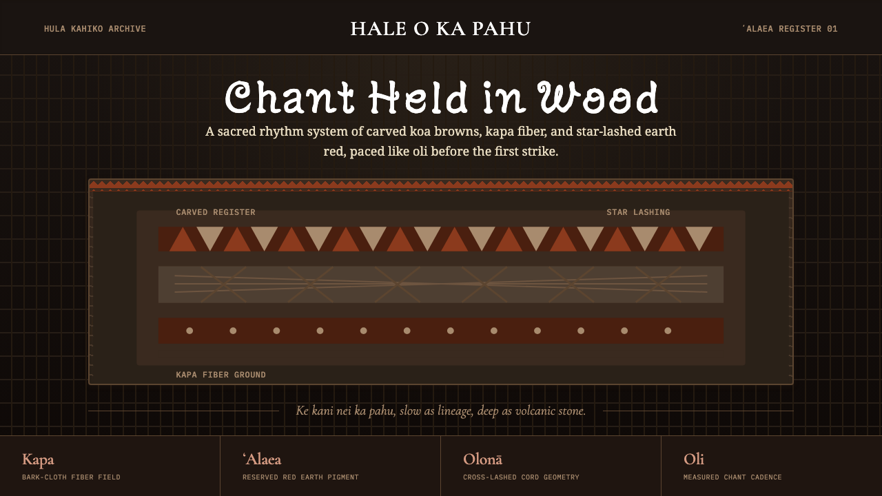 Hawaiian Hula Pahu DrumSacred weight, hand-marked. ʻAlaea red, kapa texture, and stacked carved regi…圣重而手作。ʻAlaea红、卡帕纹理与层叠雕刻带。
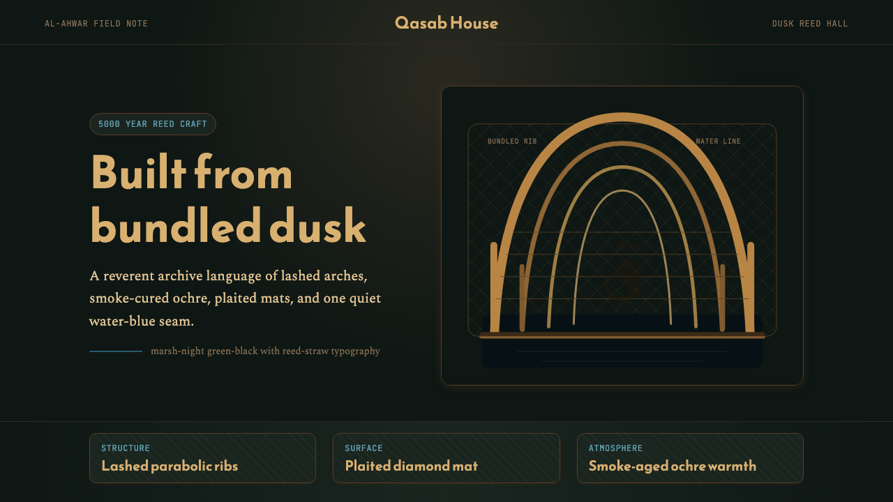 Iraqi Marsh Arab Mudhif ReedReverent reed darkness. Kufi arches, ochre lattice, and one water-blue line h…庄重的芦苇夜色。库菲拱线、赭黄格纹与一笔水蓝托住黄昏。