Design style guide设计风格指南
What is Māori Koru Spiral (Aotearoa)?什么是 Māori Koru Spiral (Aotearoa)?
Carved from the deep grain of totara wood and the iridescent shimmer of pounamu stone, the Māori koru transforms an unfurling silver-fern frond into a visual language of perpetual renewal.从托塔拉木的深沉纹理与碧玉石的虹彩光泽中凿刻而出,毛利科鲁以一枚舒展的银蕨嫩芽,构筑出永恒新生的视觉语言。
Māori Koru Spiral (Aotearoa) in briefMāori Koru Spiral (Aotearoa) 速览
The Māori koru design system is rooted in the visual vocabulary of whakairo — the traditional Māori practice of wood and stone carving — translated into a contemporary digital interface language. Its defining motif, the koru, is a spiral that mirrors the curling tip of a young silver-fern frond at the moment of unfurling. In Māori cosmology, this form carries layered meaning: new life beginning, cyclical growth continuing, and the enduring connection between past, present, and future.毛利科鲁设计体系植根于whakairo(毛利传统木雕与石雕工艺)的视觉词汇,并将其转化为当代数字界面语言。其核心母题——科鲁——是一道螺旋线,映照着银蕨嫩芽刚刚舒展时的卷曲梢端。在毛利宇宙观中,这一形态承载着多层含义:新生的萌发、循环的延续,以及过去、现在与未来之间永不断绝的联结。
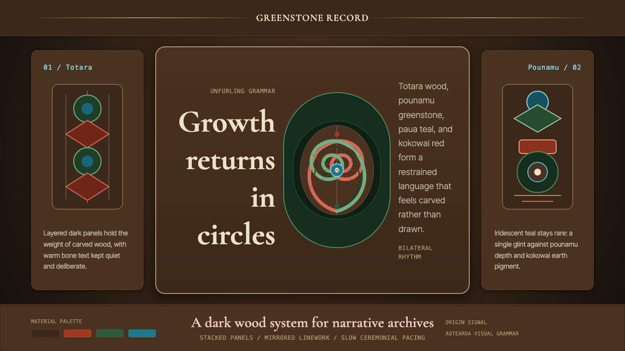
The palette draws directly from materials found in the natural and cultural world of Aotearoa New Zealand. Deep totara-wood brown forms the foundational ground — dark, warm, and dense with implied texture. Against it, pounamu (greenstone or nephrite jade) green provides the primary accent: a color that in traditional culture signified prestige, spiritual protection, and ancestral connection. Paua-shell iridescence — the shifting blue-green that lines the inner surface of the abalone shell — adds luminous depth to secondary elements, suggesting light caught beneath a surface rather than cast upon it. Kokowai, a red ochre pigment used in traditional ceremony and carving, supplies a warm, earthy emphasis that grounds the darker values.这套体系的色板直接取材于奥特亚罗瓦(新西兰)自然与文化世界中的物质。深沉的托塔拉木棕构成基础底色——深暗、温润、隐含着材料质感的厚重感。与之相衬,碧玉(pounamu,即绿玉或软玉)绿作为主要强调色:在传统文化中,这种颜色象征地位、精神庇护与祖先传承。鲍鱼壳(paua)的虹彩蓝绿——在贝壳内壁流转的那种光色——为次要元素注入发光的深度,仿佛光芒从表面之下透出,而非从外部投射。红赭石(kokowai)是传统仪式与雕刻中使用的一种矿物颜料,它提供了一种温暖、泥土气息浓郁的强调,将深色调牢牢锚定。
What makes this system distinctive is its fundamental visual logic: everything is felt as carved rather than drawn. Forms have weight and implied depth, as though they have been worked out of a resistant material. Bilateral symmetry — the mirrored geometry of kowhaiwhai rafter painting in the wharenui meeting house — organizes composition at every scale. Nothing floats arbitrarily; each element is placed with the deliberateness of a carver making an irreversible mark.这套体系的独特之处在于其根本的视觉逻辑:一切都令人感受到是凿刻而非绘制出来的。形态有重量、有隐含的深度,仿佛是从一种抵抗性材料中劳作而成。双侧对称——wharenui会议屋中kowhaiwhai椽梁彩绘的镜像几何——在每个尺度上组织着构图。没有任何元素是随意漂浮的;每一处放置都带有雕刻者作出不可逆刻痕时的那种郑重。
See the Māori Koru Spiral (Aotearoa) design system →查看 Māori Koru Spiral (Aotearoa) 完整设计系统 →
Where does Māori Koru Spiral (Aotearoa) come from?Māori Koru Spiral (Aotearoa) 从何而来?
Māori ancestors arrived in Aotearoa from eastern Polynesia in successive voyages beginning around 1300 CE, bringing with them the navigational, agricultural, and artistic traditions of the wider Pacific. The environments they encountered — vast kauri and totara forests, coastlines rich in pounamu and paua, an ecology unlike anything in the tropical islands they had left — rapidly shaped new aesthetic responses. By the fifteenth and sixteenth centuries, a distinctive regional carving tradition had developed, rooted in ancestral Polynesian forms but transformed by the density of available hardwoods and the particular spiritual needs of the new land.毛利先祖从东波利尼西亚出发,约从1300年起分批抵达奥特亚罗瓦,随船带来了更广阔太平洋地区的航海、农耕与艺术传统。他们所遭遇的新环境——广袤的贝壳杉与托塔拉森林、富含碧玉与鲍鱼壳的海岸线、一个与他们离开的热带岛屿迥然不同的生态系统——迅速催生出新的美学回应。到十五、十六世纪,一种独特的地区性雕刻传统已然成形,植根于祖传的波利尼西亚形式,却被当地坚硬木材的密度与新土地特有的精神需求所深刻改造。
Whakairo — formal wood carving — became the primary architectural and ceremonial art form. The wharenui meeting house, with its carved ancestral figures (poupou), kowhaiwhai rafter patterns, and tukutuku woven wall panels, was both a genealogical library and a cosmological diagram. Each carved element had specific narrative and spiritual meaning: the koru spiral represented new growth and the cycle of life; the manaia (a profile figure with a bird or reptilian beak) represented guardianship; interlocking spirals on faces and garments (tā moko, or facial tattooing) inscribed genealogical identity directly onto the body. This was never decorative art in the Western sense — every mark carried precise cultural information.Whakairo(正式木雕工艺)成为首要的建筑与仪式艺术形式。会议屋(wharenui)以其雕刻的祖先像(poupou)、kowhaiwhai椽梁图案与tukutuku编织墙板,同时充当族谱图书馆与宇宙论图解。每一处雕刻元素都承载着特定的叙事与精神含义:科鲁螺旋代表新生与生命循环;manaia(一种侧面形象,带有鸟喙或爬行动物喙)代表护卫;面部与衣饰上相互咬合的螺旋(tā moko,即面部纹身)则将谱系身份直接铭刻于身体。这从来不是西方意义上的装饰艺术——每一道刻痕都携带着精确的文化信息。
The period from roughly 1500 to 1840 represented the classic flowering of these traditions. Contact with European explorers and settlers from the late eighteenth century onward brought both disruption and new materials. The musket wars of the early nineteenth century, followed by land confiscation and colonization, severely damaged the social structures within which whakairo and related arts had flourished. By the late nineteenth century, Gottfried Lindauer — a Czech-born painter who worked extensively in New Zealand from 1874 — produced a body of portraiture that documented Māori subjects and their traditional dress and moko with unusual care, providing a crucial visual archive of forms that were under pressure.大约从1500年到1840年,这些传统迎来了经典的繁盛期。从十八世纪末开始,与欧洲探险者和定居者的接触带来了冲击,也带来了新材料。十九世纪初的枪战,继之以土地没收与殖民化,严重破坏了whakairo等艺术赖以存在的社会结构。到十九世纪末,出生于捷克、自1874年起长期在新西兰工作的画家戈特弗里德·林道尔留下了大量肖像作品,他以异常细致的笔触记录了毛利人及其传统服饰与moko纹身,为那些正承受压力的视觉形式提供了一份至关重要的图像档案。
The Māori renaissance of the 1960s and the broader political and cultural resurgence that followed transformed this relationship. Artists such as Cliff Whiting and Pakariki Harrison reasserted traditional carving forms not as museum artifacts but as living artistic traditions capable of engaging with contemporary materials and contexts. Scholar and activist Ngahuia Te Awekotuku provided critical intellectual frameworks for understanding Māori art on its own terms rather than through colonial categories. By the 1990s and into the twenty-first century, koru and kowhaiwhai forms had entered the broader design vocabulary of Aotearoa — appearing in national logos, airline branding, and architectural ornament — while simultaneously being reclaimed by Māori artists insisting on the depth and specificity of the tradition those surface applications drew upon.1960年代的毛利文艺复兴及其后更广泛的政治与文化振兴,彻底改变了这种关系。克利夫·怀廷(Cliff Whiting)、帕卡里基·哈里森(Pakariki Harrison)等艺术家重申了传统雕刻形式的生命力——它们不是博物馆里的文物,而是能够与当代材料和语境对话的鲜活艺术传统。学者兼社会活动家恩加惠娅·特·阿威科托库(Ngahuia Te Awekotuku)提供了关键的知识框架,使人们得以在毛利自身的逻辑框架内理解毛利艺术,而非透过殖民主义的分类体系。进入1990年代乃至二十一世纪,科鲁与kowhaiwhai图案已进入奥特亚罗瓦更广泛的设计词汇——出现在国家标志、航空公司品牌与建筑装饰中——与此同时,毛利艺术家也在坚持追究这些表面应用所援引的传统的深度与特殊性。
What defines the Māori Koru Spiral (Aotearoa) look?Māori Koru Spiral (Aotearoa) 的视觉特征是什么?
Palette色板
The palette is organized around four culturally specific values: totara-wood brown (a deep, warm, reddish-dark ground), pounamu green (a mid-to-deep green with cool, mineral clarity), paua-shell iridescence (a luminous blue-green used for subtle shimmer effects), and kokowai red ochre (a warm, earthy accent). Against the dark ground, these colors function as carved surfaces do — they catch light at different angles, suggesting relief rather than flat application. The overall effect is rich and restrained, never garish, always implying depth within darkness.色板围绕四种具有特定文化含义的色值构建:托塔拉木棕(深沉、温润、略带红意的深色底调)、碧玉绿(带有冷调矿物清晰感的中至深绿)、鲍鱼壳虹彩蓝绿(用于细腻光泽效果的发光蓝绿)与红赭石(温暖、富有泥土气息的强调色)。在深色底面上,这些颜色如同被雕刻的表面——在不同角度捕捉光线,暗示浮雕而非平涂。整体效果丰富而克制,绝不刺眼,始终在暗色中暗示深度。
The Koru Spiral科鲁螺旋
The koru — an expanding logarithmic spiral that closes back into itself at the center — is the system's primary formal unit. It appears at every scale, from large structural motifs to micro-details at component edges. The spiral is never used as pure decoration; it carries directional energy, suggesting emergence and return in the same gesture. When two koru face each other in bilateral symmetry, they form the kowhaiwhai pattern that governed the rhythmic ornament of the meeting house. Proportions follow the natural geometry of the fern frond itself, not an arbitrary geometric formula.科鲁——一道向外扩展、在中心回卷的对数螺旋——是这套体系的主要形式单元。它出现在每个尺度上,从大型结构性母题到组件边缘的微小细节。螺旋从不被当作纯粹装饰使用;它携带方向性能量,在同一个姿态中同时暗示萌发与回归。当两道科鲁以双侧对称相向排列时,它们构成了kowhaiwhai图案——这正是会议屋中律动装饰的基本语法。比例关系遵循蕨叶本身的自然几何,而非任意的几何公式。
Bilateral Symmetry双侧对称
Unlike Bauhaus asymmetry or Swiss rationalist grids, this system is built on bilateral mirroring derived from the kowhaiwhai tradition. Layouts, patterns, and components tend to fold along a central axis, with each element having a mirror counterpart. This symmetry is not mechanical or cold — small variations in carved-surface texture and color depth prevent it from feeling rigid. The effect is closer to the breathing symmetry of a living form than to the imposed symmetry of classical architecture.与包豪斯的非对称或瑞士理性主义网格不同,这套体系建立在源自kowhaiwhai传统的双侧镜像之上。版面、图案与组件倾向于沿中轴折叠,每个元素都有对应的镜像。这种对称并不机械、不冷漠——雕刻表面质感与色彩深度上的细微变化,使其避免了僵硬感。效果更接近生命形态的呼吸式对称,而非古典建筑所施加的强制对称。
Carved Surface Quality雕刻表面质感
Elements feel worked from material rather than printed onto a surface. This is achieved through subtle layering of slightly different tonal values within the dark ground — suggesting the faceted planes of a carved form catching light from different angles — rather than through any literal texture simulation. Edges have weight; they do not feel like strokes on paper but like the boundaries of a form that has been cut away. Even flat fields in the UI carry this sense of material presence.元素令人感到是从材料中凿刻而出,而非印于表面之上。这一效果通过在深色底调中细微叠加略有差异的色调值来实现——暗示一个雕刻形体的多个刻面从不同角度捕捉光线——而非任何字面意义上的质感模拟。边缘有重量感;它们不像纸上的笔触,而像是被凿去的形体的边界。即便是界面中的平面色块,也携带着这种材质存在感。
Iridescence and Luminosity虹彩与发光感
Paua-shell iridescence — that characteristic shift between blue, green, and purple depending on angle of view — provides the system's most distinctive visual effect. Used sparingly on interactive states, hover effects, or focal highlights, it creates a sense of depth and aliveness that the matte totara ground cannot. The luminosity is never ambient or diffuse; it is specific and located, like light caught in a facet of polished stone. Overuse flattens the effect; restraint is essential.鲍鱼壳虹彩——那种随视角变化在蓝、绿、紫之间流转的特征性色光——提供了这套体系最具辨识度的视觉效果。将其节制地用于交互状态、悬停效果或焦点高光时,它创造出哑光托塔拉底色所无法给予的深度感与生动感。这种发光感从不是弥散或漫射的;它是特定的、有位置的,仿佛光芒被捕捉在一片抛光石材的刻面之中。过度使用会令效果流于平淡;克制是必要的。
Tā Moko Line WorkTa Moko 线描
Tā moko — traditional Māori facial tattooing — informs the system's approach to fine line work and detailing. Lines are not merely outlines; they are active, curvilinear, interlocking elements that carry meaning through their configuration and direction. Within UI components, this principle appears as intricate border treatments, divider ornaments, and decorative rule patterns that echo the genealogical specificity of tā moko without directly reproducing sacred motifs. The line work is always purposeful and densely organized, never casual or decorative in isolation.Tā moko——毛利传统面部纹身——为这套体系的细线描绘与装饰细节提供了参照。线条不仅仅是轮廓;它们是主动的、曲线性的、相互咬合的元素,通过排布方式与走向传达意义。在界面组件中,这一原则体现为复杂的边框处理、分割线装饰与规则图案,它们呼应tā moko的族谱特殊性,却不直接复制神圣母题。线描始终是有目的、组织严密的,从不孤立地作为随意或纯粹的装饰存在。
Structural Restraint结构性克制
Despite the richness of the palette and the intricacy of the spiral vocabulary, the system is governed by deep restraint. Each element earns its place through cultural reference or structural function. Random ornamentation — spiral patterns added purely for visual filling, kokowai red deployed without relational purpose — immediately reads as pastiche. The restraint is not minimalism (the system is visually dense when used fully) but discipline: everything present should belong there, and belong for a reason.尽管色板丰富、螺旋词汇繁复,这套体系的根本却是深度克制。每个元素都需通过文化指涉或结构功能来证明自身的存在。随意的装饰——纯为填充视觉而添加的螺旋图案、没有关联目的而使用的红赭石——立刻会显现出仿作的痕迹。这种克制并非极简主义(完整使用时,这套体系在视觉上是浓密的),而是一种纪律:凡是存在之物,都应该在那里,并且是有原因地在那里。

See the Māori Koru Spiral (Aotearoa) design system →查看 Māori Koru Spiral (Aotearoa) 完整设计系统 →
Who shaped Māori Koru Spiral (Aotearoa)?谁塑造了 Māori Koru Spiral (Aotearoa)?
Cliff Whiting was a leading figure in the Māori arts renaissance of the late twentieth century, known for large-scale paintings, carvings, and installations that brought traditional koru and kowhaiwhai forms into dialogue with contemporary art contexts. His mural work — most prominently in public institutions across Aotearoa — demonstrated that the visual logic of whakairo could speak with full authority in modern architectural settings, without requiring translation into a Western visual idiom. Whiting's approach insisted on cultural continuity rather than cultural nostalgia.克利夫·怀廷是二十世纪末毛利艺术复兴运动的核心人物,以将传统科鲁与kowhaiwhai形式引入当代艺术语境的大型绘画、雕刻与装置作品著称。他的壁画作品——尤以遍布奥特亚罗瓦各地公共机构中的作品为代表——证明了whakairo的视觉逻辑无需翻译成西方视觉惯用语,便能在现代建筑环境中充分自信地言说。怀廷的创作立场坚持文化延续,而非文化怀旧。
Pakariki Harrison was one of the foremost master carvers of the twentieth century, trained in traditional whakairo and responsible for major carvings in meeting houses and public buildings throughout New Zealand. His work maintained rigorous fidelity to the formal principles and cultural protocols of traditional carving while adapting to new scales and materials. Harrison also played a central role in transmitting carving knowledge to younger generations, ensuring the craft's continuity at a time when the social structures that had previously transmitted it were under severe pressure.帕卡里基·哈里森是二十世纪最重要的雕刻大师之一,接受过系统的传统whakairo训练,在新西兰各地的会议屋与公共建筑中留有大量重要雕刻作品。他的创作对传统雕刻的形式原则与文化规范保持严格忠实,同时能适应新的尺度与材料。哈里森还在向年轻一代传授雕刻知识方面发挥了核心作用,在传统社会结构承受巨大压力的时代,确保了这门工艺的薪火相传。
Gottfried Lindauer was a Czech-born painter who immigrated to New Zealand in 1874 and devoted much of his career to portraiture of Māori subjects. Working at a time of significant cultural disruption, Lindauer produced hundreds of paintings documenting traditional dress, tā moko facial patterns, and ancestral objects with a degree of visual precision unusual for the period. His work — controversial in some respects, because of the colonial context in which it was produced — nonetheless constitutes an important visual archive of koru and moko forms as they existed in the nineteenth century, before many of the objects and practices he depicted were lost or suppressed.戈特弗里德·林道尔是一位出生于捷克的画家,1874年移居新西兰,将职业生涯的大部分时间献给了毛利人肖像的绘制。在文化剧变的年代,林道尔留下了数百幅记录传统服饰、tā moko面部纹样与祖传器物的画作,其视觉精确程度在当时实属罕见。他的作品——在某些方面因其殖民语境而存在争议——仍构成科鲁与moko形式在十九世纪面貌的重要图像档案,记录下许多此后已失传或遭压制的器物与习俗。
Ngahuia Te Awekotuku is a scholar, writer, and activist whose intellectual work has been fundamental to establishing Māori art as a subject of serious critical inquiry on its own terms. Her research challenged colonial frameworks that had categorized Māori visual culture as craft or ethnographic artifact rather than art, and provided rigorous analysis of tā moko, whakairo, and related practices as sophisticated aesthetic and cultural systems. Her work created intellectual space for contemporary designers and artists to engage with these traditions with both depth and accountability.恩加惠娅·特·阿威科托库是一位学者、作家与社会活动家,她的知识性工作对于在毛利自身逻辑框架内将毛利艺术确立为严肃批评研究对象至关重要。她的研究挑战了将毛利视觉文化归类为手工艺品或民族志文物(而非艺术)的殖民框架,并对tā moko、whakairo及相关实践作为成熟美学与文化体系进行了严谨分析。她的工作为当代设计师与艺术家提供了知识空间,使他们得以以深度与责任感介入这些传统。
How do you use Māori Koru Spiral (Aotearoa) today?今天怎么用 Māori Koru Spiral (Aotearoa)?
Applying the Māori koru system to contemporary design work requires understanding what the visual language is doing at its deepest level: creating a sense of carved presence, cultural depth, and cyclical meaning rather than simply borrowing aesthetic surface features. Used thoughtfully, it is one of the most distinctive and emotionally resonant design languages available for projects rooted in Aotearoa New Zealand, Pacific identity, environmental stewardship, or cultural heritage.将毛利科鲁体系应用于当代设计,需要在最深层理解这套视觉语言的作用:营造雕刻的存在感、文化的深度与循环的意义,而非简单地借用美学表面特征。经过深思熟虑地使用,它是适用于植根于奥特亚罗瓦(新西兰)、太平洋身份认同、环境守护或文化遗产主题项目的最具辨识度、最富情感共鸣的设计语言之一。
For presentation slides, the system works most powerfully at the structural level. A cover slide benefits from a single large koru spiral set against the deep totara-ground dark, with the title in a clean, generous weight letterform that does not compete with the spiral's complexity. Content slides should use the dark ground consistently, with pounamu green reserved for active elements — headers, key data points, navigational cues — and kokowai red used sparingly for critical emphasis. Data slides take on a ceremonial quality when bar charts and timeline elements are organized along the bilateral symmetry axis, as though data itself has been made to participate in the kowhaiwhai rhythm.在演示文稿中,这套体系在结构层面最具感召力。封面幻灯片适合以一道大型科鲁螺旋置于深沉的托塔拉底色之上,标题使用笔画清晰、字重充裕的字形,不与螺旋的复杂性相竞争。内容幻灯片应始终保持深色底调,碧玉绿留给活跃元素——标题、关键数据点、导航提示——红赭石则节制地用于关键强调。当柱状图与时间轴元素沿双侧对称轴组织时,数据幻灯片会呈现出一种仪式感,仿佛数据本身被邀请参与了kowhaiwhai的韵律。
For web interfaces and dashboards, the dark background and luminous accent colors suit environments where concentration and authority matter: cultural institution portals, government heritage platforms, environmental monitoring dashboards, or any product positioning itself within Aotearoa's indigenous identity space. Navigation should feel weighty and deliberate — generous spacing, strong typographic hierarchy, paua iridescence reserved for hover and active states only. Cards should carry implied depth through layered tonal variation rather than drop shadows; the goal is to suggest carved planes, not floating paper.对于网页界面与仪表板,深色背景与发光强调色适合需要专注感与权威感的环境:文化机构门户、政府遗产平台、环境监测仪表板,或任何将自身定位于奥特亚罗瓦原住民身份空间的产品。导航应呈现出厚重感与郑重感——慷慨的间距、强劲的字体层级、鲍鱼虹彩色仅保留给悬停与活动状态。卡片应通过色调层次的叠加来传达隐含的深度,而非依赖投影效果;目标是暗示雕刻的刻面,而非漂浮的纸张。
For editorial and marketing work, the style supports storytelling with deep historical texture. Feature spreads can use full-bleed dark grounds with kowhaiwhai-derived border treatments framing the central content area. Pull quotes and section breaks benefit from a single koru spiral as ornamental anchor rather than generic typographic rules. In marketing materials, the kokowai red accent serves well as the primary call-to-action color — warm, urgent, culturally specific — while the pounamu green carries informational hierarchy.对于编辑与营销内容,这种风格支持具有深厚历史质感的叙事。特稿版面可使用满版深色底调,以kowhaiwhai衍生的边框装饰框定中央内容区。引用段落与小节分隔适合以单个科鲁螺旋作为装饰锚点,而非通用的排版规则线。在营销材料中,红赭石强调色可用作主要行动召唤色——温暖、紧迫、具有文化特殊性——而碧玉绿则承担信息层级的职责。
A common mistake is reducing the system to its most obvious surface feature — the koru spiral — and tiling it decoratively across backgrounds or using it as a generic logo device without cultural grounding. This produces what Māori artists and scholars have called a surface application that strips the form of its meaning. A more disciplined approach uses the spiral sparingly, at deliberate scale, in positions that echo its traditional structural role. Similarly, the palette is often misapplied by adding bright contemporary hues alongside the totara-pounamu-paua range; this immediately breaks the system's coherence, because those additional colors carry no referential weight within the cultural logic the system is built upon.一个常见错误是将这套体系简化为其最显眼的表面特征——科鲁螺旋——并将其作为装饰性图案平铺于背景,或在没有文化根基的情况下将其作为通用标志元素使用。这会产生毛利艺术家和学者所称的「表面应用」——一种剥去形态意义的借用。更有纪律的做法是节制地使用螺旋,在深思熟虑的尺度与位置上,呼应其传统结构角色。同样,这套色板常见的误用是在托塔拉-碧玉-鲍鱼色域之外加入明亮的当代色彩;这会立刻破坏体系的连贯性,因为那些额外的颜色在这套体系所建基的文化逻辑中不携带任何参照重量。
See the Māori Koru Spiral (Aotearoa) design system →查看 Māori Koru Spiral (Aotearoa) 完整设计系统 →
Māori Koru Spiral (Aotearoa) — FAQMāori Koru Spiral (Aotearoa) · 常见问题
Is it appropriate to use koru and kowhaiwhai forms in commercial design?在商业设计中使用科鲁与kowhaiwhai图案是否适当?
This is a question that Māori communities, artists, and scholars actively debate, and there is no single consensus answer. The broad principles that have emerged from those conversations are: attribution and context matter enormously; using these forms for products or organizations with a genuine connection to Aotearoa or Māori culture is different from using them as generic exotica; direct reproduction of specific sacred motifs (particularly tā moko designs) is widely considered inappropriate without direct iwi or whānau authorization; and commercially viable work should ideally involve Māori cultural consultation or co-authorship. The safest approach is to work with a designer who has deep cultural knowledge of the tradition, rather than applying the visual system from the outside.这是一个毛利社区、艺术家与学者正在积极辩论的问题,目前没有单一的共识性答案。从这些对话中浮现的一般原则是:归因与语境至关重要;将这些形式用于与奥特亚罗瓦或毛利文化有真实联结的产品或机构,与将其作为通用异域元素使用,性质截然不同;直接复制特定神圣母题(尤其是tā moko纹样)在没有部落(iwi)或家族(whānau)授权的情况下被普遍认为不当;商业化的作品理想情况下应涉及毛利文化咨询或共同创作。最稳妥的方式,是与对这一传统有深厚文化知识的设计师合作,而非从外部套用这套视觉体系。
How does this system differ from generic Pacific or Polynesian design?这套体系与泛太平洋或波利尼西亚设计有何不同?
The Māori koru system is specific to the artistic traditions of Aotearoa New Zealand, shaped by the particular hardwoods, stones, and shell materials available there, and by the cosmological and genealogical frameworks of Māori culture. It should not be conflated with Hawaiian, Samoan, Tongan, or other Pacific visual traditions, which have their own distinct formal vocabularies and cultural protocols. What they share is a Polynesian ancestry, but the centuries of development in their respective environments have produced systems that are genuinely different. Using Māori koru forms as a stand-in for generic Pacific identity is a flattening that disrespects the specificity of all the traditions involved.毛利科鲁体系是奥特亚罗瓦(新西兰)艺术传统所特有的,由当地特定的硬木、石材与贝壳材料所塑造,也由毛利文化的宇宙论与族谱框架所塑造。它不应与夏威夷、萨摩亚、汤加或其他太平洋视觉传统相混淆——这些传统各自拥有截然不同的形式词汇与文化规范。它们共享的是波利尼西亚的共同祖源,但各自在不同环境中数百年的发展,已产生出真正相异的体系。将毛利科鲁形式用作泛太平洋身份的替代符号,是一种抹平——这对所涉及的所有传统的特殊性都是不尊重的。
Can this system work in a light-background version?这套体系能用于浅色背景版本吗?
A light inversion is possible, but it fundamentally changes the system's character. The dark totara-ground is not simply a color choice — it reflects the material reality of carved wood, where the depth of the material is what you see, and light catches the raised forms from above. On a light background, the pounamu green and kokowai red remain culturally specific, but the sense of carved depth disappears. The result can still be visually coherent and culturally referenced, but it will read differently — lighter, more decorative, less immersive. For applications where the full carved-material quality is important, the dark ground is strongly preferable.浅色反转版本是可能的,但这会从根本上改变体系的性格。深色的托塔拉底调不仅仅是一种颜色选择——它反映了雕刻木材的物质现实:你所看见的是材料的深度,光线从上方捕捉那些凸起的形态。在浅色背景上,碧玉绿与红赭石的文化特殊性依然存在,但雕刻深度的感觉消失了。结果仍然可以在视觉上连贯且具有文化指涉,但阅读感截然不同——更轻盈、更具装饰性、更少沉浸感。对于雕刻材质质感的完整感受至关重要的应用场景,深色底调是强烈推荐的首选。
How should typography be chosen to work with this system?如何选择与这套体系相配的字体?
Typography for this system should feel substantial rather than delicate — letterforms with clear structure and generous weight sit better against the carved-material quality of the visual ground. Typefaces that evoke hand-made quality or calligraphic influence can work well, while ultra-thin or highly geometric typefaces tend to feel at odds with the system's material warmth. Whatever typeface is chosen, a strong scale contrast between headline and body sizes amplifies the system's sense of hierarchy and ceremony. For Chinese text, a typeface with clear, confident strokes — rather than a compressed or overly mechanized face — maintains the right register.与这套体系配合的字体应呈现厚重感而非纤细感——轮廓清晰、字重充裕的字形更能与视觉底调的雕刻材质质感和谐共处。唤起手工感或书法影响的字体通常表现良好,而极细或高度几何化的字体往往与这套体系的材质温度感格格不入。无论选择何种字体,标题与正文尺寸之间强烈的尺度对比,都能放大这套体系的层级感与仪式感。对于中文文字,笔画清晰有力的字体——而非过度压缩或机械化的字体——能维持恰当的语言气质。
What kinds of projects are a poor fit for this system?哪类项目不适合使用这套体系?
The Māori koru system is not appropriate for projects seeking lightness, playfulness, or generic universality. Products targeting children, casual consumer markets, or contexts where cultural specificity would feel imposed rather than earned will not benefit from this system. It is also poorly suited to high-speed transactional interfaces — e-commerce checkout flows, quick-service utilities — where the visual weight and ceremonial quality of the system slow the user's reading rather than aiding it. The system rewards contexts where depth, cultural resonance, and considered presence are values the product genuinely holds, not borrowed atmosphere.毛利科鲁体系不适合追求轻盈感、玩趣感或泛化普适性的项目。面向儿童、大众休闲消费市场、或文化特殊性会显得强加而非自然生长的语境,都无法从这套体系中受益。它也不适合高速事务性界面——电商结账流程、快速服务工具——在这类场景中,体系的视觉分量与仪式质感会拖慢用户的阅读,而非辅助之。这套体系在深度、文化共鸣与经过审视的存在感是产品真正持有的价值(而非借来的氛围)的语境中,才能充分绽放。
Related design styles相关设计风格
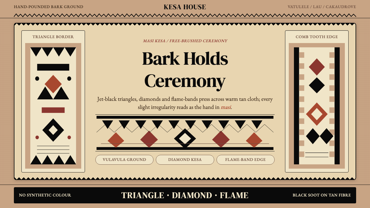 Fijian Masi (Tapa Cloth)Ceremony hits in black. Tan bark ground carries diamonds, zigzags and flame-b…黑色几何即仪式:暖褐树皮底承载菱形、锯齿与火焰边。
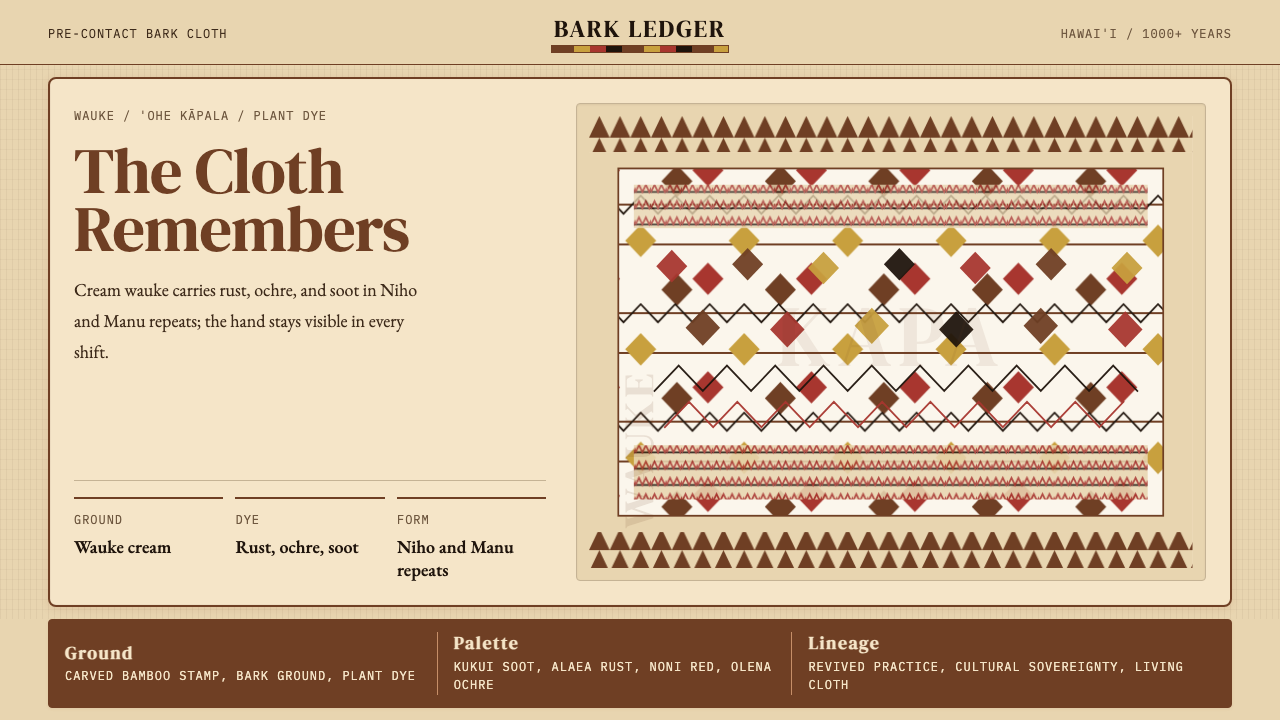 Hawaiian Kapa (Bark Cloth)Ceremonial geometry. Cream wauke, rust, ochre, and soot stamped in repeat.庄严几何。奶油 wauke 底上锈红、姜黄、烟黑反复手印。
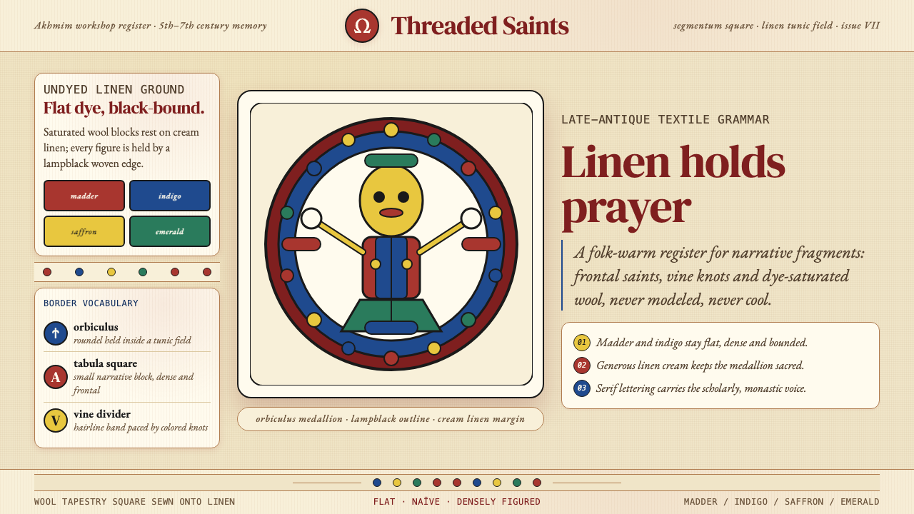 Egyptian Coptic TextileWarmth woven flat. Madder, indigo and saffron medallions sit on linen cream.温暖被织成平面:茜草红、靛蓝与藏红花圆章落在亚麻乳白上。
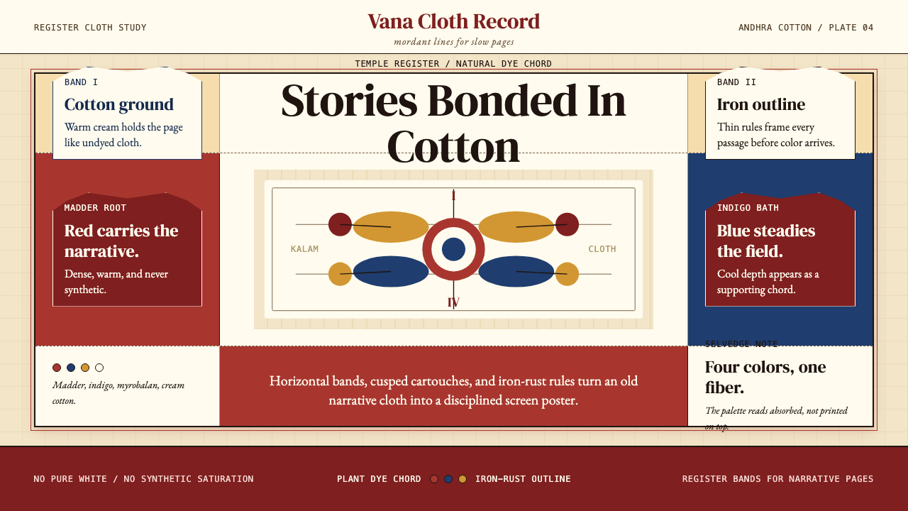 Kalamkari (Andhra Pradesh)Cloth becomes narrative. Madder bands, indigo panels, and iron rules stack li…棉布化为叙事:茜草红条带、靛蓝面板与铁锈线层层如庙布。
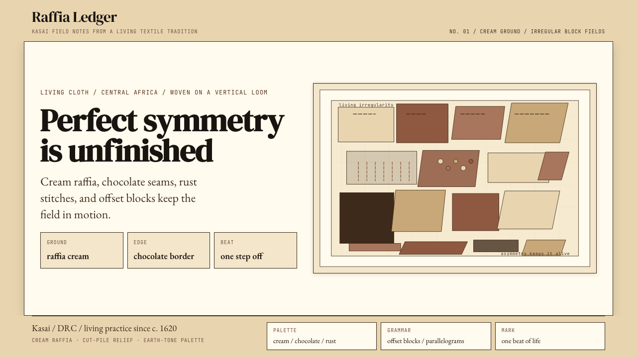 Kuba Raffia Cloth (Congo)Deliberate asymmetry lives. Cream raffia, chocolate seams, and rust blocks.不对称才有生命。奶油拉菲亚底配棕、赭、铁锈块面。
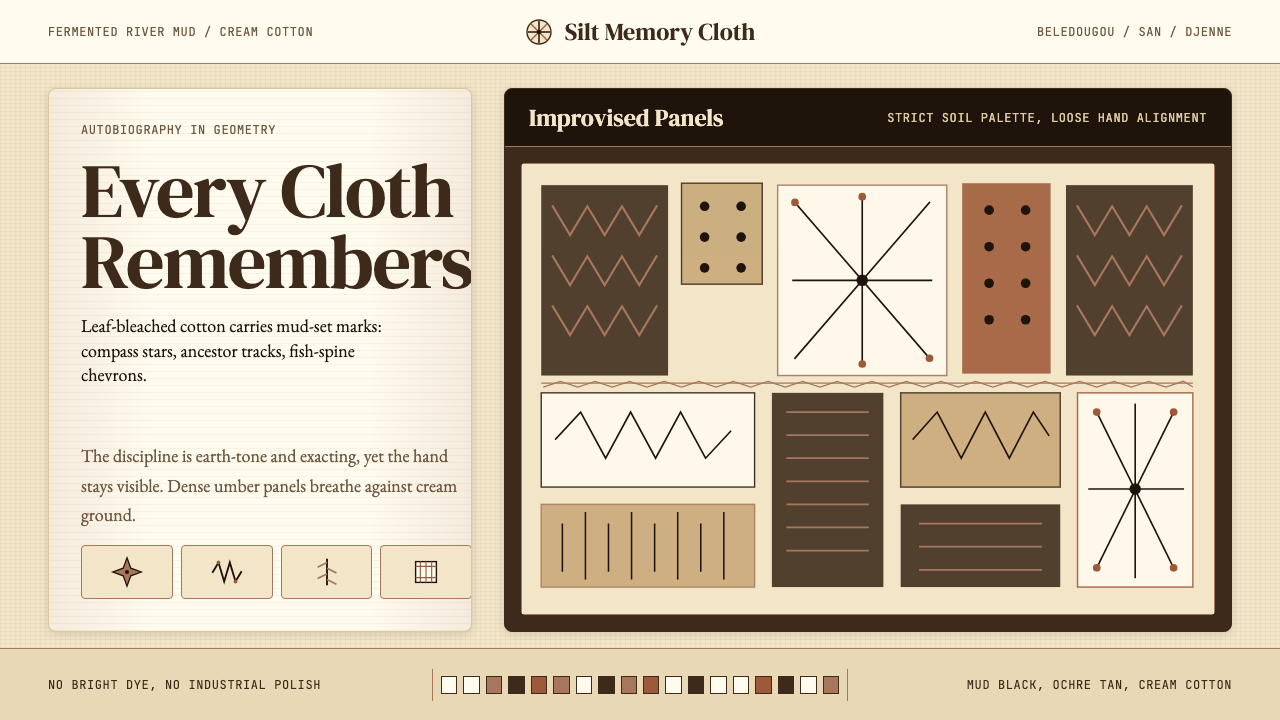 Mali Bògòlanfini (Bambara Mud-Cloth)Autobiography in geometry. Deep umber motifs breathe across cream cotton.几何写成自传:深赭纹样在米白棉布上呼吸。