What is Bosnian Stećak Medieval Tombstone?
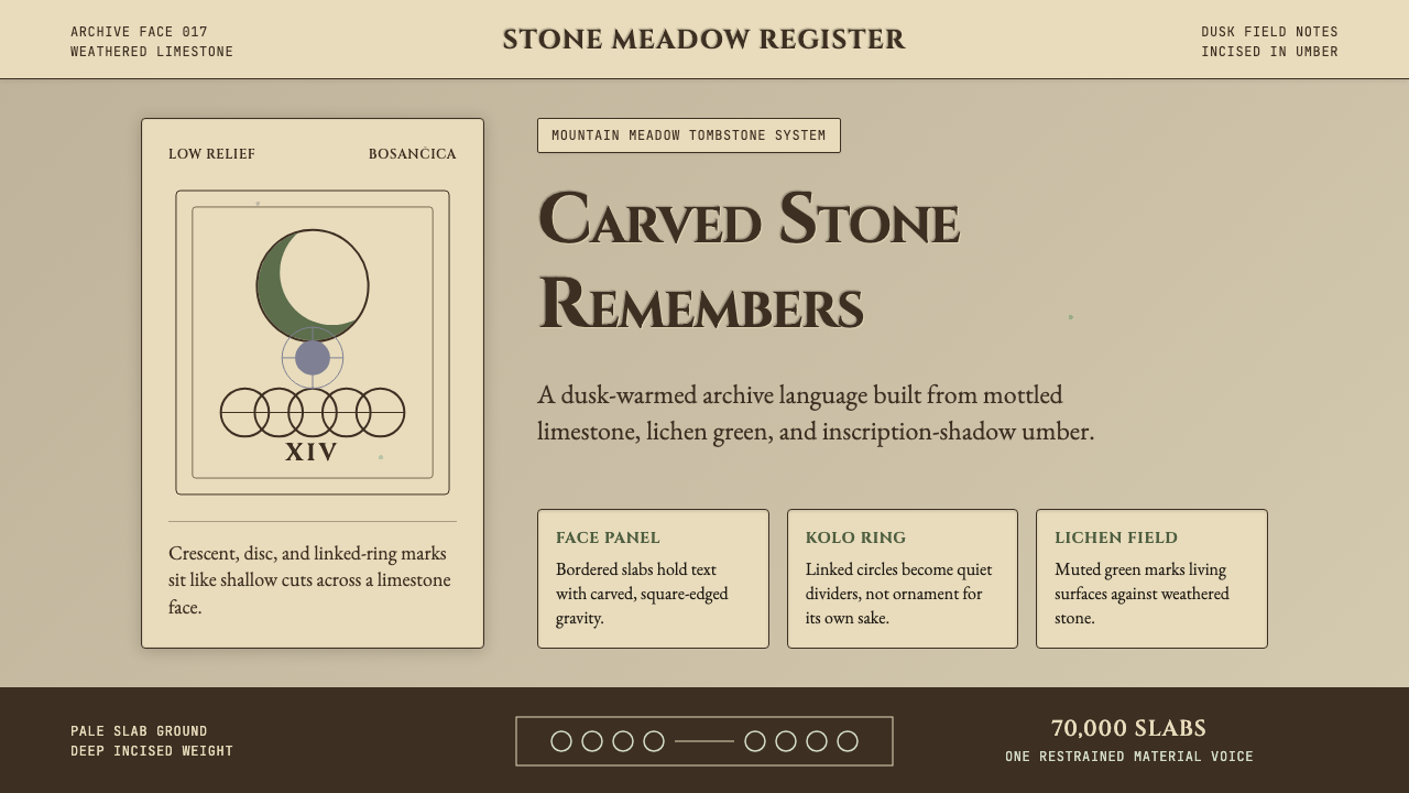
Stećci — 70,000 carved limestone monoliths scattered across the Western Balkans — translate six centuries of medieval Bosnian funerary art into a design language built on weathered stone, lichen green, and inscription-weight typography.
Bosnian Stećak Medieval Tombstone in brief
Stećci (singular: stećak) are monumental medieval tombstones erected between the 12th and 16th centuries across Bosnia-Herzegovina, Croatia, Serbia, and Montenegro. Numbering around 70,000 surviving examples, they constitute one of the largest concentrations of medieval funerary monuments in Europe, yet they remained largely unknown outside the region until the mid-twentieth century. Their scale ranges from modest flat slabs flush with the earth to chest-high sarcophagus forms and towering obelisks reaching the height of a standing adult.
The decorative vocabulary carved into their limestone faces is immediately distinctive: crescent moons and sun-discs, kolo-dance rings of stylized human figures joining hands, stags and vines in fluid low relief, heraldic shields, and sword motifs. Inscriptions in bosančica — a Bosnian variant of the Cyrillic script — run along edges and faces, recording the names and titles of nobles, soldiers, merchants, and shepherds who commissioned their own memorials. The combination of geometric symbol, organic motif, and calligraphic inscription gives stećci a visual density that is neither purely abstract nor purely figurative.
As a design aesthetic, the Stećak style draws on the specific visual experience of visiting a necropolis like Radimlja in Herzegovina at dusk: the pale, mottled limestone ground acting as an undulating canvas, the blue-grey lichen colonizing every shaded crevice, the carved lines catching raking light and casting deep umber shadows. The system translates this material reality into interface and print work — using stone-derived neutrals as its field, the living green of biological encroachment as its primary accent, and the gravity of carved inscription as its typographic model.
Where does Bosnian Stećak Medieval Tombstone come from?
The earliest securely dated stećci appear in the mid-12th century, corresponding with the rise of an autonomous Bosnian polity under Ban Kulin (reigned 1180–1204). By the 14th and 15th centuries, under the Kotromanić dynasty, stećak production reached its peak — the most elaborate monuments dating to this era, when Bosnia was a significant regional power navigating between the Ottoman Empire, the Kingdom of Hungary, and the Serbian despotate. The tradition declined sharply after the Ottoman conquest of Bosnia in 1463 and effectively ended by the early 16th century.
The monuments are closely associated with the Bosnian Church, a medieval Christian institution distinct from both Roman Catholicism and Eastern Orthodoxy whose precise theology has been debated by scholars since the 19th century. Early scholars, drawing on Catholic polemics, labeled it a Cathar or Bogomil heresy; subsequent research, particularly by Šefik Bešlagić — who catalogued stećci across the former Yugoslav republics through exhaustive fieldwork in the mid-20th century — and the British scholar Marian Wenzel, who produced the first comprehensive iconographic analysis, established that the Bosnian Church was more likely an indigenous schismatic body with orthodox Trinitarian belief but independent ecclesiastical structure. The visual symbols on stećci cannot therefore be read as heretical iconography; they are better understood as a regional funerary vocabulary shaped by local noble patronage.
The iconographic program draws from multiple streams. The kolo — the circular chain dance depicted on dozens of prominent monuments — connects to pan-Balkan folk ritual traditions that predate Christianity in the region. Celestial symbols (crescents, sun-discs, stars) appear across the medieval Mediterranean and carry eschatological rather than specifically Islamic meaning in this context. Heraldic elements reflect the aspirations of provincial nobility to legitimacy within the broader feudal world. The vine scroll, one of the most common motifs, carries Eucharistic resonance shared with Byzantine funerary art. The synthesis is distinctively Bosnian rather than derivative of any single artistic center.
Modern rediscovery of stećci accelerated after World War II within the socialist Yugoslav framework, which found in these monuments a pre-national, multi-confessional heritage that could be claimed by all constituent peoples. Dubravko Lovrenović, the most significant contemporary scholar of the tradition, has worked extensively on contextualizing stećci within Bosnian dynastic history. In 2016, the stećci cultural landscape was inscribed on the UNESCO World Heritage List as a joint nomination by Bosnia-Herzegovina, Croatia, Serbia, and Montenegro — the first transnational UNESCO site in the Western Balkans. This recognition formalized what fieldworkers and local communities had long understood: that these stones are not the heritage of any single ethnic or religious group but of the entire medieval Bosnian world.
What defines the Bosnian Stećak Medieval Tombstone look?
Color Field
The palette begins with the stone itself: a warm, mottled limestone tone — neither clean white nor true beige — that carries the memory of centuries of weathering. Against this ground, lichen green serves as the primary living accent, evoking the biological layer that colonizes every surface left undisturbed for decades. Deep carved-shadow umber defines weight, inscription, and structural boundary. The overall effect is earthy and organic rather than bright or saturated, with color seeming to have been deposited by time rather than chosen by a designer.
Typography
Letterforms in this system carry the authority of stone inscription — that is, they are drawn with precision and given monumental weight, as if each character has been laboriously chiseled rather than quickly typeset. Small-caps serifs evoke the bosančica tradition of carved epigraphic lettering, where each glyph needed to survive centuries of weathering. Against these high-authority display letterforms, a warmer, more humanist serif carries body text — the pairing produces the contrast between the permanence of the monument and the intimacy of what it records.
Surface Texture
Unlike flat digital design systems that eliminate texture entirely, the Stećak aesthetic foregrounds material memory. Subtle grain patterns, irregular ground tones, and the visual suggestion of porosity — the way limestone absorbs and reflects light differently across its face — are central to the style's authenticity. Cards, panels, and backgrounds are treated as stone faces rather than blank canvases: they have a history implied in their surface before any content is placed on them.
Motif Vocabulary
The decorative grammar of stećci translates directly into interface ornament: the kolo-ring becomes a loading indicator or section divider, its chain of linked figures reduced to a repeating geometric band. Crescent and sun-disc motifs function as iconographic anchors at corners or within badges. Vine scroll patterns inform border and separator treatments. The stag — the most emblematic animal on the monuments — can appear as a simplified emblem or watermark. This is not arbitrary historical pastiche; each motif carries eschatological weight in its original context, and deploying it in design work imports that gravity.
Light and Shadow
The stećak surface was designed to be read by raking light — the shallow relief carving becomes legible only when illuminated at an oblique angle, casting the incised lines into sharp shadow. This logic of revelation-through-shadow carries into the design system: depth is communicated not through gradients or soft diffused shadows but through hard, directional shadow edges that recall the way a carved groove catches afternoon sun. Elevation is implied by how sharply and decisively an element casts its shadow.
Geometry and Symmetry
Medieval stonemasons working on stećci employed bilateral symmetry as the organizing principle for the more formal heraldic compositions, but the kolo-dance registers and vine scrolls introduce a flowing, rotational rhythm that softens the overall rigidity. This tension between formal symmetry and organic rhythm — between the heraldic shield and the dancing ring — gives the aesthetic its characteristic balance: monumental but not static, ordered but not mechanical.
Inscription as Structure
On the actual monuments, the bosančica inscriptions function as both text and structural element — a band of lettering along an edge anchors the composition, while the legibility of the individual characters is secondary to the visual rhythm of the repeated glyphs. In the design system, this principle translates into treating type as texture: long runs of display letterforms can function as ruled bands or ornamental registers, unread but compositionally essential. This is the opposite of the modernist principle that every element must be functionally justified — here, legibility and decoration are not distinguished.
Who shaped Bosnian Stećak Medieval Tombstone?
Bešlagić was the foremost scholar of stećci in the twentieth century. Working through the mid-century decades in socialist Yugoslavia, he conducted exhaustive field surveys across Bosnia-Herzegovina, Croatia, and Serbia, cataloguing thousands of individual monuments with photographs, measured drawings, and epigraphic transcriptions. His multi-volume catalogues — covering the distribution, typology, and decoration of stećci across the entire tradition — remain the foundational reference for any subsequent study. Without his systematic fieldwork, much of the iconographic analysis that followed would have been impossible.
The British art historian Marian Wenzel produced the most thorough iconographic analysis of stećak decoration in her study of ornamental motifs across the entire corpus. Her work systematically classified the decorative grammar — identifying recurring motifs, tracing their possible sources in Byzantine, Romanesque, and local folk traditions, and distinguishing between workshop conventions and individual invention. Wenzel's analysis provided the scholarly foundation for understanding stećci as a coherent visual system rather than an accumulation of folk carving.
Lovrenović is the most significant contemporary Bosnian scholar working on stećci and medieval Bosnian history more broadly. His research has situated the monuments within the political and ecclesiastical dynamics of the Bosnian medieval state, recontextualizing them away from earlier nationalist or confessional frameworks. His work has been particularly important in the period following the 1990s war in Bosnia, where questions of heritage ownership were deeply politicized; his insistence on the multi-confessional and pre-national character of stećci has been both scholarly and political.
Grgur of Bisinja is among the most historically documented individual commissioners of a stećak monument. His tombstone, bearing a bosančica inscription recording his name, lineage, and feudal title, exemplifies the class of provincial Bosnian nobility for whom the most elaborate stećci were produced. The inscription tradition he represents — carving one's own biographical record into permanent stone — is what gives stećci their unusual dual character as both funerary monument and historical document.
How do you use Bosnian Stećak Medieval Tombstone today?
The Stećak style works best in contexts where gravitas, cultural depth, and a sense of historical weight are desirable — not as nostalgia, but as authenticity. It is naturally suited to projects where the product itself has substance and longevity built into its proposition: archival platforms, premium editorial publishing, cultural institutions, heritage tourism, specialty food and drink brands with genuine provenance, and software tools designed for serious, long-term use. It struggles in contexts requiring lightness, urgency, or tech-forward signals.
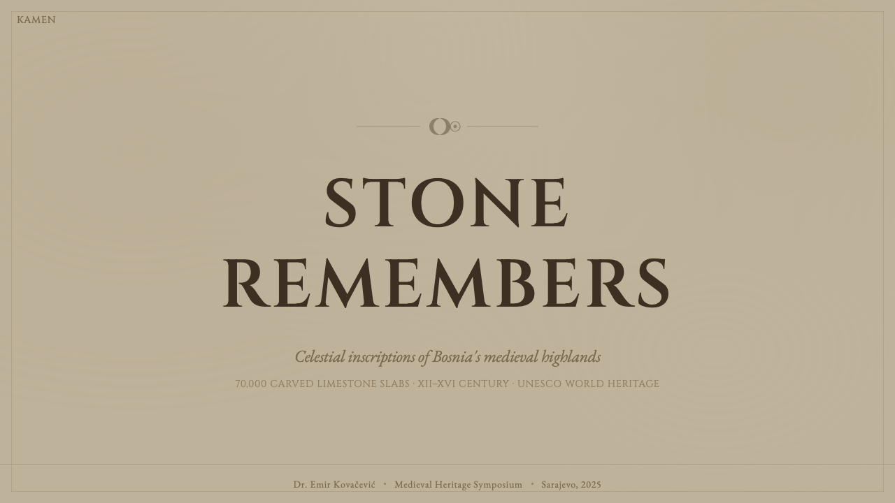
For presentation slides, the style functions as a premium alternative to the generic neutral-corporate aesthetic. A cover built on a weathered limestone ground with a single carved-weight headline immediately communicates seriousness and distinction. The kolo motif used as a section-opening flourish, or vine-scroll borders framing data panels, add the period depth without overwhelming content. Content slides should restrain the decorative vocabulary sharply — one motif element per slide at most, with the bulk of the space given to typographically strong text. Data slides work well with the hard-shadow card treatment: bar charts rendered as stacked stone-face panels, with the umber shadow providing the elevation cue.
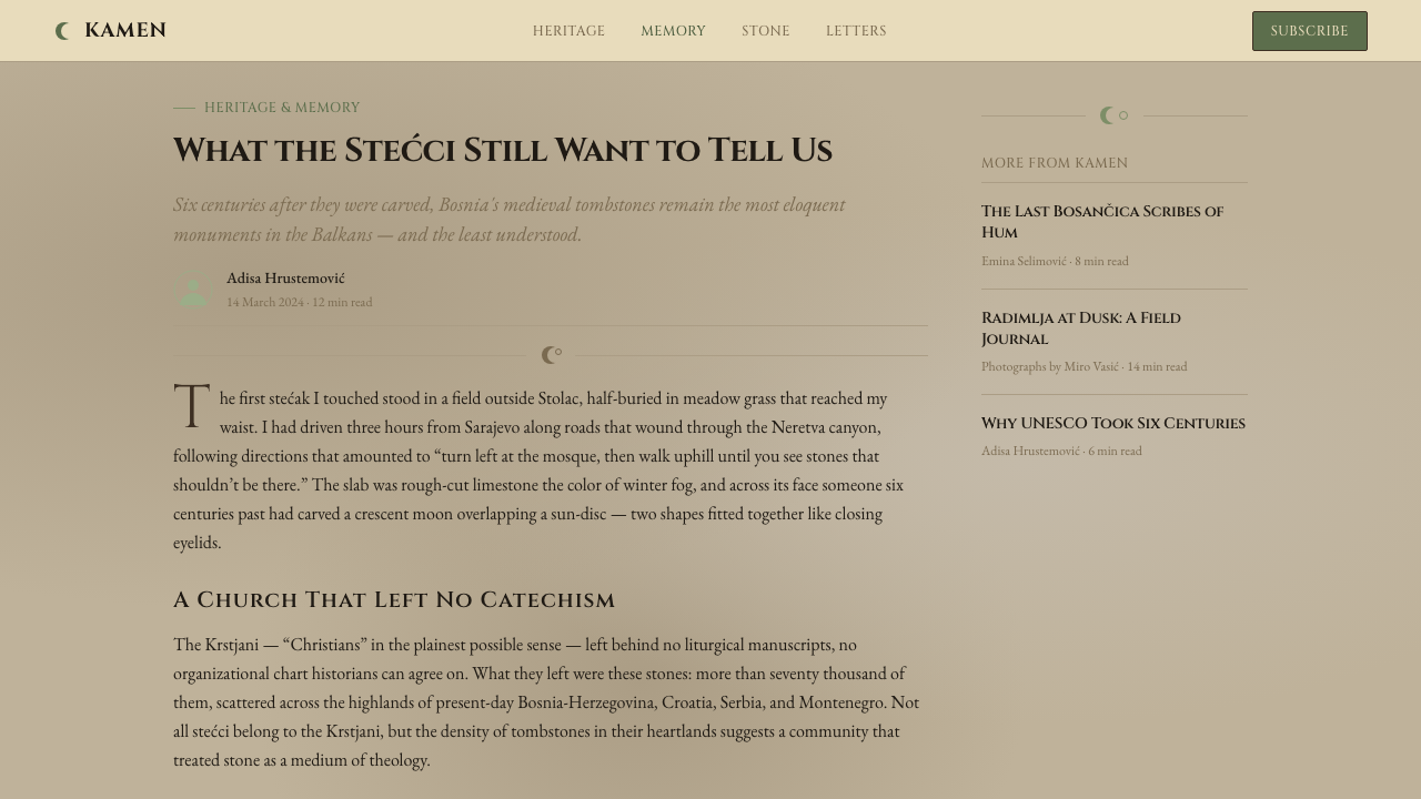
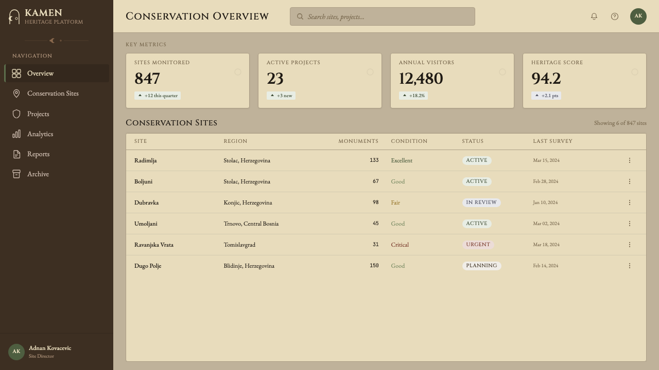
For web interfaces, the Stećak aesthetic is most appropriate in editorial contexts — magazine-style layouts, long-form publishing platforms, and cultural institution websites — where the reading experience rather than conversion rate is the primary design goal. A limestone-ground hero section with large inscription-weight headlines and a lichen-green call-to-action button communicates unhurried authority. Dashboard applications can use the system in a restrained way: stone-neutral backgrounds, hard-shadow data cards, and the green accent reserved strictly for live or active status indicators.
For marketing and editorial work, the style supports rich print-adjacent compositions. A poster or campaign using the stećak vocabulary can alternate limestone-ground sections with deep umber panels carrying reversed text, creating a rhythm of light and shadow that mirrors the experience of walking among the monuments themselves. The bosančica-inspired typographic band — a horizontal run of inscription-weight letterforms used as a section separator — is a distinctive signature move that differentiates this style from every other historical aesthetic.
The most common mistake when applying this style is confusing its earthiness with rusticity and then over-applying texture until the work looks distressed rather than aged. Authentic stećak work is precise: the carvings are skilled, the proportions are considered, and the inscriptions are carefully composed. Texture should read as the passage of time applied to something that was originally executed with intention and craft — not as a shortcut to character. Similarly, the lichen green should appear as a deliberate and restrained accent, not as a dominant ground color. When it begins to compete with the limestone neutral for surface area, the palette loses its sense of geological hierarchy and becomes merely decorative.
Bosnian Stećak Medieval Tombstone — FAQ
Is the Stećak style appropriate for digital products, or is it too tied to physical stone?
The style translates to digital work effectively when the translation principle is understood correctly. The point is not to simulate stone on a screen — that produces skeuomorphic kitsch. The point is to carry the aesthetic logic: the same values of weight, permanence, restraint, and the layering of time. A limestone-toned background is a color decision, not a texture simulation. Hard shadows express the same structural clarity that a chisel line does. The inscription-weight typography communicates the same authority whether it is carved in calcite or rendered in a web font. Applied with this understanding, the style is as native to digital contexts as any historical aesthetic can be.
How does the Stećak style differ from other stone-based or medieval European aesthetics?
Most medieval European visual traditions that get adapted into design work — Gothic, Romanesque, Celtic — are characterized by either vertical aspiration (pointed arches, soaring cathedral geometry) or interlaced complexity (knotwork, illuminated manuscript patterns). Stećci are horizontal, ground-level, and emphatically naturalistic in their motif choices — stags, vines, kolo-dancers — without the mathematical abstraction of Celtic patterns or the spiritual verticality of Gothic. The color palette is also distinct: where other medieval aesthetics tend toward gold, deep blue, and rich pigments, the Stećak system is geological — its colors are borrowed from limestone, lichen, and soil. The result is a medieval aesthetic that reads as earthy and rooted rather than courtly or transcendent.
What industries or brand archetypes fit this style best?
The style aligns with brands and products whose value proposition is grounded in time, craft, or cultural depth. Wine and spirits producers with genuine regional heritage, slow-journalism and long-form literary publishing platforms, documentary and archival organizations, museum and cultural institution identity work, premium craft manufacturing (ceramics, leather, textiles), and travel brands focused on deep regional immersion are natural fits. It also works for software products that want to communicate patience and durability over novelty — a version control system for creative work, a long-form writing environment, a personal knowledge archive — where the dominant aesthetic signals would otherwise be tech-forward and ephemeral.
Can this style work alongside other historical aesthetics, or does it need to stand alone?
The Stećak style can be combined productively with other earthen or archival aesthetics — particularly Central European vernacular traditions, Ottoman decorative arts, or Byzantine mosaic traditions — because they share the same general chromatic register (warm neutrals, earthen accents, gilded or dark accent tones). It is less compatible with aesthetics that depend on precise geometric abstraction, primary color symbolism, or photographic naturalism, because those systems operate on entirely different principles. Mixing it with Bauhaus, Swiss International Style, or high-modernist minimalism produces incoherence: the values of the two systems simply do not overlap. If used in a multi-brand system, it should occupy a distinct tier — the heritage or archival track — rather than appearing alongside contemporary minimal brands.
Does the 2016 UNESCO listing change how this style should be credited or used?
The UNESCO listing recognizes stećci as a shared cultural landscape belonging to four countries and, by extension, to no single ethnic or national group exclusively. This is actually liberating for design use: the style does not carry the kind of singular national or ethnic ownership that could make its use feel appropriative. It is a transnational medieval heritage, as open to aesthetic adaptation as Romanesque architecture or Byzantine iconography. The responsible approach is to understand what you are drawing from — to know that these are real monuments marking real graves, that the bosančica inscriptions are actual personal records, and that the kolo figures depicted real communal practice — and to bring that seriousness of reference into the work rather than using the visual surface as costume.
Related design styles
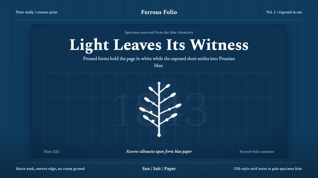 Anna Atkins CyanotypeScience turns spectral. Prussian blue ground, white reserves, Victorian serif…
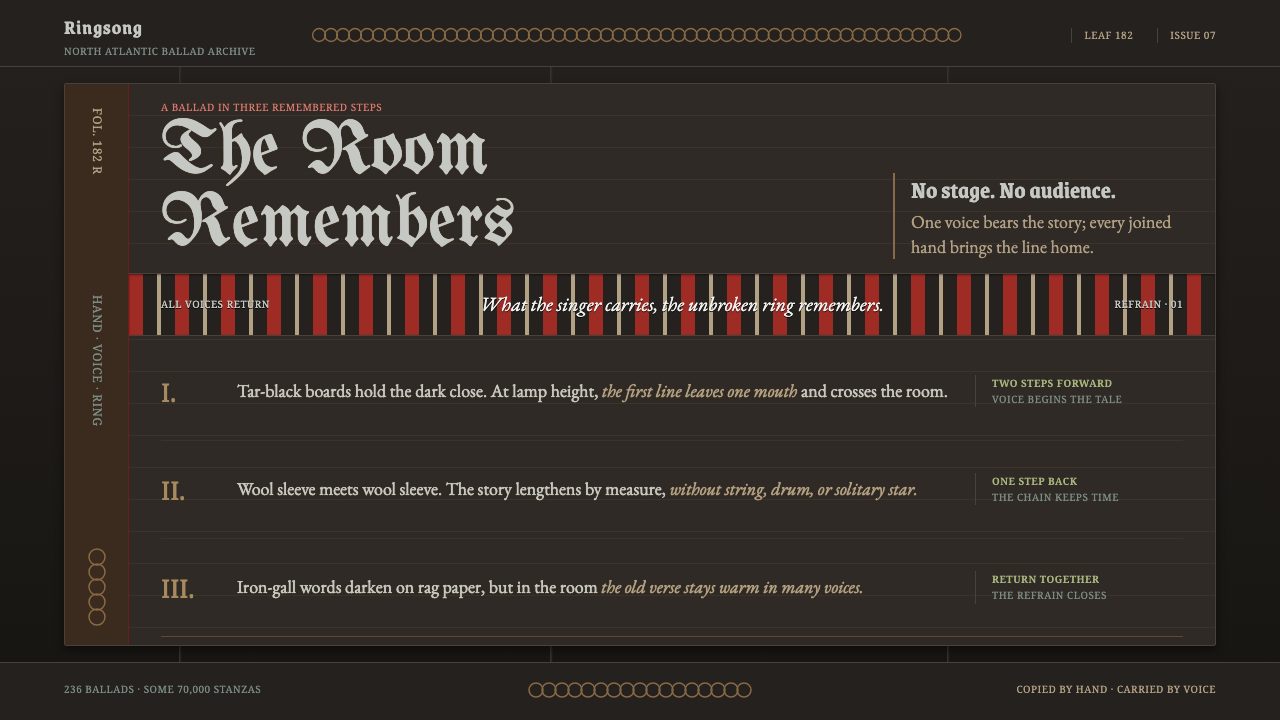 Faroese KvæðiThe room sings as one. Silver type and red refrain bands rule a tar-black man…
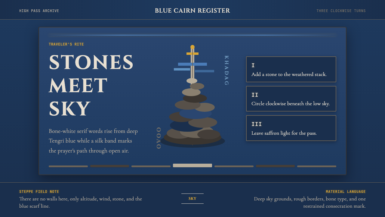 Mongolian Ovoo (Cairn Prayer Site)Sacred austerity. Steppe-blue ground, bone serif type, and one silk-blue pray…
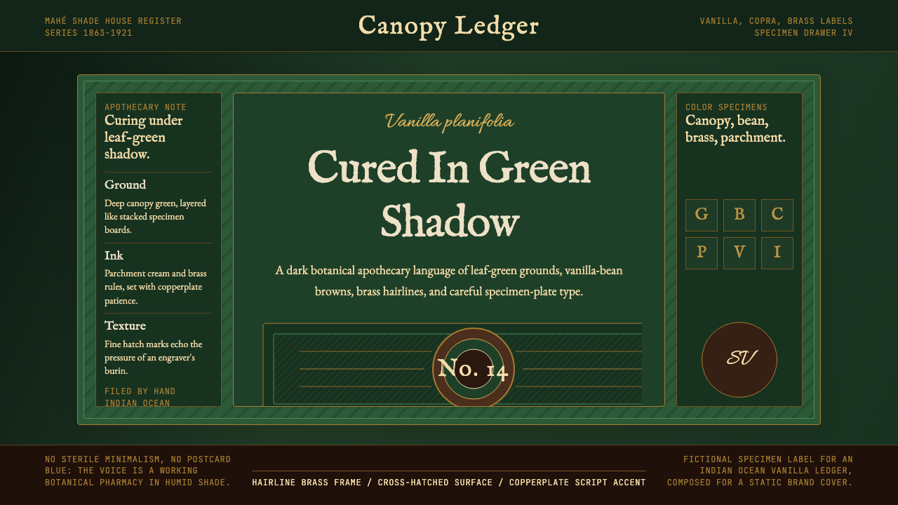 Seychellois Vanilla TakamakaBotanical apothecary in shadow. Deep green, brass hairlines, and copperplate…
 Tintype Wet PlateLight fixed to tarnished metal. Gunmetal grays rise from blackened iron, capp…
 Hill of CrossesMemory returns by hand. Rain-black oak and rusted iron overlap until density…