Design style guide设计风格指南
What is Mongolian Ovoo (Cairn Prayer Site)?什么是 Mongolian Ovoo (Cairn Prayer Site)?
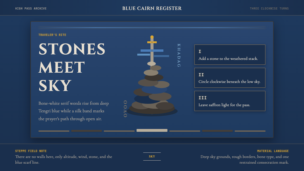
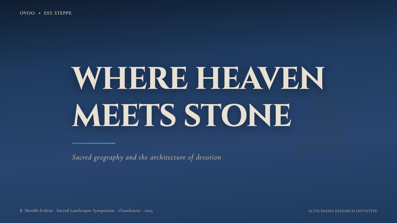
The Mongolian ovoo — a sacred cairn of stones, bleached wood, and sky-blue prayer scarves raised at mountain passes — becomes a design language of austere verticality, deep steppe-sky grounds, and bone-white type that weathers like stone.蒙古敖包——石块、风化白木与天蓝色哈达丝巾堆叠于山口的神圣路标——化为一套设计语言:肃穆的垂直感、深邃的腾格里蓝底色与骨白衬线字,沉静如风蚀的碑石。
Mongolian Ovoo (Cairn Prayer Site) in briefMongolian Ovoo (Cairn Prayer Site) 速览
Mongolian Ovoo (Cairn Prayer Site) is a design aesthetic drawn from the sacred cairns — called ovoo — that mark high passes, hilltops, and liminal zones across the Inner Asian steppe. An ovoo is not a monument built to last in the architectural sense; it is an accumulation: each traveler adds a stone, a branch, a strip of silk, until the pile becomes a breathing collaboration between landscape and human passage. The visual language of the style translates this quality into interface and graphic work — layered rather than monolithic, devotional in its attention to surface and absence.蒙古敖包(Cairn Prayer Site)是一套从内亚草原的神圣石堆中提炼出的设计美学。敖包不是建筑意义上经久不衰的纪念碑,而是一种积累——每位旅人添一块石头、一根树枝、一条丝绸,直至这堆砌物成为大地与人类往来之间活着的合作。这种风格将这一特质转化为界面与平面设计语言:层叠而非整块,在对表面与空白的关注中散发着一种虔敬气质。
At its core, the Mongolian Ovoo aesthetic is built on deep steppe-sky blue grounds, bone-white type that reads like carving in pale stone, and a single thread of silk blue — the color of the ceremonial khadag scarf — that runs through compositions as an accent line or highlight. Texture is implied rather than rendered: the roughness of granite, the grain of bleached larch, the flutter of dyed silk in high-altitude wind. The result is simultaneously grounded and vertiginous, heavy and airy, sacred and spare.蒙古敖包美学的核心,是深邃的腾格里蓝天底色、读来如刻在浅色石面上的骨白衬线字体,以及一条丝绸蓝——仪式哈达丝巾的颜色——以强调线或高亮形式贯穿整个构图。质感以暗示而非描绘的方式存在:花岗岩的粗粝、漂白落叶松的木纹、高海拔风中飘动的染色丝绸。最终效果同时具有沉实感与失重感,厚重而空灵,神圣而简省。
Unlike purely decorative ethnographic references, the Ovoo style is grounded in a consistent visual logic: deep grounds absorb the eye as an enormous sky absorbs a traveler; type sits carved and still; the accent scarf-color provides the only warmth or movement. This is a dark-mode aesthetic in temperament even when specific implementations vary — its emotional register is reverence and exposed space, not ornament or abundance.与纯粹的民族装饰性引用不同,敖包风格建立在一套一贯的视觉逻辑之上:深色底面如同苍穹吸纳旅人的目光;文字如凿刻般静止;那一线丝巾色提供整体中唯一的温度与动势。无论具体实现如何变化,这在气质上都是一种深色模式美学——其情感基调是肃穆与暴露的空间,而非装饰或丰盛。
Where does Mongolian Ovoo (Cairn Prayer Site) come from?Mongolian Ovoo (Cairn Prayer Site) 从何而来?
The ovoo tradition predates recorded history across the Inner Asian steppe, rooted in Tengrist shamanism — the animist belief system of the Turkic and Mongolian peoples centered on the sky deity Tengri and the earth deity Etugen. In Tengrist practice, high places are where the two realms touch: the sky presses down, the earth rises up, and the cairn marks the seam. Travelers who pass an ovoo add a stone to acknowledge the spirits of the place and invoke safe passage. The practice is neither prescribed nor centralized; it accumulates organically, one gesture at a time, across generations.敖包习俗早于内亚草原的文字记录,植根于腾格里萨满教——突厥与蒙古民族以天神腾格里和大地神额土根为核心的万物有灵信仰体系。在腾格里信仰的实践中,高处是两个世界相触之所:苍天向下压,大地向上隆,而石堆就标示着那道接缝。途经敖包的旅人添一块石头,以此承认此地诸神并祈求平安过路。这一习俗既无固定仪轨也非集中管理,它在数代人间自然积累,一个姿态接着一个姿态。
By the seventeenth century, the arrival of Vajrayana Buddhism in Mongolia — partly through the influential reformer and sculptor Zanabazar, the first Jebtsundamba Khutughtu — had layered Buddhist iconography and ritual structure over the Tengrist foundation without displacing it. Prayer flags, incense offerings, and mantras joined the stone and wood. The blue khadag silk scarf, whose color represents the sky and Tengri himself, became the ovoo's most recognizable textile element. This syncretism is itself a design principle: accumulation without erasure, each layer legible through the others.十七世纪,藏传佛教传入蒙古,部分经由具有重要影响力的改革者与雕塑家扎那巴扎尔——第一世哲布尊丹巴呼图克图——在腾格里信仰的底层叠加了佛教图像与仪式结构,却未将其取代。经幡、焚香供奉与咒语加入了石木之间。象征苍天与腾格里本身的蓝色哈达丝巾,成为敖包最具辨识度的织物元素。这种合流本身即是一种设计原则:积累而不抹除,每一层皆可透过其他层清晰辨读。
Russian scholars in the nineteenth century began systematic documentation of ovoo practice across Buryatia and what would become the Mongolian People's Republic. Among them was Sergei Dordzhi Banzarov, whose 1846 work on the Black Faith — the term he coined for the pre-Buddhist shamanic tradition — remains a foundational text. The anthropologist Caroline Humphrey and the geographer Owen Lattimore both wrote extensively about ovoo as cultural infrastructure: not mere superstition but a technology for marking territory, coordinating passage, and sustaining community across the vast distances of nomadic life.十九世纪,俄国学者开始在布里亚特及后来的蒙古人民共和国境内系统记录敖包习俗。其中包括谢尔盖·多尔贾·班扎罗夫,其1846年关于「黑教」(他为前佛教萨满传统创造的术语)的著作至今仍是基础性文本。人类学家卡罗琳·汉弗莱与地理学家欧文·拉铁摩尔均对敖包作为文化基础设施有大量论述:它并非单纯的迷信,而是在游牧生活的广阔距离中标定领土、协调通行、维系社群的技术。
The spatial logic of the ovoo — high ground, expansive horizon, one vertical marker against an enormous sky — shaped the aesthetic vocabulary that eventually became this design style. The deep blue is the steppe sky at dusk, neither night nor day, neither protective nor hostile. The bone-white is weathered stone and bleached wood after years of wind and ultraviolet exposure. The silk-blue accent is the khadag itself: a flash of human intention in an inhuman landscape. These are not arbitrary color choices; they carry the weight of a specific relationship between a culture and its physical environment.敖包的空间逻辑——高地、开阔地平线、一根垂直标杆对抗巨大苍穹——塑造了最终成为这套设计风格的美学词汇。深蓝色是草原黄昏的天色,既非黑夜也非白昼,既不庇护也不威胁。骨白色是经年风吹日晒后风化的石块与漂白的木材。丝绸蓝的强调色就是哈达本身:在非人性尺度的风景中,一道人类意志的闪光。这些不是任意的色彩选择;它们承载着一种文化与其所处物理环境之间特定关系的重量。
What defines the Mongolian Ovoo (Cairn Prayer Site) look?Mongolian Ovoo (Cairn Prayer Site) 的视觉特征是什么?
Palette: Deep Sky and Bone色彩:腾格里深蓝与骨白
The dominant ground color is a saturated, mid-to-deep steppe-sky blue — the color of the Mongolian sky viewed from altitude at the blue hour between dusk and night. Against this ground, primary text and structural elements appear in a warm bone-white, neither pure white nor cream, suggesting weathered limestone or sun-bleached wood. A single silk blue — warmer and lighter than the ground, the precise color of a ceremonial khadag — appears as the system's accent, used sparingly for a single line, a highlight state, or a key label. Secondary tones are rarely needed; the power of the palette comes from its restraint to three closely related values rather than contrast through hue opposition.主导底色是一种饱和度中等偏高的腾格里蓝——从海拔高处俯瞰黄昏与夜晚之间蓝色时刻的蒙古天空之色。在这一底色上,主要文字与结构元素以温暖的骨白呈现——既非纯白也非奶油色,令人联想到风化石灰岩或日晒漂白的木材。一种丝绸蓝——比底色更暖更亮,是仪式哈达的精确颜色——作为整个体系的强调色出现,极度克制地用于一条线、一个悬停状态或一个关键标签。辅助色调几乎不需要;这套色板的力量来自对三种近似色调而非色相对比的克制坚守。
Typography: Carved and Patient字体排印:刻凿与沉静
Type in the Ovoo style carries the quality of stone inscription: serifs are appropriate and preferred, giving letterforms the sense of having been cut into a surface rather than painted onto it. Body text is set at a generous measure with deliberate spacing between lines, evoking the patience of reading weather-carved inscriptions. Headlines are large and unhurried, using scale rather than decoration to establish hierarchy. Weight contrast between headline and body is significant — the headline is a presence, not merely a label. All-caps usage in display contexts is acceptable and reinforces the monumental register; lowercase body text provides the necessary counterpoint of approachability.敖包风格中的文字带有石刻铭文的气质:衬线字体适切且被推荐,赋予字形一种被凿入表面而非涂绘其上的质感。正文以宽裕的行宽排布,行间距刻意放宽,令人联想到阅读风蚀碑刻时所需的耐心。标题大而不急,以尺度而非装饰建立层级。标题与正文之间的字重对比显著——标题是一种存在,而非仅仅是标签。展示场景中的全大写使用是可以接受的,能强化这种纪念碑式基调;小写正文则提供必要的平衡与亲切感。
Texture by Implication质感的暗示
The style does not render texture directly — no photographic grain overlays, no simulated stone patterns, no skeuomorphic surfaces. Instead, texture is present in the choice of ground color (a blue that carries the memory of open sky), in the weight of the type (letterforms that feel carved rather than screened), and in the placement of the accent line (the flutter of silk registered as a straight edge). This is texture as cultural memory rather than literal surface. Backgrounds remain flat; the depth comes from association rather than simulation.这种风格不直接描绘质感——没有摄影颗粒叠加,没有模拟石面纹路,没有拟物化表面处理。质感通过底色的选择(承载着开阔天空记忆的蓝)、字体的分量(感觉像凿刻而非丝印的字形),以及强调线的位置(丝绸飘动被登记为一条笔直边线)来隐性呈现。这是作为文化记忆的质感,而非字面上的表面肌理。背景保持平整;深度来自联想而非模拟。
Vertical Emphasis and Open Sky垂直强调与开阔天际
Compositions in this style favor generous vertical space — the sense of a tall cairn silhouetted against an enormous horizon. Layouts breathe: generous margins, ample space between typographic elements, and a reluctance to crowd the visual field with competing content. When a single vertical element — a title, a rule, a single accent element — is placed against a large open ground, the effect echoes the experience of standing beside an ovoo in the steppe: the world is mostly sky, and the cairn is a point of orientation within it. This compositional restraint is not emptiness but presence through absence.这种风格的构图偏向宽裕的垂直空间——高耸的石堆剪影在巨大地平线上的那种感受。版面有呼吸感:大面积留白、排印元素之间充裕的间距,以及对将视觉场域填满相互竞争内容的拒绝。当一个单独的垂直元素——标题、分隔线、一个强调元素——置于开阔的底色之上,效果呼应了站在草原敖包旁边的体验:世界大半是天空,石堆是其中的定向坐标。这种构图上的克制不是空洞,而是通过缺席达成的存在。
Accumulation and Layering积累与层叠
Where most minimal styles eliminate layering, the Ovoo aesthetic permits — even encourages — a quality of strata: elements that appear to have been placed one upon another over time, each legible through the others. This might manifest as typographic overlays where a large ghosted letterform sits behind smaller active text, or as subtle opacity differences between levels of a UI hierarchy. The principle is that depth should feel accreted, not engineered. Each layer should look as if it arrived with intention and then was added to by the next.大多数极简风格会消除层叠,而敖包美学则允许——甚至鼓励——一种地层质感:仿佛随时间依次叠加、每一层皆可透过其他层辨读的元素。这可能体现为排印叠加——一个半透明的大字形坐落在较小的活跃文字后方——或UI层级间微妙的透明度差异。其原则是:深度感应当来自积累,而非工程设计。每一层看上去应该像是带着意图抵达,然后被下一层所叠加。
Sacred Restraint in Ornamentation装饰中的神圣克制
The Ovoo style is not anti-ornament in the ideological sense that Bauhaus was; rather, it treats ornamental elements as offerings — each one placed with intention and in small number. A single thin rule, a carefully positioned decorative glyph from an Inner Asian script tradition, or a deliberate asymmetric margin can function as the equivalent of a stone added to the pile: a small human mark within a larger natural order. Ornament is not absent but rare, and rarity is what gives each instance weight.敖包风格并非像包豪斯那样在意识形态上反对装饰;它将装饰性元素视为供奉——每一件都带着意图、以少量呈现。一条细规则线、一个来自内亚文字传统的装饰字形、一道刻意的非对称边距,都可以发挥向石堆添加一块石头的等效作用:在更大的自然秩序中,一道微小的人类印记。装饰不是缺席的,而是稀少的,稀少使得每次出现都具有重量。
Dark Ground as First Principle深色底面作为第一原则
The style's deep blue ground is not a dark mode alternative to a light base — it is the aesthetic's natural state. The steppe sky is the environment, not a feature. This means that when adapting content for light-ground contexts (such as printed materials or light-mode UIs), the system requires deliberate reconstruction rather than simple color inversion: the ground becomes a sky-blue tinted near-white, the type shifts to near-black, and the khadag accent deepens to a richer, more saturated blue. The emotional register changes with the ground; light versions feel more documentary, less devotional.这种风格的深蓝底色不是浅色基调的深色模式替代——它是这套美学的自然状态。草原天空是环境本身,而非一种功能特性。这意味着当需要将内容适配到浅色底面场景(如印刷材料或浅色模式界面)时,系统需要刻意重建而非简单的色彩反转:底色变为带有天蓝色调的接近白色,文字转为接近黑色,哈达强调色加深为更饱和、更丰富的蓝。情感基调随底色而变;浅色版本感觉更具文献性,而非虔敬感。

Who shaped Mongolian Ovoo (Cairn Prayer Site)?谁塑造了 Mongolian Ovoo (Cairn Prayer Site)?
Zanabazar (1635–1723) was the first Jebtsundamba Khutughtu — the highest reincarnate lama of Mongolian Buddhism — and one of the most significant sculptor-artists of Inner Asia. His bronze figures, which synthesized Tibetan Buddhist iconography with distinctly Mongolian aesthetic sensibilities, established a visual language for the fusion of shamanic and Buddhist traditions that the ovoo itself embodies. His influence on sacred art across Mongolia, Inner Mongolia, and Buryatia meant that the visual vocabulary of Mongolian sacred spaces — including the color, textile, and spatial conventions associated with ovoo — developed in dialogue with his work.扎那巴扎尔(1635—1723年)是第一世哲布尊丹巴呼图克图——蒙古佛教最高转世喇嘛——也是内亚最重要的雕塑艺术家之一。他的铜铸造像将藏传佛教图像与独具蒙古特色的美学感性融为一体,为萨满教与佛教传统的合流建立了一套视觉语言——而敖包本身正是这一合流的体现。他对蒙古、内蒙古与布里亚特各地神圣艺术的影响,意味着蒙古圣地的视觉词汇——包括与敖包相关的色彩、织物与空间惯例——是在与他的作品对话中发展形成的。
Banzarov (1822–1855) was the first Buryat Mongolian scholar to receive a European university education, completing his studies at Kazan University. His 1846 dissertation The Black Faith, or Shamanism Among the Mongols was the first systematic academic study of Tengrist shamanism and remains foundational. By documenting the ritual function of ovoo within the broader cosmological framework of the steppe peoples, Banzarov preserved an intellectual record that allows the spatial and symbolic logic of the cairn tradition to be understood rather than merely observed.班扎罗夫(1822—1855年)是第一位接受欧洲大学教育的布里亚特蒙古学者,完成了在喀山大学的学业。他1846年的论文《黑教,或蒙古人的萨满教》是第一部关于腾格里萨满教的系统性学术研究,至今仍具基础性地位。通过在草原民族更宏观的宇宙观框架内记录敖包的仪式功能,班扎罗夫留下了一份智识档案,使石堆传统的空间与象征逻辑得以被理解,而非仅仅被观察。
Caroline Humphrey is a British social anthropologist at Cambridge whose fieldwork in Mongolia and Buryatia across several decades produced some of the most detailed accounts of ovoo ritual practice available in English. Her writings examine the ovoo not as a static monument but as an ongoing social process — a site of negotiation between human communities, natural forces, and cosmological powers. This understanding of the ovoo as accumulative, relational, and living rather than fixed and symbolic is precisely the principle that the design style translates into its approach to layering, restraint, and the treatment of accent elements.卡罗琳·汉弗莱是剑桥大学英国社会人类学家,数十年在蒙古与布里亚特的田野调查产生了英语世界中关于敖包仪式实践最为详尽的记述。她的著作将敖包理解为一个持续进行的社会过程——人类社群、自然力量与宇宙力量之间的协商场域——而非静态纪念碑。这种将敖包视为积累性、关系性、活态而非固定象征物的理解,正是这套设计风格在其层叠方式、克制态度与强调元素处理上所转化的原则。
Owen Lattimore (1900–1989) was an American scholar and journalist who spent decades traveling and living across Inner Asia and wrote extensively about the geographical and cultural logic of the steppe. His analyses of how nomadic peoples organize space, mark territory, and build community through infrastructure like the ovoo provided a framework for understanding the cairn not as a religious anomaly but as a rational technology for inhabiting vast, undifferentiated landscape. His geographic sensibility informs how this design style thinks about white space: not as emptiness to be filled but as steppe to be navigated.欧文·拉铁摩尔(1900—1989年)是美国学者与记者,数十年间在内亚各地旅行、生活,并大量著述于草原的地理与文化逻辑。他对游牧民族如何通过敖包这类基础设施来组织空间、标定领土、构建社群的分析,提供了一个将石堆理解为——不是宗教异常,而是在广阔无差别地景中栖居的理性技术——的框架。他的地理感性影响了这套设计风格对留白的理解:不是待填充的空洞,而是需要穿越的草原。
How do you use Mongolian Ovoo (Cairn Prayer Site) today?今天怎么用 Mongolian Ovoo (Cairn Prayer Site)?
The Mongolian Ovoo aesthetic is among the more distinctive and context-sensitive historical styles available for contemporary design work. Because its emotional register is reverence, exposure, and austere verticality — rather than energy, playfulness, or warmth — it suits products and communications that benefit from that same quality: solemnity without stiffness, grandeur without excess. Applying it well requires understanding what the visual system is doing structurally, not simply borrowing its color palette.蒙古敖包美学是当代设计实践中最具特色、也最需因地制宜的历史风格之一。因为它的情感基调是肃穆、暴露与肃立的垂直感——而非活力、趣味或温暖——它适合那些需要同样品质的产品与传播:庄严而不僵硬,宏阔而不过量。正确应用它,需要理解这套视觉系统在结构上做了什么,而不仅仅是借用其色板。
For presentation slides, the Ovoo style works powerfully on cover pages and section dividers where a single strong statement needs to land. A cover built on a deep blue ground, a large bone-white serif headline, and a single silk-blue rule below the title reads as intentional and distinctive without requiring any graphic decoration. Content slides benefit from treating the ground as a sky: wide margins, spare bullet structure, generous space between items. Data visualizations in this style should use the accent blue for the primary data series and bone-white for secondary reference lines — the visual hierarchy mirrors the hierarchy of sky above and ground below.在演示文稿中,敖包风格在封面页与章节分隔页上极具力量——这些场合需要一个强烈的单一陈述准确落地。一张以深蓝底色为基、骨白大号衬线字为标题、标题下一条丝绸蓝规则线的封面,读来意图明确且与众不同,无需任何图形装饰。内容页应将底色理解为天空:宽裕的边距、简省的要点结构、项目之间充裕的间距。这种风格的数据可视化应将强调蓝用于主数据系列,骨白用于次级参考线——视觉层级映射了天在上、地在下的层级关系。
For web interfaces, the Ovoo style suits applications where depth, trust, and considered experience are primary values: research platforms, cultural institutions, premium editorial products, and tools aimed at sustained engagement rather than rapid conversion. The approach: commit fully to the deep blue ground and resist the impulse to lighten it for accessibility reasons by using only bone-white text at large, well-spaced sizes. Navigation is typographic and vertical-friendly. Cards and content blocks appear as accumulated layers rather than bordered containers — slightly different opacity levels or subtle shadows distinguish depth without hard borders. Interactive states use the silk-blue accent to mark focus and selection.对于网页界面,敖包风格适合那些以深度感、信任感与深思熟虑的体验为首要价值观的应用:研究平台、文化机构、高端编辑产品,以及面向持续沉浸而非快速转化的工具。方法是:充分投入深蓝底色,不要因无障碍顾虑而将其调浅——而是在大字号、宽行距的骨白文字上保证可读性。导航采用字体性处理,适合垂直布局。卡片与内容块呈现为积累的层叠而非带边框的容器——微妙的透明度差异或细腻的投影区分深度,而非硬质边框。交互状态用丝绸蓝标记焦点与选中。
For editorial and marketing work, the style excels in long-form contexts: journal covers, book interiors, cultural institution communications, and annual reports. The compositional principle of one vertical marker against an open ground — derived from the cairn itself — makes for powerful full-bleed layouts where a single large typographic element anchors a deep blue field. Marketing pages can alternate between full-ground-blue hero sections and bone-white body sections, using the accent blue consistently for calls to action or highlighted data points. The style is less suited to fast-moving consumer product marketing, where its deliberateness reads as slow rather than thoughtful.对于编辑与营销内容,这种风格在长篇幅场景中表现卓越:期刊封面、书籍内文、文化机构传播与年度报告。石堆对抗开阔地的构图原则——单一垂直标志物置于开放底色之上——创造出有力的全出血版式,让一个大型排印元素锚定深蓝色域。营销页面可以在全地色蓝色英雄区块与骨白正文区块之间交替,将强调蓝一贯地用于行动号召或高亮数据点。这种风格较不适合节奏快速的消费品营销——在那些场景里,它的从容会被读作迟缓,而非深思熟虑。
A common mistake when applying the Ovoo style is treating the deep blue as merely a dark background and then populating it with the same density of content and contrast that would work on a light ground. The deep blue is environmental — it needs room to function as sky. Crowding it with multiple competing type scales, icon sets, and brightly colored UI components destroys the spatial logic the style depends on. Equally, introducing warm neutrals, amber tones, or any color outside the three-value palette (deep blue, bone-white, silk-blue) breaks the system's coherence. The strength of this style is precisely its commitment to a narrow, culturally specific palette; diluting that commitment produces a generic dark-mode aesthetic rather than something with the particular resonance of the steppe.应用敖包风格时最常见的错误,是将深蓝色仅仅视为一种深色背景,然后以适用于浅色底面的相同密度与对比度填入内容。深蓝色是环境性的——它需要空间来发挥天空的功能。用多个相互竞争的字号等级、图标集和高饱和度UI组件将其填满,会破坏整套风格所依赖的空间逻辑。同样,引入暖中性色、琥珀色调,或三色值体系(深蓝、骨白、丝绸蓝)以外的任何颜色,都会打破系统的整体性。这种风格的力量恰恰来自对一套窄而具有文化特异性的色板的坚守;稀释这种坚守,会得到一套平庸的深色模式美学,而非草原所特有的那种共鸣。
Mongolian Ovoo (Cairn Prayer Site) — FAQMongolian Ovoo (Cairn Prayer Site) · 常见问题
Is this style appropriate for products outside of cultural or heritage contexts?这种风格适合文化遗产领域之外的产品吗?
Yes, but the application needs to be grounded in what the style actually communicates rather than its surface appearance. The Ovoo aesthetic's core qualities — depth, patience, reverence for space, and the sense of something accreted rather than engineered — translate effectively to any product that wants those values: a long-form research tool, a meditation application, a premium publication platform, or a cultural organization's digital presence. The mistake is applying the palette and type conventions while ignoring the spatial logic, producing something that looks like a borrowed aesthetic rather than a coherent design decision.可以,但应用需要建立在理解这种风格实际传达的内容之上,而非其表面外观。敖包美学的核心品质——深度感、耐心、对空间的尊重,以及某种积累而非工程建造的感觉——能有效转化到任何需要这些价值观的产品中:长篇研究工具、冥想应用、高端出版平台或文化组织的数字形象。错误的做法是借用色板与排印惯例,却忽略空间逻辑,产出某种像是挪用来的美学,而非一个连贯的设计决策。
How does the Ovoo style differ from generic dark-mode design?敖包风格与通用深色模式设计有何不同?
Generic dark-mode design inverts a light-ground system — it starts from utility and adjusts for low-light contexts. The Ovoo style's deep blue ground is its natural state and primary expressive medium. The differences show up in several ways: generic dark mode tends toward near-black or very dark grey grounds; Ovoo uses a saturated, directional blue that reads as sky rather than shadow. Generic dark mode accommodates a broad range of accent colors; Ovoo commits to a single silk blue. Most importantly, generic dark mode is density-neutral — it will accept as much content as the light version. Ovoo demands spatial generosity; density breaks its logic. The spiritual register of the steppe is present in well-executed Ovoo work and entirely absent from generic dark UIs.通用深色模式设计是对浅色底面系统的反转——它从功能出发,为低光环境进行调整。敖包风格的深蓝底色是其自然状态与主要表现媒介。两者的差异体现在多个层面:通用深色模式倾向于接近黑色或非常深的灰色底面;敖包使用饱和且有方向感的蓝色,读来是天空而非阴影。通用深色模式可容纳广泛的强调色范围;敖包只坚守一种丝绸蓝。最重要的是,通用深色模式在密度上是中性的——它能接受与浅色版本同等的内容密度。敖包则要求空间上的慷慨;密度过高会破坏其逻辑。草原的精神向度在执行精良的敖包设计中清晰可感,而在通用深色界面中则完全缺席。
Can the Ovoo style work in a light-ground version?敖包风格可以做成浅色底面版本吗?
It can, but with significant loss of the style's characteristic quality. The deep blue ground is not an optional variant — it is where the steppe-sky metaphor lives. A light version requires reconstruction: the ground becomes a sky-blue tinted near-white, the type moves to near-black, and the silk-blue accent becomes a deeper, richer blue to maintain its distinctiveness against the lighter field. The result is usable and retains some of the style's typographic and spatial logic, but it loses the particular sense of enormous atmospheric depth that the dark ground provides. Light versions are appropriate for printed materials or contexts with strong accessibility constraints; they should not be treated as equivalent to the base style.可以,但代价是风格特征性品质的显著损失。深蓝底色不是一个可选的变体——它是草原天空隐喻的居所。浅色版本需要重建:底色变为带天蓝色调的接近白色,文字转为接近黑色,丝绸蓝强调色则需加深、加饱和以在更亮的底面上保持辨识度。结果在使用上是可行的,保留了部分排印与空间逻辑,但失去了深色底面所提供的那种巨大的大气深度感。浅色版本适合印刷材料或有较强无障碍约束的场景;不应被视为与基础风格等效。
What kinds of imagery work within the Ovoo aesthetic?哪类图像适合敖包美学?
Photography and illustration within the Ovoo style should carry the same spatial logic as the rest of the system: expansive, unhurried, and dominated by sky or open ground. Documentary landscape photography of the Mongolian steppe — shot at dusk or under overcast skies with long horizons — integrates naturally. More generally, images with a strong vertical subject against an open ground work well: a single figure on a hillside, a tower against sky, a lone tree. Heavily cropped, detail-focused, or visually busy imagery conflicts with the style's core spatial principle. Illustration should tend toward simplified, near-silhouette forms rather than detailed rendering — think of the visual weight of a cairn seen from a distance rather than the textural detail of its individual stones.敖包风格中的摄影与插图应承载与系统其他部分相同的空间逻辑:开阔、从容、以天空或开放地面为主。在黄昏或阴天拍摄、长地平线的蒙古草原纪录性风景摄影自然融入其中。更普遍地说,以开放底色为背景、主体鲜明垂直的图像效果良好:山坡上的单一人影、天空中的塔楼、孤树。大幅裁切、聚焦细节或视觉繁杂的图像与这种风格的核心空间原则相冲突。插图应倾向于简化的、近似剪影的形式,而非细节刻画——想象从远处看见石堆的视觉重量,而非其单块石头的质感细节。
Does the Ovoo style incorporate script or calligraphic elements from Mongolian writing traditions?敖包风格是否融入了蒙古文字传统中的书法元素?
The vertical orientation of traditional Mongolian script — written in columns from top to bottom, left to right — aligns naturally with the style's compositional emphasis on vertical elements, and incorporating a few glyphs or script fragments as decorative elements is historically grounded and visually coherent when done with restraint. However, this should be treated as an accent in the same way as the silk-blue line: rare, intentional, and never as a substitute for the system's primary typographic structure. Using Mongolian script elements without understanding their meaning, or using them at a scale and density that reduces them to texture, crosses into superficial exoticism. When in doubt, the spatial and color logic of the system is sufficient without any direct textual reference to the tradition.传统蒙古文字的垂直方向——从上到下、从左到右排列的竖写栏——与这种风格对垂直元素的构图强调自然契合,在克制的前提下将少量字形或文字片段作为装饰元素融入,既有历史依据,在视觉上也是连贯的。但这应当被视为与丝绸蓝线同等性质的强调:稀少、有意而为、绝不作为系统主要排印结构的替代。在不理解含义的情况下使用蒙古文字元素,或以削减其为纹理的密度与尺度使用它们,会滑向表面化的异域风情消费。如有疑虑,系统的空间与色彩逻辑本身就已足够,无需对传统进行任何直接的文字性援引。
Related design styles相关设计风格
 Bosnian Stećak Medieval TombstoneStone remembers quietly. Lichen green and Cinzel cuts sit on weathered limest…石头静默记忆。苔藓绿与Cinzel刻痕落在风化石灰岩上。
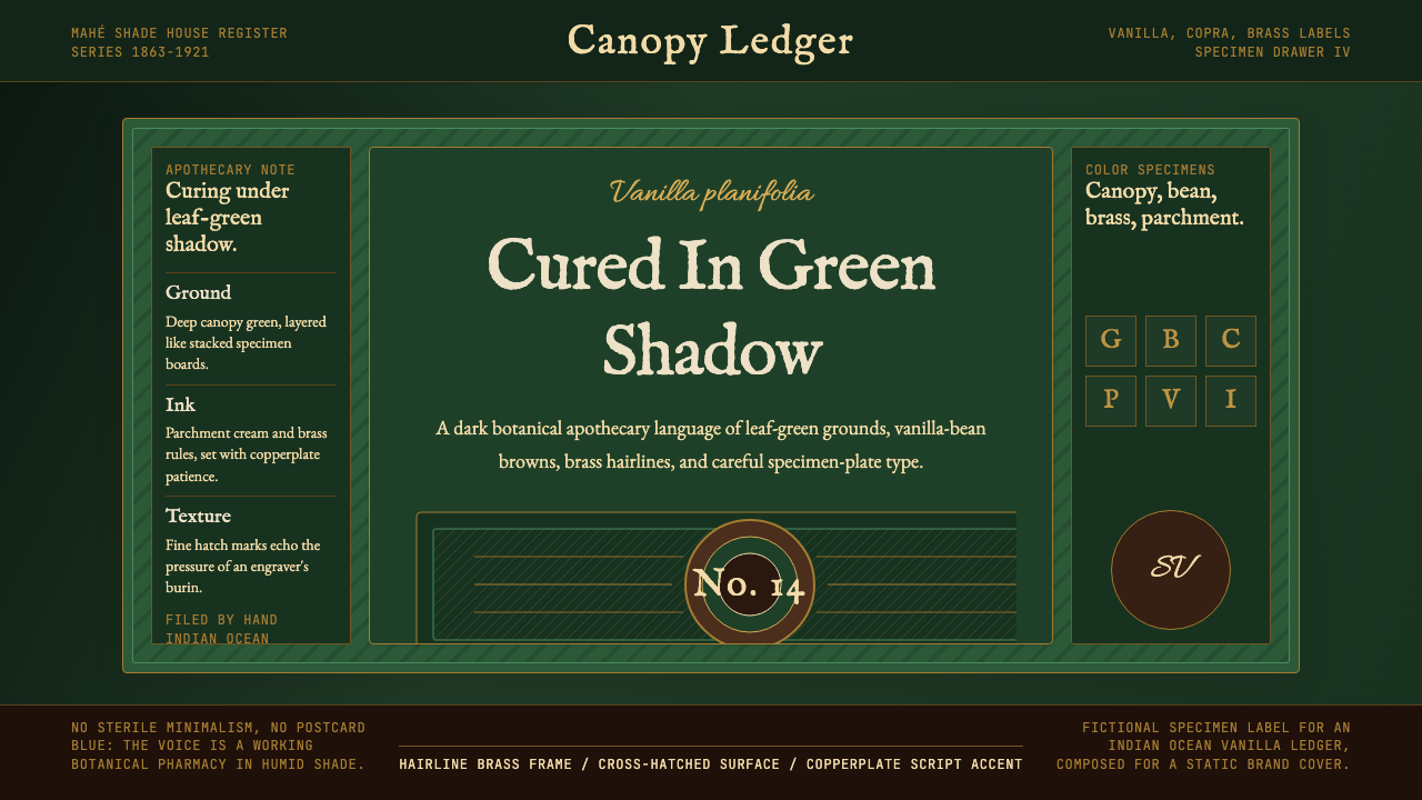 Seychellois Vanilla TakamakaBotanical apothecary in shadow. Deep green, brass hairlines, and copperplate…阴影中的植物药房:深绿底、黄铜细线与铜版字体。
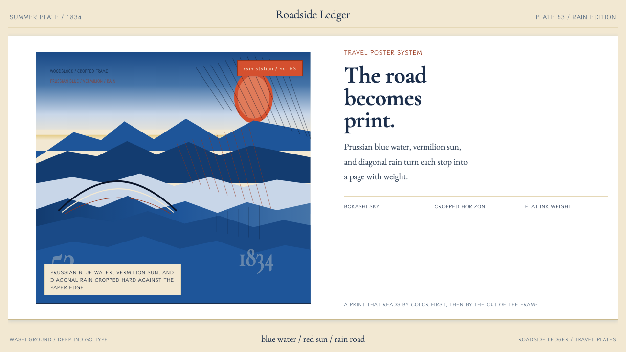 Hiroshige — Tokaido RoadA road print in motion. Prussian blue blocks, vermilion cartouches, diagonal…会行进的路途海报。普鲁士蓝色块、朱红题签与斜雨。
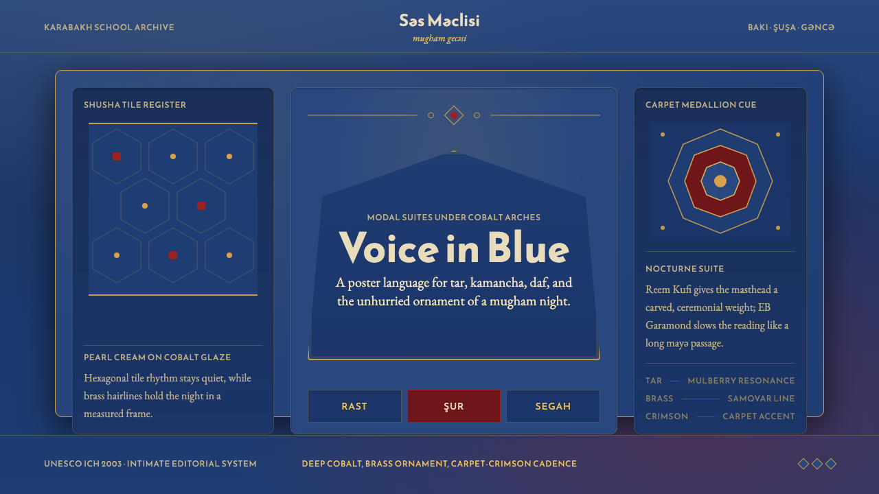 Azerbaijani Mugham Saz BlueMugham night, deeply tiled. Cobalt ground, brass hairlines, arched editorial…穆卡姆之夜深而温暖:钴蓝底、黄铜细线与拱形排版。
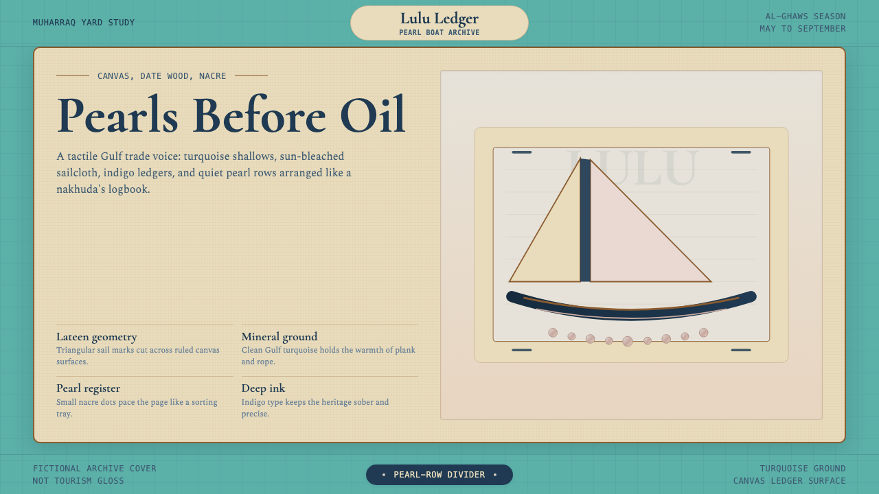 Bahraini Dhow Pearl-Diving BoatMineral and sun-bleached. Gulf turquoise, canvas cream, and pearl rows frame…矿物感且日晒褪色。海湾蓝绿、帆布奶油与珍珠点列成册。
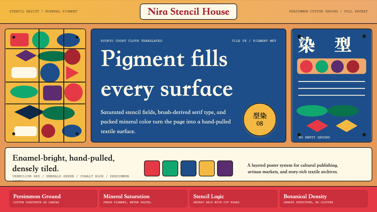 Okinawan Bingata Resist DyeOrnate without clutter. Persimmon ground, vermilion type, emerald-cobalt sten…繁而不乱。柿涩底、朱红字与翠绿钴蓝型染网格。