What is Azerbaijani Mugham Saz Blue?
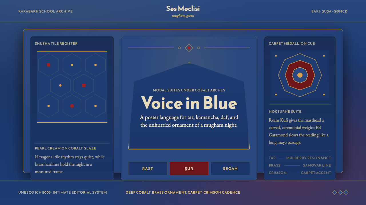
Azerbaijani Mugham Saz Blue translates the intimate world of Caucasian modal music — cobalt-tiled tea-houses, firelit samovar brass, and the arched courts of Shusha — into a visual language as layered and unhurried as a mugham suite itself.
Azerbaijani Mugham Saz Blue in brief
Azerbaijani Mugham Saz Blue is a dark, richly ornamented design system rooted in the visual heritage of Azerbaijan's most celebrated musical tradition. Mugham — the country's classical modal-music form — is performed in intimate gatherings under cobalt-glazed tile arches, with the melancholic sweep of tar and kamancha strings threading through the night. This visual style takes those materials seriously: deep Shusha-tile blues form the dominant ground, samovar-brass lines and ornamental borders trace the music's improvisatory arabesques, and carpet-crimson accents pulse like a recurring melodic phrase.
The style is emphatically dark. Unlike the white-ground restraint of many contemporary design systems, it places light elements against deep, saturated fields — an approach that feels immediately intimate and theatrical, like candlelight against blue glazed tile. Typography draws on both the Arabic-script calligraphic heritage of the region and the warmth of classical editorial serifs, placing them together in a combination that bridges centuries. Pointed-arch motifs and hexagonal tile textures appear as structural frames and surface ornaments, grounding every composition in Azerbaijani craft traditions without becoming mere pastiche.
At its best, the style produces interfaces and presentations that feel genuinely ceremonial — the visual equivalent of a mugham gecesi, a night gathering where improvisation and tradition coexist in careful balance. It is not a style built for speed or sparse minimalism; its richness is its argument. Every surface invites close attention, every border carries a reason, and the overall effect is one of cultural specificity and quiet prestige.
Where does Azerbaijani Mugham Saz Blue come from?
Mugham is among the oldest living musical traditions of the South Caucasus. Its roots stretch into medieval Persian court music and the pre-Islamic bardic culture of the ashiq troubadours who wandered between the cities of Ganja, Shusha, and Baku carrying the saz — a long-necked lute that gave this design system its name. By the eighteenth and nineteenth centuries, mugham had been codified into a set of major modal suites — Shur, Segah, Rast, Chahargah, and others — each with its own emotional character and improvisatory conventions. The tradition passed through generations of ustad masters in the workshops and tea-houses of Karabakh, particularly in Shusha, which earned the title of the Azerbaijan's 'conservatory' and 'cradle of culture.'
The visual vocabulary of this style draws most directly from the architecture and decorative arts of Azerbaijani urban culture at its height. The cobalt-blue tilework of Shia mosques and palatial baths in Baku and Shusha, produced by craftsmen working in a tradition that merges Persian, Ottoman, and local Caucasian influences, provided the dominant chromatic keynote. Samovar culture — the brass tea urn that is the central object of Azerbaijani hospitality — contributed the warm metallic register that runs through the style as ornamental hairlines and border gilding. Hand-knotted carpets, particularly those of the Karabakh school with their deep crimson fields and geometric medallion systems, supplied the accent color logic and the underlying grammar of repeating motif.
The twentieth century brought both crisis and codification to mugham. During the Soviet period, Azerbaijan's classical musicians faced pressure to conform to European concert forms, yet mugham proved resilient. Composers like Uzeyir Hajibeyli fused mugham modes with operatic structure in works such as Leyli and Majnun (1908), creating the first opera in the Muslim world and establishing a tradition of synthesis that continues today. Jazz pianists like Vagif Mustafazadeh found in mugham an improvisation logic perfectly compatible with bebop's harmonic freedom, producing a distinctly Azerbaijani jazz-mugham fusion from the 1960s onward.
In 2003, UNESCO inscribed Azerbaijani mugham on the Representative List of the Intangible Cultural Heritage of Humanity, affirming both its vitality and its fragility. The recognition drew international attention to a tradition that had been largely unknown outside the Caucasus and the global Azerbaijani diaspora. Today, performers like Alim Qasimov — whose voice has been described as capable of expressing the full range of human emotion in a single phrase — carry the tradition to concert stages worldwide, while younger musicians experiment with electronic and ambient synthesis. This design system sits within that longer story: it is an act of translation, not preservation — taking a living musical culture and finding its visual correlates.
What defines the Azerbaijani Mugham Saz Blue look?
Color Ground
The dominant field is a deep, saturated blue derived from the cobalt glazes of Azerbaijani tilework — the kind of blue found in the interior domes and arched niches of Shusha's mosques and the baths of Baku's old city. It is not navy and not sky; it sits in that lapis-like register between night and candlelight. Against this ground, warm metallic tones — the brass and amber of samovars and carpet borders — read as highlight and ornament. A deep crimson, drawn from Karabakh carpet traditions, serves as the primary accent: assertive but never dominant.
Ornamental Structure
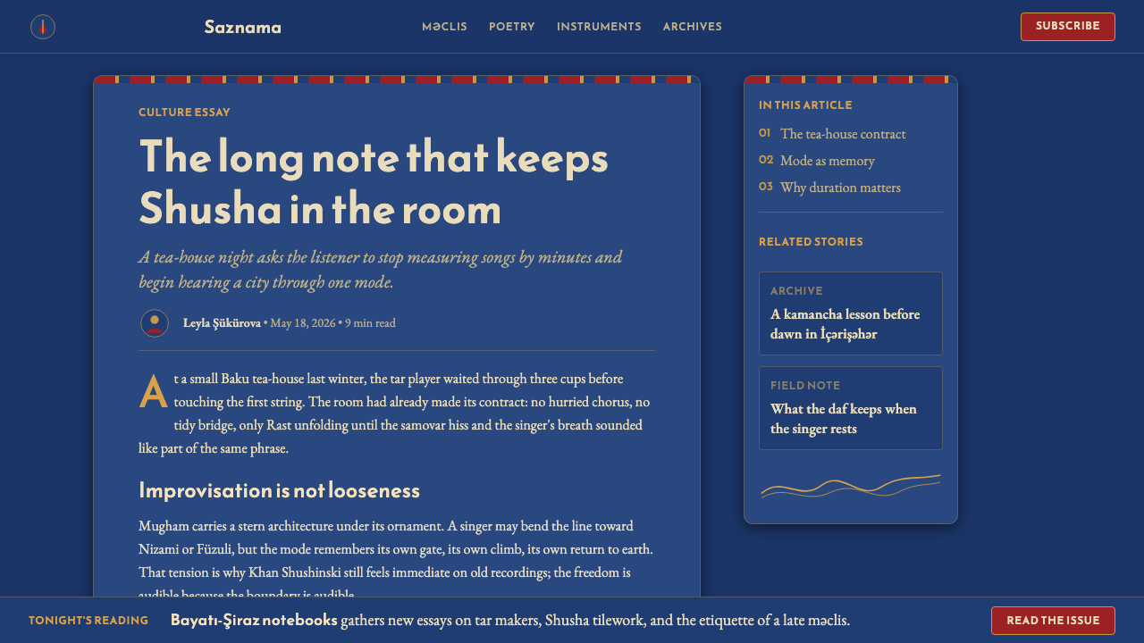
Where many contemporary dark-mode systems strip ornament to achieve depth, this style treats ornament as structural. Borders are not decorative additions but load-bearing frames: metallic hairlines define sections, arch-shaped containers organize major content blocks, and hexagonal tile patterns recur as background texture. The ornamental logic is borrowed directly from Azerbaijani architectural craft — the same geometric repeat that covers a mosque's interior wall is here used to give a card surface or section divider its visual weight. Nothing is purely decorative; every pattern element earns its presence by also defining space.
Typography Register
The type system pairs a headline face with Arabic-script heritage — its letterforms echo the curves and counter-spaces of classical Nastaliq and Kufic calligraphy — with a body face drawn from the Western editorial serif tradition: warm, legible, and slightly old-world in its rhythm. The combination is not a collision but a dialogue, reflecting the historical position of Azerbaijan at the crossroads of Persianate and European literary cultures. Headings are large and architecturally placed; body text sets at a generous measure that suits the ceremonial pace of the content. Capitals and display sizes carry the weight of inscriptions.
Arch and Frame
The pointed arch — omnipresent in Islamic architecture from Andalusia to Central Asia, and the defining structural motif of Azerbaijan's medieval mosques and caravanserais — appears throughout as the organizing frame for content. Hero sections may be bounded by arch outlines; image containers adopt pointed-arch cropping; pull quotes and call-to-action areas sit within arch-shaped insets. The motif does double duty: it signals cultural origin and it provides a vertical dynamism that counters the horizontal flow of screen layout. Unlike rectangular containers, the arch guides the eye upward, lending even static content a sense of aspiration.
Warmth Within Darkness
One of the style's distinctive achievements is that it reads as warm despite being built on a dark ground. This is accomplished through the quality of the blue itself — which leans toward the warm side of the spectrum, never into cold steel-blue territory — and through the deliberate deployment of brass, amber, and crimson accents that recall firelight and textile dye rather than neon or LED. The result is an atmosphere analogous to the tea-house interior where mugham is traditionally performed: intimate and enveloping, with light seeming to come from within surfaces rather than from a direct source above.
Carpet and Tile Logic
The underlying compositional grammar of the style is borrowed from two crafts: carpet weaving and tilework. From carpets comes the principle of bounded fields — a central medallion surrounded by subsidiary borders of diminishing complexity, each zone defined by its own repeat pattern. From tilework comes the logic of modular geometry — hexagons, stars, and interlocking units that can tile a surface at any scale without loss of coherence. Applied to screen layout, this means major content areas behave like central medallions, while navigation rails, card grids, and footer bands function as the carpet's successive border registers.
Musicality of Rhythm
Mugham suites are not structured in equal measures; they move through phases of relative stillness and intensification, with the vocalist and instrumentalists responding to each other in call-and-response patterns. The visual style mirrors this through deliberate unevenness in its layout rhythm. Dense ornamental sections alternate with open breathing spaces; large-scale typographic gestures give way to long passages of quiet, generous body text. The pacing is never uniform, and this variation — like the musical tradition it references — prevents monotony and sustains attention across a long viewing session.
Who shaped Azerbaijani Mugham Saz Blue?
Ibrahim Abdullayev, known as Khan Shushinski, was one of the twentieth century's most revered mugham vocalists and a defining figure of the Karabakh school. Born in Shusha in 1901, his voice embodied the concentrated emotional power of the Shur and Segah modes. His recordings — some of the earliest documentation of mugham in its classical form — remain reference points for both performers and scholars. The visual heaviness and ceremonial depth of this style owes something to the emotional register that his performances represented.
Born in 1957 in Qazakh, Alim Qasimov is internationally the best-known living practitioner of mugham. His voice — capable of moving between whispered intimacy and full-throated power within a single phrase — has brought the tradition to audiences across Europe, Asia, and the Americas who had no prior exposure to Azerbaijani music. He received the UNESCO Music Prize in 1999 and continues to perform and teach. His interpretations are marked by an almost architectural use of silence and a refusal to rush the music's natural unfolding, qualities this design system attempts to carry into visual pacing.
Vagif Mustafazadeh (1940–1979) was a jazz pianist who found in mugham's modal improvisation a framework entirely compatible with jazz harmony, creating a synthesis he called jazz-mugham. Performing and recording primarily through the 1960s and 1970s, he became the founding figure of a distinctly Azerbaijani approach to jazz — one where European harmonic language and local modal tradition enriched each other rather than competing. His work embodies the historical position that makes this style possible: Azerbaijan as a place of synthesis, where East and West have not simply met but genuinely fused.
Ashiq Alasgar (1821–1926) was the most celebrated ashiq — wandering bard — in Azerbaijani literary history, performing for over a century with saz in hand. The ashiq tradition predates and exists alongside mugham, and Alasgar represents its highest expression: an improvising poet-musician who composed in the local vernacular, traveled across Azerbaijan and the Caucasus, and whose work was preserved primarily through oral transmission and the memories of those who heard him perform. The saz — the instrument he carried — lends its name to this design system, acknowledging the folk dimension alongside the courtly.
Uzeyir Hajibeyli (1885–1948) was the composer who first systematically brought mugham into contact with European formal structures, creating the first opera in the Muslim world — Leyli and Majnun in 1908 — by setting a mugham performance within an operatic frame. His subsequent compositions including the opera Koroglu (1937) established a national musical canon that placed mugham modes at the center of Azerbaijani artistic identity. Without his synthesis, the tradition might have remained confined to private tea-house performance; his work ensured it became a point of national cultural pride capable of entering international concert life.
How do you use Azerbaijani Mugham Saz Blue today?
Azerbaijani Mugham Saz Blue is a high-ceremony style, meaning its strengths emerge most clearly when the context calls for prestige, cultural depth, and intimate attention — and its weaknesses appear most quickly when applied to contexts demanding speed, lightness, or functional neutrality. Understanding this fit before reaching for the style saves significant rework.
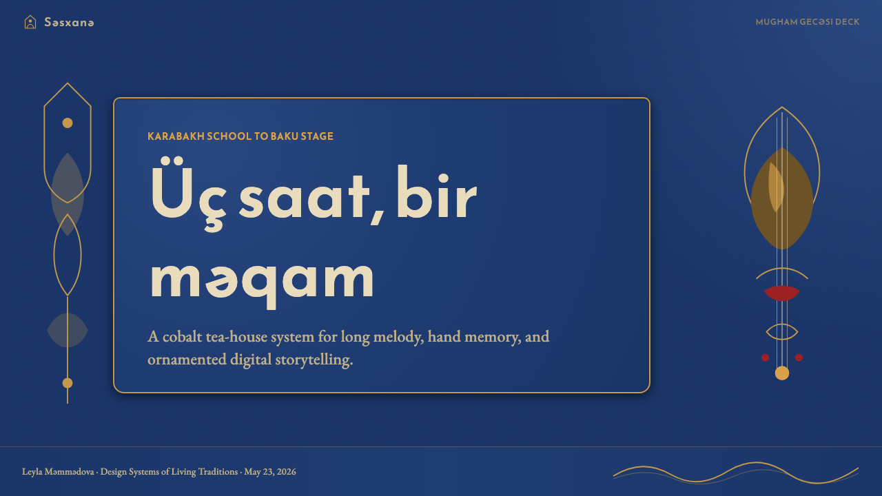
For presentation slides, the style excels on cover pages and chapter dividers where the full visual weight can breathe. A cover benefits from a centered or arch-framed title set large in the display typeface, the dominant blue filling the slide ground, with a single brass or crimson ornamental element providing hierarchy. Section-break slides work well with the hexagonal tile texture as a full-bleed background and minimal typography. Content slides require more discipline: the ornamental density that reads as rich on a cover becomes claustrophobic on a text-heavy slide. For data slides, keep charts and graphs simple — the palette's warmth works beautifully with bar charts where each bar adopts a color from the accent register, but avoid introducing new hues beyond the core three. The carpet-medallion logic maps naturally onto agenda and overview slides, where a central statement sits within a visually bounded region.
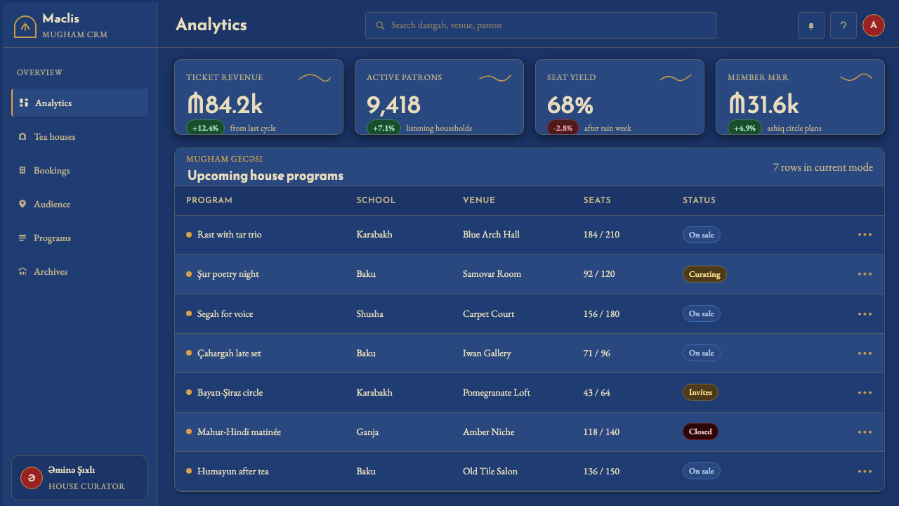
For web interfaces and dashboards, the style suits dark-mode analytics platforms, cultural institution sites, music streaming applications, and any product communicating craft heritage or artisanal quality. The approach: establish the deep blue as the page background, use brass-toned borders to separate major content regions, and deploy the crimson accent exclusively for interactive states and primary calls to action. Navigation works well as a vertical sidebar — a rail that mirrors the border register of a carpet — rather than a horizontal top bar. Card components should have depth through layered blues rather than soft drop shadows; the aesthetic is one of inlaid surfaces, not floating objects.
For editorial and marketing layouts, the style carries strong cultural associations that can be used deliberately or undermined inadvertently. Use it for content about craft, heritage, music, travel, or prestige consumer goods. The arch motif provides a natural pull-quote frame; the tile texture works well as a section background that differentiates a testimonial block or feature highlight. For marketing headers, the combination of large editorial display type against the cobalt ground with a brass rule underneath creates an impression of authoritative restraint — expensive in the way that a well-crafted object is expensive, not in the way that luxury advertising is loud.
The most common mistake when applying this style is treating the ornament as freely addable decoration rather than as structural language. Piling arches, tile patterns, metallic borders, and crimson accents onto a layout simultaneously produces visual noise rather than richness. The original tea-house and mosque interiors that inspired this style are rich because each element is in its correct relationship to all others — the tile covers the wall, the arch frames the niche, the carpet defines the floor zone. Applied digitally, the same discipline applies: assign ornament to a role and do not duplicate roles. One tile texture, one arch shape, one border weight is typically the maximum before the system becomes self-cancelling.
Azerbaijani Mugham Saz Blue — FAQ
Is this style appropriate only for Azerbaijani or Caucasian cultural content?
Not strictly, but the cultural specificity is strong enough that misalignment reads clearly. The style works for any context where the values it embodies — ceremony, depth, craft heritage, intimate prestige — are genuine product values, regardless of geographic origin. A high-end music application, a cultural foundation, a craft spirits brand, or a luxury hospitality service could all adopt elements of the style legitimately. What it cannot do is function as neutral infrastructure: every surface carries meaning, and that meaning derives from a specific tradition. Using the style while ignoring its origin typically produces work that feels vaguely ornate but culturally rootless — the aesthetic equivalent of a surface-level pastiche.
How do you keep the ornamental richness from overwhelming content?
The key is role assignment. Every ornamental element should occupy a defined spatial role: texture for backgrounds, hairlines for separators, arch motifs for containers, crimson for interactive signals. The moment two ornamental elements compete for the same role — two different border treatments on the same card, both a tile texture and a crimson accent on the same button — the system breaks down. The discipline is not reduction but hierarchy: the richest elements belong to the largest or most ceremonially important surfaces, and simpler surfaces support them without competition. Reading the style's source materials — Azerbaijani carpet borders, tile panel compositions — reveals that their richness is always organized, never random.
Can this style work in a light or white-ground version?
A light version is possible but represents a significant departure from the style's core logic. The deep blue ground is not a preference but a load-bearing element: it gives the brass and crimson accents their warmth and prevents the ornamental structure from reading as fussy against a light field. On a white or cream ground, the same brass borders and tile patterns tend to look decorative-but-flat, losing the quality of light-against-depth that makes the dark version feel genuinely three-dimensional. If a light adaptation is necessary — for accessibility or print contexts — the most viable approach is to invert the value relationship while preserving the hue relationships: warm ivory as ground, with muted blue as the structural color and crimson remaining as the accent. This loses some atmospheric depth but retains the essential color logic.
How does this style handle dense data or complex information architecture?
Carefully, and with clear priority decisions made in advance. The style is not natively suited to data-dense interfaces — its ornamental richness competes with the visual encoding of information in charts and complex tables. The approach that works is containment: treat data regions as visually quieter insets within the larger ceremonial frame. A data table inside an arch-bordered panel can read correctly if the table itself uses minimal styling — the border does the ceremonial work, the table does the informational work, and they do not overlap. For complex information architectures with many navigation levels, the vertical rail navigation pattern works better than nested horizontal tabs, as the rail can use the carpet-border logic to indicate hierarchy through progressive visual simplification from top to bottom.
What is the relationship between this style and other Islamic geometric design systems?
This style shares a family resemblance with Islamic geometric design traditions more broadly — Persian tilework, Moroccan zellige, Ottoman Iznik ceramics, Andalusian muqarnas — but it is distinct in its specific color signature and its Caucasian-Azerbaijani cultural grounding. The cobalt-and-brass palette is specifically associated with the Azerbaijani and Iranian Azeri traditions rather than with North African or Anatolian variants. The combination with the musical reference — mugham, the saz — and the integration of Nastaliq-influenced display typography places this system in a very specific geography and history. Designers working with other Islamic geometric traditions should be aware that swapping the color palette or the typographic register will produce a different cultural reading entirely, even if the underlying tile geometry looks similar.
Related design styles
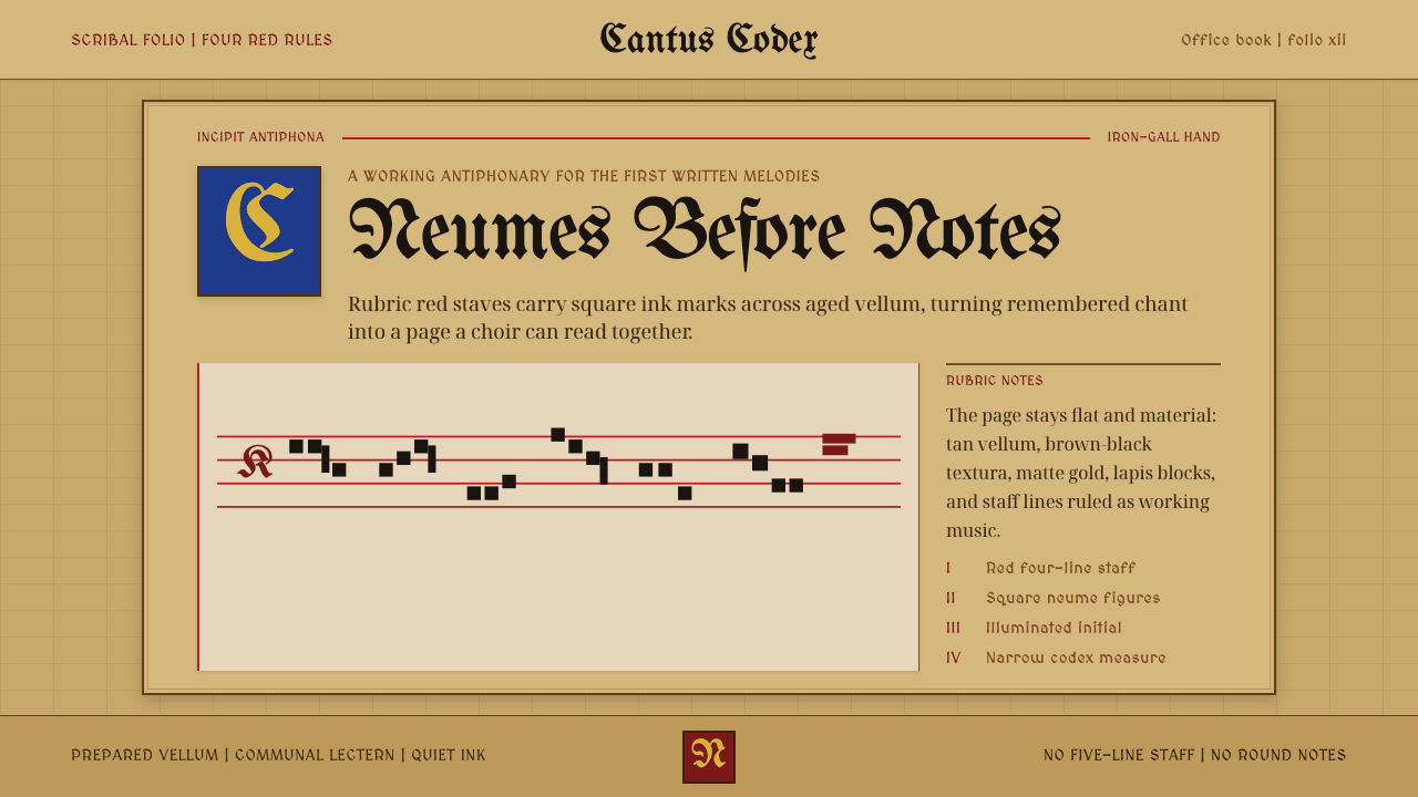 Gregorian Chant NeumesNotation becomes scripture. Rubric red staff lines and square neumes sit on t…
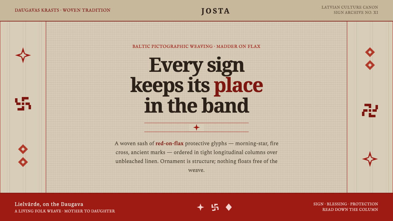 Latvian Lielvārde BeltOrnament is structure. Madder-red Baltic glyphs in tight longitudinal bands o…
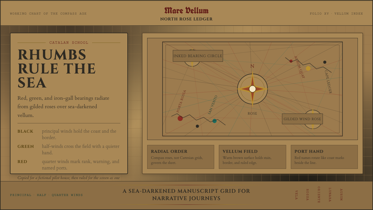 Portolan Rhumb ChartNavigation feels ceremonial. Rhumb lines cross dark vellum with red ink and g…
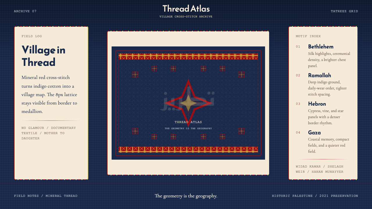 Palestinian Tatreez Cross-StitchMemory in thread. Red cross-stitch on indigo cotton, built on an 8px grid.
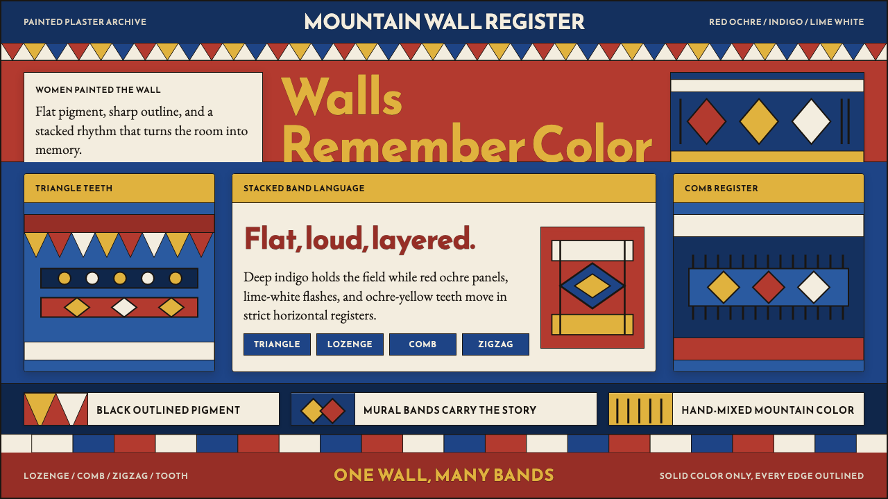 Saudi Asiri Qatt Wall PaintingPainted walls speak loudly. Indigo bands, red triangles, ochre teeth, black o…
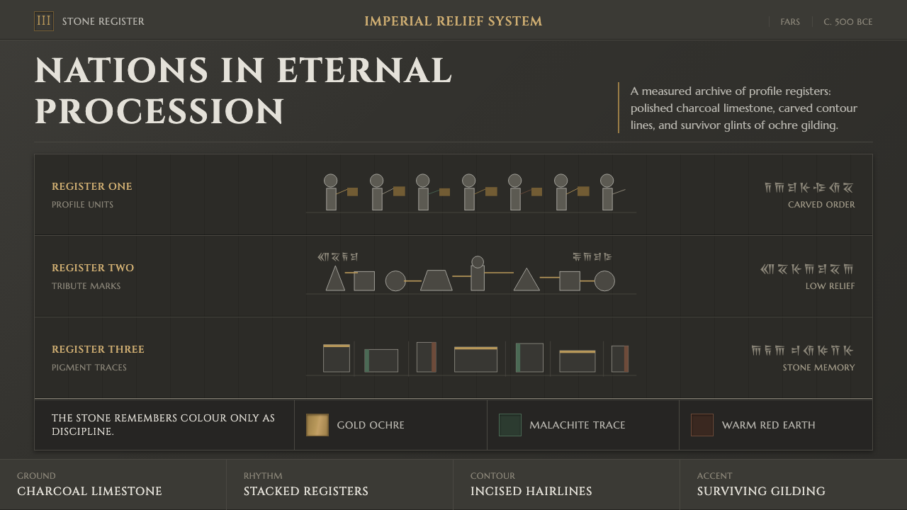 Achaemenid Persepolis ReliefImperial restraint in stone. Charcoal registers carry ochre, green, and red p…