Design style guide设计风格指南
What is Bissau-Guinean Pano de Pente?什么是 Bissau-Guinean Pano de Pente?
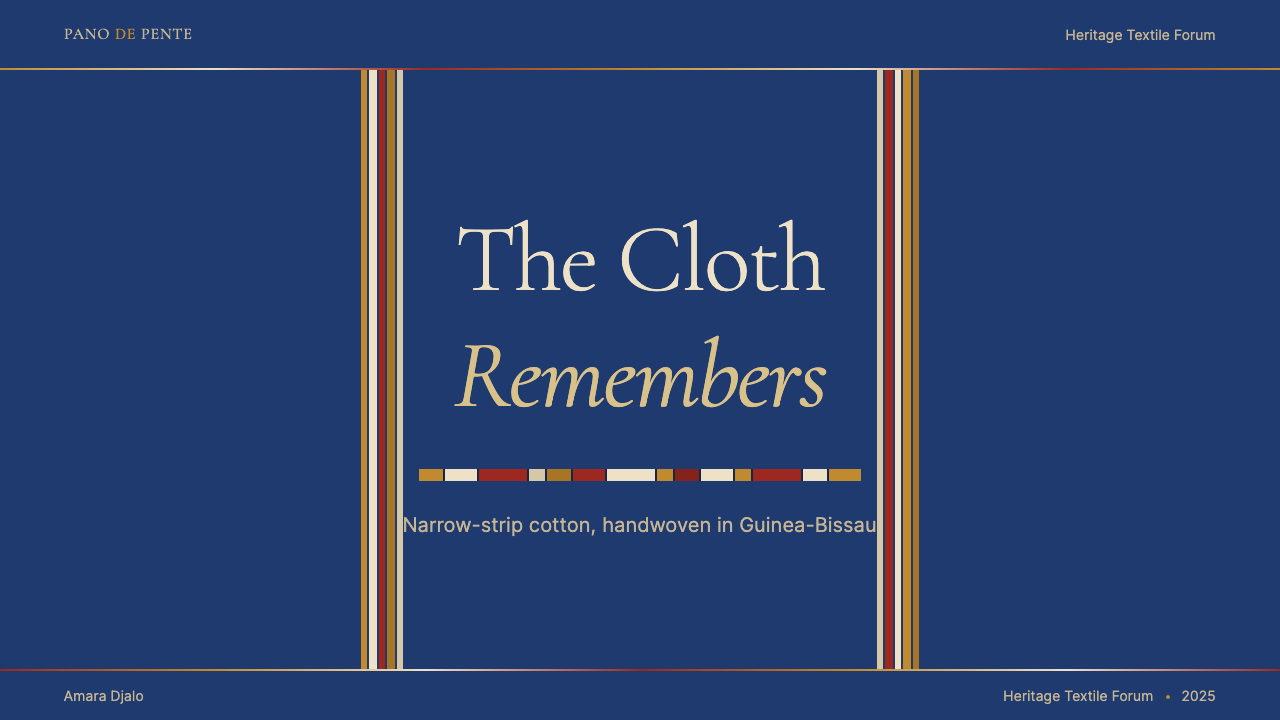
Six-inch strips of handwoven cotton, saturated in Atlantic indigo and stitched edge-to-edge, carry the oldest pixel logic in West Africa.六英寸宽的手织棉布条,浸透大西洋靛蓝,边对边缝合成布——承载着西非最古老的像素逻辑。
Bissau-Guinean Pano de Pente in briefBissau-Guinean Pano de Pente 速览
Pano de pente — literally cloth of the comb, named for the reed comb of the narrow-strip treadle loom — is the signature handwoven textile of Guinea-Bissau. Woven primarily by Manjaco and Pepel artisans along the country's coastal regions, each cloth is assembled from a series of narrow bands, each band carrying its own geometric drawdown: a precise interlocking of warp and weft that encodes village identity, weaver lineage, and ceremonial function into the fabric's very structure.梳布(Pano de pente)——字面意思是“梳子织的布”,得名于窄幅踏板织机的金属筘——是几内亚比绍最具代表性的手织纺织品。主要由该国沿海地区的曼雅科族与佩佩尔族织工织造,每块布由一系列窄条带拼合而成,每条带携带自己独有的几何纹样:精确交织的经纬线将村庄身份、织工血脉与仪式功能编码进织物的结构本身。
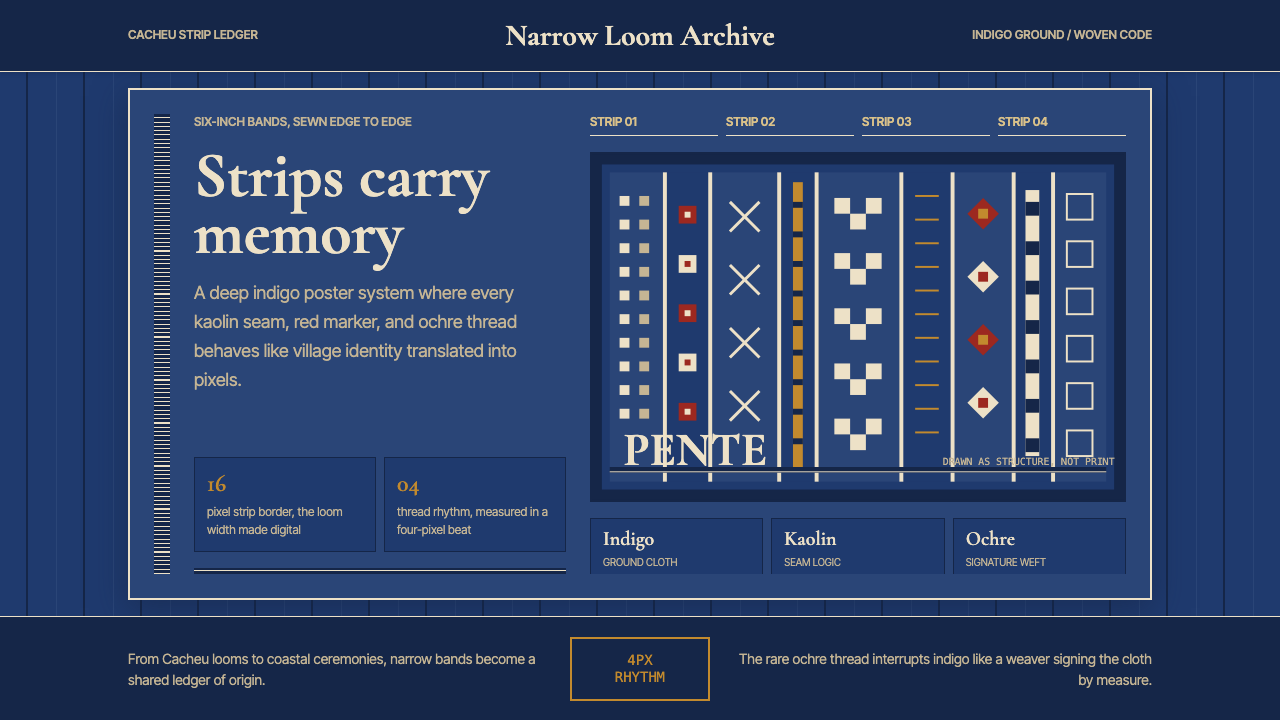
What makes pano de pente visually distinctive is the interplay between the deep, saturated indigo ground and the brilliant white or cream stripes produced by undyed cotton. The vertical rhythm of the assembled strips creates a system of alternating dark and light columns, punctuated by fine horizontal seam lines where band meets band. These seam lines are not disguised — they are embraced as a structural feature, giving the finished cloth a grid-like character that feels simultaneously ancient and startlingly contemporary.让梳布在视觉上如此独特的,是深沉饱和的靛蓝底色与未染色棉线形成的亮白或奶油色竖纹之间的对话。拼合条带的垂直节奏创造出明暗交替的纵向列系,各带之间纤细的水平接缝线为其打点。这些接缝线并不被刻意隐藏——它们被当作结构特征加以拥抱,赋予整块布料一种网格般的气质,既古朴又令人惊讶地具有当代感。
As a design language, pano de pente operates through constraint. The narrow loom limits the width of each band, imposing a module. The binary logic of the weave — thread up or thread down — limits the geometry to hard-edged figures. The two-tone palette of indigo and undyed cotton limits the color. Yet within these constraints, Manjaco and Pepel weavers have produced an astonishing range of surface patterns, each distinct enough to identify a weaver's hand, yet coherent enough to read as a unified system when strips are joined. It is, in the most literal sense, a modular grid system realized in textile.作为设计语言,梳布依靠约束运作。窄幅织机限制了每条带的宽度,强制规定了模块尺寸。织造的二进制逻辑——线在上或线在下——将几何限制为硬边图形。靛蓝与未染色棉线的双色色板限制了颜色选择。然而在这些约束之内,曼雅科族与佩佩尔族织工创造出惊人丰富的表面纹样,每一种都独特到足以辨别织工之手,又内聚到在条带拼合后读作统一系统。这在字面意义上就是一套以纺织品实现的模块网格系统。
See the Bissau-Guinean Pano de Pente design system →查看 Bissau-Guinean Pano de Pente 完整设计系统 →
Where does Bissau-Guinean Pano de Pente come from?Bissau-Guinean Pano de Pente 从何而来?
Strip-weaving in Guinea-Bissau predates Portuguese contact, with evidence of narrow-loom textile production along the coast reaching back to at least the fifteenth century. The term pano de pente appears in Portuguese colonial records from the sixteenth and seventeenth centuries, when these cloths served as a primary unit of exchange in the Atlantic trading economy. Panos circulated as currency alongside cowrie shells, iron bars, and European cloth — valued not merely as material but as encoded social objects whose patterns and assembly could communicate status, origin, and intent.几内亚比绍的条带织造早于葡萄牙人到来,沿海窄幅织机生产纺织品的证据可追溯至至少十五世纪。“梳布”一词出现在十六至十七世纪的葡萄牙殖民记录中——那时这种布料是大西洋贸易经济中的主要交换单位。梳布与贝壳、铁条和欧洲布料并列流通,被视为货币;其价值不仅在于物质本身,更在于它作为编码社会信息的对象——纹样与拼合方式能传递地位、来源与意图。
The geography of production shaped the aesthetic. The Cacheu River region, the Biombo peninsula, and the Bijagos island archipelago each developed recognizable weaving traditions, with local variations in stripe proportion, geometric vocabulary, and the density of pattern bands. Weaving was and remains a male-dominated practice among the Manjaco, organized through age-grade associations that transmitted both technical skill and pattern knowledge across generations. A young weaver began with simple striped compositions and advanced over years toward the complex interlocked figures that signified mastery.产地的地理条件塑造了美学。卡谢乌河流域、比翁博半岛和比热戈斯群岛各自发展出可识别的织造传统,在竖纹比例、几何词汇和图案带密度上各有地方变体。织造在曼雅科族中是且仍是以男性为主的行业,通过年龄组织传承技艺与纹样知识。年轻织工从简单的条纹构图开始,历经数年进阶至代表精湛技艺的复杂互锁图形。
The Atlantic trade intensified production and spread demand. European merchants and African trading partners both sought pano de pente, and Guinean weavers responded by increasing output while preserving the core structural logic of the tradition. Indigo — either locally sourced from the plant Lonchocarpus cyanescens or acquired through trade — provided the deep blue ground that became the cloth's signature. The dyeing and weaving were separate specialized crafts, and the quality of the indigo saturation was as much a mark of excellence as the complexity of the woven pattern.大西洋贸易加剧了生产,扩大了需求。欧洲商人与非洲贸易伙伴都寻求梳布,几内亚织工在提高产量的同时保留了传统的核心结构逻辑。靛蓝——来自本地生长的龙骨花(Lonchocarpus cyanescens)或通过贸易获得——提供了深蓝底色,成为这种布料的标志。染色与织造是两门独立的专业技艺,靛蓝饱和度的品质与织造纹样的复杂性同样是卓越的标志。
In the twentieth century, pano de pente navigated colonial disruption and post-independence economic pressure. The cloth retained its ceremonial importance — present at funerals, initiations, and marriage ceremonies — even as machine-made substitutes flooded the market. The 2010s brought a new wave of attention from the global fashion industry, with designers such as Sarah Diouf incorporating the textile's visual grammar into contemporary garments, and scholars such as Lisa Aronson and Eric Robertson producing detailed documentation of the tradition's technical and social dimensions. Today the cloth occupies a dual role: living craft with active ceremonial function, and recognized source material for contemporary design practice worldwide.二十世纪,梳布在殖民破坏与独立后经济压力中求生。即使机制替代品充斥市场,这种布料在葬礼、成人礼和婚礼中仍保持着仪式重要性。2010年代,全球时尚界掀起新一波关注,设计师萨拉·迪乌夫等人将这种纺织品的视觉语法融入当代服装,学者莉萨·阿伦森与埃里克·罗伯逊对这一传统的技术与社会维度进行了详尽记录。今天,梳布承担着双重角色:一是具有活跃仪式功能的活态工艺,二是当代设计实践的公认源泉。
What defines the Bissau-Guinean Pano de Pente look?Bissau-Guinean Pano de Pente 的视觉特征是什么?
Indigo Ground靛蓝底色
The dominant tone is a deep, saturated blue-black produced by repeated immersion in indigo vat dye — a color that deepens with successive dyings and softens with age toward a rich, complex navy. This indigo ground is not uniform; slight tonal variation from selvage to center gives the cloth a living, breathing quality distinct from flat dyed yardage. The depth of the indigo signals quality: the most valued panos were dyed until the color reached near-black intensity.主导色调是经反复浸泡靛蓝染缸产生的深沉饱和蓝黑色——随着染色次数增加而加深,随时间推移柔化为丰富而复杂的深海军蓝。这种靛蓝底色并非均匀一致;从布边到布心的细微色调变化赋予布料一种鲜活、呼吸的品质,有别于平整染色的布料。靛蓝的深度是品质的信号:最珍贵的梳布被染至颜色接近纯黑的浓度。
Vertical Strip Rhythm垂直条带节奏
The assembled cloth reads as a series of vertical columns, each column the width of one woven band. Within each band, the geometric pattern runs in horizontal registers — rows of interlocked figures — while the band itself reads as a vertical module in the larger composition. Where adjacent bands carry different patterns, the seam between them creates a strong vertical accent. The overall effect is a grid whose columns are decorated internally but whose vertical structure governs the whole.拼合成的布料读作一系列垂直纵列,每列宽度等于一条织带。在每条织带内,几何纹样以水平层次运行——一排排互锁图形——而织带本身在更大的构图中读作垂直模块。相邻织带携带不同纹样时,它们之间的接缝形成强烈的垂直重音。整体效果是一个网格:纵列内部装饰丰富,但垂直结构统领全局。
Weft-Structure Geometry纬线结构几何
The patterns within each band are generated entirely by the weave structure — by which threads float over the surface and which sink below it. This constrains the geometry to forms that can be built from a regular grid of thread crossings: diamonds, zigzags, stepped triangles, interlocking rectangles, and cruciform motifs. The resulting shapes have crisp, hard edges and a pixelated quality that reads simultaneously as textile and as digital bitmap. No curved forms appear; every shape is an aggregate of rectangular thread crossings.每条织带内的纹样完全由织造结构生成——哪些线浮于表面,哪些沉入底部。这将几何约束为可由规则经纬交叉网格构建的形态:菱形、锯齿、阶梯三角、互锁矩形和十字形母题。由此产生的形状边缘清晰、硬朗,带有一种像素化品质,读起来同时像纺织品又像数字位图。没有任何曲线形态出现;每个形状都是矩形线交叉的集合。
Two-Tone Palette双色色板
The canonical pano de pente palette is binary: deep indigo and undyed cotton white or cream. Occasionally a third tone — a lighter, partially dyed thread — introduces a mid-value accent, but the logic of the cloth is fundamentally two-tone. This constraint is not a limitation so much as a discipline: with only two values, every pattern decision becomes legible at a glance. The contrast between the dark ground and the bright weft-structure figures is what makes the geometric system readable across distance.标准梳布的色板是二元的:深靛蓝与未染色的棉白或奶油色。偶尔,第三种色调——一种经部分染色的线——引入中间值重音,但这种布料的逻辑从根本上是双色的。这种约束与其说是局限,不如说是一种自律:仅有两个明度时,每个纹样决定都能一目了然。深色底色与明亮纬线结构图形之间的对比,使几何系统在远距离上依然清晰可读。
Seam as Structure接缝作为结构
When individual bands are joined edge-to-edge to form the full cloth, the seam line between them remains visible — a thin white or cream thread that divides the surface into its constituent modules. Rather than being a flaw to hide, this seam is a structural declaration: it announces the modular logic of the textile. In design translations, this quality manifests as visible grid lines, column dividers, or repeating vertical accents that acknowledge the underlying structure rather than papering over it.当各织带边对边缝合成整块布料时,它们之间的接缝线依然可见——一条细白或奶油色线将表面划分为其构成模块。与其说这是需要隐藏的缺陷,不如说它是一种结构宣言:它宣告了纺织品的模块化逻辑。在设计转化中,这种品质表现为可见的网格线、纵列分隔符或重复的垂直重音——承认底层结构,而非掩盖它。
Encoded Identity编码身份
No two weavers' panos are identical. Each band's drawdown — the precise sequence of thread lifts — encodes information readable by others trained in the tradition: which village, which lineage, sometimes which specific weaver. This encoding is not decorative symbolism layered on top of a functional textile; it is intrinsic to the weave structure itself. The design language is also a record-keeping system. This quality — information embedded in pattern rather than added to it — is what distinguishes authentic pano de pente from surface-pattern imitations.没有两位织工的梳布是完全相同的。每条织带的纹样——提线的精确顺序——编码着受过传统训练的人可以读取的信息:哪个村庄、哪个血脉,有时是哪位特定织工。这种编码不是叠加在功能性纺织品之上的装饰符号;它本质上属于织造结构本身。设计语言同时是一套记录系统。这种品质——信息嵌入纹样而非附加于其上——正是真正的梳布与表面纹样仿制品的区别所在。
Ceremonial Weight仪式重量
Pano de pente was never a casual textile. Its primary social contexts — funerals, initiations, marriages, and diplomatic exchange — gave it a gravitas that shaped how it was perceived and used. The cloth is associated with transition, with the crossing of thresholds. This ceremonial weight is legible in the deliberateness of its visual system: nothing is arbitrary, nothing is merely decorative. Every pattern decision is justified by precedent and social meaning. This quality of intentional seriousness — restraint used not as minimalism but as respect — is one of the most transportable properties of the style.梳布从来不是随意的纺织品。其主要社会场景——葬礼、成人礼、婚礼和外交交换——赋予它一种庄重感,影响了人们对它的感知与使用方式。这种布料与过渡、与门槛的跨越相关联。这种仪式重量在其视觉系统的审慎性中清晰可辨:没有什么是任意的,没有什么仅仅是装饰性的。每个纹样决定都有先例与社会意义作为正当理由。这种刻意的严肃感品质——克制不作为极简主义,而作为尊重——是这种风格最具可迁移性的属性之一。
See the Bissau-Guinean Pano de Pente design system →查看 Bissau-Guinean Pano de Pente 完整设计系统 →
Who shaped Bissau-Guinean Pano de Pente?谁塑造了 Bissau-Guinean Pano de Pente?
Carlos Cardoso was a Guinean journalist and intellectual who, before his assassination in 2000, played a formative role in documenting Guinea-Bissau's material and cultural heritage. His work contributed to the broader awareness of pano de pente as a national and diasporic cultural marker, positioning the textile not merely as craft but as a political and social text. His legacy continues to shape how Guinean cultural practitioners engage with traditional forms.卡洛斯·卡尔多佐是一位几内亚记者与知识分子,在2000年遇刺前,他在记录几内亚比绍物质与文化遗产方面发挥了奠基性作用。他的工作促进了社会对梳布作为国家与离散文化标志的更广泛认知,将这种纺织品定位为不仅是工艺品,更是政治与社会文本。他的遗产至今仍塑造着几内亚文化从业者与传统形式的互动方式。
Sarah Diouf is a Senegalese-born designer and founder of the fashion label Tongoro, which brought West African textile traditions — including the visual grammar of strip-woven cloth — into contemporary luxury fashion. Her work with pano de pente aesthetics on the international stage helped establish the textile's geometric vocabulary as viable source material for high-end design. Diouf's approach has been influential in demonstrating that African textile traditions can be referenced without pastiche: the structure, not the surface decoration, is what translates.萨拉·迪乌夫是塞内加尔裔设计师,Tongoro时装品牌创始人,将西非纺织传统——包括条带织布的视觉语法——引入当代高端时尚。她在国际舞台上对梳布美学的运用,帮助确立了这种纺织品几何词汇作为高端设计可行源材料的地位。迪乌夫的方法在证明非洲纺织传统可以被引用而不流于仿制方面颇具影响力:可以转化的是结构,而非表面装饰。
Lisa Aronson is an art historian specializing in West African textiles whose scholarly work provided some of the most detailed technical and contextual documentation of pano de pente available in English. Her research traced the trade routes, weaving communities, and social functions of Guinean strip cloth, establishing the textile's complexity as a system of encoded meaning rather than mere surface pattern. Her documentation has been foundational for designers and researchers seeking to work seriously with this tradition.莉萨·阿伦森是专研西非纺织品的艺术史学家,她的学术著作提供了英语世界中关于梳布最为详尽的技术与背景记录。她的研究追溯了几内亚条带布的贸易路线、织造社区与社会功能,确立了这种纺织品作为编码意义系统而非单纯表面纹样的复杂性。她的记录文献为希望认真研究这一传统的设计师和研究者奠定了基础。
Eric Robertson's field research and documentation of Manjaco weaving practices contributed substantially to the preservation of technical knowledge about the treadle loom systems and drawdown sequences used in pano de pente production. His work bridges ethnographic documentation and design history, treating the weave structure itself — not just the finished cloth — as the primary artifact worth recording. This approach has made his documentation particularly useful for design practice, since it reveals the generative logic rather than just the output.埃里克·罗伯逊对曼雅科族织造实践的田野调查与记录,为保存梳布生产中踏板织机系统与纹样顺序的技术知识做出了重要贡献。他的工作连接了民族志记录与设计史,将织造结构本身——而非仅仅是成品布料——视为值得记录的主要文物。这种方法使他的记录文献对设计实践尤为有用,因为它揭示的是生成逻辑,而非仅仅是输出结果。
How do you use Bissau-Guinean Pano de Pente today?今天怎么用 Bissau-Guinean Pano de Pente?
Pano de pente translates into contemporary design practice most cleanly when the designer engages with its underlying logic — the modular column, the binary palette, the weft-structure geometry — rather than sampling its surface patterns. A design built around these principles will feel grounded and coherent; one that simply pastes a scanned pano texture onto a layout will feel decorative and hollow.梳布转化为当代设计实践时,最为干净利落的方式是让设计师与其底层逻辑互动——模块化纵列、二元色板、纬线结构几何——而非采样其表面纹样。建立在这些原则之上的设计会感觉扎实连贯;而仅仅将扫描的梳布纹理粘贴到版面上的设计,会感觉装饰性强而内容空洞。
For presentation slides, the system works especially well on cover pages where bold vertical structure is needed. A cover organized as a series of alternating dark and light columns — with type aligned to one of the column intervals — draws directly on pano's strip logic without literal imitation. Content slides benefit from a strict two-tone approach: one deep indigo-equivalent tone for backgrounds and emphasized elements, undyed white or cream for text fields and secondary areas. Data visualizations can adopt the weft-structure principle: bar charts built from stacked rectangular units, with pattern differentiation achieved through alternating fills rather than hue changes.在演示文稿中,这套系统在需要粗犷垂直结构的封面页上表现尤为出色。以一系列交替深色与浅色纵列组织的封面——文字对齐到某个列间距——直接借用了梳布的条带逻辑而不流于字面模仿。内容页受益于严格的双色处理:一种深靛蓝等效色调用于背景与强调元素,未染色的白色或奶油色用于文本区域与次要区域。数据可视化可以采用纬线结构原则:由堆叠矩形单元构建的条形图,通过交替填充而非色调变化实现图案区分。
For web interfaces and dashboards, the pano aesthetic supports layouts where vertical column structure is paramount. A dashboard grid that makes its column boundaries visible — through subtle vertical rules or alternating column backgrounds — echoes the seam-as-structure logic of the assembled cloth. Navigation systems and sidebar components work well as vertical-strip modules: contained, self-sufficient, distinct in their content but rhythmically consistent with adjacent panels. The two-tone palette keeps cognitive load low on data-heavy screens while maintaining strong visual identity.对于网页界面和仪表板,梳布美学支持以垂直纵列结构为先的版面。使列边界可见的仪表板网格——通过细微垂直线或交替列背景——呼应了拼合布料中接缝即结构的逻辑。导航系统和侧边栏组件作为垂直条带模块效果出色:内容自足、相互独立,与相邻面板在节奏上保持一致。双色色板在数据密集的屏幕上降低认知负荷,同时维持强烈视觉身份。
For editorial and marketing work, the style's most powerful quality is its combination of visual boldness and structural restraint. A magazine spread or marketing page built on the pano logic uses alternating full-bleed column blocks — deep indigo sections interrupted by cream or white sections — to create rhythm and emphasis without ornament. Pull quotes and callouts work as narrow bands set against a contrasting ground, in exactly the proportion a weaver might allocate to an accent strip. Headlines set in heavy, spaced letterforms against the indigo ground recall the way pattern figures read off the cloth's dark field.对于编辑与营销内容,这种风格最有力的品质是视觉大胆与结构克制的结合。基于梳布逻辑的杂志跨页或营销页面,使用交替全出血纵列区块——深靛蓝区段被奶油或白色区段打断——创造节奏与强调,无需装饰。引用语与标注作为衬于对比底色的窄带运作,正是织工可能分配给强调条带的比例。在靛蓝底色上以厚重、有间距的字母设置的标题,召唤出纹样图形从布料深色底面浮现的方式。
A common mistake is treating the deep blue as a background color to be neutralized by other elements. In pano de pente, the indigo is active — it is the ground from which the pattern figures emerge, and its depth is what gives them their legibility. Designs that reduce the indigo to a pale blue accent or dilute it with multiple additional colors lose the foundational tension that makes the system work. The palette should remain essentially binary, with the indigo asserting full saturation whenever it appears. A second common error is introducing rounded forms — the geometry of pano de pente is exclusively angular, built from the logic of the thread grid, and curves have no place in an authentic translation.一个常见错误是将深蓝视为需要被其他元素中和的背景色。在梳布中,靛蓝是主动的——它是纹样图形从中浮现的底色,其深度正是赋予图形清晰度的来源。将靛蓝简化为浅蓝色重音或用多种额外颜色稀释它的设计,会失去使这套系统运作的基础张力。色板应当保持本质上的二元性,靛蓝在出现时始终保持完全的饱和度。另一个常见错误是引入圆形——梳布的几何形态完全是棱角分明的,建立在线网格的逻辑之上,曲线在真实转化中没有位置。
See the Bissau-Guinean Pano de Pente design system →查看 Bissau-Guinean Pano de Pente 完整设计系统 →
Bissau-Guinean Pano de Pente — FAQBissau-Guinean Pano de Pente · 常见问题
How is pano de pente different from kente cloth?梳布与肯特布有什么区别?
Both are West African strip-woven textiles assembled from narrow bands, but their visual logic and cultural contexts differ substantially. Kente, from Ghana and the Akan-speaking world, is celebrated for its multi-color silk and cotton patterns — dense, jewel-toned, and symbolically rich in meaning assigned to specific named patterns. Pano de pente is fundamentally two-tone: deep indigo and undyed white, with pattern generated by the weave structure rather than by color variation. Kente's geometry tends toward diagonal and diamond forms; pano de pente stays within the strict vertical and horizontal register of its weft-structure drawdowns. Where kente reads as exuberant and declarative, pano de pente reads as spare and structural — quiet authority rather than celebratory display.两者都是由窄带拼合的西非条带织物,但其视觉逻辑与文化语境有着实质差异。来自加纳和阿坎语世界的肯特布,以其多彩丝棉纹样著称——色彩浓郁、如宝石般绚烂,特定命名纹样被赋予丰富的象征意义。梳布从根本上是双色的:深靛蓝与未染色的白,纹样由织造结构而非颜色变化生成。肯特布的几何形态倾向于对角线与菱形;梳布严格保持在纬线结构提花的垂直与水平方向内。如果说肯特布读起来热情洋溢、宣告性强,那么梳布读起来则简约而具结构感——是静谧的权威,而非欢庆性的展示。
Can the style work in a light-background context?这种风格能在浅色背景下使用吗?
Yes, with a significant inversion. The authentic pano de pente is dark-ground — the indigo is the base, and the white geometric figures float on top of it. A light inversion reverses this: a cream or white ground with deep indigo geometric figures. This version is viable and maintains the binary logic, but it changes the perceptual weight of the composition substantially. Dark-ground pano reads as dense and solemn; light-ground reads as crisp and graphic. For interface work where extensive reading is expected, the light inversion is often more practical. For ceremonial or high-impact visual contexts, the dark original ground is more faithful to the tradition's mood.可以,但涉及重大反转。真正的梳布是深色底面——靛蓝是基础,白色几何图形浮于其上。浅色反转将此颠倒:奶油或白色底面上的深靛蓝几何图形。这种版本是可行的,保持了二元逻辑,但它实质性地改变了构图的感知重量。深色底面的梳布读起来浓密而庄重;浅色底面读起来清晰而平面感强。对于需要大量阅读的界面工作,浅色反转往往更实用。对于仪式性或高冲击力的视觉场景,深色原版底面更忠实于这一传统的气质。
Is it appropriate for brands outside Guinea-Bissau to use this aesthetic?几内亚比绍以外的品牌使用这种美学是否合适?
This is a question worth taking seriously. Pano de pente is not an abstracted African geometric motif — it is a specific, living tradition with active ceremonial use and traceable community ownership. The most defensible approach for outside brands is to engage with the visual logic rather than reproduce specific traditional patterns, and to acknowledge the source explicitly in brand communication. Designs that translate the modular column structure, the binary palette, and the weft-structure geometry into new contexts are doing something different from designs that lift specific pattern sequences that belong to specific weaving communities. Transparency about inspiration and, where possible, economic connection to the tradition's practitioners, converts cultural reference into cultural exchange.这是一个值得认真对待的问题。梳布不是一种抽象化的非洲几何母题——它是一个具体的、活态的传统,具有活跃的仪式用途和可追溯的社群归属。对于外部品牌而言,最站得住脚的方式是与视觉逻辑互动,而非复制特定传统纹样,并在品牌传播中明确致谢来源。将模块化纵列结构、二元色板和纬线结构几何转化为新语境的设计,与挪用属于特定织造社区的特定纹样序列的设计,是两回事。对灵感来源保持透明,以及在可能的情况下与传统从业者建立经济联系,能将文化引用转化为文化交流。
How does the textile's ceremonial seriousness translate into interface design?这种纺织品的仪式庄重感如何转化为界面设计?
The ceremonial weight of pano de pente suggests a design approach that treats nothing as arbitrary. In practice: avoid decorative elements that do not carry structural meaning, keep the palette binary unless a specific communicative need justifies a third tone, and use the deep indigo ground for contexts where gravity and authority are appropriate — authentication screens, confirmation dialogs, high-stakes decision points. The style is ill-suited to playful, casual, or discovery-oriented interfaces. Where it works, it works because the seriousness of the visual language signals to the user that what they are doing matters. That signal is most powerful when the product actually deserves it.梳布的仪式重量暗示一种将任何事情都视为非任意的设计方法。在实践中:避免不承载结构意义的装饰性元素,保持色板二元性,除非特定传达需求为第三种色调提供正当理由;将深靛蓝底色用于庄重与权威适切的场景——身份验证屏幕、确认对话框、高风险决策点。这种风格不适合轻快、随意或以探索为导向的界面。当它奏效时,原因在于视觉语言的严肃性向用户发出信号:他们正在做的事情是重要的。当产品本身确实值得这种信号时,这种信号最为有力。
What distinguishes an authentic reference to this tradition from a superficial one?对这一传统的真实引用与浮浅引用有何区别?
The clearest test is whether the design works for structural reasons or decorative ones. An authentic reference engages with the modular column logic — why the composition is divided the way it is, what the strip width means for information hierarchy, how the binary palette creates legibility at distance. A superficial reference takes the surface pattern — the zigzag and diamond motifs — and applies them as texture or wallpaper without understanding why those forms exist. Authentic references also tend to maintain the palette discipline: two tones, maximum, with occasional accent. Superficial ones often dilute the indigo, add tertiary colors, and round the geometry — all of which dissolve the tradition's specific visual character into generic multicultural decoration.最清晰的检验标准是:这个设计是否因结构原因而奏效,还是仅因装饰原因。真实的引用与模块化纵列逻辑互动——为什么构图如此划分,条带宽度对信息层级意味着什么,二元色板如何创造远距离的可读性。浮浅的引用采用表面纹样——锯齿和菱形母题——将其作为纹理或壁纸应用,而不理解这些形式为何存在。真实的引用也倾向于保持色板自律:最多两种色调,偶有重音。浮浅的引用常常稀释靛蓝,添加三次色,使几何圆润化——这些做法都将这一传统特有的视觉性格溶解为泛泛的多元文化装饰。
Related design styles相关设计风格
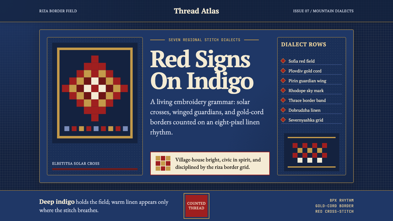 Bulgarian Shevitsa Folk EmbroideryVillage-bright code. Deep indigo carries shevitsa red crosses and gold-cord b…村舍般明亮:深靛蓝承托红色太阳十字与金线边框。
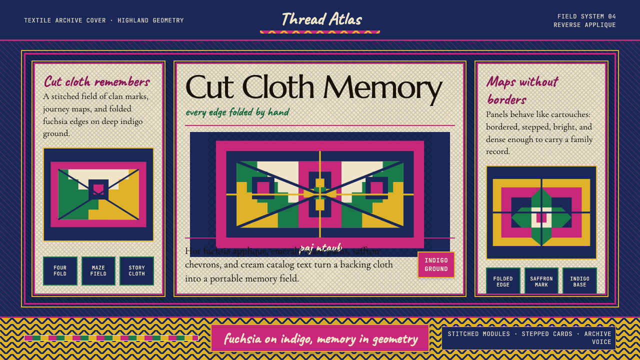 Hmong Paj Ntaub (Flower Cloth)Memory is geometric. Fuchsia applique on indigo forms stepped maze panels.记忆是几何的:靛蓝底上桃红贴花,组成阶梯迷宫面板。
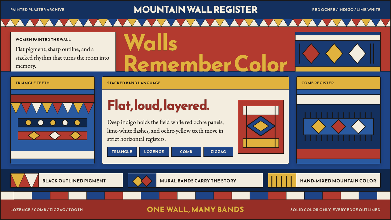 Saudi Asiri Qatt Wall PaintingPainted walls speak loudly. Indigo bands, red triangles, ochre teeth, black o…墙面大声说话。靛蓝横带、赤红三角、赭黄齿纹由黑线收束。
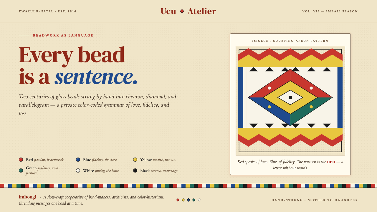 Zulu Beadwork (KwaZulu-Natal)Every bead is a sentence. Saturated glass primaries strung into chevron and d…每一颗珠子都是一句话:饱和玻璃原色在米色帆布上排成 chevron 与菱形——…
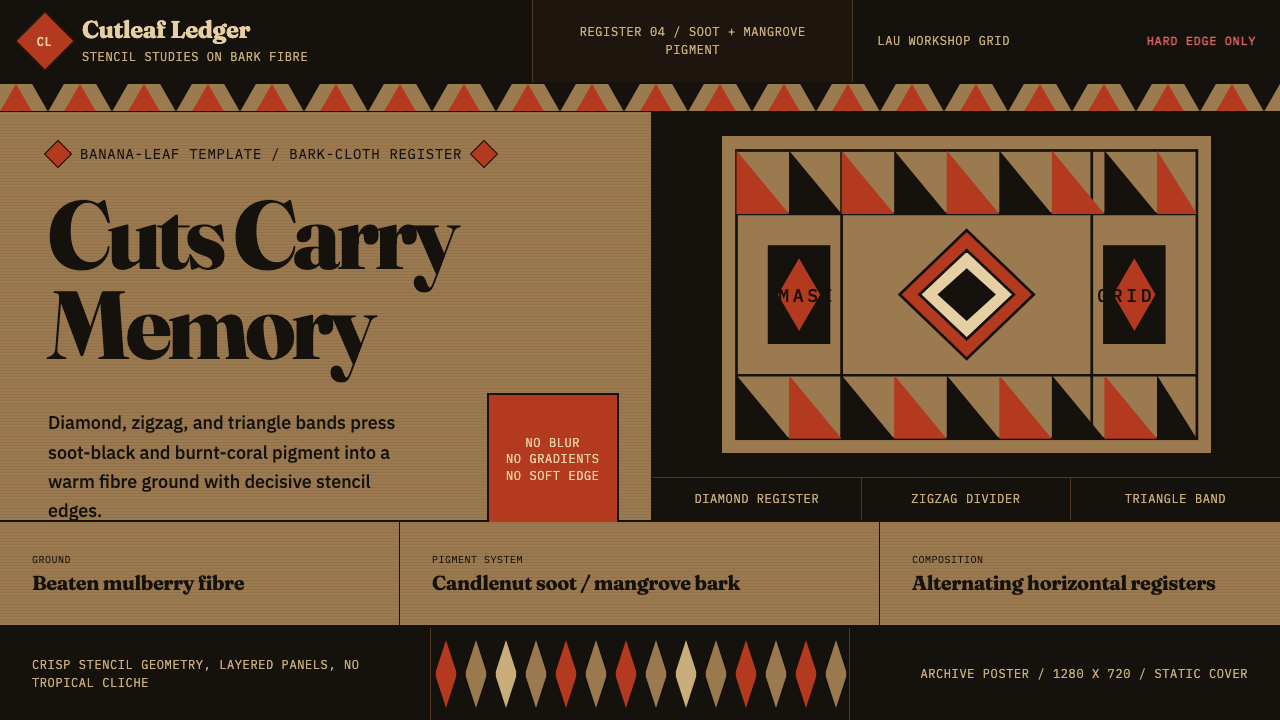 Fijian Masi (Bark Stencil)Stencil memory stays sharp. Soot black and burnt coral strike bark-fibre band…模板记忆锋利:烟黑与焦珊瑚红压入树皮纤维横带。
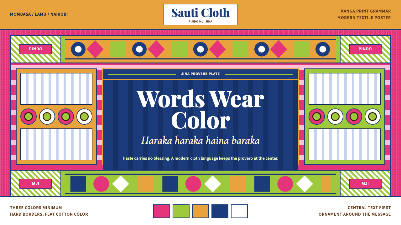 Kenyan Kanga PrintText speaks first. Hot pink ground, lime pindo border, indigo italic proverb…文字先发声:热粉底、青柠边框、靛蓝斜体谚语板。