What is Hmong Paj Ntaub (Flower Cloth)?
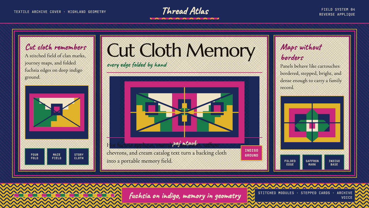
Paj ntaub — Hmong flower cloth — encodes clan memory and cosmology in hand-cut geometric mazes of fuchsia, indigo, and saffron, a textile tradition that survived diaspora and now offers contemporary design one of the most vibrant and symbolically loaded palettes in the world.
Hmong Paj Ntaub (Flower Cloth) in brief
Paj ntaub — literally 'flower cloth' in Hmong — is a centuries-old textile art practiced primarily by Hmong women across the highlands of Laos, Vietnam, and Thailand, and carried into diaspora communities in the United States, France, and beyond. At its technical core, the tradition involves cutting intricate geometric mazes into a top layer of cloth, folding and stitching the edges onto a contrasting backing — a technique known as reverse applique — to produce bold, interlocking patterns with clean exposed edges. The resulting textiles are saturated in color and dense in symbolic content: spider webs, elephant-foot crosses, snail spirals, and mountain zigzags appear not as decorative motifs but as encoded identifiers of clan, region, and spiritual belief.
The visual character of paj ntaub is defined above all by contrast and compression. Patterns are tightly rotational — most compositions are built around a central axis of symmetry from which mirror elements radiate outward — yet the field is never still. Hot fuchsia applique sits against deep indigo grounds; emerald and saffron accents anchor corners and borders; mountain-chevron frames repeat at the edges, creating a sense of contained energy. Nothing in traditional paj ntaub is purely decorative: every shape communicates. The maze-like quality of the cut-cloth patterns is sometimes interpreted as a protective barrier against evil spirits — the labyrinthine path confuses and delays malevolent forces.
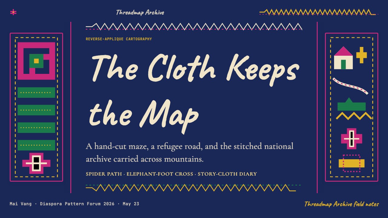
After 1975, when the Hmong fled Laos following the end of the Vietnam War, a significant new subgenre emerged in the refugee camps of Thailand — the story cloth. Rendered in running embroidery rather than applique, story cloths depict entire migration narratives: village life in the highlands, the dangerous crossing of the Mekong River, arrival in the camps at Ban Vinai and elsewhere. These works blend the geometric textile tradition with something closer to naive cartographic illustration, and they represent one of the most remarkable visual documentary traditions produced by any displaced community in the twentieth century.
Where does Hmong Paj Ntaub (Flower Cloth) come from?
The roots of paj ntaub reach back into pre-migration Hmong society in upland China, where the tradition is thought to be several centuries old, though the absence of written records makes precise dating difficult. The Hmong — who identify themselves by several subgroup names including White Hmong, Green Hmong, and Flower Hmong — migrated southward into the highlands of Laos, Vietnam, and Thailand over the eighteenth and nineteenth centuries, carrying the textile tradition with them. By the nineteenth century, paj ntaub was a central feature of ceremonial and everyday life across the highland communities: wrapped around babies, worn at festivals, exchanged as courtship gifts, and buried with the dead as a guide for the spirit's journey.
The geographic spread of Hmong communities across three countries produced regional variation in pattern and palette, but the underlying structural logic — rotational symmetry, geometric maze motifs, high-contrast color pairings — remained consistent. White Hmong communities tended toward predominantly white grounds with restrained accents; Flower Hmong subgroups are associated with the most saturated and multi-colored compositions, including the bold fuchsia-on-indigo pairings that came to define paj ntaub's international visual identity. Green Hmong work often features more elongated, angular patterns. These distinctions, read fluently by community members, encode subgroup identity as legibly as a flag.
Scholarly attention to paj ntaub intensified in the 1970s and 1980s, as researchers including Marsha MacDowell, Joanne Cubbs, and Norma Diamond began documenting the tradition in both Southeast Asian highland communities and the emerging diaspora in the United States. Their work established that paj ntaub was not simply a craft but a sophisticated visual language with its own grammar, and that the story-cloth subgenre in particular represented a genuinely new form — one that emerged in direct response to historical catastrophe. MacDowell's fieldwork in Minnesota and California, where large Hmong communities had resettled after 1975, documented the ways in which the textile tradition was simultaneously preserved and transformed in urban diaspora contexts.
The story-cloth genre, which developed primarily between 1976 and 1992 in the Ban Vinai refugee camp in Thailand, was in part commercially encouraged: aid organizations and camp buyers recognized that story cloths had a market with Western collectors interested in both folk art and documentation of the refugee experience. This commercial dimension introduced new visual pressures — compositions became more narrative and legible to outsider audiences, and the tight geometric abstraction of traditional paj ntaub gave ground to more representational rendering. The two modes — geometric applique and narrative embroidery — have since continued to develop alongside each other, both within surviving highland communities and across diaspora settings in North America and Europe.
What defines the Hmong Paj Ntaub (Flower Cloth) look?
Palette
The paj ntaub palette is built on extreme contrast: hot fuchsia or magenta applique sits against deep indigo grounds, creating a vibration that reads across distance. Emerald green and saffron yellow function as accent colors, typically used to frame compositions or mark borders with mountain-chevron bands. Black appears as a structural outline and separator. The overall effect is intentionally loud — these textiles were made to be seen at festivals, and the visual intensity is not incidental but essential to their communicative purpose.
Rotational Symmetry
Nearly all traditional paj ntaub compositions are organized around rotational symmetry — a central motif from which identical or mirrored elements radiate outward in four or eight directions. This is not merely aesthetic preference but a structural consequence of the reverse-applique technique, in which cloth is folded and cut symmetrically before being opened and stitched. The result is a characteristic visual rhythm: dense, centripetal, never static. Even complex multi-panel compositions maintain this underlying rotational logic as a unifying device.
Geometric Maze Motifs
The dominant visual vocabulary of paj ntaub is built from a specific set of recurring geometric forms: spider webs, elephant-foot crosses, snail spirals, and mountain zigzags. These are not interchangeable decorations — each carries specific clan and regional associations, and experienced community members can identify the maker's subgroup and sometimes home village from the pattern selection alone. The stepped, maze-like quality of many motifs is attributed to a protective function: the labyrinthine paths are believed to confuse malevolent spirits, preventing them from reaching the wearer.
Edge Quality
The defining tactile and visual quality of reverse-applique paj ntaub is the edge: where the top cloth is cut away and its folded edge is stitched to the backing, a crisp, slightly raised boundary forms between adjacent color fields. In traditional textile, this edge is soft and slightly rounded from the fold. Translated into a digital vocabulary, this quality becomes the stepped or slightly beveled card edge — an interface element that suggests hand-cut cloth rather than ruled geometry. The edge is where the craft is legible; flattening it entirely loses the tradition's most distinctive mark.
Density and Pattern Coverage
Traditional paj ntaub leaves almost no ground uncovered. The entire surface of the textile is packed with pattern — borders frame the composition, a central medallion anchors the field, and subsidiary motifs fill the remaining space. This horror vacui (fear of empty space) is culturally meaningful: the density of a textile signals the skill and patience of its maker, and sparse paj ntaub would be read as incomplete. For contemporary digital applications, this translates into a preference for pattern-filled backgrounds, layered textures, and bordered or framed layouts over open, minimal compositions.
Narrative Embroidery
The story-cloth subgenre introduces a second visual mode alongside geometric applique: running embroidery used to render scenes, figures, and landscapes in a flattened, naive perspective reminiscent of folk cartography. Human figures are small and schematic; trees are represented by repeated geometric symbols; rivers and paths are shown as parallel lines. This mode is not illustrational in the Western sense — it is indexical, using established visual conventions to place events in time and space. The combination of geometric pattern-making and narrative embroidery within the same tradition gives paj ntaub an unusual breadth as a design reference.
Cross-Stitch Texture
Alongside reverse applique, Hmong textile work makes extensive use of cross-stitch embroidery to fill subsidiary areas with fine-grained pattern. The cross-stitch grid introduces a pixelated, screen-like texture into the composition — each stitch is a unit in a larger pattern, and the grid structure is always faintly visible beneath the surface imagery. This quality translates naturally to digital contexts: a cross-stitch-inspired texture applied to a background, a button, or a divider carries the visual weight of hand labor without requiring complex illustration.

Who shaped Hmong Paj Ntaub (Flower Cloth)?
A folklorist and curator at Michigan State University, MacDowell was among the first scholars to conduct sustained fieldwork documenting paj ntaub among Hmong refugee communities in the United States. Her research in Minnesota and California, beginning in the late 1970s, established the tradition's continuity and transformation in diaspora contexts and contributed to its recognition as a significant art form deserving museum exhibition and academic study rather than being treated as folk craft of purely ethnographic interest.
Cubbs contributed foundational scholarly writing on the symbolic grammar of paj ntaub and the story-cloth genre, helping to articulate the distinction between the geometric applique tradition and the narrative embroidery that emerged in the refugee camps. Her work helped reframe story cloths not as simplified adaptations for Western buyers but as a genuine new form with its own internal logic, produced by artists navigating catastrophic displacement while maintaining cultural continuity.
An anthropologist whose research on Hmong textile traditions in Southeast Asia helped establish the scholarly framework for understanding paj ntaub in its original cultural context, before the diaspora transformed the form. Diamond's work emphasized the role of textile-making as a form of women's knowledge transmission — a way of passing clan history, cosmological belief, and technical skill across generations in a community that historically lacked a writing system.
Paj ntaub is and has always been a collective practice rather than an individually attributed art form. The tradition's masters are largely anonymous in the Western art-historical sense — their names were not recorded by outside observers, and the tradition itself does not privilege individual authorship. The makers were and are primarily women, who learned the technique from mothers and grandmothers and passed it on to daughters. The absence of named individual artists is not a gap in the historical record but a feature of how this tradition understands creativity: as communal, intergenerational, and inseparable from daily and ceremonial life.
How do you use Hmong Paj Ntaub (Flower Cloth) today?
Paj ntaub is one of the most distinctive and specific design traditions available as a contemporary reference precisely because its visual language is so far removed from the modernist canon that dominates most design education. Applying it correctly requires understanding that its power comes from density, contrast, and symbolic repetition — not from selective color borrowing or superficial pattern overlay. The tradition rewards commitment: a layout that fully adopts its organizational logic will read as coherent and intentional; a layout that borrows only the fuchsia-and-indigo palette without the underlying structural discipline will read as costume.
For presentation slides, paj ntaub works best where visual impact and cultural distinctiveness are primary goals. A cover slide built in this tradition should commit to the high-contrast palette — a deep indigo or near-black ground with fuchsia, emerald, or saffron type and graphic elements — and use a border or frame motif drawn from the chevron or stepped-edge vocabulary. Content slides face a more significant challenge: the tradition's density is not well suited to information-light layouts, but it can work well for slides that carry substantial visual content — a map, a diagram, an illustrated process — where the surrounding pattern frame reinforces rather than competes with the central information. Data slides work well when chart elements are colored according to the palette's high-contrast logic, with each data series assigned one of the tradition's signal colors.
For web interfaces, paj ntaub is best suited to contexts where cultural identity, artisan craft, or festival atmosphere are part of the product's core values — e-commerce for handmade goods, cultural institution websites, event platforms, or any application where the user experience is meant to evoke richness and tradition rather than efficiency and neutrality. Dashboard and productivity interfaces are a poor fit: the tradition's density and visual intensity work against the scannability that task-focused interfaces require. Where it does apply to interfaces, the most effective approach is to confine the dense pattern to structural elements — borders, headers, section dividers — and use the solid ground colors (indigo, deep teal, near-black) for content areas, reserving the full pattern treatment for accent surfaces only.
For editorial and marketing work, the style supports bold, high-impact visual storytelling. A marketing page built in the paj ntaub tradition might use a stepped-border frame as the primary compositional device — enclosing hero text within a geometric cartouche — with full-pattern background sections alternating with solid-ground content sections to provide visual breathing room. The story-cloth subgenre offers a different editorial register: its naive, cartographic illustration mode is well suited to explainer graphics, journey maps, or any content that needs to convey sequence and movement with warmth and handmade character. Type should be set in high contrast against the ground — cream or white on indigo, or deep indigo on saffron — and set at generous sizes to hold its own against the surrounding pattern.
A common mistake when working with paj ntaub is treating it as a color system rather than a structural system. The palette — fuchsia, indigo, emerald, saffron — is memorable and distinctive, but applying it to a standard modern layout produces something that looks like a tinted version of the original design rather than a genuine engagement with the tradition. The tradition's organizing principles — rotational symmetry, full-surface pattern coverage, the bordered frame as a compositional device, the high-contrast edge as a design element — are what give the color system its coherence. Without them, the palette floats free of any structural logic and reads as arbitrary exoticism. Similarly, using only one or two motifs as isolated decorations on an otherwise unrelated layout misrepresents the tradition's density and intentionality.
Hmong Paj Ntaub (Flower Cloth) — FAQ
Is paj ntaub the same across all Hmong communities?
No — paj ntaub varies significantly across Hmong subgroups and geographic regions. White Hmong, Green Hmong, and Flower Hmong communities each have distinct pattern vocabularies, color preferences, and technical approaches. Flower Hmong work is generally associated with the most saturated and multi-colored compositions; White Hmong work tends toward more restrained grounds. Regional variation within each subgroup adds further complexity: a textile made in Laos may differ meaningfully from one made in Vietnam or in diaspora communities in Minnesota, even within the same subgroup. Treating paj ntaub as a single monolithic style misses the tradition's internal diversity.
What is the difference between the applique tradition and story cloths?
Traditional paj ntaub uses reverse applique — cutting a geometric pattern into a top layer of cloth and stitching the folded edges to a contrasting backing — to produce abstract geometric compositions. Story cloths use running embroidery to render narrative scenes: people, buildings, animals, rivers, and landscapes in a flattened, semi-representational style. Story cloths emerged primarily in the Thai refugee camps after 1975 and were partly shaped by the commercial market for folk documentary art. The two modes are distinct in technique, purpose, and visual character, though both are now recognized as part of the broader paj ntaub tradition. Some contemporary makers work in both modes, and hybrid pieces that combine geometric borders with narrative central fields have also emerged.
How do I use this style without it becoming cultural pastiche?
The most important principle is to engage with the tradition's structural logic rather than simply borrowing its surface aesthetics. A design that adopts the geometric organization — rotational symmetry, full-surface pattern coverage, the bordered frame, the stepped edge — is engaging with how paj ntaub actually works, not just how it looks. Acknowledging the source explicitly, in design notes or accompanying documentation, is also appropriate. The tradition is not copyrighted, but its origins are specific and significant: the Hmong community that produced it has lived through displacement, loss, and cultural preservation under difficult circumstances, and treating the tradition with that weight in mind — rather than as an exotic color palette to be sampled — is both more respectful and more likely to produce work that is genuinely coherent rather than superficially decorative.
Can paj ntaub work in a dark interface, or does it require a light background?
The traditional paj ntaub palette is built on a dark ground — deep indigo is the canonical base, not a light or cream field. This makes it one of the few historical textile traditions that translates directly to dark-mode interfaces without inversion. The fuchsia-on-indigo pairing reads beautifully against dark grounds; saffron and emerald accents hold their luminosity. The challenge in dark interfaces is managing the intensity of the pattern: at full density on a dark background, the composition can become visually overwhelming. The most effective approach is to use the dark indigo ground as the primary background and reserve the full pattern treatment for bordered sections, headers, and focal surfaces, letting the dark ground serve as the breathing space that the density of the pattern otherwise denies.
What contemporary design work draws on paj ntaub most effectively?
The most coherent contemporary applications tend to appear in contexts with a strong cultural affinity or explicit documentary purpose: Hmong cultural institution branding, textile and craft fair identities, diaspora community publications, and museum exhibition design for shows featuring Southeast Asian art and material culture. Fashion contexts have produced some notable engagements, typically when designers have worked directly with Hmong makers or have commissioned original paj ntaub textiles for use in collections. The weakest applications are those that extract only the color palette — fuchsia, indigo, saffron — and apply it to otherwise conventional layouts, which produces a result that looks like a color-theme choice rather than a genuine engagement with the tradition. Effective use always involves some commitment to the organizational principles: the border, the rotation, the dense surface, the high-contrast edge.
Related design styles
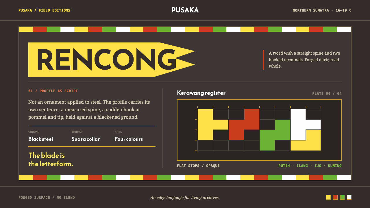 Acehnese Rencong MotifA blade that reads as a word. Flat kerawang red, white, green and yellow lock…
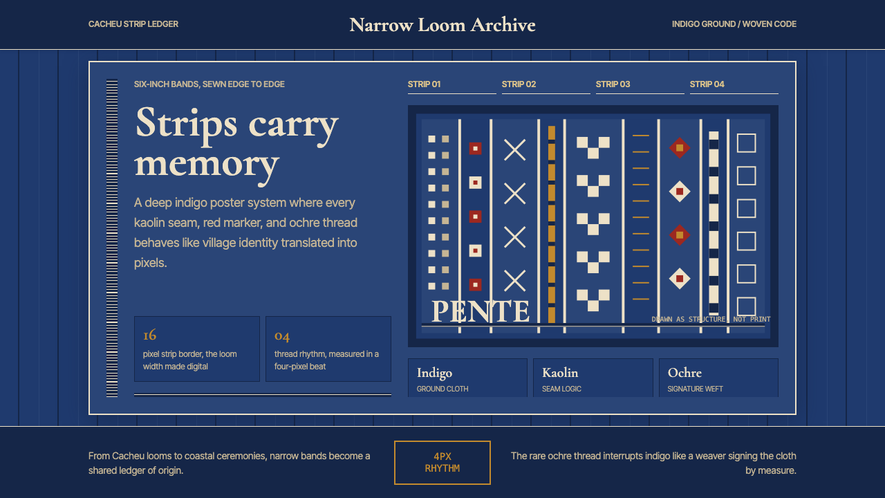 Bissau-Guinean Pano de PenteIndigo remembers. Narrow bands and kaolin seams turn weave grammar into pixel…
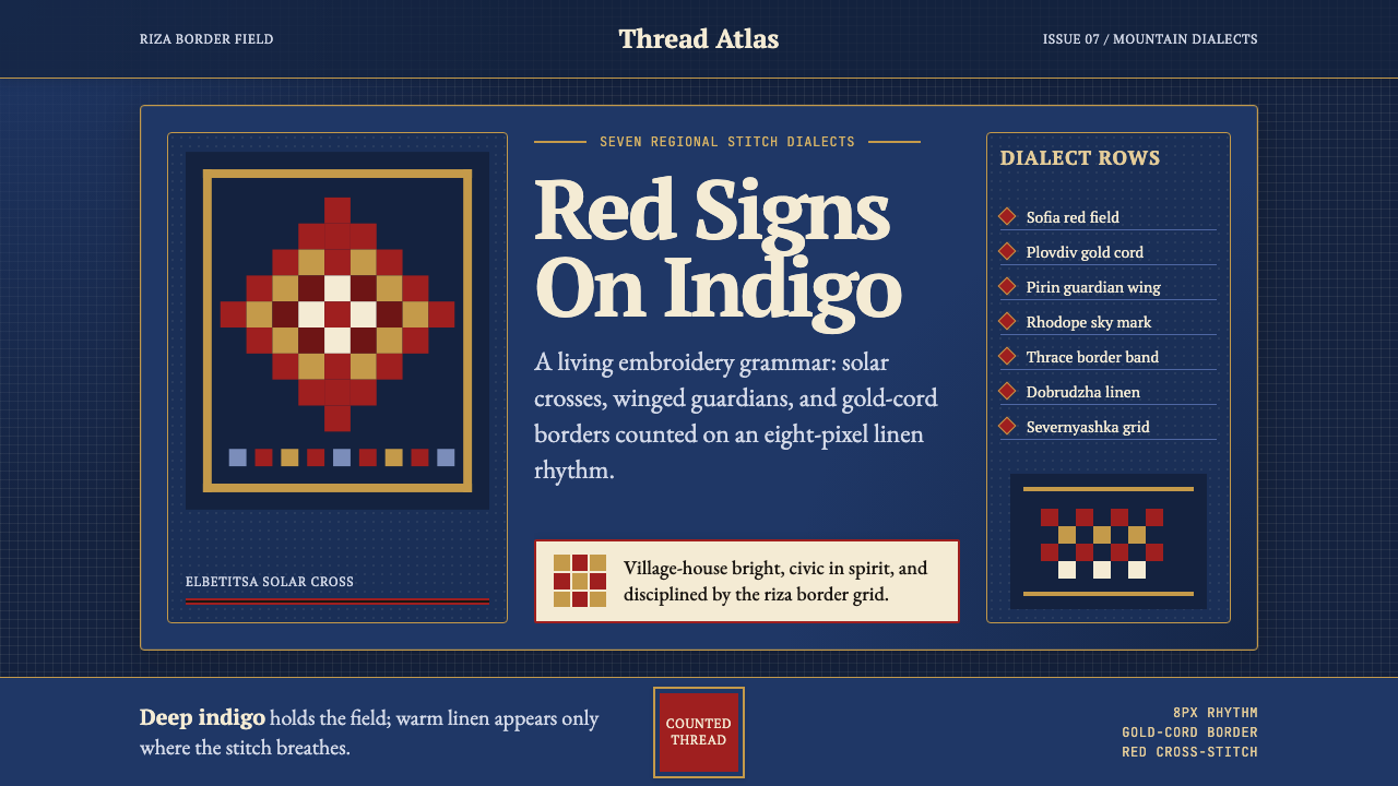 Bulgarian Shevitsa Folk EmbroideryVillage-bright code. Deep indigo carries shevitsa red crosses and gold-cord b…
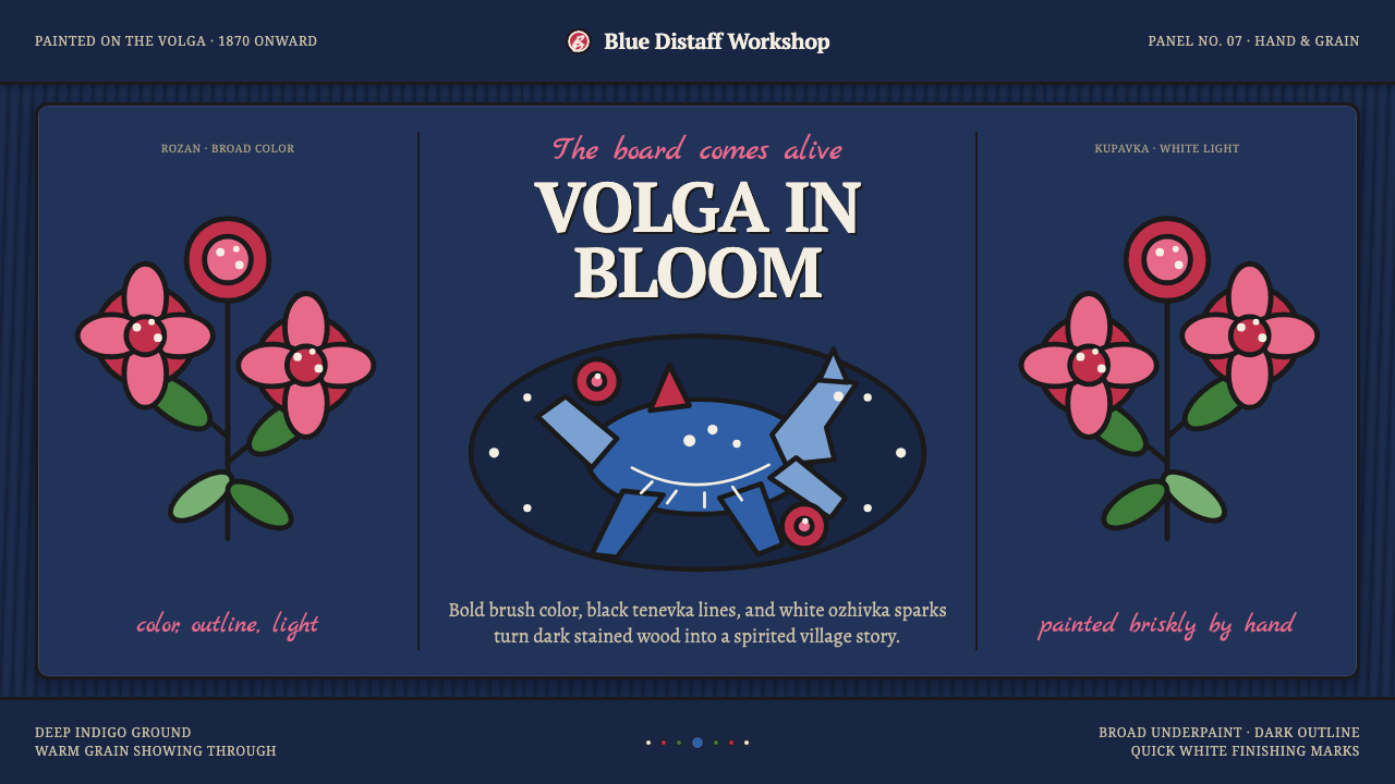 Gorodets Folk Panel PaintingFolk color moves at a gallop. Blue forms, red roses and white dots spark on i…
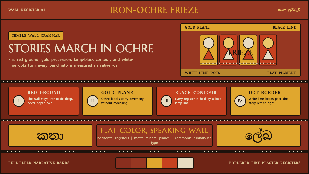 Kandyan Temple Mural FriezeTemple-wall gravity. Red ochre, gold planes, black contours, white-dot regist…
 Naga Angami ShawlEvery stripe bears standing. Indigo seams frame rare red bands and one earned…