What is Babylonian Hammurabi Stele?什么是 Babylonian Hammurabi Stele?
Four thousand years before digital dashboards, Hammurabi carved 282 laws into basalt — and every design choice on that monument still communicates authority, permanence, and absolute clarity.在数字仪表板诞生四千年前,汉谟拉比将282条法律刻入玄武岩——那座纪念碑上的每一个设计决定至今仍在传递权威、永恒与绝对的清晰。
Babylonian Hammurabi Stele in briefBabylonian Hammurabi Stele 速览
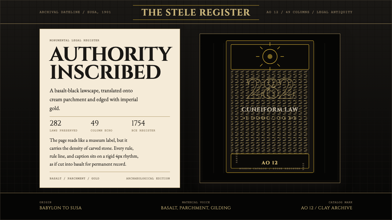
The Babylonian Hammurabi Stele design system draws its entire visual logic from a single historical object: the seven-foot basalt pillar commissioned by King Hammurabi of Babylon around 1754 BCE to proclaim his law code to the ancient world. The aesthetic is archaeological and monumental — warm basalt-black grounds, cream-toned parchment panels for content, and imperial gold reserved for the moments of highest emphasis, the way gilding appears on ancient cylinder seals. Stone-sharp geometry and inscription-weight typography complete the effect.巴比伦汉谟拉比法典风格设计系统的全部视觉逻辑源自一件历史实物:公元前1754年前后,巴比伦王汉谟拉比为向古代世界昭示法典而竖立的七英尺玄武岩柱。其美学基调是考古式的、纪念碑式的——温暖的玄武岩黑底色,奶油色羊皮纸内容面板,以及帝王金——如同古代圆筒印章上的鎏金,只在最需要强调的时刻出现。石刻般锐利的几何与铭文量级的字体排印共同完成这一效果。
What makes this system unusual is its commitment to scholarly authenticity rather than fantasy. The visual references are specific — the actual proportions of the Louvre stele, the rhythm of dense cuneiform columns, the bas-relief composition of king and sun-god at the monument's apex — and they are interpreted through restrained, principled abstraction. There are no hieroglyphic pastiche elements, no theatrical shadows, no cinematic lighting. The discipline is the same as the original object: authority does not decorate itself.这个系统的独特之处在于它对学术真实性的承诺,而非对奇幻想象的追求。视觉参照是具体的——卢浮宫石碑的实际比例、密集楔形文字列的韵律、石碑顶端国王与太阳神的浮雕构图——并通过克制而有原则的抽象加以诠释。没有象形文字拼贴元素,没有戏剧性阴影,没有电影感光效。其纪律与原始对象如出一辙:权威不为自身添加装饰。
The result is a design system that feels simultaneously ancient and completely functional. It is well-suited to interfaces and documents where gravity, precision, and institutional weight are the desired impression — legal and financial platforms, archival and reference tools, scholarly publications, and high-stakes data environments where the user should feel they are reading something permanent.最终呈现的是一个既感觉古老、又完全实用的设计系统。它非常适合那些需要传递庄重、精确与机构分量的界面和文档——法律与金融平台、档案与参考工具、学术出版物,以及需要让用户感受到正在阅读某种永久性内容的高风险数据环境。
See the Babylonian Hammurabi Stele design system查看 Babylonian Hammurabi Stele 完整设计系统
Where does Babylonian Hammurabi Stele come from?Babylonian Hammurabi Stele 从何而来?
The Stele of Hammurabi was created during the reign of Hammurabi, sixth king of the First Babylonian Dynasty, who ruled from approximately 1792 to 1750 BCE. Hammurabi's kingdom unified much of Mesopotamia — the land between the Tigris and Euphrates rivers in what is now Iraq — through a combination of military conquest and diplomatic consolidation. The law code inscribed on the stele was not Hammurabi's invention from nothing; earlier Mesopotamian legal collections existed, including the Laws of Ur-Nammu from around 2100 BCE. But Hammurabi's code, at 282 provisions inscribed in Akkadian cuneiform, was the most comprehensive of its era and was designed explicitly for public proclamation: the stele was displayed in the city of Babylon so that any literate citizen could read the law.汉谟拉比法典石碑创作于汉谟拉比统治期间。汉谟拉比是巴比伦第一王朝第六位国王,大约在公元前1792年至前1750年在位。他通过军事征服与外交整合,将美索不达米亚大部分地区——今伊拉克境内底格里斯河与幼发拉底河之间的土地——统一于巴比伦王国之下。石碑上铭刻的法典并非汉谟拉比凭空创造;更早的美索不达米亚法律汇编早已存在,包括约公元前2100年的乌尔纳姆法典。但汉谟拉比的法典以阿卡德语楔形文字铭刻了282条法令,是那个时代最为完备的法律体系,且被明确设计为公开昭示之用:石碑竖立于巴比伦城中,使任何识字的公民都能阅读法律。
The object's physical design was itself an argument. The monument is a rounded-top basalt pillar, chosen for stone's resistance to weathering and its association with permanence. At the top, a bas-relief scene depicts Hammurabi standing before Shamash, the Babylonian sun god of justice, receiving the laws — or in some readings, presenting them for divine ratification. This image establishes divine authority for the legal text below. The remaining surface is covered in dense columns of cuneiform, approximately forty-nine columns across obverse and reverse faces, written in a formal register of Akkadian. The visual effect is one of total coverage — not a single surface wasted, every available plane given over to the weight of law.这件实物的物理设计本身就是一个论证。纪念碑是一根顶端圆弧的玄武岩柱,材质的选择出于石料抗风化与象征永恒的特性。顶端的浮雕描绘汉谟拉比站立于巴比伦正义太阳神沙马什面前,接受法律——或在某些解读中是将法律呈交神圣批准。这一图像为下方的法律文本确立了神圣权威。其余表面密布楔形文字列,正反两面合计约49列,以正式的阿卡德语书写。视觉效果是彻底的覆盖——没有一处空白被浪费,每一块可用平面都承载着法律的分量。
The stele remained in Babylon for over a millennium until it was seized as war spoil by the Elamite king Shutruk-Nahhunte around 1155 BCE and carried to the Elamite capital Susa, in modern-day Iran. There it stood for another three thousand years, unknown to the modern world, until the French archaeological mission to Susa led by Jacques de Morgan excavated it in three fragments between December 1901 and January 1902. The fragments were reassembled and transported to the Louvre in Paris, where the stele has been displayed ever since — first in the Salle des Antiquités sémitiques and later in its current permanent home, where it draws visitors specifically to see what complete, codified law looks like in physical form.石碑在巴比伦矗立了一千多年,直至约公元前1155年被埃兰国王舒特鲁克-纳洪特作为战利品掠走,带往埃兰首都苏萨(今伊朗境内)。在那里,它又沉默地站立了三千年,直至1901年12月至1902年1月,由雅克·德摩根率领的法国考古队在苏萨将其以三块碎片的形式发掘出土。碎片被重新拼合,运往巴黎卢浮宫展出至今——先在闪族古物馆,后移至其现在的永久陈列位置。人们专程来此,只为亲眼目睹完整、成文的法律以物质形式存在时的样子。
The scholarly decipherment of the text was accomplished remarkably quickly. Jean-Vincent Scheil, a Dominican priest and Orientalist attached to the expedition, published a full transliteration and French translation in 1902, the same year the stele arrived in Paris. Scheil's reading made the code accessible to the international scholarly community almost immediately, and within a few years the Hammurabi Code was being discussed in legal history, biblical scholarship, and comparative linguistics. The stele became the most famous object in Mesopotamian archaeology and remains among the most recognized ancient artifacts in any collection worldwide. Its design vocabulary — the monumental column, the dense inscribed field, the god-and-king summit composition — has entered the visual language of authority across cultures.文本的学术解读完成得出乎意料地迅速。多明我会神父、东方学家让-文森·谢伊尔随考古队同行,于1902年——石碑抵达巴黎的同一年——发表了完整的音译与法文翻译。谢伊尔的解读几乎立即使法典向国际学术界开放,数年之内,汉谟拉比法典便已出现在法律史、圣经学术与比较语言学的讨论之中。石碑成为美索不达米亚考古学中最著名的实物,至今仍是全球任何馆藏中最广为人知的古代文物之一。它的设计语汇——纪念性立柱、密集铭文区域、神王顶冠构图——已跨越文化,进入权威的视觉语言之中。
What defines the Babylonian Hammurabi Stele look?Babylonian Hammurabi Stele 的视觉特征是什么?
Color色彩
The palette is built around three anchoring tones derived directly from the monument: a deep, warm basalt-black for grounds and structural elements; a soft, aged cream or parchment tone for content panels where body text lives; and an imperial gold — warm and slightly burnished rather than bright yellow — reserved for the highest-priority accents, borders, and ornamental marks. A fourth tone, a cool stone-gray, functions as a midtone for secondary elements and dividers. Color is never decorative here; each tone carries a categorical meaning tied to its place in the original monument.色板围绕直接源自石碑的三个锚定色调构建:深沉温暖的玄武岩黑色,用于底色与结构性元素;柔和的古旧奶油色或羊皮纸色,用于承载正文的内容面板;以及帝王金——温暖、略带磨砂感而非明亮的黄色——保留用于最高优先级的强调、边框与装饰性标记。第四个色调,冷调的石灰色,作为辅助元素与分割线的中间色。色彩在这里从不用于装饰;每个色调承载的类别意义,与其在原始纪念碑中的位置直接挂钩。
Typography字体排印
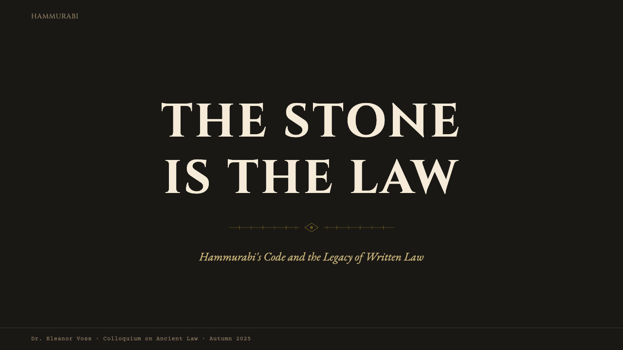
The typographic model is the carved inscription: letterforms that feel cut into a surface rather than printed onto one, with strong vertical strokes and controlled horizontal stress. Display type is set at monumental scale, wide-tracked, and often spaced with the deliberate openness of stone-carved text where each character must be individually chiseled. Body text sits in a dense, upright register — compact but highly legible, echoing the rhythm of cuneiform columns. No script or calligraphic typefaces appear; every form should feel lapidary, made to last millennia rather than seasons.字体排印的范本是刻刻铭文:字形感觉是刻入表面而非印刷于表面,具有强烈的竖向笔画与克制的横向重量。展示字体以纪念碑式的大尺度呈现,字距宽阔,常以石刻文字特有的舒朗间距排列——每个字符如同被单独凿刻。正文以密集、直立的风格排列——紧凑而高度可读,呼应楔形文字列的韵律。不出现任何手写或书法风格字体;每一个字形都应有「石刻感」,仿佛是为千年而造,而非为季节而生。
Surface and Texture表面与质感
Unlike many historical design systems that embrace flat digital surfaces, the Hammurabi Stele aesthetic allows for the suggestion of material surface — but only through restrained, non-photographic means. Content panels may carry the very faint visual memory of aged parchment or worn stone, rendered through subtle tonal variation rather than any explicit texture map or photographic overlay. The goal is legibility first, with just enough material warmth to distinguish the surface from pure neutrality. Heavy-handed texturing immediately collapses the scholarly tone into theatrical decoration.与许多拥抱纯粹平面数字表面的历史设计系统不同,汉谟拉比石碑美学允许暗示材料表面——但只通过克制的、非摄影手段。内容面板可以携带极其微弱的古旧羊皮纸或磨损石面的视觉记忆,通过细腻的色调变化而非任何明显的纹理图或摄影叠加来实现。目标首先是可读性,再加上刚好足够的材质温度,使表面区别于纯粹的中性底色。过重的纹理处理会立即将学术基调坍塌为戏剧性的装饰。
Grid and Proportion网格与比例
The stele's physical proportions — tall, narrow, and self-contained — inform the preferred aspect ratios for content containers. Vertical orientations are favored over wide horizontal ones; where wide layouts are necessary, they are organized into clearly distinct column zones echoing the inscription's columnar structure. Grid lines are not hidden infrastructure but expressed as visible rules and borders that divide the surface the way column separators divide a cuneiform text. The forty-nine cuneiform columns of the original monument are an evocative reference, not a literal specification.石碑的物理比例——高挑、纤细、自足完整——决定了内容容器的首选宽高比。垂直方向优先于宽幅水平方向;在必须采用宽幅版面时,它被组织为清晰区分的列区,呼应铭文的列状结构。网格线不是隐形的基础设施,而是作为可见的线条与边框表达,如同列分隔符划分楔形文字文本那样划分表面。原始纪念碑的四十九列楔形文字是一个充满联想的参照,而非字面上的规格要求。
Geometry and Ornament几何与装饰
Ornament exists in this system — which distinguishes it fundamentally from zero-ornament modernist traditions — but it is governed by the principle of inscription: ornament should feel as though it was carved rather than drawn. Border elements are composed of repeated geometric units that reference cuneiform wedge marks and cylinder-seal motifs without directly copying them. The bas-relief composition at the stele's apex — god and king, enthroned and standing — provides the logic for image hierarchy: figures of authority occupy summit positions, their scale signaling rank. Decorative elements are restrained and symmetric; complexity is found in density, not in elaboration.这个系统中存在装饰——这从根本上将其与零装饰的现代主义传统区别开来——但它受铭刻原则支配:装饰应感觉是凿刻而非描绘出来的。边框元素由重复的几何单元构成,这些单元参照楔形文字的楔形笔画与圆筒印章母题,但不直接复制。石碑顶端的浮雕构图——神与王,一坐一立——提供了图像层级的逻辑:权威人物占据顶部位置,其尺度传达等级。装饰性元素克制而对称;复杂性来自密度,而非繁复。
Contrast and Legibility对比度与可读性
The system demands high contrast at every hierarchical level: warm gold on basalt-black for primary emphasis, near-black type on parchment cream for body content, and gold rule lines on dark grounds for structural division. Intermediate low-contrast relationships are avoided; the monument's original purpose was public proclamation — the law had to be readable at a distance, in daylight, on a carved surface. This insistence on bold contrast gives the system strong accessibility characteristics and makes it particularly effective in environments where rapid information scanning is required.该系统要求在每个层级都保持高对比度:玄武岩黑底上的温暖金色用于主要强调,奶油羊皮纸底上的近黑色文字用于正文内容,深色底上的金色线条用于结构分割。中间层次的低对比度关系被刻意回避;石碑的原始用途是公开昭示——法律必须在户外日光下、从一定距离处、在刻刻表面上都清晰可读。这种对大胆对比度的坚持赋予系统优异的无障碍访问特性,使其在需要快速信息扫描的环境中尤为有效。
Scale as Authority尺度即权威
The original stele is physically imposing — nearly two and a half meters tall — and the design system encodes scale as its primary hierarchy signal. Display elements are large not for emphasis in the contemporary attention-economy sense, but because large scale communicates institutional weight. A page number or section label in this system may be nearly as large as body text; a chapter heading occupies a substantial portion of its page. This willingness to commit space to hierarchy markers, rather than compressing them, is what gives the system its monumental feeling even at screen scale.原始石碑在物理上令人肃然起敬——近两米半高——设计系统将尺度编码为其首要的层级信号。展示性元素之所以大,不是为了当代注意力经济意义上的「强调」,而是因为大尺度传递机构分量。在这个系统中,页码或章节标签的尺寸可能接近正文;章节标题占据其页面的可观部分。这种将空间慷慨地赋予层级标记、而非将其压缩的意愿,使这个系统即使在屏幕尺度上也呈现出纪念碑式的感受。

See the Babylonian Hammurabi Stele design system查看 Babylonian Hammurabi Stele 完整设计系统
Who shaped Babylonian Hammurabi Stele?谁塑造了 Babylonian Hammurabi Stele?
Hammurabi reigned as the sixth king of the First Babylonian Dynasty from approximately 1792 to 1750 BCE. Through a sustained campaign of military conquest and diplomatic alliance, he expanded Babylonian rule across Mesopotamia, unifying city-states that had previously competed for regional dominance. His law code — the text inscribed on the stele — was not merely a legal instrument but a political document that asserted Babylonian supremacy over conquered territories and framed that supremacy as divinely sanctioned justice. Hammurabi is represented on the stele itself in the bas-relief at its apex, standing before the god Shamash in a posture of reception or presentation that established the iconographic model for the divine-human authority relationship in ancient Near Eastern art.汉谟拉比约于公元前1792年至前1750年在位,是巴比伦第一王朝第六位国王。通过持续的军事征服与外交联盟,他将巴比伦统治扩展至整个美索不达米亚,统一了此前相互角逐区域霸权的各城邦。石碑上铭刻的法典不仅仅是法律文书,更是一份政治文件,宣示巴比伦对被征服领土的至上权威,并将这种权威框架为受神圣认可的正义。汉谟拉比本人出现在石碑顶端的浮雕中,以接受或呈递的姿态立于太阳神沙马什面前,为古代近东艺术中神人权威关系确立了图像学范本。
Shamash was the Babylonian and Assyrian deity of the sun and of justice — the divine patron of law, fairness, and the exposure of wrongdoing. The bas-relief at the apex of the Hammurabi Stele depicts Shamash enthroned, presenting Hammurabi with the symbols of royal authority — the rod and ring — which in some scholarly interpretations are instruments of measurement and construction, signifying that the law is a built, measurable structure. Shamash's presence on the monument was essential to its authority: the code was not merely Hammurabi's decree but a transcription of divine will. In design terms, Shamash's summit position and larger seated scale established the visual grammar of authority through placement and proportion that the design system inherits.沙马什是巴比伦与亚述的太阳神与正义之神——法律、公平与揭露不义的神圣守护者。汉谟拉比法典石碑顶端的浮雕描绘沙马什端坐,向汉谟拉比授予王权象征——杆与环——在某些学术解读中,这些是测量与建造的工具,意味着法律是一种可以建造、可以度量的结构。沙马什出现在石碑上对其权威至关重要:法典不仅仅是汉谟拉比的法令,更是神圣意志的转录。就设计语言而言,沙马什居于顶端且尺度更大的坐姿,确立了通过位置与比例传递权威的视觉语法——这正是本设计系统所继承的。
Jacques de Morgan was a French engineer, archaeologist, and geologist who directed the French Archaeological Delegation in Persia at the turn of the twentieth century. His excavation campaigns at Susa — the ancient Elamite capital where the Hammurabi Stele had lain buried for three millennia — produced one of the most consequential single-season discoveries in the history of Near Eastern archaeology. Between December 1901 and January 1902, his team unearthed the three basalt fragments that, when reassembled, constituted the stele. De Morgan's systematic approach to stratigraphy and artifact documentation ensured that the object was recovered with enough contextual information to situate it historically and physically, making its subsequent scholarly analysis possible.雅克·德摩根是二十世纪之交率领法国波斯考古代表团的法国工程师、考古学家与地质学家。他在苏萨——汉谟拉比法典石碑沉睡三千年的古代埃兰首都——的发掘活动,产生了近东考古史上最具影响的单季发现之一。1901年12月至1902年1月间,他的团队挖掘出三块玄武岩碎片,拼合后即为完整的石碑。德摩根对地层学与文物记录的系统性方法确保了该实物在获取时具备足够的情境信息,得以在历史与空间上准确定位,从而使后续的学术分析成为可能。
Jean-Vincent Scheil was a Dominican priest and Assyriologist who accompanied the French expedition to Susa and accomplished the first complete decipherment and publication of the Hammurabi Code text. Working with remarkable speed, Scheil produced a full transliteration and French translation of the Akkadian cuneiform in 1902, the same year the stele arrived at the Louvre. This publication transformed the stele from a visually impressive but opaque object into one of the most studied texts in ancient legal history. Scheil's reading made it possible to compare Hammurabi's provisions with Mosaic law, earlier Mesopotamian codes, and later Roman legal precedents — situating the monument at the center of debates about the origins of codified law that continue to this day.让-文森·谢伊尔是随法国考古队前往苏萨的多明我会神父与亚述学家,完成了汉谟拉比法典文本的首次完整解读与出版。谢伊尔以惊人的速度工作,于1902年——石碑抵达卢浮宫的同一年——发表了阿卡德语楔形文字的完整音译与法文翻译。这一出版物将石碑从视觉上令人震撼却无法解读的实物,转变为古代法律史上研究最深入的文本之一。谢伊尔的解读使人们得以将汉谟拉比的条款与摩西律法、更早的美索不达米亚法典以及后来的罗马法先例相互对照——将这座纪念碑置于关于成文法起源争论的核心,这场争论延续至今。
Shutruk-Nahhunte was an Elamite king who ruled from approximately 1185 to 1155 BCE and conducted a series of military campaigns against Babylonian cities that rank among the most destructive in ancient Mesopotamian history. Among his documented spoils — which he transported to his capital Susa and had inscribed with records of his conquests — was the Stele of Hammurabi, removed from Babylon around 1155 BCE. Shutruk-Nahhunte's appropriation of the stele was itself an act of symbolic authority: to possess another king's law monument was to supersede his claim to divine-backed legitimacy. The stele's three-thousand-year sojourn in Susa was therefore an accident of conquest as much as of geography, and it accounts for the object's preservation in a region where it would eventually be excavated by modern archaeologists.舒特鲁克-纳洪特是约公元前1185年至前1155年在位的埃兰国王,对巴比伦各城市发动了一系列堪称古代美索不达米亚史上最具破坏性的军事远征。在他有据可查的战利品中——他将这些战利品运至首都苏萨,并刻上征服记录——汉谟拉比法典石碑约于公元前1155年被从巴比伦移走。舒特鲁克-纳洪特占有石碑本身就是一种象征性的权威行为:拥有另一位国王的法律纪念碑,意味着取代其受神圣背书的合法性主张。石碑在苏萨长达三千年的停留,因此既是征服的意外产物,也是地理的偶然结果,这也解释了这件实物为何得以在一个最终由现代考古学家发掘的地区保存下来。
How do you use Babylonian Hammurabi Stele today?今天怎么用 Babylonian Hammurabi Stele?
The Hammurabi Stele system is best understood as a palette of institutional gravity. Before applying it, consider whether the product or document genuinely calls for the weight it carries — this is not a system that softens or flatters, and audiences will perceive its seriousness whether or not the content earns it. When the match is right — legal technology, compliance platforms, archival databases, financial reporting, academic publishing, civic government interfaces — it is extraordinarily effective at communicating permanence and trustworthiness without any verbal claim to those qualities.汉谟拉比法典石碑系统最好被理解为一套机构重量感的调色板。在应用之前,请思考产品或文档是否真正需要它所携带的分量——这不是一个会柔化或讨好的系统,受众会感知到它的严肃性,不论内容是否配得上这种严肃。当匹配恰当时——法律科技、合规平台、档案数据库、财务报告、学术出版、政府机构界面——它在传递永久性与可信度方面极为有效,无需任何言语宣称这些品质。
For presentation slides, the system works across both cover and content pages with distinct approaches for each. A cover page benefits from the stele's vertical compositional logic: the title set in inscription-weight type at a large, spaced scale against the basalt-black ground, with a narrow gold border rule framing the content area as a monument frames its inscription field. A single gold ornamental element — a horizontal rule or a minimal geometric mark — serves the function of the bas-relief apex: it tells the viewer where to look first. Content slides should be treated as inscription panels: a generous margin on the left serving as a metadata or label column, the main content in dense, legible columns to the right, and section markers as bold horizontal rules in gold or cream rather than decorative dividers. Data slides take on a lapidary quality — charts and figures should be rendered in the palette's tonal hierarchy, with the most critical data points emphasized in gold, supporting data in parchment cream, and structural elements in basalt-black.对于演示文稿,该系统在封面页与内容页各有其独特的处理方式。封面页受益于石碑的垂直构图逻辑:标题以铭文量级的字体在玄武岩黑底上大尺度、宽字距地排列,细金线边框框定内容区域,如同纪念碑框定其铭文区。一个单一的金色装饰元素——水平线条或最简的几何标记——承担浮雕顶端的功能:告诉观者应当首先看向何处。内容页应被当作铭文面板处理:左侧留有充裕的边距作为元数据或标签列,主要内容以密集、清晰可读的列排列于右侧,章节标记用金色或奶油色的粗水平线而非装饰性分隔符表示。数据页呈现出一种石刻品质——图表与数字应以色板的色调层级呈现,最关键的数据点用金色强调,辅助数据用羊皮纸奶油色,结构性元素用玄武岩黑色。
For web interfaces, the system is particularly suited to dashboards, legal and compliance portals, financial data platforms, and institutional reference tools where the user needs to trust the information before acting on it. The approach: ground the layout in basalt-black or a very deep warm dark, reserve the parchment cream tone for all primary reading surfaces, and apply gold with strict discipline — interactive elements such as primary calls to action, critical alerts, and navigation highlights only. Component edges should be sharp and defined rather than rounded; card components carry visible border rules in stone-gray or gold rather than floating on shadows. For pricing or tier comparison pages, the stele's columnar structure translates directly: each tier occupies a defined column, gold highlights the recommended tier, and the visual weight of the layout communicates that the decision being made has permanence.对于网页界面,该系统尤其适合仪表板、法律与合规门户、金融数据平台,以及用户在采取行动前需要信任信息的机构参考工具。方法如下:以玄武岩黑色或非常深的暖暗色奠定版面基础,将羊皮纸奶油色保留给所有主要阅读表面,并以严格的纪律使用金色——仅用于主要行动号召等交互元素、关键警示与导航高亮。组件边缘应当锐利清晰而非圆角;卡片组件携带石灰色或金色的可见边框线,而非浮于阴影之上。对于定价或层级对比页面,石碑的列状结构可以直接转化:每个层级占据一个定义明确的列,金色高亮推荐层级,版面的视觉重量传达出正在做出的决定具有永久性。
For editorial and marketing work, the system supports dense, authoritative information hierarchies. An editorial layout using this aesthetic places a wide, clearly bounded content column on a parchment ground, with a narrower left margin carrying section metadata, folios, and classification labels in a smaller, more open typographic setting — the cuneiform margin of the stele, in effect. Section breaks are marked by full-width gold rules rather than white space or decorative ornament. Marketing pages using the system should resist the temptation to add photographic backgrounds or imagery that suggests warmth or lifestyle; the system's authority comes precisely from its refusal to court the viewer. Instead, feature blocks alternate between basalt-black grounds with gold and cream type and parchment grounds with near-black type, producing a rhythm of contrast that reads as confident iteration rather than variation for variety's sake.对于编辑与营销内容,该系统支持密集、权威的信息层级。采用这一美学的编辑版面将宽幅、边界明确的内容列置于羊皮纸底色上,左侧较窄的边距承载章节元数据、页码与分类标签,以较小、更开阔的字体排印——实质上是石碑的楔形文字边距。章节分隔以全宽金线标记,而非空白或装饰性装饰物。使用该系统的营销页面应抵制添加摄影背景或暗示温暖感或生活方式的图像的诱惑;系统的权威感恰恰来自它对讨好观者的拒绝。特性区块在玄武岩黑底配金色与奶油色文字、和羊皮纸底配近黑色文字之间交替,产生一种对比节奏,读来如同自信的迭代而非为变化而变化的变奏。
The most common mistake when applying this system is misunderstanding the role of gold. Because gold is the system's most distinctive and visually active tone, it attracts designers who want to use it broadly — as background fills, as decorative pattern, as typographic color for body text. This dissolves the system's logic entirely. Gold in the Hammurabi Stele system is emphasis, not decoration; it should appear where the original monument's gilding appeared — at borders, at key structural markers, at the single most important element on any given surface. A layout where gold appears more than three or four times at meaningful scale has already lost the system's gravitational center. Similarly, softening the palette — introducing warm amber tones, graduated backgrounds, or rounded geometry — immediately collapses the archaeological severity that makes the system distinctive. The design should feel excavated, not designed.应用这个系统时最常见的错误是误解金色的作用。因为金色是系统中最具辨识度和视觉活力的色调,它吸引设计师想要大量使用它——作为背景填充、作为装饰性图案、作为正文的字体颜色。这会彻底瓦解系统的逻辑。汉谟拉比法典系统中的金色是强调,而非装饰;它应当出现在原始纪念碑的鎏金出现的地方——边框处、关键结构标记处、任何特定表面上最重要的单一元素处。一个版面中金色在有意义的尺度上出现超过三四次,已经失去了系统的引力中心。同样,柔化色板——引入温暖的琥珀色调、渐变背景或圆角几何——会立即瓦解使系统具有独特性的考古学严肃感。设计应该感觉像是被发掘出来的,而不是被设计出来的。
See the Babylonian Hammurabi Stele design system查看 Babylonian Hammurabi Stele 完整设计系统
Babylonian Hammurabi Stele — FAQBabylonian Hammurabi Stele · 常见问题
How does the Hammurabi Stele system differ from other dark, gold-accented design themes?汉谟拉比法典系统与其他深色调、金色点缀的设计主题有何不同?
The critical difference is the source of the gold and black logic. Many dark-gold themes derive from luxury branding — the black is opulent, the gold is precious, the overall effect is jewelry-store or financial-product advertising. The Hammurabi Stele system's black is basalt: geological, heavy, permanent. Its gold is inscription-emphasis: restrained, categorical, earned by context. The parchment cream tone — absent from most luxury-black-gold systems — is the most telling marker. It introduces the specific warmth of aged written material rather than the cold gleam of a display case. When in doubt, look at how the typography is handled: luxury systems tend toward elegant thin weight; the Hammurabi system favors strong vertical strokes with the weight of carved stone.关键区别在于金色与黑色逻辑的来源。许多深色金色主题源自奢侈品牌——黑色是富丽的,金色是珍贵的,整体效果是珠宝店或金融产品广告的感觉。汉谟拉比法典系统的黑色是玄武岩:地质性的、厚重的、永久的。它的金色是铭文强调:克制的、类别性的、由上下文赋予意义的。羊皮纸奶油色调——在大多数奢华黑金系统中不存在——是最具辨别意义的标志。它引入了陈旧书写材料特有的温度,而非展示柜的冰冷光泽。若有疑惑,看字体排印的处理方式:奢华系统倾向于优雅的细字重;汉谟拉比系统偏爱具有刻刻石面分量的强劲竖向笔画。
Can this system be adapted for consumer-facing products, or is it strictly institutional?这个系统可以用于面向消费者的产品,还是严格限于机构用途?
It can be adapted, but with honest awareness of what the adaptation costs. The system's authority communicates credibility, permanence, and seriousness — qualities that translate well for any consumer product where trust is the primary purchase driver: high-value insurance products, long-term investment platforms, estate planning services, premium legal document tools. It will struggle, and may actively repel users, in contexts that call for approachability, warmth, playfulness, or emotional intimacy. A consumer wellness app, a social platform, or a food and beverage brand applying this system without modification will likely produce an experience that feels correctional rather than inviting. The honest question is not whether the aesthetic can be adapted but whether the product's emotional contract with its users genuinely aligns with what the system communicates.可以适配,但需要诚实地意识到适配的代价。系统的权威感传递可信度、永久性与严肃性——这些品质对任何以信任为主要购买驱动力的消费者产品都有很好的转化:高价值保险产品、长期投资平台、遗产规划服务、优质法律文件工具。在需要亲切感、温暖感、趣味性或情感亲密度的场景中,它会举步维艰,甚至可能主动排斥用户。未经改动地将这一系统应用于消费者健康应用、社交平台或食品饮料品牌,很可能产生一种感觉像是矫正性机构而非欢迎性场所的体验。诚实的问题不是美学是否能被适配,而是产品与用户之间的情感契约是否真正与系统所传递的内容一致。
What is the correct use of the parchment cream tone — background only, or can it be used for elements?羊皮纸奶油色调的正确用法是什么——仅作底色,还是可以用于其他元素?
The parchment cream tone functions primarily as the reading surface — the content panel ground, the equivalent of the stele's inscribed field. As a background for body text on dark grounds, it is also highly effective: cream text on basalt-black is the standard inversion for dark-mode content areas. What cream should not do is appear as a decorative element on a light ground, where it will collapse into invisibility, or as an emphasis color competing with gold. The practical rule: cream defines reading surfaces; gold defines emphasis points; basalt-black defines structural grounds. When these three roles are respected, the system maintains its categorical clarity. When they overlap — cream used for call-to-action buttons, gold used as a large background field — the hierarchy dissolves and the system reads as merely dark and ornate.羊皮纸奶油色调主要作为阅读表面——内容面板底色,等同于石碑铭文区的功能。作为深色底上正文文字的颜色,它同样非常有效:玄武岩黑底上的奶油色文字是深色模式内容区域的标准反转方案。奶油色不应出现的场景是:作为浅色底上的装饰性元素(会消失于底色中),或作为与金色竞争的强调色。实用规则:奶油色定义阅读表面;金色定义强调点;玄武岩黑色定义结构性底面。当这三种角色得到尊重,系统保持其类别清晰度。当它们叠加混用——奶油色用于行动号召按钮,金色用作大面积背景——层级就瓦解了,系统看起来只是深色而繁复,而非严肃而有权威。
How should imagery and photography be treated within this system?在这个系统中,图像与摄影应如何处理?
Photography and figurative imagery are difficult to incorporate without disrupting the system's archaeological register. Where imagery is necessary, the most consistent approach is high-contrast duotone treatment using the system's own palette — basalt-black and parchment cream, or basalt-black and gold — which transforms photographic subjects into something closer to relief or print. Silhouetting against a dark ground also works well. What the system cannot accommodate gracefully is naturalistic, full-color photography with ambient lighting, because such imagery imports the logic of the present-day visual world into a composition that is making an argument about permanence and historical weight. Ancient maps, manuscript pages, seal impressions, and cuneiform tablet photographs, if needed, integrate naturally — they are from the same visual universe as the stele.摄影与具象图像很难在不破坏系统考古学基调的情况下融入。在必须使用图像的地方,最一致的处理方式是使用系统自身色板的高对比度双色调处理——玄武岩黑色与羊皮纸奶油色,或玄武岩黑色与金色——这将摄影主体转化为更接近浮雕或印刷品的形态。在深色底上做轮廓剪影也很有效。系统无法优雅容纳的是带有环境光照的自然主义全彩摄影,因为这类图像将当代视觉世界的逻辑引入了一个正在就永久性与历史重量做出论证的构图之中。古代地图、手稿页面、印章压印和楔形文字泥板照片——如果需要的话——可以自然融入,因为它们与石碑来自同一视觉宇宙。
Is this system appropriate for digital dark mode, and how should dark-mode implementation differ from light mode?这个系统适合数字深色模式吗?深色模式的实现应如何不同于浅色模式?
This system is, in a meaningful sense, natively dark-mode: the original stele is a dark monument with light inscription. The basalt-black ground with parchment and gold content is the primary orientation, and it translates directly to dark-mode digital interfaces. The light-mode variant — where parchment cream becomes the ground and near-black or basalt serves as type — is the adaptation, not the default. In practice, this means the light-mode version requires more care: the gold tends to lose some of its gravitas on a light ground, and the contrast structure that makes the system legible on dark grounds needs to be recalibrated. A light-mode implementation works best when gold is used more sparingly than in dark mode, with stone-gray rules and borders carrying more of the structural work, and near-black type sitting in high contrast against the cream ground.从有意义的角度看,这个系统原生就是深色模式:原始石碑是一座深色纪念碑,带有浅色铭文。玄武岩黑底配羊皮纸与金色内容是主要方向,直接转化为深色模式的数字界面。浅色模式变体——羊皮纸奶油色成为底色,近黑色或玄武岩色用于文字——是适配版本,而非默认版本。在实践中,这意味着浅色模式版本需要更多的处理:金色在浅色底上往往会失去一些庄重感,在深色底上使系统清晰可读的对比度结构需要重新校准。浅色模式实现在以下情况下效果最好:金色比深色模式中使用得更为克制,石灰色线条与边框承担更多结构性工作,近黑色文字在奶油色底上保持高对比度。
Related design styles相关设计风格
 Ex Libris BookplateScholarly ownership, cut in ivory. Cinzel caps and crosshatch rules rise from…学者藏书的象牙刻痕。Cinzel 大写与交叉排线浮出黑版。
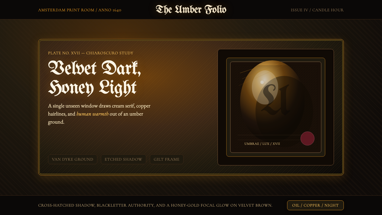 Rembrandt BaroqueDarkness becomes theatre. Honey-gold spotlight and blackletter rise from Van…黑暗成为剧场:蜂蜜金聚光与哥特黑体从范戴克棕浮现。
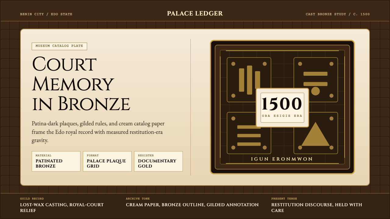 Benin Bronze (Edo, 1500)Royal memory, cast in bronze. Cream plaques and gilded lines carry museum gra…王权记忆铸于青铜。奶油牌板与鎏金线条带出图录庄重。
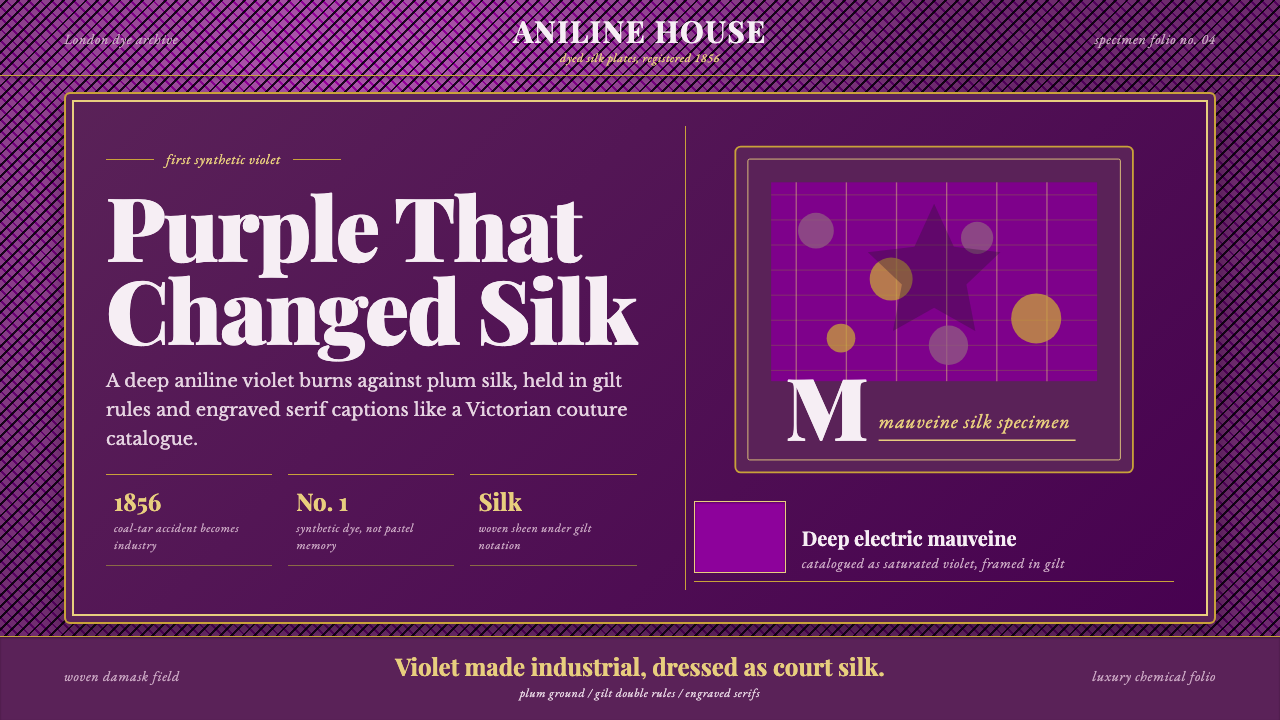 Mauveine (Perkin 1856)Electric purple, framed as luxury. Gilt rules and Playfair serifs turn dye in…电光紫即奢华:鎏金细框与 Playfair 衬线,把染料做成丝绸。
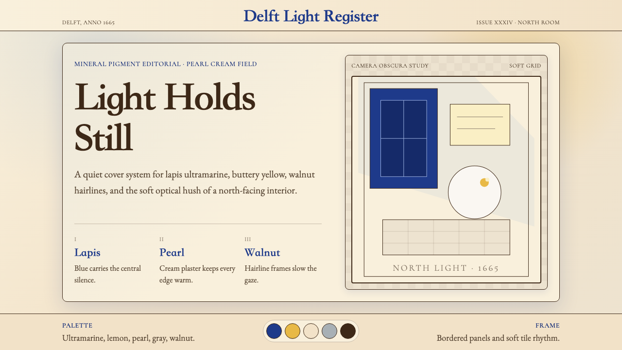 Vermeer Dutch Golden AgeStillness glows. Lapis ultramarine, pearl cream, and walnut frames hold north…静谧发光:青金石蓝、珍珠奶油与胡桃边框承住北窗光。
 Romanian Orthodox Modern RevivalSacred dark refuses sparkle. Voroneț blue halos and gold hairlines rise from…神圣暗场拒绝亮俗:沃罗内茨蓝光环与金箔细线从修道院黑中浮起。