What is Ex Libris Bookplate?
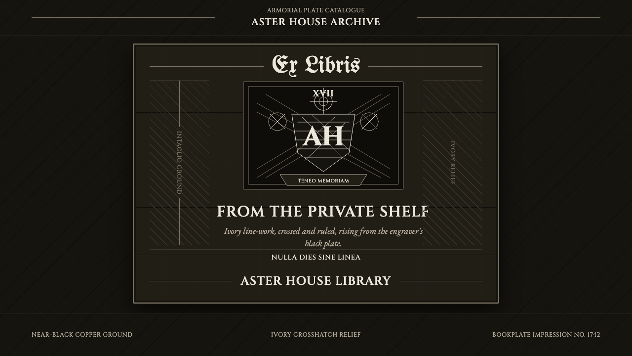
Ex Libris Bookplate turns the private mark of ownership — a coat of arms cut into copper — into a full interface language of ivory line on near-black ground.
Ex Libris Bookplate in brief
Ex Libris Bookplate takes its name and its logic from the small printed label — Latin ex libris, "from the books of" — that collectors have pasted inside the front cover of a book for centuries to mark ownership. The classic form is armorial: a coat of arms or crest, a ribbon carrying a motto, sometimes a border of foliage, all rendered in the vocabulary of intaglio engraving, where the image exists purely as incised line rather than painted mass.
This style inverts that artifact. Instead of ivory paper printed with black ink, the ground itself reads as a near-black engraved plate, and the linework sits on top of it in ivory — as if the design had been lifted straight off the copper before printing, relief still intact. The effect is a full-bleed dark canvas carrying crisp, pale line-work: crests, rules, and dense fields of crosshatching that behave less like illustration and more like structural drafting.
It is a style with exactly one register: monochrome, linear, and precise. There is no color to modulate mood and no photographic shading to suggest depth — every value shift on the page comes from how densely the lines are packed. That constraint is what gives the style its particular authority. It reads as engraved rather than drawn, permanent rather than decorative, and closer to a legal seal or a currency plate than to a poster.
Where does Ex Libris Bookplate come from?
Bookplates are far older than the armorial style most associated with them today. The earliest known examples date to fifteenth-century Germany, simple woodcut labels pasted into monastic and private libraries to identify an owner in an age when books were rare and expensive enough to need such marking. The practice spread across Western Europe as printing itself matured, and by the seventeenth and eighteenth centuries it had become closely tied to the aristocratic and landed classes, who had both the libraries worth marking and the heraldry to mark them with.
The armorial bookplate reached its peak in exactly this window because it sat at the intersection of two established crafts. Heraldry supplied the content: a coat of arms was already a legally regulated, highly codified visual system built to declare identity and lineage at a glance. Intaglio engraving supplied the technique: copperplate engravers, already producing currency, legal seals, and fine illustration, applied the same incised-line, crosshatched-shading vocabulary to the bookplate as a minor but respectable commission.
That pairing is why the style looks the way it does. Engraving on copper does not permit soft gradients the way a brush or a lithographic crayon does — the burin cuts a line, and the only way to darken an area is to cut more lines closer together, crossing them at angles to build up density. Armorial engravers pushed this to a high level of refinement: mantling (the decorative drapery around a crest) became an excuse for virtuoso crosshatching, and the composition was organized the way a legal document is organized, with a clear hierarchy of crest, motto, and supporting ornament.
The tradition never fully died, even as photographic and offset printing made the hand-cut plate commercially unnecessary. Collectors and specialist societies — organizations such as The Bookplate Society continue this today — kept the armorial and pictorial bookplate alive as a niche print form long after it stopped being a practical necessity, valuing it for the density and precision that only engraving, not looser drawing, can produce.
What defines the Ex Libris Bookplate look?
Palette
The palette is reduced to two values: a near-black ground and an ivory or bone-white line color, with no intermediate hues anywhere in the system. There is no accent color standing in for a call to action, no tinted surface indicating a card or a panel. Distinction between elements is carried entirely by line density and by how much ivory is allowed to show through, which forces every layout decision to be legible in grayscale terms before anything else is considered.
Line and Crosshatch
The single formal unit of the entire style is the engraved line — thin, consistent in weight, and drawn as if by a burin rather than a pen. Shading is built by layering parallel lines and crossing them at controlled angles; a lightly shadowed area might carry one direction of hatching, a deeply shadowed area three or four crossing passes. Curves are rendered as a series of straight or gently arced cuts rather than a single fluid stroke, giving even organic motifs — foliage, ribbon, drapery — a faceted, engraved quality.
Typography
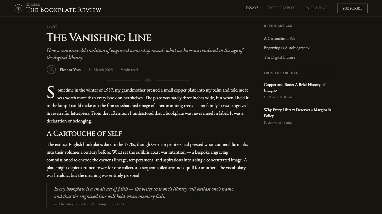
Lettering follows the engraved capital tradition — tall, evenly weighted capital letterforms with pronounced serifs and high contrast between thick and thin strokes, the kind historically cut directly into the plate alongside the crest. Set text reads as inscribed rather than typeset: wide letter-spacing on headings evokes a motto banner, and body copy stays restrained and secondary to the crest or emblem it accompanies, never competing with the engraved imagery for attention.
Composition
Layout follows the heraldic tradition of a fixed, symmetrical hierarchy: a central emblem or crest anchors the composition, flanked or capped by supporting ornament such as mantling, a ribbon, or a border, with a motto or name occupying a clearly separated band. This is composition by protocol rather than by improvisation — every element has a customary place, the same way a coat of arms has a blazon that specifies exactly where the charges sit on the shield.
Texture and Density
Because there is no photographic shading available, perceived texture — velvet drapery, fur trim, metallic sheen, foliage — is entirely simulated through line spacing and direction. A dense, tightly packed crosshatch reads as a shadowed recess or a dark material; sparse, widely spaced parallel lines read as a lit surface or a light material. Mastery of the style shows in how convincingly this illusion of material is built from nothing but line rhythm.
Border and Frame
Content is almost always contained within a defined frame — a rule, a decorative border, or the implied edge of the plate itself — echoing the fact that a real bookplate is a fixed-size printed object meant to sit within a page's margins. Elements read as engraved onto a plate rather than floating freely, giving the system a sense of fixed, finished ceremony rather than open-ended, scrollable content.
Motion and Stillness
Because the source medium is a fixed printed plate, the style carries almost no native vocabulary for motion. Where interaction must be shown, the more faithful approach is an abrupt reveal or a line redrawing itself stroke by stroke — never a soft fade or cross-dissolve, which would reintroduce the photographic softness the whole style exists to reject.
Who shaped Ex Libris Bookplate?
Founded in Britain in 1972, The Bookplate Society is the leading modern body dedicated to the study, collection, and continued practice of ex libris design. Its journal and exhibitions have documented the armorial and pictorial bookplate traditions in detail and connected surviving engravers and collectors internationally, keeping the historic vocabulary of crest, motto, and crosshatched line legible to contemporary designers long after the bookplate stopped being a common household object.
Though best known for his broader engraving and woodcut work, Dürer produced some of the earliest and most technically accomplished bookplates in the early sixteenth century, including designs for patrons such as Willibald Pirckheimer. His command of line-built shading — building tone entirely from incised marks rather than wash or color — set a technical benchmark that armorial engravers two centuries later were still working within.
An English engraver working chiefly in wood rather than copper, Bewick raised fine line-engraving to new levels of naturalistic precision in the late eighteenth century, and his workshop produced bookplates and vignettes alongside his celebrated natural-history illustrations. His work demonstrates how the same crosshatched, incised-line discipline used for heraldry could be extended to render texture and material with near-photographic conviction, entirely through line control.
Charles William Sherborn was among the most prolific and technically precise armorial bookplate engravers of the Victorian revival of the form, producing hundreds of copperplate designs for private clients in the second half of the nineteenth century. His work is often cited as the high-water mark of the armorial style's late flourishing, prized for the evenness of his line and the restraint of his heraldic compositions.
How do you use Ex Libris Bookplate today?
Ex Libris Bookplate is a demanding style to transplant because its entire vocabulary is built around the absence of color and photographic depth — success depends on treating line density, not hue, as the primary tool for hierarchy and mood.
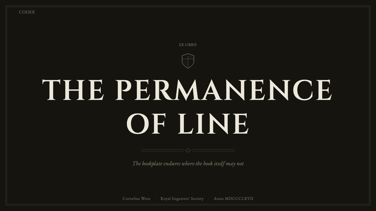
For presentation cover slides, the style produces an unmistakably formal, almost ceremonial opening: a central emblem or monogram rendered in engraved line sits against the near-black ground, framed by a thin border, with the deck title set in wide-spaced engraved capitals beneath it. Content and data slides need more restraint than the cover — a single crest-like icon can anchor a section header, but body text and data should stay in simple ivory-on-black type with hairline rules doing the work that color-coding would do elsewhere; a bar chart or diagram rendered as thin engraved outlines, rather than filled color blocks, keeps the whole deck in one register.
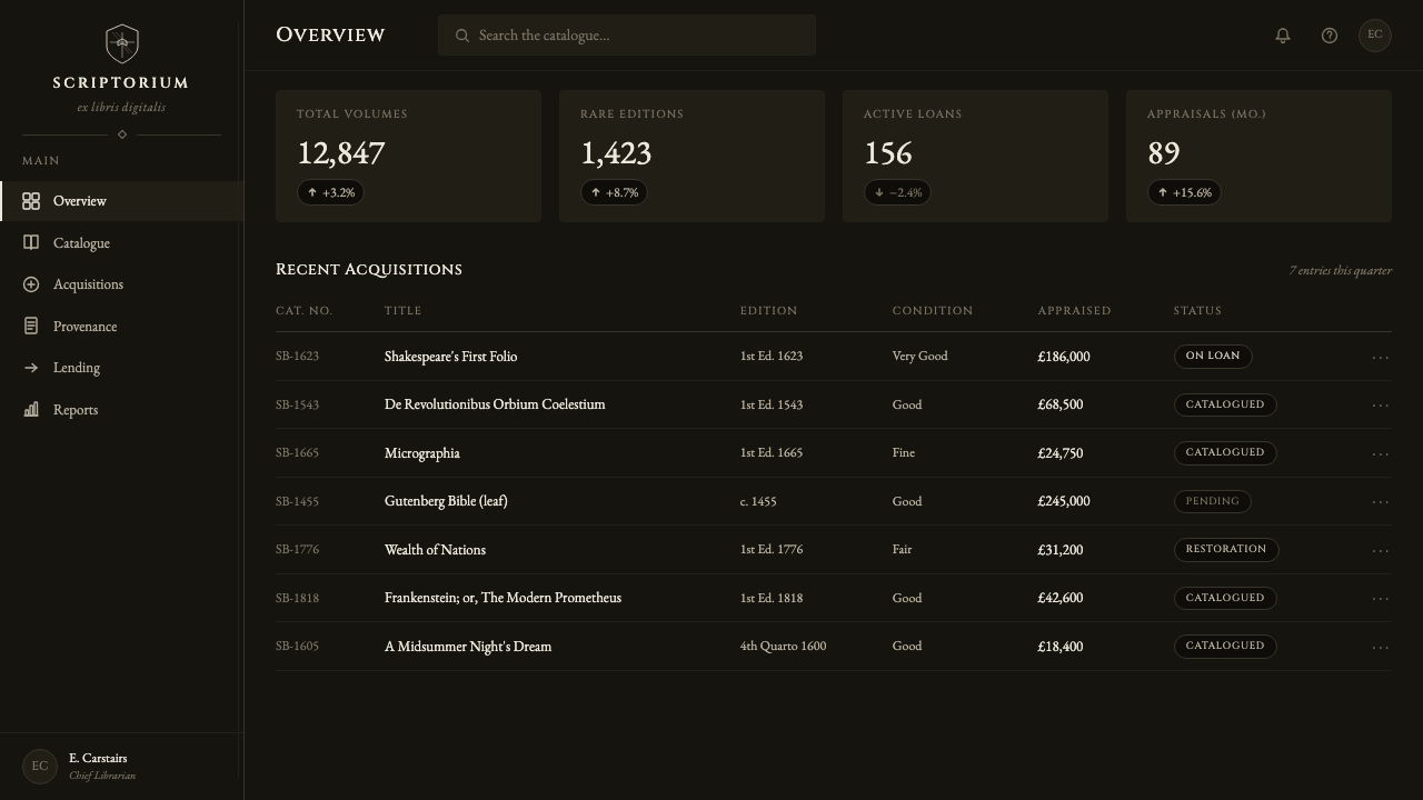
For web UI, dashboards and pricing pages benefit from the style's built-in sense of authority and permanence — a pricing table reads like a chartered document, with tier names set in engraved capitals and a hairline-ruled grid standing in for card borders. Dashboards should use crosshatch density, not color, to distinguish states: a lightly hatched icon for a normal state, a densely crosshatched one for an alert. Buttons and interactive elements work best as bordered plates rather than filled blocks, since filled color would break the two-value discipline the whole system depends on.
For editorial and marketing work, the style suits mastheads, chapter openers, and premium or heritage-positioned brand campaigns particularly well — a magazine section break or a luxury product page can use a full-bleed engraved illustration exactly as a historic bookplate would use a crest, with the headline set in the same engraved-capital voice. Marketing pages should use the near-black ground as full sections rather than small accents, since the style reads as most authentic when allowed to dominate a whole panel rather than appear as a flourish inside an otherwise conventional layout.
The most common mistake is treating this as simply a black-and-white theme and reintroducing photographic gradients, soft drop shadows, or anti-aliased blur to suggest depth — these break the engraved illusion, because the style's credibility rests on every value change being explainable as more or fewer lines, never a soft gradient. A second mistake is overcrowding a layout with ornament borrowed from historic mantling; authentic armorial bookplates reserve their densest ornament for the crest itself and keep supporting text plain, and the same restraint should govern how much crosshatched decoration surrounds any single interface element.
Ex Libris Bookplate — FAQ
Is Ex Libris Bookplate the same thing as a general "engraving" or "etching" style?
They overlap but are not identical. "Engraving" is a broad printmaking technique spanning currency, scientific illustration, and portraiture. Ex Libris Bookplate is a specific application of that technique, inherited from the armorial bookplate tradition, which adds a fixed compositional protocol on top of the engraved line: a central crest or emblem, supporting mantling or ribbon ornament, and a motto or name band, organized the way a coat of arms is organized. A general engraving style has no such compositional requirement. Ex Libris Bookplate specifically carries the heraldic, ownership-marking logic of its origin.
Can this style use any color at all, or is it strictly black and ivory?
The style is defined by its two-value discipline, and that is where its authority comes from — introducing a third hue, even a restrained one, tends to read as a hybrid rather than an authentic application. A very occasional, tightly controlled exception — a single dark red or deep gold used exactly once, the way an heraldic tincture might appear on the crest itself — can be historically plausible, but it should never be treated as a usable accent color across an interface. The safest and most faithful approach treats the style as genuinely monochrome throughout.
How should crosshatch density be handled at small interface sizes, like icons or buttons?
At small scale, dense crosshatching quickly turns into visual noise or a solid gray blur, defeating the purpose of the technique. The historic solution, seen in small bookplate vignettes and seal engravings, is to simplify: use fewer, more widely spaced lines and reserve the densest crosshatching for larger focal elements like a central crest, where the eye has room to resolve individual strokes. A small icon should read as a simplified engraved mark, not a miniaturized copy of a large, densely worked illustration.
Does Ex Libris Bookplate work for light-mode products, given that it's presented on a near-black ground?
The style as codified here is specifically the inverted, plate-ground reading — ivory line on near-black — which gives it the relief-lifted-off-copper quality described above. A conventional light-mode version, ivory paper with black ink, is historically the more common form of an actual printed bookplate, but it loses the dark, almost ceremonial authority this variant is built around. If a product genuinely requires a light background throughout, this particular style is not the right fit; a lighter engraving-derived treatment would need different design decisions rather than a simple color flip.
What kinds of products or brands should avoid this style?
The style's formality and historical weight make it a poor match for products that need to feel fast, casual, or playful — consumer social apps, children's products, or anything positioning itself as approachable and modern will find the engraved, heraldic register works against that goal. It also struggles wherever color needs to carry functional meaning, such as status dashboards that rely on red/yellow/green signaling, since the style's entire premise is the absence of hue. It suits contexts that want to borrow the authority of an heirloom document or a legal seal — premium credentials, rare-goods marketplaces, archival or literary platforms — far better than it suits anything meant to feel light or immediate.
Related design styles
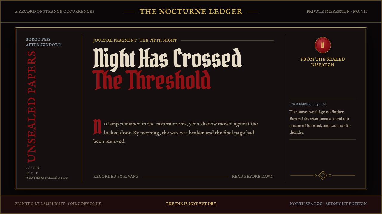 Dracula Gothic (1897)Victorian dread after dark. Blood-red initials and tarnished gilt haunt coffi…
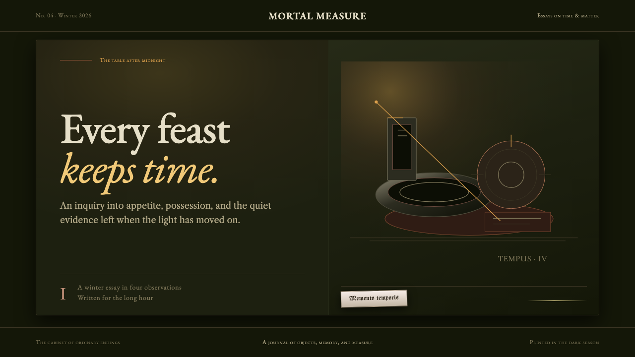 Dutch VanitasTime waits at the table. Olive-black depths, earth-brown type, and one candle…
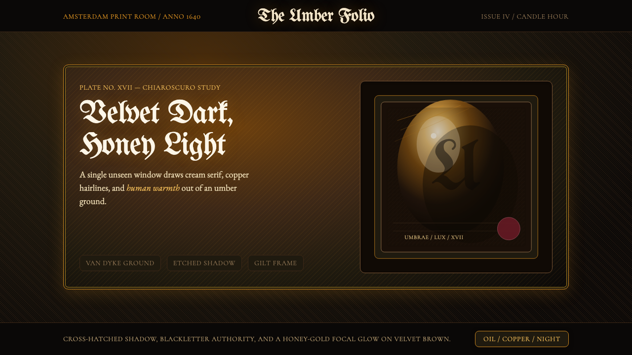 Rembrandt BaroqueDarkness becomes theatre. Honey-gold spotlight and blackletter rise from Van…
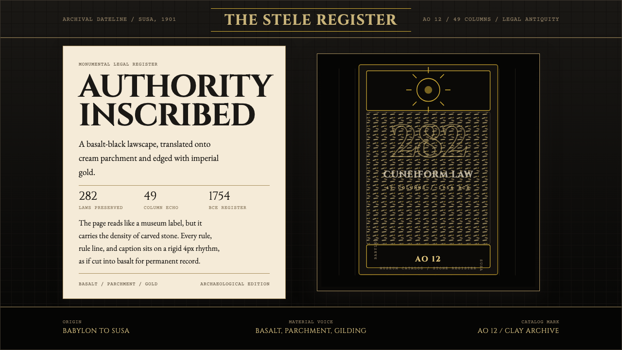 Babylonian Hammurabi SteleAuthority carved in stone. Basalt-black grids, parchment panels, and imperial…
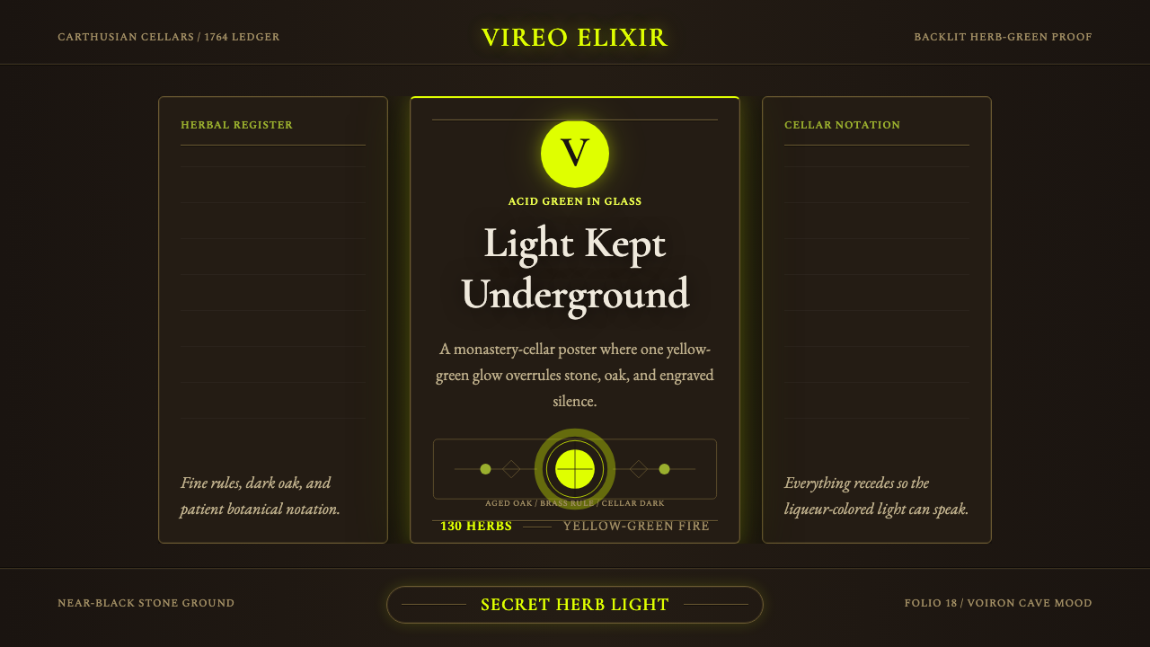 Chartreuse Liqueur GreenAcid glow rules the cellar. Cormorant Garamond and brass hairlines frame yell…
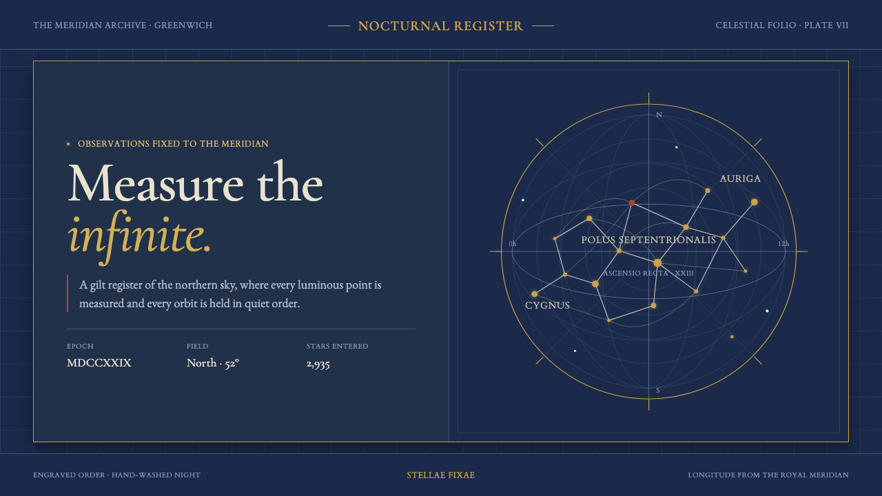 Flamsteed Atlas CoelestisMeasurement wears mythology. Ivory engravings and gilt stars cross a deep ind…